ARTS 102 Brittney Stokes

2
3 Meet the Artist ................................................................. Statement of Intent .......................................................... Project One: 6 Word Memoirs .......................................... Project Two: Abstraction Typeography ......................... Project Three: Go TV Poster ........................................... Project Four: Character Logos ....................................... Project Five: Syntax + Semantics .................................. Reflection ....................................................................... Colophon & Grid ............................................................ C O N T E N T S 4 5 6 10 14 18 22 26 28
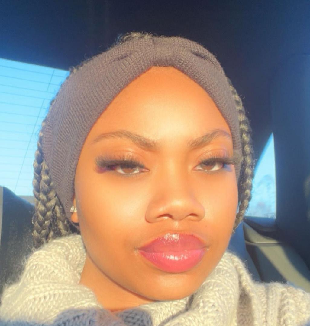
Meet the Artist
Welcome! I am Brittney Stokes, a creative and artistic soul who aspires to become a graphic designer who will eventually blossom to become a graphic design business owner. My interest in the arts began in elementary school, where I was inspired by my elementary school art teacher to embrace my creative genes. Continuing from there, I always found myself being the one that people relied on to draw, paint, design, and more. I believe the fact that I can use my gift to help others has allowed me to continue on this journey enabling myself to learn more about myself and try to perfect my craft.
4

Statement of Intent

Being considered by the Graphic Design + Illustration program would allow me to not only challenge myself but also give me the chance to achieve the greatest amount of instruction to make myself and my work “one in a million.” I am a creative mind who wants to use the skills that I have gained over the years, like leadership, responsibility, teamwork, and communication, to create a vision that proves to change the future. With this program, I believe that the criticism and feedback could shape me to be the best that I know that I can be. It would also provide me with the confidence to grow as an artist in the presence of a world that is now considered black and white. As a result, I would hope to insert my color of creativity into the world with the opportunities and experience that this program could provide.
Sincerely,
 Brittney Stokes
5
Project One 6 Word Memoirs
6
8
AI becomes our NEW normal!
Screenshot of Project One in Adobe Photoshop
Project One Response
Within the past two weeks, I have experienced a whole new perspective of change because of my Design Technology and Concepts course. The first project, although not hard, put me through the ringer due to it being my first time working with Photoshop. Pretty amateur, am I right? However, based on the reading, I have learned that all graphic designers won’t be perfect at a task they have just started. I know for a fact it took me a good 30 minutes to ask for help, which I normally don’t do, but I am glad I did. As a result, this assignment has shown me three things that I will remember throughout my learning experience. The first being that everyone has a different level of experience behind their career, the second is that growth is found within critiques and asking for help, and the last is that taking your time comes with being a creative mind. I know that I have a few more things to work on and learn about myself, but I am up for the challenge.
9
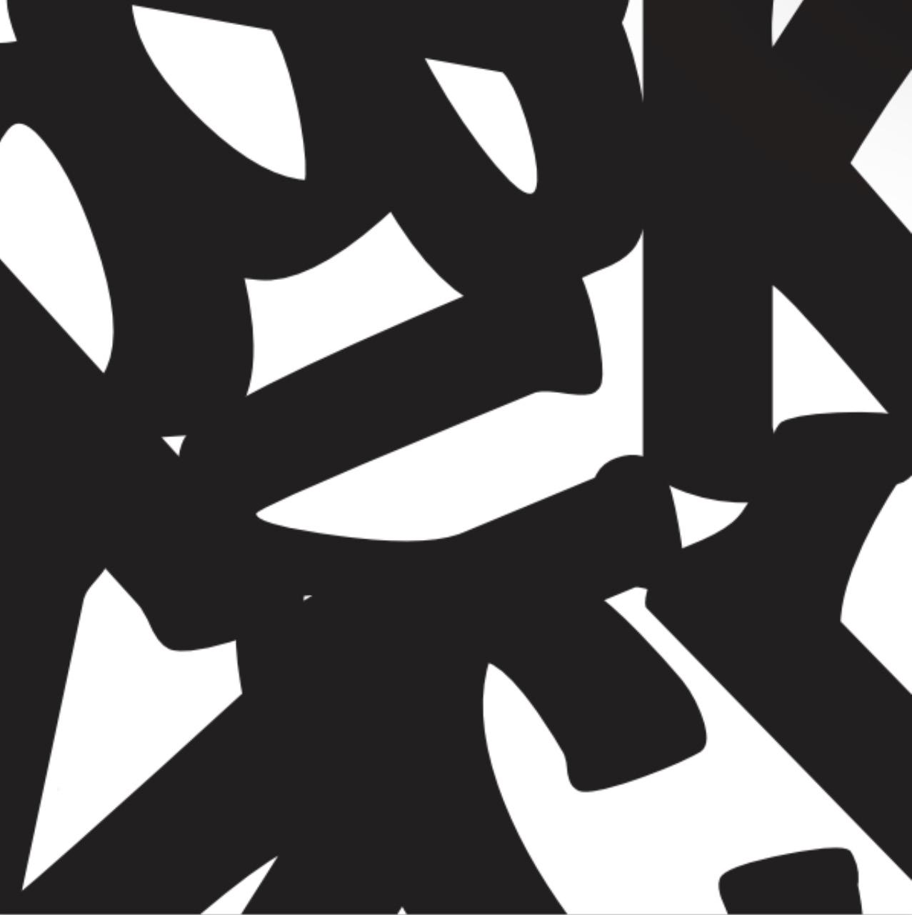
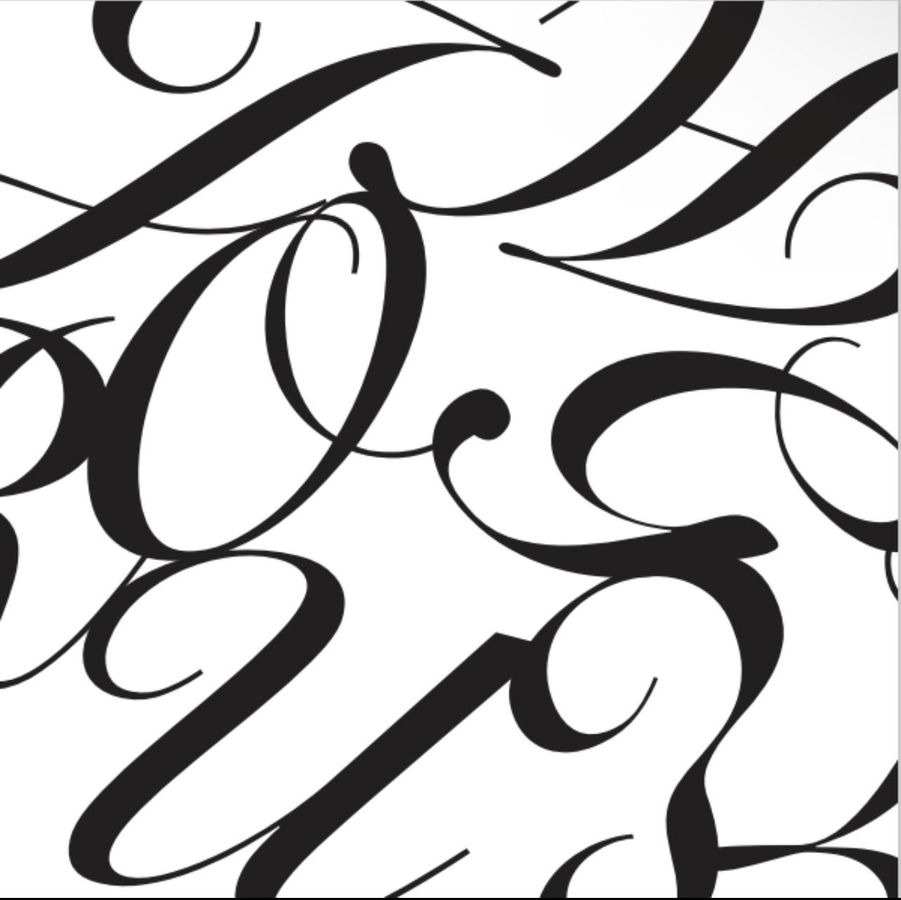
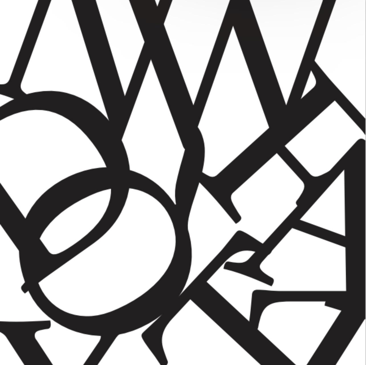
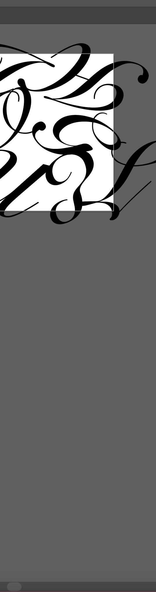
Project Two Typography Abstraction
10
11
12
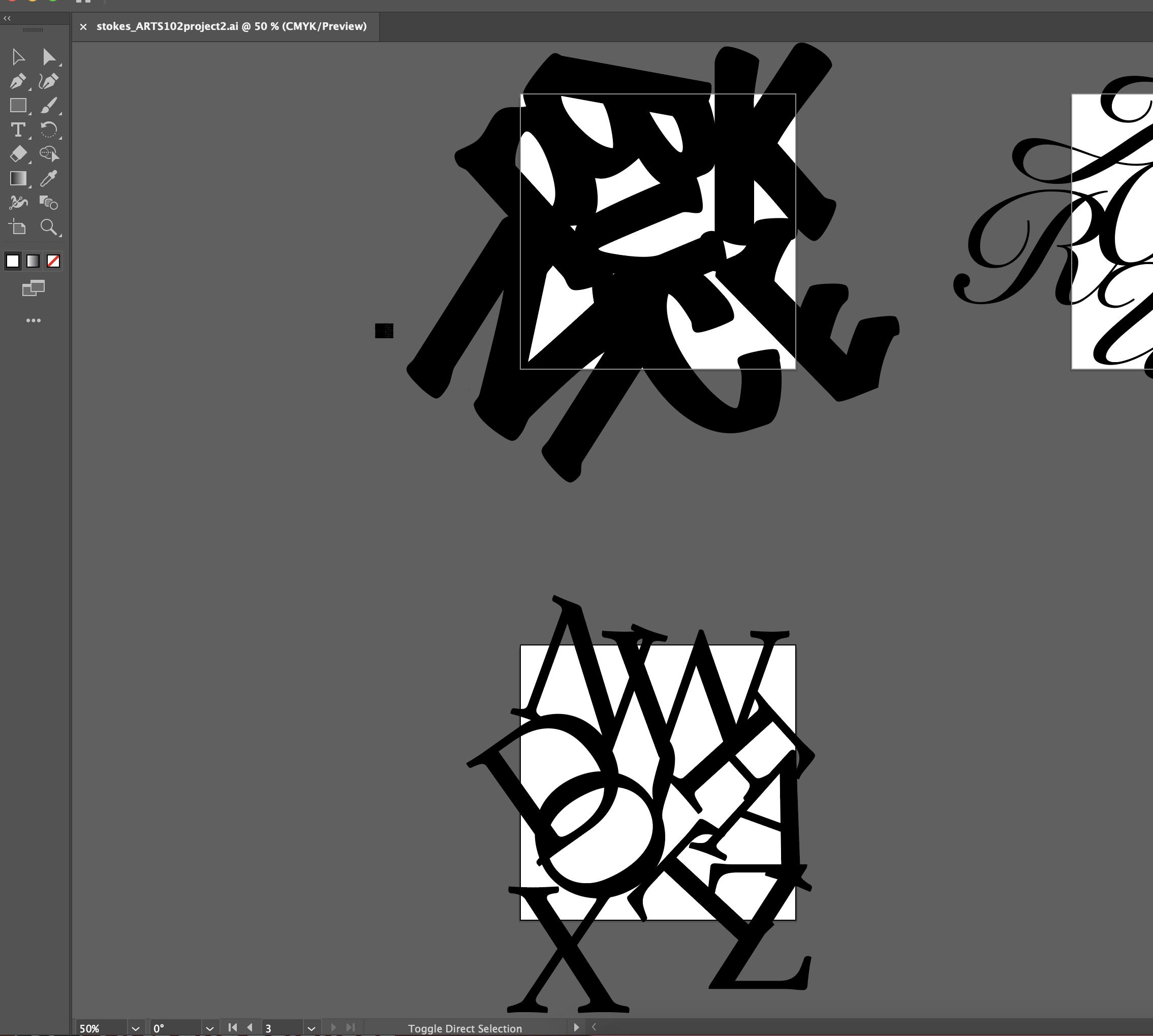
Screenshot of Project Two in Adobe Illustrator
Project Two Response
Typography Abstraction! My second project, another new thing that I had to learn (I do feel like I am getting the hang of this Adobe thing though). For this project, instead of using photoshop, we used illustrator to create three different squares with letters that aren’t supposed to be seen (I challenged myself to use all 26 letters of the alphabet, once). To be honest, for my first time using Adobe Illustrator I think I did well, but there are some things that still need to work on. For example, I noticed that some letters were still recognizable and could definitely be blended a bit more, but I’ve learned that growth comes from those who continue and learn from their past experiences. The critiques this week were also helpful as well. This brings me to the point of the reading where I learned about collaboration, not with a group where everyone has certain responsibilities, but with people who know how to work with others, communicate, and use their feedback to help myself, as well as others out in the future. I found that with two of my seat mates and hope to keep it going!
13
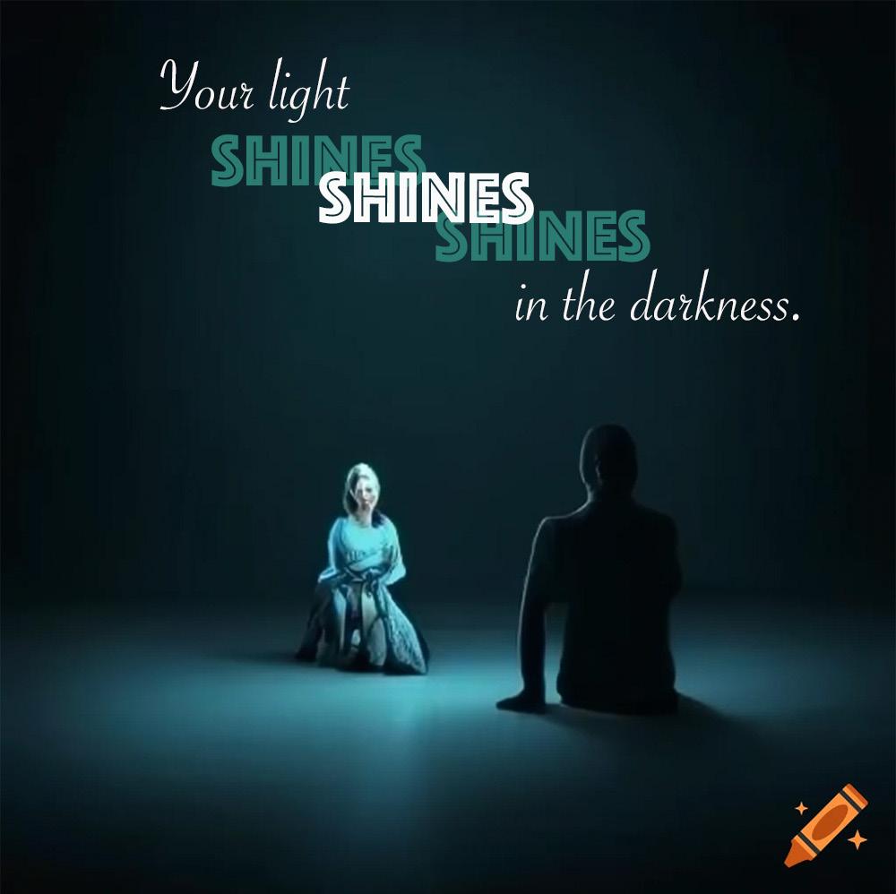
Project Three GO TV POSTER
14
15
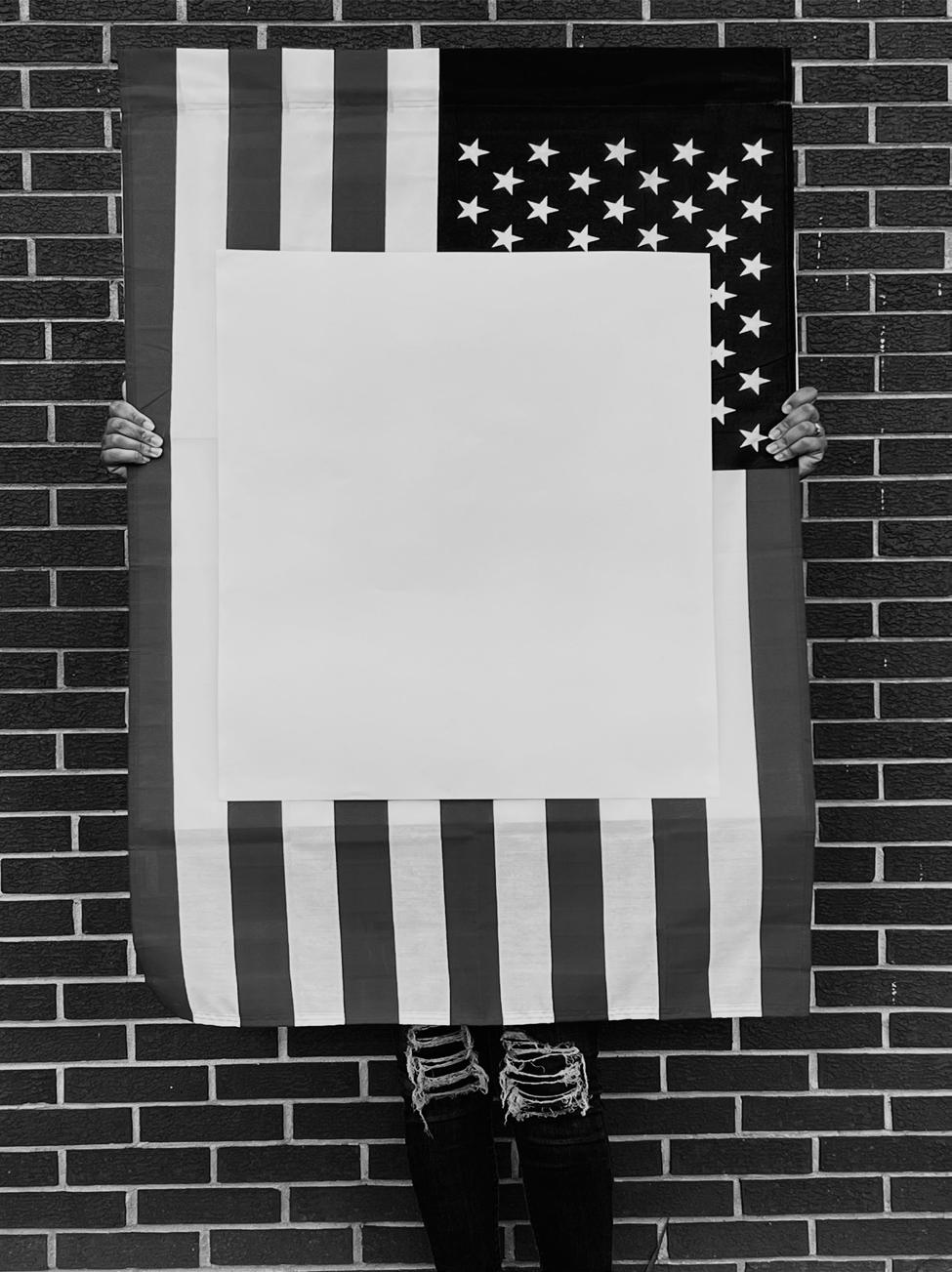
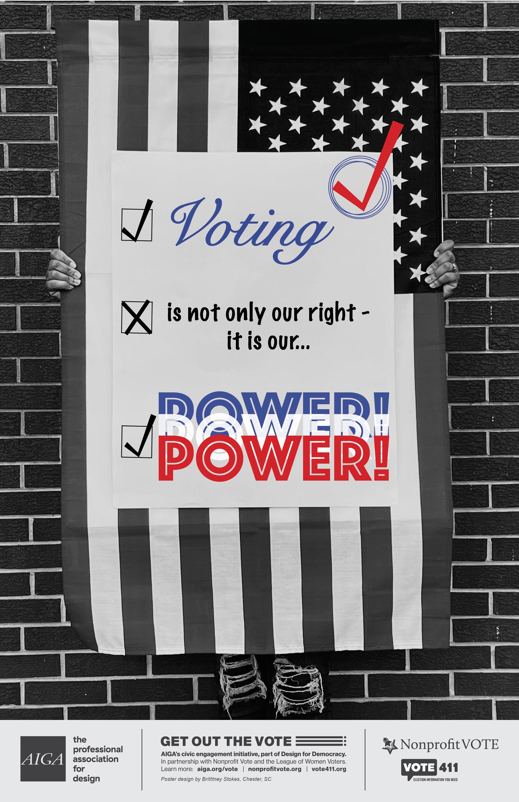
I decided to use a combination of what I learned in my film photography and design class, so my base for my poster was someone holding and American flag with a white poster board over it.
16
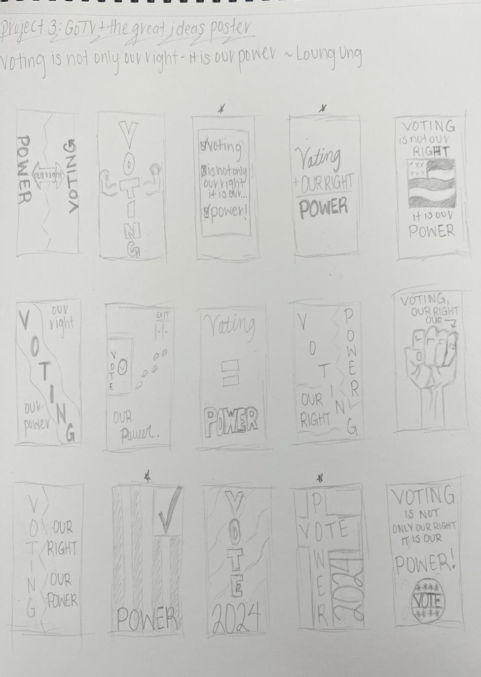
Project Three Sketches
Project Three Response
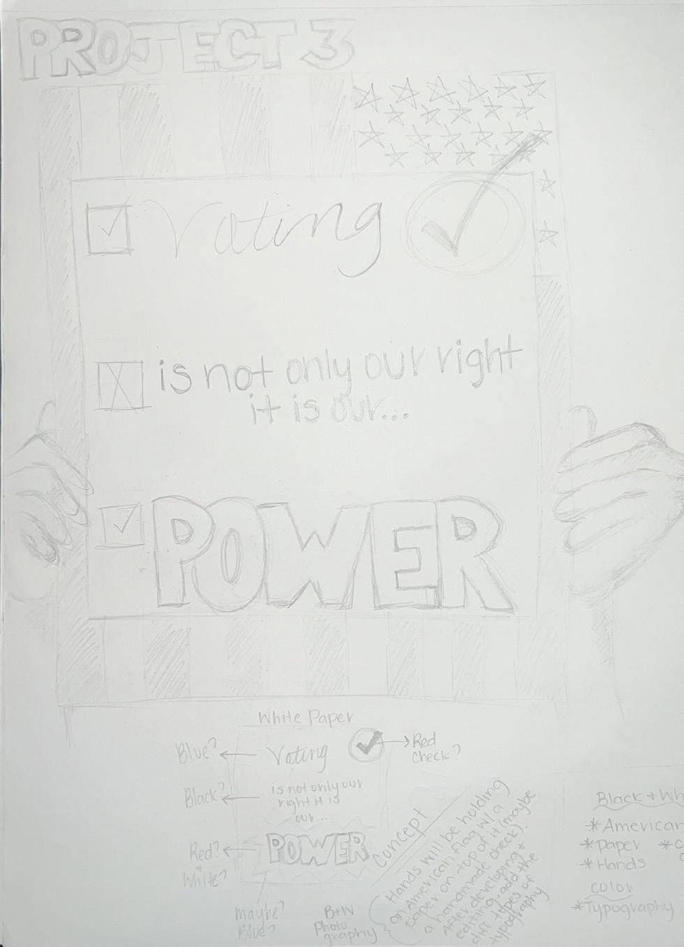
This being my third post, I would like to reflect on the fact that my current project has been the most interesting. For this, I was required to make a poster based on a quote for voting, my quote being, “Voting is not only our right - it is our power” by Loung Ung. I went through a process of drawing 15 small sketches and narrowing them down to my top three. My final 2 options included the design being very simple typography or taking a photograph and attaching typography to it. As you can see, I chose the second option. To achieve my vision, I used Adobe Photoshop and InDesign. Although this assignment is somewhat different from the topic of the reading, I believe they correlate with the main idea which talks about publishing and marketing. Both are reasons why I viewed this assignment professionally effectively helping me complete my vision.
17
Project Four Character Logos
18
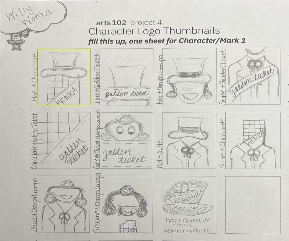
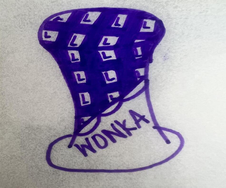
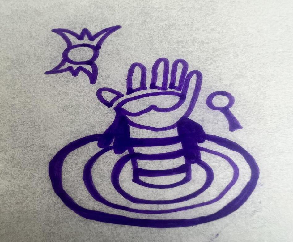
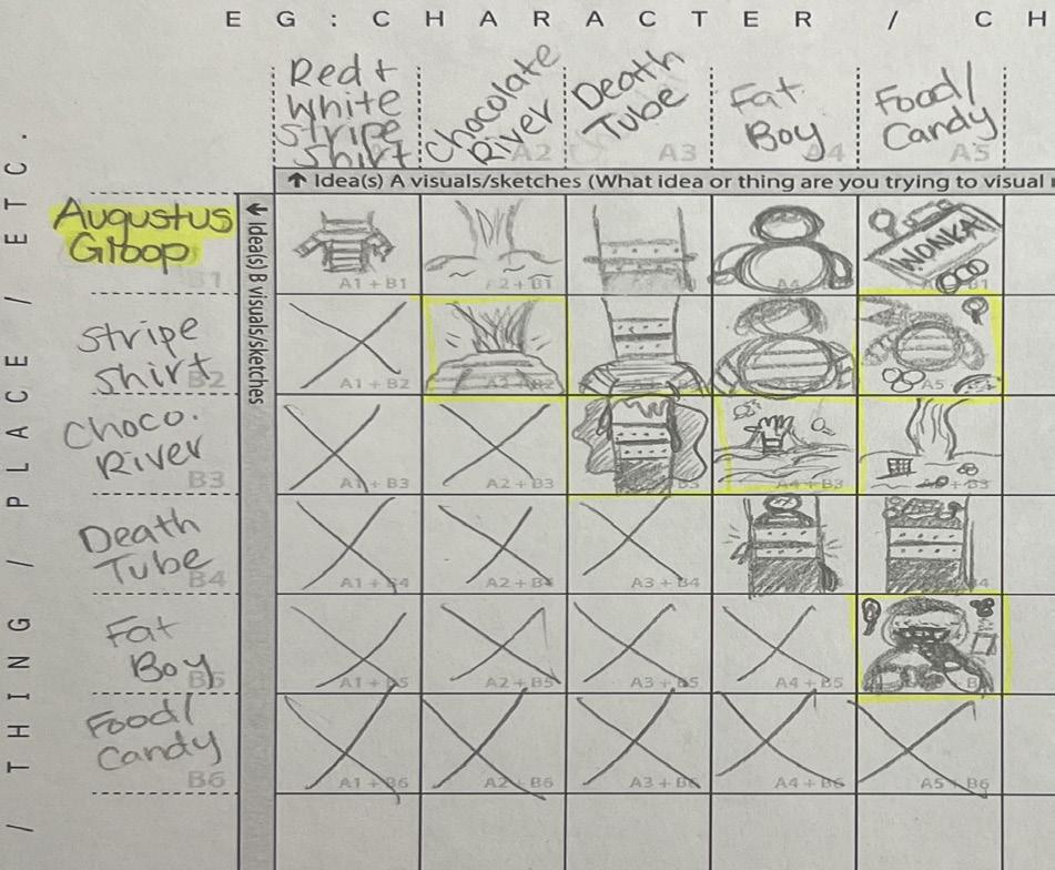
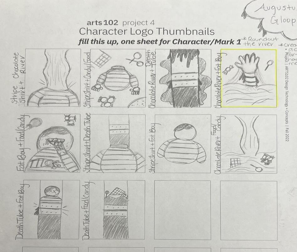
19 Wonka BAR Wonka BAR Wonka BAR Wonka BAR Wonka BAR WILLY WONKA WILLY WONKA WILLY WONKA Augustus Gloop Augustus Gloop Augustus Gloop arts 102 project 4 Character Logo + Mark BRITTNEY STOKES ARTS102-002 Willy Wonka (left), Charlie and the Chocolate Factory Concept statement: I decided to do Willy Wonka from Charlie and the Chocolate Factory because I feel that his character is basically the face of the movie. My concept for him was to mix two of the main things that you see in the movie, I believe that was himself and chocolate. When designing, I mixed the brown hat that he wears and a chocolate bar together to achieve my logo. As for my text, I noticed that some of the text in the movie was similar, so I felt that it was a great fit. I also used the Gestalt Rule of Emergence (people might not understand the chocolate part of the hat until actually looking or reading a description that tells you what it is). Augustus Gloop (right), Charlie and the Chocolate Factory Concept statement: Augustus was one of the children that got a golden ticket in the movie. The problem that he had was that he liked to eat everything that he could get his hands on. So, for his character I decided that he would be depicted as if he fell into the chocolate river with candy around him, similar to the scene in the movie. Since he was a kid, I wanted to do text that was z somewhat similar to a child’s hand writing. And I used the Gestalt Rule of Pragnanz with the way that I made his hand.
20
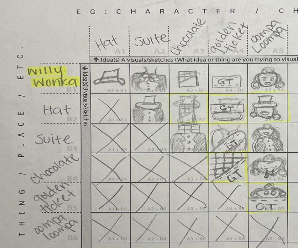
Thought process and sketches for Augustus Gloop
Thought process and sketches for Willy Wonka
Project Four Response
Now introducing, project number fourmaking logos!! For this, we must design a logo based on two characters from our favorite movie or television show. To be honest, deciding on the movie or television show that I wanted to do seemed like the hardest part on my end because I simply didn’t have a favorite. However, I did end up choosing Willy Wonka and Agustus Gloop from Charlie and the Chocolate Factory. The concept that I had for Willy Wonka revolved around his hat and suit that he wore, chocolate, the golden ticket, and his Oompa Loompas. Agustus was chunky, wore a striped shirt, fell into the chocolate river, got stuck in the chocolate tube, and was always eating some type of food or candy. I do know that comparing this project to the reading was similar in a way because of the topic of traditional design and digital media. As the book has said, I can see the use of collaborating with another project and combining that topic with the ideas that you get from them. In my case, this project. Although l am not finished, I do feel like this will be a great mission to accomplish.
As of right now, I am officially done with Project 4! As mentioned in my textbook, functionality issues were one of the reasons I struggled with my logos, especially the one dealing with Augustus Gloop (the one on the right). The design that I had thought out was much more difficult to put together than I thought. You couldn’t necessarily put shapes together and move on, you had to actually draw certain things out and mesh them together to look correct. I believe that the hand for Augustus was the most difficult because of the way that I shaped each part. My thought process figured that it wouldn’t be hard because I drew it out pretty guickly, but boy was I wrong. The fact that I am still getting used to Adobe Illustrator also played a factor, however, I do feel that the end design turned out pretty good and I am glad that I had this experience, especially for things in the future!
21
Syntax + Semantics Project Five
22
SYNTAX (visual elements & relationships)
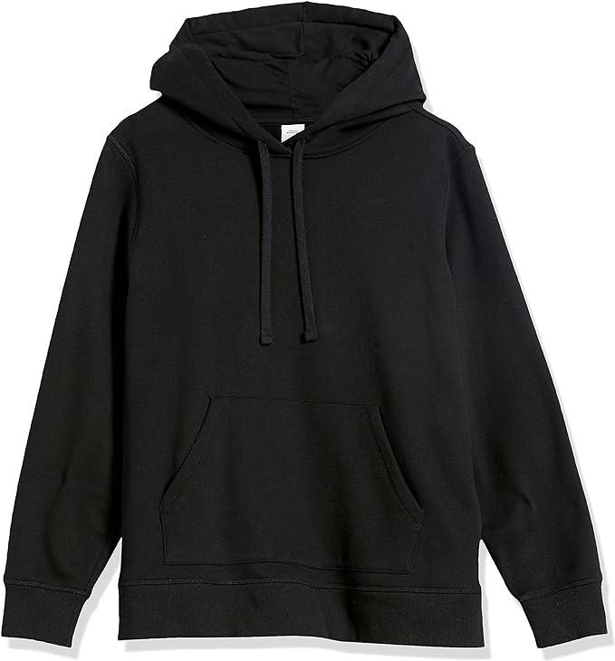
The object has an all-black background with two rectangular pieces of black cloth extending from each side of the main body. The bottom front section contains a pocket of space where your hands are placed. A 1 ½ inch above this pocket is two rectangular strings connected to an extra piece of black cloth.
SEMANTICS: DENOTATION (specified)
Clothing > Women’s Fashion Hoodies & Sweatshirts > Pullover Hoodie
SEMANTICS: EXPRESSION (feelings)
Cozy, comfy, and simple.
SEMANTICS: CONNOTATION (associations)
Shared: Affordable, long-lasting, everyday, and basic.
Specific: My favorite color hoodie in high school
PRESENCE (contextual)
Little: Taking a walk in the park
Lots: At a job interview for Google
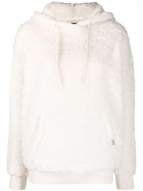
SYNTAX (visual elements & relationships)
White form with two rectangular pieces of cloth on each side. Two circular strings connected to the bottom jacket. 2 inches down from the strings is a pocket of space. On the right edge of the space is a rectangular shape with three light purple letters turned sidways. An extra piece of cloth sits on the back of the main body.
SEMANTICS: DENOTATION (specified)
Tops > Outerwear > Fleece Hoodie
SEMANTICS: EXPRESSION (feelings)
Warm, fluffy, and soft.
SEMANTICS: CONNOTATION (associations)
Shared: Winter, Autumn, cold weather, recycling.
Specific: Reminds me of my fuzzy black-and-white hoodie I wore in middle school
PRESENCE (contextual)
Little: At a ski resort
Lots: At the beach
SYNTAX (visual elements & relationships)
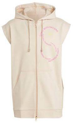
Beige cotton form with a vertical section in the center that extends down the front with a slider that binds the two edges together on the bottom and top. On each side of the vertical section is a pocket where your hands are placed. 2 inches above that are two vertical pieces of string with a knot at the end connected to an extra piece of cloth at the top of the beige form. The upper right element contains pink words in the shape of a capital S. In the top curve of the S is a yellow circular form made with words and in the middle are 3 diagonal lines on top of each other with minimal space in between.
SEMANTICS: DENOTATION (specified)
Clothing > Hoodies > Short Sleeve Hoodies
SEMANTICS: EXPRESSION (feelings)
Cute, expensive, and fun.
SEMANTICS: CONNOTATION (associations)
Shared: Modern, trendy, and fashionable.
Specific: An ad seen while online shopping
PRESENCE (contextual)
Little: Photoshoot or fashion show
Lots: Playing in a hockey game
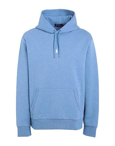
SYNTAX (visual elements & relationships)
Blue form with two rectangular pieces of cloth extending from each side of the main body. The bottom section on the front contains a pocket of space. An inch above the pocket of space are two rectangular strings with cylinder shape silver metal at the end. Connected to them is an extra piece of powder blue cloth that sits on top of the main body. In between the two rectangular strings is a white form of a horse and horseback rider swinging a slim rectangular form.
SEMANTICS: DENOTATION (specified)
Sport & Lounge > Sweatshirts & Hoodies > Oversized Hoodies
SEMANTICS: EXPRESSION (feelings)
Simple, nice, and basic.
SEMANTICS: CONNOTATION (associations)
Shared: Young adults, bright
Specific: On the body of a male college student
PRESENCE (contextual)
Little: Drake’s closet
Lots: Browsing through the mall
23
ProjectResponseFive
For Project 5, I can say that it was mostly easy because I got to pick an item that most definitely resides on my Christmas list, a.k.a HOODIES! I believe that hoodies are a type of clothing that can be dressed up and down, so I felt like this would be a great choice for the assignment. However, creating a syntax for 4 completely different designs proved to be my challenge. My teacher suggested visualizing myself describing this product to someone who hasn’t been on Earth. Basically, they can’t differentiate the hood from the front pocket. So, I did the best I could by using numbers, units, and the easiest words I could think of. The semantics of the project came easier because I could describe the hoodies in a way as if I saw them in person or online. Similar to what I learned from syntax and semantics, is the main idea in this week’s reading. In this, I learned that graphic design can’t go on without all of its parts, more specifically the “geeky” part. Two figures, Frieder Nake and Mark Webster, emphasized algorithmic thinking as being the geeky part of the design process, which leads me to agree based on not only this lesson but similar situations as well.
24
25
REFLECTION
26
Looking back at my first day in this course, I can say that I have grown not only in my work but as a person. I came with the mindset that I knew whatever was going to be taught and that this would be a class that would brush up on the skills that I already knew, however, I was proven wrong. I had no idea how to work with Adobe Photoshop, Illustrator, or InDesign, so I figured that was my first sign to give up. On the other hand, I knew that I wasn’t a quitter, so my ARTS 102 journey began.
Now that this course is coming to an end, I can say that I have learned three things. The first is to never give up on a challenge. Conquering is the only thing that can be done to a challenge. You may need to step away and take a break, but never let something or somebody keep you from the vision that you know you can achieve. Two, being a perfectionist won’t get you anywhere. As a human being, nothing in this life is perfect, so don’t stress striving to be. And last, don’t be afraid of criticism and feedback. Allowing a fresh set of eyes to help you improve in ways that you haven’t seen before is beneficial, especially in the art world.
In conclusion, even though ARTS 102 is coming to an end, I want to reflect on the fact that I conquered many challenges and proved to my past self, who doubted if this career was actually for her, that I can do anything that I set my mind to! Also, a big thank you to Daniel Machado, your insight, encouragement, and stories got me through the semester. Overall, I enjoyed learning from 102 and I am excited to be continuing my journey to adopt new skills and experiences!
27
Brittney Stokes
ARTS 102
Daniel Machado
University of South Carolina
Columbia, SC
Year: 2023
Header: Source Serif
Variable - Regular (60pt)
Body Title: Source Serif
Variable - Italic (36pt)
Body Text: Source Serif
Variable - Semibold Italic (15pt)
Captions: Source Serif
Variable - Light Italic (17pt)
The Grid
28
Colophon