“You’re free to be different, Be different.”

“You’re free to be different, Be different.”

To be the leading lingerie and corset brand that redefines luxury through refined craftsmanship, modern inclusivity, and a timeless sense of self-expression.

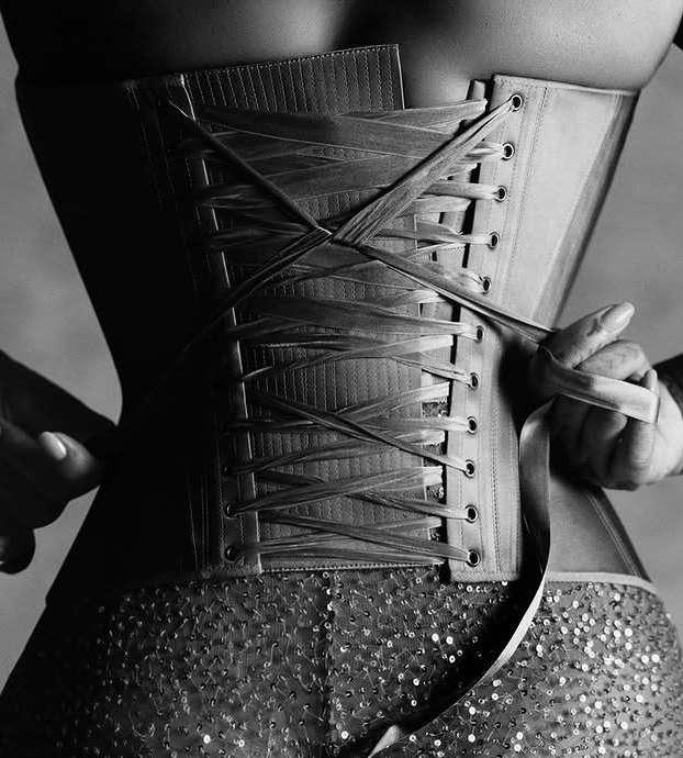
We craft each piece to celebrate and empower ev- ery body, blending traditional artistry with inno- vative design. Our goal is to embrace individuality, and champion a new era of sophisticated sensuality.
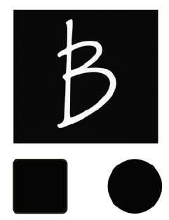
The BK logo features bold, handwritten initials in a dynamic brush script style. The flowing strokes of the “B” and “K” create a sense of movement and elegance, reflecting artistic confidence and personal identity. The minimalist black-on-white design emphasizes sophistication and modern luxury, making it ideal for a high-end fashion or lifestyle brand.

The flowing strokes of the “B” and “K” create a sense of movement and elegance, reflecting artistic confidence and personal identity.
The Bahar Khatony logo features a distinctive handwritten signature style, combining elegance with individuality. The typography is fluid and artistic, evoking a sense of personal craftsmanship and refined creativity.
The thumbnail mark serves as the brand’s minimalist emblem for digital platforms, particularly social media. Designed with a stylized “B” enclosed within clean square and circular formats, this mark is instantly recognizable even at small sizes, ensuring consistent visibility across profile icons, app favicons, and product tags. Its high contrast and simplicity maintain the elegance and identity of the Bahar Khatony brand while adapting seamlessly to modern, mobile-first environments. Whether used as an Instagram avatar or stitched onto a garment tag, this mark conveys luxury with subtle impact a whisper of exclusivity in a visual world of noise.

Th u m b n a i l
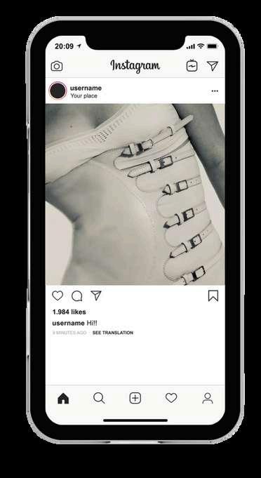
M a r k
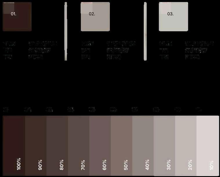
The color palette defines the emotional tone and visual consistency of the Bahar Khatony brand. It builds on rich, earthy neutrals—anchored by deep chocolate tones and softly graded to pale greys— evoking sensuality, comfort, and elegance. This tonal range allows for flexible application across fabric, packaging, and digital design while maintaining a cohesive, high-fashion identity. Each gradient step from 100% to 10% enables refined layering and visual hierarchy across brand materials
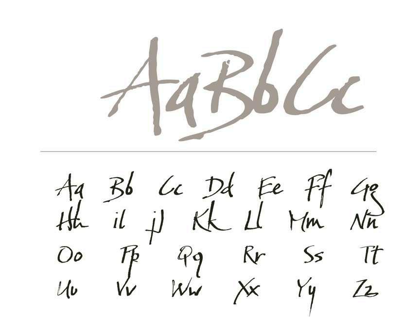
. The Baka Too typeface introduces a bold, expressive contrast to the clean classicism of Inter. With its hand-drawn elegance and organic flow, Baka Too captures a sense of raw emotion, creativity, and personal signature making it the perfect font for titles, hero text, and visual accents throughout the brand. It adds a human touch that reflects the intimate nature of the Bahar Khatony collection, especially in the context of lingerie and corsetry. When paired with Inter, Baka Too infuses personality without compromising legibility, achieving a balance between editorial sophistication and artistic flair that feels distinctly high-fashion.
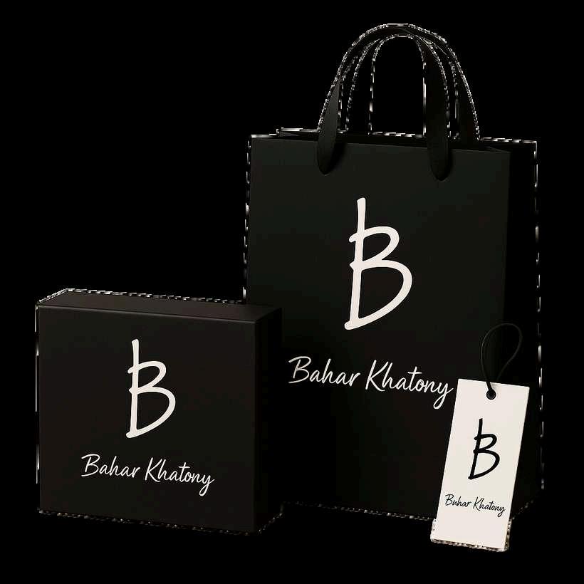
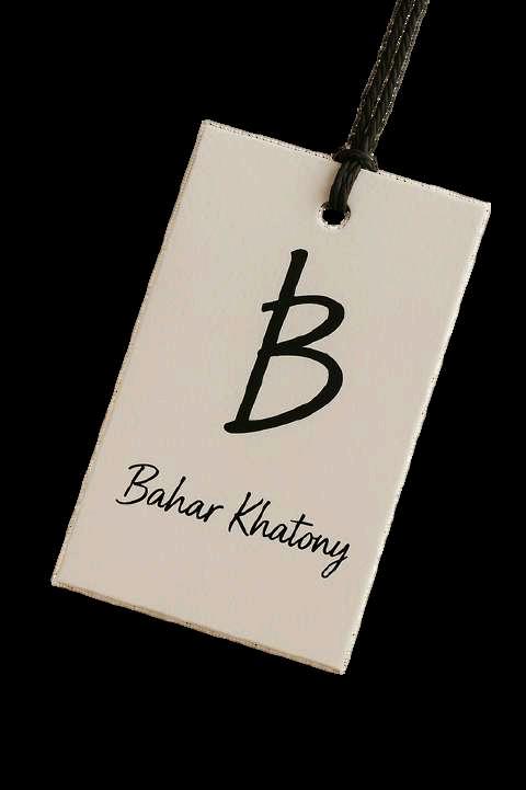
The Bahar Khatony packaging suite blends elegance and intimacy through a cohesive set of luxury elements a matte black shopping bag, structured corset box, and minimalist hang tags. Each piece is adorned with the iconic "Bk" monogram and signature script, designed to elevate the unboxing experience with a sensual, coutureinspired finish.
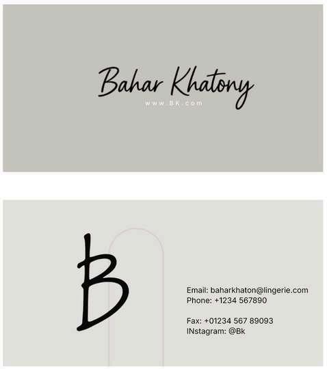
The Bahar Khatony business card is a refined extension of the brand’s identity—minimal, luxurious, and intentional. The front showcases the elegant signature logotype, paired with a clean web address, while the back features the bold “B” monogram alongside key contact details. Set against a soft neutral background, the card reflects the sensual sophistication of the brand, making every touchpoint—from networking to packaging—feel cohesive and elevated. It’s not just a card; it’s a tactile introduction to the Bahar Khatony experience.
Bu s i n e s s c a r d
The Content Strategy Table and Content Calendar outline Bahar Khatony’s digital presence with precision and purpose. Each platform is used intentionally to build brand identity, connect emotionally, and drive engagement. While the strategy table defines the role and goals of each channel, the calendar provides a structured yet creative posting rhythm—balancing product highlights, behind-the-scenes moments, and editorial storytelling to ensure consistent, elegant communication across all touchpoints.