2026 BRAND GUIDELINES
“
We make products for people we love, and then share them with the world”
Bill
Whyte, Badger Founder


30 YEARS OF CULTIVATING GOOD
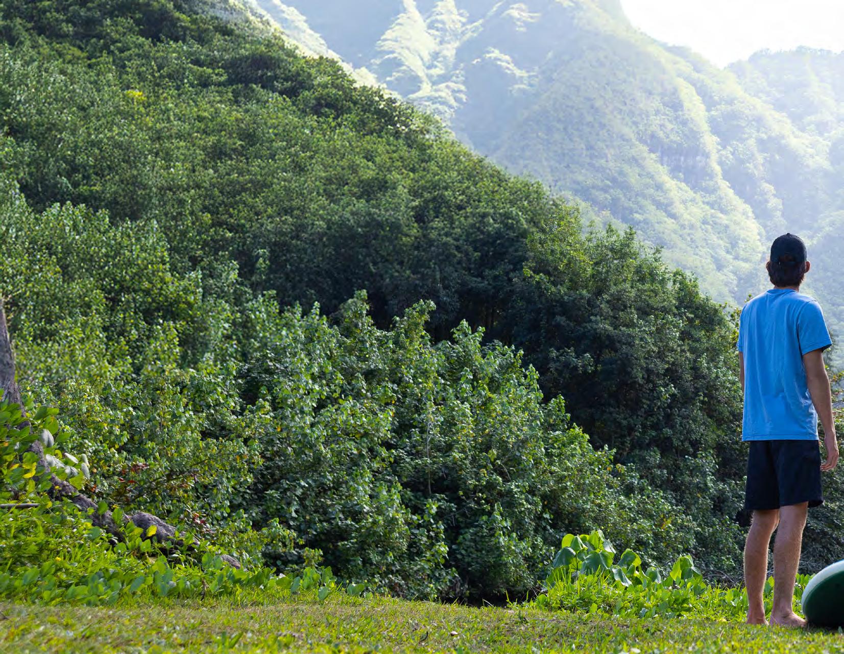
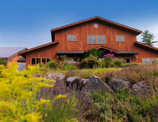
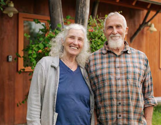
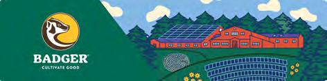
Badger was founded when our dad, a carpenter, created our first product to heal his cracked hands. Our parents raised us close to the land, eating organic food and taking bucket showers on the porch of our little cabin, which still stands on our family property, just a short walk through the woods from our post-and-beam manufacturing headquarters in rural New Hampshire. Badger and our family were part of the early hippie origins of the organic movement, and for the past 30 years, we’ve been proud to help shape the movement and watch it grow.
Now, as second-generation leaders of the company, we recognize that both Badger and the movement have evolved. Just as we’ve grown up, so has Badger. We are embracing this change while staying true to our roots, continuing to craft exceptional products with the same care and commitment to quality that started it all.
We are proud to expand our organic daily skincare line alongside our trusted family-friendly sunscreens and original herbal aromatherapy balms.
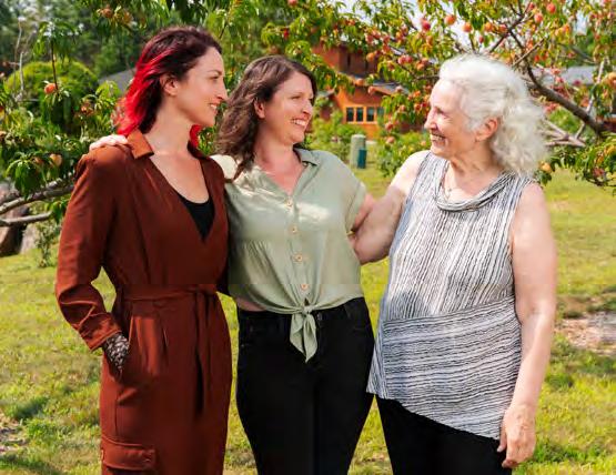
Warmly, Rebecca and Emily
Family Owned Since 1995
Second Generation co-CEOs
Emily Schwerin-Whyte & Rebecca Hamilton

BRAND VISION:
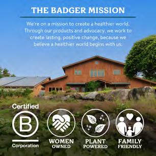
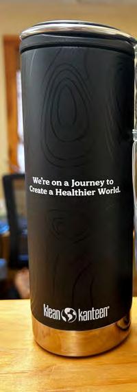
We’re on a journey to create a healthier world.


BRAND MISSION:
CULTIVATE GOOD
We are inspired to make healing products and run a healthy business where money is the fuel and not the goal, where fun is encouraged, and where we cultivate good through our actions and advocacy.
BRAND VALUES: Products for People We Love
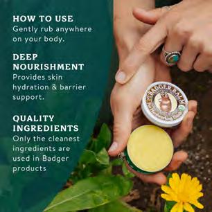
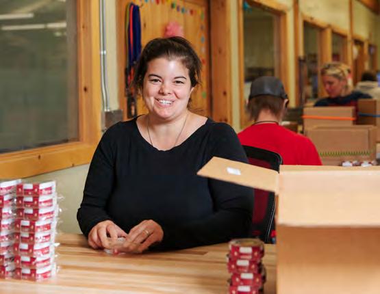
WE ARE MAKERS. We proudly dream, formulate, and manufacture in our very own post-and-beam facility in rural New Hampshire. Each product we create is made with the intention to protect, soothe, and heal and is inspired by people that we love, including you!
Closer to the Source
WE CHOOSE INGREDIENTS that are minimally processed and grown in nature, still brimming with life force and nourishing nutrients. We are organic fanatics, value close supplier relationships, and are passionate advocates for regenerative and sustainable agriculture.
Kindness is Our Compass
COMMUNITY IS AT THE HEART OF OUR COMPANY.
We treat each other with kindness, embracing diversity, equity, and inclusion. We support and uplift each other through our advocacy, community service, and charitable giving.
Walk a Healthy Trail
WE STRIVE TO PROTECT OUR NATURAL RESOURCES and make climate justice an integral part of our daily practices. Walking a healthy trail means taking responsibility for our actions and having a net positive impact on the world.

MONEY IS A FUEL, NOT A GOAL
Revenue fuels the work but is never the purpose of the work. It gives us the ability to do meaningful things and build a healthy business.
Bill once described it as driving a long desert road with our mission glowing at the horizon. The car needs gas to reach it, but the gas is not why we travel. In the same way, our factory needs solar panels for healthier manufacturing, and our products need organic ingredients for a carbon friendly supply chain. All of it supports our broader aim to be net positive and continue on the journey to create a healthier world.
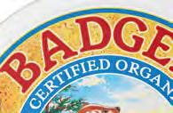
The History of Badger


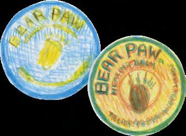
POSSIBLE NAMES:
Great Bear
Golden Bear
Brown Bear
Little Paw
Grand Paw
Strong Paw
Bear Brand
Yellow Bear
Bear Hand

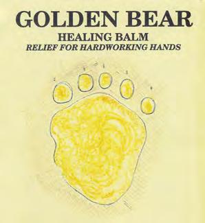
Brand Identity
Soft Paw
Smooth Paw
Panda Owl
Otter
BADGER!
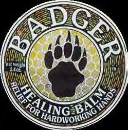
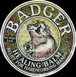
Spirit of the Badger
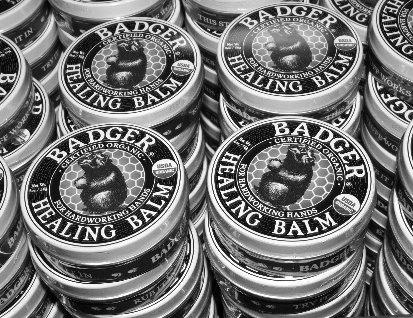
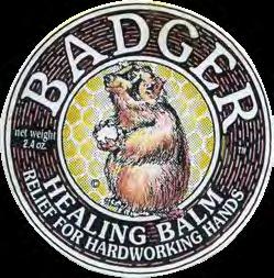
The Badger logo is a natural evolution of the hand drawn badger that Bill Whyte developed for his original tin of Badger Balm.
The Badger spirit animal remains an essential piece of the brand identity to remind us of the pillars of the brand. Even when it is not used in conjunction with our wordmark, the Badger mascot stands as a totem overseeing the ethics of the brand.
CULTIVATE GOOD
“
GOOD PRODUCTS Giving products life beyond words”
Bill Whyte, Badger Founder
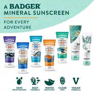
OUR PRODUCT PILLARS
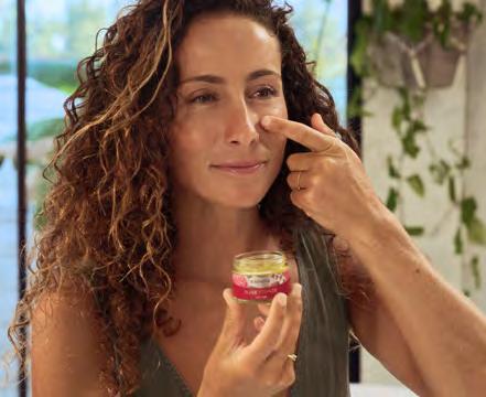
Organic Daily Care
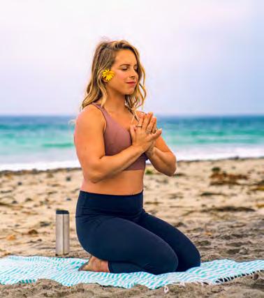
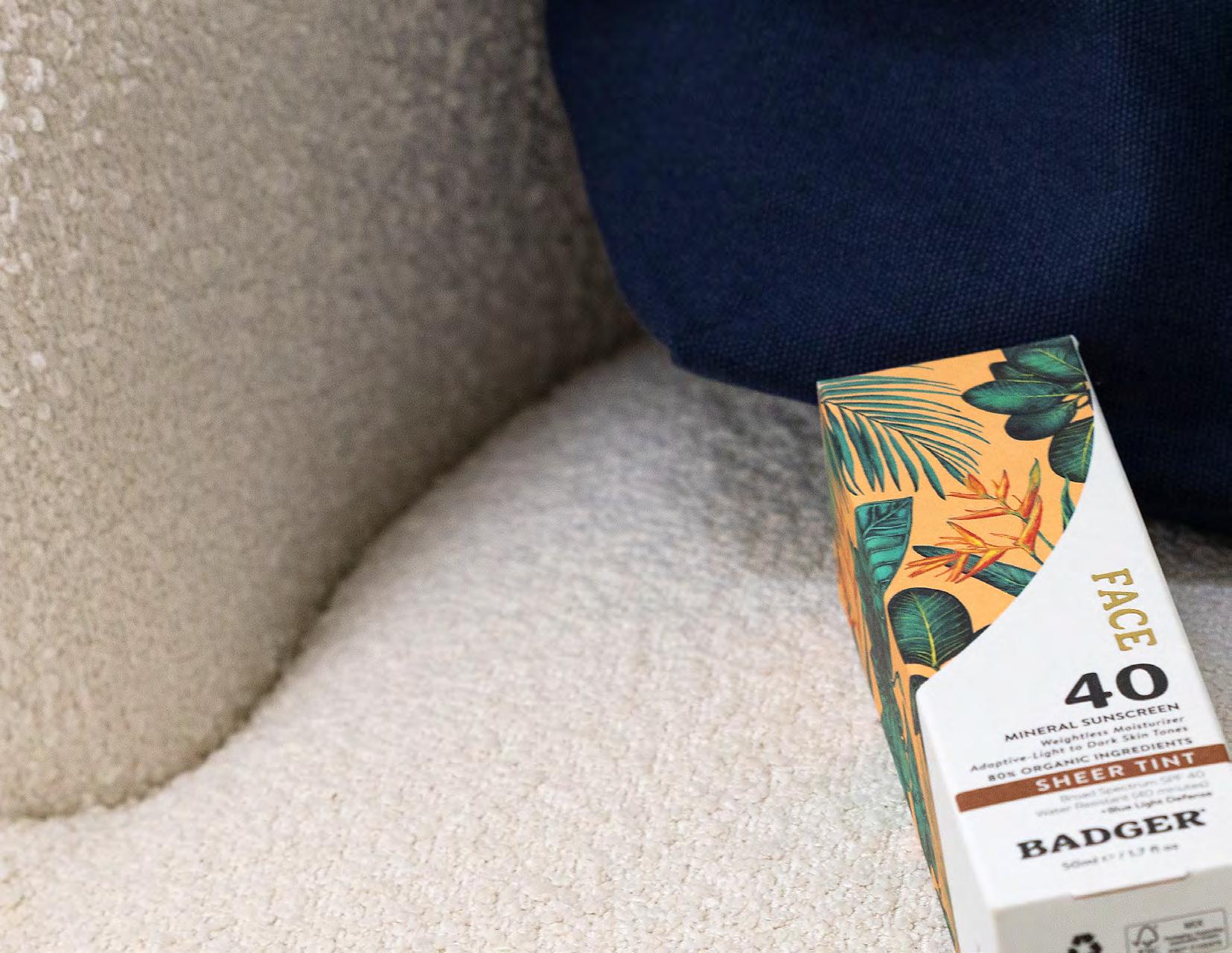
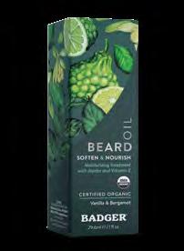
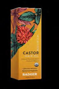
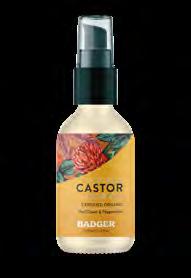
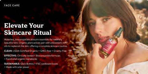
This pillar centers on daily ritual supported by effective products made closer to the source of their ingredients. The visual direction is elevated, clear, and grounded. It communicates the ethnobotanical nature of our formulas in a modern and confident way. The aim is simplicity with quiet sophistication, creating products that feel trustworthy and look naturally at home on any counter.
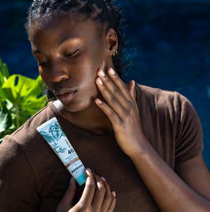
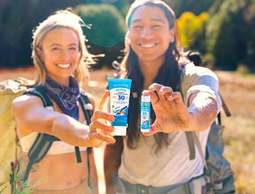
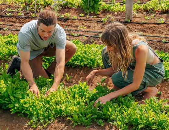
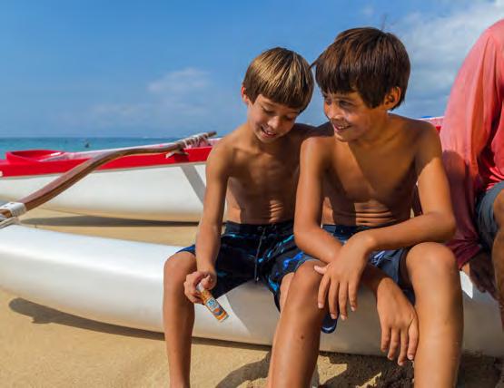
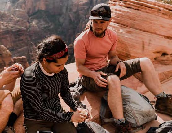
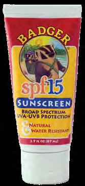
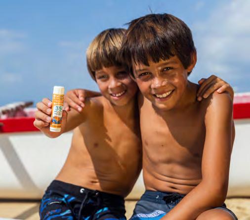
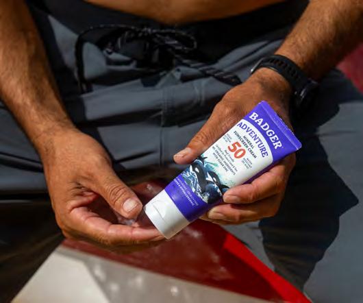
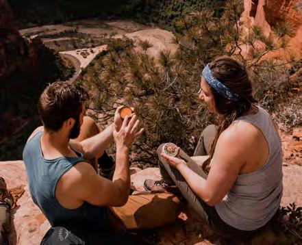
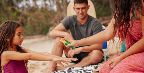
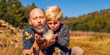
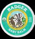
Organic Outdoor & Family
This pillar reflects our belief that fun is good and that The visual direction feels energetic and welcoming, with world where they feel most alive. It includes light references illustrated botanical elements, bringing a gentle sense

W.S. BADGER
healthy lifestyles stay connected to nature. with movement that invites people into the natural references to landscapes, species stories, and more sense of play to the design without overwhelming it.

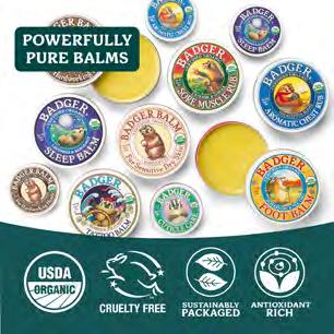
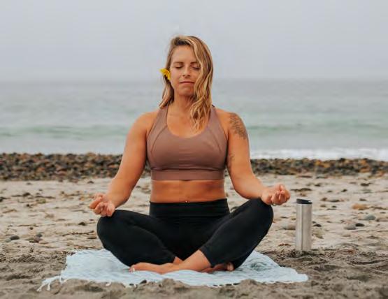
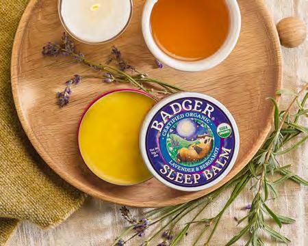
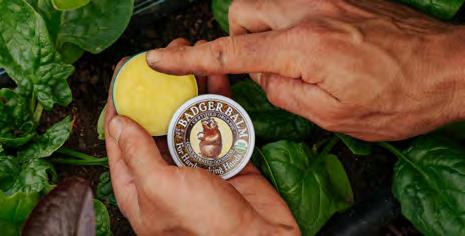
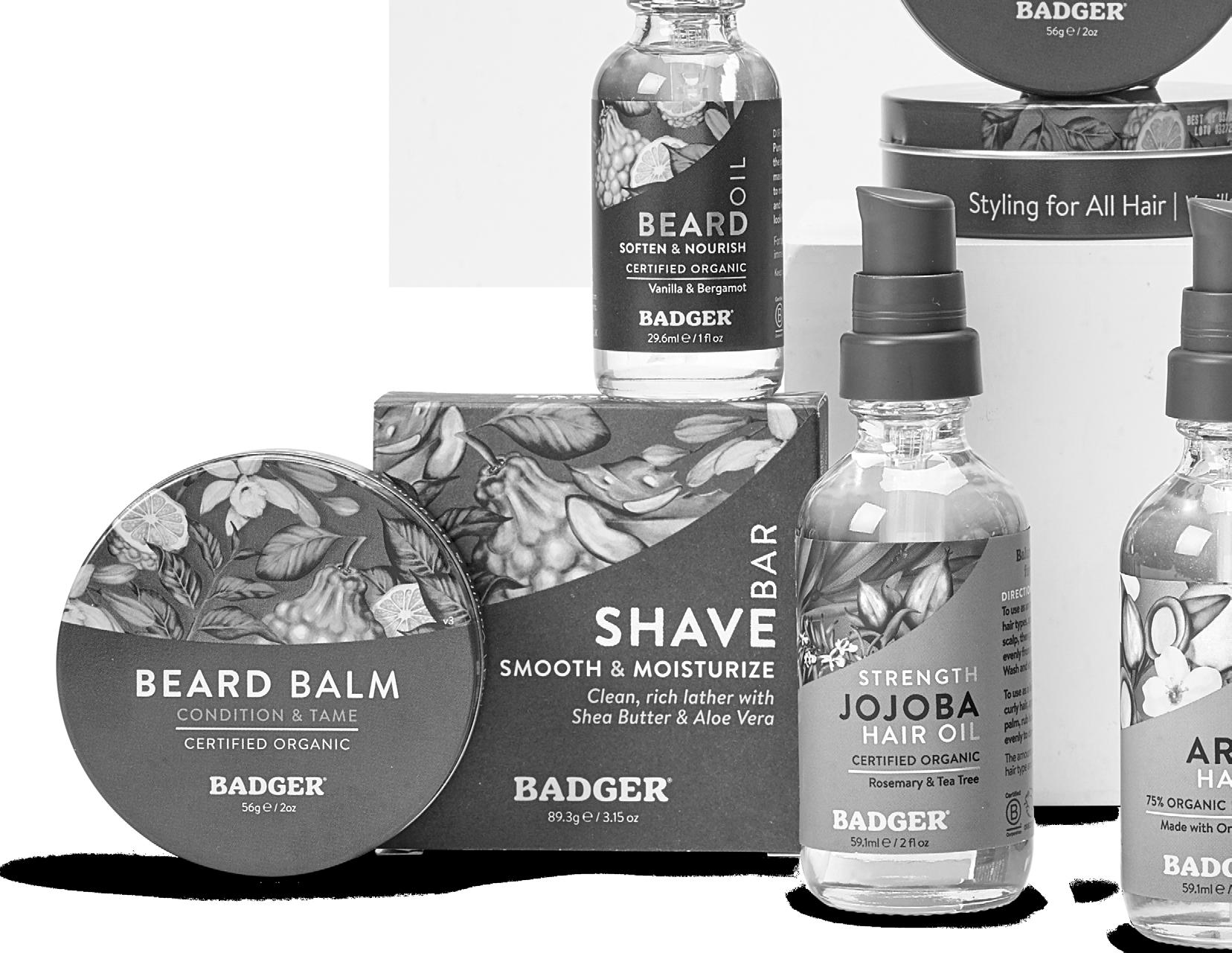
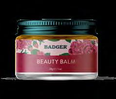
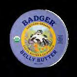
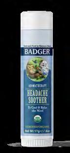
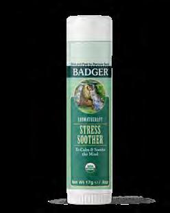
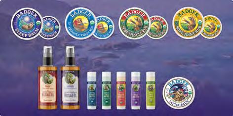
Organic Balms & Wellness
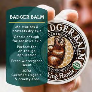
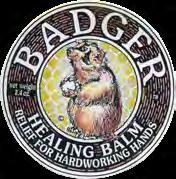
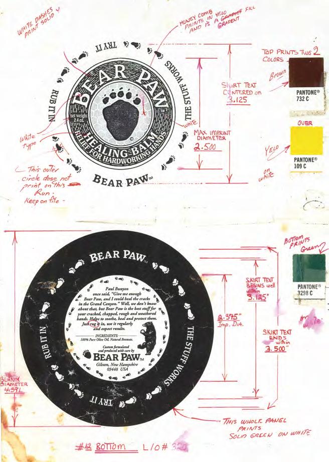
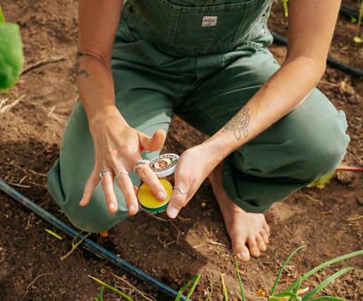
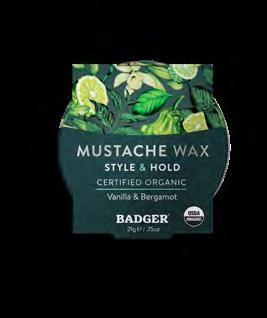
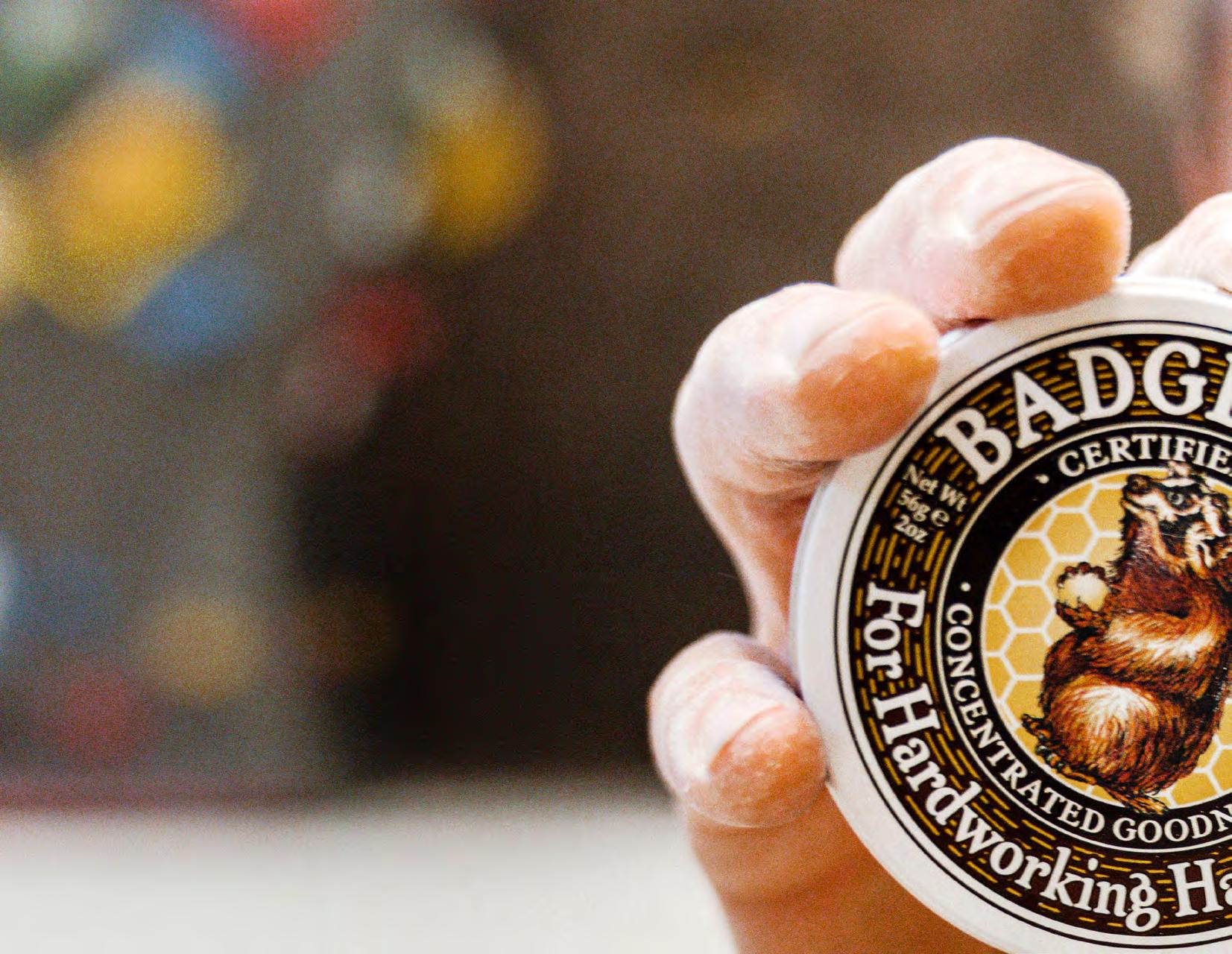
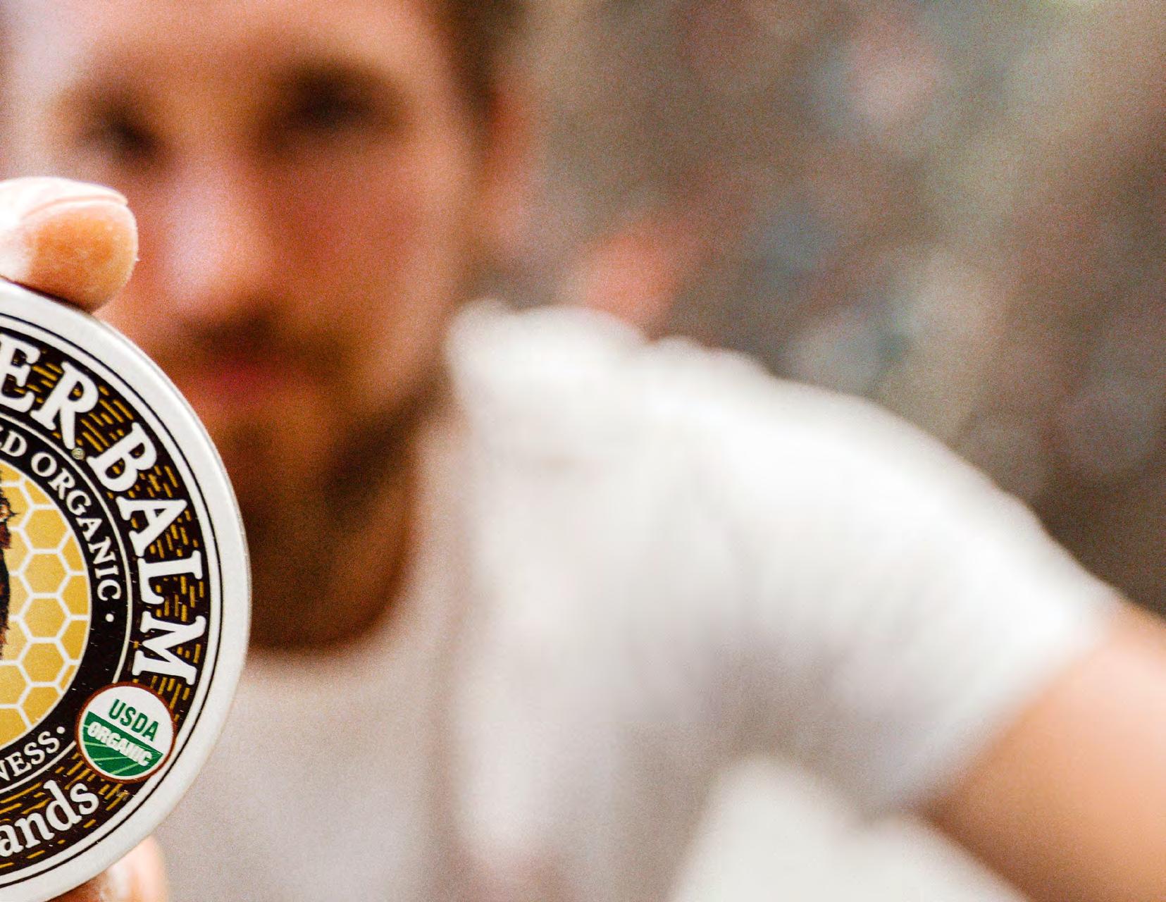
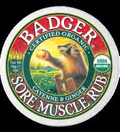
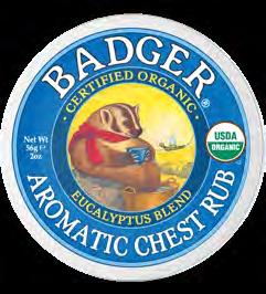
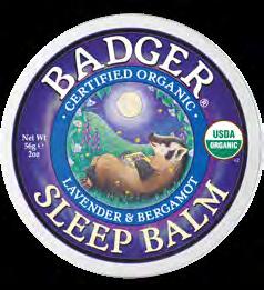
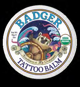
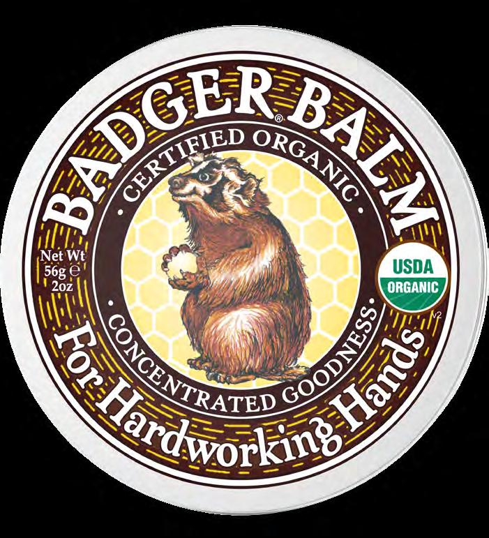
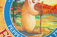
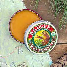
This pillar is where the craft of healing is expressed most directly. The artwork draws most deeply from Badgers roots with an apothecary influenced approach to our classic illustrations. It brings attention to stroke texture and the physical character of the packaging, especially within our tin products. The tone offers a steady and calming presence that supports a sense of restoration.
A SHORT
DISTILLATION
OF WHO WE ARE AND HOW WE SPEAK.
The Shape of Our Voice
Badger’s voice is warm, knowledgeable, and deeply rooted in nature. Every word reflects our mission to Cultivate Good, whether through nurturing, educating, or inspiring others to make healthier choices for themselves and the planet. We speak to our customers with trust, care, and playful wisdom, offering them products that nurture and protect. Our tone is friendly and inviting yet expert and informative.
We build trust through telling our family story, from humble roots to expert organic formulators. We build loyalty by sharing the benefits of skin care so clean you could literally eat it. We create products that are superfood for your skin, nourishing, protective, and deeply effective.
Where the Voice Comes From
The Badger voice is not invented. It is inherited. It comes from a founder who made the first products for his own family. It comes from years of learning how to blend essential oils with intention and how to paint a metal tin so it feels right before you ever read a word on it.
It comes from a belief that things made with care have meaning beyond their ingredients. That organic science is a craft. That beauty matters. That a workplace filled with laughter makes better products. That money is a fuel but never the goal.
Our voice should feel like it was shaped by these truths, not imposed on them.
Tone Across Different Parts of the Brand: Product to Storytelling

ORGANIC DAILY CARE
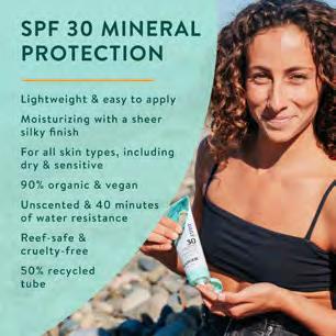
This voice is elevated and grounded, offering premium organic care people can trust. It highlights the sensory experience of botanicals and reflects products that are based in science, rooted in nature, and obsessively formulated to perform. The tone encourages nourishing daily rituals that feel intentional and restorative.
ORGANIC OUTDOOR & FAMILY
This voice is friendly, reassuring, and protective, with a sense of “fun is good” that feels natural and inviting. It helps people feel confident that our products keep their families safe while also keeping them connected to nature. The tone is practical and clear, making protection simple to understand and easy to use in real life.
ORGANIC BALMS & WELLNESS
This voice is comforting, a little magical, and rooted in plant wisdom and folk tradition. It creates a sense of emotional connection while staying clear and helpful, bringing forward remedies that feel both familiar and effective. The tone carries a light touch of whimsy without losing grounding, helping people understand how herbal balms and aromatherapy support natural healing in simple, honest ways.
BRAND STORYTELLING
This is where the voice breathes. This voice is human, warm, and guided by a belief in creating good through everyday actions. Fewer polished lines. More real moments. It reflects our connection to nature and our commitment to simplicity and integrity. A little wonder. A little humor. A sense of being on a winding journey towards a healthier world.
Brand Guidelines
The Badger Logo
The light background version has our wordmark and tagline in Badger Green. The dark background version has our wordmark and tagline in white.
Provide ample clear space around the logotype. Center on the page, or place in the top left corner to watch over the page.
Make sure the Badger logotype is centered as if the registration mark were not there.
LIGHT BACKGROUND
Brand Colors
These are the main colors that make up the Badger corporate color palette. These colors have been chosen to reflect the heritage and vision of the Badger brand.
As colors translate between screen (RGB), four color printing (CMYK), and spot (Pantone) colors, there will be some variation.
It is important to use CMYK values for printed material and RGB for digital. CMYK colors are not accurately reflected on digital displays.
All swatch colors shown are spot (Pantone) colors.
BROWN
RGB 78 / 53 / 36
HEX #4E3524
CMYK 49 / 66 / 79 / 56
Pantone 2322 C
GREEN
RGB 0 / 106 / 82
HEX #004645
CMYK 95 / 47 / 67 / 2
Pantone 3302 C
BADGER YELLOW
RGB 255 / 198 / 43
HEX #FFC62B
CMYK 0 / 23 / 92 / 0
Pantone 123 C
BADGER
BADGER
Brand Fonts
These are the primary fonts used for Badger. Google font alternatives should only be used when the preferred typefaces are unavailable.
Badger Apothecaria is a Badger owned serif font designed to echo our early whimsical product designs and bring a distinct sense of brand ownership to our typography. It carries inspiration from Bill’s handwriting and gives the visual system its own character. Badger Apothecaria is a custom font that was made for Badger by Badson Studio in 2021.
Brandon Text is a font by HVD Fonts. It is a sans serif type family of six weights with matching italics. It is optimized for long texts, small sizes and screens.
Fonts can be accessed here.
BADGER APOTHECARIA is best for headlines. Primarily used in Mixed Caps, but can be used in ALL-CAPS.
BADGER APOTHECARIA - BOLD
ABCDEFGHIJKLMNOPQRSTUVWXYZ abcdefghijklmnopqrstuvwxyz 0123456789
GOOGLE FONT ALTERNATIVE: ARIAL BOLD
BRANDON TEXT is a complimentary typeface that gives body copy distinguished character. This font can also be used in ALL-CAPS.
Brandon Text - Medium
ABCDEFGHIJKLMNOPQRSTUVWXYZ
abcdefghijklmnopqrstuvwxyz 0123456789
GOOGLE FONT ALTERNATIVE: ARIAL MEDIUM
Font Hierarchy for Product Groupings
To differentiate the product pillars of Badger, it is necessary to use specific font pairings.
ORGANIC DAILY CARE
Badger’s Everyday product pillar uses a font that feels direct and simple, with a clear sans serif lead.
Headline
34/34, Brandon Text Bold Upper Case, Tracking 50
Body Copy
10/14, Brandon Text Regular
Sentence case, Tracking 0
ORGANIC OUTDOOR & FAMILY
ORGANIC BALMS & WELLNESS
Badger’s Outdoor, Family, and Wellness lines lead with Apothecaria. It supports the fun is good spirit in our outdoor products and reinforces the apothecary inspired character of our healing lines.
Headline (All Caps may be utilized)
34/34, Badger Apothecaria Sentence Case, Tracking 25
Body Copy
10/14, Brandon Text Regular Sentence case, Tracking 0
ORGANIC DAILY CARE
HEADLINE COPY
Ut aut aut laboris toriati to optate volo exercie ntectium vel magni optaqui cuptate maxim earchic tatiae rerspitatem fugit volorest quae maios et, soluptate ne laut ullectempos et ex eum antia coremporem aut mod quaspero et
Organic Outdoor & Family, Balms & Wellness Headline Copy
Ut aut aut laboris toriati to optate volo exercie ntectium vel magni optaqui cuptate maxim earchic tatiae rerspitatem fugit volorest quae maios et, soluptate ne laut ullectempos et ex eum antia coremporem aut mod quaspero et
Wordmark & Tagline
The Badger wordmark can be used separate from the full logo and is available as a graphic. It is a thicker version of our custom typeface Badger Apothecaria.
With a light background, use Badger Green or Brown. With a dark background, use white.
Make sure the Badger wordmark (curved and straight) is centered without the registration mark (as if it wasn’t there).
Logo Clear Space & Placement
Make sure the logo and/or wordmark has ample clear space around it, and that no graphic elements impede on this clear space.
Logo Clear Space & Placement
Make sure the logo and/or wordmark has ample clear space around it, and that no graphic elements impede on this clear space.
At a minimum, the white space should be to the x-height of the letter “A” in the Badger wordmark.
At a minimum, the white space should be to the height of the letter “A” in the Badger wordmark.
When creating printed material, place the logo in the upper lefthand corner of the page.
When creating printed material, place the logo in the upper lefthand corner of the page.
Make sure the logo has space between itself and the edge of the page equivalent to the height of two of the letter “A”s in the Badger wordmark.
Make sure the logo has space between itself and the edge of the page equivalent to the height of two of the letter “A”s in the Badger wordmark.
The logo should be 1/5 of the width of paper and should be measured from the outer-edges of the defined clear space (highlighted in green).
The logo should be 1/5 of the width of paper and should be measured from the outer-edges of the defined clear space (highlighted in green).
One-Color Logo
Use this version of the logo only when one print color is the only option.
There are three logo options (green, black, white) based on the print colors available and the background type.
W.S. BADGER Brand Guidelines
Varying Curves
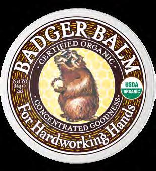
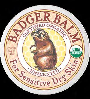
The curved wordmark is a reference to the original Badger Balm tin.
Make sure the Badger wordmark (curved and straight) is centered without the registration mark (as if it weren’t there).
Use the curved wordmark on arches or frames.
NO. 1
& PRODUCTS ARCH NO. 2 BRANDED GRAPHICS ARCH NO. 3 TIN & FULL CIRCLES
Logotype Lockups
The preferred version of the logotype is with the wordmark and tagline below. However, when space is constrained, you can use a version without the tagline, with the wordmark on its own, or the logo on ts own.
W.S. BADGER Brand Guidelines
Incorrect Usage
Logo Do’s/Dont’s
Please don’t do the following with the logo.
Consistent use of the Badger logo ensures recognition and familiarity with our brand identity.
These are some examples that do not comply with the Badger standards, and should be avoided.
DON’T USE THE GREEN WORDMARK ON COLORED BACKGROUNDS
DON’T CHANGE THE PROPORTION OF THE WORDMARK TO THE LOGO
DON’T CHANGE THE COLORS OF THE LOGO AND WORDMARK
DON’T CHANGE THE COMPOSITION OF THE LOGO
DON’T DISTORT THE LOGO IN ANY WAY
DON’T ROTATE THE LOGO
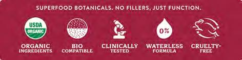
Iconography Guide
W.S. BADGER Brand Guidelines
Iconography
ORGANIC OUTDOOR & FAMILY, BALMS & WELLNESS
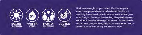
Icon library for the majority of Badger products. Icons should be designed to provide direct communication of the primary product benefit, and be easy to interpret and understand even at small scale.
ORGANIC DAILY CARE
Iconography for this product group should eliminate the bounding circle of the graphic to promote simplicity whenever possible
PRODUCT DESIGN
“
Beauty is good in and of itself”
Bill Whyte, Badger Founder
PRODUCT DESIGN
Organic Daily Care
W.S. BADGER Brand Guidelines
SUN CARE HAIR CARE
Organic Daily Care Product Line Colors
As colors translate between screen (RGB), four color printing (CMYK), and spot (Pantone) colors, there will be some variation.
It is important to use CMYK values for printed material and RGB for digital. CMYK colors are not accurately reflected on digital displays.
DAILY
161 / 221 / 211
#A1DDD3
35 / 0 / 21 / 0
Pantone 522 C
DAILY DARK GREEN
0 / 106 / 82
HEX #004645
CMYK 95 / 47 / 67 / 2
Pantone 3302 C
HAIR CARE Castor
240 / 181 / 43
#F0B52B
0 / 27 / 92 / 1
Pantone 7409 C
HAIR CARE Jojoba
74 / 149 / 102
#4A9566
68 / 3 / 68 / 1
Pantone 7730 C
HAIR CARE Argan
0 / 156 / 168
#009CA8
100 / 0 / 36 / 1
Pantone 320 C
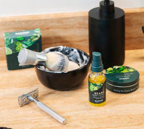
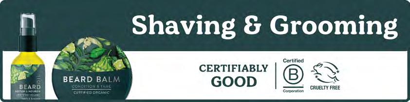
SHAVING & GROOMING
37 / 71 / 73
#254749
82 / 38 / 48 / 60
Pantone 4168 C
SHAVING & GROOMING
Secondary
143 / 202 / 195
#8FCAC3
44 / 0 / 26 / 0
Pantone 4163 C
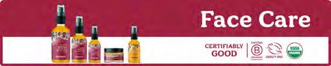
RESTORE FACE CARE
159 / 35 / 65
#0064C0
0 / 78 /59 / 38
Pantone 7420 C
RADIANT FACE CARE
255 / 163 / 17
#FFAD00
0 / 42 / 100 / 0
Pantone 137 C
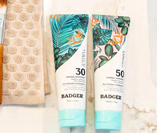
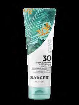
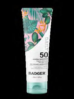
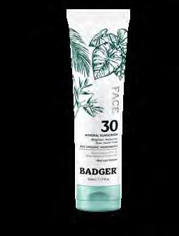
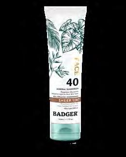
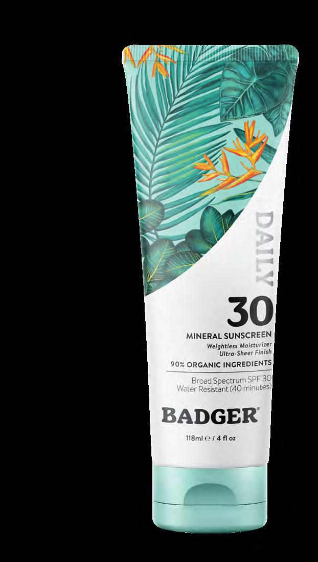
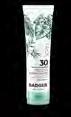
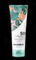
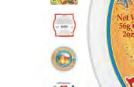
Organic Daily Sun Care Packaging
Color and artwork are very important to the Badger brand.
Make every element as simple, legible, and clean as possible, leaving lots of white space.
Never place elements, such as type or graphics, over artwork.
MONOCHROME ARTWORK, WITH AMPLE WHITE SPACE ON BOTTOM
PRIMARY PRODUCT CLAIMS IN BRANDON MEDIUM ITALIC
SECONDARY PRODUCT CLAIMS IN BRANDON
PRODUCT WEIGHT IN BRANDON MEDIUM
ARTWORK PLACE IN CURVED, WITH LOTS OF WHITE SPACE ON BOTTOM
PRODUCT LINE NAME, FOILED, IN BADGER APOTHECARIA
SPF IN BADGER APOTHECARIA
INGREDIENTS CLAIMS IN BRANDON BOLD
BRAND WORDMARK IN BLACK
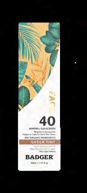
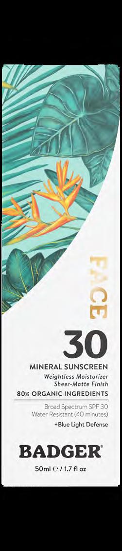
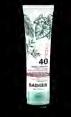
Organic Daily Sun Care Packaging
Color and artwork are very important to the Badger brand.
Make every element as simple, legible, and clean as possible, leaving lots of white space.
Never place elements, such as type or graphics, over artwork.
PRIMARY PRODUCT CLAIMS IN BRANDON MEDIUM ITALIC
PRODUCT CLAIMS IN BRANDON REGULAR
PRODUCT WEIGHT IN BRANDON MEDIUM
ARTWORK PLACE IN CURVED, WITH LOTS OF WHITE SPACE ON BOTTOM
PRODUCT LINE NAME, FOILED, IN BADGER APOTHECARIA
SPF IN BADGER APOTHECARIA
INGREDIENTS CLAIMS IN BRANDON BOLD
BRAND WORDMARK IN BLACK
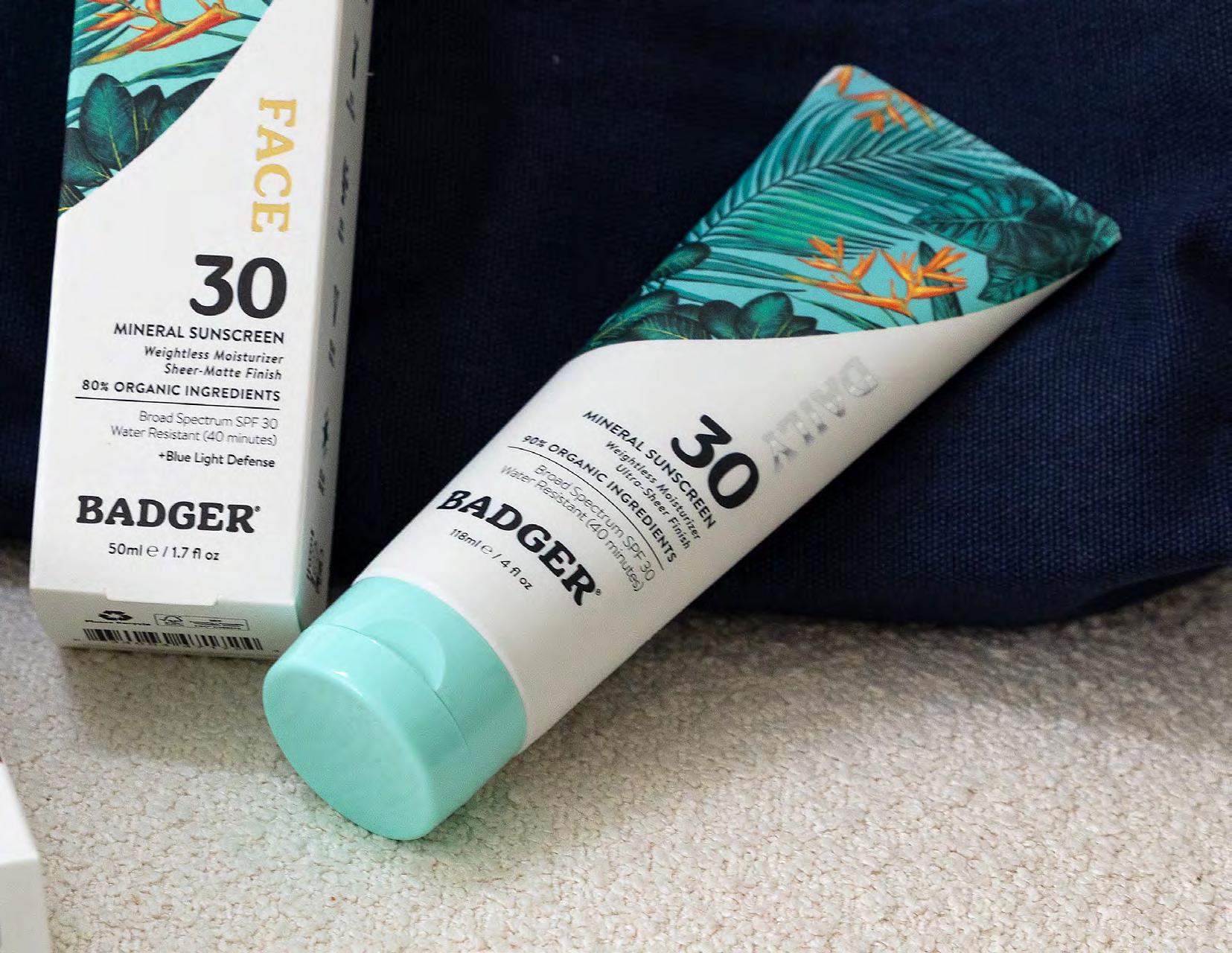
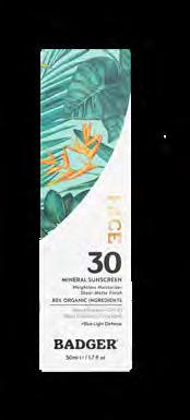
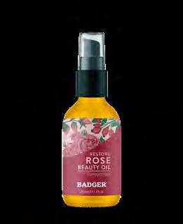
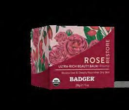
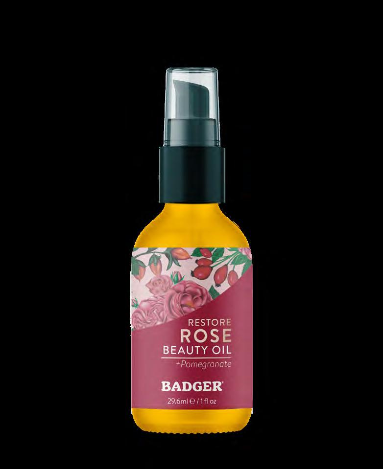
Organic Daily Face Care Packaging
Color and artwork are very important to the Badger brand.
Make every element as simple, legible, and clean as possible, leaving lots of white space.
Never place elements, such as type or graphics, over artwork.
ARTWORK PLACE IN CURVED, WITH LOTS OF WHITE SPACE ON BOTTOM
LINE CALL OUTS IN BRANDON MEDIUM
NET WEIGHT IN BRANDON REGULAR
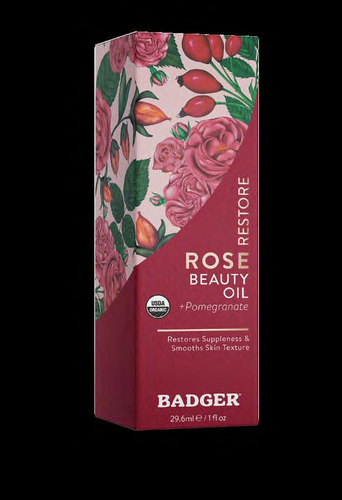
PRODUCT NAME, BRANDON BOLD
INGREDIENT CALL OUT IN BRANDON
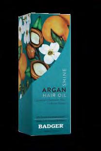
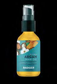
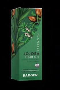
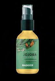
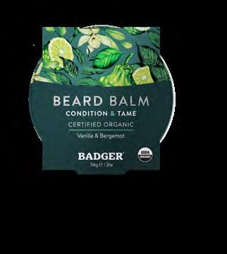
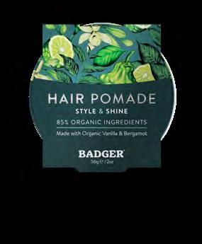
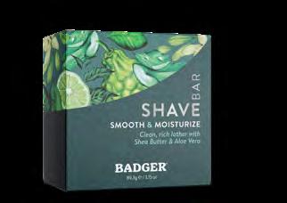
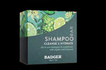
Organic Daily Hair Care Packaging
Color and artwork are very important to the Badger brand.
Make every element as simple, legible, and clean as possible, leaving lots of white space.
Never place elements, such as type or graphics, over artwork.
ARTWORK PLACE IN CURVED, WITH LOTS OF WHITE SPACE ON BOTTOM
LINE CALL OUTS IN BRANDON MEDIUM
NET WEIGHT IN BRANDON REGULAR
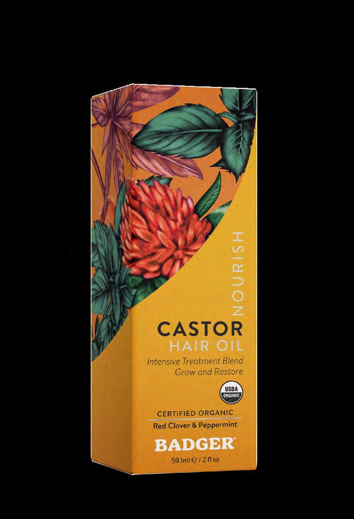
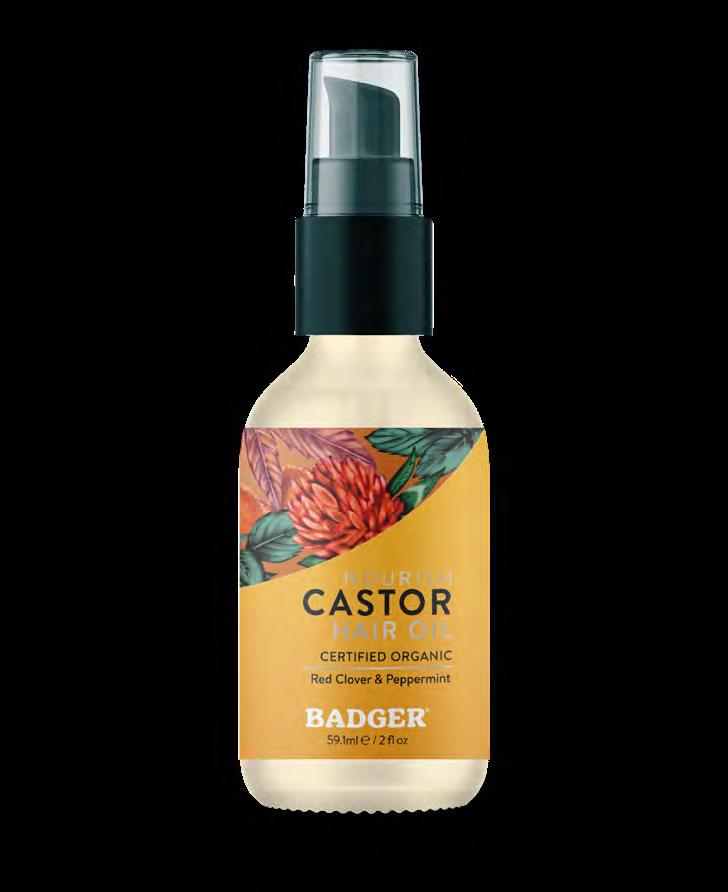
PRODUCT NAME, BRANDON BOLD
INGREDIENT CALL OUT IN BRANDON
BRAND WORDMARK
Organic Daily Grooming Packaging
Color and artwork are very important to the Badger brand.
Make every element as simple, legible, and clean as possible, leaving lots of white space.
Never place elements, such as type or graphics, over artwork.
ART AS MEDICINE: PRODUCT DESIGN
“
Product packaging that feels healing and beautiful before a single word is read.”
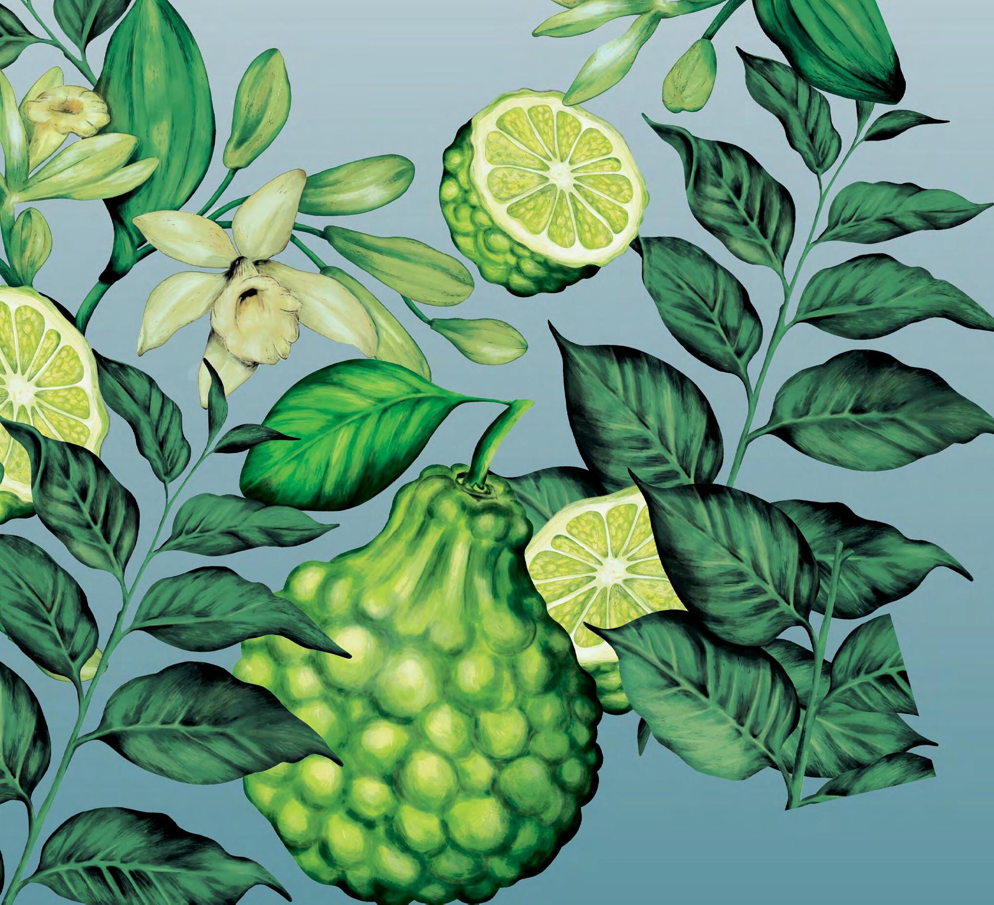
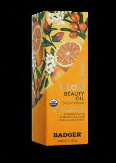
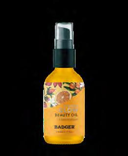
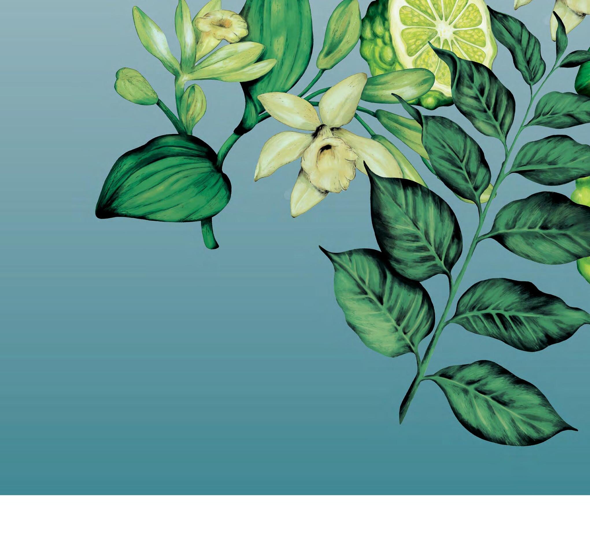
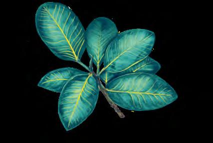
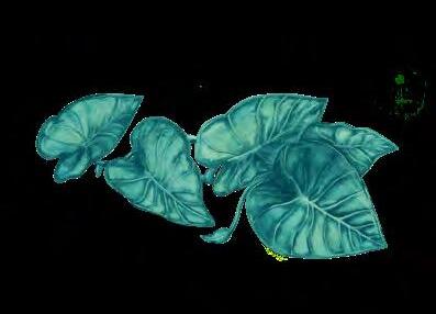
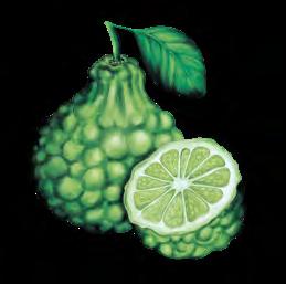
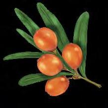
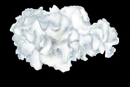
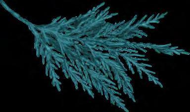
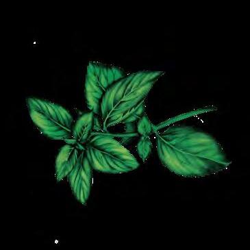
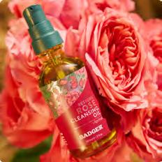
Organic Daily Care Artwork
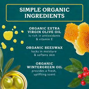
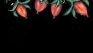
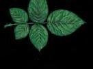
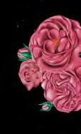
Organic Ingredients that are closer to the source are essential to the Badger brand expression.
Product packaging artwork in our Organic Daily Care line are an opportunity to showcase our organic approach to product development.
All botanicals are produced by the same illustrator to guarantee a consistent brand look and artistic hand. Stock representations of botanicals are not permitted.
W.S. BADGER Brand Guidelines
FICUS
TARO
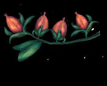
BERGAMOT
SEABUCKTHORN
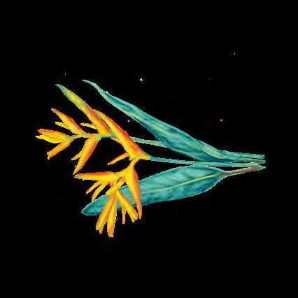
HELICONIA
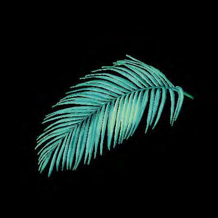
PALM
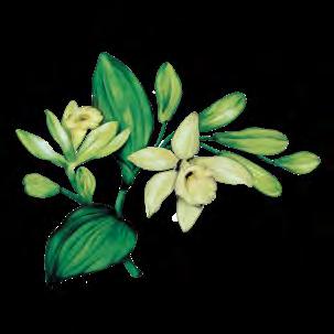
VANILLA
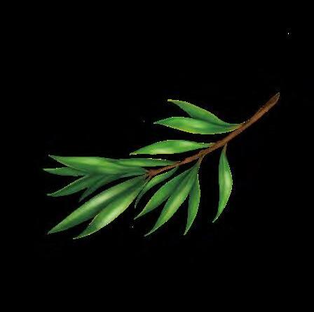
JOJOBA
SNOW MUSHROOM CYPRESS
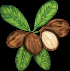
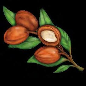
ARGAN
MARSHMALLOW
TEA TREE
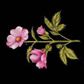
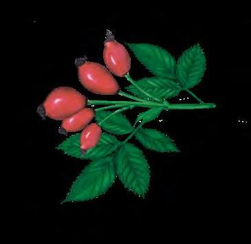
ROSEHIP
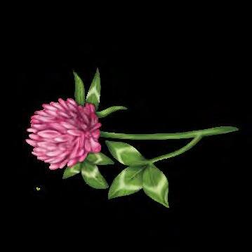
CLOVER
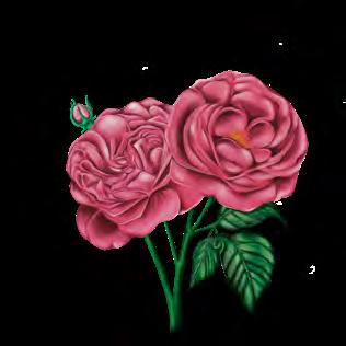
ROSE
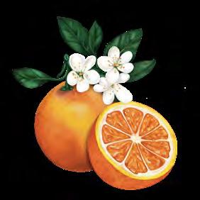
MANDARIN
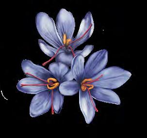
SAFFRON
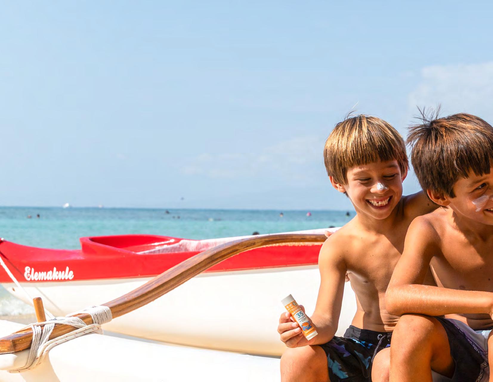
Fun is good! There is something so healing about having fun”
Bill Whyte, Badger Founder

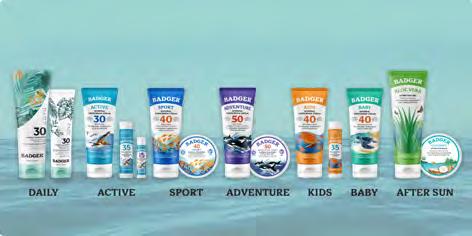
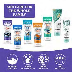
Organic Outdoor & Family PRODUCT DESIGN
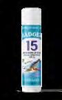
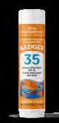
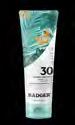
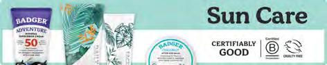
Sun Care
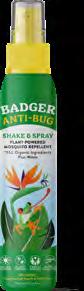
Bug & Outdoor
Organic Outdoor & Family Product Line Colors
As colors translate between screen (RGB), four color printing (CMYK), and spot (Pantone) colors, there will be some variation.
It is important to use CMYK values for printed material and RGB for digital. CMYK colors are not accurately reflected on digital displays.
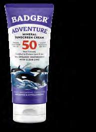
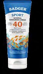
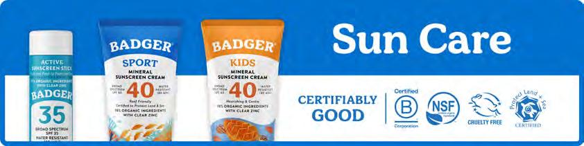
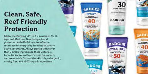
SPORT SUN CARE
0 / 113 / 206
#0071CE
84 / 54 / 0 / 0
Pantone 285 C
BUG & ITCH RELIEF
0 / 152 / 70
#009846
86 / 15 / 100 / 2
Pantone 347 C
ADVENTURE SPORT
88 / 73 / 166
#5949A7
78 / 82 / 0 / 0
Pantone 2103 C
AFTER-SUN
0 / 180 / 190
#00B4BE
83 / 0 / 30 / 0
ANTI-TICK
227 / 96 / 32
#E36020
0 / 69 / 100 / 0
Pantone 1655 C
255 / 148 / 34
#FF9422
0 / 51 / 93 / 0
Pantone 3588 C
/
/
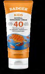
Pantone 312 C KIDS
LIP CARE 136 / 93 / 156
#885D9C
53 / 73 / 8 / 0
Pantone 7413 C
#00A6CF 97 / 5 / 15 / 0
105 / 192 / 75
#69C04B 62 / 0 / 95 / 0
Pantone 360 C
168 / 123 / 201
#A87BC9
36 / 58 / 0 / 0
Pantone 2577 C
Pantone 2397 C NIGHT NIGHT
BABY & MOM CARE
0 / 190 / 161
#00BEA1
91 / 0 / 52 / 0
Pantone 2240 C
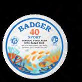
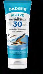
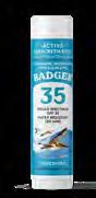
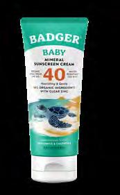
Organic Outdoor & Family Sun Care Packaging
Color and artwork are very important to the Badger brand.
Make every element as simple, legible, and clean as possible, leaving lots of white space.
Never place elements, such as type or graphics, over artwork.
PRODUCT LINE NAME IN ITS COLOR, ABOVE BOLD PRODUCT DESCRIPTION IN BRANDON BLACK
CONSERVATION ARTWORK FRAMED, WITH LOTS OF WHITE SPACE ON TOP
NET WEIGHT IN BRANDON MEDIUM AT 7 PT
BRAND WORDMARK ON ARCH IN PRODUCT LINE COLOR
SPF COLOR DIFFERENTIATED AND LARGE
ITALICIZED CLAIMS, ABOVE INGREDIENTS IN BRANDON BOLD
PRODUCT CLAIMS, ABOVE SCENT IN BRANDON BOLD
Organic Outdoor & Family Sun Care Packaging
Color and artwork are very important to the Badger brand.
Make every element as simple, legible, and clean as possible, leaving lots of white space.
Never place elements, such as type or graphics, over artwork.
PRODUCT LINE NAME IN ITS COLOR, ABOVE BOLD PRODUCT DESCRIPTION IN BRANDON BLACK
CONSERVATION ARTWORK FRAMED, WITH LOTS OF WHITE SPACE ON TOP
BRAND WORDMARK ON ARCH IN PRODUCT LINECOLOR
SPF COLOR DIFFERENTIATED AND LARGE
PRODUCT CLAIMS BELOW PRODUCT DESCRIPTION IN BRANDON BLACK
NET WEIGHT IN BRANDON BOLD AT 5 PT
Organic Outdoor & Family Sun Care Packaging
Color and artwork are very important to the Badger brand.
Make every element as simple, legible, and clean as possible, leaving lots of white space.
Never place elements, such as type or graphics, over artwork.
PRODUCT LINE NAME IN BADGER APOTHECARIA
PRODUCT CLAIMS IN BRANDON BLACK
CONSERVATION ARTWORK FRAMED, WITH LOTS OF WHITE SPACE ON TOP
NET WEIGHT IN BRANDON MEDIUM AT 5.7 PT
BRAND WORDMARK ON ARCH IN WHITE
PRODUCT CLAIMS BELOW PRODUCT DESCRIPTION IN BRANDON BLACK
SCENT IN BRANDON BLACK
endangered, across frame. product line generally match illustrations.
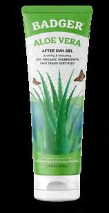
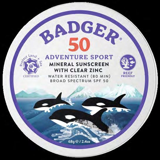
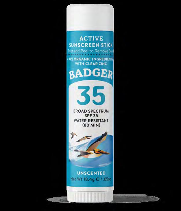
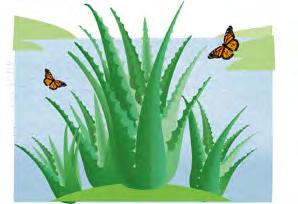
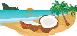
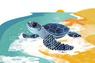
Organic Outdoor & Family Sun Care Artwork
Packaging artwork showcases different habitats, protected and endangered, across our globe.
Sun Artwork
Artwork can be displayed in a frame. Always use the corresponding product line color. Make sure horizons generally match up between the different illustrations.
Packaging artwork showcases di erent habitats, protected and endangered, across our globe.


Artwork can be displayed in a frame. Always use the corresponding product line color. Make sure horizons generally match up between the di erent illustrations.

DAILY
ALOE AFTER SUN
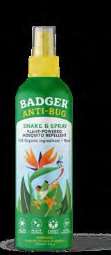
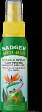
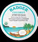
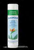
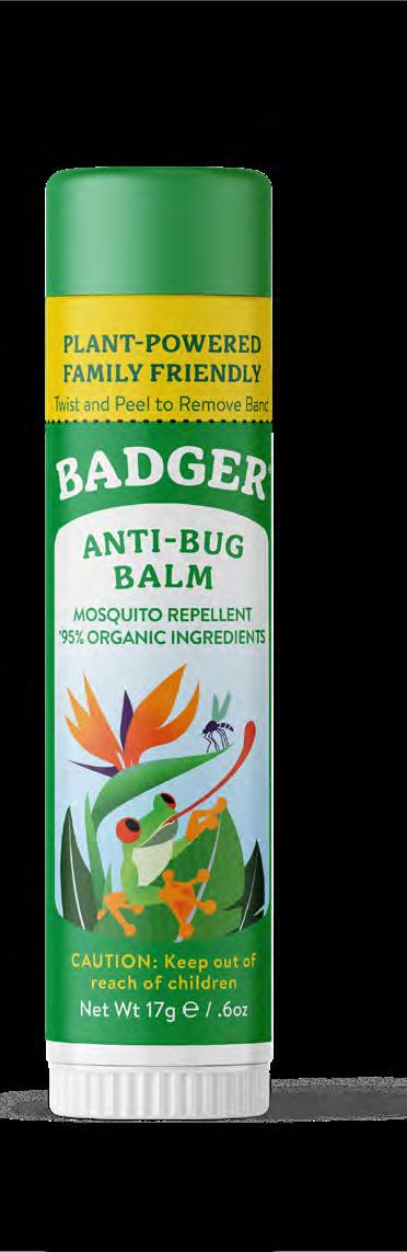
Organic Outdoor & Family Anti-Bug Packaging
Color and artwork are very important to the Badger brand.
Make every element as simple, legible, and clean as possible, leaving lots of white space.
Never place elements, such as type or graphics, over artwork.
PRODUCT LINE NAME ARCHED IN SECONDARY COLOR, ABOVE BADGER APOTHECARIA PRODUCT NAME
CONSERVATION ARTWORK FRAMED, WITH LOTS OF WHITE SPACE ON TOP
NET WEIGHT IN BRANDON MEDIUM AT 7 PT
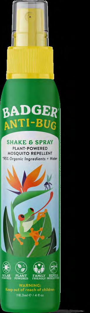
PRODUCT BADGES ABOVE WARNING STATEMENT IN SECONDARY COLOR IN BRANDON BOLD BRAND WORDMARK ON ARCH IN WHITE
ITALICIZED CLAIMS, BELOW PRODUCT DESCRIPTION IN BRANDON BLACK
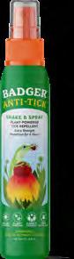
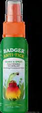
Organic Outdoor & Family Anti-Tick Packaging
Color and artwork are very important to the Badger brand.
Make every element as simple, legible, and clean as possible, leaving lots of white space.
Never place elements, such as type or graphics, over artwork.
PRODUCT LINE NAME ARCHED IN SECONDARY COLOR, ABOVE BADGER APOTHECARIA PRODUCT NAME
CONSERVATION ARTWORK FRAMED, WITH LOTS OF WHITE SPACE ON TOP
NET WEIGHT IN BRANDON MEDIUM AT 7 PT
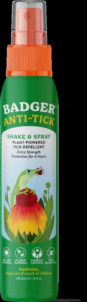
BRAND WORDMARK ON ARCH IN WHITE
ITALICIZED CLAIMS, BELOW PRODUCT DESCRIPTION IN BRANDON BLACK
PRODUCT BADGES ABOVE WARNING STATEMENT IN SECONDARY COLOR IN BRANDON BOLD
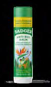
Organic Outdoor & Family Anti-Bug & Ant-Itch Packaging
Color and artwork are very important to the Badger brand.
Make every element as simple, legible, and clean as possible, leaving lots of white space.
Never place elements, such as type or graphics, over artwork.
PRODUCT CLAIMS IN BADGER APOTHECARIA
PRODUCT NAME CURVED IN BADGER APOTHECARIA IN PRODUCT LINE COLOR
CONSERVATION ARTWORK
FRAMED, WITH LOTS OF WHITE SPACE ON TOP
NET WEIGHT IN BRANDON MEDIUM AT 5.7 PT
BRAND WORDMARK ON ARCH
PRODUCT CLAIMS BELOW PRODUCT DESCRIPTION IN BRANDON BOLD
PRODUCT INGREDIENTS OR CAUTION IN BRANDON BOLD
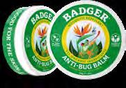
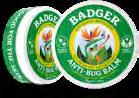
Organic Outdoor & Family Anti-Bug Packaging
Color and artwork are very important to the Badger brand.
Make every element as simple, legible, and clean as possible, leaving lots of white space.
Never place elements, such as type or graphics, over artwork.
CONSERVATION
ARTWORK FRAMED, WITH AMPLE WHITE SPACE ON TOP
PRODUCT NAME IN WHITE IN BADGER APOTHECARIA
NET WEIGHT IN BRANDON BOLD AT 5.7 PT
BRAND
WORDMARK ON ARCH IN PRODUCT LINECOLOR
PRODUCT CLAIMS IN SECONDARY COLOR RING IN BRANDON BOLD
PRODUCT ICONS IN WHITE
WARNING STATEMENT IN SECONDARY COLOR IN BRANDON BOLD
Bug Packaging Artwork
Artwork can be displayed in a frame or as an ornamental flourish. Always use the corresponding product line color whenever possible. Make sure horizons generally match up between the different illustrations.
Organic Outdoor & Family Lip Care Packaging
Color and artwork are very important to the Badger brand.
Make every element as simple, legible, and clean as possible, leaving lots of white space.
Never place elements, such as type or graphics, over artwork.
PRODUCT CLAIMS IN BRANDON BLACK
PRODUCT LINE NAME IN BADGER APOTHECARIA
CONSERVATION ARTWORK
FRAMED, WITH LOTS OF WHITE SPACE ON TOP
BRAND WORDMARK ON ARCH IN WHITE
PRODUCT DESCRIPTION IN BRANDON BOLD
NET WEIGHT IN BRANDON MEDIUM AT 5 PT
Organic Outdoor & Family Lip Care Packaging
Color and artwork are very important to the Badger brand.
Make every element as simple, legible, and clean as possible, leaving lots of white space.
Never place elements, such as type or graphics, over artwork.
PRODUCT LINE NAME IN BADGER APOTHECARIA
CONSERVATION ARTWORK FRAMED, WITH LOTS OF WHITE SPACE ON TOP
PRODUCT BADGES IN WHITE
BRAND WORDMARK IN BADGER GREEN
FLAVOR IN BRANDON BLACK
Organic Outdoor & Family Lip Care Packaging
Color and artwork are very important to the Badger brand.
Make every element as simple, legible, and clean as possible, leaving lots of white space.
Never place elements, such as type or graphics, over artwork.
PRODUCT CLAIMS IN BADGER APOTHECARIA
PRODUCT LINE NAME IN BADGER APOTHECARIA
CONSERVATION ARTWORK
FRAMED, WITH LOTS OF WHITE SPACE ON TOP

BRAND WORDMARK ON ARCH IN WHITE
PRODUCT DESCRIPTION IN BRANDON BOLD
NET WEIGHT IN BRANDON MEDIUM
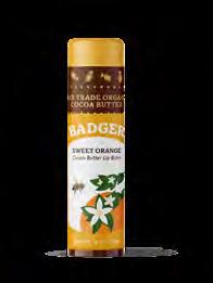
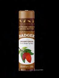
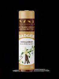
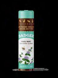
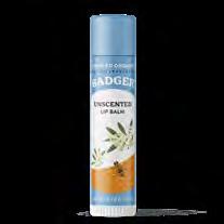
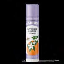
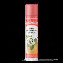
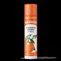
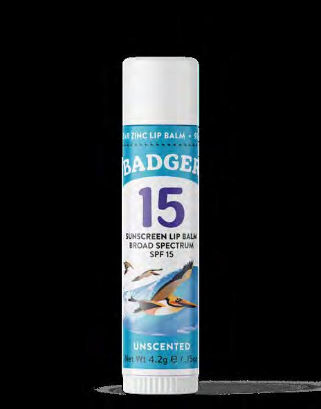
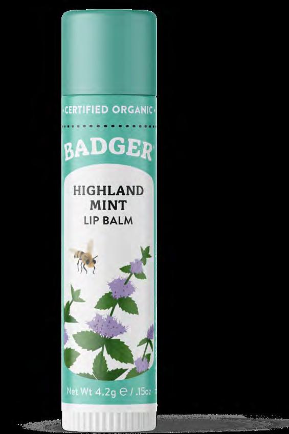
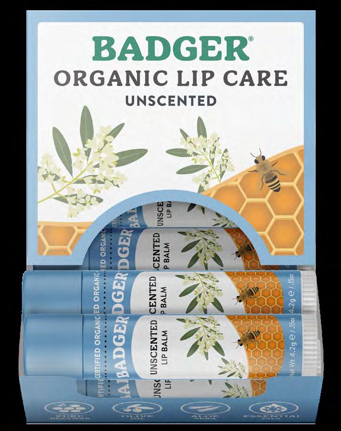
Organic Outdoor & Family Lip Care Artwork
Artwork can be displayed in a frame or as an ornamental flourish. Always use the corresponding product line color whenever possible. Make sure horizons generally match up between the different illustrations.


CREAMY COCOA BUTTER
HIGHLAND MINT
VANILLA
LAVENDER ORANGE UNSCENTED PINK GRAPEFRUIT TEA TREE
“
Make something for someone you love”
Bill Whyte, Badger Founder
DESIGN
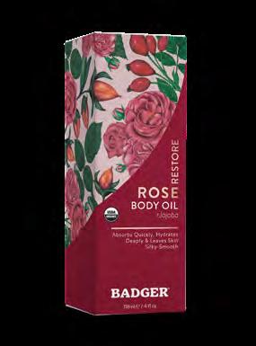
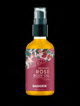
Organic Balms & Wellness
Intensive Moisturizer


(REBRAND IN 2027)
Wellness & Aromatherapy
(REBRAND IN 2027)
Organic Balms & Wellness Product Line Colors
As colors translate between screen (RGB), four color printing (CMYK), and spot (Pantone) colors, there will be some variation.
It is important to use CMYK values for printed material and RGB for digital. CMYK colors are not accurately reflected on digital displays.
BADGER BROWN
RGB 78 / 53 / 36 HEX #4E3524
CMYK 49 / 66 / 79 / 56
Pantone 2322 C
BADGER YELLOW
RGB 255 / 198 / 43
HEX #FFC62B
CMYK 0 / 23 / 92 / 0
WELLNESS & AROMATHERAPY
51 / 33 / 100 #332164
96 / 100 / 29 / 19
Pantone 2112 C
Pantone 123 C INTENSIVE
241 / 233 / 156 #F1E99C
7 / 3 / 48 / 0
Pantone 600 C
GIFT SETS 0 / 106 / 82 #006A52
89 / 35 / 74 / 24
Pantone 3298 C
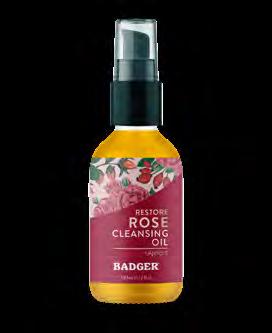
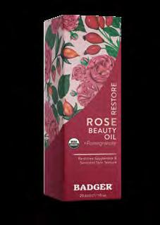
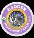
Organic Balms & Wellness Packaging
Color and artwork are very important to the Badger brand.
Make every element as simple, legible, and clean as possible, leaving lots of white space.
Never place elements, such as type or graphics, over artwork.
PRODUCT NAME IN WHITE IN BADGER APOTHECARIA
NET WEIGHT IN BADGER APOTHECARIA
BRAND
WORDMARK ON ARCH IN WHITE OR PRODUCT LINE COLOR
PRODUCT CLAIMS IN SECONDARY COLOR RING IN BADGER APOTHECARIA
PRODUCT ICONS IN WHITE
PRODUCT NAME IN BADGER APOTHECARIA
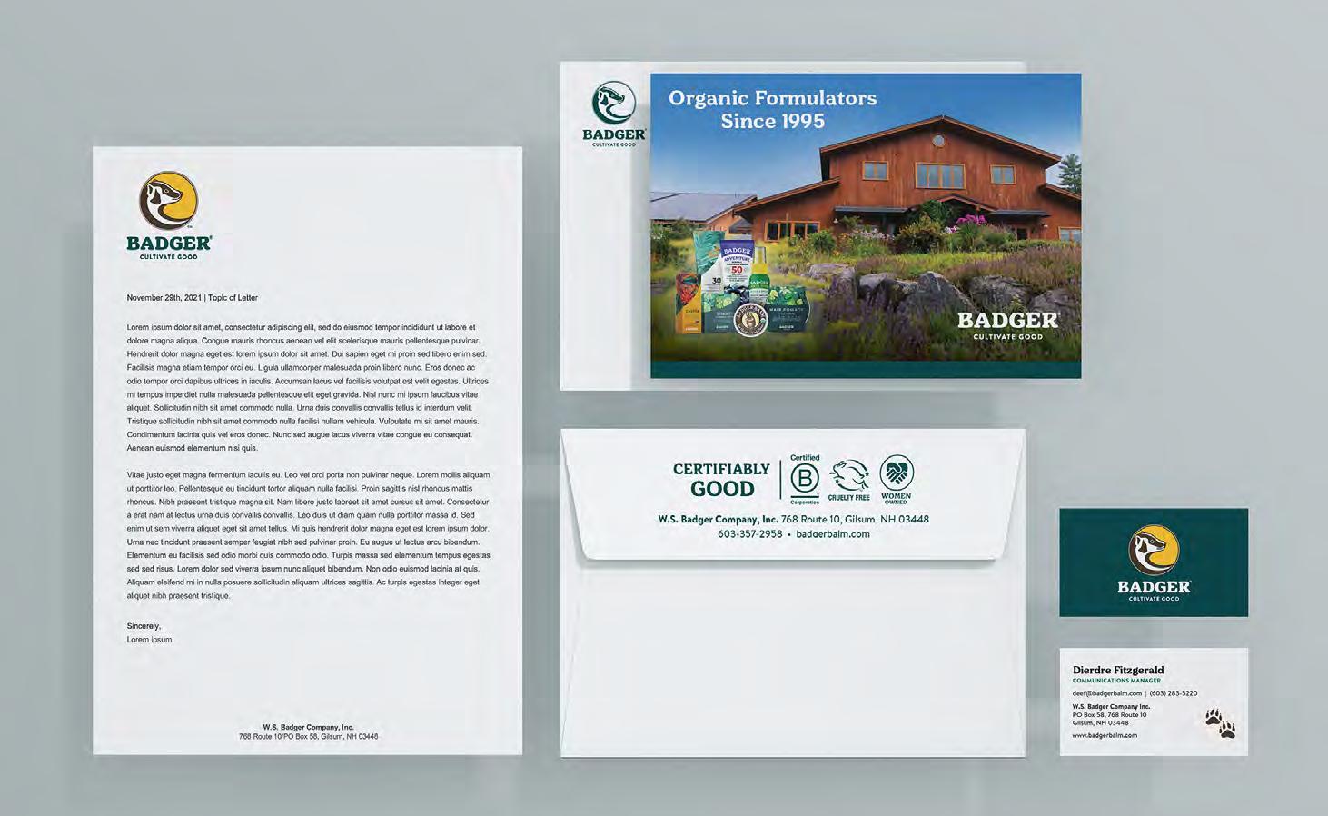
Collateral Guide
W.S. BADGER Brand Guidelines
Presentation Template
Use Badger Apothecaria for Headlines and Call-Outs. Use Brandon Medium for body copy. Brandon Bold can be used for secondary headlines.
Utilize brand colors whenever possible in the creation of informative graphics.
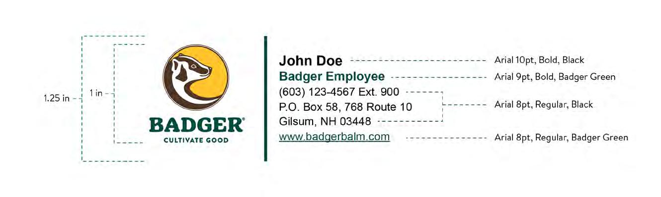
Email Signature
Badger’s email signature is an important part of establishing and reinforcing the company’s brand while also creating trust and asserting that the recipient is communicating with someone professional.
The signature uses Arial because it is a web safe font. It is vital that Arial, and not Badger Apothecaria or Brandon Text, is used.
As signatures easily get corrupted through various email programs (Gmail, Outlook, Yahoo, etc), there will be slight variations.
Stationary
Badger’s stationary features our logo in the top left corner.
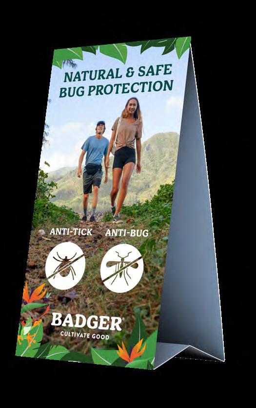
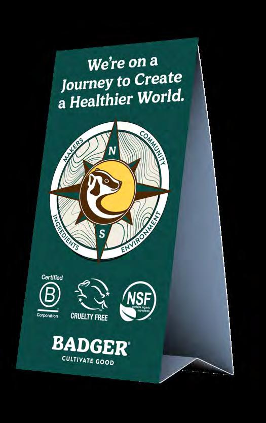
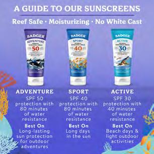
POPs & Table Tents
Table tents are used to inform on product benefits and brand initiatives.

W.S. BADGER Brand Guidelines
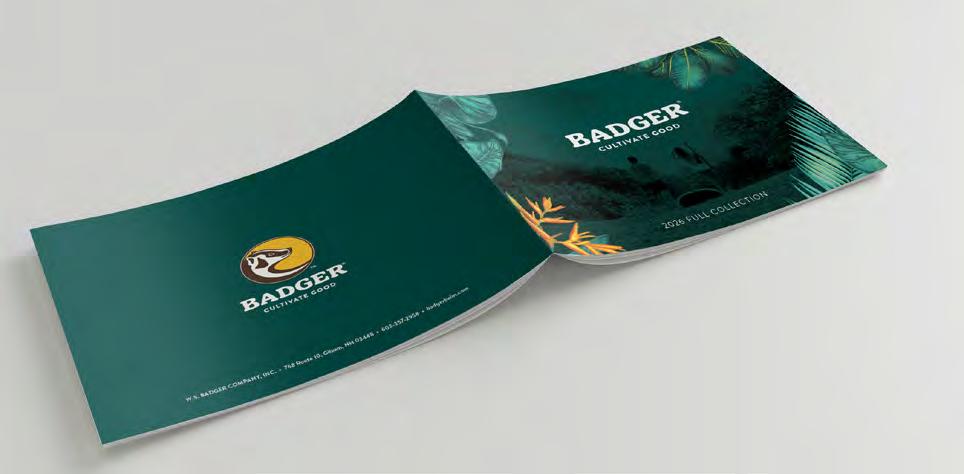
Catalogs
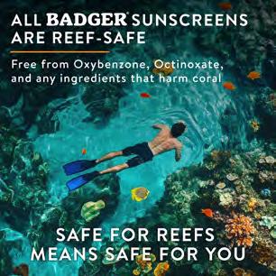
Badger annually produces two catalogs: the Summer Catalog and the Order Book. The summer catalog features our sun and bug product lines. The order book features all our product lines.


Sales & PR Sheets
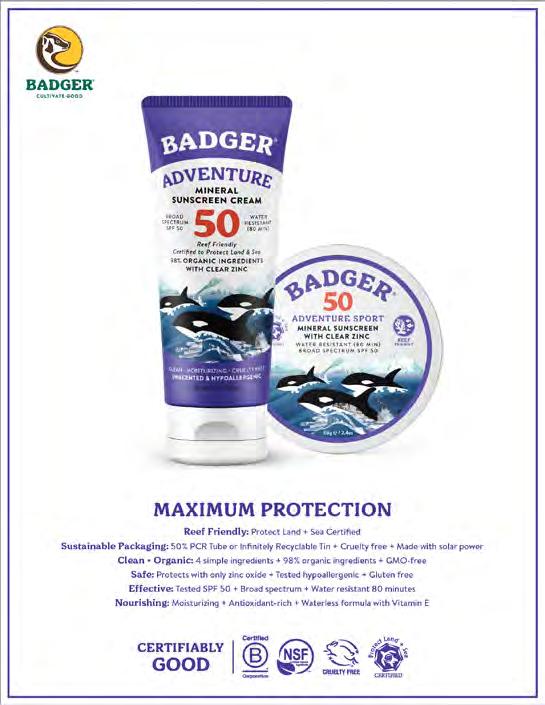
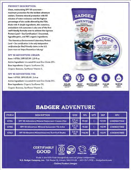
Organic Outdoor & Family, Balms & Wellness
We make both sales and PR sheets for each product and product line.
W.S. BADGER Brand Guidelines
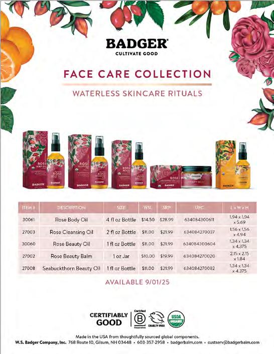
Sales & PR Sheets
Organic Daily Care
We make both sales and PR sheets for each product and product line.


Promotional items
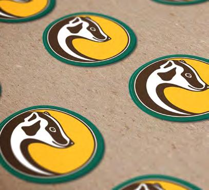
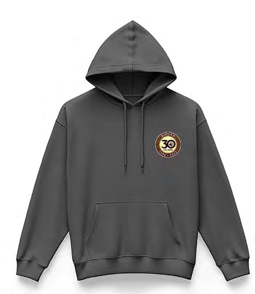
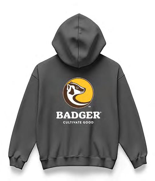
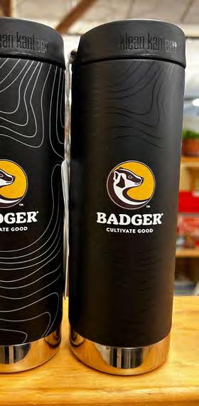
Logo Wear, stickers, patches and buttons are designed to promote brand recognition and awareness in the retail space and everyday environments.
For items such as these it is acceptable to use the Badger icon as a stand alone without wordmark or tagline.


Ecommerce Guide
W.S. BADGER Brand Guidelines
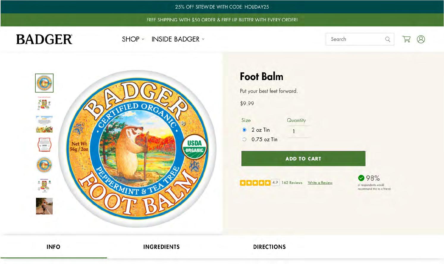
Shopify Product Display Page
Mixed case Badger
Apothecaria is used for headlines (the only version of this font is bold).
Brandon Medium is used for most other situations.
Brandon Black in all-caps is used for box callouts (like “Add to cart”).
Brandon Medium Italic is used for quotes.
There are various other versions of Brandon that can but should be used sparingly (Light, Regular, Medium, Bold, Black).


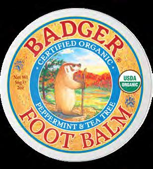
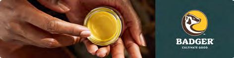
Foot Balm


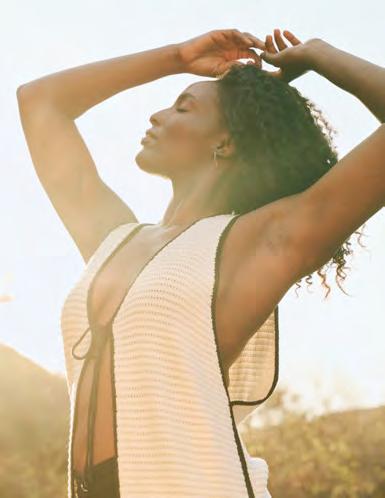
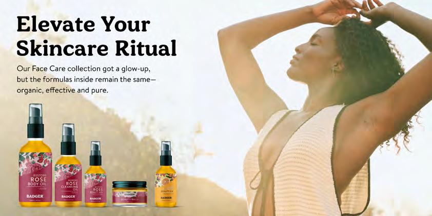
Shopify Home Page & Category Hero Images
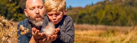
Used for showcasing sales and highlighting products via lifestyle images. Design with text placement top in mind.
Desktop: 4098px x 1629px
Mobile: 768px x 994px
DESKTOP

W.S. BADGER Brand Guidelines
MOBILE
Amazon Brand Storefront
The Amazon Storefront works via the creation of modules. All our modules have rounded corners.
Headers/Footers:
6000px x 1500px
Large Modules:
6000px x 3000px
Category Modules:
6000px x 1500px

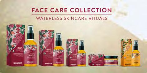
Amazon Category Storefront Organic Daily Care
The Amazon Storefront works via the creation of modules. All our modules have rounded corners.
Headers/Footers:
6000px x 1500px
Large Modules:
6000px x 3000px
Half Modules (Side by Side):
3000px x 3000px
Category Modules:
6000px x 1500px
Amazon Category Storefront Organic Outdoor &
Family, Organic Balms & Wellness

The Amazon Storefront works via the creation of modules. All our modules have rounded corners.
Headers/Footers:
6000px x 1500px
Large Modules:
6000px x 3000px
Half Modules (Side by Side):
3000px x 3000px
Category Modules:
6000px x 1500px


Shopify/Amazon
PDP Carousels
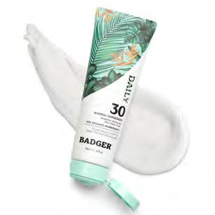
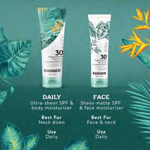
Organic Daily Care
Make sure the product is centered, yet fills as much space as possible.
Dimensions are 1500px x 1500px
Export as JPG 72dpi, sRGB, High Quality.

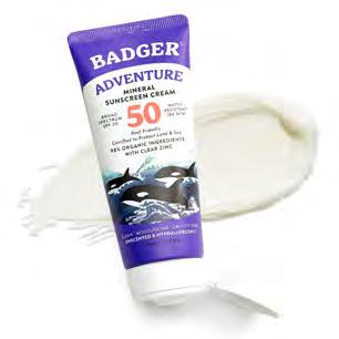
Shopify/Amazon
PDP Carousels
Organic Outdoor & Family
Make sure the product is centered, yet fills as much space as possible.
Dimensions are 1500px x 1500px
Export as JPG 72dpi, sRGB, High Quality.
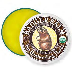
Shopify/Amazon PDP Carousels
Organic Balms & Wellness
Make sure the product is centered, yet fills as much space as possible.
Dimensions are 1500px x 1500px
Export as JPG 72dpi, sRGB, High Quality.