Mark Construction
Monkeys is a Mexican food brand that is passionate about bringing authentic and delicious flavors to our customers. We believe that food is more than just sustenance; it’s an experience that brings people together and creates lasting memories.
This brand manual is designed to provide you with the guidelines for using the Monkeys brand identity. It includes information on our logo, typography, colors, and messaging.
18 X
X
Logo Construction
Our logo is a key part of our brand identity. It is a symbol that represents our company and our values.
Our logo is a stylized monkey head with a sombrero. The monkey is a playful and mischievous animal that represents our funloving spirit. The sombrero is a traditional Mexican hat that represents our heritage and our commitment to authentic Mexican cuisine.
Horizontal Logo
While logos might sometimes be seen stacked or in a vertical format, a strong horizontal presence is vequally important. This is because logos are often displayed on business cards, websites, signage, and packaging – all traditionally horizontal layouts.
Our logo’s design thrives in this horizontal space. The monkey head and sombrero are positioned in a way that feels balanced and easily readable when placed side-by-side. This ensures clear communication of our brand message at a glance, without requiring any additional interpretation or mental reshaping of the logo.
Mono Color Logo
Sometimes , often due to production costs, only one color of link is available and so Monkeys Logo must be reproduced using only one color. In this scenario, the logo, logotyep,or symbol must be used following the convention of using a light color tyep on dark background or in adark color tyep on a light background.
Background Logo
Sometimes , often due to production costs, other color of link is available and so the Crypter Logo must be reproduced using other background color.
Safe Zone
1/2 X 1/2 X 2.8
It”s important to maintain proper spacing around the logo to avoide overcrowding. Also the use of whitepace keeps the brand feeling clean.
1/2 X X
Thumbnail Mark
Compressed mark used for small scale and where applicable.
Esto es para uso donde se requiera usar el imagotipo como por ejemplo las el ‘icono de aplicaciones móviles
Mark Scaling
When Significantly reduced, the logo will become illegible. These are the pixel size units we recommend Staying within to preserve the quality of the logo
Color palette
The colors used in a logo contribute to brand recognition, differentiating it from the competition and creating a memorable image in the public’s mind. A consistent and strategic use of colors across the brand’s different platforms strengthens this recognition.
Incorrect Logo Usage
Use only Brand Color
Do not distart
Do not change the Opacity
Do not space out of the logo
Do not add extra copy
Do not place on an angle
Do not add a stroke
MONKEYS
Stand Kit
In a fair or commercial environment, where stands abound and competition for the public’s attention is fierce, a company’s logo plays a fundamental role in standing out from the crowd. A well-designed and memorable logo can be the key to attracting potential customers, building trust, and conveying your brand message effectively.

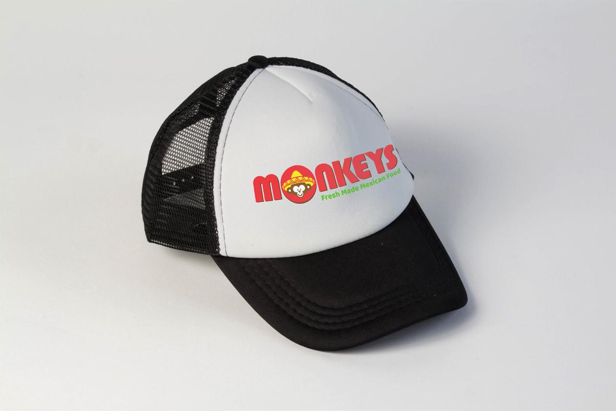
Promotional
Los artículos promocionales pueden ser una herramienta de marketing valiosa para las empresas de todos los tamaños. Al elegir los artículos promocionales correctos y usarlos de manera efectiva, las empresas pueden aumentar el reconocimiento de marca, mejorar el recuerdo de marca, generar leads, fidelizar clientes y motivar a los empleados.

Typography Primary
Typographic hierarchy system based on human interface guideliness. Aesthetic from while keeping text legibility, prioritize content and emphasize important information.
Bauhaus 93 Regular
PRIMARY TYPEFACE
Typography Secondary
Typographic hierarchy system based on human interface guideliness. Aesthetic from while keeping text legibility, prioritize content and emphasize important information.