Brand Identity
Our Purpose Logo Colours Typography Imagery style Post style 03 04 07 08 10 13
Tribal News Network (TNN) provides independent and reliable information that empowers local communities in KP. We aim to create awareness, build capacities and promote inclusivity. We produce and share untold stories that matters to people.
1. We value accessible information. Because it helps in empowering local communities and promote voices of everyone, specially marginalised groups.
2. We care about our communities. Because we help and train to build capacity of local media and encourage citizen journalism.
3. We value credibility and authenticity. Because we want people to trust us by providing them effective and reliable information through digital mediums.
Tribal News Network (TNN) logo is a combination of symbols and the letter T. The symbols and letter are geometrically combined with the main typography so it embellishes the look and feel of this brand.
A - Logo + text
B - Symbol / Alternate Version
Always use the logo consistently, according to the rules outlined in this manual.
The logo safe area is the width of the logo shape. All the other objects in the compostion should at least stay clear of the safe area. But more “space” is always better.
For printing purposes, the width of the logo must not be smaller than 20mm. For digital usage on screens, the width of the logo must be bigger than 20px, depending on the pixel density.¹
1 Pixel density is the relation between the physical size and the resolution of the screen. Generally, the pixel density on computers and smartphones is greater than that of the TV’s and projectors, which allows for a more comfortable rendering of the graphical objects.
Min 20mm /20px
Under no circumstances can Tribal News Network (TNN) logo should be edited in the mentioned ways.
Here are the most common mistakes that must be avoided.
Wrong colour usage
Wrong proportions and angle
Wrong logo composition
Wrong background and logo colour
It is forbidden to use any effect
Mixed colour versions
Compressed or condensed logo
Avoid busy backgrounds
The brand colour pallete consists of 4 colours.
These colours must be always present in visual design. The brand blue, black and white can be used as backgrounds. Red, blue, grey and green for graphics or fills. Typography text is always black or white from the brand colours.
Graphics / Posts
Logo typography
Neue Einstellung is a simple and geometric typeface by Alfredo Marco Pradil, Hanken Design.
This typeface with simplicity and straightforwardness that stands out in small or large scale applications. Inspired by the Einstellung Effect, it embodies rigidity in the way it looks and the way it performs.
It has been used by contemporary brands all over the world due to the clean and minimalistic feel that it promotes.
Neue Einstellung - Light
Neue Einstellung - Medium
Neue Einstellung - Regular
Neue Einstellung - Bold
Here’s an example of Neue Einstellung in a paragraph
Heading: Neue Einstellung Bold, 48pt
Post Headline: Neue Einstellung Semi-Bold, 36pt
Sub heading: Neue Einstellung Regular / Medium, 24pt
Body: Neue Einstellung Regular / Light, 16pt
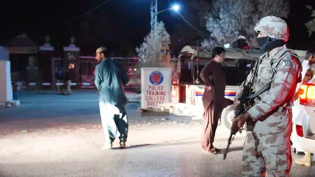
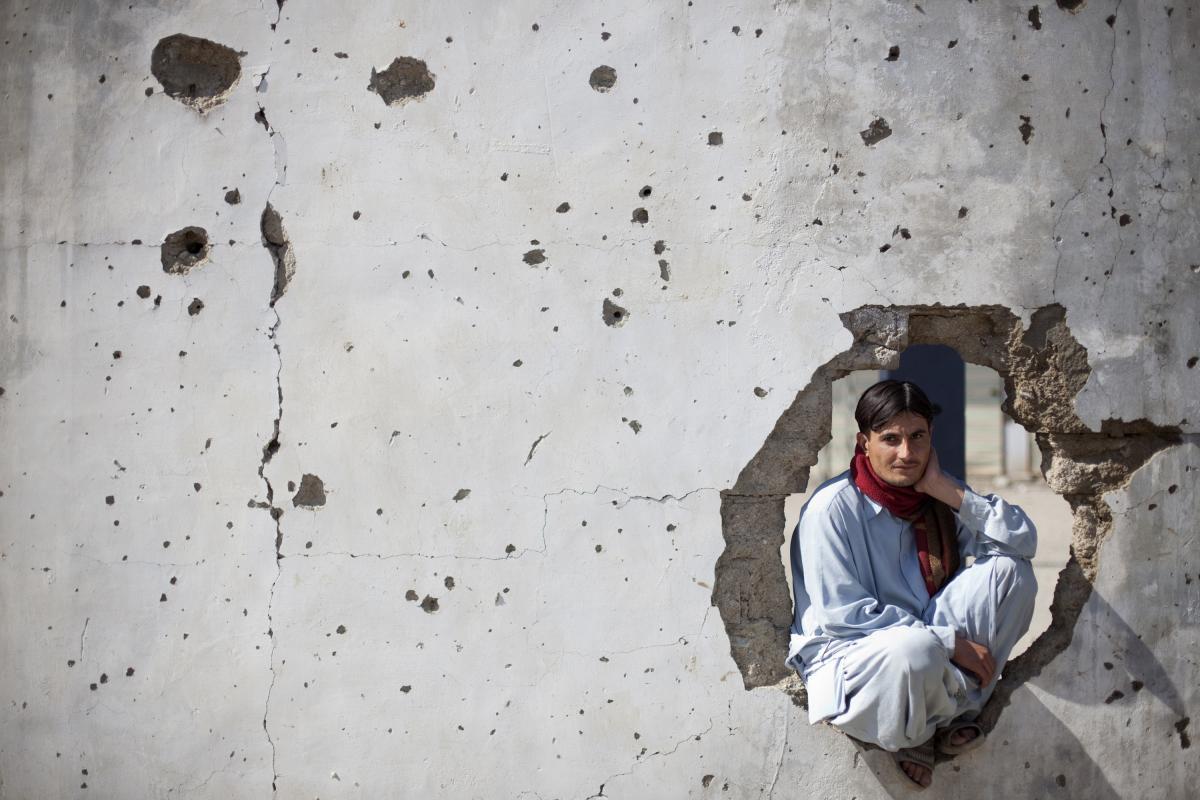
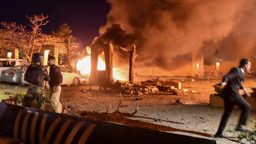
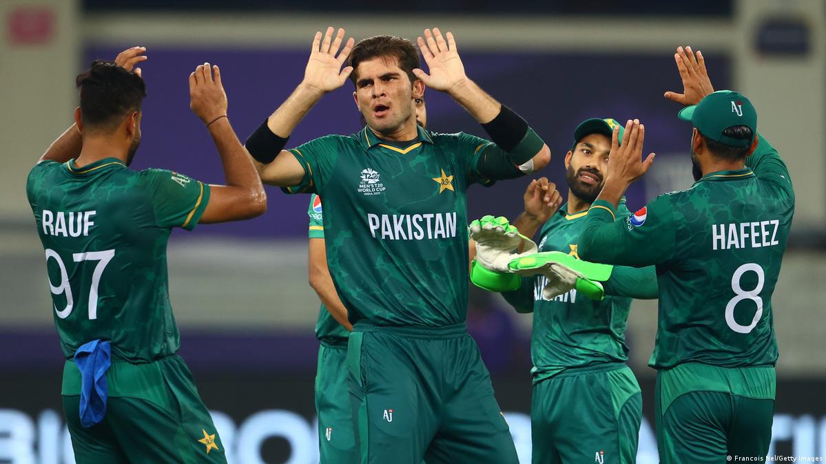
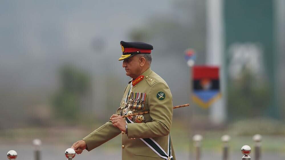
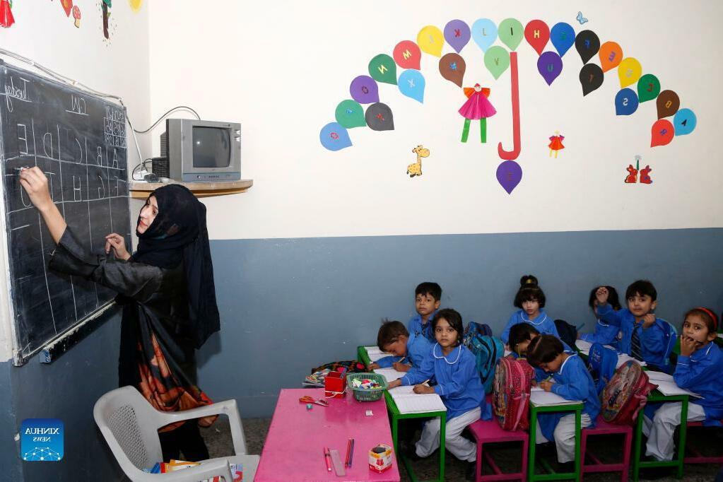
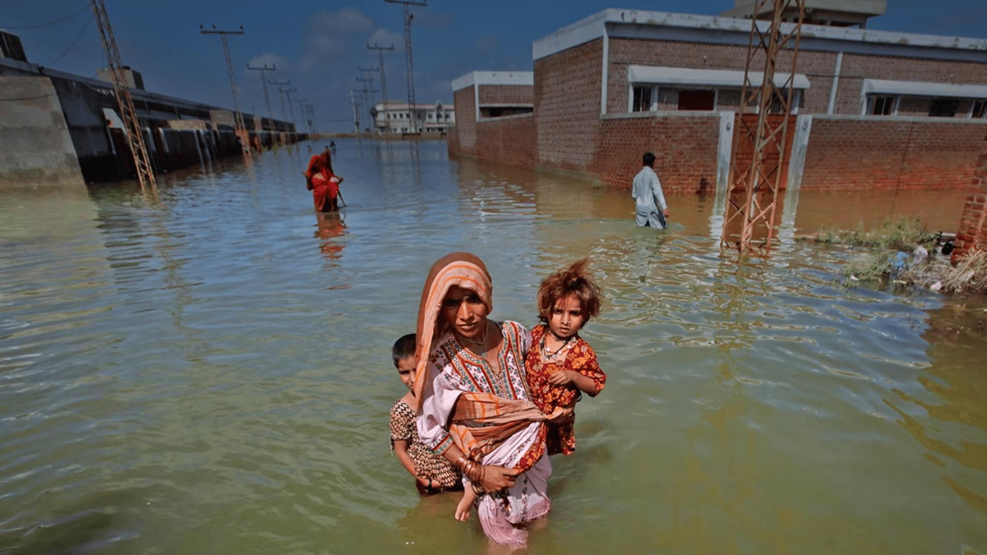
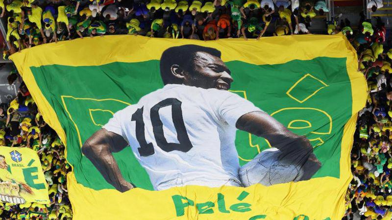
The images used for the brand’s post need to be dynamic, focused, and should emphasize on the character or the topic.
Make sure the images are less crowded and rushy! Don’t make your post a miserable experience for your user.
Do not use stock photos that look fake, rather use images that bring forward clear emotions and the right tone.
The positioning of the images used need to make sure that the subject of the photo is clearly captured.
It’s important that the scene being captured must feel real and not generic or cliché.
9:16 ratio / 1080×1920 px Instagram/ TikTok/ YouTube post
Headliners, breaking news, Politics, important, exclusive etc.
General, local news, daily bulletin, regional, tribal news etc.
Lifestyle, entertainment, sports, business, education etc. Blogs, op-eds, personal etc.
Who
Grey for blogs and op-eds
Podcast #1
Black for podcasts
Podcasts
Example of Urdu content and its usage for social media.
16:9 ratio / 1280x720 px for video thumbnail and/or article image
1:1 ratio / 1000 X 1000 px Social Media and/or Podcast Post
9:16 ration / 1080×1920 px Instagram/ TikTok/ YouTube post
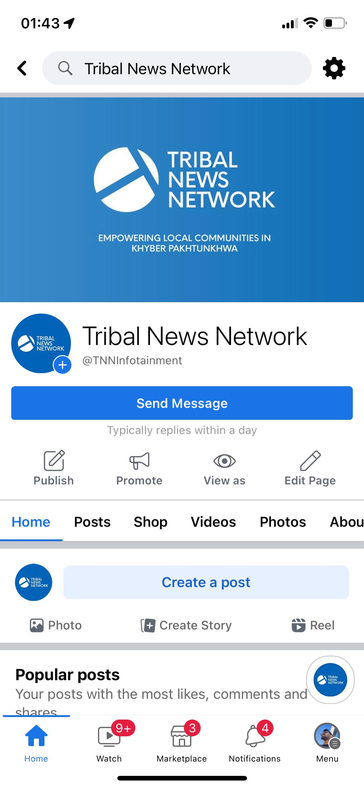
EMPOWERING LOCAL COMMUNITIES IN KHYBER PAKHTUNKHWA
820x312 px on desktop computers, 640x360 px on smartphones
Cover post with typography and logo elements
Social media icons for usage on web, print and social media platforms.