Our brand guidelines


• Introduction.
• Our brand message.
• Our brand tagline.
• Our vision, mission and values.
• Our brand house.
• Our tone of voice.
• Our brand building blocks.
- Logo.
- Colours.
- Typography.
- Photography.
- Icon library.
- Print and paper stock.
• Bringing our brand guidelines to life.
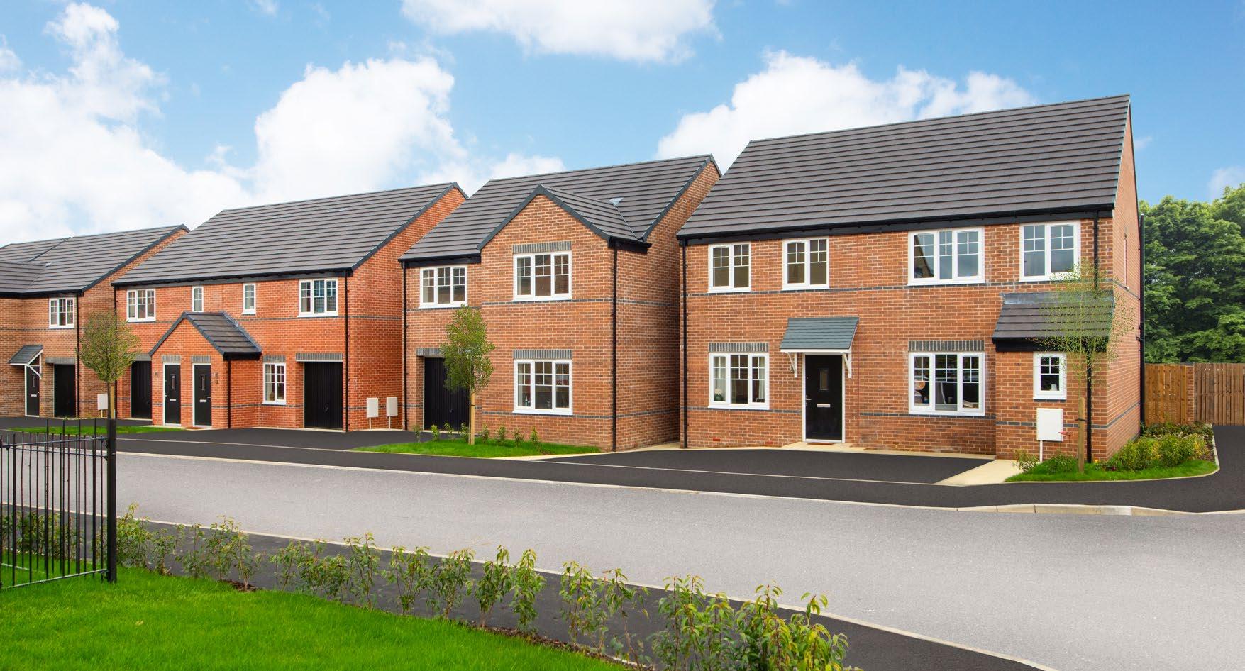
The Avant Homes brand is simple, straightforward and eye-catching. Our design style and colours are clean and fresh, aligning with our multi-tenure target audience. We are targetting everyone who wants and needs a home, from private sale to PRS and Housing Associations. Primarily catering to first time buyers and second steppers; those who want an affordable, stunning and practical home.
Our messaging is encouraging and easy to digest, making the complexitites of buying a home painless and the process sound exciting and rewarding.
Forget the bold, challenger brand mentality of the past; the Avant brand is agile and ready to provide customers with what they want and need.
Here in our guidelines we will explain everything you need to know about our brand.

Purchasing a home is an infrequent, emotional experience. For our customers it’s probably the biggest decision of their lives. So they will have dreams of what their ideal home looks like, and where it is, giving them a positive but practical needsbased mindset.
This is where Avant comes in! We recognise the goal of achieving a quality home, and we have a breadth of house types, with different layouts and prices and a strong specification, on beautiful developments, in great locations to meet that need.
We allow our customers to feel confident that the home they buy will suit their lifestyle and their finances - and be a good investment for the long term.
Quality homes, for everyone.
Our tagline encapsulates how we help customers realise their dreams of owning their first home, or next home, or a home for their family whether it be owned by them, be PRS or via a housing association.
With the optionality of our house types and our breadth of developments we have something for everyone, no matter the tenure, their budget or their requirement.
The expression also works on an internal level and for our suppliers. That’s because we promote fairness, equality, and growth opportunities for our colleagues – to create a positive work environment. We treat suppliers with fairness, integrity, and respect to foster mutually beneficial partnerships.
This helps us get the best materials at the right price, which in turn ensures our customers get a quality home.
We have created a vision, mission and values for Avant people to live by, to ensure we deliver upon our goals and be the best version of the brand we can be.
To further explain our brand messaging and purpose, we have created a brand house.
This explains in more detail how we have the foundations to substantiate it – and how all the elements of our brand come together to ladder up to the expression.
Brand Tagline Quality homes, for everyone.
Brand Expression
Avant make owning an affordable home possible!
Brand Phrases Making your... ...first step a reality. ...big step a reality. ...next step a reality. ...family’s step a reality.
Brand Belief
Brand Proposition
Brand Pillars
Proof Points
We recognise the desire to own the dream home. We understand the wish to get onto the housing ladder. It’s our mission to make this possible for the next generation of house buyer.
Opening the door to well built, affordable homes in fantastic locations.
Putting the value where it countssimplicity and quality
We have altered our approach to development in line with the changing needs of the next generation of house buyers. Avant homes are accessibly priced, and attainable at all tenures, reflecting the way people really live. Less ‘wow’ and more ‘positive but practical’ for all lifestyles. Helping people achieve a place to call home.
Our focus is on efficient layouts, and liveable areas. We’ve developed optionality in the house types and options and extras, giving people choice to fit with their needs.
Carefully selected locations and well thought out developments
We only choose fantastic locations where people want to live. Our developments range from those that are close to shops, schools and local amenities through to more rural areas, with far reaching views of the beautiful countryside.
Each development is carefully planned so there’s a mix of properties - a house type that will fit any requirement - options for everyone. We have shared aspirations, everyone helps each other. We have a passion for building for individuals not simply for the bottom line.
A commitment to realising the dream of getting on the housing ladder and buying your own home or moving up the property ladder into a home that better suits your requirements.
Customer-first service
We understand that when it comes to housing, it can feel like the doors are always shutting. At Avant, our customer service is founded on the basis of being ‘buyer first’ - we care about each buyer, each plot and each development. Thinking and acting locally, not nationally. Caring, not corporate.
We’re here to help open the doors for as many buyers as possible, saying ‘yes’ as much as we can at each stage of the journey whilst trying hard to reduce the hurdles and stress along the way.
Our commitment to first class customer service continues well after moving in day, so any niggles can be ironed out fast. We are driven by the desire to ‘get things done’.
Personality Considered. Empathetic. Relatable. Straightforward. Practical. Youthful.
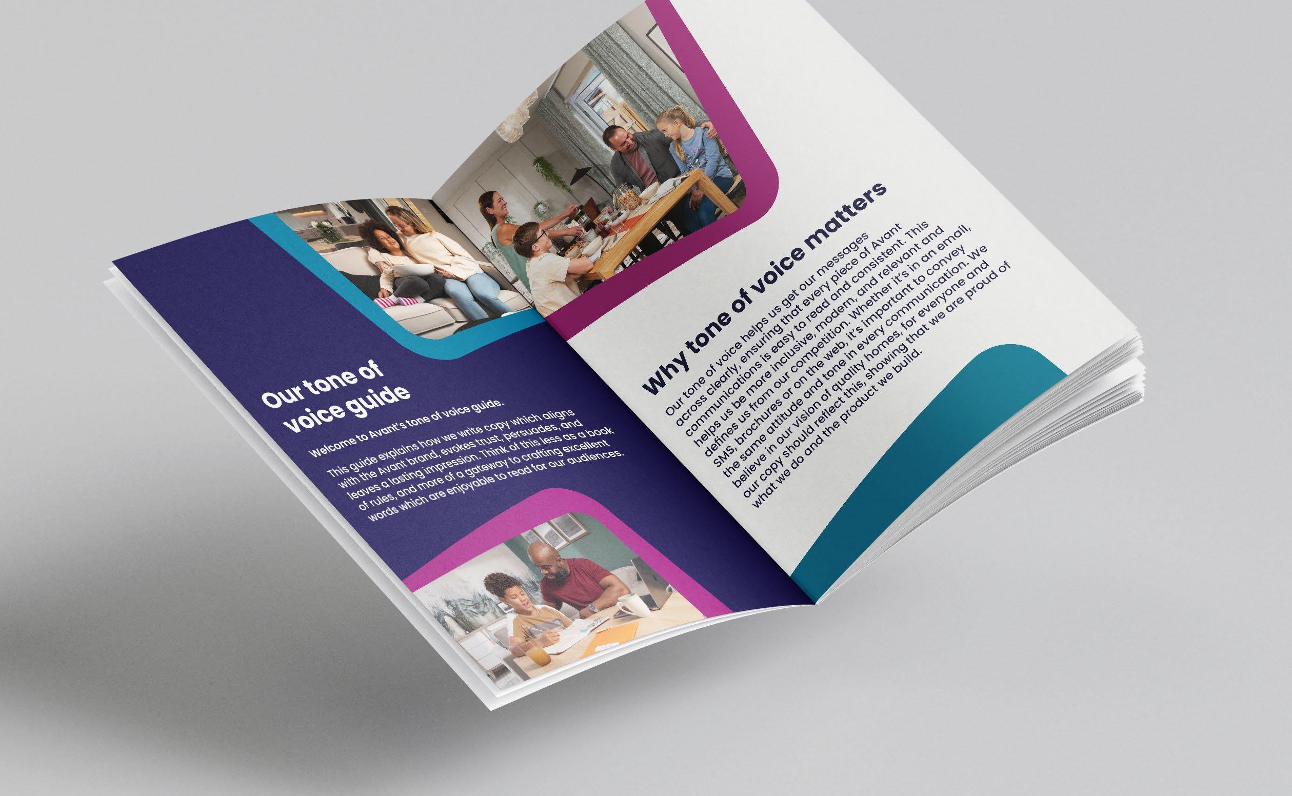
Tone of voice is the way we talk to our audience, whether it’s in an email, in an SMS, in brochures or on the web. It’s important to convey the same attitude and tone in every communication. Consistency is everything. It defines who we are and separates us from our competition. You can view our full Tone of Voice guide hereTone of Voice guide
There are two versions of our logo that can be used, ‘Avant Homes’ and ‘Avant. Quality homes, for everyone’.
Avant Homes is our primary logo, whilst ‘Avant. Quality homes, for everyone.’ is our secondary logo. This one should only be used when minimal/no text is used on the artwork or as a main feature. The logo can be utilised in both the Avant purple, and white.
The Avant logo must appear on all communications.
The colour cannot be customised, opacity should remain at 100% and the transparency blending mode cannot be altered. The logo should remain clear of obstruction, it cannot be rotated, cropped, or altered in any way.
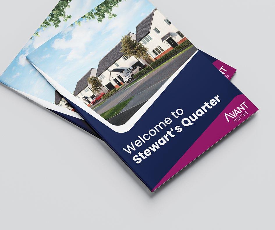
The predominately angular Avant ‘supergraphic’ has gone. To reflect our new brand essence and so we appear warmer and friendlier, it’s been replaced by a more fluid and rounded design. It’s also been consolidated to focus on our core brand colours.
This shape and logo can be used on simpler artwork, as well as in place of any other logos on the artwork.




Our colour palette is distinctly recognisable as Avant. The purple is our most prominent, leading colour. Navy and teal are also within our core colour palette.
Our secondary colours compliment our primary colours perfectly, creating darker and paler contrasts to offset our brand colours. White is also a commonly used colour within our communications, especially for text.
Poppins is our lead typeface and should be used across all our communications. It’s simple, clean, universal and friendly – ensuring text is legible and easy to read.
At the same time, it conveys expression and energy, in both static compositions and motion. It’s also a typeface that projects us as a straightforward, relatable and professional homebuilder.
*Light Poppins should only be used for Terms and Conditions or disclaimers.
The style of our photography should always deliver on our proposition of quality homes, for everyone. Having strong photography is crucial.
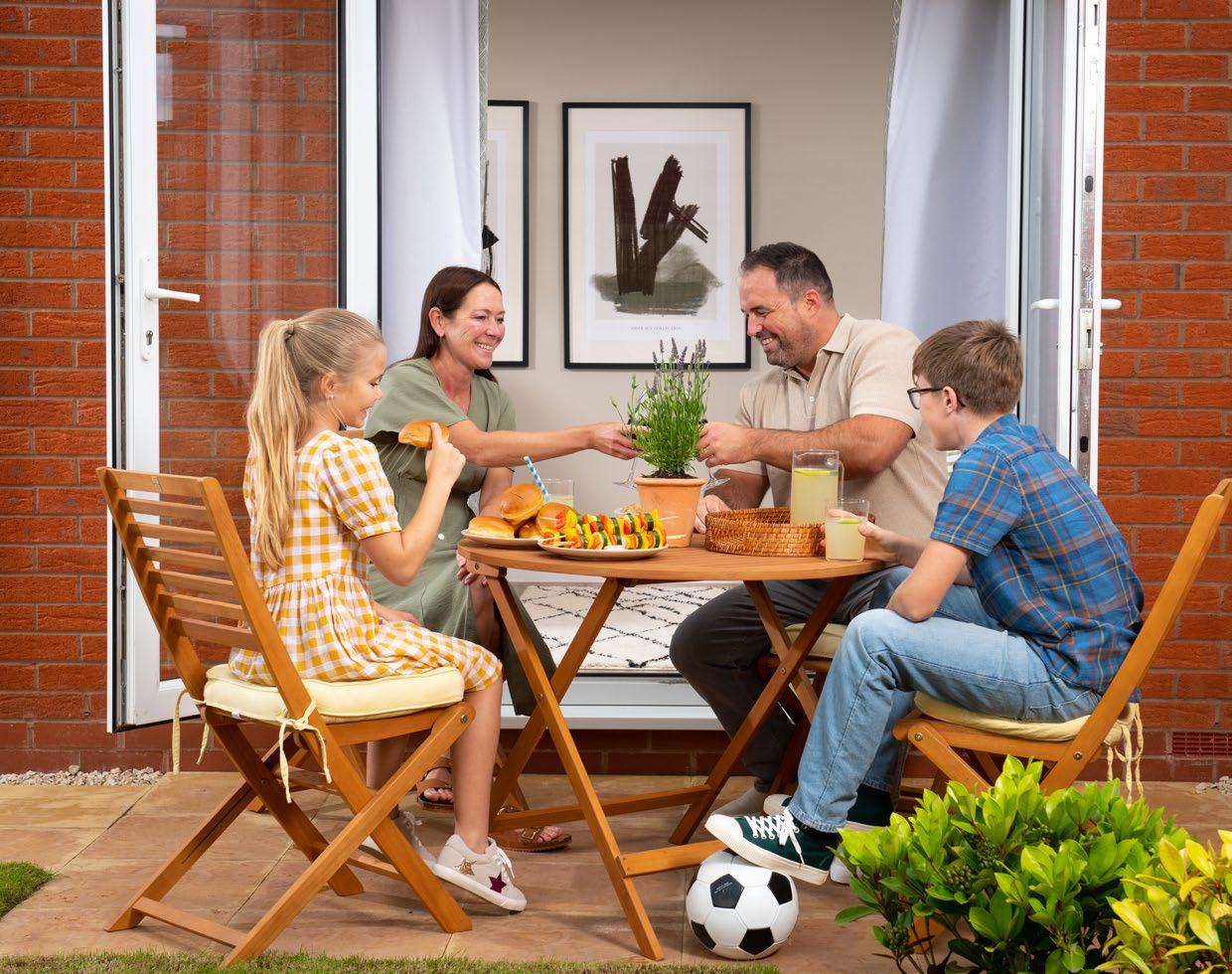
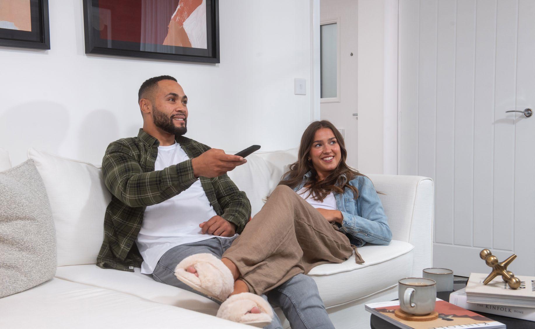
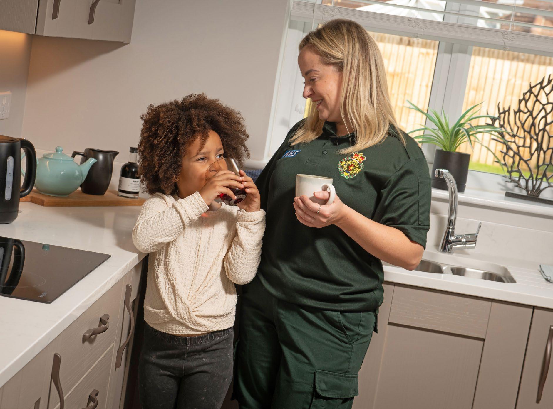
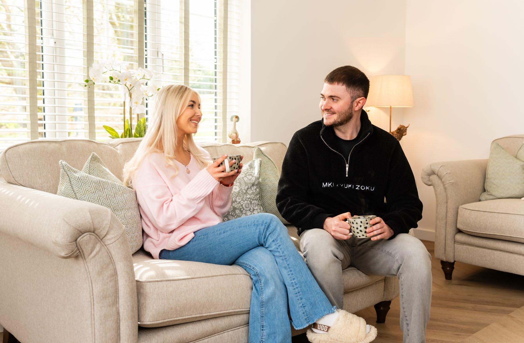
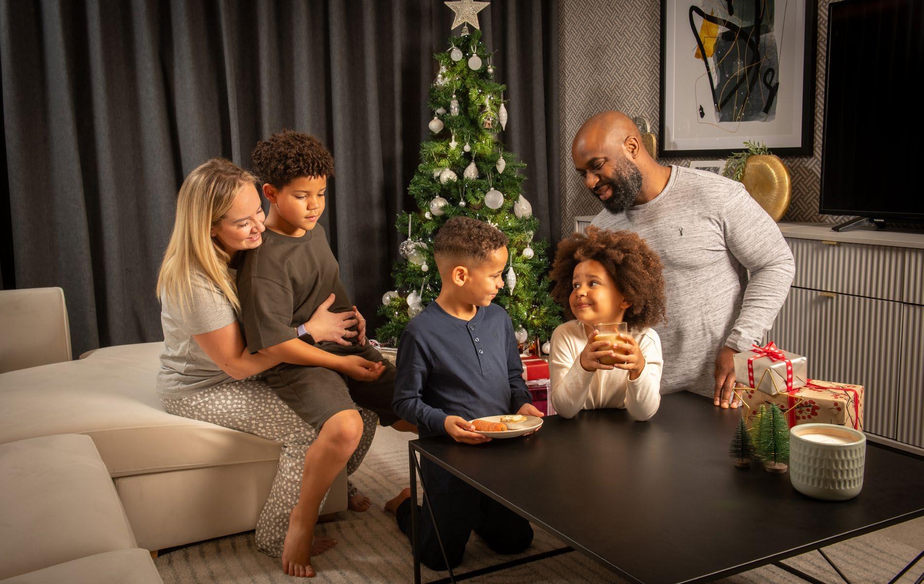
Lifestyle photography should show happy purchasers living in their homes, using them in a stereotypical way e.g. cooking, dining, tidying, chilling out. We should show imagery of all walks of life, ethnicities and ages.
Colleague photography should show happy colleagues, from sales to trades, everyone who plays a part in building our homes should be included.
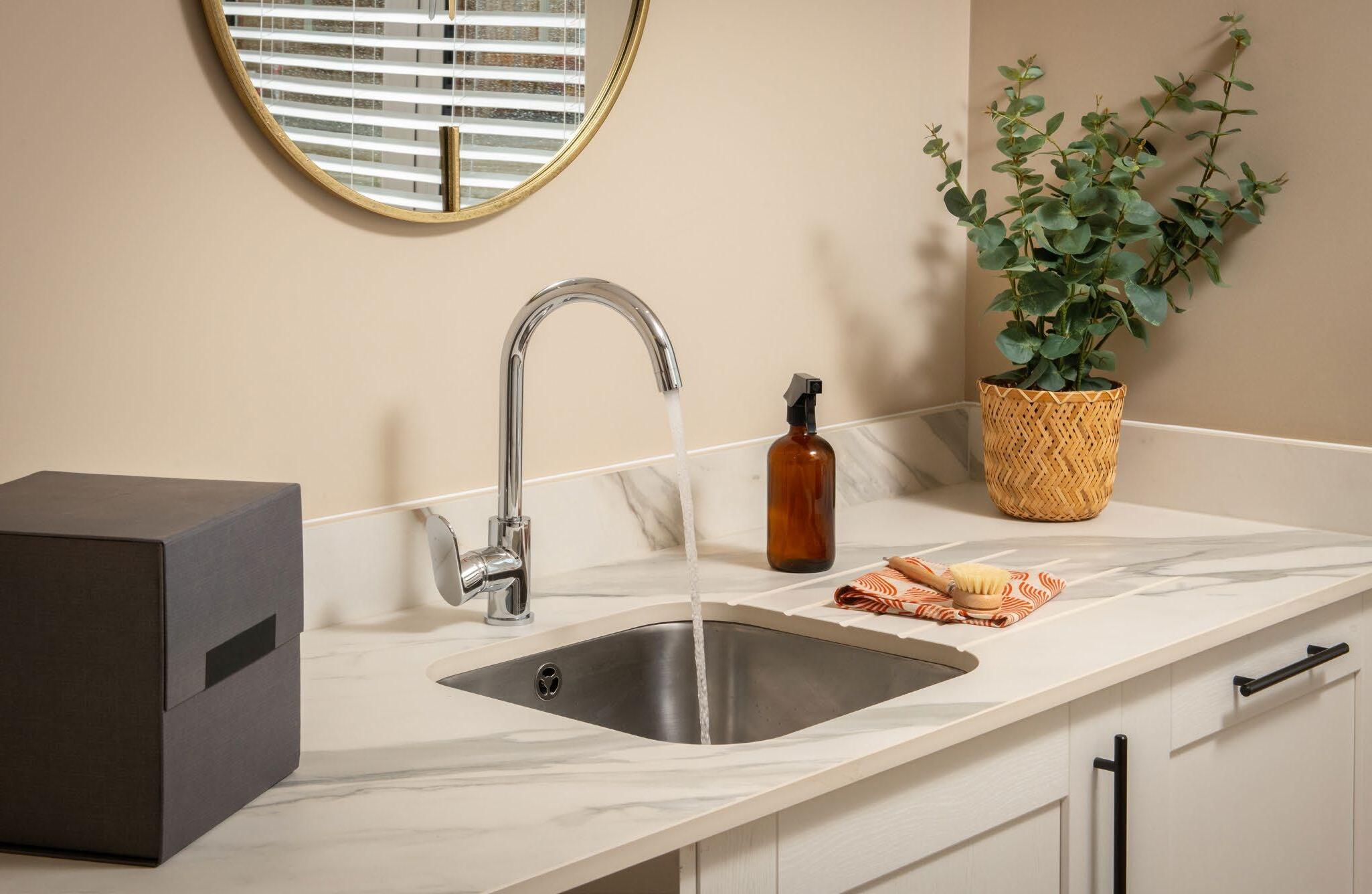
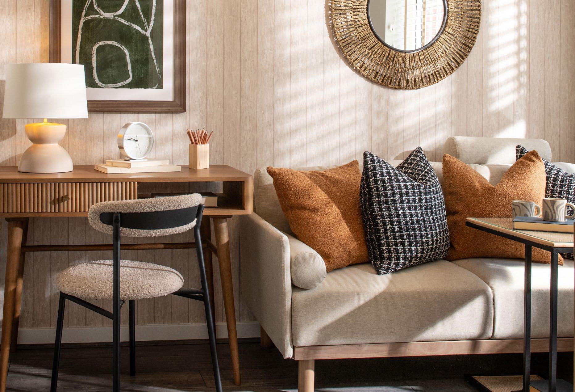
Product photography is key as it gives prospects a visual insight into our beautiful homes. Internal photography should be well-lit, and should be captured to show spacious rooms, our quality specification and the little details that make our show homes special such as accessories and extras. Beds must be made and well dressed with pillows and throws. Sofas should look comfortable, tables should be set but not cluttered and there should be no gaps where appliances should be. Everything should be in order.

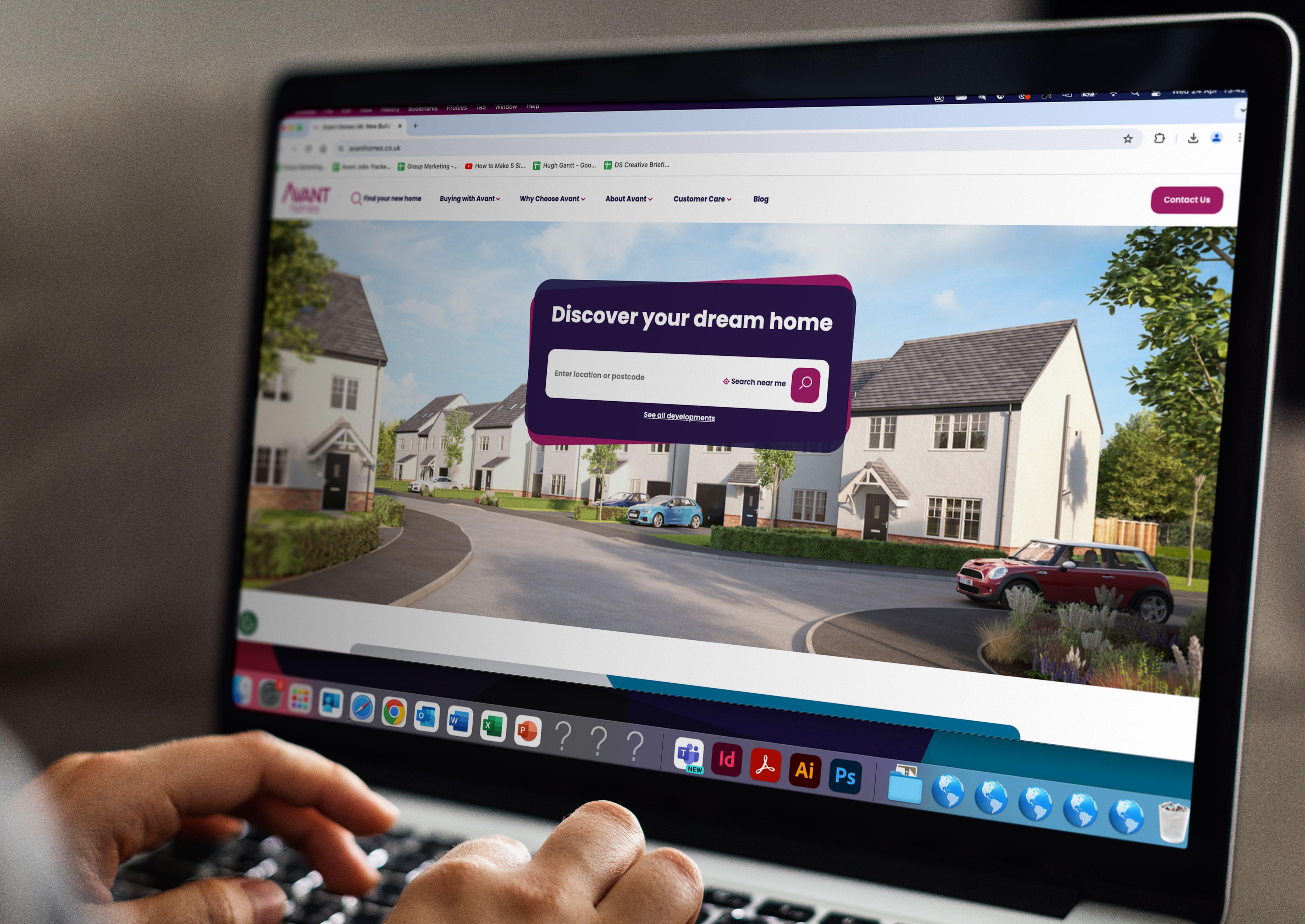
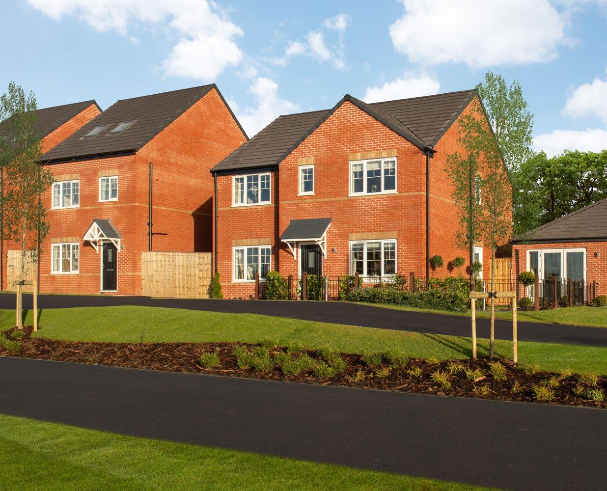
When showing exterior images and street scenes, presentation is everything. Our images should make a potential buyer imagine themselves living there.
It’s really important that gardens are tidy and well maintained; grass should be neatly cut, flowers and plants should be in full bloom. Windows and front doors should be clean and well dressed with blinds and curtains where appropriate. There should be no parked cars. Avoid showing fencing, hoardings or empty plots in the background. All signage including flags, house names, number plaques etc should be well presented and showcase the brand well.
When showcasing our building sites, it is important that they look presentable – clean and tidy. They should not be shown covered in mud. Everyone in foreground and background must be wearing full Avant PPE.



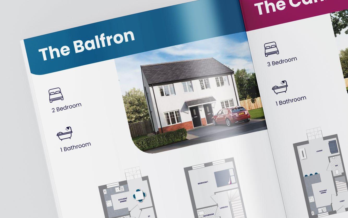
To further communicate our brand, we have created a set of icons for various uses. We have the icons that are used in association with our schemes, icons in our brochures to demonstrate bedroom/bathroom numbers and our Vision, Mission and Values icons, amongst others.
These icons are to be used in conjunction with the necessary messaging, not as a standalone image or feature. The icons should not be changed in terms of colour or proportion.



Our brand building blocks.
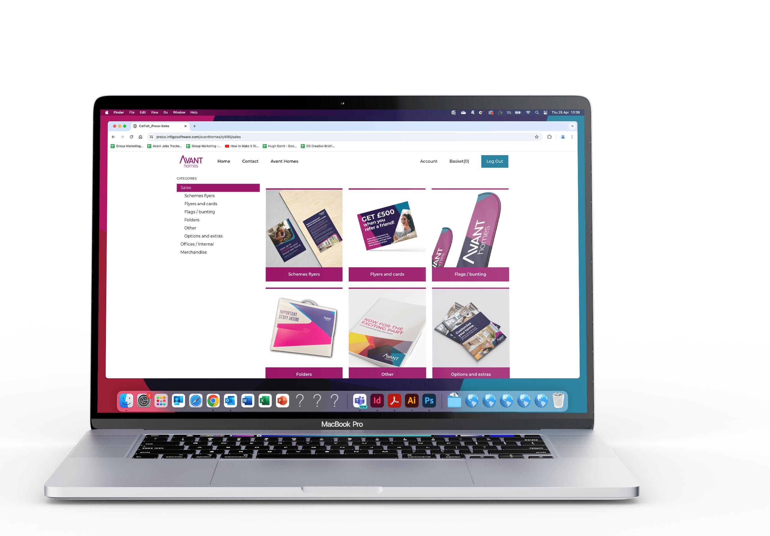
To ensure consistency with our printed collateral, we have adopted a print ordering portal, through our print supplier.
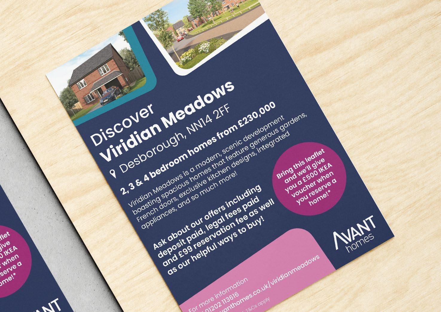
Within this, you can order stationary, merchandise, brochures and more. All printed collateral will be a set specification and high quality material.
Our preferred paper stock is vision indigo in a 250gsm. All paper we use is Forest Stewardship Council Accredited.
