

BRAND GUIDELINES

ACKNOWLEDGEMENT OF COUNTRY
AUSTRALIA’S SOUTH WEST ACKNOWLEDGES THE TRADITIONAL CUSTODIANS THROUGHOUT THE SOUTH WEST OF WESTERN AUSTRALIA ON NOONGAR BOODJA AND THEIR CONTINUING CONNECTION TO THE LAND, WATERS AND COMMUNITIES. WE PAY HOMAGE TO ALL MEMBERS OF THE PINJARUP, WIILMAN, WADANDI, PIBELMAN, KANEANG, MENANG, KORENG ABORIGINAL COMMUNITIES BY ENCOURAGING VISITORS TO RESPECT AND LEARN ABOUT THE WORLD’S OLDEST LIVING CULTURE.

INTRODUCTION
AUSTRALIA’S SOUTH WEST
Australia’s South West is a region abundant in nature, ancient culture, indulgence, adventure, exceptional produce and simple joys.
Laid-back and efortlessly beautiful, a fullbodied richness lies beneath, so wildly perfect, with undiscovered charm waiting to be unearthed.
Our new brand platform – Dream Deeper invites visitors to get of the beaten track, explore ancient trails, and indulge in dream food and wine experiences.

Working side-by-side with Western Australia’s Walking on a Dream this brand is designed to showcase the unique ofering of Australia’s South West, and appeal to travellers looking for a deeper connection with nature and awe-inspiring experiences away from the hustle and bustle of modern life.
DREAM DEEPER.
MANIFESTO

WE DREAM OF LEAVING THE EVERYDAY FAR BEHIND.
In Australia’s South West, it’s not just about feeting moments – we seek deeper connections, discoveries and transformation.
Walk atop ancient forests of towering karri and jarrah trees where nature shares its age-old stories with a whisper.
Hike rugged clifs where oceans meet –a spectacle that takes your breath away. Pure forest air fuelling each step of your adventure.
With grapes caressed by ocean breezes yielding fne wines, a tale of enchantment within each sip.
Relish in produce plucked from fertile soils, curated and paired in sensory feasts.
Soak up moments of powerful stillness in ancient limestone caves.
Dive into crystal clear oceans, lakes and rivers.
Be at one with wild nature, with playful dolphins and graceful humpback whales, riding the perfect wave.
Where of-track foraging through undergrowth gifts earth’s treasures.
Beaches so vast, trails untouched, tracks unbeaten.
Where those who seek diverse and transformative experiences fnd them in abundance.
AUSTRALIA’S SOUTH WEST DREAM DEEPER
OUR BRAND PLATFORM
Our brand invites people to dream deeper in Australia’s South West. With such a wide range of unique experiences to be found around every bend, there is no better place to get away from the trappings of modern life.
Our tone and use of language is deep and dreamy. We are down-to-earth, confidence with grace, with a touch of magic.
We encourage people to explore this most beautiful part of the world, to reconnect with nature, to feel empowered.
This brand is all about how a dream getaway to Australia’s South West can transform you.

OUR BRAND TAGLINE

Connected to Walking on a Dream. Dreaming of a life connected to nature, awe-inspiring experiences, and world-class food & wine.
Encouraging exploration beyond the obvious. Get off the beaten path. Go around the next bend. Enjoy a deeper understanding of ‘place’ and how it can transform you.
JESTERS FLAT, MARGARET RIVER

BRAND ELEMENTS
TONE OF VOICE
How we write and speak as a brand is guided by our brand tone-of-voice.
The following will help those writing or speaking on behalf of Australia’s South West to ensure that our brand tone is consistent at every touchpoint.
This is a companion piece to the Tourism WA Style Guide.
OUR PERSONALITY
Sandy feet or farming boots, we wave g’day and smile at passers-by.
Our relaxed demeanour immediately puts others at ease.
Explorers at heart, we go where desire takes us; recharging in nature, chasing waves, tending to farmland or seeking adventure.
Beneath our laid-back exterior lies a fullbodied richness of character.
An old-world wisdom runs through our veins, handed down, earned.
Our spirited charm captivates. We respect our wild wonders and seek to sustain them. We efortlessly balance our easy-going nature with depth, ensuring that every encounter is a wondrous experience.
G’DAY
In Australia’s South West we are always welcoming and friendly. We are keen to share the beauty of our region and invite visitors to explore.
GO DEEPER, GO DREAMY
Exploring Australia’s South West involves getting into nature’s rhythm.
Our copy can fow like a river winding its way through an ancient landscape.
Longer copy can unwind like our thoughts when we daydream, rather than the traditional structure of written copy.
For shorter copy, retain a sense of ‘dreaming’ with language that uses dream references in a fun and entertaining way.
We use language that is:
DOWN TO EARTH
Friendly, welcoming and easy-going, we invite others in to experience the abundance of our region.
CONFIDENCE WITH GRACE
We’re confdent in our oferings so we can speak with grace and tastefulness.
A TOUCH OF MAGIC
We show the real magic that our region has to ofer, we use our language to spark intrigue and wonder.

COPY EXAMPLES
FILM/DIGITAL
LAUNCH/BRAND OOH
AUSTRALIA’S SOUTH WEST
DREAM DEEPER
SHORT-DWELL OOH (HIGHWAYS)
VISUAL
Person jumping into a rock pool, river or ocean.
YOU CAN FLY
VISUAL
Person lying in or having experience amongst wildfowers in ASW.
WHERE FLOWERS DELIVER
VISUAL
Rocks and ocean in ASW. With or without people.
ROCKS CAN TALK, JUST LISTEN.
MEDIUM-DWELL OOH (DIGITAL SAMPLES)
VISUAL
Person on hilltop.
CLIMB A HILL, CALL IT A MOUNTAIN, SURVEY FROM ON HIGH.
VISUAL
A Dad jumping into the ocean of rocks.
ONE MOMENT YOU’RE A HUMAN. THE NEXT YOU’RE A FISH.
VISUAL
A Dad facing down waves as he’s about to enter the ocean. YOU ARE NOT DAD. YOU ARE POSEIDON, RULER OF THE SEA.
VISUAL
Sipping on wine at a vineyard.
DID YOU DISCOVER THE WINE, OR DID THE WINE DISCOVER YOU?
VISUAL
Kayak going around a bend in a river with no modern elements in scene.
GO AROUND THE BEND, BEND, BEND, BEND, BEND, BEND…
COPY EXAMPLES
FILM/DIGITAL
BRAND MANIFESTO FILM
Head down south.
Hire a kayak.
Go around a bend. And another…
Float away and fnd the land that time forgot.
Do yoga.
Discover inner quiet.
Forget the modern world... and become a yogi.
Go for a hike.
Climb a hill.
Decide to call it a mountain.
Survey the world from on high.
Try sauvignon blanc. With oysters.
Discuss fruit undertones and ‘terroir’.
Become a sommelier.
COPY EXAMPLES
BRAND/LAUNCH PRINT
(LONG COPY
VISUAL
Woman at the top of a hike with a great view of the landscape around her.
GO FOR A HIKE. CLIMB A SMALL HILL. CALL IT A MOUNTAIN. SURVEY FROM ON HIGH.
VISUAL
Woman enjoying a wine tasting at a Margaret River winery.
GO TO MARGS. TRY A PINOT GRIS. START TASTING, SWIRLING AND SIPPING. START DISCUSSING ‘VISCOSITY’ AND ‘TERROIR’. DECIDE TO BECOME ‘SOMMELIER’.
VISUAL
Kayaking around a bend on an ancient river way.
HIRE A KAYAK. GO AROUND A BEND. ANOTHER BEND. AND ANOTHER. DISCOVER A LAND THAT TIME FORGOT. DECIDE TO LEAVE CIVILISATION FAR BEHIND AND NEVER TOUCH DRY LAND AGAIN.
BRAND THEMES
NATURE
AT ONE WITH WILD WONDERS
Wander with the nature’s wild wonders, see whales, stingrays and dolphins in the wild or observe the marine life that lies beneath.
NATURE’S GIFTS
Revel in nature’s generous gifts with unique geography preserved over thousands of years. See nature’s art during wildfower season and giant rocks in all their beauty.
CONNECTION TO COAST
Experience the Indian Ocean and the Southern Ocean in all their glory, from calm waters to some of the best big waves on earth.
WINE, FOOD AND PRODUCE
FINE WINE
Near perfect grape growing conditions for winemakers means there is an abundance of world-class wines on ofer and plenty of cellar doors to drop into.
BREWERIES AND DISTILLERIES
Award winning and worldclass spirits and brews are on ofer – tasty tipples for any palate.
CULINARY VARIETY
Degustations, hand-crafted platters, pub classics and bakery goods – the region is full of gourmet delights to suit your tastes.
PROVISIONS AND PRODUCE
Produce plucked fresh from fertile soils, edible treasures straight from the seas, rare gems foraged from the earth – the region has so many gourmet provisions on ofer.
ADVENTURE AND TRANSFORMATIVE WELLNESS
FILL YOUR CUP YOUR WAY
Swap the big city for small town relaxation, sandy toes, uncrowded beaches, hillside chalets, foat on dams, or walk unbeaten trails. The choice is yours.
NATURE’S INVIGORATION
Open spaces, forest air, fresh water, enchanting trails and tracks. Be at one with nature and reinvigorate.
ABUNDANT ADVENTURES
Recharge your mind, body and spirit through a range of wellness options, challenge the body at new heights or awaken the soul swimming with the wild.
EVENT EXPERIENCES
Experience special events, from wildfower festivals, intimate wine tastings and tours, to watching the world’s best surfers take on the largest waves or ultra endurance adventure races.
ABORIGINAL CULTURE AND RICH HISTORY
ANCIENT HISTORY
Explore rich Noongar history by experiencing the Wadandi and Bibbulmun country through the eyes of the traditional owners with cultural tours.
RICH HISTORY
Immerse yourself into the ANZAC legend, learn more about whaling history or pop into town museums to discover more about the town’s history.
ARTS AND CULTURE
A melting pot for artists and creatives, fne arts precincts, galleries and open studios, as well as beautiful displays of public art in both city and country settings.
PRIMARY LOGO
The Australia’s South West logo is a simple type treatment that has a relaxed look and feel. It is reminiscent of local road signs or the type styling found in maps and cartography.
Carefully crafted typography has been explored by lowering the ‘x’ height of the font and subtly allows the font to sink deeper. Each letter is spaced out further, to give a spacious and free feeling. By stacking the words, a subtle link to the direction of South and West has been created. Each word steps down, and ‘West’ edges slightly further to the westerly position.
New versions of the logo lockup should not be created.
The reversed version of the logo is predominantly used as the main lockup in brand communications as it works well across photography and block colour.
The coloured logos – vineyard green and ocean blue – can be used on lighter backgrounds where there is not enough contrast for the reversed version of the logo to be present.
For further examples of how the logo is used please see Creative Examples on page 22.
Australia’s South West Logo - Reverse
Australia’s South West LogoVineyard Green
Australia’s South West Logo - Mono
Australia’s South West LogoOcean Blue
SECONDARY MNEMONIC
The primary logo lockup is the preferred identity to be used across applications. In saying that, an abbreviation of the logo has been created that can allow for small space usage such as social media or as an additional design element on applications within the design system.
Australia’s South West - Secondary Mnemonic - Green
Australia’s South West - Secondary Mnemonic - Blue
Australia’s South West - Secondary Mnemonic - Grey
Australia’s South West - Secondary Mnemonic - Mono
MINIMUM SIZING AND CLEAR SPACE
LOCKUP USAGE
There will be instances where Australia’s South West logo will be used in conjunction with the ‘Western Australia Walking On A Dream‘ brand campaign lockup. When this occurs, both logos will be of equal heights and sit alongside each other with adequate spacing.
To maintain the integrity of the design, the primary logo lockup is to adhere to the minimum clear space and minimum size requirements as demonstrated to the right. Minimum size
29mm print or press 82px online
TYPOGRAPHY
Our brand fonts are Schramberg Sans, Clash Display and Noto Sans. All fonts are available to download here:
Schramberg Sans Clash Display Font
Noto Sans
Schramberg Sans is used for headline, larger set text and introductory copy.
Clash Display is used for secondary subheads.
Noto sans is used for body copy text.
TYPOGRAPHY
USAGE
HEADLINE
SCHRAMBERG SANS
SIZE: 36PT
LEADING: 54 (150% FONT SIZE)
KERNING: 40
Rocks CAN TALK, JUST LISTEN.
SUBHEADING
CLASH DISPLAY – MEDIUM
SIZE: 13PT
LEADING: 16.25PT (125% FONT SIZE)
KERNING: 100
BODY COPY
NOTO SANS REGULAR
SIZE: 8PT
LEADING: 14PT (175% FONT SIZE)
KERNING: 0
Soluptat iisciam laut est, sim volor acienisim volorere placcatquo iunt que at quia dent eossimusame aris volorrum sequat et ventorr umquiat qui od et veris autaspelis a id moluptumquam es saeperiorrum sitatis aut voloresequae mintios untus ulluptatecae cus, et omnihic imendis ex esto qui temquo ofci.
CLASH DISPLAY – MEDIUM SIZE: 8PT
LEADING: 16PT
KERNING: 100
LOCATION TEXT
CLASH DISPLAY – MEDIUM SIZE: 8PT
LEADING: 16PT
KERNING 100
COLOUR PALETTE
Australia’s South West colour palette has been inspired by tonal, earthy colours found within the region. A focus on the sky, greenery and rock forms has been used to pull a base colour in addition to a secondary deeper tone.
Colours should be used sparingly within layouts to not over complicate the design and should be strictly limited to two colours per layout.
MOSS GREEN
C52 M37 Y48 K6
R128 G138 B128 #808A80
VINEYARD GREEN
C49 M38 Y74 K14
R128 G128 B86 #808056
SKY BLUE
C54 M32 Y18 K0
R126 G154 B181 #7E9AB5
OCEAN BLUE
C80 M61 Y31 K11
R69 G95 B128 #455F80
PEBBLE GREY
C33 M31 Y33 K0
R175 G166 B161 #AFA6A1
ROCKY GREY
C52 M43 Y43 K8
R128 G128 B128 #808080
APPROACH TO IMAGERY AND VIDEO
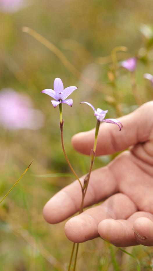
Showcasing photography that depicts Australia’s South West and its wild and expansive landscape. A visual palette of images covering everything from expansive, dreamlike aerials to more intimate photography zooming in at eye level with soft depth of feld should be included.
Interesting angles and selective composition should be used to emphasise the beauty and nature of the environment.
Imagery should highlight people having deep and meaningful experiences within their environment, their connection to the land, and a moment of refection.
When talent is included, please ensure diversity across cultural background, age and gender is considered.
Imagery is to be sourced largely from the Tourism Western Australia image library where possible and should refect the photography tiers outlined within the master brand’s photography guidelines. In instances where new content is needed, please ensure that any new photography or video also sits within these guidelines.
To access the library, please visit:
TWA Image Library


LOCATOR MARK AND DUAL NAMING
The location device is used to help our audience identify destinations within Australia’s South West. This device includes a small icon that is a pin point on photography and is paired with a type descriptor.
GUIDELINES
• Location text is typeset in Clash Display Medium.
• The locator icon sits along the baseline of the location text.
• Spacing between locator icon and location text is the width of locator icon.
• The height of the locator icon sits slightly taller than the location text. The location text sits halfway through the “O” of the icon.
• Where an Aboriginal place name exists, dual naming should be used.
• In instances where the locator text is long and requires splitting, the divider line and Aboriginal place name moves to a second line (example below).
• In body copy, a forward slash is used to separate the Aboriginal place name from English text.
MARGARET RIVER REGION
LOCATOR MARK
AND DUAL NAMING
The below examples will assist with ensuring consistency in referencing destinations.
HERO DESTINATIONS:
Where the destination name on its own is sufcient; the location is well-known, easily searchable or a common feature on South West travel itineraries.
ALBANY | KINJARLING
BUNBURY | GOOMBURRUP
COLLIE
DENMARK | KOORABUP
DUNSBOROUGH | QUEDJINUP
MANJIMUP
MARGARET RIVER | WOODITUP
PEMBERTON | WANDERGARUP
ATTRACTION FOLLOWED BY
DESTINATION:
Where the destination or attraction does not provide enough information on its own, a more detailed location can be provided. Please consider the length ofthe name in each application and the inclusion of the surrounding area whererelevant (i.e. national park or town name) to give sufcient context. Also keep in mind the region’s name, Australia’s South West, will be included in the logo type in each application. Please see Creative Examples on Page 22 for examples on how the locator device has been applied and shortened based on the specifc application.
BEEDELUP FALLS, BEEDELUP NATIONAL PARK
BLUFF KNOLL, STIRLING RANGE NATIONAL PARK | BULA MEELA
BORANUP FOREST, MARGARET RIVER REGION
CANAL ROCKS, YALLINGUP | WINJEE SAM
CAPE TO CAPE TRACK, MARGARET RIVER REGION
CASTLE ROCK, PORONGURUP NATIONAL PARK
DOLPHIN DISCOVERY CENTRE, BUNBURY | GOOMBURRUP
GOLDEN VALLEY TREE PARK, BALINGUP
MOUNT CHUDALUP, D’ENTRECASTEAUX NATIONAL PARK
NATIONAL ANZAC CENTRE, ALBANY | KINJARLING
VALLEY OF THE GIANTS TREETOP WALK, WALPOLE-NORNALUP
NATIONAL PARK
WELLINGTON DAM, WELLINGTON DAM NATIONAL PARK
CREATIVE EXAMPLES


CREATIVE EXAMPLES


CREATIVE EXAMPLES


CREATIVE EXAMPLES
DIGITAL BANNERS
728X90


Full colour background with headline and mnemonic.
Full bleed photography with logo.
Full bleed photography with headline and mnemonic.
CREATIVE EXAMPLES


Visit our corporate website to learn more corporate.australiassouthwest.com or discover more about the South West region at australiassouthwest.com.