
AUSTEN WALLENFANG HUMANIZING THE GEORGE L MOSSE HUMANITES BUILDING UGLY, BEAUTIFUL, OR BOTH...


The project you hold in your hands is dedicated to the family, friends, professors, and peers who constantly challenge the way we look at the world around us. May we always try to listen – even when we think we know best.
 FRAMING THE PAGES AHEAD
he book that you hold in your hand does not exist in nature. It was conceptualized, designed, refined, and then sent out into the world to be made physical. It is not until it is made physical that we can see it in its truest form. When someone with a design background perceives it, they begin to ask questions. What shapes do the letters make and how do these letters sound as I read them in my head. Is the paper quality something I notice right away, for better or worse, or is it something that was adequate enough to be dismissed? Some voices in the design world believe that good design is meant to be dismissed. I disagree wholeheartedly.
There is something to be said about the notoriety of people and things that disrupt the normative and become significant via maligned fame. I argue that critical attention can be more favorable than no attention at all, if not objectively intending to be invisible. After all, criticality is what shapes the world of art and design. Progress forward does not happen in a vacuum but rather by people pushing back on one another. By asking questions and understanding pitfalls we move forward. So, appreciate effort and push.
“
CRITICALITY HELPS SHAPE THE WORLD OF ART AND DESIGN.”
The contents of the book are the result of people pushing. When people push, listen because they are trying to say something even if they can’t find the right words. The title of this book, Ugly Beautiful and Maligned, is a summary of the pushing heard around campus regarding the building. It is almost the nature of the building to form an opinion in its presence.


The George L Mosse Humanities Building, in short, is a space that has been called many names and criticized deeply. Some people adore it while others despise its existence. Neither of them are wrong. The building is all of the above. It is innovative as much as it is depressing. It is ugly as much as it is beautiful. It is falling apart as much as it has potential. If it has been experienced in such a way, that is enough for it to be true. Many things can be mutually correct and ambiguity is okay.
Like this book, the building does not exist in nature. It was conceptualized and a lot happened before it was made physical. It has become a piece of architecture that is a part of our built environment at the University of Wisconsin – Madison. It is many things at the same time, and there is potential that it is nearing the end, yet it still exists as an artifact of campus past. While it does have its flaws, I am not here to apologize for where it fell short, but to hopefully share that the intention of this incredibly unique piece of architecture is worthy of appreciation.
“WHILE IT DOES HAVE FLAWS ... THE INTENTION OF THIS INCREDIBLY UNIQUE PIECE OF ARCHITECTURE IS WORTHY OF APPRECIATION”
n the fall of 2021, I was studying graphic design at the University of Wisconsin - Madison. As part of a class, I was tasked with building an interactive website that told a story. After exploring a few topics, the story I chose to tell was that of the George L Mosse Humanities building. To me, this was the building where I attended most of my classes, and while I knew many people hated the building because of its brutal nature, I often found myself gazing in appreciation of its uniqueness. The building had been rumored to be demolished and replaced sometime in the next decade, so my professor, Yeohan Ahn, and I agreed that it was a story that should be told before the building ceased to exist.
So, I began my research and very quickly realized how much information there was to talk about regarding the building. Over the course of the fall 2021 semester, I had to remind myself that the main goal was to build the website and there came a point where I needed to conclude my research for the fall semester. I painted a small picture (metaphorically) with the information I had and told a very abridged version of the building’s history through an interactive website. With the completion of my website neatly packaged and published to the world wide web, my professor and I discussed the opportunities for continuing this project.
“ WE AGREED THAT IT WAS A STORY THAT SHOULD BE TOLD
”
At first, I was hesitant because, at times, the amount of information about the building was overwhelming and I knew I had only scratched the surface. I was also about to enter my final semester as a student at the University of Wisconsin – Madison, so it felt unlikely that I would be able to take on such a project while also receiving funding to expand on my work. So, I continued to keep the idea of this project in the back of my head.
Then, in January of 2022, I needed to define my thesis project in graphic design. After playing around with a few other ideas, I decided to pursue this topic and focus on expanding my design solutions for presenting the information. Further, I chose to apply for a humanities-based scholarship and was quickly accepted into the program. From that point to the end of April, just over three months, I proceeded to research as much as I could about the George L Mosse Humanities Building, and develop my design solutions for the information I found.
There were a seemingly infinite number of rabbit holes that I needed to avoid to stay focused and meet my deadlines for graduation. The final product is this case study. Not a book, or a peer-reviewed article, or anything rooted in years of research, but a case study that tells what I was able to find in scratching the surface of researching the building. My scope was originally broad and leaves me with a rudimentary understanding of our built environment, the ambiguities in defining architectural style, and a whole lot about an area of UW Madison’s campus that was once known as the Southeast Lower Campus Project.
In the following pages, you will find images I see as relevant, diagrams I have created to help explain a narrative, and summaries of information that is sometimes ambiguous given the nature of theoretical academic writing. I hope to humanize an incredibly maligned and unintentionally authoritarian building. I hope to humanize topics of architecture that seem to be inaccessible. And I hope these pages provide an appreciation for the ugly beautiful things that surround us.
I HOPE THESE PAGES PROVIDE AN APPRECIATION FOR THE UGLY BEAUTIFUL THINGS AROUND US”
 BACKGROUND INFORMATION ABOUT THE BUILDING AND ITS PUBLIC PERCEPTIONS AS IT STANDS IN MADISON, WISCONSIN
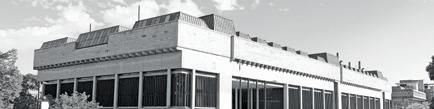
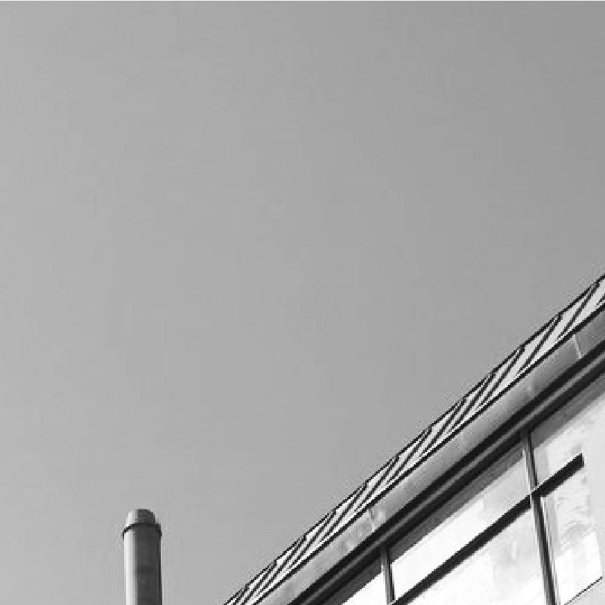
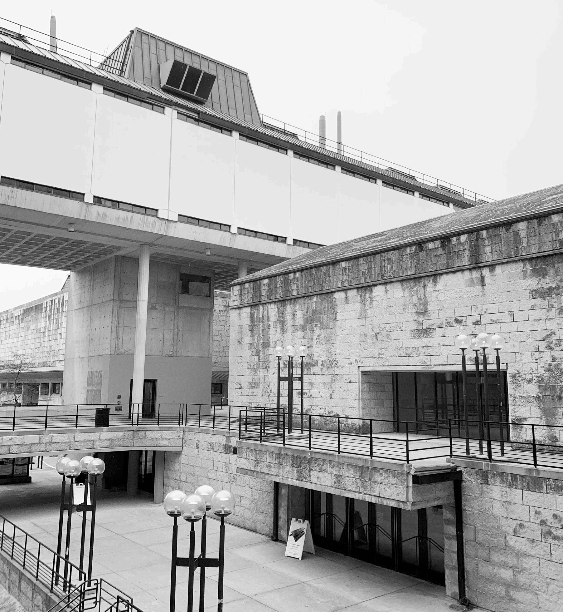
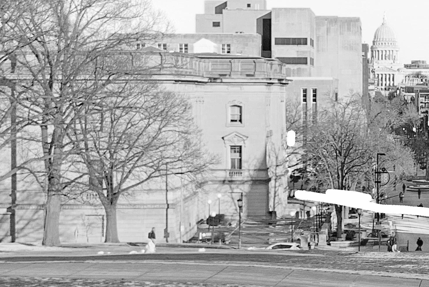
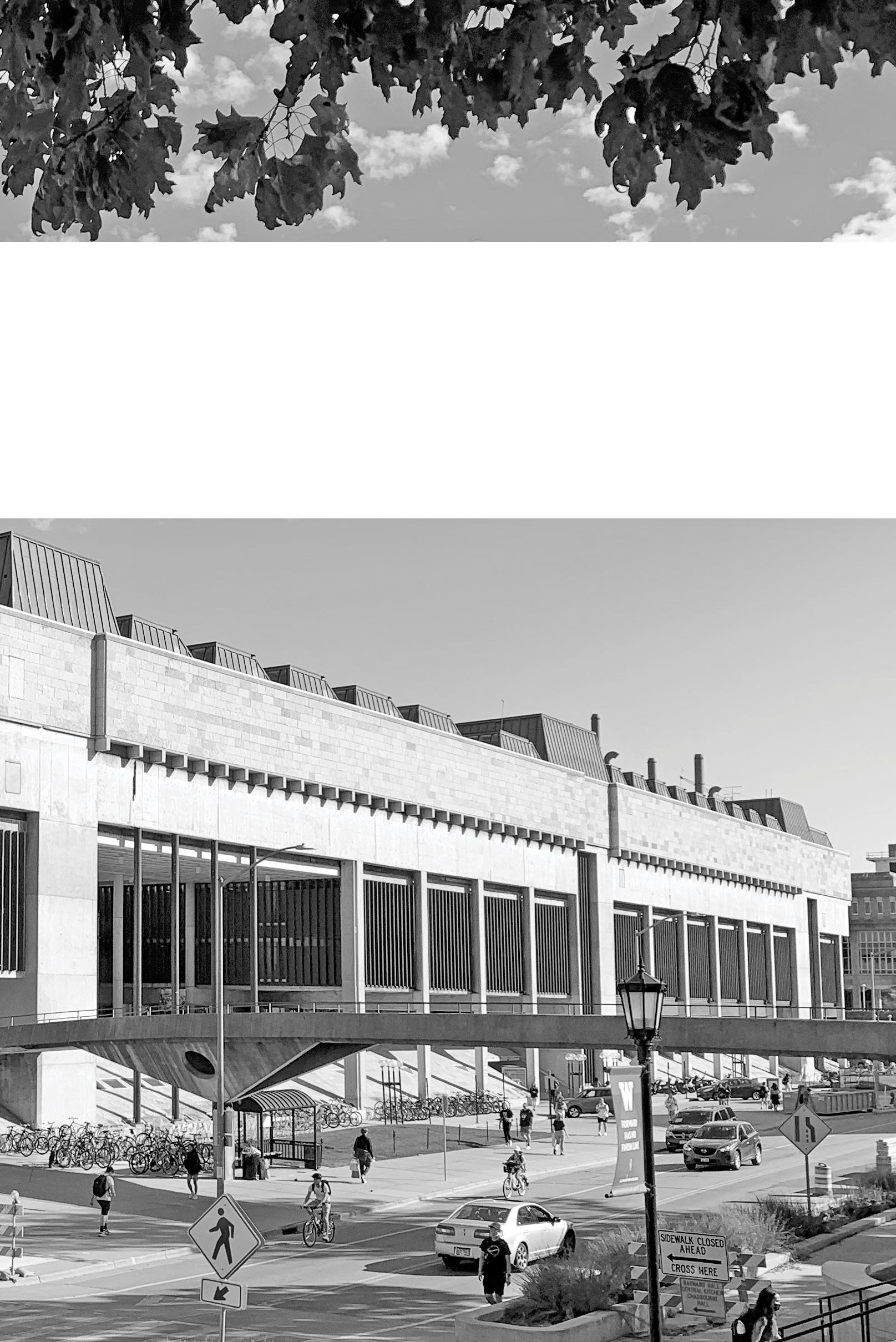
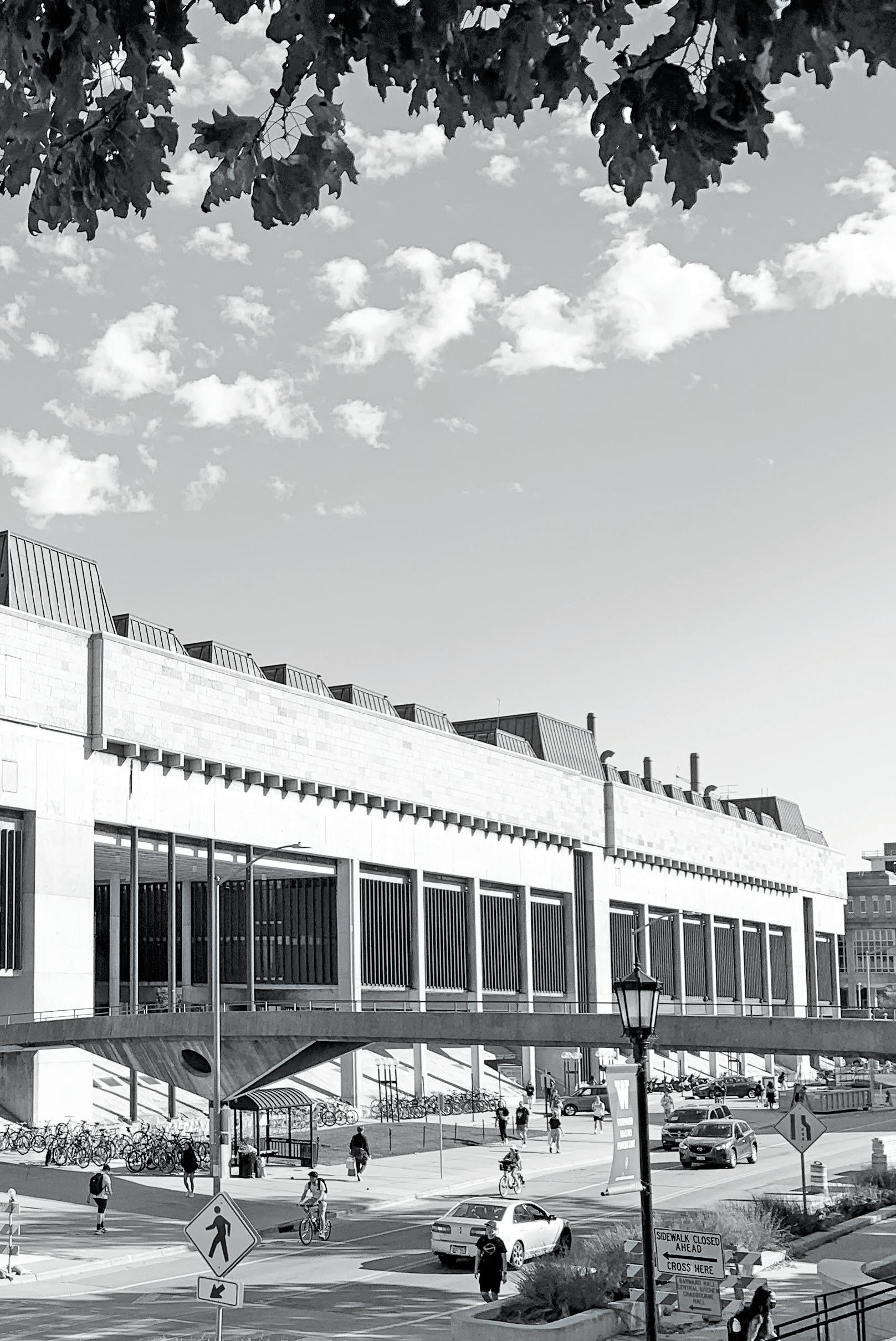
n the campus of the University of Wisconsin – Madison, at the corner of North Park Street and University Avenue, stands a building that houses the art department, history department, and music department under one roof. This building is named the George L Mosse Humanities Building but is commonly referred to as either the “Humanities Building” or simply “Humanities” by many students, faculty, and staff. It is a very maligned building in the city of Madison. It sits on one of the busiest roads in downtown Madison, Wisconsin, and every day there are thousands of people who pass the seven-story structure and carry their own opinions.
To say that public opinion of the building is varied is an understatement – a quick read of the building’s Google Reviews will both confirm this and entertain you. Further, there are many rumors and countless opinions, that come from people who range from everyday users of the space to the mere passers-by. The strongest opinions on the building come from users who loathe the space. It is more strongly disliked than it is strongly appreciated – or maybe those who dislike it are just louder. Most commonly, these frustrations come from people having difficulty navigating the structure. Admittedly, the layout is confusing. The main entrance is not intuitively located on any exterior side of the building but rather along an inner corridor. Further,
“ IT IS MORE STRONGLY DISLIKED THAN IT IS STRONGLY APPRECITATED
not every part of the building can be accessed from any entrance and you might need to exit the building and enter through a different door to get to where you need to go. Not to mention that there is not one singular working elevator that stops on every floor. Evidently, from the few details provided, it is clear how quickly the structure can become difficult to navigate.
In 1969 the building was completed and officially opened. From its inception, the project was riddled with problems. The story that leads up to the construction of the building is interesting as it shows how the project evolved. There have been many modifications to the space and the scars around the building serve as a record of these changes – slightly different for each generation of students. Then again, no building is “done” until it is demolished.
Today there are people who appreciate it, and those that despise it daily. It has its shortcomings in terms of function while having architectural aspects that can be appreciated. Experiencing and studying the unique features of the building can be subject to a changed perspective. But at the end of the day, no matter if something stands out in infamy or as an icon, it is nonetheless capturing your attention for one reason or another.
verything that does not come directly from nature was imagined, designed, and created by someone. This person, or people, brought their lived experiences to their work, which means there is context to the way they were thinking – context relating to how they imagined the world and the potential for our built environment. If the things in our physical world are the what, this context is the why.
Every building that has ever existed was once imagined, then designed, and then built by someone and there is context to explain why certain buildings look the way they do. In the story of the George L Mosse Humanities Building, there is an incredible amount of information that can be studied. From the needs of the university, to the year it was built, to the architect, to the funding available, these are all relevant to why the building looks how we see it today.
“THERE IS CONTEXT TO EXPLAIN WHY CERTAIN BUILDINGS LOOK THE WAY THEY DO
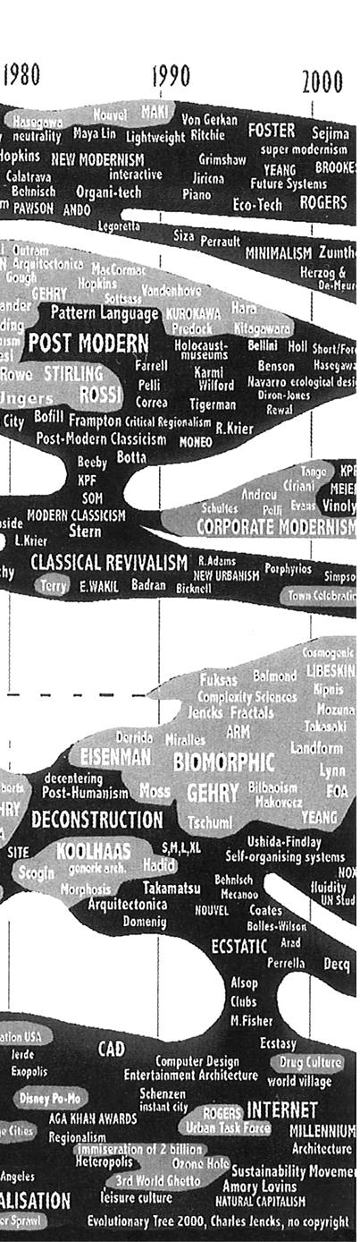
In the big picture of architectural history, there are many theories of how this history progresses. Some seem to argue that architectural history flows linearly. That styles are constantly building off of what came before them and progress only forward. Others, like architectural historian and landscape architect Charles Jencks, believe that the history of architecture flows more organically with overlapping ideas that exist in a more complex way.
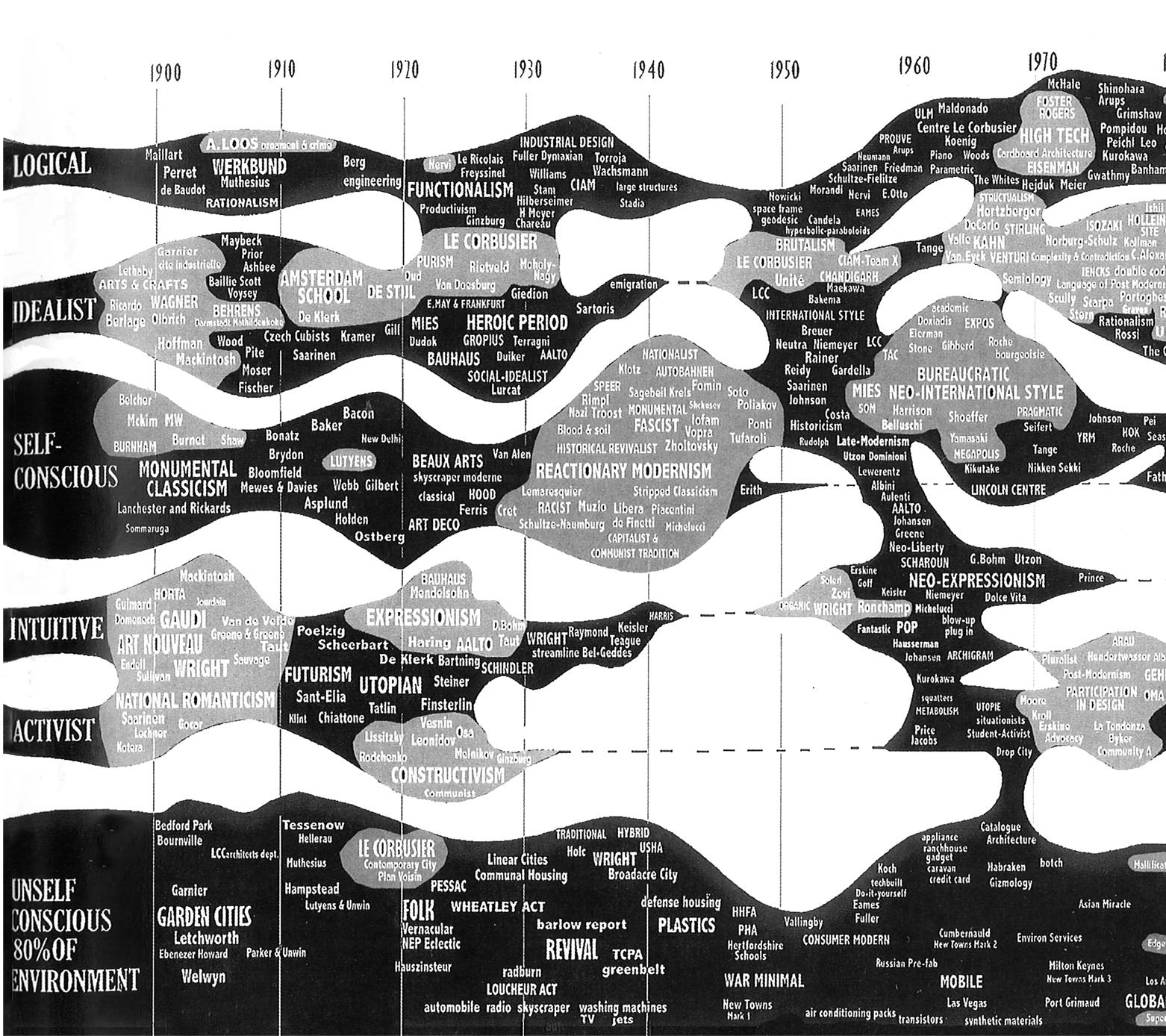
In the case of the George L Mosse Humanities building, this structure is often considered a work of Brutalist Architecture due to its exposed concrete, sculptural nature, and heavy presence. Brutalist architecture is partially an ideology that strives to create community through open spaces, and partially an aesthetic that can be classified visually. In relation to Jenck’s diagram, it sits somewhere between logical and idealist. The style known as Brutalist originated in the 1950s as a postwar aesthetic that strived to be a solution for urban reconstruction. The wide intentions of this style were to create public spaces that were made of common materials and free of ornamentation commonly seen in classical architecture.
In July of 2000, architectural critic, Charles Jencks, released this diagram in an issue of AR and theorized the history of 20th century architecture. This diagram speaks to how architecture can ba categorized and connected to each other. The negative space, or lack thereof, serves to show distinct separations or connections between ideas and aesthetics.
One of the earliest documents relating to its existence was The New Brutalism by Reyner Banham. In this publication, Banham describes this style of architecture as memorability as image, exhibition of structure, and materials as found. These three characteristics are important in determining what is classified as Brutalist Architecture and what is not. In today’s terms and by this definition, The George L Mosse Humanities Building is considered Brutalist Architecture.

To try and explain the style of Brutalist Architecture is a rabbit hole that is only adjacent to the topic of the Humanities building. Nonetheless, understanding Brutalism can help develop an appreciation for the Humanities. There are experts and historians that devote their careers to defining architecture. In December of 1955, the aforementioned Reyner Banham, a renowned architectural critic, published The New Brutalism in an issue of Architectural Review. This article pre-dated his later book on the subject but would serve to define Brutalism for years to come.
THE FOLLOWING PAGES HIGHLIGHT (IN GREEN) SOME OF THE MOST IMPORTANT PARTS OF “THE NEW BRUTALISM” BY REYNER BANHAM. IT WAS PUBLISHED IN ARCHITECTURE REVIEW IN 1955 AND IS ONE OF THE FIRST DOCUMENTS THAT DEFINES THE STYLE OF BRUTALIST ARCHITECTURE. THESE HIGHLIGHTED EXERPTS AIM TO SIMPLIFY AND DECODE THE LONG, COMPLEX, ESSAY ORIGINALLY WRITTEN WITH LANGUAGE FOR OTHER ARCHITECTS. THE REMAINING COPY IS INTENTIONALLY LESS-LEGIBLE AS A MEANS TO SAVE YOU FROM THE FORMALITIES OF WRITING IN THE MORE ACCADEMIC WORLD.
ntroduce an observer into any field of forces, influences or communications and that field becomes distorted. It is common opinion that Das Kapital has played old harry with capitalism, so that Marxists can hardly recognize it when they see it, and the widespread diffusion of Freud’s ideas has wrought such havoc with clinical psychology that any intelligent patient can make a nervous wreck of his analyst. What has been the influence of contemporary architectural historians on the history of contemporary architecture?
They have created the idea of a Modem Movement – this was known even before Basil Taylor took up arms against false historicism and beyond that, they have offered a rough classification of the ‘isms’ which are the thumbprint of Modernity into two main types: One, like Cubism, is a label, a recognition tag, applied by critics and historians to a body of work which appears to have certain consistent principles running through it, whatever the relationship of the artists; the other, like Futurism, is a banner, a slogan, a policy consciously adopted by a group of artists, whatever the apparent similarity or dissimilarity of their products. And it is entirely characteristic of the New Brutalism – our first native art movement since the New Art-History arrived here that it should confound these categories and belong to both at once. Is Art History to blame for this? Not in any obvious way, but in practically every other way. One cannot begin to study the New Brutalism without realizing how deeply the New Art-History has bitten into progressive English architectural thought, into teaching methods, into the common language of communication between architects and between architectural critics. What is interesting about R. Furneaux Jordan’s Parthian footnote on the New Brutalism‘… Lubetkin talks across time to the great masters, the Smithsons talk only to each other’s, not the fact that it is nearly true, and thus ruins his argument, but that its terms of valuation are historical. The New Brutalism has to be seen against the background of the recent history of history, and, in particular, the growing sense of the inner history of the Modern Movement itself.
The history of the phrase itself is revealing. Its form is derived from THE ARCHITECTURAL REVIEW’S postwar trouvaille ‘The New Empiricism,’ a term which was intended to describe visible tendencies in Scandinavian architecture to diverge from another historical concept ‘The International Style.’ This usage, like any involving the word new, opens up a historical perspective. It postulates that an old empiricism can be identified by the historian and that the new one can be distinguished from it by methods of historical comparison, which will also distinguish it from a mere ‘Empirical Revival.’ The ability to deal with such fine shades of
historical meaning is in itself a measure of our handiness with the historical method today, and the use of phrases of the form ‘The New Xism’ – where X equals any adjectival root became commonplace in the early nineteen-fifties in fourth-year studios and other places where architecture is discussed, rather than practiced.
The passion of such discussion has been greatly enhanced by the clarity of its polarization Communists versus the Rest and it was somewhere in this vigorous polemic that the term The New Brutalism was first coined. It was, in the beginning, a term of Communist abuse, and it was intended to signify the normal vocabulary of Modern architecture flat roofs, glass, exposed structure considered as morally reprehensible deviations from ‘The New Humanism,’ a phrase which means something different in Marxist hands to the meaning which might be expected. The New Humanism meant, in architecture at that time brickwork, segmental arches, pitched roofs, small windows (or small panes at any rate) picturesque detailing without picturesque planning. It was, in fact, the so-called ‘William Morris Revival,’ now happily defunct, since Kruschev’s reversal of the Party’s architectural line, though this reversal has, of course, taken the guts out of subsequent polemics. But it will be observed that The New Humanism was again a quasi-historical concept, oriented, however spuriously, toward that mid-nineteenth century epoch which was Marxism’s Golden Age, when you could recognize a capitalist when you met him.
However, London architectural circles are a small field in which to conduct a polemic of any kind, and abuse must be directed at specific persons, rather than classes of persons, since there was rarely enough unanimity (except among Marxists) to allow a class to coalesce. The New Brutalists at whom Marxist spite was directed could be named and recognized and so could their friends in other arts. The term had no sooner got into public circulation than its meaning began to narrow.
Among the non-Marxist grouping there was no particular unity of programme or intention, but there was a certain community of interests, a tendency to look toward Le Corbusier, and to be aware of something called le beton brut, to know the quotation which appears at the head of this article and, in the case of the more sophisticated and aesthetically literate, to know of the Art Brut of Jean Dubuffet and his connection in Paris. Words and ideas, personalities and discontents chimed together and in a matter of weekslong before the Third Programme and the monthlies had got hold of the phrase it had been appropriated as their own, by their own desire and public consent, by two young architects, Alison and Peter Smithson.
The phrase had thus changed both its meaning and its usage. Adopted as something between a slogan and a brickbat flung in the public’s face, The New Brutalism ceased to be a label descriptive of a tendency common to most modern architecture, and became instead a programme, a banner, while retaining some rather restricted sense as a descriptive label. It is because it is both kinds of ism at once that The New Brutalism eludes precise description, while remaining a living force in contemporary British architecture.
As a descriptive label it has two overlappings, but not identical, senses. Non architecturally it describes the art of Dubuffet, some aspects of Jackson Pollock and of Appel, and the burlap paintings of Alberto Burriamong foreign artists and, say, Magda Cordell or Edouardo Paolozzi and Nigel Henderson among English artists. With these last two, the Smithsons collected and hung the I.C.A. exhibition Parallel of Life and Art, which, though it probably preceded the coining of the phrase, is nevertheless regarded as a locus classicus of the movement.
The more instructive aspects of this exhibition will be considered later: for the moment let us observe that many critics (and students at the Architectural Association) complained of the deliberate flouting of the traditional concepts of photographic beauty, of a cult of ugliness, and ‘denying the spiritual in Man.’ The tone of response to The New Brutalism existed even before hostile critics knew what to call it, and there was an awareness that the Smithsons were headed in a different direction to most other younger architects in London. Alison Smithson first claimed the words in public as her own in a description of a project for a small house in Soho (Architectural Design, November, 1953) designed before the phrase existed, and previously tagged ‘The warehouse aesthetic’a very fair description of what The New Brutalism stood for in its first phase. Of this house, she wrote: ‘… had this been built, it would have been the first exponent of the New Brutalism in England, as the preamble to the specification shows: “It is our intention in this building to have the structure exposed entirely, without interior finishes wherever practicable. The contractor should aim at a high standard of basic construction, as in a small warehouse”.’
The publication of this project led to an extensive and often hilarious correspondence in various periodicals through the summer of 1954, a correspondence which wandered further and further from its original point because most writers were in fact discussing either the exhibition Parallel of Life and Art, or the (as yet) unpublished school at Hunstanton. When this was finally published (AR, September, 1954) the discussion took a sharper and less humorous tone, for here in three-dimensional and photographic reality, and in the classic Modern Movement materials of concrete, steel and glass, was the Smithsons’ only completed building. The phrase The New Brutalism was immediately applied to it, though it had been designed in the spring of 1950, long before even the house in Soho, but the Brutalists themselves have accepted this appellation, and it has become the tag for Hunstanton wherever the building has been discussed.
Hunstanton, and the house in Soho, can serve as the points of architectural reference by which The New Brutalism in architecture may be defined. What are the visible and identifiable characteristics of these two structures? Both have formal, axial plans – Hunstanton, in fact, has something like true biaxial symmetry, and the small Gymnasium block alongside the school is a kind of exemplar in little of just how formal the complete scheme was to have been and this formality is immediately legible from without. Both exhibit their basic structure, and both make a point of exhibiting their materials in fact, this emphasis on basic structure is so obsessive that many superficial critics have taken this to be the whole of New Brutalist Architecture.
Admittedly, this emphasis on basic structure is important, even if it is not the whole story, and what has caused Hunstanton to lodge in the public’s gullet is the fact that it is almost unique among modern buildings in being made of what it appears to be made of. Whatever has been said about honest use of materials, most modern buildings appear to be made of whitewash or patent glazing, even when they are made of concrete or steel. Hunstanton appears to be made of glass, brick, steel and concrete, and is in fact made of glass, brick, steel and concrete. Water and electricity do not come out of unexplained holes in the wall, but are delivered to the point of use by visible pipes and manifest conduits. One can see what Hunstanton is made of, and how it works, and there is not another thing to see except the play of spaces.
This ruthless adherence to one of the basic moral imperatives of the Modern Movement honesty in structure and material has precipitated a situation to which only the pen of Ibsen could do justice. The mass of moderate architects, homes, moyens, sensuels, have found their accepted, practices for waiving the requirements of the conscience code suddenly called in question; they have been put rudely on the spot, and they have not liked the experience. Of course, it is not just the building itself which has precipitated this situation, it is the things the Brutalists have said and done as well, but, as with the infected Spa in An Enemy of the People, the play of personalities focuses around a physical object.
The qualities of that object may be summarized as follows: 1, Formal legibility of plan; 2, clear exhibition of structure, and 3, valuation of materials for their inherent qualities ‘as found.’ This summary can be used to answer the question: Are there other New Brutalist buildings besides Hunstanton? It is interesting to note that such a summary of qualities could be made to describe Marseilles, Promontory and Lakeshore apartments, General Motors Technical Centre, much recent Dutch work and several projects by younger English architects affiliated to ClAM. But, with the possible exception of Marseilles, the Brutalists would probably reject most of these buildings from the canon, and so must we, for all of these structures exhibit an excess of suaviter in modo, even if there is plenty of fortiter in re about them. In the last resort what characterizes the New Brutalism in architecture as in painting is precisely its brutality, its jem’en foutisme, its bloody-mindedness.
Only one other building conspicuously carries these qualities in the way that Hunstanton does, and that is Louis Kahn’s Yale Art Centre. Here is a building which is uncompromisingly frank about its materials, which is inconceivable apart from its boldly exhibited structural method which being a concrete spaceframe is as revolutionary and unconventional as the use of the Plastic Theory in stressing Hunstanton’s steel H-frames. Furthermore, the plan is very formal in the disposition of its main elements, and makes a kind of symmetry about two clearly defined axes at right angles to one another. And this is a building which some Brutalists can apparently accept as a constituent New Brutalist structure.
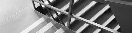
But, with all due diffidence, the present author submits that it still does not quite answer to the standard set by Hunstanton. For one thing, the Smithsons’ work is characterized by an abstemious under-designing of the details, and much of the impact of the building comes from the ineloquence, but absolute consistency, of such components as the stairs and handrails. By comparison, Kahn’s detailing is arty, and the stair rail and balustrading (if that is the word for stainless netting) is jarringly out of key with the rough-shuttered concrete of the main structure. This may be ‘only a matter of detailing’ but there is another shortfall about Yale Art Centre which could not be brushed off so easily.
Every Smithson design has been, obviously or subtly, a coherent and apprehensible visual entity, but this Louis Kahn’s design narrowly fails to be. The internal spaces will be cluttered with display screens which, in the nature of his programme and his solution of it, must be susceptible of being moved, so that formal clarity is always threatened. But beyond this the relation of interior to exterior fails to validate the axes which govern the plan. Available viewpoints, the placing of the entrances, the handling of the exterior walls all tend to lose or play down the presence of planning axes. No doubt there are excellent functional reasons for the doors being where they are, and excellent structural reasons for the walls being treated in the way they are – but if these reasons were so compelling, why bother with an axial plan anyhow?
This is a hard thing to have to say about a seriously considered building by a reputable architect of some standing, but contact with Brutalist architecture tends to drive one to hard judgments, and the one thing of which the Smithsons have never been accused is a lack of logic or consistency in thinking through a design. In fact it is the ruthless logic more than anything else which most hostile critics find distressing about Hunstantonor perhaps it is the fact that this logic is worn on the sleeve. One of the reasons for this obtrusive logic is that it contributes to the apprehensibility and coherence of the building as a visual entity, because it contributes to the building as ‘an image.’
An Image – with the utterance of these two words we bridge the gap between the possible use of The New Brutalism as a descriptive label covering, in varying degrees of accuracy, two or more buildings, and The New Brutalism as a slogan, and we also go some way to bridge the gap between the meaning of the term as applied to architecture and its meaning as applied to painting and sculpture. The word image in this sense is one of the most intractable and the most useful terms in contemporary aesthetics, and some attempt to explain it must be made.
A great many things have been called ‘an image’ S. M. della Consolazione at Todi, a painting by Jackson Pollock, the Lever Building, the 1954 Cadillac convertible, the roofscape of the Unité at Marseilles, any of the hundred photographs in Parallel of Life and Art. ‘Image’ seems to be a word that describes anything or nothing. Ultimately, however, it means something which is visually valuable, but not necessarily by the standards of classical aesthetics.
Where Thomas Aquinas supposed beauty to be quod visum placet (that which seen, pleases), image may be defined as quod visum perturbat that which seen, affects the emotions, a situation which could subsume the pleasure caused by beauty, but is not normally taken to do so, for the New Brutalists’ interests in image are commonly regarded, by many of themselves as well as their critics, as being anti-art, or at any rate anti-beauty in the classical aesthetic sense of the word. But what is equally as important as the specific kind of response, is the nature of its cause. What pleased St. Thomas was an abstract quality, beauty what moves a New Brutalist is the thing itself, in its totality, and with all its overtones of human association. These ideas of course lie close to the general body of anti-Academic aesthetics currently in circulation, though they are not to be identified exactly with Michel Tapie’s concept of un Art Autre, even though that concept covers many Continental Brutalists as well as Edouardo Paolozzi.
Nevertheless this concept of Image is common to all aspects of The New Brutalism in England, but the manner in which it works out in architectural practice has some surprising twists to it. Basically, it requires that the building should be an immediately apprehensible visual entity; and that the form grasped by the eye should be confirmed by experience of the building in use. Further, that this form should be entirely proper to the functions and materials of the building, in their entirety. Such a relationship between structure, function and form is the basic commonplace of all good building of course, the demand that this form should be apprehensible and memorable is the apical uncommon place which makes good building into great architecture.
The fact that this form-giving obligation has been so far forgotten that a great deal of good building can be spoken of as if it were architecture, is a mark of a seriously decayed condition in English architectural standards. It has become too easy to get away with the assumption that if structure and function are served then the result must be architecture so easy that the meaningless phrase ’ the conceptual building’ has been coined to defend the substandard architectural practices of the routine-functionalists, as if ‘conceptual buildings’ were something new, and something faintly reprehensible in modern architecture.
All great architecture has been ‘conceptual,’ has been image-making and the idea that any great buildings, such as the Gothic Cathedrals, grew unconsciously through anonymous collaborative attention to structure and function is one of the most insidious myths with which the Modern Movement is saddled. Every great building of the Modern Movement has been a conceptual design, especially those like the Bauhaus, which go out of their way to look as if they were the products of ‘pure’ functionalism, whose aformal compositions are commonly advanced by routine-functionalists in defence of their own abdication of architectural responsibility. But a conceptual building is as likely to be aformal as it is to be formal, as a study of the Smithsons’ post-Hunstanton projects will show.
Hunstanton’s formality is unmistakably Miesian, as Philip Johnson pointed out, possibly because lIT. was one of the few recent examples of conceptual, form-giving design to which a young architect could turn at the time of its conception, and the formality of their Coventry Cathedral competition entry is equally marked, but here one can safely posit the interference of historical studies again, for, though the exact priority of date as between the Smithsons’ design and the publication of Professor Wittkower’s Architectural Principles of the Age of Humanism is disputed (by the Smithsons) it cannot be denied that they were in touch with Wittkowerian studies at the time, and were as excited by them as anybody else.
The general impact of Professor Wittkower’s book on a whole generation of postwar architectural students is one of the phenomena of our time. Its exposition of a body of architectural theory in which function and form were significantly linked by the objective laws governing the Cosmos (as Alberti and Palladio understood them) suddenly offered a way out of the doldrum of routine-functionalist abdications, and neo-Palladianism became the order of the day. The effect of Architectural Principles has made it by far the most important contribution for evil as well as goodby any historian to English Architecture since Pioneers of the Modern Movement, and it precipitated a nice disputation on the proper uses of history. The question became: Humanist principles to be followed? or Humanist principles as an example of the kind of principles to look for? Many students opted for the former alternative, and Routine Palladians soon became as thick on the ground as Routine-Functionalists. The Brutalists, observing the inherent risk of a return to pure academicism-more pronounced at Liverpool than at the AA-sheered off abruptly in the other direction and were soon involved in the organization of Parallel of Life and Art.
Introducing this exhibition to an AA student debate Peter Smithson declared: ‘We are not going to talk about proportion and symmetry’ and this was his declaration of war on the inherent academicism of the neo-Palladians, and the anti-Brutalist section of the house made it clear how justified was this suspicion of cryptoacademicism by taking their stand not only on Palladio and Alberti but also on Plato and the Absolute.
The new direction in Brutalist architectural invention showed at once in the Smithsons’ Golden Lane and Sheffield University competition entries. The former, only remembered for having put the idea of the streetdeck back in circulation in England, is notable for its determination to create a coherent visual image by nonformal means, emphasizing visible circulation, identifiable units of habitation, and fully validating the presence of human beings as part of the total image the perspectives had photographs of people posted on to the drawings, so that the human presence almost overwhelmed the architecture.
But the Sheffield design went further even than this and aformalism becomes as positive a force in its composition as it does in a painting by Burri or Pollock. Composition might seem pretty strong language for so apparently casual a layout, but this is clearly not an ‘unconceptual’ design, and on examination it can be shown to have a composition, but based not on the elementary rule-and-compass geometry which underlies most architectural composition, so much as an intuitive sense of topology.
As a discipline of architecture topology has always been present in a subordinate and unrecognized way qualities of penetration, circulation, inside and out, have always been important, but elementary Platonic geometry has been the master discipline. Now, in the Smithsons’ Sheffield project the roles are reversed, topology becomes the dominant and geometry becomes the subordinate discipline. The ‘connectivity’ of the circulation routes is flourished on the exterior and no attempt is made to give a geometrical form to the total scheme; large blocks of topologically similar spaces stand about the site with the same graceless memorability as Martello towers or pit headgear.
Such a dominance accorded to topology in whose classifications a brick is the same ‘shape’ as a billiard ball (unpenetrated solid) and a teacup is the same ‘shape’ as a gramophone record (continuous surface with one hole) is clearly analogous to the displacement of Tomistic ‘beauty’ by Brutalist ‘Image,’ and Sheffield remains the most consistent and extreme point reached by any Brutalists in their search for Une Architecture Autre. It is not likely to displace Hunstanton in architectural discussions as the prime exemplar of The New Brutalism, but it is the only building – design which fully matches up to the threat and promise of Parallel of Life and Art.
And it shows that the formal axiality of Hunstanton is not integral to New Brutalist architecture. Miesian or Wittkowerian geometry was only an ad hoc device for the realization of ‘Images,’ and when Parallel of Life and Art had enabled Brutalists to define their relationship to the visual world in terms of something other than geometry, then formality was discarded. The definition of a New Brutalist building derived from Hunstanton and Yale Art Centre, above, must be modified so as to exclude formality as a basic quality if it is to cover future developments and should more properly read: 1, Memorability as an Image; 2, Clear exhibition of Structure; and 3, Valuation of Materials ‘as found.’ Remembering that an Image is what affects the emotions, that structure, in its fullest sense, is the relationship of parts, and that materials ‘as found’ are raw materials, we have worked our way back to the quotation which headed this article ‘L’ Architecture, c’est, avec des Matieres Bruts, etablir des rapports emouvants [Architecture is, with Raw Materials, establishing moving relationships] but we have worked our way to this point through such an awareness of history and its uses that we see that The New Brutalism, if it is architecture in the grand sense of Le Corbusier’s definition, is also architecture of our time and not of his, nor of Lubetkin’s, nor of the times of the Masters of the past. Even if it were true that the Brutalists speak only to one another, the fact that they have stopped speaking to Mansart, to Palladio and to Alberti would make The New Brutalism, even in its more private sense, a major contribution to the architecture of today.
LOOKING INTO THE NEEDS OF THE UNIVERSITY IN THE LATE 1950s AND HOW THIS IMPACTED THE INSEPTION OF THE BUILDING WE SEE TODAY.
ith the end of World War II, there was a global trend in production and rehabilitation. New buildings were being built across Europe to create housing solutions and rebuild cities that were lost to war. Across the United States, many science-related university buildings were constructed as the United States looked to both expand studies in the related fields and create opportunities for a growing population. The addition of the GI Bill created further expansion as veterans and their families came to campus seeking academia. This cross between a growing population and heavy emphasis on science buildings at a rate of five to one between 1940 and 1960, presented a problem for UW Madison and compensation of space for the humanities studies.
In 1959, the University of Wisconsin-Madison was planning for its future. The campus architect at the time, Leo Jakobson, called for a campus plan that would reflect the advanced architectural thinking of the time. As the campus grew in terms of admission numbers and the available room quickly shrunk, the need for more space became increasingly clear. The art department needed a space that would allow proper ventilation for hazardous materials, the history department needed their own building as they were, then, scattered in buildings across campus, and the music department needed more space for practicing and performing.
“
A CAMPUS PLAN THAT WOULD REFLECT THE ADVANCED ARCHITECUTRAL THINKING OF THE TIME
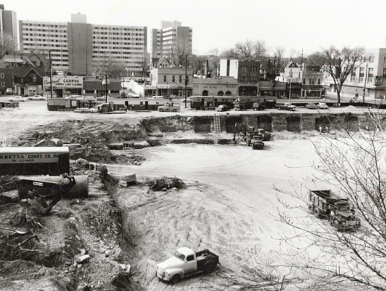
In 1961, the University conducted a study that determined their options, or lack thereof, in expanding the campus to accommodate the projected rise in student body population and the need for adequate space for the Art, Music, and History Departments. The 1961 study determined that the area known, at the time, as Sterling Court would be the relative only option for expansion. Sterling court contained mostly student housing and was mostly a cultural spot for Greek Life and other incidents of fraternization and campus gossip.
With this study in 1961, began what would become known as the Southeast Lower Campus Project. In 1962, Chicago architect, Harry Weese was selected for the job. His idea for the project was to not create three high-rise buildings but to create one building that housed the three departments. Then the project progressed like most campus buildings seem to – design, bidding, and construction.
Unfortunately, the process is more complicated than the previous statement indicates and many of the problems would be financially related in an attempt to actualize the building’s potential. An important note is the fact that the project continued and only modified the design of the building as the lowest project bid came in over budget by one million dollars (upwards of ten million dollars USD in today’s terms.)
The goal to accommodate the growth of the state’s eminent university would be reached no matter the cost, and in 1969 the building completed construction. A space big enough for the three departments until the enrollment of the university reached 40,000 students. Over fifty years later the building still stands and accommodates the same three departments on a campus of over 44,000 students.
The completion of the building was something of a great feat and deserves that much recognition. Additionally, it is a unique piece of architecture. So much so that after only four years, the building was included with the Bascom Hill Historic District on the National Register of Historic Places. While most buildings are not even considered to be listed until after at least fifty years, the Humanities Building (alongside the Elvehjem Art Center) was projected to assume historical architectural significance in time, given it was the work of a major, nationally-known architect, and as a major work of modern (contemporarily speaking) architecture. Further, the fact that the design of the Humanities Building responds to the design of the neighboring Historical Society Building adds to its relative significance.
While the future of the building remains unknown, there are many conversations to be had about preserving the built environment and a structure that has impacted so many people
CONSIDERING THE MANY DECISIONS THAT GO INTO THE DESIGN OF A BUILDING AND THE ADDITIONS TO THE BUILT ENVIRONMENT
n 1963, the renowned Chicago architect Harry Weese was selected as the architect for the South East Campus Project at the University of Wisconsin – Madison. As the architect, and for this specific project, Weese had a very particular job at hand. There is a lot to consider when making a dramatic change to the built environment on a rapidly growing campus. The original vision from the university was to create three separate high-rise buildings. One building for the art department, one building for the music department, and one building for the history department.
The job of the architect, in short, is to plan and design buildings. While this is simply put, there is an almost overwhelming amount of complex concerns that the architect needs to consider to find a viable solution. There is the idea of what the building should represent, the setting where it will be added to, the site that people will be met with, the structure that holds the space, the function of users within the space, and the skin that we see on the exterior – all of these are just some of the pieces that come together to create spaces within our built environment.
“
THERE IS AN ALMOST OVERWHELMING AMOUNT OF COMPLEX CONCERNS THE ARCHITECT NEEDS TO CONSIDER”
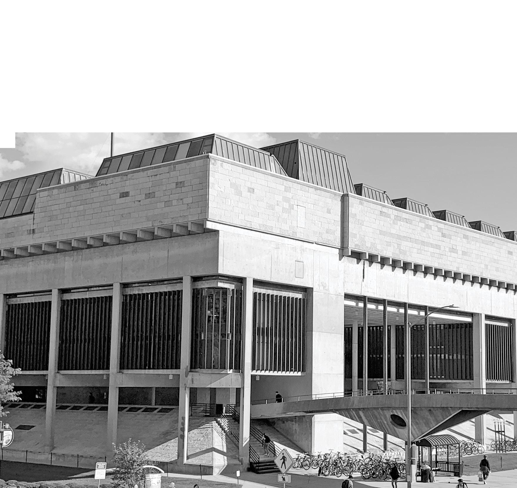
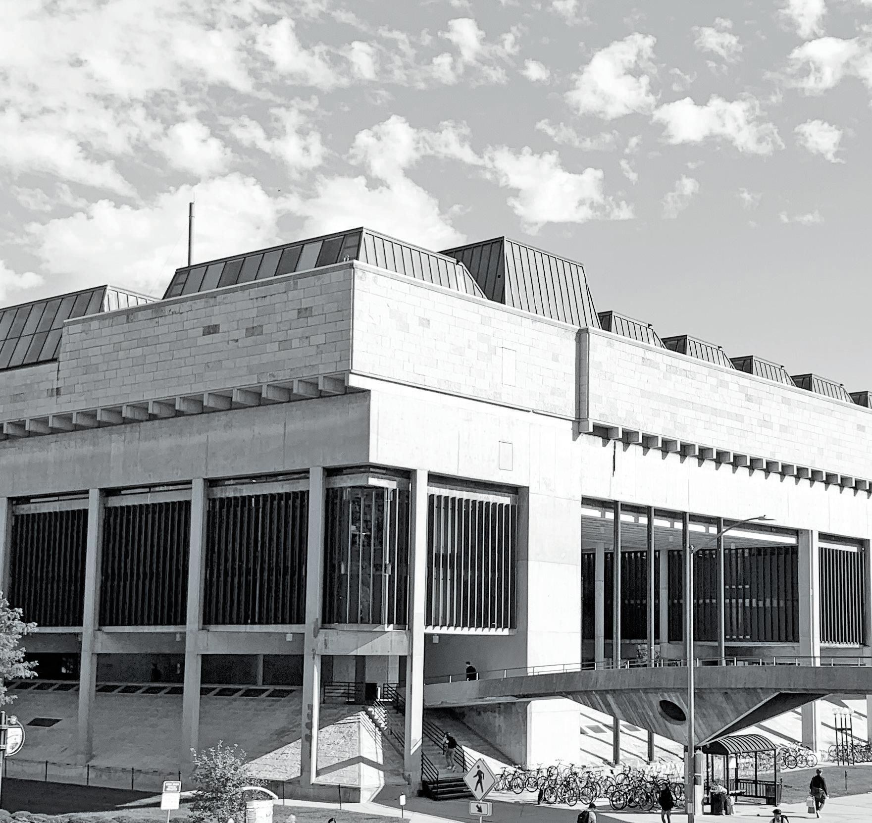
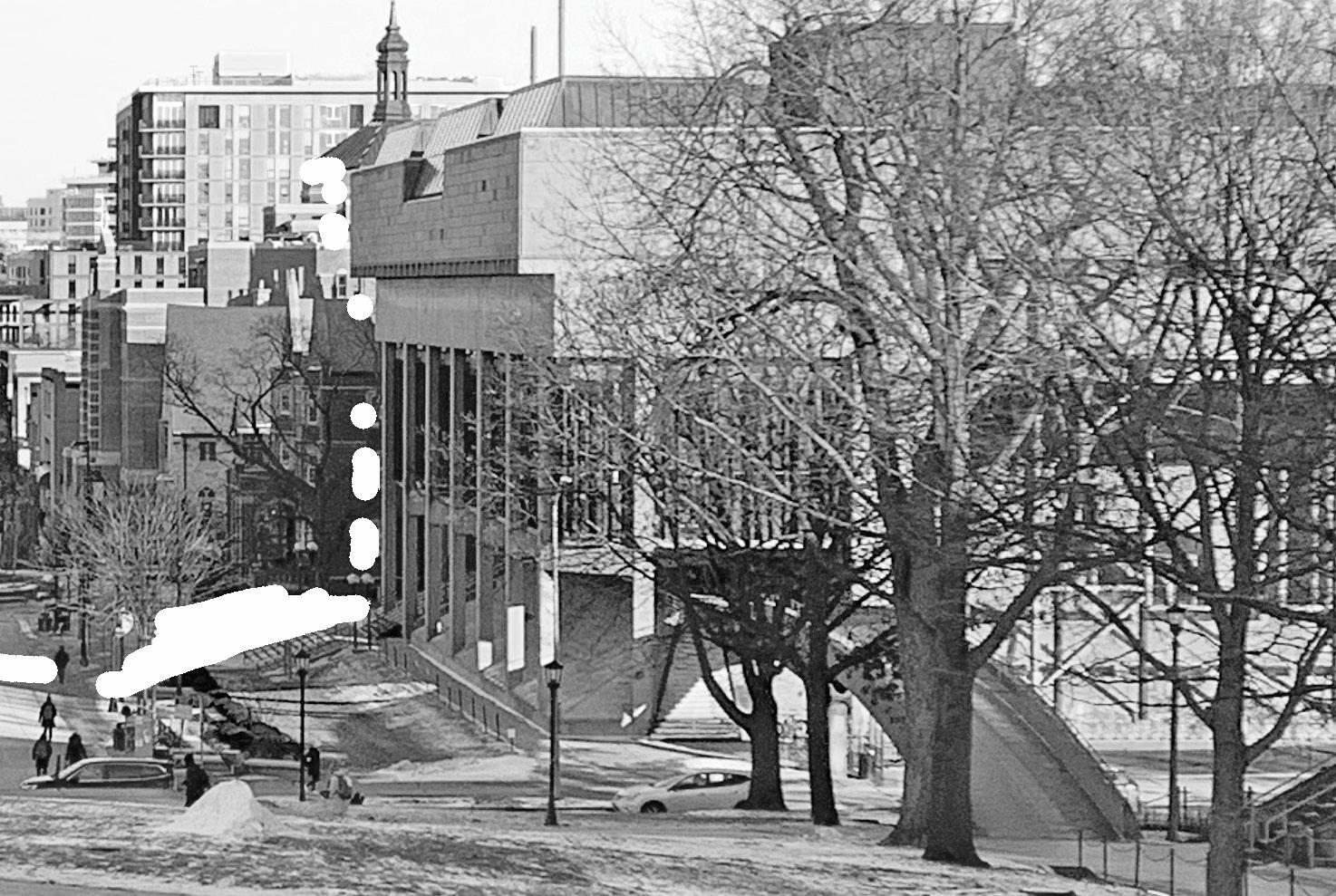
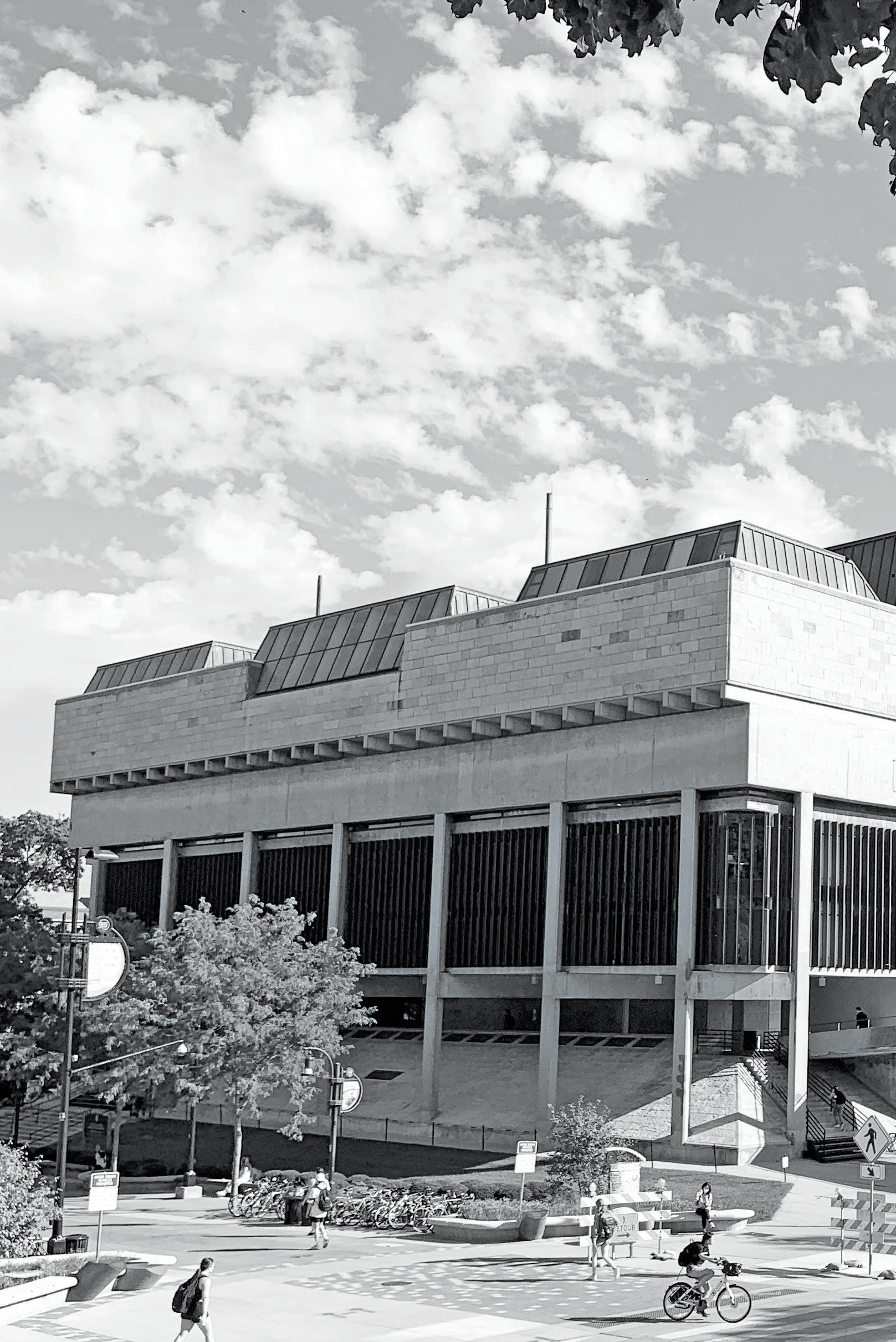
Weese and his associates considered the idea of the building and the setting quite prominently in the design of this building. The idea is that instead of having three high-rise buildings, there would instead be one wide structure that houses the three departments under one horizontal roof. This idea protects the incredibly coveted skyline of Madison and the view of the city and capital from Bascom Hill. The consideration of the setting responds to the environment and existing buildings quite perceptively. At the time of construction, the main neighboring building was the Wisconsin Historical Society. The horizontal lines of the Humanities building nearly match up to it’s closest neighbor, and in terms of the structure of the building, there is a similar composition between the two buildings. This is notable because it makes the building even more significant in terms of what it represents.
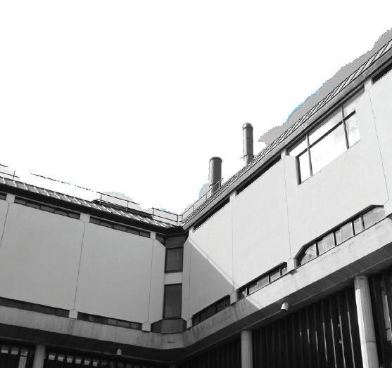
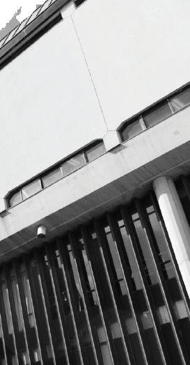
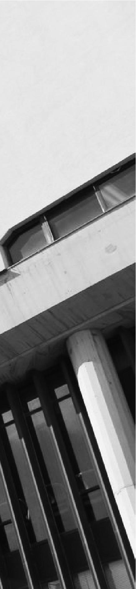
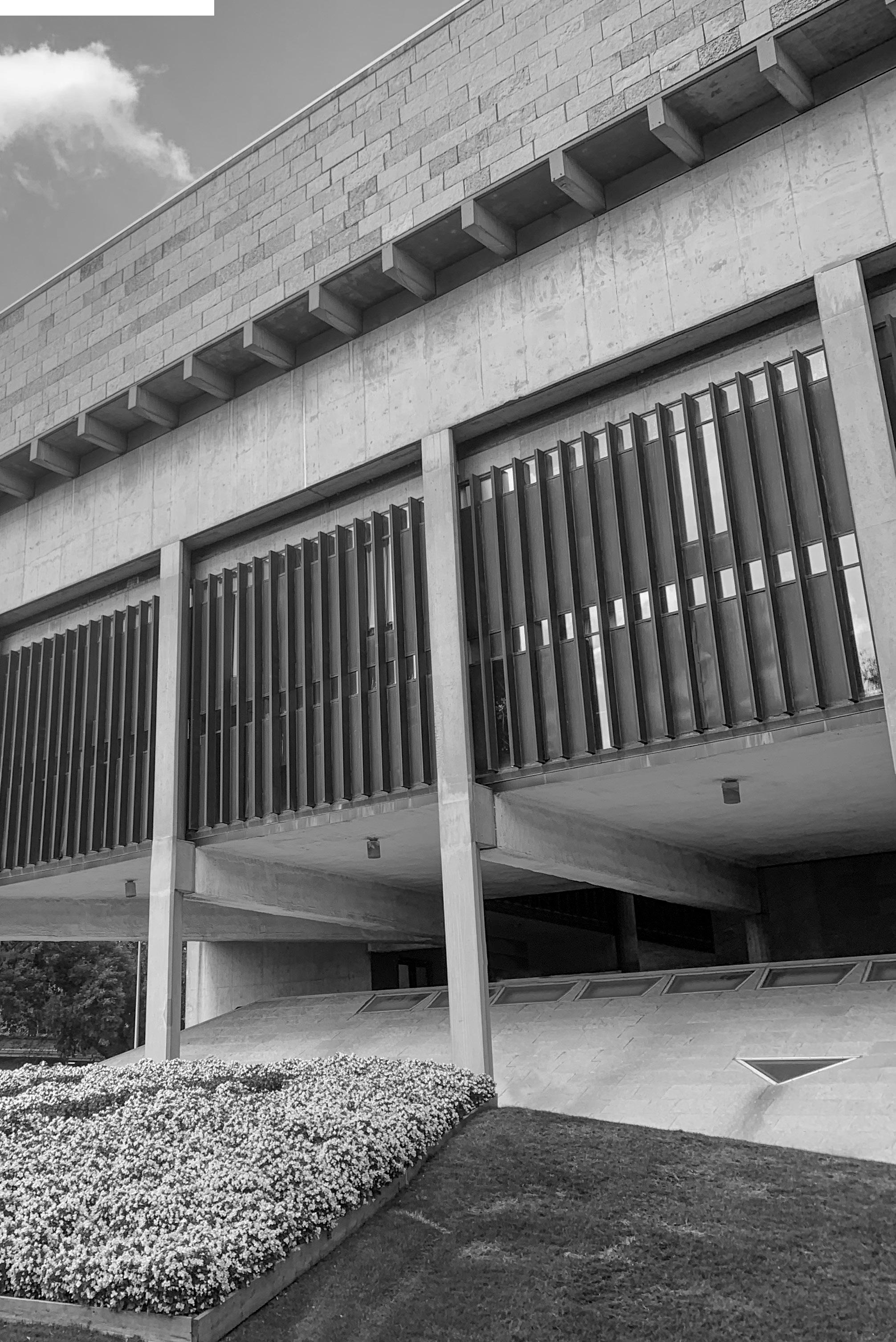
Not only is the structure worth mentioning because of its response to the setting, but there is also a level of transparency and legibility that can be seen in it’s skin. By looking at the exterior of the building we can easily see how the building is assembled. Beams extend out, supports are exposed, and the pieces seem to rest on top of each other. The simplicity of Weese’s structure aligns the building to Brutalism, but the exposed nature that adds interest, reinforces the building into simply a post-war building.
WHILE NOT PERFECT, IMAGINARY LINES CAN CONNECT THE TWO BUILDINGS ALMOST EXACTLY TO UNDERSTAND THE INTENDED RELATIONSHIP THAT EXISTS BETWEEN THE TWO STRUCTURES.
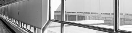
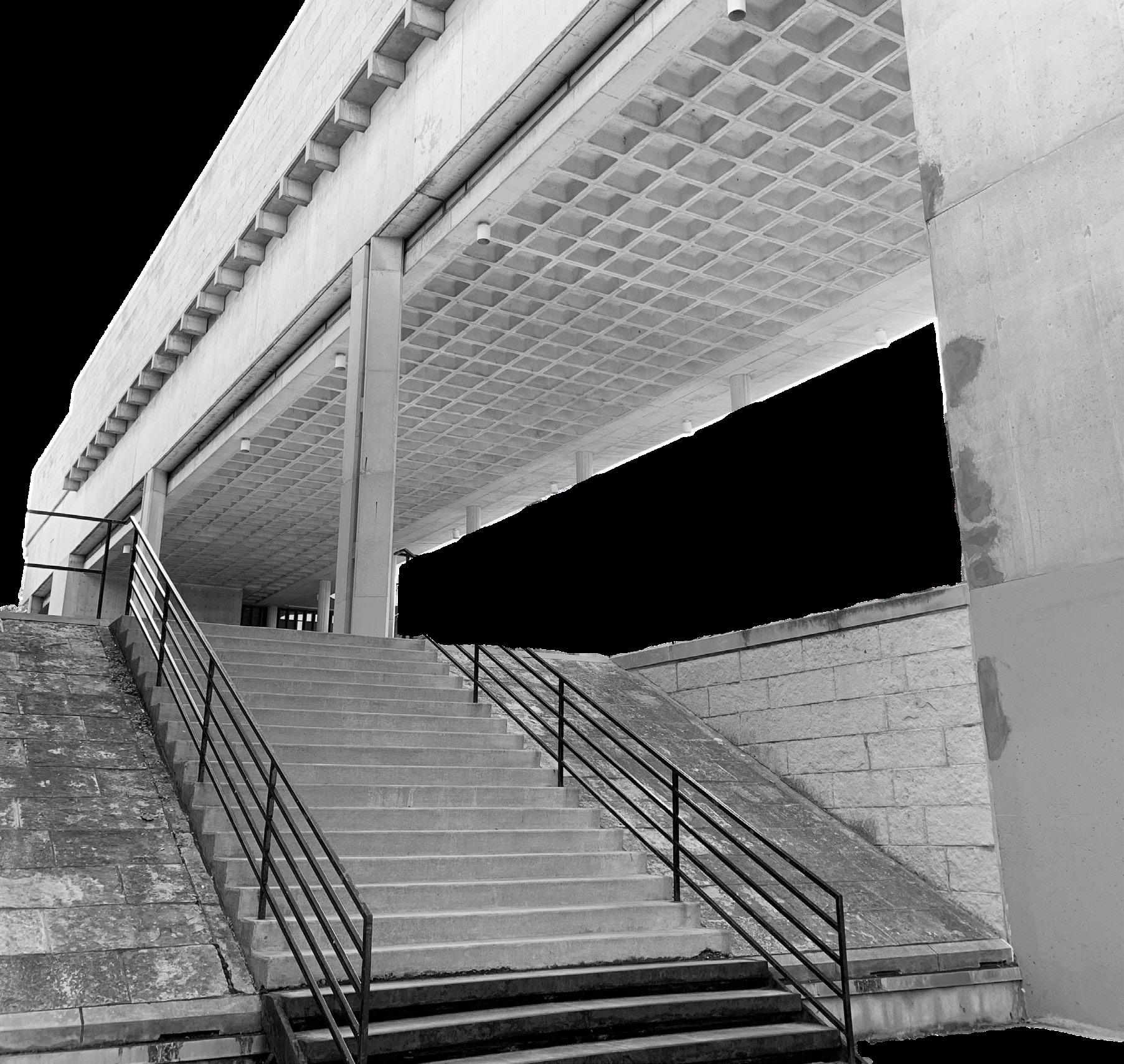
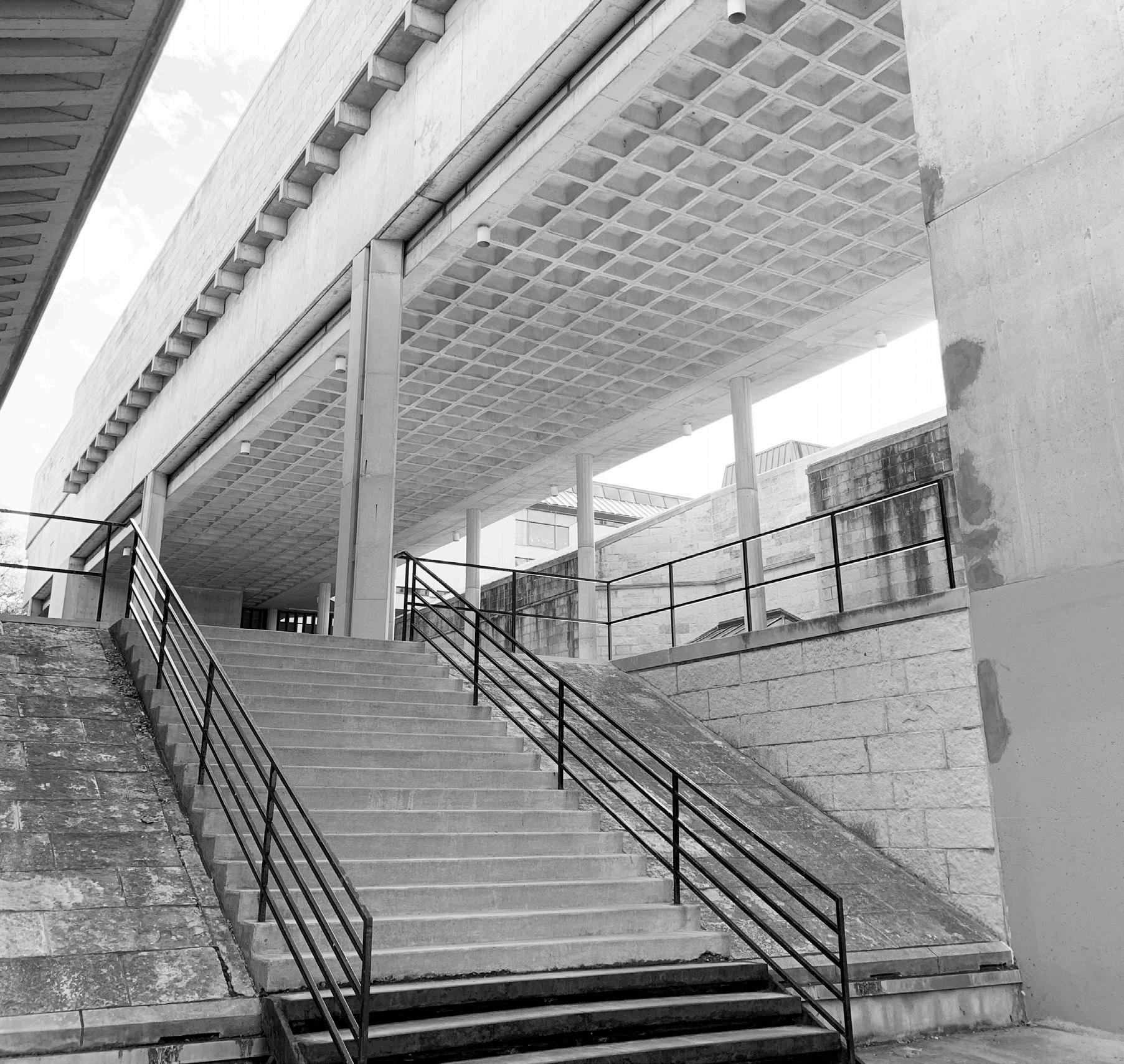
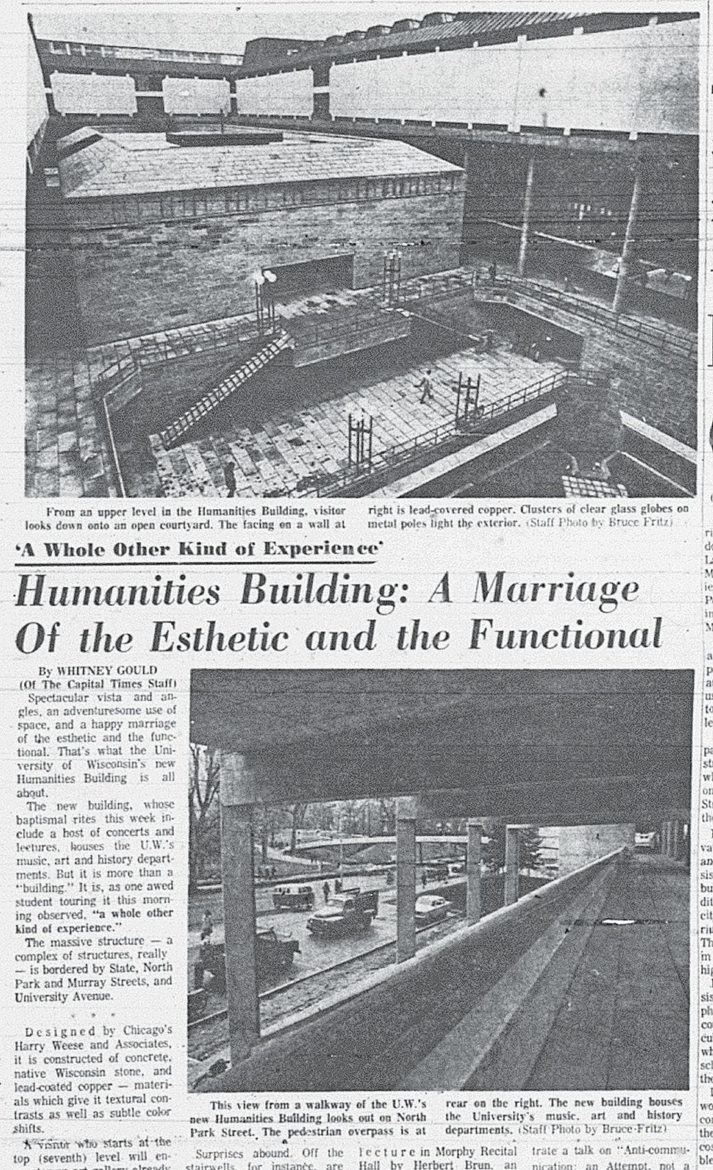
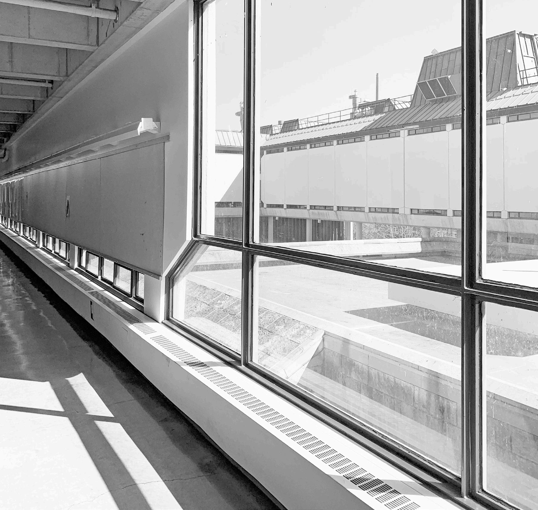
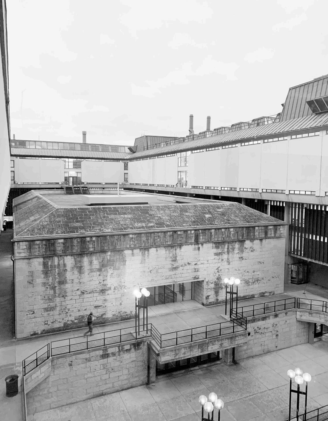
The skin of any building is what we judge first no matter how often we preach to not judge a book by its cover. Brutalist architecture is often criticized for its cold nature of the concrete exteriors and its counterintuitive top-heavy abstract geometries. It is one of many architectural styles of the 20th century that lacks ornamentation like modernism and the international style, but it takes it to an extreme by leaving concrete exposed. After so many years exposed to the elements of the midwest climate, modern concrete does not look the same as it once did – any midwest road or sidewalk can attest to this. While the building is sandwiched by limestone upper and lower sections, these are not the sections that pedestrians engage today. Today pedestrians are met with concrete on many of the surfaces they engage with – the walls and floors at the pedestrian levels are almost entirely concrete. It is important to note that the original ground-surfacing, included in Weese’s design, was limestone [newspaper clipping at right that shows ground-surfacing] and while this originally made the surfacing more to human scale, its removal has changed the perception of the skin for contemporary users.
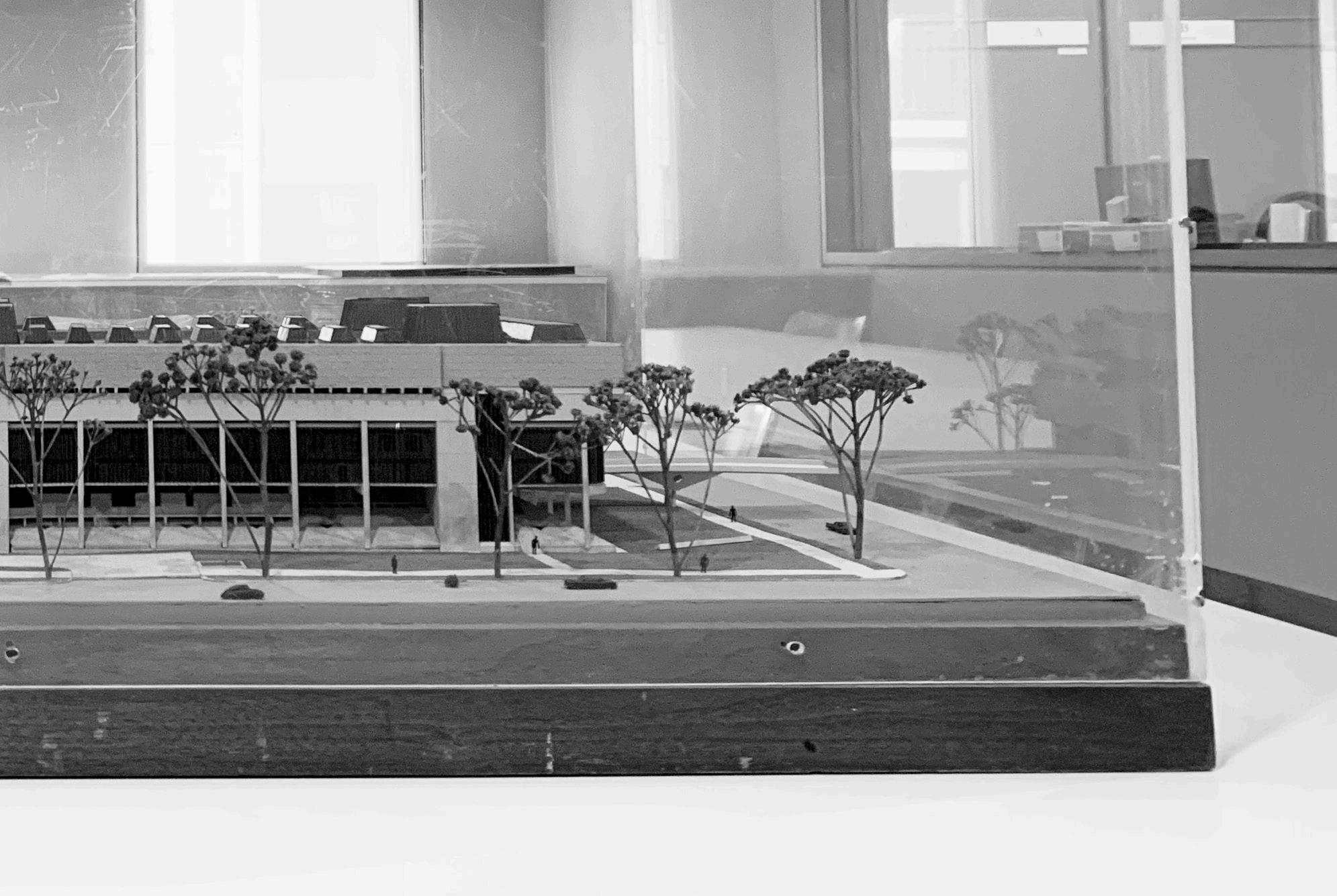
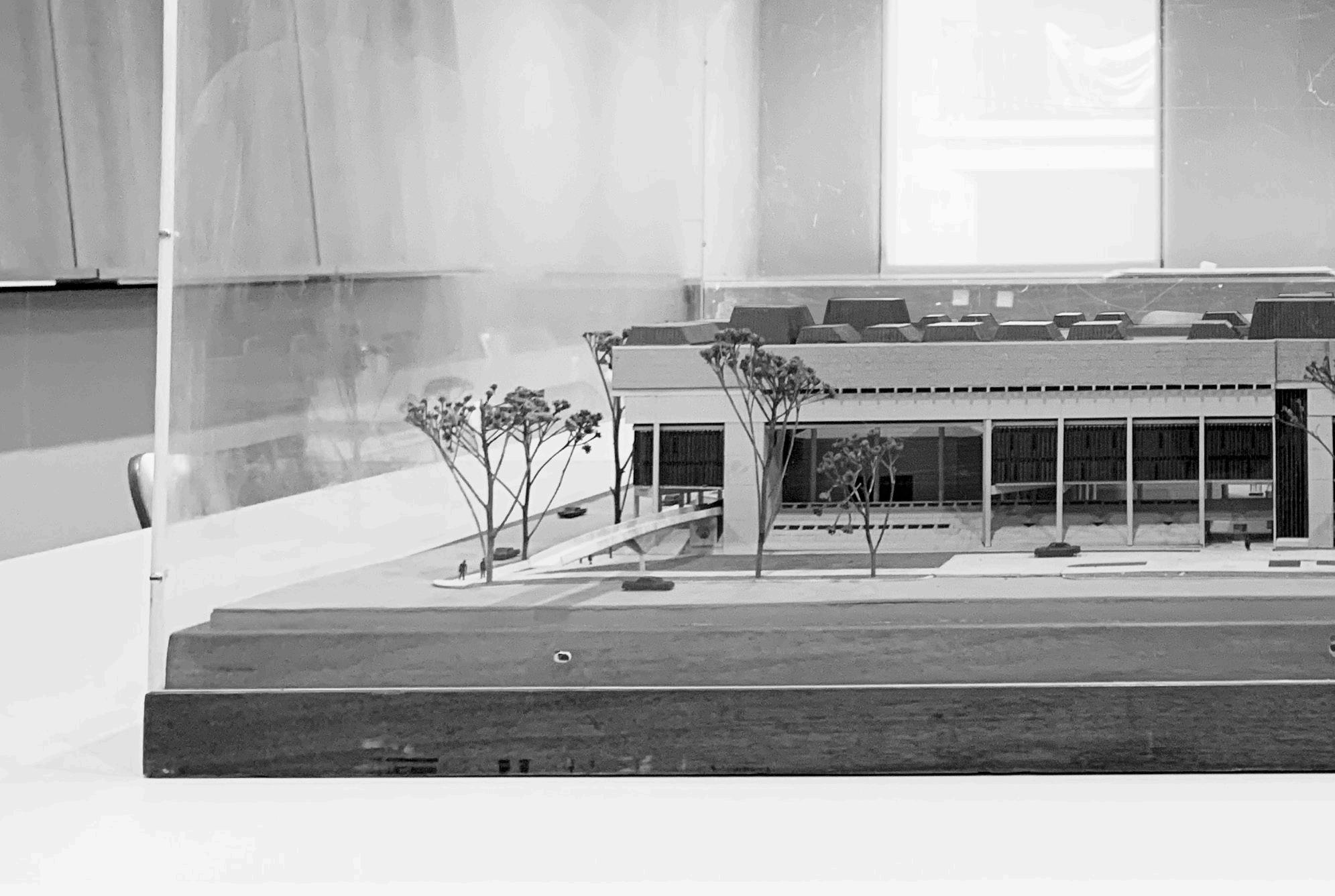 THE ORIGINAL MODEL FOR THE BUILDING VISUALIZES THE SKIN OF THE BUILDING AND SHOWS HOW PEDESTRIAN TRAFFIC ENGAGES WITH THE SITE
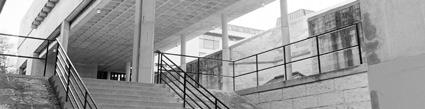
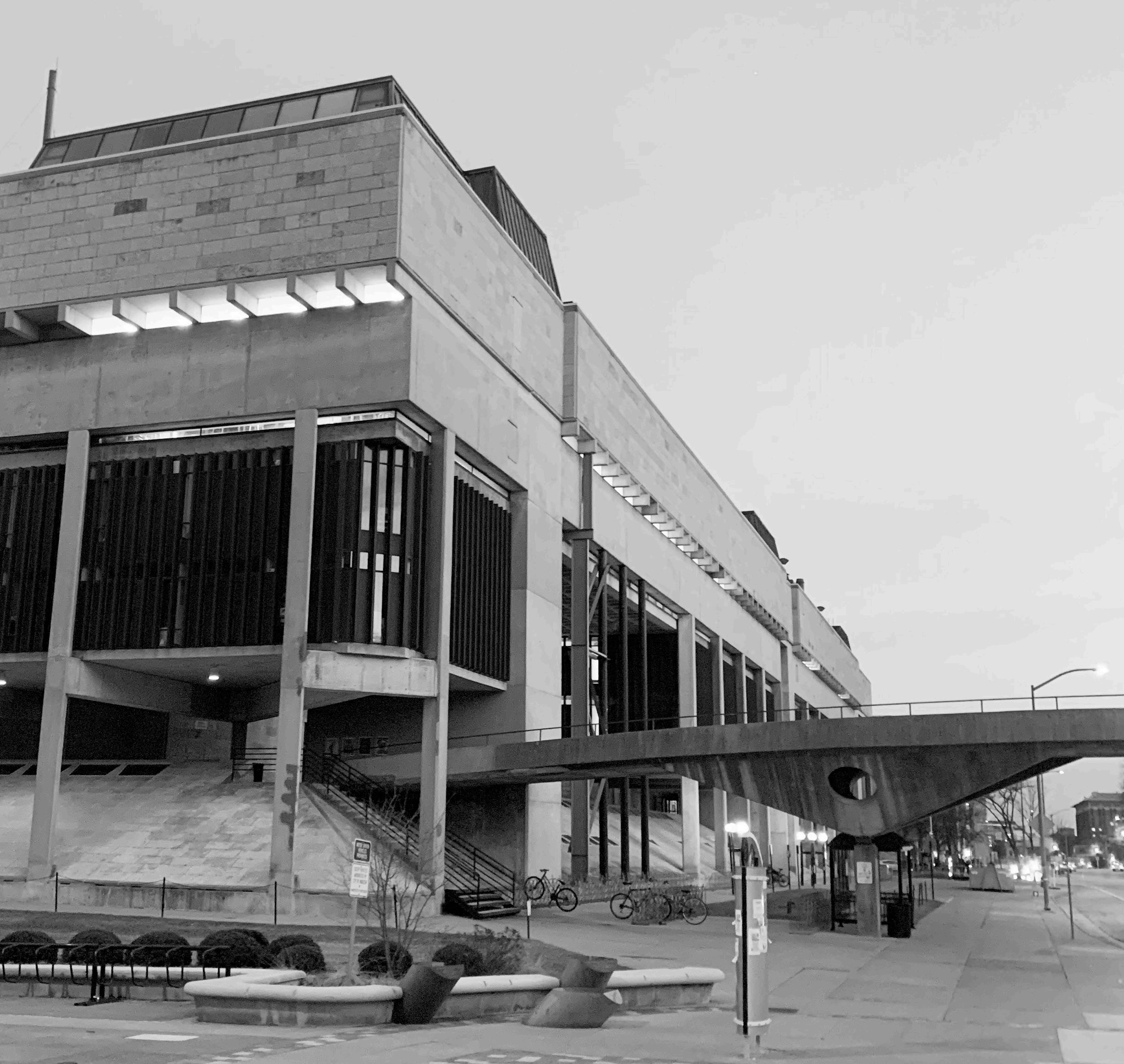
The site and function are aspects where the building seems to have the most trouble in finding justification. When we meet the entrance of a building, we are engaging with the site – it is our initial interaction with the built environment. The sloped sides of the main level of the building and various exterior staircases, invite you to the second level that, at one point, had two pedestrian bridges. One leads to Bascom hill and the other (removed in 2015) across University Avenue. These bridges are inventive pieces of the architecture that make the space unique. At the same time, when approaching a building there is often a grand entrance that intuitively tells you where to enter. The humanities lack this element. The closest thing to a main entrance is not intuitively located on the exterior of the building. The centermost corridor on the street level of the building has two five entryways. After spending time in the space, it is understandable that the three entrances facing north within this corridor may intended to be the entrances to the different academic departments. Returning to the idea of the building being three departments under one roof makes this understandable but begins to affect the function of the building.
The function of the building relates to how the building is being used and addresses program needs for the various departments. In the case of the South East Lower Campus Project, this is not only making sure that there is adequate space, but that the spaces operate properly. It is worth noting that, as opposed to architecture for residential buildings or corporate buildings the function here is academia – architecture for educational spaces. Weese and his associates bring their experiences from designing residential architecture, corporate office spaces, and buildings for other academic spaces to the design of the Humanities building. While this is most easily observed in comparing the skins of buildings, it is hard to say how that experience affected their decisions in terms of function. Learning, and education, is a social activity. There are very few spaces beyond the defined program necessities of the building to support the informal socialization of students. Further, the music program has historically had trouble with the function of their space in terms of acoustics and humidity within the building. Concrete walls are not the most forgiving environment for instruments and anyone playing music. In regard to the art department, the detail that very few windows actually open has affected the function of adequate ventilation. And in a building where students have chronically not been able to find their classes, it is hard to argue that it is efficiently functioning as architecture for educational space.
While there is a lot to consider, it was in fact the job of Weese and his associates to consider all aspects. Some explanation of the faults can be attributed to cuts in funding for the project, but at the end of the day, the most valid judgment comes from its most contemporary users. There are aspects where Weese and his associates were inventive and imagined the potential for the space in an incredibly unique way, but there are many intersections within the complex web of considerations that leave the building open to be so incredibly criticized.
 INVESTIGATING MULTIPLE RUMORS ABOUT THE BUILDINGH AND LOOKING TO UNDERSTAND HOW THEY
There are three main rumors about the Humanities Building and many variations of the same ideas. In short, the three main rumors are that the building was built to be riot proof, that the building was built backward, and the third and most dark is that the architect killed himself in some connection to the building. By studying the building and understanding the context we can understand where these rumors stem from.
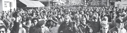
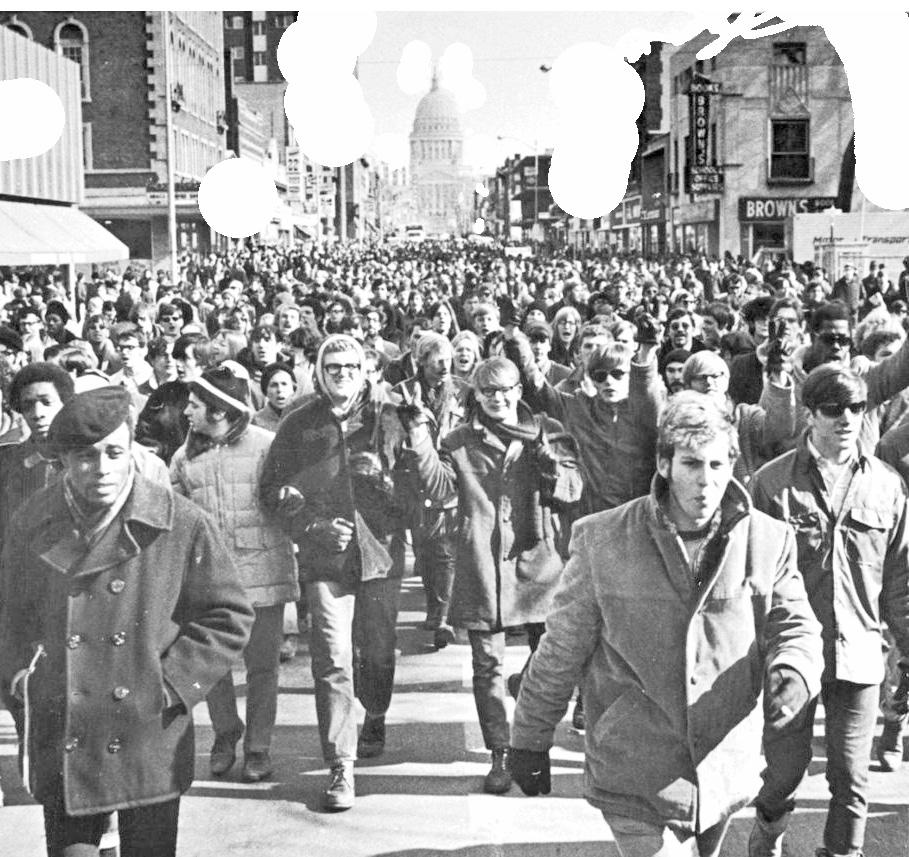
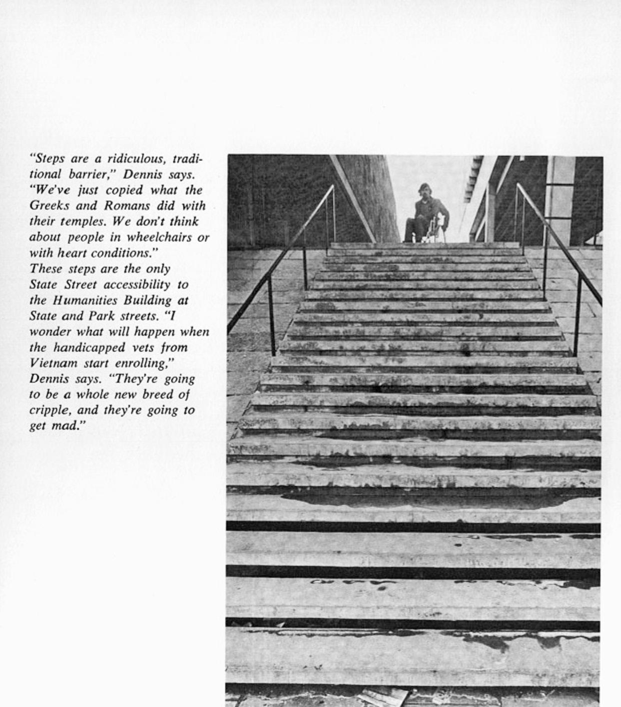
The rumor that the building was designed to be riot-proof stems from the campus protests of 1967 where students opposed the Vietnam War and DOW Chemical’s recruitment efforts on campus. The idea is that the university designed the building to prevent students from gathering and that the building could be quickly cleared by police officers if intervention would be needed. With architectural details that make the imagination run wild with this rumor, it is easy to imagine people scaling the slanted ground level sides of the building, police storming the six stairwells to the upper floors, and not feeling like anyone could make an escape in hallways that commonly feel like a labyrinth to students. While the building was designed and broke ground well before the protests in 1967, the coincidence of timing and power of the imagination do not serve to dismantle this rumor.
“
IT IS EASY TO IMAGINE PEOPLE SCALING THE SLANTED SIDES OF THE BUILDING”
Every year, it feels like a right of passage to be lost in the Humanities building for new students. The inner, windowless hallways make for a disorienting experience. Not to mention that not every part of the building is connected and you might need to exit the building only to re-enter the correct entrance to find your destination. These details make the building un-intuitive to navigate and when faced with confusion, we conspire to understand why something might not make sense. This is the only logical explanation found for this rumor. While the building was built with a larger footprint than originally imagined, it was not built upsidedown, backward, or facing the wrong direction. Nonetheless, the layout is often disorienting and there is no good explanation.
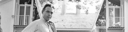
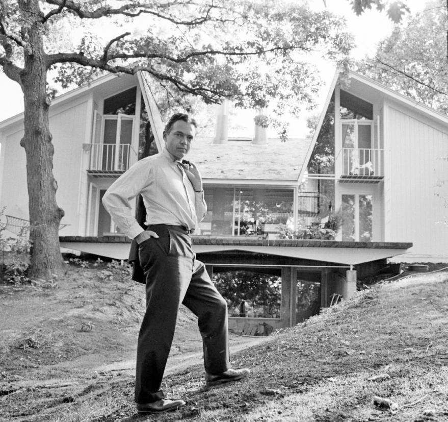
The third main rumor is hard to trace and unclear of its origin. The idea that Harry Weese killed himself in relation to the building, is quite theatric. His final years were reportedly spent drifting in and out of consciousness at a veterans’ hospital in southern Illinois after an alcohol-filled 1980s. Many people close to him admit that few interactions with him were without drama – that he enjoyed being a rebel and a rule breaker. While there might have been a lot of drama in his personal life, it is almost certain that this building was not on the renowned architect’s mind at the time of his passing, let alone related to his passing. This building might have an impact on its contemporary users, but it was only one of nearly a thousand buildings Weese had designed in his career.
 LOOKING AT AND CONSIDERING THE PROBLEMS THAT HAVE RIDDLED THE BUILDING FROM THE TIME OF ITS INCEPTION
aying that the humanities building has had its shortcomings is an understatement. It does not take much digging at all to see that the humanities building has been a headache for many people since its inception. Like any building, it has flaws, it has neglected maintenance, and it has its signs of use. Some of these shortcomings have been accelerated due to the lack of funding from the beginning. Remember, the lowest bid for the project came in with more than 10 million dollars over budget in today’s terms with mere generalized inflation numbers. Further, when you cut funding for a project you can expect that at some point you will begin to compromise the structural integrity of the building. In the case of the Humanities Building, with not many planned decorative elements to the original design, there were few corners to cut off and reduce the cost of the building.
The concrete and limestone building we see today has fifty-five years of weathering on its exterior in a climate that is not forgiving to porous surfaces – any midwestern road can attest to this. One of the most dramatic recent issues with the building has resulted in multiple physical reinforcements on the exterior of the building that support a previously cracked section of floor that looms 50 feet in the air.
“ THERE WERE FEW CORNERS TO CUT OFF AND REDUCE THE COST”
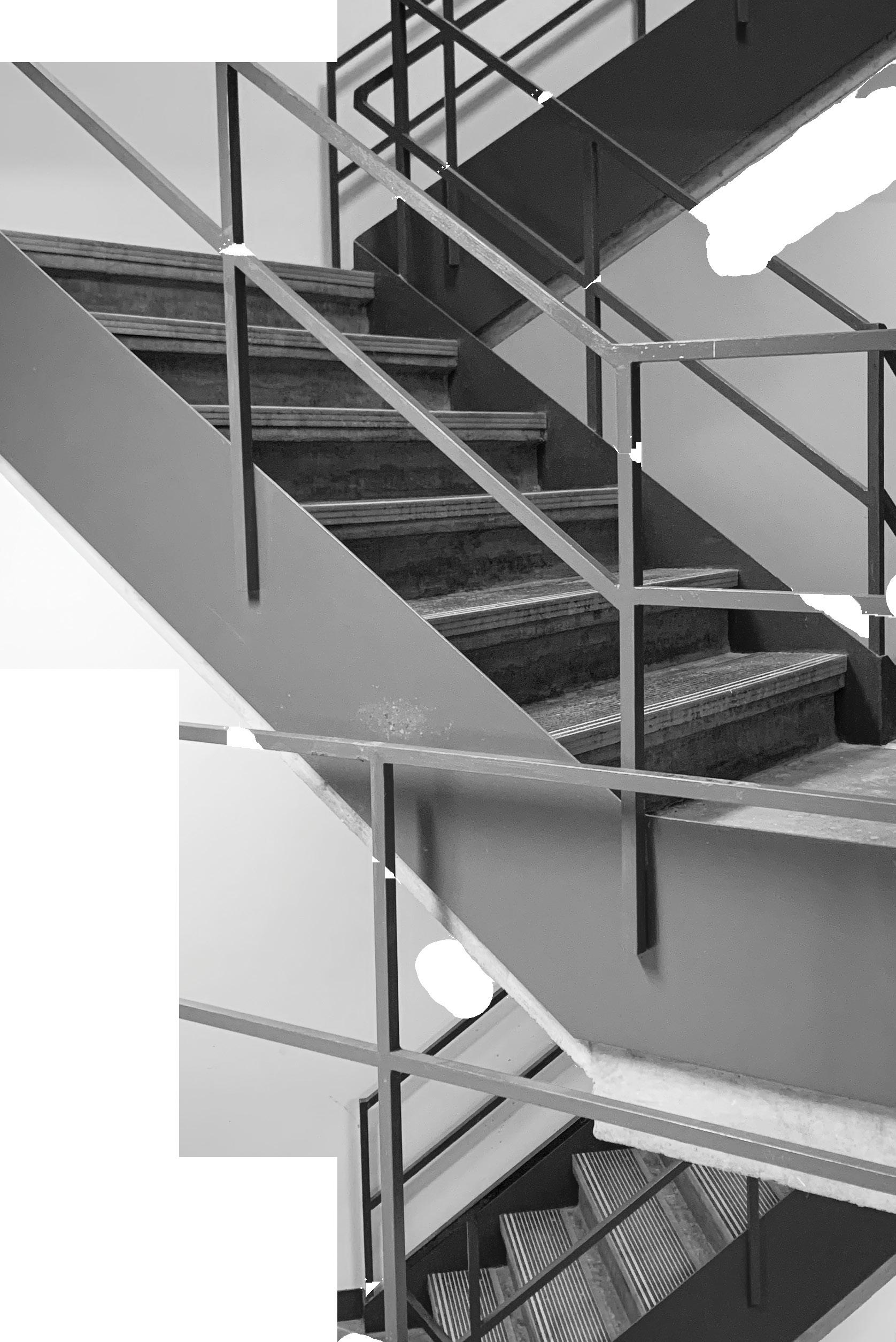
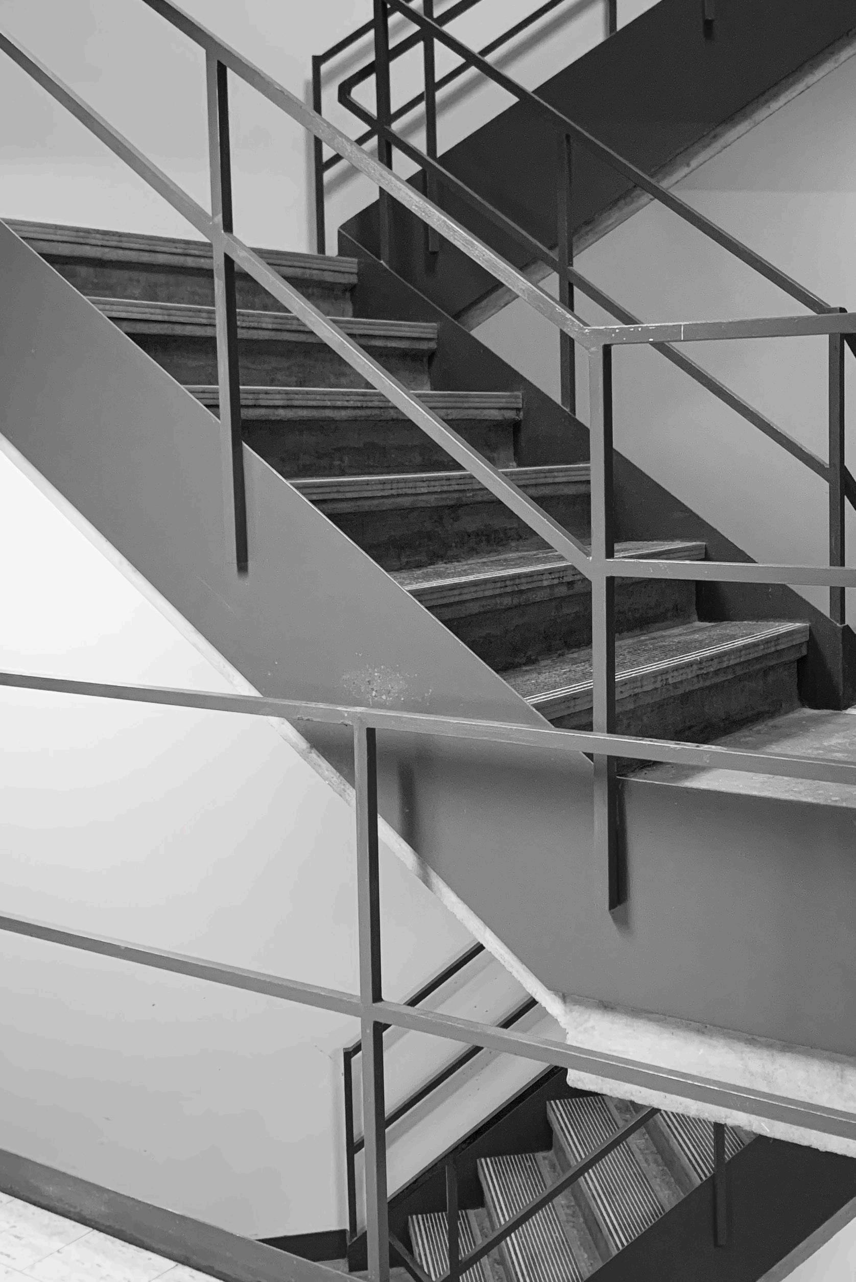
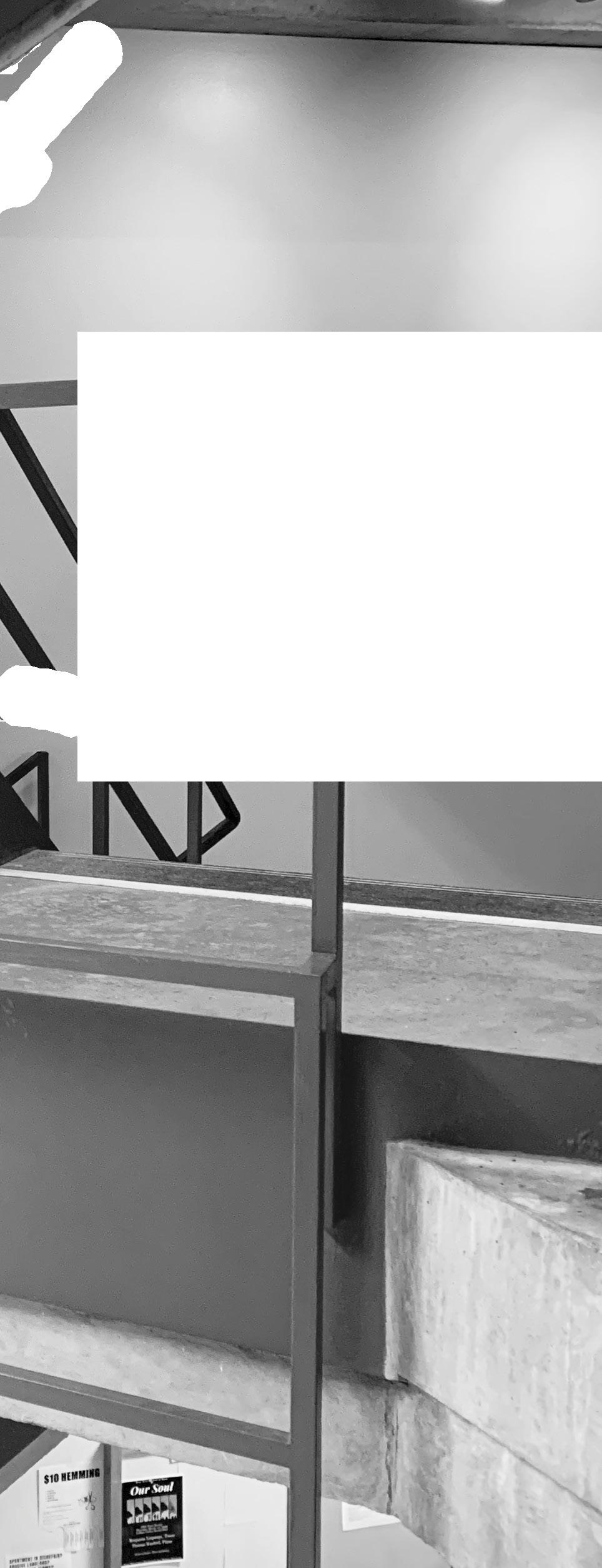
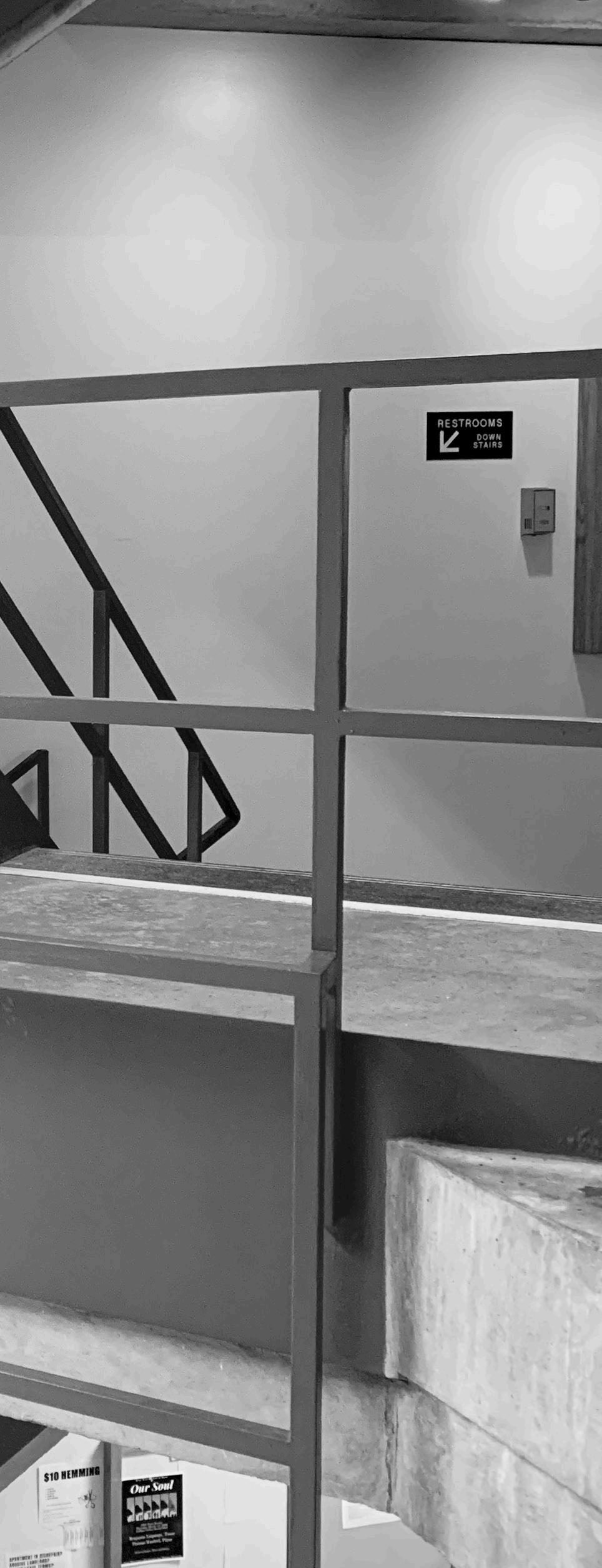
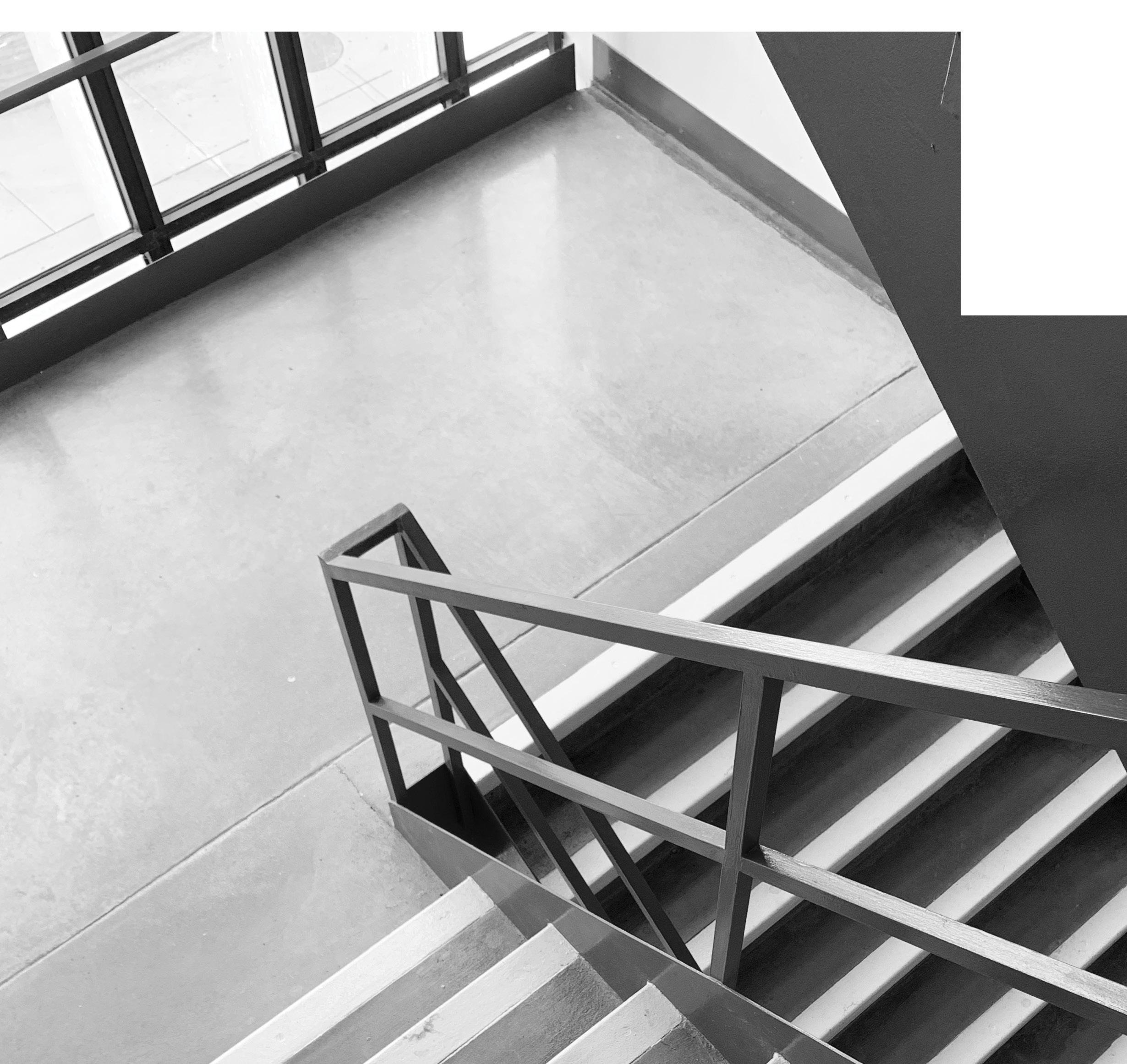
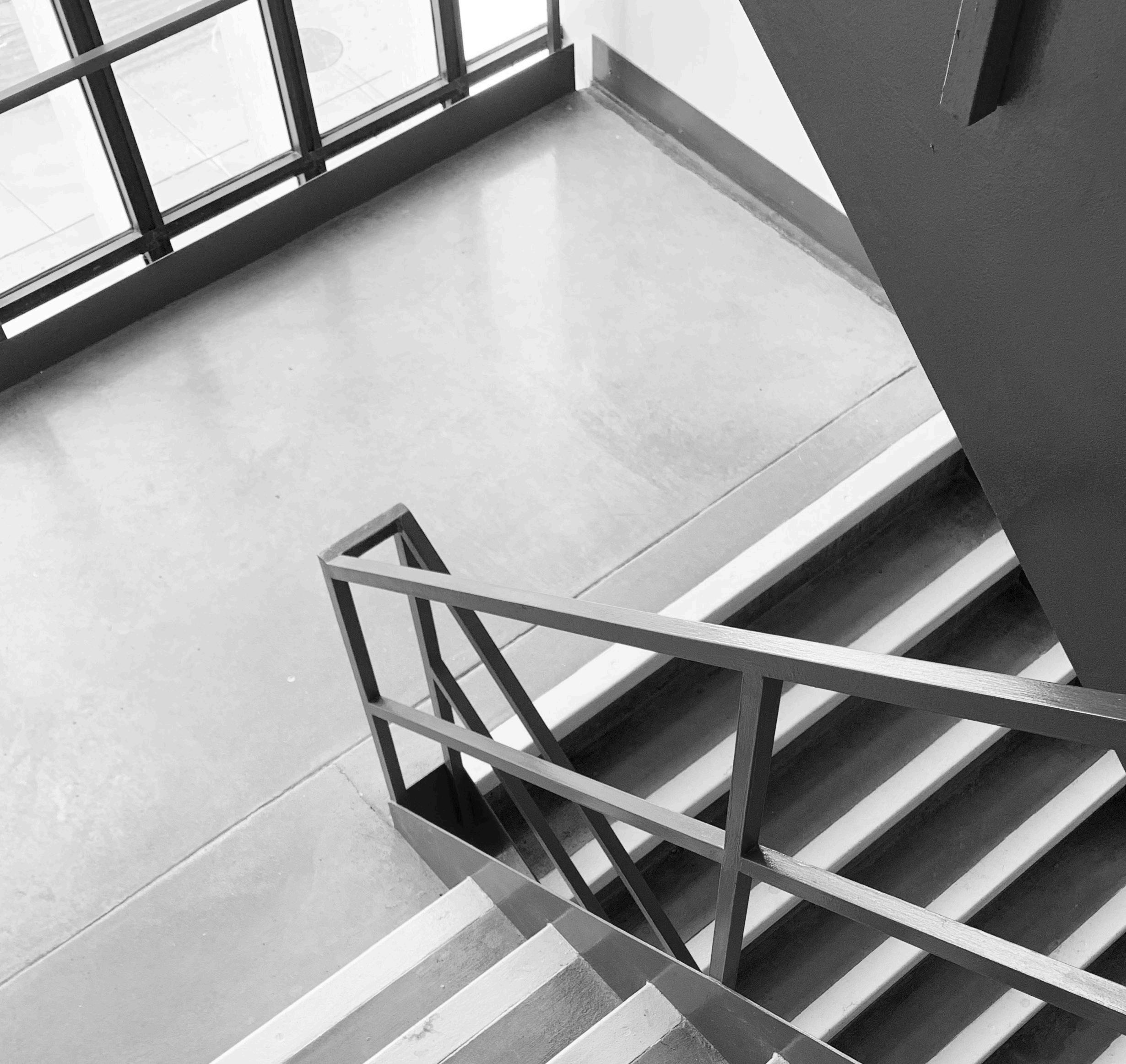
The exterior is dirty and has had some modifications that change the flow of pedestrian traffic. It is almost metaphorical of the interior dysfunction of the space. At the time this is being written, two exterior stairwells, and one of the only working elevators are either closed or out of service making the already low accessibility even more challenging. Further, a freight elevator is being used to accommodate those who cannot take the stairs. Simply put, this building is not easily accessible and was already a stretch for accessibility.
The lower levels are confusing to navigate as a whole and the source of countless frustrations that multiply on cold and/ or wet days in Madison. These shortcomings are frustrating to anyone who has to experience the space that further lacks more than a few human-scale windows to the outside world. In layman’s terms, it provides a rather depressing experience in the winter months – which is a significant part of the academic year. Not to mention the original in-floor radiant heating broke shortly after the building’s opening and was never fully repaired. This makes the cold days even colder and more uncomfortable for fourth-floor offices that are more exposed to the outside – attempted to be remedied with carpet and the occasional secret personal space heater.
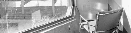
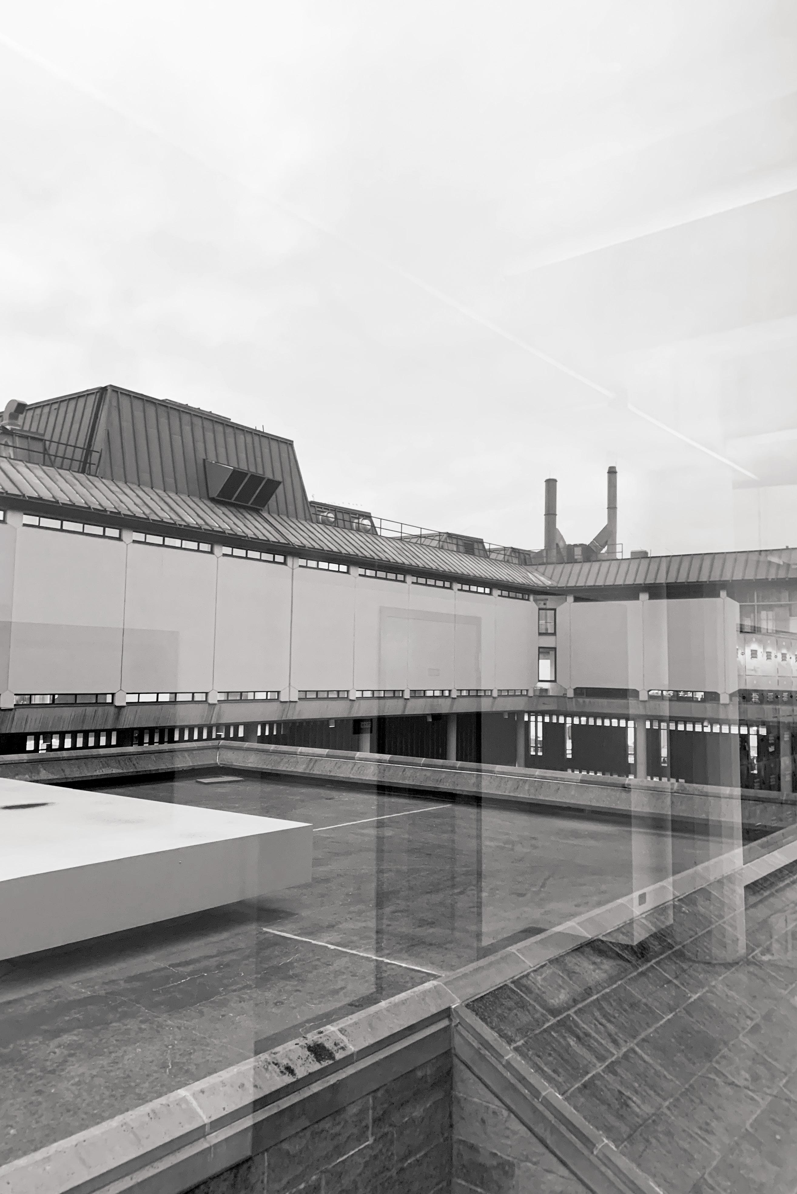
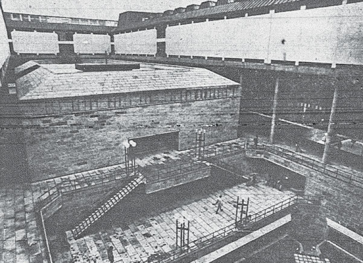
For the patrons who use the upper levels of the building, they experience something a little different. It can be argued that the sixth and seventh floors are easier to navigate, but still not necessarily intuitive. Up until the writing of this passage, they would experience an elevator ride up to the sixth or seventh floor of the building where narrow hallways traced the shape of a capped-H with periodic large windows that overlooked rooftop courtyard spaces (arguably the most interesting space of the building that is subsequently unused due to reported structural issues.)
THE REMOVAL OF THE STAIRCASE DEPICTED HERE CHANGES THE FLOW OF PEDESTRIAN TRAFFIC AROUND THE BUILDING
Additionally, the ventilation has been so poor in some parts of the building that one faculty member in the 90s claimed that their doctor was concerned that the lack of ventilation could kill them. While this concern has been remedied within the building with better ventilation, it is still an interesting detail that none of the windows can be opened.
The problems with the function of this building run rampant and date back to shortly after it opened. The list of service requests over its lifetime is impressive and not in a good way. If it functioned and was moderately accessible, maybe the general opinion would not be so maligned.
FRAMING THE POSITIVE ASPECTS OF AN INCREDIBLY MALIGNED BUILDING

(WHILE IT DOES HAVE ITS PROBLEMS, MY HOT TAKE IS THAT IF YOU HATE IT AND HAVENT STOPPED TO LOOK AT IT, YOU MIGHT WANT TO RECONSIDER WHAT IS SITTING INFRONT OF YOU))
n example of an incredibly unique and inventive piece of architecture from a fascinating and busy time in American architectural history is the George L Mosse Humanities building . It is sculptural, expressive, inventive, and it disrupted the norm of architecture in the city of Madison with a new style while simultaneously embracing the details of the buildings around it.
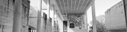
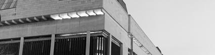
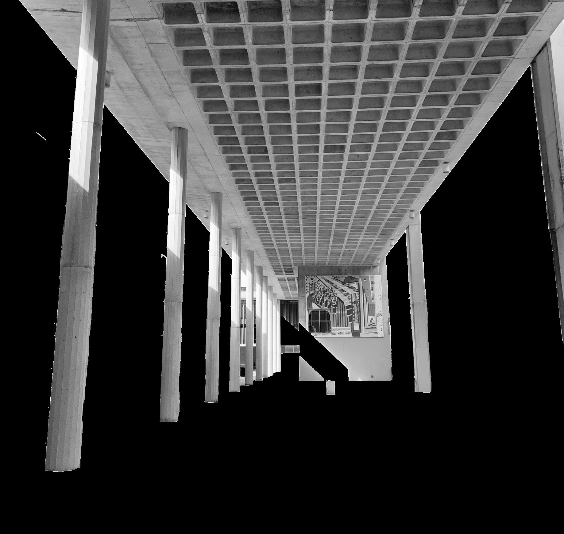
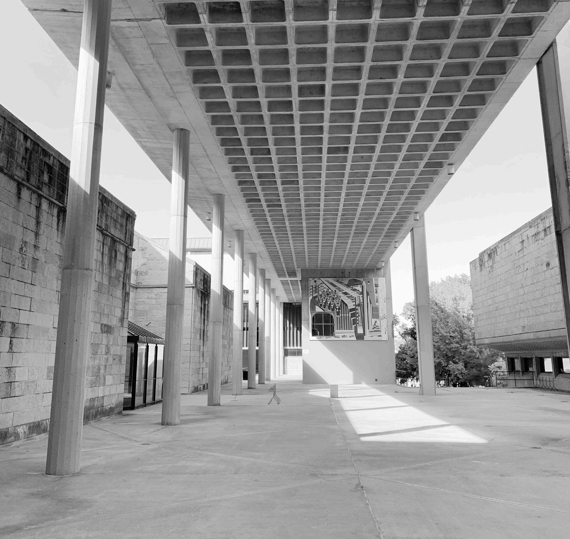
There are details like the waffled ceilings on the southeast corner of the building that serves as reference to a specific period of innovation in American architecture. These specific details were engineering and architectural feats that allowed for longer, thinner, and lighter ceilings made of concrete. Another detail that adds interest to the built environment is the pedestrian bridge that connects the footprint of the building to the ever-loved green space that is the lawn of Bascom Hill. Even shadows cast on the surfaces and interiors of the building draw further interest because they call attention to the abstract geometries. These details cannot be separated from the building because they are a part of what makes it special. Not every building on campus is as architecturally inventive and we know this because not every building captures your attention and stays in your mind. This is memorability as image and what makes good architecture, good architecture.
While the functionality of the building is far from flawless, it is impressive to see such a large program need captured into one singular building. Not every architect would be able to complete such a design, and to never see it fully realized due to funding brings questions to what it could have been.
Our built environment has an impact on our lives every single day and we spend most of our lives inside buildings. In a world of disposability, architecture remains standing for years – and when built well, even centuries. It is worth mentioning that no matter if a building is built well or not, as long as it is still standing and safe to stand in, it can be added to. Given that history favors what people build, there isn’t anything sexy about putting money towards preservation. In the case of the Humanities Building, when the audience is conflicted on loving or hating the structure it is even harder to imagine any sort of preservation. It is likely that the building will be demolished regardless of those who appreciate its inventiveness. With that, there would be an incredible loss of a structure rich with history and consideration if you simply try to understand its intentions.
Preservation of architecture is important because it gives us a look into who we once were as a society and in the case of the humanities it gives us a look at who our campus once was. To propose the disposability of a building is more challenging than it seems at the surface. Preservation requires appreciation. It is not easy to appreciate such a chronically problem-ridden building that does not meet the needs of its patrons.
No building is “done” evolving or telling its story until it is demolished. So for now it will sit with its leaky roof, broken elevators, and labyrinth of hallways as it calls us back to eras of innovation in American architecture that have long since passed. Connecting beyond its footprint trying to meet the needs of an incredible amount of programming, and casting shadows on the students who walk below.
hlberg, Peter. Please Make This Look Nice : The Graphic Design Process. New York, Ny: Skira Rizzoli, 2016.
Bamberger, Tom. “In Public: The Lost Legacy of Harry Weese.” Urban Milwaukee, April 22, 2019. https://urbanmilwaukee. com/2019/04/22/in-public-the-lost-legacy-of-harry-weese/.
Barnabas Calder. Raw Concrete : The Beauty of Brutalism. London: William Heinemann, 2016.
Bruegmann, Robert, and Kathleen Murphy Skolnik. The Architecture of Harry Weese. New York: W.W. Norton & Co, 2010.
Campe, Chris, and Ulrike Rausch. Designing Fonts: An Introduction to Professional Type Design. London: Thames & Hudson, 2020.
Chadwick, Peter, and Phaidon Press. This Brutal World. London ; New York: Phaidon Press, 2017.
Cheng, Karen. Designing Type. London, United Kingdom: Laurence King Publishing, 2020.
Chris Van Uffelen. Massive, Expressive, Sculptural : Brutalism Now and Then. Salenstein, Switzerland: Braun Publishing Ag, 2018.
Dahlman Begley, Mary. “Towards an Appreciation of Brutalism: Or, the Humanities Building Is Very Good.” Tone Madison. Tone Madison, April 26, 2022. https://tonemadison.com/articles/towards-an-appreciation-of-brutalism-or-the-humanities-building-is-actually-good/.
MOE, DOUG. “Doug Moe: Humanities Architect a Hot Topic.” madison.com, August 19, 2012. https://madison. com/wsj/news/local/doug_moe/doug-moe-humanitiesarchitect-a-hot-topic/article_12bf677e-8ff0-5355-867966d2709f1d86.html.
Feldman, Jim. The Buildings of the University of Wisconsin. Madison, WI: Jim Feldman, 1997.
Grindrod, John. How to Love Brutalism. London: Batsford, 2018.
Hatch, Fiona. “Levy Hall to Rightfully Replace Troubled History of Mosse Humanities Building.” The Badger Herald, November 2, 2021. https://badgerherald.com/opinion/2021/11/02/levy-hall-to-rightfully-replacetroubled-history-of-mosse-humanities-building/.
Heller, Steven. Teaching Graphic Design History. New York: Allworth Press, 2019.
May, Kyle, Julia van den Hout, Jacob Reidel, Jeffrey Franklin, Archie Lee Coates IV, and Michael Abrahamson, eds. “Brutalism.” CLOG 2nd Edition, June 2013.
Mcleod, Virginia, and Clare Churly. Atlas of Brutalist Architecture. New York: Phaidon Press, 2018.
Rybczynski, Witold. How Architecture Works: A Humanist’s Toolkit. New York: Farrar, Straus and Giroux, 2014.
Schmitt, Preston. “How the Humanities Building Went Wrong | on Wisconsin.” On Wisconsin, 2013. https:// onwisconsin.uwalumni.com/features/how-the-humanities-building-went-wrong/.
Touhey, Connor. “It’s Time to Replace the Humanities Building.” The Badger Herald, January 25, 2017. https:// badgerherald.com/opinion/2017/01/25/its-time-to-replacethe-humanities-building/.
Tschichold, Jan, Robert Bringhurst, and Hajo Hadeler. The Form of the Book : Essays on the Morality of Good Design. London: Lund Humphries, 1992.
Unger, Gerard. Theory of Type Design. Rotterdam: nai010, 2018.
uge thank you to everyone who has helped push me inside and outside of the classroom for the last 19 years of my life as a student.
To my friends and family, for supporting me.
To Professor Dennis Miller, thank you for pushing me in the classroom for the last three years – I have learned an incredible amount and feel like I have all the tools I need to continue learning after graduation.
To Assistant Professor Yeohyun Ahn, thank you for pushing me to pursue this project and opening my eyes to the digital graphic design world.
To my community partner, Daina Penkiunas and the Wisconsin Historical Society, thank you for your partnership and support – I have thoroughly enjoyed working with you and our many conversations about architecture and history.
To my peers in the classroom, all of you, thank you for challenging my work and making me better but also supporting and encouraging me when I needed it.
Lastly, to everyone who I spoke to about this project, thank you for your enthusiasm and interest – connecting with you is always fun!
This book and the included display typeface was designed and created by Austen Wallenfang as a senior thesis project in graphic design in the spring of 2022.
The design and contents are not to be used for any other purpose than this project.
This project is protected under copyright and should not be used without the consent of the designer.