
Simplicity, carried to the extreme, becomes elegance
 - JOHN FRANKLIN


Audrey Singapore June 5th 2002 201806K@mymail.nyp.edu.sg PERSONAL PROFILE +65 98347448 SOFTWARE SKILLS PHYSICAL SKILLS OTHER SKILLS AutoCad 3DMax Sketch Up Adobe Indesign Google Drive Microsoft Powerpoint Sketching Painting Model Making Hand Crafting Leadership Event Planning Teamwork INTERESTS EDUCATION St Theresa Convent CHIJ Secondary School Graduated with N & O Level Certificate Diploma in Spatial Design 2020 - 2022 Comunications 2018/2019 EXPERIENCES Organized a School event STCFIESTA 18 Organized a Food drive 2018 2017 Attended a Hackaton Workshop By Start up X 2020 Organized an event Internation Migrant Workers Day 2021 Creativity Fine arts Digital art Sketching Photo graphy ACHIVEMENTS Director list in Spatial Design 2020 Semester 1 Director list in Spatial Design 2020 Semester 2 I’m a Year 3 Student in Nanyang Polytechnic. Studying in Design and Media School and currently a Spatail Design Student. With 2 years of Fine Arts experience. Procreate Hello! I’m Audrey STC Exco Member CCE Leader (Secretary) 2017 - 2018 Adobe Illustrator Performed in a School event Showcase - Fragments (Nyp Sound Card) 2021
INTRODUCTIONS
About Me
SCHOOL PROJECTS MOE KINDER _ _ _ _ _ 28 FORMULAR 1 _ _ _ _ _ 34
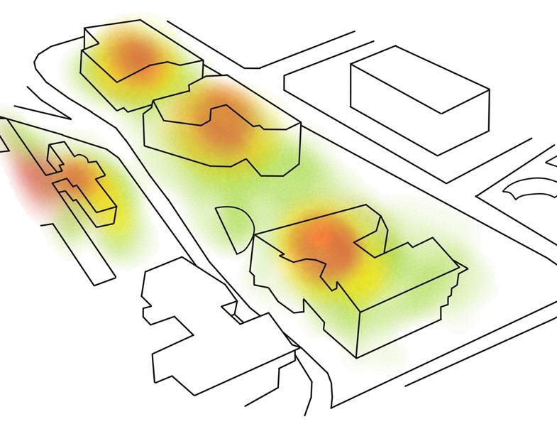
WAYFINDING

03 INTRODUCTION
_ _ _ _ _ _ 02 BURGEON _ _ _ _ _ _ _ 16
_ _ _ _ _ 10
TABLE OF CONTENTS _ _ _ _ _ _ 06 ABLESPIA _ _ _ _ _ _ _ 22 OTHER WORKS _ _ _ _ 40
WABI SABI
PROJECT 1
WABI SABI
A group project, where we have to propose a design for the clients new business venture in the aesthetic industry. We also have to help propse a branding identity for their marketing strategies


WABI SABI
ABOUT THE CLIENT


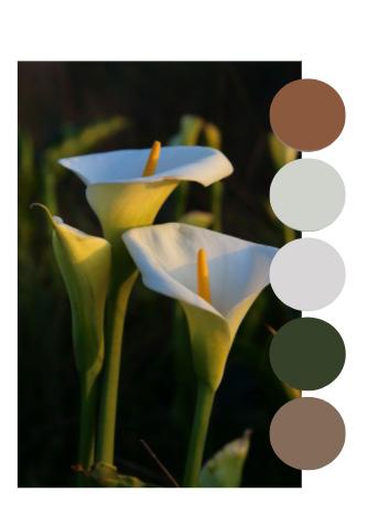
Since the Company is called ‘ The Soul ‘,I designed the logo relating white calla lily as it has a similar meaning. “Represents the different stages of life”
CONCEPT
The theme of the space is inspired by Modern Zen & Wabi sabi Interior Style as to connect the branding of the aesthetic company through the meaning of finding beauty in imperfection & creating a calming atmosphere.


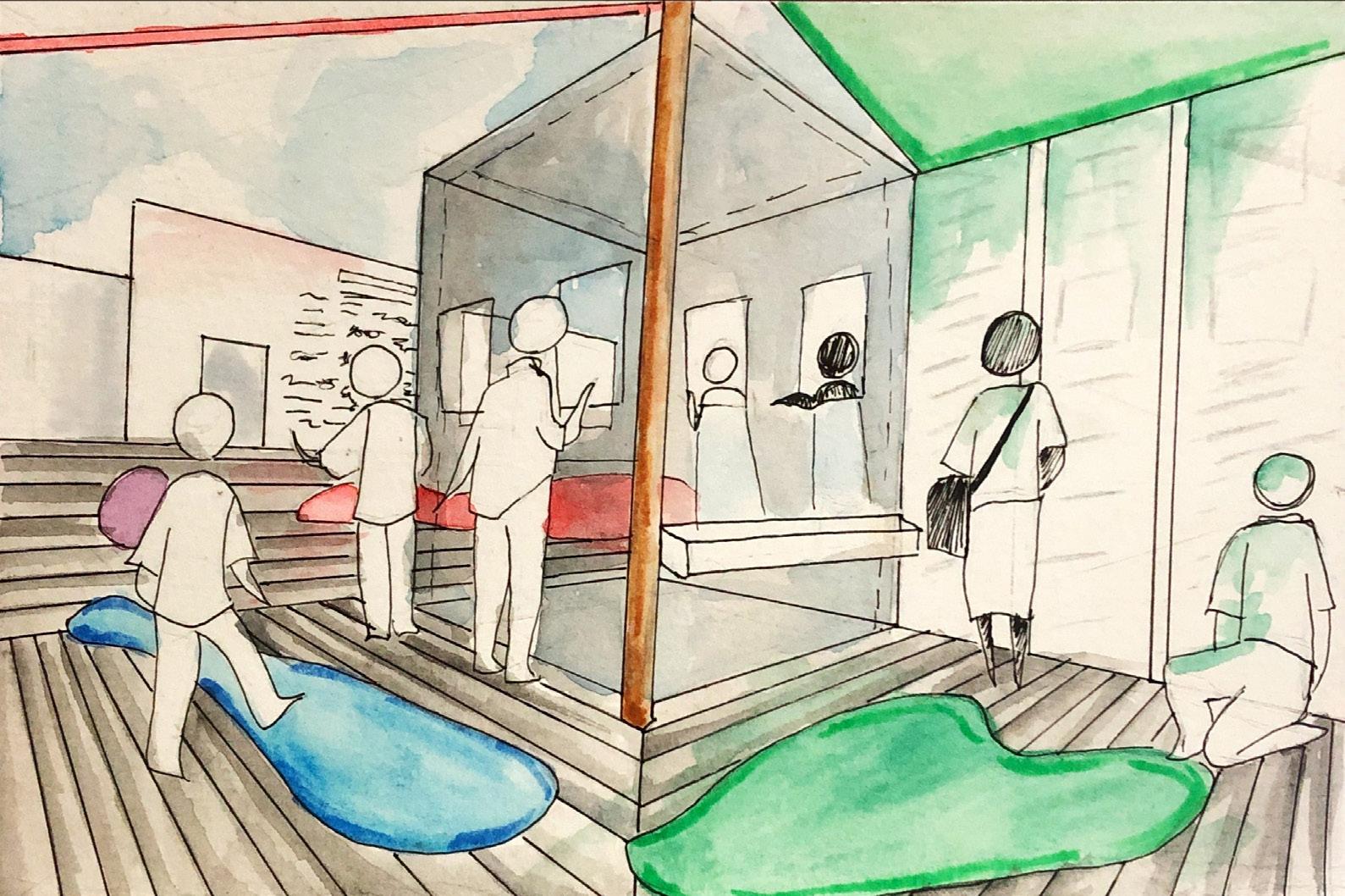
We also made sure that the main areas like the treatment rooms and waiting lounge are facing the beautiful views as that's where clients will spend time the most.
SEATING WASHROOMS
WAITING
TREATMENT AREA
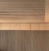
MATERIALS: Natural Stone,Concrete, Ceramic & Wood
MOOD BOARDS OUTDOOR
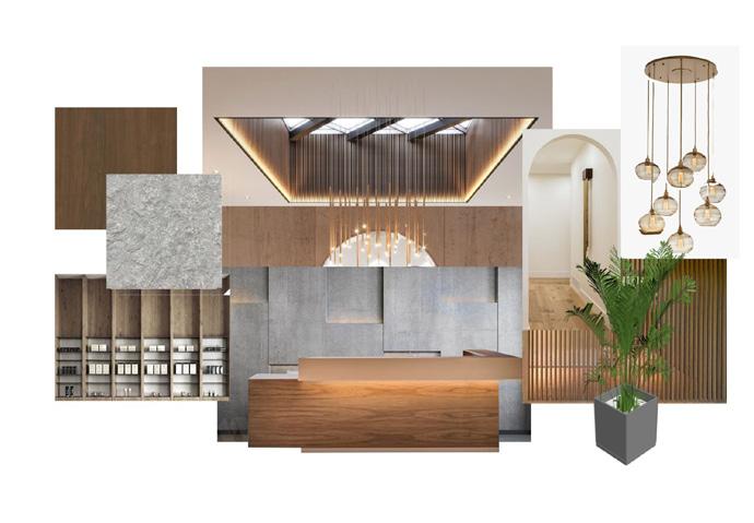
RECEPTION AREA
AREA
MAIN
WABI SABI DEVELOPMENT 06
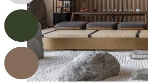
COLOUR PADLET
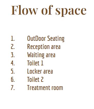
We arranged the spaces in a manner based on how we view the clients will walk through each space in a sequence. Thus we made use of existing walls and doors to guide them to each space.

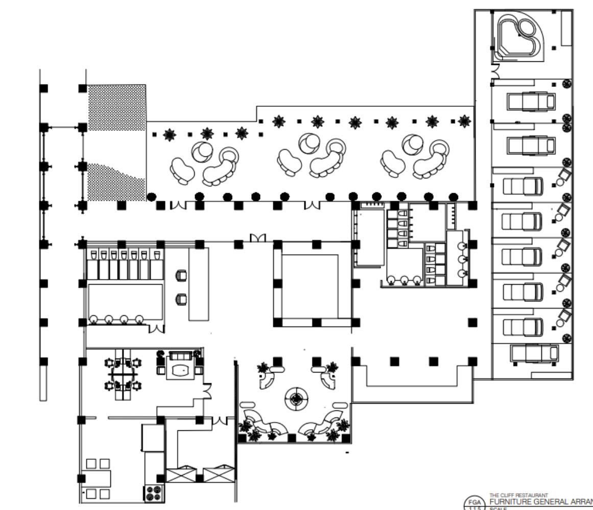
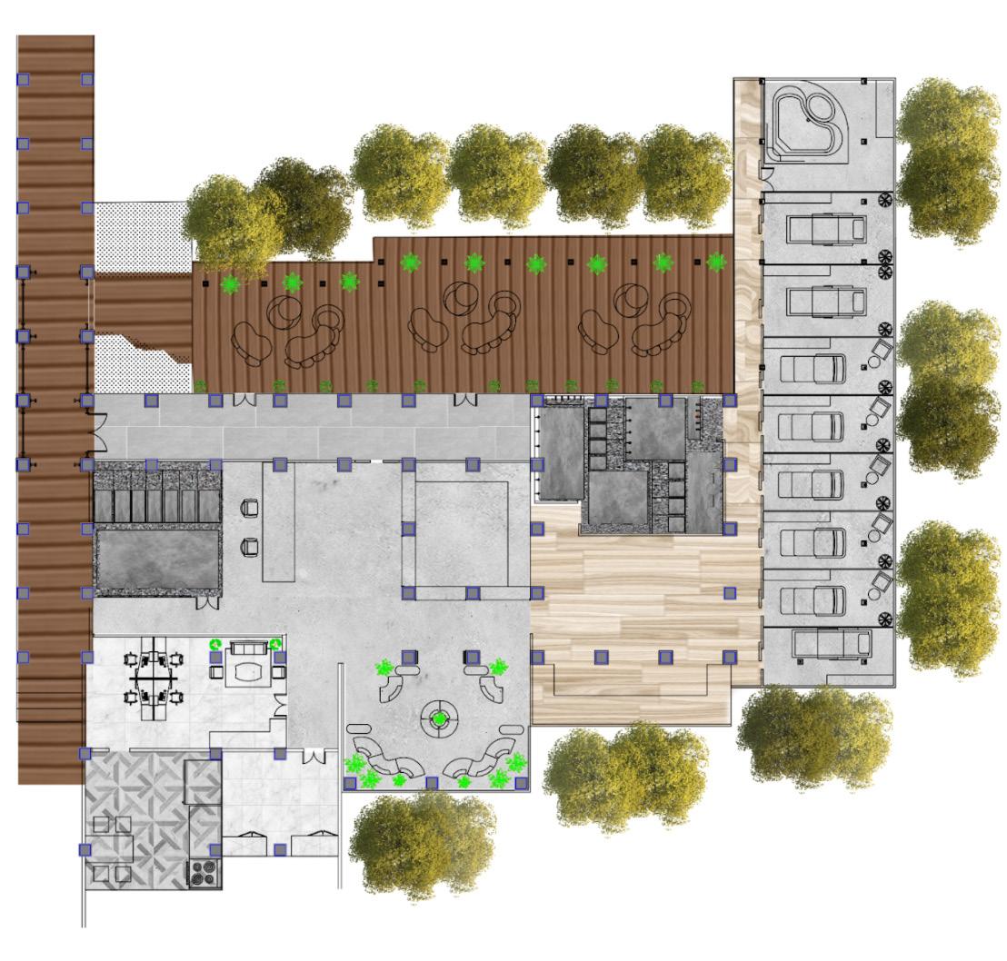

Reception area
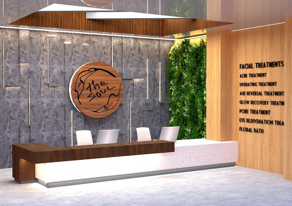
The use of natural materials and led lights shape the ambience of the room. The scratches on the concrete walls gives an authentic look which represents the beauty in imperfections.

08 RENDERING
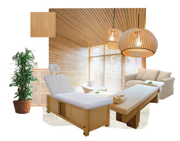
Treatment area
For the treatment areas, a cosy and japanese-like design was chosen. The warm ambience, bed design and wooden panel for walls is something we want to integrate into the treatment rooms.


RENDERING
PROJECT 2
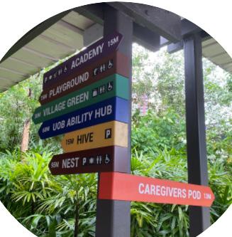
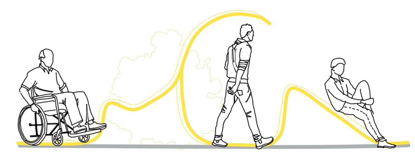
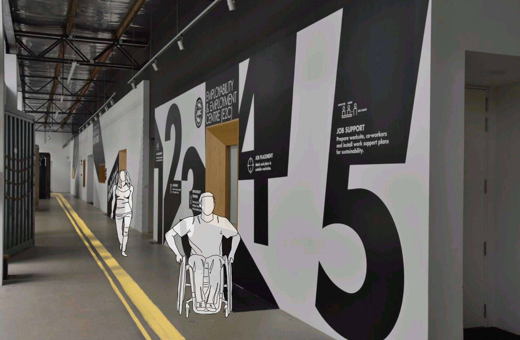
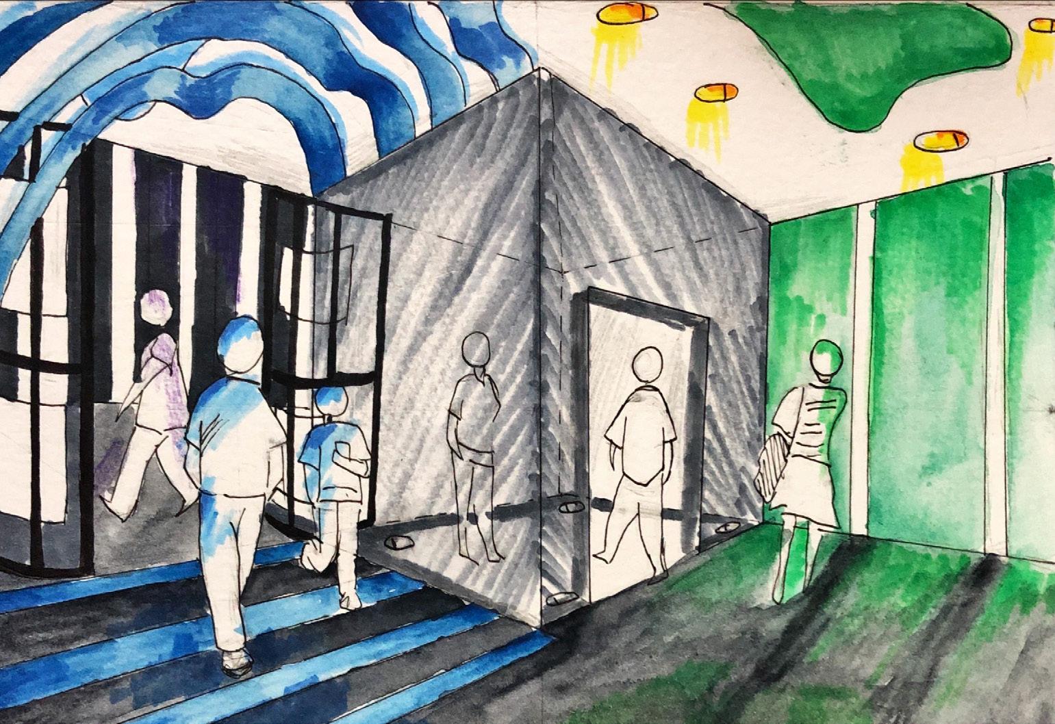
WAYFINDING
Had to develop a system to unsure that people can utillize the space during the pandemic, while upholding the social distancing measures.
WAYFINDING
10
WAYFINDING DEVELOPMENT
CONCEPT LOCATION
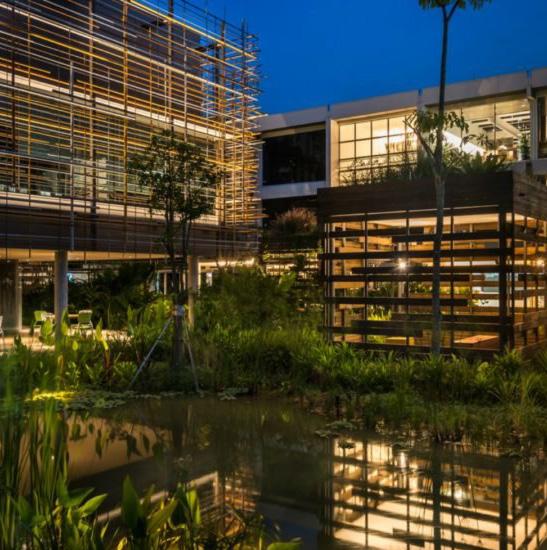
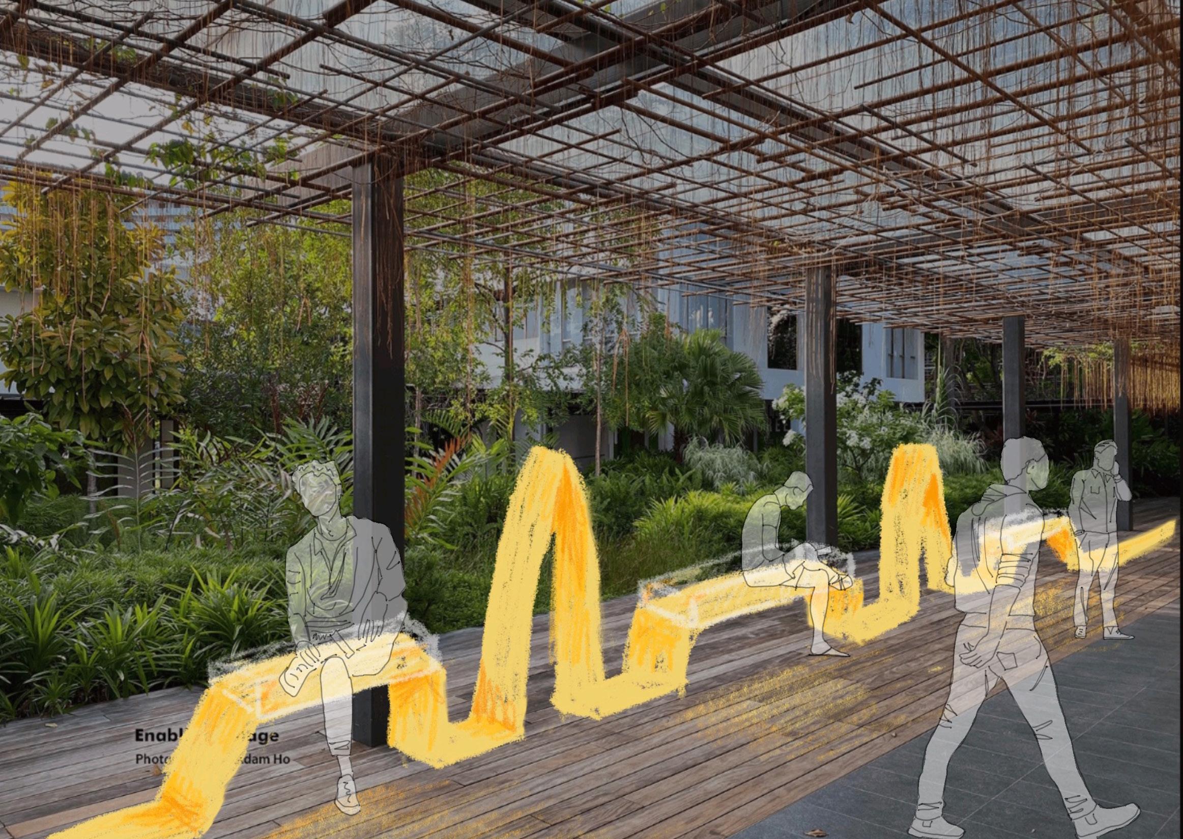
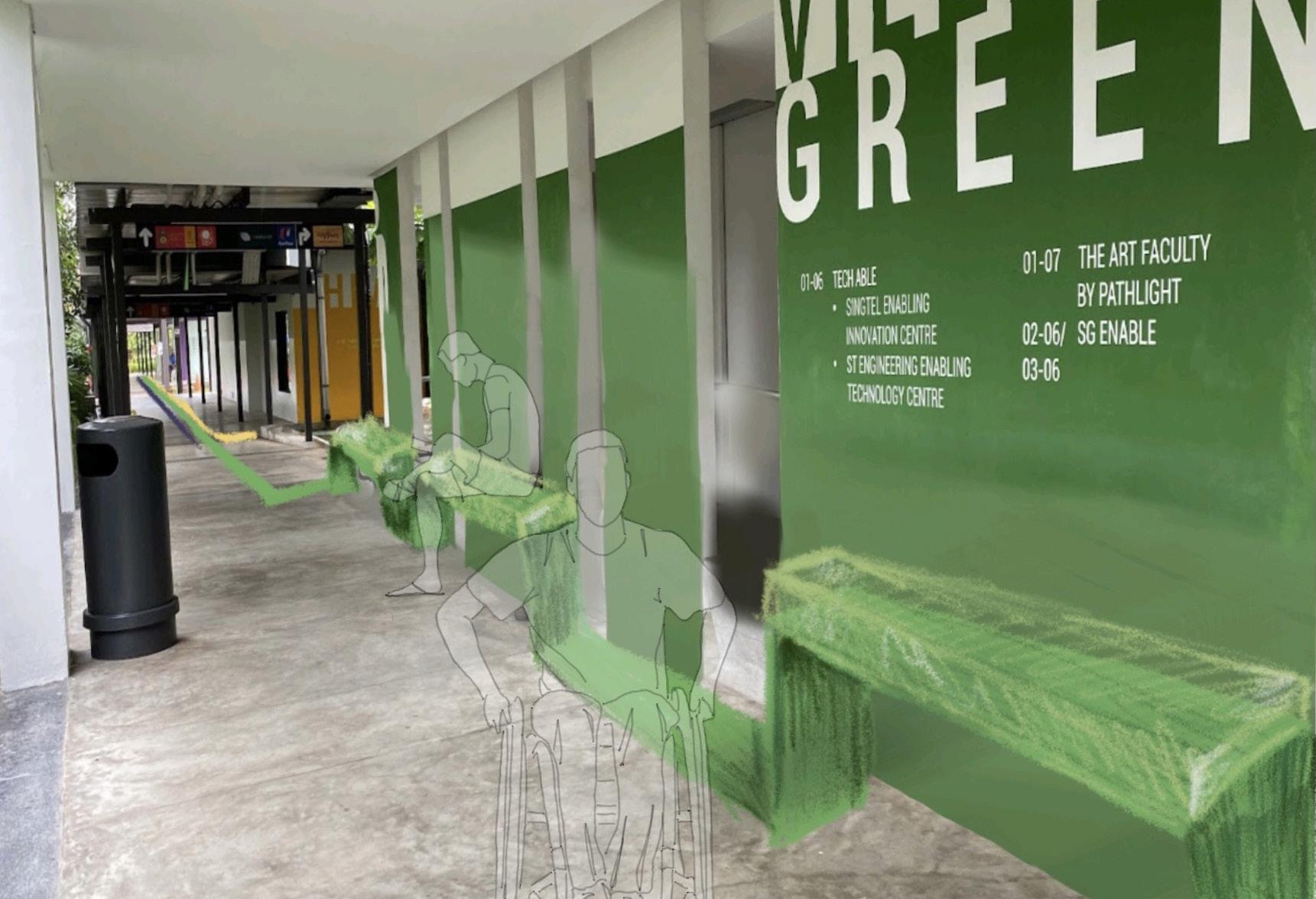
Enabling Village, has created amenities & a community the disabled. Their building is even well known for their universal design in their structure.

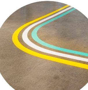
Was inspired by the original way finding layout and felt to take advantage of it and emphasize with floor markings & Seating to make it more visual, then the tiny signage on the walls. They will follow the colour coding of the buildings. keeping it simple to understand
MORE DEVELOPMENT
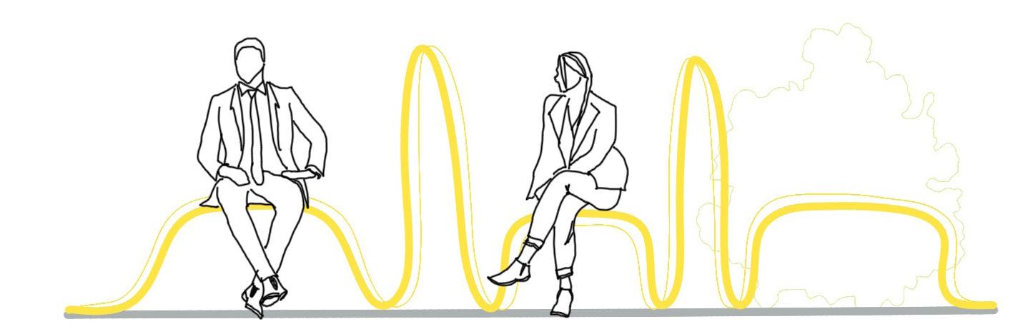
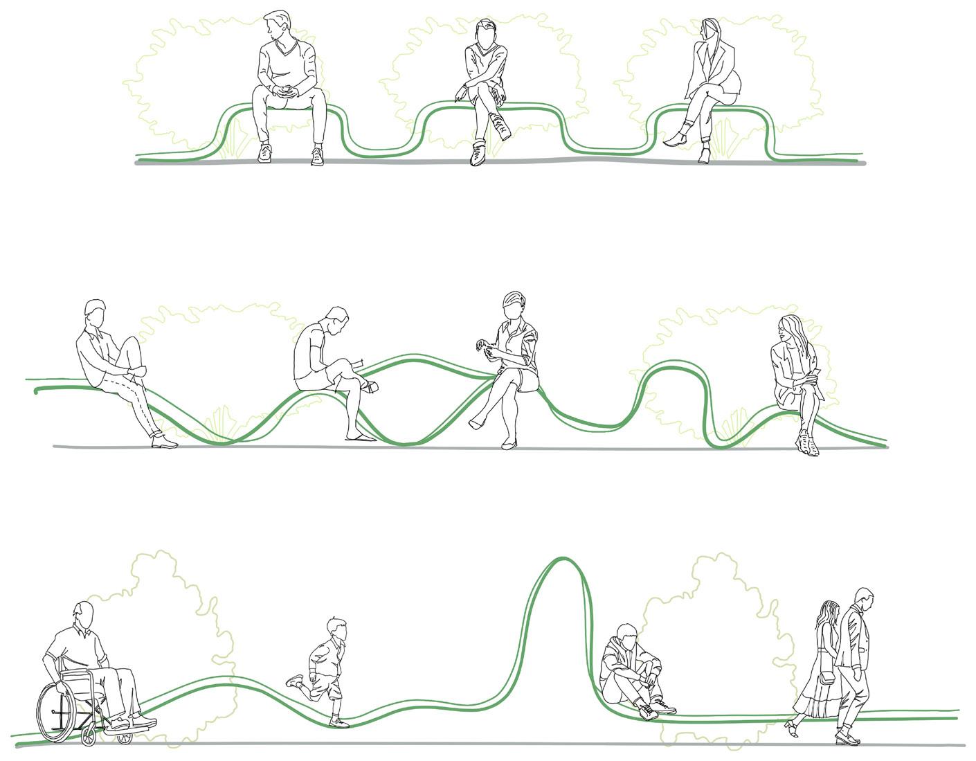
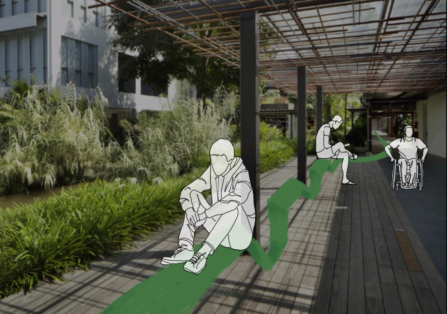
Designed to ensure social distancing ( separated at least 1 meter apart ), also making sure it is available for anyone to access, especially wheelchairs. Wanting not to block any access of the pathway as its space purpose is to allow wheelchair bound to pass throug.

CONBINATION WITH WAYFINDING & SEATINGS

 COLOUR PADLET
It can become another safety measure, since there is no fences around the pond.

Materials

The space has a lot of natural lighting, which means heat in the environment, the metal material acts as a measure to prevent any more physical contact as it is heated
The acrylic is the only place you will contact with
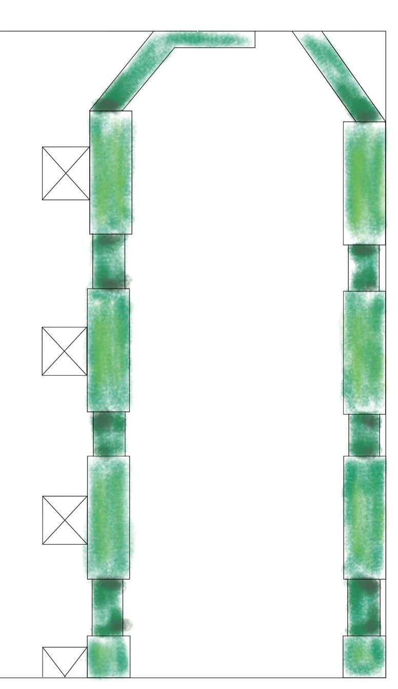
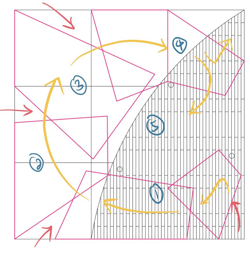
FLOORLAYOUT ON AREA 1
12
My purpose of the design is to allow people to access the space easier and safe, while enjoying their surroundings. Hoping the design magnifies the atmosphere of the place.
Seatings with 1meter divider
Space 2


14
Space 4 Space 1 Space 2 Space 3 Viewing area with Design 1 Way finding system with chairs Design 1 replacing concrete chairs Wayfinding system
PROJECT 3
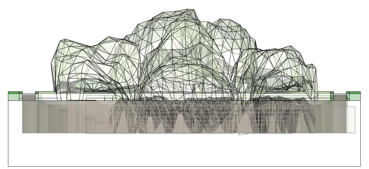
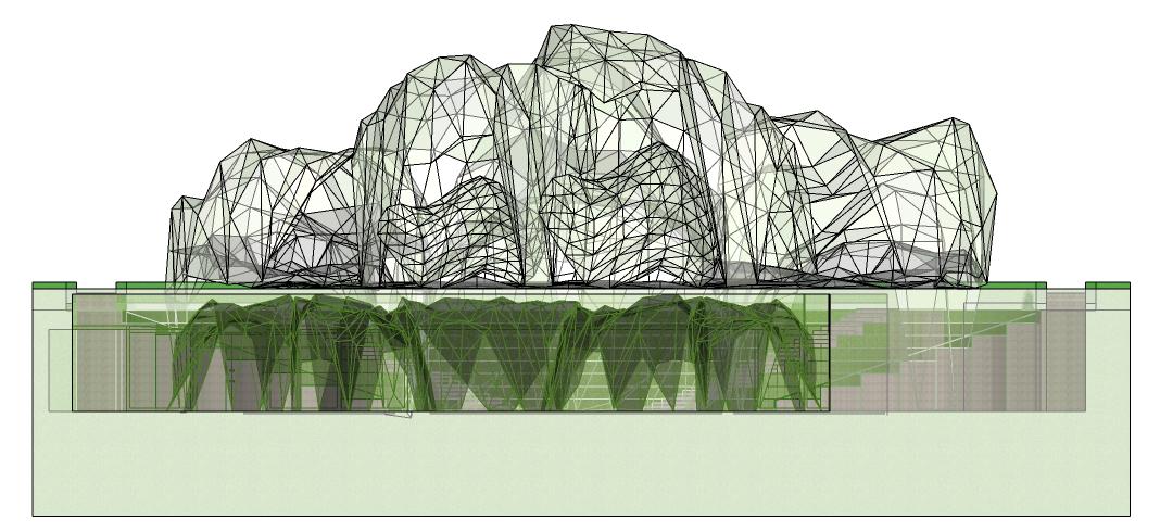
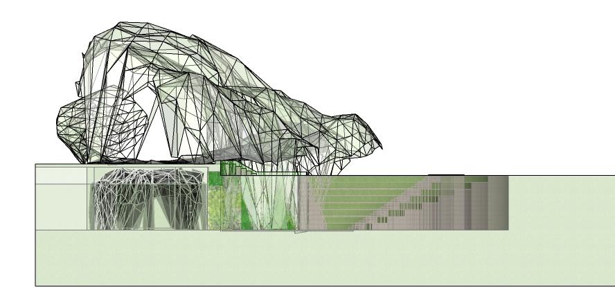
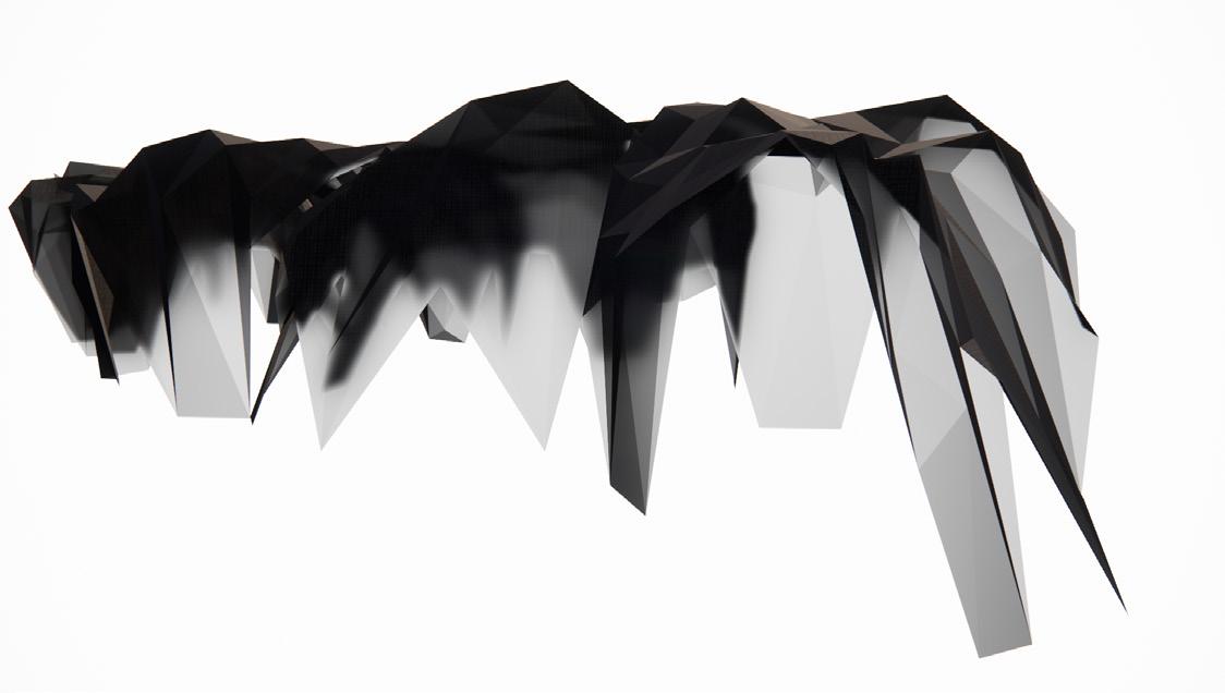
PROJECT BURGEON
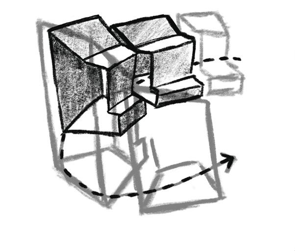
This project is to create a space and programme to help re-brand or brand a business during the pandemic. With the forms & shapes we created before hand. This forms & shapes are modules that can be connected together.
BURGEON

16 Proccess 3
Proccess
4
Proccess 2
1 Proccess
CONCEPT ABOUT THE CLIENT


They have a mission to bring the world to Southeast asia and provide gate way for Southeast Asian Brands to reach international consumers, Lazada cross-border business features homegrown brands and ellers from markets that include China, Hong Kong SAR, Korea, Japan, the United States, and Europe.


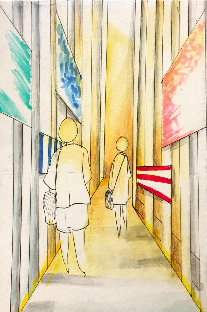
To deliever their message in the space, it’s design so the person is going through the app itslef. Each section will have products displayed as if they are going through the different sections of lazda, so inturn they also can understand the app and trust their service.

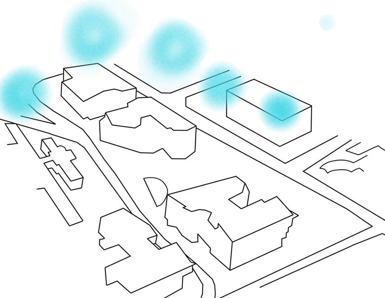
SITE ANALYSIS & LOCATION
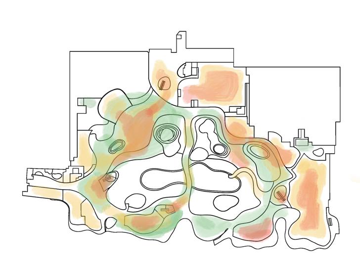
VivoCity is very fitting to my client’s mission, as it is surrounded by an ocean and located near a HabourFront Center. These elements usually have relation to travel and connection, which is similar to lazada’s aim to have Cross Border Business.
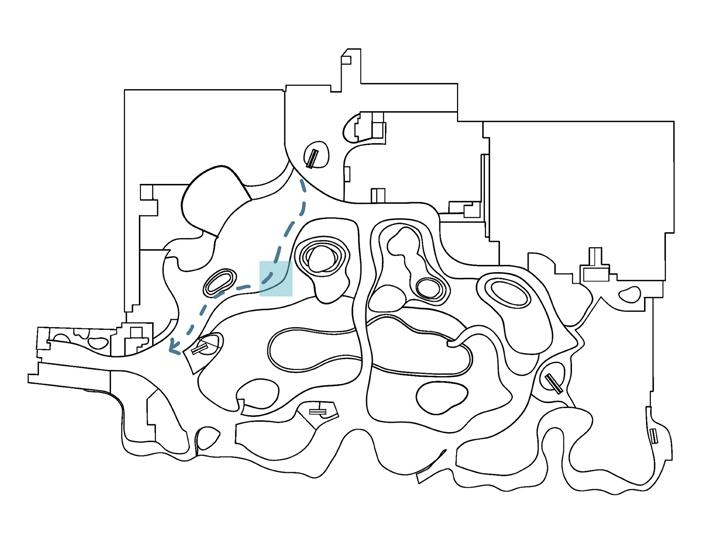

PATHWAY
HUMAN TRAFFIC
FORMATION DIRECTION ELEVATION PLACEMENT VISULIZATION
STAGES OF DEVELOPMENT
LOCATION
BURGEON DEVELOPMENT
While reserching about the Client, lazada. I realized that lazada makes use of their logo not only as their identity but also through their structures. Example the Lazada concert and every advertisment set they have. There is always a structures, which is in a form of the logo. This has sort become a of distictive feature of the lazada brand.


18
FINALIZED FLOORLAYOUT
Activities & Material

Acrylic with dichroic flim
• To establish that it’s a lazada space. Adding this as it’s a lazada charcteristics.
• The film used Is Gold - Blue Flim as it has the colour patlete of lazada. Instead using the colours to divided and indicate the different section, i designed each space with a different shape. To still colour scheme there for i picked this as it reflects diferent colours wherever the sun shines
Wood
• Light wood colour to bring out the colours of the products
• To also blend to it’s surrounding & to not be too overwhelming
• To have a homely atmosphere as lazada is usually shopped at home
Seating area
here & reflect about your exprience
Seat


& learning about lazada Experiencing the space & looking at products Experiencing the space & looking at products Experiencing the space & looking at the view 20
Exterior Space 1 Space 2 Space 3 An introduction
PROJECT 4
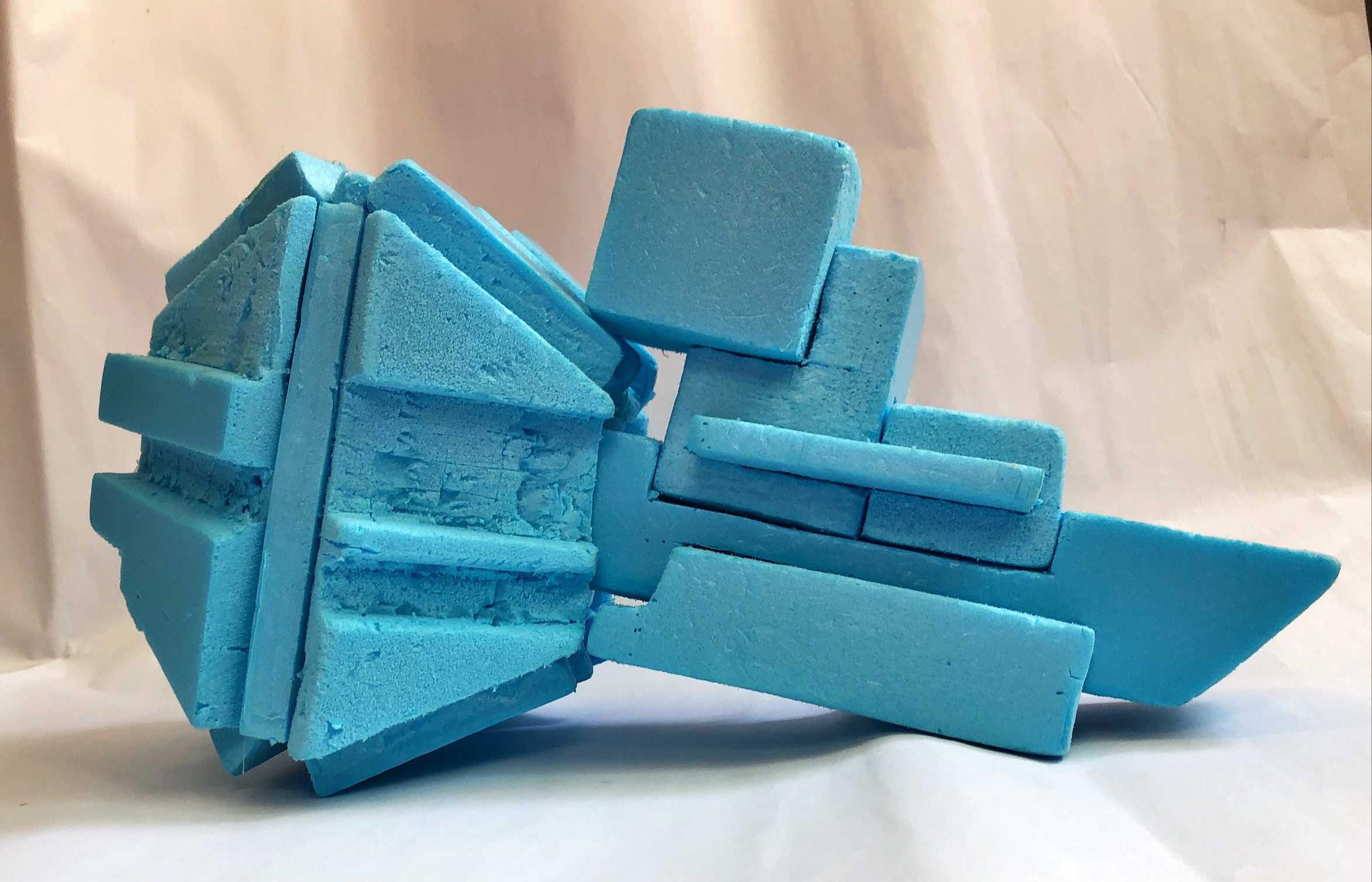
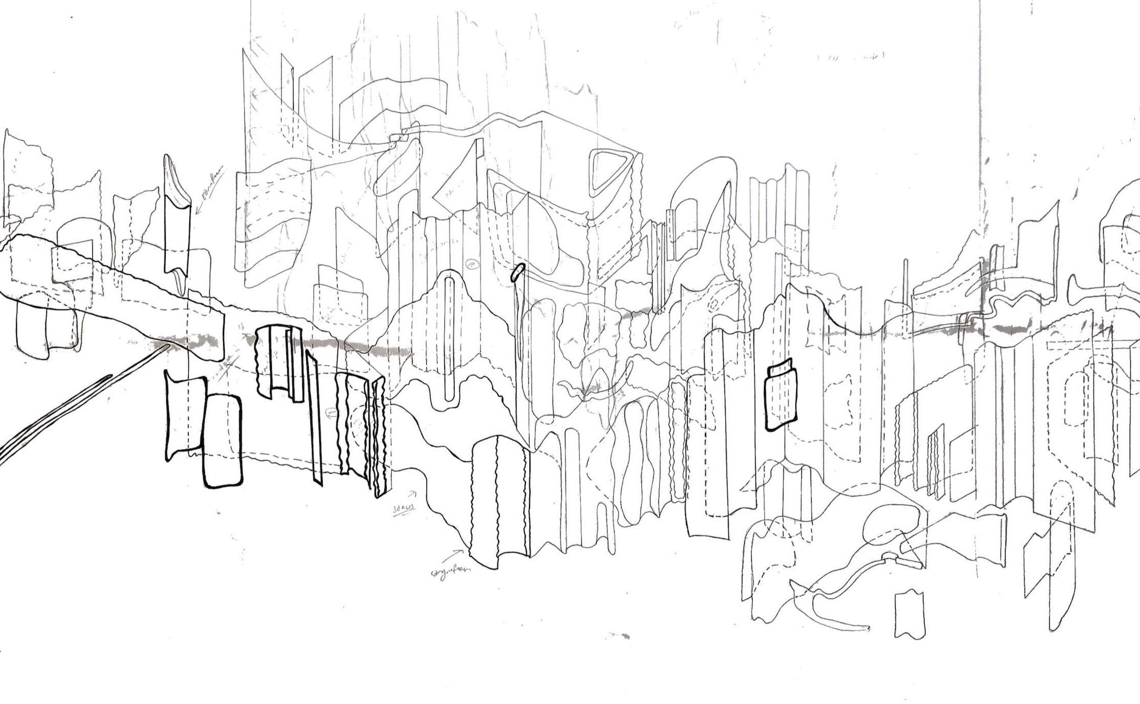
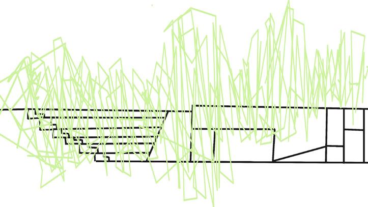
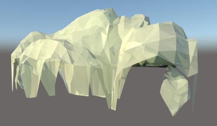
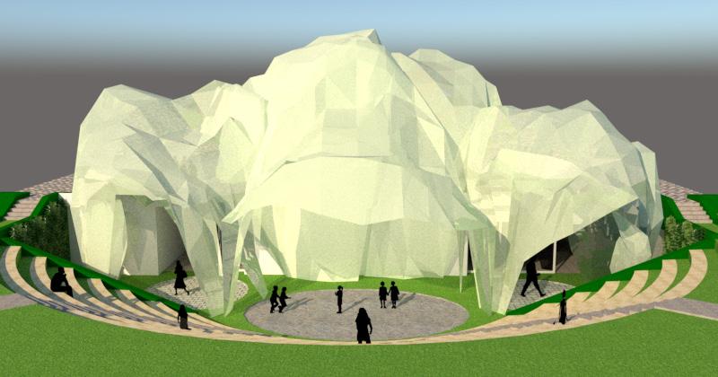
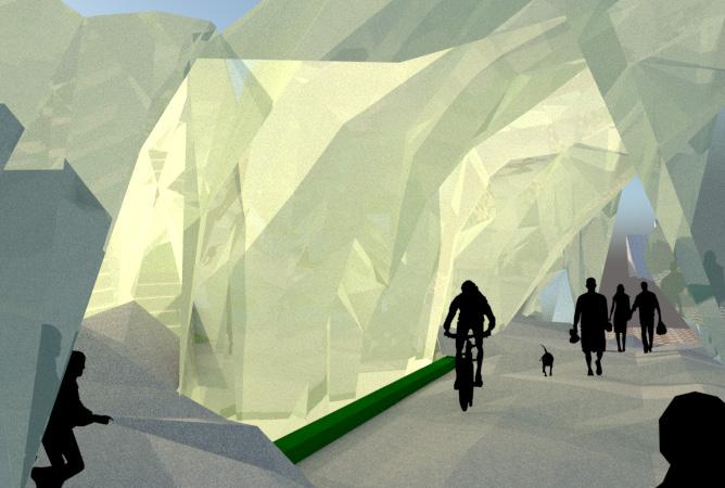
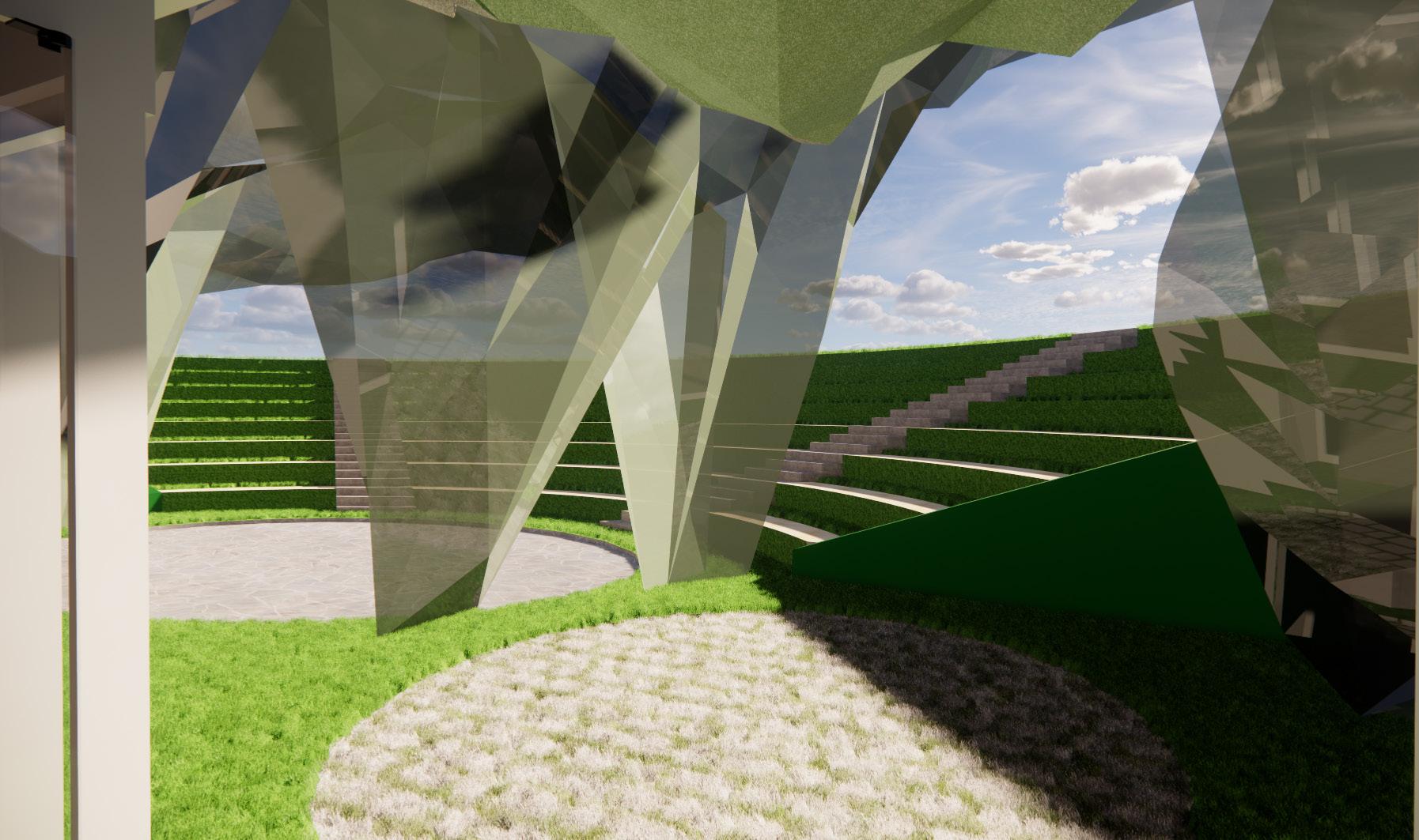
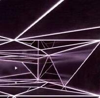
PROJECT ABLEPSIA
This project is to create a space and programme based on the observation on our given line & created device. Finding details & data on sounds, movement and sight

ABLEPSIA
SUMMARY
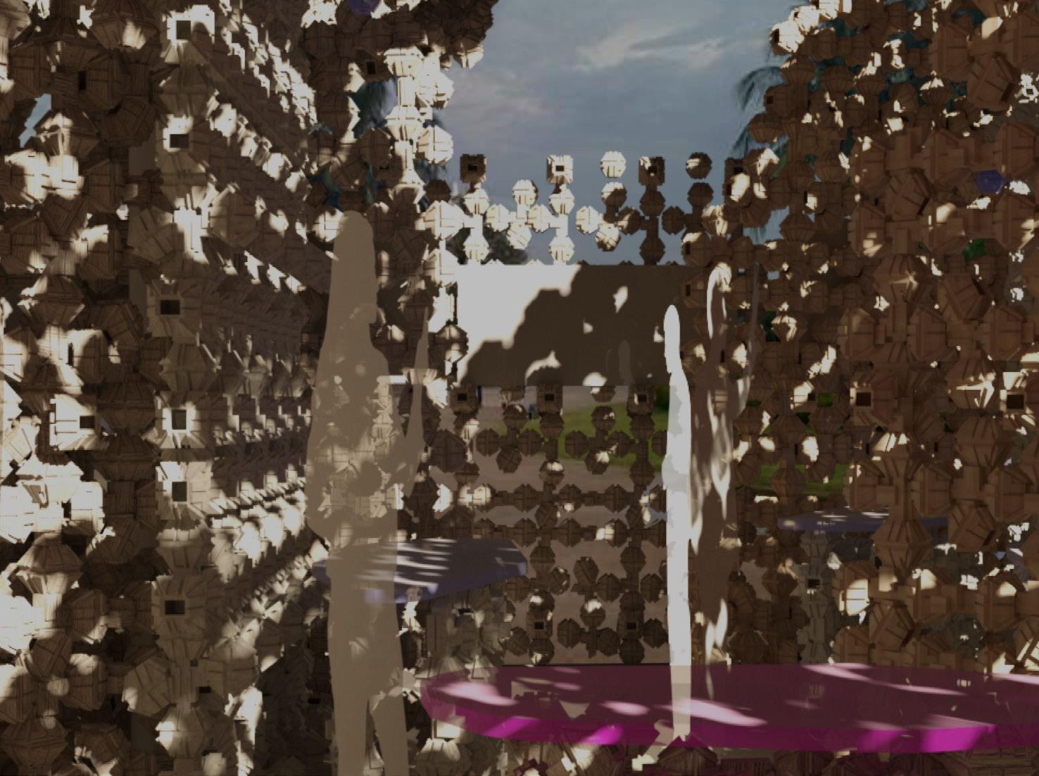
During my whole journey with and without the device, I learned movement don’t only happens with physical movement but also the changes in time, sounds and lights. Therefore insomelence is used to descibe my line.

Details Device Visual Insomelence
Intial Walk
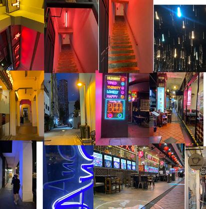
This was the main focuses during my investigation and understand of the slice. Picked out many movements, even when i’m standing still, this are espacially picked up at ventilated areas.
Signages and bustops Lights (Neon/highlighs/ traffic lights) Alley Ways / Cross Roads

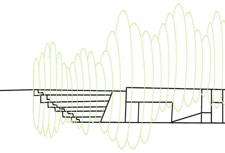
Device Walk
The motion of the fabric ( Darker shade = motion faster )


Changes seen on the Aluminum ( Capturing surroundings lighting)
The movement on the Frills ( Capture the small movements of surrounding)


22
ABOUT THE SPACE
I came across a reserach on how visual impared people suffer a condition “ Ciradian Rythm Disorder” due to their unability to identify time to sleep. Thefore creating a space that allows users to understand what they are going through in a tectile experince can help users understand how they live daily, without sterotyping their experiences.

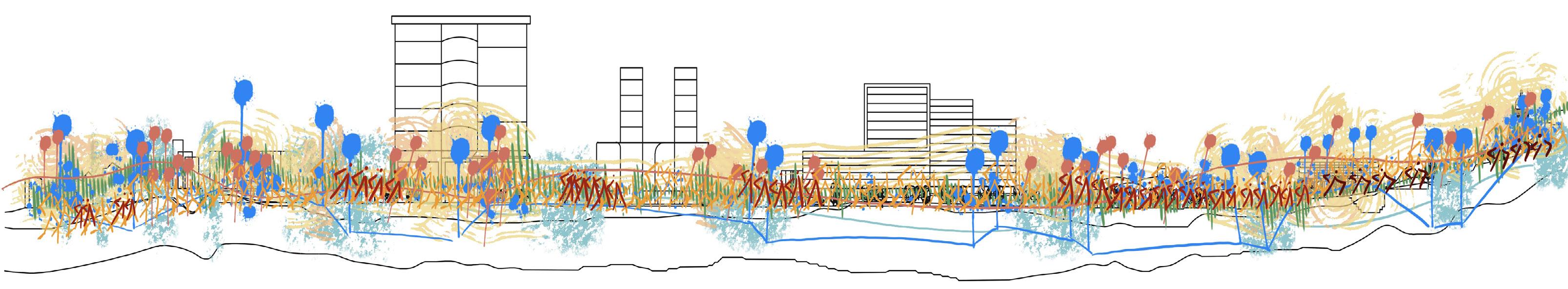
SITE ANALYSIS & LOCATION

From all the location from my given line, the SMU amphitheater was the most suitable place to create the space, due to it being a hot spot for physical activities & performances. Since there always activities takeing place it really represence the meaning of insomelence.
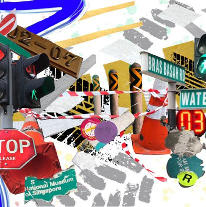
LINE OBSERVATION: TAN QUEE LAN ST - NATIONAL MUSUEM


SUN PATHWAY HUMAN TRAFFIC
STAGES OF DEVELOPMENT
DESIGN CONCEPT 1


DESIGN CONCEPT 2 DESIGN CONCEPT 3

DESIGN CONCEPT 4
ABLEPSIA DEVELOPMENT
Musems
Transport
Greenery
DEVELOPED FORMS
BACK ELEVATION

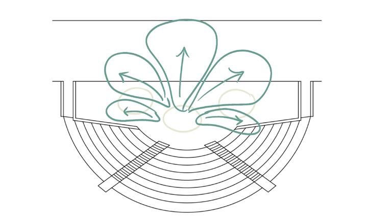
• Looking through the concepts design. I though of a centrailze design, where the space are created through the centrailze stage growing out to different zonings.

• While looking through development 3, it reminded me of shells and inpired me to twist and bend the shell to a petal / fan like shape. Added textures the twist or comes down as to create, another tactile in the exterior and interior viewing.
FRONT ELEVATION
SIDE ELEVATION
24
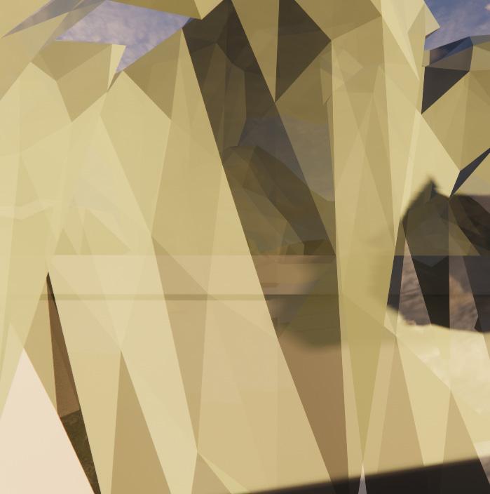
Forms & Material
Reflective Transluscent Acrylic
• This green material will change based on timing of the day. Showing the ever changing surroundings with the interior visuals distorred an bluring the line between the sky & ground

Patio Carpet
• This allows people to sit in the ground and different shape it’s surroundings. Contrast of comforbility on the different materials


2
26
Level 1 Level
Level 2 Level 1 Exhibition Area Main & Side Stage Hang Out Space Obsertory Area
PROJECT 5

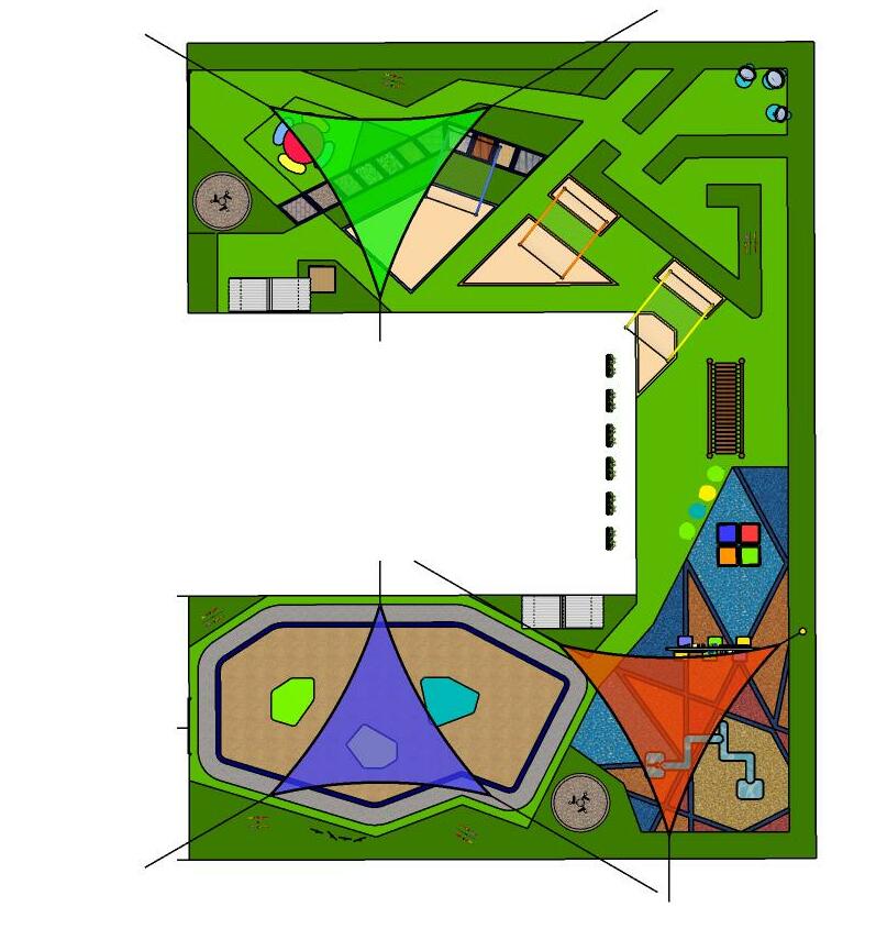
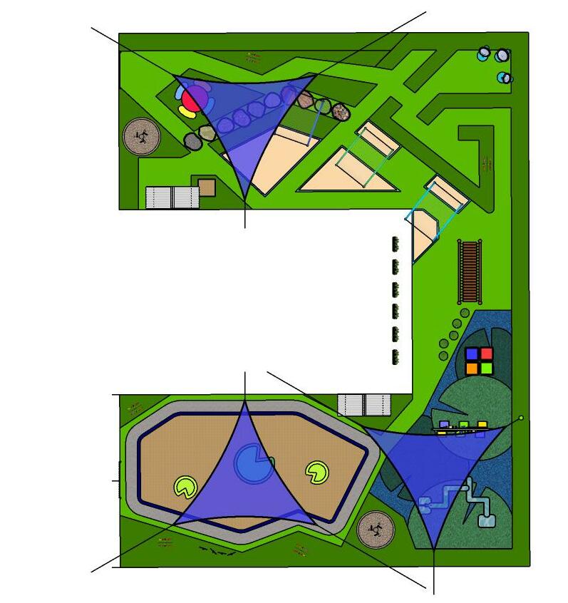
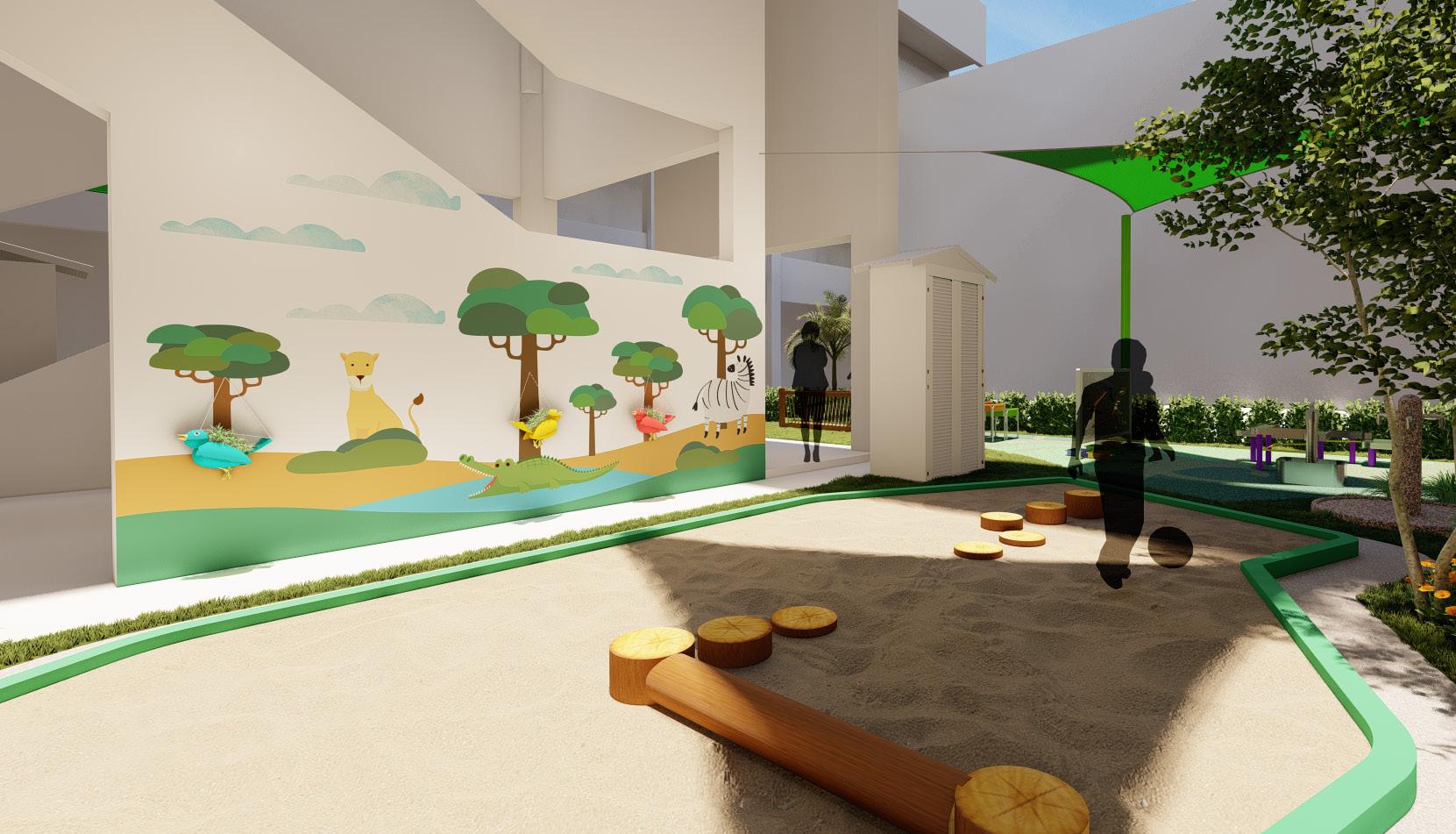
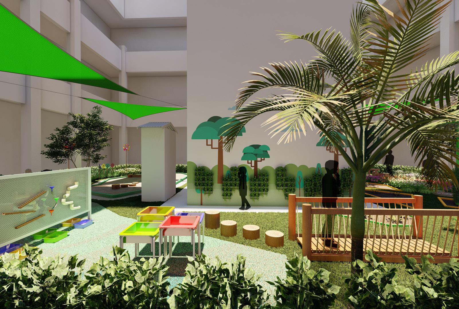
MOE KINDERGARTEN
Create a space for kindergarteners to learn through play in an existing area in Shunqun Primary school.
INTERNSHIP PROJECT
CONCEPT ABOUT THE PROJECT
Rejuvinating a part of the shunqun school’s garden and reinventing it into a playground for a kindergarten. Based on a new MOE programe placed into the school.
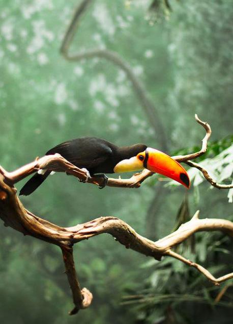
The inspired Zoo space can expand children’s understanding to their natural surroundings as through jungle like structures and visuals of animals. They will have a chance to learn and explore, new forms of sensory elements and venture many sights of mazes or merging paths. Adventure and discovery always awaits in the space


COLOUR PADLET
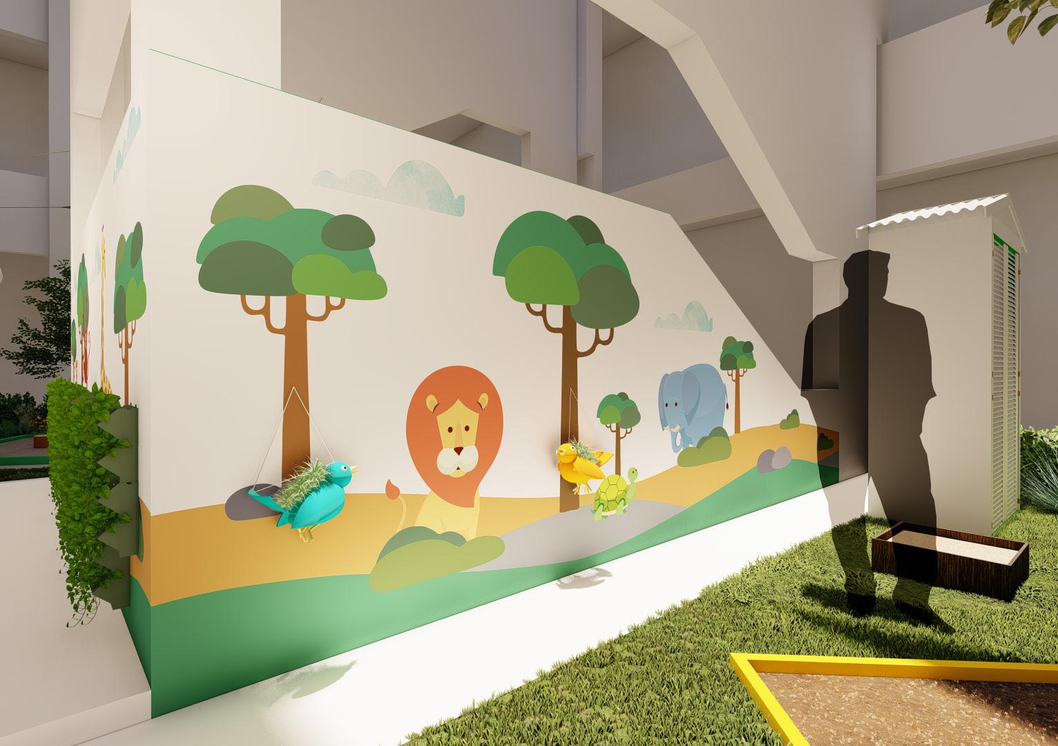
WALL MURALS
Main focal point in the enviroment is the painted wall mural. As it’s purpose is to make kids feel like they are playing next to animals
Children are very visual people, so having a colour full enviroment will help bring out their imaginative minds and enhance the activity in the space.

1 WALL
2 WALL
3 MOE KINDERGARTEN DEVELOPMENT 28
WALL DESIGN
DESIGN
DESIGN
Wall Mural
RENDERING
With the added bird planters
DESIGN CONCEPT 1
DESIGN CONCEPT 2
I came out with multiple concepts:
• MOSIAC = Kids can piece the mural art in their minds
• LILY POND = Kids can feel like they are hoping around the space.
RENDERED FLOORLAYOUT


30
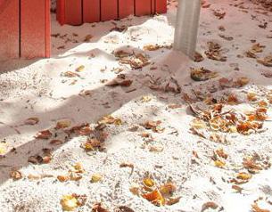
Sand Play Area
Canopies shelter placed in the main areas of activities
RENDERING
Water
Play Area Garden Area


Water Play Area
Garden Maze

32
PROJECT 6
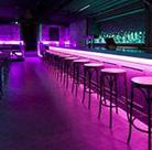
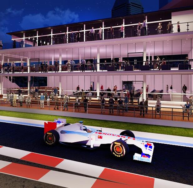
FOMULAR ONE PROPOSAL
Designing 3 levels of Interior spaces for the VIP viewing in the 2022 F1 singapore race. Interiors i worked on is Level 1 and 3

INTERNSHIP PROJECT
ABOUT THE PROPOSAL
Had to create visuals for the clients based on the themes they wanted each spaces have.

1. Retro Neon Club 2. Sophisticated dinning 3. Jungel & Rain forest

ACTIVITIES
Spaces is a dining aeas which allows the best view on the F1 Tracks and races taking place.


1ST DEVELOPMENT


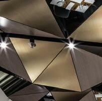
Even there are different themes, my team made sure to have a similar design languge throughout the whole space as to create a smooth transition each levels. This show through the ceiling design and materials. The differing design is the lighting & seating layout.


LVL 1 ROOM 1
LVL 1 ROOM 2 LVL 3 VIP

F1 DEVELOPMENT 34
AUTOCAD DEVELOPMENT

LVL 1 FLOOR PLAN

LVL 1, ROOM 1 ELEVATION
LVL 3 FLOOR PLAN

LVL 1, ROOM 2 ELEVATION

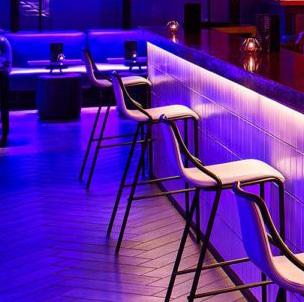
LVL 1 ROOM 1
The inspiration for retro neon club, is shown through the purple ligtings and ceiling design as it shaped the ambience of the room. The bar area is emphasized in this space

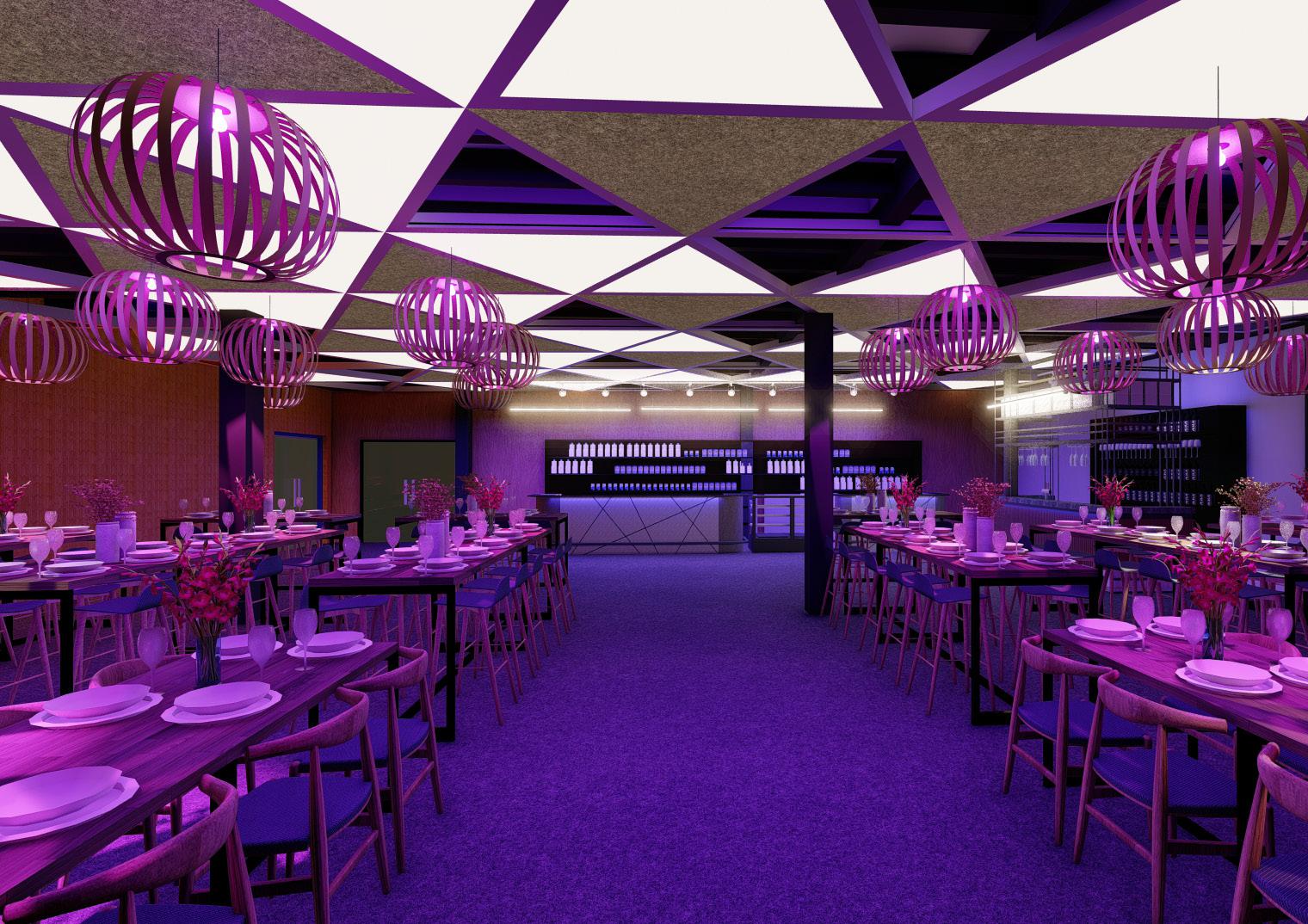
RENDERING
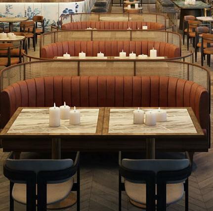
The inspiration for sophisticated dinnning, is shown through the ligthing scheme and material design. Dining activity emphasized in it’s floor layout

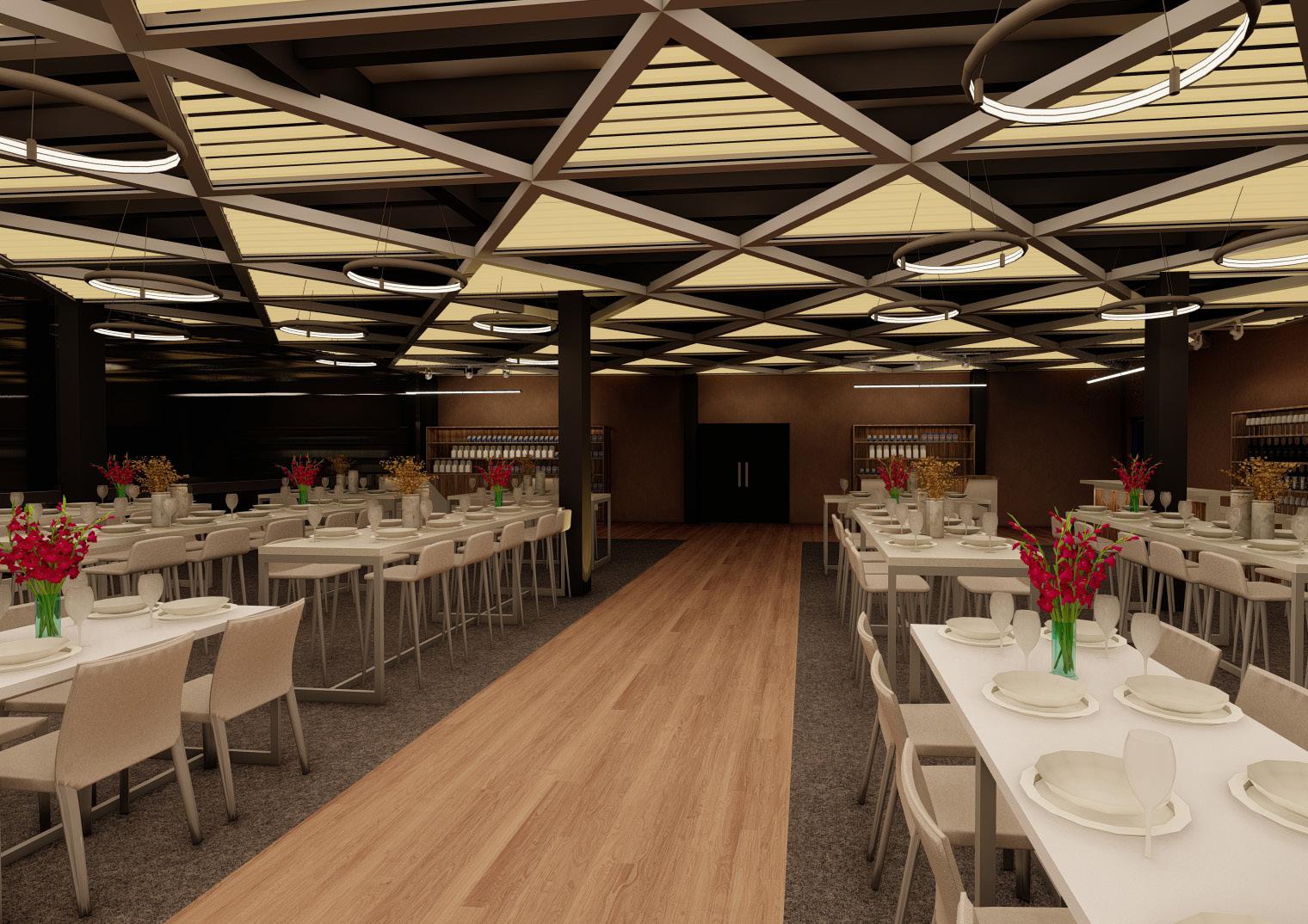 LVL 1 ROOM 2
RENDERING
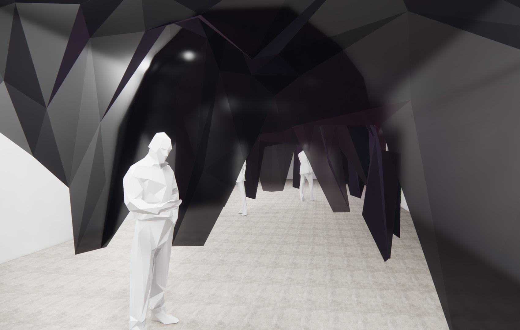
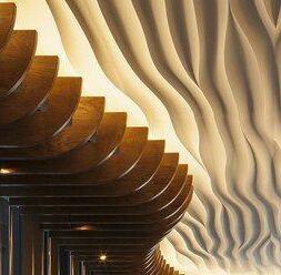
LVL 3 The inspiration for Jungel & Rain forest is shown through the use of natural materials, plants and led lights shape the ambience of the room.
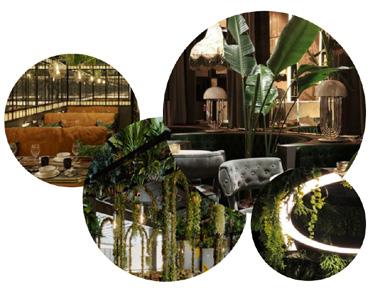

RENDERING
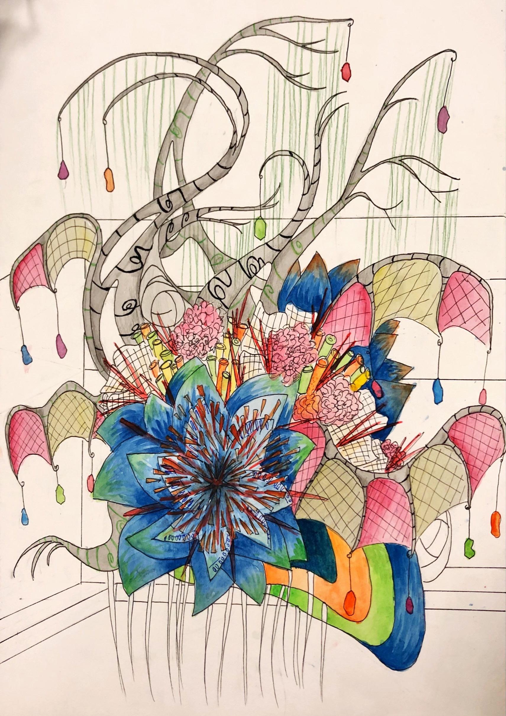
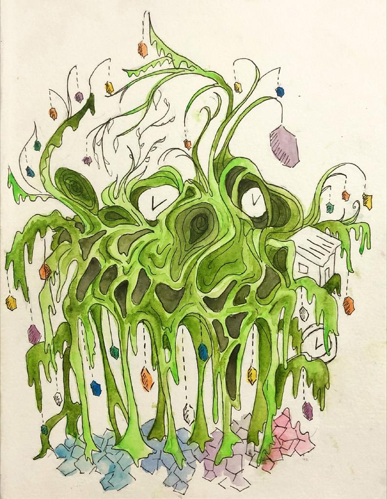
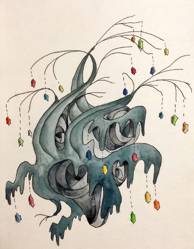
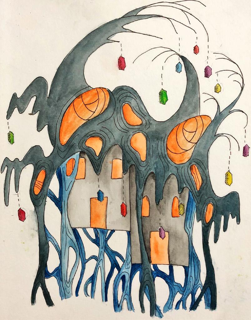
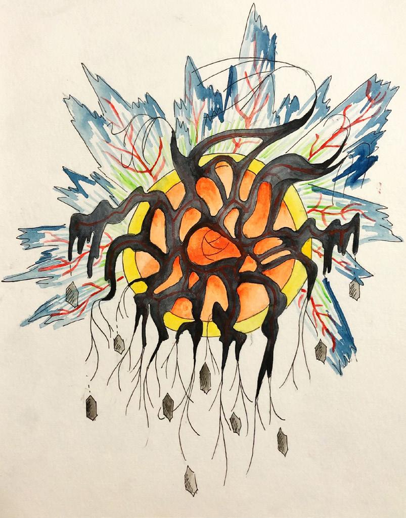
OTHER WORKS

MY OWN WORKS
Sketches

I have other skills such as graphic designs and illustrations I was able to use them for multiple projects. Some works were created in procreate or hand drawn


40
HETEROTOPIA

44
EXHIBITION


46

43
BALOGBOG
REMORIN MARY AUDREY
