SPECTRUM PAINT

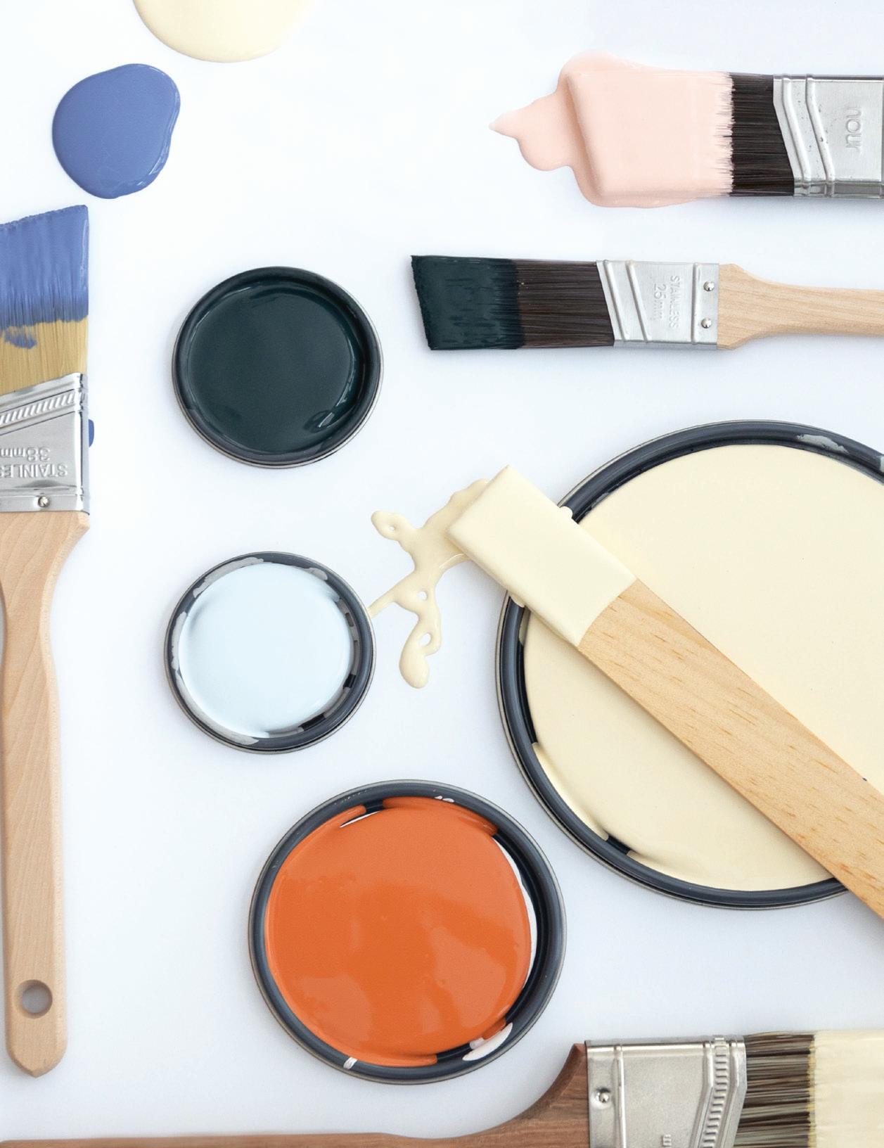
hot shades for you home
et's Paint


Color Yearthe with LIMITLESS! PPG'S
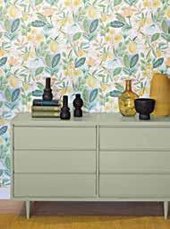
LE PRINTEMPS A PARIS


DISCOVER THE CITY OF LIGHT AND EXPLORE THE LARGEST ANTIQUES MARKET IN THE WORLD PICNIC PERFECT FROM SANDWICHES ON THE LAWN TO POTLUCKS IN THE PARK


ppg1091-3
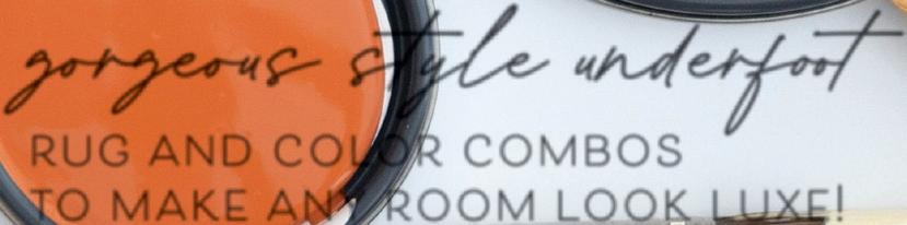
gorgeous style underf t rug and color combos to make any room look luxe!

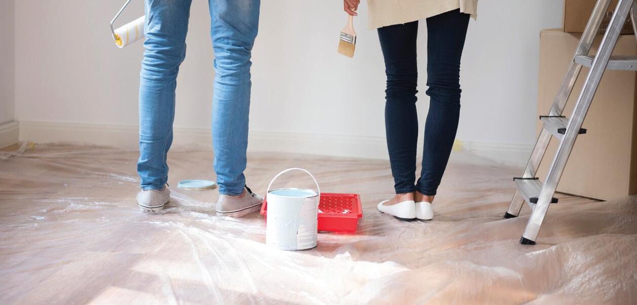
HOW MUCH PAINT DO I NEED?
Follow this formula to estimate the paint requirements of your project.
You’re nearly finished painting when you look down into the almost empty can and realize – yikes! You won’t have quite enough paint to finish the job.

Estimating the amount of paint you need is as important as choosing your color scheme. Save yourself time and a panic attack by taking the guesswork out of your paint requirements using a calculator similar to the one on this page. It’s as simple as measuring the dimensions of the room being painted to find the surface area.
STEP 1: Measure the Walls
Wall 1 Width: ___ ft. X Height: ___ ft. = _____ ft.
Wall 2 Width: ___ ft. X Height: ___ ft. = _____ ft.
Wall 3 Width: ___ ft. X Height: ___ ft. = _____ ft.
Wall 4 Width: ___ ft. X Height: ___ ft. = _____ ft.
Add together to find Total Wall Surface = _____ ft.
STEP 2: Measure the Doors
Door 1 Width: ___ ft. X Height: ___ ft. = _____ ft.
Door 2 Width: ___ ft. X Height: ___ ft. = _____ ft.
Add together to find Total Door Surface = ____ ft.
STEP 3: Measure the Windows
Window 1 Width: ___ ft. X Height: ___ ft. = _____ ft.
Window 2 Width: ___ ft. X Height: ___ ft. = _____ ft.
Add together to find Total Window Surface = _____ft.
STEP 4: Add Total Doors plus Total Windows to = Surface Not to Be Painted.
STEP 5: Subtract Surface Not to Be Painted from Total Wall Surface = Total Surface To Be Painted.
STEP 6: Divide Total Surface to Be Painted by the Spread Rate* = Amount of Paint Needed For Each Coat.
*SPREAD RATE: The spread rate is the recommended yield you can expect from a can of paint. Typically, a U.S. gallon of paint will cover 350-400 square feet. As coverage may vary depending on paint product and thickness of application, check your paint can label to determine the spread rate before purchasing.
PRO TIP: It’s wise to buy a bit more paint than you think you will need for the job. This way, you can ensure you will not run out of paint before the job is done, plus you’ll have leftover paint for touch-ups.
Don’t run out! Let Spectrum Paint help calculate the right amount for you


The best paint jobs start with
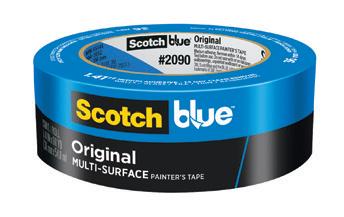
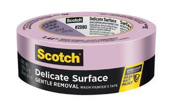
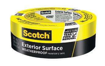
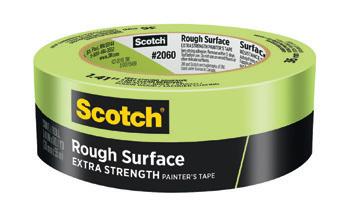
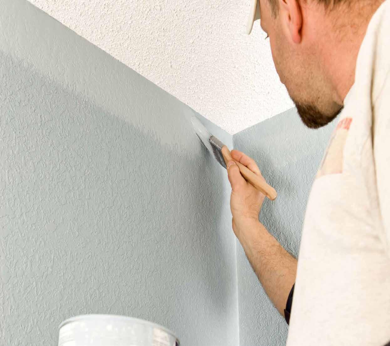
No two surfaces are alike — that’s why starting with the right prep can make all the difference. With a family of tapes designed specifically for your surface, Scotch® Painter’s Tape helps you prep right for professional-looking results.
tape are trademarks of
© 3M 2019. All rights reserved. 3M, Scotch, ScotchBlue, Edge-Lock and the BLUE color of the
3M.
Check out more colorful and inspiring spaces starting on page thirty.
SPACES: Real home redesigns with wall-to-wall ideas you can use.
28
HISTORY IN THE MAKING
A historic loft goes from dull and dated to bold and beautiful thanks to a reimagined renovation courtesy of Studio Sven’s Lauren Svenstrup
34
THE LAKE HOUSE
Lisa Clark Design turns a cramped cottage into the ultimate family getaway with a refreshing aesthetic update and a second storey
40
DIAMOND IN THE ROUGH
Amanda Hamilton Design enriches this new build, nestled in farmland outside of Red Deer, Alberta, with contemporary design and lots of personality
46
BEST FOOT FORWARD
A 1912 craftsman home has its character restored thanks to an elevated and whimsical design courtesy of Denise Ashmore of project22design
Products featured in At Home are available at Spectrum Paint, some by special order.
5 SPRING 2024
PG.34
LYNSEY CORBETT PHOTOGRAPHY
CARLEE BAIGRIE
ANDREA DANELAK
TWILA DRIEDGER
DARREN GRUNERUD
OLIVIA HIEBERT
ARTHUR LIFFMANN
JIM TAYLOR
AUBREY TAYLOR
IRA VAN DEN BERG
Love the designs within our pages? Connect with the talented folks behind the gorgeous spaces.
HISTORY IN THE MAKING
Studio Sven
Lauren Svenstrup studiosven.com @studiosven
THE LAKE HOUSE
PG. 34
Lisa Clark Design
Lisa Clark lisaclarkdesign.net @lisaclarkdesign
DIAMOND IN THE ROUGH
PG. 40
Amanda Hamilton Design
Amanda Hamilton amandahamiltondesign.com @ahidstudio
BEST FOOT FORWARD
PG. 46 project22design
Denise Ashmore project22design.com @project_22_design
CONTRIBUTORS
6 ISSUE 15
SPRING 2024
Bahia Taylor Editor in Chief Co-founder
Leigh McKenzie Creative Director Co-founder
Twila Driedger
Contributing Writer & Editor
Olivia Hiebert Graphic Designer
Carlee Baigrie
Contributing Writer
Andrea Danelak
Contributing Writer
Graphic Design
Styling
Gallon Creative
www.galloncreative.com
Owned and Published by: Gallon Creative
For inquiries, please contact us at projectsgalloncreative@gmail.com
5 Scurfield Blvd #25 Winnipeg, Manitoba R3Y 3G4
www.galloncreative.com
projectsgalloncreative@gmail.com
Cover Photography - Aubrey James Projects aubreyjamesprojects.com
While every effort has been made to ensure that advertisements and articles appear correctly, At Home Magazine cannot accept responsibility for any loss or damage caused directly or indirectly by the contents of this publication. All material is intended for informational purposes only. The views expressed in the magazine are not necessarily those of its publisher or editor.
All rights reserved. Reproduction in whole or part prohibited without written permission from the publisher.
Typeset in Adobe Garamond and Avenir Printed in Canada
22
CRAFTY:
DIY? WE SAY Y-E-S!
HANDMADE WAX SACHETS
Pretty, fragrant bars of wax that look darling and smell amazing
24
HOT SPOT: Shining a spotlight on the world’s hidden gems
LE MARCHÉ AUX PUCES DE SAINT-OUEN
Explore the largest antiques and second-hand market in the world
52
TOOLBOX: Helpful resources for any homeowner
HOW TO HANG LIKE A GALLERIST
Pro tips for mounting pictures and artwork
58
CHOW: Just thinking about it is making us hungry
PICNIC PERFECT
Relax, soak up the sun and enjoy a basket full of delicious food
62
EXPLORER: Pack your sense of adventure and let’s go
LE PRINTEMPS A PARIS
Discover the City of Light as it gleams and blooms in front of your eyes
PG.28
PG.46

CONTENTS
RYAN MCDONALD, JANIS NICOLAY PHOTOGRAPHY
© 2022 PPG Industries, Inc. All Rights Reserved. The PPG Logo is a registered trademark of PPG Industries Ohio, Inc. PPG_1041364 11/22 7 SPRING 2024
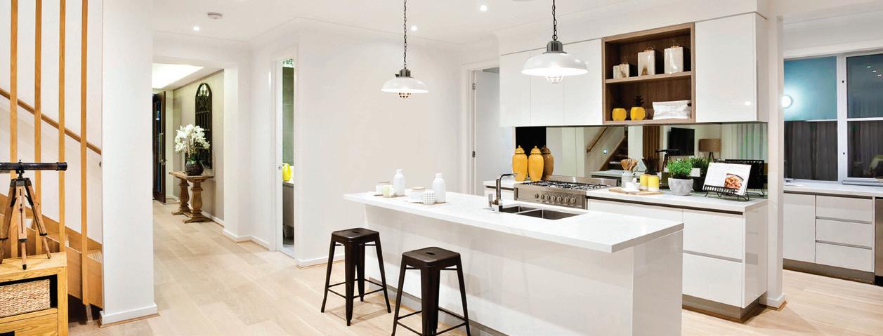
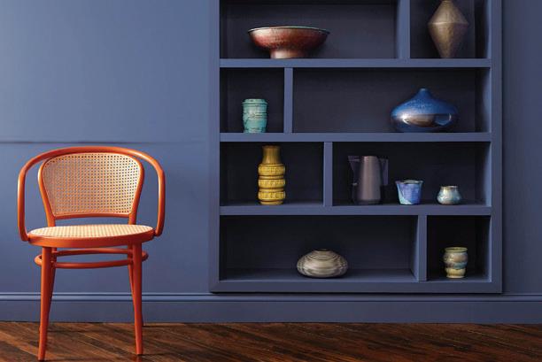
We aren’t afraid of a little color. In fact, we believe color in your home can change your mood. Happy, bright, springtime colors are able to energize and make you feel rejuvenated. Conversely, deep, dark hues have the ability to calm and create a relaxing space. We’re all about expressing ourselves through color, whether it be in a vibrant front door, bright pair of pants, bold hue in the half bath, or rug with a muted motif grounding the living area. Color makes a room, a canvas, even a closet, come alive.
If you’re timid when it comes to adding color and pattern but want to add a juicy jewel tone or happy hue to your home, like this year’s Color of the Year, Blue Nova (PG. 70), rest assured, you are on the right track to decorating success. Find that one item that brings you joy and build your space around it. Perhaps it’s a beloved serving tray in a soothing shade of green (PG. 34), a funky Marketplace find or sexy sofa in mulberry velvet (PG. 28), or a whimsical print and a pair of shoes in your favorite shade (PG. 46). Use your treasures as a jumping off point to create a coherent color scheme for your space.
SPECTRUM PAINT

This issue is swimming with all the inspiration you need for incorporating a playful vibe or peaceful mood, as well as plenty of tips to get you there. Much of our influence for the spirited doses of color come from springtime in Paris, where cherry blossoms bloom on corners and people gather at cafes on cobblestone streets (PG. 62). At this time of year, the city comes alive with flea markets (PG. 24), and people enjoy picnics on the grass in front of the Eiffel Tower (PG. 58).

Whatever inspires you, whether it be travel, fashion, art or nature, draw on those tones to enrich and enliven your space. Be brave, be bold, and experience the power of paint.


FALL 2023 SPECTRUM PAINT AT HOME ISSUE FOURTEEN INTRODUCING 2024 COLOR TRENDS This palette focuses on looking inward to create a deeper, more holistically connected relationship with oneself. Consumers of all ages are putting their mental, emotional and social well-being at the forefront. LIMITLESS PPG1091-3 Color of the Year AQUAMARINE DREAM PPG1135-4 FOCUS PPG1008-1 CABIN FEVER PPG1021-7 NIGHT RENDEZVOUS PPG1037-5 PERSUASION PPG1077-3 BLUSH BEIGE PPG1070-2 OCTOBER MIST 1495 COLOR OF THE YEAR & COLOR TRENDS 2022 Make room for creativity. OCTOBER MIST 1495 COLOR OF THE YEAR & COLOR TRENDS 2022 Make room for creativity. SPRING 2022 SPECTRUM PAINT AT HOME ISSUE ELEVEN NO SWEAT CLEANING TIPS: RECIPES FOR HOME-MADE SOLUTIONS FABULOUS FOCACCIA FARM-TO-TABLE AND BEYOND PASSPORT TO TOFINO A SURFER'S PARADISE AND NATURE-LOVER'S RETREAT PALE MOON 289 Walls that make it paper pop with W O W COLOR FIX PAINT IT WITH THE COLOR OF THE YEAR OCTOBER MIST 1495 PEEL AND STICK WALLPAPER MAKES IT EASY TO UPDATE ANY SPACE IN MINUTES FALL 2020 SPECTRUM PAINT AT HOME ISSUE EIGHT UNMATCHABLE WALL: Stormy Monday 2112-50, Aura® Eggshell ©2020 Benjamin Moore Co. Aura, Benjamin Moore, Gennex, and the triangle “M” symbol are registered trademarks licensed to Benjamin Moore & Co. Color accuracy is ensured only when tinted in quality Benjamin Moore® paints. Color representations may differ slightly from actual paint. 7/20 When you find the perfect color, nothing else will do. Perfection comes from our paint and our proprietary Gennex colorants, together, creating results that are breathtaking. Rely on Benjamin Moore for premium quality and Gennex Color Technology, which makes our long-lasting colors, all 3,500 of them, one-of-a-kind. Unmatchable. 20-277650_At Home Magazine_8.375 10.875.indd ADD A POP OF COLOR FROM CHAIRS, TO DRESSERS, TO DOORS CRAFT YOUR OWN WOODEN GAMES FOR FAMILY AND FRIENDS TO ENJOY SOUP'S ON! FROM THE GARDEN TO YOUR TABLE BRINGING VACAY VIBES HOME: TAKE TIME TO REINVENT YOUR HOME AS A STAYCATION ADVENTURE DESTINATION SPECTRUM PAINT FIND A LOCATION NEAR YOU WWW.SPECTRUMPAINT.COM
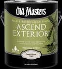
FIND A BREAKDOWN OF THIS COVER ON PG.76 WELCOME Ascend Exterior® Water-Based Clear Finish • Resists water and weather • Advanced ultraviolet protection • Clear, durable finish • Dries quickly and cleans easily • Designed for exterior application on wood, fiberglass, coated metal, or painted surfaces • Available in matte, satin, semi-gloss, and gloss sheens Scan QR Code for Project Inspiration myoldmasters.com | (800) 747-3436 | STRONG ENOUGH FOR EVEN THE TOUGHEST ENVIRONMENTS 8 ISSUE 15
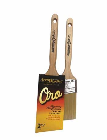


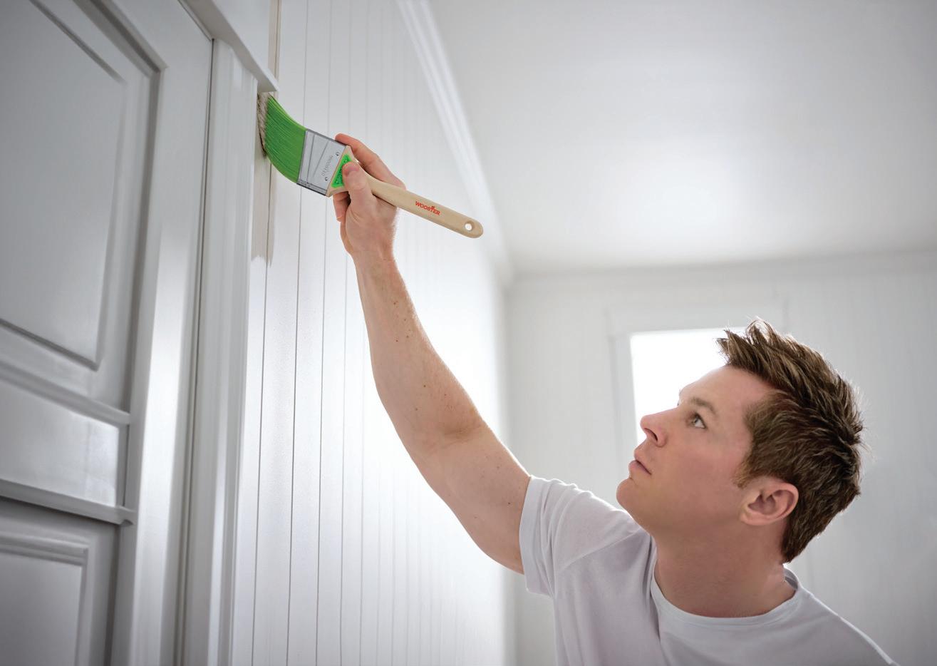
Handcraf ted Brushes
is the per fect compliment for all Latex or Oil/Alkyd Paints and Stains
✓ Superior Taper
✓ Advanced Flagging
✓ Exceptional Quality
✓ Holds & Delivers More!


Superior Roller Covers
Today’s paints demand more from today’s applicators and the lintless Glossdel Plus delivers like no other cover.
✓ Supreme Woven Fibers
✓ Solvent Resistant Core
✓ Exceptional Pick-up and Release


P i c k s Up and R ele a ses M o r e Pa i n t ! P i c k s Up and R ele a ses M o r e Pa i n t ! L I N T L E S S
9 SPRING 2024
SHEEN CHEAT SHEET

A breakdown of the sheen spectrum from flat to high-gloss
From flat and matte to eggshell, pearl or satin, semi and high-gloss, it can be hard to know which sheen will work best for your space. For newbies who are just dipping their toes into the sheen pool, your best bet is to chat with the professionals at Spectrum Paint, who can point you in the right direction, but before you go shopping it never hurts to have a basic idea of what you’re after.
Generally speaking, the sheen spectrum — from low to high sheen — goes flat, matte, eggshell, satin or pearl, semi-gloss and high-gloss. Check out the sheen cheat sheet below to get the details on each of these options and see which one sounds like the perfect fit for your project.
FLAT: Low-sheen with a non-reflective finish. Ideal for very low-traffic areas and ceilings.
MATTE: Low-lustre finish, relatively durable, easy to clean and hides minor surface imperfections well.
EGGSHELL: Has a soft, smooth appearance, very much like its namesake, an eggshell; slightly reflective. It’s a moderately durable sheen and is a safe choice for most types of walls in your home.
HERE’S A COUPLE OTHER THINGS TO KEEP IN MIND WHEN SHEEN SHOPPING:
More sheen means more durability: One rule of thumb is the higher the sheen the better it will be in a high-traffic area that requires a bit more durability. Flat and matte sheens that have little or no shine can be quite easily scratched and marked up, so bedrooms and home offices or similar, lower-traffic spaces would probably be the only places you’d want to use those sheens in. at said, some manufacturers have developed matte finish products with durability equal to that of their eggshells. Moderate sheens like eggshell, satin or pearl, and higher sheens such as
SATIN OR PEARL: Has a lustrous fi nish, and is a good option for high-traffi c areas due to its durability. It can also stand some exposure to moisture.
SEMI-GLOSS: Super sleek, shiny appearance, and best for hightraffi c areas and spots that get touched or bumped a lot, such as doors and trims.
HIGH-GLOSS: Creates a bright, ultra-shiny and reflective finish that almost resembles glass. Suitable for surfaces in a high-use environment.
semi or high-gloss, however, can stand a lot of abuse, so they are great for busy areas. Moisture-prone areas such as the bathroom or kitchen are great candidates for paints made specifically for those conditions, ask your local expert.
Sheen affects room mood: It’s important to base your sheen selection on the function of your room and using the sheen that will accommodate that, but you should also consider how it will look in that room and the overall feel you are after. For example, lower sheen paints soak up light, which helps hide imperfections, and high-gloss sheens do the opposite, reflecting light to make darker rooms feel brighter and lighter and emphasizing imperfections.
KEEP IN MIND SHEENS CAN VARY FROM MANUFACTURER TO MANUFACTURER, SO LET SPECTRUM PAINT FILL YOU IN ON ALL THE INFORMATION BEFORE YOUR MAKE YOUR FINAL DECISION!


TOUCHING UP IS (NOT) HARD TO DO


How to spot paint scratches, marks and dings without repainting the entire room
It happens. In the rush of daily life, walls in high-traffic areas of the home get scratched and scuffed. With a bit of time, patience and procedure, you can touch up those marks and keep your walls looking fresh and smooth. Before you start in on the six-step process below, remember that the ability to touch up a painted surface depends on the gloss and color of the original paint product, whether it is alkyd (oilbased) or latex, as well as the length of time it has been on the surface. The experts at Spectrum Paint can help you do the job right.
Step 1: Clean the wall surface
Dirt, dust and grime build up can affect paint adhesion so it’s important to wipe down your wall before beginning. Using a sponge, lightly clean the work area with a mixture of mild detergent and water.
Step 2: Repair divots and dents
Premixed spackling compound can fill in any dents, nail holes or deep scratches that have accumulated on your wall. Before applying, smooth the surface with a fine-grit sandpaper, then use just enough compound to fill the hole or crack. Wipe away any excess with a damp cloth and allow it to set (this takes a few hours) before lightly sanding it again.
Step 3: Prime the area
To ensure proper paint adhesion and color blending, you must prime the repair area before painting. If you skip this step, the touched-up spot will stand out from the rest of the wall surface. Apply the primer just to the repair area and allow it to dry completely.
Step 4: Use the same paint
It’s always wise to store leftover paint so that you can use it for making repairs. In fact, your touch-up paint should be from the original can –otherwise, matching colors could be mission impossible. If that’s not possible, return to your paint store and ask for the same brand, color and finish (flat, eggshell, semi-gloss, gloss). Bonus tip: Alkyd paint loses 30% of its gloss after a few months, making new touch ups appear too glossy for several weeks – even if from the original paint can. Generally, latex paint makes touch ups easier because the paint’s age does not affect gloss or color.
Step 5: Use the same application tool
If the wall surface was originally painted with a roller, use a roller to touch up the paint finish. Brushes and rollers will leave different surface textures, making necessary repair jobs quite apparent.
Step 6: Inspect once dry
Let the paint dry before doing a visual inspection. You will want to see how it looks at different angles as well as in both natural and artificial light. Remember, even though you know where the patch is, visitors will not be able to spot it once the paint dries and ages.
POP IN TO SPECTRUM PAINT FOR ALL THE TIPS AND TOOLS YOU NEED TO MAKE QUICK WORK OF ANY PAINT TOUCH-UP JOB IN YOUR HOME.

CATCHING UP ON THE CLASSICS
VERSATILE NEUTRAL PAINT COLORS THAT WILL NEVER GO OUT OF STYLE
e classics. ey’re in your closet in the form of black pants and that snappy goes-with-everything blazer. ey’re stacked in your library - treasured, must-read novels, and songs saved in your playlist. And they’re also tried and true colors meant for any room in your home.
However, with so many wonderful classic neutrals, shades of white, even hues with undertones of a definable color, it’s hard to know which ones to choose. PPG suggests the following neutral colors to create depth and structure in any space.
GYPSUM PPG1006-1
is soft, warm white is popular for a reason. A pale, gray, veiled white with red undertone, this neutral is a timeless shade for any space. It’s not stark, but also not yellow, creating a creamy white that adds a bright, happy feel.
DELICATE WHITE PPG1001-1
With its non-existent undertone, this clean, crisp, true winter white is a versatile favorite for any room. Consider this neutral for an entire room or open concept living space. While it brightens up a room, it also pairs with almost any color.
TUNDRA FROST PPG1009-1
PPG’s Tundra Frost is a stunning paint color for any room where you want to add a touch of elegance. With its pale, warm, stormy gray and ebony undertones, this neutral is a go-to shade for an open concept floor plan.
WHISKERS PPG1025-3
With a soft umber undertone, Whiskers is PPG’s truest greige. It’s a perfect paint color for a foyer and a popular neutral to add color and warmth to a room. Pair this shade with deeper tones like Coffee Bean PPG1025-7 or lighter neutrals like Commercial White PPG 1025-1.


APPLESAUCE CAKE PPG1095-5
is shade is a detour from most neutral colors, with Applesauce Cake described as a golden yellow with an almond undertone. Use this soft, neutral subdued tan to add a rich tone to any room.
SILVERY MOON PPG1029-1
A naturally understated gray, PPG’s Silvery Moon creates a hushed and calming feel on interior walls. e subtle gray feels elevated and stylish alongside pure white trim and ceilings. PPG suggests pairing it with deeper olive for the main exterior color of your home.
GARLIC CLOVE 18-09
ough a bright white, Garlic Clove has just enough warmth to counterbalance the snowy shade. is pale neutral is off-white with a sage undertone, making it an ideal choice for interior walls.
HIGH SALUTE PPG1039-7
PPG describes High Salute as a dark, cool, indigo black with a cobalt undertone. Because it has both warm and cool undertones, the deep hue can be paired with almost any color, acting like a neutral. e saturated shade adds color without overpowering other elements in the room.


 GYPSUM PPG1006-1
APPLESAUCE CAKE PPG1095-5
TUNDRA FROST PPG1009-1
GARLIC CLOVE 18-09
DELICATE WHITE PPG1001-1
SILVERY MOON PPG1029-1
WHISKERS PPG1025-3
GYPSUM PPG1006-1
APPLESAUCE CAKE PPG1095-5
TUNDRA FROST PPG1009-1
GARLIC CLOVE 18-09
DELICATE WHITE PPG1001-1
SILVERY MOON PPG1029-1
WHISKERS PPG1025-3
STOP BY YOUR LOCAL, INDEPENDENT PAINT RETAILER TO FIND OUT WHAT CLASSIC COLOR WOULD LOOK BEST ON YOUR WALLS.
HIGH SALUTE PPG1039-7

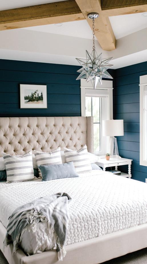
BENJAMIN MOORE’S 2024 COLOR OF THE YEAR
Introducing Benjamin Moore’s selection for 2024’s Color of the Year: Blue Nova CC-860. A character-rich hue inspired by the great expanse of outer space.


Benjamin Moore describes their selection for 2024’s Color of the Year as a shade that combines the best of violet and blue to balance intrigue and depth with “an undercurrent of reassurance,” suggesting it both “captures the spotlight” and offers “endlessly classic appeal.” With an essence of cosmic possibility, the shade encourages us to indulge in new experiences. To further emphasize the inspiration behind Benjamin Moore’s choice, they announced the Color of the Year during a live streamed press conference held at Blue Origins orbital space launch site.
At ease among many different shades and situations, Blue Nova caters to both the adventurous and the traditional. As a mid-tone, it is inherently versatile (it’s already being touted as a bolder navy alternative), but its vibrancy allows it to make a statement, too. Paired with contrasting colors like orange, it can create a dynamic and grounding atmosphere. Surrounded by neutrals, it sings as a focal point. Or, envelope an entire room in its moody, soft glow—experts suggest trying it out as a wall and ceiling color in a powder room or bedroom for an immersive feel. In a high traffic area like a living room or dining room, it can be used to highlight architectural features like molding, and it will also shine particularly bright against natural wood finishes. But Benjamin Moore says the best place to seek inspiration for a color story featuring Blue Nova is the sky itself—pick out shades you see in a sunset, just before twilight, and you can’t go wrong.
Simplifying the process of bringing Blue Nova into any space is the entire Benjamin Moore Color Trends Palette, announced alongside the Color of the Year.
MORE TO LOVE
Bridging traditional and modern aesthetics, the Color Trends palette is comprised of 10 shades, all inspired by the night sky. Considered together, they offer limitless possibilities for the home and beyond.
TALK TO THE EXPERTS AT SPECTRUM PAINT ABOUT HOW TO BRING BLUE NOVA INTO YOUR HOME.
White Dove OC-17 Pristine OC-75 Topaz 070 Teacup Rose 2170-50 Honeybee CSP-950 Regent Green 2136-20 Antique Pewter 1560 Polar Sky cc-790 Hazy Lilac 2116-40
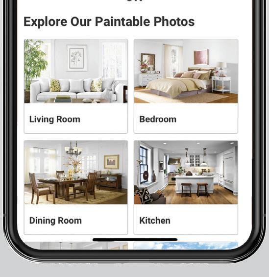
PPG Paint Color
Visualizer
Visiting a paint store can often be an overwhelming experience: with so many paint colors to choose from, it’s hard to narrow down your options. Thankfully, PPG’s award-winning developers have created an online tool using proprietary technology, allowing users to instantly “try on” paint colors by snapping a photo of the space and selecting the desired shade—all from the comfort of your own home. The results are a polished and realistic vision that puts your colors in question into context, so you can make an educated choice. After you’re done, save your project, and the website will help you locate & purchase your selected shade.
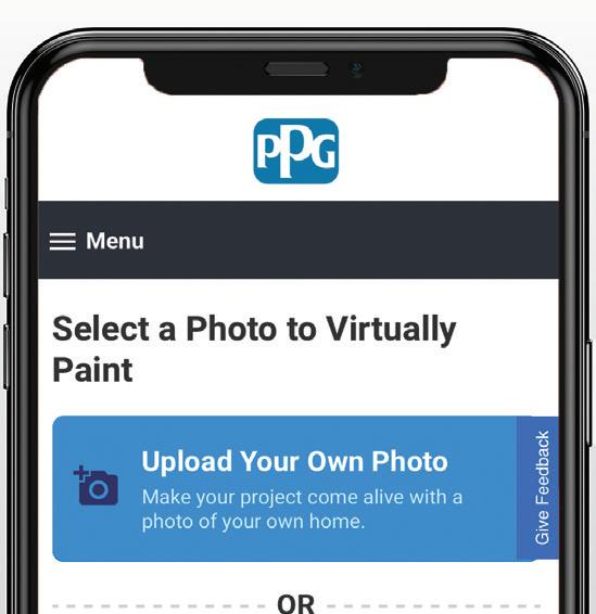
Talk to your experts at Spectrum Paint about how to maximize your online experience!
www.visualizecolor.com/ppgpaints


Whether you’re planning to sell or simply wanting to improve the space you’re living in, these simple DIY hacks can instantly bring up the value of your home while providing more functionality to its residents.
BUILT-INS
Storage is always an important feature that people look for when purchasing a home, and there’s nothing more attractive than a customized look that fits seamlessly with its surroundings. Take a trip to your local hardware store and create a built-in storage solution on a vacant wall or inlet.
PAINT YOUR KITCHEN CABINETS
For many, the kitchen is the heart of the home, but it’s also one of the most expensive areas of the home to renovate due to all the appliances and tilework typically required. If you’re not ready to invest in that big of a project, painting or re-staining your cabinets can be an excellent compromise.
CHANGE YOUR LIGHT FIXTURES
Even though they are a relatively inexpensive aspect of an overall design concept, light fixtures can have a huge impact on the impression of your home. Updating old fixtures to more modern pieces can have a dramatic effect on increasing interest in your property. If you’re looking to save in this area while still providing an upgrade, try spray painting your fixtures in a matte black for a modern edge.
BUILD-A-BEDROOM
Have an office or den? You can instantly bump up the value of your home by installing a closet in it, transforming it into another bedroom (so long as there is a window that meets regulation). You can use bookcases and tension rods to create any dream closet, all while staying within budget.
CREATE A PRIVACY FENCE
As much as new home owners fantasize about block parties and backyard BBQs with neighbors in their prospective new home, there’s no deterrent quite like open sightlines in your backyard oasis. Everyone values a little bit of privacy. Rather than waiting years for foliage to grow, build a privacy fence. There are a ton of cool designs and ideas on Pinterest that keep things simple enough to do with relatively little skill.
TEXTURE TUNE-UP
Challenge yourself to create one accent wall with texture on the walls. Installing a board and battan wall or wainscoting is a lot easier than you think, and it gives that extra boost of character that helps people fall in love with a space.
BASEBOARD BASICS
Collectively, in the design world we’ve moved away from skinnier, moulded baseboards and towards the flat, wider type. If you can, upgrade your home, but only if you’re able to do them all uniformly, otherwise it will appear disjointed.
Chat with the experts at Spectrum Paint to find out which upgrades are best suited for your home, and to find all the materials you’ll need to make them happen.
Wi ing
WITH WHITES
A true design lover will understand the impact that even subtle variations of white can have on a room. From frosty blue tinges to hints of warm yellow, the shade you select will set the tone for the mood of your space. Many a home-owner have warned about the trials and tribulations that come along with selecting a white paint color. The source of all this woe? White is THE most reflective color, which means that whatever shade of natural light you have pouring into your space will show up on your new white walls. That’s why it’s crucial to have a comprehensive understanding of the ways that your home’s natural light will work with whatever shade you select.
1. NORTHERN EXPOSURE
Sunlight streaming in from the North may create a gray or blue-ish hue.
2. SOUTHERN EXPOSURE
If your room has a window facing South, white walls might appear slightly warmer or softer.
3. FURNITURE & TEXTURES
If your room has a significant amount of wooden textures (furniture, ceilings, etc) or boldly colored furniture (potent blues, reds, yellows, etc) this may further impact your shade of white,
reflecting the colors and tones of the fixtures in your room onto the walls. A large surface area of wood will create a warm or orangey reflection.
4. INDOOR LIGHTING
Warm-toned bulbs paired with blue hued whites may create a green tinge.
5. GREENERY
If your home is surrounded by greenery, it’s likely even a bright white will have somewhat of a greenish hue during day.
A FEW OF OUR FAVORITES

TUNDRA FROST PPG1009-1
Intuitively sophisticated & highly versatile, this shade is the ideal shade to enhance its surroundings with a grayish hue.
DELICATE WHITE PPG1001-1
Our favorite bright white, this shade is the best background to help illuminate your furniture & fixtures. This cool white reflects a lot of light, creating an expansive feel & an inviting aesthetic.

MOUNTAIN GRAY PPG1021-1
With a subtle tinge of warm light, this shade breathes life and calming energy into the room.


PPG COLOR OF THE YEAR: LIMITLESS
Fresh, warm and with plenty of staying power, PPG’s selection for 2024’s Color of the Year is the quintessential modern neutral with an undercurrent of contemporary boldness.
According to PPG’s Ashley McCollum, Limitless can act as both an open-ended neutral and a bright and lively pop of yellow. “Limitless is bold enough to serve as a leading, primary color, yet has the essence of a neutral to act in a supporting role.” Combined with other colors from a curated color palette, the collection tells the narrative of a new era of creativity, optimism and introspection. McCollum expands on this, citing an “eagerness amongst consumers to find comfort amid the chaotic world, a willingness to break free of convention and a growing focus on creativity, well-being and fulfillment” Undeniably optimistic, Limitless appears almost sun-soaked, drenched in both traditional warmth and untethered possibility.
“LIMITLESS” POSSIBILITIES:
At home within a wide range of palettes, Limitless is as energizing as it is subtle and versatile. It’s easy to incorporate the honey beige into an existing design or build an enter color story around it. This soft statement color (an oxymoron that somehow rings true as a descriptor) makes sense both as the starring role as a floor to ceiling shade or in the supporting cast as an accent. PPG’s experts have noted it fits in effortlessly in wellness spaces from bathrooms to yoga studios. It’s not too playful or out there to be considered as an exterior shade, either. But to streamline and showcase Limitless’ potential contexts and stoke your creativity, PPG has offered up three unique color stories containing the 2024 Color of the Year.
VOLUME I:
“Grounded / Ethereal Tender” and hint at a focus on looking inward to strengthen the relationship with the self.
VOLUME II:
This color story is earthy and warm, with natural elements that ground and uplift simultaneously. PPG says this collection is about “transforming the world at large into a place of wonder and awe.”
VOLUME III:
“Playful / Expressive / Retro”
Described as “contemporary with classic references,” this collection feels bold and unapologetic. PPG characterizes it as a celebration of “creating life on your own terms and be[ing] happy in the face of adversity.”
TALK TO THE EXPERTS AT SPECTRUM PAINT ABOUT HOW TO BRING LIMITLESS INTO YOUR HOME.

BRICK DUST PPG1056-7
Looking for a color that will add some oomph to your abode? Turn up the heat with a rich, earthy red that captures the flavor of vine-ripened tomatoes and a bottle of Chianti. This velvety shade makes a statement everywhere, whether covering a bedroom or adding it as an accent to painted furniture, frames and accessories.
SAILOR’S COAT PPG 1153-7
Add unexpected depth to your space with a wall or accent in this saturated shade. Like a still and clear night sky, this dark, rich blue offers an otherworldly elegance. But a big impact doesn’t always have to come from a wall or full-room paint job. Consider adding this sophisticated shade to a kitchen island, side table or front door. Deep blue is also a bold and beautiful choice for a boy’s bedroom or home study.
paint see what can do!
Shop these stunning PPG Paints colors, from the homes featured in this issue at, Spectrum Paint.
The friendly staff will help you get all the right tools to help with your project.

ISTOCKPHOTO
PG.34
PG.28
18 ISSUE 15
CORBETT, RYAN
LYNSEY
MCDONALD

CLEAR YELLOW PPG1215-1
This versatile white is a go-to for many designers because it works so beautifully in so many spaces. From baseboards and moldings to board and batten and shiplap, this hue is often the choice for trim work but can be rolled anywhere. Lightweight and luminous, use this subtle shade of soft white on walls, ceilings and cabinets for depth and warmth.
SMOKY SLATE PPG1028-4
Bathe this timeless shade from floor to ceiling for a refined backdrop. Whatever your style preferences, this neutral gray will add a soothing hue in the dining room, on mudroom cabinetry or statement moldings. Pair this color with rich wood tones and gold and brass finishes and bring a touch of polish to this paint hue.

 PG.46
PG.40
PG.46
PG.40
© 2022 PPG Industries, Inc. All Rights Reserved. The PPG Logo is a registered trademark of PPG Industries Ohio, Inc. PPG_1041364 11/22 19 SPRING 2024
JOEL KLASSEN, JANIS NICOLAY PHOTOGRAPHY


• Handcrafted in USA with global components
• Firm Nylon/Polyester blend
•
•
• Durable construction suitable for everyday use
• Excellent cleanup attributes


MADE IN THE ALLPRO PROFESSIONAL BRUSH Proud Third Generation Family-Owned Business www.premierpaintroller.com Professional Gold Series™ Pro Plus™
Hardwood handle, stainless steel ferrule, chiseled edge for ease of use
stains,
Designed for all interior or exterior latex and oil-based paints,
primers, and polyurethanes
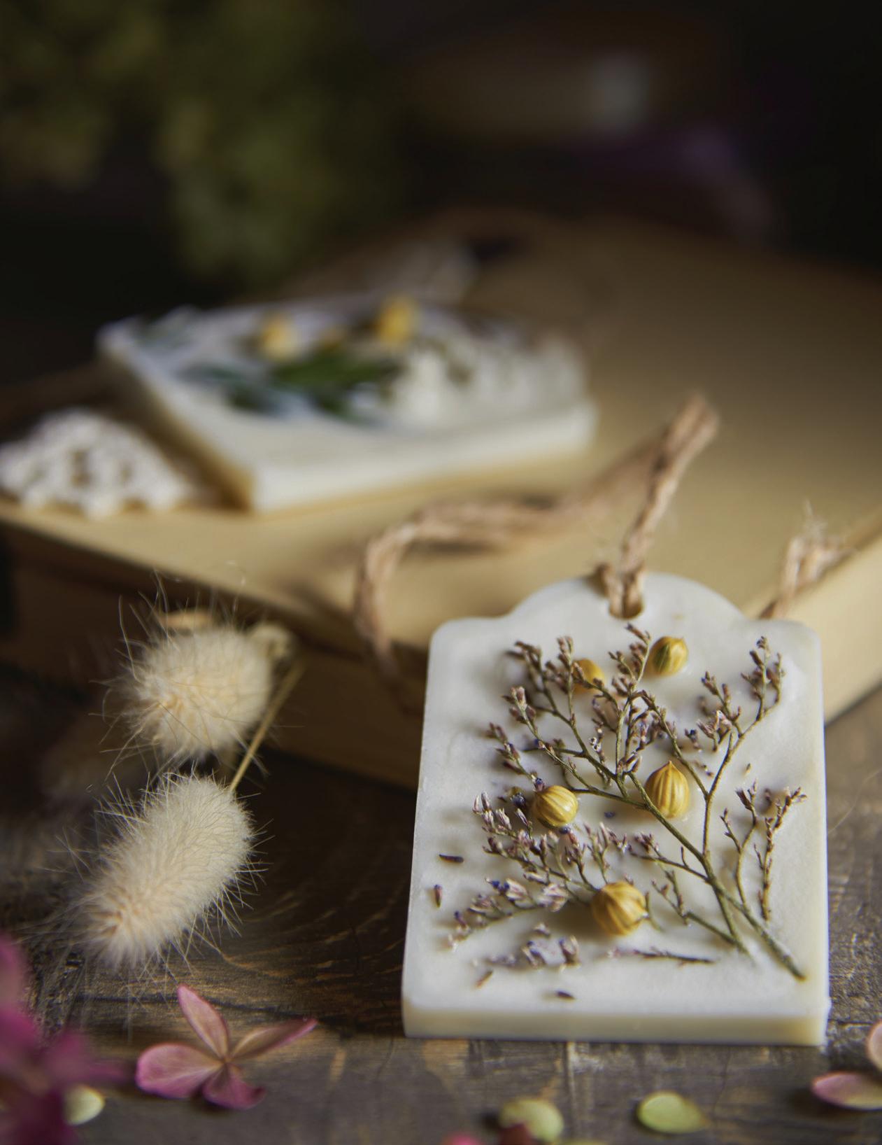
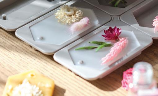
handmade wax sachets
PRETTY, FRAGRANT BARS OF WAX THAT LOOK DARLING AND SMELL AMAZING.
CRAFTY
22 ISSUE 15


Hung or displayed around the house, wax sachets evoke a subtle scent without the use of chemicals found in store-bought air fresheners or the worry of an open flame candle. Stack some on pretty plates or lovely baskets, tuck them into a drawer, suitcase or closet or put a few on your desk. Hang on your clothes hangers, towel bars and bespoke hooks or in a window that doesn’t get too hot, and let the sun help release the scent. It’s heavenly!
HANDMADE WAX SACHETS
Ingredients
1 cup soy wax
1/2 cup beeswax
1 tablespoon essential oil
Silicone molds
Double boiler or large aluminum can in a pot
Dried fruit, flowers or spices
String or leather cord
HOW TO
Place the soy wax and beeswax in a double boiler or a large aluminum can in a pot of boiling water for a makeshift double boiler.
Over medium heat, melt wax. Stir until melted and smooth.
Remove from the heat and allow the wax to cool slightly. Protect your hands if you are using the can method as it will be very hot to touch.
Add in essential oils and stir until the oils are mixed well with the wax.
Pour the wax mixture into silicone molds.
Once set slightly, add flowers, spices and seeds as desired and press gently into the surface.
Use a bamboo skewer or long nail to poke a hole through the wax about 1/2" from the top.
Allow the wax to completely harden and then pop out of the molds.


 ISTOCKPHOTO
23 SPRING 2024
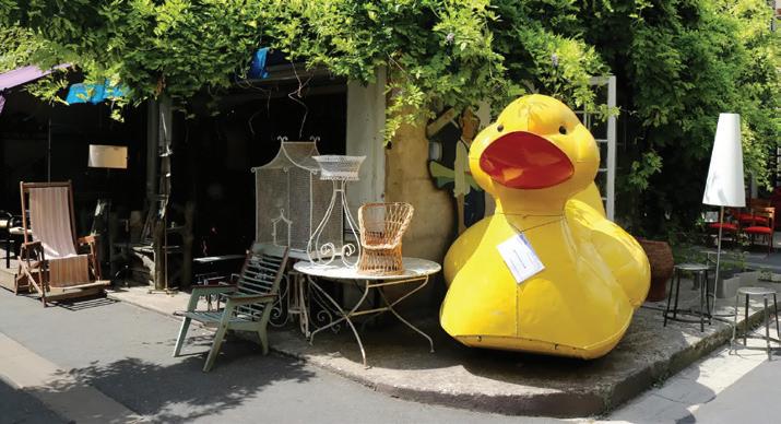
Le Marché aux Puces de Saint-Ouen Le Marché aux Puces de Saint-Ouen
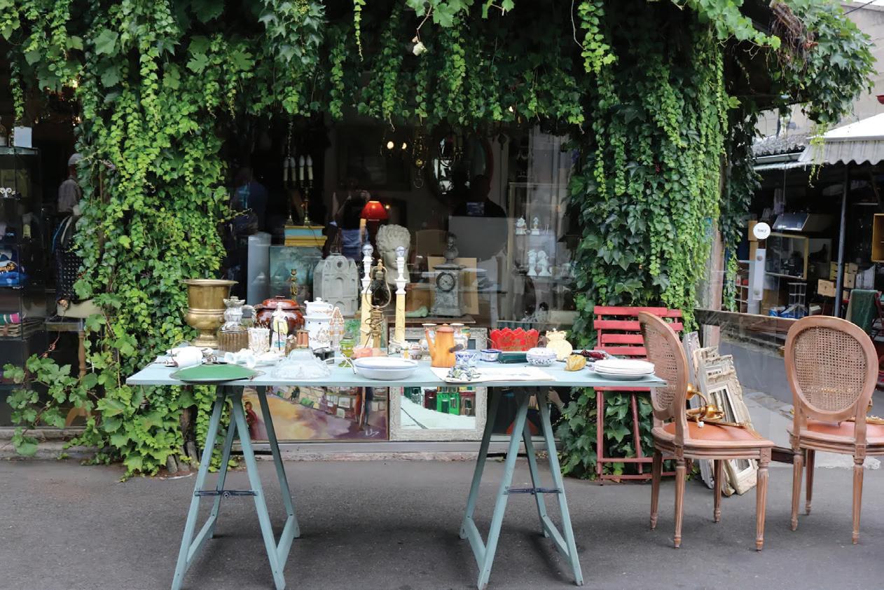
EXPLORE THE LARGEST ANTIQUES AND SECOND-HAND MARKET IN THE WORLD
Brimming with treasures and trinkets varying from vintage gems to up-and-coming architectural marvels, the Paris flea market is an iconic European shopping destination, drawing celebrities and internationally renowned designers from around the globe. Each weekend, it receives around 150,000 visitors, totaling more than five million every year, making it the fourth most visited attraction in France.
Le Marché aux Puces de Saint-Ouen’s origins date back to the 19th century, before the city’s garbage collection infrastructure was put into place. Ragmen (sometimes called crocheteurs, or, in English, ‘hook men’, for the hooks they used) would scour through garbage, collecting objects they hoped to resell. In 1860, these men were barred from the city on account of health concerns, pushing them to the outskirts where they constructed temporary structures (building was illegal in this area) to conduct their business. Before long, rumors of incredible bargains (and cheap firearms) circulated, bringing more and more traffic to the area. In the early days, the market operated in ostensible unorganized chaos, with items for sale in stacks and heaps on the ground. One visitor called what he saw “nothing but a flea market” – which is where the now popular phrase was born.
Today, the market spans 17 acres, with 12 official markets connected via five streets (although you can access all markets from the main road, Rue des Rosiers), and around 2,500 vendors. In 2001, it was classified as a heritage zone due to its significant historical roots and particular brand of ambiance. The Saint-Ouen flea market has grown into a sprawling community, where passers-by can find everything from antique cut
crystal to perfectly-patinaed French-label leather jackets. But even if you’re not on the hunt for a bargain (or you have absolutely no wiggleroom in your suitcase), it’s a worthy endeavor to experience the unique charm and bustle that attracts so many year over year.
DO AS THE PARISIANS DO: BARTERING 101
The only thing more thrilling than snagging a one-of-a-kind piece is knowing you got it for less than asking. A little bit of haggling is expected and welcomed at the Paris flea. Provided you are maintaining decorum, you’ll fit right in.
A few things to keep in mind:
• Always greet your merchants with a polite smile and a simple “bonjour.”
• Allow vendors to share their knowledge with you about whatever pieces you are considering – many of them are experts and want to know their pieces are going to a home where they will be appreciated.
• Although the market doesn’t break for lunch, you’ll sense when vendors are slowing down to grab a bite. If you see them unfolding a small card table, consider it your cue to take a lunch break yourself!
KASIA DIETZ HOT SPOT
24 ISSUE 15
PLAY HARD TO GET:
You won’t want to express too much interest at first, as it may expose yourself as an easy target, limiting your negotiating power.
BE A LITTLE DRAMATIQUE:
If a price is given that you aren’t prepared to pay, react! There’s no need for raised voices, but a tiny gasp paired with a saddened “tant pis” (oh well) can work wonders.
EXTORT THE EXPORT:
During your negotiation, don’t forget to mention the fees that might be involved in bringing the product back overseas. They may agree to lowering the price even further.
A HANDSHAKE SEALS THE DEAL:
Once a price is decided on and hands have been shaken, it would be considered rude to go back on your end of the bargain.
Shipping & Handling
A lot of the individual dealers at the market will ship items for you, however, this option can sometimes be less cost-effective than seeking a third party. There are shipping vendors on site at the market too, which can be enlisted for help, or, you can use a professional shipping service. Often, market dealers will have recommendations, but some favorites of Saint-Ouen’s regulars are Hedley’s and Euroline.
Hours of Operation
Operating hours are reduced to the weekends between 10am and 6pm, and Mondays between 11am and 5pm, with vendors working right through the lunch hour.
Custom guides are available for hire if you’d like help navigating the Marché aux Puces. These guides are equipped to personalize your shopping experience, bringing you to markets that align with your interests, assisting with price negotiations and even arranging for shipping on occasion.
Must-See Markets:

MARCHÉ VERNAISON: This market holds some of the oldest stalls, with dealers who specialize in toys, glassware and objects related to science. Bizarre and brilliant are two words that come to mind. While you’re here, pop into the iconic Chez Louisette, a cabaret café that is an experience in and of itself.
MARCHÉ DAUPHINE: A vintage lover’s dream and one of Saint-Ouen’s largest markets set inside a stunning glass pavillion. Here, you’ll find Booksellers’ Square, furniture and antiques from the 17th and 18th centuries and stands with vintage records, prints and clothing. Don’t miss the larger-than-life mural that colors the entrance.
MARCHÉ BIRON: Visit 220 antique dealers and art merchants offering ornaments, ceramics and artwork. Discover pieces that hail all the way from Asia or made right in Paris during its Art-Deco phase.
MARCHÉ PAUL BERT SERPETTE: Perhaps the most popular of all the markets, this collection of sellers showcases fine furniture, art and décor ranging in origin from antiquity to the 1970s. These dealers are exceptionally knowledgeable in their craft of interior design, with an eye on future trends and avant-garde aesthetics. This particular market has been known to attract celebrities so keep your eyes peeled! The expansive outdoor terrace on the second floor of Ma Cocotte is a great place to break for lunch and a glass of rosé.
MARCHÉ ANTICA: The smallest of all the markets with about a dozen stalls offering jewelry, rugs, art and furnishings from the 18th and 19th centuries.
MARCHÉ CAMBO: Held in a former furniture store and spread over two floors, this market holds around 20 dealers who specialize in furniture, musical instrumentals, art objects and décor from the 1600s-1900s.
MARCHÉ JULES VALLÈS: With 120 stalls, this market offers unexpected finds and forgotten treasures like military memorabilia, old movie posters, rare books and unusual collectables. Many visitors liken it to a trip up to a very well-lived grandparent’s attic.
MARCHÉ L’ENTREPÔT: Here you’ll find large-scale architectural pieces like staircases, mantles, gates and even outdoor structures. Shipping can often be arranged through the appropriate channels on the spot.
MARCHÉ LE PASSAGE: This is a newer addition to the Saint-Ouen markets, holding mostly decorative objects form the 20th century. It's a great place to visit if you want to try out your bargaining skills!
MARCHÉ MALASSIS: Hundreds of merchants and artists gather here to sell items from the 18th century to modern day, with an emphasis on 20th century goods. Look out for restored furniture, Asian art collectibles, unique tableware and Maritimethemed items.
KASIA DIETZ
25 SPRING 2024

Famous Fleas from Across the Globe


PORTOBELLO ROAD - London, UK
From first editions to forgotten movie posters, this world-renowned network of nearly 1,000 vendors spans two miles and has earned its rightful place in the historical fabric of London’s vibrant culture.
ROSE BOWL FLEA MARKET - Pasadena, USA
What do football and flea markets have in common? On the second Sunday of every month, this iconic stadium transforms into a bargainhunter's dream, attracting 20,000 buyers every month.
THE GREAT AMERICAN TAG SALE WITH MARTHA STEWART - New York, USA
A curated selection of Martha Stewart-approved goods including furniture, plants, tableware, art and linens that the multi-hyphenate is looking to find new homes for. Hopeful attendees must purchase a ticket in advance to shop the sale.
FERIA DE SAN TELMO - Buenos Aires, Argentina
Patrons pour over 13 blocks of cobbled streets, admiring the neighborhood’s stunning architecture while hunting for treasures and trinkets to bring home for a steal.
HELL’S KITCHEN - New York, USA
Hunt for fashion-forward finds for the closet and home in this trendy spot, open every weekend from 9am to 5pm.
GRAND BAZAAR - Istanbul, Turkey
Explore spices, traditional pipes, artisanal carpets, ceramics and more in this market, which dates back to the 15th century.
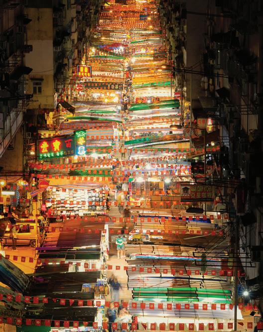
TEMPLE STREET NIGHT MARKET - Hong Kong, China
While in Hong Kong, be sure to visit the Temple Street Night Market to get a taste of the city’s exuberant nightlife scene. Lively and vibrant, visitors can expect to stumble into a variety of authentic nightlife experiences while indulging in local cuisine and admiring captivating art installations and dazzling lights.
STANLEY MARKET - Hong Kong, China
Always bustling with traffic, the Stanley Market offers a chance to explore local artwork and souvenirs, people watch and sample delicious cuisine.
ISTOCKPHOTO
26 ISSUE 15

FROGTAPE® OFF.
PERFORMANCE YOU CAN TRUST ON.

From clean lines and conformability to durability and versatility, FrogTape®– the brand that reinvented painting with PaintBlock® Technology – delivers performance you can be proud of, when it matters most.

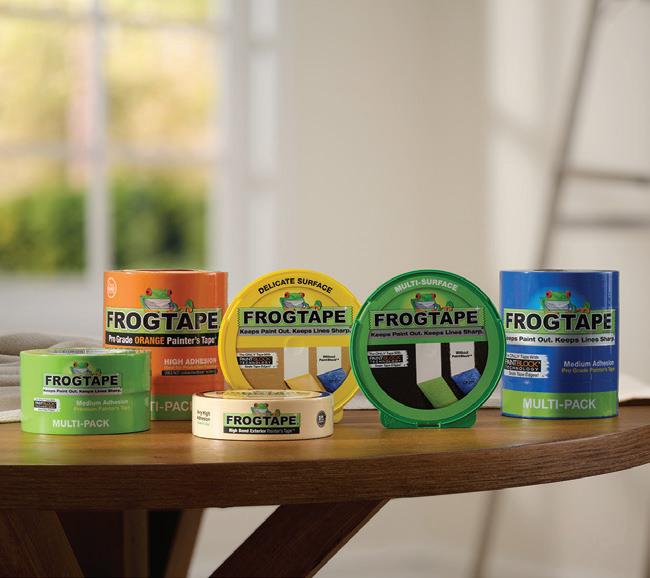
FrogTape.com/Contractors
©Shurtape Technologies, LLC 2024/ASW00697
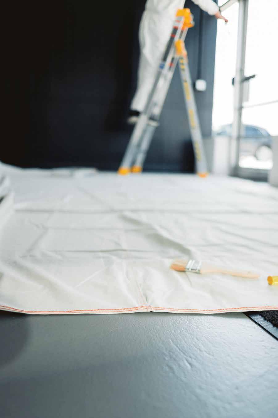
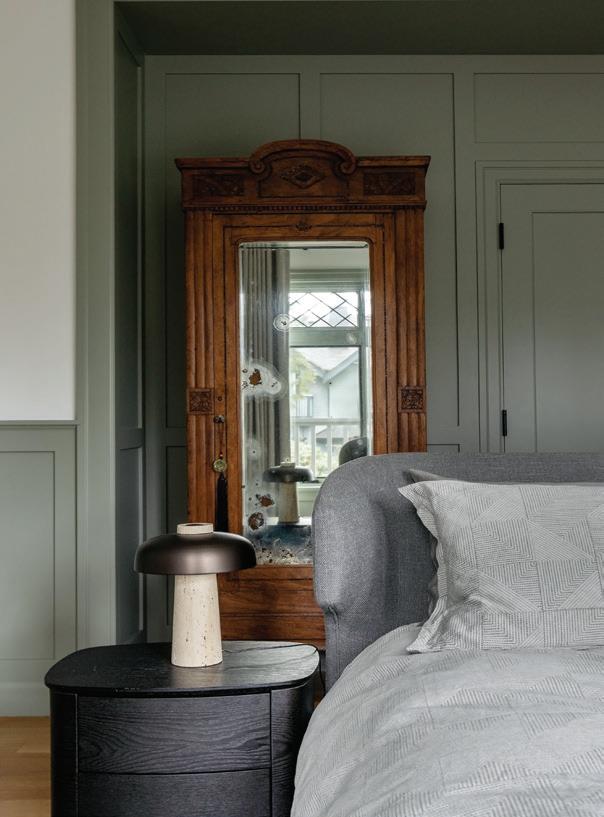
HISTORY IN THE MAKING

Design: Lauren Svenstrup, Studio Sven | Photography: Ryan McDonald | Text: Twila Driedger
Design: Lauren Svenstrup, Studio Sven | Photography: Ryan McDonald | Text: Twila Driedger
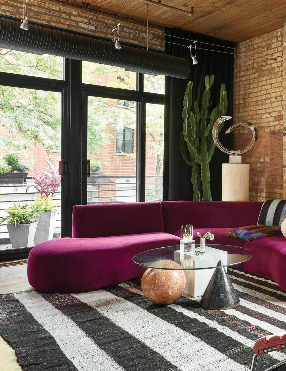
Renovating a loft with your partner is no easy feat, but designer Lauren Svenstrup and her husband Jim Fessler took on the challenge, creating something bold and beautiful from the bones of a historic building.
Svenstrup and her husband Jim Fessler took on the challenge, creating something bold and beautiful from the bones of a historic loft.


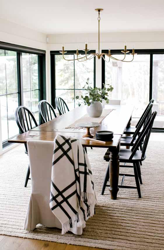
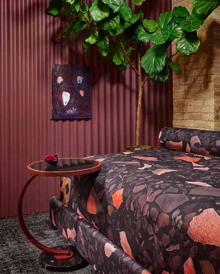
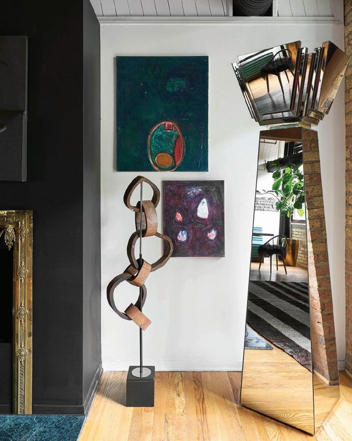
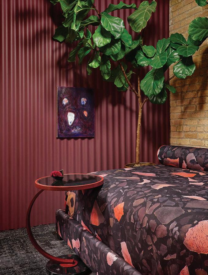
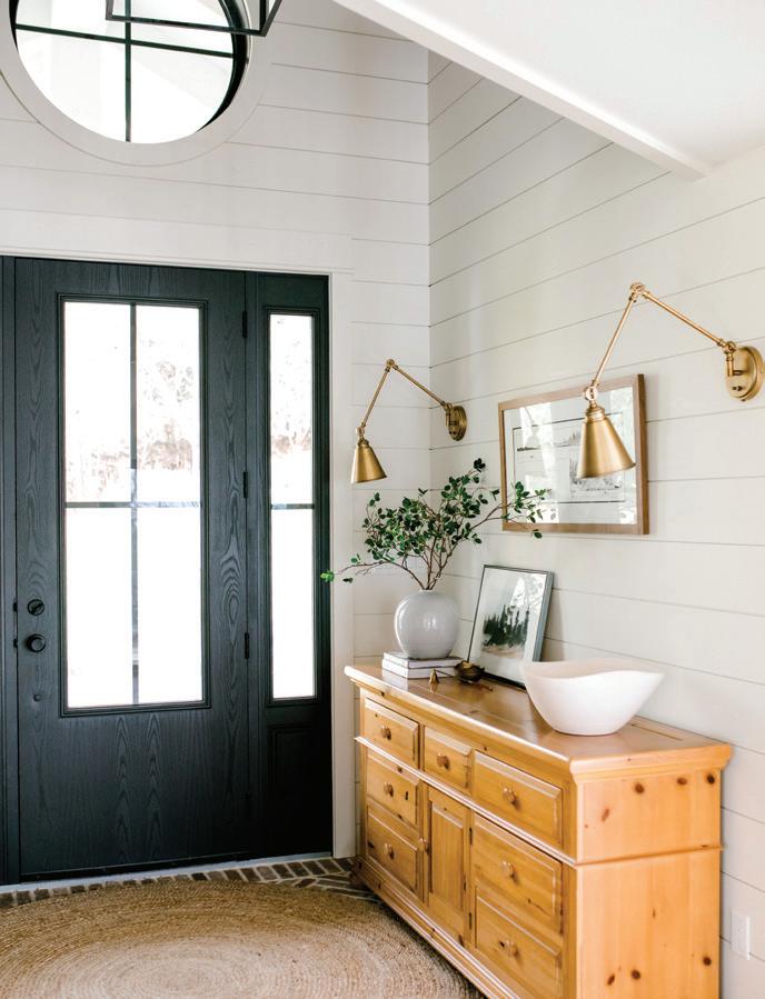
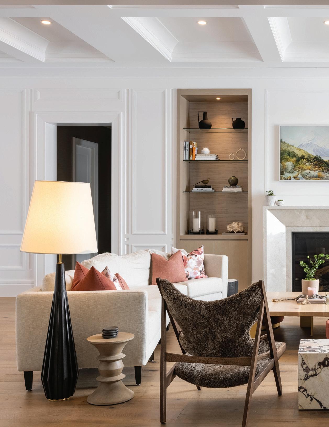
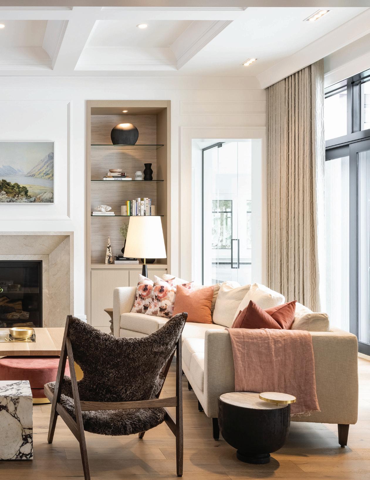
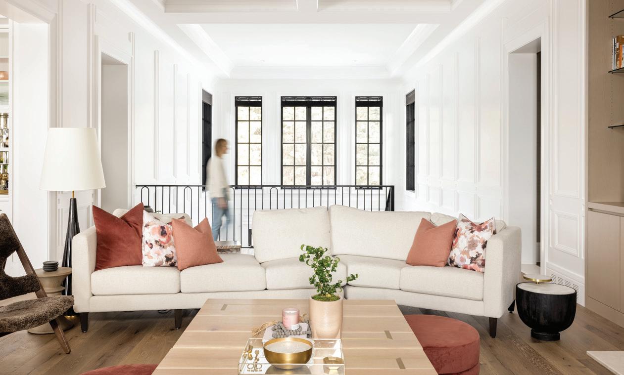
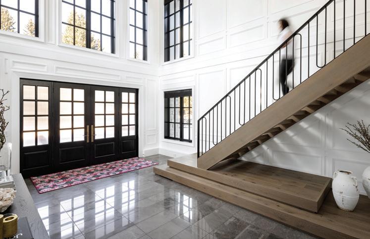
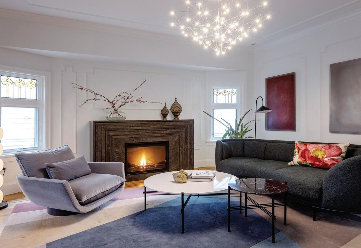
ABODE
A soft, curvy sofa in mulberry velvet provides comfy seating while also making a statement in this Chicago condo. The exposed brick, glass coffee table, eclectic art pieces and giant cacti add even more interest and texture.
28 ISSUE 15
29 SPRING 2024
T“The client was highly design-forward, big into taking risks and very opinionated… and I’m allowed to say all that, because I was the client,” shares designer Lauren Svenstrup, founder of Studio Sven.
When Svenstrup and her husband Jim Fessler first laid eyes on this historic organ-factory-turned-loft in Chicago, they knew they had to make it their own. Once home to the Hammond Organ Company, the space hadn’t seen an update since the 1990s and was ripe for renovation. “We at Studio Sven are all about bold, unapologetic personality, so a loft with a unique history was the perfect base for our style.”
At the time, the couple hadn’t yet expanded their family, and they wanted a home that reflected their busy, urban lifestyle. So, Svenstrup started designing a dramatic space that reflected both of their personalities.
“If there’s one thing about me, it’s that I choose the bold choice nearly every time,” Svenstrup says. “I knew I wanted my home to reflect that – for the sake of creativity and my portfolio – so I made a statement at any chance I got. As for my husband, he leans far more utilitarian. In his single-guy apartment, he was content using a barstool as a side table next to his sofa. I didn’t want him to feel like he was sacrificing function in favor of my vision, so the design looked to infuse livability and practicality into every room.”
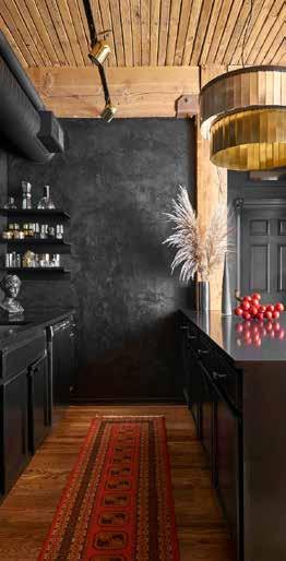
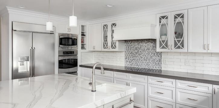
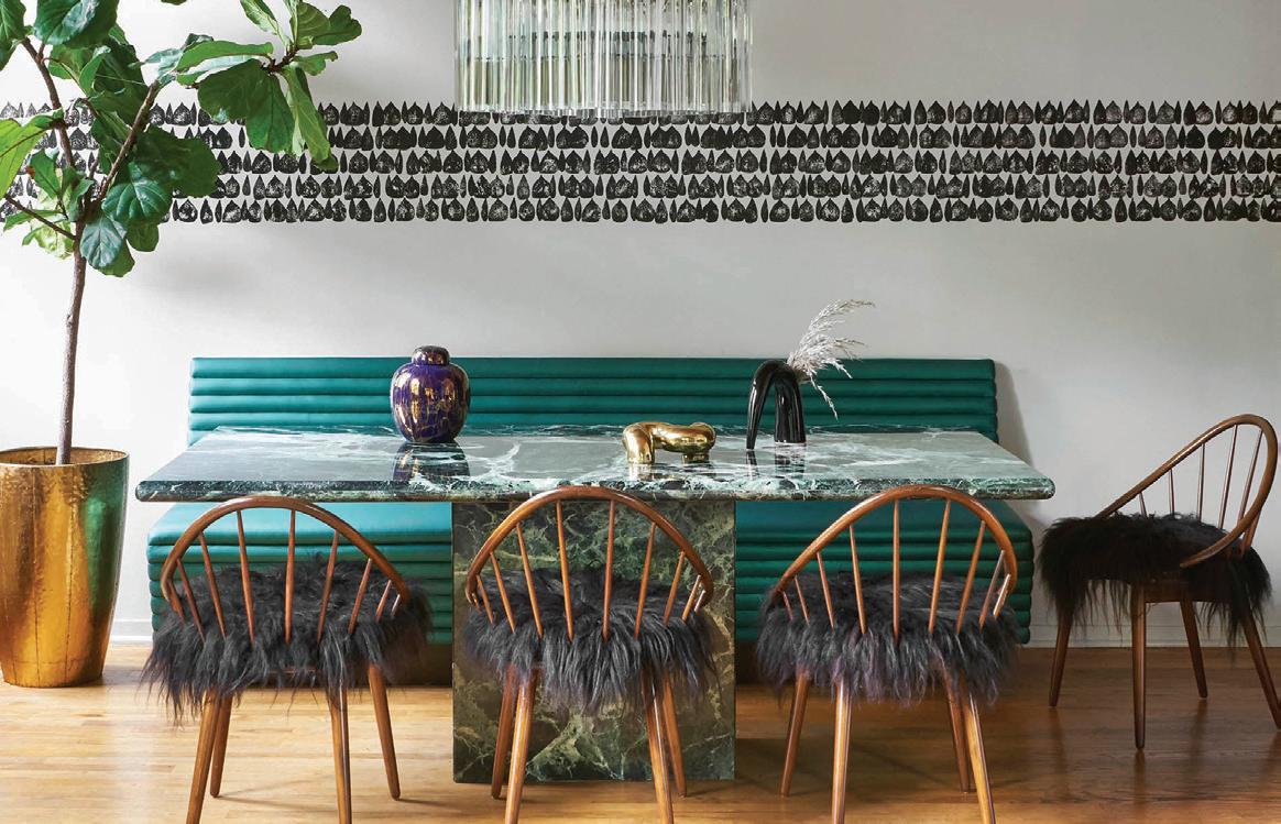
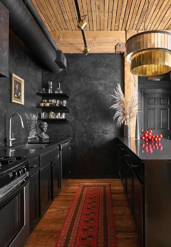
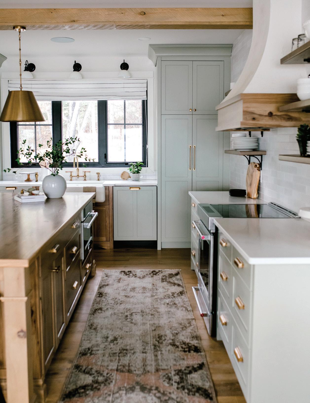
Below: Svenstrup scored second-hand gold when she went to purchase this green marble dining table and the owner offered to sell her the Italian Murano chandelier that now hangs above it. Together with the green vinyl banquette, it’s the perfect place to wine and dine. Beside: Black is anything but basic in the kitchen, where the bold black walls, cabinets and countertops are warmed with wood floors and ceilings, soft decor and glitzy accessories.
30 ISSUE 15
Renovating bathrooms and a kitchen while living in the home proved to be the biggest hurdle for the couple, who tackled some of the work, like painting the dated oak kitchen cabinets, themselves. “We started construction within a few weeks of moving in together – just to add a layer to the stress beyond the acclimation period of moving in with your significant other,” Svenstrup says, laughing.
Thankfully, all the drama came by way of design and not in the relationship. The architectural bones of the project – including the exposed brick, fireplace and wooden beams –already told a distinct narrative and guided Svenstrup in the design. Her penchant for dark, moody hues played out in the edgy black walls and kitchen dripping with drama. According to the designer, the black started small but quickly spread from the countertops to the cabinets, then to the backsplash and eventually crept up the Venetian plaster walls.
“Venetian plaster is a technique combining marble dust and plaster to create a textured look and feel, and we took this route over more expensive wallpaper or backsplash. Not only was it a budget-friendly choice, but it’s one of the most conversation-sparking elements of the whole home. The Venetian plaster is a great choice for a kitchen or bathroom –it’s inherently waterproof and antimicrobial.”
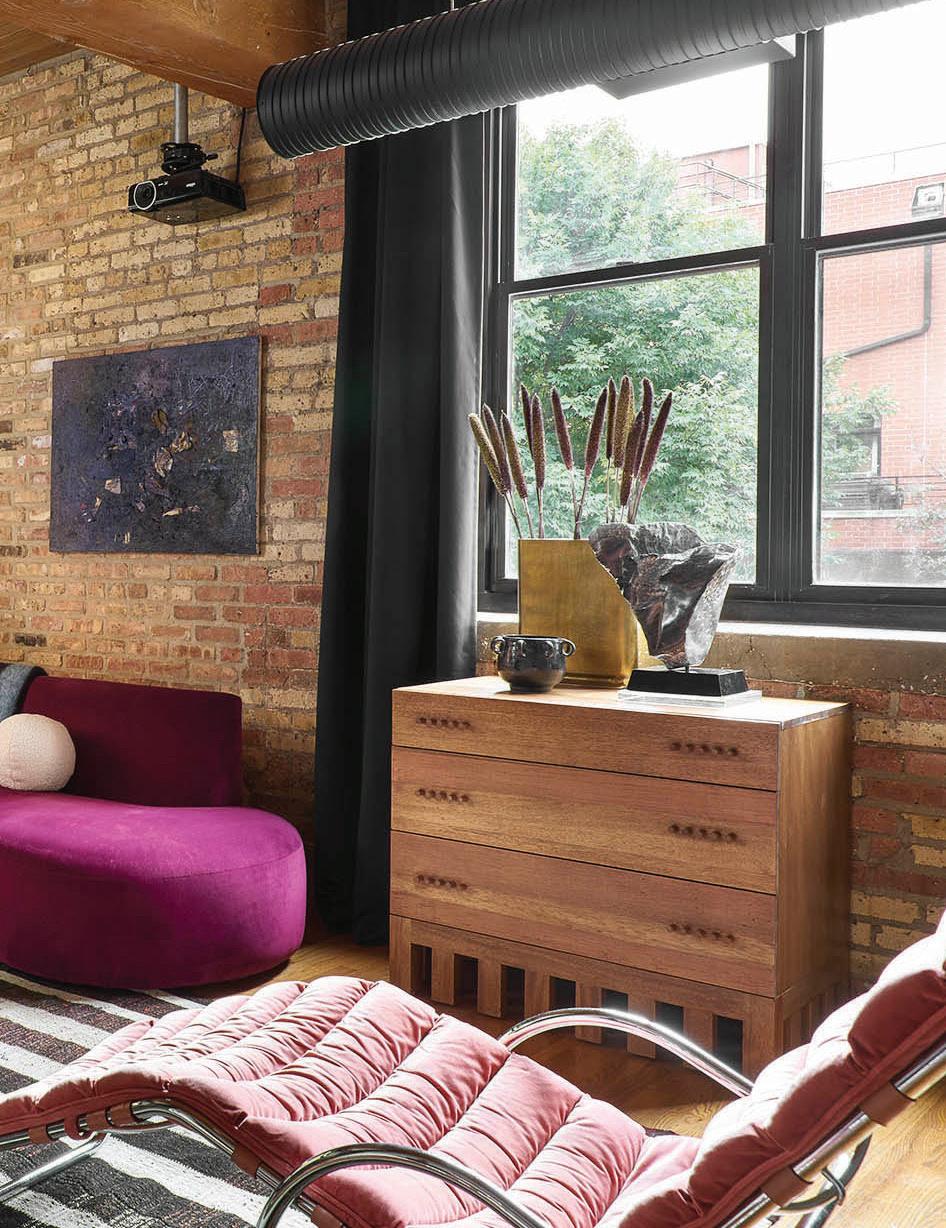
Generating conversations is easy in this loft, with authentic elements and curated artifacts that were carefully displayed throughout the space. The couple selected a handful of new items and paired them with vintage or pre-owned furniture
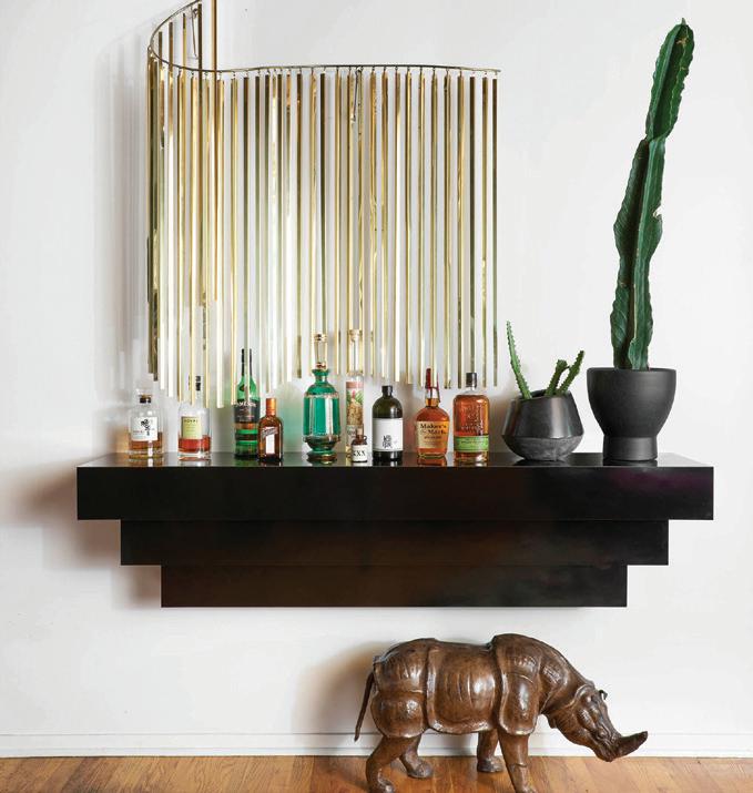
31 SPRING 2024
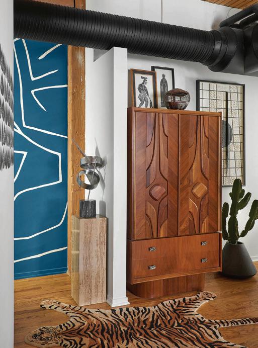
and materials that add an elevated edge. An eight-foot mirrored floor lamp, a green marble dining table, an Italian Murano chandelier and a few cacti in the corners bring a character that is as refined as it is surprising. Punches of color such as mulberry velvet on the sectional, green vinyl on the banquette and a burst of teal in the bedroom are as fun as they are functional.
“I kept the existing architectural elements of the space, then built around them with light fixtures, hardware and furnishings,” explains Svenstrup. “Given the setting and our own taste in vintage pieces, we wanted the entire space to give off the ‘collected’ feel of a favorite vintage shop, while also paying homage to the building’s history.”
The designer stayed true to the age of the space, allowing the bones of the building to be the backdrop to bold layers of prints and patterns, like a hand-stamped border in the dining room, a tiger print rug and a large-scale line mural in the bedroom. “The interiors are a mix of old and new, with unique stories layered into every room. Many of the furnishings and accessories within are vintage, and there’s texture everywhere from the walls to the soft finishes,” she says.
Svenstrup used three paint colors on the wall in the primary bedroom to create movement within a textured background and then painted a pattern over it with a creamy satin finish paint to catch the light.
While the tones are dark and moody, the clients are anything but. “We wanted this space to be ready for entertaining and relaxing – and what sparks better conversation than bold design elements?”
Since Svenstrup spends her days designing for others, pouring her creative energy into her own home was extremely satisfying.
“This is the first time I was ever able to fully start over and do this for myself, for our aesthetic and functional needs first,” she details. “Devising a plan and executing it versus mixing and matching what we already had was very exciting and rewarding. It was important to leave everything else behind and begin again with a space that best represented us versus what our individual lives were before.”
The couple has since had another opportunity to start anew, handing the keys off to the loft’s current owner and opting for a larger family home suited to their current needs with two young daughters.
“I’m jealous of [the] new residents – it truly is a special place.”
and complementary neutral colors and textures bring character and warmth to the gathering space.
32 ISSUE 15
It’s heaven for a treasure hunter in this Chicago condo, with artifacts and antiques adorning every corner and on every curated countertop.


Storm Stain is comprised of only best-in-class formulations, so no matter what you choose, you will be getting one of the most beautiful, long-lasting finishes available today.


DESIGNED TO WITHSTAND:
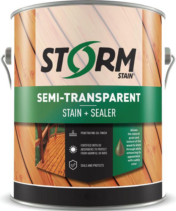


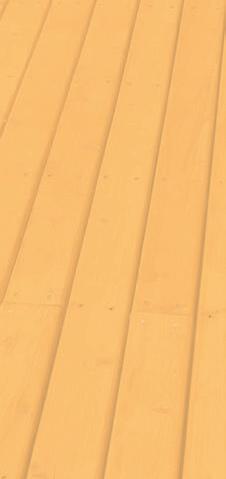


endless rain extreme heat


freezing temperatures cycles of freezing & thawing


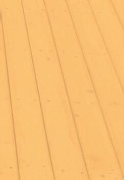


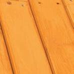


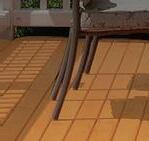
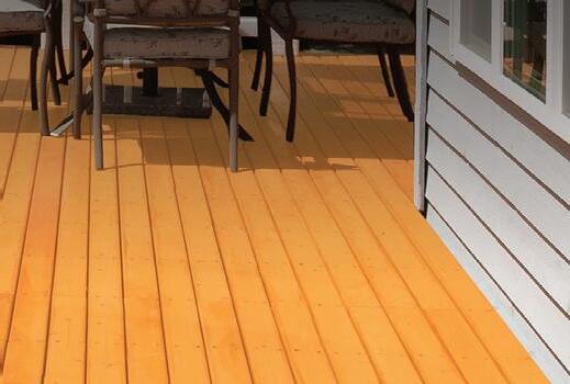
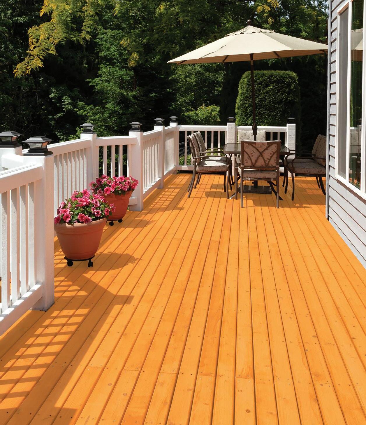
GET YOUR DECK BBQ READY
FOR SPRING
©2024 Storm and other marks on this brochure are trademarks of ICP Group.
www.stormstain.com
THE LAKE HOUSE

Design: Lisa Clark, Lisa Clark Design
Photography: Lynsey Corbett Photography
Text: Twila Driedger
A cramped cottage in Lake of the Woods gets a refreshing aesthetic update - and an extra storey - to make it the ultimate family getaway.
ABODE
34 ISSUE 15
 Left: Warmer natural woods win out over cooler white oak in this kitchen, which also favors creams, greens and caramel.
35 SPRING 2024
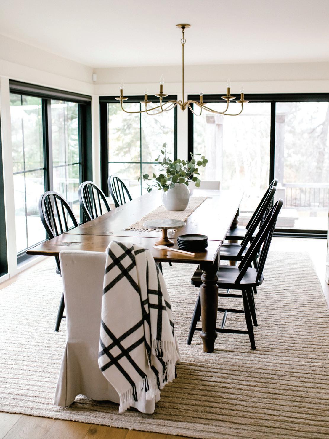
Dinner with a view is on the menu in this charming cottage, where a solid wood table and black Windsor-style chairs enhance this dining area.
When Lisa Clark was 12 years old, she saved every penny of her babysitting earnings to design the bedroom of her dreams.
“My sister was saving up for makeup and name brand clothes, and I was saving up to buy paint, fabric, wallpaper and furniture,” she explains. “By the time I was 13, I had bought all new furniture for my bedroom.”
Using her artistic juices to make spaces sparkle was simply a hobby for Clark, who grew up in rural Manitoba, Canada, and didn’t know that interior designers existed. “I was always this person who, when I was in a space, was trying to figure out how to make it more beautiful or welcoming,” Clark details. “I didn’t know that making a living being creative was an option for me.”
It was only after Clark got married and she and her husband were building a little bungalow that she started seeing the literal painting on the wall. Tradespeople coming in to work were not only admiring her design work but interested in hiring Clark to join their team.
“It was really serendipitous, it was just meant to be,” says Clark, who poured herself into learning the practical skills, enrolled in classes, and eventually made a complete career change. “I totally shifted direction.”
After a local radio station featured the aspiring designer in a Trading Spaces-style story, word of mouth spread, and the designer started connecting with clients and transforming their spaces into places with function, beauty and longevity.
“What I do is all about the people, because as much as I love design, I’m not about my portfolio,” Clark clarifies. “I’m actually all about the people for whom I’m creating. At the end of the day, I want to know how families live, how they
36 ISSUE 15
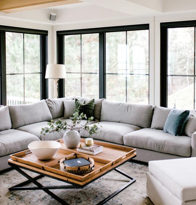
From plenty of seating space in the large living area, to the roomy entrance (check out that brick floor!) and beverage center, every area in this lake house is intended for gathering with family and friends.
work and how they connect with one another. And then I create spaces that make their family life more enjoyable.”
When Clark’s clients – a mother-daughter duo, both businesswomen – approached her, they were looking for the designer to create a lake home where they could escape and unwind with their families. The property on Lake of the Woods, close to the Manitoba-Ontario provincial border, featured a toosmall cottage, with great bones and incredible views on all sides.
In order to make the space big enough for extended gatherings, summer sleepovers and weekend getaways, Clark teamed up with Black Fox Construction who gutted the main floor, added a mudroom and doubled the size of the complete space with a second storey.
“It took an army to piece together the structural engineering to get the second floor on,” she explains. “There’s a room that’s called the bunk room and it’s just built-in bunk beds - doubles on the bottom, singles on the top, in a teeny tiny footprint. But the thought was that we can fit so many people in there!”
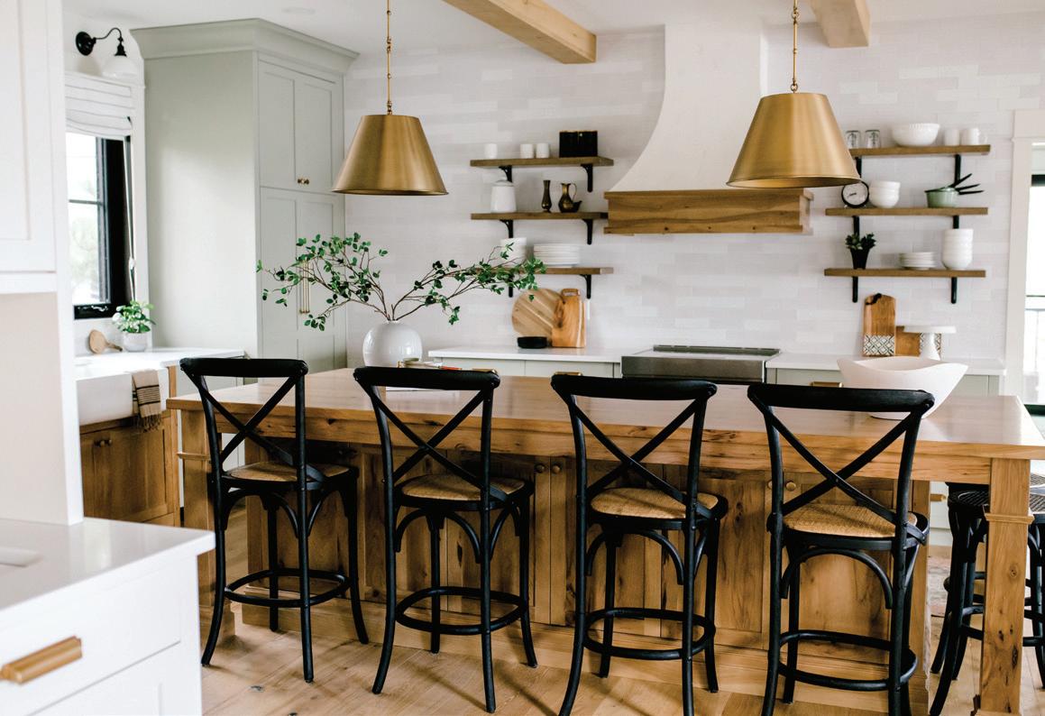
While space was essential for the women, so was warmth and walls of windows showcasing the area’s breathtaking views. So, Clark brought tones and textures from the flora and fauna and sticks and stones and incorporated them seamlessly into the renovation.
“I’m always drawn to respecting the environment that I’m building in and so, I’m often thinking about how I can use natural materials,” explains Clark, who opted for hickory on the island and open shelving.
37 SPRING 2024
“I wanted a very warm wood that had some knots in it and some texture that felt a little more rustic and a little more [cabin-like] as opposed to a white oak that can read a little cleaner. And so we went with a hickory because of all that character and graining and knotting that you get in it.”
To create a charming cottage that feels entrenched in history with years of memories in the waiting, Clark matched the exact shade of the kitchen cabinets to a beloved green serving tray that the clients brought in, selected standalone appliances, pulled the warm wood forward into the sink cabinet and added cupped brass hardware. “I wanted the island to have a wood top as well. I didn’t want quartz on top of it. I wanted the island to feel like a piece of furniture,” Clark details. “Every little detail, every little molding was thought out so that it wouldn’t read like cabinet boxes.”
Splashes of color were added to bathrooms and bedrooms to help tell the story of the space. A bright blue vanity with Benjamin Moore’s Van Deusen Blue is mirrored in the crisp cool waters off the dock. The green walls in the main floor powder room acknowledge the thick boreal forest bordering the cottage. And additional shades of blue are brought onto the ceiling in the bunkie and on the walls of the master bedroom, a sign of clear skies and fun times ahead.
“We tried to keep all of our floors black and white and neutral but then inject some color in each room,” Clark shares, adding that the walls, baseboards and casings in the main living space were all painted the same soft shade of white to draw the eye to the view out the window. “I didn’t want too many competing focal points because everything was so light and bright. But then when you contrast that with the change to a much different, deeper color, it changes the feel. If you do everything light or everything dark, I think you miss out on some of that opportunity to change your experience as you move through [the space].”
The client certainly hasn’t missed the opportunity to experience the joy of making memories at their Lake of the Woods property. From gathering around the island and baking cookies with grandchildren to packing the place full during Manitoba’s magical summer weekends, the lake house continues to bring the family together.
“That’s the rewarding part,” says Clark. “I know that this family is growing and creating memories in this space and it’s functioning for them in such a beautiful way.”
38 ISSUE 15
Brilliant blue is balanced with soft textures and creamy tones.


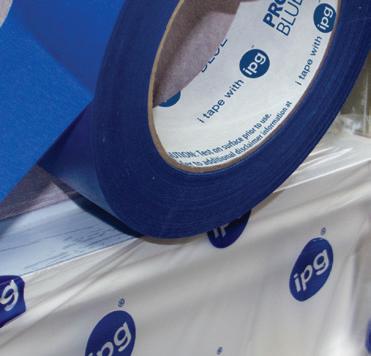


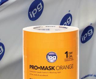

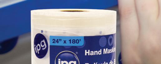

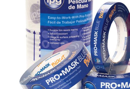


888-898-7834 | itape.com YOU NEED We Have All The TOOLS YOU NEED
full line of
and performance
both the contractor and consumer alike!
the
a new construction site
your home a fresh
of
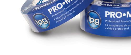
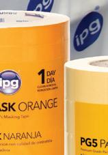
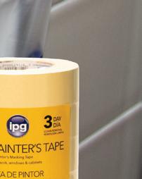
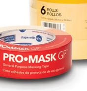
IPG has the solution for you!
IPG®’s
masking tapes provides value
for
Whether on
job at
or giving
coat
paint,
DIAMOND IN THE ROUGH

Design: Amanda Hamilton Design
Photography: Joel Klassen

Text: Twila Driedger
The owners of this hidden gem of a house, nestled in farmland outside of Red Deer, Alberta, enlisted Amanda Hamilton Design to enrich their new build with everything they envisioned. And so, the studio delivered, curating a contemporary design with lots of personality and loads of space to play.

build with everything they envisioned. And so, the studio delivered, curating Red Deer, Alberta, enlisted Amanda Hamilton Design to enrich their new a contemporary design with lots of personality and loads of space to play.

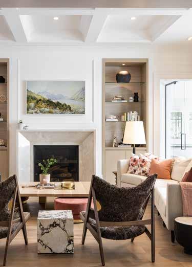
 The main living space is light and breezy but also warm and inviting with layered textures, brushed brass, rift sawn white oak, custom paneling and plenty of seating.
SPACES 40 ISSUE 15
41 SPRING 2024
Amanda Hamilton Design has given a family of four beauty for ashes.
The client, a husband-wife duo, along with their two young daughters, reached out to the studio via their website after losing their home to a fire.
“It was totally turnkey,” Amanda Hamilton of Amanda Hamilton Design says of the project. “They didn’t have anything. It was all gone.”
The designer, along with her team of 12 headed by lead designer Sarah Peters, took on the task of turning adversity into advantage and delivering a warm, inviting family home. From the full scope of interior design drawings to lighting, hardware, finishes and furniture – even the itty-bitty details, like the vessel on the nightstand and towels in the powder room, Hamilton’s team was part of every piece of this custom project.
“[It included] all the plans, all the elevations, all the renderings, specifications, finishes and materials,” Hamilton explains. “And then, of course, the furniture package which was extensive. There’s actually a lot of custom furniture in the house.”
The approximately 8,000-square-foot residence, nestled in the trees just outside of Red Deer, Alberta, is bathed in luxe, yet livable design and family-friendly function, a necessity for the laid-back clients who are busy business owners. Working alongside the professionals to create this classic contemporary custom home was a delight for the team at Amanda Hamilton Design, who used their signature approach of thoughtful exploration and true distillation of the client’s aesthetic, values and lifestyle.
“From a personality standpoint, we just really hit it off. They are very down to earth, hard-working people and just very modest. And we ended up building this really beautiful house
42 ISSUE 15
for them,” Hamilton says, explaining that prior to the aesthetic plan, an initial design call determined the client’s expectations, the scope of work and ultimately if they’re a good fit for each other.
According to Hamilton, part-way through the project, the customer trusted the team enough to give them the go-ahead to proceed without showing them all the specs, furniture choices and details. And so, they set out, selecting sumptuous finishes, custom furniture and relaxed and playful accessories to adorn the blank canvas.
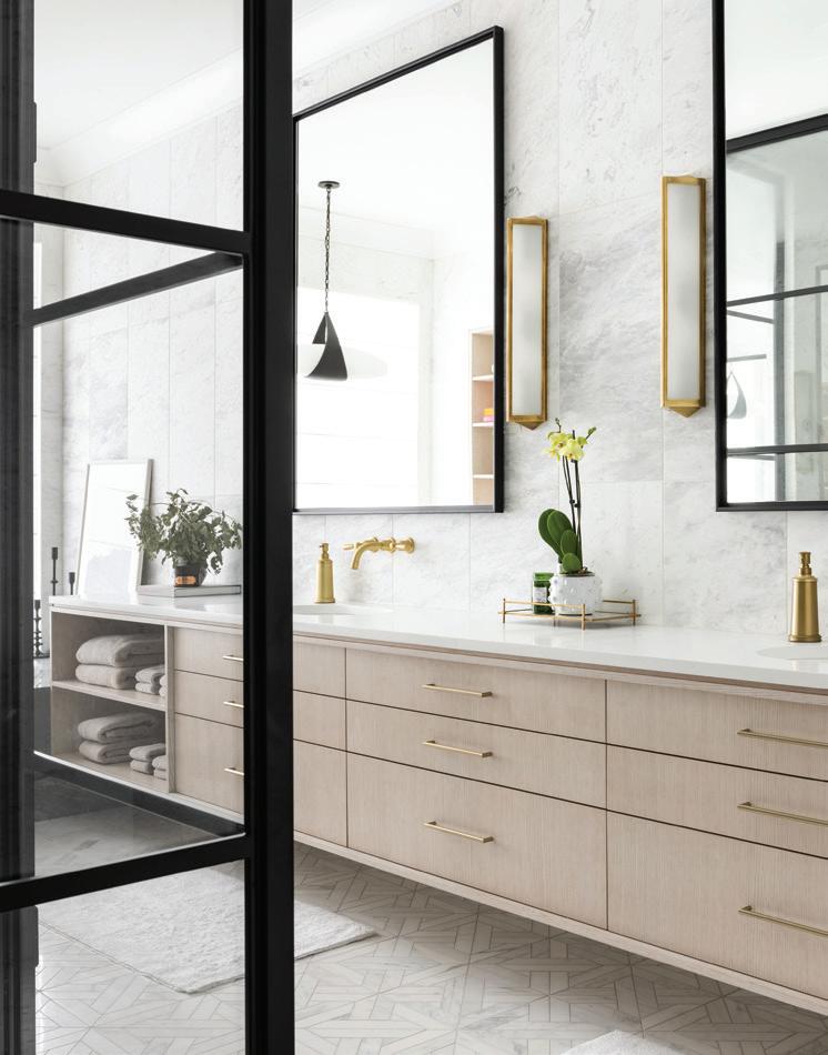
To create a bright and calming vibe on the second floor, where the kitchen and living room are situated, Hamilton and her team chose a predominately soft and ethereal palette featuring a combination of natural stones, brushed brass, rift sawn white oak, textural wallcoverings and custom paneling.
“One of the things that I think is really important in a custom home is making sure that there’s lots of variation in a big house,” Hamilton details. “We’re really mindful about modifying the finishes and materials.”
The studio used three or four different wood stains to complement the hardwood, with hickory on the custom coffee table and white oak in the millwork and played with materiality between the rooms that mirror each other.
“We don’t want them to be identical. But you can see that the countertops are the same material as the surround for the fireplace,” she adds. “For the backsplash in the kitchen, we introduced another stone – something that has a little bit more movement and character to it.”
The backsplash acts as art and is complimented with two-toned cabinetry gushing with glamor and exceptional symmetry. And the five stools at the counter accommodate plenty of opportunity for gathering and play, a specific client request.
In addition to the bright main floor, the house showcases an indoor pool for the kids to swim in during Canada’s cold winter months, an outdoor living space for the area’s stunning seasons, a home gym and a collection of contemporary bathrooms, including one that is ultra spa-inspired.
“We decided during construction that we wanted to keep [the primary bathroom] really light and bright, but very elevated, like a hotel aesthetic,” Hamilton details. “So, we played a lot with the brass detailing and did some accenting, because one of the things that really dates the house is if you only use one metal type all the way through. So, in the same way that we like to use three or four different
43 SPRING 2024
types of millwork stains and color, we also like to mix metals, and brass and black complement each other really well.”
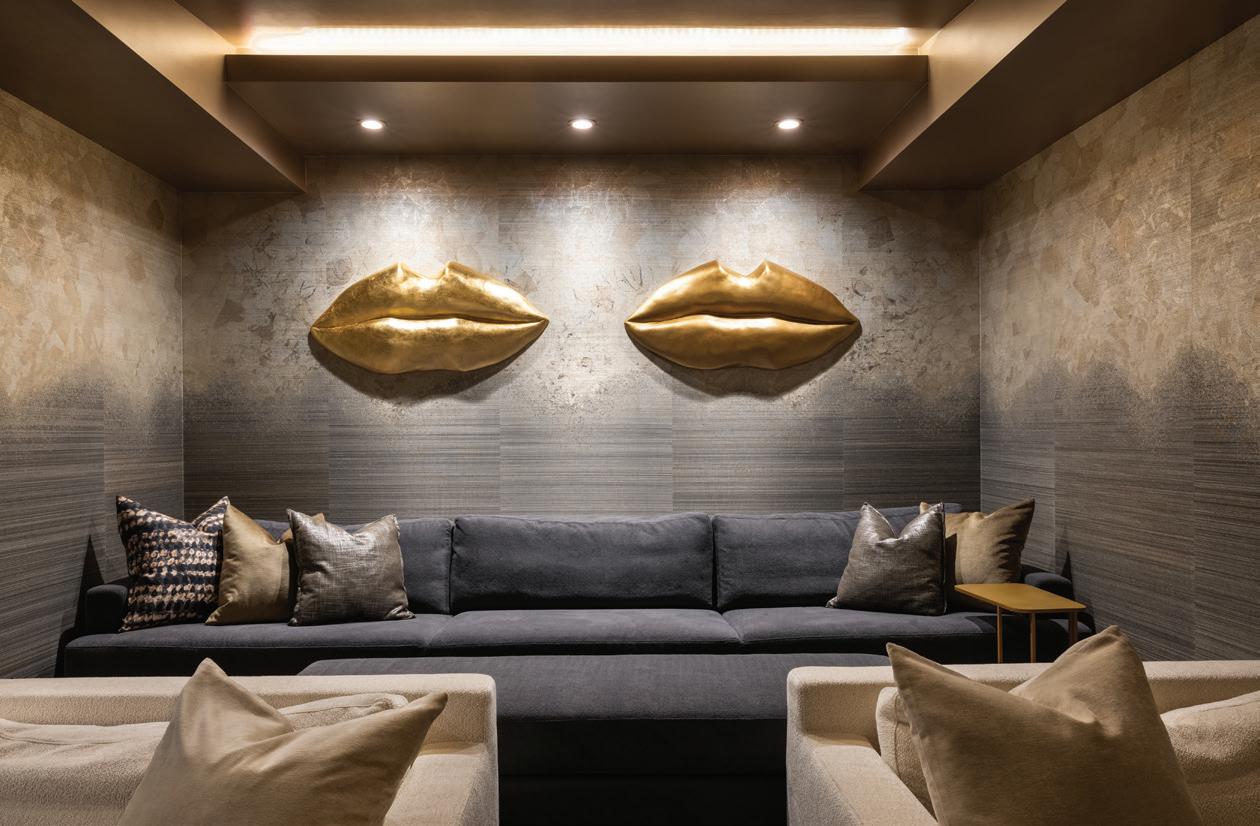
As light and bright as is this home’s main living space, the lower level is a complete contrast. Dark paneled walls, a hip bar with backlit onyx, an oversized green velvet sectional and separate theater room add a moody aura to this otherwise airy abode. And its interior is as diverse as its exterior locale – a treasure tucked in the countryside of central Alberta.
“I just remember going to a site visit once and both of their girls were in pink tights, with no shoes, playing in a dirt pile,” she says. “I think it’s so interesting because I think people make assumptions based on the formality of the house, how people live, but this is a house that people actually live in.”
The clients appreciate their stylish space so much that they’ve acquired Amanda Hamilton Design to bring their Palm Springs-inspired lake house design dreams to reality.
“If you have multiple properties, why not express different aesthetics in each of the properties? Because when you go to them, you’re going there for a different reason,” Hamilton says. “So, your mountain home shouldn’t feel like your city home and your city home shouldn’t feel like your mountain home.”
Either way, with Hamilton driving the design, it’ll feel like home.
In comparison to the main floor, the lower level is a dramatic departure, with brass accents, dark stone, contemporary wallpaper and mod decor for a hip, laid-back vibe.
44 ISSUE 15
Crisp. Elegant.
Ties it all together.
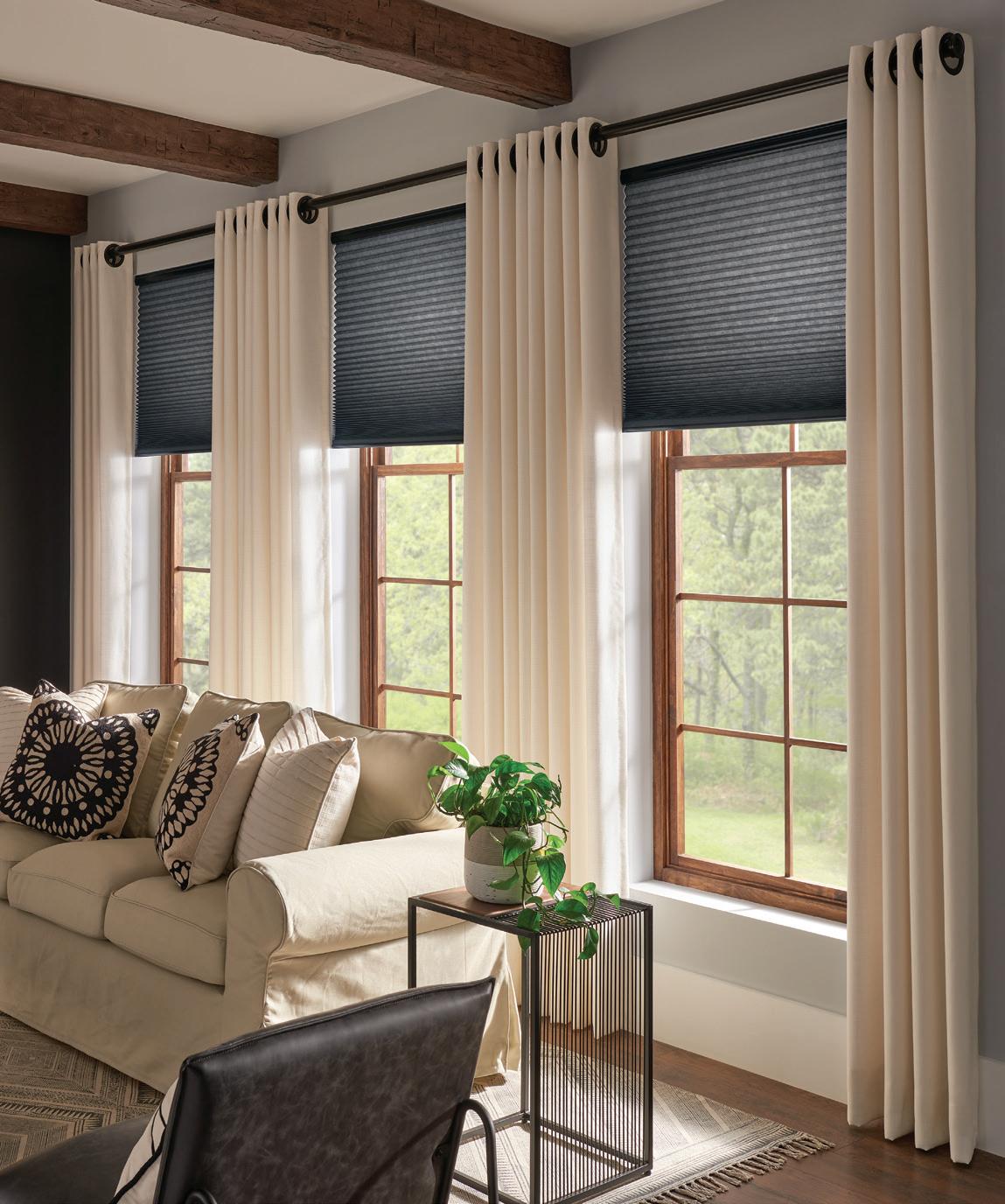
Wander into energy-efficient style, lush fabrics, and sophisticated layers of drama with Graber Cellular Shades and Drapery. They’re everything you want in a custom window treatment—for less.
BEST FOOT FORWARD

Design: Denise Ashmore, project22design
Photography: Janis Nicolay Photography

Text: Twila Driedger
A 1912 craftsman has its traditional character restored and elevated with a touch of sophistication and a bit of whimsy.
A 1912 craftsman has its traditional character restored and elevated with a touch of sophistication and a bit of whimsy.
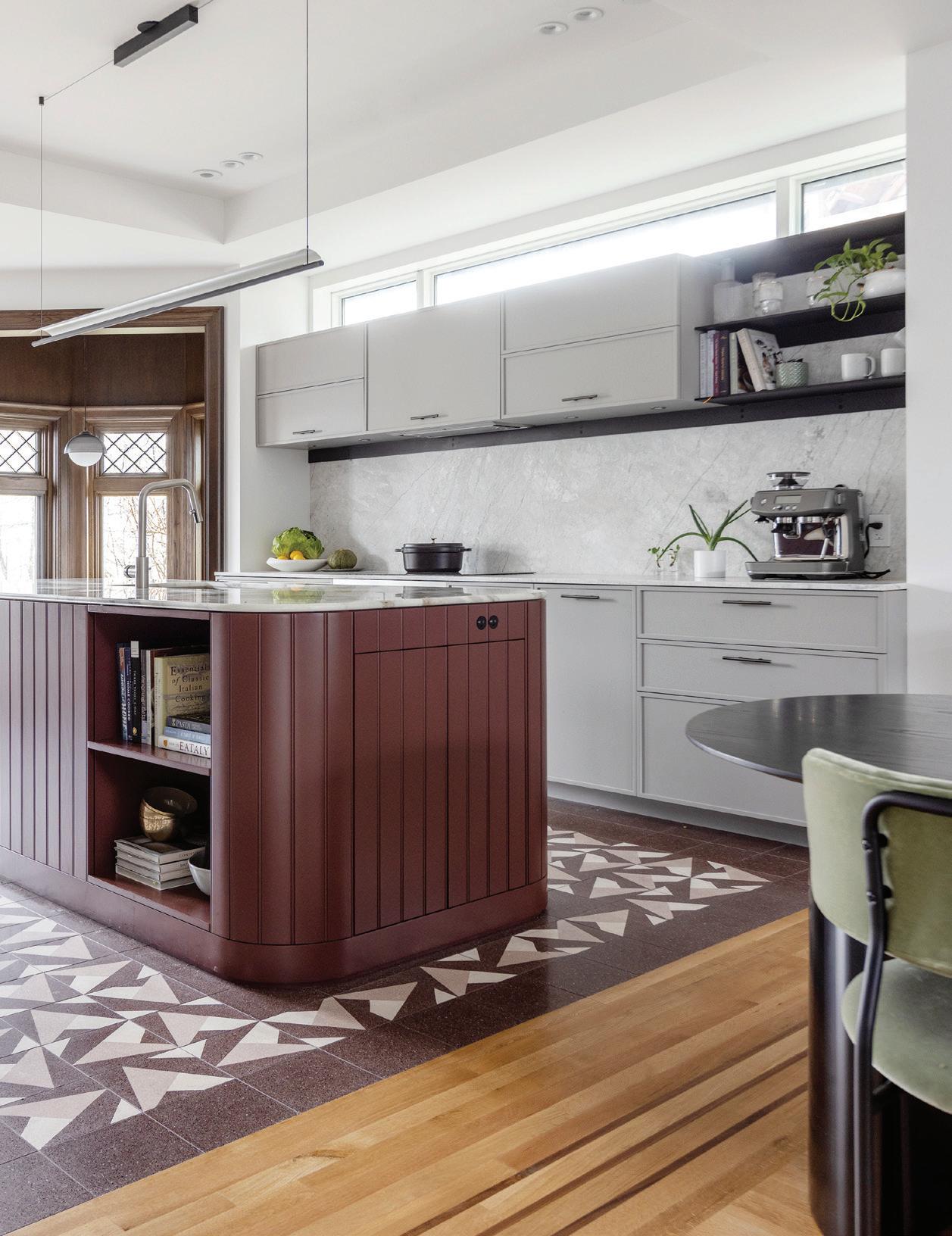
The oxblood in the island and warm whites and grays in the cabinets are echoed around the house, including in the kitchen’s playful terrazzo flooring.
SPACES
46 ISSUE 15
Inspiration for the design of this large Kitsilano craftsman renovation project literally walked into interior designer
Denise Ashmore’s office. Her client, a well-traveled father of two, was wearing shoes that kicked off the color scheme.
“David came in one day – he’s always well dressed, he’s a fashionable fellow. He came in with oxblood shoes and we decided, why do a gray kitchen when we could do something much different, like a classic burgundy or oxblood color, based on his shoes,” explains Ashmore.
As international travelers, busy professionals and parents to young twins, the clients approved of the surprising shade.
Another item they hoped Ashmore’s project22design firm could help them with? Restoring their classic Vancouver heritage home to its rich character. The clients were relocating from Hong Kong to Vancouver’s Kitsilano neighborhood and needed help bringing their traditional craftsman build up to date, while respecting its beautiful bones.
“We basically wanted to restore it back to what it was,” she shares. “The vision was to take it back to looking and feeling like a Kits craftsman house. A lot of the detailing was kept. More than anything, they wanted something that was much more playful and not typical.”
The original house was divided up into a number of suites and needed a ton of work. Through the studio’s design interview process, Ashmore discovered the best arrangement for the busy family was to rebuild the house and recreate the traditional elements that attracted the owners to the property.
“It made sense for us to lift the house, move it over and drop it back down and create this much more livable permanent dwelling for them,” Ashmore details.
By the time the crumbling craftsman was gutted, lifted and moved onto a new foundation, there was nothing left but a shell, requiring a rebuild courtesy of Lepp Construction and meticulous interior planning by Ashmore and her team to completely restore the one-of-a-kind project.
“The client wanted to keep that little turret space in the back completely intact and the inlaid oak floors in the main,” says Ashmore. “And so, we painstakingly took photos. We documented that house and then recreated all of it.”
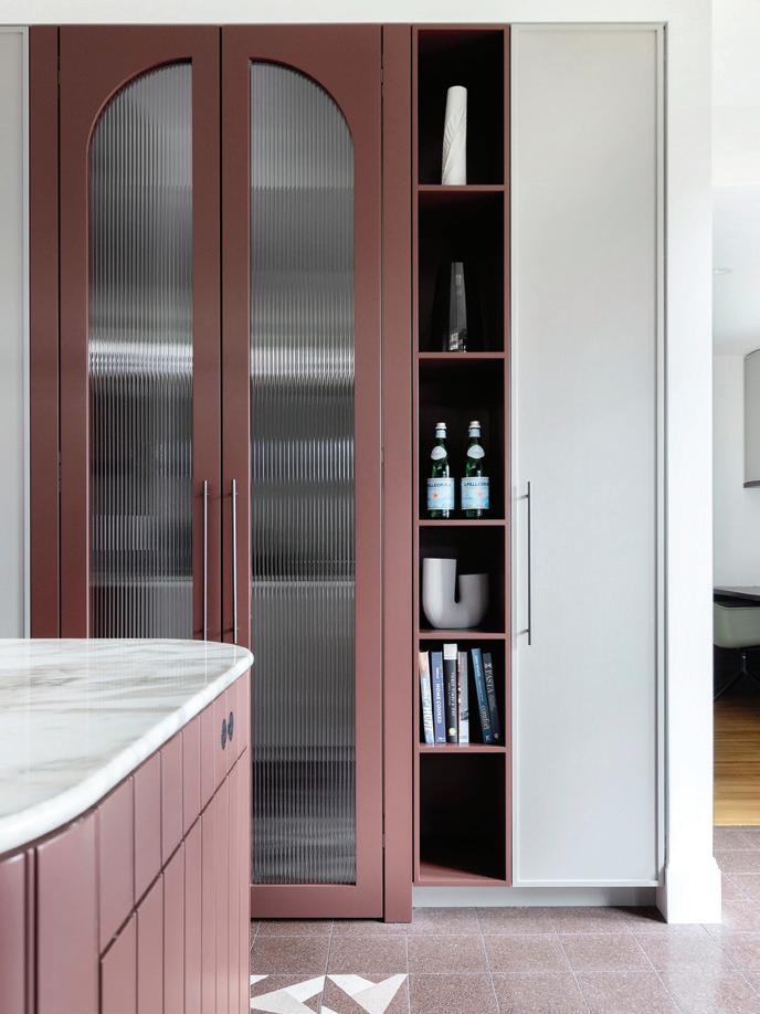
Signature archways, moldings and trim work and distinctive details were all restored and preserved. The historic home’s original stained-glass windows were salvaged and reinstalled in new frames, rousing a rich palette for Ashmore to echo in various elements. Greens and oxblood, tempered with warm white and soft gray, are playfully placed bringing color and pattern, such as in the kitchen’s terrazzo tile.
In the cozy breakfast nook, the stain was matched, and the original oak paneling was recreated for the family of four. Other elements unique to the 1912 build were also brought back to life, albeit some with a different purpose.
“There were a few little treasures in the house that they really wanted to keep,” Ashmore details. “There are a few hot water heaters that still remain but they’re unfunctional. They
 Built-in storage was provided as the perfect way to showcase the client’s brilliant collection of Danish glass birds, while the scenic view provides the perfect backdrop for rest and relaxation.
47 SPRING 2024
use them as plant stands or just as decorative objects in the house. So, they were very much trying to pay homage to the house and be respectful of what it was.”
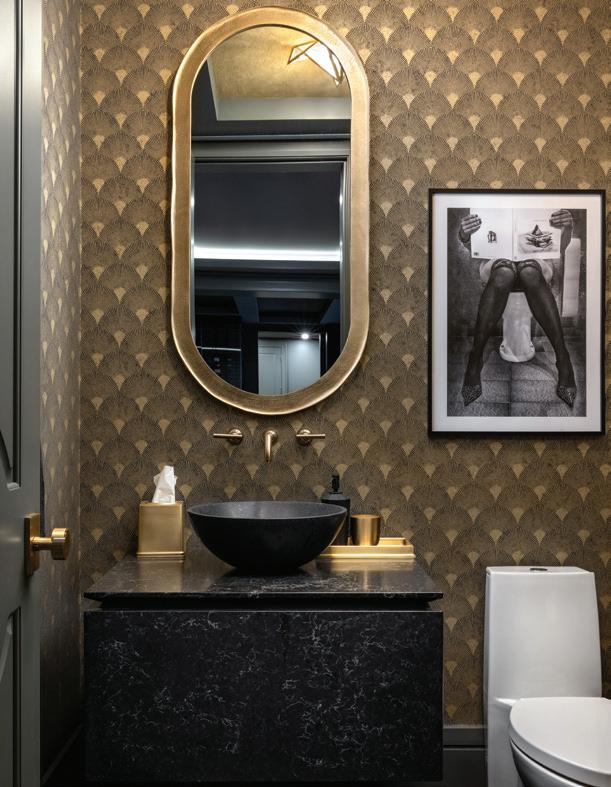
The original clawfoot tub was also salvaged and dramatically re-enameled in oxblood and antique gold and moved to the principal bathroom on the second floor. The luxurious ensuite is rich in design materials with contemporary black metal shower enclosure, porcelain terrazzo tile and complementary puzzle tile pattern on the shower wall.
In the main floor powder room, the client’s personalities and penchant for travel are displayed in the playful fabric wallcovering featuring extinct animals. “They didn’t want it to be an expected experience. They wanted something different,” Ashmore explains. “They’re internationally sort of grounded in the world. So, they have a very fun wallpaper that is of extinct animals; it’s a very cool print.”
Treasures and objects and art from the clients’ travels and personal collection are displayed throughout the home, generating interest and elegance, and weaving stories throughout the sophisticated spaces.
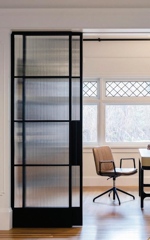
But not all elements of the remodel evoke history. Contemporary and elegant elements, such as the black reeded glass sliding screen between the office and living room and stunning chandeliers bring a modern spin to the traditional build.
In addition to desiring a beautiful reinterpretation of the original character,
Above:
Right:
Sink into luxe living room furniture in front of a blazing fire - and stunning architectural fireplace surround. The modern take on the room’s chandelier makes the eye bounce around the room and highlights the meticulously recreated moldings.
48 ISSUE 15
Contemporary reeded glass and black metal details are interwoven throughout the home, like in the sliding screen between the office and living room.
49 SPRING 2024
the clients needed a space that was equally functional for their family. With house guests coming from overseas and across the country, two busy working professionals and active kids, each room needed to suit their lifestyle.
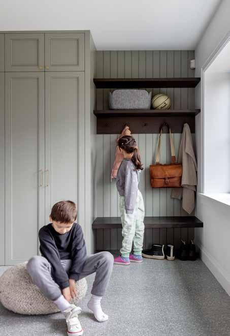
“They like to entertain. Roy works at home and David travels for work but also works at home,” Ashmore explains. “So, we have one office on the main floor, a little nanny suite at the back and a great mudroom for coming in with all kinds of stuff and gear. The house is very functional.”
Now when the family comes home, there is a locker for every member, and plenty of floor space for putting on shoes and boots. Thanks to Ashmore and her team at project22design, her clients are finally able to hang up their coats at the same place and unwind in a space that is unequivocally created for them.
“The most exhilarating part was probably moving them in and seeing the kids enjoying their space,” she says. “It sounds cliché, but honestly, the family had never lived together in the same house. Roy was living with the twins and David was living in another apartment, so actually getting them together in the same home really felt good.”
Above: The whimsical wallpaper in the main floor powder room reflects the client’s global background.
Left: A place for everything and everything in its place. The spacious mudroom is both functional and fashionable, with crisp cabinetry and lots of storage space.
50 ISSUE 15


how to hang like a gallerist
TOOLBOX
52 ISSUE 15
Just as no floor space is complete without furniture, no wall is complete without the adornments of pictures and artwork. Incorporating frames helps to personalize a home while creating varied focal points for the eye to rest upon in delight. Don’t be intimidated by the processwe’re breaking it down step by step to have you hanging like a gallerist.
SUPPLIES:
• LEVEL
• MEASURING TAPE
• PENCIL
• HAMMER, ELECTRIC DRILL OR SCREWDRIVER
• YOUR HARDWARE OF CHOICE (see "METHOD" section below)
STEP ONE: Select the photographs or artwork you’d like to hang. It can be as simple as a snapshot of a fond memory or as obscure as a movie poster of one of your favorite flicks –in the right frame, anything can be art. As long as it means something to you and doesn’t detract from the color scheme and overall feel of your space, it’s a great opportunity to display a little character.
STEP TWO: Find the right frame – photographs will generally look better with a larger matting around them to draw the eye inward on smaller details, while artwork or prints that are larger in scale can be fitted to the frame.
STEP THREE: Select your method of hanging in coordination with the hardware attached to your frame (if no wire or holes are visible at the back of your frame, you can select what works best for you depending on your comfort level and the weight of your frame).
RENTER’S TIP: If you’re looking to avoid holes in your walls altogether or have a strict damage-deposit policy to work with, Command Strips can be a great option! You can find them at most independent paint and decorating stores!
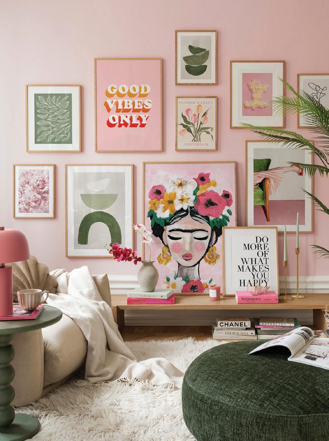
pro tips:
• When hanging a single frame of a larger size, a good rule of thumb is to have the bottom of the frame float exactly 60" above the floor. This will put the frame roughly at eyeline height, right where we want it!
• If you’re hanging a frame above a console table or another object, have the bottom of the frame float about 2" off the surface.
method
LIGHTWEIGHT:
If a frame is lightweight enough, a simple nail (which will leave the least amount of damage on your wall) paired with one of the following hardware options will often do the trick. Measure your desired height and hammer the nail into the wall so about 2 cm remains sticking out.
Sawtooth: A small bracket with a zig-zag edge – a great option for lighter-weight frames. Place the jagged-edge of the sawtooth upon it until it finds the right “groove” to rest level.
Hanging Wire: Can often be the simplest solution, but will sometimes allow your frame to lean slightly forwards. Position your frame so the wire can rest upon the nail and use a level to find the right angle.
HEAVYWEIGHT:
For heavier frames, keyholes and D-Rings are the best option to ensure your frame will have the support it needs. You’ll need to measure your desired height as well as the distance between the hardware on the back of your frame. Plot one of the corners first using a pencil, and then hold your frame with a level on top to plot the second mark. A double headed screw is the best match for this type of hardware – you can screw them in using an electric drill or a screwdriver.
Keyholes: A slotted hole mounted to the top corners of the back of your frame.
D-Rings: Two rings mounted to the corners of your frame.


What is ALLPRO ?
• We’re your local paint store. Each of us is part of a cooperative of over 1,700 independent, family-owned paint and decorating stores.
• Since 1960 we’ve built a network of retailers who believe in the entrepreneurial spirit, community, hard work, and determination.
• By working together we’re able to thrive in an ever increasingly competitive market. Spending less time focused on the business of business and more time focused on you.
• So next time you have a painting project or need decorating expertise, shop your local ALLPRO retailer.
To find the retailer nearest you, visit our website
at www.allprocorp.com/locator


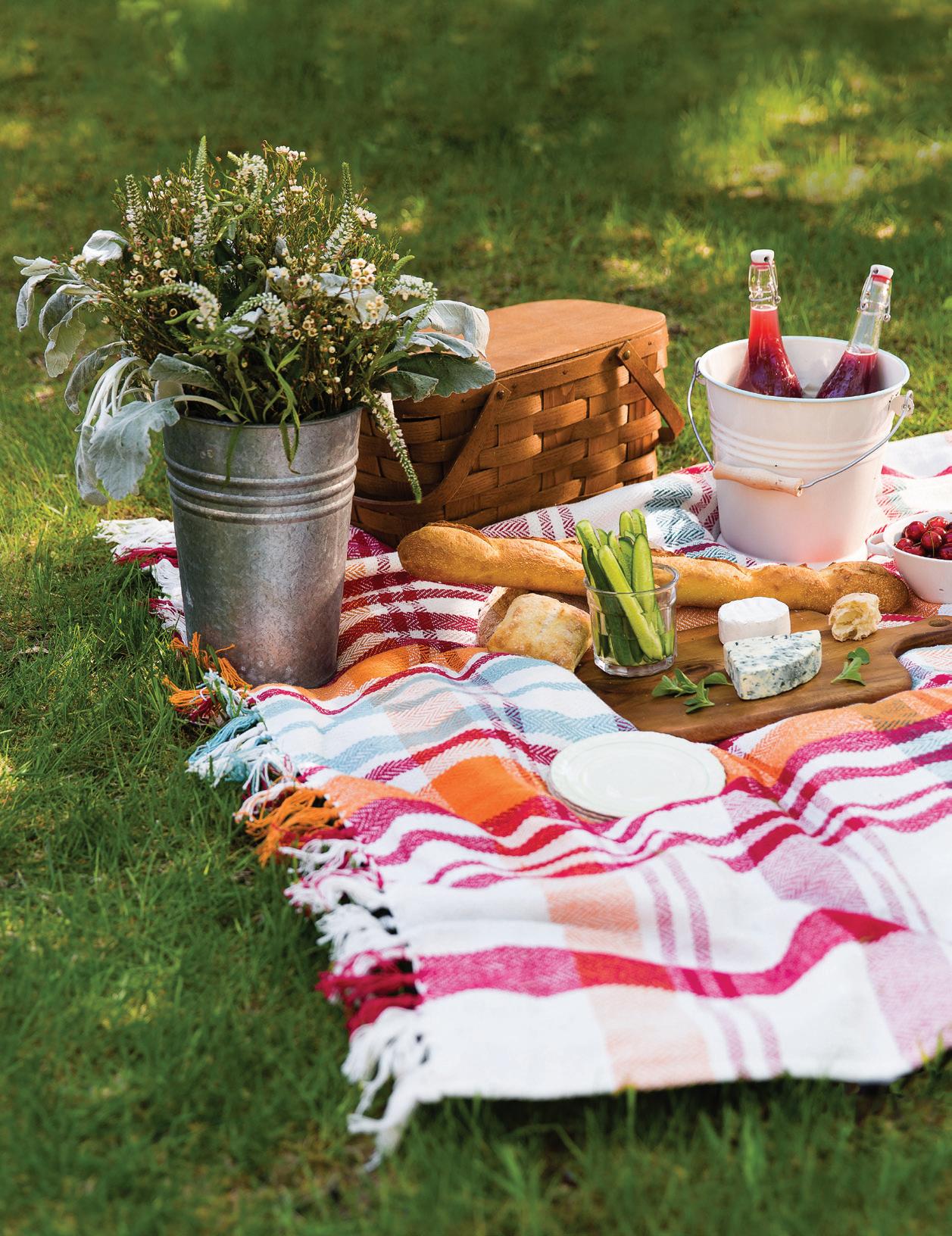

Picnic Perfect


recipes and food styling


 MARISA CURATOLO photography CORY ARONEC
From spur-of-the-moment sandwiches on the lawn to extended family potlucks in the park, how can you go wrong sitting in nature, enjoying great company and a plate full of delicious food?


CHOW ic 58 ISSUE 15

Picnic Essentials:
The perfect summer day is spent in the fresh air of your favorite outdoor spot by the river, on a boat or in your own backyard. Relax, soak up the sun and enjoy a lovely meal.

- a basket to carry your food
- a large blanket
- plates and bowls
- glassware
- cutting boards
- metal bucket for ice
- cloth napkins


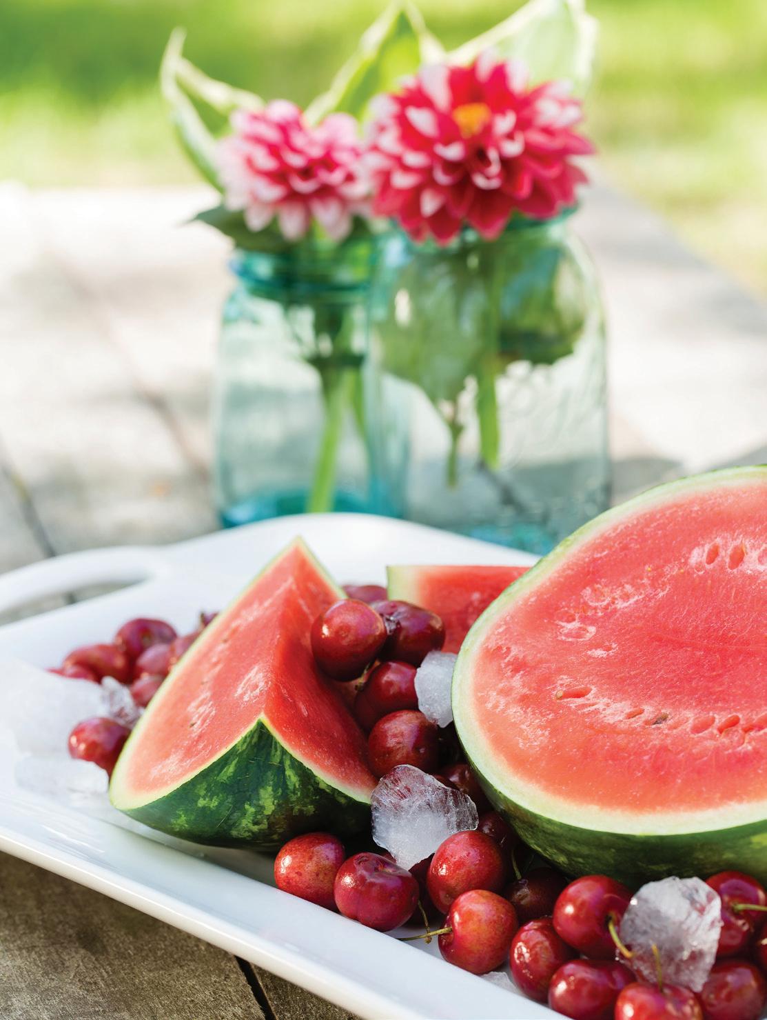
59 SPRING 2024

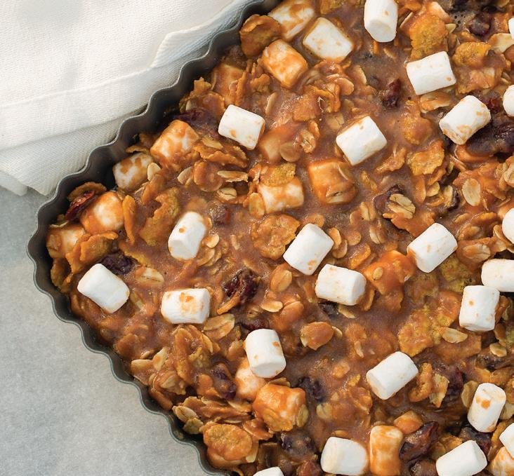
ASIAN SLAW
2 cups shredded cabbage
1 cup sliced snow peas
2 green onions, sliced Dressing:
¼ cup Japanese mayonnaise
1 garlic clove, finely chopped
1 teaspoon sugar
1 teaspoon Dijon mustard
2 tablespoons fresh lemon juice
1 teaspoon light soy sauce
1 teaspoon sriracha sauce
½ teaspoon ground coriander
Coarse salt and freshly ground pepper, to taste
For dressing, combine all ingredients in medium bowl; set aside. In large bowl, combine cabbage, snow peas and green onions. Pour dressing over cabbage mixture and toss well. Season with salt and pepper. Cover and chill 1 hour. Serves 6.
MUFFULETTA SANDWICH
1 (6-inch) round French or sourdough loaf
½ cup pesto
1 cup roasted red peppers
4 ounces sliced provolone
4 ounces sliced capicolla
4 ounces sliced mortadella
4 ounces sliced Genoa salami
6 ounces sliced mozzarella
For sandwich, slice bread in half horizontally and hollow some bread from bottom and top. Spread pesto on bottom of loaf. Place peppera on bottom crust. Layer with provolone, capicolla, mortadella, Genoa salami and mozzarella. Cover with top half of bread and press down. Wrap in plastic wrap and chill 30 minutes. Cut into 6 wedges. Serves 6.
CHERRY & PEANUT BUTTER SQUARES
These no-bake treats are a summertime childhood classic. This grown-up take gets an update from the addition of flaked oats, chopped peanuts and dried cherries. A dash of food coloring paste gives the dish a pink color.
½ cup butter
½ cup 35% cream
1 cup brown sugar
1 cup peanut butter
1 teaspoon vanilla
1 cup large flaked rolled oats
2 cups Corn Flakes
½ cup chopped dried cherries
1 cup chopped peanuts
1 cup mini marshmallows
Line 8-inch metal square pan with parchment paper. Set aside.
In medium saucepan, melt butter with cream. Add sugar and bring mixture to boil; reduce to low. Stir in peanut butter; add vanilla and red paste; remove from heat. In large bowl, combine oats, cornflakes, cherries, peanuts and marshmallows. Pour sugar mixture over oats mixture; toss to coat. Pat mixture into prepared pan. Cover and chill 2 hours or up to 3 days. Cut into squares. Serves 10 to 12.
60 ISSUE 15
There’s nothing quite like the cool, crisp crunch of a great slaw.
A muffuletta is a large, round and somewhat flattened loaf with a sturdy texture. The sandwich is the perfect picnic food as it travels extremely well and the longer it sits in a cooler the better the flavors will be. You may use any cold cuts you wish, but the Italian trio is a true and delicious classic.
POTATOES WITH GREEN BEANS
½ cup extra virgin olive oil
⅓ cup freshly squeezed lemon juice
2 tablespoons grainy Dijon mustard
1 tablespoon finely chopped shallot
1 teaspoon fresh thyme, plus more for garnish
½ lb fresh green beans, trimmed
10 baby potatoes
1 cup cherry tomatoes
In medium bowl, whisk together olive oil, lemon juice, mustard, shallot and thyme. Set aside.
In large saucepan of boiling salted water, cook beans for 5 minutes. Drain and refresh under ice water; drain well. Pat dry.
Place potatoes in a large pot and cover with cold water and salt. Bring to boil and reduce to simmer, cook until fork tender; about 8 minutes. Drain and cool. Cut potatoes in half lengthwise. Toss potatoes, beans and tomatoes with dressing. Arrange on serving platter and garnish with fresh thyme. Serves 6.
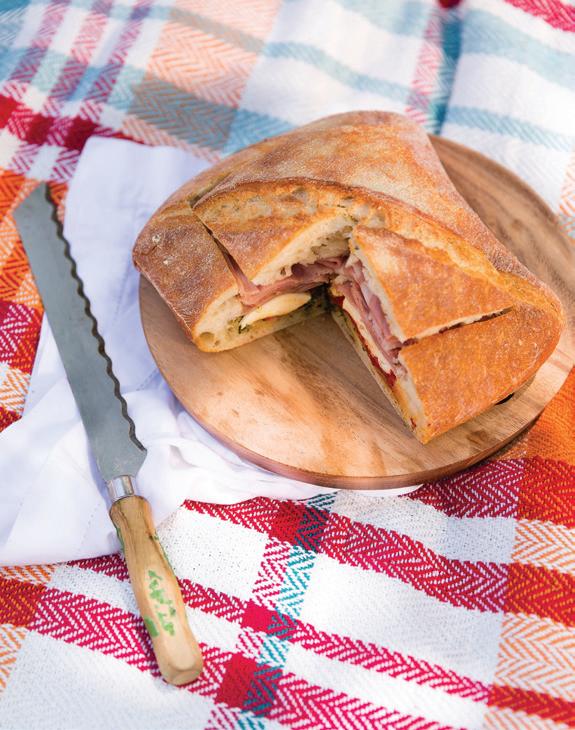
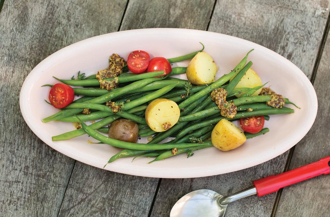
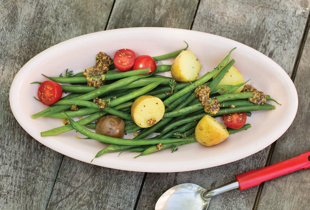


Printemps A Paris Le
Text:
Andrea Danelak


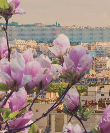
EXPLORER
Discover the City of Light as it gleams and blooms in front of your eyes.
62 ISSUE 15


he great American novelist Henry Miller once wrote “when spring comes to Paris, the humblest mortal alive must feel that he dwells in paradise.” Indeed, as the city saturates with blooms that seem to cover every façade and Parisians shed their cozy peacoats that kept them warm all winter, there is an air of possibility, an unmistakable joie de vivre, discernable at every street corner. It’s a time of optimism, a time of liveliness and perhaps most importantly, a time when tourists have not yet arrived en masse to crowd every reservation list, vintage shop and museum.
The sunshine is warm while the breeze is cool, tinged with the sweet aroma of cherry blossoms. Birds flutter busily overhead. The scene is set for you to “flâner” (a French word which means to stroll aimlessly) about the city at your preferred pace.


FUN FACT
Paris received its nickname, The City of Light, after its early adoption of an extensive system of street lighting in the 19th century.


63 SPRING 2024

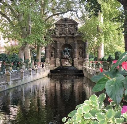
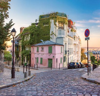
Sights To See
MUST-SEE ATTRACTIONS THAT WILL PUT A SPRING IN YOUR STEP.
Marché aux Puces de Saint-Ouen
The biggest and busiest flea market in the world, sporting over 1,200 stalls and a charm that will have you feeling like a true Parisian. Bring your bartering skills and a keen eye for vintage! (Read more on PG. 24).
Arc de Triomphe
This monument erected by Napoleon in the peak of his career to commemorate military glory must be experienced in person to appreciate its grand stature. It’s also the perfect starting point for a romp down the luxurious shops of Champs-Élysées.
The Louvre
If you only visit one museum while in Paris, let it be the Louvre. Famous throughout the globe and home to the Mona Lisa and the Venus de Milo statue, it’s filled with essential pieces of art history you’ve learned about all your life.
The Eiffel Tower
As you may have guessed, the Eiffel Tower is not to be missed. In fact, we’d recommend putting this on your itinerary twice: once for an afternoon picnic (don’t forget your baguette and a bottle of bubbly for the full experience), and once after sunset so you can see it all lit up!
Montmartre
A staple within the Parisian landscape is Montmartre village, which sports a distinctly vintage feel and authentic ambiance. Famous in its own right (thank you, Moulin Rouge!), you can enjoy an afternoon simply wandering its sloped cobblestone roads and popping in and out of hip bistros and shops.
Jardin du Luxembourg
Covering 25 hectors of land and offering free admission to tourists and Parisians alike, the Jardin du Luxembourg is a wonderful place to dream away an afternoon amongst manicured lines of tulips, a beautiful rose garden and 106 statues spread throughout the park.
Musée de l’Orangerie
An exhibition of impressionists and post-impressionists, you can find Claude Monet’s large “Water Lilies” mural here.
Saint-Germain-Des-Prés
With a storied past that housed writers like Oscar Wilde, de Beauvoir and Albert Camus, this neighborhood is home to classic cafes where existentialists did their bidding (a.k.a., talking). Stop by Café de Flore and Deux Magots to take in a piece of literary history.
Easter Church Service
Some of the city’s oldest and most monumental buildings are churches (Sacré Coeur Basilica and the Église Saint Germain des Prés) – and what better time to see them than during Easter celebrations. Paris’ American Cathedral, Trinity International Church and St. Joseph’s Catholic Church all offer English-language services.
WEATHER: The temperature in springtime ranges from a comfortable 54 F to 68 F, creating the perfect climate for street markets and outdoor exploration, although dressing in layers is always a good idea, especially for after dark. The city sees a good amount of rain during late March and early April, so it’s a good idea to pack an umbrella or make a point to pick one up on your first day. Luckily, there are no shortage of museums to pop into should you find yourself in the middle of an unexpected downpour.
64 ISSUE 15 ALAMY

L’Histoire De La Belle Epoque
aris and its beauty are inextricable from its history. So much of its distinctive charm came about during a period of time now known as the Belle Époque, a time of remarkable economic, artistic and architectural progress between 1871 and 1914 that began after the fall of the Paris Commune and ended with the onset of the first world war. The radical left-wing group known as the Paris Commune had seized power in the wake of France’s defeat during the Franco-Prussian War and the subsequent collapse of Napoleon III’s Second Empire. They ruled from March 18 through to May 28, when the French Army reclaimed the city – but not before significant destruction had occurred. Several beloved buildings were casualties of the violent confrontation, including Paris’ city hall, Hôtel de Ville and Tuileries Palace. In the decades following, Paris was rebuilt with new vigor, with the influence of Art Nouveau weighing in, a sensibility that favored ornate details, intricate awnings and naturally-inspired forms. Most notable among the Belle Époque’s architectural advancements is the Eiffel Tower, which was constructed to serve as the grand entrance to the 1889 World’s Fair. The city’s metro entrances are also a stunning example of this aesthetic at work. Installed between 1900 and 1912 and designed by architect Hector Guimard, 86 of 141 still stand today.
One can attribute the visual harmony of Paris’ architecture to Napoleon III and his Prefect of the Seine, Baron Haussmann, who imposed strict aesthetic standards for buildings while also widening downtown boulevards, giving way to a walkable city that buzzes through all four seasons.
The architecture boom at the turn of the 20th century was also accompanied by an explosion of culture – writers, artists and creatives from all over the world took their turns contributing to a rich intellectual scene. Already known as a scientific and philosophical hub of activity thanks to its instrumental role in the Age of Enlightenment, it quickly became a destination for dreamers and free thinkers. The city’s art world underwent an “avant-garde” reinvention – a reaction to the traditionalism that had previously ruled. Historical subjects and religious allegories were put aside in favor of new approaches to ordinary scenes – leading the charge were a group who would later be known as the Impressionists (Claude Monet, Camille Pissarro, Edgar Degas and Pierre-Auguste Renoir). This influence steeped into graphic design as well with the introduction of the color lithograph, an invention from the “Father of the Modern Poster,” Jules Chéret. Artists used this new tool to immortalize cafes and cabarets (you may be able to call to mind the iconic Moulin Rouge poster by artist Henri de Toulouse-Lautrec, which has been reproduced countless times).
It was this critical period of prosperity that still seems to define Paris today, a time that poised Paris as the cultural capital of the world, cementing its romantic ideals in our collective consciousness and paving way for new dreams to be built upon an already rich legacy. This vision of Paris has proven to be so seductive, it attracts tens of millions of visitors every year – people who come to add their own chapter to the city’s ever-expanding story.
65 SPRING 2024
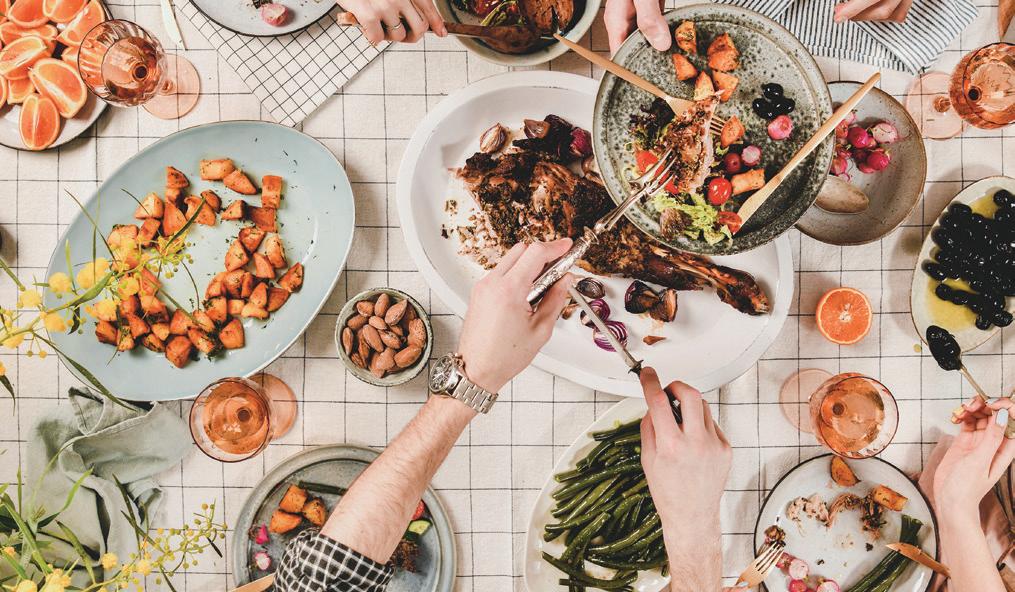
Sipping & Dining
FROM FORMAL DINING TO CASUAL BITES, EXPLORE THIS CURATED LIST OF PARISIAN PIT STOPS.
Le Clarence
Set in a luxurious private mansion lined with neoclassical paintings and draped with crystal chandeliers, Le Clarence offers more than a delicious meal (although Chef Christophe Pelé’s seasonal menu is reason enough to visit). If you appreciate the finer things in life (like an expertly curated natural wine list and the ornate decadence of wood paneling), it’s a must see.
Maison Sauvage
Located in a lively corner in Saint-Germain-des-Prés, and covered in a sea of seasonal florals, this caférestaurant is the perfect lunch spot (or anytime spot - stop by between 7am and 2am without reservations).
Le Recamier
It would be a shame to leave Paris without trying an authentic souffle. Situated a short walk from Le Bon Marché and Jardin du Luxembourg, you can make an afternoon of it.
Clown Bar
Contrary to what this establishment’s name would have you think, Clown Bar’s food is nothing to laugh at. Its chef, Sota Atsumi, has curated a delicious menu to be enjoyed amongst quintessential Art Nouveua paintings (be sure to look up at the ceiling!).
Bisou
An intimate evening is always in store at Bisou, where mixologists create individually tailored craft cocktails on the spot and chefs will cook up your cravings using fresh ingredients they have on hand.
66 ISSUE 15


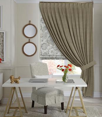
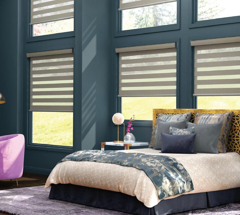


Cheap Sells Once Quality Sells Over and Over Painters Know AllPro® GoldPro®

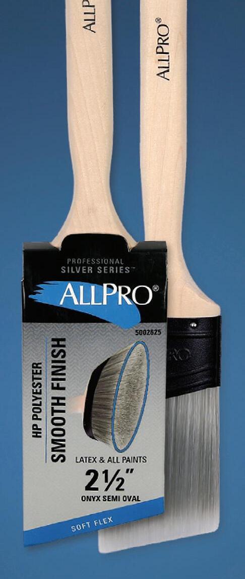


Metal Effect s ® COLLECTION
Modern Masters® Metal Effects® products create the distinctive and timeless look of bronze and copper patina, or the weathered appearance of rusted iron in the matter of minutes.
• Easy to use
• Interior/exterior
• Brush or roller applied
• Available in pints, gallons and 2 oz kits


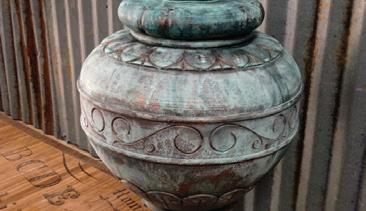


To learn more, get inspired and view application videos visit modernmasters.com
“Offering an unrivalled choice of statement designs, Galerie Wallcoverings delivers visual interest, rich textures and unique patterns that will transform interiors”


A BRITISH WALLPAPER BRAND SINCE 1990 www.galeriewallpaper.com | 800 985 9151
Green Patina Finish
Blue Patina Finish
Rust Finish
3 SPRING 2023
INTRODUCING 2024 COLOR OF THE YEAR
PPG1091-3
We are entering a new era of explosive creativity and change. This next decade will see unprecedented shifts in the way we work, communicate, take care of our health, build and navigate our environments, explore digital worlds, create and design and even how we share our own identities with the world.
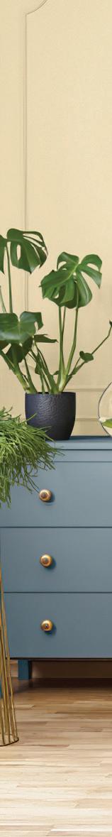
INSIDER
70 ISSUE 15
Color of the Year
INTRODUCING 2023 COLOR TRENDS
This grounding and magical palette captivates the beauty of the natural world. These earthy colors create a sense of safety and a desire to push into unfamiliar territories.
© 2022 PPG Industries, Inc. All Rights Reserved. The PPG Logo is a registered trademark of PPG Industries Ohio, Inc. PPG_1041364 11/22
VINING IVY
PPG1148-6
BLACKBERRY PPG1172-7
CHAMPAGNE WISHES PPG1071-3
STONEHENGE GREIGE PPG1024-5
FOSSIL STONE PPG1102-2
PINE FOREST PPG1134-7
DARK GRANITE PPG1005-7
MOSTLY METAL PPG1036-7
FOXFIRE BROWN PPG1069-6
COOL CLAY PPG1071-5
MOUNTAIN STREAM PPG1149-4
GOOSEBERRY PPG1048-7
71 SPRING 2024
SPICY MUSTARD PPG1108-5
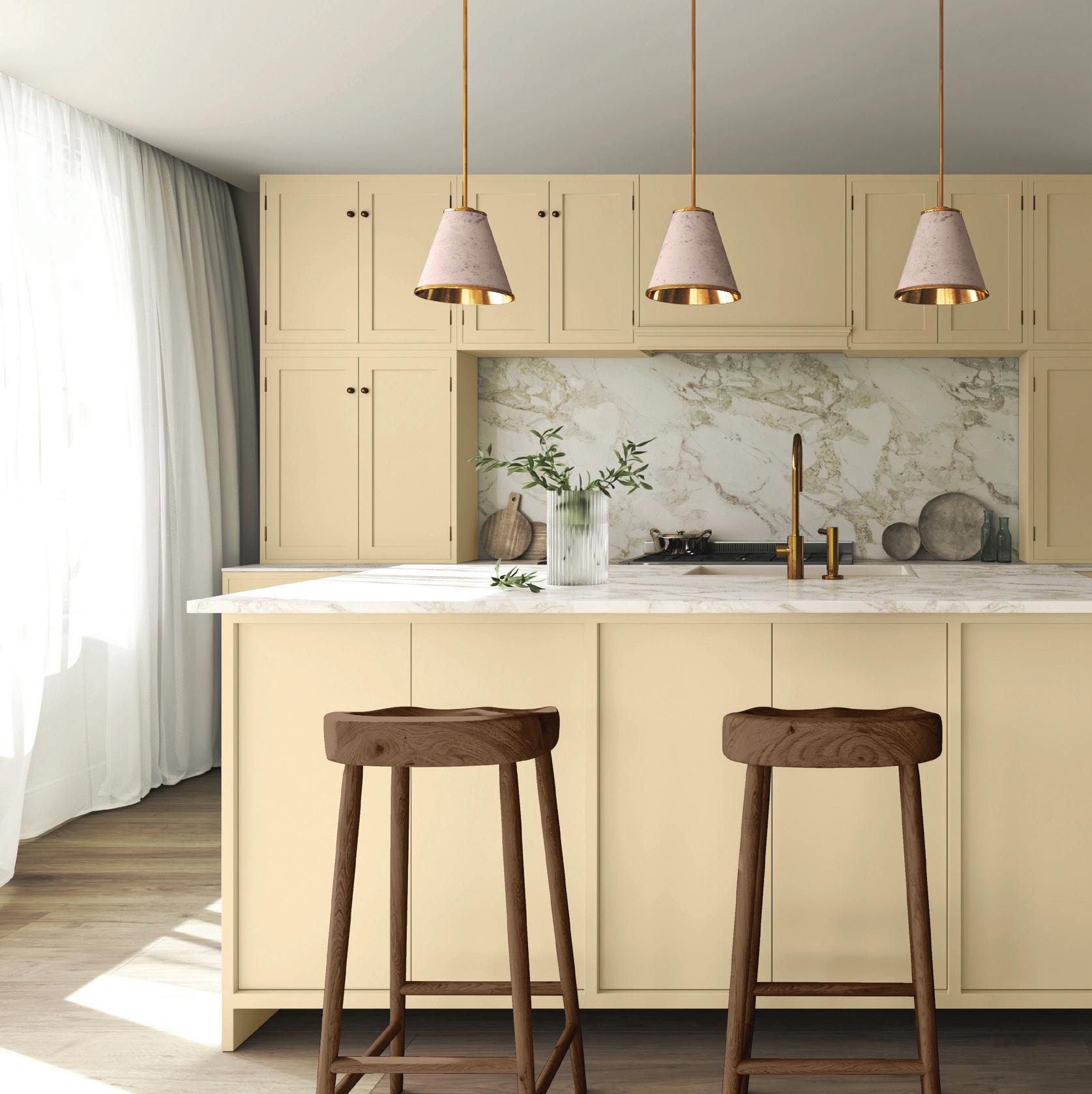
72 ISSUE 15


INTRODUCING 2023 COLOR TRENDS
This grounding and magical palette captivates the beauty of the natural world. These earthy colors create a sense of safety and a desire to push into unfamiliar territories.
Color of the Year
VINING IVY PPG1148-6
A fresh, warm hue, Limitless contains both the power of a primary and the essence of a neutral. It is strong enough to stand as the leading color of many products, yet works equally well as a supporting tone to both warm and cool shades.
DYNAMIC | SPIRITED | RADIANT

© 2022 PPG Industries, Inc. All Rights Reserved. The PPG Logo is a registered trademark of PPG Industries Ohio, Inc. PPG_1041364 11/22
© 2022 PPG Industries, Inc. All Rights Reserved. The PPG Logo is a registered trademark of PPG Industries Ohio, Inc. PPG_1041364 11/22
BLACKBERRY PPG1172-7
CHAMPAGNE WISHES PPG1071-3
STONEHENGE GREIGE PPG1024-5
FOSSIL STONE PPG1102-2
PINE FOREST PPG1134-7
DARK GRANITE PPG1005-7
MOSTLY METAL PPG1036-7
FOXFIRE BROWN PPG1069-6
COOL CLAY PPG1071-5
MOUNTAIN STREAM PPG1149-4
GOOSEBERRY PPG1048-7
73 SPRING 2024
SPICY MUSTARD PPG1108-5
2O24 COLOR PALETTE
2024 COLOR PALETTE
THE FULL PALETTE
Celebrate the dynamics of our relationships with each other and how we show ourselves to the world. Home interiors use warm neutrals to add elegance and temper dramatic combinations of bold
THE FULL PALETTE
TO LEARN MORE AND VISUALIZE THESE COLORS, SCAN THIS QR CODE © 2022 PPG Industries, Inc. All Rights Reserved. The PPG Logo is a registered trademark of PPG Industries Ohio, Inc. PPG_1041364 11/22 INSPIRE TOGETHERNESS
STARLESS SKY PPG0995-7 CITRUS SACHET PPG1198-3 CRUMB COOKIE PPG18-01 CRYSTAL OASIS PPG1138-3 SILVERADO PPG1172-6 BRIQUETTE PPG1188-6 VISIONARY PPG1210-3 KIMONO PPG1166-5 HEART’S AFIRE PPG13-14 OYSTER SHELL PPG14-13 LILAC BREEZE PPG1248-4 LAUREL WREATH PPG1228-5 WALL: CITRUS SACHET CABINETS: VINING IVY VINING IVY PPG1148-6 2023 Color of the Year 16 2024 GLOBAL COLOR & DESIGN TRENDS FOCUS PPG1008-1 JAM SESSION PPG1172-3 CAJUN SPICE PPG1191-6 TAMPICO BROWN PPG16-23 DARK AS NIGHT PPG14-05 NIGHT RENDEZVOUS PPG1037-5 PERSUASION PPG1077-3 BUTTERSCOTCH RIPPLE PPG1106-7 CABIN FEVER PPG1021-7 BLACK WALNUT PPG1014-7 ROASTED PEPPER PPG13-13 HEART’S CONTENT PPG1050-6 BLUSH BEIGE PPG1070-2 SUBDUED PPG1015-4 BLACK ELEGANCE PPG1004-7 LIMITLESS PPG1091-3 SWEET SPICEBERRY PPG1059-7 SOOTHING SAPPHIRE PPG10-09 TURNER’S YELLOW PPG1106-4 CARAMELIZED PECAN PPG1089-7 MERLOT PPG13-04 PURPLE BASIL PPG1046-7 CAPPUCINO BOMBE PPG1061-5 PARFAIT PPG1059-4 SIESTA PPG1200-3 PUTURPLE PPG1248-5 DUSTY TRAIL PPG1097-4 CRAFTSMAN GOLD PPG1092-4
accent colors.
74 ISSUE 15
ESSENTIAL NEUTRALS
ESSENTIAL NEUTRALS
CHOCOLATE
© 2022 PPG Industries, Inc. All Rights Reserved. The PPG Logo is a registered trademark of PPG Industries Ohio, Inc. PPG_1041364 11/22 17
DUSTY TRAIL PPG1097-4
SUMMER RAIN PPG1130-1
DO NOT
DISTURB PPG1117-6
STILL SEARCHING PPG13-31
GRACEFUL PPG1152-3
BLUE FLAME PPG1157-7
NAPOLEON PPG1013-7
GHOST WRITER PPG1007-3
PATCHES PPG1024-6
GARLIC CLOVE PPG18-09
HOURGLASS PPG1022-1
STONE’S THROW PPG1008-7
CRUSHED SILK PPG1024-3
PRISTINE PETAL PPG1034-3
CATALINA PPG1142-5
EMERALD POOL PPG1146-7
GRANITE PPG1022-6
INDUSTRIAL REVOLUTION PPG0997-6
STONEHENGE GREIGE PPG1024-5
BLANK CANVAS PPG1085-1
BLACK WIDOW PPG0997-7
LAB PPG1000-7
DUST BUNNY PPG1000-1
AQUAMARINE DREAM PPG1135-4
MALLARD GREEN PPG1132-6
STONY CREEK PPG1097-5
WILLOW HERB PPG17-26
PINE GARLAND PPG1126-6
VIVA LA BLEU PPG1242-3
DARING INDIGO PPG1166-7
75 SPRING 2024

et's Paint


With a sunny disposition, Limitless possesses an inherently optimistic energy that’s ready to uplift a wide variety of spaces. With its open-ended nature and honey-tinged sensibility, Limitless retains mass-appeal while providing character and genuine personality. It's contemporary in its multitude of potential applications, from commercial to residential and automobiles to architecture. It’s easy to envision the subdued and sophisticated shade enlivening a quaint bathroom or providing an eye-catching coat for large-scale exteriors.
Try it out as an alternative to your go-to beige, or as a playful alternative to white trim in an otherwise white space for a welcomed dose of charm.


PPG'S
LIMITLESS!
ppg1091-3
76 ISSUE 15
“Limitless brings a reassuringly calm yet refreshing energy”
– PPG
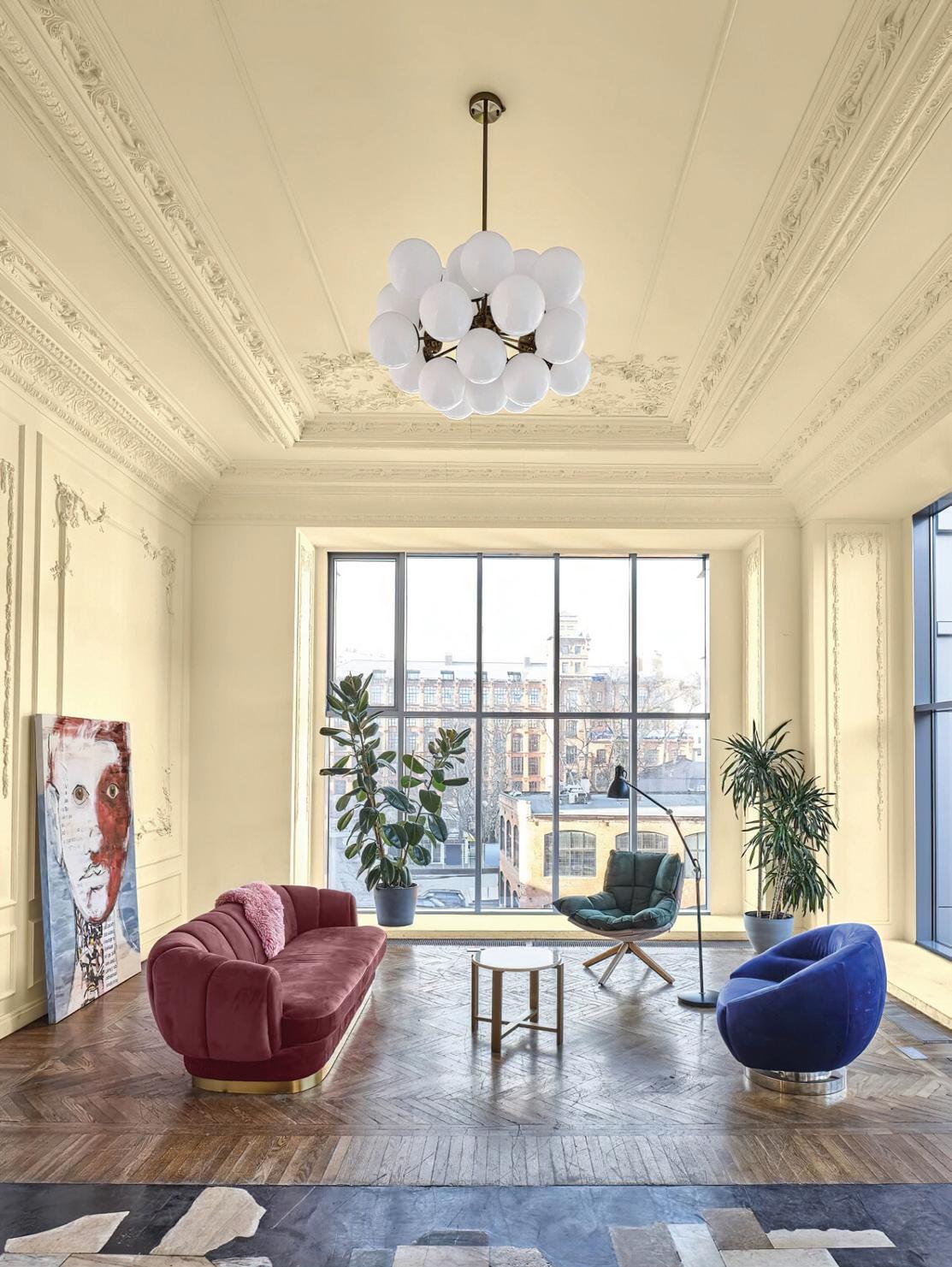
© 2022 PPG Industries, Inc. All Rights Reserved. The PPG Logo is a registered trademark of PPG Industries Ohio, Inc. PPG_1041364 11/22
77 SPRING 2024


Limitless PPG1091-3
A honey beige that radiates warmth, possibility, and growth.


home shades
In recent years, color has exploded back into our lives and interiors, foregoing the beiges and grays that previously dominated in favor of hues with more personality and verve. PPG confirms this seismic shift with their 2024 Color Trends palette, which features a wide array of shades that still feel sophisticated and elegant in their own right. By selecting shades that favor bold strokes rather than the greiges of the past, PPG encourages us to expand our horizons. Bringing energy and charisma, these hues work well as stand-alone pops of color or in varied combinations of one another, offering us an infinitely expanding network of color moments to integrate into our spaces.
Blueberry Patch PPG1167

Reassurance and elegance underscore this charming, cosmic mix of violet and blue.


78 ISSUE 15

sunset in summer heat.
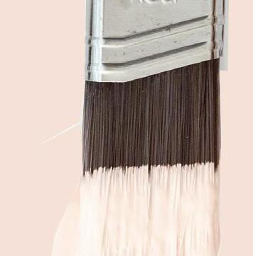


UFlamingo Peach PPG1193-2
With a hint of cinnamon in its undertone, this light apricot shade is ideal for trim or walls.

Misty Violet PPG1247-3
is amethyst purple with a paisley undertone is equal parts soft and bright.


nited under the shared theme of explosive creativity and change, this collection speaks to a new chapter for humanity. PPG has classified their hues into three discrete volumes. e first is characterized by calming, soothing tints, shades inspired by warmed earthenware, dusky twilights and all the mesmerizing color moments often overlooked in the natural world. e second volume is a generous range of deeper, earthier tones. Vivacious blues are counterbalanced by dark neutrals, and warm floral notes bring subtle romance. And the third takes more direct influence from some of our world’s most dominant art movements, such as Art Deco, Baroque and Renaissance. ese shades have taken the inspired cues from nature and reinvented them, defying rules in favor of ingenuity.
Considered together, they present an extraordinary pool within which to play—to make unexpected pairings and rewrite the rules. To create a space that inspires you to reach beyond your comfort zone and into the realm of limitless potential.
Mountain Pine PPG1034-7
A dark, Caribbean-inspired aqua with hints of turquoise.

Banana Brûlée PPG1214-3
A brightly hued yellow that features a hint of zesty citrus and a Dijon undertone.

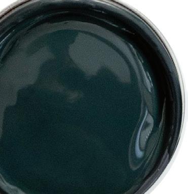


Calla Lily PPG1042-1


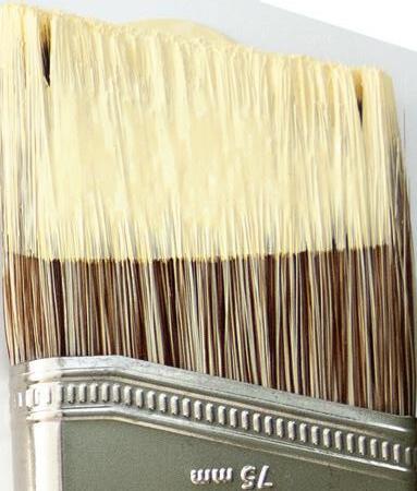
A pale, enchanting blue with a misty undertone.
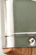

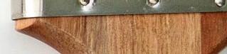


79 SPRING 2024


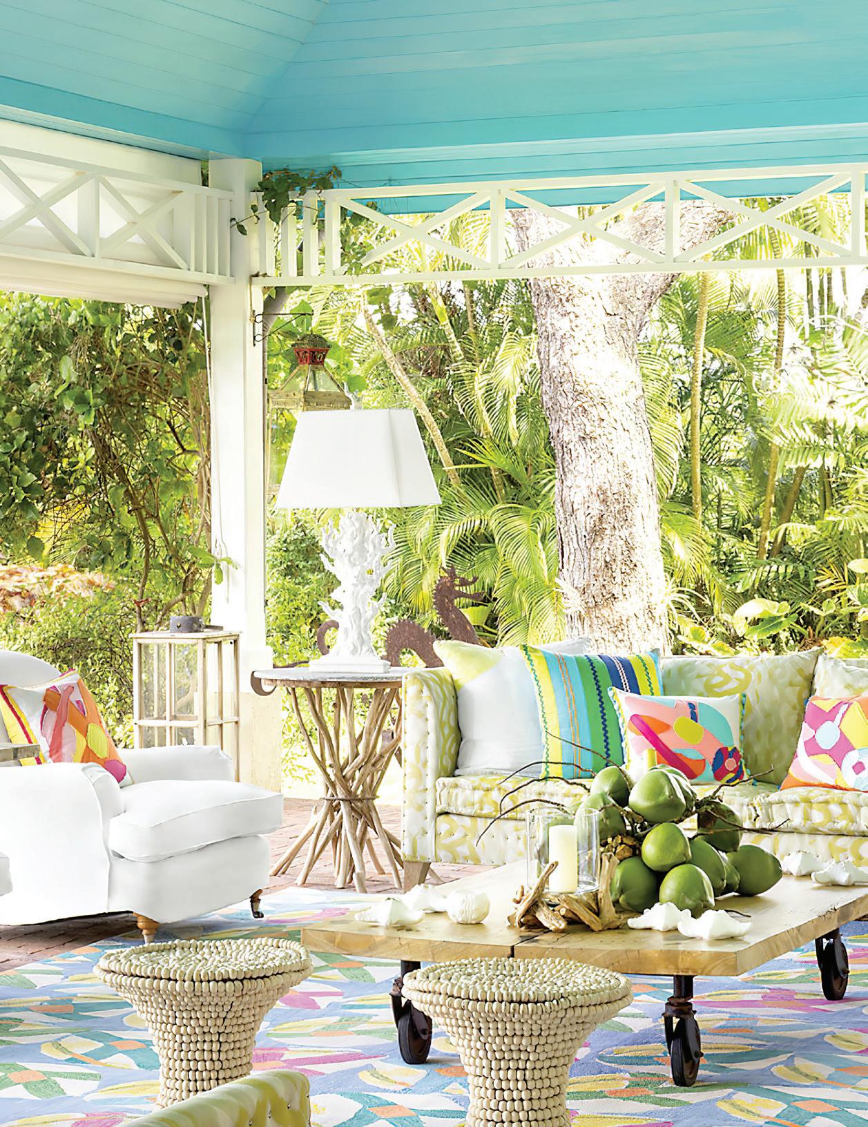
footing find your

When it comes to crafting a coherent color scheme for your space, look no further than beneath your own two feet. A thoughtfully selected rug can provide all the inspiration and direction you need. From bold and brilliant patterns to muted motifs, looking to this single item will ensure you end with a final look that feels true to your taste and organically integrated.


GEOMETRIC WHIMSY
A selection like this is guaranteed to become the focal point of the space, so the work becomes about complimenting the established playful vibe. Because the pattern is working on a larger geometric scale, you can invite other patterns in that feature smaller-scale prints, like striped cushions.


STAINED GLASS PPG1165-6


 DYNAMO PPG17-22


STYLE TO STEAL
80 ISSUE 15


BOLD STROKES
A fun print featuring a well-established color scheme is a great choice, as it allows you to select shades that are already proven to play well together. We recommend pulling two paint matches (one neutral, and another with more personality, as seen here) to use for your walls and accents.
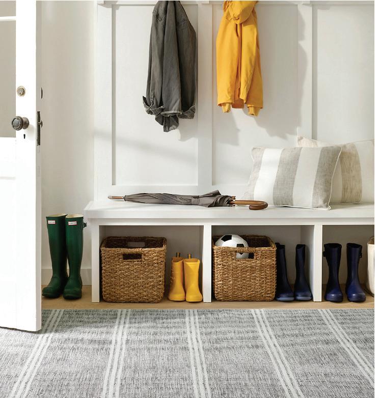


CUE THE NOSTALGIA
A classic striped rug will allow your creativity to soar, especially when it features a tried-and-true contrast as shown here. Uniformity underfoot calls for an unexpected pop of color – a bright yellow is an excellent way to add character and charm to this old-school formula.
Annie Selke Paint Chip Multi Machine Washable Rug
© 2022 PPG Industries, Inc. All Rights Reserved. The PPG Logo is a registered trademark of PPG Industries Ohio, Inc. PPG_1041364 11/22 MINIMAL PPG1107-1 BE YOURSELF PPG1218-7 VEIL OF DUSK PPG1029-2 BEACH PARTY PPG1211-6 81 SPRING 2024
Annie Selke Malta Grey Machine Washable Rug
INSPIRE TOGETHERNESS

SILVERY

BRIAR

Celebrate the dynamics of our relationships with each other and how we show ourselves to the world. Home interiors use warm neutrals to add elegance and temper dramatic combinations of bold accent colors.


LILAC

PRETTY IN PINK
is ornately detailed pattern is primed for the royal treatment. Play up the romantic vibes with a delicate but deep rose hue and bring in accessories and accents that call back to the rug’s undertones.
VISIONARY
CRUMB
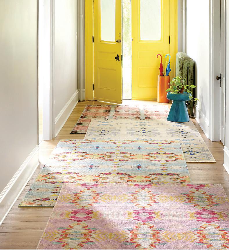
CITRUS
OSTRICH

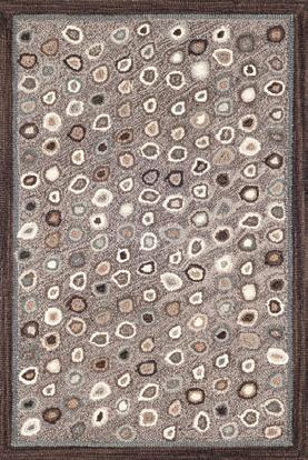

ROSE
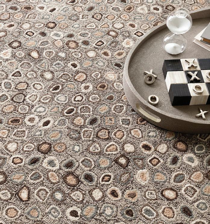
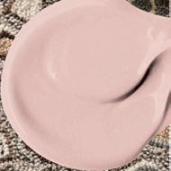

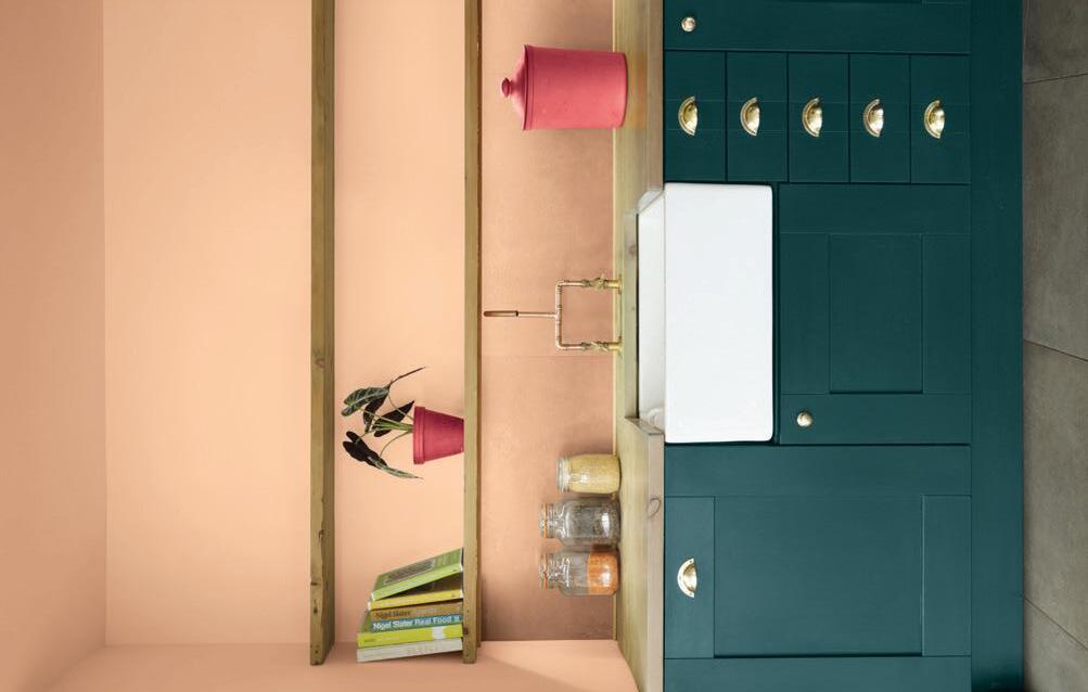
Annie Selke Casar Hand Knotted Wool Rug TO LEARN MORE AND VISUALIZE THESE COLORS, SCAN THIS QR CODE © 2022 PPG Industries, Inc. All Rights Reserved. The PPG Logo is a registered trademark of PPG Industries Ohio, Inc. PPG_1041364 11/22
STARLESS SKY PPG0995-7
SACHET PPG1198-3
OASIS PPG1138-3
PPG1172-6
PPG1188-6
COOKIE PPG18-01 CRYSTAL
SILVERADO
BRIQUETTE
PPG1210-3 KIMONO PPG1166-5
AFIRE PPG13-14 OYSTER SHELL PPG14-13
HEART’S
BREEZE PPG1248-4 LAUREL WREATH PPG1228-5 WALL: CITRUS SACHET CABINETS: VINING IVY VINING IVY PPG1148-6
2023 Color of the Year
MOON PPG1029-1
ROSE PPG1050-5
FEATHER PPG14-32
PPG1057-3 82 ISSUE 15
PETAL


If you’re going for the best finish, go with the best brush. Corona. The finest paint tools. Handmade in the USA since 1961. HANDMADE IN THE USA SINCE 1961 For more information, contact your local Corona Dealer or our Customer Service Department at 800.458.3483. www.CoronaBrushes.com | @CoronaBrushes 83 SPRING 2024
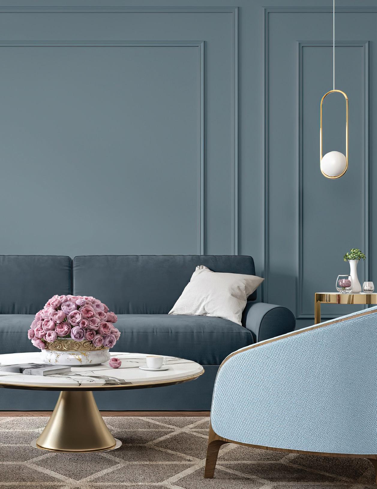
the language of color

True comfort is about so much more than our physical senses. It’s a feeling — the distinct sense that we are at one with our surroundings. We cultivate it by creating spaces that envelope the eye and put our bodies at ease. One of the most impactful tools we have at our disposal in this pursuit is the language of color. While every shade carries a world of significance, it is also sublingual, allowing us to project our own meanings.
Now that we have bid adieu to the standardized neutral palettes of decade’s past for the full spectrum of possibilities, we have given our homes permission to say new things through the power of paint. Next time you step into a room and ponder over paint chips, ask yourself: If these walls really could talk, what would I want them to say?


SILVER FEATHER PPG1002-1


GRACEFUL PPG1152-3

PARTING SHOT
84 ISSUE 13
Why caulk before you paint?
Fills gaps and provides a uniform surface
Saves on heating and cooling by stopping air leaks
Caulking can enhance every paint job
Projects are likely to last longer, saving you time and money
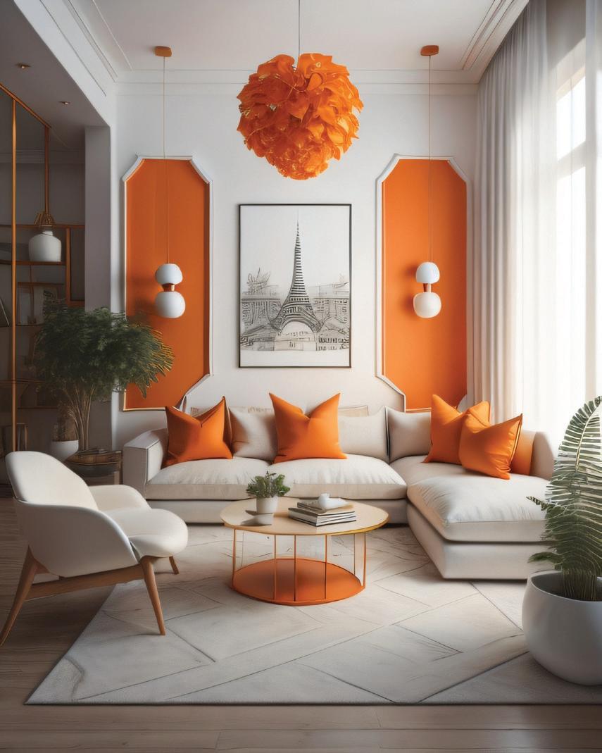


Learn more at www.allprocorp.com For product information call 866.897.7568 or email tech@towersealants.com
• • • •

© 2023 PPG Industries, Inc. All Rights Reserved. The PPG Logo is a registered trademark of PPG Industries Ohio, Inc. PG_1315806 11/23 INTRODUCING 2024 COLOR TRENDS This palette focuses on looking inward to create a deeper, more holistically connected relationship with oneself. Consumers of all ages are putting their mental, emotional and social well-being at the forefront. LIMITLESS PPG1091-3 Color of the Year SWEET SPICEBERRY PPG1059-7 SUBDUED PPG1015-4 TAMPICO BROWN PPG16-23 CAJUN SPICE PPG1191-6 JAM SESSION PPG1172-3 CRAFTSMAN GOLD PPG1092-4 AQUAMARINE DREAM PPG1135-4 FOCUS PPG1008-1 CABIN FEVER PPG1021-7 NIGHT RENDEZVOUS PPG1037-5 PERSUASION PPG1077-3 BLUSH BEIGE PPG1070-2 OCTOBER MIST 1495 COLOR OF THE YEAR & COLOR TRENDS 2022 ©2021 Benjamin Moore & Co. Benjamin Moore and the triangle “M” symbol are registered trademarks licensed to Benjamin Moore & Co. 9/21 Make room for creativity. 21-594305_COTY_Color Trends 2022 MAC Assets_Print Ad_8.5x11_US.indd 5 9/10/21 2:31 PM OCTOBER MIST 1495 COLOR OF THE YEAR & COLOR TRENDS 2022 ©2021 Benjamin Moore & Co. Benjamin Moore and the triangle “M” symbol are registered trademarks licensed to Benjamin Moore & Co. 9/21 Make room for creativity. 21-594305_COTY_Color Trends 2022 MAC Assets_Print Ad_8.5x11_US.indd 5 9/10/21 2:31 PM WALL: Stormy Monday 2112-50, Aura® Eggshell ©2020 Benjamin Moore & Co. Aura, Benjamin Moore, Gennex, and the triangle “M” symbol are registered trademarks licensed to Benjamin Moore & Co. Color accuracy is ensured only when tinted in quality Benjamin Moore® paints. Color representations may differ slightly from actual paint. 7/20 When you find the perfect color, nothing else will do. Perfection comes from our paint and our proprietary Gennex® colorants, together, creating results that are breathtaking. Rely on Benjamin Moore for premium quality and Gennex Color Technology, which makes our long-lasting colors, all 3,500 of them, one-of-a-kind. Unmatchable. Home Magazine_8.375 x 10.875.indd 1 7/13/20 10:35 FIND A LOCATION NEAR YOU WWW.SPECTRUMPAINT.COM
