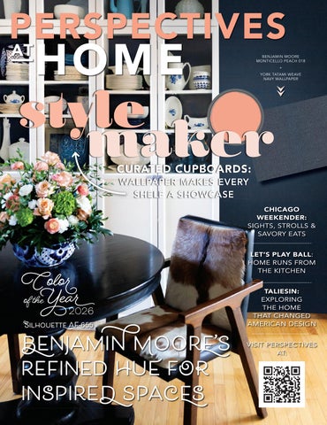
Perspectives At Home Spring 2026

Page 1


Color of the 2026Year

Silhouette AF-655

CURATED CUPBOARDS: WALLPAPER MAKES EVERY SHELF A SHOWCASE

CHICAGO WEEKENDER: SIGHTS, STROLLS & SAVORY EATS

LET’S PLAY BALL : HOME RUNS FROM THE KITCHEN TALIESIN: EXPLORING THE HOME THAT CHANGED AMERICAN DESIGN

benjamin moore’s refined hue for inspired spaces

VISIT PERSPECTIVES AT:

Using a paint roller

Put down the brush and pick up a roller for a smooth, even finish.

When painting walls, ceilings and other flat surfaces, a good roller will make your job quicker and easier. Because they can apply paint at about three times the

BUYING THE RIGHT ROLLER

• If you are applying latex paint, choose a roller cover made with a synthetic “nap” or fiber surface. If you are applying an oil-based paint, choose a natural fiber cover or a synthetic cover.

• When selecting a roller, you should consider the length of the nap. ey range from 1/8” (short) to 1” (long). Short naps are suitable for smooth surfaces, while long naps are best for rough surfaces such as stucco or brick.

• While it may be tempting to go with a cheap roller that you can throw away after, a high quality roller is a worthwhile investment. ey will apply paint more easily, hold more paint, and have less tendency to leave nap fibers on the surface being painted.

EASY CLEAN UP

• For latex paint, wash the roller sleeve in soap and water, using your hand to squeeze and push the paint off the fibers.

• For oil-based paints, pour solvent into the paint tray and dip and roll the cover into the solution.

• Stand the rollers on end as laying them flat will cause the fibers to mat on one side and create an uneven roll next time they are used.

rate of brushes, a roller cuts down on painting time and leaves behind a smooth and even finish. But before you get rolling, here are a few things to consider:

THE PROPER TECHNIQUE

• Before painting, moisten the cover of the roller with water when working with latex paints or with a bit of paint thinner for oilbased paints. Lightly blot the roller cover with a paper towel to remove any excess moisture.

• Do not submerge the roller in paint. Roll it in the tray until it is half coated, then up onto the grid of the tray and then back down into the paint. Do this a few times to ensure the sleeve is well saturated but not overloaded with paint. You want as few drips as possible.

• Don’t start against an edge with a roller full of paint or you may get lumps. Instead, start about 6” from the edge so you can gradually unload the heaviest paint and then work your way toward the edge, where you can overlap areas already cut in by your paint brush.

• Roll the wall in a straight line from top to bottom to coat the surface. Work quickly, lapping newly applied paint onto paint that is still wet.

• Remember, the roller should sound wet; when you can no longer hear that crinkly, moist sound, it’s time to reload it in the paint tray.

• It’s important not too press too hard. Too much pressure can leave a “fat edge” or roller mark on the wall. After each stroke, lightly lift the roller away from the wall to avoid causing an edge.

28

FROM 22 TO FOREVER

A small West Coast home is crafted to evolve beautifully through every life stage

34 A NEW CHAPTER

A storied Victorian is reborn with layered color, art and personal expression

44 A HOUSE BUILT FOR SUMMER

A relaxed beach house is designed for light, landscape and long summer days

50 A PLAYFUL RETREAT

A California getaway is energized by bold color, pattern and joy SPACES: Real home redesigns with wall-to-wall ideas you can use.

Check out more colorful & inspiring spac starting on page 28

MADE IN THE USA

Crafted for the way you live, Dockside is designed for everyday life. Proudly Made in the USA, it’s built to stand up to life’s toughest moments — 100% waterproof, scuff-resistant, and dent-defiant. Whether you’re chasing adventure or embracing everyday ease, Dockside brings effortless elegance and rugged resilience to every space.

Live boldly. Live beautifully. Live Dockside.

SPRING 2026

Bahia Taylor

Editor in Chief

Co-founder

Leigh McKenzie

Creative Director Co-founder

Twila Driedger

Contributing Writer & Editor

Olivia Guay

Graphic Designer

Carlee Baigrie

Contributing Writer

Aubrey Taylor

Contributing Photographer

Jim Taylor Painter & Set Contractor

Graphic Design

Styling

Gallon Creative www.galloncreative.com

Owned and Published by:

Gallon Creative

For inquiries, please contact us at projectsgalloncreative@gmail.com

5 Scurfield Blvd #25 Winnipeg, Manitoba R3Y 3G4

www.galloncreative.com projectsgalloncreative@gmail.com

Cover Photography - Aubrey James Projects aubreyjamesprojects.com

While every effort has been made to ensure that advertisements and articles appear correctly, At Home Magazine cannot accept responsibility for any loss or damage caused directly or indirectly by the contents of this publication. All material is intended for informational purposes only. The views expressed in the magazine are not necessarily those of its publisher or editor.

All rights reserved. Reproduction in whole or part prohibited without written permission from the publisher.

22

CRAFTY: DIY? WE SAY Y-E-S!

FORM & FLOW

Crafting organic relief art for modern walls

24

HOT SPOT:

Shining a spotlight on the world’s hidden gems

THE LIFE AND WORK OF FRANK LLOYD WRIGHT

Exploring the roots and design philosophy of an American architectural icon

58

CHOW:

Just thinking about it is making us hungry

BIG LEAGUE BITES

Ballpark-inspired recipes for winning game days

64

EXPLORER:

Pack your sense of adventure and let's go

BLOWING THROUGH THE WINDY CITY

From deep-dish pizza to iconic architecture, Chicago serves up big-city character

70

INSIDER: 2026 Color of the Year

COLOR TRENDS 2026 PALETTE

Discover your style with eight inviting hues

76

COVER FORMULA: STYLE MAKER

Wallpaper that makes every shelf a showcase

A Dose of Color

After a long winter, what many of us crave is a good dose of color. When the world outside feels muted and monochrome, personality and pattern become the perfect prescription – a cure to the cold, bleak canvas that lingers far too long. In this issue, we deliver shades in spades and spaces designed to delight.

This season’s color forecast begins with Benjamin Moore’s Color of the Year for 2026, Silhouette AF-655 – a deeply refined and quietly exquisite shade paired with a palette of pale neutrals and approachable warm tones, demonstrating how the right hue has the power to elevate not just a room, but how you feel within it. That same transformative power is reflected throughout the features in this issue.

On PG.34, a worn Victorian flat proves that contrasting design sensibilities can come together beautifully in a layered, personal home. In “A Playful Retreat” (PG.50), designer Emilie Munroe embraces color, whimsy and spirited confidence in a California vacation home. Turquoise kitchen cabinets? Absolutely. Seahorse wallpaper? Why not.

As summer approaches and beach homes beckon, we’re drawn to spaces that blur the boundary between indoors and out. In “From 22 to Forever” (PG.28), Kyla Bidgood maximizes sweeping inlet views, creating a home deeply connected to its natural surroundings. And in “A House Built for Summer” (PG.44), weekend hosting and hospitality take center stage in a renovation designed for long evenings, full tables and effortless togetherness.

Even our Chicago feature administers some seasonal therapy – proof that good food and a great city has a way of pulling us out of hibernation.

So, consider this issue your doctor’s orders: prescribe yourself a little color, a bold pattern and perhaps a playful risk or two. Side effects may include joy, inspiration and a renewed love for the spaces you call home.

FIND A BREAKDOWN OF THIS COVER ON PG.76

COLOR PL AY

Understanding e eory Behind e Design

Have you ever looked at a room and everything just felt right? All the details work together to create harmony, but you couldn’t quite put your finger on it? This is likely the workings of color theory at play. Chances are high that the designer or homeowner had a firm grasp on the science behind the color wheel and how to harness its power for aesthetic benefit. Even with a base level understanding, you can be empowered to choose colors in your spaces with confidence.

At its core, color theory is the art and science of how we perceive color.

HARMONIOUS COLOR SCHEMES

VOCABULARY

Hue: Another word for color

Tint: A hue with white added

Shade: A hue mixed with black

Tone: A hue mixed with gray

Value: e amount of lightness or darkness a color has

Chroma: How saturated (dull or bright) a color is

Temperature: is indicates whether a hue is warm or cool

Although good intuition can go a long way, the sure-fire way to ensure your color palette is cohesive is to utilize the tried-and-true color schemes indicated by the science of the color wheel!

MONOCHROMATIC

Using any combination of tint, tone, or shade in just one color.

ANALOGOUS

Using colors adjacent to one another on the Color Wheel (at least 2 and no more than 5 consecutive colors.)

COMPLEMENTARY

Using any two colors directly opposite to one another on the wheel.

SPLIT COMPLEMENTARY

Using any color alongside the two colors on each side of its complement.

TRIADIC

Using three, equally spaced hues on the color wheel.

Did you know Perspectives, Inc. offers full custom options in...

Did you know Perspectives, Inc. offers full custom options in...

Shutters

Did you know Perspectives, Inc. offers full custom options in...

Bedding

Did you know Perspectives, Inc. offers full custom options in...

Shades

Shutters

Shades

Upholstery

Bedding

Bedding

Upholstery

Bedding Upholstery

Shutters

Design Services

Upholstery

Design Services

Bedding

Exterior shades & cushions for residential, commercial and hospitality?

Shutters

Design Services

Bedding

Shades Blinds Drapery

Shades Blinds Drapery

Exterior shades & cushions for residential, commercial and hospitality?

Exterior shades & cushions for residential, commercial and hospitality?

Shades Blinds Drapery

Upholstery

Exterior shades & cushions for residential, commercial and hospitality?

Shades Blinds Drapery

Upholstery

Design Services

Design Services

Exterior

Exterior shades & cushions

& many more!

& many more!

PLAN LIKE A Pro

Get your project off on the right foot. A little bit of preparation can go a long way, saving you time and effort with your forethought.

Painting, no matter how small or large the project at hand, can be one of the most transformative, gratifying and cost-effective ways to elevate your space. But the process is much smoother and the results much better when you take the time to plan your approach.

Look critically at the area or areas you plan to paint. Carry a pen and paper if you need to jot down notes about the following:

SURFACES: Write down all the different materials your paint will need to cover. An exterior project can encompass any combination of brick, stucco, vinyl or wood. Surfaces on interior projects can range from smooth drywall, to plaster and textured surfaces.

CONDITION: Note any imperfections that need to be addressed. Is mildew present? Rust? Is the existing paint peeling at all? Is the caulk intact or are you able to spot gaps?

REPAIRS: If you’re working on an interior project, you may have to cover chips or nail holes prior to painting, or work on scrubbing out existing stains.

This methodical approach to prepping your project will ensure you’ll only need to make one trip to Perspectives, saving you time and effort and ensuring you get the job done right the first time.

TALK TO THE EXPERTS AT PERSPECTIVES FOR

Design DICTIONARY

Lost in the latest design lingo? Don’t sweat it. e industry is constantly shifting and evolving and with it, so is its language. It’s easy to get overwhelmed and confused by the seemingly infinite array of interior design’s latest and greatest style categories, but we’re here to help set the record straight so you can navigate between “shabby chic” and “mid-century modern” proficiently and effectively. is convenient cheat sheet breaks down these style concepts into digestible definitions that will help you understand and utilize design terminology instead of letting it scare you away.

MODERN /mod-ern/ • Adjective

is one is fairly broad, and it typically is used in reference to an aesthetic with clean and crisp lines, minimal clutter, and few accessories. Contemporary is often used interchangeably with modern, but the term “contemporary” actually refers to the dominant style of the current period (contemporary style shifts throughout time, whereas “modern” is a stable definition).

MINIMALIST /min-i-mal-ist/ • Adjective

Like modern on steroids. It exaggerates the sleek and clean lines of modern design and values simplified furnishings. e color palette is usually muted and airy and accessories will be sparse and functional.

MID-CENTURY /mid-sen-tu-ry/ • Adjective

is aesthetic often showcases raw materials like wood, exposed brick and beams. Spaces usually contain copious amounts of natural light and usually rely on clean and curved lines. Furniture with functionality at its heart is usually the focal point in these spaces.

INDUSTRIAL /in-dus-tri-al/ • Adjective

As you might have guessed, the industrial aesthetic is inspired by the warehouse, and often features open light fixtures, cement, high ceilings and plenty of wood or metal materials. In an industrial styled home, there will be sparse furniture and ample space.

TRADITIONAL /tra-di-tion-al/ • Adjective

ese homes usually showcase dark finished wood amongst ample accessories, various textures, and a diverse array of fabrics.

RUSTIC /rus-tic/ • Adjective

is design concept is inspired by nature, often using unrefined textures and unfinished edges in its furniture. Accessories are usually somehow tied to the outdoors, and here, reclaimed wood is common.

SCANDINAVIAN

/scan-di-na-vi-an/ • Adjective

is style of design is mirrored after the simplistic lifestyles led by Nordic folk. It is typically understated and usually incorporates some sort of outdoor influence, such as handcrafted wood workings. In the Scandinavian design world, the furniture is usually highly functional with minimal accessorizing and the color palette is usually based in neutral tones.

BOHEMIAN /bo-he-mi-an/ • Adjective

is style category gets its name from its carefree mentality and free-spirited energy. ese homes often feature vintage items, international influences, and a plethora of textiles and rugs. Bohemian style is also incredibly comfortable, often sporting ample pillow selections and comfy floor seating arrangements.

COASTAL

/coast-al/ • Adjective

is aesthetic is inspired by the beachy vibes that emanate from the famous vacation spot off the coast of the state of New York. is palette is predominantly white, usually with white washed wood paneling, flooring, or interior walls. Décor is typically nautically inclined, with navy and softer yellows and reds cropping up as accent colors.

Wonderful Window Treatments Transform Your Spaces

Change the look of an entire room by dressing up windows with drapes and valances, shades and shutters, or blinds that transform a room in both subtle and dramatic ways, giving a space the nishing touch. The right treatment can add texture and softness, privacy and sunlight by elevating an interior from simple to spectacular. Our Designers help you with the ambiance of a room and make it energy ef cient too. The right window treatment can tie the entire room together.

Did you know that by adding shutters you increase the appraised value of your home? Let our experienced designers help you nd the perfect look for your areas.

HERE ARE SOME OF THE WONDERFUL WINDOW TREATMENTS OUR DESIGNERS CAN HELP YOU CHOOSE FROM:

• Blinds

• Shutters

• Valances

• Toppers

• Drapes

• Sheers

• Shades: Cellular Layered Pleated Natural Roller Roman Solar

Graber Wood Blinds
Graber Sheer Shades

MIMICKING MARBLE

York PSW1127RL Step

Give your kitchen new energy, a pop of print or a dramatic edge with an easy and affordable update. With everything from pompous prints and classic graphics to subtle textures and whimsical designs, you can showcase your personality without the cost and long-term commitment of tile, stone or a slab. Wallpaper is turning heads as the new trend in kitchen backsplash.

Perfect for a renter, a DIYer whose style shifts with the seasons or the budget conscious, peel and stick wallpaper provides a perfect way to reinvent your kitchen. As the popular entertaining space takes a turn from the all-white way of the past and toward a more personal style, wallpaper walks in with all of its colorful, graphically enchanting and textural glory to steal the show.

A STONE’S THROW

With the magic of peel and stick wallpaper, achieving your Carrara marble dreams is closer than you think. If splurging on extravagant marble, granite, or quartz isn’t in your budget, get rocking with this eco-friendly Oil & Marble Premium Peel + Stick Wallpaper by York Wallcoverings. e pattern is described by the paper company as a ‘dance of colorful marbling inspired by the Persian art of oil on water known as clouded paper.’

With simple installation, making it easy to remove and reposition the paper, you can save yourself the cost and the heavy lifting of stone. Just like a luxury mineral, you’ll want to protect your paper with a waterproof varnish. e finish will help it hold up to the wear and tear as a backsplash in a busy kitchen.

Have a couch or chair that has “Good Bones” but has seen better days?

REFRESH THE LOOK

THE CLEAR CHOICE FOR WOOD

Shop these stunning Benjamin Moore paint colors, from the homes featured in this issue, at Perspectives. The friendly staff will help you get all the right tools to help with your project.

Love the designs within our pages? Connect with the talented folks behind the gorgeous spaces.

FROM 22 TO FOREVER | PG.28

BIDGOOD | Kyla Bidgood bidgood.co | @bidgoodco

A NEW CHAPTER | PG.34

Banner Day Interiors

Clara Jung | bannerday.com @bannerdayinteriors

A PLAYFUL RETREAT | PG.50

Studio Munroe | Emilie Munroe studiomunroe.com | @studiomunroe

A HOUSE BUILT FOR SUMMER | PG.44

Laura Killam Architecture & Sophie Burke Design

Laura Killam; Sophie Burke laurakillamarchitecture.com; sophieburke.com @laurakillamarchitecture; @sophieburkedesign

JAMES JONES, CHRISTOPHER STARK, LATREILLE ARCHITECTURAL PHOTOGRAPHY, THOMAS KUOH

form &

flow

CRAFTING ORGANIC RELIEF ART FOR MODERN WALLS

Bring quiet movement and sculptural texture to your walls with this elegant DIY relief art project. Using ALLPRO Pro Stretch interior/exterior caulk by Tower Sealants, you can transform a simple canvas or panel into a galleryworthy piece inspired by organic forms and natural flow. is technique relies on gentle curves, repeated lines and subtle dimension rather than bold color, making it ideal for modern, minimalist interiors. With just a few tools and a creative touch, you’ll create raised texture that catches the light and adds depth without overwhelming the space. Finished in soft white or neutral tones, this DIY artwork feels timeless, tactile and thoughtfully handmade – perfect for elevating a living room, bedroom or foyer.

FORM & FLOW RELIEF ART

STEP ONE: PREP THE SURFACE

Start with a stretched canvas, wood panel or MDF board. Make sure the surface is clean, dry and free of dust. If needed, apply a base coat of white or neutral acrylic paint and let it dry completely. This creates a smooth foundation and ensures an even final finish.

STEP TWO: PLAN YOUR DESIGN

Lightly sketch your design with a pencil. Think flowing lines, gentle curves or abstract organic shapes inspired by nature – water, wind, leaves or topography. Keep it simple and balanced, allowing negative space to play a role in the composition.

STEP THREE: APPLY THE CAULKING

Using ALLPRO Pro Stretch interior/exterior caulk by Tower Sealants, apply the caulking directly to the surface, following your sketched lines. Use steady pressure to create consistent raised lines. You can smooth or refine shapes with a palette knife, toothed trowel or other pottery or sculpture tools. Let the piece cure fully for 24 hours.

STEP FOUR: FINISH THE PIECE

Once dry, paint the entire artwork – texture included – with a matte or satin paint in white or a soft neutral. This unifies the piece and highlights the sculptural relief. Allow to dry completely before hanging.

Make It a Series

Instead of stopping at one piece, create a small collection. Vary the direction of lines or scale of shapes while keeping the same color palette. Hung together, a series of form and flow relief artworks creates rhythm and visual harmony –proof that simple materials can deliver high-end impact.

calm through craft

Creating relief art is as much about the process as the finished piece. The slow, repetitive motion of drawing lines with caulk encourages focus and calm, making this project a form of creative meditation. There’s no need for perfection – small variations add character and authenticity. Set aside quiet time, play soft music and let your hands guide the flow. The result is art that carries a sense of ease into your home.

THE LIFE AND WORK OF FRANK LLOYD WRIGHT

There are few professions that have as profound an impact on the way we live as that of an architect – and few architects have been as influential as Frank Lloyd Wright. Examples of his creative genius can be found in cities throughout the United States and beyond, but Chicago, which served as the launching pad for his long and illustrious career, bears his mark like a badge of honor.

Wright arrived in Chicago in 1887, already infatuated with the world of architecture and determined to contribute to it. After bouncing between a few firms, he began working under architect Louis Sullivan. With a loan from his employer, Wright designed and built his first residential home – his own – using it as a testing ground for his emerging ideas and practical aesthetic. Eventually, he began accepting residential commissions, which led to his departure from Sullivan’s firm, with Sullivan citing a breach of contract. Although the split sparked a decades-long rift between the two men, it’s clear that Wright’s curiosity and ambition were always destined to take him out on his own.

His early work, which began while he was a junior draftsman and continued as he started and grew his own firm, established what would eventually be known as the Prairie style. Characterized

by broad sheltering roofs and long, low, open floor plans, the style reflected Wright’s desire to create a distinctly American architecture. Wright believed this horizontal emphasis helped to fuse the landscape with the structure, creating harmony. At a time when prominent contemporary styles such as Victorian architecture favored ornate details, Wright’s restrained approach marked a dramatic departure, gaining him significant notoriety.

Adding to the allure of Wright’s work was his outspoken nature and the philosophical ideals embedded in his practice. A staunch believer in democracy, he viewed design as a vehicle through which people could achieve a better standard of living. From Wright came the concept of “organic architecture,” which considered a building in its context. Wright viewed homes – or any structure – as ecosystems. He even took the time to design kitchenware, furniture, lighting and more to see his vision through completely.

Wright’s tumultuous personal life eventually drew him away from Chicago and his family. After moving on with Mamah Borthwick Cheney and a stint in Europe, tragedy struck in 1914 when she was killed in a brutal attack at Taliesin, their Wisconsin home.

“Study nature, love nature, stay close to nature. It will never fail you.“
FRANK LLOYD WRIGHT

In the years that followed, Wright spent extended periods working in Japan before returning to the United States. When Wright eventually remarried a more stabilizing partner and channeled his genius into lecturing and writing, his influence and revered position within the industry took on greater weight. In addition to releasing multiple publications, he and his wife founded the Taliesin Fellowship, an apprenticeship program that approached architecture holistically, integrating art, agriculture, music and daily life. Wright continued to work, travel and lecture well into his 80s, completing several important commissions in the 1930s and enjoying a dedicated exhibit celebrating his life’s work at the Museum of Modern Art in 1940.

Wright died in 1959, a few months shy of his 92nd birthday, due to complications from surgery. His revolutionary ideas will live on, immortal in their contributions to the world of design.

TALIESIN:

EXPLORING THE HOME THAT CHANGED AMERICAN DESIGN

At Taliesin, architecture settles into the land rather than announcing itself upon it. The house stretches low across the Wisconsin hillside, its horizontal rooflines echoing the prairie’s quiet sweep. Local limestone rises directly from the earth, blurring the line between foundation and field.

Inside, space flows instead of stopping. Rooms open into one another through compressed thresholds that release into light filled living areas, creating a choreography of expansion and intimacy. Windows are arranged in rhythmic bands, drawing the horizon indoors while filtering sunlight into a soft geometric glow.

Built in seating, integrated shelving, and custom furnishings eliminate excess, proving that simplicity can feel generous rather than spare. Materials remain honest: wood warms, stone grounds, glass dissolves boundaries.

Taliesin did not decorate space. It composed it. In doing so, it shifted American design toward openness, cohesion, and a new harmony between shelter and landscape.

Exterior of "Taliesin", the house

EXPLORE SOME OF WRIGHT’S MOST ICONIC CHICAGO PROJECTS:

FRANK LLOYD WRIGHT HOME AND STUDIO (1889): This space served as a testing ground for Wright’s early thinking about design. The building itself is reminiscent of the Arts and Crafts movement, which emphasizes structural simplicity, authenticity through handmade wares and natural materials.

FRANK LLOYD WRIGHT HOME AND STUDIO 951 Chicago Avenue, IL

ROBIE HOUSE (1909): Defined by Wright’s use of long, thin rectangles stacked atop one another, Robie House was constructed at the height of Wright’s career and offers a glimpse into American family life at the turn of the twentieth century. Located in Hyde Park.

ROBIE HOUSE

5757 South Woodlawn Avenue Chicago, IL

UNITY TEMPLE (1905-1908): Considered a masterpiece by many, this is one of Wright’s only surviving public buildings in the Prairie style. Beloved for its unconventional material usage, it’s available for public tours, guided or unguided.

UNITY TEMPLE 875 Lake Street Oak Park, IL

EMIL BACH HOUSE (1915): Wright’s travels –and their influence – are discernible in this home, with hallmarks of European and Japanese design melding with Wright’s own ideals effortlessly. Guided tours are available by reservation.

EMIL BACH HOUSE

7415 North Sheridan Road Chicago IL

Left:
and office near Spring Green, Wisconsin, designed by Frank Lloyd Wright to serve as his family residence and studio.

faux GRASSCLOTH

FROM 22 TO forever

Design: Kyla Bidgood | Photography: James Jones

On a tiny footprint beside Victoria’s Portage Inlet, Kyla Bidgood turns a decades-old rental into two light-filled apartments and a boathouse art studio –tailored for a 22-year-old, with room to evolve for years to come.

Text: Twila Driedger

Large sliding doors dissolve the boundary between indoors and out, framing sweeping water views and extending the living space onto the deck beyond.

fast five

Q: What color or color combination are you loving right now?

A: I’m loving warm, autumnal colors – olive, ochre and earthy browns – paired with something unexpected. A hit of lavender or cobalt introduces contrast and keeps the palette feeling curious rather than nostalgic.

Q: What design trend do you think is overrated right now?

A: Overscaled spaces – particularly soaring ceilings and overly open plans. A kitchen or smaller room with a lid feels better proportioned and considered than a dramatic vault.

Q: What city, region or country would you love to design a project in one day?

A: Paris. I’d love to work on a historic flat – generous bones, intricate detailing and a compact scale. A space like that invites an eclectic mix of modern art and collected antiques, with an interesting tension and juxtaposition between old and new. And if we’re imagining, I might happily stay.

Q: What material are you gravitating toward lately?

A: Tile, without hesitation. Classic molding profiles, hand-painted motifs, saturated color and mosaic patterns – covering floor to ceiling, and yes, occasionally the ceiling too.

Q: What’s one thing you wish more people weren’t afraid to try in their homes?

A: Choosing character over perfection. There’s a fear that layering, tension and juxtaposition will feel overwhelming or cluttered, but we find the opposite is often true. A well-considered palette that balances different scales and blends eras and styles can feel deeply comforting and familiar – far more interesting, personal and creative than a perfectly matched space.

With its vintage-bohemian vibe, wall-to-wall windows framing the inlet and a library ladder that slips up to a rooftop perch, this 900-sq.-ft. beach house feels as cool and effortless as the young woman who calls it home. Situated on Portage Inlet near Victoria, B.C., the project began when a mother–daughter duo approached Creative Director Kyla Bidgood, from Bidgood, with a simple but compelling brief: transform their longtime rental property into two bright, airy suites and a boathouse art studio – all on a tiny existing footprint.

“The parents own the property and they’re restaurateurs,” Bidgood explains. “They weren’t strangers to construction. They wanted to do this project with their daughter, who was in her early 20s. They wanted a space she could live in that would transition with her.”

Working alongside BoForm and Aryze, Bidgood reconfigured the home into two stacked suites – one upstairs for the client’s daughter, and one below as a rental. “It was actually a pretty interesting space-planning exercise,” she says. “It was a balance between her needs and wants as a 22-year-old versus projecting how the space would evolve and work for her.”

In the end, the puzzle pieces fell into place: a serene primary ocean-view suite with an ensuite, a second bedroom, a main bath and a kitchen built for serious cooking, family meals and easy socializing.

The restaurant-savvy parents had their own priorities: a dynamic and durable kitchen. “They saw themselves coming together as a family and having meals there,” she explains, adding that they wanted to accommodate all the needs of a functional chef’s kitchen within a small apartment-sized space.

Top: Custom millwork, layered storage and a central island create a kitchen that’s as functional as it is fashionable.
Bottom: The homeowner’s art and accessories offer splashes of color, allowing the home to feel curated rather than minimal.

It was the kitchen range – the workhorse in the kitchen, and something the clients were specific about – that was the jumping off point for the palette in the hub of the home. “The stove has this classic look to it, and we countered that with more streamlined, contemporary cabinetry and added color,” Bidgood says. “We wanted a nice balance of materiality so there wasn’t a stark contrast. That’s why we have that kind of chameleon color on the cabinets. Is it blue? Is it green? It’s this rich jewel tone.”

True to the client’s easygoing character and laid-back vibe, nothing overly precious was chosen. “They told us, ‘We cook in the kitchen. We’re not gentle with everything. Things are flying around. We don’t want anything that’s going to break or stain.’” The solution: dark porcelain countertops that are “pretty bulletproof,” paired with a light hood and hand-glazed square tile backsplash to keep the compact space bright.

Complementing the range and the ocean view (the home’s real focal point) is a glass cabinet for displaying dishware and collectibles as well as everyday items. Bidgood also made use of an extended countertop, turning it into a multitasking hero: part prep surface, part breakfast bar, part impromptu dinner table and gathering spot for family meals. This allowed the daughter to have the restaurantworthy kitchen she and her parents hoped for, without sacrificing the simplicity small-space living requires.

The kitchen isn’t the only space where the client’s personality is captured. One of the project’s challenges – and joys – was connecting a newly built, architecturally modern home with treasured items, meaningful family art pieces and the client’s taste in art and music.

“[She had] these heirloom pieces that are kind of quirky – and that don’t necessarily look like they match the new architecture – I love that,” Bidgood expresses. “It gives those personal clues to who lives there.”

A ladder serves double duty – offering access to hard-toreach shelves and a casual climb up to the rooftop patio.
An aerial view highlights the home’s thoughtful placement along the edge of Portage Inlet.
“We thought about where you're going to sit and stand and sleep- and how it connects to the outdoors.“
KYLA BIDGOOD

Crisp white walls allow the artwork to come to the forefront and make the bluegreens of the cabinetry almost feel like a neutral against the vibrant pieces. Another distinctive example of the client’s taste was her desire to forgo a traditional closet for a more simplified approach. “She said, ‘Oh, I just want a rod hanging from the ceiling, because I want to see all my clothes. I have a minimalist wardrobe.’”

To accommodate, Bidgood and her team made her capsule closet a reality. And that wasn’t the only space-saving feature. Given the tiny footprint, strategic planning was critical, ensuring everything would fit like a glove.

“We don’t leave anything up to chance,” she details, explaining that they planned for everything from furniture to cookie sheets and Tupperware. “We also wanted to have the opportunity to display. That’s where the corridor adjacent to the kitchen comes in – the open shelving that opens to the skylight with the ladder.”

The ladder swings around to provide access to a rooftop patio, probably the coolest spot for a 20-something. “She’s going to love to go sit up there with her friends,” Bidgood confirms. “And obviously this location is awesome – the beautiful view of the inlet and the ocean.”

But the rooftop isn’t the only place to revel in the wonders of the West Coast. Bidgood says the view was considered in every space. “You can be at the sink and looking out at the view. We thought about where you’re going to sit and stand and sleep – and how it connects to the outdoors.”

The design team pulled in wood tones in the flooring and balanced the cabinetry with wood accents.

“We also have large openings for windows and sliding glass doors, glass railings that don’t obscure the view, and we tucked the wood stove so that everything is oriented so you’re sitting and looking in that direction.”

As the client moves from one phase to the next – whether she trades her graphictees for crisp suits or fills the space with toddler toys, Bidgood says she’ll still be able to make the home her own. “It’s not like the base itself makes such a strong statement that she’s pigeonholed into one look.”

For now, the client is living her best life and enjoying the view – from all angles.

A NEW

Design: Clara Jung, Banner Day Interiors

Photography: Christopher Stark Text: Twila Driedger

For a couple settling into their first home, designer Clara Jung transforms a worn Victorian flat into a layered, personal retreat – a project now celebrated in her new book, “Storied Homes.”

The couple’s art collection comes alive in this moody blue den, layered with mid-century furnishings, rich textiles and cozy comfort.

fast five

Q: What’s one material, texture or pattern you reach for over and over?

A: Mohair.

Q: Current color crush?

A: I’m really loving brown. It’s really speaking to me, like coffee and latte browns.

Q: Do you have a signature – something people associate with your work?

A: Wallpaper.

Q: Is there a region or country where you’d love to work someday?

A: Amsterdam.

Q: What’s your favorite way to instantly elevate or warm up a room?

A: A really good quality rug.

In the heart of San Francisco’s storied Haight-Ashbury neighborhood sits a stately Victorian ready to begin a new chapter – one written in lively greens, moody blues, crisp whites and warm walnut.

Once a well-worn rental, the four-bedroom flat became the homeowners’ first property purchase, and together with designer Clara Jung of Banner Day Interiors, they transformed it into a colorful, character-rich home that honors the building’s history while paving the way for a vibrant future.

The clients approached Jung with a creative puzzle she was delighted to solve: capture two individual design aesthetics and integrate them into a warm, cohesive whole without muting their identities.

“Their brief was interesting because one client has more Japanesecentric aesthetics while the other was more mid-century,” she explains, adding that the couple had also recently begun building an art collection. “We tried to adhere to a foundational philosophy: clean lines and classic silhouettes – always with touches that point back to some of the more traditional elements architecturally in the space.”

That meant highlighting the home’s original millwork – the fireplaces, the wainscoting – and balancing those features with opportunities to take creative risks with wallpaper, tile and color. Surprisingly, the home’s color story didn’t begin in the main living spaces, but in a small, sunlit plant room off the kitchen.

“The clients don’t have a backyard, but they love growing plants,” Jung says. “The plant room is like a mini sunroom off the kitchen, and we wanted it to feel distinct from the adjacent kitchen and dining area. That green really started the palette, and we moved forward from that point.”

The minty hue is color-drenched across the walls and ceiling, serving a surprising yet welcome backdrop to the foliage. Dramatic shades and warm whites are continued throughout the home as a nod to the original architecture and to make way for spaces for the homeowners to spend their days.

Styles, colors and materials converge in the kitchen, where warm walnut cabinetry, mint-hued pendants and stone surfaces strike a careful balance.
“That green really started the palette, and we moved forward from that point.“
CLARA JUNG
Casings, baseboards, walls – even the door –are coated in an energizing green, creating an expressive backdrop for a room filled with foliage.

The home’s architecture is brought back to life with a coat of paint, then accented with easy-living furniture and a layout designed for hosting.

In the guest bedroom, the garden-inspired green wallpaper mirrors the plant room and references the home’s period charm: “Wallpaper is something people associate with me,” Jung says. “I try to use it in ways that is not so pedestrian, but in a more notable way.” Here, the pattern becomes a connection back to the home’s original detailing.

That same sea-green shade is echoed in the kitchen pendants, tying the space to the plant sanctuary and speaking easily to both clean lines and colorful, casual tones. Because the homeowners enjoy cooking and entertaining, Jung designed a kitchen that is both robust and practical, yet polished and personal. To balance their differing tastes, she chose sleek but warm walnut cabinetry instead of a more mid-century white oak and included storage-forward planning and intricately designed upper cabinets.

“The kitchen footprint isn’t large,” she explains, “so we used the adjacent closet as a pantry and bar with additional built-ins for overflow storage.” Open shelving, ample drawers and a cleverly designed island keep the space efficient and organized.

“Functionality was top of mind,” Jung says. “The island is beautiful but also packed with drawers for cooking tools and dishware.”

If one space captures the couple best, it’s the den – a dreamy, cocooning retreat painted in a deep, moody blue. A sunny yellow sofa anchors the room, creating a joyful contrast.

“It’s a synthesis of both clients,” Jung explains. “The mid-century furniture, the bold use of color and the art collection.” It all comes together here.

The couple’s art plays a central role throughout the home, particularly in the formal living room, where a striking piece by a notable South African artist is on display.

Left: Mid-century seating, warm cognac leather and layered fabrics ground the living room, while generous windows keep the space bright and connected to the outdoors.
Right: Texture takes the spotlight in the primary bathroom, where wood, stone and limewash walls come together with intention.

“It’s very graphic in nature, and so we wanted to make sure that that piece really shined,” she says, adding that both clients are South African, so the art was close to their hearts. “If something is important to our clients, we take it into consideration and design around it.”

Of all the rooms in the house, Jung is most proud of the primary bathroom – a serene, minimalist escape inspired by Japandi influences.

“It’s a quiet moment,” she says. “It has limewash walls, walnut slats and a simple vanity. It’s compact but very spa-like and clean.”

Designing a minimal space is often more challenging than a decorative one, Jung explains.

“Sometimes it’s easy to be bolder with wallpaper or tile in terms of color,” she says. “It turned out really well, and I’m really proud of it.”

The clients agree: In Jung’s book “Storied Homes,” one confesses that “this bathroom has ruined nice hotels for him, but in a good way,” because nothing compares to the one she designed for them.

If the Haight project feels narrative-driven, that’s by design. Jung’s work – both in practice and in her new book – centers on the belief that homes should tell the stories of the people who live in them.

For these homeowners, the story includes a love of cooking and hosting, a growing art collection, a passion for greenery, two distinct design aesthetics and a shared desire for a space that feels personal and calm.

Each room reflects a different chapter, yet Jung connects them with cohesion. The home is a point of pride for both the homeowners and the designer, who highlights it in her new book.

“‘Storied Homes’ is really about my clients – their lives, their spaces and how their homes evolve,” she says. “They’re aspirational, but also a reflection of how people actually live.”

Today, the once-neglected Victorian is a warm, inviting, deeply individual home that embodies the homeowners’ lives and tastes. It’s a master class in balancing design – equally peaceful as it is personal.

Top: Garden-inspired wallpaper covers the guest bedroom in pattern and softness, lending the space warmth and charm.

Bottom: Making lemonade out of lemons, a tiny bathroom gets a big dose of personality, thanks to this playful wallpaper.

LAURENCE LLEWELYN-BOWEN

FLAWLESS FINISH

FLAWLESS FINISH

Instant response electronic gun virtually eliminates spits

Instant

Low pressure RAC X™ tip technology reduces overspray

Exclusive

EQUIPMENT THAT LASTS LONGER AND COSTS LESS TO OWN IS THE RESULT OF MANY YEARS OF CONTINUED INNOVATION.

ALLPRO Mustang® Sprayers

ALLPRO Mustang products have long been trusted by professional painting contractors for their consistent reliability. Since day one, the mission has been clear: deliver superior performance, backed by exceptional value and outstanding service.

The ALLPRO Mustang success formula is simple:

• Design equipment that can reliably pump more gallons between recommended service intervals

• Build pumps with the longest operational life

• Have the industry’s lowest cost of maintenance

ALLPRO Mustang products are built for painting professionals who rely on them every day – continuously improved for ease of use, durability, and low maintenance costs. A full line of parts and accessories is backed by expert technical support whenever you need it

A HOUSE BUILT

for summer

Architecture: Laura Killam, Laura Killam Architecture | Design: Sophie Burke Design

Photography: Latreille Architectural Photography | Text: Twila Driedger

With timber beams, soft whitewashed woods and seamless indoor–outdoor spaces, this beloved beach house is designed around light, landscape and the rhythms of summer living. Photography

beach

With its vaulted ceiling, generous island and expansive windows, the kitchen and dining space are well equipped for warm weather weekends.

“It feels very airy and deeply connected to the site.“

fast five

Q: What architectural detail do you think is often overlooked – but makes a big difference?

A: Roofwater management including gutters and downspouts – a subtle detail if handled well, but one that can really detract from a building if tacked on as an afterthought.

Q: What city, region or landscape would you love to design a project in one day?

A: We love designing projects on the west coast of British Columbia, as this landscape is so close to our hearts. We’d also love to expand to other coastal locations in warmer places, such as Hawaii and California.

Q: What color or color combination are you loving right now?

A: We love soft naturals and the richness of subtle color in wood and stone. We’re also drawn to palettes that harmonize with the natural setting outside: fog gray, golden ochre, moss green, denim blue, smoke soapstone and weathered cedar.

Q: What design trend do you think is overrated right now?

A: I think there’s a trend to oversize homes and clad them with extensive glazing. I think we can always do with less and that homes need to provide a balance of shelter and expansiveness.

Q: What material or finish are you most drawn to right now?

A: I am always drawn to timeless, natural materials that endure. We’re excited to be using Roman clay and limewash finishes on some upcoming projects.

Expansive sliding glass doors connect the beach house to the pergola-shaded dining deck, while wood-on-wood finishes quietly dissolve the distinction between interior and exterior.

On summer weekends, this coastal beach house fills with energetic teenagers, wet dogs shaking off the ocean water and friends and family arriving by boat with armfuls of groceries. It’s a vacation house built for living – plenty of sleeping space for overnight guests and materials that can withstand the sandy warm weather seasons – but it’s also an escape where evenings invite something softer: outdoor dinners, the glow of the sunset off the water and quiet stargazing from the deck.

Architect Laura Killam, Laura Killam Architecture, designed this addition and renovation with both rhythms in mind.

“They’re very gracious hosts,” she says. “They have four teenage boys, two dogs, and a never-ending cycle of people coming up from the beach with wet feet.”

The result is a rare balance: a beach house that can take a beating and still feel beautiful, calm and deeply restorative.

Originally designed in the late 1990s for a family of three and expanded in the early 2000s to add bedrooms, the home’s main living areas had remained largely untouched. While charming, they no longer reflected how the current family of six lived. Killam’s task was to expand the social heart of the house and thoughtfully update the millwork, fixtures and finishes throughout while keeping the simple off-grid charm of an island retreat.

“The main entry from the beach side came straight into the living room, so there was no real place to arrive and gather,” Killam explains. “The kitchen and dining area were cramped for a family of six and their guests. The timber structure and the whitewashed cedar walls were there and were lovely, but the floor was a Mexican terracotta tile, and the kitchen was really small with faux-finished blue cabinets – very appropriate to another time, but it needed a refresh, spatially and materially.”

The clients’ vision was clear: extend the cottage to the west and expand the kitchen and dining area to create a generous, welcoming gathering space. Killam layered on her own architectural insight, proposing the relocation of the entry so the living room could become what it was always meant to be – a true resting place – complete with custom built-in daybeds.

With the additional square footage, the kitchen – once tucked into a corner –was transformed into a long, linear workspace anchored by a calm, medium-grey mottled tile selected for its durability and understated beauty.

“There are a million doors in the house,” says Killam. “People are constantly moving between inside and out. So, the tile solution was a wonderful update –practical, durable and quiet.”

That sense of peaceful restraint became a guiding principle. The home’s unpretentious elements – the exposed Douglas fir timbers and rough sawn cedar boards – were already in place, and Burke’s design team expanded on that foundation with whitewashed pine cabinetry and materials that enhance the home’s breezy, beachy atmosphere without overwhelming it.

“Our goal as designers was to marry the old with the new,” Killam says. “We refreshed things spatially and materially while respecting what was there. The walls have warmth to them – they’re not bright white, more soft and gentle. The cabinets are slightly whiter, but you can still see the wood grain. Together, they feel pale and fresh, very beachy, without feeling urban.”

The outcome is a home that feels as though it has always existed this way.

“We started by really respecting the architecture of the house,” Killam adds. “When you’re in that main room now, you can’t tell that half of it is old and half is new.”

Anchored by a vaulted ceiling, the light-filled kitchen and dining space encourages communal meals and unhurried conversation. The pale wood walls and ceilings create a calm, cohesive envelope, while expansive windows draw the eye outward – to the surrounding trees, the shifting light and the family boat moored in the bay, ready for early-morning fishing trips. The streamlined kitchen – complete with a generous eat-in island, matte gray quartz countertops and a custom dining table – balances form and function with effortless ease.

Beyond the interiors, the design team prioritized the relationship between the house and its setting. New windows maximize views and reinforce the home’s modern, airy feel, while a pergola-covered deck blurs the boundary between indoors and out.

“We added quite a lot of glazing, especially to the west,” Killam explains. “The house originally had windows facing the water, but not much to the west. We added big sliding doors to the outdoor dining area, large sliding windows with a pass-through from the kitchen to the outdoor kitchen and more windows facing the water.”

As a result, the passage of light is felt throughout the day. Sunlight shifts across surfaces, guests move easily between deck and kitchen, and the landscape becomes an ever-present backdrop. “It feels very airy and deeply connected to the site,” says Killam.

The outdoor dining area is surrounded by windswept trees and the calm expanse of water beyond, truly capturing the essence of relaxed West Coast living: unfussy, intimate and intrinsically tied to nature.

For Killam, the project also carried a deeply personal significance.

“It’s a house I’ve known my whole life – it belongs to neighbors of mine,” she says. “I really respect the original designer; he’s a mentor to me. It was a special opportunity to work on a home where I had so much respect for the existing architecture.”

Thanks to her thoughtful approach, the beach house continues to evolve alongside the family who loves it. It’s a place where sandy boys sprawl across daybeds, friends arrive for a weekend away and grown-ups steal quiet moments under the stars – a home that works as hard as it rests.

Connected to the primary suite, the outdoor shower is enhanced with privacy shutters, a bathtub and bespoke copper plumbing, creating a spa-like retreat.

a playful

Text: Carlee Baigrie

Studio Munroe reinvigorates a couple’s California vacation home to reflect their bold personalities.

Design: Emilie Munroe, Studio Munroe
Photography: Thomas Kuoh
Punchy color and playful patterns give the living space its joyful, collected energy.

fast five

Q: Favorite paint color right now?

A: We’re doing a dining room with this incredible salmon color – I can’t wait to see it warm up everyone’s faces! It should really bring some interest.

Q: Design trend you hope is on its way out for 2026?

A: Gravitating towards fresh clean white. We want balance and we want rest, but I do not think it needs to be in a white environment. Let’s continue to customize and go bigger than that!

Q: Finish/material you can’t live without?

A: I just love translucent glass – glass cabinet knobs, pulls and orbs on chandeliers.

Q: Dream design project?

A: We finished a project in Paris last year, and it was absolutely the best! Experiencing international design and inspiration from abroad – we would love to continue that!

Q: Would you rather work within a tight timeline or a tight budget?

A: Timeline, for sure! We love project management – that’s where we thrive. Give us a timeline and we will meet it and beat it!

A vivid red front door sets the tone, offering a bold welcome into a home that embraces a kaleidoscope of charisma.
“Because this was a vacation home, we got to make it a jewel box and have bold, fun, exciting ideas that brought in that kind of joyful, relaxing, inspired energy.“

Some spaces allow you to feel the energy of the people who inhabit them almost immediately – a sentiment that certainly rings true for this cozy bungalow in California wine country. Of course, the fact that this vacation home emulates the joie de vivre ever-present in the pair who walk its halls – a lovely lawyer and artist – is no accident. It’s a product of the thoughtful, custom-forward approach to interiors that Emilie Munroe of Studio Munroe tries to infuse into every project.

“You’ll see a lot of diversity [on our website],” acknowledges the founder, who avoids clinging to a signature style in favor of a chameleonlike approach that prioritizes customization and client taste. One thing that remains consistent across Studio Munroe’s portfolio is its unyielding commitment to creating visually compelling spaces that tell joyful stories.

When Munroe first encountered this space, it had recently undergone a significant architectural revival. During that initial site visit, she was met with a mostly neutral interior atmosphere in terms of furnishings and decor, which she recalls fondly as a beautiful canvas, with a singular exception: a vibrant hue of blue coating all the kitchen cabinetry.

“It was one of the clues that we received early on,” explains Munroe, “that they wanted more. It was really satisfying to feel like we brought the rest of the interior in line with this original choice they made. I felt like we were able to finish the story they began.”

Top: Color takes center stage in the kitchen, where vibrant turquoise cabinetry and patterned accents bring excitement to everyday living. Bottom: A routine chore like washing dishes becomes a cheerful vignette, where a patterned Roman shade echoes the countertop accessories below.

A large-scale artwork anchors the space, complemented by woven cane cabinetry, layered rugs and textured wallpaper.

This project marked a second collaboration for Munroe and the clients – who have since undertaken a third – and together they seized the opportunity to see ideas through that they had entertained but ultimately shelved during their work on their primary residence in San Francisco.

“There’s a lot of trust there,” she shares, reflecting on their willingness to think outside the box.

“[The clients] were incredible collaborators and very fun to engage with in the creative process,” reflects Munroe. “Because this was a vacation home, we got to make it a jewel box and have bold, fun, exciting ideas that brought in that kind of joyful, relaxing, inspired energy.”

Indeed, every room in the home seems to sing. Equipped with an abundance of color, patterns and whimsy, the home is a true delight to take in. But underlying all this playfulness is a serious dedication to cohesion that, although effortless in appearance, is actually quite calculated.

“Really good design isn’t found in the details, but in the transition between details,” explains

Munroe. “I think a big part of working with color and pattern is being able to scale back and make sure the eye has somewhere to rest. You’re balancing areas of very dynamic, playful patterns with areas that have a more classical, grounded backdrop.”

Another avenue of assuring cohesion lies in the color touchstones that reoccur throughout the home – a strategy that maintains harmony, even when its acting on the eye subconsciously. An example of this is the striking red door – a departure from your classic heritage red that you might be accustomed to see anchoring a home’s facade – and the hints of persimmon on both sides of the entry hallway, meticulously selected and stationed to bring just the right amount of order amid all the color and pattern play.

The levity present in Munroe’s design is even present in her process, a highlight of which involves something called a “fabric party” where clients are presented with a broad range of material swatches from which they can select favorites, toss undesirables to the ground and attune themselves and Munroe with their tastes.

In this cozy main bedroom, a magical mix of textiles creates a space that feels both enveloping and indulgent.

“We want their heart and their preferences to be guiding these colors and textures,” Munroe says. “From there, it’s just Tetris!”

Munroe is keenly aware of how the role of interior designer has shifted in the last decade, acknowledging that she and her peers are no longer hired as a means of gaining access to a wider range of products. Instead, Munroe’s firm is eager to bring something else to the table.

“I look at my job as [being] a translator of lifestyle and aesthetic, but also a guide through this journey of discovery. If you’re hiring a designer, you’re curious and interested [in design].”

By keeping the client’s experience top of mind throughout the design process, Munroe provides more than just world-class interiors – she invites her clients to deepen their relationship with creativity.

Top: Washed in morning light, the guest bedroom comes alive with color and pattern.

Bottom: Graphic wallpaper paired with jewel-like sconces and bold bath linens produce effortless vacation-home vibes.

BIG LEAGUEbites

Step up to the plate with a lineup of ballparkinspired recipes that score every time. ink classic stadium favorites, refreshed for the home kitchen and ready to serve at watch parties, backyard gatherings or anytime cravings hit.

FUN FACT!

No ketchup in Chicago : A true Chicago-style hot dog never includes ketchup – it’s considered sacrilege.

CHICAGOSTYLE HOT DOG

Dragged through the garden –never ketchup.

Serves 1 (multiply as needed)

Ingredients

1 all-beef hot dog (Vienna Beef, if available)

1 poppy-seed hot dog bun

Yellow mustard

Sweet pickle relish

Chopped white onion

Tomato wedges

Dill pickle spear

Sport peppers

Celery salt

Directions

1. Simmer or steam the hot dog until heated through.

2. Steam the bun until soft and warm.

3. Place the hot dog in the bun.

4. Top in this order: mustard, relish, onion, tomato wedges, pickle spear, sport peppers.

5. Finish with a light sprinkle of celery salt. Serve immediately –no substitutions if you want true Chicago credibility.

STADIUMFAMOUS POPCORN

Buttery, salty, impossible to stop eating.

Ingredients

½ cup popcorn kernels

2 tbsp neutral oil

3 tbsp melted butter

Fine popcorn salt

(or very fine kosher salt)

Directions

1. Heat oil in a large pot; add kernels and cover.

2. Shake occasionally until popping slows.

3. Transfer to a bowl, drizzle with butter, toss with salt.

Optional Ballpark Twists

Cheese Dust: Toss with powdered cheddar seasoning

Caramel Crunch: Drizzle with warm caramel sauce

Garlic Parm: Add melted butter, garlic powder and grated Parmesan

POPCORN TRADITION:

Ballparks helped popularize popcorn as a sports snack in the early 1900s because it was cheap, portable and easy to make fresh.

BALLPARK CHERRY COKE

Sweet, fizzy and unapologetically nostalgic. Serves 1

Ingredients

1 cup Coca-Cola (very cold)

1½–2 tbsp cherry syrup (from maraschino cherries or soda-fountain syrup)

Ice

Maraschino cherry (optional, but authentic)

Directions

1. Fill a tall glass with ice.

2. Add cherry syrup.

3. Slowly pour in Coca-Cola to preserve carbonation.

4. Stir gently once.

5. Garnish with a cherry.

Tip: For a more old-school ballpark taste, use syrup from real maraschino cherries rather than flavored syrup.

CLASSIC BALLPARK SOFT PRETZELS

Chewy inside, bronzed outside, best eaten warm.

Makes 6 pretzels

Ingredients

1½ cups warm water (110°F)

1 tbsp sugar

2 tsp kosher salt

1 packet active dry yeast

4½ cups all-purpose flour

¼ cup baking soda

1 large egg, beaten

Coarse pretzel salt

Melted butter (optional)

Directions

1. Combine water, sugar, salt and yeast. Let foam 5 minutes.

2. Add flour and knead until smooth, about 5 minutes.

3. Let dough rise, covered, 1 hour.

4. Divide into 6 pieces; roll each into a rope and twist into pretzels.

5. Bring 10 cups water + baking soda to a boil. Boil pretzels 30 seconds each.

6. Transfer to a baking sheet, brush with egg wash, sprinkle with salt.

7. Bake at 450°F for 12–14 minutes until deep golden.

8. Brush with butter if desired. Serve warm.

STADIUM-STYLE PRETZEL DIPS

Classic Ballpark Nacho Cheese

Smooth, salty, unmistakably stadium.

Ingredients

2 tbsp butter

2 tbsp flour

1 cup whole milk

¾ cup processed cheese (Velveetastyle), cubed

¼ tsp paprika

Pinch cayenne (optional)

Salt to taste

Directions

1. Melt butter over medium heat. Whisk in flour; cook 1 minute.

2. Slowly whisk in milk until smooth.

3. Add cheese and spices; stir until melted and silky.

4. Keep warm for dipping.

Beer Cheese Dip

Sharper, richer, perfect with pretzels.

Ingredients

2 tbsp butter

2 tbsp flour

½ cup lager beer

½ cup whole milk

1½ cups sharp cheddar, shredded

½ tsp Dijon mustard

Black pepper

Directions

1. Melt butter, whisk in flour, cook 1 minute.

2. Whisk in beer and milk; simmer.

3. Stir in cheese and mustard until smooth.

4. Season with pepper. Serve warm.

Honey Mustard Dip

A classic concession-stand contrast.

Ingredients

½ cup yellow mustard

¼ cup honey

2 tbsp mayo

Directions

Whisk everything together until smooth. Chill briefly before serving.

BALLPARK CORN DOGS

Crispy, sweet batter – no frills. Makes 6–8

Ingredients

6–8 all-beef hot dogs

Wooden skewers

1 cup yellow cornmeal

1 cup all-purpose flour

¼ cup sugar

1 tbsp baking powder

½ tsp salt

1 cup buttermilk

1 egg

Oil for frying

Directions

1. Insert skewers into hot dogs; pat dry.

2. Mix dry ingredients. Whisk in buttermilk and egg.

3. Heat oil to 350°F.

4. Dip hot dogs into batter, coating fully.

5. Fry until golden, 3–4 minutes.

6. Drain and serve with mustard or ketchup.

LOADED BALLPARK FRIES

Big portions, bold toppings.

Feta Fries

Crispy fries tossed with olive oil, oregano and lemon zest, finished with crumbled feta, fresh herbs and tzatziki sauce.

Classic Cheese Fries

Hot fries topped with warm nacho cheese and sliced jalapeños.

Chili Cheese Fries

Fries smothered in beef chili, nacho cheese, and diced onions.

Chicago-Style Fries

Fries topped with chopped sport peppers, mustard drizzle, relish and celery salt.

Garlic Parm Fries

Toss fries with melted butter, minced garlic, grated Parmesan and parsley.

BBQ Bacon Ranch Fries

Fries topped with shredded cheddar, crispy bacon, ranch drizzle and scallions.

FAMOUS BALLPARK EATS

Iconic foods fans travel for – and try to recreate at home.

FENWAY PARK

(Boston): Fenway Frank

WRIGLEY FIELD

(Chicago): Chicago-style hot dog

DODGER STADIUM

(Los Angeles): Dodger Dog

YANKEE STADIUM

( New York): Garlic fries, chicken bucket

PNC PARK (Pittsburgh):

Primanti Bros.–style sandwiches

T-MOBILE PARK

(Seattle) : Teriyaki bowls

TRUIST PARK

(Atlanta): BBQ and Southern classics

Corn dogs’ rise: Corn dogs became a stadium staple after World War II thanks to their portability and affordability

Cheese fries evolution : Nacho cheese didn’t hit ballparks until the 1970s – and quickly became one of the most profitable concession items.

FUN FACT!

HIDING

STAIN BLOCKING

PROMOTES ADHESION

SEALS POROUS SURFACES

OPTIMIZES SHEEN

MOLD RESISTANT

RUST PREVENTION

blowing through the Windy City

Text: Carlee Baigrie

When it comes to cities in the United States, Chicago is about as American as they come. Former President Barack Obama, who famously hails from the Windy City, called it a place where the practical and the inspirational exist in harmony. Indeed, there is a duality in the culture that has grown around the nearly 10 million Chicagoans who call the city home – an inherent toughness and grit that allows Chicago to retain a soulful charm despite its metropolitan trappings. Somewhere between the steel-framed skyscrapers that unite to form its iconic skyline, a culinary scene that boasts an underrated hidden gem on every block, and a surprisingly robust artistic community, the magic of Chicago is made, leaving an indelible mark on all who visit.

And visit they do! The Mecca of the Midwest receives an annual visitor count of more than 50 million, a feat aided by its central geographic location and its status as a hub for transportation and industry. While convenience and commerce certainly draw some crowds, there is nothing quite as alluring as its food.

Typically, Chicago is known for deep-dish pizza and Italian beef sandwiches (which on their own are more than enough to satisfy), but the reality of its culinary scene is so much greater than this limited characterization. This town is brimming with an overwhelming amount of talent – from imaginative chefs working with ingredients in inspired ways to restaurateurs who are taking hospitality to new heights. The creativity and dedication humming through these establishments is unparalleled, and it feels truly special to be a part of it, whether it’s on a street corner at a food truck or in one of Chicago’s many Michelin-star restaurants. Wherever you feast, you’ll encounter a range of flavors reflective of the city’s immigrant history and diverse population, with Latin, Italian, Polish and German influences, to name a few. If you want to get a feel for the heartbeat of this town, you just have to listen to the way its locals talk about food. Ask for a recommendation and you’ll walk away with a list that will have you reconsidering your return flight.

just in case you're interested in comparing notes, here's ours:

BAVETTE’S BAR & BOEUF:

Exceptional food and remarkable service. This is quintessential fine dining featuring dimly lit, cozy booths and an elevated steakhouse selection of meals.

SMYTH:

Intimate and ingredient-focused with a farm-to-table ethos at its heart.

GAYLE V’S BEST EVER:

Try one of the New York Post’s best grilled cheese sandwiches here, made with fresh sourdough and locally made cheese. Simple and divine!

SCOFFLAW:

This tucked-away spot is best experienced late at night. Located in Logan Square, this gin joint is home to an extraordinary burger and complimentary – but unforgettable – chocolate chip cookies that are handed out at midnight.

GOOD TO GO:

Enjoy a Jamaican-inspired brunch menu with bold flavors, set amongst Art Deco-inspired interiors.

LITTLE VICTORIES:

This spot is rumored to be home to Chicago’s best chicken Caesar wrap. Come for the wrap but stay for the neighborhood vibe and a game of darts.

ALINEA:

If you’re a die-hard foodie, you won’t want to miss this pioneering spot of molecular gastronomy.

SIDE STREET SALOON:

Simple, unpretentious Chicago fare. Get your pizza fix here!

Of course, no visit to Chi-Town is complete without exploring the music venues where some of the country’s most beloved genres took their first steps. From the club-forward beats of electronic house to the rhythmic soul of the blues, Chicago has had a tremendous influence on the music industry – and it’s still shaping the sounds of popular music today thanks to a resurgence of grassroots efforts and innovative distribution models aimed at supporting emerging artists.

Equipped with an industrial edge, Chicago is sometimes misunderstood as rough around the edges, but it might surprise visitors to find that its ostensibly hard exterior conceals a softer side, one that is committed to the pursuit of excellence in all things, but especially its art. As Obama so eloquently put it, Chicago is a city that contains multitudes. Made up of a melting pot of diverse neighborhoods, there’s something here for everyone to enjoy. Its people are hardworking and ambitious – dreamers who know how to get the job done, a rare combination that leaves no room for pretension but always has time for a laugh. Walking among them, even for a few days, will have you feeling inspired – and incredibly full. You just can’t help it.

BAVETTE’S BAR & BOEUF
GAYLE
Live like a local –
or at least learn from them with these insider tips:

1. Take local transportation: With schedules that run into early morning hours and a thoughtful array of tracks, the L trains will get you to where you need to be without the headache of car rentals and traffic. You can purchase a rechargeable Ventra card at any station or the airport when you arrive or download the app to your smartphone.

2. Consider advance bookings: Some popular spots can book up quickly, so it’s wise to visit your desired museum or theatre’s website beforehand to secure your entry or seats. For museums, 24 hours should do the trick, whereas theatre tickets should be purchased with a week’s notice (or browse Hot Tix for sameweek deals).

3. Don’t sleep on Resy: Chicago takes its culinary scene – and its reservations – seriously. Don’t miss out on Michelin-starred food. Most restaurants take bookings on Resy, Tock or OpenTable. Depending on how popular the joint is, reservations may need to be made months in advance.

4. Dress in layers: Because of Chicago’s position along the shores of Lake Michigan, the weather has a tendency to give you a bit of whiplash from time to time. Even in summer months, temperatures can plummet quickly.

5. Note the ketchup rule: Chicagoans live by an unspoken rule that when it comes to local wieners, ketchup is a forbidden condiment! No one knows why for sure.

The best of Chicago

THE SECOND CITY:

Chicago is often credited as the birthplace of improvisational theatre, and The Second City, founded in 1959, was the playground. It has since gone on to launch the comedy careers of talents like Tina Fey and Stephen Colbert. Stop by for a night of unforgettable laughs.

CLOUD GATE (AKA “THE BEAN”):

You can’t leave without snapping a few pictures at the city’s most wellknown landmark. Located along the lakefront in Millennium Park, there are plenty of al fresco dining spots, and fun touristy shops to browse.

BUDDY GUY’S LEGENDS:

With entrance on a first-come, first-served basis, this spot boasts a range of local and national talent, and its interior has witnessed so much history it might as well double as a museum.

THE ART INSTITUTE OF CHICAGO:

Featuring the famous “Little Dancer Aged Fourteen” by Degas and a breathtaking Tiffany dome ceiling.

WRIGLEY FIELD:

Chicago natives are notoriously loyal sports fans, so attend at your own risk without a Cubs hat!

RIVER CRUISE:

Sometimes the best way to see a city is from a bit of distance. Chicago’s river cruises offer incredible commentary on architectural landmarks and more.

MAGNIFICENT MILE:

Endless shopping and historic architecture meet you for the perfect afternoon stroll.

THE ART INSTITUTE OF CHICAGO
WRIGLEY FIELD
CLOUD GATE
RIVER CRUISE

Refined Elegance

Silhouette AF-655 weaves luxurious notes of burnt umber with charcoal, lending sophistication to a palette of graceful hues that elevate a space from expected to exceptional.

WALL: Silhouette AF-655, Aura® Interior, Eggshell | TRIM: Silhouette AF-655, Aura Interior, Satin

Color Trends 2026 Palette

DISCOVER YOUR STYLE

Thread craftsmanship into any design with this artfully balanced selection of enchanting pales and handsome midtones. This inviting palette of eight hues can stand alone with grace, or pair with other colors for a chic approach to layering.

Raindance 1572
First Crush CSP-310
Swiss Coffee OC-45
Batik AF-610
Narragansett Green HC-157
Southwest Pottery 048
Sherwood Tan 1054
Silhouette AF-655

RAINDANCE

1572

RAINDANCE

1572

Gray undertones bring an effortless versatility to this steely green.

SWISS COFFEE

0C-45

An essential white paint color with just the right amount of warmth.

SWISS COFFEE OC-45

WALL: Raindance 1572, Aura Interior, Eggshell TRIM: Swiss Coffee OC-45, Aura Interior, Semi-Gloss

WALL: Raindance 1572, Aura Interior, Eggshell TRIM: Swiss Co ee OC-45, Aura Interior, Semi-Gloss

WALL: Swiss Coffee OC-45, Regal® Select Interior, Eggshell TRIM & DOOR: Swiss Coffee OC-45, Regal® Select Interior, Semi-Gloss; CEILING: Swiss Coffee OC-45, Waterborne Ceiling Paint, Ultra Flat

FIRST CRUSH

CSP-310

This blushing, tender hue brings subtle warmth to any space.

Interior, Semi-Gloss

Paint, Ultra Flat

WALLS: First Crush CSP-310, Aura Interior, Eggshell TRIM & DOOR: Swiss Coffee OC-45, Aura Interior, Semi-Gloss

BATIK

AF-610

Violet and rose come together to create this dusty mauve.

WALLS: Batik AF-610, Aura Interior, Eggshell

TRIM: Swiss Coffee OC-45, Aura Interior, Semi-Gloss

SOUTHWEST POTTERY

048

A nuanced hue that captures the brown and red tones of kiln-fired clay.

WALL: Southwest Pottery 048, Aura Interior, Eggshell

TRIM: Swiss Coffee OC-45, Aura Interior, Semi-Gloss

WALLS: Narragansett Green HC-157, Regal Select Interior, Eggshell CEILING: Swiss Coffee OC-45, Waterborne Ceiling Paint, Ultra Flat TRIM: Swiss Coffee OC-45, Regal Select Interior, Semi-Gloss

SOUTHWEST POTTERY

A blackened teal with a strong sense of history and architectural relevance.

BATIK AF-610
NARRAGANSETT GREEN HC-157

SHERWOOD TAN 1054

SILHOUETTE AF-655

SHERWOOD TAN

1054

A classic tan infused with notes of earthy brown.

SILHOUETTE

Balancing refinement and distinction, Silhouette AF-655 is an alluring mix of rich espresso hues and subtle notes of charcoal.

WALL: Sherwood Tan 1054, Aura Interior, Eggshell TRIM: Silhouette AF-655, Aura Interior, Semi-Gloss
WALLS: Silhouette AF-655, Aura Interior, Eggshell
TRIM & DOOR: Swiss Coffee OC-45, Aura Interior, Semi-Gloss
CEILING: Swiss Coffee OC-45, Waterborne Ceiling Paint, Ultra Flat

Curated cupboards: Wallpaper makes every shelf a showcase.

stylemaker

Glass-front cabinets invite a slower kind of styling – less about filling shelves and more about telling a story. Start with pieces you genuinely love: a favorite mug from a trip, your grandmother’s platter, a handmade bowl picked up at a market. When every object has meaning, the display naturally feels personal rather than staged.

Avoid buying everything at once. A convincing arrangement grows gradually, layered as you discover items that resonate with you. Mix old and new, refined and humble – porcelain beside pottery, clear glass next to matte stoneware – to create depth and contrast. Leave breathing room so each piece can be appreciated, and let repetition of color or material quietly tie the shelves together.

The goal isn’t perfection; it’s familiarity. Cabinets styled this way read as lived-in and evolving, a collection shaped by memory and taste over time rather than a single shopping trip.

QUIET TEXTURE WITH A COLLECTED FEEL

Drawing inspiration from traditional woven mats, Tatami Weave OG0529GV by York offers subtle pattern and architectural texture for cabinet interiors. Its neutral, organic surface grounds dishware and sculptural objects, bringing calm structure to layered shelf displays. In addition to adding color, Tatami Weave relies on texture to create interest, making it ideal for spaces that favor restraint and balance. Used behind glass-front cabinets, it lends depth while preserving a sense of openness and timeless appeal.

Images: Aubrey James Projects

SOFT COLOR, TIMELESS TEXTURE

The gentle blush tones of Craftsman AC9186 by York bring warmth and heritage appeal to curated cupboards. Its understated woven-look pattern adds tactile interest behind glass without competing with displayed pieces. This wallpaper creates a quietly romantic backdrop that enhances ceramics, vintage china and sculptural forms alike. Subtle and versatile, it bridges traditional and contemporary styles, allowing collections to feel thoughtful and personal. The result is shelving that feels layered, relaxed and enduring rather than styled for a moment.

Images: Aubrey James Projects

Collecting

Tip: Combine heirloom pieces with modern forms to keep shelves approachable.

Treat glass-front cabinets like a stage set: anchor the back with taller elements – framed art or platters – then layer smaller dishware and objects in front to create depth, guide the eye, and achieve a collected, curated look rather than a flat row of pieces.

Soft backdrops let silhouettes take the spotlight.

Add the unexpected.

Craftsman
AC9186 by York
FLORAL WHITE OC-29

Darker motifs recede, giving white ceramics greater contrast.

A GARDEN BACKDROP FOR COLLECTED CHARM

Lining the back of glass-front cabinets with York’s Wildwood Wallpaper RI5158 transforms everyday shelving into a living still life. Inspired by antique botanical illustrations, its expressive mix of wildflowers and greenery introduces depth and movement behind dishware while artfully framing small artworks and treasured objects. The layered pattern brings energy without visual clutter, allowing collections to feel vibrant yet composed. Used within cabinetry, Wildwood adds personality and color to a space often left plain, turning shelves into a decorative feature rather than simple storage.

Images: Aubrey James Projects

Use embossed or patterned pieces among simpler shapes, the raised detail catches light, adds texture and provides contrast without crowding. Tuck in a playful figurine, tiny

Wildwood

A BOLD NEUTRAL THAT WARMS THE SHELF

With its raised-ink surface and tailored linen effect, York’s Jocelyn Red Faux Fabric Wallpaper 296925872 delivers richness and structure inside glass-front cabinets. The saturated red acts as a bold canvas, lending depth and warmth while elevating neutral dishware and vintage glass. Its fabric-like texture tempers the color’s intensity, creating a foundation that feels refined rather than overpowering. When used inside cabinetry, the wallpaper turns functional shelves into a confident design statement that feels intentional and harmonized.

Let one favorite piece lead the story, give it space, center placement, or a clear backdrop so the eye lands there first and the rest of the display naturally supports it.

Images: Aubrey James Projects
“Color is a power which directly influences the soul.”
— Wassily Kandinsky

The Best Just Got Better

New FrogTape Advanced™ Painter’s Tape

Introducing FrogTape Advanced™ Painter’s Tape –the best painter’s tape we’ve ever made. Edgetreated with exclusive PaintBlock® Technology, FrogTape Advanced is engineered with everything you love about FrogTape® Multi-Surface plus advanced performance in conformability and shred-resistance, giving you the confidence of professional results – when it matters most.

PERSPECTIVES offers two lines of Ceramic Waterborne Acrylic Interior Paints that provide exceptional application and hide. The ideal choice for all of your interior paint needs.

Turn static files into dynamic content formats.

Create a flipbook