DUGAN'S


EXPLORE FOUR CHIC SPACES BRIMMING WITH INSPIRATION, CHARACTER, AND STYLE


EXPLORE FOUR CHIC SPACES BRIMMING WITH INSPIRATION, CHARACTER, AND STYLE


AT EVERY STEP

EXCEPTIONAL CUSTOMER SERVICE

CONVENIENT ONE-STOP SHOPPING

WIDE SELECTION OF QUALITY PRODUCTS

At Dugan’s, we’re passionate about guiding our customers to create spaces they’ll love with personalized, expert advice that brings their vision to life. Building strong customer relationships is at the heart of our business. With a wide range of products all in one place, we make home improvement projects easy and fun. As a fifth-generation family-owned business, we’re proud to be a trusted part of the community, always serving with care and integrity.

SPACES: Real home redesigns with wall-to-wall ideas you can use.
30 THE FRENCH CHATEAU ON CANADIAN SOIL
A timeless European legacy home is designed for generations to come
36
SECLUDED PARADISE IN THE SMOKY MOUNTAINS
A tight-knit family finds a space to gather in a private acreage in Tennessee
42
SHOWCASE FOR THE SENSES
Vibrant patterns, rich hues and botanical influences breathe life into a historic home
48
COLORING INSIDE THE LINES
How thinking inside the box can deliver big results


CARLEE BAIGRIE
TWILA DRIEDGER
DARREN GRUNERUD
OLIVIA GUAY
JIM TAYLOR
AUBREY TAYLOR
Love the designs within our pages? Connect with the talented folks behind the gorgeous spaces.
THE FRENCH CHATEAU ON CANADIAN SOIL PG.30
PlaidFox Studio Ben Leavitt plaidfox.com @plaidfoxstudio
SECLUDED PARADISE IN THE SMOKY MOUNTAINS PG.36
Berschback Design
Kathryn Berschback berschbackdesign.com @berschback_design
SHOWCASE FOR THE SENSES PG.42 de la Cruz Interior Design Jon de la Cruz dlcid.com @delagrammar
COLORING INSIDE THE LINES PG.48
Bungalow Interior Design
Rachel Teichroew bungalowid.com @bungalow.i.d.
SPRING 2025
Bahia Taylor
Editor in Chief
Co-founder
Leigh McKenzie
Creative Director
Co-founder
Twila Driedger
Contributing Writer & Editor
Olivia Guay
Graphic Designer
Carlee Baigrie
Contributing Writer
Andrea Danelak
Contributing Writer
Arthur Liffmann
Contributing Writer
Graphic Design
Styling Gallon Creative www.galloncreative.com
Owned and Published by: Gallon Creative
For inquiries, please contact us at projectsgalloncreative@gmail.com
5 Scurfield Blvd #25 Winnipeg, Manitoba R3Y 3G4
www.galloncreative.com projectsgalloncreative@gmail.com
Cover Photography - Aubrey James Projects aubreyjamesprojects.com
While every effort has been made to ensure that advertisements and articles appear correctly, At Home Magazine cannot accept responsibility for any loss or damage caused directly or indirectly by the contents of this publication. All material is intended for informational purposes only. The views expressed in the magazine are not necessarily those of its publisher or editor.
All rights reserved. Reproduction in whole or part prohibited without written permission from the publisher.
22
CRAFTY: DIY? WE SAY Y-E-S!
CRAFT A RUSTIC SILHOUETTE MASTERPIECE
Hop into creativity with this easy DIY project
24
HOT SPOT: Shining a spotlight on the world’s hidden gems
LOTUSLAND
One woman’s work, every visitor’s treasure
54
TOOLBOX: Helpful resources for any homeowner
TRANSFORM YOUR HOME WITH ALLPRO SEALANTS
The power of caulk to seal and polish
58
CHOW:
Just thinking about it is making us hungry
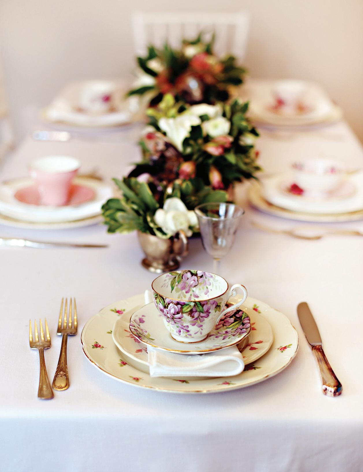
BRUNCH BLISS


Gather and savor a beautiful table and a relaxed menu
64
EXPLORER:
Pack your sense of adventure and let’s go
SAN DIEGO STATE OF MIND
Experience the coastline, cuisine and chic downtown life


The smell of spring is one of our favorite scents. There’s nothing quite like the earthy aroma after a good rain, the sweet perfume of lilacs in full bloom or freshly cut green grass that reminds us a new season is here. These sensory moments stir up creativity, bring renewed energy and remind us of the transformative power of paint to breathe new life into our spaces.
In this issue of AT HOME, we’re exploring how the Colors of the Year for 2025 can bring vibrancy and character into your home. These hues are more than a palette; they’re a sensory experience, evoking feelings of comfort and possibility. We’ll guide you on how to weave these shades into your home, whether it’s through a fresh coat of paint that completely reinvents a room or accents that add subtle charm and personality.
Spring’s vibrancy extends beyond color and smell. This issue takes you on a journey to Lotusland (PG.24), where botanical wonders burst at the seams of this not-so-secret sanctuary in Southern California. We also highlight the invigorating charm of San Diego (PG.64), a city that pairs natural beauty with urban sophistication. And if you’re a fan of food (and who isn’t?), don’t miss our brunch feature (PG.58) because there’s no better way to savor spring than gathering around a table of delightful dishes.
The homes featured in this issue also capture the season’s awakening. A French château on Canadian soil evokes timeless European elegance (PG.30), while a secluded retreat in the Smoky Mountains offers a peaceful escape into nature (PG.36). In a historic home bursting with patterns and botanical influence (PG.42), we see the joy of embracing color and fabric. And in “Coloring Inside the Lines,” (PG.48) we showcase how intentional design can spark surprising creativity. We can almost smell the mountain air and forest floor!
As you immerse yourself in this issue, we hope the sights, colors and scents of spring inspire you to reimagine your world – whether that means refreshing your home, trying something new in the kitchen or dreaming of your next great adventure. Here’s to a season of growth, beauty and vibrant possibilities!


Wooster® Hook & Hold® helps make paint projects easier. Featuring a convenient swivel hook for hanging the brush on the side of a paint can, tray or bucket, Hook & Hold® allows you to keep your brush out of the paint and right where you need it. Its synthetic filament blend is designed for all paints and offers a smooth finish for cut-in and trim work, providing better results with less effort.
the


e classics. ey’re in your closet in the form of black pants and that snappy goes-with-everything blazer. ey’re stacked in your library - treasured, must-read novels, and songs saved in your playlist. And they’re also tried and true colors meant for any room in your home.
However, with so many wonderful classic neutrals, shades of white, even hues with undertones of a definable color, it’s hard to know which ones to choose. at’s why we went straight to the experts for their favorite classic colors perfect for any interior.
Benjamin Moore White Dove is popular on Pinterest for a reason. A soft, creamy, offwhite paint color, this go-to shade is a crowd pleaser for homeowners and interior design professionals alike.
“White is a timeless neutral paint color and I always default to Benjamin Moore White Dove OC-17,” says Sommer Tate, owner/lead designer for Folkway Co. “It’s not stark but also not yellow. It’s got just enough warmth without having any obvious undertones.”
Benjamin Moore describes Hale Navy as a use-anywhere shade of navy with a classic maritime feel. Because it has both warm and cool undertones, the deep hue can be paired with almost any color, acting like a neutral. e saturated shade adds color without overpowering other elements in the room.
According to Danielle Loven, principal interior designer and CEO/owner and Jenna Olander, interior designer with Vivid Home, “Navy blue is an outstanding neutral and has been a classic and will always be a classic. Blue is a color that emulates calmness and has the ability to pair with any color because of its cool tone.”
With the slightest hint of warmth, this clean, crisp white is a versatile favorite for any room. Consider Simply White to brighten up an entire room or open concept living space.

“In the past two or three years, we have seen a massive uptick in white interior paint finishes, then layering in with textures on the furniture, flooring, ceiling details, area rugs, etc.” explains Kristin Kostamo-McNeil, owner/principal at Anna Rae Design, who uses Benjamin Moore Simply White as her go-to neutral. “A perfect white paint color on the interior walls is the ultimate canvas for layering textures, bold prints, or amazing artwork.”
With a soft green undertone that also has a blue hue in certain light, Gray Owl is a delicate light gray. One of Benjamin Moore’s most popular shades of gray, this neutral adds a comfortable and modern look to any room. “We are loving the resurgence of moody tones, especially the mossy greens paired with brass,” Kostamo-McNeil says. “Benjamin Moore Grey Owl has the slightest green undertone but is still a lovely greige that works to add color and warmth to a room. It’s earthy and cozy.”
Benjamin Moore Silver Satin is a stunning paint color for any room where you want to add a touch of elegance. With crisp lavender and warm gray undertones, it’s easy to see why this sleek shade is on Benjamin Moore’s best-selling paint colors list.
e team at Vivid Home loves this feather-light color, “because it’s not too cool or too warm.”
According to Danielle Loven, principal interior designer and CEO/owner and Jenna Olander, interior designer with Vivid Home, Silver Satin is both “fresh and inviting.”
Far from what you’d consider a neutral, blue just may be the most versatile shade on the color wheel. Designers continue to gravitate towards the hue for its wide range of undertones and ease of pairing with a variety of colors. As a standout among designers, Benjamin Moore’s Brilliant Blue can stimulate a space without overpowering it.
“ is is a definable color but can be used as a neutral in that everything goes with it,” explains Denise Davies, founder of D2 Interieurs. Davies included the electric color in a room for two boys who use it for chess lessons, play dates, and sleepovers. “ e pop of blue on the ceiling is everything and energizes you the moment you walk into the space.”

STOP BY DUGAN’S, YOUR LOCAL, INDEPENDENT PAINT RETAILER

As a design consultant with a focus on ooring, Tammy helps clients with everything from selecting tile and ooring to coordinating blinds and wallpaper. Her art background and design expertise make her a natural t for Dugan’s. Tammy’s approach is centered on each individual’s needs and comfort level. She enjoys working with those who are building new spaces or remodeling, helping them incorporate their vision within the framework of existing elements. She’s excited about the trend of bold colors, with greens, blues, and vibrant tiles gaining popularity, as well as the resurgence of wallpaper in creative designs. Tammy loves how Dugan’s can customize options to help people nd products best suited to their needs and tastes, and she nds ful llment in the creativity and variety her work brings. She’s skilled at working around any challenges that come up, always nding solutions that t each client’s unique situation. She values being mindful of budgets and works to ensure that each client leaves with a space they’ll love for years to come.
Zarah’s path into design consulting began with her hands-on experience ipping houses, a journey that gave her valuable insight into the world of interior design. Her strong eye for style and background in selecting materials led her to join Dugan’s, where she helps shape cohesive, personalized spaces. Zarah starts each project by learning about her clients’ style inspirations, whether through Pinterest boards, magazine clippings or other helpful resources, and enjoys piecing together elements that re ect each person’s unique taste. She’s particularly excited to see dark, moody colors and vintage-inspired designs making a comeback, along with darker wood tones and rich wood furniture, a shift from the Scandinavian light colors and white walls that have been popular. Her favorite projects are those that allow her to explore “outside-the-box” ideas and incorporate unexpected touches. Adaptable and focused on each individual’s style, Zarah ensures her recommendations align with the look and style that the client envisions. With her creativity and open-minded approach, she brings a fresh perspective to every project, making others feel con dent to step outside their comfort zones and discover new possibilities.
Shelly is a cornerstone of the Dugan’s Sedalia team, bringing years of experience across various design specialties, from managing the window coverings division to handling large commercial projects. She began her journey in design by helping family and friends with home projects, and that passion soon grew into a ful lling career with clients who continue to return to her for new spaces. Shelly believes in working alongside her clients, asking thoughtful questions to understand their vision and giving her honest opinions with the understanding that the client is the one who will live in the spaces every day. Shelly is excited about the resurgence of earth tones— warm browns, greens and muted blues—that she feels are timeless compared to the grays and blacks that have been popular. Even with four locations, Shelly loves that Dugan’s operates with a shared goal, making it feel like one uni ed team. Clients trust Dugan’s legacy and know they’ll be there from start to nish—and even down the road. Shelly thrives on inspiring her clients, and her approach and commitment to making each project feel personal ensure her designs have a lasting impact, with clients enjoying the results long after the project wraps up.
Kennedy is one of the newest members of the Sedalia team, bringing a fresh perspective and a background in engineering design. Her interest in design began with her family’s experience building a home with Dugan’s, which introduced her to the company and its approach to customer service. As a sales consultant, Kennedy enjoys helping clients select products that will work well in their spaces, drawing on her growing knowledge of materials and installation techniques. She starts consultations by asking open-ended questions about the client’s space, helping them zero in on colors and styles that resonate with their vision. She appreciates the opportunity to learn from more experienced team members and loves how collaborative the environment is, noting how each person brings unique insights to every project. Kennedy is particularly inspired by seeing her design concepts come to life and is enthusiastic about exploring new design trends, especially the cozy warmth of earth tones that add character and versatility to any room.


A brick wall is classic, timeless, and bursting with character, but despite being a design staple, brick still needs love from time to time. Whether you’re looking to paint over an outdated color scheme or after a more
Prep is the most important step. Clean your surface thoroughly, including all the nooks and crannies between the bricks. This will help your application adhere better. A pressure washer works (outside) perfectly, but if you don’t have one, use a stiff-bristled brush and scrub with soapy water. If you happen upon some stubborn mildew, apply a mixture of one part bleach and two parts water, let soak for an hour, and then scrub the area with a wire brush. Wait for the brick to be completely dry before you start painting.
Once your surface is completely dry, apply a primer. For smoke stained or discolored areas you may need a specialty primer to block these from bleeding through your final coat.
cohesive look, a fresh coat of paint can work wonders—plus, it’s an economical choice in comparison to replacing the brick all together. Follow these steps brick-by-brick and you’ll have a bold new look in no time.
You’re ready to paint! If you’re working on exterior brickwork, an acrylic latex exterior paint is probably your best bet, since its engineered to endure mildew build-up by evaporating moisture. When working with a large surface area, a paint sprayer will be the most efficient application, but a brush or a roller are sufficient in smaller areas (or if you’re willing to do the extra labor). If you opt for a roller, go with a thick nap so you can easily get paint into indents and irregularities.
Stop into Dugan’s and chat with our experts to find the best approach for your brick wall.

Fawn has a comprehensive background in both ooring and furniture, enhanced by her degree in design and years of experience in California. Now, at Dugan’s, she brings this breadth of expertise to the Osage Beach team as a design consultant, guiding clients through selections that range from ooring to wall treatments. Fawn’s favorite part of the design process is watching a client’s vision unfold from an initial idea into a beautifully nished space. She loves that, at Dugan’s, there’s very little pressure; the team is there to assist, not to overwhelm clients with options they don’t want. It’s a family-owned business, and that culture of support and relationship-building shines through in every interaction. Fawn focuses on getting the details right and overcoming any challenges, believing that a space should be both functional and stylish. She’s noticed a return to darker wood tones and vintage-inspired pieces, along with a growing interest in organic materials that bring warmth and timeless appeal without feeling overly trendy. Skilled at layering different looks and blending styles to create a cohesive design, Fawn is dedicated to ensuring clients feel happy and at home in a space that truly re ects them.
As the showroom manager, Mackenzie plays a vital role in keeping Dugan’s inventory fresh and appealing. Starting as the assistant to the General Manager, Mackenzie quickly developed a knack for customer interaction, which led her to the sales oor, where her passion for design could shine. Mackenzie sees each project as an opportunity to bring a client’s style to life in a way that feels both timeless and current. She helps clients nd the balance between classic design elements and trends, encouraging them
to make choices that will stand the test of time. She has a particular love for organic, earthy materials—handcrafted tiles with unique imperfections, wool carpets, tiles that mimic natural stone and wood-look tiles that can even bring a “wood” accent to a shower wall. From coordinating colors to helping select nishes, Mackenzie enjoys being involved in every detail. Known for her warm, approachable demeanor, she loves guiding clients through decisions that can sometimes feel overwhelming, making sure they feel con dent in the choices they make.
Kelly has been with Dugan’s for over a decade, bringing a wealth of marketing and design experience to her role as a consultant. Creating mood boards with real materials is an essential part of her process, helping clients visualize how each design element—whether ooring, tile or paint—will come together in their space. Her background in graphic design gives her a keen eye for detail, allowing her to create cohesive looks that align with each client’s personal style. She’s noticed a rising interest in using multiple textures in tile applications, organic-feeling tiles and wood oors with a polished matte nish, trends she loves incorporating into projects. Kelly takes the time to ask questions about clients’ lifestyles, helping to guide her recommendations so that each choice ts seamlessly into their daily lives. For Kelly, design is as much about building relationships as it is about aesthetics; she nds it incredibly rewarding to see clients excited about their spaces and con dent in their decisions. Through her thoughtful approach, Kelly ensures that every project feels like a true re ection of the client’s vision.
A true design lover will understand the impact that even subtle variations of white can have on a room. From frosty blue tinges to hints of warm yellow, the shade you select will set the tone for the mood of your space. Many a home-owner have warned about the trials and tribulations that come along with selecting a white paint color. The source of all this woe? White is THE most reflective color, which means that whatever shade of natural light you have pouring into your space will show up on your new white walls. That’s why it’s crucial to have a comprehensive understanding of the ways that your home’s natural light will work with whatever shade you select.

1. NORTHERN EXPOSURE
Sunlight streaming in from the North may create a gray or blue-ish hue.
2. SOUTHERN EXPOSURE
If your room has a window facing South, white walls might appear slightly warmer or softer.
3. FURNITURE & TEXTURES
If your room has a significant amount of wooden textures (furniture, ceilings, etc) or boldly colored furniture (potent blues, reds, yellows, etc) this may further impact your shade of white,
4.
reflecting the colors and tones of the fixtures in your room onto the walls. A large surface area of wood will create a warm or orangey reflection.
Warm-toned bulbs paired with blue hued whites may create a green tinge.
5. GREENERY
If your home is surrounded by greenery, it’s likely even a bright white will have somewhat of a greenish hue during day.

OC-55
Intuitively sophisticated & highly versatile, this shade is the ideal shade to enhance its surroundings with a grayish hue.

OC-65 CHANTILLY LACE
Our favorite bright white, this shade is the best background to help illuminate your furniture & fixtures. This cool white reflects a lot of light, creating an expansive feel & an inviting aesthetic.

OC-18 DOVE WING
With a subtle tinge of warm light, this shade breathes life and calming energy into the room.

Tory brings a unique perspective to her role as a design consultant in Laurie, tailoring her approach to the lake lifestyle and natural beauty of the area. She loves helping clients nd designs that complement their home’s aesthetic rather than just pushing the most expensive options. With an eye for how ooring works within various spaces, she’s always observing materials and styles wherever she goes. The variety of products at Dugan’s is something she values, as it allows her to match clients with options that t their style and functional needs. Tory begins by exploring inspirational photos and color palettes to understand each client’s preferences, especially for those who feel uncertain about where to start. Seeing a project come together and watching a client’s space transform gives her a real sense of accomplishment, as she knows her guidance has made a difference. Her eye for detail and dedication to completing projects make Tory an invaluable part of the Laurie team.
With over a decade of experience in sales, Brendan Tucker takes a straightforward, client-focused approach to his role. Known for his patience, he listens carefully to what clients want and need, recognizing that some may not know exactly what they're looking for and need guidance. Brendan is the type of consultant who says, "If you like it, I love it," ensuring clients feel supported in their choices without pressure. He believes that a successful project is one that re ects the client’s personality, and he enjoys seeing their excitement as their vision takes shape. Brendan has encountered nearly every kind of design challenge, from coordinating with installers to helping indecisive clients make con dent choices, and he nds it ful lling to help people transform their homes into spaces they
love. For Brendan, it all comes down to being a good listener and building trust through honest feedback. He approaches each project with patience and professionalism, ensuring that each client feels con dent and well-supported from start to nish.
Lilyana is a dedicated sales consultant whose main priority is making each client feel understood and supported. At Dugan’s, she values the relationship-driven approach and large selection that give clients a range of options, backed by strong partnerships with vendors and reps to create a seamless experience. Her day-to-day involves helping customers and keeping the process moving, sharing ideas, trends and listening to what would be best for each family. Lilyana’s favorite design trends include vertical slat wall tiles with a wood-like or textured look for showers, replaces and walls, as well as wavy tiles that add unique dimension. For her, it’s about creating a cohesive look that’s practical for the family, without requiring a large budget or creating a high-pressure environment. She loves the joy of seeing the nished product and strives to give each client a positive, thoughtful experience, building trust through each step of the design journey. Known for her attentiveness and commitment to client relationships, Lilyana ensures each client knows they’re in good hands throughout the process.

It seems slightly oxymoronic that amidst the rise of gender neutrality and fluid expression, we have also seen the rise of the “Gender Reveal” party, and with it, the prescriptive “blues for boys and pinks for girls” mentality of nursery decorating. Beyond a desire to raise children in an environment liberated from gender roles, many parents opt not to know the sex of their baby before birth, leaving them in a panic to complete a room reno while navigating the first steps of parenthood. Oftentimes, what prompts new parents to rest on these nursery-norms is a lack of alternative options. e reality is, there are loads of awww-inducing color combinations that will serve nobly as a palette for your newborn to spend its first years of life.


Opting for a gender-neutral paint color does not necessarily mean an abandonment of all things pink and blue; it means you are leaving room for versatility, creativity, and personality. ere are few who can resist the adorable markers of a newborn baby girl or boy, but these influences can easily be incorporated into the design in other capacities, like décor, artwork, or textile choices. is is especially useful for homeowners that plan to eventually convert the nursery into another room with its own function. Bright pink doesn’t exactly scream home office, after all. Here’s a list of some of our favorite combos that don’t operate under the lines of the masculine and the feminine and will suit any baby, regardless of its sex.


ASK THE EXPERTS AT DUGAN’S FOR MORE PAINT IDEAS AND COLOR COMBINATIONS TO MAKE YOUR NURSERY THE PERFECT SPACE FOR YOUR NEWBORN.

Dave brings a wealth of experience from his background in kitchen design, ooring sales and the granite industry. With a personable approach, he treats each customer like he would a family member, focusing on understanding their lifestyle and vision for the project. For Dave, it’s not just about making a sale; it’s about merging the client’s wants and needs to create a space that works for them. He believes that while people can buy ooring anywhere, his goal is to make the experience special and memorable. Communication is key, and he feels that’s where Dugan’s truly stands out. The new paint department in Bolivar has been a welcome addition, streamlining the process for clients and adding to the seamless service Dugan’s offers. For Dave, Dugan’s “Discover the Difference” slogan is more than a phrase—it’s a genuine promise that sets the store apart. Going to Dugan’s isn’t like going anywhere else; it’s a unique experience centered around client care, thoughtful guidance and delivering results clients love.
Cheri is a versatile member of the Bolivar team, balancing multiple responsibilities that keep operations running smoothly and assisting clients with various design needs. She brings a background in architecture and design, enriched by her experiences in kitchen and bath design, as well as certi cations in fashion lighting and her time as a Navy veteran. Cheri’s design philosophy centers on honoring the architecture of a home, creating cohesive spaces that enhance its structure and character. She loves that vintage styles are making a comeback, with earthy tones like 70s-inspired oranges and avocados adding vibrant pops of color without feeling overdone,
along with the return of brass and gold accents, following trends in fashion. She enjoys helping clients work with their existing home features, ensuring that each design choice feels authentic to the space. Cheri’s favorite part of her role is the problem-solving aspect, whether it’s reimagining a room’s ow or helping clients make the most of their space. Her goal is to over-deliver on client expectations, always with a practical approach that keeps clients’ lifestyles and comfort in mind.
With three decades in the lumber and building industry, Mike is a seasoned manager who brings both expertise and a personal touch to Dugan’s Bolivar location. In his role, he manages everything from commercial and ooring quotes to deliveries and inventory. Mike believes what truly sets Dugan’s apart is the family-owned atmosphere and the genuine care the team has for each client’s project, taking a full interest in every job and caring as much as the client does that it goes well. He enjoys meeting new people, building connections and helping both homeowners and builders cross the nish line, nding them the right products within budget. Mike is seeing a shift away from grays and whites to warmer tones like browns, along with more vibrant paint choices in uenced by color-of-theyear selections. While tile trends change quickly, he notes carpet and hard surfaces tend to last longer. For Mike, success is about creating spaces that re ect clients’ needs, and he takes pride in building lasting relationships within the community.


A delicate and enchanting shade that beautifully blends soft lavender and muted gray, creating an atmosphere of calm and refinement. This ethereal hue evokes a sense of tranquility, making it an excellent choice for bedrooms, nurseries or any space designed for relaxation and introspection. Combine with crisp whites and deeper jewel tones for playful contrasts or harmonious layering within a room. Its understated elegance lends itself to both modern and traditional designs, making it a versatile option for those looking to add a touch of serenity and sophistication to their interiors.
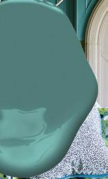
A captivating blue green that radiates tranquility and sophistication, reminiscent of serene coastal skies and gentle ocean waves. This hue strikes a perfect balance between cool and warm undertones, allowing it to create a refreshing and inviting atmosphere in any room. Ideal for spaces where relaxation is key, such as bedrooms and bathrooms, it pairs beautifully with natural materials and light woods, enhancing the overall sense of calm. Its versatility also lends itself well to modern and traditional interiors alike, making it a popular choice for those looking to infuse a touch of coastal elegance into their homes.
Shop these stunning Benjamin Moore
paint colors, from the homes featured in this issue at Dugan's. The friendly staff will help you get all the right tools to help with your project.


A soft, slightly dirty white that embodies a gentle warmth. This versatile hue acts as a perfect backdrop, allowing other colors and textures to shine while maintaining a sense of calm and elegance. Whether used in a cozy living room, bright kitchen, or tranquil bedroom, it enhances natural light and adds a subtle sophistication that complements both traditional and contemporary design aesthetics. Its understated charm makes it a favorite among designers looking to achieve a harmonious and timeless interior.


A rich, earthy green exudes a sense of serenity and a connection to nature, reminiscent of lush forests and tranquil landscapes. This inviting hue fosters a warm and cozy atmosphere, making it ideal for spaces such as living rooms, studies or any area intended for relaxation and reflection. Pair it with natural wood tones and soft neutrals to create a harmonious balance that enhances its organic feel. Its depth and character make it a versatile choice, suitable for both rustic and modern interiors, inviting a sense of the outdoors into any home.


• INDUSTRY'S LIGHTEST FULL-PERFORMANCE PROFESSIONAL SPRAYERS
• BEST-IN-CLASS PERFORMANCE & DURABILITY
• MAXIMIZE UPTIME WITH FASTEST ON-THE-JOB SERVICE


Introducing FrogTape Advanced™ Painter’s Tape –the best painter’s tape we’ve ever made. Edgetreated with exclusive PaintBlock® Technology, FrogTape Advanced is engineered with everything you love about FrogTape® Multi-Surface plus advanced performance in conformability and shred-resistance, giving you the confidence of professional results – when it matters most.


HOP INTO CREATIVITY WITH THIS EASY DIY PROJECT! TRANSFORM BURLAP, PAINT AND A SILHOUETTE (WE CHOSE A BUNNY) INTO A CHARMING ART PIECE THAT ADDS FARMHOUSE FLAIR TO ANY SPACE. WHETHER YOU’RE SPRUCING UP FOR THE SEASON OR LOOKING FOR A YEARROUND ACCENT, THIS CRAFT IS SIMPLE, FUN AND IRRESISTIBLY CUTE.


Create charming silhouette art that adds a rustic touch to your decor. Follow this simple guide to craft your own unique masterpiece.
SUPPLIES YOU’LL NEED:
• Picture frame (any size, ideally wooden)
• Interior latex paint (color of your choice for the frame and bunny)
• Interior latex high adhesion primer
• Burlap fabric (enough to cover the backing of your frame)
• Silhouette template (purchase one, print one or draw your own design free-hand)
• Scissors or craft knife
• Pencil
• Craft glue or hot glue gun
• Paintbrushes (one small, one medium)
• Optional: Sandpaper (for a distressed frame look)
Remove the glass from your frame. Prime and paint the wooden frame with your chosen color and allow it to dry completely. For a rustic look, lightly sand the edges once dry.
Print or trace a silhouette onto the cardstock. Carefully cut it out using scissors or a craft knife.
Cut a piece of burlap slightly larger than the frame’s backing. Glue the burlap to the backing, ensuring it’s smooth and flat. Trim excess burlap if needed.
Position the stencil as desired on the burlap-covered backing. Trounce the paint within the regions of your stencil until you achieve the desired coverage of the burlap you are after. Use a small brush to clean up edges as needed. Allow to dry thoroughly.
Place the burlap backing into the painted frame. Secure it, ensuring everything is snug and aligned.
Your silhouette art piece is now ready to display! Hang it on a wall or place it on a shelf for a cozy, farmhouse-inspired look – it's sure to be the hare-raising highlight of your decor!


Discover the natural marvels at what is often described as one of the most important horticultural collections in the world.

Situated on a gently sloping hill in Montecito, California, Lotusland enjoys 300 days of sunshine a year: good news for its more than 3,400 different species of plants. Committed to sustainability and conservation, the gardens that reside within it rely solely on the caring hands that tend to them and Santa Barbara’s mild Mediterranean climate to retain their staggering beauty. In images, it appears as a lush secret garden, filled with plants that range from cycads and cacti to orchards and roses. Its water garden, arguably one of the properties most exquisite, houses a sweeping collection of waterlilies, and, of course, Lotusland’s iconic lotus flowers. Steering clear of pesticides, they’ve adopted innovative, natural preservation methods to deter invasive species and attract pollinators – a testament to the foundation’s lasting commitment to sustainability. Lotusland’s Chief Executive Officer, Rebecca Anderson, describes the garden as a “global treasure” through which she hopes guests find a sense of “peace, wonder and a deeper connection to the natural world as well as a greater appreciation for the importance of biodiversity.”
The property now known as Lotusland has served as an oasis for flora and fauna since the 1800s, but no one then could have imagined the national treasure it has become today. Its storied grounds have been through three phases of ownership. When it served as the location of the Kinton family’s private residence and commercial nursery, it was known affectionately as Tanglewood. When the Gavit family took over the land in the 1920s, they renamed it Cuesta Linda. During their time as its stewards, they erected several buildings in the style of Spanish Colonial Revivals, with lush gardens to match. In 1941, the property changed hands for the last time when Madame Ganna Walska, an extraordinary woman with a life story of epic proportions, purchased it and Lotusland was officially born.
Born in Brest-Litovsk, Poland, in 1887 as Hanna Walska, Madame Ganna Walska adopted her stage name while studying and singing alongside Polish tenor Jean de Reszke in Paris, France. In 1915, Walska fled Europe to avoid World War I, landing in New York City where she would reside on and off for decades before settling at her beloved Lotusland. In the city that never sleeps, she quickly made a name for herself, singing at a French theatre and continuing to explore her operatic inclinations, while also developing a reputation as socialite who lived life on her own terms. Though her skill as a vocalist drew in mixed reviews throughout her tumultuous yet iconic career, her professional pursuits were merely a sidenote. It was her love life, which saw six marriages and as many divorces, that seemed to generate the most public interest. Her husbands’ titles ranged from doctors and counts to yogis and drunks – men who came in and out of her life at a fervent pace. But although it seemed Madame Walska was somewhat of a hopeless romantic, she never lost sight of the importance of her own independence. In 1929 she won a case against the U.S. Customs, which established an American woman’s right to have a separate domicile from her husband’s. And it was an ironclad prenuptial agreement that allowed her to keep Lotusland in her own name after her sixth and final divorce.


Despite her demanding social and professional obligations, Madame Ganna Walska was a woman of deep reflection and spiritual interest, studying numerology, Rosicrucianism, astrology and meditation. Her deep commitment to examining the meaning of life led her briefly into the arms of yoga guru Theos Bernard (the self-proclaimed “White Lama”). Together, they traveled to California for six weeks: Walska, to find a ranch property for purchase, and Bernard, to purchase land that would serve as a home and spiritual retreat for Tibetan lamas. They found both of their hearts’ desires in the then 37-acre Cuesta Linda. Walska promptly purchased the estate, dubbing it “Tibetland” until Bernard and Walska’s divorce in 1945, when it was given its final moniker and Walska’s vision for the land began to take shape.
The succeeding decades (during which she never married again) saw Madame Walska working intently and passionately to bring Lotusland into its full potential. It seemed she had finally found her true love – one commensurate for her level of adoration and care. As she tended to the land and plotted for its improvements and expansions, it flourished. She was known as Lotusland’s “head gardener,” taking a hands-on approach and collaborating with talented landscape artists, architects and gardeners from across the globe. Images from this time depict a glowing Walska, grinning from ear to ear, always dressed impeccably in bright colors and accessories. Her dedication to the project was unwavering through to the end: just seven years before her death at 96 (outliving every one of her ex-husbands), she sold off her prized jewelry collection to have the funds reinvested in the garden. The estate was left to the Ganna Walska Lotusland foundation so that their mission of preserving nature’s most beautiful plants can carry on in her absence.
Today, the gardens are visited by an estimated 15,000 every year (a number that is restricted by Santa Barbara County’s Conditional Use Permit due to its location in a residential area) and thrives as a leader in both conservation and education – success Anderson credits to the “extraordinary work of its team and generosity of donors who see the vital role Lotusland plays in preserving
Originally intended to be called the Silver Garden, what is today known as the Blue Garden began in 1948 when Madame Ganna Walska planted blue Atlas Cedars. Today it features a host of bluehued beauties: a tinge present due to a thick waxy “cuticle” that serves to protect from intense sun.

the environment and enriching lives.” Spanning over 37 acres and home to rare and celebrated botanical species (a third of which are threatened in their native habitats), the gardens themselves have been considered to possess all of Walska’s drama and eccentricity, leading many to describe it as a sort of autobiography in natural form. Whether you see the resemblances or not, there is no debating that Madame Walska created something special in her breathtaking collections. Her passion, dedication and individual spirit will certainly live on – and what a beautiful legacy she has left.
“Lotusland is a living testament to Madame Ganna Walska’s vision and dedication. Over 40 years, she transformed the property into an artistic masterpiece, blending design and nature in ways that remain unparalleled. Her legacy lives on in the garden’s 22 distinct landscapes, each with its own iconic character – walking through Lotusland is like stepping into a series of otherworldly environments, from the serene Japanese garden to the enchanting topiary garden and the breathtaking water garden. Since opening to the public in 1993, Lotusland has honored her dream of creating a worldclass botanical garden that inspires awe and educates visitors.”
– Rebecca Anderson, Chief Executive Officer, Ganna Walska Lotusland


With an intimidating roster of apparently unmissable gardens and only so many hours in a day, you’ll want to carefully plan your trip to ensure your most-anticipated spots can be hit. Additionally, due to its position in a residential neighborhood, there are daily visitor restrictions in place that limit the number of guests. Advance reservations are necessary for all visitors, with a recommended book-ahead time of three weeks. Reservations are available between mid-February and November, Wednesday – Saturday, with two sessions available daily: 9:30 a.m. and 1:30 p.m. Visitors are expected to arrive 15 minutes prior to their reservation, which will permit entry for two hours. Reservations can be made online through their website.
Visitors can choose between self-guided or docent-led tours. Self-guided tours will allow for guests to move along at their desired pace while still taking in various facts and details thanks to QR codes and interpretive signs placed throughout the gardens. Docent-led tours require an additional fee of $15 per person, but will reveal enriching details about Lotusland’s history, its dynamic plant collection and unyielding conservation efforts.
Although it requires some planning, Lotusland’s 2025 visitor season is expected to be its most memorable and iconic yet, with unseen updates to unveil and new experiences to share. Depending on the time of year you visit, different plants and flowers will naturally be in bloom while others may be at rest. If you’re interested in seeing a particular plant variety at its peak, we recommend visiting their monthly garden highlights on their website to ensure you won’t miss it.
From vibrant cacti and lush cycads to serene water gardens, Lotusland’s breathtaking landscapes showcase its unparalleled horticultural artistry and Madame Ganna Walska’s visionary spirit.


Design: PlaidFox Studio | Photography: Ema Peter Photography | Text: Carlee Baigrie

PlaidFox Studio brings to life a timeless European legacy home to be adored for generations to come.


Just outside of Vancouver, BC, and nestled between two vineyards on an expansive equestrian property, sits a 9,000-square-foot timber-frame home and one of the latest spaces to benefit from the tremendous talents of PlaidFox Studio. The project, which was three years in the making (a testament to the age-old adage that good things indeed take time) and a collaborative effort among several trades, was what creative director (and lead designer on this project), Ben Leavitt, refers to as “a back-to-your-roots” endeavor. Over a decade ago, when PlaidFox first began, their resume skewed predominantly traditional. But as their portfolio has expanded, they’ve gravitated toward more modern sensibilities in recent years. But in the images of this tremendous chateau-inspired abode, we find the authentic charm of French provincial living: an estate intended to be passed on from generation to generation. This new build (with architecture designed by Homestar’s Tara St. Jean) provided the perfect opportunity for Leavitt and his team to call back to their origins while incorporating their more recently modern inclinations.
Initial conversations around the project revealed that the space would need to circumvent trends in a way that assured its relevance for decades to come. The clients, a family of four who had worked previously with PlaidFox on their Mid-Century Modern home, wanted to create a legacy that could one day be passed on to their children. Working together with home builder Chris Meyer from Homestar, Leavitt, alongside two senior designers from his firm, Kelly O’Quinn and Maria Espinosa, began charting plans for a residence that would pay tribute to the past while ensuring its ability to stand the test of time.
The team decided on an approach that would combine the antiquated appeal of a countryside estate with the grandeur of chateau


living: a sort of elevated farmhouse that avoids the genre’s typical cliches by incorporating historical European elements. “So, we started from the drawing board,” explains Leavitt, “researching and diving into… historical timber frame homes.” The spiral staircase speaks to their thoughtful approach. Aiming to capture the feel of traditional lime-washed stone staircases without allowing the feature to feel too castle-like, they plastered natural stone on the walls and opted for a more modern staircase. “[R]ight from the beginning, we wanted to create a more traditional backdrop for contemporary and modern furniture.”
Beyond this, the specific asks for the space from the clients were simple, having already established confidence in the studio during their previous collaboration. “The homeowner entrusted us and the builder Chris Meyer from Homestar to create and execute the vision,” shares Leavitt. “[They] essentially gave us carte blanche” with the stipulation that the space feature an open-air bathroom in the master and a wine tasting and cocktail room. Leavitt was pleased to share that the wine tasting room, which is temperature controlled and can store up to 6,000 bottles, is now among the homeowner’s favorite places to relax and entertain. While the home’s proportions are undeniably grand (its oak timber frame is constantly drawing the eye upwards to stunning beam work amidst lofty ceilings), Leavitt was keen on creating plenty of “intimate and small pockets” to facilitate “conversation and everyday living.”
One of the ways Leavitt and his associates achieved this more lived-in feeling was through their careful selection of color. Although working within a decidedly neutral palette, the team maintained visual interest and an inviting essence by layering in varied textures and shapes wherever possible. “In any given room there are 10-20 textures… which gives the room… depth, but more importantly, the warmth to make it feel cozy,” shares Leavitt. With gray as a prominently featured color throughout the home, Plaidfox also took care to ensure they selected shades that had undertones of green, blue and brown to prevent the walls from feeling too cool, always pairing them with wools and linens to create that inviting sense of warmth.
French European countryside may be where the home gets its aesthetic inspiration, but Leavitt also wanted it to feel at home within the context of the property’s Canadian landscape. Building upon the timeless tenants already established through the French chateau motif (and avoiding the often gratuitously ornate styles seen in the more metropolitan areas of France), Plaidfox leaned into an effortlessness that prevents anything from feeling too fussy. Wool rugs, slip-covered sofas, natural stone and an absence of interior mouldings (save the cabinetry, where a more traditional form of craftsmanship is allowed to shine through), create a more grounded feeling.
As you move through the home, the intention and thoughtfulness paid to every detail is evident – care that will serve the homeowners well as this space grows with their evolving needs and preferences over the decades to come.


A tight-knit family finds a space to gather in a secluded acreage in the Great Smoky Mountains.


Soft beams of sunlight stream in from newly appointed windows and a screened-in porch, setting the scene for idyllic country living in Northern Tennessee – a feeling Kathryn Berschback of Berschback Design was determined to capture in this 1700’s log cabin remodel. The structure itself had been in her clients’ family for decades and they were eager to retain as much of its original, timeworn charm as possible while still laying the foundations for the convenience of modern life. Indeed, the space feels untouched by the hallmarks of the 21st century – a testament both to Berschback's instincts as a designer and her clients’ expansive collection of Tennessean art and artifacts, which fill every room.
Each piece invited into the design of this space tells a story in its patina, from the tufted leather ottoman that grounds a cozy living space to the unlacquered brass faucet in the kitchen. Some are family heirlooms, passed on through generations, others, objects of affection, picked up along the way, like a grandfather clock with broken hands, set to read an eternal 5 o’clock. But among these collected fixtures and features, the client’s collection of Tennessean art does the most legwork in establishing the pastoral themes of this historic home. “I really wanted to put [the artwork] in places that they would be highlighted,” explains Berschback, who hung her favorite piece (one of many in the home by Carroll Cloar) above the wet bar. Even the rugs serve as yet another layer of the clients’ steadfast dedication to fine art, with antique rugs scattered throughout.
But these adornments and details that work to establish the home’s rustic sensibility came after Berschback set to work upgrading the bathrooms and kitchen and working to brighten what were already beautiful bones. “The house felt dark when I first got there,” shares Berschback. “By adding new windows and white sofas [featuring performance fabric, of course, for the client’s pets]….we really opened it up.” The windows also serve to cement the connection between the home’s picturesque views and its interiors –another important element the clients wanted to incorporate. Berschback, a dedicated color enthusiast (a trait she shares with the client), recalls site visits throughout the seasons and all the inspiration they brought into her color palette. Of special note were the deep red and rust tones of the fall foliage and the exquisite greenery in the spring. “The wife loves hiking and nature, so we had lots of conversations about the colors [she wanted to bring in],” explains Berschback, providing some insight into her process as well as the close working relationship that underlined this project. “That’s one of the things I pride myself most on as a designer – my ability to get to know who my clients are and what speaks to them so I can create that tone for them.”
“YOU CAN FEEL THE HISTORY IN THE WOOD” – Kathryn Berschback
Bottom Right: The wet bar, a new addition to the structure, offers yet another space for hidden storage while its cabinetry color compliments and brightens its neighboring wood tones.


This rusted Persian rug provides the perfect contrast to the wall’s subtle green – a feature that occurred by mistake after a miscommunication with the painter. Both Berschback and the clients quickly fell in love with the shade in context, calling it a happy accident.
Although the home features a substantial array of wood tones, Berschback has combined them all in a way that feels true to the home’s down-to-earth mandate, a result achieved by ensuring every element, from the original hardwoods (re-finished with a stain selected over Facetime while Berschback was out of state!) to the dining set, all possessed the same organic sensibility. “Every piece is handcrafted. If you look at the dresser drawers, they are all dovetailed. It was all intentionally selected to maintain that natural feel,” reveals Berschback. “It’s a great example of how beautifully crafted wood always goes together. It’s all so rich and warm and earthy feeling. It feels connected to the earth.”
This project was actually the second collaboration between Berschback and her clients, whom she refers to as lifelong friends. The first was within Nashville’s city limits and served as their primary residence. During that experience, she gained a deeper understanding of their aesthetic preferences and functional lifestyle needs. So when it came time to reimagine their home away from home, she knew it was a matter of highlighting what had already made the property so special to them in the first place. This home had provided a special setting in the story of this family’s life for some time, and the clients made it clear that it would continue to serve as a gathering place throughout the years. For that reason, the seating area, anchored on one end by the towering stack stone fireplace, was carefully laid out to ensure every individual had a space to sit comfortably. Now equipped with the benefits of modern comfort alongside its rich character, Berschback is eager to hear about this residence’s next chapter.


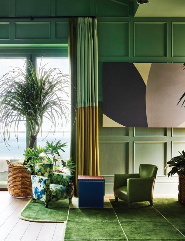
Vibrant patterns, rich hues and botanical influences breathe life into a historic home, echoing the emerald vista and deep blues of the San Francisco Bay beyond the windows. Guided by designer Jon de la Cruz’s artistic vision and innovative approach, “the Observatory” brings the outside’s verdant landscape in and transforms the penthouse of a five-story estate into a versatile, family-friendly hub that balances style with functionality.


This year, the San Francisco Decorator Showcase saved the best for last. Every year, design enthusiasts and curious visitors flock to the showcase, eager to see how acclaimed interior designers celebrate their creative vision and fearless design. This year’s edition unfolds in the grand Bliss Estate, a stunning Edwardian mansion on Broadway Street in San Francisco’s Pacific Heights. All 30 rooms inside the estate are a master class of interior design ingenuity, with an ensemble cast of designers leaving their mark on the historic 125-year-old Dutch Colonial Mansion. But it is the top floor that leaves the biggest impression on the Bay area abode.
San Francisco designer Jon de la Cruz reimagined the penthouse as the ultimate family room offering breathtaking panoramic views of the Golden Gate Bridge and San Francisco Bay. Coined “the Observatory,” the entire room is draped in colors and patterns that echo the exterior palette – the deep blues of the Bay and its lush landscapes.
“The room basically demanded the treatment we gave it – because your experience when you reach the top level of this five-story house is dominated by the sweeping view of the San Francisco Bay,” de la Cruz explains. “Your first impulse whenever entering the room is to walk directly to the 14-foot-wide windows and gaze into the distance, so the brief was clear – enhance and focus on what the view has to offer.”
To do so, de la Cruz soaked the attic room’s oak-paneled walls in blue and adorned other spaces with alpaca curtains and plush upholstery. The design offers a reflection of the beauty beyond the walls and windows.
Top: The room is enriched by eclectic features and playful touches, including green hand-tufted rugs assembled to emulate lush lawns, junior club chairs for the kids and a custom-crafted chess board. Right: Custom seating with garden-inspired upholstery mimics the scenery outside.


Since 1977, the San Francisco Decorator Showcase has raised more than $18 million to benefit the San Francisco University High School financial aid program.
“The stained and painted brackish blue walls blended with the Bay water and the foggy skies, we underscored the rolling green hills by painting a continuous verdant green horizon line over the oak paneling and alluded to the view of the city blocks and treetops with a gridded pattern area rug and potted indoor trees.”
Key features include oak-paneled walls stained in tones that complement the skyline and floral-patterned sofas that evoke the natural beauty of the surrounding landscape. The room’s design is enriched with unique touches, such as hand-tufted rugs and artwork by prominent figures like Ai Weiwei.
The space is designed for ultimate versatility, effortlessly transitioning between a media room, breakfast nook and cocktail lounge. Expansive folding glass walls blur the boundary between indoors and outdoors, creating a seamless connection to the surrounding environment. This thoughtful integration ensures an immersive experience that shifts with the time and activities of the day, making the room both adaptable and inviting.
When de la Cruz isn’t designing for the San Francisco Decorator Showcase, he’s bringing his experience and vision to other unforgettable homes in the Bay Area and New York and leaving his mark on well-loved restaurants. His experience and expertise in hospitality is inherently connected to his work in residential design – inspiring how a home should feel and function.
To create an effortless style for his residential clients, de la Cruz starts by determining the functionality of the home before applying the elements that set his style guidelines.
“Three factors help me compose a room: The House: What style is the house? How does the exterior architecture inform the interior intent? The Context: Where is the house located? City or country? Seaside or mountain house? The Owner: How will the owner live in the space? What is family structure? Children/Pets?”
From there, de la Cruz brings his own inspiration into the home, often blending modern and vintage aesthetics, and focusing on comfort, functionality and timeless elegance, ensuring the space reflects the needs and personalities of his clients.
While de la Cruz is known for meticulously balancing aesthetics with practicality, he stays on the cutting edge of design and keeps things creative by giving in to his wanderlust. “Traveling keeps the eye fresh,” he shares.
“When I travel, I love to be able to mix in details I see and experience in unexpected ways.”
Whether he’s transforming a historic Edwardian mansion, jet-setting to exotic locales to influence his art or partnering with a homeowner to add a bit of personality to a project, de la Cruz does it with passion and purpose, garnering attention and acclaim from the design world along the way.
Top: Conceptual artist Mel Bochner’s playful Blah, Blah, Blah piece is executed in oil on velvet, adding texture and depth to the vibrant space. A ceramic stool by Reinaldo Sanguino complements the scene and serves as both functional furniture and a vibrant art piece.
Bottom: The space is for all ages, exhibited by an area perfect for a tea party for two.


Handwoven from renewable materials, Graber Natural Shades create an amazing display of texture and color, allowing you to bring a bit of nature indoors.


Design: Bungalow Interior Design | Photography: Victoria Anne Photography | Text: Arthur Liffmann
How thinking inside the box can deliver big results.


Whether we’re the homeowner, the designer, the contractor or the architect, the project brief invariably comes down to the same thing: “We need more room; we need more storage; we need spaces that address our needs.” More often than not, the plans that follow feature blown-out walls, large additions and reconfigurations of space that add tons of square footage in order to best address that wish list.
This is not one of those projects. While the clients’ wish list certainly included the same needs, the plan that interior designer Rachel Teichroew developed to address them looked inward to grow what was already there.
“This is my favorite project from last year,” laughs Teichroew, co-founder and principal designer of Bungalow Interior Design in Winnipeg. The homeowners, a professional couple with several pets, are avid collectors of amazing things; they came to Teichroew with a short but clear mandate: “We feel like we’re bursting at the seams here – we need to maximize storage and functionality.”
Exacerbating the congestion was the fact that both clients were working from home due to the pandemic. The existing dining room, already crowded due to a complete lack of any storage space, was previously under-utilized aside from occasional get-togethers with friends. Now it was serving double duty as a daily office for two, and the home’s only area to sit down for a meal.
“We wanted to use every square inch available to us here. These clients have so many memories displayed throughout their home –of friends, family, travel – and we wanted them to have options of how and where to show them,” says Teichroew. And while she was given the green light to do something fun and think outside of the box, the designer’s plan cleverly reimagined the space within the existing footprint.
The longest unbroken wall in the dining room runs perpendicular to an exterior wall with a large double door to the patio. By moving this door further down along the garden wall, Teichroew created enough depth on the long, unbroken plane to install a full wall of custom millwork that dramatically expanded the storage options on the main level of the home. Coated in a deep, rich green and complemented by simple gold hardware, the cabinetry plays several roles here. Aside from providing a plethora of storage, it creates a strong focal point and imbues the space with a modern classic aesthetic that feels current, while remaining respectful of the home’s original architecture.
And if that’s not enough, this wall serves as the literal backdrop for a splendid custom dining banquette that wraps itself across the cabinetry and includes integrated hidden spaces. Featuring channeltufted creamy boucle fabric, the back of the banquette is actually a
This smart design solution features concealed bins within the banquette base, perfect for storing extra beverages.
series of upholstered doors that, with a simple touch, pop open to allow access to additional storage. Not to be outdone, the cognacupholstered seats also lift up to reveal concealed bins within the banquette base.
“This involved a bit of math and a lot of back and forth with the upholsterers,” laughs Teichroew, “but the end result was worth it.”
Coordinating dining chairs and a leggy oval dining table with warm wood tones further enhance the warmth of the green millwork, while the creamy walls and a stunning black pendant fixture with lines that echo the curves of the seating, and the glass cabinet fronts provide contrast and balance out the space.
Special attention was also given to the placement of electrical receptacles and easy-access spaces to stash away the byproducts of a work-from-home day. “While the clients both maintain their fulltime offices, they still occasionally do some work here… this space now allows them to do that with clarity and organization,” notes the designer.
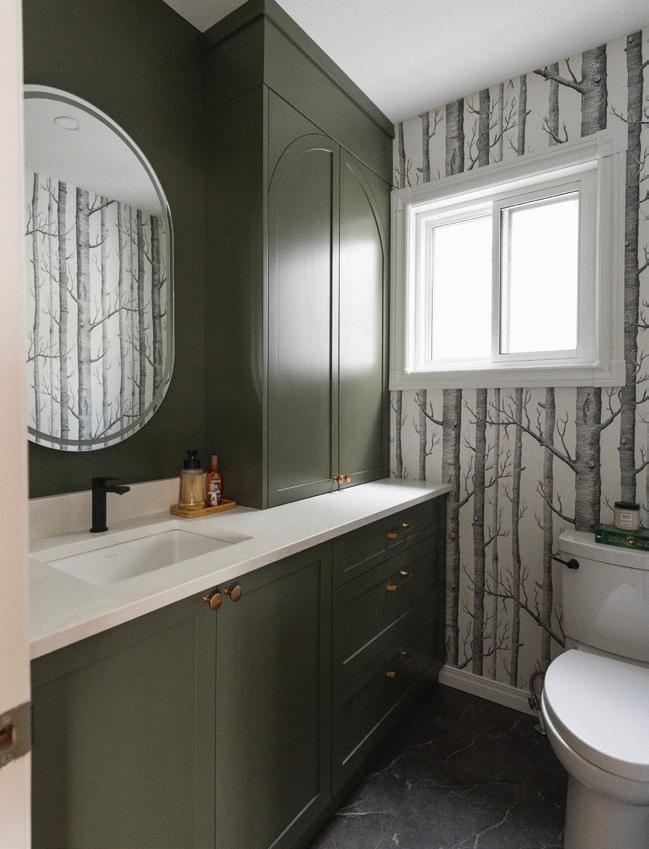
Turning her attention to the powder room, the designer employed the same sensibility to maximize storage and maintain a continuous design flow. The original vanity was replaced with more custom cabinetry, with the sink offset to one side to allow for full height storage on the other end.
“This space plays double duty as the wife’s area to get ready in the morning,” explains Teichroew. “Generous countertop surfaces provide convenience while getting ready, and then everything can be tucked away behind closed doors.”
While the commode remained in its original location, rotating its position 90 degrees allowed the designer to install a large bank of fully extendable drawers in the base of the vanity. This small change increased the functionality and usability of the area. A large mirror with integrated lighting maximizes the light and adds some sparkle to the small space.
But the star of the show here, undoubtably, is the Woods wallcovering by Cole & Son. “We always knew that this room would be the perfect place to really have fun with wallpaper,” says Teichroew. “We were wanting something that would establish a certain mood, with a touch of whimsy.” The classic pattern, in a black and white colorway, is a natural complement to the rich deep green woodwork and winks at the subtle play between the two.
Beyond the excellent professional relationship established between the clients and designer, Teichroew acknowledges that being hands-on during construction allowed for a nimble and steady project.
“Offering a design/build process has many benefits; having an intimate understanding of the details allows for the opportunity to
Maximizing both function and beauty, the custom cabinetry is finished in a luxurious deep green, creating a dramatic backdrop for displaying cherished keepsakes. The sleek gold hardware adds a touch of understated elegance, perfectly complementing the rich tones and enhancing the room's modern sophistication.


immediately respond to situations as they develop.”
On the morning when the special-order vanity sink arrived with a large crack, Teichroew immediately knew, without referencing any notes or plans, exactly what was needed, enabling her to immediately hit the road and scour the city until she found the identical model from another supplier.
“It kept us right on track, without having to reschedule trades and push back the timeline.”
It’s that kind of focus that brought the project to fruition, with clients who are “over-the-moon happy” with the results. And aside from the smart storage solutions, the luscious mix of finishes and the stylish spaces she’s created, what makes this one her favorite?
Teichroew’s quick smile and answer are immediate: “It’s real. These are real spaces that are really designed for the people who live here, not just pretty rooms that look good.”
The powder room combines personality and practicality with Cole & Son's classic Woods wallpaper in black and white, balanced by rich green cabinetry. The custom vanity, featuring full-height storage and extendable drawers, enhances both style and function.


Whether you’re sealing a drafty window, sprucing up trim or refreshing your bathroom, caulking is a simple and affordable way to save energy and enhance your home. With trusted ALLPRO Sealants made by TOWER and these expert tips, your DIY projects will look as polished as professional work.
When it comes to DIY home improvement, caulk might not be the most glamorous material, but it’s undoubtedly one of the most versatile. Whether you’re sealing gaps for energy efficiency, creating a polished look for trim work or tackling a bathroom makeover, caulking is an essential skill. With the right product – like ALLPRO’s premium line of caulks – and a little know-how, you can achieve professional level results on a range of projects.

For DIY enthusiasts, choosing the right caulk can make or break a project. TOWER Sealants provides a variety of high-performance caulks designed for every application, from paintable interior trim work to water-resistant options for kitchens and baths. Their products are trusted for their superior adhesion, durability and smooth application. Whether you’re a seasoned DIYer or just starting out, TOWER Sealants’ user-friendly products ensure excellent results every time.


Nothing elevates a space like pristine crown molding, baseboards or door trim. However, even the most expertly installed trim often has gaps where walls or ceilings aren’t perfectly flat.
1. ALLPRO Pro Gun Plus is ideal for interior trim, as it’s easy to apply and paintable.
2. Clean surfaces with a damp cloth to remove dust and debris.
3. Cut your caulk tube’s nozzle at a 45-degree angle for precision. A small opening works best for fine cracks.
4. Use a caulk gun to apply a thin, even bead along the gaps. Smooth with a damp finger or caulking tool for a seamless finish.
5. Once the caulk has cured, paint your trim for a professional, polished look.
Drafty windows and doors not only make your home uncomfortable but can also send energy bills skyrocketing. Sealing these areas with caulk is a simple, cost-effective solution.
1. Look for visible gaps, cracks or areas where light peeks through.
2. ALLPRO Pro Stretch Urethanized Acrylic is perfect for areas that expand and contract with temperature changes.
3. For wide gaps, cut the nozzle with a larger opening. Apply a bead of caulk along the seam, then smooth with a caulking tool or your finger, ensuring adhesion to either side of the gap.
4. Ensure no gaps remain. This step keeps out drafts and moisture. Make sure not to apply sealant on any components of the window that will move when opening.
Bathrooms are one of the most high-maintenance areas in any home due to constant exposure to moisture. Caulking around tubs, sinks and showers can keep mold and mildew at bay while giving your bathroom a fresh, clean appearance.
1. Use a caulk remover tool to scrape away old, cracked material. Clean the area with rubbing alcohol to remove residue.
2. ALLPRO Tub and Tile is mold-resistant and ideal for wet areas.
3. Cut the nozzle at a 90-degree angle for tight corners. Apply a steady bead of caulk, pressing it firmly into the joint.
4. Use a wet finger or a caulking tool to create a clean, even line. Allow the caulk to cure fully before exposure to water


PRO TIPS FOR CAULKING SUCCESS
Practice First: If you’re new to caulking, practice on a scrap surface to get a feel for the caulk gun and smoothing technique.
Use Painter’s Tape: For clean lines, apply painter’s tape along the edges of the area you’re caulking. Remove the tape immediately after smoothing the caulk.
Don’t Rush: Allow the caulk to fully cure before painting or exposure to water. Check the instructions for drying times.
PRO TIPS FOR PERFECT CAULK BEADS
Cut the nozzle at a 45-Degree Angle: Ideal for trim and baseboards. Provides a precise bead for small gaps.
Cut the nozzle at 3/16” Flat: Best for wide joints, such as gaps in siding or large seams in drywall.
Cut the nozzle at 1/8” Angle: Perfect for tight corners and areas where precision is key, like around sinks or tubs, backsplash or tile.
1. Wipe excess caulk off tools with a damp cloth before it dries. For silicone caulk, use mineral spirits.
2. Store partially used caulk by first covering the nozzle. Use a nozzle cap or wrap the open nozzle with plastic wrap. Protect from freezing and store in dry place.
3. Properly stored caulk will have a two year shelf/storage life.
For more DIY inspiration and product recommendations, visit your local independent paint store or explore TOWER Sealants’ full ALLPRO product line. Your next project is just a bead of caulk away from perfection! www.towersealants.com

& DONE


PRO STRETCHTM is an Acrylic Urethane elastomeric sealant engineered to withstand wear, weather, and water with ease. Its exceptional strength and durability provide lifetime performance, ensuring your work stays protected in the toughest conditions. With the ability to fill gaps up to 2" wide and boasting 800% elongation, Pro Stretch offers the flexibility and resilience you need on any job site.
PRO STRETCHTM is an Acrylic Urethane elastomeric sealant engineered to withstand wear, weather, and water with ease. Its exceptional strength and durability provide lifetime performance, ensuring your work stays protected in the toughest conditions. With the ability to fill gaps up to 2" wide and boasting 800% elongation, Pro Stretch offers the flexibility and resilience you need on any job site.

Once applied, Pro Stretch holds firm—no cracks, no leaks, no callbacks. ONCE & DONE means exactly that: a sealant you can trust for a job well-sealed and a result that lasts!

Once applied, Pro Stretch holds firm—no cracks, no leaks, no callbacks. ONCE & DONE means exactly that: a sealant you can trust for a job well-sealed and a result that lasts!


recipes and food styling MARISA CURATOLO photography BRIAN

Gather and savor a beautiful table and a relaxed menu, creating the perfect setting to enjoy meaningful moments with friends and family.


¾ cup all-purpose flour
2 ½ tsp baking powder
½ cup finely grated sharp white cheddar
1 tsp salt
6 tbsp unsalted butter, chilled and cubed
¾ cup buttermilk
Preheat oven to 450°F.
In bowl, whisk together flour, cheese, baking powder and salt. Using pastry cutter, combine butter and flour mixture until it resembles coarse meal. Slowly add milk, stirring with fork, until dough slightly comes together. Turn dough out onto lightly floured surface and gently knead, just enough to bring the dough together. Roll out dough about ¾ inch thick. Using biscuit cutter, cut about 24 small biscuits, rerolling any scraps. Place on parchment lined baking sheet. Bake for 13 to 15 minutes until golden brown.
1 lb fresh asparagus (about 12)
6 slices prosciutto, sliced in half lengthwise
Coarse salt and freshly ground pepper, to season
2 tbsp extra virgin olive oil
2 tbsp chopped fresh basil
Preheat oven to 350°F.
In large saucepan of boiling salted water, blanch asparagus for 4 minutes. Drain and refresh under cold water. Pat dry.
Wrap one piece of prosciutto around one asparagus. Arrange single layer on parchment lined baking sheet. Season with salt and pepper and drizzle with olive oil. Cook for 5 to 7 minutes. Place on serving platter and sprinkle with basil. Serves 6.
2 cups finely grated carrots
3 eggs
1 cup sugar
1 tsp vanilla
¾ cup canola oil
1½ cups flour
1½ tsp baking soda
½ tsp salt
2 tsp ground cinnamon

½ tsp ground nutmeg
Preheat oven to 350°F.
Whisk together carrots, eggs, sugar, vanilla and oil. In another bowl, whisk together flour, baking soda, salt, cinnamon and nutmeg. Pour the wet ingredients into the dry ingredients and fold the ingredients together until just combined. Line muffin tins with paper cupcake liners. Divide batter evenly among cups. Bake until wooden skewer inserted in center comes out clean, about 20 minutes. Transfer to wire rack to cool completely. Cupcakes can be stored overnight at room temperature or frozen up to 2 months. Makes 24.
1 (8 oz) pkg cream cheese, at room temperature
¼ cup unsalted butter, room temperature
2 tsp fresh lemon juice
1 cup icing sugar, sifted
In mixing bowl, beat cream cheese with butter and lemon juice on medium high speed until light and fluffy, about 2 minutes. Gradually beat in icing sugar, scraping down sides of bowl. The frosting will keep for 3 days in refrigerator. To frost, use a small offset spatula to spread cupcakes with frosting.
1 cup all-purpose flour
¼ tsp salt
3 eggs
1¼ cups milk
3 tbsp unsalted butter, melted, plus more for the pan
In medium bowl, whisk flour with salt. In large bowl, whisk together eggs, milk, butter and salt; add flour to egg and whisk until smooth. Cover and chill for 1 hour. Strain batter through fine mesh strainer to remove any lumps.
Heat crepe pan or skillet over medium heat. Brush lightly with butter. Pour ¼ cup batter in centre of pan, swirling to coat; cook for 1 minute per side. Repeat with remaining batter. Makes 12 crepes.
2 tbsp olive oil
3 boneless skinless chicken breasts, sliced
2 tbsp unsalted butter
3 cups sliced button mushrooms
2 tbsp brandy
6 ounces cream cheese
½ cup sliced green onions
2 tsp chopped fresh rosemary
¼ tsp salt
¼ tsp freshly ground pepper
1 cup shredded gouda cheese
Heat oil in large skillet over medium-high heat; add chicken and cook for 5 to 7 minutes or until no longer pink. Remove chicken from pan and place in medium bowl. Melt butter in skillet and add mushrooms; cook until almost no liquid remains, about 5 minutes. Add brandy and bring to boil; stir in cream cheese. Return chicken to pan. Add green onions and rosemary; season with salt and pepper. Remove mixture from heat. Add ½ cheese and let mixture cool slightly. Spoon ⅓ cup filling in a line along centre of each crepe; roll up. Place seam side down in a single layer, in a well greased 13" x 9" glass baking dish. Sprinkle with remaining cheese. Bake at 375°F until bubbly and heated through, about 35 minutes. Filling can be made ahead.


Experience the golden days of summer year-round with the beach city’s sprawling coastline, delicious cuisine and chic downtown life.


Boasting an impressive 70 miles of pristine Pacific coastline, San Diego is home to 1.3 million residents (many of whom are transplants) and attracts north of 30 million tourists in any given calendar year, making it a top five travel destination in the U.S. Beloved for its mild Mediterranean climate, laid-back lifestyle (it’s relaxed vibes are often compared to the island life of Honolulu), you’ll find its inhabitants soaking up San Diego’s signature sunshine whenever possible. From the morning surf to an afternoon hike, this city was made for lovers of the great outdoors—in fact, the world’s first-ever triathlon was held at San Diego’s Mission Beach.
Alongside San Diego’s sun-soaked locales and down-to-earth atmosphere, visitors can look forward to some excellent cuisine options. Thanks to the city’s proximity to the border and coast, authentic Baja-style Mexican food and fresh seafood are never in short supply, while San Diego’s Spanish roots have paved the way for some extraordinary traditional Spanish restaurants to open their doors. This, paired with the city’s booming craft beer industry, commitment to fresh local produce farming and nearby wineries, ensures a memorable meal is never far away. You can find the most beloved dining spots in the Gaslamp Quarter, Little Italy, Hillcrest and Old Town. Although San Diego is technically one of California’s oldest cities, it is laid out with the convenience and thoughtfulness of a modern settlement. Its streets are laid out in a grid-like system and its neighborhoods are highly walkable, making it easy to navigate between must-see spots regardless of your mode of transportation.
Known for its rich heritage and spectacular views, the border town is often credited as the hidden gem of the West Coast, offering all the beauty of L.A. without the bustle and materialism (and traffic!) that sometimes deters people from California living. In contrast, San Diego feels coolly understated, featuring quaint neighborhoods, each with their own story to tell, and a quirky boutique around every corner. Although plenty of cities possess their fair share of character, what makes San Diego truly unique is that for all its charm, it still carries the sophistication of a mature metropolis. In fact, the City in Motion (a nickname garnered from its outdoor-oriented nature) recently became a hotspot for development in the healthcare and biotechnology space, attracting professionals and businesses that have helped to elevate San Diego’s downtown core without jeopardizing its sunny disposition.


Whether you come for the wealth of sunshine, outdoor excursions or nightlife, you’ll learn quickly why the city is filled with so many who have moved from other states and even countries: San Diego is an impossibly difficult place to leave.
FUN FACT: San Diego holds the record for having the largest number of farms in the country and is the largest producer of avocados in the U.S.!

Although inhabited by the Kumeyaay people for nearly 12,000 years prior, European activity in California began in 1542 when explorer Juan Rodriguez Cabrillo docked on the western coast, a moment of history re-enacted annually at the Cabrillo Festival. In 1602, the bay and area of San Diego were given its name by a Spanish merchant Sebastian Vizcaino as he was mapping the coast for Alta California. Vizcaino was optimistic about the potential for settlement due to the fertile ground and friendly peoples he encountered, but it would be another 167 years before the colonization began in the area. Eventually, the official settlements of The Presidio and Mission San Diego de Alcala were founded. The Kumeyaay people rebelled against the intrusion, burning down the mission, but it was later rebuilt with fireproof adobe. By 1774, it had become the largest in California. In 1803, an earthquake once again took down the structure, but construction of a third church was completed in 1813.
In 1821, San Diego became part of the newly developing Mexican Empire, reformed as the First Mexican Republic in 1823. However, the Mexican-American war in 1848 saw California conquered by the United States and it was officially admitted as the 31st state in 1850; San Diego was incorporated as a city the same year. Eventually, economic activity shifted closer to the port, calling the area “New Town.” In 1871, official county records were moved there from “Old Town,” signaling a clear direction for the city’s future, a fate that was sealed by a series of natural disasters. In 1885, the first of many trains hailing from the east coast arrived: a great boom began, the population soared, and the rest is history.


FUN FACT: San Diego was the first site on the United States' western coast visited by European settlers.


BALBOA PARK: Hallmarked as the Smithsonian of the West, Balboa Park features 17 museums, a host of art galleries, performance art venues and of course, the iconic San Diego Zoo. Entrance is completely free and its pavilion often puts on performances. Stop by the Japanese Friendship Garden before you leave!


SAN DIEGO ZOO: As one of the largest zoos in the world (it spans across 100 acres), this attraction houses upwards of 12,000 rare and endangered animals. It also features a botanical garden, a 4D theatre with rotating shows and plenty of restaurants to stop along the way to quench your thirst or grab a bite. Visit their website ahead of time to plan your trip as it’s typically too large to conquer everything in one day.
LA JOLLA: Named after the region’s first inhabitants and featuring pine trees, rugged cliffs and secluded homes belonging to the stars, this is a great spot to really take in the beauty of the Pacific. Take the kayak tour to explore the seven sea caves that line the La Jolla Ecological Reserve. Ask your guide for stories about the part they played in smuggling alcohol during the prohibition and don’t forget to look down for leopard shark and sea lion spottings!
OLD TOWN: This area is known as the site of the original village of Kosa’aay belonging to the region’s Kumeyaay people, from which the settlement of San Diego stemmed from. Today, it is filled with art galleries, historic buildings and monuments to peruse, parks and shopping districts.


PEPPER GROVE PARK: Named after the California pepper trees that offer shade to the sprawling property, this park features idyllic picnic spots and playgrounds for kids of all ages, making it a must-visit destination for families with young children.
THE USS MIDWAY MUSEUM: Located on Navy Pier, this historic naval aircraft carrier was the only carrier to serve the entirety of the Cold War – approximately 200,000 soldiers had their turn serving aboard the vessel, where an impressive fleet of aircrafts are on display today. With the highest military concentration in the world, the city is proud to showcase this reminder of America’s freedom.
HOTEL DEL CORONADO: Famous for its iconic red turrets and storybook appeal, Hotel Del Coronado was established in 1888. Its historic grounds and dedicated staff have been mastering the art of simple luxury for centuries. With 11 restaurants to satisfy your cravings, a state-of-the-art wellness spa, a generously equipped fitness center and various shops to commemorate your visitr, you’re bound to have an unforgettable stay from check in to check out.


ANNIE’S CANYON TRAIL: At the end of Solana Beach’s residential road, Annie's Canyon Trail begins: the first part of the walk is relatively easy and will feature beautiful wildflowers, lagoon and ocean views and cacti. Once you reach the winding path, the ascent becomes steeper until it leads you to the top.
SCRIPPS PIER: A popular Instagram backdrop (especially during sunset hours), this picturesque spot along La Jolla Shores Beach is a rite of passage for visitors, and walking to it is a great way to get your steps in.
WHALEY HOUSE MUSEUM: If you’re intrigued by a good ghost story, stop by what the Travel Channel has called “the country’s most haunted house” and learn the lore that’s made it so legendary.


COMIC CON MUSEUM: Although the permanent museum is new to the city, Comic Con is no stranger: it’s been the home of the national multi-genre entertainment event for super fans since 1970. Visit the newly anointed space to enjoy immersive exhibits and celebrate the media you love most.


Cinnamon Slate infuses an elevated ease into this palette of quietly colorful hues that transition gracefully from room to room.
Discover the beauty in undertones and the possibilities they can bring to a design. This palette of foundational colors transitions gracefully from room to room. Paired together in a room or throughout the whole home, these thoughtful hues exude warmth, comfort and a sense of ease.


SEA SALT CSP-95
CSP-95
A nuanced neutral that effortlessly balances between warm and cool.
MOSS 1484
A deep graphite-green suggestive of a dark, veiled forest.


GLACIER WHITE OC-37
LEFT: WALLS, TRIM & CEILING:
Glacier White OC-37
BELOW: UPPER
WALL: Rosepine 461
WAINSCOTING: Ashwood Moss 1484
GLACIER WHITE OC-37
A versatile off-white with hushed cream undertones.
461
Hints of gray bring versatility and depth to this forest green.


ROSEPINE 461

CSP-685
Like the color of moonlight filtering through glasswork, this captivating teal is stunning yet serene.


STAINED GLASS CSP-685
RIGHT: WALLS, TRIM, DOOR & CEILING: Stained
Glass CSP-685
BELOW: WALLS: Tissue
Pink 1163
BASEBOARD: Glacier White OC-37


TISSUE PINK 1163
TISSUE PINK 1163
A graceful blush with a flattering glow.


bold hues, daring designs: Your next paint project starts here!


TThe repetition of color in décor creates a harmonious flow, uniting various objects into a cohesive and inviting space. Mixing patterns and colors can transform a space into a vibrant expression of style. Start by choosing a dominant color that will serve as your base. Incorporate patterns that feature this color to create harmony. For added interest, combine large and small patterns, which will balance the overall look. Stick to a limited color palette to prevent the décor from feeling chaotic (unless color chaos is your vibe!), and don’t forget to add texture through fabrics and materials to add depth and dimension without overwhelming the space.

Consider painting various surfaces to layer color effectively…
1. Walls – select a color that emanates the feeling you want in the room. Are you looking for bold, calm, quiet, energizing, etc.?
2. Painting the ceiling a different color can add to the atmosphere. Remember to consider options beyond pure white to emphasize the mood. Alternatively, enveloping the room with the same color on the walls and ceiling can create a dramatic effect but also be soothing and enlarging because the eye is uninterrupted where the ceiling and walls meet.
3. Chairs, tables and cabinets can be painted to add pops of color. Select colors that tie into your look and feel but also make a statement.
4. Trim and moldings can accentuate architectural features when treated to a coat of a contrasting color. White is classic and polished. Options other than white can help enhance the vibe you’re after, and a tone-on-tone color drench will make for an immersive environment.


Light can significantly affect how paint colors are perceived in your space. The type of light source, natural or artificial, as well as its color temperature can alter the appearance of a paint color. Warm light can make colors appear softer and cozier, while cool light can enhance clarity and vibrancy. Additionally, the direction of light can create shadows and highlights, further influencing how the color is experienced throughout the day.


Natural light enhances mood, improves productivity and creates sense of spaciousness. Utilize mirrors, light colors and throw open the shades and blinds to welcome the most natural light into your spaces.
Layer your artificial light sources, combining different light types for functional and aesthetic appeal. Incorporate ambient light for general illumination (overhead fixtures), task lighting for focused utility (lamps and undercabinet lights) and accent lighting (sconces, picture or spotlights) to highlight features and add interest and depth. Consider dimmers for versatility.

Specialty paints are available for specific areas and substrates. For example, a bathroom specific paint will contain additives for moisture resistance and mold and mildew prevention. Seek expert advice for metal surfaces, plastic, concrete and masonry, glass, tiles and so forth. Using the right specialty paints for tricky substrates helps ensure a successful application and long-lasting results.

Flat paint is typically used for ceilings and very low traffic areas to minimize the appearance of imperfections and reduce glare.
Matte paint offers the depth and nonreflective attributes of a flat paint but boasts enhanced durability over a flat finish. Great for living rooms, dining rooms, bedrooms, home offices and is especially nice when using dark colors.
Eggshell finishes offer a soft sheen, are durable and wipeable with a soft appearance and suitable for living and dining areas, bedrooms, home offices and hallways.
Satin/Pearl finishes are suitable for high traffic areas and frequently cleaned surfaces, they carry a subtle sheen that reflects light beautifully adding depth and dimension to walls. Great for kitchens, trim and doors, hallways and laundry rooms.
Semigloss paint is commonly used for high traffic areas, trim and cabinetry. The sheen accentuates architectural details and can withstand more wear and tear than less shiny finishes.
High gloss paint is valued for its very reflective quality and ease of maintenance making it a popular choice for cabinets, furniture, doors, trim and moldings.
Sometimes the right finish just isn’t the best option. Choosing finishes that may not be as resistant to wear and tear but offer a more appealing look or choosing overly durable finishes where they aren’t functionally needed are certainly available choices. For example, opting for a matte or flat finish can create a soft, elegant appearance that enhances the ambiance of a room. However, such finishes may require more frequent touch-ups and may not withstand heavy cleaning or scrubbing. Alternatively, a high gloss ceiling can be a unique and striking look, while not the easiest to apply. Feel free to break convention in spaces where aesthetic is prioritized and the visual impact is more significant than the need for extreme durability but consult an expert to help you assess the specific needs of the space and balance the desire for beauty with practical considerations.

e right combination of wallpaper and paint can transform your spaces from ordinary to extraordinary. Check out these inspiring wallpaper and paint combos to enhance your home and reflect your personal style whether you’re looking to create a serene oasis or a vibrant focal point.
LEAD GRAY 2131-30

NORWESTER TAN CC-332
BLACK PANTHER 2125-10
LAURENTIAN RED
CC-152


Black floors and moody space-gray doors bring drama to a space but also recede, allowing the attention to focus on the furnishings and wallpaper. Dark colors can make a space feel more intimate, but they can also lend an air of sophistication and elegance. The balance of dark elements with minimal furnishings in organic tones of tan and gold balance the space while the muted purple wallpaper and rich wine-red accents provide a striking contrast.
The simple and airy stylings of Tropical Sketch Toile are inked in thin lines of brown against white. Accents layered on the bed are punctuated by an earthy, dramatic green and anchored by the deep gray of the headboard and oatmeal linens. It's a perfect palette of personality and casual sophistication.

Melt into a timeless embrace with a nostalgic design narrative: the classic woven wool rug serves as a canvas for neutral furnishings, earthenware accessories, a melange of warm brown and beige textiles and the graceful arch of birds wings that create the fringed demilune fan shape of pattern Feather & Fringe. Together, the elements craft a cozy yet dynamic atmosphere that invites warmth and style into the space.

Step into a world where elegance meets tranquility, with a scheme that captures the essence of serenity through a harmonious blend of colors and textures.The heart of this sanctuary is the exquisite Peacock Block Print, an artisan delight that weaves a delicate dance of birds and branches across a sophisticated linen backdrop.This intricate motif adds a touch of artisanal charm, reminiscent of hand-applied patterns that whisper stories of craftsmanship and tradition. Paired with a crisp, clean white, a tranquil sea-glass blue and a melted, chocolate ice cream brown, the colors subtly amplify the natural light and offer a touch of rustic allure designed to nurture the soul and inspire the senses.


The sporadic, crosshatched lilac, gray and pink paint strokes of Gilded Sumi-E are accented with the slightest hint of metallics to offer a minimalistic take on artistic glamour, a masterpiece that marries artistic flair with muted tones. The busier print provides a dynamic backdrop for refined furnishings. Deep mossy green velvet, soothing, gray-washed floors and a pristine white background to the paper combine to conjure a modern connection to the tones of a forest floor. A subtle pale and fleshy pink woven throughout the motif add a gentle pop of color that enhances the overall look without overwhelming.


"Gold is not ju a color; it’s a atement of luxury and warmth that elevates the soul of a r m."


WALLS: SEA SALT CSP-95


No two surfaces are alike — that’s why starting with the right prep can make all the difference. With a family of tapes designed specifically for your surface, Scotch® Painter’s Tape helps you prep right for professional-looking results.
