Welcome
Welcome to the Webuild Interiors Brand Guidelines.
This document contains all you need to know about how our brand should be used in print and digital materials ensuring it remains consistent throughout. Using our brand correctly is extremely important to us, so we ask that the guide is always referred and adhered to. We hope you enjoy getting to know our brand better.
1. Brand Strategy
Our brand is more than our name or our logo. It’s the sum total of everything we say and do. Our brand connects people to who we are as an organization and what we want to be known for. This guide will explain how to use the new visual identity with confidence and clarity. Our guidelines have been designed to ensure consistency within our brand, helping to create strong, recognizable and innovative communications. The following pages demonstarte the flexibility within the identity and should be used to inspire and motivate creative expression.
2. Logo
The single most identifiable element of our identity is our logo. Consistent use of our logo is is key to retaining brand strength through immediate recognition of who we are and what we stand for as a brand.
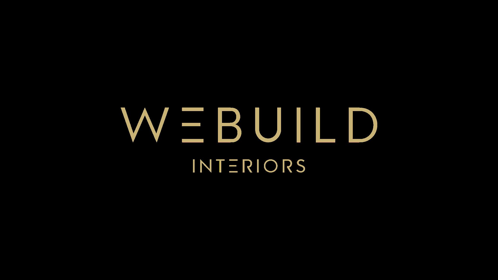
Logo Master Logo
The updated look of our logo makes it both simple, modern and clean. The logo is available for use in Light Grey, Dark Grey, Rich Gold, Black or White in all instances where the logo is used on it’s own.
For example, stationary, signage, uniforms, merchandise and third party use, The first preference is to use the Dark Grey logo. However sometimes to ensure the legibility the black or white options will work better.
Light Grey and Rich gold options are considered as secondary colors which are only used if necessary. Preferably the Logo shouldn’t be used in more than one or two colors.
Dark Grey
Black
Rich Gold
White
Light Grey
White
Logo Secondary Logo
A consistent logo should be readable and viewable in any communications. A Secondary Logo which is also designed in 2 lines can be used for some other purposes which needs be more clear and readable. Since the primary logo is long and one line, in few circumstances logo won’t be visible and that decreases the readability. For that logo needs an alternative options which can be acommadated in such spaces in which logo communicates well.
Secondary logo is designed mainly for social media use in which profile pictures, display pictures etc. which are so small to view especially from mobile devices. Logo can be also used in such spaces it needs better attention.


Dark Grey Black
Rich Gold
White
Light Grey
White
Logo
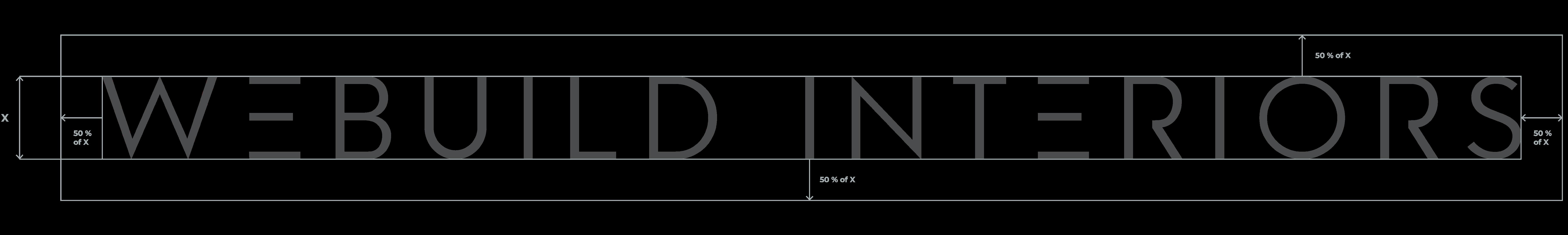
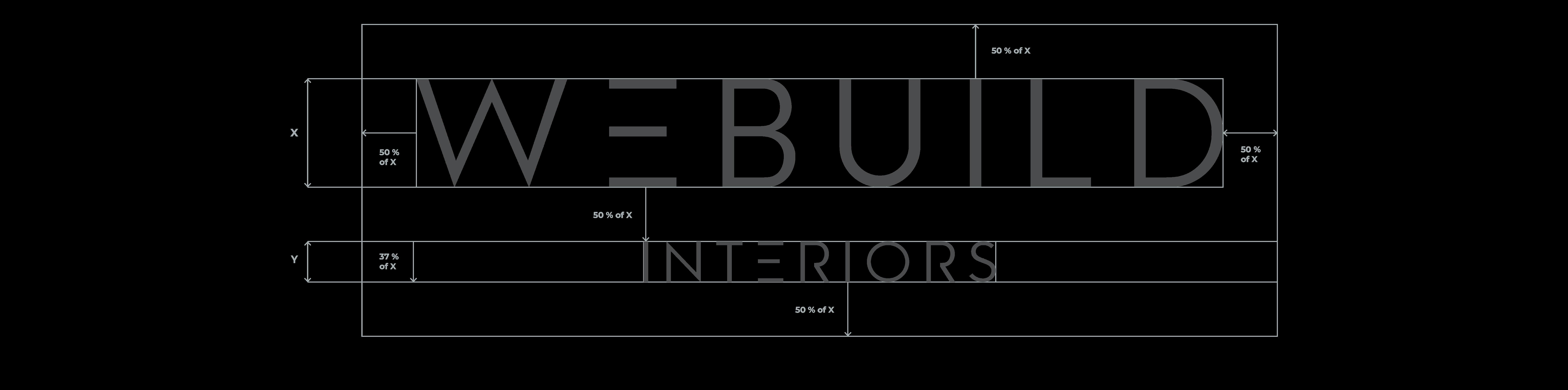
Clear space and sizing
Clear space is the area surrounding our logo that must be kept free of any text or graphic elements. By leaving space around the logos, we make sure it stands out on all of our communications. The minimum clear space is 50% of the height of the logo. Our logo must be besized large enough to be easily read on every application. While minimum sizes are specified, it is preferred that the logo appears larger than the minimum size when possible.
Any size beyond the minimum size can be applied, but the proportional distance between the logo and text remains the same.
Logo Misuse
Any changes to our logo diminish its integrity and equity of our brand. The examples shown here are some specific “Do nots” for our logo.
Do not alter the Logos colors in anyway. Any text shouldn’t be locked up with logo.Otline versions of logo are not allowed. Placing logos in any holding shape is not recommended. Don’t change the measurements or proportions of any elements in logo. Only sizing propoirtionally are allowed.
Altering the logo in any shape, warp, roate etc are not allowed. Do not add elements or shadows to the logo which effects the aestetics of the identity.
Do not alter the Logos colors in anyway. Do not lock up text to the logo. Do not alter the logo shape in anyway. Do not add elements or shadows to the logo.
Do not place logo in a holding shape Do not outline the logo
Do not rotate or distort the logo. Do not change the measurement of the logo components.
3. Colour
The single most identifiable element of our identity is our logo. Consistent use of our logo is is key to retaining brand strength through immediate recognition of who we are and what we stand for as a brand.
Colour Brand Colours
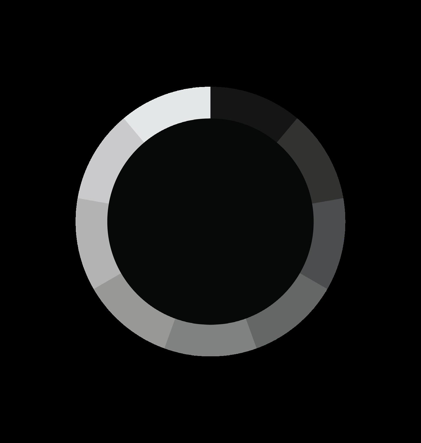
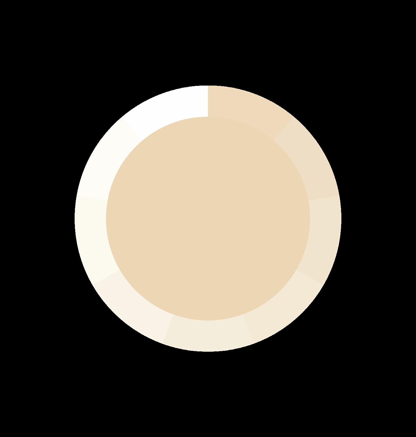
Primary colour palette is constant throughout all communications. A colour hierarchy has been implemented, ranging from Dark Grey being the most important to rich gold the least used.
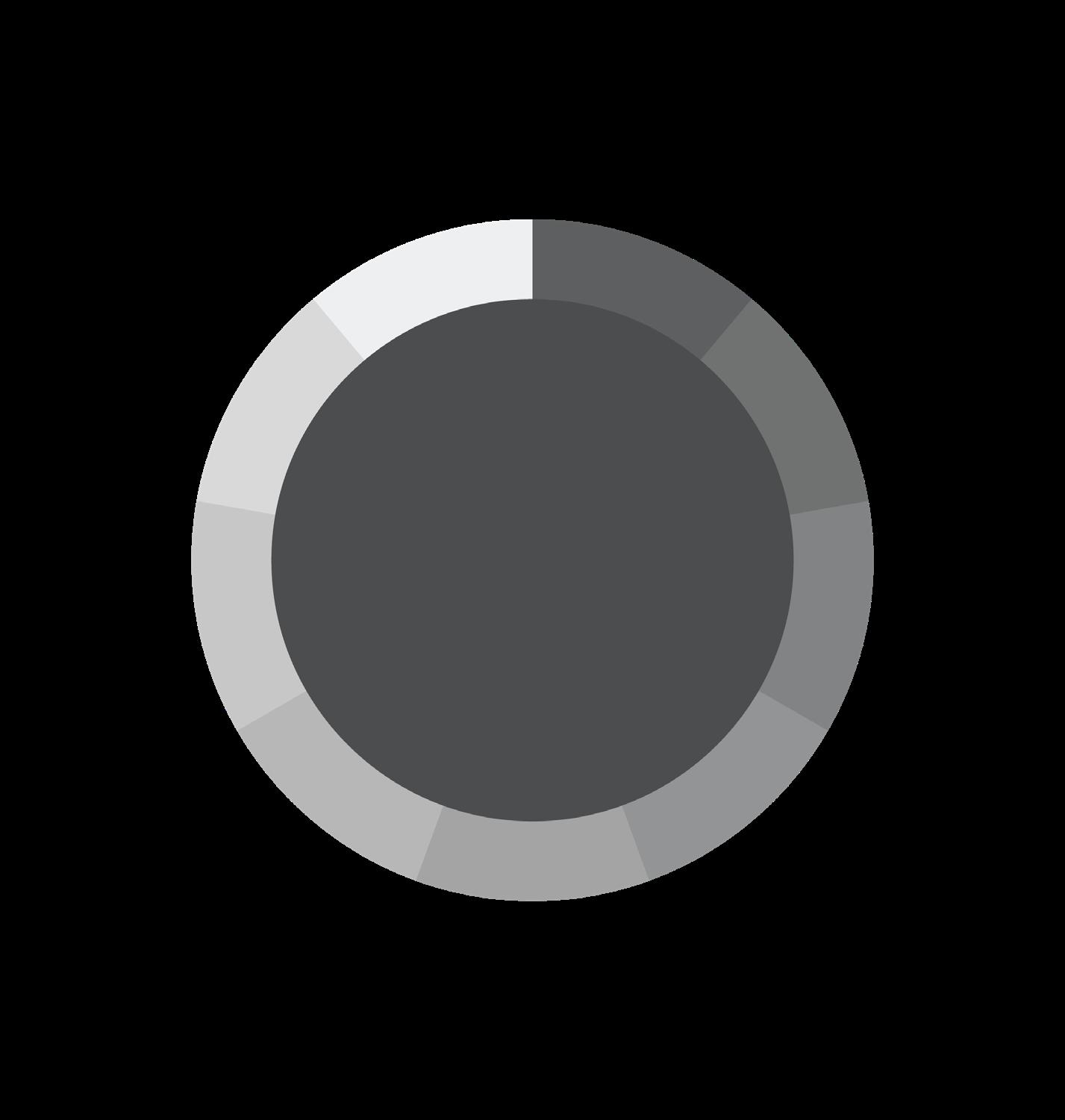
Rich gold and and light grey are mainly used for conveying importance. Dark grey is predominately used for text. White, Champagne gold and light grey shades are mainly used for background washes.
Any size beyond the minimum size can be applied, but the proportional distance between the logo and text remains the same.


Pantone
Process Black C Cool Gray 11 C CMYK
C0 M0 Y0 K100 C0 M0 Y0 K70
R0 G0 B0 R75 G75 B76
C
M2 Y0 K32
Pantone 16 - 0836 TCX Rich Gold
M9 Y33 K22
C
R232 G212 B180
Pantone
Pantone
Pantone
Dark Grey Black Light Grey Rich Gold
Champagne Gold
Pantone
Colour Dark Grey
Cool Gray 11 C
Pantone
Cool Gray 11 C
Colour Light Grey
Colour Rich Gold
Pantone
Colour
Secondary Colour
Champagne Gold
Pantone
4. Typography
Raleway is our brand typeface, it should be used in all instances where typography is required. It is a simple, clean and legible typeface that compliments our logo. Typography shouldn’t be overlooked as a key element within our toolkit. It is important to adhere to the leading, tracking and text arrangement specidied in this document to achieve brand consistency throughout.
Typography
Our Typeface
Raleway is our corporate typeface, it should be used in all instances where typography is required. It is a simple, clean and legible typeface that compliments our logo. We use three weights of Raleway, Regular, Bold and Light.
Nexa typeface can be used as a secondary font for typography use. Arial and Helvetica can be used as a substitute for Raleway on digital applications such as websites and email.
It’s is important to adhere to the leading, tracking and text arrangement specified in the document to help achieve brand consistency throughout.
Raleway
Typography
Typeface Weights
abcdefghijklmnopqrstuvwxyz
ABCDEFGHIJKLMNOPQRSTUVWXYZ 0123456789!@#$%^&*()_+{}[]|\:;”<>,.?~
abcdefghijklmnopqrstuvwxyz
ABCDEFGHIJKLMNOPQRSTUVWXYZ 0123456789!@#$%^&*()_+{}[]|\:;”<>,.?~
abcdefghijklmnopqrstuvwxyz
ABCDEFGHIJKLMNOPQRSTUVWXYZ 0123456789!@#$%^&*()_+{}[]|\:;”<>,.?~
Use of Type
Bold is our headline weight.
Regular is used for captions and small bodies of text. It’s also used on our stationary.
Light is used for body copy and sub headings.
Extra Light is used for purposes where text should be be very thin.
5. Stationery
This section presents the visual layouts and mockups of our stationery and communications collateral.
Stationery
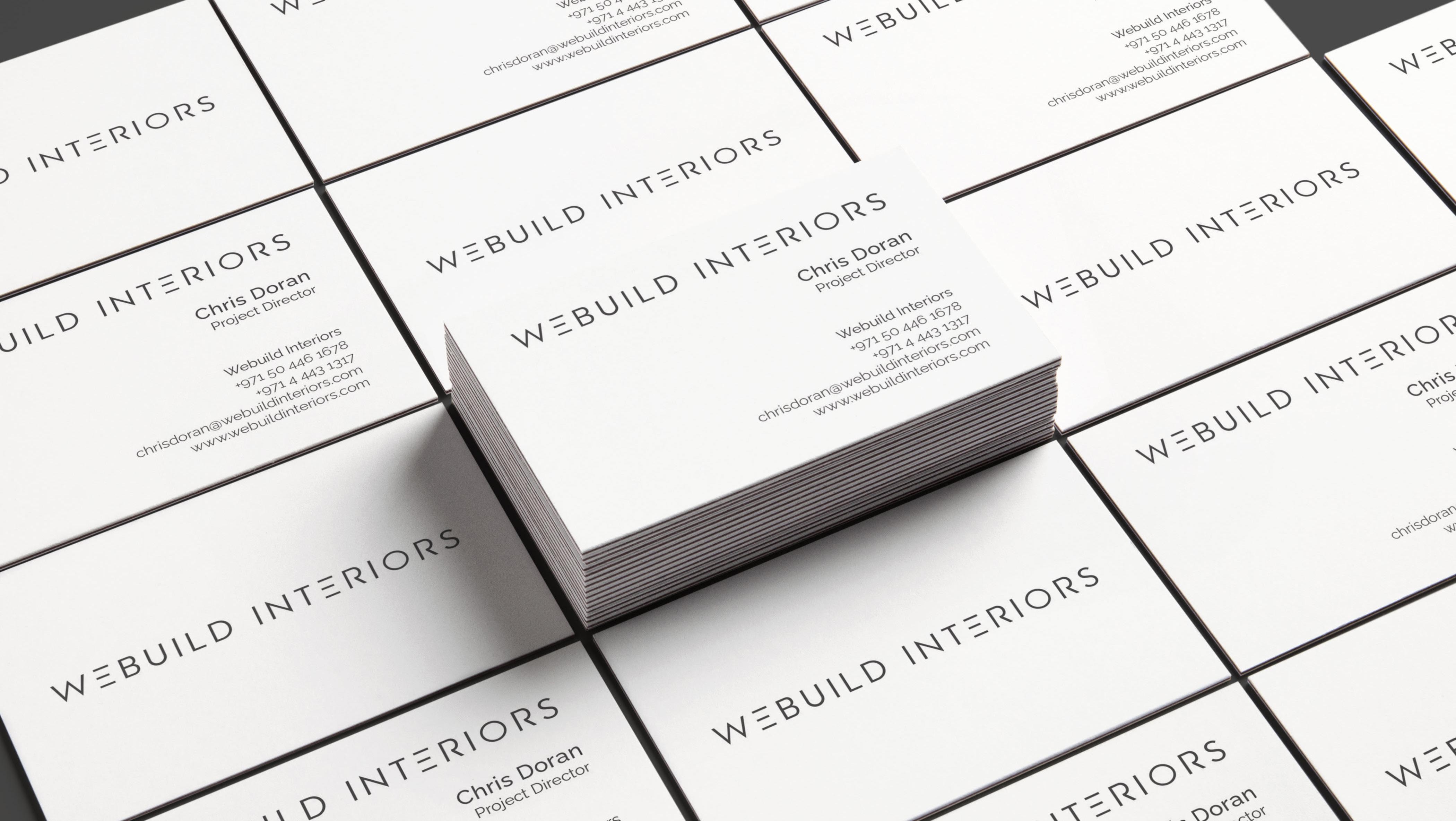
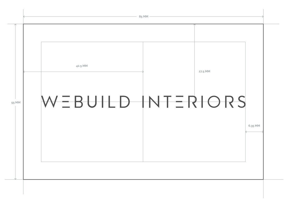
Business cards
Final card size: 55 mm X 85 mm
1. Refer the Layout below for size
2. Right align all the text.
Font: Raleway Medium, Regular & Light Size: 11 pt for Name, 8pt for other texts.
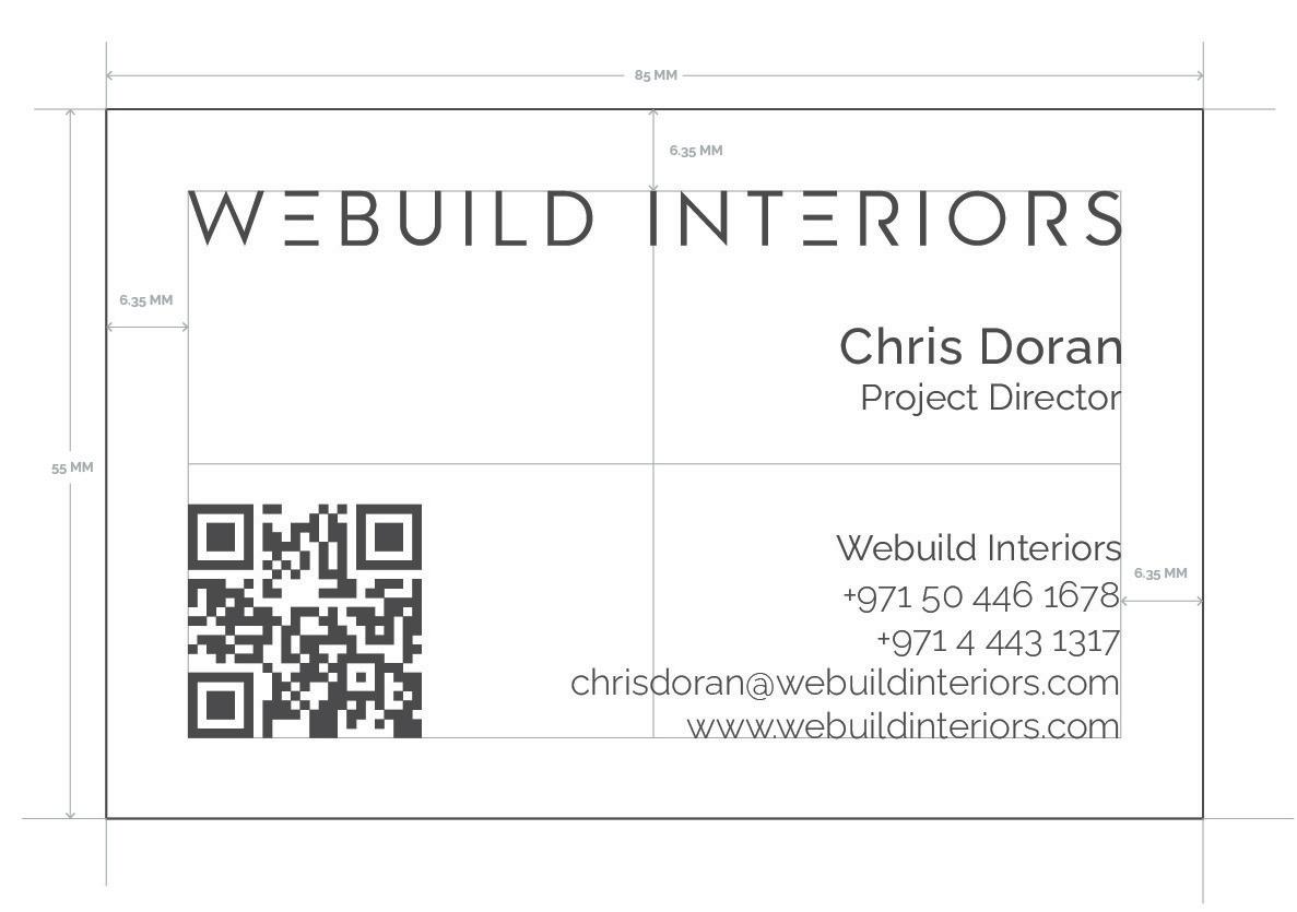
Where possible, Pantone colours should be used to achieve consistent colour accross all print collateral.
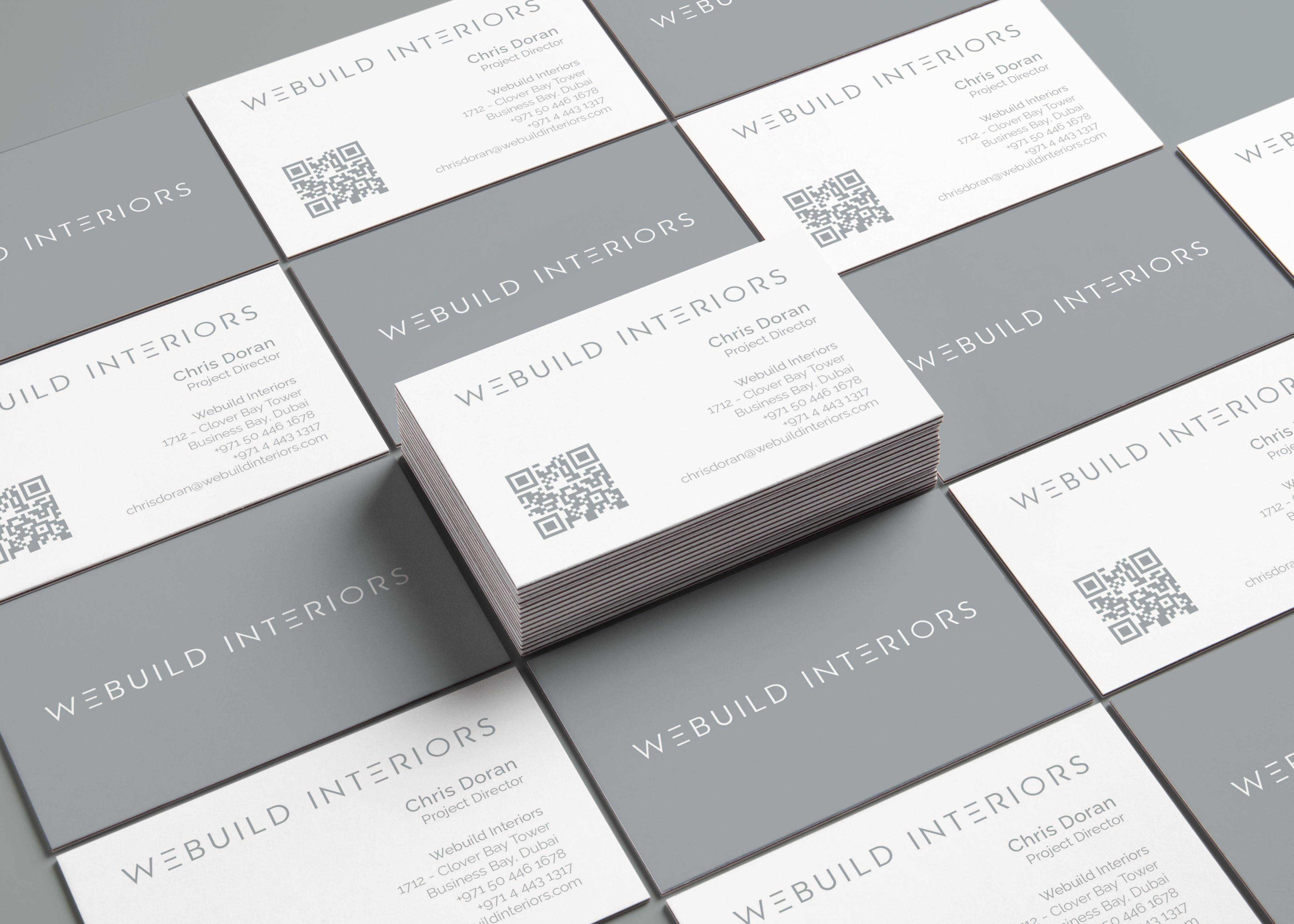
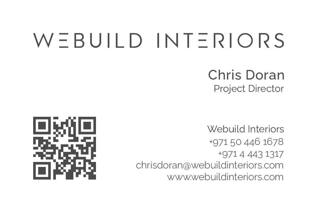
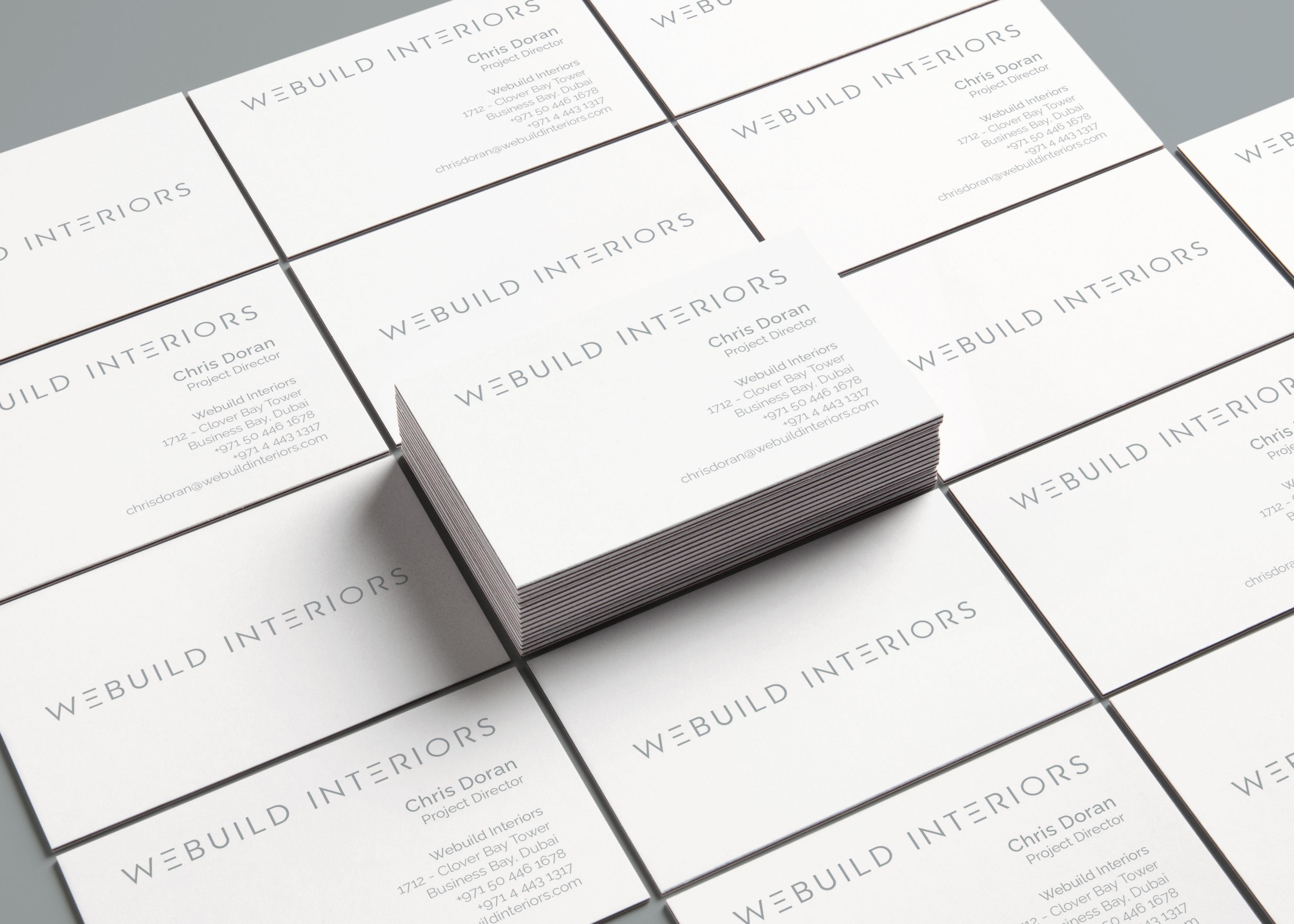
Business Card
Option 1
Minimal White
In this Option, We did a minimal design approach which has 2 color options that is Light Grey and Dark Grey colors. One of the option includes a long company loacation address and the other one with short company name and contact details.
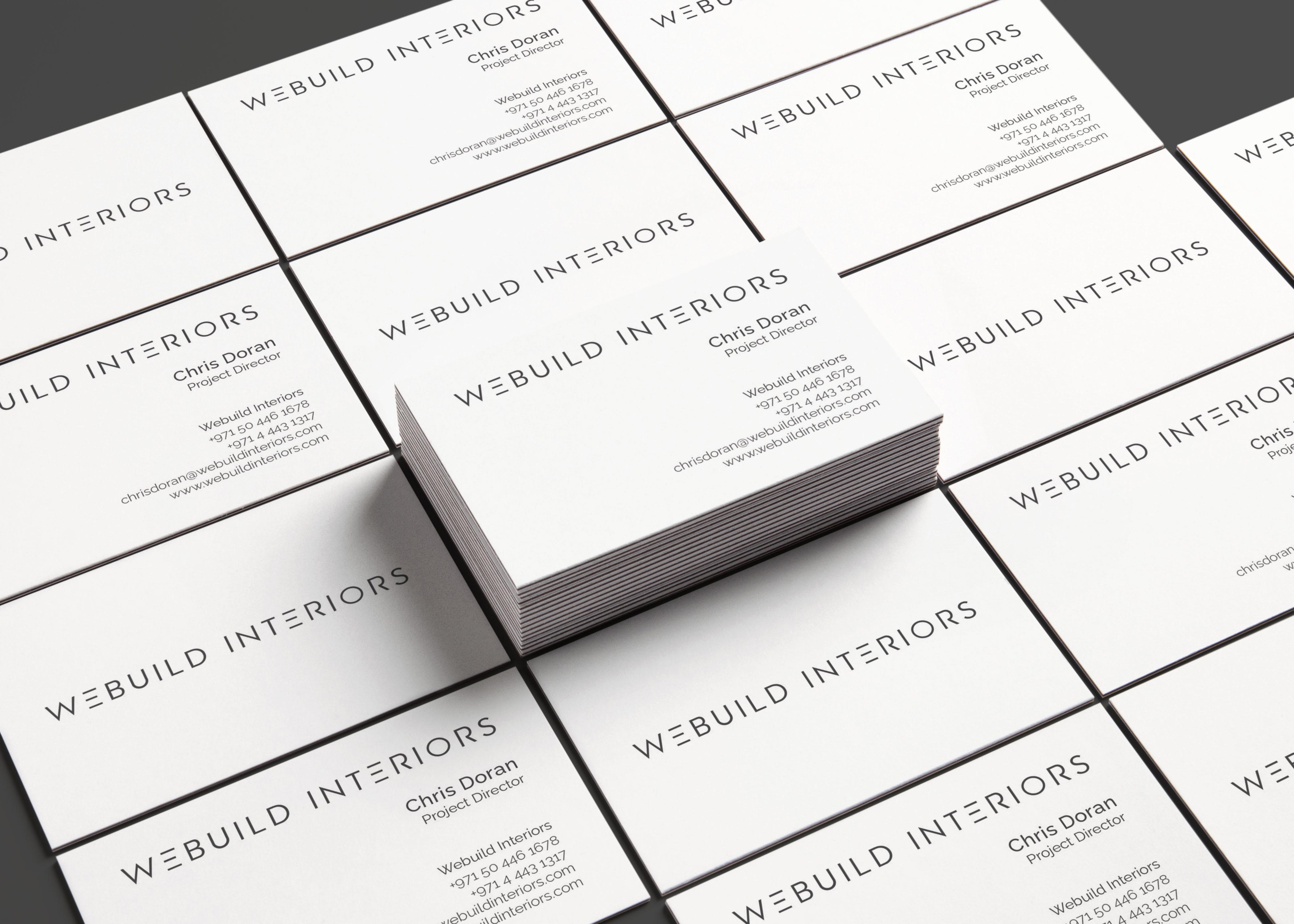
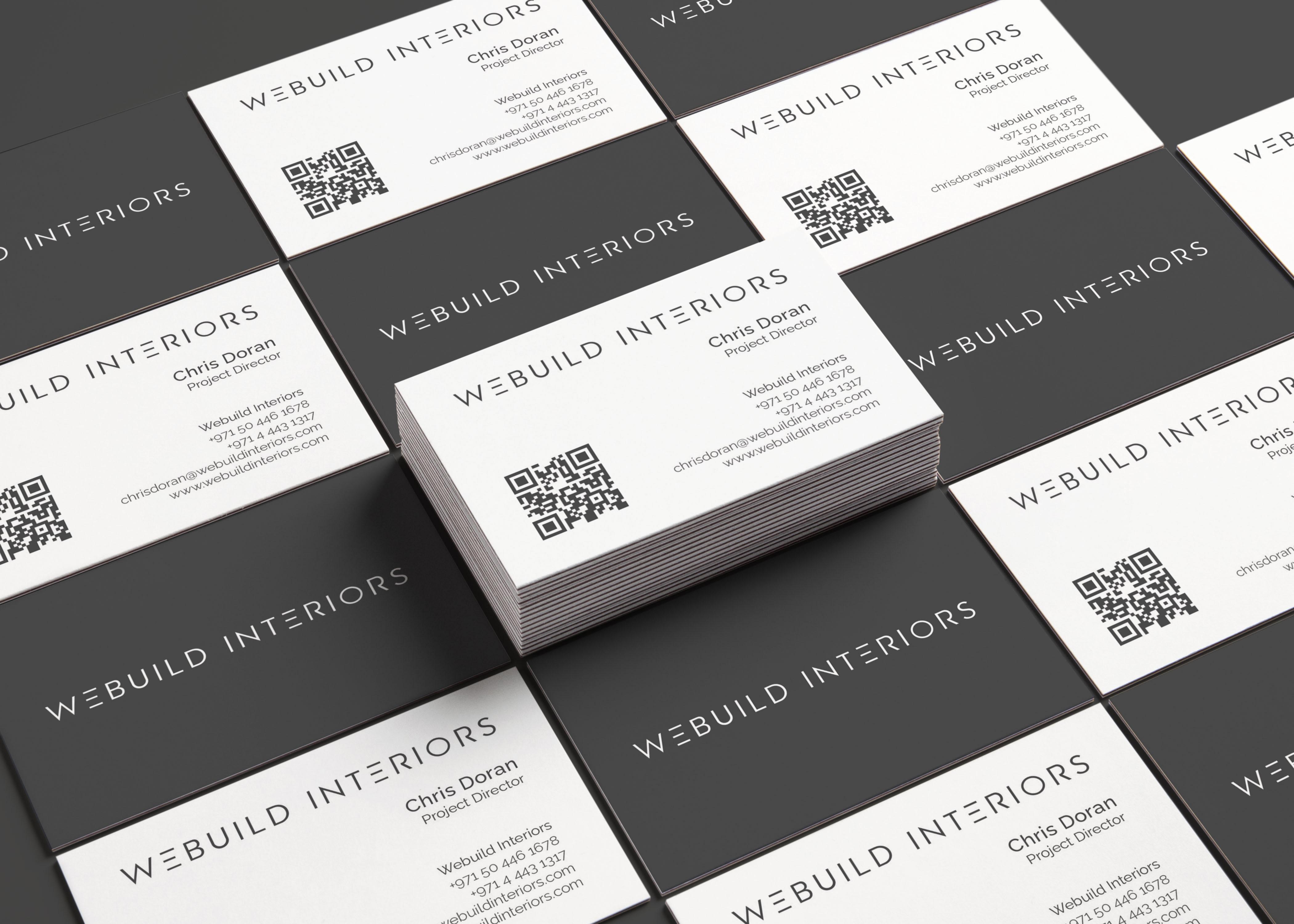
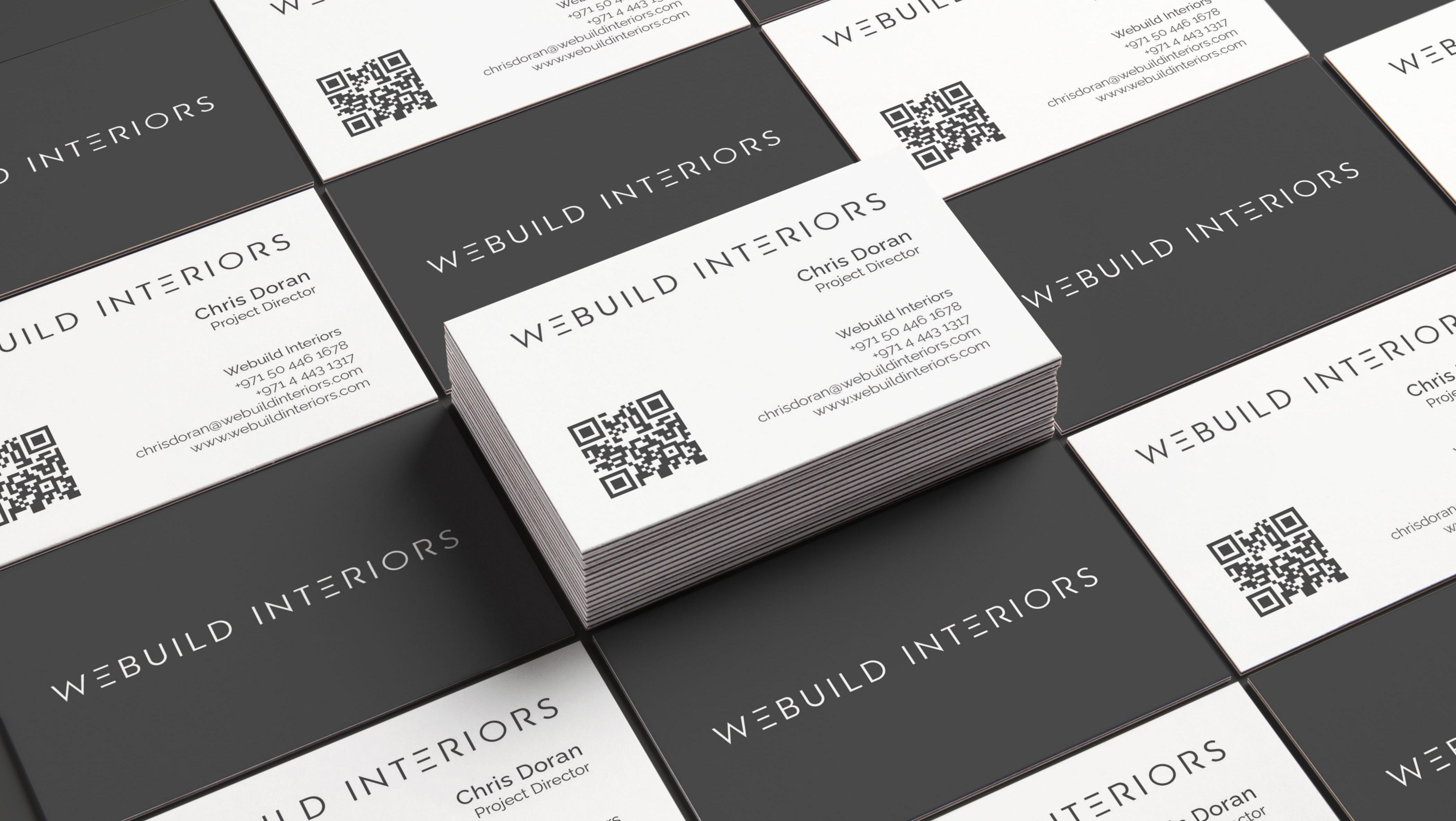
Business Card
Option 2
QR Code
Second Option includes a design with QR code included to scan that directs to website in which people can interact through website for other details like projects, location, contact etc. This option is also available in 2 colors.