
Brand Guidelines Created by Artwoll Media For Consistency & Creativity
3 Introduction 4 IdentityElements 5 Typography 6 BrandColors 7 Photography 8 Stationery 10 BrandApplication 11 Contact NavigationPage
WelcometoTheInstituteofAesthetics&Spa'sBrandBook. Thisdocumentprovidesguidelinesforeffectivelypresenting communicationsthatalignwiththehighstandardsofour brand,bothverballyandvisually.Byfollowingthesebest practices,individualsandcompaniescancreateacohesive identitythataccuratelyreflectsourbrand'svisionand values.

As a member of our community, you can expect to receive exclusive content that provides deeper insight into our brand's history, vision, and future plans. We encourage everyone associated with our brand to use this guide as a reference for maintaining a consistent and professional image.
As our brand evolves and more visual elements are defined, this Brand Book will be updated with new sections or refinements. This is a living document that will continue to serve as a valuable resource for our brand's identity and communication efforts.
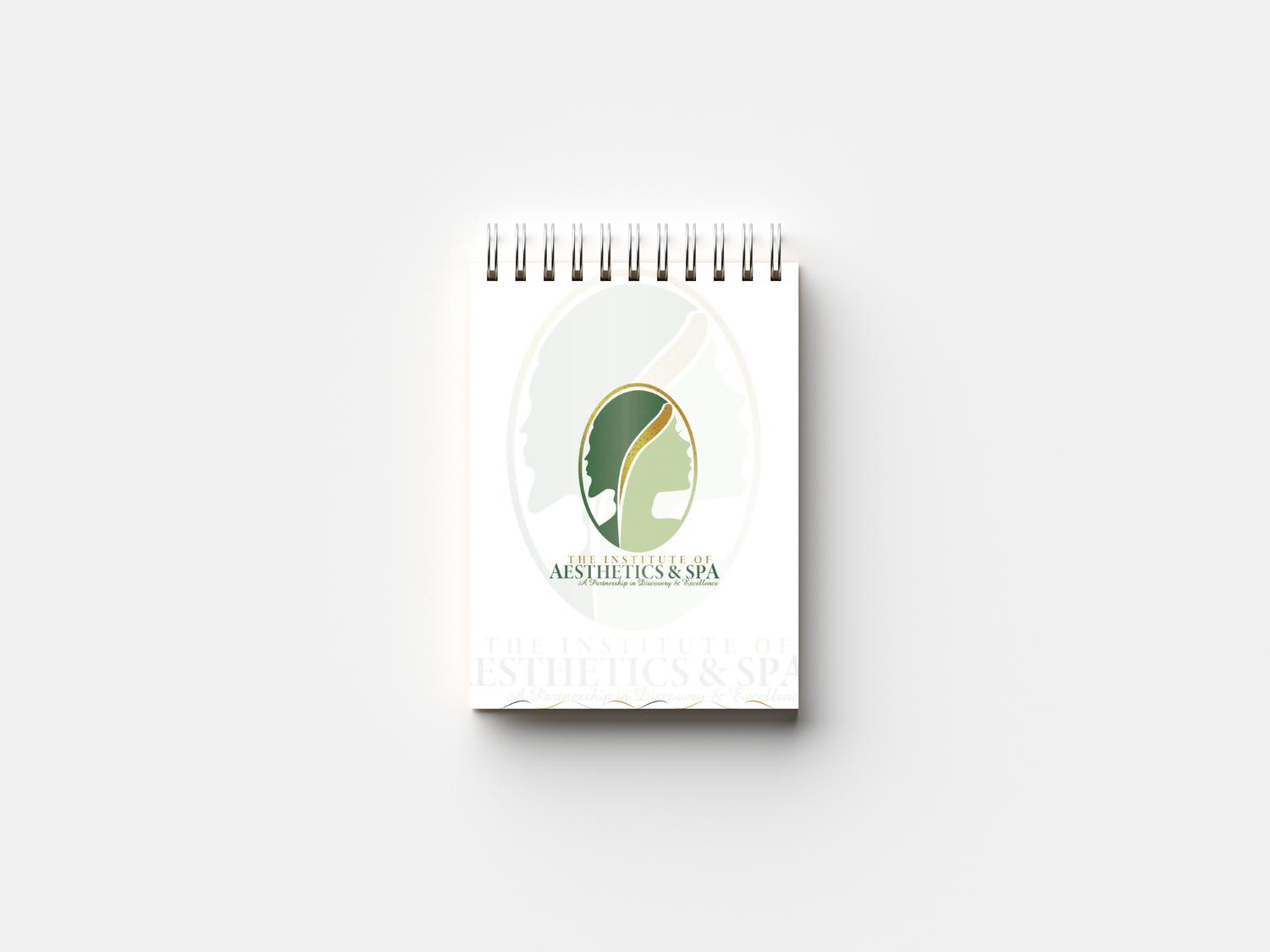
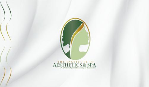
The Institute of Aesthetics & Spa's logo symbolizes The Institute of Aesthetics & Spa and provides a consistent identification to the brand. Maintaining the integrity of The Institute of Aesthetics & Spa logo is key to building a strong identity. It must be presented in a consistent and legible manner.

Our logo originates from a silhouette face of a man and a woman representing beauty. The icon is precisely proportioned and balanced within an oval shape.
The Wordmark, The Institute Of Aesthetics & Spa, can be used in combination with the icon or both the logotype and icon may be used by themselves.
The logo mark can only be used on specific websites: Facebook, Instagram, Twitter or any other social media sites no other usage is allowed.
The standard logo should be used for 3 main purposes:
On in-house printed artwork.
To close a piece (i.e. back of a datasheet or brochure). For on property signage.
The Secondary logo should be used when there is limited height to put in standard logo for the TIAS brand communications.
The sub-mark logo is used when the design must be resized to extremely small formats or to help communicate your brand quickly.
Clear space is the area surrounding our logo that must be kept free of any text or graphic elements. By leaving space around the logo, we make sure it stands out in all of our communications. The minimum clear space is 50% of the height of the entire logo. Our logo must be sized large enough to be easily read on every application.
It is sometimes necessary to increase and decrease the logo depending on the print area. Always keep in proportion. Always ensure the text is legible.
The most effective background colour is white as it gives a clear contrast for the logo's colour and elements. if the logo were to be positioned on a green, brown or lemon background colour, the legibility of the wordmark (The Institute of Aesthetics & Spa) and some parts of the logomark would be lost.

In order to achieve flexibility we can use our logo on backgrounds that do not distract from or compete with our logo i.e. when placing the logo on an image, colour or pattern, it is essential that there is enough contrast between our logo and the background.
Top
Here we have our original logo which is used on white or very light backgrounds.
Center
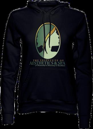
Our logo is equally effective on a black background while maintaining its original design and impact designed for white or light backgrounds.
Bottom Our logo is equally effective and and legible on a pale shade of blue-grey or light background.
The logo may never be altered in any way. Use only the digital artwork provided by The Institute of Aesthetics & Spa. Never redraw or modify the symbol in any way or rearrange the relationship between the icon & logotype. Always use TIAS Brand logo in its complete form. Never use a partial image or pieces
The conditions under which the TIAS Logo may not be used are as follows:


a) Do not change the colour of the logomark. Changing the colour of the logomark can impact brand identity and customer trustworthiness.
d) Do not crop the logo.
g)Donotplacethe logoinaholding shape.
b) Do not change the typeface of the wordmark. Typography becomes symbolic and a recognised element of a brand so changing it may have destructive consequences.
c) Do not tilt the logo. Tilting logos can create an informal and unprofessional view which does not accurately reflect brand identity.
e) Do not apply any effects
h) Do not add elements
f) Do not use the logo directly over a busy image.
 THEINSTITUTEOF AESTHETICS & SPA APARTNERSHPNDSCOVERY&EXCELENCE
BRAND TAGLINE
The brand tagline utilizes a short phrase to drive the brand's messaging position home. The brand tagline may be used in the headline portion of print or digital creative space.
When not using the tagline as the headline, it can appear in combination with the logo. Only one typefaces is allowed in the tagline - Amazone
Logo + tagline = standard logoOur brand's tone should exude simple, calmness, elegance, and luxury. Our goal is to create an atmosphere that makes our guests feel like they are indulging in a luxurious and relaxing retreat.
Allmaterialsrelatedtoourbrand mustbewritteninaprofessional andrefinedmanner.Itis recommendedtousedescriptive andpoeticlanguagetohelp establishanatmosphereofluxury andrelaxation.
Tohelpcreateacalming environment,itisrecommended toplaysoothingbackground musicthroughoutthespa.
Toenhancethecalmingandrelaxing atmosphereofthespa,werecommend usingasignaturescentsuchas lavenderorvanilla.Theuseofsuch scentscanhelpcreateasoothingand invitingambiance.
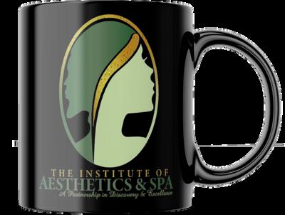
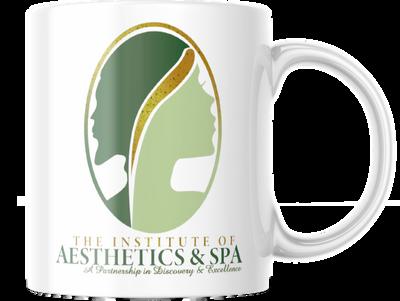
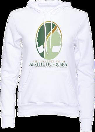
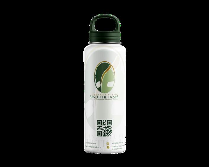
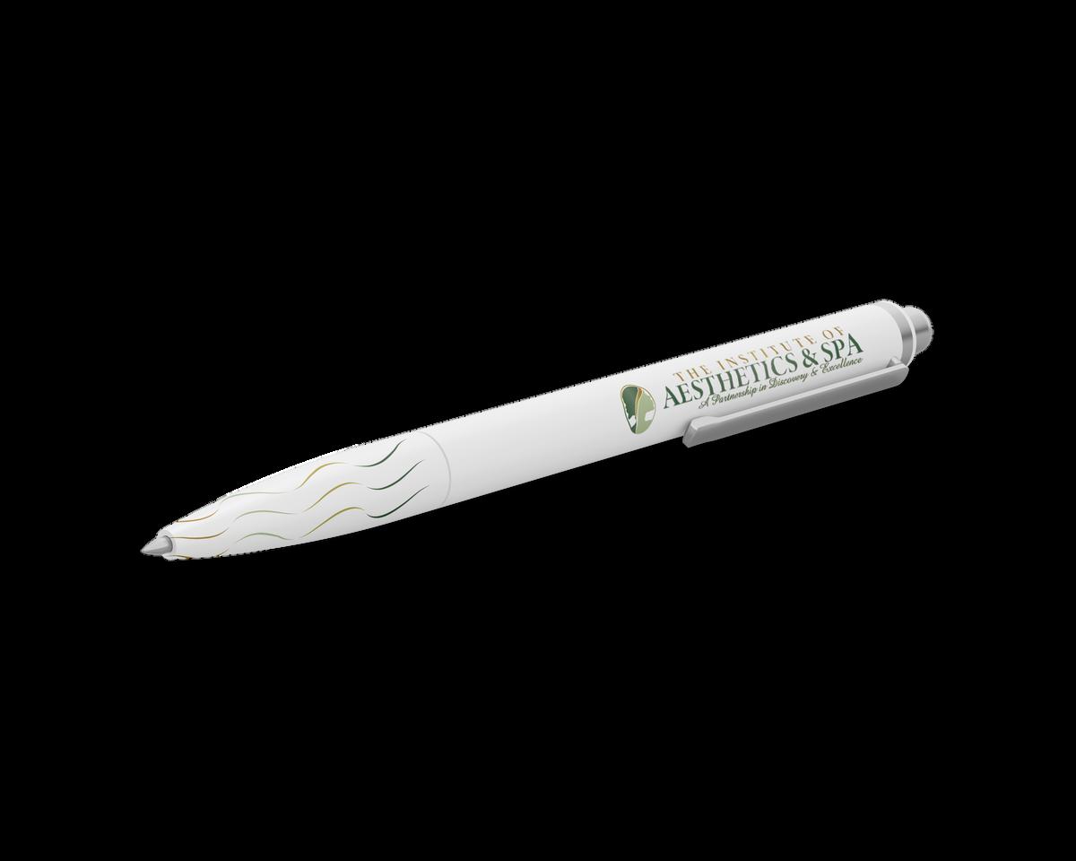
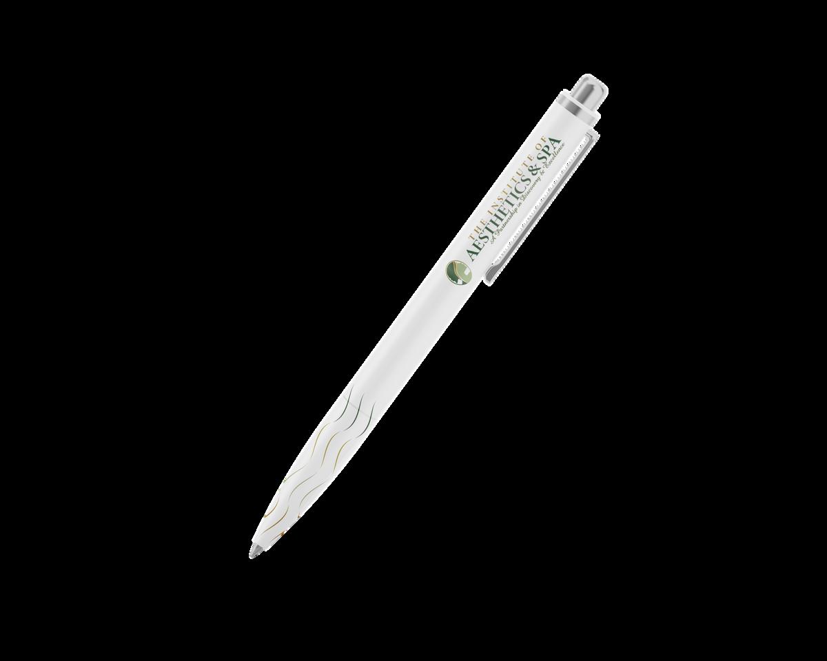
Useoflogoandotherbrandelements shouldbeconsistentacrossall materials,frombusinesscardstothe spa 'swebsite.
Protect and use the brand guidelines document to monitor and regulate the brand's usage.
Use of our brand or logo without permission is strictly prohibited.
The brand guidelines should be followed for all marketing and promotional materials, including brochures, advertising, and social media posts.
It is important to regularly review and update the brand guidelines to ensure that they are accurate and effective. Any changes to the brand identity, such as updates to the logo or colour scheme, should be communicated clearly to all employees and partners.
These are general guidelines for the Elithan brand. The brand should be consistently applied to all the materials to create a cohesive and memorable experience for the guests.
MINION PRO A B C D E F G H I J K L M N O P Q R S T U V W X Y Z a b c d e f g h I j k l m n o p q r s t u v w x y z
1234567890!@#%&()+
DESIGNED BY: ROBERT SLIMBACH
DESIGNED BY: MATTHEW CARTER
poppins MEDIUM POPPINS BOLD Poppins ITALIC
poppins REGULAR
FIGURES
POPPINS THIN 0123456789
Onlyfourfontstylesareusedinthebrandingfor TIAS,fromfourdifferentfamilies:Minionpro, Amazone,poppins,Georgiapro.
MINION PRO
WHENTOUSE
ItisalsothefontthatwasusedandinspiredfortheTIAS
BrandIdentity.Itservesasthetypefaceforthelogoand primaryheadlinesforonlineandprintedmaterials.
GEORGIA PRO
WHENTOUSE
Georgiaproisaversatilefontthatcanbeusedasa substituteforminionproincaseofunavailability.Itcan alsobeusedforprimaryheadlinesforonlineandprinted materials,rangingfromstationery,websitedesign, brochures,andallformsofgeneralcorrespondence.
WHENTOUSE POPPINS
Thisfontisusedasthesoletypefaceinthetagline. It canalsoserveasaheadlineorsub-headline typefacethroughoutmarketingandeditorial materials.
WHENTOUSE
Poppinsisthesoletypefaceforbodycopy, anditcanalsobeusedasanoptionfor secondaryheadlinesonprintedandonline pieces.
White
HexCode #ffffff
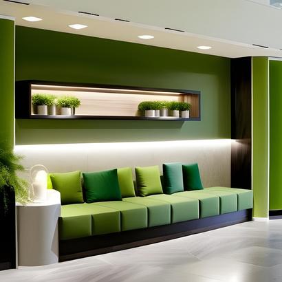
Deepmoss green
CMYK 0%,0%,0%,0% RGB 255-255-255
HexCode #355834
CMYK 40%,0%,41%,66% RGB 53-88-52
LightMoss Green
The Institute of Aesthetics & Spa has two main colours: Deep Moss Green and Light Moss Green. These colours are a recognizable identifier for the brand. The supporting colours are complementary to the primary colours.
When used together they create the identifiers for The Institute Of Aesthetics & Spa.
HexCode #688F4E
CMYK (10%,0%,24%,18%) RGB 189-209-158
It's consistent use defines our brand and create a visual language across all our communication materials.
Darkolive green
BlueGray
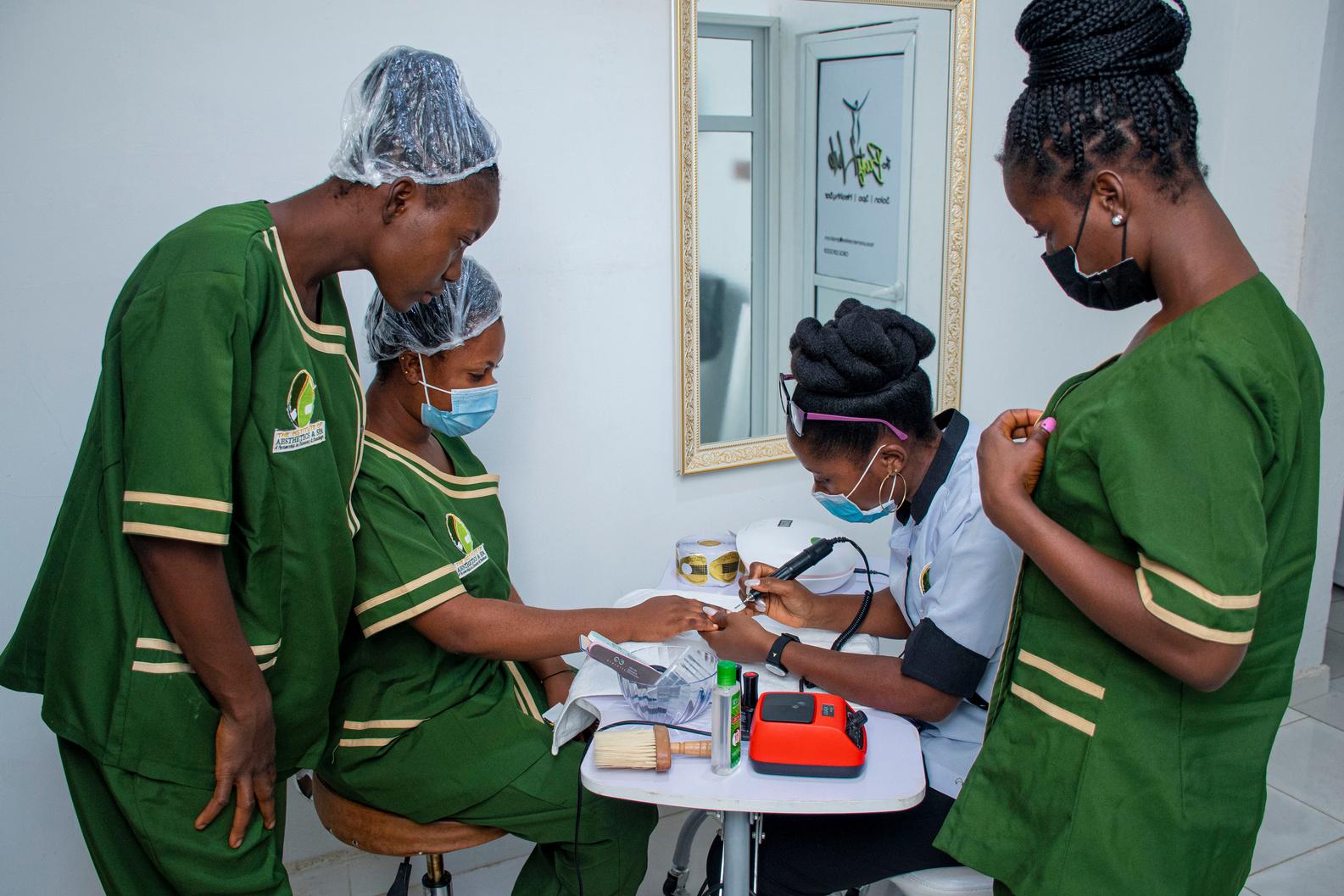
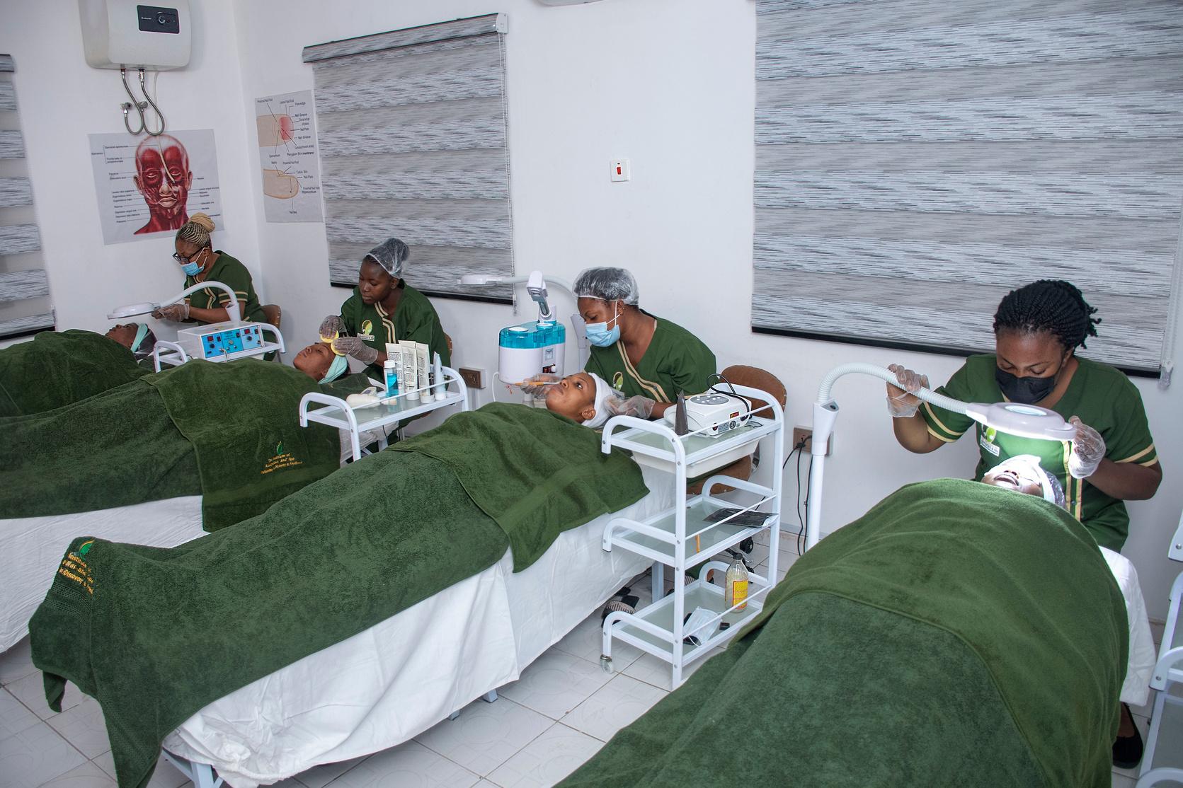
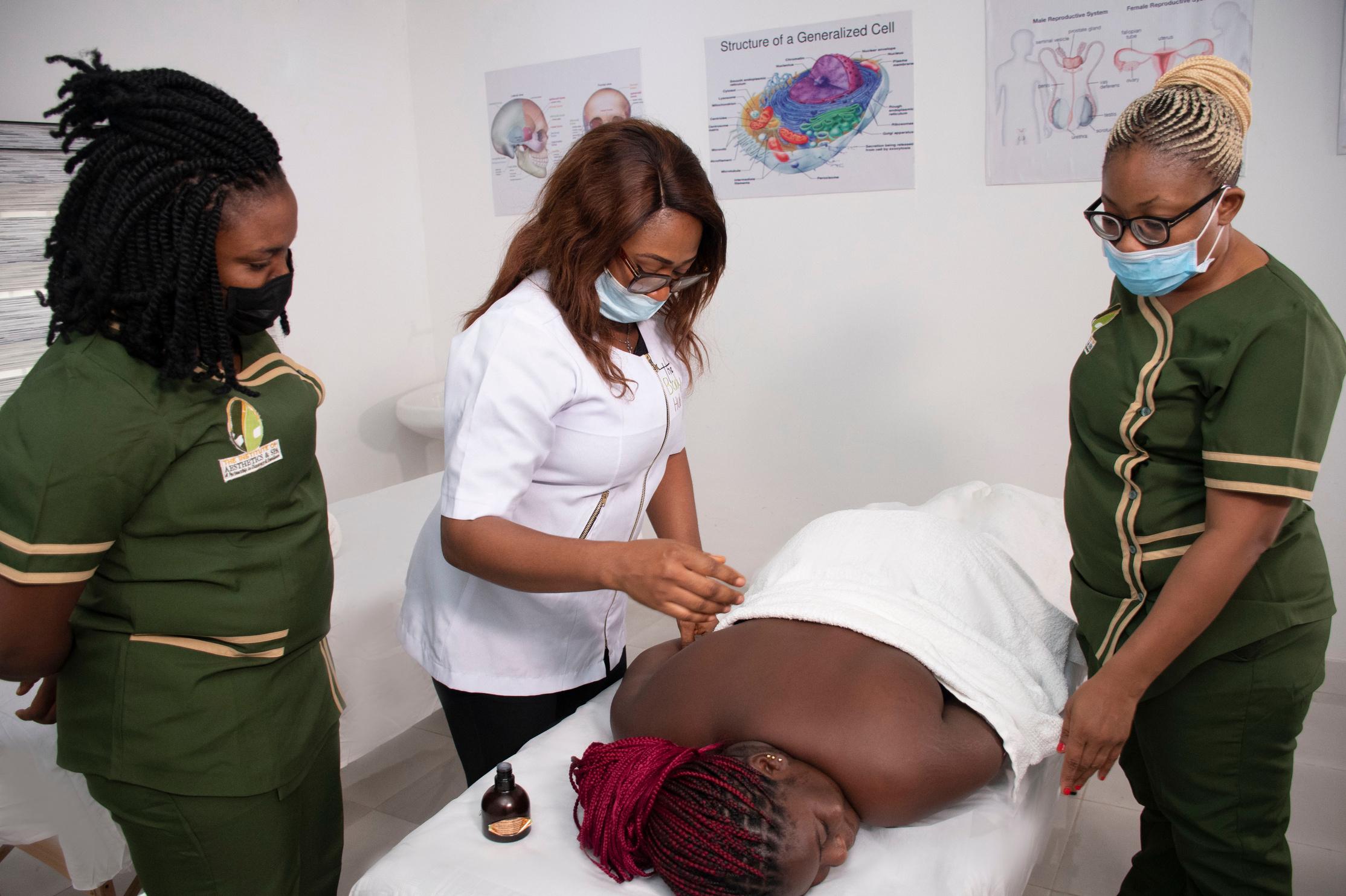
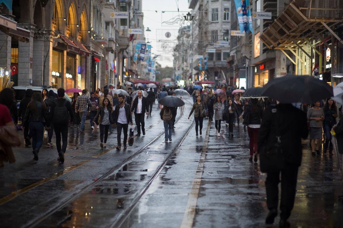
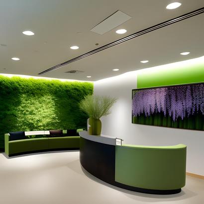
Our photos are designed to evoke a feeling of tranquility and luxury. They convey an atmosphere of assurance, hospitality, and beauty, inviting you to come in and unwind. Our goal is for you to feel confident that peace and relaxation await you here. We prioritize your comfort and take great care to ensure your wellness is our top priority.
An overall professional look should be carefully adhered to.
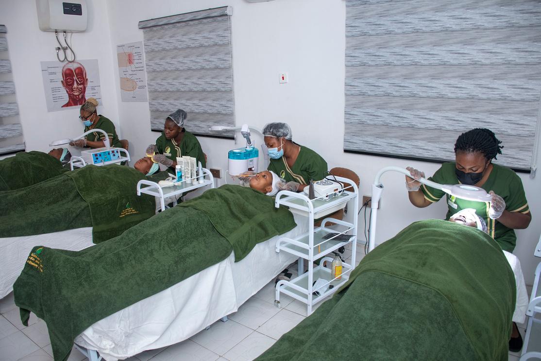
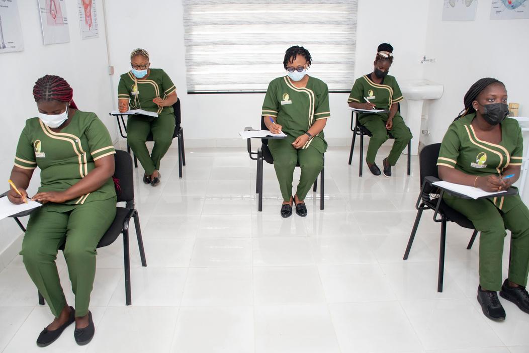
Attractive, yet simple depth of field creates focus on the details.
Images should adhere to the corporate colors.
High resolution, high contrast, desaturated Colors are a requirement.
Use lighting for a tranquil effect and to give off an overall feeling of luxury. well-being and harmony.
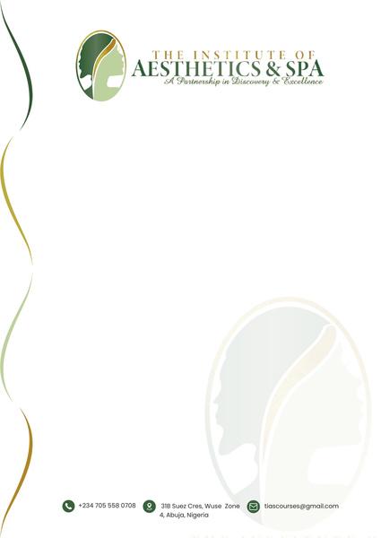
Standard 8.5 x 11
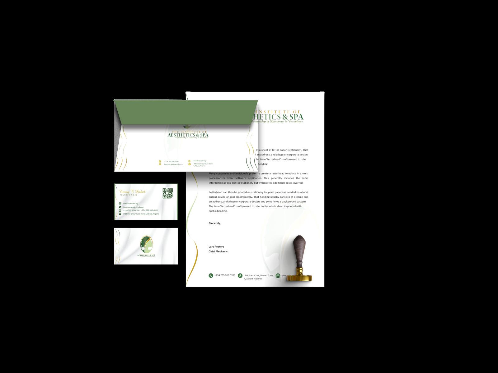
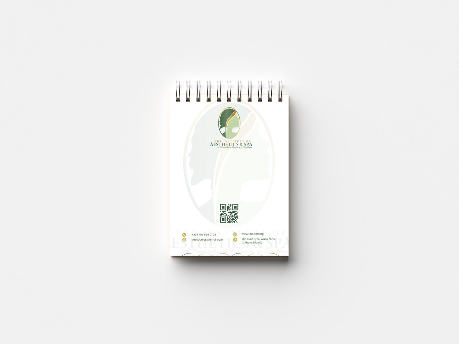
The TIAS letterhead is Elegant and modern.
LETTERHEAD:
• Standard 8.5 x 11 inches
• Clear space around logo
• Clear space below footer address


• DIN A4 paper size
• High quality image
• Professional look
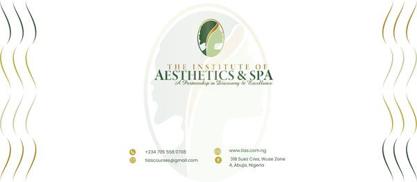
Envelope 4.125 x 9.5
• Print format CMYK
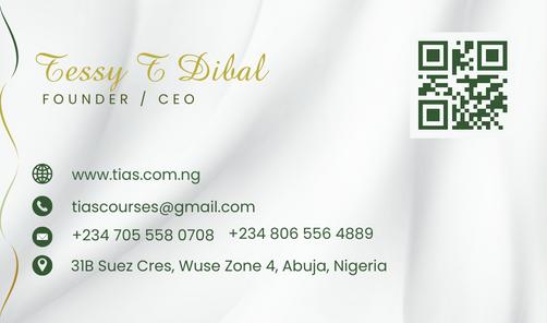
The Institute of Aesthetics & Spa is simple, sophisticated and elegant.
• Dimensions 3.5" x 2"
• Print format CMYK
• Professional Look