The PSOAE European Members Newsletter is a fine art newsletter with contribution from European members of the Portrait Society of America for the European members, compiled and written by the PSOA Ambassador to Europe, Andrea Steinbauer.
Information about the Portrait Society: https://www.portraitsociety.org/ Membership: https://www.portraitsociety.org/join
Contributors:
Frances Bell, Eddy Greenwood, Victoria von Kap-herr, Rosanna Gaddoni, Fernando Garcia-Monzon, Elske Wilton, Alexandra Telgmann
By Eddy Greenwood
Copyright:
All contents and images of this newsletter are copyright by the authors/artists of the artworks.
Layout & Design: Andrea Steinbauer
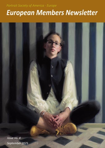
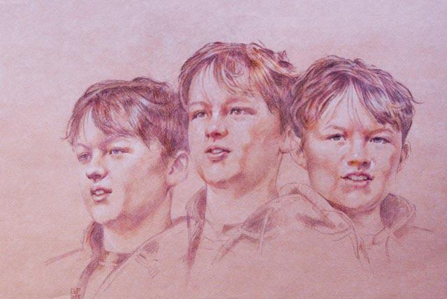
Cover Artwork: Frances Bell
“Yellow Trainers”
The International Portrait Competition Congratulations European Artists
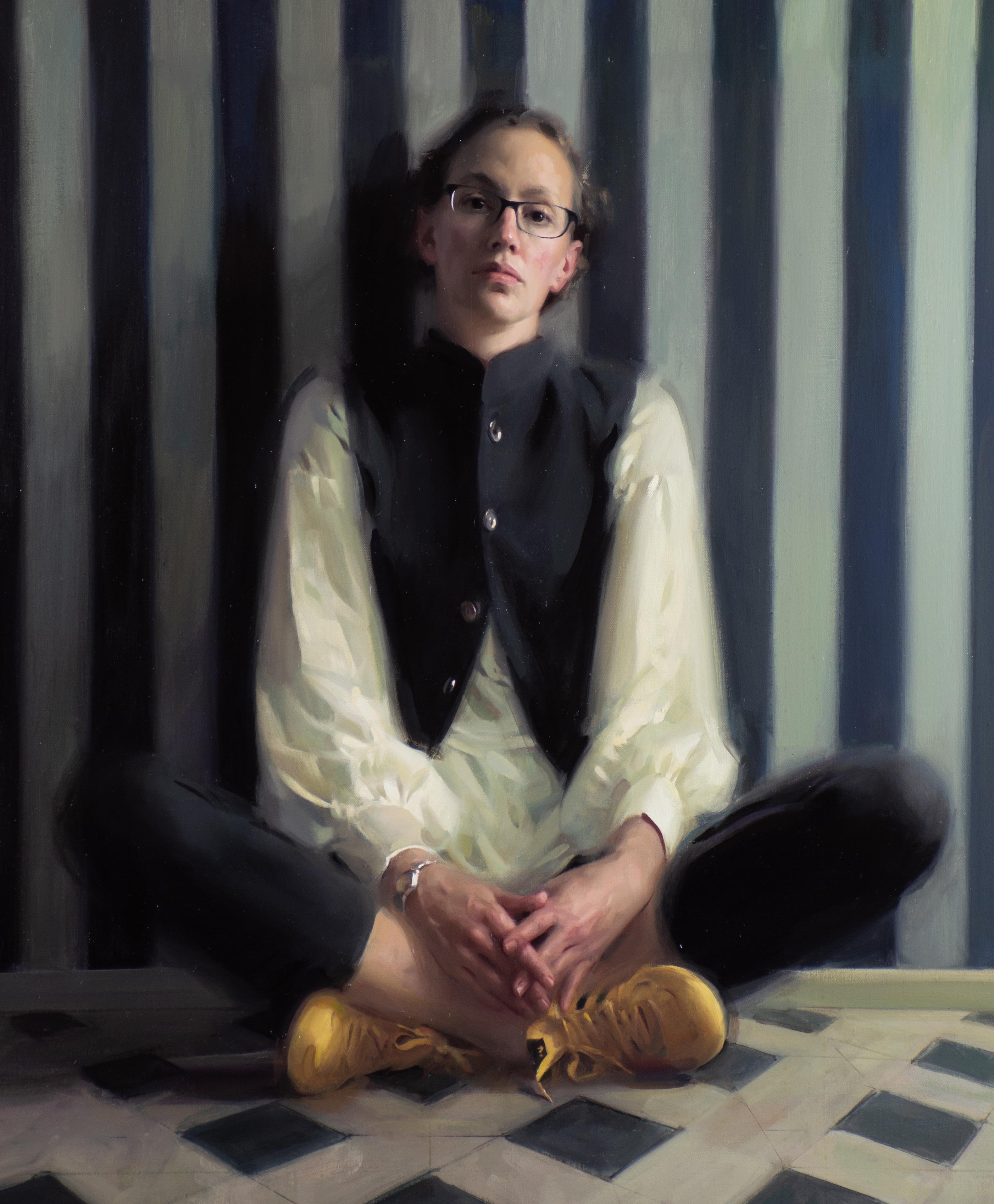
William F. Draper Grand Prize & People’s Choice Award
Over 3000 images were submitted for the Portrait Society’s 27th annual The International Portrait Competition. Out of them the jury selected 19 finalists and at The Art of the Portrait Conference in Washington, D.C. Frances Bell was announced as the winner of the Draper Grand Prize and the People’s Choice Award as well. Congratulations Frances!
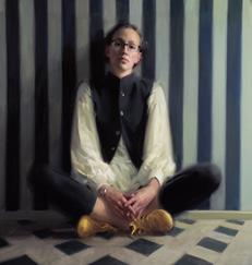
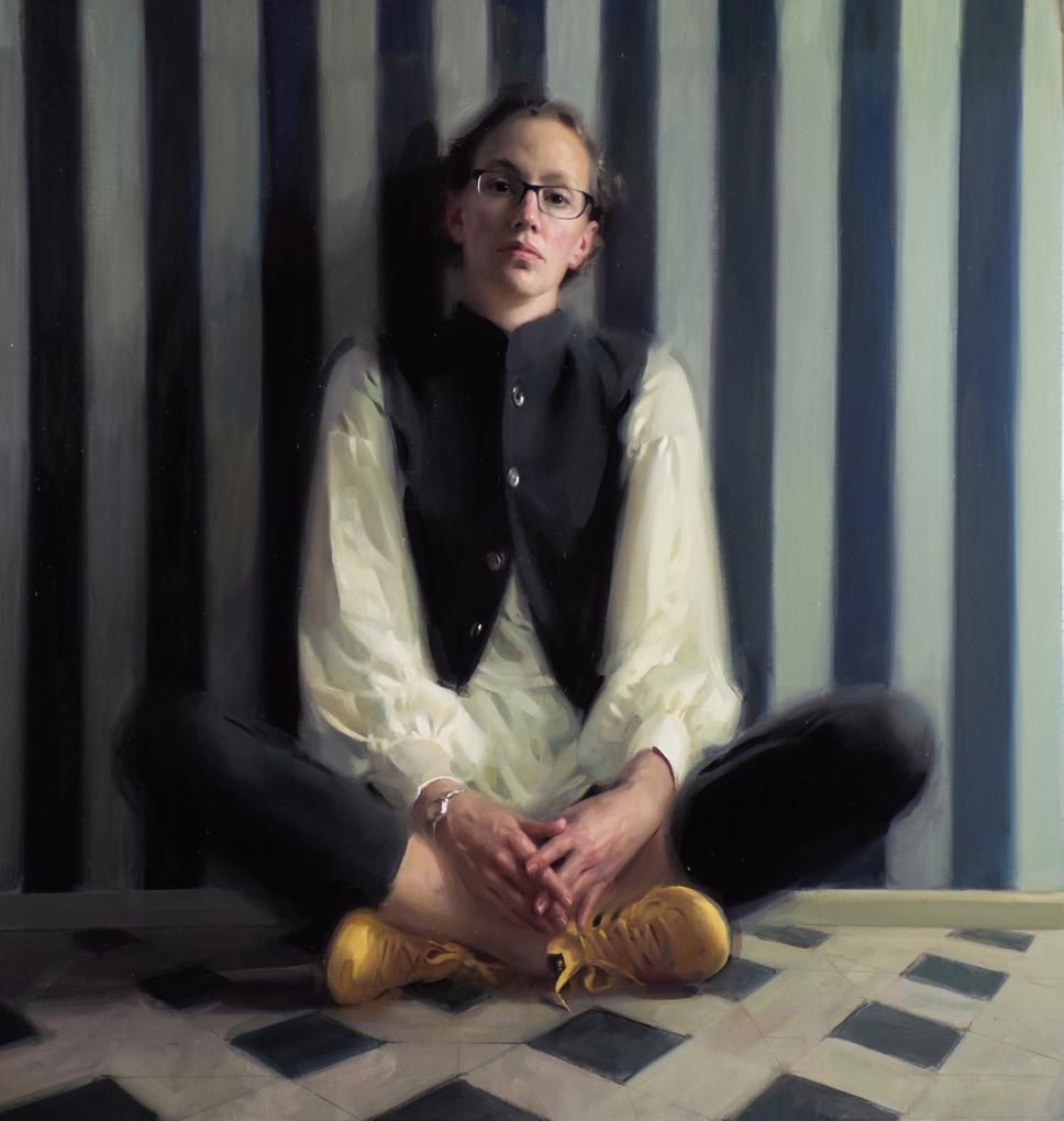
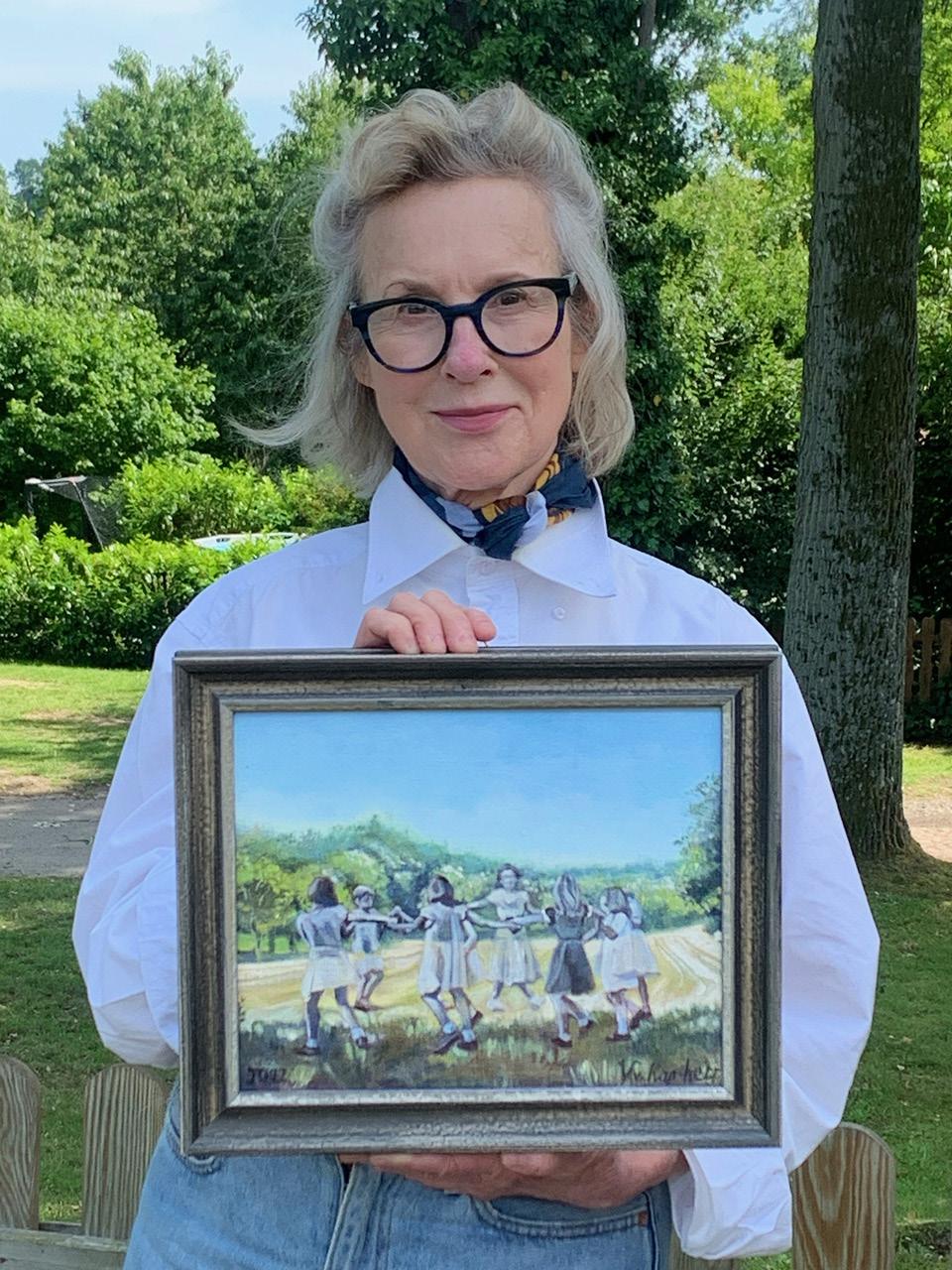
Frances Bell (UK)
Title: Yellow Trainers
Medium: Oil on canvas
Dimensions: 35,5” x 37,5”
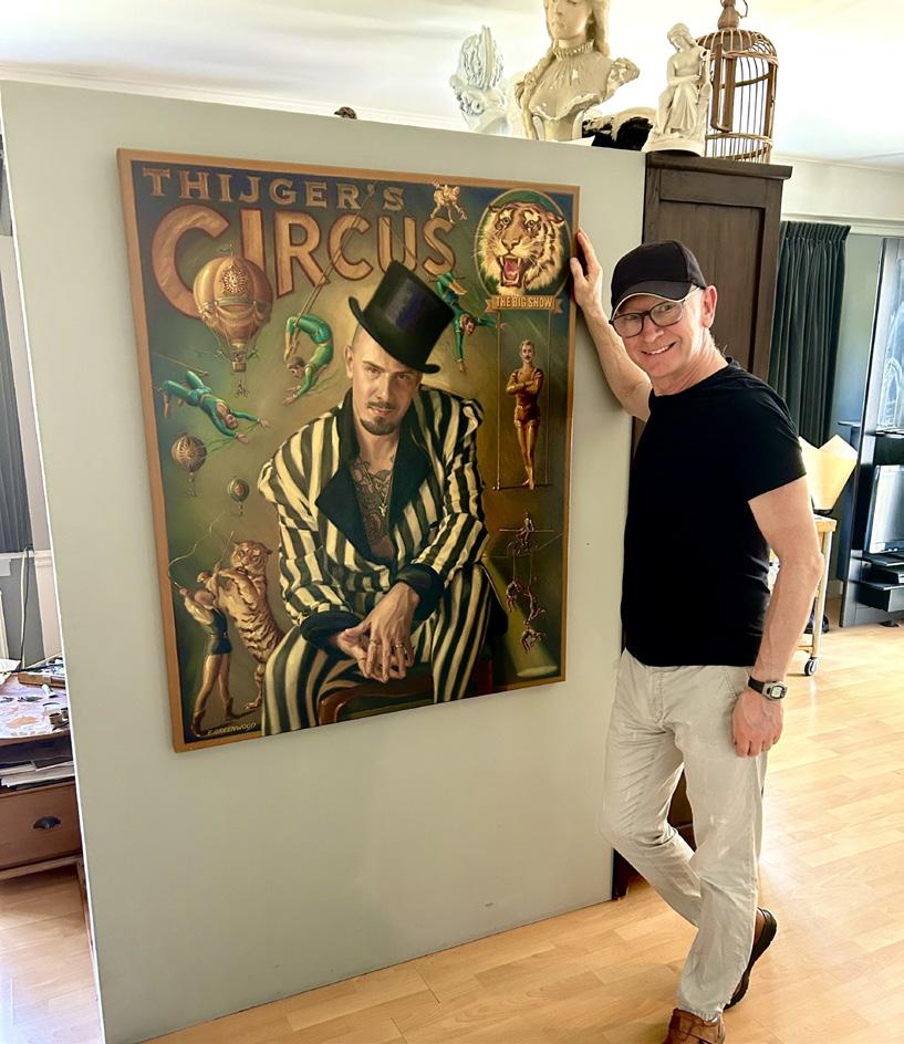
Eddy Greenwood (Netherlands)
Title: Life’s a Show
Medium: Oil on canvas
Dimensions: 47”x39”
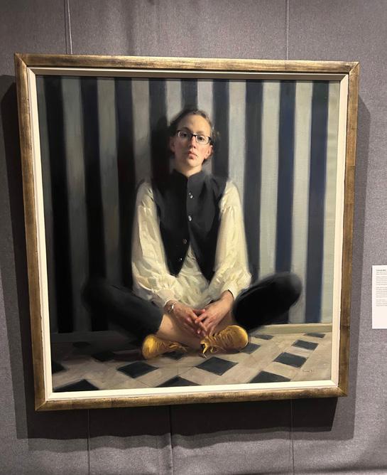
Ruth Fitton (UK)
Title: Kanukai, Study
Medium: Oil
Dimensions: 14”x11”
As an awarded artist, Eddy Greenwood was invited to visit this years The Art of the Portrait Conference. Learn more about Eddy’s experience in his article on page 4-6.
Certificate of Excellence
Image by Eddy Greenwood: Eddy with his painting “Life‘s a Show”
Image by Frances Bell: Her awarded painting “Yellow Trainers”
Impressions from The Art of the Portrait Conference 2025
By Eddy Greenwood
I was thrilled to get the news from the Portrait Society of America that my painting “Life’s a Show” had been awarded a Certificate of Excellence in this years International Portrait Competition. With the prize came an invitation to collect the award during The Art of the Portrait Conference in Washington DC.
I flew from The Netherlands and after landing in the USA, it was a short ride to The Hyatt where the 3 day event was being held. The fatigue from the journey was quickly forgotten, when I entered the location - the hotel was full of artists! As a painter I spend most of my time in isolation, and this was a chance to connect with others. After all we all love the same thing. In America you don’t have to be shy, it was really easy to introduce yourself, the delegates were very open and friendly.
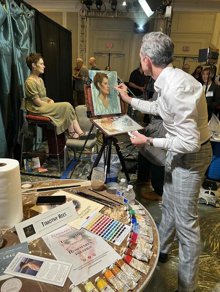
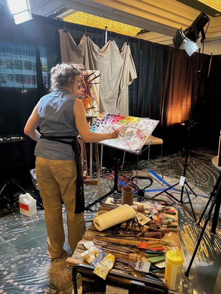
I was hit by the creative energy of the conference. The Face Off Challenge had an incredible atmosphere. People crowded around artists who were painting models from life, at the same time informing the audience about their approach to the portrait. It was a valuable experience to get up close to their colour pallets and see how they handled the paint. You could see so much, and understand the artists motivation.
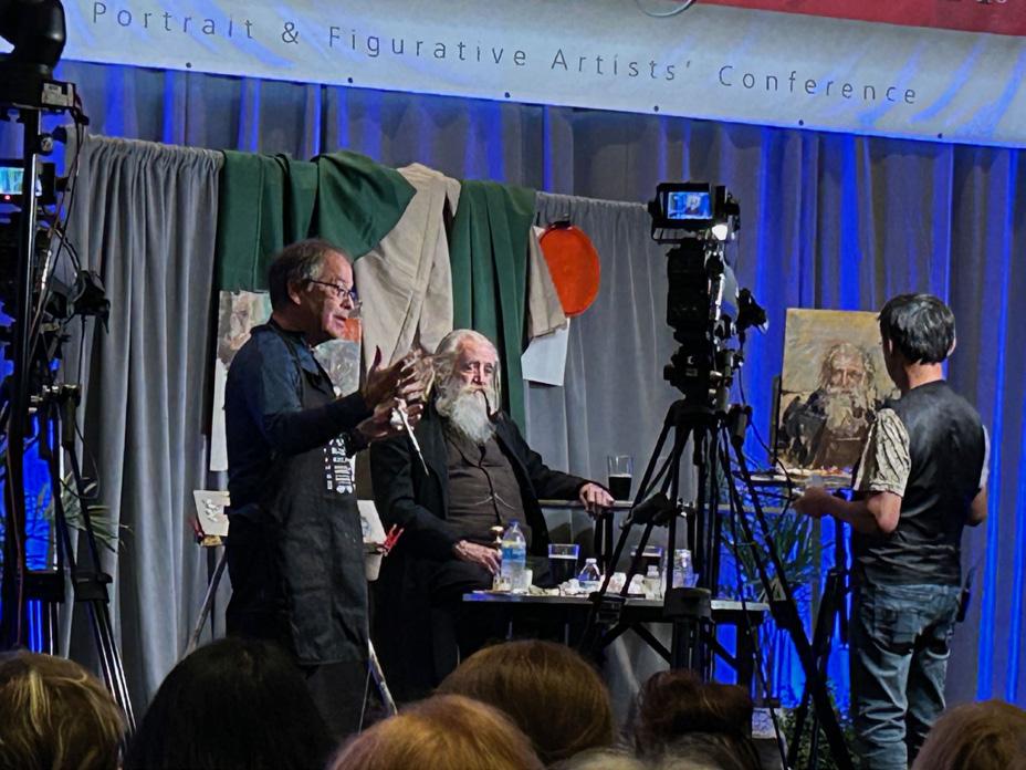
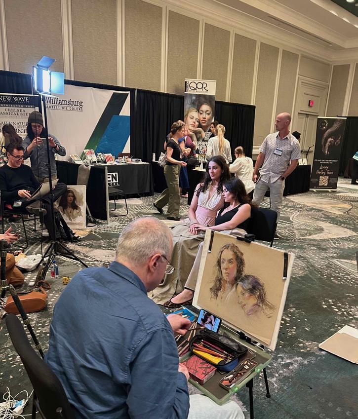
In other rooms different events were kicking off. There was a Future Generation demonstration showing young talented artists painting models from life. One of them was Phoebe Stewart Carter from the UK. To capture the likeness of the model Phoebe was using a mirror, an artists tool from the 17th century. Kind of ironic for the future generation artists! The work of the 19 finalists was on display in a special room. There were crowds of people trying to get a closer look at these exceptional paintings. The conference is attended by artists of all different levels, from world famous names to people enjoying it as a retirement hobby. There were also many students from the different schools in America. They had come to the conference with their mentor to learn more and soak up the atmosphere.
There was a full program of painting demonstrations with artists working on stage with models while explaining their approach. This kind of demonstration needs a lot of technical support. PSA did an excellent job using a film crew with multiple cameras that focused on the artist, the artwork and what was happening on the pallet. So everything could be seen on big screens using split images. How they managed to paint and at same time talk with the audience was truly impressive!
One of the most popular events were the portfolio critiques. You could choose an artist to look at your portfolio on an iPad, and give you guidance on how to improve. I felt like a child in a toy shop, so many great painters to choose from! I was lucky to get Ruth Fitton who was very encouraging and inspiring.
There were painting demonstrations from artists using Alla Prima techniques. I was fascinated by the approach of many American artists who could switch their styles from highly rendered realistic commission work to loose impressionistic studies that could be completed in less than an hour. Watching Rose Frantzen was really interesting. Very expressive, thick layers of paint, with dynamic brush strokes. Then she told us that she was working on a commission for a well known author, who of course wanted to be painted in front of his books, and he wanted the titles to be readable. So she had been working for weeks with a tiny sable brush to paint the lettering. It was so small she had to use neurosurgical magnifiers on her glasses to see what she was doing! However being a true professional, she prepared herself for the demo in Washington by painting a model from life every evening for a week, just so she could ‘loosen up’.
The Artists Market Place was a fun area where you could stock up on painting supplies and try out new materials. It was also a place where you could set up an easel and paint models who were sitting there for short poses. Walking around with a sketchbook was essential as supervised life drawing classes were also being offered.
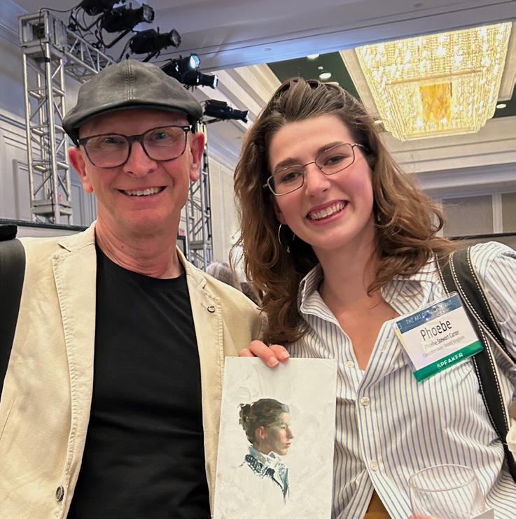
The Auction of Small works was a great moment, you got the chance to own a miniature painting from a great artist for just 250 dollars! The paintings had been donated by the artists and all the money raised went into the student scholarship fund. I was delighted to be the new owner of one of Phoebe’s self portraits.
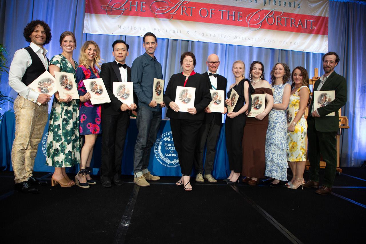
The gala dinner and prize giving was a wonderful evening. Frances Bell was the winner of the Draper Grand Prize and People’s Choice Award with her stunning self portrait. Laura Arenson was the other finalist who won an Exceptional Merit Award for an amazing portrait. I received a Certificate of Excellence Award together with Ruth Fitton. When I first started painting I never imagined I would be sharing a stage with such talented artists. I was thrilled beyond words. Thank you so much Portrait Society of America for this award and organising such an incredible event.
Members Spotlight
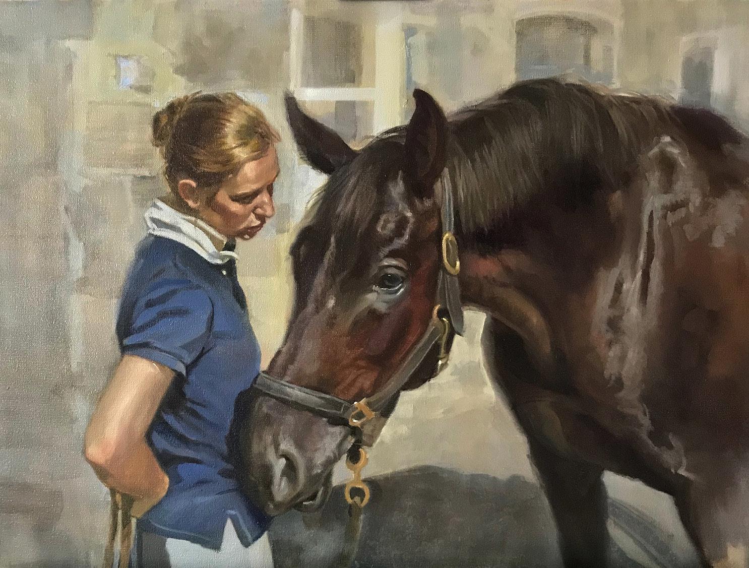
Victoria von Kap-herr (Germany)
Victoria von Kap-herr was drawing before she could walk. Born in Montreal to German-Austrian parents, she grew up surrounded by classical music and the fine arts—a world that shaped both her eye and her sensibility. She began her formal studies at the Montreal Museum of Fine Arts School, focusing on illustration with a special interest in animation. Travels through Europe, India, and Central America expanded her vision and deepened her artistic perspective.
Her career began in the United States as an illustrator, designing storyboards for advertising agencies, before she shifted her focus to equine and canine portraiture. These works quickly earned her recognition for their ability to capture the essence and character of both animals and their owners.
In Florence, under the mentorship of Charles Cecil, Victoria refined her mastery of light and form and adopted the four-colour Zorn palette—valued for its elegant simplicity and extraordinary tonal range. She later merged her illustration background with classical technique in Berlin, and in Vienna she drew inspiration from the Viennese Secession. Portraits—especially of animals—remain her favourite subject, allowing her to unite technical mastery with emotional depth. This September, she will lead a two-week workshop in Berlin on conceptual art for illustration students, working solely from live reference and imagination. Afterwards, she will return to her studio to focus on building a new body of work.
Image by Victoria von Kap-herr: Victoria with her painting
Image by Victoria von Kap-herr: “Where is My Carrot”, 80x65cm, Oil on linen, Commission
News from Members
Exhibitions, Awards and Other News
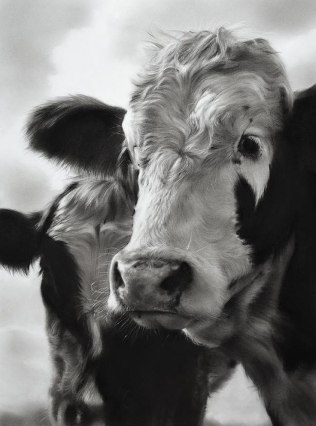
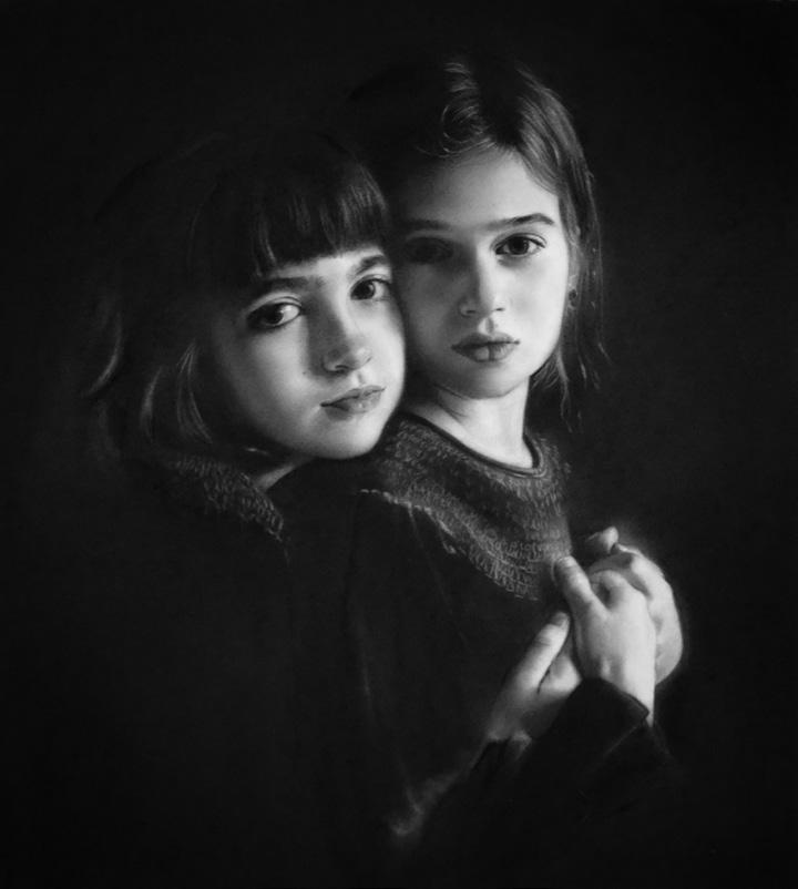
Rosanna Gaddoni (Netherlands) – Exhibitions and Awards
Rosanna’s latest drawings focusing on animals were included in the exhibition “Telling Stories” at Galerie Bonnard (NL), from 25 May to 29 June 2025 and her drawing”‘Companions” was on view in the exhibition “The Painted Nature” at Galerie Bonnard (NL), running from 6 July to 31 August 2025.
Her drawing “I See You” received the Best Animal and Birds Award in the PleinAir Salon, April 2025 and the drawing “The Cats Know” has been selected for the 65th Annual Exhibition “Art & the Animal” by the Society of Animal Artists. It will be exhibited at the Art Museum of Eastern Idaho from 10 October to 3 January 2026.
Rosanna’s drawing “Song for Myself” was juried into the Allied Artists of America 112th Annual Online Exhibition and her work “Sisters” received an Honorable Mention Award in the Stroke of Genius drawing competition by Artists Network, and will be published in the winter 2025 edition of The Best of Drawing.
Elske Wilton (Netherlands) - Exhibition
Elske’s latest portrait drawing will be exhibited in the Gallery De Molen in Wassenaar (NL) in August.
Images by Rosanna Gaddoni: Rosanna’s charcoal drawings “Stories” and “Sisters”
Image by Elske Wilton
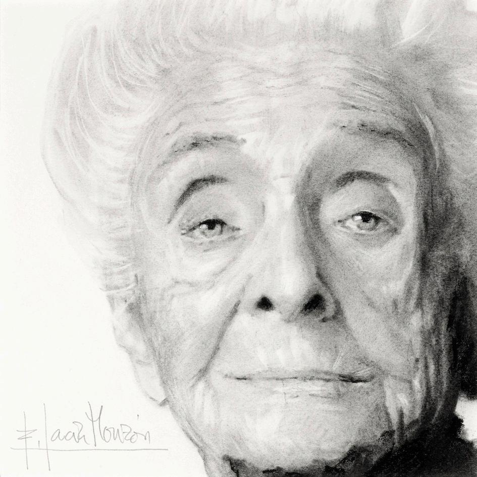
Fernando Garcia-Monzon (Spain) - Exhibition
In commemoration of the 25th anniversary of the Spanish Gallery “ArteLibre” a group exhibition of 120 works was held in New York, at the Atlantic Gallery” from 15th July to 2nd August.
Fernando’s contribution was a 20 x 20 cm portrait of Rita Levi Montalcini, a renowned Italian Noble Prize winner in Physiology and Medicine. Although its small size, the drawing shows his command of technique to fully capture the soul of the portrayed.
Alexandra Telgmann (Germany) - Shortlist Ruth Borchard Prize & Exhibition
Alexandra Telgmann was selected into the shortlist of the Ruth Borchard Prize, a biennial art contest that promotes and celebrates the practice of self-portraiture. The opening ceremony with an exhibition of the selected 37 artworks was held at the Russell-Cotes Gallery&Museum in Bournemouth (UK) in July. Alexandra said: “It was a great experience!”
Image by Fernando Garcia-Monzon: Fernando’s portrait drawing of Rita Levi Montalcini, 20x20cm
Image by Alexandra Telgmann: “Golden Ocean Reflections Dance – Self-Portrait”, 80 × 80 cm, Oil & 24-carat gold leaf on aluminium panel
InspirationThe Magic of the Color Blue in Art
By Andrea Steinbauer
While visiting an exhibition on storytelling in Old German and Old Dutch art, I noticed that most of the paintings on display had one thing in common: the use of the color blue. This caused me to find out more of what is so special about this color.
Blue is a primary color. In color psychology, blue stands for harmony and happiness. According to scientific studies, it has a calming effect on the human nervous system and can help to reduce stress. In rooms, blue creates a sense of well-being and a relaxing atmosphere. It reminds us of the boundless expanse of the sky and the depth of the ocean; it awakens longing and inspires dreams. As artists, we can use these emotions associated with blue to create a corresponding mood in our artwork.
Historically seen, the use of blue pigments became increasingly important in European painting in the 15th century, when artists began to depict the Virgin Mary in a blue robe. With this development, blue became a royal color, a symbol of the divine heaven, infinity, and immortality. For centuries, blue pigments such as lapis lazuli and azurite were amongst the most exclusive colors on the palette of European artists. It was only with the development of synthetic blue in the early 18th century that the color became affordable and available in a wider variety, leading to its widespread use.
Popular blue color pigments in oil paint:
Prussian Blue (Berlin Blue)
Pigment PB 27, dark blue, transparent, hight tinting strength
Cobalt Blue
Pigment PB 28, blue, opaque, low tinting strength
Ultramarine Blue
Pigment PB 29, red-blue, transparent, high tinting strength
Phthalocyanine Blue
Pigment PB 15, bright blue, transparent, high tinting strength
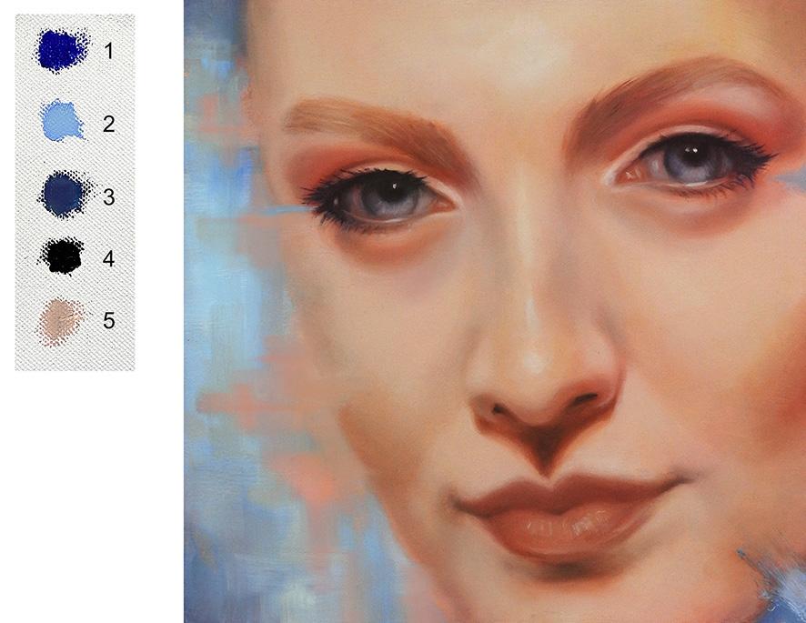
My favorite blue is French Ultramarine. It is an essential color on my palette and I use it to mix cool and neutral skin tones. In a mixture with Transparent Oxide Red it produces my favorite black, and I like to use it to mix my greens.
5
Image by Andrea Steinbauer: 1 French Ultramarine, pure 2 tint with Titanium White
3 desaturated with gray
4 mix with Transparent Oxide Red
in neutral/cool skin color
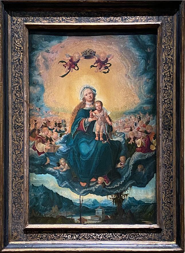
Photo by Andrea Steinbauer: Albrecht Altdorfer, “Virgin and Child in a Glory”, 1518, Castle Neuburg a.d. Donau