
THE COLLECTION OF JOHN AND SHEANA GELLERT


Auckland Art Gallery Foundation is dedicated to helping Auckland Art Gallery Toi o Tāmaki to be a thriving, thought-provoking visual arts platform for the benefit of generations to come.
To find out more about supporting the Foundation, please contact foundation@aagfoundation.nz

Secure your own private cask, maturing at Scapegrace Distillery in the heart of Central Otago.
A limited number of casks are now available for private ownership. As a cask owner, you’ll enjoy annual distillery visits for private tastings, witness your whisky evolve over time, and personalise your experience with a custom cask name and bespoke labels.


including works to be sold for the benefit of Auckland Art Gallery Foundation
Don Binney
Te Henga
acrylic and oil on canvas (1966)
800 x 900mm
Provenance: Gifted by the current owner to be sold for the benefi t of Auckland Art Gallery Foundation.
$400 000 – $600 000
Ralph Hotere I can hear you making small holes in the silence
acrylic and dyes on unstretched canvas (1979)
1830 x 900mm
Provenance: Private collection, Auckland.
$200 000 – $300 000


19 August


We are delighted to offer a major collection of rare books from the library of John Pritchard, a significant part of which originally came from the library of Alfred Eccles, grandson of Johnny Jones (Otago Whaling Pioneer). It includes important southern regional and New Zealand histories and a large number of military offi cial histories. Other major items include: an original fern album by Eric Craig; a rare copy of ‘The History of Tattooing and its Significance’ by W.D. Hambly; Augustus Hamilton’s ‘Maori Art’; Voyages and Exploration; a complete set of ‘The Voyages of Captain James Cook’ (1773-1784); Original manuscripts by Hone Tuwhare and James K. Baxter; Maps, historical photographs, manuscripts and documents.
09 September from 6pm
Pam Plumbly pam@artandobject.co.nz
+64 21 448 200


Eye-Catching Design. Timeless Elegance.

The Leica M11-P Safari perfectly embodies your passion for photography and emphasises your individual style. It makes a statement that combines timeless elegance, uncompromising quality and photographic precision. It was created for all those who love iconic camera art and exacting aesthetics.
www.progear.co.nz | +9 529 5055 3 Railway Street, Newmarket, Auckland 1023
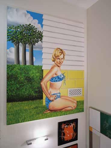
Interior view of the Brow residence featuring works by Liz Maw, Don Driver, Andrew McLeod, Jake Walker, Michael Parekōwhai and Séraphine Pick.
Simon Denny, Untitled (2006) plastic tablecloth, woollen blanket, static electricity
Ben Plumbly ben@artandobject.co.nz +64 21 222 8183

A two day Contemporary Art auction 22—23 October 2025


Art+Object is delighted to present The Collection of John and Sheana Gellert; not least of all for our long-held respect for this wonderful family of art lovers, who’s dedication to collecting New Zealand art over some fi ve decades has had a profound impact on the lives of numerous artists and the world they inhabit.
The 1970s and 80s, when much of the collection was assembled, were a time where New Zealand art was celebrating a new-found confi dence. The artists like Ian Scott, Michael Smither, Milan Mrkusich and Gordon Walters represented in this catalogue were thinking deeply about their practice and certainly had an awareness of what was happening in the art world beyond New Zealand’s shores. Their burgeoning interest in minimalism and abstraction refl ects developments in the international art scene and is superbly represented here.
This sale arrives at a buoyant time for the market; the Aotearoa Art Fair was a resounding success and New Zeal and is celebrating a return to the 61st La Biennale di Venezia in 2026, with a national pavilion where Dr Fiona Pardington will represent us on the international stage.
We look forward to sharing this superb collection with you; do join me during the weekend viewing for what promises an engaging conversation with one of Auckland’s most renowned collectors, Warwick Brown.
Yours sincerely
Leigh Melville
Art + Object. 3 Abbey Street, Newton, Auckland. PO Box 68345, Wellesley Street, Auckland 1141 Tel +64 9 354 4646, free 0800 806 001, fax +64 9 354 4645, info@artandobject.co.nz, artandobject.co.nz Instagram: @artandobject, Facebook: Art+Object, Youtube: ArtandObject

Auction
Tuesday 17 June at 6pm
3 Abbey Street, Newton, Auckland
Preview
Tuesday 10 June, 5pm–7pm
3 Abbey Street, Newton, Auckland
Viewing
Wednesday 11 June
Thursday 12 June
Friday 13 June
Saturday 14 June
Sunday 15 June
Monday 16 June
Tuesday 17 June
Floor talk
Warwick Brown in Conversation
Saturday 14 June, 3pm
3 Abbey Street, Newton, Auckland
9am–5pm 9am–5pm 9am–5pm 11am–4pm 11am–4pm 9am–5pm 9am–1pm
Art+Object
Saturday 14 June
3pm

Please join us to hear Warwick Brown in conversation with Leigh Melville as they discuss Warwick’s unique relationship with John and Sheana Gellert and their collection, art collecting in all its various forms, the vagaries of the changing artworld, and why the collecting bug is one he just can’t seem to shake.
Warwick Brown is John Gellert's brotherin-law. He and his wife Kitty purchased the first artwork for their collection in 1969. Ten years later, together with Peter Webb and Grahame Reeves, he founded the country's first art buying group, The Prospect Group, and invited John and Sheana Gellert to become members. Brown is the author of numerous books on New Zealand art and is himself a practising artist.


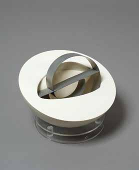
Terry Stringer
Bench/Woman 1985–1986
‘Aspects of Recent New Zealand Art: Sculpture’ Auckland City Art Gallery, March 25 – May 25, 1986
Since founding the business in 2007, Art+Object has undergone several shifts and changes. One constant has been our focus on finelyprovenanced private collections of Aotearoa-New Zealand art. Through the last near-twenty years we’ve been truly blessed in presenting many of the country’s most significant and interesting private art collections. Each of these collections are unique and they all bring with them both rewards and complexities for us in unveiling them to the public and attempting to maximize both the cultural and economic value for our vendors and the collector’s legacy. Every collector is also unique, and their collection reflects everything from their world view, philosophies, relationships, means and, of course, their tastes.
We are delighted to be offering the collection of John and Sheana Gellert in this catalogue. Whilst much of the collection has been unseen to the overwhelming majority of you, a great deal of it has been visible before through John Gellert’s law practice, latterly Gellert Ivanson in St Heliers, and through recent high-profile museum exhibitions. The collection has its genesis in the late 1970s and the formation of the Prospect Group collection, the country’s first art buying collective. Whilst art buying groups are fairly ubiquitous today, it is arguable that
the Prospect Group remains the most interesting and ground-breaking buying group formed in this country. Alongside the Gellert’s, members included the inimitable Peter Webb and Warwick Brown, John Gellert’s brother-in-law. The Prospect Group included 22 members, each of whom paid an initial $500 and then $250 annually thereafter. Highlights from this collection included a major Gordon Walters’ ‘Koru’ paintings and one of Colin McCahon’s ‘Visible Mysteries’ paintings.
The maxim that art buying groups are a great way to introduce potential collectors to the joys of art collecting could not be truer in this instance and soon after John Gellert was regularly ducking downstairs from his law practice in the CBD to Petar/James and New Vision galleries where he acquired major works by Gordon Walters, Milan Mrkusich, Ian Scott, Richard Killeen, Stephen Bambury and others. If the Prospect Group precipitated the arrival of the collecting bug, then Petar Vuletic ensured its bite would be felt for decades to come.
Unlike many of the provenanced private collections we’ve been privileged to be involved with in recent times, the John and Sheana Gellert collection is a definitively ‘Auckland’ collection. Its beating heart is in their holdings of Auckland painters like Ian Scott, Richard Killeen, Geoff Thornley, Mervyn Williams, Stephen Bambury and Milan Mrkusich. The Gellert’s collected and connected. In the family archives, there’s a lovely story of the Gellert’s celebrating the acquisition of a Gordon Walters painting with him and Petar Vuletic. Clearly sales and ‘believers’ were in short supply for the artist at this point.
If John was the driving force in the early stages of the Gellert collection, then in more recent times it has been Sheana who has dutifully maintained and cared for it and kept the collecting flame burning bright. After John passed, Sheana downsized, filling every available wall and space of her new townhouse in Ōrākei with their treasures and always making time for fortunate visitors, such as myself, for a tour of the collection.


Finally, just as the life of the art object outlives us all, it seems fitting to note that the Gellert collecting gene has now been passed onto the next generation. As well as being an ‘Auckland’ collection, The John and Sheana Gellert collection is also very much a family collection.
Ben Plumbly

In 1972, after two years teaching art at Nelson Boys college, my father, Ian Scott, moved back to Tāmaki Makaurau, Auckland. That year the Petar/James gallery opened in the CBD, and a few floors up in the same building, John Gellert had begun working as a solicitor. In part through this happenstance, John became a regular visitor to the gallery. In 1973 my father had the first of several exhibitions there, and he and John met, eventually becoming friends.
Although the Petar/James Gallery survived for barely a decade, it had an outsized influence on art in this country. Along with the vision of its artists, its founder Petar Vuletic had an uncompromising belief that local art needed to move beyond regionalism, into the new international languages of colour-field painting, and minimalism. At that time, this kind of art had bite, and edge, and it was hugely challenging to both conservative, and mainstream taste. Even as late as 1978, when my father won the national art award, people would still sometimes unashamedly tell him, “Their kid could do a Lattice”. Against this parochial context, John became a regular buyer from the Petar/James Gallery, and his early support was important and unique. Gallery director Petar Vuletic reflected that at that time John had, “a very rare interest and curiosity about what he saw.”1
In 1978, my father met my mother, Nan Corson. Not long afterwards, she met John and Sheana. “I remember very clearly Sheana’s dazzling warm smile, and John’s enthusiasm and respect for Ian’s work. I knew they were special people in his world, and soon they became special in mine too. The beginning of a life-long friendship.”2
Throughout the 1980s, John and Sheana continued to collect art intensely, to the point they were running out of space. A problem compounded by the fact that many of the artists they supported –especially my father – were now working at a scale previously unseen in this country. In 1989, John co-founded Gellert-Ivanson lawyers on Tāmaki Drive in Kohimarama, and with a new ‘gallery’ to fill, their collecting began afresh. John wrote in 1993, “Although clients may not
at first appreciate the work, it is noticeable that after several visits many of the clients make positive comments about it.”3 His comment shows that he saw his law office collection not as background decoration, but as an educational semi-public gallery.
By 1987, my father felt most of what could be explored with abstraction had been. He was then at the height of work on The Lattices (of which John and Sheana own No. 1, a work you might assume would be in a public gallery), but he made a dramatic change in his work anyway. Turning away from abstraction, he began making work which meditated on landscape, text, literary refence, and regionalism. The move was not popular with collectors who had only just accepted ‘The Lattice’ series , and even as a five-year-old, I could see the stress this sudden withering of support had on my father, and our family.
John and Sheana were among the very few collectors whose support remained as my father tried to grow and change in his work. They knew exactly what they were doing, and the position they were taking. In 1993, John wrote in a foreword for an exhibition catalogue, “Unlike many artists Scott has not been satisfied with continuing to paint the work which is most ‘popular’ and for which he is best known.”4
Recognising the difficulty of this period, and seeing that my father needed a break, from the early 1990s, John and Sheana began letting us stay at their old beachfront caravan at Whangapoua in Coromandel. Today, these seafront properties are crowded with multimillion-dollar mansions, but then it was a remote beach community with just one street of houses, flanked by an affordable campground. For John’s entire life he held out on building a house there. He preferred the honesty and simplicity of the old caravan and outhouse, (and later, a tiny bunkhouse for his kids.)
Even after John’s death, (and my father’s, a decade later), Sheana continued to let us use the property, which by then was a modest beach house, in which several of my father’s small Lattices and watercolours
hung on the walls. For his entire life, my father loved painting landscapes, and at Whangapoua it was like he was free from the normal pressure of being an artist. Each day he would walk kilometres over the hills, around the coastline, and harbours, painting watercolours. As a kid it wasn’t easy to keep up, but looking back, it’s clear the overgrown concrete ruins of Whangapoua’s 19th century sawmill, and the then magic wildness of the place was a huge influence on my own art now. Memories of climbing through wild blackberry on the headland’s ancient Pā, and swimming between the breakers in rockpools off the cost in clear summer light, are forever etched in my mind.
My father was a shy person, and he hated public speaking. His respect for John was such though, that at John’s funeral he gave a lengthy eulogy, which he ended simply with, ‘John was one of the good ones.’ By this point John and Sheana’s house was well and truly full of art, and they had mostly stopped collecting. Even so, she continued to come to openings, offering warm support, and her friendly biting sense of humour. As a couple, they exemplified what supporting artists could look like.
Chris Corson-Scott

Neither of my grandparents considered making a career in art. Instead, my grandmother worked within early childhood and dedicated her time to looking after her four children within their home, while my grandfather studied law and was to eventually form his own practice.
Collecting art for my grandparents began in the early 1970s when they first became exposed to Petar Vuletic’s Gallery, conveniently placed below my grandfather’s law practice. During lunch, my grandfather would take the time to look at the stable of artists on display. As his interest in contemporary art grew my grandparents then joined, upon the invitation of Warwick Brown, the first art group collective in New Zealand, the legendary Prospect Group Collection, and within this group they began collecting art from the many skilled emerging contemporary artists that had become active during that time. During the ten years my grandparents collected within the Prospect Group their eagerness and presence continued to grow which then motivated them to begin collecting privately. During this time my grandfather had started to become more established within his practice and their family was beginning to grow. This opened up a lot more opportunity and motivation to collect as their larger available income could be dedicated
to collecting. They could begin to fill the empty walls of my grandfather’s law practice and their newly built modern home. Having now collected over 200 individual works, my grandparents have presented a collection that represents the forefront of contemporary art over the last 50 years.
Collecting contemporary art was another way for my grandparents to express their passions and interests, and they found they could also do this within abstract contemporary art. They felt abstract art did not confine them to one or the other, and they did not feel restrained by either art-historical or institutional requirements. Unlike some other collector’s motives, they did not see the collection as trading stock and so were not unduly influenced by the potential escalation in value that their choices would achieve in the market; instead my grandparents collected what excited them, but of course they had to consider their relatively modest budget.
There have been many times my grandparents have been confronted with doubt, but their confidence in their community prepared them to grin and bear the many opinions shared by those detached from the world of contemporary art. “Oh your children paint?”: to that they would respond politely and would smile at the disbelief that crossed the many faces when they were told how much the artwork was bought for. “$2000? For a red square?” (Milan Mrkusich’s Painting (Red), Lot 28), but of course to my grandparents it wasn’t about their money; instead, the investment

was into the artists, their career and the lives that they supported. Collecting primarily from artists that were only a few exhibitions out of art school, my grandparents relied on the relationships formed and their own personal attachment to the artworks they collected. This in turn has resulted in some unforeseen profit but a larger increase in personal value.
I have seen how my grandparents’ commitment to contemporary art has contributed value to the community, and how through their support they have personally promoted so much of the success and development of many New Zealand artists and their evolution within the contemporary arts ecosystem since the 1970s. The growing success in my grandfather’s career correlated with my grandparents’ desire to focus on giving support to local and aspiring New Zealand artists. Blending the personal passion my grandfather had for contemporary art with his professional practice, he created a unique environment that transformed the offices of his law firm, and grew to resonate in an entirely different way. The art slowly became a part of the firm’s identity, while encouraging and promoting contemporary art to the public.
Over most of the 21 years of my life, the Gellert Family Collection has provided me with a continuous stream of support and visual stimulation that I feel has contributed to getting me to this stage in my life as a Visual Communication Design graduate. It was a privilege to be able to grow up surrounded by so much talent, on the wall or otherwise.
Stella Davis


Paul Beadle, The Crucifixion with the Virgin Mary and St John, cast bronze, wood and nails, signed and with artist’s monogram and dated 1980 verso, 325 x 315 x 150mm. $4000 – $7000
2
Greer Twiss, Untitled – Cushion and Vice, cast bronze and found vice, signed and dated ’81, 90 x 150 x 110mm. $1000 – $2000


$15 000 –


Gordon Walters, Rauponga, screenprint, 15/50, title inscribed, signed and dated June 1983, 480 x 540mm. $8000 – $14 000
Gordon Walters, Then, screenprint, 4/125, title inscribed, signed and dated 1980, 435 x 557mm. $4500 – $7500


Ian Scott, Sail, acrylic on canvas, title inscribed, signed and dated 1981 and inscribed Cat No. 109 verso, 375 x 375mm. $4000 – $7000 8
Ian Scott, Colour Diagonal No. 5, acrylic on canvas, title inscribed, signed and dated ’74 verso, 358 x 358mm. $3000 – $5000


signed and dated 1974, 517

Michael Smither, Huntley and Palmers Cracker Biscuit, oil on board, 1973, inscribed Cat No. C/407 on original Peter Webb Galleries (Lorne and Wellesley Streets) label affixed verso, 830 x 830mm. Illustrated: Trish Gribben, Michael Smither: Painter (Ron Sang Publications, 2004), p.160. $65 000 – $85 000
In 1973, when the artist was just 34 years old, art critic Patrick Hutchings described Michael Smither as a leading young contemporary New Zealand realist. Smither was mostly self-taught, although he had begun a Diploma of Fine Arts at Elam in 1959, leaving in July of the second year to work towards his first solo exhibition at Moller’s Gallery in Queen Street in 1961. Recognition was instantaneous, and he was curated into the Auckland City Art Gallery exhibition “Contemporary New Zealand Painting”.
Flush with success, he headed south to the isolation of Patearoa in Otago, to hone his skills on his own for most of 1962 before returning to his hometown of New Plymouth to marry and have a family. By 1970 he was back in Otago as the Frances Hodgkins Fellow at the University. The late curator Ron Brownson called the period from 1964 to 1978 the “wonder years” of the artist’s career, characterising the work of this era as magic realism. “I paint what’s in front of me,” Smither said, exhibiting the works painted between 1966 and 1973 under the title “Domestic Realism” at Peter McLeavey Gallery.
Even though he once told The Taranaki Herald that “overseas art is irrelevant”, this work indicates international influences. As a faithful rendition of a water cracker topped by a crinkle cut piece of cheddar, it recalls American Pop Art, a movement much concerned with consumption. In 1964 a New York gallery grouped works by Andy Warhol (Campbell soup cans), Wayne Thiebaud (display cakes) and Roy Lichtenstein (hot dogs) in an exhibition titled “The American Supermarket”. Depicting food was a way to achieve one of the aims of Pop Art: to bring popular culture into fine art practice.
Like Warhol, Smither has chosen to depict a product associated with an iconic brand in his bold composition. If there is a slightly mournful tone to this orphaned biscuit, it could be because news had reached Smither in 1972 that Huntley & Palmers, a Quaker bakery that had been operating for 150 years, was closing its Reading factory. Was the era of the after-school cracker and cheese coming to an end? Reassuringly, the cream cracker survived. It is still on the menu in many kiwi homes, its dimpled surface embossed diagonally with the Huntley & Palmers name. Its continuity of manufacture is a reminder that these were the sustaining biscuits taken to the South Pole by Robert Falcon Scott in 1910.
Smither endows this cracker with the same special treatment as it gets on the traditional product packaging: it is viewed from above and dramatically foreshortened, making it loom up from its fashionable orange background. As a young painte r steeped in Catholicism with its doctrine of transubstantiation where a communion wafer symbolises the body of Christ, Smither is able to transform this humble snack into a symb ol of heroic fortitude and endurance.
Linda Tyler


Richard Killeen, Floating Islands, acrylic on paper, signed and dated 4.3.86; title inscribed, signed and dated 4 March 1986 and inscribed Cat No. 525 on artist’s original catalogue label affixed verso, 760 x 580mm. $3000 – $6000
15
Richard Killeen, Tropical Pattern, silkscreen print, 23/50, title inscribed, signed and dated November 1978, 555 x 450mm. $2500 – $4000


Richard Killeen, The Politics of Difference, alkyd on aluminium, 15 parts, signed and dated 1984; title inscribed, signed and dated March 1984 verso, 2300 x 2900mm: installation size variable. $60 000 – $85 000
In 1976 Richard Killeen won the Benson & Hedges Art Award for Frogshooter, a painting in which images of aquatic and amphibious animals are concealed within a grid constructed using a saw-toothed comb motif. I remember seeing it at the Peter McLeavey gallery in Wellington and enjoying the search I had been invited to make through the interstices of the grid for the imagery hidden therein. Two years later, Killeen abandoned the grid altogether, released his creatures and started making works in which images, cut out and painted, stood alone in wallbased assemblages whose order was flexible and could be determined by the owner or the exhibitor; and, in at least one case, at the Auckland City Art Gallery in 1982, by members of the public. It was a breakthrough which has sustained him for the rest of his career.
As Neil Rowe remarked at the time, these works feature ‘logo-like, pictographic shapes, which swarm silhouetted over the wall in an infinite variety of pictorial arrangements.’ Last year Peter James Smith reiterated: ‘these shadowy shapes are essentially pictograms.’ Killeen himself said he banished the grid out of ‘discontent with the compression caused by the four static points of the frame.’ The consequent freeing of his imagery (‘off-stretcher presentation’) gave him a multitude of motifs, including invented shapes, to play with, in a wealth of potential arrangements. In effect, they are glyphs which may be re-ordered to write any number of sentences and paragraphs.
The Politics of Difference (1984) is an early example of the works generated by this method. There are fifteen discreet, often portmanteau, motifs in the painting. Some are figurative — a flamingo, two fish, a dog, a fly (and its reflection), a goat-like creature, albeit with a foot protruding from its back, the façade of a building — while others, if not exactly abstract, seem to hover upon some equivocal line between the ab stract and the figurative. All are colourful and all may be seen as provocations, not just towards sense but towards inquiry. They are enigmatic but not necessarily inscrutable: witness the façade of the building at the bottom of the current arrangement, with the words ‘Australian Pensioners League’ written above the lintel of the door.
Australians nationwide were granted the pension in 1908; the League came into being between the wars to lobby government about anomalies an d injustices in the system. It was a voluntary organisation with benefits for fee-paying members, including a funeral fund. Quite what the image is doing in a Killeen painting is a moot point; but it might be taken as one of the points of reference for the title. Or not. Belgian surrealist René Magritte was in the habit, after he finished a painting, of calling in his friends and colleagues to consult upon what he might call it. I don’t imagine Killeen does this but his titles are, like Magritte’s, frequently oblique if not actually obscure. Alternatively, in the words of Marcel Duchamp, ‘a title is just another colour added to the painting’.
Killeen cannot be considered a true surrealist; nevertheless he has found a way of painting which uses dream-like imagery and allows multiple modes of representation, thus giving his audience the opportunity to decide for themselves how a work should look and what it might mean. You could say he is a serious painter who has made play the essence of his art; play that is witty, perceptive and with real world consequences. The Politics of Difference is an excellent example of the deft, elegant, intriguing, resonant and ultimately mysterious works he makes.
Martin Edmond


19
Ian Scott, Small Lattice No. 173, acrylic on canvas, title inscribed, signed and dated ’88 verso, 458 x 458mm. $5000 – $8000
Ian Scott, Sprayed Light, acrylic on canvas, title inscribed, signed and dated 1974 verso, 1725 x 835mm. $12 000 – $18 000


Note: This Desk and Chair were the silver medal winner in the 1987


Guy Ngan, Bronze Habitation No. 105, cast bronze on original stone base, title inscribed, signed and inscribed Raukawa St, Stokes Valley, New Zealand to underside, 120 x 200 x 200mm. $18 000 – $26 000


Milan Mrkusich, Chromatic – Meta Grey No. I, acrylic on board, title inscribed, signed and dated 1970 verso, 710 x 1220mm. Illustrated: Alan Wright and Edward Hanfling, Mrkusich: The Art of Transformation (Auckland University Press, 2009), plate 54. Exhibited: ‘TransForm: The Abstract Art of Milan Mrkusich’, Gus Fisher Gallery, Auckland, 6 March – 2 May 2009. $65 000 – $85 000


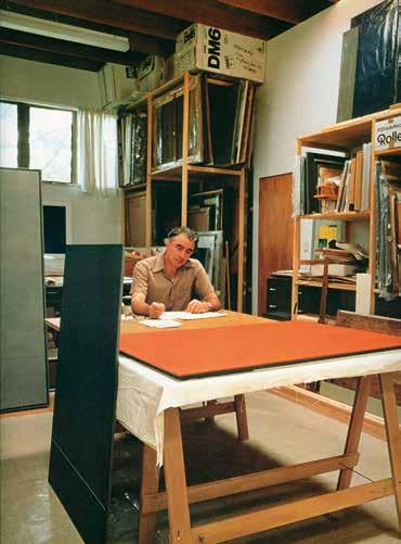
I met Milan Mrkusich (1925–2018) several times and talked to him at gallery openings and once visited him in his studio and house where I was taken by painter James Ross. Two memories remain: one of the order and precision, the careful filing of completed work, the protective plastic and the pristine surface of his worktable (no paint splashes or dribbles here); the other is of a copy of Saint Augustine’s City of God open on his nearby work desk. Readers of Augustine’s book will know that it is voluminous and it was clear to me that Mrkusich’s copy had been much read and thumbed through. There exists a photograph of Mrkusich taken by Adrienne Martyn in 1987, that is remarkable for what it suggests about Mrkusich’s character and his art. Heavy-lidded, silver-wisped eyebrows, long arms crossed, a crumpled white linen shirt, the sitter exudes a certain coolness and elegance: this we soon realise is a lover of fine clothes, refined design and skilled workmanship. While the raffish Mrkusich is seated at an impersonal distance — which his crossed arms rein force — there is something sensuous (the dark circles under the eyes, the full mouth, the large yet delicate hands — painting is a medium of the hand) that draws you in. And enigmatic: is the meticulously stapled canvas to the reversed stretcher visible on the right a record of work completed or an intimation of work to come? It might seem a little facile to suggest Mrkusich’s painting is like his character but uncannily it
is. Mrkusich believed in his art; his dealers (like Peter McLeavey and Sue Crockford) and he believed that art was serious. His paradigms of seriousness were also architecture and design. In 1949 together with three architects — Stephen Jelicich, Des Mullen and Ron Grant — Mrkusich set up Brenner Associates, a one-shop stop for the modernist homes they designed. Operating initially from an office in Queen St and then moving to Vulcan Lane where a shop was opened to retail their own and other designers work, local and overseas. In 1951 Brenner Associates, with Mrkusich’s considerable input, designed his outstanding home in Arney Road: an open design of three floor levels on a steep hillside section unified by a roof-plane at a twenty-degree pitch. Mrkusich also designed the aesthetically integrated furniture and fittings. Today, unless the city council or a patron purchases it, this local modernist masterpiece risks being bowled for a new terrace of nondescript townhouses.
Although he had never left New Zealand, Mrkusich seemingly embodied the Bauhaus. Whereas Gordon Walters’ ‘modernist shift’ entailed the mentorship of ex-Bauhaus protégé Theo Schoon, Mrkusich seemingly did it on his own with the help of magazines like Art and Architecture and books from the Auckland Public Library.1 His colleague Jelicich wondered at his “inventiveness and natural application of design principles.” 2 Perhaps the best way of defining Mrkusich’s particular talent is to compare him to some of his contemporaries who were also concerned with abstraction. McCahon seized pictorial space on a similar scale, confronting the beholder with the sheer physicality of painting, but always with internal suggestions of hazy religious portent. That was part of his poetry. Mrkusich’s style instead is more of an august prose. Perhaps he found justification for his high ambition — for himself and for painting — in St Augustine? I am reminded of Augustine’s words: “Faith is to believe what you do not yet see; the reward of this faith is to see what you believe.” 3
Mrkusich was born above a fish and chip shop in Dargaville and moved to Auckland in 1927 when he was two. Of Dalmatian descent his parents came to New Zealand from Podgora after World War 1. Mrkusich’s father initially worked in the Northland gumfields. Does Mrkusich’s painted surface embrace the simultaneous op eration of two apparently divergent value systems, a double-sided modus vivendi that marks the condition of Dalmatian immigrants in New Zealand? The one side embraced Epicureanism in the nobility and enjoyment of food, wine, life and family; these were the tarara, Dalmatian ‘fast talkers’ who integrated so well into Māori society. The other exemplifies austerity, piety, the vanity of the restrained, industrious work ethic of the gumfields; the sobriety of the successful immigrant intent on carving out a successful niche in the new world. But rather than these opposing norms guaranteeing a permanent condition of schizophrenia for Dalmatians they came eventually to function together within a single overarching community. To stand in front of a Mrkusich painting, I want to argue, is to experience this ambivalence.
In 1942 Mrkusich took up an apprenticeship in Writing and Pictorial Arts with Neuline Studios — an early New Zealand film studio founded by Robert Steele an Australian-born producer — while also attending night courses at Seddon Technical and taking separate lifedrawing classes. Though he returned to the commercial art studio after painting full-time for
1 Mrkusich purchased a copy of R.H. Wilenski’s Modern French Painters (New York: Harcourt Brace, 1954) while at Neuline and consulted books on the Bauhaus at the Library. See Allan Wright and Edward Hanfling, Mrkusich: The Art of Transformation (Auckland: Auckland University Press, 2009), p. 3.
2 Stephen Jelicich, ‘My Recollections of Brenner Associates,’ (1999), Te Papa Collections.
3 The Works of Saint Augustine (Electronic Edition), Sermon 43.1, p. 238.

Milan Mrkusich, Blue Squared, oil on canvas, title inscribed, signed and dated 1967 verso, 1310 x 1310mm. Exhibited: ‘Trans-Form: The Abstract Art of Milan Mrkusich’, Gus Fisher Gallery, Auckland, 6 March – 2 May 2009 (touring to City Gallery, Wellington). Illustrated: Alan Wright and Edward Hanfling, Mrkusich: The Art of Transformation (Auckland University Press, 2009), plate 45. Literature: Alan Wright and Edward Hanfling, Mrkusich: The Art of Transformation (Auckland University Press, 2009), pp. 57–58.
$120 000 – $180 000

Milan Mrkusich, Chromatic Circle 62–64, oil, sand and collage on board, title inscribed, signed and dated 1967 verso, 1220 x 862mm. Illustrated: Alan Wright and Edward Hanfling, Mrkusich: The Art of Transformation (Auckland University Press, 2009), p. 109. Literature: Alan Wright and Edward Hanfling, Mrkusich: The Art of Transformation (Auckland University Press, 2009), p. 110. Provenance: Purchased from Petar/James Gallery, Auckland, March 25, 1976. $120 000 – $180 000
two years, those two years laid the groundwork of his geometric painting style. His early work, like the 1946 Constellations, consisted of networks of black lines that double back on each other and capture floating coloured shapes. This work recalls both Alexander Calder’s mobiles and Ben Nicholson’s painted reliefs. Derived from other artists the shapes all sit on the surface regimented and flat and decorative, and there is li ttle here that could be recognised as a later Mrkusich (although his subsequent Arc paintings of the early 1980s brought back the curving line). Then, influenced by Paul Klee (who himself was for a time a teacher at the Bauhaus), and by the many mosaic murals he had been commissioned to complete around Auckland, Mrkusich’s paintings became accumulations of tiny patches of colour that colonised his canvas surface. The most famous of these is Auckland Art Gallery’s City Lights (1955). After that comes one of those apocryphal stories often told of artists: one day in 1959 in his studio Mrkusich carelessly knocked one of his freshly-painted patch paintings off the easel and as it slid across the floor he found that the surface tiles had all smeared.4 He had discovered what would become his ‘programme’: the construction of the surface. As he later specified: “The surfaces … and their uniqueness, I think, is my own uniqueness.”5 With his next group of works known as Emblems the painting is no longer the result of a previo usly conceived design, now in rough rectangles and blobs his brushstrokes fight with each other, and a transition seems to have taken place with an ease that beleaguers what must have been Mrkusich’s struggle. It was a kind of painting that seemed easy, but it wasn’t easy for it wa s intensely skillful too. Everything now depended on the physical presence of a surface on which brush marks and variations of tone and colour worked their magic.
Despite many changes in the work (after the Emblems come the Elements then the Corners and the Meta-Greys and the Journeys) what counts now is the surface. A painting like Chromatic Circle 62–15 (1962–64), painted over a two-year period, marks a transition from the mélange of brushstrokes back to geometric form: the unruly chaos of the coloured circle collapses down into the semi-geometricised, brushstroke-like debris at the bottom of the composition. However, the entire effect still depends upon a brushed and stippled surface. And though even from a short distance away the surface of many Mrkusich paintings looks uninflected and impersonal, as though the paint had been laid on with a roller brush, step up close to a later painting like Blue Squared (1967) and you see that it is stippled on and alive. You see how much of the artist’s touch is visible in the way the underlying colour peeps through a paint surface covered in dabs and splotches of paint perhaps applied with a short brush held in a clenched hand. To create the matte surface that makes the painting as sensuous and vulnerable as soft skin, Mrkusich jettisons story, myth, and illusion, an d with them representation and spatial depth. At the time of their making these paintings were seen as arid and cerebral, nailing a spiritual vacuum at the core of an increasingly secular society. Now, of course, we understand that the strength of Mrkusich’s best work has always been its winning combination of perceptual subtlety and sensuous immediacy. It is this odd alliance of the rational (the scaffold of the painting shape — its frame and the geometric elements it contains) and the ascetically luxuriant (the tantalising vortex of colour we must lose ourselves in) that has made Mrkusich such an awkward fit for the canon of New Zealand mode rnism, where too often the elemental purity of his work has been mistaken for jejeune intuition or otherwise blankness. At one end of the opinion spectrum, critics nervous of pure shape have tried to square his singular manner with the standard categories of art historical convenience — minimalism, high formalism, colour-field
4 See Wright and Hanfling, Mrkusich, p. 25.
5 Milan Mrkusich, 1976 https://christchurchartgallery.or g.nz/collection/2005078/milan-mrkusich/painting-1972.
abstraction — none of which actually suit. No foreign modern movement or style actually ‘suits’. At the other end, are those who peer at the paintings and see nothing but flat geometric shapes and blank spaces. What these critics don’t perceive is that Mrkusich’s art is about receptivity and reflected responses to the phenomenal world. It appears for us, as it shines forth and shows itself, and we incline our attention towards it; or tilt our head to see as it rushes up towards us. “Colour is a life-force,” he responded to a journalist quizzing the logic of his coloured, enamelled glass spandrels for the façade of Te Papa in Wellington.6 There is something both effusive and inscrutable about the visuality of his work. As I have suggested, the evident fullness of his painting has a sense of the ‘too much’ and often their blankness may seem a deliberate ‘opting out’. But this refusal or turning away is consistent with notions of the ineffable as the unrepresentable, formless chaos that underlies the familiar structures of our habitual world. This is perhaps because within the sphere of colours, Mrkusich’s chromatic hues marked by the achromatic (if that is what they are) are themselves often treated as abstractions, and thus open to more generalised statements about their meaning or symbolic value. Nevertheless, colours are often felt by way of metaphor and association — in terms of what they are like: warm, cold… — whereas colour is often discussed in relation to what it may be distinguished from, in terms of what it is not like. We cannot touch colour, even though it constantly surrounds us and we are in some ways always touched by it. One of the paradoxes of colour is that it is at once truly universal and unaccountably particular to each painter, each viewer; it is something vividly experienced by almost all people almost all of the time, and yet our understanding of the nature of this experience remains rudime ntary and contested, perhaps unshareable (for all of us are colour-blind). Above all, it is almost impossible to put the experience of colour into words in anything but the most bland and general ways. For, as Bauhaus colourist Josef Albers once luminously declared, “colour deceives continuously.” 7
The first thought now, a hundred years after his birth, is that Mrkusich has been vindicated. He has become one of New Zealand’s ‘old masters’ along with Walters and McCahon, recognisable, inimitable, ‘grand’ even. The accompanying thought is that in achieving this place Mrkusich’s work now loses something of its power, it is now accepted, sublime, calm and unclouded by a sense of questioning. So, it loses the edge it once had. Have those of us who like his work let him down in an obvious sense when we find his work easy and now expect to see his paintings alongside those of McCahon and Walters in public gallery collections? Somehow, he deserved to reverberate in the work of subsequent artists in Aotearoa but he doesn’t. Mrkusich was the first to use the corner wedge that McCahon later exploited as did Walters. His ‘Corner Paintings’ of the 1960s and 70s are some of his best. Painting Red (1974) is one of the finest of these. Here his cloudy red with its corners — variants of red — beguiles us with its power. For red is the sign of supremacy: the traffic light that commands us to stop; the teacher’s pen that corrects your essay; the Ferrari speeding in the wind you lust after; the Cardinal’s robes. Mrkusich’s corners operate like the stones you might place at the corners of a loose page to stop it lifting in the breeze. Like a graphic mat the corners hold the image down, isolating it for purely visual contemplation. But few other younger artists have found a way to pursue the implications of his work and none of his younger contemporaries was particularly close to him — although he did for a short period join the meetings of an informal group of Walters, Killeen, Scott and Thornley centred around Petar Vuletic’s Auckland gallery.
6 Quoted in Helen Watson White, ‘An elemental collection of work from one of New Zealand’s masters,’ Sunday Star Times, 7 April 2002.
7 Josef Albers, Interaction of Color (New Haven and London: Yale University Press, 2013 [1963]), p. 1.

Milan Mrkusich, Painting (Red), acrylic on canvas, title inscribed, signed and dated 1974 verso; original catalogue label affixed verso, 1730 x 1730mm, Provenance: Purchased from Petar/ James Gallery, Auckland, 25 March 1976. $140 000 – $220 000

Perhaps Mrkusich’s seriousness — St Augustine again — is still there to be pursued? There is a general unwillingness to engage with what we might call his ‘intelligence’ and the fact that whatever it is that takes place between the viewer and the painting has a phenomenological dimension. We now tend to think of the colour, the depth of focus, the painterliness as nostalgic, as if Mrkusich were somehow the last painter who could be painterly before the expressionistic turn to figuration in the late twentieth century. But whatever medium or methodology Mrkusich employs, whatever meticulousness attends his production, I always encounter his art as a form of poetic detachment and distraction; he makes paintings that seem made while looking elsewhere, but works that nevertheless suck me into their surface in a kind of trance. Mrkusich’s work prompts me to seek its significance somewhere off-stage, off to the side, through an inclination to the oblique and phenomenally ephemeral.
So, where does Mrkusich’s art sit on the continent of knowledge? Although it may depend upon the gestural mark, it is not on the continent of the physical, in the bodily sense of the term, where we might place Pollock. Nor is it on the continent of psychology, where one might place Warhol. Maybe it is on the continent of metaphysics where Mrkusich has a place? An important series of works is titled the ‘Meta Greys’. Mrkusich first embarked on them in 1969, they then mutated into the Chromatic Meta Greys, Meta Grey Lights and the Meta Grey Darks in 1970. They were all produced and relate closely to the Corner paintings of the same period. The paintings’ grey rectangles and corners are rich, relatively uniform, and uninflected by the use of brush marks; in contrast, the equally proportioned square coloured panels offer an intense chromatic experience with inflections of texture. Sombre, steely colour seems to engulf you with tenderness and then infinitely to recede. In Chromatic Meta Grey No. 1 (1970) the static image is eloquent of volatility and mutability: alchemical. It captur es a world where everything literally flows and seeps into everything else. One colour mutates into the next with the help of its tiny corners. Background becomes foreground and foreground becomes background. The grey palette is chosen deliberately for this interstitial world, creating both emotional and intellectual spaces for viewer. Mrkusich’s canvas lives and breathes in a space of uncertainty, his grey is enigma, instability, contradiction. Mrkusich’s steely greys recall the ungraspable nuances of Velásquez. He shows us that, as the contemporary German artist Anselm Kiefer has argued, “The truth is always grey.” 8

Milan Mrkusich, Untitled – Study for Segmented Arc, synthetic polymer paint, crayon and graphite on card, signed and dated ’82, 590 x 492mm: paper size.
$6000 – $9000
31
Ian Scott, Untitled, acrylic on paper, signed and dated ’79 verso, 762 x 568mm.
$1200 – $2000
This painter’s ambition is to move us through the image — not just visually as in a traditional composition with planes, but as if physically in bodily terms — penetrating spaces as we proceed. What are we to make of the ‘meta’ of Mrkusich’s title? Meta is a Greek preposition, a prefix meaning ‘after’, ‘beyond’, ‘transcending’. So, the immediate reference is to a state beyond the material world, and to beyond colour simply understood as a physical sensation. This ‘beyond the physical’ is a meditation based on the union of thought and feeling as its poetic mode; the metaphysical is something that transcends its object quality as a thing. “Painting,” Mrkusich declared with some significance in 1969, “could be termed a speculative metaphysics.” 9 Secondly, meta — as Mrkusich uses it — is self-referential (the currently fashionable ‘metadata’ is data about data). So, these are paintings about painting: about its form, its corners, the four angles of the square canvas, the architectonic array of echoing panels, the implacable gesture of colour. Finally, meta, as Mrkusich intended it here, also refers to ‘metallic’ and the specific paint he has employed. Thin layers of acrylic gold and silver stroked directly onto unprepared canvas with a decorator’s speed brush. The unpredictable staining and fusing of surfaces by using thin films of layered, brassy colour results in almost alchemical modulations. When you turn away from this ineffable surface it grows talismanic in your mind. There is yet another association of ‘metaphysical’ we might invoke: the poetic movement of the seventeenth century. Like the poetry of John Donne and others, Mrkusich’s painting is a blend of emotion and intellectual ingenuity characterised by a conceit — that is, a yoking together of apparently unconnected ideas and things, so that as viewers we are startled out of complacency and forced to think through an argument. I am trying to make one here… T.S. Eliot claimed that the ‘metaphysicals’ were “constantly amalgamating disparate experience and thus expressing ideas through the experience of feeling.”10 The ascetic passion of Mrkusich enabled him to engage with the malleability of pictorial space, to shape it into a visual logic, and to make the plasticity and peculiarity of images relate to our emotional experience. There are artists who are supremely confident, whose power lies in the direct statement, and then there are those who invest hesitancy with tremendous significance. The texture of Mrkusich’s art speaks of hesitancy, it is full of undisguised retouchings and alterations — a way of representing things that might always be different, might always be looked at differently. In Mrkusich’s case one has the sense that possibilities are being consciously worked out; that these paintings may even be experiments in the strict sense of trying to discover not how something works but if it works. He has described the process as “painting as an exploration.”11
9 Quoted in Jan Walker, ‘Milan Mrkusich,’ Salient, 30 September 1969.
10 T.S. Eliot, ‘The Metaphysical Poets,’ Selected Essays (London: Faber & Faber, 1951), pp. 281–91.
11 Quoted in Jim and Mary Barr, Contemporary New Zealand Painters, volume 1 (A–M) (Martinborough, Alister Taylor, 1980), p. 156.
Mrkusich’s starting point with his paintings was the experience in his studio of standing or sitting and looking at them for a long time. It must be ours too. They seem to ask for time. The experience of looking tells you what is happening in the work. You go on being engaged by the physical presence of a surface on which brush marks (produced by traditional brushes and those used by interior decorators) and variations of tones and colour do their stuff. Some of Mrkusich’s canvases are very lovely things. They are particularly sensitive to the surrounding space, the ambient light and the distance you stan d away from them. If you stand close so that they fill your entire visual field your mind does not float off; there are still a myriad of things to be found in them. Mrkusich, I think, would have endorsed Mark Rothko’s statement: “A picture lives by companionship, expanding and quickening in the eyes of the sensitive observer. It dies by the same token.”12 Much of what is said about Mrkusich, including what I write here, rarely does more than expand on the themes of emotion and spirituality. (The exception is Peter Leech who writes of Mrkusich from a resolutely philosophical position).13 However, the shift from mood to mood that takes place in front of his paintings is possible because we must interrogate them — they are not just sentimental or even full of emotion — they are painting at work. They call for interpretation and at the same time defend themselves from it.
Art cannot be used to explain the mysterious; art uncovers the mysterious. And when noticed and uncovered, it becomes more mysterious. Perhaps, a hundred years after his birth, the innate mystery of his painting can again persuade us to give Mrkusich the rapt attention he deserves? Despite its sharp bends and swerves his career followed remarkably consistent principles. The American critic Harold Rosenberg once declared: “The modern painter begins with nothingness. That is the only thing he copies. The rest he invents.”14 Mrkusich’s parents came with nothing from Podgora in Croatia to Dargaville. In a real sense, Mrkusich’s art is an emigrant art, seeking, as only emigrants do, the unfindable place of origin, the moment before everything began.
Laurence Simmons
12 Mark Rothko, Writings on Art, edited by Miguel Lopez-Remiro (New Haven, CT: Yale University Press, 2006), p. 57.
13 See his ‘Painting, Object, Relation: A Decade of Milan Mrkusich Painting’ in Milan Mrkusich: A Decade Further On 1974–1983 (Auckland: Auckland City Art Gallery, 1985).
14 Harold Rosenberg, ‘The Intrasubjectives’ in Reading Abstract Expressionism: Context and Critique, edited with an introduction by Ellen G. Landau (New Haven: Yale University Press, 2005), p. 156.


inscribed, signed and dated 8/79 verso, 1095 x 830mm.
$10 000 – $15 000 34
Untitled No. 6, oil on canvas laid onto board, title inscribed, signed and dated 78.80 verso, 1095 x 1300mm.
$12 000 – $18 000


Gordon Walters, Genealogy No. 8, polyvinyl acetate and acrylic on canvas, signed and dated 1976 verso; original exhibition label affixed verso, 270 x 1375mm. Exhibited: ‘Vuletic and his Circle’, Gus Fisher Gallery, Auckland, 10 May – 28 June 2003 (touring to the Sarjeant Gallery, Whanganui). Provenance: Commissioned from the artist. $140 000 – $220 000


In the paintings he produced in the late 1960s, Gordon Walters developed his use of the koru, a motif which in Māori art is inspired by the pītau or young shoot of a fern frond scroll. Koru had first appeared in his work in gouaches in 1956. His Genealogy paintings are characterised by the dynamic opposition of black and white lines ending in koru. He began the series in Wellington in November 1969 and continued it after he moved to Auckland in 1971, ending it with this work which was commissioned in 1973.
Working as a temporary lecturer in painting at the Elam School of Fine Arts, Walters exhibited his work at the New Vision Gallery where Dutch émigrés Kees and Tine Hos encouraged his geometric abstraction. Genealogy 1 was exhibited there in September 1971 and inaugurated the series of eight works, many of which are now in public collections including Genealogy 2 (1969/1970; Manawatu Art Gallery), Genealogy 3 (1971; Te Papa) and Genealogy 4 (1971; Auckland Art Gallery). The later works in the series were shown in a solo exhibition at New Vision Gallery in May 1972, a show which Walters described in a letter to his Wellington dealer Peter McLeavey as looking very good and being “by far my best to date”. Genealogy 8 was commissioned directly from the artist by John and Sheana Gellert.
According to the Auckland Art Gallery, the Genealogy series is one of Gordon Walters’ outstanding achievements as a painter. The name of the series recalls rākau whakapapa, the notched sticks which Māori who were expert in genealogy held as they recited names back through many generations to the gods, moving their hands along the notches on the side of the stick as they spoke. Walters, though, declared that as a painter he was only interested in formal relationships, not content: “My work is an investigation of positive/negative relationships within a deliberately limited range of forms; the forms I use have no descriptive value in themselves and are used solely to demonstrate relations. I believe that dynamic relations are most clearly expressed by the repetition of a few simple elements.” In 1982 though, he explained that he had begun to use Māori titles in 1964, initially street names which had emotional resonance for him, to “pay tribute to the Māori tradition, which has meant a great deal to me.”
Typically for this series, Genealogy 8 has narrow bands of black and white arranged in horizontal stripes with black and white koru in a perceptually tense alternating figure/ ground relationship, their punctuation creating a steady rhythm. While only 29 black koru are distinguished from their white background, 30 white koru appear on a black background. It is a predictable, repeating pattern which covers the whole canvas symmetrically, creating a harmonious balance apart from a concession to asymmetry at lower right where the black line continues rather than terminating in a bulb. Genealogy 8, the last of this significant series of work, is a triumph of optical syncopation, and completely unique.
Linda Tyler

Gordon Walters, Painting No. 9, polyvinyl acetate and acrylic on canvas (1981), 1220 x 935mm, signed and dated ’65 – ’81. Illustrated: Michael Dunn, Gordon Walters (Auckland City Art Gallery), p. 65, Francis Pound, Gordon Walters (Auckland University Press, 2023), p. 280. Note from Michael Dunn publication: The original version of this work was painted on hardboard and was exhibited at New Vision Gallery in 1966. It was damaged in transit and destroyed by the artist. This second version follows the general design of the first but has been transferred to a canvas support. The image has been reversed and the colours changed to grey and white instead of the white and black of the original work. Studies exist for both the original work and the revised version. $300 000 – $400 000


Gordon Walters, Untitled Painting, acrylic on canvas, signed and dated ’74; inscribed Cat No. 104 on original ‘Gordon Walters: New Vision’ exhibition label affixed verso, 1220 x 915mm. Illustrated: Lucy Hammonds, Laurence Simmons and Julia Waite, Gordon Walters: New Vision (Auckland/Dunedin, 2018) pp. 28, 196. Exhibited: ‘Gordon Walters: New Vision’, Dunedin Public Art Gallery, 11 November 2017 – 8 April 2018; Auckland Art Gallery Toi o Tāmaki, 7 July – 4 November 2018. $100 000 – $150 000
Surprising as it may now seem, during and immediately after Gordon Walters’ ground-breaking exhibition at the New Vision Gallery in 1966 no one, apart from Colin McCahon, certainly no reviewer, commented on the fact that the motif Walters employed was inspired by the koru or Māori kōwhaiwhai patterns. A decade after these koru paintings had surfaced in public, and Walters had continued to develop the motif, a similar thing happened with a small group of two paintings from 1974 known as Painting and Untitled Painting (the work we have here). That is, no one noticed that their stark geometric patterns were in fact inspired by a page of drawings of Marquesan facial tattoos that Walters had come across during a period of extensive library and museum research in the Alexander Turnbull Library in the 1950s. The page is to be found in an article from 1922 in a Hawaiian Museum journal by Willowdean Handy, ‘Tattooing in the Marquesas’.1 The basic elements of the composition of Untitled Painting (1974) are derived from a page of ink drawings of a man’s face with wide bands of tattoos running horizontally across the face in parallel. Walters, however, replaces the linearity of the ink drawing with a pure geometry and planarity, deleting facial features and distortions due to the rounded nature of the face, replacing skin tone with mid-greys. Michael Dunn and others had puzzled over the fact that Walters had seemingly returned to a compositional form that appeared to re-situate him in the European abstract tradition. It was only much later Francis Pound informs us when standing in front of the companion painting to this one, in a dealer gallery together with Walters’ widow, Margaret Orbell, that he was told that it was based on a Marquesan facial tattoo. Walters in the 1993 inventory of his paintings had simply referred to the two paintings as Abstract Painting I and Abstract Painting II. What surprises, continues Pound, is “the discovery that the boundaries between abstraction and figuration can be frail, despite all modernist claim to the contrary.” 2 What equally surprises, and is often overlooked, is Walters’ extensive cross-cultural dialogue with the indigenous arts of the Pacific.
Now we might say that ‘the secret is out’. Once you know it is an awareness that is invisible but palpable, and rather than ‘look’ at this painting you almost ‘watch’ as if some ultimate secret were in the offing if you wait, not to be missed when it reveals itself. Ethnic identity is not so much asserted as welded into a sophisticated aesthetics. The work’s asymmetrically structured bars seemingly generate an effortless majesty, the stentorian blacks engage in a formal dance with a modulation of greys. Walters brought to everything he did an attitude of formal rigour but it has become apparent over the years that pl enty of emotion, like banked-up fire, underlies his compositions. One of the results of ‘knowing the secret’ is that you become more conscious of your physical relation to the canvas. For you are now asked to think about how you are standing in front of a face that is the size of the painting. In what way are you now looking ‘face to face’? What Walters also does is at one point divide the painting into white and grey blocks reminding us of how the two halves of a face ar e mirror images of each other. So, now we can understand this material division conceptually. An d is it not telling that the formats of most of Walters’ paintings are ‘portrait’ rather than ‘landscape’ in orientation? For Francis Pound this “equivalence of size” (canvas to human body) meant a Walters’ painting “ is the body, like us, a bilateral, symmetrical breathing being.”3
1 Willowdean C. Handy, ‘Tattooing in the Marquesas,’ Bishop Museum Bulletin, no. 1, 1922.
2 Francis Pound, Gordon Walters (Auckland: Auckland University Press, 2023), See footnotes 4 and 6 p. 363 and p. 365.
3 Francis Pound, The Invention of New Zealand: Art & National Identity 1930–1970 (Auckland: Auckland University Press, 2009), p. 255.

Another result of the ‘secret’ revealed is how the metaphor of a palimpsest becomes apposite for Walters’ painting. A palimpsest is a surface on which the original text has been effaced or partially erased, and then overwritten by another. This metaphor of a palimpsest not only describes Walters’ paintings where something (a source) is always held back, hidden, a force at odds with its own circumscription, but also Walters’ working method, his way of applying paint where we have layers upon layers, the unseen ghosts of older surfaces of paint lurk, over-washes press further and further down, so th e surface acquires a density, a luminosity of colour and depth. Untitled Painting at first sight appears simple, lucid, clear in its astringent minimal geometry and abstraction but, as we have seen, this magnificent work hides a deeper vocabulary. It is hardly by chance that, as the last entry on the last page of his working notebook, Walters inscribed this quotation from Paul Valéry: ‘What can be more mysterious than clarity?’4


Terry Stringer, Bench/Woman, cast bronze, aluminium and enamel paint, signed and dated ’85, 1005 x 1210 x 820mm. Exhibited: ‘Aspects of Recent New Zealand Art: Sculpture’, Auckland City Art Gallery, March 25 – May 25, 1986. Illustrated: Ron Brownson (ed), Aspects of Recent New Zealand Art: Sculpture (Auckland, 1986), unpaginated.
$40 000 – $65 000


Stephen Bambury, No. 26 (‘Spot’ for J), oil on canvas, two panels, title inscribed, signed and dated 1981 verso, 920 x 490mm.
$6000 – $9000
43
Stephen Bambury, ‘The Plumb-Line in our Hand’, mixed media on aluminium, title inscribed, signed and dated 1989 verso, 395 x 380mm. $8000 – $12 000


Frank Hofmann, Composition with Cactus, gelatin silver print, 4/10, title inscribed, signed and dated 1950, 490 x 390mm.
$3000 – $6000
46
Peter Peryer, Snake, gelatin silver print (1982), title inscribed, signed and dated ’83, 277 x 410mm. $2000 – $3500


50
Mervyn Williams, Little Vortex, wood construction, title inscribed, signed and dated ‘Wanganui 1989’ verso, 655 x 640 x 50mm. $4000 – $7000
Mervyn Williams, Pilgrim No. I, wood construction, title inscribed, signed and dated ‘Wanganui 1989’ verso, 1320 x 1320 x 35mm. $12 000 – $18 000


Neil Dawson, Cause and Effect, enamel on steel wire and brass, title inscribed, signed and dated 1984 on accompanying crate, 1150 x 1150 x 200mm: installation size. $8000 – $12 000
53
Neil Dawson, Here and There, custom wood and acrylic paint (1980), 260 x 370 x 220mm. Exhibited: ‘Neil Dawson and Pauline Daly’, New Zealand Embassy, Washington DC, America, June 6 – June 23, 1980. Literature: Peter Leech, ‘Neil Dawson and Pauline Daly’, Art New Zealand, No. 17, 1980, pp. 18 – 19. $5000 – $8000


57
Roy Good, Pacific Corporation Series ‘Diptych’, acrylic on canvas, two parts, title inscribed, signed and dated ’85 verso, 1800 x 600mm: installation size.
$8000 – $14 000
58
Marté Szirmay, Ying-Yang, aluminium sheet and stainless steel (1986), 1500 x 1200 x 1250mm. Provenance: Purchased from the artist in November 1986. $15 000 – $25 000


Philippa Blair, Heart Book, acrylic on unstretched canvas, signed and dated ’84, 900 x 1600mm. $6000 – $10 000
60
Ron Left, Untitled No. I: ‘Axial Series’, acrylic on shaped board, title inscribed, signed and dated 1985 verso, 1570 x 1180mm. $4000 – $7000


61
Michael Smither, St Kilda Beach, silkscreen print, signed with artist’s initials MDS and inscribed V57/76 – 158, 610 x 690mm.
$1500 – $2500
62
John Pule, In Another Country, lithograph, 1/15, title inscribed, signed and dated 2013, 550 x 480mm. Provenance: Purchased from Gow Langsford Gallery, Auckland, 24 September 2014. $1500 – $2500


Nigel Brown, Head of a Poet, colour woodcut, 6/10, title inscribed, signed and dated ’83, 450 x 240mm. $1000 – $2000
64
Stanley Palmer, Arrival – Western Viaduct, bamboo engraving, 64/100, title inscribed, signed and dated 1988, 455 x 655mm. $1000 – $2000


65
Jim Cooper, Untitled from Sergeant P., glazed earthenware and mixed media, two figures, inscribed Nos. 12 and Nos. 23, 880mm: height (each). Provenance: Purchased from Whitespace Gallery, Auckland in April 2008. $2000 – $4000
66
Artist Unknown, 81 – A, wood and iron, 2270 x 950 x 500mm. $3000 – $6000
67
Marté Szirmay, Untitled, polyester resin, acrylic and aluminium, 250 x 320 x 320mm. $2000 – $3000


Ray Rogers, Fungoid Form Vase Escape II, raku-fired ceramic, signed to underside, 410 x 460 x 460mm. $700 – $1200
69
Barry Brickell, Stoneware Vase, impressed TANDEM COMPOUND to circumference, 600 x 200 x 200mm. Note: repaired chip to foot. $500 – $800
70
Chester Nealie, Stoneware Flagon, 520 x 330 x 330mm. $1000 – $2000


71
Rodney Fumpston, Home Decorating –Quotes, mezzotint and etching on paper, 7/50, title inscribed and signed, 660 x 575mm. $200 – $400
72
Barry Cleavin, A Leaf from Leonardo’s Book, etching, 2/30, title inscribed, signed and dated ’67, 343 x 245mm. $200 – $400


Geoffrey Short, Untitled No. 12: Newton, Auckland, 1985, cibachrome photograph, title inscribed, signed and dated 1985 and inscribed from ‘Looking for Godot’, at Real pictures Gallery, August 1985 verso, 283 x 285mm. $600 – $1000
74
Richard Wotton, Empty Pool, Wanganui, colour photograph, title inscribed, signed and dated 1983 verso, 320 x 235mm. $200 – $400

The Collection of John and Sheana Gellert
Auction: Tuesday 17 June 2025 at 6.00pm
This completed and signed form authorises Art+Object to bid on my behalf at the above mentioned auction for the following lots up to prices indicated below. These bids are to be executed at the lowest price levels possible.
I understand that if successful I will purchase the lot or lots at or below the prices listed on this form and the listed buyer s premium for this sale (19%) and GST on the buyers premium. I warrant also that I have read and understood and agree to comply with the condition s of sale as printed in the catalogue.
Bid maximum in New Zealand dollars (for absentee bids only)
Payment and Delivery: Art+Object will advise me as soon as is practical that I am the successful bidder of the lot or lots desc ribed above.
I agree to pay immediately on receipt of this advice. Payment will be by Eftpos, cash (under $5000.00) or direct credit. I unde rstand that there is a 2.5% surcharge for payment by Visa or MasterCard credit cards. I understand that payments over $10,000.00 must be ma de by direct credit to Art+Object’s bank account as shown on the invoice.
I will arrange for collection or dispatch of my purchases. If Art+Object is instructed by me to arrange for packing and dispatc h of goods I agree to pay any costs incurred by Art+Object. Note: Art+Object requests that these shipping arrangements are made prior to the auction date to ensure prompt delivery processing.
Please indicate as appropriate by ticking the box:
Signed as agreed:
To register for Absentee or Phone Bidding this form must be lodged with Art+Object by 12pm on the day of the sale in one of three ways:
Please note: it is assumed that all bidders at auction have read and agreed to the conditions described on this page. Art+Object directors are available during the auction viewing to clarify any questions you may have.
1. REGISTRATION: Only registered bidders may bid at auction. You are required to complete a bidding card or absentee bidding form prior to the auction giving your correct name, address and telephone contact and supplementary information such as email addresses that you may wish to supply to Art+Object.
2. BIDDING: The highest bidder will be the purchaser subject to the auctioneer accepting the winning bid and any vendor’s reserve having been reached. The auctioneer has the right to refuse any bid. If this takes place or in the event of a dispute the auctioneer may call for bids at the previous lowest bid and proceed from this point. Bids advance at sums decreed by the auctioneer unless signaled otherwise by the auctioneer. No bids may be retracted. The auctioneer retains the right to bid on behalf of the vendor up to the reserve figure.
3. RESERVE: Lots are offered and sold subject to the vendor’s reserve price being met.
4. LOTS OFFERED AND SOLD AS DESCRIBED AND VIEWED: Art+Object makes all attempts to accurately describe and catalogue lots offered for sale. Notwithstanding this neither the vendor nor Art+Object accepts any liability for errors of description or faults and imperfections whether described in writing or verbally. This applies to questions of authenticity and quality of the item. Buyers are deemed to have inspected the item thoroughly and proceed on their own judgment. The act of bidding is agreed by the buyer to be an indication that they are satisfied on all counts regarding condition and authenticity.
5. BUYERS PREMIUM: The purchaser by bidding acknowledges their acceptance of a buyers premium of 19% + GST to be added to the hammer price in the event of a successful sale at auction.
6. ART+OBJECT IS AN AGENT FOR A VENDOR: A+O has the right to conduct the sale of an item on behalf of a vendor. This may include withdrawing an item from sale for any reason.
7. PAYMENT: Successful bidders are required to make full payment immediately post sale – being either the day of the sale or the following day. If for any reason payment is delayed then a 20% deposit is required immediately and the balance to 100% required within 3 working days of the sale date. We accept payment via Eftpos, cash (under $5000.00) and direct credit. Visa and MasterCard credit cards are accepted, however a surcharge of 2.5% will be added. Payments over $10 000.00 must be made by direct credit to our bank account. Our bank details for deposits are 12-3107-0062934-00. Please use your buyer number as transaction reference. Please refer to point 7 of the Conditions of Sale in the catalogue for a detailed description of payment terms.
8. FAILURE TO MAKE PAYMENT: If a purchaser fails to make payment as outlined in point 7 above Art+Object may without any advice to the purchaser exercise its right to: a) rescind or stop the sale, b) re offer the lot for sale to an underbidder or at auction. Art+Object reserves the right to pursue the purchaser for any difference in sale proceeds if this course of action is chosen, c) to pursue legal remedy for breach of contract.
9. COLLECTION OF GOODS: Purchased items are to be removed from Art+Object premises immediately after payment or clearance of cheques. Absentee bidders must make provision for the uplifting of purchased items (see instructions on the facing page).
10. BIDDERS OBLIGATIONS: The act of bidding means all bidders acknowledge that they are personally responsible for payment if they are the successful bidder. This includes all registered absentee or telephone bidders. Bidders acting as an agent for a third party must obtain written authority from Art+Object and provide written instructions from any represented party and their express commitment to pay all funds relating to a successful bid by their nominated agent.
11. BIDS UNDER RESERVE & HIGHEST SUBJECT BIDS: When the highest bid is below the vendor’s reserve this work may be announced by the auctioneer as sold ‘subject to vendor’s authority’ or some similar phrase. The effect of this announcement is to signify that the highest bidder will be the purchaser at the bid price if the vendor accepts this price. If this highest bid is accepted then the purchaser has entered a contract to purchase the item at the bid price plus any relevant buyers premium.
The following information does not form part of the conditions of sale, however buyers, particularly first time bidders are recommended to read these notes.
A. BIDDING AT AUCTION: Please ensure your instructions to the auctioneer are clear and easily understood. It is well to understand that during a busy sale with multiple bidders the auctioneer may not be able to see all bids at all times. It is recommended that you raise your bidding number clearly and without hesitation. If your bid is made in error or you have misunderstood the bidding level please advise the auctioneer immediately of your error – prior to the hammer falling. Please note that if you have made a bid and the hammer has fallen and you are the highest bidder you have entered a binding contract to purchase an item at the bid price. New bidders in particular are advised to make themselves known to the sale auctioneer who will assist you with any questions about the conduct of the auction.
B. ABSENTEE BIDDING: Art+Object welcomes absentee bids once the necessary authority has been completed and lodged with Art+Object. A+O will do all it can to ensure bids are lodged on your behalf but accepts no liability for failure to carry out these bids. See the Absentee bidding form in this catalogue for information on lodging absentee bids. These are accepted up to 2 hours prior to the published auction commencement.
C. TELEPHONE BIDS: The same conditions apply to telephone bids. It is highly preferable to bid over a landline as the vagaries of cellphone connections may result in disappointment. You will be telephoned prior to your indicated lot arising in the catalogue order. If the phone is engaged or connection impossible the sale will proceed without your bidding. At times during an auction the bidding can be frenetic so you need to be sure you give clear instructions to the person executing your bids. The auctioneer will endeavour to cater to the requirements of phone bidders but cannot wait for a phone bid so your prompt participation is requested.
D. NEW ZEALAND DOLLARS: All estimates in this catalogue are in New Zealand dollars. The amount to be paid by successful bidders on the payment date is the New Zealand dollar amount stated on the purchaser invoice. Exchange rate variations are at the risk of the purchaser.
Artist Unknown 66
Bambury, Stephen 42, 43
Beadle, Paul 1
Blair, Philippa 59
Brickell, Barry 69
Brown, Nigel 63
Cleavin, Barry 72
Cooper, Jim 65
Dawson, Neil 52, 53, 54
Fumpston, Rodney 71
Gimblett, Max 44
Good, Ray 57
Hedwig, Murray 48
Hofmann, Frank 45
Hotere, Ralph 40
Killeen, Richard 14, 15, 16, 17
Left, Ron 22, 60
Maddox, Allen 3
McLeod, Rob 39
Mrkusich, Milan 25, 26, 27, 28, 29, 30
Nealie, Chester 70
Ngan, Guy 23, 24
Noble, Anne 47
Palmer, Stanley 64
Peebles, Don 41
Peryer, Peter 46
Pule, John 62
Rogers, Ray 68
Scott, Ian 7, 8, 9, 18, 19, 20, 31, 56
Short, Geoffrey 73
Smither, Michael 13, 61
Stringer, Terry 39, 55
Sydow, Carl 10, 11, 12
Szirmay, Marté 58, 67
Thornley, Geoff 33, 34, 35
Trubridge, David 21
Twiss, Greer 2
Walters, Gordon 4, 5, 6, 36, 37, 38
Williams, Mervyn 49, 50, 51
Wotton, Richard 74
Back cover: Billy Apple, From The Gellert Collection. Page art, originally appeared in Art New Zealand, No. 17, Spring 1980.
