Thanks to all:
Alan Summers
Andrew Hooper
Bernadine Murray
Chris Bebbington
Chris Millward
Cian Quayle
Clare Dickens
Danny Sandford
David Raffo
Delphine Wilson
Drew West
Emma Averton
Gareth Price
Greg Fuller
Hannah Harry
Janey Deng Klingelfuss
Jen John
Jeremy Turner
Kevin Furlong
Lynne Bell
Lynne Connolly
Maggie Jackson
Maxine Bristow
Nick Thompson
Paula Johnson
Rebecca Falcon
Sarah Connor
Simon Grennan
Simon Owen
Simon Winter
Stephen Clarke
Steve Carrick
Sue Grundy
Tabitha Jussa
Tim Daly
Tom Hignett
Tom McGuirk
Tracey Hall
Tracy Piper-Wright
Face Illustrations by
Hannah Thomas

23 20
Welcome to the “All Inclusive” Degree Show Catalogue, a fascinating exhibition which invites you to explore a diverse range of artistic disciplines, offering a unique perspective on contemporary art, design and visual communication via:

The captivatingly expressive strategies of Fashion Marketing Communication. The craftsmanship and visionary designs of Fashion Design. The evocative and thought-provoking works of Fine Art. The imaginative and striking visual journeys of Graphic Design. The compelling intersections of space and design in Interior Design. The bold and impactful visual narratives captured through Photography. The seamless fusion of aesthetics and functionality in Product Design.
“All Inclusive” celebrates the culmination of years of exploration, experimentation, and dedication and the power of creativity to shape our perceptions, challenge conventions, and foster inclusivity.
Join us in celebrating the extraordinary accomplishments of our talented graduates as they embark on their creative journeys and leave an indelible mark on the world.
Bernadine Murray Head of Department
Welcome!
23
* all inclusive 2023 DEGREE SHOW
Maleah Bailey
Alisha Evanson
Alex Novacki

Becca Porter
Elouise Robinson
Tash Rowland

nfashion design *
Maleah Bailey fashion design
INSTA : misurami.me
VIEW : www.MISURAMI.co.uk
MAIL : misurami.me@gmail.com
My final collection, LE FUTURE INTERDIT explores the impact of how we don’t know what is to come. Le Future Interdit ‘The Forbidden Future’ was inspired by brain cancer awareness and the journey people face when dealing with a diagnosis like this. Each look throughout my collection has a story to tell about this journey, with each look having a more heavily influenced impact from a more personal point of view.
I want to create a feel with my collection like no other, look 6 from my collection which is being showcased is a look I really feel embodies the story behind my collection which incorporates each different aspect from how I have tried to portray awareness about the journey of battling brain cancer. My brand will be recognized for its dark mysterious silhouettes and shapes, Misurami will embrace fearlessness, confidence and refine sexy in the fashion industry.
CALL : 07823605035 a b
a a l e
e h i
l m y
 Alisha Evanson fashion design
INSTA : alishaevanson_fashiondesign
Alisha Evanson fashion design
INSTA : alishaevanson_fashiondesign
MAIL
: alisha_evanson@hotmail.co.uk
Alisha is a gymnast on the English National Squad who uses her experiences within the sport of gymnastics to influence her decisions when it comes to designing and led her to become a sportswear designer. ‘No Pressure’ is her first sportswear collection influenced by the pressures within sport that includes all your sportswear and athleisure staples from sports bras to oversize hoodies.
The standout feature of this collection is the bright, bold print seen in many pieces from small accents to fully printed garments. These designs have been created with athleisure approach so can be worn every day, not just for doing sport where some pieces have a loungewear feel to them. The wide variety of colours within this collection’s colour palette has elements of cool tones as well as elements of warm tones giving the collection unique colour bursts across various pieces in the collection.
a e
h i l n o
s v
a a s n
 Alex Novacki fashion design
INSTA : alexnovacki
VIEW : alexandranovacki.com
MAIL : alexnovacki@hotmail.co.uk
CALL : 07985752612
“Furious Creatures” by Alexandra Novacki is a high fashion womenswear collection that stems from the concept of weaponizing sexuality. Each garment focuses on accentuating the female body and its natural beauty. Using sharp tailoring and luxurious fabrics, each look brings out strong personality and attitude.
Alexandra reflected on her Polish roots for inspiration and created concepts based on the national “creatures” including the grey wolf, stork and white eagle. Aiming to capture the essence of each animal throughout each look. Her brand aims to create highly performative clothes, walking the line between high fashion and theatre.
Alexandra Novacki as a brand looks at creating a runway experience with ready to wear garments released post performance that offer people the chance to own their own piece of the runway, in a more wearable style.
The latest runway looks to create drama with a high fashion experience from start to finish.
c e i k l n o v x a
a
 Becca Porter fashion design
INSTA
MAIL
CALL
Becca Porter founded No Man’s Land, a sustainably focused brand, creating genderless garments.
The brand’s style is utilitarian and modular, drawing influence from military uniform, with additional inspiration from streetwear and skater aesthetic to take a more modern approach. The name was chosen as a nod to their heritage but also as a play on words. Despite the style of the brand being predominantly masculine, they want their brand to be seen as not exclusive to men.
The objective of No Man’s Land’s A/W24 collection, End the War Before it Ends You, is to create a functional, capsule wardrobe that encourages longevity in wear and emotional connection with wearer and garment.
Their debut collection showcases multi-wearable pieces, with oversized and adaptive shapes to ensure inclusivity across body types and comfortability. All fabrications, hardware, and details have been carefully considered to create a functional, yet fashion conscious line up.
a b c e o p r t
c e r
: @_noman.sland_
: beckyporter12@gmail.com
: 07765717862
 Elouise Robinson fashion design
INSTA : jvune2.6th
MAIL : robinsonelouise2@gmail.com
CALL : 07480135043 b
o r
e i l n
s u e o i s o n
 Tash Rowland fashion design
INSTA : @_natasha.rowland_
MAIL : tashtwin3@gmail.com
Tash Rowland is a womenswear brand that specialises in evening and eventwear. It focuses on using drape and satin fabrics to create feminine shapes that accentuate the natural body, with additions of organic knitwear to build texture. The founder of Tash Rowland hopes to encourage feeling comfortable in your own skin with their garments.
The brands S/S24 collection extracts inspiration from the ocean with a collection of blue and green hues in the colour palette, along with various prints created from watercolour paintings.
CALL : 07539633706 a d h l n o r
t w a
s

Isabella Antoniazzi
Freya Davidson
Jess Gillett
Erin Gribbon
Martha Griffiths

Eleanor O’Brien
Milly Shimmin
g o n

fashion marketing communication *
Isabella Antoniazzi fashion marketing communication
a b e i l n o
s t z
l a a n i a z a
 Freya Davidson fashion marketing communication
INSTA : @freyajanevintage
My final major project of my journey on the Fashion Marketing and Communication course is centred around the lack of size inclusivity within the second-hand resale market. As I found this to be an evident gap in the market, I looked into how I could fill in this gap. For my final year on this course, I have been running a business within this market, specialising in the sale of vintage/early 2000s clothing. As I already had my business, I thought that it would make most sense to utilize it for my FMP to fill this gap. Therefore, throughout this module, I have been exploring and looking into how I could introduce size inclusivity into my business, using it to fill the gap in the market and using this project as an opportunity to trial how I could implement size inclusivity into my business in the future.
d e f i n
v
a
o r s
y a d
 Jess Gillett fashion marketing communication
INSTA : @jessgillett_fmc
MAIL : jessicaegillett4@icloud.com e g i
I am a level 6 Fashion Marketing & Communication student, and this image is a part of my FMP (final major project). I collaborated Ralph Lauren and The Sandbox to create a gaming masterpiece. The aim of this collaboration is to connect Ralph Lauren with Generation Z and to continue building on the brands dream in the metaverse. I used an AI platform called Midjourney on Discord to create this image
l
s t
s l e t
j
 Erin Gribbon fashion marketing communication
Utopia is a conceptual project that is created by graduates. The concept surrounds the struggles graduates face when trying to work their way into various creative industries and the different pressures they may face alongside the coping mechanisms they use to escape their struggles. Utopia is a simulated reality that students are transported to through drug use, a place where they feel free from the stresses and anxiety that occur post-graduation. Although this feeling of ‘utopia’ is meant to make them feel free eventually they become aware of the negative effects that it can cause, and it eventually makes them feel trapped.
e g
b
i n o
r r i b n
 Martha Griffiths fashion marketing communication
g
a f
h i
t m a r f i h t
r s


META
Eleanor O’Brien fashion marketing communication
INSTA : @eleanorobrien_fmc
VIEW : https://a201165558d3.myportfolio.com/welcome
MAIL : e.obrien2@outlook.com
Streetwear by Miu Miu is a campaign aimed to reach the youthful and conscious feminist woman. The kind of women who are rebellious, conveyed by their provocative personalities. For centuries women have been expected to dress and look a certain way however Streetwear by Miu Miu brings together like minded individuals who rebel against social standards, this campaign is for all woman kind. Streetwear by Miu Miu redefines the meaning of streetwear.
Streetwear is ever changing since its urban routes, originating in the 70s. Today streetwear is a movement of self-expression, offering their community a sense of exclusivity. Miu Miu state they are a brand for the most refined femininity however they have missed the opportunity to give their consumers fashion they have desired; my campaign aims to fill that gap.
CALL : 07957513639 a
‘
b
e i l n o r e o n e r
 Milly Shimmin fashion marketing communication
INSTA : styledby.millyy
VIEW : https://linktr.ee/millyshimmin
MAIL : millyshimmin02@gmail.com
CALL : 07858589593
I am Milly, I am from Liverpool. I am 21 years old. I believe that it is my mindset that has established the concept for my FMP as I want to create something that best reflects me. The focus of my FMP is to inspire a new perspective for Generation Alpha regarding the current pressures we see Generation Z are faced with. My campaign comes from a perspective of female empowerment, exploring the ‘chaos’ within conformity, how conventional beauty and stereotypes have created a society that fears their true authentic self and how we are brainwashed to strive for perfection rather than enjoying the beauty that is hidden within imperfection. I find that no matter which route I go down in terms of research, I always lead back to the topic of female empowerment. I think that this stems from my female-orientated upbringing. There are a lot of strong, independent women in my life and this is something I wish to honour within my creative work!
h
i l n s y m l i m m i

Derry Bergin
Jack Boutet
Betty Bradford
Chris Bunn
Grace Busby
Bethany Coe
Nickolas Fischer
Hannah Fowkes
Alicia Hodkinson
India Hutchinson
Charlotte Jennings
Amy Jones
Thomas Kerrigan
Emilia Michalak
Charlotte Nicholls

Jade Palmer
Kia Piggott
Emily Robinson
A’nnya Ryan
Jess Ryan
Dave Smallman
Annie Spencer
Mark Steggall
Hannah Thomas
Tanya Tranter
Jess Walker
Nicole Weatherley
Izzy Wedgwood
Chloe White
Alex Williams
Loerie Williams
Jenny Wood
Maya Zacarias

ene art *
Derry Bergin fine art & graphic design

INSTA : art_by_dezz
VIEW : linkedin.com/in/doire-b-290438225
MAIL : derrybergin@outlook.com b
Throughout this module I have developed and changed my work and what direction I wish for it to go in significantly. For instance, at the start of the year I was diverse with the many styles I exhibited. However, by the end of the year I had chosen an abstract style that used an intense amount of collage, materials, colour, and texture. It was my overall goal to create something that was visually unique yet pleasing and I believe I have achieved this.
r y r e r
d e g i n
 Jack Boutet
fine art
INSTA : jackboutet.art
VIEW : jackboutet.art
MAIL : jackboutet.art@gmail.com
CALL : 07593880819
My creative practice centres around the human impact on, and within the landscape & cityscape. I have always found organic and manufactured materials to be conducive to the development of original ideas, with endless creative possibilities in both natural and urban sites. As a multidisciplinary artist, I work across sculpture, installation, paintings, ceramics. I work with a variety of mainly reclaimed materials, for their voice of the past that echoes into the present; working with concepts connected to, and at times contrasting, the Earth and human beings.
I also attempt to bring a degree of physical balance and fragility during my creative process to respond to the major man-made problems experienced all over our planets.
b
e
o
u
a
c
j k
t
t
 Betty Bradford
fine art
Betty Bradford
fine art
INSTA : @artb.ybet
MAIL : bettybradford9@gmail.com
CALL : 07494095296 a
The meaning behind my artwork is experimenting with human portraits in an unusual and uncomfortable way. My pieces are “distorted” self-portraits showing myself in ways I wouldn’t usually want to be seen. From having a big struggle with my own identity with the filters on social media and always wanting people to see me in my best form with the current beauty expectations I decided to do the complete opposite of this and show how you can be viewed differently but still be your own identity. I experimented with my own photography and reflective objects to help add distortion to the face and then cropped and painted these photographs. I decided to keep my painting monochrome so that I could focus on the features and harsh tones of black and white.
b d
e f o r
t y t b r d
 Chris Bunn fine art
INSTA : cbunn_oilpainter
VIEW : facebook.com/chris.bunn.712
MAIL : c-bunn@hotmail.co.uk
My name is Chris Bunn & I am an oil painter…In fact, I have a compulsion to paint, painting is in my blood.
I find inspiration from everyday life which form my ideas and the resultant photographs, sketches & collages start as a reference point. I layer high saturated, beautifully coloured oil paint using various brush marks to create my work.
Playing with chance has enabled my painting ethic to become more open & less structured than ever before. Recently, I have been battling between representation & abstraction, making decisions with how far I take somethingwhich the viewer can get something positive from.
There are constant contrasts relating to the colours, shapes & marks, while at the same time containing the shifting of balance between them, is the challenge.
For this work, a travelling fairground and a local band ‘The Hustle’ provided the inspiration for a series of four paintings entitled Guitar, Bass, Sax & Drums.
I wish for my paintings to show a progression & an honesty that can be admiredbut that is up to you…
c h i n
r s
n
b
CALL : 07939 002388 u
 Grace Busby fine art & graphic design
This work is inspired by ideas of trying to find visual formats to capture, emotions, dreams, and memories. From a fine Art perspective, I reviewed past modules to find a discipline I liked that would depict the future direction of my work. Which led me to Fractured Image. I wanted to create work with a dreamscape quality: blurring the lines between reality and other worlds. I started by capturing dreams and experiences I had with physical media and then making various copies of them. I made sure that each version highlighted a different aspect through tone, subject matter etc, then moved on to distorting them later-on using stencils, paintings and cut out collages. Subject matters ranged from Architectural themes of bunkbeds, visual plinth like structures to Uncanny-valley esq humanoid features such as hands reaching out from the void. Materials used: Ink, Acrylic Paint, Markers/Fine-liners, Water Colours, A4/A3 and A1/2 paper.
a b
c e g r s u y b

fine art
INSTA : @maea_2506
MAIL : annyaryan@live.com
I decided to focus on portraiture as I like being able to capture people within my drawings, but to add more to my work I wanted to make the portraits more abstract and use less marks and do them in less time as a way to experiment and challenge myself to get out of my comfort zone. I wanted to use faces of people that I admire such as the KPOP group BTS as I have a connection to them as a fan and feel as though I can capture their expressions well along with still being able to maintain a distance from them. I enjoyed trying different media along with changing the way I go about doing my work.
y n a y a n
CALL : 07803278448 a n r ‘
 Jess Ryan fine art
INSTA : jess._.ryanart
MAIL : jessryan760@gmail.com
Over the course of this project, I have acquired an appreciation for textures and materials by using my photography to create an appealing sculptural piece. Dolls are a common theme throughout my works as I am fascinated by their uncanny ability to conjure different feelings and opinions. I have left raw materials visible to prevent any identity given to the faces seen, there is no colour to provoke unintended emotion. My intention is to create a platform which resonates with my emotion as the artist in contrast to the viewer’s experience when placed in front of something out of the ordinary.
e j n r
CALL : 07495359964 a
s y
s
 Dave Smallman fine art
INSTA : @ds_pastelworks
MAIL : davesmallman@gmail.com
CALL : 07977114295 a
During my final year of fine art practice, I have set out to explore the tension between the imposing aesthetic of Brutalist architecture and the surrounding natural environment. Through the use of various materials, I have attempted to convey the contrast between the hard, angular lines of concrete structures and the soft, organic qualities of nature. I aimed to evoke a feeling of isolation in my work and used a mostly monochrome palette to draw on the characteristics of Brutalist architecture. Through experimenting with scale, composition, texture, the mirror image and the interplay between light and shadow, my intention was to emphasise the relationship between man made and natural elements, highlighting their conflicting coexistence as well as inherent beauty. I believe that this juxtaposition creates a compelling visual dialogue that speaks to the complex relationship between humans and the world around us.
v m a
l m a
n s
l
d e
 Annie Spencer fine art

INSTA : art_by_annie_x
MAIL : anniespencer@live.co.uk a c
Over the course of my final year at the University I have been experimenting with charcoal as a medium to show expression. I started off with a theme of Abstract Landscapes on Natural and Man-made disasters which I later moved away from as I wanted to be free with the expression I was evoking. Moreover, I researched microscopics of nature as I wanted to investigate shapes of nature and realized that some look like landscapes that are not seen by the naked eye. Whilst creating my most recent works I have unknowingly created my own unique and eerie world on a large scale.
e i n p r s
n e n e
 Mark Steggall fine art
MAIL : monkey300760@outlook.com
I have always been a creative and constructive person, making models and building structures with anything, sculpting with plasticene, learning by watching other people do things. I could look at any object and draw it as if it were in front of me on the paper. I used construction sets to understand my world and art to express my emotion.
I think deeply, struggle with processing external stimuli and process all information visually, with no sound filter, so my work can be very raw.
The physical process of creating something new from the real things around me has always made sense. I use art and the process of making art, to understand, to express, to thrive, and to live. I am now re-discovering my artist, my sculptor, my creator and now with the confidence of age and experience, back at the career stage of my twenties, ready to go again.
CALL : 01244310470 a e g
r s t
m g a
k l
 Hannah Thomas fine art & photography
INSTA : hannahthomasphotography
MAIL : hannah.thomas.photographyy@gmail.com a h n o s t m
My fine art practices take the form of a series of collages inspired by my family and friends portraits as well as the children’s toy ‘Mr Potato Head’. I started off this project by using my combined subject of photography and collaging images together, that in turn allowed me to produce prints which I then worked into using paints, drawings and three-dimensional objects. I used shapes to form the torso and arms, looking at colours and textures to create different characters. I looked at scale, exaggerating certain facial features and making some smaller and more insignificant on the faces. This distorted the faces giving them more of an abstract look. As each character is a collage, I wanted to create one final piece with these characters interacting with each other.
n a h h a
 Tanya Tranter fine art
INSTA : art.z.tranter
MAIL : art.by.T.Z.T@gmail.com
I am drawn to artworks with a social message and for my third year work I have focused on my experience as a new parent. Whilst pregnant I appreciated the few people who were honest about their difficulties post-partum, as too often people want to paint pregnancy and motherhood in the overly sentimental fashion that it is represented in art and society. In our patriarchal society motherhood is assumed to come naturally. This creates pressure and a stigma concerning any personal difficulties an individual may have in adjusting to such a life-altering event.
For the purpose of social commentary, I have appropriated the imagery of famous paintings to highlight themes of representation and visibility, whilst working on a large scale to mimic the grandiosity of masculine historic paintings. I have tried to create honest pieces conveying the pressure of parenthood, depicting the shift in focus and changing identity.
CALL : 07716112815 a e
n r
t y a t t a n r
 Jess Walker fine art
Finding life in things that aren’t ‘alive’. Define ‘alive’ – it’s there, it’s real.
How does life act when we’re not there? When we’re not observing it?
Do microscopic beings act the same when they’re no longer microscopic?
What happens if we take life out from under the microscope and instead it becomes the microscope?
It thrives.
a e j k l r
w s e
s
 Nicole Weatherley fine art
INSTA : @nicolesprintstudio
MAIL : nicolesprintstudio@gmail.com a
Nicole Weatherley is a fine artist specialising in printmaking and mixed media. Her work is based around an interest in nature and travel, combining both industrial and natural forms. She enjoys experimenting with alternative mounts for her work, combining two or more different printing processes as well as using collage and painting. She also likes to express her passion for colour, through the range of colour and textures she uses in her work to create an uplifting and positive experience for her viewers and clients.
c e h
e e l
i l n o r t w y e
 Izzy Wedgwood fine art
MAIL : izzy@kingslock.co.uk
In this project I wanted to recreate interior spaces and reflect the abstractness of memory when visualising place.Through collage,I intend to reflect how you can remember selective aesthetic details and lose the practical concepts of scale and perspective.By using predominantly photocopied reproductions of my original collages, the quality contrasts the original curated source material of magazines and creates a more painterly and abstract feel. I incorporated real material against these photocopied reproductions to confuse the perception of texture and surface.
CALL : 07896711939 ed g
i o
w
y z z e w o d
 Chloe White fine art & graphic design
INSTA : cw_.art
MAIL : cswhite123@aol.com c e h i
Throughout this module, I have developed a visual language using different materials, in particular, natural ingredients to create colour to experiment with. Within this project, I have taken inspiration from artists within the Abstract Expressionism movement, not just the finished work but the way in which they work, being process-based and not worrying about the finished product which I found freeing to work in such a way to create these abstract pieces. I have experimented with using various ingredients to use to create my work, such as spinach, acorns and raspberries. My work isn’t focused on telling a narrative, but instead allowing people to interpret it in their own way.
l o t w e h
 Alex Williams fine art
MAIL : alexmayawilliams@outlook.com
As a queer identifying person, my experiences and identity often have an impact on my art. Being born female and dealing with gender dysphoria alongside an attraction to the female form has always distorted my perceptions of the body. Because of this, my work can be described as representational but with a more abstract and less realistic representation of the human form. Gender is something I’ve never had an accurate grasp of, so within my work it can also be difficult to determine the gender and identity of those I’ve illustrated.
My work is heavily inspired by fashion and identity, and I often use Vogue magazines as reference for my drawings and paintings. I enjoy the permanence of paint and ink, as it allows for me to have the freedom to create a piece of art without being held back by erasable marks such as pencil.
w
l l i a
x m
CALL : 07783345370 a e i l s
 Loerie Williams fine art
INSTA : @l.u.wills
These fractured image pieces use an abstract gestural, figurative drawing approach, which combine to create a transformation of shapes, forms and textures that are opposites in methods and approaches but combine and balance out by their gestural paint strokes and forms that link with one another. Each form of the abstract painted shapes links physically and visually with the figurative distorted drawn bodies and human forms that are created.
The pieces show the balance between the figurative and the abstract work to express the idea of destruction and formation in two different art approaches, allowing the figurative body drawing to be equally enhanced with every brushstroke of abstract paint forms.
The idea is to show how figurative drawing and abstract paint work can be combined and enhanced between one another to create pieces that express forms, shapes and gestural approaches through two art mediums.
MAIL : loeriewilliams@hotmail.com a
e i l o r s
e i l l i
w m
 Jenny Wood
fine art
Jenny Wood
fine art
INSTA : j.woodphotography
VIEW : https://jennywoodphotography.squarespace.co
MAIL : jenny@JWoodphotography.uk
CALL : 07387573058
The opportunity to experiment and push myself further in my artistic career has challenged and excited me. My fine art style is bright and exciting realism using acrylic or oil paints. My focus for the degree show is narrative portraits and my aims is for the viewers minds to run wild with a possible narrative for the artworks presented to them.
I have always had a strong love for painting and drawing for as long as I can remember. Growing up I loved painting alongside my Nanna, who has remained my greatest inspiration throughout my 22 years of creating.
I hope to continue my passion for Fine art and Graphic Design in a related career in addition to building my own business in photography.
d
e j n o w n o
 Maya Zacarias fine art

INSTA : @machin3g1rl2
MAIL : mayajajaza@gmail.com
I have always had a proclivity for death and the macabre, it evokes many different emotions depending on each person. For me, it makes me feel both fear and comfort. With the imagery being unsettling, there is a sense of acceptance and understanding that comes when confronting the inevitability of our own morality. The juxtaposition of death and macabre with beauty adds to this complex emotional experience, allowing us to find comfort in the face of our fears.
y m z
a a a a
CALL : 07737035303 a c l r s

Beth Ansell
Megan Austin
Derry Bergin
Jay Blackwell
Grace Busby
Sophia Cain
Ellie Castle
Sam Clibery
Alice Crutchley
Sam Dowling
Harri Eccleston
Nuala Ellis Jones
Hannah Fowkes
Laura Hayes
Sasha Hughes
Juliette Lewis
Tom Lindsay
Jack McKindley
Mollie Moorhouse
Iestyn Morris
Stephanie Morris
Charlotte Nicholls

Shaun Nunnen
Emma Persico
Kane Scott
Dave Smallman
Chloe White
Jenny Wood

graphic design * c
n
Beth Ansell graphic design
INSTA : @bybethansell
VIEW : bethansell.com
MAIL : bybethansell@yahoo.com
I created a brand identity called ‘Plant Hog’ in my design management module at university. In this module we had to design for empathy and tolerance and identify a problem to solve with a design solution.
As a vegan, I was inspired by animal welfare and plant-based products. I found that factory farming in the UK was a somewhat unethical practice with negative effects on the environment, farm animals and the local economy. I learnt that pig-meat was the most widely eaten meat globally, so I decided to create a plant-based food brand that makes vegan alternatives to your traditional pig-meat products. The main campaign was called ‘Don’t Pig Out’, which encouraged people to eat from home using Plant Hog products, saving money while keeping pig off your plate. The aim of ‘Plant Hog’ was to promote vegan values and end the suffering of all pigs.
CALL : 07789856155 a
b e h l n s
t e l
 Megan Austin graphic design
MAIL : austmeg1@gmail.com
I’ve always had a love for illustration and feel it is a very adaptable style which incorporates multiple levels of design. This piece reflects the different techniques utilised which has been inspired by my interest of fantasy worlds and stories.
I have devised a Death Map which was the beginning of a larger project that I have been working on the map is depicted through a series of interlinking books with a big focus on the supernatural. The map theme creates the background to which the story has been created.

m a
CALL : 07843501371 a
e g i
n s t u
n
 Derry Bergin graphic design & fine art
INSTA : art_by_dezz
VIEW : linkedin.com/in/doire-b-290438225
MAIL : derrybergin@outlook.com b
During this module I have undertaken, various ways of working and experimenting. For example, at the start of this academic year I created sketches of Anthropomorphic creatures with human qualities. Initially I wanted to look at how animals would look with their own fur as clothing. I created many sketches and it helped to inform the direction I intended my work to go in. My work became very based around anthropomorphism and its importance in helping the public to be informed about the fur farming industry and why it is cruel to so many animals. I also wanted to see the psychological affect this has on us as viewers, so I created my work in a poster format. Overall, my process has included a lot of experimentation and trial and error, however it is only through this I have been able to find out what direction I want to go in.
r y r e r
d e g i n
 Jay Blackwell graphic design
INSTA : Jayblackwell_
MAIL : jayblackwelljay@aol.co.uk
As far as I can remember I have always had a passion for drawing, in particular cartoons and digital arts. My earliest memory of the creative is visiting my great grandad who’d always draw me little abstract cartoon pirates. I also have a great passion for science fiction and fantasy genres.
My work in this exhibition is a visual representation of these passions combining to create my own series of cartoon characters. The inspiration for my characters followed on from a previous project where I had been focusing on litter in Chester. The characters came from a process of flattening out collected litter and using them to print shapes, from these I had found the characters within in the prints and used this to digitally create the characters. From this I have developed them into a comic book cover completing my degree exhibition.
j k l w
CALL : 07871280918 a b c e
y a l l
 Grace Busby graphic design & fine art
INSTA : @gracebusby.art
MAIL : gracebee04@gmail.com
CALL : 07851056571 a b
This Illustrated Zine was inspired by a free use audio from BBC Radio 4 Sounds episode; Grace Notes. I found in my 2nd year of university Motion Design Module but decided not to use, despite finding it highly relatable at the time. I re-purposed it into a series of illustrations for my Zine, using a method called: ‘redacted poetry’ where I took the original text and only kept words I felt relevant to change the narrative to make it a short story. This is an LGBTQ+ Zine for all those of us in the community looking for something to relate to as well as a piece of media for all to enjoy! Themes associated to this work; unrequited love, wanting to fit in, self-exploration and self-love. My Zine was made using physical mixed media (Water colours, ink and marker pens ) to (digital Photography and use of Adobe Photoshop).
c e g r s u y b
 Sophia Cain graphic design
INSTA : @todayisnotreal
VIEW : https://sophiacainillustration.myportfolio.com/
MAIL : sophiacain1@gmail.com
CALL : 07502229709
I have always been interested in art, and for many years I have had an interest in digital illustration. A lot of my work is influenced by popular culture, but I also love making my own characters and designs.
I love both cute themed art, and also art with a darker theme, so I like to try and mix both together when I can, which can be seen in my exhibition piece, with my cute themed tarot card designs.
I mostly use apps such as Procreate to do my illustration, as well as software such as Adobe Illustrator and Clip Studio Paint. I am hoping to be a freelance digital illustrator in the future, with the hopes of creating my own products. I would also love to be a children’s book illustrator.
i
a c h i n o p s a
 Ellie Castle graphic design & photography
INSTA : instaaddress
VIEW : www.websiteaddress.com
MAIL : emailaddress@server.com
CALL : 000 000 000000 a c
Lorem ipsum dolor sit amet, consectetur adipiscing elit. Phasellus nec semper dolor, eu interdum nisi. Praesent porttitor orci ut nunc hendrerit, id varius est sollicitudin. Integer ullamcorper nibh ac nisi sagittis, eget euismod nibh rhoncus. Nunc sapien mauris, pretium nec blandit in, pulvinar sed lorem. Nam vel arcu nec magna euismod sodales. Integer non nisl ac purus tempor vestibulum accumsan congue nulla. Quisque tempor, justo sed pellentesque cursus, sapien ante rhoncus dolor, ac rutrum velit felis at leo. Pellentesque tempor egestas cursus.
Quisque a lorem felis. Sed interdum pulvinar fermentum. Nulla nec arcu magna. Vivamus hendrerit placerat libero, sit amet dictum velit placerat at. Nunc mattis cursus congue. Suspendisse at elementum magna. Phasellus vel risus et velit faucibus sagittis. Sed eget iaculis risus. Pellentesque pharetra justo quis volutpat gravida. Fusce nec facilisis nunc. Etiam ac accumsan justo. Morbi aliquet elit neque, non varius ipsum luctus in. Donec laoreet sapien blandit.
e i l s t
l e l e
 Sam Clibery graphic design
INSTA : samclibery_design
MAIL : samclibery@gmail.com
My work here revolves around 3-dimensional typography, with physically made words and phrases. I have used this project to demonstrate the versatility of typographical onomatopoeia, as well as to explore a many different methods of production as possible. Here, you will see examples of laser cutting, 3D printing, epoxy resin casting, and more tradition methods, like plaster, paint and inkjet printing.
The outcome shows an argument between a couple, with each small piece representing the focus of each point they make in this back and forth. The words have been mapped out across Chester city centre to show the route they have walked, and to also highlight some of the most important parts of the city. They are represented scaled down, as part of a larger concept for an installation of the words at full size, to engage people and encourage people to talk and not manifest a larger conflict.
CALL : 07443436896 a b c e
m

s y
i l r
 Alice Crutchley graphic design
INSTA : cherriyade
MAIL : alicecrutchley@hotmail.com
My main interests in the Graphic Design field are illustration as well as my newer interest in 3D design. Merging the two has become a huge passion as it allows me to explore physical media as well as digital. For my final degree project, I exhibit both passions, through my admiration of all thing’s cats. Here however, is a 3D render of a cherry I created for my social media profiles.
My work will usually include elements of my love for the mix of cute and creepy and the contrast the two share. Learning new media and styles through exploration alongside inspiration from friendships, is what excites me to see where my work will lead me in my future career.
CALL : 07497386748 a c e h
i l r t u
y c c l e
 Sam Dowling graphic design

MAIL : samdowl@hotmail.co.uk
After deciding in my first few months of university that I was never going to make it as a successful fine artist, with the contributing factor being that I’m a poor man and *most* famous fine artists die before they sell their work for millions. I decided to take the leap and pursue a career in graphic design.
The Catalogue image shows in my opinion the best piece of work that I have created throughout my tenure at UOC. It’s a brand identity project which focuses on an app that I have developed and named Tawny. One of my main reasons for designing this app was to help people living in urban environments get out and discover green spaces and bird life that are right on their doorsteps. One of the main features of the app is the recording and logging of sightings of birds to assist with conservation.
CALL : 07828654310 a
d
l
s
g i
n o
w m
 Harri Eccleston graphic design
INSTA : hzillahart
MAIL : harrieteccleston@gmail.com
For this project I have created and illustrated my own children’s picturebook called The Tiger, The Snake and The Mouse. The story follows a tiger called Tio who is isolated from the rest of the rainforest animals until one faithful day.
As someone who wants to pursue children’s book illustration as a career, creating this picture book was the perfect opportunity to practice and explore my creative skills. The inspiration for this project came from a video of a snake and a mouse I found one day on twitter that then sparked the idea for this story. In the past I have illustrated short stories, however I wanted to challenge myself with this project by writing and illustrating a full 32 page children’s picturebook, something I haven’t done before.
CALL : 07925045342 a
c e
h i l n o r s t r c e
 Nuala Ellis Jones graphic design
INSTA : @rachelnuala_design
MAIL : nuala.ellisjones@gmail.com
CALL : 07801013000 a e i j
From a young age, putting pen to paper was second nature to me. Which now as a designer has meant that sketching and doodling are the main foundations to all my designs. The main aim with my designs and illustrations is that they are fun, bold, and sophisticated. This is where my love for branding has developed over the years. I love creating designs unique to the individual and discovering their identity. Keeping up with current trends also encourage me to try new things and experiment with my designs even further. So with that, watch this space.
l n o
s
u a l l n e s
 Hannah Fowkes graphic design & fine art
INSTA : @hanfowart
MAIL : hannah.fowkes@btinternet.com
My project outcome for my interdisciplinary practice module consists of a folded book that investigates how the qualities of ink and printmaking can be used to enhance different narratives. This shows the development of physical work into a digital manner that produces an engaging format for three illustrated narratives: The Monkey in the Hat, The Snail and the Whale, and Boswell the kitchen cat.
The folded book format returns the designs and illustrations back to a physical manner. This challenges the tangible quality of the ink and how I create a sense of emotion to the characters and the narrative. The collection of narratives explores a range of different print processes, from dry point to monoprint, creating a story with ink.
CALL : 07787768483 a
a h
e
f h k n o s w n
 Laura Hayes graphic design
VIEW : laura98hayes989471.myportfolio.com
CALL : 07397970418
I was inspired to do a collection of American styled signs as I am going there this year and they are something I would love to create in the future. This idea spiraled into creating a zine with influence from Jonny Hannah pushing the American sign style further. I created this zine using Procreate, and Illustrator. This has challenged my typographic knowledge and illustrative style.
a e h l r s u y a a
 Sasha Hughes graphic design
MAIL : sashahughes2000@hotmail.com
Since starting university, I came into it having an interest in Game designing. Over the last 3 years, my interests started to change as I got to explore different methods of design. I took a liking in typography, branding and now illustration. I took the opportunity to try new skills and develop my knowledge by using different digital methods/software, physical techniques.
After trying out different styles I found out I was better at illustrating digitally over anything else I tried. For my final project I have created a series of posters about caring for indoor plants. It’s aimed at children as not many know how to take care of plants.
h s u
CALL : 07785717020 a e g
s a h h s
 Juliette Lewis graphic design and photography

INSTA : juliettelewisphotography
MAIL : juliettelewis23@gmail.com
What is our responsibility as designers? Do we use our position in society to confront inequalities? Or do we overlook it and exploit it to our advantage in contempt of morality and ethics to advance in the industry? Looking into social issues within the media highlighted how these issues are presented to the public in print publications. Articles are accompanied with very explicit photography that is directly related to the narrative. Drawing on my knowledge of photographs as a combined honours student studying Graphic Design and Photography, Throughout this research, I investigated how inexplicit imagery could be used to attract the reader’s attention and subconsciously link to the article.
t u w
CALL : 07934328962 e i j l s
t e l e i
 Tom Lindsay graphic design
INSTA : @thomasdavidlindsay
MAIL : tomdlindsay14@gmail.com
Over my time at university, I’ve worked on various types of design from illustration and editorial, to branding and promotion, but quickly developed an interest in typography and decided to explore and experiment with that area of design in my final year. I have used physical processes, photography, found text, hand illustration, and digital software to produce type-based work over the course of this year, building on my individual style and developing skills along the way.
My exhibition work is centred around the word “ego” and the concept that “everybody has an ego”, exploring the ways typography is used, how to visually convey a message to an audience, and how people interact with design, with the hope that everyone can build their own interpretation of the work.
t i
d l n
o s
CALL : 07484268296 a
m y
 Jack McKindley graphic design
MAIL : jackmck8@hotmail.com
I’ve always experimented with my art and feel that during university, I’ve adapted a more simplistic, bold style. I’ve tried honing this style more and more and wanted to experiment with fully illustrating my own book.
I really enjoy children’s book illustrations and wanted to have a go at it myself, focusing on character design. As I would like to be an illustrator myself, I found this to be a perfect opportunity to have fun with my imagination and draw something playful.
mc k
CALL : 07565814411 a c d e i
j k l n y
 Mollie Moorhouse graphic design
INSTA : mollie_design
MAIL : molliemoorhouse@icloud.com
I have always considered myself to be a creative individual. From a young age I have always been fascinated by art and the buzz I get from being innovative.
I consider myself to be a designer who thinks outside of the box when it comes to being creative. I have a vivid imagination which helps me to create and design unique pieces of work. My designs tend to be simple yet affective allowing the concepts to be thought provoking.
m l m oo o
i l o r s u e
CALL : 07740391332 e h
 Iestyn Morris graphic design
INSTA : @designbyiest
MAIL : Iestynmorris31@hotmail.com
CALL : 07484314640
Throughout my 3 years in University, I have explored many different areas of Graphic Design and learnt a lot about myself and my aspirations. I have been able to experiment and discover what aspects I enjoy and which direction I would like to take in my career. My main areas of interest are a combination of branding design and illustration, as I enjoy the process of creating branding concepts and bringing them to life with illustrations. Growing up in the Welsh countryside and being surrounded by nature has a substantial influence on my work, whether that’s through a brand identity for a vegan ice cream company, or a comic strip about weird and wacky pets. One of those comics can be seen here, and it was one of my favourite projects I worked on, as it challenged me to illustrate a narrative in only 4 panels.
e
o r
m
i
i n
s t y
r
s
 Stephanie Morris graphic design
MAIL : stephomoz10@gmail.com
CALL : 07785717020 a e h i n o
When starting university I was excited to expand my knowledge in Graphic Design and to find my own style and interest. Over the past 3 years I have pushed myself to try out different software, digital drawings, ink techniques and so much more. From trying all this out I found that I was more interested in aiming all of my work at children. I then started looking into children based work more often and since then I have changed my career path to be a primary teacher. I have volunteered in a primary school since the start of the year, this has helped with my final project as I have created an activity pack that is more engaging to children to make them want to work.
s t m
p r
e r i s
 Charlotte Nicholls graphic design & fine art
INSTA : @artbychora
MAIL : charlotte.cn32@gmail.com
CALL : 07541974026
This idea started from my love of video games and how they work, I’ve always been focused on art, and looking into concept art is one of my favourite things to do. Going into this project I wanted to explore this process in more detail. My work is focused on a horror game concept around Cefn Viaduct where in 1928 there was a severe train collision, I’ve designed a book that will count as a guide through the game as to what you must take photos of and find in order to unlock this mystery. I have also been designing concept art designs of environments and features of the game as well. I love horror and how it can be portrayed in many different formats and hope it translates well here.
a c e h i l n o r s t t c h l o l
 Shaun Nunnen graphic design
INSTA : @shaungraphics
MAIL : shaunnunnen@gmail.com
As a graphic design student, I am drawn to the power of visual communication and its ability to shape perception and evoke emotion. I enjoy exploring the endless possibilities of colour, typography, composition, and layout, and how they can be utilized to tell stories, convey messages, and solve problems. I strive to become a versatile and skilled designer who can create meaningful and impactful designs that resonate with people.
I am excited to share the new board game I have created called “Escape Planet Mars”. In this game players take on the role of astronauts who are stranded on the red planet and must find a way to escape. The game features a range of challenges, including answering trivia questions, managing resources, and navigating treacherous terrain, all while racing against time. I hope that this game will not only be entertaining but inspire players to learn more about space exploration.
CALL : 07476738355 a
h n s u
e
n u n n n
 Emma Persico graphic design
INSTA : emma.persico.design
VIEW : https://emmapersico.myportfolio.com/home
MAIL : emma.persico@outlook.com
noun: imposter syndrome
the persistent inability to believe that one’s success is deserved or has been legitimately achieved as a result of one’s own efforts or skills.
I’m supposed to say…..
I produce beautiful travel illustrations of places that are normally rather boring to the unimaginative folk.
CALL : 07725550557 a
c e
p
mm e
i o
r s


 TENBY
Plantagenet House, Hidden away in Quay Hill leading down to the harbour nestles the oldest building in Tenby
Kane Scott graphic design
TENBY
Plantagenet House, Hidden away in Quay Hill leading down to the harbour nestles the oldest building in Tenby
Kane Scott graphic design
MAIL : kanescott1@icloud.com
CALL : 07717207755 a c
As a final year graphic design student, I am excited to present my work, which reflects my passion for creating innovative design solutions. Through my time at university, I have honed my skills in design and I am proud to showcase my unique visual style. My design approach is rooted in research and problem-solving, and I am committed to creating designs that are not only visually striking but also highly effective in communicating a message.
e k n o s t t
 Dave Smallman graphic design & fine art
INSTA : @ds_pastelworks
MAIL : davesmallman@gmail.com
For this project I set myself the challenge of redesigning record sleeve artwork by using collage and the ProCreate app. To do this I developed a process that involves listening to different genres of music, noting key words and ideas, taking inspiration from lyrics or themes, researching artist’s backgrounds and studying their current artwork for reference and comparison. I would then sift through magazines collecting relevant or interesting imagery, create and photograph various arrangements and compositions before importing the most successful ones into ProCreate on my iPad, where I then add digital elements such as photo manipulation, digital collage and text. Finally I print out the designs and turn them in to record sleeves or covers.
I chose to do a variety of musical genres in order to test my process, eventually creating pieces for Daft Punk (Dance/Electronic), A Tribe Called Quest (Hip Hop/ Rap), Pigs x7 (Heavy Metal /Psych Metal) and Joanna Newsom (Folk/Baroque Pop).
CALL : 07977114295 a d e l n
ma
ma
s v
l
 Chloe White graphic design & fine art
INSTA : cw_.art
MAIL : cswhite123@aol.com c e h i
The work from my Interdisciplinary Practice module ties into the work from my Studio Practice work but with this project, I wanted to focus on how you create a dye from natural ingredients, which led me to design a series of booklets with a guide on how to make each dye. Each booklet was created in InDesign apart from the illustrations which were scanned into InDesign. This work focuses on designing an appealing and encouraging booklet with the idea of trying to make more people aware of what you can do with natural ingredients such as fruit or vegetable at the same time making people think about food waste and alternative ways you can use it by creating different coloured dyes which could be used for art or textiles.
l o t w h e
 Jenny Wood graphic design & photography

INSTA : j.woodphotography
VIEW : https://jennywoodphotography.squarespace.com/
MAIL : jenny@jwoodphotography.uk
CALL : 07387573058
The opportunity to experiment and push myself further in my artistic career has challenged and excited me. Growing up on family run farm, I have learnt the importance of shopping local and supporting our hardworking farmers.
My graphic design work for the final year of my degree studies has been primarily focused on the importance of farmers and their hard work. My farm to fork festival design work not only presents the importance of farming, but reflects my upbringing on my families Lake District farm.
My degree show work has taken these views from a different angle and shows how different breeds of cattle can impact our environment in different ways.
I hope to continue my passion for Art & Design in a related career in addition to building my own business in my other interests of Photography.
e
hi j n t w y n e

Katie Blythyn
Lauren Dunn
Ffion Jones
Amy Livingston
Tiger Lily McCormack
Tom Padmore

Ryan Williams
Eleanor Wilson
r g n

interior design *
Katie Blythyn interior design
INSTA : art_katieb
VIEW : linkedin.com/in/katie-blythyn
MAIL : blythynkatie@gmail.com
“Main Event” is an event space located in a derelict car park on Lower bridge street in Chester. It is situated close to the main high street and main focal point of the city. “Main Event” is a space which encourages enjoyment by creating a main street of passage throughout the building. The main street consists of open plan space used for food and drink consumption however its main use is to connect different smaller spaces within the building together.
These smaller booth-like areas create spaces for different amounts of people to gather, the public have a choice of different sized booth-like areas which all provide a different type of entertainment adaptable to the customers wants and needs. A large auditorium space allows big events to occur within the building. Materials used are resilient to the Chester nightlife but also work well with the unique and club style lighting used.
CALL : 07538014195 a b
i k l n
t y t y
e h
 Lauren Dunn interior design
INSTA : @art.withheart101
MAIL : dunn2002lauren@gmail.com
CALL : 07592951696 a d
The Potting Shed, located at the Flat Shed in Taylor Boathouse, Chester provides a tranquil canal setting where users can immerse themselves in various activities that positively distract the mind and body. Activities have been carefully selected to allow any user to participate and have a successful outcome. This space has been designed as a friendly, welcoming area where neurodiverse people can spend time with friends and family engaging creatively by making and painting or gardening and cooking collaboratively. The scheme has been created in a sustainable manner, focusing on biophilic design with natural materials, soft edges, and lighting. Spaces have been designed to be safe and comfortable with some smaller, more intimate areas for individuals to relax and desensitise if they are overwhelmed in a larger space.
e l n r u n n u
 Ffion Jones
interior design
Ffion Jones
interior design

INSTA : @studio.ffion
VIEW : www.linkedin.com/in/ffion-jones-4496441ba
CALL : 07803281741
This project provided the opportunity to define a new use for an empty site in Chester. The site sits within the city walls on Lower Bridge Street and is the site of the former Quicks garage. The proposal responds to issues such as the closure of the old market, preventing creative brain drain and the adaptive reuse of an empty building. The ground floor consists of a brewery that makes use of hops grown hydroponically, a flexible, cross programme space brought to life by moveable units that facilitate activities and events. Individual makerspaces and spaces for collaboration on the first-floor aim to encourage creativity and learning. The former car ramp that runs through the building from ground floor to the roof has been reimagined as a planted pathway that connects the community garden on the roof to the winter garden and café on the ground floor.
e f i j n o s f o n
 Amy Livingston interior design
MAIL : amylivingston96@gmail.com
Community Centers are important for socializing and forming connections. Yet many are outdated, based in old church halls or council buildings, and are having to close due to lack of funding. The Green Collective is a project that will focus on a building adaptation to reinvent the typical community center and instead, create a sustainable building design that is self-funded, and empowers a community culture that can help Chester to thrive. The proposal for this project will be based on the former Quicks garage on Lower Bridge Street which is a central part of Chester connecting to nearby bus routes, and bridges to the Handbridge area. This will be a safe space for the people of Chester and local areas to hold classes, educate and reskill, celebrate the arts, keep fit and healthy, support small businesses, and give back to the community.
CALL : 07715429291 a g
y m i n
i l n o s t
v

 Tiger Lily McCormack interior design
“Glow garden spa” is a luxury indoor and outdoor resort located in a previously derelict car garage on Lower bridge street, Chester. Situated near is a high street city center as well as the Grosvenor Park and river dee. The GG spa Provides the essential necessities, it takes to unwind the body and mind you will be able to slow down and relax in our rooftop garden, heated pools or pods, massage rooms or even de stress using the vast variety of gym equipment. Indulge in one of our heated tubs which encourages muscle relaxation and pain relief. The benefits are endless. Materials are highly considered in the garden to create the perfect ambience. As a result, the heated pools were designed in an oak wood finish in which is enhanced by the natural sunlight beaming down.
a c e g i k l o r t y m i l c r m c
 Tom Padmore interior design
INSTA : tompadmore97
MAIL : tomalan1997@gmail.com
Red Sands Sea Forts
In the wide expanse of the Thames estuary stand some of the most remarkable relics of the second world war, these other worldly structures were built to protect London from arial and surface attacks by Nazi Germany. Abandoned and exposed to the elements they later became a broadcasting studio for pirate radio.
The objective of this project is to provide these decommissioned structures with a new service life by creating a place that explores the possibilities of alternative future living through a variety of means, this will include the harnessing of tidal, wind and solar energy to power the facility, the introduction of aquacultural methods to provide a sustainable food source, the study of astronomy to understanding the universe and the preservation and exploration of our oceans through marine biology. The concept will also incorporate a recording studio alongside a museum to stand testament to the forts historically rich background.
t m m o
o p r
CALL : 07873780645 a d e
 Ryan Williams interior design
MAIL : ryanlee_jackson@yahoo.com

The aim of this project is to design a skate park for anyone who may have an interest or this specific hobby; in the location of the flat shed, located by the canal in Chester. There aren’t many skate parks in Chester. I plan to create a unique space where people feel welcome. Features will include multi-functional surfaces and a variety of elements for skaters to use. Design inspiration will include a scheme that associates with the hobby and any other relationships skaters perceive as an interest.
I aim to deliver a sustainable skate park in places wherepossible and think about how I could use local recycled materials like used tiresor construction debris that may have been cleaned up as a way of respecting the environment.
CALL : 07982806384 a
i l
s w
n r
y m l i a

a e i l
n o r s w
e l n
o
 Eleanor Wilson interior design

Ellie Castle
Sally Elphick
Alex Evans
Jane Evans
Sarah Flanagan
Emily Griffith
John Hardiman-Jones
Danny Ho
Emily Johnson
Juliette Lewis
James Moore
Lucas North-Ryder
Rhianne Osment
Emma Petruzzelli
Isabel Reynolds
Mick Roberts

Laura Sproston
Hannah Thomas
Izzy Wedgwood
Emily Whitehead
Loerie Williams

photography * h y
Ellie Castle photography & graphic design
INSTA : @elliecastle_visualartist
MAIL : elliesuecastle@gmail.com
WHY DO WE CARE ABOUT FASHION WHILE THE WORLD IS FALLING APART?
For this project, I wanted to utilise fashion photography as a form of activism photography. The enormous gap between what is happening to our county and what we care about in today’s culture is so vastly different that I wanted to juxtapose the two in this project to show it. There is a magnitude of serious problems in our country that require attention including homelessness, assaults on women’s and human rights, the economic crisis, climate change, and racial attacks. Through the use of visual art, this project aims to effectively persuade people who are motivated by culture, rather than what is actually happening within the environment, to care. In order to restore what has been damaged, awarenessraising is crucial since it encourages action; that’s what this project is about.
CALL : 07776029967 a c
e i l s t
l e l e
 Sally Elphick photography
INSTA : @sallyelphickphotography
In my third year of study I have been working on a project that involves the University of Chester Women’s Rugby Union team. Sports photography was a completely new genre for me before this year and it was something I wanted to try and learn more about. I would go down to training sessions and attend games to photograph what the team get up to on a weekly basis as well as going with the team to activities outside of designated training hours. The photographs that will be on display at this exhibition will be a wide mixture and variety of what I have been fortunate enough to capture over the past academic year. These may include small detail shots, training action and portraits of players on the MUGA on Exton Park Campus where training is held.
I hope you enjoy my work.
MAIL : sally@elphick.net a c
s y l l
e h i k
l p
 Alex Evans photography
INSTA : nicolee_docuphotography
VIEW : https://evansalex966.wixsite.com/nicole-evans-photogr
MAIL : evansalex966@gmail.com
My name is Alex Nicole Evans I am currently a photography student studying to become a future photography teacher. In my practice I focus on lower-class communities and environments, bringing awareness to the social and political issues in working class, this is very important to me.
This is because I grew up in a low-income area called Runcorn, I grew up where our needs as a society where not granted by the people in the higher-class system or of political status. I share my personal connection and stories of my family or people I meet who have grown up in the same environment. The project focuses on my family tree starting with Maureen who is my Nan, I documented her story from living in Widnes to moving to Runcorn through the inspiration of her old photographs, as well as reliving her footsteps of her past.
CALL : 07902173767 a e l n s
x e a
v
 Jane Evans photography

INSTA : jane_evansphotography
VIEW : https://janehelenphotography.co.uk
MAIL : janehelenphotography@gmail.com
Hidden Histories
I am a Landscape photographer who is also passionate about history, my images are made from a multiple of shots merged together creating panoramic prints that give an ultra-wide perspective of the landscape. Having recently moved to Wales I am passionate about photographing the Welsh landscape I now call home. My exhibition shows Anglesey’s historical legacy, because landscape is more than attractive scenery it is a record of the past which also defines its future.
This work is inspired by Marc Wilson’s images from A Wounded Landscape and Last Stand, his images document the histories, memories and stories within the landscape by focusing on the objects, building and the land itself. As well as taking photographs my work involves researching each chosen site via newspaper articles and historical journals to understand the evolution of the landscape.
v e a n
CALL : 07740555740 a e j n s
 Sarah Flanagan photography
INSTA : @flans_photos
VIEW : https://sarah260602.wixsite.com/sarah-flanagan-photo
MAIL : shflanagan26@gmail.com
‘Ageing Perspectives’ uses anaglyph technology to separate two images in order to create a comparison. The cross-cancellation of the red and cyan tones helps the viewer to flip between the two images using coloured lighting. This project looks at how people change as they grow older, and helps viewers compare the subjects to their younger selves.
The use of anaglyph technology links to the history of colour photography and the development of colour technology within photography and film. This helps to draw a link between the medium and the subject itself through the ideas of change and development. Using red and cyan lights or filters you can split the piece into two separate images, one of the subjects as a child and one of them as they are now.
CALL : 07743354030 a
f g h l n r s a a a a n
 Emily Griffith photography
INSTA : emm.rose.photography
VIEW : https://emilygriffith00.wixsite.com/mysite-2
MAIL : emily_griffith00@hotmail.co.uk
My name is Emily Rose and my pronouns are she/her. This work focuses on people’s fashion and how they incorporate different inspirations from different decades. My images include the 60s, 70s, 80s and 2020s. Within my work I like to focus on fashion and how people like to present themselves.
This work is supposed to show off the model and how they dress normally, however they incorporate and include these certain styles and trends that have been popular throughout the decades and continue to be so today. Trends make a resurgence every few years, and these images represent that and combine the older trends with how modern styles look nowadays. The focus is on the models and their personal styles, the setting and editing (even the weather) are an addition to this goal.
i l r t
y m i i f
f g h
e
 John Hardiman-Jones photography
INSTA : johnhardimanjones
VIEW : https://johnhardimanjones.wordpress.com/
MAIL : john.hardiman81@gmail.com
My practice is based around artificial, created spaces that simulate a natural world corrupted by the influences of humanity. I photograph these miniature sets with macro photography to present statements based around the things that matter to me the most: The environment and our impact on it. We share this world with a plethora of life and, as it is our only world, we need to protect it both as individuals and collectively as a society.
There is a deliberate contradiction of using artificial items to represent something living, and a purposeful ambiguity to my work as I want the viewer to understand my message but also should abstract a meaning for themselves as individuals. The questions I want to raise with my work relate to humanity’s impact on the environment. What steps do we take to protect the natural world around us? What steps can we take? Or do we not care and look forward to a world of artificiality?
h i j n o r s
m h a n j n -
o

CALL : 07710051743 a d e
 Danny Ho photography
Remember
As my time in the UK draws to a close, I am filled with a sense of nostalgia and a desire to hold on to the memories I have made here. This is what inspired me to take up street photography as a personal project. With my camera in hand, I set out to capture the moments that define the country and its people, freeze them in time, and remember them forever.
My project, titled “Remember”, is a reflection of my love for photography and the UK. It is a collection of images that tells the story of my journey and the places that have left an impression on me. Each image is a window into the culture and everyday life of the people that make the UK a unique and vibrant place.
Through “Remember”, I hope to share my passion for street photography and the UK with others. I want to take my viewers on a visual journey through the country, and to show them the beauty of the places and people that I have encountered along the way.

a d h n o y n
 Emily Johnson photography
INSTA : emphotography101
VIEW : emilyjohnson.co.uk
MAIL : emilyJohnsonPhotography@outlook.com
CALL : 07767373266
As a female photographer, I aim to help others feel empowered in front of the camera. Female empowerment and equality have been a constant theme of my work this year, allowing me to further my knowledge on this subject. My images are depictions of young females in the studio whom I have helped to feel confident in the studio using music. Escapism is a great way to shut out what may be going on outside the studio and using music allowed me to create a healthy environment for this.
When photographing each person, I have asked them to wear ‘Something that makes them feel confident’ which has been one of the many ways I have collaborated with others throughout the project. Each image is titled after the song that was playing as the photo was taken, giving insight into what each person was feeling at that time.
e h
j l n o s
n o
i
y m
 Juliette Lewis photography & graphic design
INSTA : juliettelewisphotography
MAIL : juliettelewis23@gmail.com
CALL : 07934328962
Without colour, what would the world be? Can the hue of the world conceal the negative? Amidst the havoc of society, our country’s cities are exploding with colours. Investigating how city architecture has been changed over time and how colour has influenced the view of our cities.
The architecture in Manchester and New York differed noticeably. Experimenting with colour lines on black and white imagery raised questions about how colour is perceived in society. This opened the possibility of experimenting with introducing colour after the image was monochrome.
What more minor elements are visible around the colour? The brilliance of the colour is used to attract people by drawing in their attention. When the eye is focused on a single element of an image, it begins to scan the rest of it, looking for more information to help interpret the context.
j l s
u w
l i
e i
t
t e e
 James Moore photography
INSTA : @jamesmoore_photography
MAIL : jamoore@mail.com
CALL : 07437905330
Fear
Hello, my name is James. My photography for this exhibition has been focused on a combination of psychology and horror to capture the concept of fear. I have explored psychology in previous projects as I am passionate about creating work that makes the viewer think and question what is being portrayed. Outside of photography, I am very interested in the genre of horror through films, games and books and saw this as an opportunity for me to combine my two interests. My photographs display a range of horror masks and faces that I have used to represent different fears I’ve experienced throughout my lifetime. I have left the images untitled to not reveal what fear is being shown and allow you to decide what each face makes you fear.
e j o r s
m o e
a
m

The backstreets and alleys of urban areas are something that I find particularly fascinating. Whilst the pristine and polished tourist locations are photographed by thousands of people every day, the lesser-known areas go unnoticed. During my studies, I’ve struggled with documenting the popular areas of Liverpool and wanted to find a way to avoid documenting them.
By sticking a map printout onto an old dartboard, I could throw darts at the map to randomly select locations for photoshoots. After randomly selecting a location, I placed focus on choosing a subject that was old, damaged, or broken. For example, abandoned buildings, items that were lost or graffiti.
I’ve done this for multiple cities or towns, including Liverpool, Runcorn and our very own Chester.
l n o r
a c d e
h y -
s t u r r
Lucas North-Ryder photography
 Rhianne Osment photography
MAIL : osmentrhianne@gmail.com
I am a third-year photography student, that photographs manly portraiture. I like making portraiture images as I like to capture people how they are and create beautiful work that showcases them as a person. This relates to my final showcase project which is about creating imagery that shows and represents each person how they want to be seen by the world. My final showcase project main theme is about breaking the stereotype of being classed/grouped as “women” and aims to shows the models being more than just a part of the group “women” but as individual women instead. My main aims are to show each woman individuality through her, her objects and her space in a way that they want to be represented.
e hi
o
s t
e n
a
n
r
m n
 Emma Petruzzelli photography
INSTA : emmajp_photography/
VIEW : https://www.ejphoto60.org
MAIL : ejphoto60@gmail.com
Landscapes that inspire Myths & Legends
Across the British Isles, Myths and Legends adorn the landscape. Born in the mists of time, many of which are inspired by the unique personalities prevalent within the land.
This photographic project grew from the writings of Alan Garner, George R. R. Martin, and Stephen Donaldson. It blossomed from the landscapes of Alderley Edge, Cheshire, Whitby, North Yorkshire and the Isle of Skye, Scotland leading now to Snowdonia, North Wales.
The landscape is a place for contemplation, of wonder. It is forever changing. The time of day, the current weather conditions. It is restless. My images try to capture the unique mood that binds the person occupying the land into images that defines it. Mist, fog, sunshine, of tempest and driving rain. Spooky woods, lakes of reflection, mountains that inspire awe.
It is a place of colour, of black and white, of Autumn, Winter, Spring and Summer. Night and Day.

CALL : 07495271143 a e i l p r t u
m e z e l
m z
 Isabel Reynolds photography
INSTA : @IsabelReynoldsPhotography
Coastal Walks
My Name is Isabel Reynolds, and I am in my final year studying Photography at the University of Chester. I am most interested in the genres of photography involving Landscape, Nature, and Outdoor environments. My interest in Photography started as an enjoyable hobby before I decided to study the practice further at degree level.
My work investigates a documentary-style approach to exploring various locations within the coastal area of West Kirby using text embedded in the image for a descriptive outlook, this was inspired by the artist Hamish Fulton, who uses words within their work to give a more detailed and informative perspective to their Images.
MAIL : isabelReynolds08@gmail.com a b d
e i l n o r
s y e
l s
 Mick Roberts photography
INSTA : emerald.two.photography
MAIL : mackenzie66@me.com
The New Victorians
The invention of photography as we know it and the first permanent images date back to the late 1830s. This, the Victorian era, was a period of rapid change, invention and development in Britain, but it was also a period of extreme social inequality.
For this project, I intend to transport us back in time, to the beginning of photography and to photograph the people from that era, capturing the essence of the Victorian people’s identity and character.
I am inspired by many artists and their work, including paintings from the Old Masters, like Rembrandt and Velázquez, who use lighting, shadows and darkness to draw the viewer’s eyes, to where in the picture, the painter wants them to focus their attention, whilst also creating depth and dimension.
I have attempted this lighting style with some of my subjects during this project. I am a portraiture and editorial photographer, plus videographer.
b
o r
c e i k
s t m r
 Laura Sproston photography & graphic design
INSTA : @laurasprostonphotography
MAIL : laura.sproston13@gmail.com
This project is based around vascular dementia and what it is like to have to live with it, day in and day out. I will explore people’s awareness on the topic; but also help to create understanding of what it is really like to live with an illness such as this.
Throughout this process I will demonstrate via the form of photography, exploring various viewpoints. The main reason for me taking on this topic was to erase the stigma; or at least demonstrate to people that there is more to this topic than they realise. I want people to see this illness for what it is and the effects it can have not just on the people with the condition; but the people caring for them. Dementia was not understood or acknowledged as it is today; it has evolved through the generations through the advancing of research practice.
r s t
CALL : 07811924786 a l n
o p
u a r s o
 Hannah Thomas photography
INSTA : hannah.thomas.photographyy@gmail.com
My photographic practice takes the form of a series of collages inspired by location and the contrast between landscape and cityscape. The project includes six images that on first inspection appear natural but on further studying reveal hidden aspects not immediately apparent. I manipulated these images using collaging and mounted them together allowing my combined subject of fine art to feature within my photography. I used size and layering to create depth and texture within the images. I chose to work digitally which gives the photographs a crisp appearance allowing them to have a sense of realism focusing the attention on the detail of each composition. This also allowed me to cut out outlines of shapes producing stark contrast giving presence and impact to the urban images included.
t m
MAIL : hannah.thomas.photography@gmail.com a h n o s
n h a h a
 Izzy Wedgwood photography
MAIL : izzy@kingslock.co.uk
Within my photography practice I have explored my family albums. I am intrigued by the physical and material quality of the photographs and how the personal connection of holding and handling mirrors the intimate connections of family lineage. There is something important especially in the photographs that significantly predate the present generations and era. They become historical artefacts, remnants of memory and time self edited by survival either saved or salvaged. From this, I wanted to define the photograph’s narrative and developed this by layering other recorded public or material artefacts and documents. I felt it was important to combine these materials together in a physical re-presentation of the family archive. I took inspiration from Victorian scrapbooks and various archival collections such as Gerhard Richter’s Atlas.
w
CALL : 07896711939 d e g i o
y z
z e w o d
 Emily Whitehead photography
INSTA : ejwphotography2022
MAIL : ejwphotography@outlook.com
CALL : 07850318257
I have created a set of 9 digital collages, I want my work to show off the love and excitement I have for the photography of fashion, portraits and studio work. When creating these collages, I want to portray the freedom of collage, as this is something I have struggled with in the past. I decided to use images from many fashion and modelling shoots to gather and create a base for my collages, from there I’ve digitally painted, drawn, and layered to create the collages I have now.
e h
il t w
y m i e e h
ad
 Loerie Williams photography
INSTA : @l.u.wills
MAIL : loeriewilliams@hotmail.com
Loerie Williams photography
INSTA : @l.u.wills
MAIL : loeriewilliams@hotmail.com
‘Moments in life’ is about capturing passing moments we take for granted in our daily life. It captures the little moments in our day to day lives that we take for granted that we wouldn’t normally think twice about. Each image represents the moments in life and memories we create without realising. Capturing these creates a candid-based view of the public and the reality of those intimate moments between one another or between ourselves.
These images were taken locally in the city centre of Chester, where I was able to capture the interactions between members of the public from a documentary viewpoint. These images are presented as a reminder of how fast life can go by, and all the memories we make within our lifetimes. It shows that each moment in life is memorable and allows us to reflect, and look back on people, places and events which might otherwise be forgotten.
a e i l o r s w m e i l l i
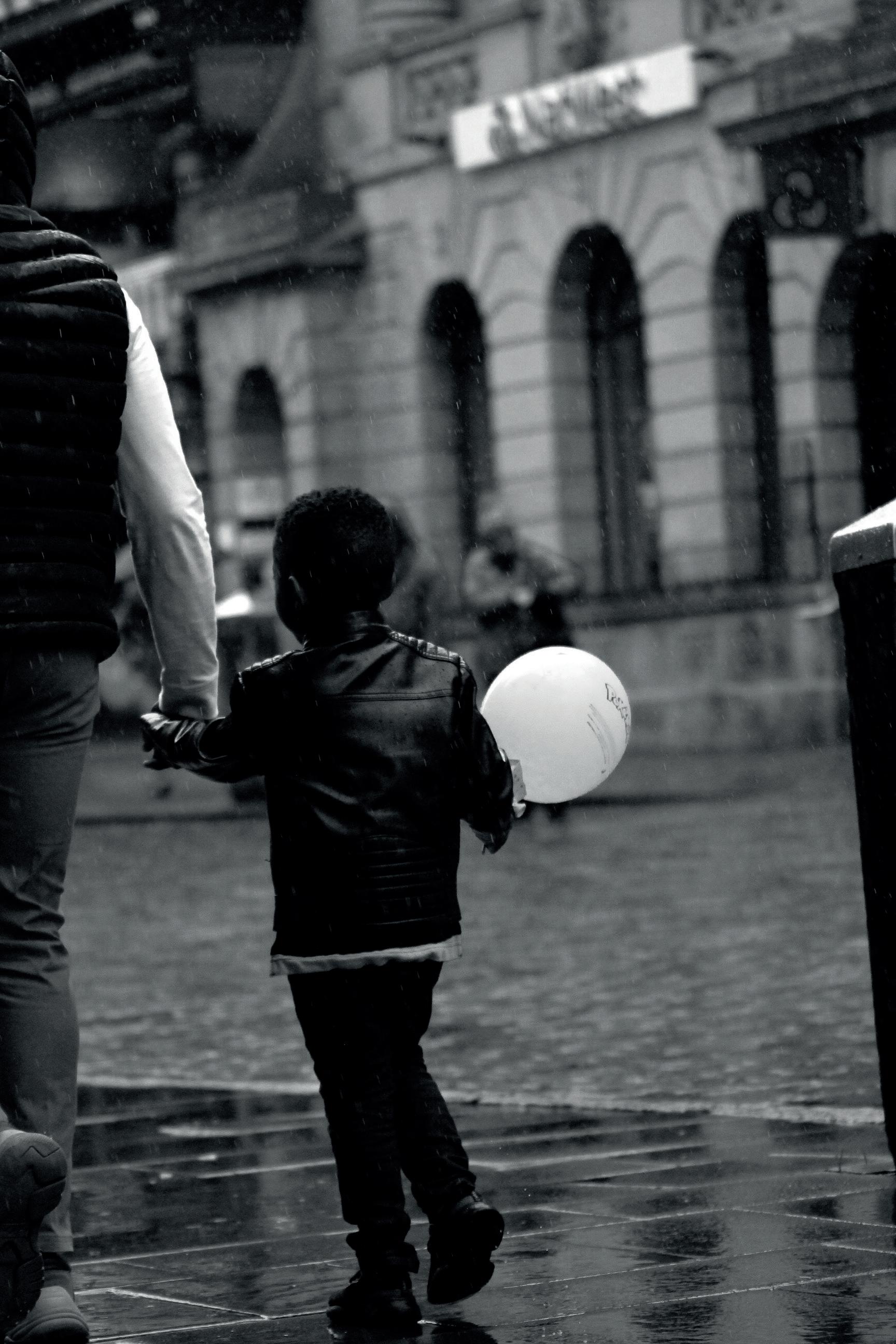
 William Abbott
Emily Catterall
Bailey Jones
William Abbott
Emily Catterall
Bailey Jones
t n

product design *
William Abbott product design
INSTA : wababbott@gmail.com
This project started with wanting to allow people to control their home. At first thinking about energy, heating, and security, however through research it was identified that biggest annoyance families had in their home was their family.
The life of a modern-day family can be hectic and mismanaged, keeping track of what everyone is doing and what task have to be completed is difficult and can lead to events being forgotten about, or misunderstood. Control at home is a project about allowing families to take back control of their lives, by bringing everything into one place. Families can add events to their calendar, create tasks and assign to family members, give out points for completing tasks, which can be used to get rewards. This is about taking that idea of the calendar in the kitchen or the chore chart on the fridge and bringing it into todays world.
MAIL : wababbott@gmail.com a b
i l o t
w m l i a b t
 Emily Catterall product design
I am Emily Catterall, currently a third year Product Design student. At my time at university of Chester, I have developed a real passion for furniture design from previous projects and have an interest of becoming a homeware buyer.
However, my major project reflects more on the furniture design aspect as it is in collaboration with a garden furniture company, called Zest Outdoor Living. My project, Be Outside Again, encapsulates two main themes togetherness and the outdoor classroom. The whole essence of the product is to bring adults and children together, in their own garden. This encourages children to learn new things whilst investigating bugs and potting plants, with their parent/guardian, who can enjoy a beautiful product in their garden. In early research it was emphasised that children want to spend more quality time with their parent/ guardian and don’t want to be alone. Therefore, this product will bring them together and be outside again.
c e
l l
a
i l r t y m t e a
 Bailey Jones product design
INSTA : baileyjones.design
VIEW : https://baileyjones163.wixsite.com/bjdesigns
MAIL : bailey.jones1@outlook.com
Shorelines are full of families and avid water sport adventurers wanting to get out of the house. Getting changed in and out of your beach outfit can be hard under these environments, especially with lack of beach facilities.
…….. offers this solution. In essence …… allows for a private shelter to assist both single users and families to change at the start and end to their beach day. The user simply opens out of a bag and pops up the origami inspired shelter to conceal themselves in an area separate from the rest of the beach. The beauty is, …. can also be used in other outdoor circumstances like festivals, and camping.
Working with CabinMax to create an extra benefit to the traditional rucksack, this has been a great opportunity to work on an outdoor product based brief, leading into a future of outdoor design.
CALL : 07731392907 a b e i j
y e
l n o s

thank you for viewing!

23
20

23
*
all inclusive * First Published June 2023 © University of Chester, Department of Art & Design All rights reserved. No part of this publication may be reproduced, stored in a retrieval system or transmitted in any form or by any means without the permission of the publisher.

 Nickolas Fischer fine art
 Hannah Fowkes fine art & graphic design
 Alicia Hodkinson fine art
 India Hutchison fine art
 Charlotte Jennings fine art

 Thomas Kerrigan fine art
 Emilia Michalak fine art
 Charlotte Nicholls fine art
 Jade Palmer fine art
 Kia Piggott fine art
 Emily Robinson fine art
 A’nnya Ryan