


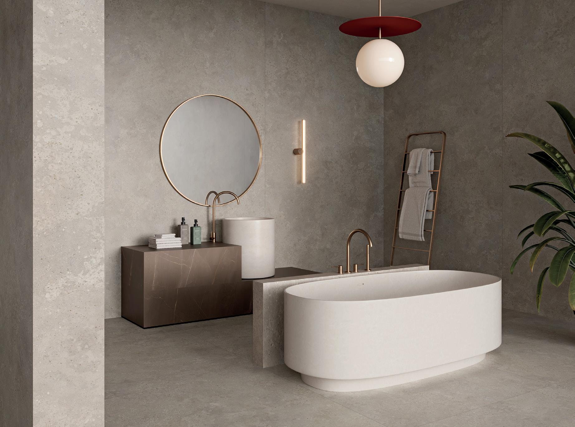
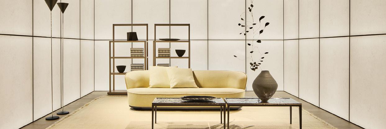
New York, Miami, Los Angeles, Chicago info.usa@rimadesio.us











New York, Miami, Los Angeles, Chicago info.usa@rimadesio.us


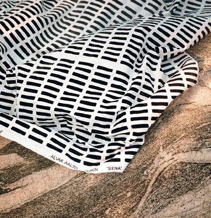
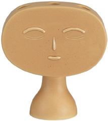
Artek celebrates its 90th anniversary in 2025. This is a milestone that calls for a party. To mark the occasion, Artek has come together with a select group of likeminded creative partners to highlight the design language that has evolved since Artek’s founding in 1935. Artek’s 90th anniversary is a celebration that is resolutely Finnish in style, but universal in its appeal. It is a party to which everyone is invited.







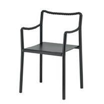


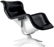

In August, I had the chance to visit the Miller House and Garden in Columbus, Indiana, a phenomenal modernist residence completed in 1957. It was realized by talented individuals from allied disciplines: architect Eero Saarinen (with Kevin Roche as the project lead within the ofce), interior designer Alexander Girard, and landscape architect Dan Kiley. Inside, visitors quickly perceive the boundary between architecture and interiors. The architects drafted a pinwheeling, nine-square plan that updates ideas from Palladio and Mies, while Girard warms the stark, white space with colorful furniture, cabinets, rugs, upholstery, pillows, art, objects, and the Millers’ personal efects. The contrast is intense and brilliant.
Such genius clashing seems less possible today, in a moment when design culture appears to be valorizing the seamless integration of architecture and interiors, a merger that parallels the larger economic trend of conglomeration. The dissolution of the disciplinary divide between the two fields is actually a good thing, as it removes a type of mid-20th-century division of labor that was sexist: Men did architecture, and women did interiors. The unification also acknowledges the common goal of making spaces that are functional, healthy, and beautiful, a trend that reaches back to the proto- and early-modern idea of creating a total design environment—a Gesamtkunstwerk—in which all aspects of inhabitation are considered. The effort summons the text of a Bruce Mau poster from 1997: “The blurring of our boundaries suggests the shape of a new terrain.”
Lately, what matters most is one’s attitude and approach. For example: Was it a problem that Sala Hars had never designed a health-care facility prior to winning the competition for Zoī Vendôme? Not really. See page 92 for the results.
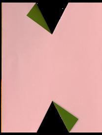
What unites AN Interior’s annual Top 50 list (page 69) is precisely the ability to bridge the (artificial) gap between architecture and interiors in order to deliver impactful spaces. The concerns of these 50 offices extend “up” into furniture and art, but also “down” into the realities of construction and labor. Our layout, with a design by Studio Loutsis that began from folded paper, shares the faces of these Top 50 awardees. The goal? To celebrate the people behind the projects.
Elsewhere, this issue of AN Interior gets into the weeds of things to emphasize how collaborative design actually is: Three out of the four featured projects are within existing buildings, and the fourth, a ski lodge by Davies Toews Architecture, was shaped by a concern for the area’s birds (page 100); Emiliano López Mónica Rivera Arquitectos worked closely with artisans to finish a handsome vacation home (page 62); and hotelier Carlos Couturier of Grupo Habita meets writer Suleman Anaya at Condesa DF to discuss his support of Mexico’s leading architects (page 124). Plus our cover comes from a live/work project on a tight budget by Atienza Maure that largely consists of prefabricated components assembled by its client (page 34).
Ecological concern transcends price point: Vincent Van Duysen mentions it driving the design of a new luxury development in Portugal (page 30), while Cordero Pardee delivers a low-carbon retrofit for a dive bar in Ridgewood, Queens (page 32).
AN Interior aims to be a resource for working designers. So, here’s a deep dive: Uncover new furniture releases (page 39), take note of a recommended set of design stores in New York and beyond (page 24), and check out a quartet of emerging furniture makers (page 14).
Our print magazine is one component of our larger platform that serves our North American design community. We also facilitate togetherness through online coverage, virtual events, and in-person gatherings, all in the spirit of supporting and inspiring our audience. In these troubling times, care is essential. See you out there.
Talk soon,
Jack Murphy Executive Editor
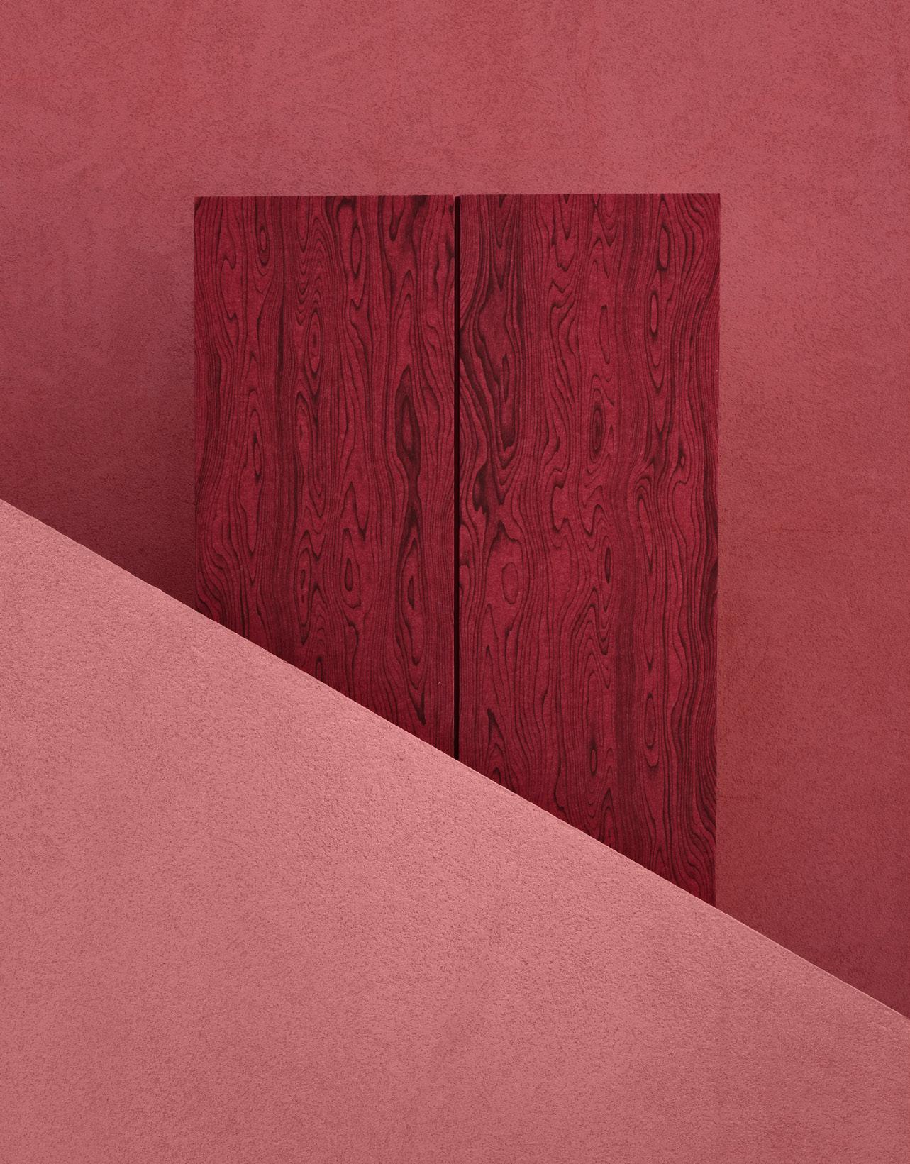
Designed for those who go against the grain
If creativity is in your nature, our new family of Wood Textures is your acoustic solution. Maximize style and minimize echo with an exquisite suite of colors and textures.
turf.design
Lila Allen is a writer, brand strategist, and editor of the new design publication Wrong House. She has held senior editorial roles at Architectural Digest, where she ran AD PRO, and Metropolis, where she was managing editor. Today she runs an independent practice supporting designers and cultural organizations with brand storytelling and messaging strategy while continuing to write for leading publications.
Suleman Anaya writes about architecture and culture for T Magazine, Aperture, Apartamento, and the Architectural Review, among other publications. He studied at London’s Architectural Association and is based in New York and Mexico City.
Jesse Dorris is a writer and DJ based in Brooklyn. His work has appeared in Aperture, Architectural Digest, Crack, Dwell, Frieze, Galerie, The New Yorker, PIN-UP, Pitchfork, and many other publications. He is also the host of the show Polyglot on WFMU.
Elizabeth Fazzare is a New York–based editor and journalist who covers architecture, design, culture, and travel for publications including Architectural Digest, Dwell, and Interior Design. She was previously the senior architecture and design editor at Cultured and an editor at Architectural Digest.
Gay Gassmann is an art historian, writer, and art adviser based in Europe. She contributes to numerous publications, and her monograph on French artist Guy de Rougemont was recently published by Norma Editions.
Kelsey Keith is the creative director of MillerKnoll. She spent years in architecture media and still publishes a design Substack called Ground Condition —which, not so coincidentally, is running “Sauna Month” this October.
Adrian Madlener is a New York–based journalist and consultant. He contributes to Architectural Digest, Ark Journal, Artnet, Curbed, Domus, Dwell, Hypebeast, Metropolis, and Wallpaper* and coauthors the design criticism Substack EXT.RUDE.D. Madlener cowrote Vincenzo De Cotiis: Interiors (Rizzoli, 2023) and has curated exhibitions on tool theory and copycat culture.
Joann Plockova has been a design writer for over a decade. Her bylines have appeared in The New York Times, Architectural Record, Dwell, and Wallpaper*. Following Come Together: The Architecture of Multigenerational Living (Gestalten, 2021), her latest book is Courtyard Homes (Monacelli, 2025).
Shane Reiner-Roth is a writer and lecturer on architecture and urbanism.
Dan Mahboubian Rosen is a comedian and cultural commentator based in New York. His viral videos satirizing the art and design world have received over 100 million views. Rosen cohosts the Middlebrow podcast, where he takes a comedic lens to high and low culture.
Will Speros is a writer and journalist based in Brooklyn. With a focus on architecture and design, he covers topics including sustainability, wellness, and queer experience. His work has also appeared in Architectural Digest, Metropolis, Hospitality Design, Workplace Design, Luxe, and Inc.
This issue’s cover features a photograph by Simone Marcolin of a live/work apartment in Barcelona designed by Atienza Maure. The interior was largely fitted out using prefabricated components and retains an industrial warehouse vibe. Read Kelly Pau’s story on page 34.
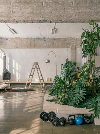
CEO/Creative Director
Diana Darling
Executive Editor
Jack Murphy
Art Direction
Studio Loutsis
Design Editor
Kelly Pau
Web Editor
Kristine Klein
News Editor
Daniel Jonas Roche
Associate Editor
Paige Davidson
Contributing Editor
Adrian Madlener
Copy Editor
Don Armstrong
Proofreader
Joanne Camas
Editorial Intern
Ilana Amselem
AN Interior (ISSN 2476-1532) is published twice a year as part of The Architect’s Newspaper, which is published 7 times a year by The Architect’s Newspaper, LLC, 25 Park Place, Floor 2, New York, NY 10007.
Presort-standard postage paid in New York, NY. Postmaster, send address change to: 25 Park Place, Floor 2, New York, NY 10007.
For subscriber service, email subscribe@archpaper.com.
$15.00 per copy, $45.00 one year (2 issues of AN Interior and our Best Of issue). Entire contents copyright 2025 by The Architect’s Newspaper, LLC. All rights reserved.
The views of our reviewers and columnists do not necessarily reflect those of the staff or advertisers of The Architect’s Newspaper.
Vice President of Brand Partnerships
Dionne Darling
Director of Brand Partnerships
Tara Newton
Sales Manager
Heather Peters
Audience Development Manager
Samuel Granato
Vice President of Events Marketing and Programming
Marty Wood
Senior Program Associate
Steven Sculco
Program Assistant
Izzy Rosado
Events Marketing Managers
Andrea Parsons
Business O fce Manager
Katherine Ross
Design Manager
Dennis Rose
Graphic Designer
Carissa Tsien
Associate Marketing Manager
S ultan Mashriqi
Marketing Assistant
Eazhel Breeden








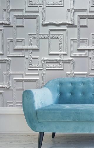


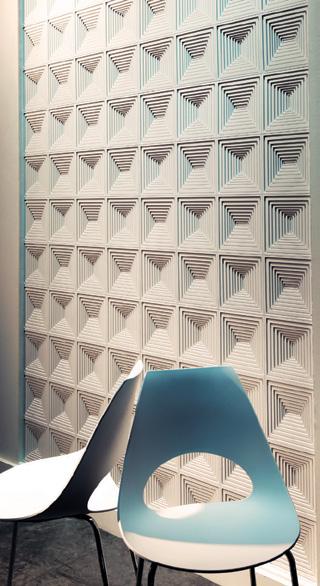
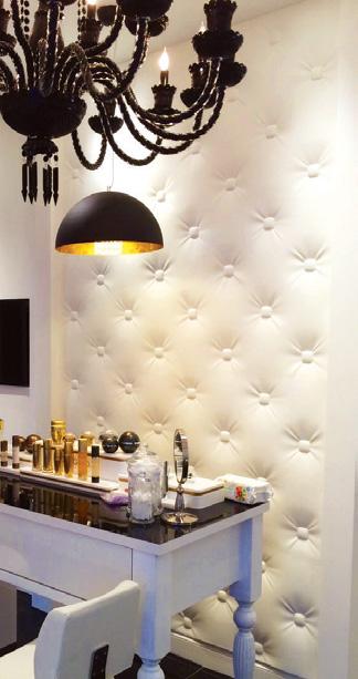
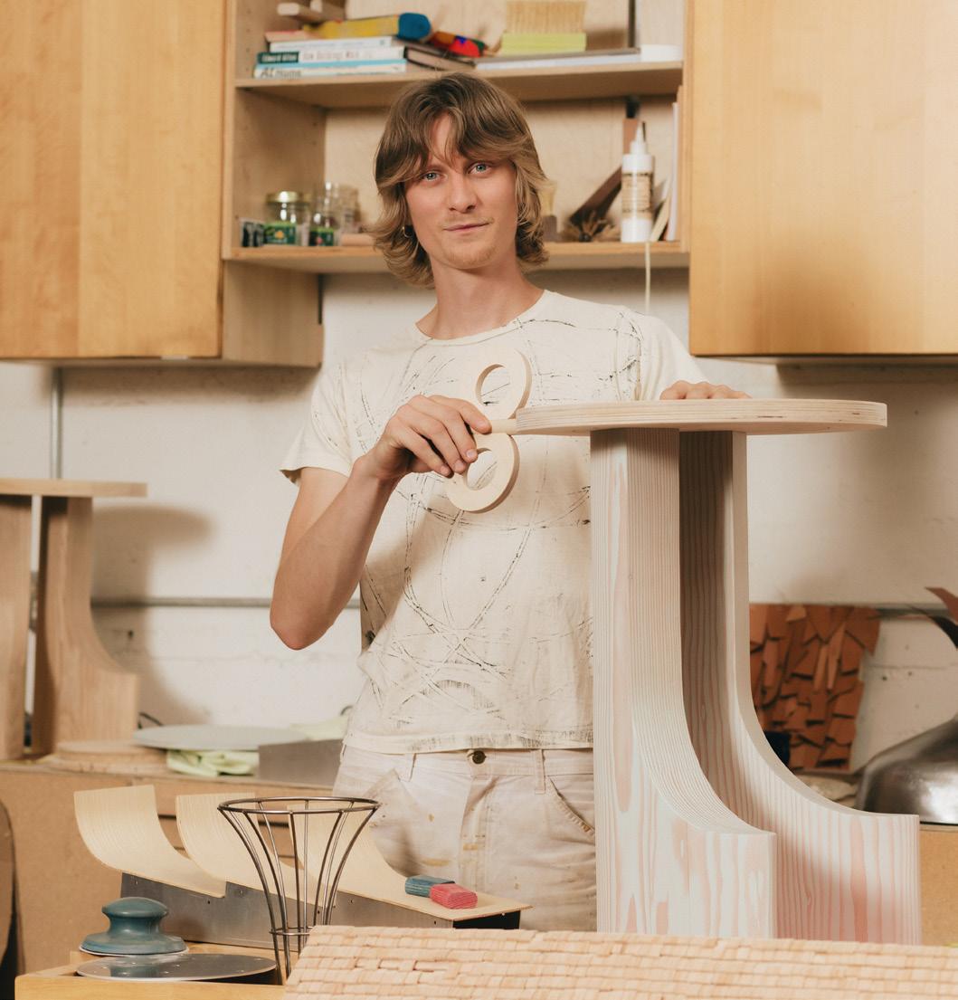
Based in Portland, Oregon, Ingemar Hagen Keith founded their furniture and object design studio, Marmar, in 2023 with a quest to animate the inanimate. Keith designs objects so that utility becomes an extension of character. With the Ibbit Stool, Keith deploys this ethos with playful results. The stool contrasts a baby-blue corduroy seat with ash legs. The joinery between the two is left exposed, highlighting the duo’s juxtaposed connection. Meanwhile, carved textures on the top of the legs mimic the lined textures of the textile, finding unity between the two. For the next chapter of Marmar’s work, Keith is exploring the explicitly sculptural for their residency at Rex Hill Winery in Oregon. They will also design a permanent outdoor sculpture for the winery’s tasting room. The new work is sure to expand Keith’s warm and joyful style. —Kelly Pau




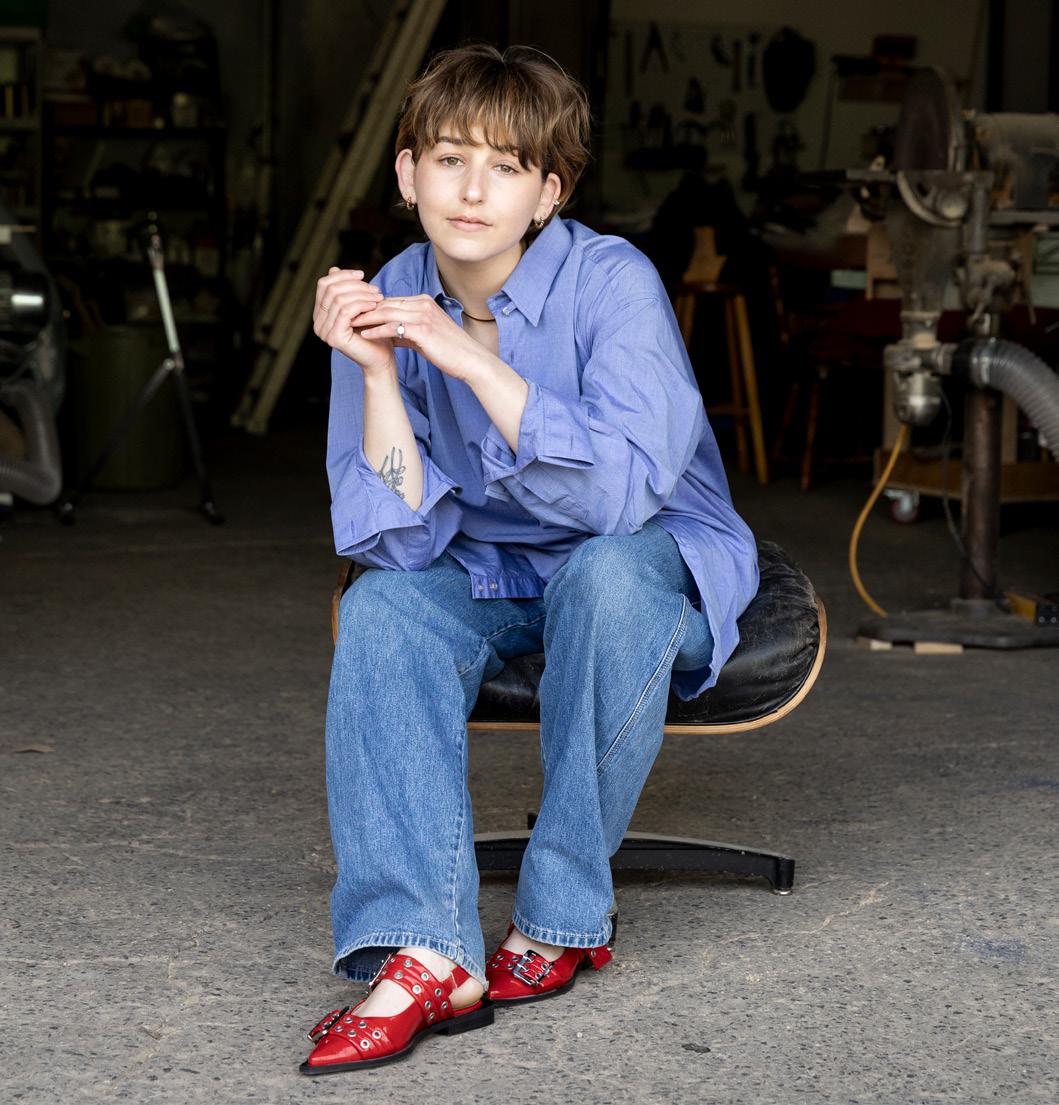
Environmental consideration serves as the backbone of Laura Goodman’s furniture design and eponymous studio. In particular, this concern informs her choice of materials, many of which are sourced from regional waste streams. Her collection, Fresh Catch, uses broken lobster traps salvaged off the coast of New England. Goodman deconstructs the traps and then reassembles them into wired bookshelves and hourglassshaped side tables as colorful reclamations of waste. More recently, the Montreal-based designer created a splayed vase, titled Desert, made from offcut leopardwood that’s then transformed into a veneer and laminated. The process uses pressure to reshape the material, which is typically brittle and prone to fractures, into gentle curves. In using the seemingly unpractical material for the sculptural form, Goodman meditates on notions of fragility and patience. The vase, like the rest of her work, meaningfully considers material in its relation to structure and place. —Kelly Pau



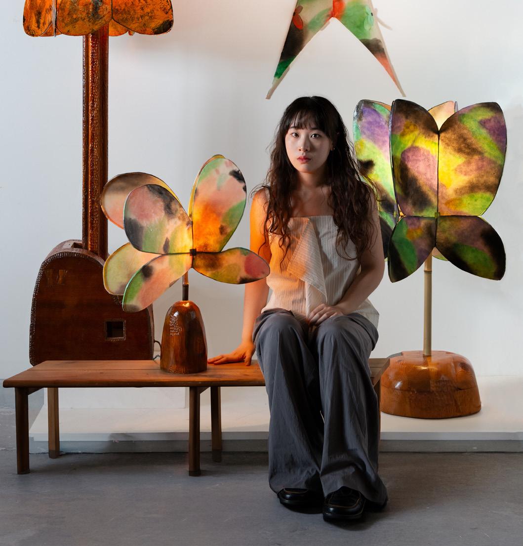
Yuxuan Huang is a furniture and lighting designer based in New York and China. Her work employs the use of found furniture, which she stitches and collages together. Dream Tower, for instance, was created by melding together wood salvaged from a 1800s chest of drawers. The stitches uniting the different pieces are left visible, exposing Huang’s detailed material and craft. The shades of the lamp are made from hand-painted mashi paper and bamboo using traditional Chinese lantern and kite-making techniques. Huang continued this design at this year’s COLLECTIBLE New York. Her new iterations use kozo paper to capture the dreamy hues of butterflies, swallows, and mountains— motifs in Chinese folklore. Huang’s work has already begun making the design fair rounds, even as she earned her MFA in furniture design from Rhode Island School of Design in 2024. Her poetic approach to salvaged materials is sure to evolve with each new piece. —Kelly Pau
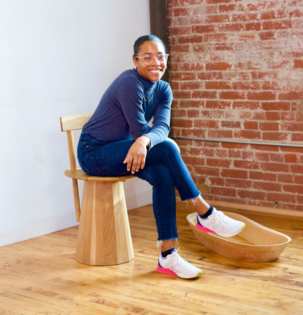
Tiarra Bell uses her belief in religion and spirituality to guide her furniture and lighting designs. Based in Philadelphia, the founder of Bellafonté Studio approaches her designs with the intimacy of personal diary entries. The Mountain Chair, a minimal piece of bent white oak veneer, was inspired by Bell’s moving experience of watching the sun rise over the Swiss Alps. Curving pieces of wood translate the experience, as well as the significance of mountains in the Bible. Other works, like the Bondage Pendant, serve as a testament to hold fast in her beliefs: Crafted from a wooden aperture with a gold-leaf inlay inside, the hand-sculpted lighting illuminates a golden suspended halo, creating a visual reminder of faith. Bell’s designs reveal a personable and relatable vulnerability through formal purity and narrative concept. —Kelly Pau

Easy Operation: The large panels smoothly glide to their open or closed position. Motorization option available.
NanaWall transforms homes into boundaryless gateways to the outdoors—open or closed.

contact@nanawall.com
800 873 5673
NanaWall.com
Superior Performance: Exceptional resistance against wind-driven rain. Energy-eficient panels keep extreme weather out. Air, water, structural, and forced entry tested.
Design Options: Large panel sizes up to 15’, customizable configurations including open corners and pocketing. Multiple sill, glazing, and 50 standard color choices.
Maybe it’s the Oscar-winning movie The Brutalist or the rise of Brutalist buildings in rap videos in recent months (thank you, Bad Bunny), but the style has a newfound place in the zeitgeist. This time, it arrives with an urgent twist. Its resurgence might also be related to the Trump administration’s disapproval of the style. Some recent iterations of Brutalism might be curvy, but they’re not without teeth. —Kelly Pau

Sella Curulis by sashaxsasha is a stool with dramatic gestures, from its fluted pillar to the winged seat that stretches regally outward. sashaxsasha.com → TOM DIXON
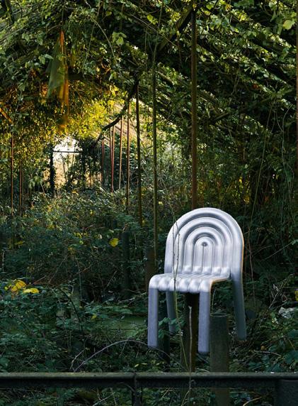
Tom Dixon collaborated with Hydro to design a lightweight chair of recycled aluminum, made using automotiveinspired blowforming techniques. tomdixon.net hydro.com
→ STUDIO JIALUN XIONG
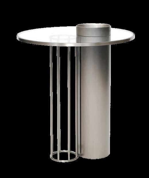
Kaleidoscope Round Side Table by Studio/ JIALUN XIONG taps into the sculptural side of steel, interweaving shapes and thinness for a striking piece. jialunxiong.com
← MARLOT BAUS
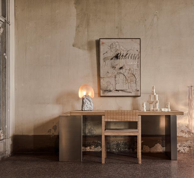
Canoa Studio Table by Marlot Baus uses bulky metal legs to balance a lighter slab of wood, which plays with contrasting materials and thicknesses. marlotbaus.com
→ GARNIER PINGREE
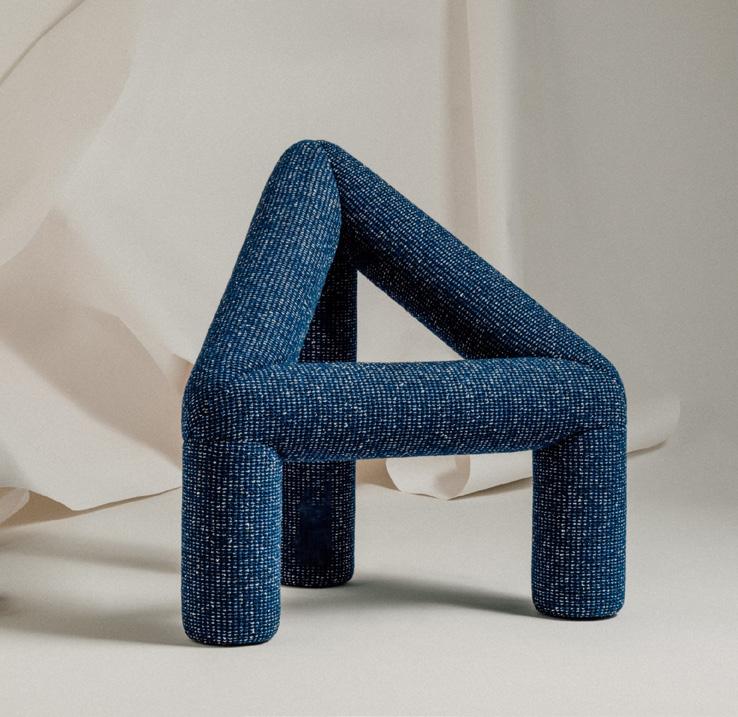
‘A’ Chair by Garnier Pingree cleverly uses the negative space within the strong, angular form of the letter A to carve out a seat. garnier-pingree.com
↓ KNOWN WORK
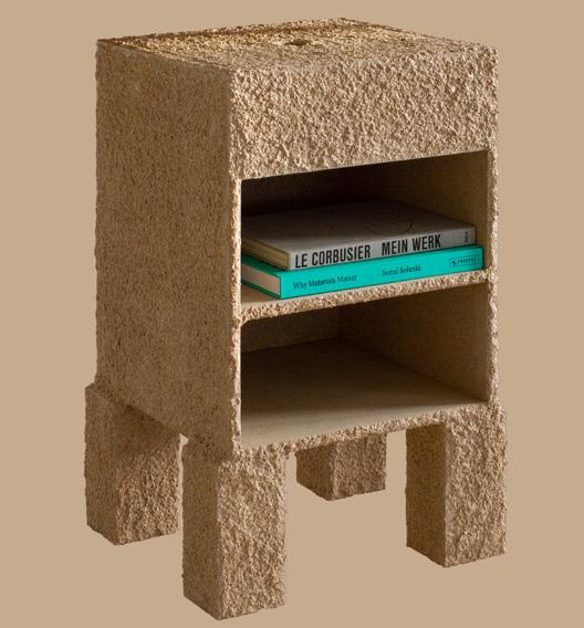
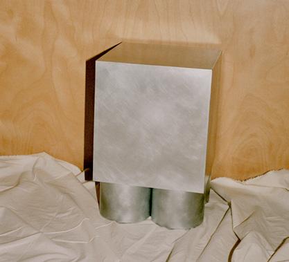
With the KW 01 PERCEPTIONS CUBE, Known Work pairs a block of aluminum or raw steel atop cylindrical legs for a modular set with striking mass. knownworkstudio.com
↑ ITEM/ ENSO
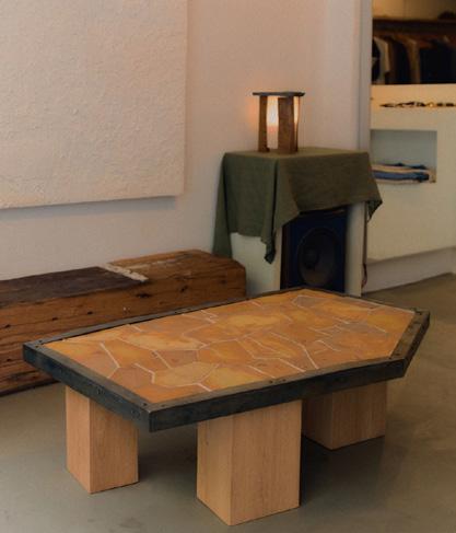
Apricot Coffee Table by Item: Enso pairs the warmth of hand-assembled ceramic tiles with the ruggedness of patinated metal in a pentagramlike shape. item-enso.co
↓ FORMARKIVET
Formarkivet softens the Cubio Side Table’s boxy, raw aluminum form by rounding out its contours but keeps linearity along its underside. formarkivet.com
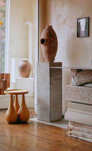
Situated in the middle of the popular Hudson Valley region of New York State, Available Items is a multivalent store and gallery that offers a diverse blend of vintage and contemporary wares in a domestic setting. You feel as though you are shopping in the living room of founders— and bona fide industry insiders—Chad Phillips and Kristin Coleman. 64 Broadway Tivoli, New York 12583 availableitems.com
In New York and beyond, a range of venues are essential resources for interiors products and inspiration.
Specifying furniture, finishes, and fixtures can be complicated. To do so, designers scour endless catalogs, numerous mono-brand showrooms (hopefully clustered together), and the endless rows of expansive trade fairs. With brick and mortar returning in a very real—yet more considered—way, a slew of holistically staged multibrand platforms are popping up.
Simplifying things significantly, the following resource libraries, showrooms, and retail experiences are changing the game by demonstrating how different product typologies can complement each other in situ. They’re also making it easier for up-and-coming and underrepresented producers to get a leg up bypassing the financial burdens that normally impede growth and getting exposure.
Purveying a distinctive range of crafted furnishings, accessories, and food products from the country of Georgia, Jamieri has taken Brooklyn’s Red Hook neighborhood by storm with its immersive, cinematic displays. The locale plays host to a vast array of events and channels the entrenched qualities of this ancient culture in a contemporary light.
392 Van Brunt Street Brooklyn, New York 11231 jamieri.com
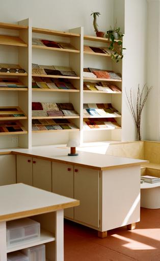
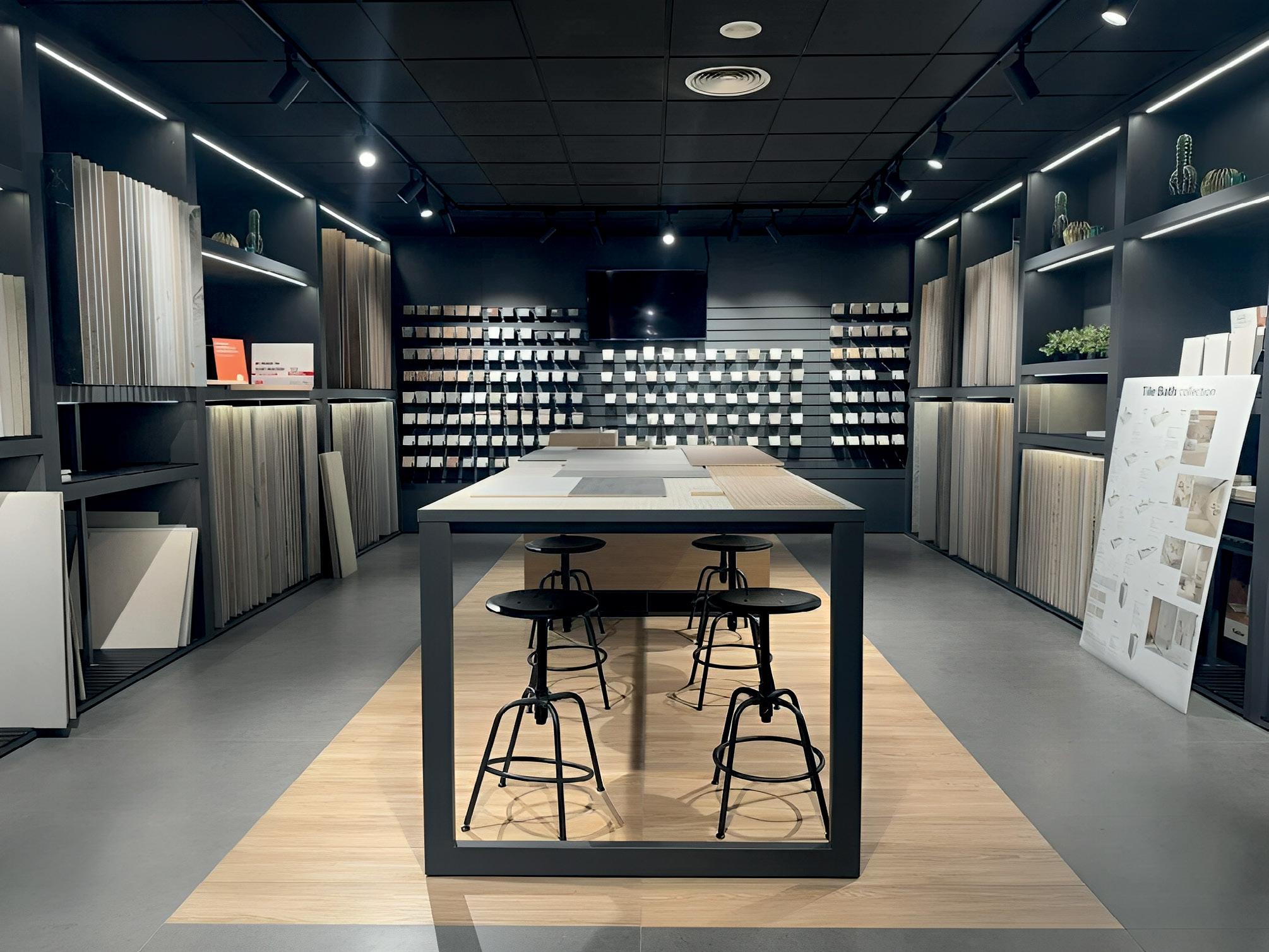
A far more curated and tangible alternative to giant online material libraries, Sample House sets up in a captivating glass- and brick-enclosed Long Island City warehouse. Seamlessly outfitted with pull-out shelves and modular display stands, the resource library encompasses a vast array of finishes and hardware developed by some of today’s best independent talents.
43-01 22nd Street #110 Long Island City, New York 11101 samplehouse.nyc

Whether it’s swinging or sliding, small or monumental, Halliday + Baillie offers iconic flush solutions for any door in your project. Delivered in a dozen New Zealand-tested architectural finishes, H+B is dedicated to sustainable sourcing and manufacturing to ensure a lifetime of elegance and performance. The future is flush.
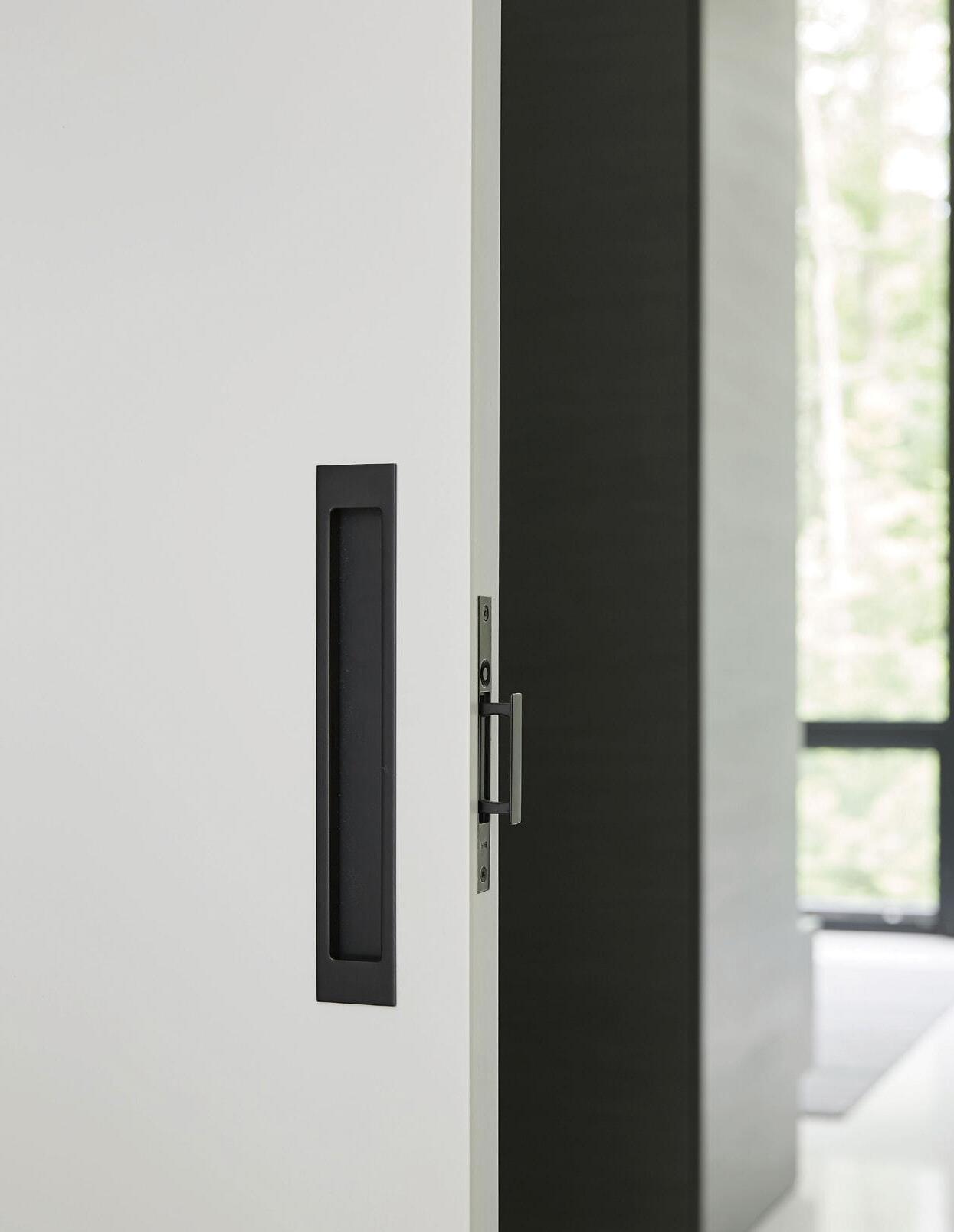
Designed + manufactured in New Zealand

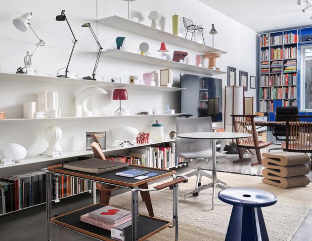
Building on its success as the leading online platform for carefully restored design classics—a stylistic and sustainable alternative to always buying new furniture— Rarify, led by cofounders David Rosenwasser and Jeremy Bilotti, recently opened a storefront in Philadelphia. The ground-floor space showcases rare and collectible chairs and lamps, now available for in-person inspection.
735 Bainbridge Street Philadelphia, Pennsylvania 19147 rarify.com
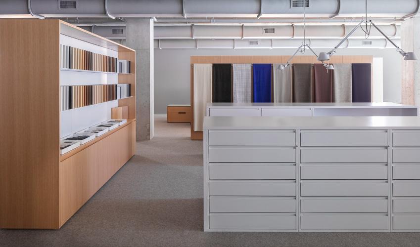
As leading U.S. design brands Herman Miller and Knoll merged a few years back, it only made sense that the extensive roster of brands they each operate should cohabitate under one roof in Chicago—or, more accurately, two roofs. MillerKnoll’s 1100 complex in the Fulton Market District situates Herman Miller, Knoll, and multibrand textiles together, while the nearby 1144 location combines MillerKnoll’s health-care solutions and Design Within Reach, setting the benchmark for other such locales across the country.
1100 and 1144 West Fulton Market Chicago, Illinois 60607 millerknoll.com
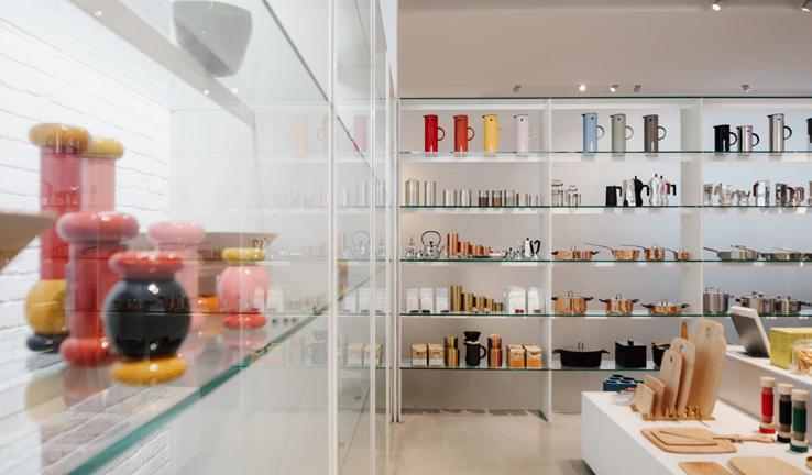
In operation since 1963, Inform is a vital under-one-roof resource for Vancouver’s illustrious crop of interior architects and designers. A comprehensive department store with two locations (the latter was an early project for Omer Arbel), the platform has grown into a fully fledged ecosystem and trusted resource. It not only hosts different types of activations but also publishes articles and videos that keep its discerning clientele informed of the latest best practices.
50 Water Street
Vancouver, British Columbia V6B 1A4 inform.ca
Brown Napa Valley expands its footprint with a new mixed-use headquarters by Catherine Kwong Design.
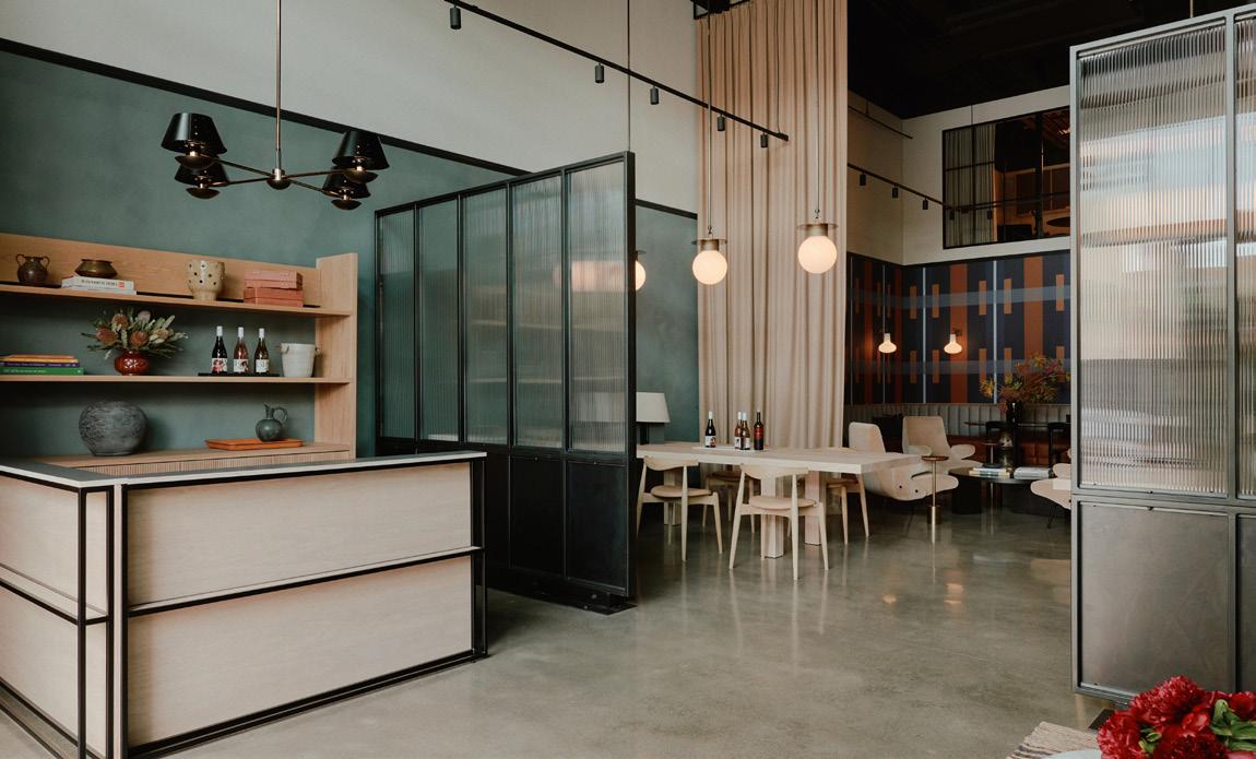
Established in 1995 as one of the first Black-and-women-owned wineries in Northern California, Brown Napa Valley, perhaps best known for its Brown Estate label, has now opened a hybrid office and multipurpose hospitality venue in downtown Napa. The San Francisco–based studio Catherine Kwong Design was commissioned for this project. (It had previously handled the design of Brown Napa Valley’s first hospitality space down the street.) The goal was to cohere the brand’s main office with a new intimate tasting room and to do so with a residential touch.
The savvy result demonstrates how these distinct programs—office and tasting room—can be effectively melded together. Kwong layered discrete zones, each partitioned off with half walls lined with translucent glass panels. To break down the scale of 30 -foot-tall space, she introduced a graphic wallcovering to define dining and tasting areas. A consistent material and color palette of muted blue plaster walls and blackened steel trim plays well with light-toned wooden furnishings and tall drapes. Custom counters and built-in banquette seating enhance the comfortable arrangement.
The mezzanine-level office and “situation room” conference space above flow between open-to-below cutaways, which allows the staff to interact with customers as they come in and for guests to glimpse the company’s inner workings.
The multilevel, loftlike space can easily be adapted for activations and special events, including “exclusively inclusive” VIP gatherings. The overall design not only takes on a domestic feel but also an elevated industrial, even urban, look: The interior lets guests step out of Napa’s semirural context and enter the world of Brown Estate. —Adrian Madlener
ICG Italia showcases an installation at BDNY that highlights architectural fexibility and material integrity through the ATTRACT system.

Belgian architect Vincent Van Duysen talks about his love of the Portuguese coast and the upcoming Club Comporta.
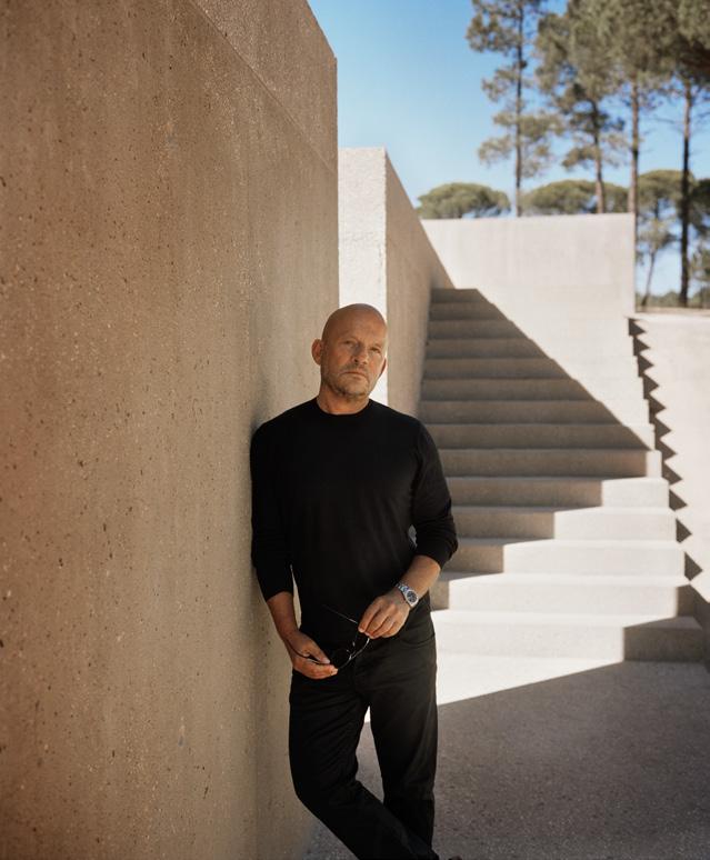
The Antwerp, Belgium–based architect and designer Vincent Van Duysen is a giant in the interior design world. After earning a degree in architecture from the Sint-Lucas School of Architecture in Ghent and a few stints in ofces, Van Duysen founded his eponymous frm in 1989. Today he is acclaimed for everything from high-end architecture to product design: He has designed collections with Zara Home since 2002, and since 2016 he has been the creative director for Molteni&C.
GAY GASSMANN
What is your personal history with Comporta?
VINCENT VAN DUYSEN
It all started 15 years ago, when I fell in love with the region. It’s unspoiled, protected, and beautiful. It’s a rare combination of rice paddies, dunes, ocean, umbrella pines, and storks. I thought if I found a plot, I would construct my own holiday home there. One year later, I found land in Melides, adjacent to Comporta, and built Casa M. This is now my sixth summer in the area.
GG
The master plan for Club Comporta calls for 64 villas, just over half a mile of private beachfront, and many amenities. How did it all start with Paula Amorim and JNcQUOI’s Miguel Guedes de Sousa?
VVD
We met through a mutual friend during my first summer here; they came to visit me at home, Casa M. They fell in love with it, and Miguel told Paula, “He is going to do our project.” The construction is already underway: The beach club opened last year.
GG
Van Duysen adores Comporta, a buzzy beach destination on the Portuguese coast south of Lisbon, and built Casa M for himself in nearby Melides. Now he is the architect of Club Comporta, a 405-acre project for JNcQUOI and Amorin Luxury Group set to open in 2028. Gay Gassmann caught up with him to discuss his vision for pared-down living set among the dunes.
Can you tell us about the process?
VVD
First, we met with the clients to review all aspects. Once the layouts were locked in, we made a model, and then we started the visualization of the program. Next came the communications. With the photographer François Halard, we created a story around the project to activate the senses in a visual and poetic way. It is about how you delve into the project with your heart. This is what my architecture is all about.
GG
What is your philosophy for Club Comporta?
VVD
The architecture is solid, and it merges with nature. The color of the concrete is the color of sand, and the tiles that I use are the colors of tree bark. At my home, Casa M, and at Club Comporta, the wood is Brazilian, as I wanted to bring in the historic link between Portugal and Brazil.
The lifestyle here is about experiencing the exterior and the interior: It’s almost like living outside. Like at Casa M: When the windows are open, the sand dunes are literally rolling into my home. There are only a few materials, and all the views relate to the exterior.
GG
How do you describe your style?
VVD
I am a modernist at heart. I love an open plan where there are no barriers and one room flows into the other. But more than at Casa M, with Club Comporta I hope to emphasize vernacular architecture. The chimney and the fireplace are essential for Portuguese architecture, even in a small house; I have reinterpreted them for the Club Comporta houses. Every entrance is a 22foot-tall dome where the light welcomes visitors.
GG
And what about sustainability?
VVD
We are trying to restore as much of the landscape to its original state as we can using local species. Our building materials are concrete, wood, and tile. The vision is for all the houses to disappear into nature. For us, nature is our ruler.


Cordero Pardee revamps a New York corner shop into Mr. Nancy’s, a lowcarbon dive bar.
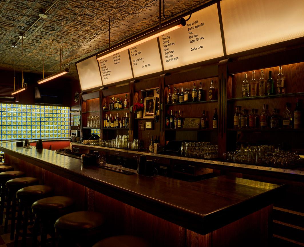
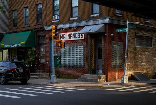
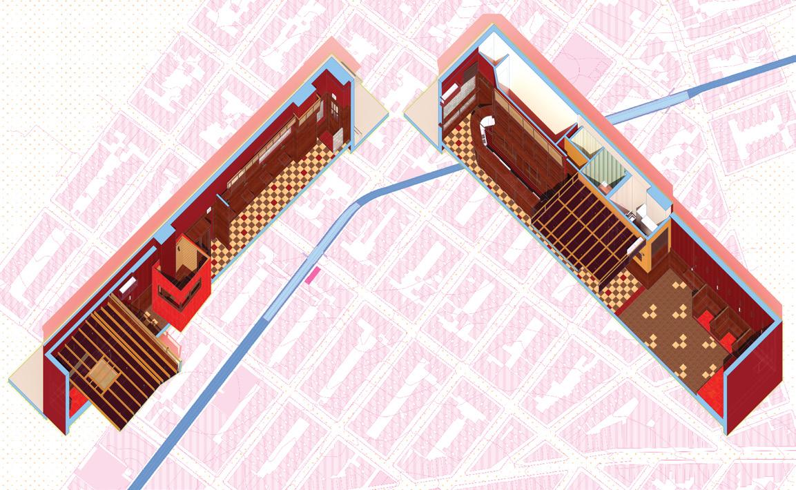
A time capsule was recently uncovered in Ridgewood, Queens. Abandoned for nearly two decades below the elevated Seneca Avenue station for the M train, the remains of a linear bar and lounge presented a canvas of old-school flourishes ripe for refreshment. The derelict cavern required a polish from bicoastal architecture studio Cordero Pardee (COPA). “Every space in this building smelled like an ashtray. Everything had this layer of nicotine tar on it,” COPA principal Galen Pardee remembered. “As soon as we saw that, it made for a very easy next step.” The space has now been reborn as Mr. Nancy’s, a sleek neighborhood dive bar.
Pardee and fellow principal Manuel Cordero assembled a palette of sustainable alternatives—dubbed low-carbon “twins,” in their vocabulary—to mirror the original 1950 s materiality. Recycled clay tiles replace asbestos floors, beadboard walls are traded in for cork, and fiberglass soffits are swapped out for polycarbonate sheeting. Linoleum floors and wallcoverings are installed for uniformity and eco-friendly properties as well. “We really started an obsession with linoleum,” said Pardee. “It’s not a true biomaterial in the same way that mycelium is, but it is biodegradable. It is actually made of industrial reuse in a way already, so it has a fascinating ecological lineage.”
ABOVE
The existing glass block was uncovered inside to create continuity between Mr. Nancy’s and its urban context.
BELOW
The split axonometric drawing slices the long linear space in half to describe the spatial procession.
FACING PAGE
The bartop, seating, and back bar area was designed to invoke the original 1950s interiors.
Original glass block windows, some of which were previously covered up inside, are now echoed with new glass accents above. This move enhances daylighting and facilitates a more dramatic engagement with outside streetlights. “We spent a lot of time matching the spirit of the old bar up front,” Cordero added. “There was a sense of maintaining the vibe of the original bar but also trying to just make it a little bit more futuristic, a little bit sexier.”
A sagging roof and an awkward, liminal hallway necessitated a more architectural overhaul in the rear lounge. To revitalize the windowless back area, COPA thought outside the walls. “We just called it the backyard,” Pardee said. “It helped us define the middle spaces.”
The reconstructed roof now sports a polycarbonate and Homasote shroud aimed at the subway tracks overhead. The enlarged hallway is activated with a pair of original 1950 s phone booths combined to offer intimate accommodations for two, while gabled ceilings perpetuate the alfresco influence along with a stand-alone gazebo clad with linoleum. Anchored by an elevated stage, the space earns its nickname as the “Red Room” thanks to sconces and track lighting that gently cast its aubergine walls in a crimson glow. The effect punctuates the design’s overall effort, creating an homage that’s “more in keeping with the old-school midcentury bar vibe,” Pardee said. At once expressive and restrained, the update revives a bygone functionality that’s both sustainable and sexy—with hearty cocktails to match. —Will Speros
Atienza Maure converts a warehouse into a live-work interior using prefabricated systems.
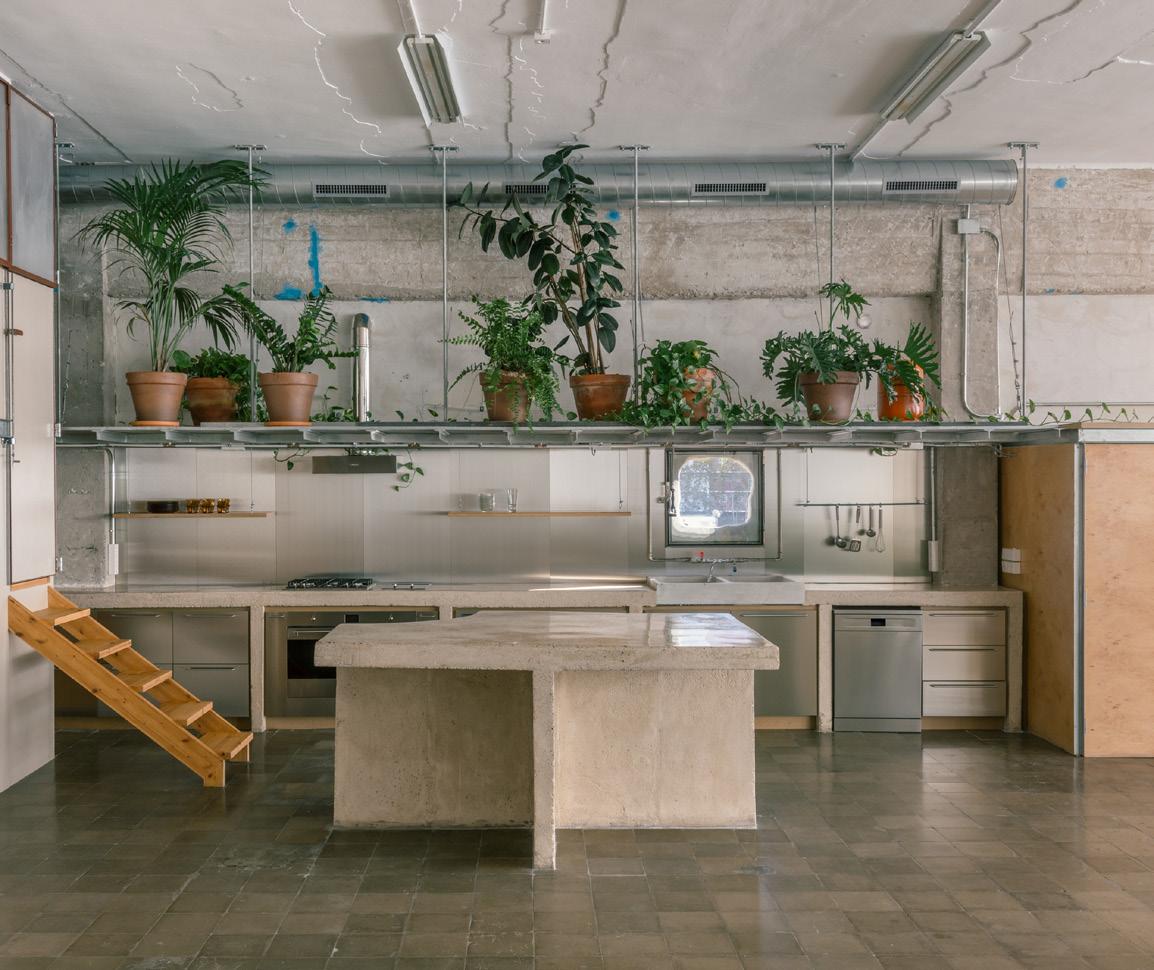
On the outskirts of Barcelona, Nave en La Pau is a 1 , 476 -square-foot unit in a warehouse that was previously a printing house. Juan Agustín Iglesias sought to convert the space into a home and office on a superlimited budget of about $ 38 per square foot, for an overall cost below $ 200,000. He commissioned local atelier Atienza Maure, founded in 2018 by Alonso Atienza Sánchez and Miguel Ángel Maure Blesae, for the project. The duo responded to the project’s industrial site, and the resulting project celebrates the rough and ready. It largely consists of prefabricated components that were imported and assembled on site by the client and his brother.
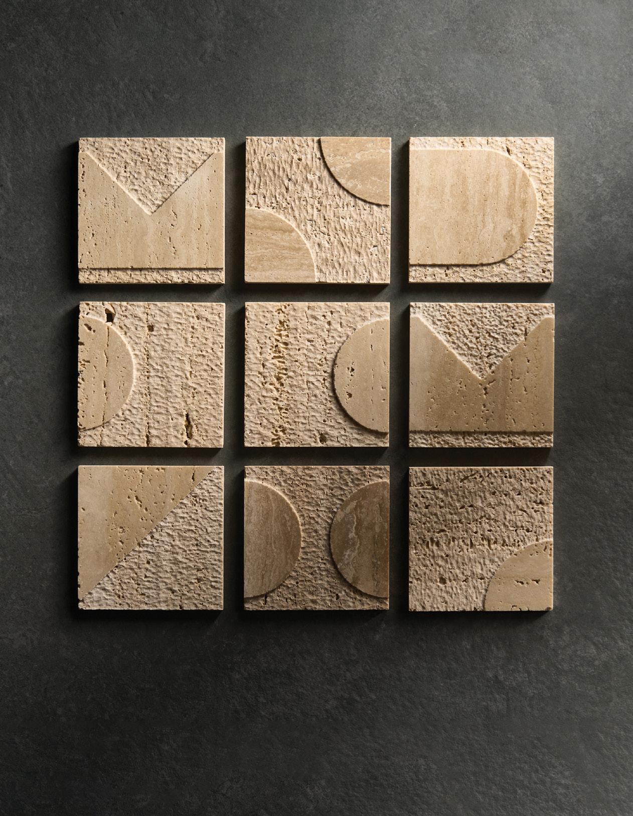
Explorations in materiality and craftsmanship, showcased above in the Trevino collection of carved natural stone.
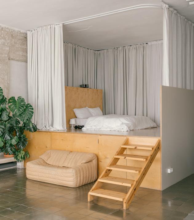
Located on the fourth floor between party walls, the project features windows along the north and south facades. No new facade openings were allowed, so to maximize daylight in the space, Atienza Mazure kept an open floorplan. Instead of walls, the home and office spaces are differentiated by wooden boxes. A 1 -story platform, circled by soft curtains, acts as a main bedroom. It connects to the nearby 2-story structure, composed of galvanized L-profile shelves, posttensioned steel trays (which also double as storage), birch plywood cladding, and translucent polycarbonate windows. This volume serves as a guest bedroom or studio.
Steel trays continue beyond the volumes to form a mezzanine, hanging planters, and kitchen storage. With each zone enabling two entry points, the mezzanine grants access between spaces without disturbing work areas or vice versa, while also allowing each space to change function on demand.
The exposed construction not only creates an economical, fluid spatial organization but also reflects the site’s urban surroundings. And throughout the dwelling, plants establish a sense of warmth and creativity. —Kelly Pau
PREVIOUS PAGE
ABOVE


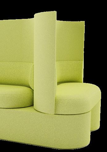
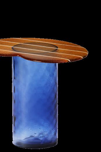
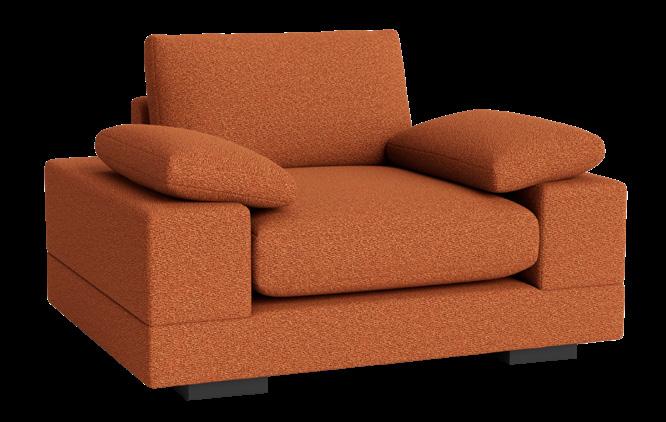
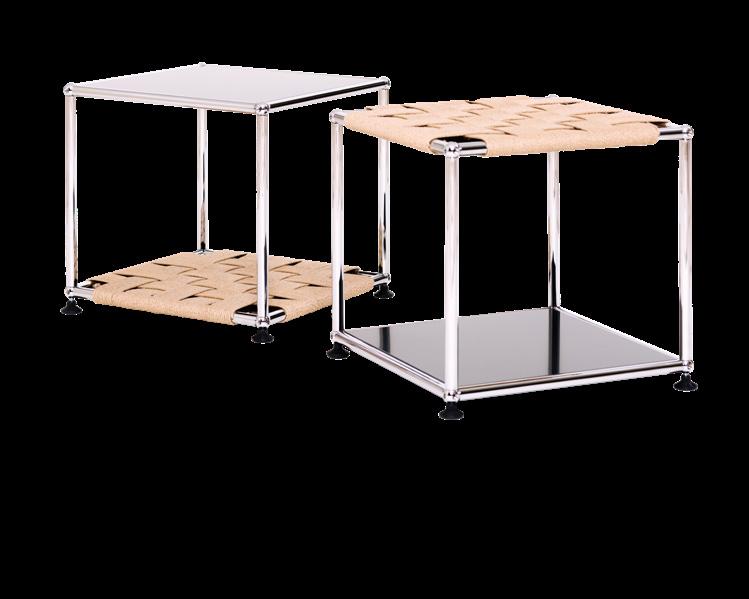
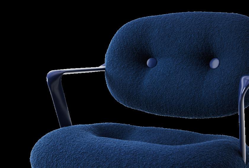
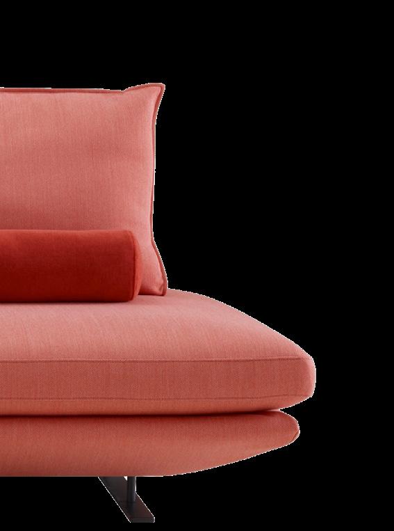
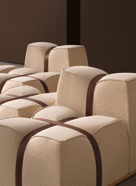
Furniture reflects culture’s ever-changing priorities. We gather five of the latest trends across typologies for a bird’s-eye view of what contemporary design—and interiors at large—look like today. —Kelly Pau
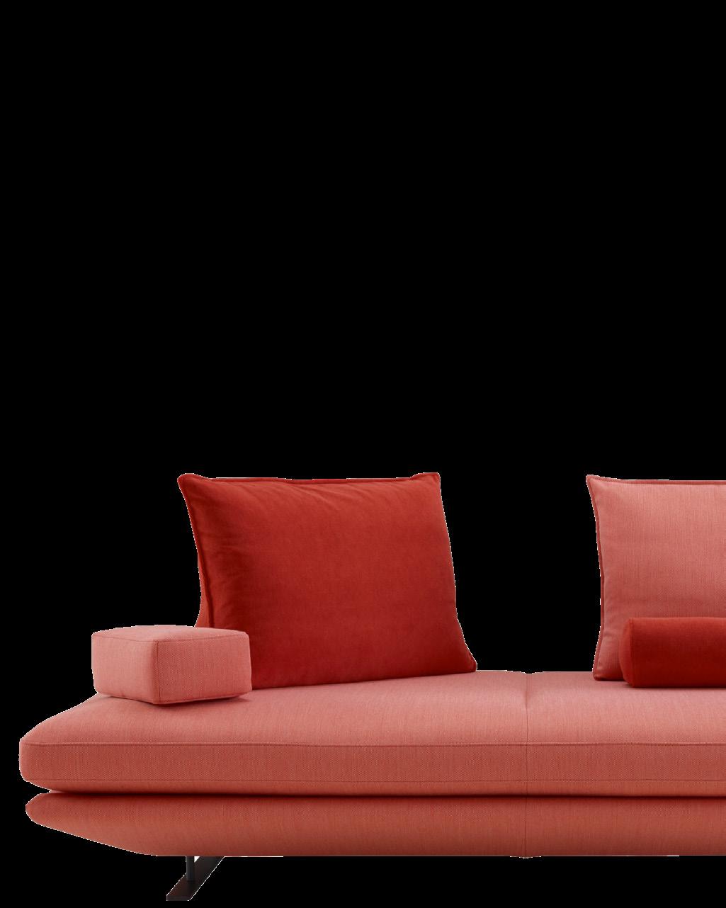
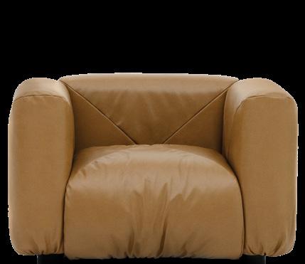
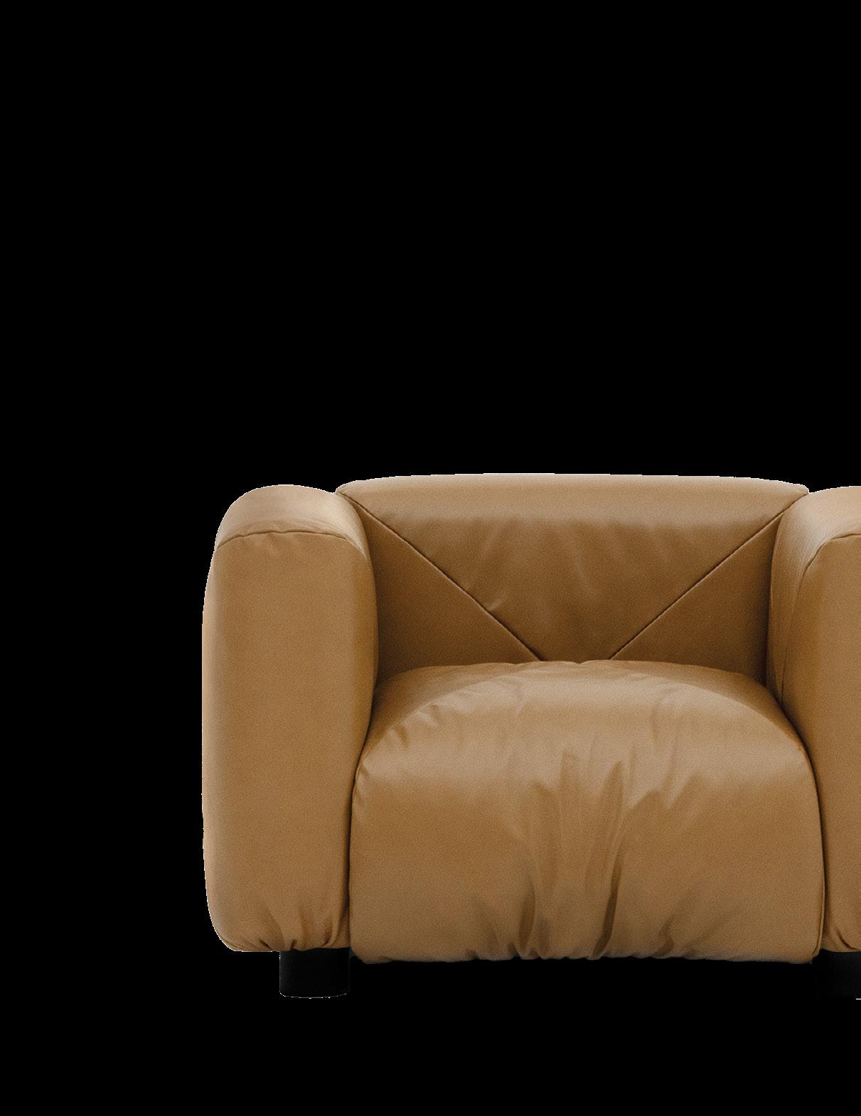
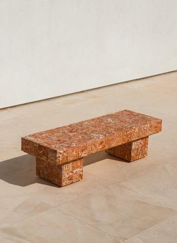
Is there a collective craving for nostalgia? Whether reissuing old classics or designing new retro-inflected pieces, the latest trend sweeping furniture seems to be the past seen through a warm, 1970s-style lens

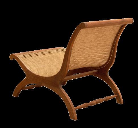
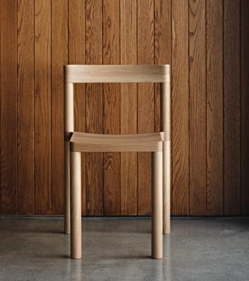
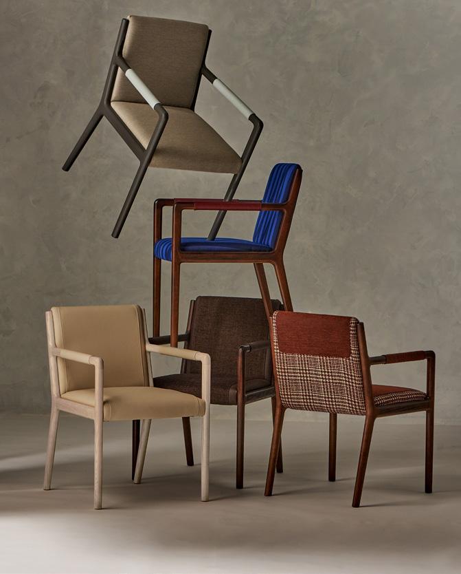
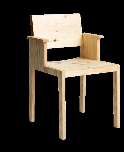
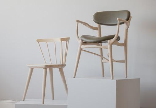
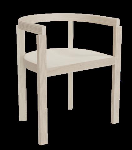
Minimalism is back, at least when it comes to chairs. These quiet forms celebrate understated beauty through pure geometry.
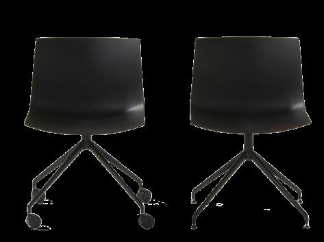
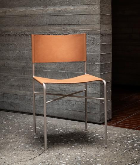
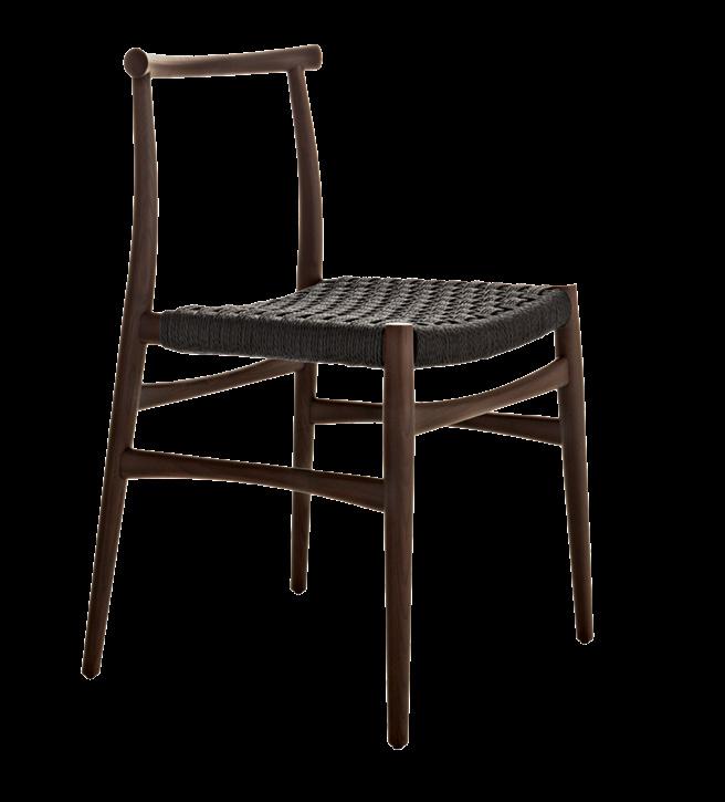

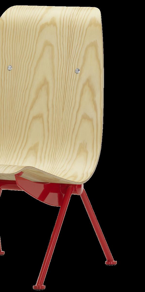
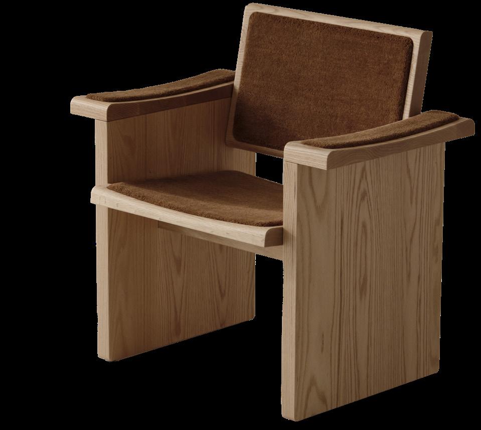
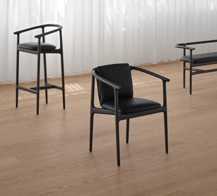
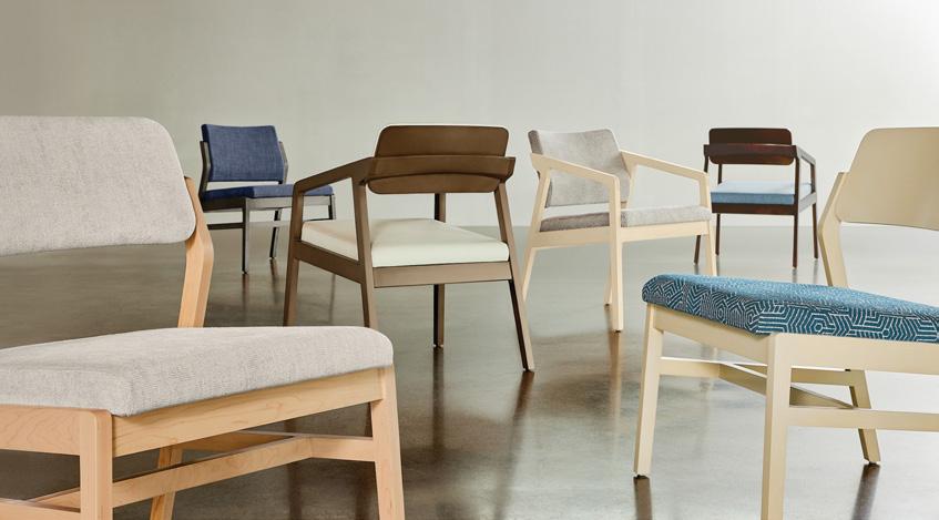



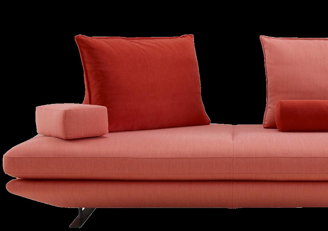
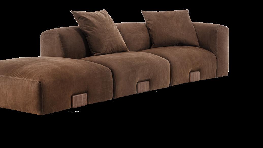
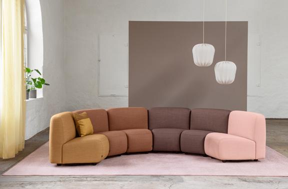
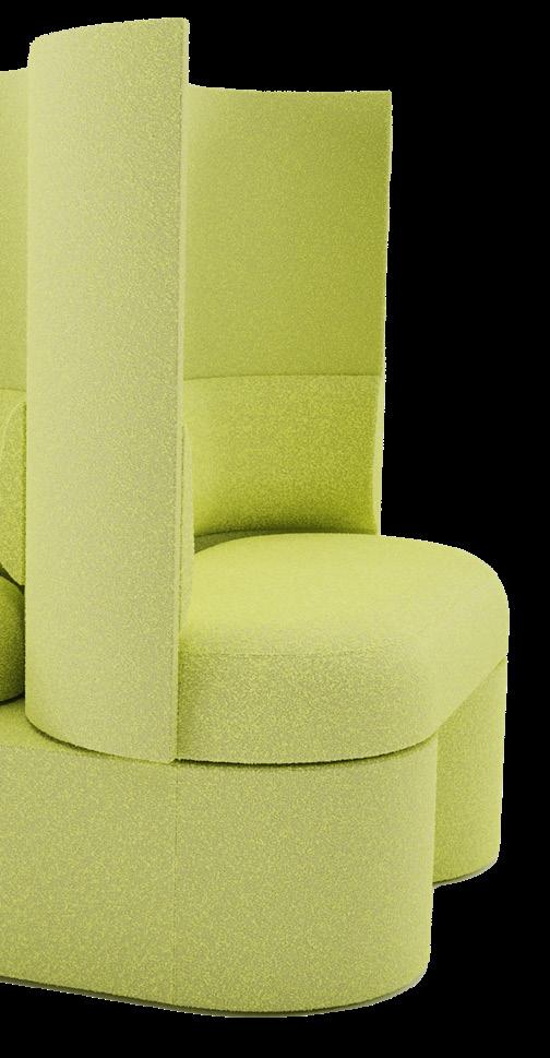
Since the pandemic’s great readjustment, the need to be flexible—to perform in different spaces, lounge differently, and accommodate potential futures—has increasingly informed the design of soft seating.

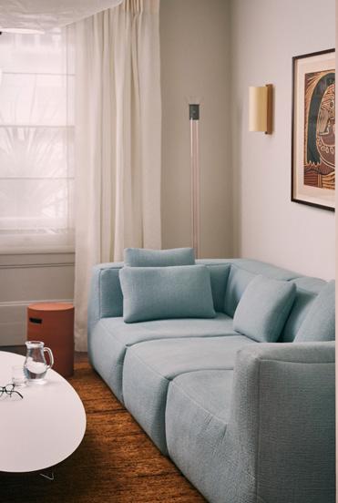
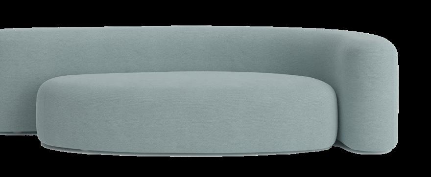
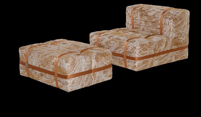

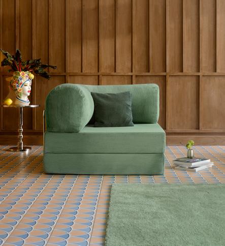
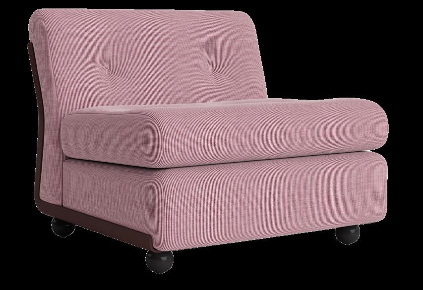
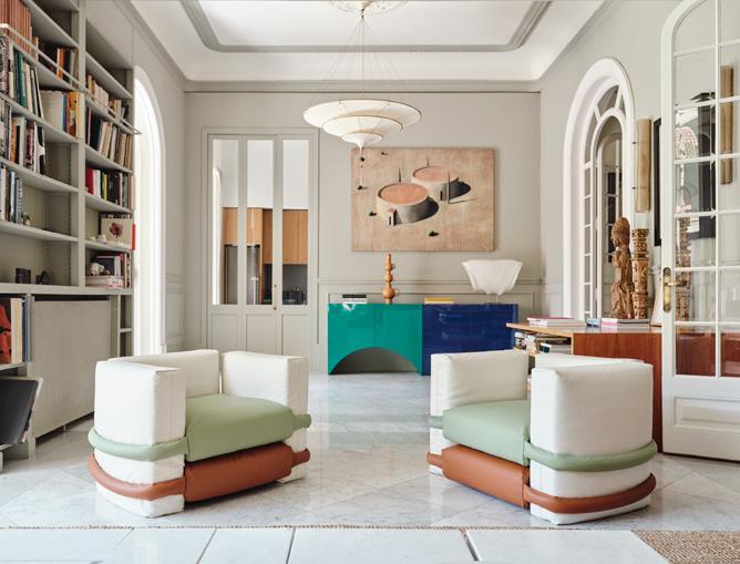


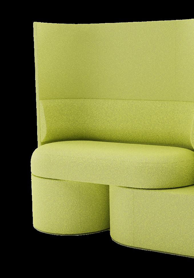
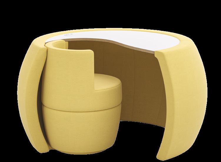
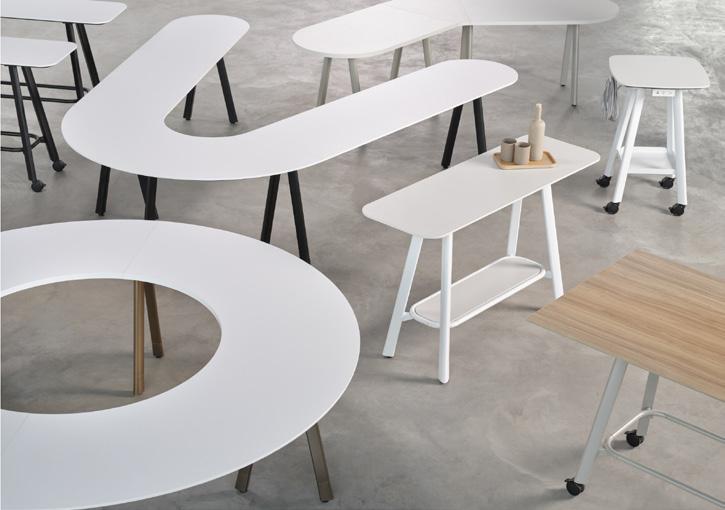
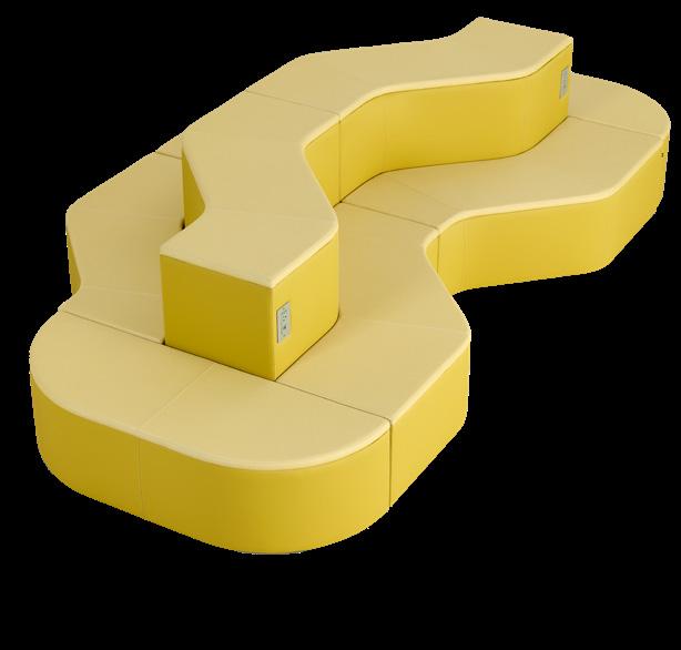
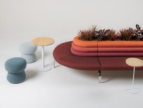
The latest wave sweeping workplace furniture is curvature. The designs gathered here have used sculptural arcs to increase flexibility, conviviality, and warmth in the office.
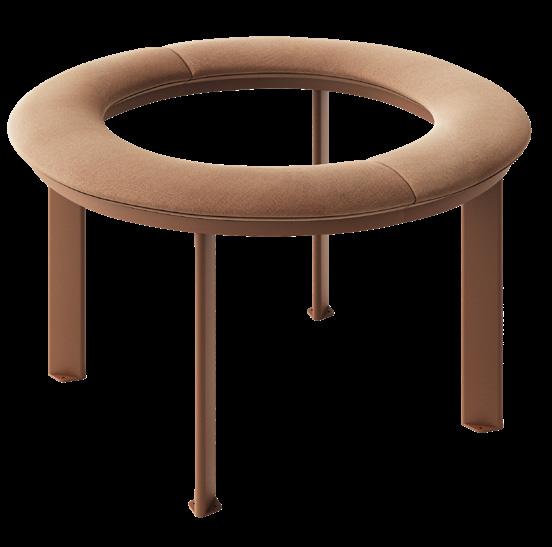
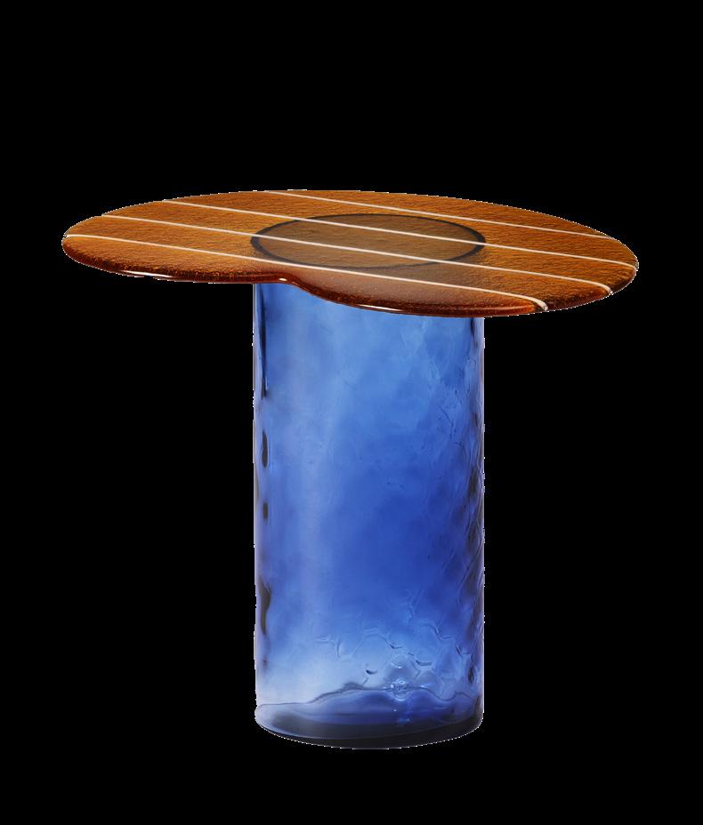
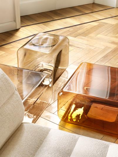
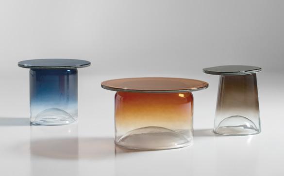
Glass tables get a bright and playful upgrade in the latest additions to a classic typology.


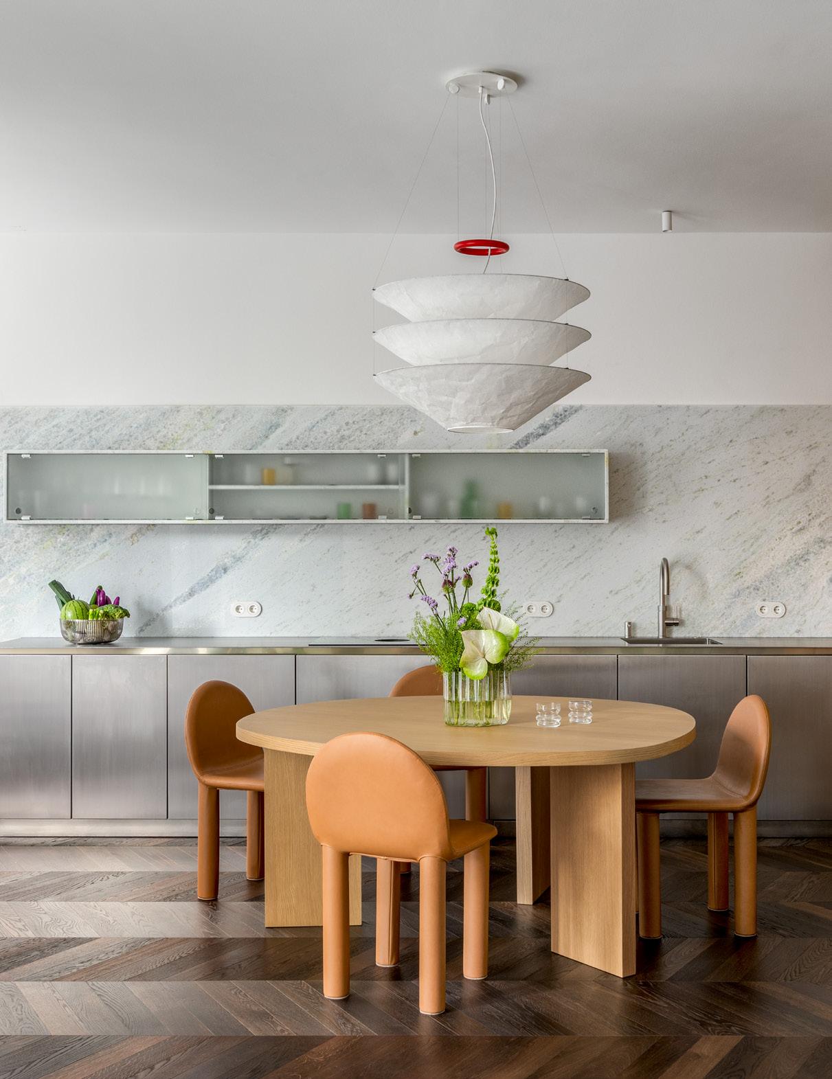
balbek bureau delivers an eclectic and comfortable Berlin apartment for ArchDaily founder David Basulto.
FACING PAGE
The dining table set by Ellison has leather seats that accent the table’s soft-toned wood. The kitchen backsplash is made of Caribbean quartzite.
ABOVE LEFT
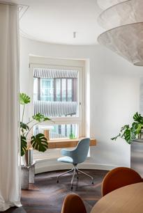
A custom desk with a concealed makeup mirror is set into the curved window bay.
ABOVE RIGHT
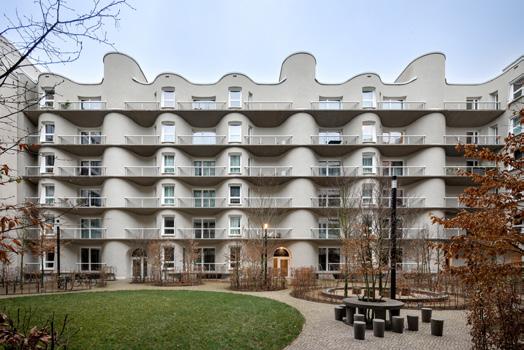
The 900-square-foot apartment is located in a new building by Herzog & de Meuron.
BELOW
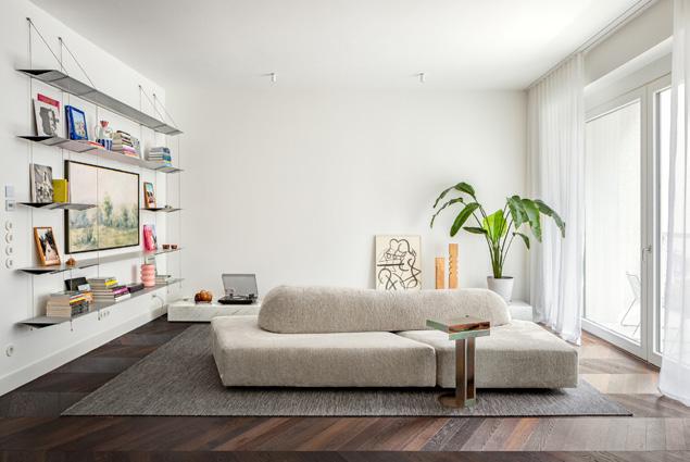
The flexible sofa is designed by Edra and the floating aluminum bookshelf is by Ben Hoek.
In Berlin’s Mitte district, a new quarter planned by Herzog & de Meuron takes its name from the heritage-listed Kunsthaus Tacheles building. Facing one of the complex’s internal courtyards, the curvy facade of a residential building, also designed by Herzog & de Meuron, easily turns heads. It’s no wonder that Chilean architect and ArchDaily founder David Basulto and his wife, Ukrainian beautician Valeriia Karas, decided to call it home. To make the 900-square-foot apartment their own, they called on Kyiv-based firm balbek bureau to carry out a complete redesign.
“I noticed their work is always very forwardlooking. And it’s always comfy,” Basulto told AN Interior. “But also, as an architect, I was always looking at the details. I had this sense that in Ukraine, there was a good approach to fabrication in wood, steel, and stone, which I saw in balbek’s projects.”
Working with the couple’s eclectic set of inspirations—including the Japandi-style Soho House (Basulto and Karas met at a party at its Berlin location in 2017), the work of Sabine Marcelis, and a requested dining table and chairs by Sarah Ellison—balbek expanded on the building’s motto: Living in the house of fine aesthetics. This included the careful selection of materials like stone, wood, and steel; color; atypical lighting and furniture; and custom-made elements. Together, this approach led to a refined yet cozy space that offers “a lighter atmosphere that you feel immediately,” Basulto said.
As a starting point, the team worked with the 1-bedroom, 2-bathroom apartment’s existing dark parquet floors and white walls. “In Berlin, where there are a lot of cloudy days, these finishes don’t make for a warm atmosphere,” said balbek bureau architect Yelyzaveta Schastlyvtseva, who led the project along with architect Nata Kurylenko.
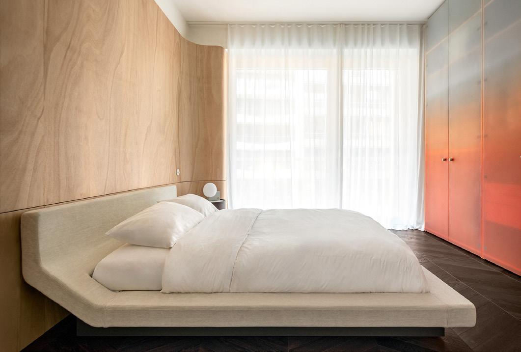
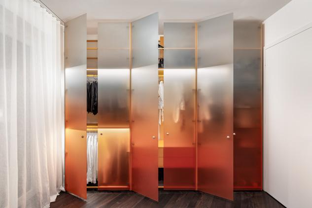
To introduce balance, balbek incorporated light wood throughout: custom cabinetry in the open-plan kitchen, the chunky Ellison dining table and light-colored leather chairs in the dining room, and a built-in desk at a bay window, which cleverly doubles as a makeup table. In the bedroom, a curvy wall finished in varnished pine, installed behind the curved Porro Lipla bed, was inspired by the building’s facade. A semitransparent glass wardrobe is faced in doors that transition in gradient from deep peach to matte white as an homage to Marcelis.
ABOVE
BELOW
The
Many of the home’s design elements were custom-made by Ukrainian German carpentry studio PlanB, including marble vanities in colorful his-and-hers tiled bathrooms (Basulto’s is green, Karas’s is pink); wallhung slabs of Caribbean quartzite as a backsplash in the kitchen, set above stainless steel cabinets; and a long, low stone shelf in the living room, where a flexible Edra sectional sofa and a floating aluminum bookshelf by Ben Hoek serve as visual centerpieces.
“[From] one side, you have something very open and flexible—this singular space of kitchen, dining, and living—but the bedroom turned out to be like a nest,” Basulto said. The paired spaces, furnished with a mix of design objects, suited the couple’s lifestyle. Basulto characterized the aesthetic as one that is “forward-looking but at the same time timeless.”
Perhaps the ultimate testament to their satisfaction: Now when the two return home from their travels, Basulto said, they no longer have the feeling of wishing they were still away. “We’re so happy to be back in our apartment.”
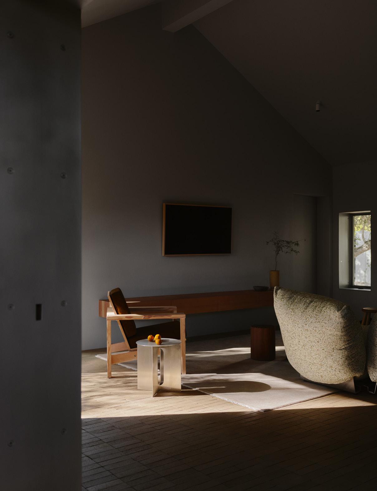
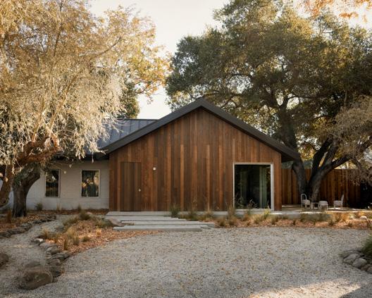
Los Angeles–based design f rm Klein Agency converts a 1920s shack into a holiday home.
FACING PAGE
The
ABOVE
The
RIGHT
BELOW
Old-growth trees provide
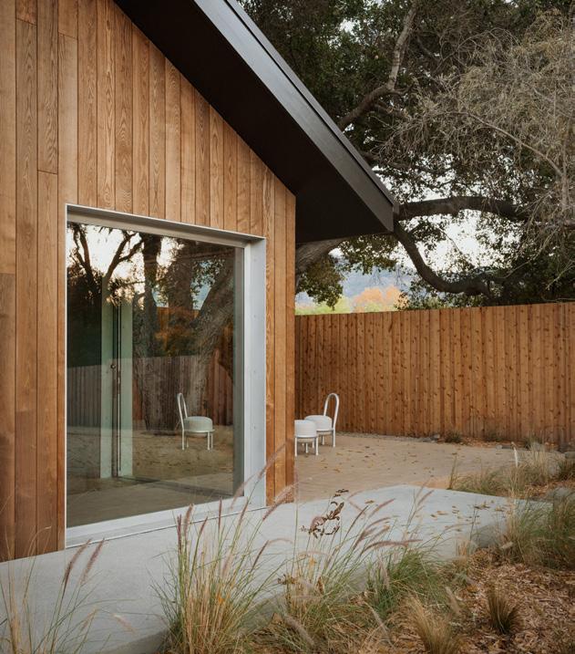
Though they arrived in Los Angeles from Belgium only eight years ago, the husband and wife team of Jon and Ma š a Kleinhample behind Klein Agency has more than made its presence known in the city’s architecture and furniture design scene.
It helps that their work often balances material honesty with playful minimalism, allowing details to shine without breaking the bank. “Early on, we realized how inflated construction costs can be in California,” Maša told AN Interior. They began pricing out their own millwork and consistently came in under typical market rates—and with better results. This technique, which includes working with local fabricators in Boyle Heights and Sun Valley, has been their routine for years.
It also helps that they work from two of the city’s trendiest neighborhoods, with a street-facing office and gallery space in Silver Lake and a home store within a 40,000-square-foot courtyard building of their own design in the Arts District. Having worked on the latter project for over four years, the Kleinhamples came to know the developer well. “Our languages, designwise, just clicked,” Ma š a recalled. “He was open, supportive, and trusted us to do it right. He knew what we could do.”
They soon found themselves designing the developer’s holiday home in Ojai, a small, peaceful town 80 miles northwest of Los Angeles. There, the client purchased a 15,000-square-foot property just a short walk from the main drag. “There was this little 600-squarefoot pioneer shack on it,” said Maša, “and the rest of the lot was filled with beautiful old-growth trees—including an ash tree that’s probably 30 feet tall.”
If all went well, the holiday home would initiate a following set of larger commercial projects on the site. “The first step was to test the ground, build a structure, and see how it integrates with the land and the surroundings,” she added. “The small house was a prototype that would indicate the potential for a larger hospitality project—still intimate, never oversized—that might include a few larger units for group stays.” The point was to maintain sensitivity to the land and context.
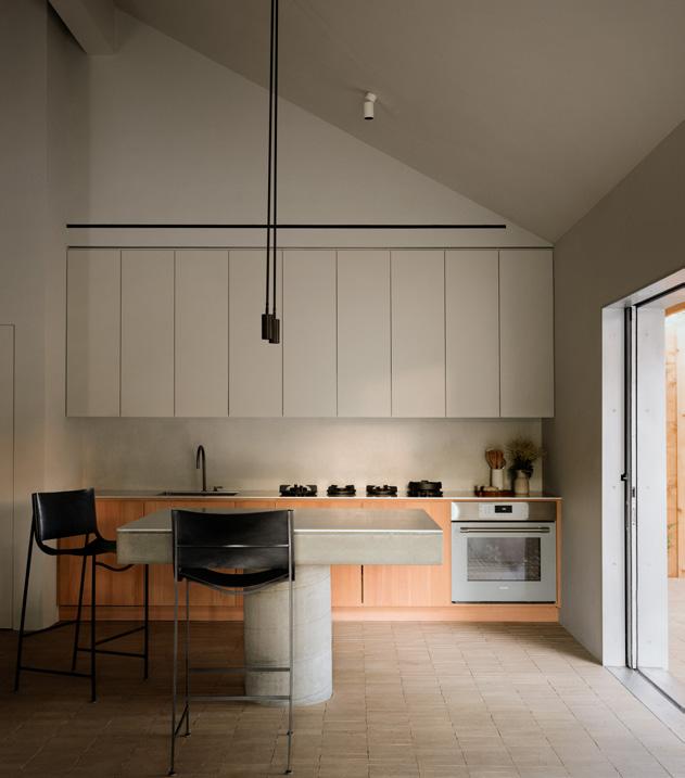
Klein Agency sought to preserve the character of the site, starting with the century-old brick structure, which it doubled in size while maintaining and responding to the structure’s material essence. “At around 1,200 square feet, we had to focus deeply on each detail,” said Maša. “It’s intimate. You can’t hide anything.”
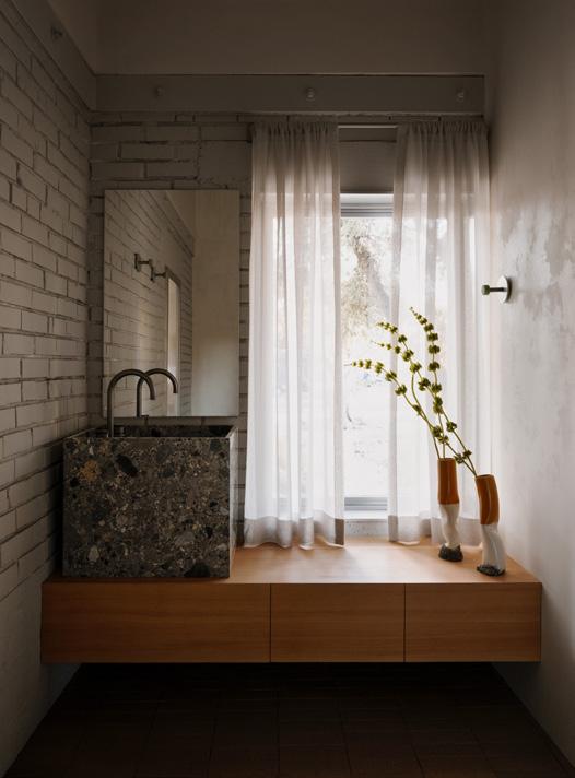
The duo used solid Douglas fir for the millwork; stone and fixtures designed by John Pawson for Cocoon for the sinks; and cast-in-place concrete for the kitchen island. Even the glazing system can be described as bespoke. With the help of its metalworker, Klein Agency installed 38-millimeter solid aluminum sliders that are “just on another level,” as Ma š a put it. “They have presence, sound, and weight—you can feel the difference immediately.”
The original shack was adapted to include one of the bedrooms and a bathroom, which bear the details of the original brick and other antique remnants beneath a newly constructed ceiling. Beyond the original footprint, muted brick pavers from ORCA unite the elements of the added open-plan common space. Even beyond that, the flooring continues outside to constitute the 500-square-foot deck, where the old growth of the site comes into full view.
The whole interior, of course, also acts as an unofficial showroom for the firm’s furniture line. Everything from the decorative lighting and furniture bears its signature balance of material and form, including the “pillow sofa” luxuriating at the center of the living room. It invites an afternoon snooze, which can be enjoyed while the leaves of the ash tree sway in the middle distance.
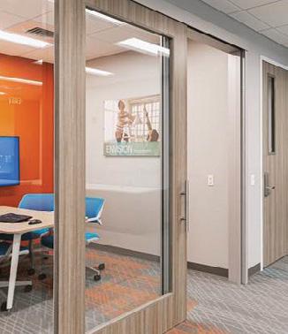
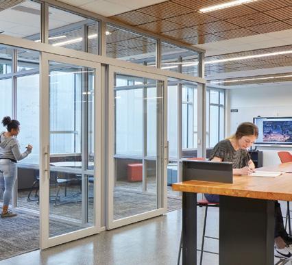
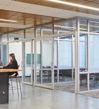
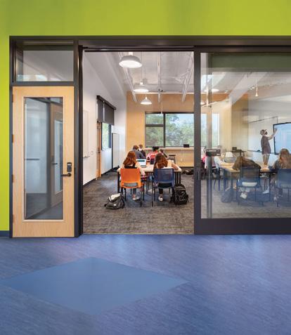


AD Systems’ commercial sliding and swing doors do more than save space. We’ve developed systems with fre ratings, hands-free automatic operators and a patented drop seal for improved acoustic performance. Learn more at specadsystems.com.
AD Systems’ assemblies provide value through:
• Superior acoustic performance
• Space-saving design
• High quality commercial-grade hardware
• Impact-resistant perimeter frames
• Large selection of materials and fnishes
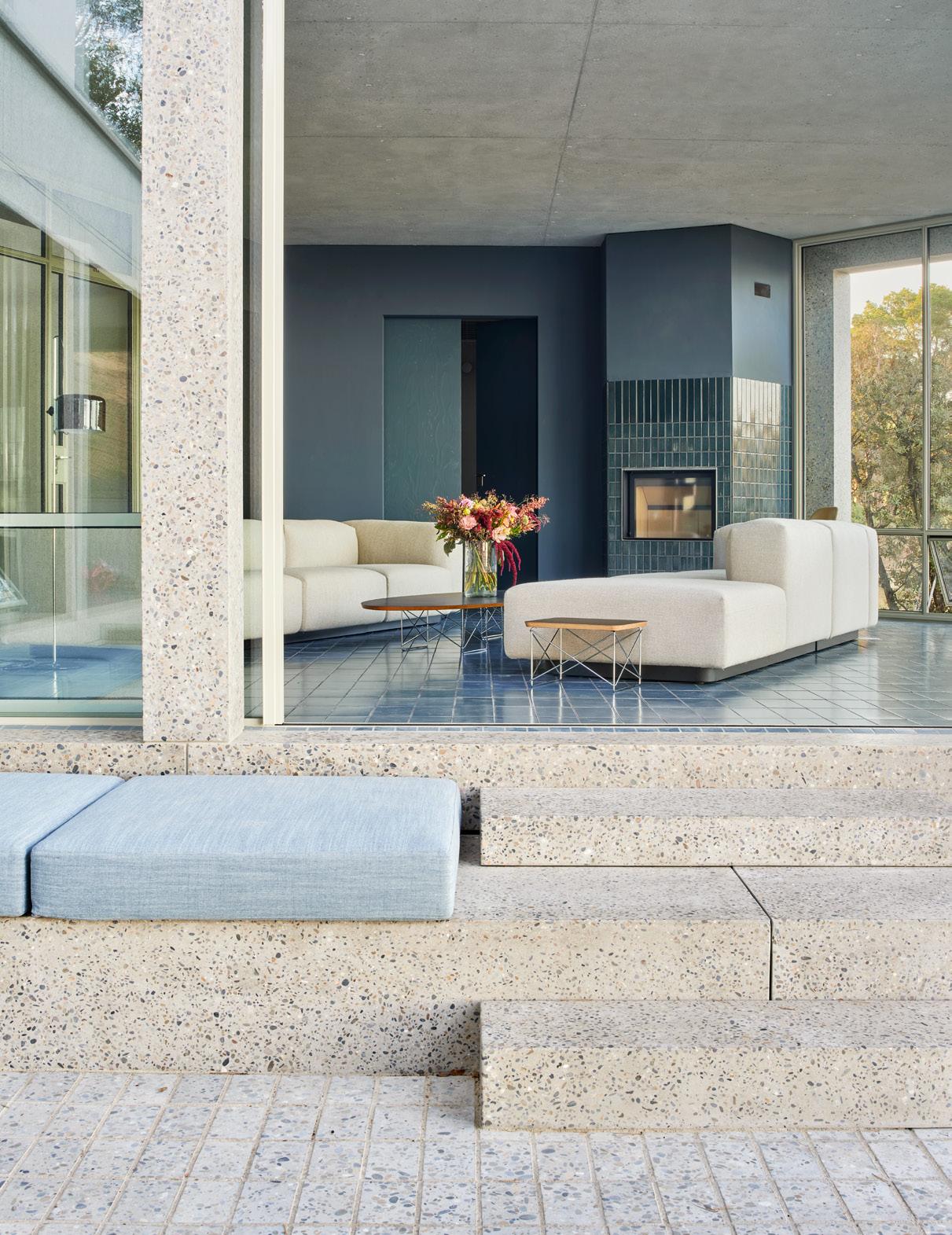
Arquitectos realizes a blue-hued vacation home designed for intergenerational relaxation.
FACING PAGE
Precast concrete was used for the home’s structural columns, beams, steps, and pavers.
FAR RIGHT
The home prioritizes views out over the Mediterranean Sea.
RIGHT
An internal court allows for cross ventilation through the residence.
BELOW
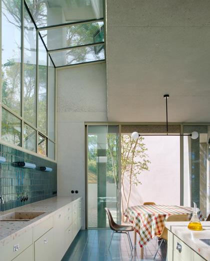
The kitchen sports custom terrazzo countertops and a tiled backsplash.
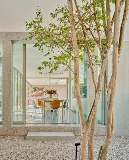
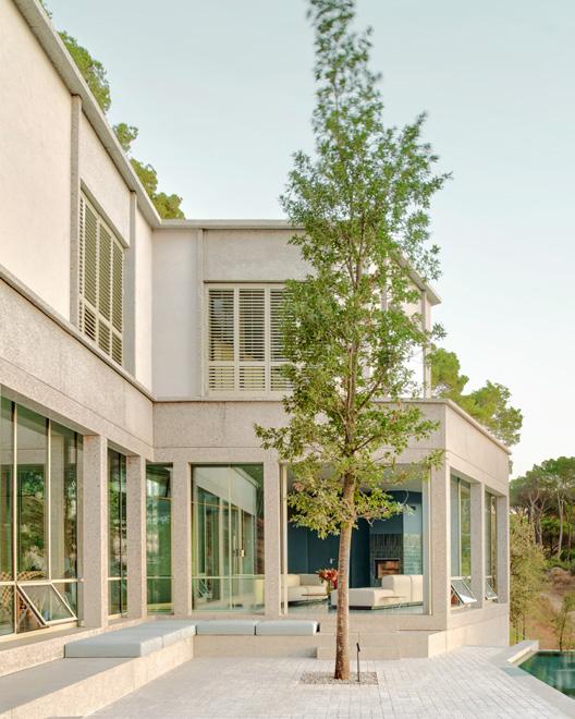
Spain’s Costa Brava is a rugged stretch of shoreline northeast of Barcelona where desirable second residences rise from steep slopes to offer views of the sea. The area’s building codes regulate what can be built through setbacks and height restrictions, and clients inevitably want to maximize the footprint. The design problem, then, quickly becomes about balancing compactness with fragmentation, Mónica Rivera of Emiliano López Mónica Rivera Arquitectos told AN Interior on a recent call about a house here that the office began in 2018 and completed earlier this year.
The home, two floors above a basement, reads as opaque walls upon arrival that then open up to the horizon. The plan is “quirky, because we are responding to forces that you don’t see,” Rivera said. While the main volume aligns with the topography to minimize earthwork, retaining walls, and foundations, the living room is rotated to prioritize the ocean view. The layout was also designed with cross ventilation in mind, so spaces have openings on both sides to allow the sea breeze to pass through.
Upstairs, the bedrooms are small, which encourages indoor–outdoor gathering on the main level. Here, the living room leads to the kitchen, and both spaces spill out onto the shaded patio and open deck. This separate but connected arrangement reinforces the cultural aspect of the home as an intergenerational gathering place where family or friends can stay for extended visits.
A couple with young children commissioned the house. The wife is an educator and a swimmer. The husband is a professional basketball player who studied interior design. Given his interest in the field, he was closely involved throughout the design process and selected some of the furniture, like the sofa and porch chairs.
Cala d’Aiguablava’s clear waters deepen from turquoise to cobalt, so the residence takes on a similar gradient. (The bay’s name means “blue water” in
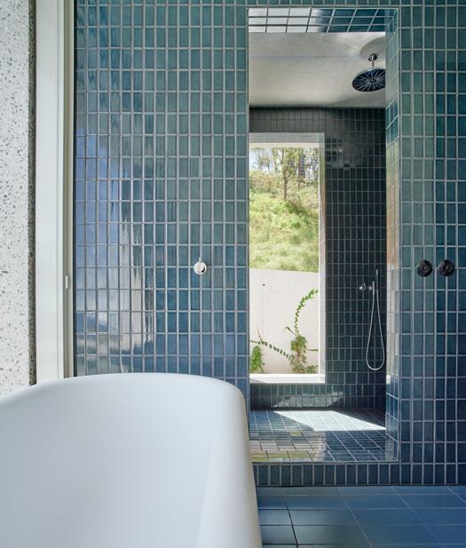
Catalan.) The underground, cave-like hammam is clad in dark-blue tiles, the main level in blue, and the upper floor in a lighter blue, while the pool is faced in green. These finishes come from Ceràmica Cumella, a famed Catalan tile factory founded in 1880.
Outside, the home is structured by a trabeated portico of polished, precast concrete columns and beams set outboard from Jansen windows and Vitrocsa sliders. The architects and the client worked with the manufacturer UBASART to customize the stone mix’s sizes, proportions, and colors, which range between blue and gray. (The company also produced the pavers that surface the patio and the window jambs and headers on the upper level.) The remaining walls are infilled with brick and lined with continuous insulation, which reduces the load on the PV-powered aerothermal system that heats and cools the space.
The color story continues inside, where the pale-green kitchen millwork supports custom terrazzo countertops made by Huguet in Mallorca. Above, blue tiles line the backsplash, which is illuminated by babyblue sconces from NEMO, originally designed by Charlotte Perriand. The aforementioned Vitra sofas are complemented by an elliptical Eames surfboard coffee table from Herman Miller. Nearby, the wooden stair guard, painted in a light sage hue long favored by the office, is “very strategic,” Rivera observed, as it navigates the tight radius of the steps with beveled vertical pieces that can be fitted to the concrete structure.
Though small, the practice typically employs two or three designers at a time beyond its partners. The atelier specializes in low-energy and low-carbon construction: Its mass-timber house in Arteaga is currently on view in Internalities, the Spanish Pavilion’s exhibition at the Biennale Architettura 2025 in Venice. And the cofounders have a presence in the U.S., as Rivera directs graduate studies at the Rice School of Architecture, and next spring López will be a visiting professor at the University of Texas at Austin School of Architecture. Rivera also served as a juror for AN ’s Best of Design Awards last year.
The house in Aiguablava is the latest example of Emiliano López Mónica Rivera Arquitectos’ expert ability to realize thoughtful dwellings that unite site sensitivity, smart construction logic, and stylish interiors— all of which set the stage for a good life.
ABOVE
The upstairs primary bath is lined in tile and opens onto an elevated outdoor deck.
FAR RIGHT
A wooden balustrade caps the end of a concrete staircase.
RIGHT
A view down through the kitchen emphasizes the scheme’s thin depth and openness.
FOLLOWING PAGE
The ample outdoor spaces encourage “separate but together” habitations.
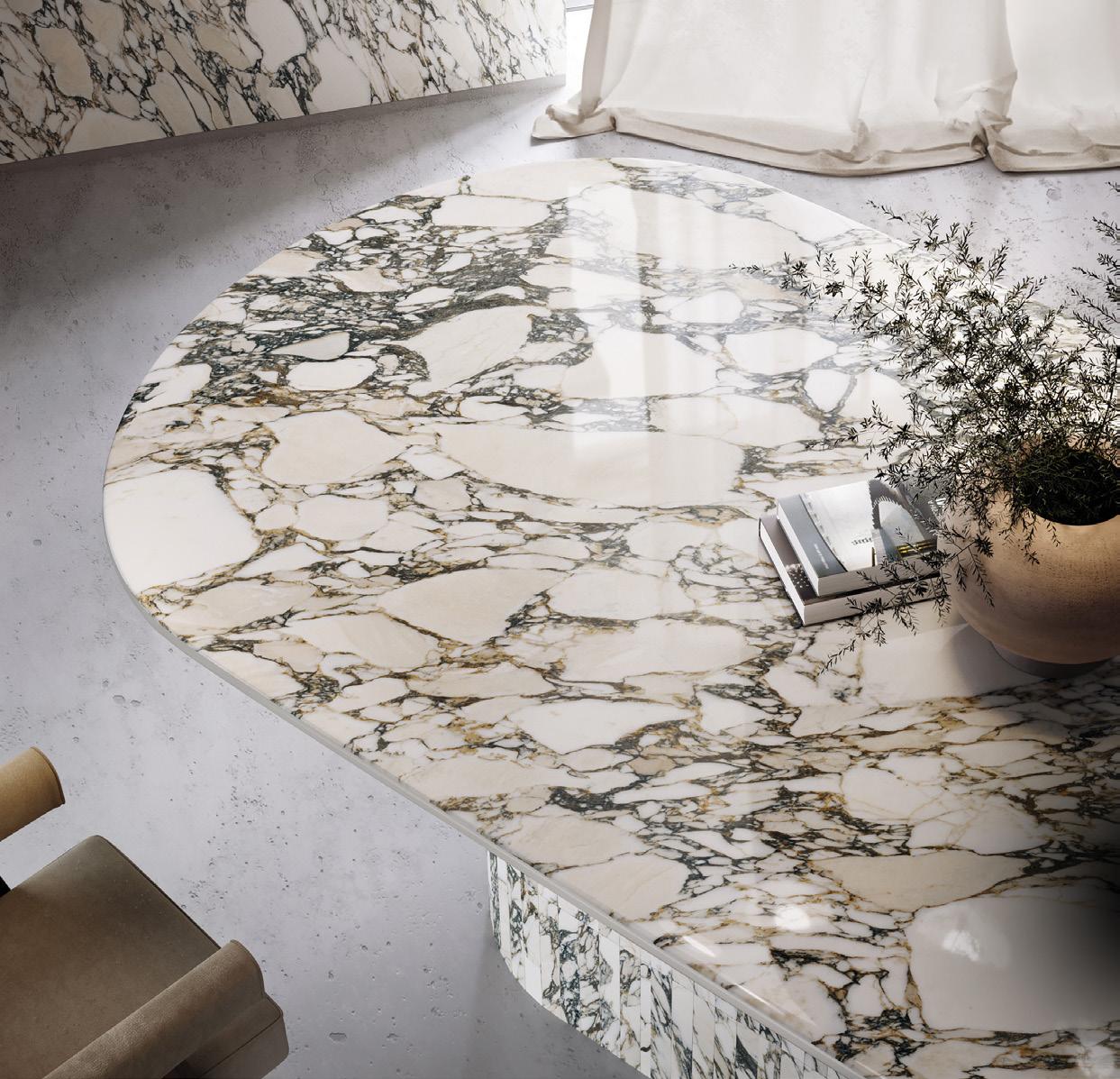




ACHIEVE SEAMLESS, COORDINATED DESIGNS ACROSS MULTIPLE SURFACES WITH XL PREMIUM PORCELAIN SLABS




North America’s got talent! Now in its eighth year, this listing, built from our editorial coverage, observation, and research, showcases the most relevant architecture and design firms working in interiors today.


The studio, established by Joshua Aidlin and David Darling in 1998, works across public and private sectors and focuses on environmental connection and restraint.
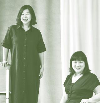

Founded by principal Dean Levin, 22RE practices groundup architecture,interiors, and furniture design with an emphasis on craft and sensorial experiences.
Created by Alda Ly and now led by Ly and Tania Chau, ALA Studio serves clients worldwide who are looking to rethink traditional hospitality, health and wellness, workplace, and retail spaces.
Dorian Booth and Anthony Gagliardi cofounded Almost Studio in 2018. Across typologies, they experiment with form, material, program, and representation. Los


Anya Moryoussef initiated her practice in 2016. She focuses on the overlooked potential of renovations and vernacular reinterpretation with restraint and sensitivity.
amarch.ca

Architecture Research Office is led by Stephen Cassell, Kim Yao, and Adam Yarinsky, a collective united by a research-driven approach.
aro.net
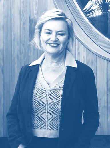

Established by Barbara Bestor, Bestor Architecture works across scales, from wineries to community centers, with an eye toward creating accessible urbanism.
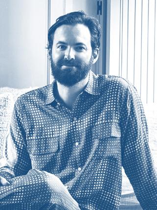
Los Angeles patrickbernatz.com
Bernatz Studio by Patrick Bernatz is a design, architecture, and furnishings studio that prioritizes local materials and craftsmanship.
Washington, D.C.
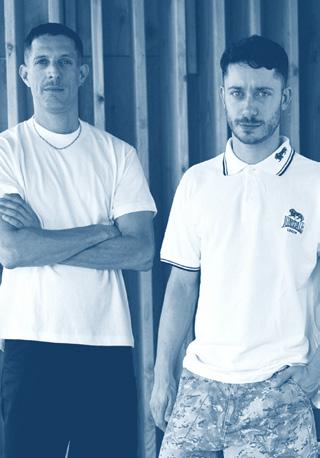
Founded in 2013 by Jack Becker and Andrew Linn, BLDUS practices design, development, and construction across the U.S., exploring American vernaculars and economy of construction.
bld.us
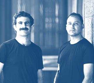
BOND, or Bureau of Noam Dvir and Daniel Rauchwerger, was founded in 2020 to bridge a gap between architecture and interior design.

Brent Allen Buck works across the country to deliver both smallscale furniture, large-scale multifamily buildings, and the interiors in between. He created his own office in 2018.
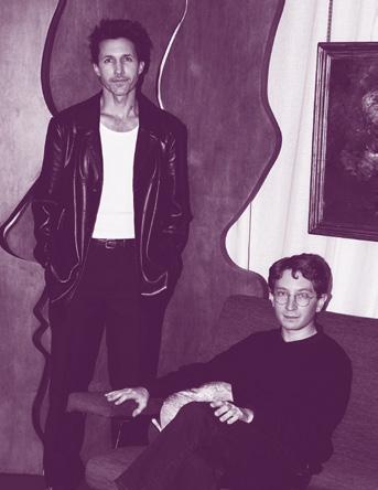
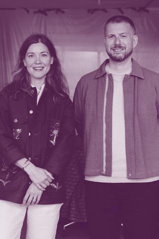

Adam Charlap Hyman and Andre Herrero lead the bicoastal firm with a fantastical, immersive vision that considers divergent art forms and scales.
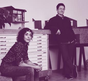
Established in 2017 by Matthew Au and Mira Henry, Current Interests designs cultural projects, residences, and exhibitions, with an emphasis on social, spatial, and material liveliness.


San Francisco
James Leng and Jennifer Ly direct Figure, offering quiet interventions through a sensitivity to identity, context, and an economy of means.
figure.us


Vancouver darcyjones.com
Since 1999, D’Arcy Jones has developed a practice that delivers inventive experimental and conceptual work across scales and in urban and rural areas.
Austin
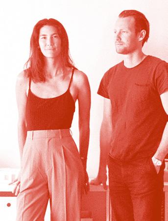
Husband-and-wife team Will and Alice Fox lead Fox Fox Studio with an emphasis on conceptual narrative and art sensibilities for a range of projects.
foxfoxstudio.com
Chicago
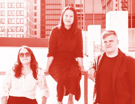
Founded by Ann Lui and Craig Reschke in 2015, Future Firm is an architecture and design office with a focus on clients in arts and culture organizations and nonprofits.
future-firm.org
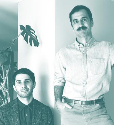
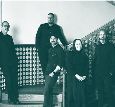
Cofounders Tal Schori and Rustam-Marc Mehta lead a team of 12 with the motivation of uniting distinctive aesthetics with technical excellence across all project types and material liveliness.
grtarchitects.com

Working in interiors, architecture, and object design, INC Architecture & Design was created by Adam Rolston, Drew Stuart, and Gabriel Benroth to unite joy, utility, and craft.
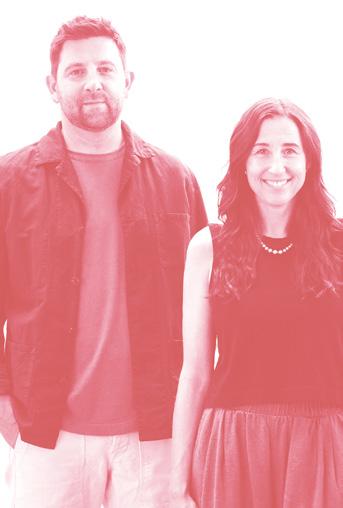
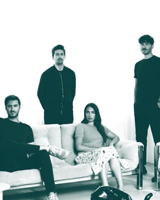
Led by Nick and Brittany Hunt, Hunt Architecture is an integrated interior architecture and interior design firm, focusing on a modern yet approachable style.
hunt-architecture.com

Partners Guillaume Riel, Philip Staszewski, Gabrielle Rousseau, and David Kirouac make up Ivy Studio, an office creating bold, hyperpersonal spaces.

New York
Specializing in luxury residential, hospitality, and commercial projects, JG Neukomm Architecture, led by Jean-Gabriel Neukomm, considers context and tactility in all projects.
jgnarch.com


Los Angeles; Cambridge, Massachusetts
Established in 1998 by Sharon Johnston and Mark Lee, Johnston Marklee has realized buildings and interiors in 14 countries. They are engaged with arts, culture, and academic pursuits.
johnstonmarklee.com
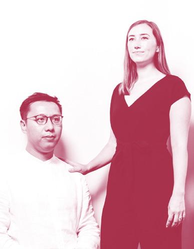

Founded in 2015 by Isabel Abascal and Alessandro Arienzo, LANZA celebrates beauty through striking form, conceptual furniture, sitespecific interiors, and engaging exhibition design.
lanzaatelier.com
Lap Chi Kwong and Alison Von Glinow created their firm in 2017 and bring a formally innovative yet accessible spirit to living spaces,cultural venues, urban public areas, and other projects. Chicago kwongvonglinow.com


Fayetteville, Arkansas
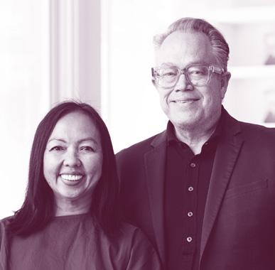
Practicing architecture and interiors that are both contextually resonant and experientially rich, the firm, led by Marlon Blackwell and Meryati Blackwell, applies a situational approach.
marlonblackwell.com
Since 1989, Leo Marmol and Ron Radziner have led their design-build architecture practice in a way that integrates architecture, construction, landscape architecture, and interior design.
marmol-radziner.com


Led by Arancha González Bernardo and Michael Fohring, Odami delivers commercial and residential spaces using atmospheric and confident visual languages.
odami.ca

Austin; Houston
Founded by Michael Hsu in 2005, Michael Hsu Office of Architecture works across project typologies worldwide, all of which are united by a sense of welcoming hospitality.
hsuoffice.com

Of Possible was created in 2008 by Vincent Appel and works across spheres of architecture, design, interiors, urbanism, furniture, sculpture, and large-scale public art.
ofpossible.com
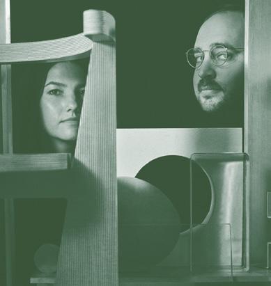
San Francisco; New York
Michael Yarinsky and Kelley Perumbeti work across disciplines—including architecture, furniture, and, most recently, food—but always maintain a sense of play.

Since establishing his office in 2003, Omer Arbel has experimented with construction methods, spatial concepts, and form, alongside designing for Bocci, the lighting company he cofounded.
omerarbel.com
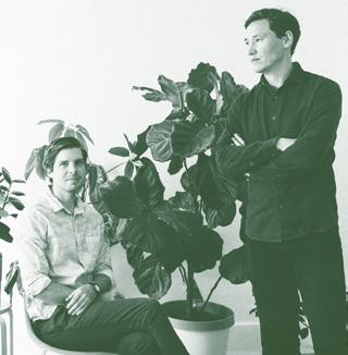
Tyler Noblin and Max Obata founded their office in 2020. Together they combine a language of warmth and formal restraint in projects across the U.S.


In 2018, Pablo Pérez Palacios founded his practice to work across disciplines in architecture, art, planning, urban design, and interior design projects.

Working in hospitality, retail, and residential programs, Post Company, led by Ruben Caldwell, Jou-Yie Chou, and Leigh Salem, crafts grounded yet rich and wellresearched environments.

ringo-studio.com

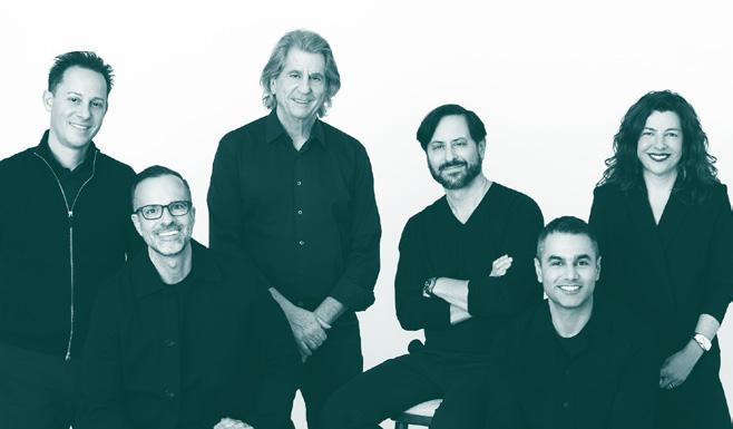


New York; Los Angeles; Madrid rockwellgroup.com
Founded in 1984 by David Rockwell, Rockwell Group is a 350-person firm that is well-known for realizing layered and theatrical interiors across scales and around the world.
Sarah Jacoby created her eponymous firm in 2014. She specializes in building, creatively restoring, reconfiguring, and designing space.
New York sarahjacobyarchitect.com
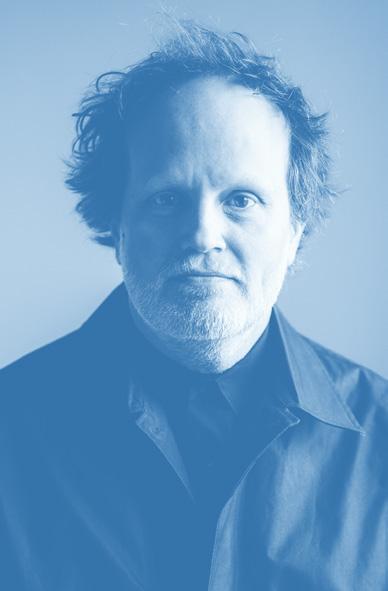
Troy Schaum and his firm consider the city at the scale of the building as the basis of the approach to national and international projects.
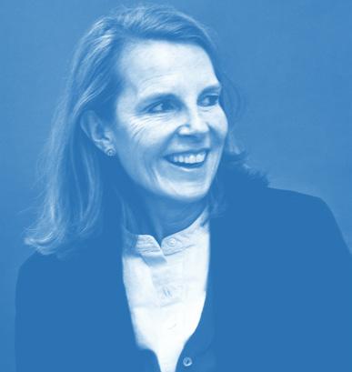

This 65-person firm, established by Annabelle Selldorf in 1988, creates large-scale public and civic projects, as well as private spaces, with clear, modern sensibilities.
Kristen Sidell and Rudabeh Pakravan began practicing together in 2014 to explore speculative research and building commissions in Northern California.

Jing Liu and Florian Idenburg lead SOLID OBJECTIVES IDENBURG LIU (SO – IL),an office that delivers a range of project types with the ambition of shaping a stronger civic realm.

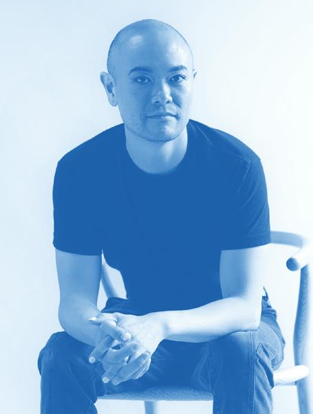
Craig Stanghetta leads Ste Marie in the design of immersive hospitality, residential, and commercial spaces across North America. J. Roc Jih leads their firm in designing pragmatic and sculptural works, where culture acts as a framework for construction and form.


Little Wing Lee established her firm in 2019. She specializes in interior design, architecture, furniture, and lighting, guided by a narrative approach. From Giancarlo Valle and Jane Keltner de Valle, Studio Valle de Valle is an international practice dedicated to playful, studied, and unexpected spaces.

Founded by Amale Andraos and Dan Wood in 2003, WORKac designs public, cultural, and civic projects in the U.S. and beyond while considering landscape and ways of living.
work.ac
New York; Toronto
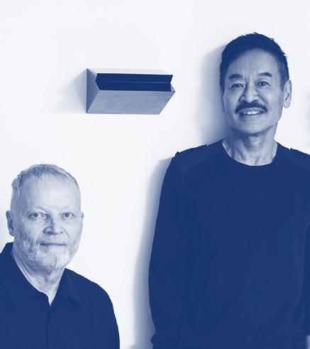
The global studio, cofounded by George Yabu and Glenn Pushelberg, has designed notable interiors, furniture, textiles, and objects since 1980.
yabupushelberg.com

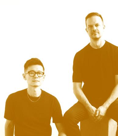
Max Worrell and Jejon Yeung’s studio, established in 2015, considers conceptual clarity and future adaptability in residential, commercial, civic, cultural, and adaptive reuse projects.
worrellyeung.com
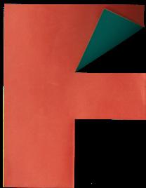
To create the identity for this year’s Top 50 Architects and Designers list, Studio Loutsis started from a blank page—literally. Its designers established a language of cuts and folds to create a custom alphabet for the listing. Each letter, and the opening page, were modeled in colored paper and then scanned to create the layout. The idea is a reminder to keep things fun, fresh, and experimental.

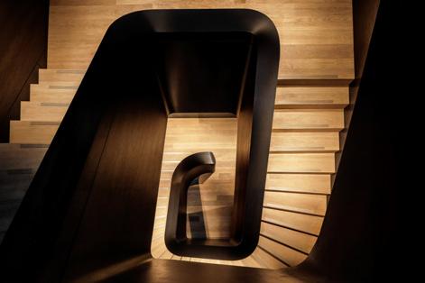
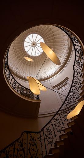
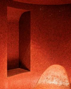
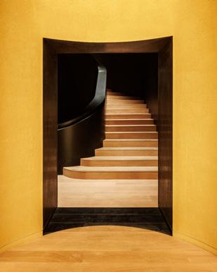
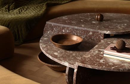
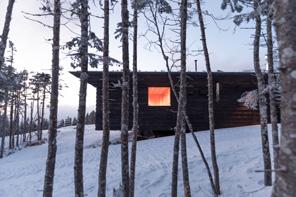


Four projects explore spaces for escape, wellness, sport, and dining.
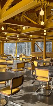
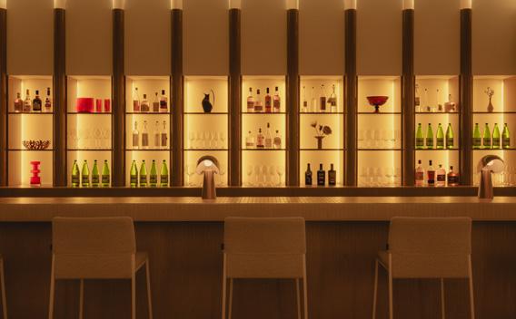
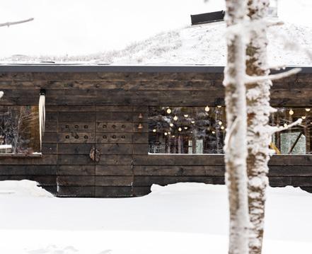
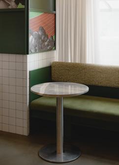
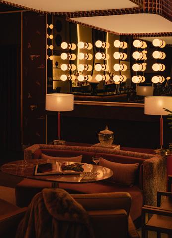
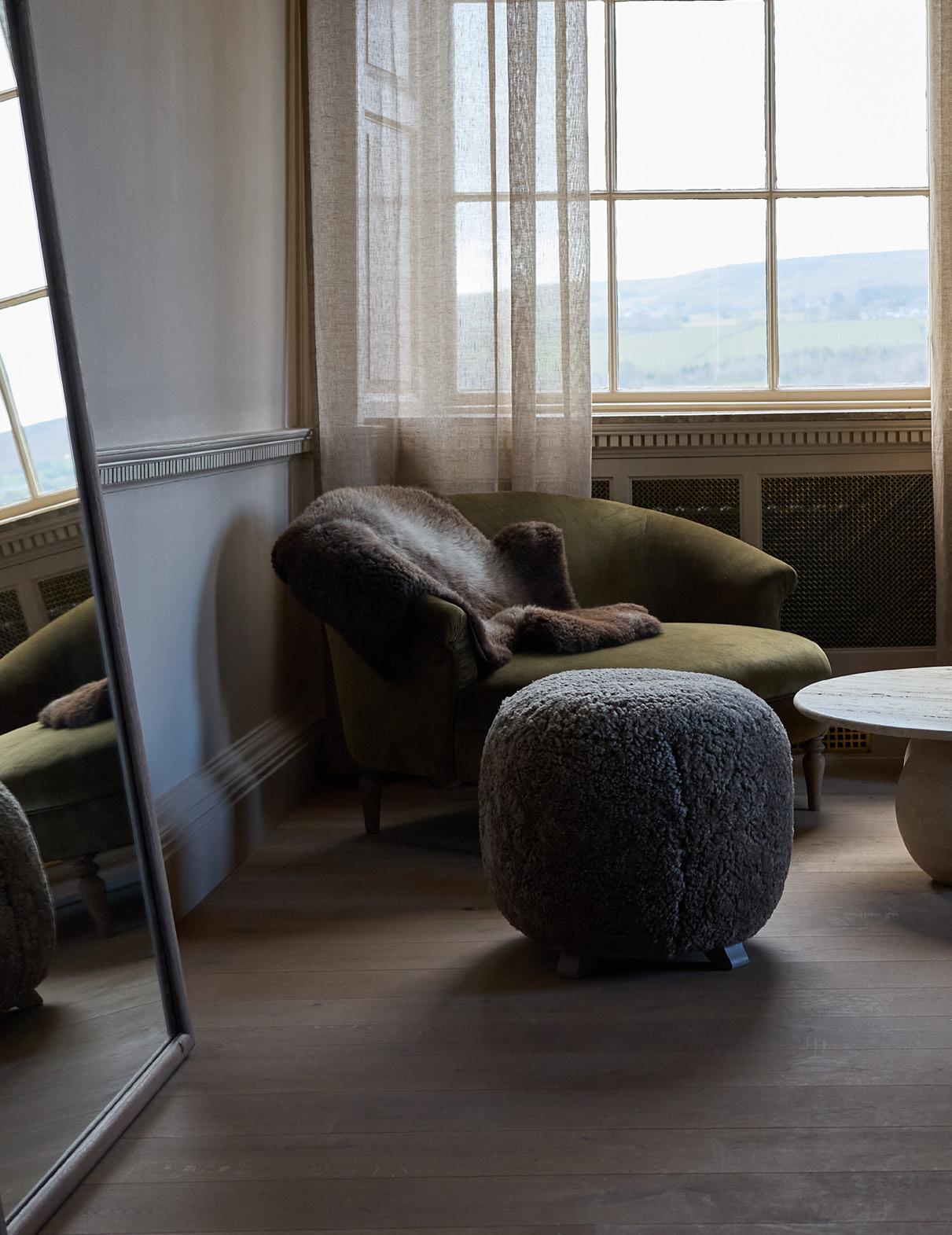
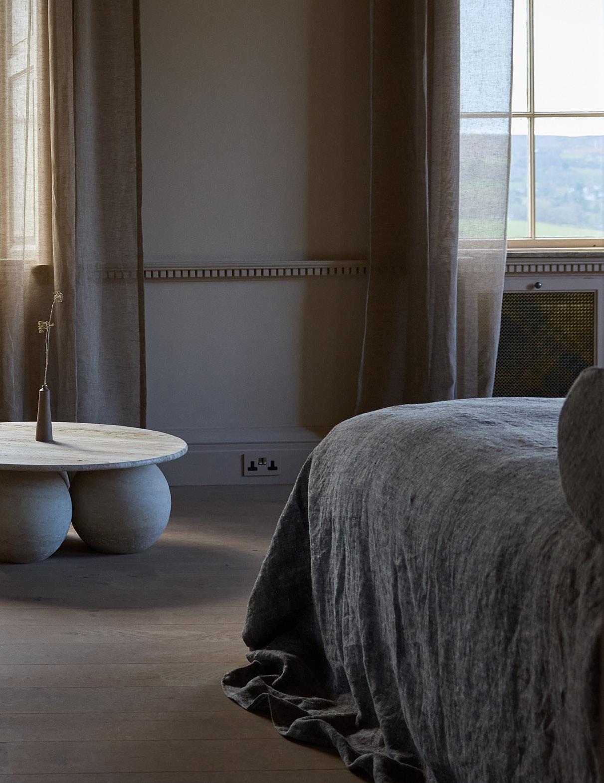
BOX 9 transforms a manor in the English countryside into an otherworldly hospitality destination.
PREVIOUS SPREAD
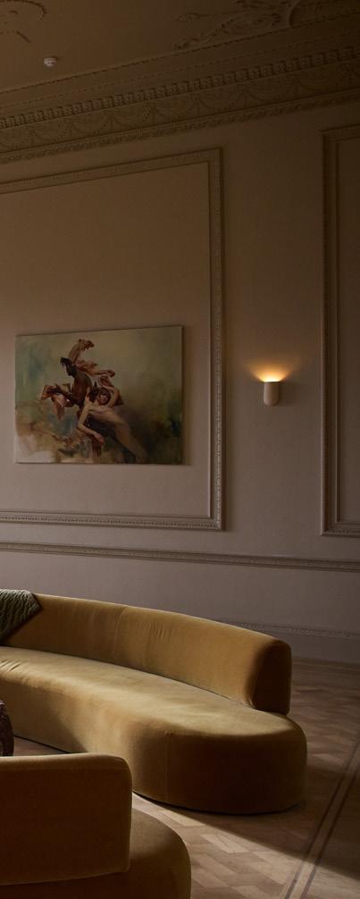
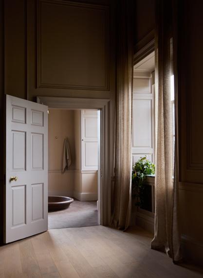
Contemporary furniture and fixtures are set against the original estate interior. Existing drapery was replaced with more translucent textiles.
ABOVE
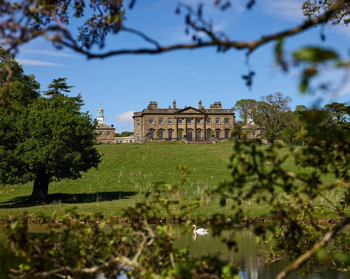
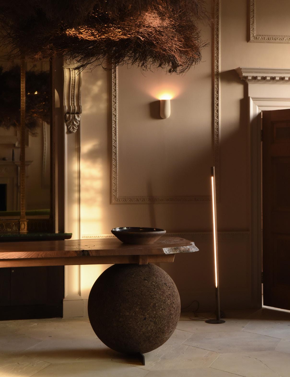
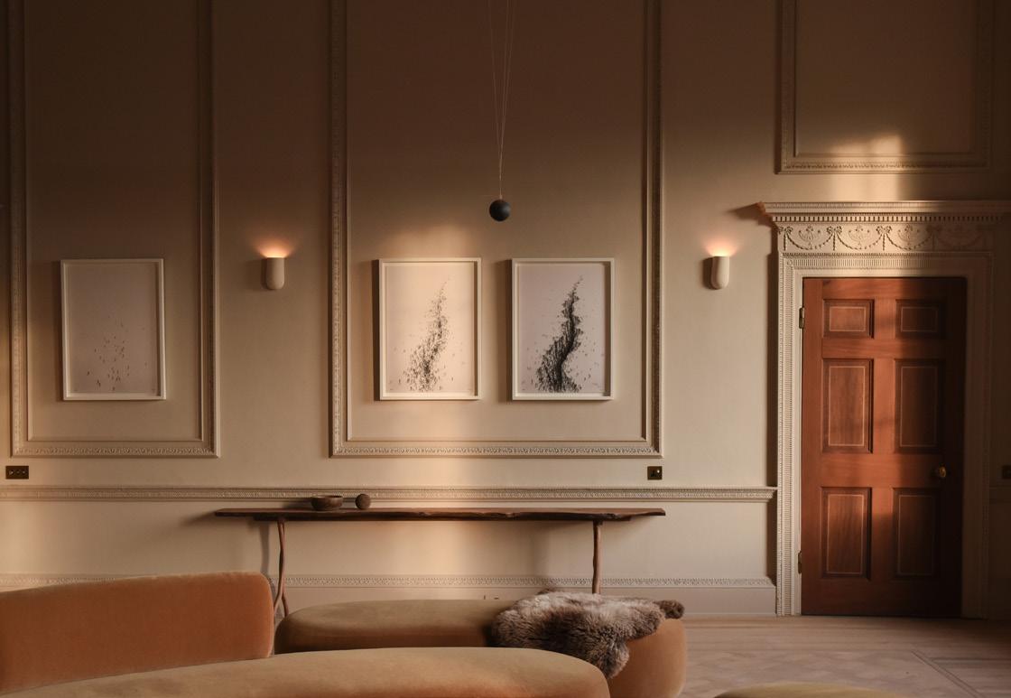
Denton Hall, a Palladian manor house in the English countryside, is at the center of a 2,500-acre estate that has been rewilded.
BELOW
The color palette uses tones and materials that evoke the Yorkshire Dales’s soil, stone, and moorland moss.
FACING PAGE
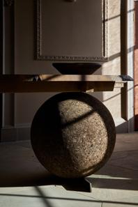
The table, set upon a cork sphere, was fabricated from a storm-downed British oak. It was designed by BOX 9 with Ted Jefferis ahead of a capsule collection that will launch in 2026.
From central “background” roles in Gosford Park to the ever-expanding universe of Downton Abbey, the English manor house has remained a deeply romanticized emblem of the Georgian and Victorian eras. As fortunes and customs shifted in the early 20th century, many houses were turned into museums, hospitals, and hotels. Some were even left abandoned. All too often, these grandiose mansions were haphazardly renovated with efficiency in mind.
Denton Hall was one such property. Situated at the center of an expansive Yorkshire estate, the Palladian-style palace was completed in 1778 by period-defining architect John Carr, but over the following centuries, it endured numerous alterations. In the 1970s, it was subdivided into offices. Original detailing and sumptuous surface treatments were covered up by heavy wall-to-wall carpeting, thick curtains, and the boldly toned geometric patterns popular back then.
“Our challenge was to undo the interventions layered over time,” said Lou Davies, cofounder of London firm BOX 9, which led Denton Hall’s recent restoration and transformation into a multivalent events venue. (The entire manor house can now be rented out.) “All of that noise made the space feel intimidating, which of course was intentional, but we felt it needed undoing. We wanted to reorient attention to the architecture, volumes, and light.”
Davies and her team saw themselves as design custodians. They gently guided the historically listed structure back to a certain version of its former glory, all while carefully bringing it up to contemporary standards.
“We wished our work to be respectful, to learn from and honor the past but to not be afraid of the future,” Davies added. “We led with determination and assumed responsibility, ensuring a building of such significance would be renovated in a way that keeps it relevant and keeps generations engaged with history.”
BOX 9 assessed what was worth keeping and amplifying, which took place in parallel to the ecological restoration of Denton Reserve. The team refreshed the estate’s interiors, with placemaking top of mind, not only sprucing up historical detail but also tying the space back to its immediate natural surroundings.
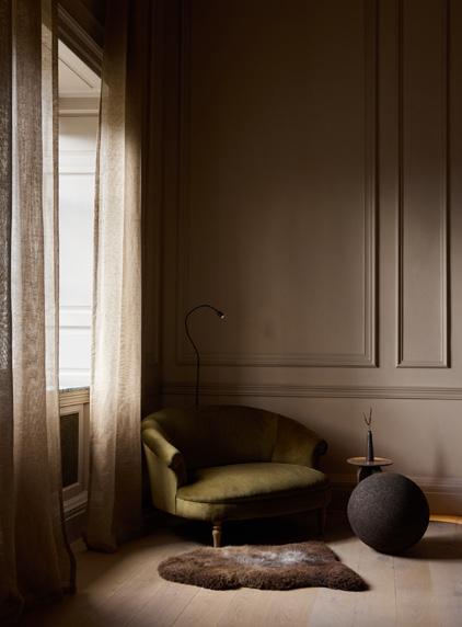
Walls were rendered in tones and materials reminiscent of the Yorkshire Dales’s soil, stone, and moorland moss. The large windows encircling stately rooms were relieved of cumbersome drapery. Many of the meticulously selected furnishings reflect this ethos as well.
“We achieved this by working with materials and makers who honor nature, who work reciprocally with what it gives but without draining it,” she explained. “Designers can no longer just aim to be less wasteful; we must also clean up the waste we’ve already created.” While Sussex-based practice Studio Amos crafted a custom 13-foot-tall chandelier out of moorland heather, the monumental reception desk was hewn from stormfelled British oak and propped up by spherical cork legs.
“There’s a quiet refusal to overstate,” Davies said. “There’s an invitation to slow down. The design suggests a degree of endurance.” This ambition is clearly more futuristic than nostalgic.
Unlike with a standard gut renovation, the firm carried out a series of carefully studied and implemented interventions. Favorable attributes already in place were left untouched. “These days, the challenge in restoration often lies in opening up old houses to create larger living spaces,” she explained. “Denton Hall already has that type of layout. A central reception room flows into wings. The rooms upstairs are generously proportioned. Listing constraints led us toward creating spacious bedrooms with vast open-plan bathrooms.”
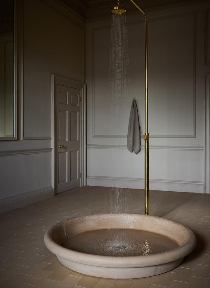
The sleekly integrated, geometrically shaped exposed bathtubs and showers were a bold yet inspiring move. They allow guests to carry out their ablutions while appreciating the open expanse of the room—and nature beyond.
ABOVE
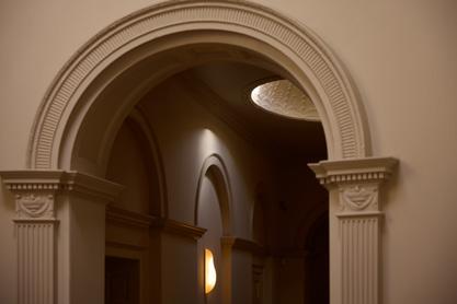
Original detailing and surface treatments, covered up during past renovations, were unearthed and left exposed.
BELOW
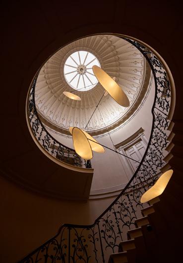
An elliptical dome, illuminated by a skylight, is an ideal spot for sculptural lighting.
RIGHT
An upstairs corridor frames a view of the expressive chandelier made by Studio Amos.


FAR LEFT, ABOVE
Original ornamentation from the 1778 structure establishes a dramatic milieu.
FAR LEFT
A bespoke living room set by Leleni Studio consists of curvy couches and a coffee table made from industry waste offcuts.
TOP
Freestanding fixtures are imagined as sculptural insertions to avoid partitions or compromised sightlines.
LEFT
Whether in an open bathroom or a bedroom, the windows offer views of the moors and grazing sheep.
PHOTOGRAPHY BY 11h45
In Paris, Sala Hars works its magic to create Zoī Vendôme, a preventative medicine experience.
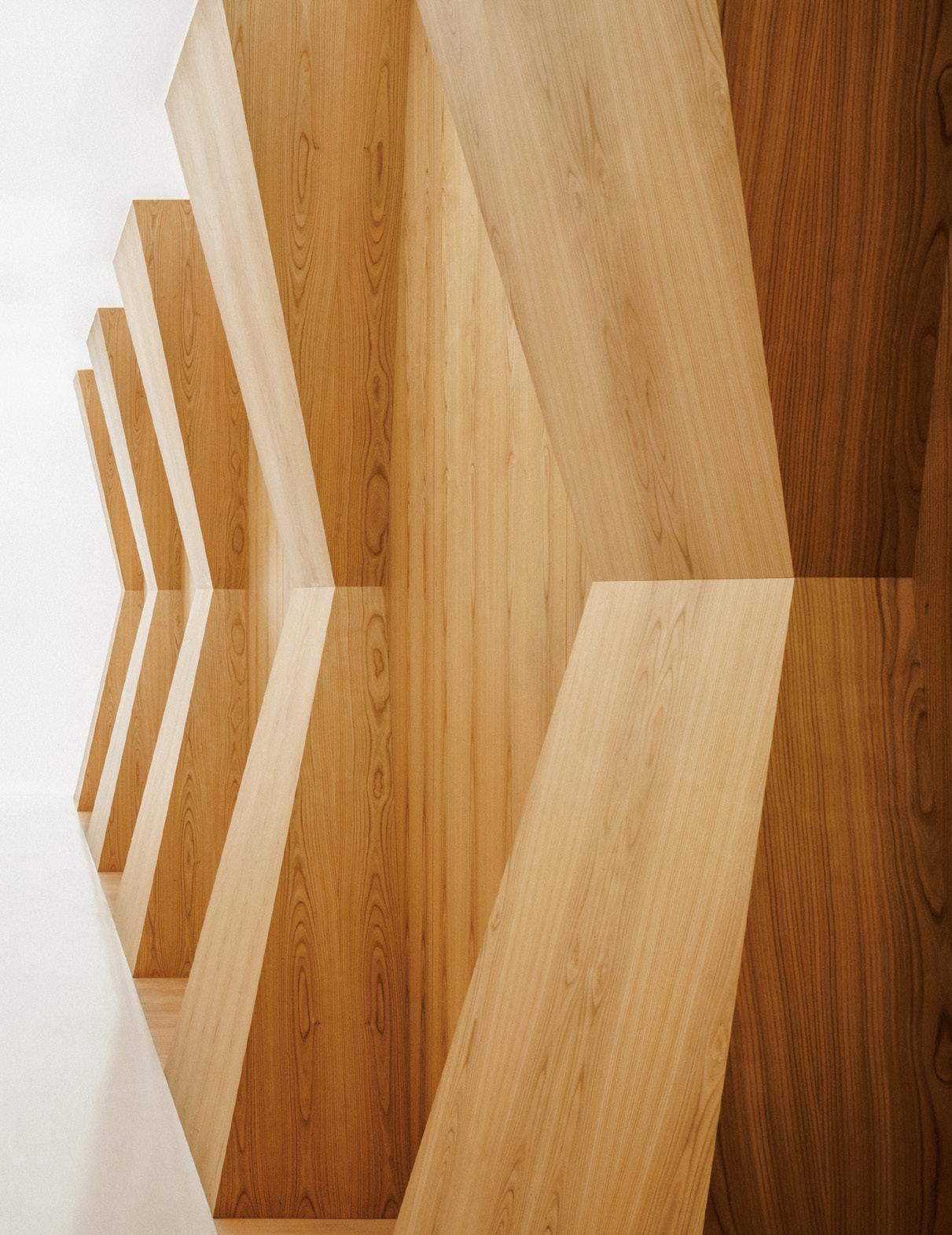
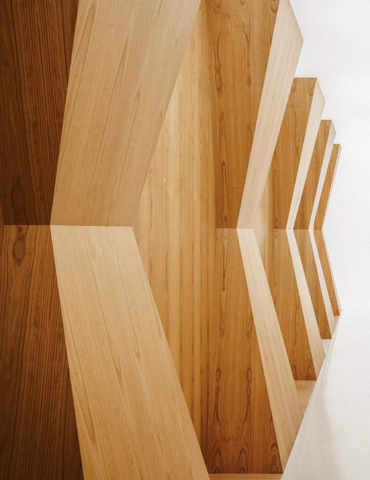
An enfilade of hyperboloid-like millwork greets visitors upon entry, making for a dramatic procession into the wellness space.
The architects liken these elements to sculptures by Constantin Brâncuși.
FACING PAGE
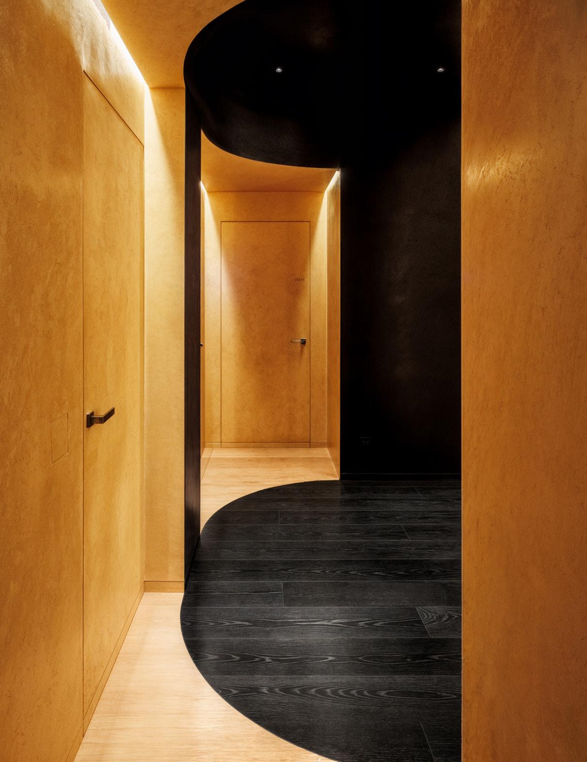
Black surfaces and ocher-colored plaster walls frame each other with alternating curves.
BELOW
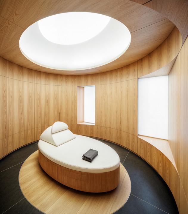
The 18 examination suites are elliptically shaped, echoing baroque churches. Medical gear isn’t fixed to the walls but rather arrives on mobile carts.
RIGHT
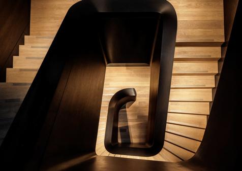
The sculptural stair creates a sense of procedural wonder.
Zoī Vendôme is no ordinary medical facility. The Paris-based center joins the wave of new preventative medicine companies that offer holistic, full-body examinations for members. The goal? Life extension. But Zoī is even more unique: Its 20,000-square-foot wellness center, discreetly located behind a Haussmannian facade near Place Vendôme, is a site for both electrocardiograms and a room that re-creates a snowstorm.
Unconvention follows unconvention. The clients hosted a design competition for the interior, and Sala Hars, a young, Mexico-based firm with no prior health-care experience, emerged as the victor. The firm abandoned traditional health-care designs completely. Instead, it delivered a contemporary take on baroque architecture, where theatricality is more in gesture than ornament. The team calls it “neon baroque.”
“The idea of Zoī is focused on the human body and specifically on each patient that enters,” Douglas Harsevoort, founding partner of Sala Hars, told AN Interior. “So everything from sight to sound to smells to tastes is curated around these different sensorial experiences as you move from one space to the next.”
The journey begins with a black box. The solemn entry makes a dramatic switch to a glowing hallway, framed with an enfilade of hyperboloid-like millwork. “These almost obelisk forms are somewhere between Brâncușian and Egyptian,” explained Harsevoort. They’re sandwiched above polished white concrete floors and below a ceiling surface that evenly diffuses light. If Zoī teaches its members that the body is a temple, the heavenly hallway helps inspire reverence.
“In baroque churches, despite their powerful geometrical motifs and verticality, part of why you feel awe is this question of how something is built,” added Juan Sala, the other founding partner of the firm.
The architects channeled this while sculpting each space. As the hallway progresses to the stairs and elevator banks, black walls and ocher-colored plaster walls frame each other with alternating curves. Sala indicates the ways in which curves meet other curves at a point and the hidden thickness that create an illusion of flatness.
These geometric tricks serve functions. In the 18 wood-clad examination suites, Harsevoort and Sala slot an elliptical room within a square footprint. On one hand, it helps establish an environment that doesn’t feel medical. On the other hand, it allows the negative space to serve as storage and hide equipment. Even venting is concealed: Slits in the wood floor are the only evidence of air escaping, a detail that is reinforced by the gap between the luminous panel on the ceiling and the plaster ring below—it may look like a dome, but it is really just the visual effect of a straight line cutting an ellipse.
The rotund room and lack of visually evident medical gear (much of which was moved to a cart the doctors tote around) provide a clean, calm interior that looks neither medical nor spa-like. Ambivalence is the point.
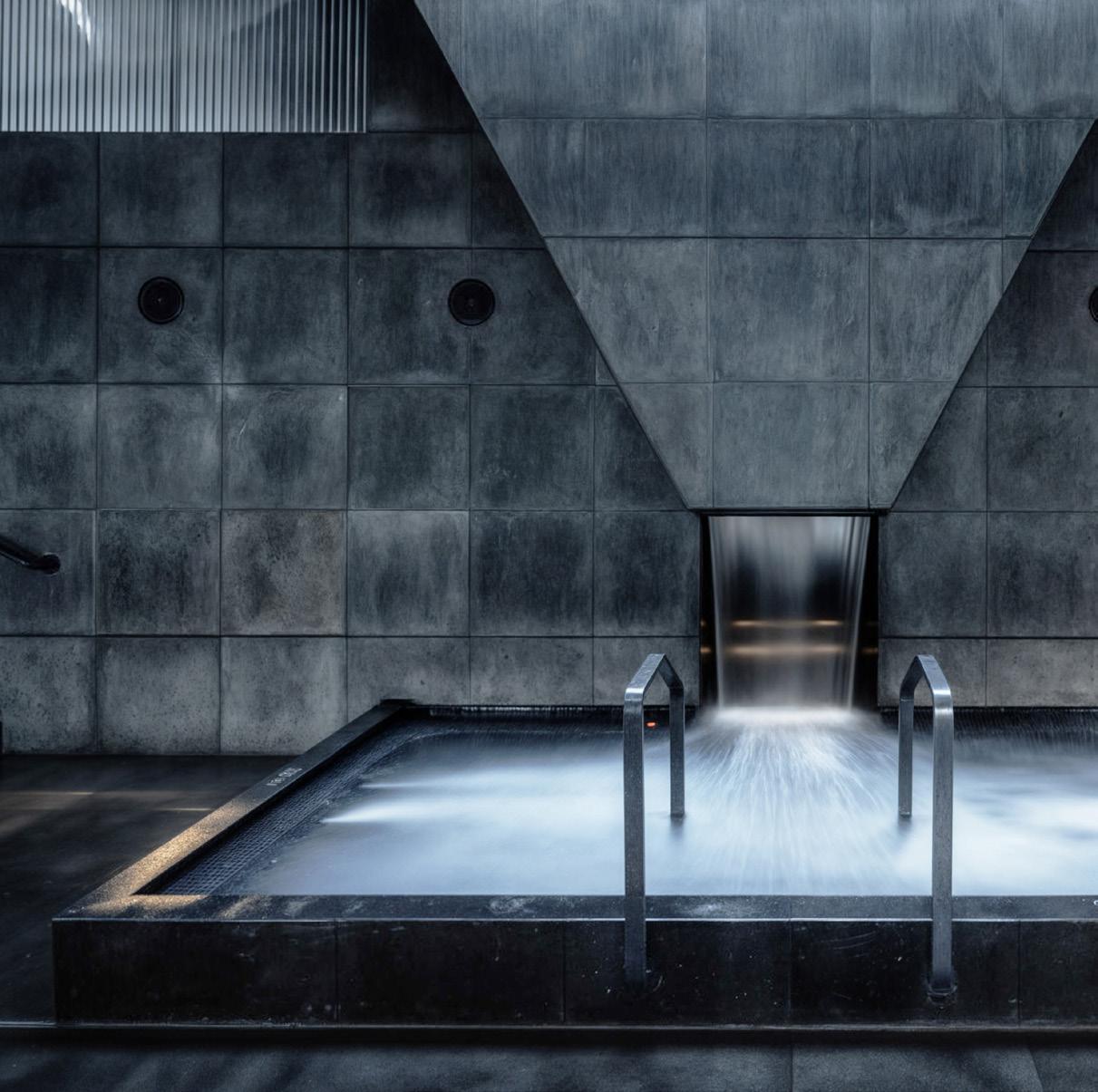
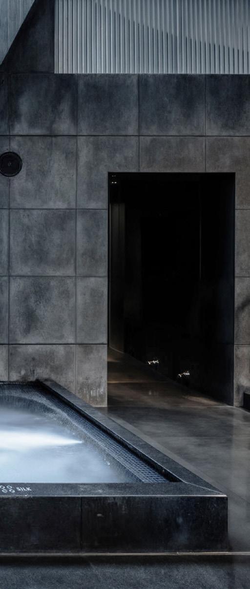
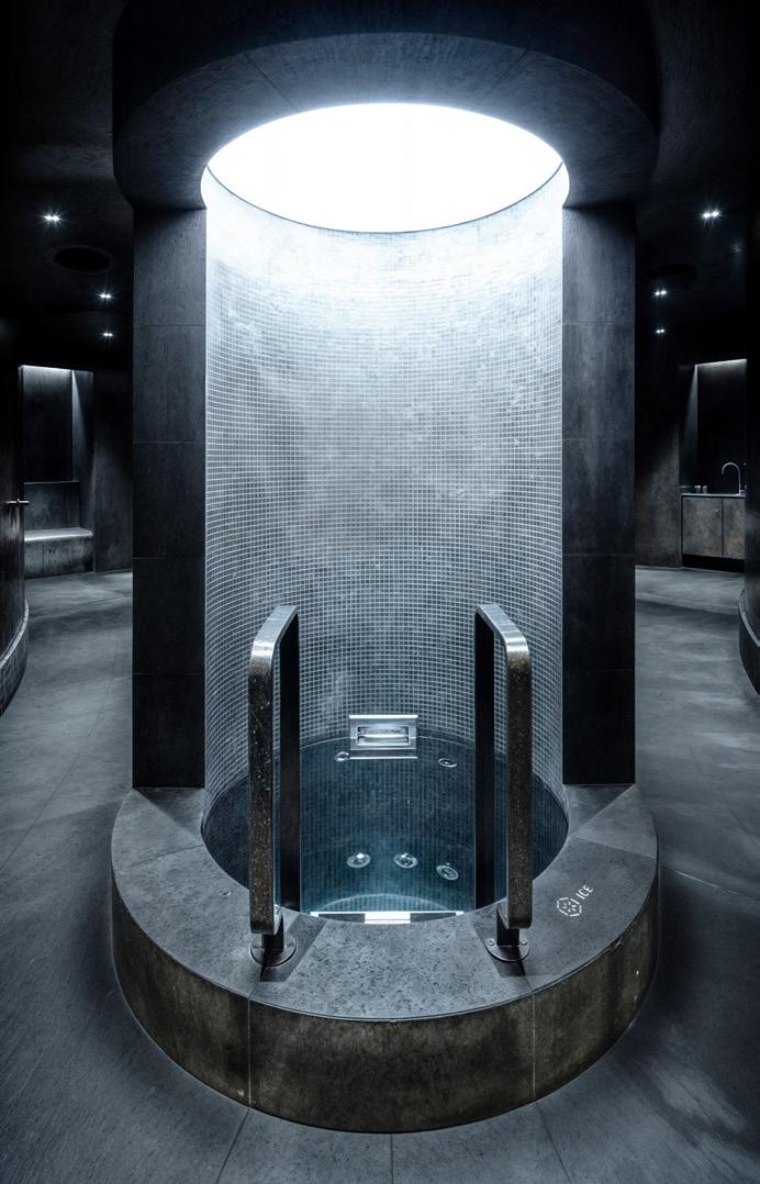
When done with exams, members can ascend to the top floor of the building, where an onsen awaits. Full of volcanic stone and strong, almost severe gestures interrupted with skylights over the pools, this space rejects traditional design. “The idea was not to replicate a Japanese onsen,” continued Sala. “I think that would have been maybe too easy and also a bit absurd; a Japanese onsen should be in Japan. If you’re in Paris, I think you should maintain this pillar of the experience but infuse a certain nuance, a negotiation of cultures.”
In fact, Zoī is very much rooted in its sense of place despite its otherworldly style. “The DNA of the project is very Parisian; it’s baroque architecture. People don’t think about Paris as having this Egyptian influence, but it’s very much there,” said Sala. Emphasizing culture, and mediation between its old forms and new possibilities, is the basis of the project and Sala Hars’s own practice.
LEFT
Brâncușian geometries continue throughout the space, from the millwork in the entry to the pool area.
BOTTOM
Elliptical shapes also repeat; they appear in examination suites and plunge pool area.
NEXT SPREAD, LEFT An overall section and a first floor plan.
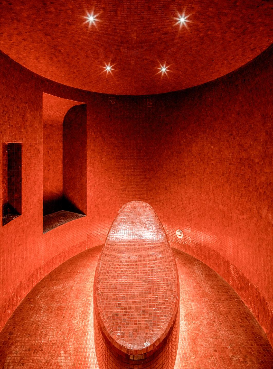
NEXT SPREAD, RIGHT Red mosaic tiles line a steam room. Sala Hars is already at work on Zoī’s London location.
TEXT BY Lila Allen
PHOTOGRAPHY BY Andy Gagne and Davies Toews Architecture
Davies Toews Architecture crafts a ski-up oasis in Maine that plays nice with local fauna.
PREVIOUS SPREAD
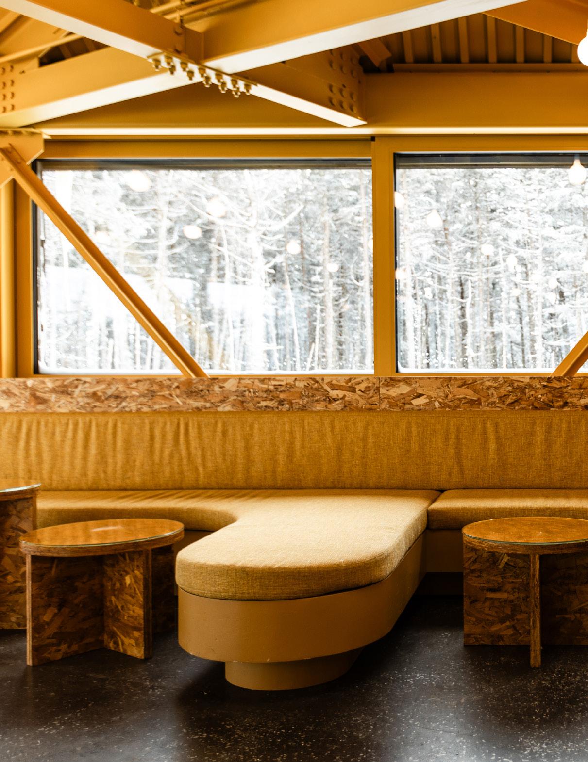
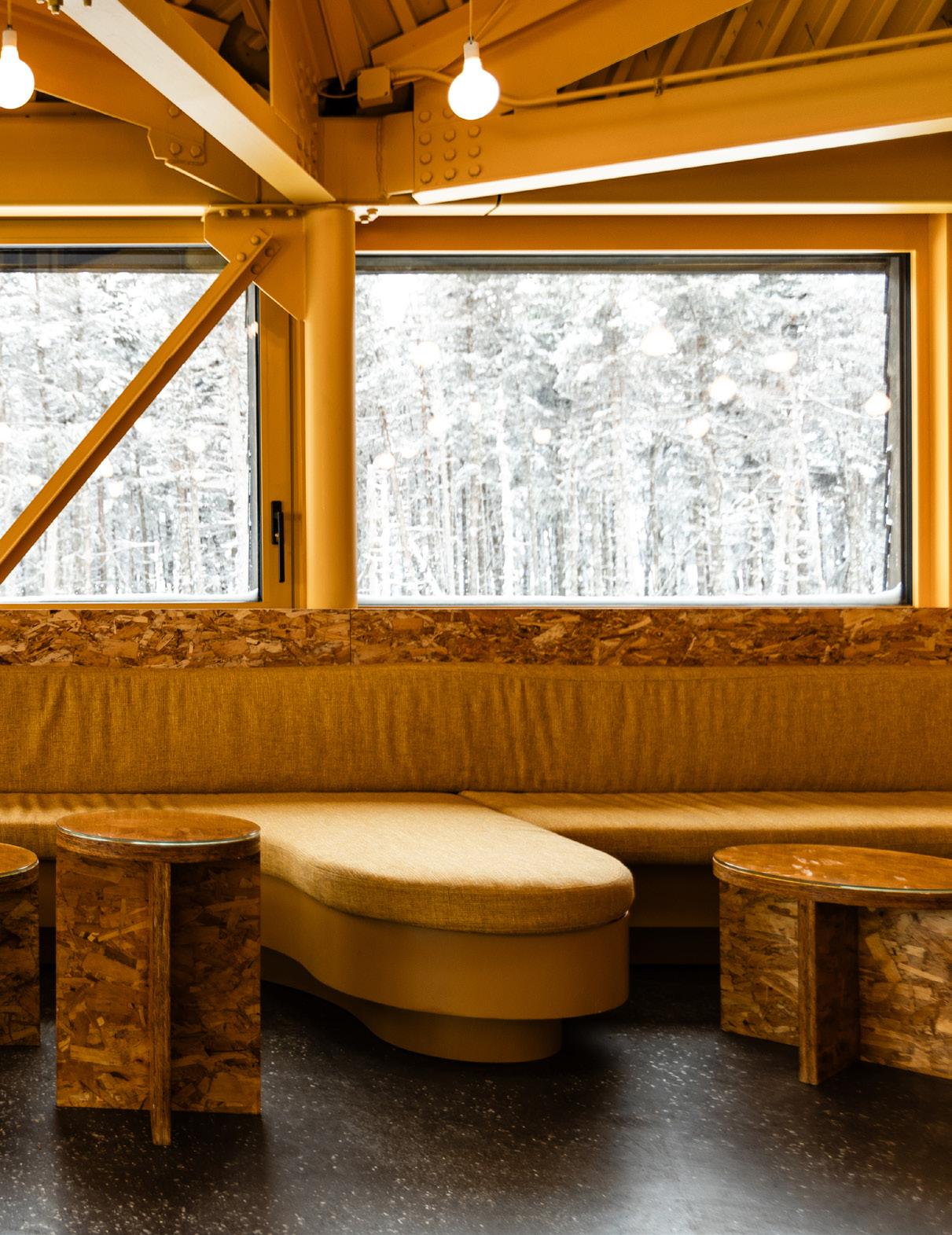
The coffee tables, fabricated by Davies Toews Architecture, and furniture heighten the interior’s mustardyellow coloration.
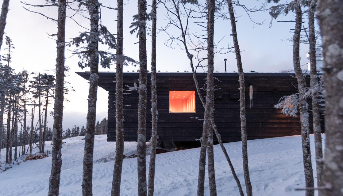
TOP The building is set on posts so it doesn’t disrupt the surrounding watershed.
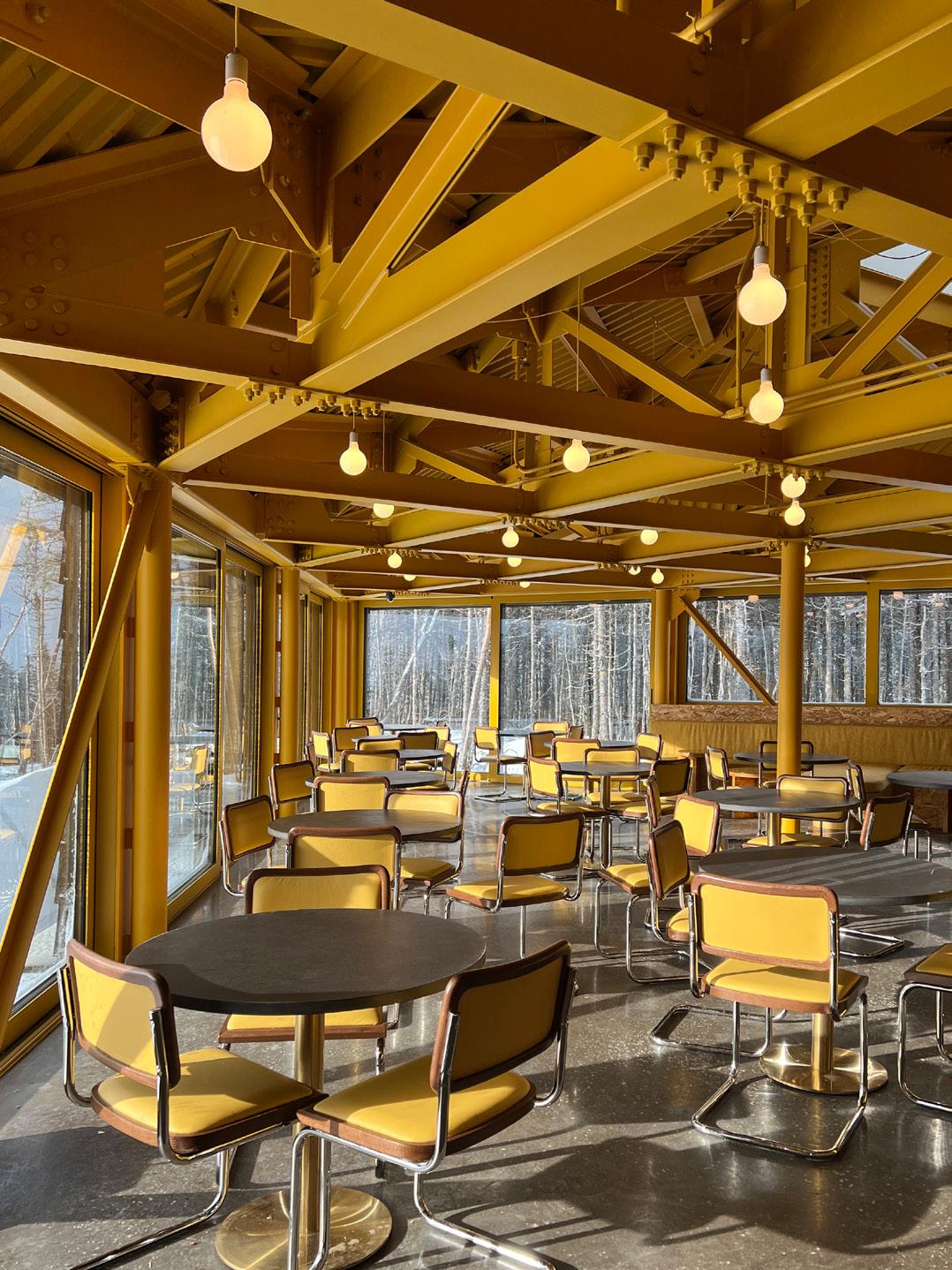
RIGHT A matrix of saffronpainted steel beams enables an open floorplan with panoramic views of the nearby forest.
The Bicknell’s thrush is a humble little bird. Beak to tail, it stretches no longer than the length of a human hand. Its dusty plumage is the color of a field mouse, and at first glance, it’s difficult to tell apart from the gray-cheeked thrush—until you hear its warble, which staccatos like a digital glitch.
It’s this call, and the sight of this bird— among Maine’s rarest—that draws onlookers to Saddleback Mountain during warmer months. Over the winter, when the birds have flown south, skiers flock to the slopes of Saddleback for runs like Black Beauty, Warden’s Worry, and Frostbite. Now, thanks to an intervention from New York City–based firm Davies Toews Architecture, skiers, hikers, and birders can enjoy the views from Saddleback with a drink in hand at a restaurant called The Nest.
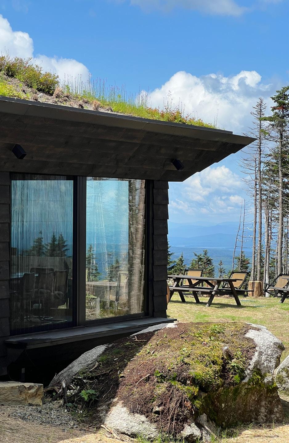
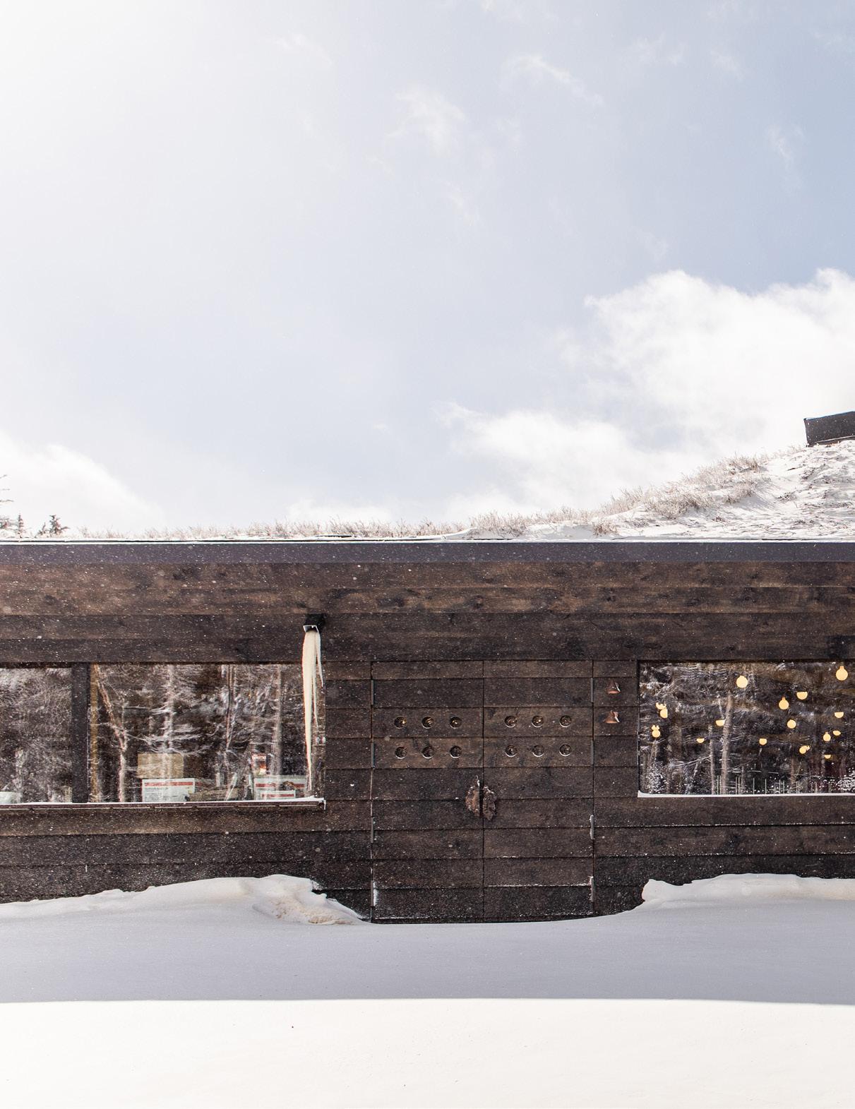
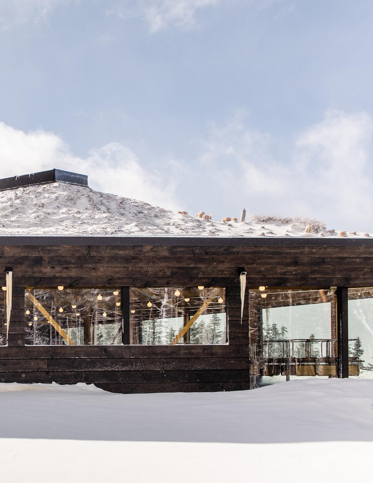
Appropriately, the 2,700-square-foot Nest perches on the slope, rather than cutting into it. Set on posts to mitigate disruption to the natural watershed, the building seems “like it’s running down the mountain,” as Davies Toews principal Trattie Davies put it, “like it burgled the piece of land.” From the ski lift, the structure’s equilateral-triangle plan looks like a play button.
That unusual layout allowed the architects to consider the three exterior experiences: the grove, the meadow, and the “beach,” or grand view. At the latter, the firm installed an operable glass wall, leaving the panorama uninterrupted. On another edge, there’s a ski-up bar—also usable by hikers in the offseason.
Like its avian neighbors, The Nest is modest on the approach. Jonathan Toews—who is married to Davies as well as being her fellow principal in the architecture office—likened it to a “secret hut you discover in the woods.” Part of that is due to its native-plant green roof, which lifts the meadow off the mountain and into the sky. For the rest of its skin, Davies Toews took cues from Norwegian vernacular structures, deploying pine tar–covered clapboard siding—a darkened material that is all the starker against the pure white of the slopes. But there are
Easter eggs here, too, like the doors’ bronze pulls cast from tree fragments found at the architects’ Vermont cabin, which functions as a second office for their studio. Through those doors, spectacle awaits. A shocking saffron shade drenches the 80-seat, skylit interior, running across built-in and movable furnishings (designed and fabricated by the office), light fixtures, and a tangle of steel beams overhead. Even the particleboard used across the eatery’s undulating banquette is a honey shade, allowing it to fade into the campfire warmth. Psychedelic as it all is—Davies and Toews mention that the The Teletrips of Alala, a children’s book from 1970, was a source of inspiration—it isn’t pulled out of thin air: The yellow is the same hue as moss found just beyond The Nest’s walls. The color even briefly returned there: “We actually brought the palette of materials up into the forest when it was under construction,” Toews said.
Because of the difficulty of site access, the structure was prefabricated at the base of the mountain. And because the restaurant interior welcomes guests coming in from rugged conditions, it, too, needed to be hard-wearing. The fittings and materials at The Nest lean modern and utilitarian—a Maya Romanoff burlap lines the walls, for instance, and the floors are custom-mixed dyed concrete. Even the Marcel Breuer–designed Cesca chairs that surround cafe tables have ditched their typical caned backs for wood and leather—yellow, of course. Through all of this, the plight of the Bicknell’s thrush was never out of sight. Because of the bird’s summer breeding season, construction timelines were constrained, leaving The Nest’s build window even more limited than the cold temperatures demanded. “That bird made us more thoughtful and sensitive about how something really tiny can invert the logic of something really big, like a building,” said Davies. The architects even created their own bird- deflection screens to safeguard the thrushes from run-ins with The Nest’s expansive windows, a move that earned them the inaugural BirdSafe Maine Award. How’s that for a feather in the cap?
The windows use birdsafe glass, while the green roof offers avian visitors friendly nesting space of their own.
Jörg Breuning of Green Roof Technology helped dial in the details.
RIGHT
The plan of the triangular building, shaped like a play button, showcases the prefabricated logic of the structure.
The pine tar–covered clapboard siding takes cues from Norwegian vernacular design.
TEXT BY Elizabeth Fazzare
PHOTOGRAPHY BY
Conrad Brown
Ste Marie crafts three sumptuous and detailed restaurant interiors in Edmonton, Canada.
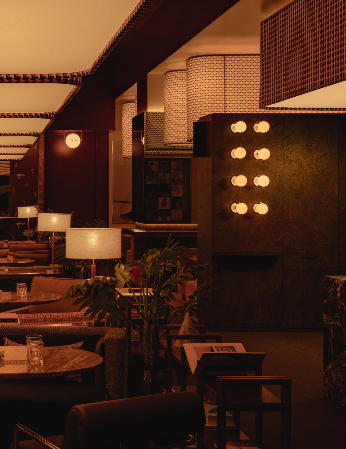
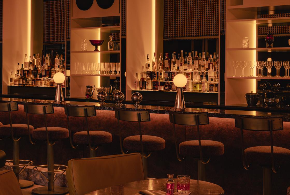
PREVIOUS SPREAD
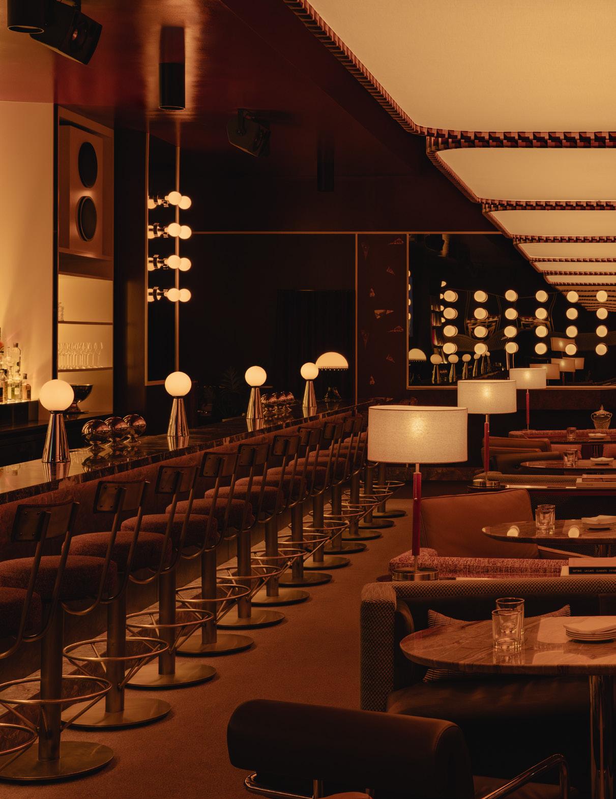
A deep red establishes a late-night vibe at Mimi. The scene was inspired by Italo disco.
ABOVE
Swiveling chairs line the bar top, which is lit by reflective sentinels that support illuminated orbs.
FACING PAGE
The interior includes furniture for DJing and displaying records.
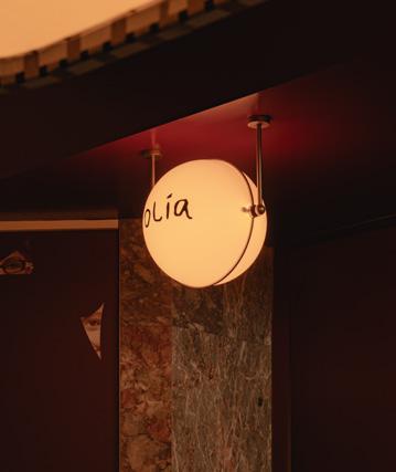
Like the Italian menu it serves, a night at Canadian chef Daniel Costa’s Olia Ristorante is meant to be savored. However, since it’s located within a vast space at the base of a new residential building in Edmonton, Alberta, the eatery required a deft interior vision to create the intimacy and long-stay welcome Costa was craving. After a successful cold call to Vancouver-and Torontobased interiors firm Ste Marie, the restaurant’s warm, inviting, and well-proportioned design now beckons diners to linger over tagliatelle, saltimbocca, and perfectly paired wine selections.
Olia is one of three interconnected hospitality concepts designed by the practice for Costa within the building’s 7,000-square-foot ground-floor retail space. Its adjacencies include an all-day cafe, Va!, and a late-night cocktail bar, Mimi, while Olia focuses on traditional dining at a relaxed European pace. In comparison to its boldly decorated neighbors, “for Olia, there had to be an energy shift,” said David Boucher, senior designer at Ste Marie. “It has more of a subdued feeling informed by a longer stay, with lights that cast an ambient, uniform glow and materiality that reflects a southern Italian look.”
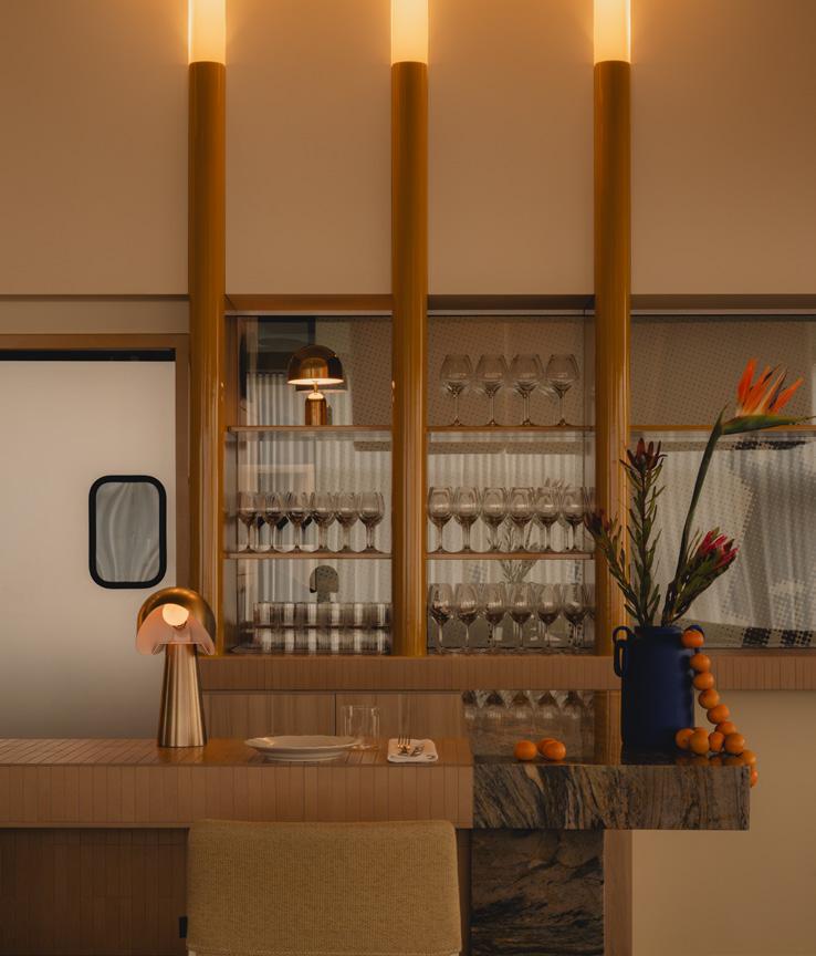
The interior palette focuses on natural materials in calming neutrals, from the custom walnut or Santorini quartzite tables that belly up to ecru leather benches, arranged sinuously so that patrons never feel they have their back to the room, to the sandy-hued lacquered cabinetry that builds the yellow fluted-glass backbar, which is lit to dramatic yet handsome effect. Earth-colored finger tiles lend tactility to the front of the bar, which is topped with a smoother rectified tile and brown- and gold-veined Breccia Bahia quartzite. The entire restaurant has an intentionally “soft, buttery” undertone, explained Ste Marie founder, principal, and creative director Craig Stanghetta, which is enhanced by the “ethereal low-level prairie daylight that filters in
through sheer drapes” and clerestory windows, with sculptural, lantern-like pendants illuminating the space from overhead at night.
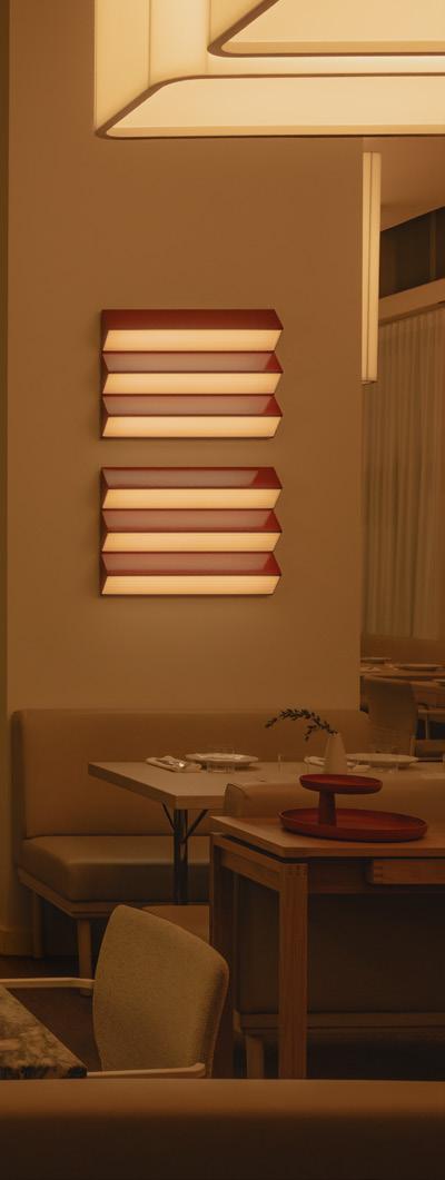
“Light is the biggest design gesture in the space,” Stanghetta continued. “Shape, volume, and texture are all meant to hold it or play with shadows.” The restaurant’s muted color scheme allows such subtlety to shine, visually broken only by pops of hue in custom artwork and additional statement light fixtures.
In many ways, Olia’s design is a counterpoint to the 1970s Italo disco–inspired bar that Ste Marie designed next door, where chef Costa hopes guests might conclude their evening meal with a high-energy nightcap and a dance-floor move. But it is also a reflection of the climate just outside its walls. “We were working within the context of the environment,” explained Stanghetta, referencing the intense daylighting that rolls across Edmonton’s flat terrain. Olia more openly embraces its city’s natural phenomena, while Mimi and Va!—whose green-andwhite ceramic tiles and stainless steel surfaces conjure everyday Roman espresso bars—aim instead to bring microcosms of Italy to Canada.
Still, the trio of moody eateries are complementary. Each builds a space that allows both intimate, familiar gatherings and spontaneous meetings at a variety of times of day. In a city where winter is long and harsh and requires many months of indoor dining, offering such a diversity of experiences within one locale “is also quite useful,” added Stanghetta. While Mimi might feel like a shot of espresso and Va! would serve you one, dining at Olia offers a slow-food experience, which Costa has studied in Italy to perfect. “Because there’s an interplay between the three spaces, Olia was allowed to be a bit dreamlike in a way,” said Stanghetta, “not fixed in a reference of time nor a design vernacular.”
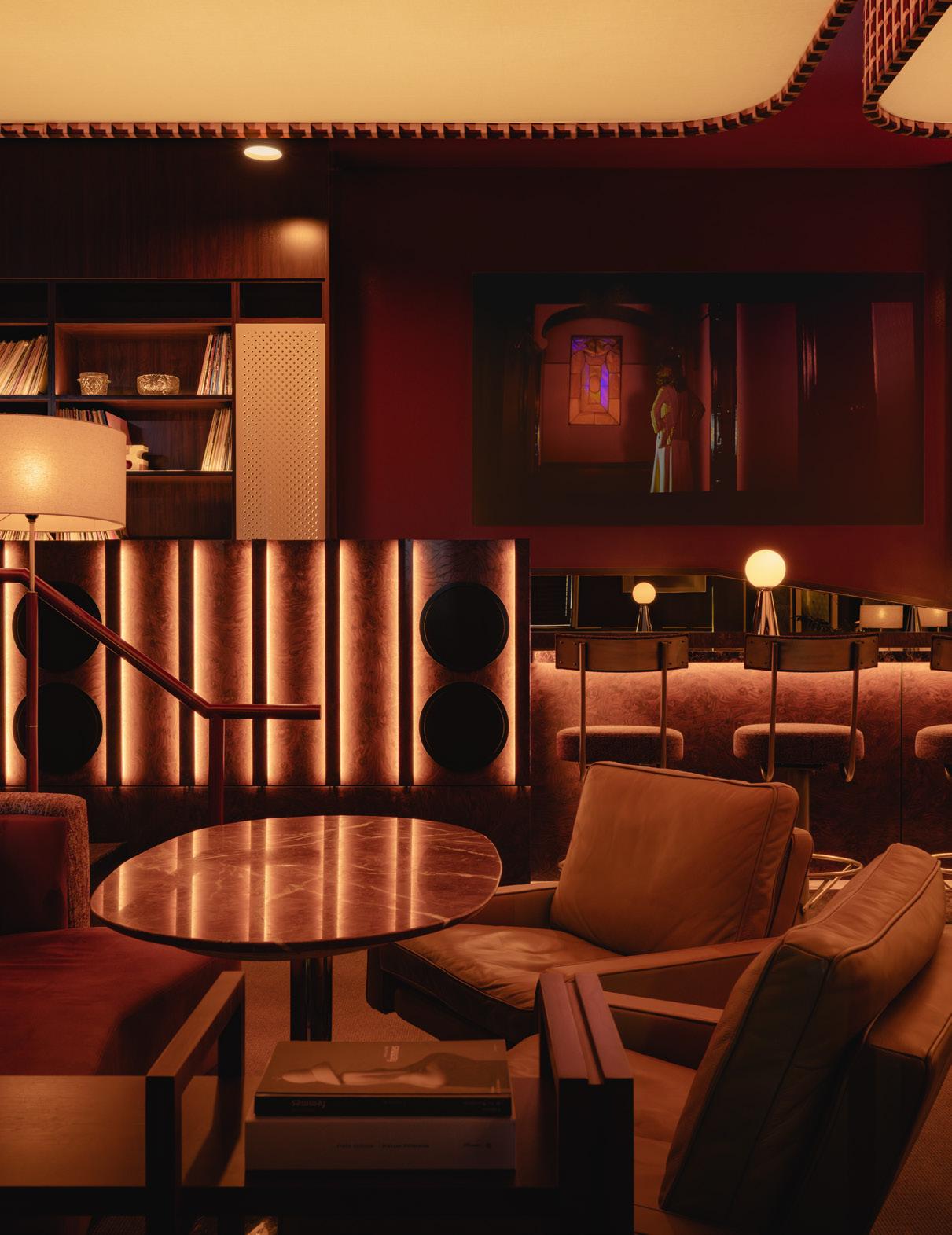
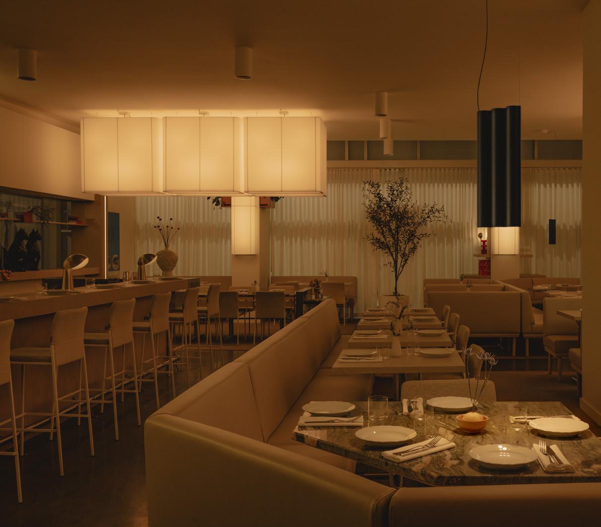
LEFT
Sculptural, lantern-like pendants illuminate Olia’s main dining room.
LEFT BELOW
Signage, part of Ste Marie’s scope, was integrated into the environment.
RIGHT
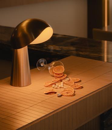
Hooded light fixtures top the bar in Olia, setting the scene for dreamlike stagings.
BELOW
The cylindral divisions and mirrored walls and fixtures all contribute to the 1970s vibes.
The plan reveals how Ste Marie divided the spaces into three separate but related dining concepts.
WORK, THEN PLAY 30
Gentleman Scholar Signs gentlemanscholarsigns .com
Vita Pehar Design vitapehardesign.com
ECO-RETRO DISCO 36
AmCork amcork.com
Aramco Imports aramcoimports.com
Benjamin Moore benjaminmoore.com
Bradbury & Bradbury bradbury.com
Daltile daltile.com
Forbo Flooring Systems forbo.com
Homasote Company homasote.com
Kohler kohler.com
O’Lampia Studio olampia.com
Seves Glass Block sevesglassblockinc.com
Sloan sloan.com
True truemfg.com
WAC Lighting waclightinglights.com
FINELY FABRICATED 50
&Tradition andtradition.com
Ben Hoek Meubelarchitectuur benhoekfurniture.nl
ELLISON STUDIOS ellisonstudios.com
HOLDER holder-objects.com
IKEA
ikea.com
Ingo Maurer ingo-maurer.com
Kvadrat kvadrat.dk
Modular supermodular.com
NEW TENDENCY newtendency.com
NO GA
no-ga.com
Pianca pianca.com
PLAN B planb-works.de
Porro porro.com
RBW rbw.com
Vallvé vallve.com
Vitra vitra.com
EXACTING IN OJAI 58
Armadillo armadillo-co.com
COCOON bycocoon.com
Design Within Reach dwr.com
EZ Concept ezconcept.com Flos flos.com
Klein klein.agency
Nemo Lighting nemolighting.com
ORCA orcaliving.com
Phylrich phylrich.com
PITT Cooking pittcookingamerica.com
Portola Paints portolapaints.com
Sixpenny sixpenny.com
Texston texston.com
Thermory thermoryusa.com
THE STONES OF AIGUABLAVA 54
Atelier Areti atelierareti.com
ATYCA atyca-obras.com
Berker berker.com bis bis211.com
Ceràmica Cumella cumella.cat
Ethnicraft ethnicraft.com
Herman Miller store.hermanmiller.com
Huguet huguetmallorca.com
Jansen jansen.com
Miguel Milá miguelmila.com
Nemo Lighting nemolighting.com
Oluce oluce.com
Vitra vitra.com
Vitrocsa vitrocsa.com
VOLA en.vola.com
ESTATE ESCAPE 84
Amorim amorim.com
Amy Brock Morgan amybrockmorgan.com
Atelier278 atelier278.com
Born of Wood bornofwood.com
Céline Wright celinewright.com
Chiara Colombini chiaracolombini.com
Domus domusgroup.com
Drew Pritchard drewpritchard.co.uk
Erik Bratsberg erikbratsberg.se
Hang-Up hanguppictures.com
HOST thehost.store
Jan Hendzel janhendzel.com
Jennifer Pattison jennifer-pattison.com
Lauren Baker laurenbakerart.com
Leleni Studio lelenistudio.com
Nikki Heaton Studio nikkiheatonstudio.com
Or This orthis.co
Provision provisionstore.co.uk
Robin Friend robinfriend.co.uk
SASA Works sasaworks.co.uk
Smile Plastics smile-plastics.com
Studio Amos studioamos.co.uk
Studio ORE studio-ore.com
TedWood tedjefferis.co.uk
The Main Company maincompany.co.uk
The Poured Project thepouredproject.com
Tom Bogle tombogle.co.uk
Viaduct viaduct.co.uk
GOLD THRUSH 100
AKLA acetokimball.com
Alape alape.com
ALT Global altglobal.com
Bauhaus 2 Your House bauhaus2yourhouse.com
Color Cord Company colorcord.com
European Architectural Supply eas-usa.com
Exactitude exactitudeinc.com
Jon Meade Design jonmeadedesign.com
Johnson-Lancaster and Associates johnson-lancaster.com
Kuzco kuzcolighting.com
Lucifer Lighting Company stg.luciferlighting.com
Maya Romanoff mayaromanoff.com
Mosaic House mosaichse.com
Örsjö orsjo.com
Ramberti ramberti.com
Sage Restoration sagerestoration.com
Studio Ami studioami.info
Windham Millwork windhammillwork.com
OLIA, MIMI, VA! 108
Adesso adessohome.com
Ensemble ensembleprojects.com
Lambert & Fils lambertetfils.com
Pure Hospitality Concepts purehospitalityconcepts .com
RBK Millwork rbkmillwork.com
Suite 22 suite22.com
Tafisa tafisa.ca
VISO visoinc.com
A&D Building 68 adbuilding.com
Allegion 61 allegion.com
Allsteel 38 allsteeloffice.com
Audo 2–3 audocph.com
Formani 17 formani.com
Halliday & Baillie 25 hallidaybaillie.com
Hanover Architectural 65 hanoverpavers.com
ICG Italia 29 icgitaliaporcelain.com
Infinity Drain 31 infinitydrain.com
Jewett Farms 19 jewettfarms.com
Karen Pearse Stone and Architectural Surfaces 49 kpgd.com
Ligne Roset 15 ligne-roset.com
Modular Arts 13 modulararts.com
Moooi Back cover moooi.com
NanaWall 21 nanawall.com
Nemo Tile 53 nemotile.com
Neolith TheSize 27 neolith.com
Poliform 4–5 politform.it
Rimadesio 6 rimadesio.it
Roca Tile 57 rocatileusa.com
Rottet Collection 7 rottetcollection.com
Stone Source 67 stonesource.com
The MART 45 themart.com
Tile Bar 35 tilebar.com
Toto 131 totousa.com
Turf 11 turf.design
Vitra 9 vitra.com
Vitrocsa 37 vitrocsa.com
Request information and learn more about our partners, products, and services at AN Library. library.archpaper.com
Green Roof by Ari Burling/ Esto Restoration by Serhii Chrucky/ Esto Landscape by Sahar Coston-Hardy/ Esto
Portrait by George Etheredge/ Esto Airport by Jeff Goldberg/ Esto Development by Mike Kelley/ Esto Aerials by Alon Koppel/ Esto Museum by Matthew Monteith/ Esto
Flagship Store by Anna Morgowicz/ Esto Factory by Christopher Payne/ Esto Skyscraper by David Sundberg/ Esto Film by Ben Stechschulte/ Esto Library by Lara Swimmer/ Esto House by Michael Vahrenwald/ Esto University by Albert Vecerka/ Esto
Established 1939 by Ezra Stoller/ Esto Esto.com

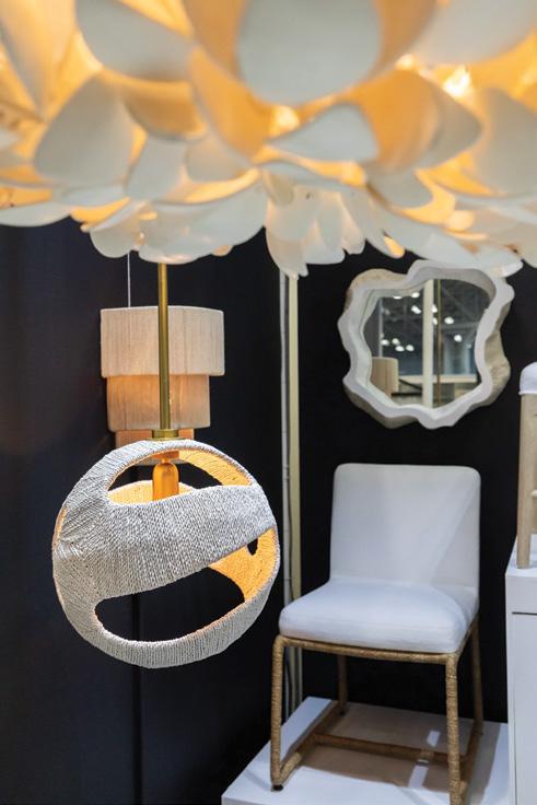

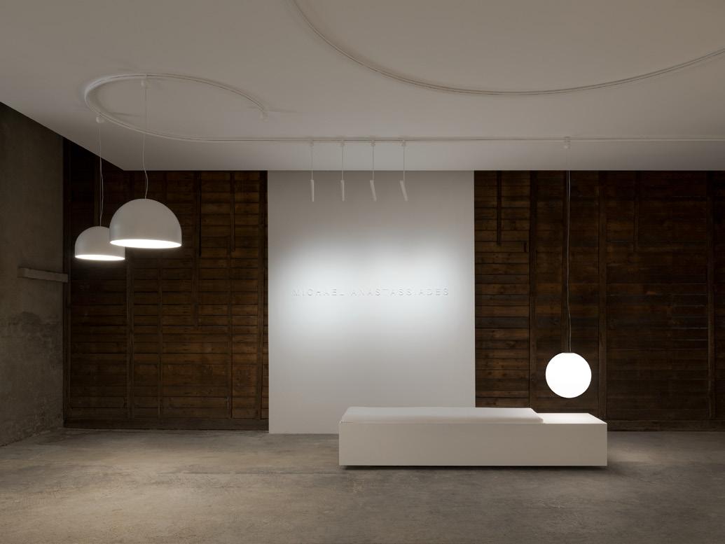
In Common With stages Strata, its latest lighting collection, within a modernist Italian villa designed by Vittoriano Viganò.
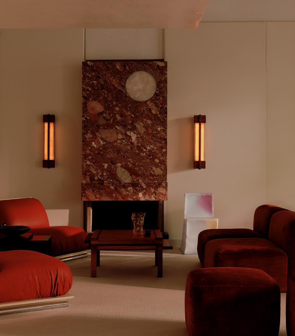
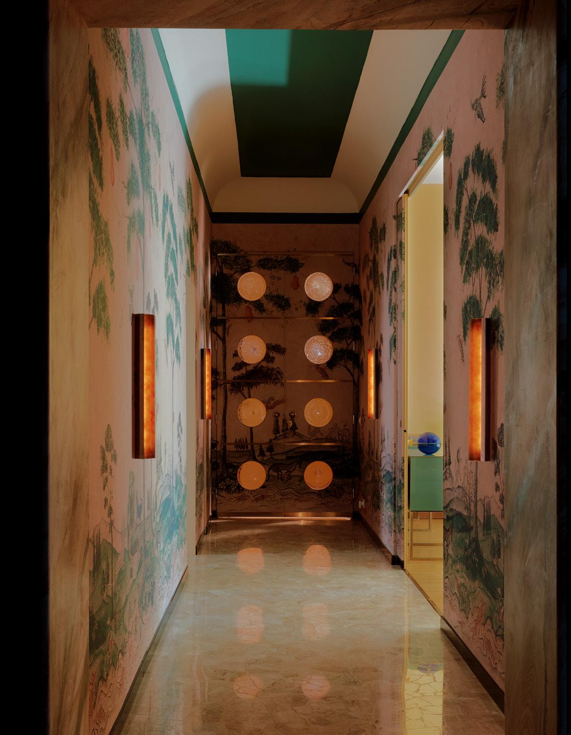
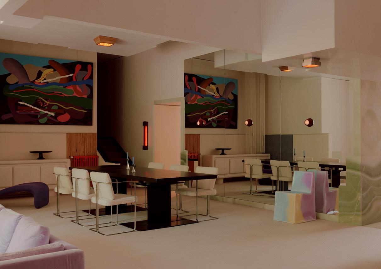
Strata, a recent lighting collection by In Common With, relies on two experimental techniques. The first uses the application of glass powder to glass sheets, much like silk-screening, and the second relies on the assembly of glass pieces into mosaics that are then kiln fired. Expressive and sleek, the resulting surface-mount sconces can be used in a variety of configurations. To showcase the pieces, In Common With founders Felicia Hung and Nick Ozemba decamped to Italy. They set up within the little-known Villa Vittoriano Viganò, named for its designer, a 20th-century Milanese architect. The staging works: The interior’s colors, textures, and sensibility offer a supportive environment for the handmade geometric fixtures.
Grupo Habita’s Carlos Couturier reflects on 25 years of developing Mexico’s premiere boutique hotels.
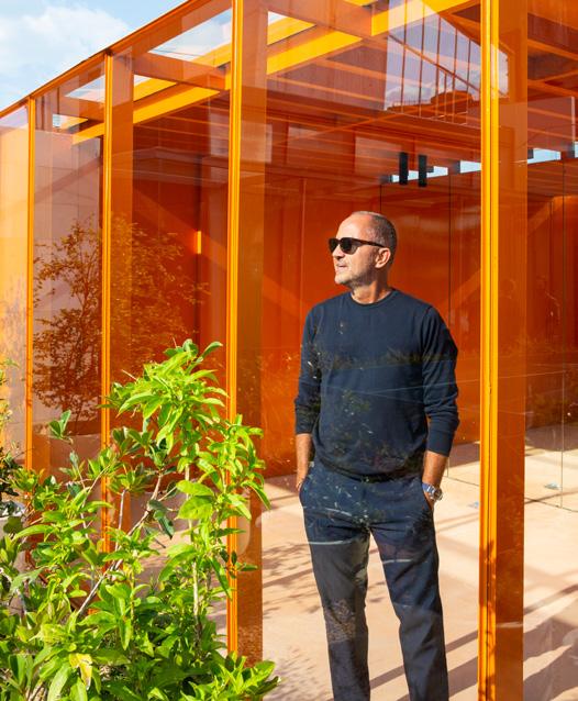
On a warm August afternoon in Mexico City’s La Condesa neighborhood, I met Carlos Couturier at Condesa DF, the boutique hotel that helped put the charming area back on the map as a stylish enclave favored by art-conscious visitors to Mexico’s capital. Along with brothers Moisés, Jaime, and Rafael Micha, Couturier is a founder of Grupo Habita, Mexico’s design-forward hotel empire. Condesa DF was its second hotel in the capital—located in a converted triangular building from 1928, it looks as fresh today as it did when it opened in 2005.
Since launching its first property 25 years ago, Grupo Habita has both shaped the evolution of design hotels and responded to global hospitality trends. Today, Habita operates 17 hotels across Mexico, as well as The Robey in Chicago. (Habita also ran Hotel Americano in New York’s Chelsea neighborhood
SULEMAN ANAYA
What has Grupo Habita done differently?
CARLOS COUTURIER
We weren’t hoteliers when we started Habita. We were developers helping preserve architecturally significant residences at risk of being demolished. We converted big neocolonial mansions people didn’t want to live in into offices. One day a tenant asked why Mexico City didn’t have a hotel made with this approach, and that’s how we became hoteliers. It was unplanned.
SA
How was Mexico City different when you opened the original Habita in Polanco?
CC
It was 2000, and we couldn’t find an operator for such a small hotel, so we decided to do it ourselves. That property—the 36-room Habita Hotel, designed by TEN Arquitectos—changed how Mexico City was perceived in terms of tourism. Back then, Mexico City didn’t have the ecosystem of walkable
from 2011 to 2018, when it handed over management to other parties.) Five new properties are in the works, one of which is the fourth Habita location in Mexico City.
Grupo Habita’s efforts have contributed to Mexico City’s rise as the go-to destination for a specific profile of traveler— someone who is cultured, proactive, and more interested in discovering the latest speakeasy or under-the-radar artist than trekking to Teotihuacán. What unites Habita’s clients is their intelligence, Couterier told me during our conversation.
“We try to do a hotel every year,” he continued. “It takes lots of energy doing something differently each time—working with different architects, interior designers, chefs, and so on. My job is to pare things down and make them sharp.”
CC
vibrant neighborhoods it has now. We wanted to build an oasis in what at the time was considered a chaotic, unsafe, polluted city. People came to Mexico City only briefly on their way to the country’s beaches and historic sites. Even the art scene wasn’t what it is now. We helped change that through hospitality and architecture, in concert with how the film and food industries bolstered Mexico’s public image.
When we opened Condesa DF, the publicist who organized our opening event asked, “Who is going to come here?” At the time, the neighborhood was on the fringes of what some Mexicans considered fashionable. The same happened when we opened our two hotels in Centro Histórico, the Downtown and later Círculo Mexicano. But we didn’t care, because we were betting on these areas and knew that adventurous travelers would be drawn to them.
SA When did you decide to make architecture one of Habita’s calling cards?
It started with the first Habita Hotel in Polanco. From there we decided to link our brand to architecture and creative design, including interiors and graphics. We weren’t concerned with the size of the hotel but with the singular experience guests have through architecture.
Terrestre is the most extreme example: It is a radical hotel with no TV and air-conditioning on a rustic stretch of coast along the Pacific Ocean. You only have solar power, nature, and one’s own company. Ultimately, a stay there is shaped by the phenomenal building by Alberto Kalach.
SA
A stay at a Habita hotel is not for every luxury traveler, right?
CC We attract a sensitive, art-oriented clientele. Our guests come from all fields, but they care about the social aspect of a small hotel—think of the people you meet at breakfast or by the pool. Good architecture brings a clientele that becomes part
of the hotel’s identity. You can’t do good design without building a mixed community; it must be universal. Both a 5-year-old and his 80-year-old grandmother need to feel comfortable, like they belong. We can’t just think of an idealized guest as some slim, hip young person. Intelligence is the only thing our guests have in common.
SA
You have hotels in cities and remote areas; all look different yet offer a consistent aesthetic. What defines Habita’s signature style?
CC
Natural light and ventilation are paramount. At all our properties, you can open a window. The room has to simultaneously feel like a cocoon that allows the best rest while also offering a degree of stimulus. It’s a tricky paradox, so you need a good relationship with the architect to create it. The room needs to be as dark as possible at night but as lit as possible during the day, maybe with a balcony over a lively courtyard. We are also known for active rooftops, where something is always happening, often around a pool.
Our properties are inviting; no one is ever going to ask you why you’re here. It has never been an issue, even when celebrities stay. Recently Rosalía took over Condesa DF. She would come in and out, but the hotel remained open the whole time. It was friendly and alive as usual.
As different as our hotels are, you can always tell we love architecture. All Habita spots are human-oriented—we prioritize comfort through architecture, lighting, and our staff. At the same time, we hate repeating ourselves.
SA
How did you decide to work with the best emerging and established architects?
CC
Our properties must express a local essence. That has been in place since we did Condesa DF with Javier Sánchez of JSa and brought in India Mahdavi for the interiors. This project, our third, started our practice of pairing exceptional local architects with extraordinary non-Mexican interior design studios. Over the years we’ve commissioned people like the Parisian Joseph Dirand, Madrid-based Plantea Estudio, Milan’s Dimorestudio, and the design duo Jaune from Marseille.
For each project, we work with great Mexican architects like Frida Escobedo, Mauricio Rocha, Max von Werz, Estudio Macías Peredo, and Kalach. I love architects that stay small and don’t become huge enterprises. It reminds me of how Luis Barragán practiced. I think what he did at his own house hasn’t been surpassed.
SA
How do you work with designers?
CC
We meet, give them a brief, and make sure we feel comfortable with each other, because we are going to be stuck together for at least a couple of years. We eat and travel together, discover things, and nurture each other. I’ve never worked with someone I don’t appreciate.
SA
What have been some of your favorite collaborations?
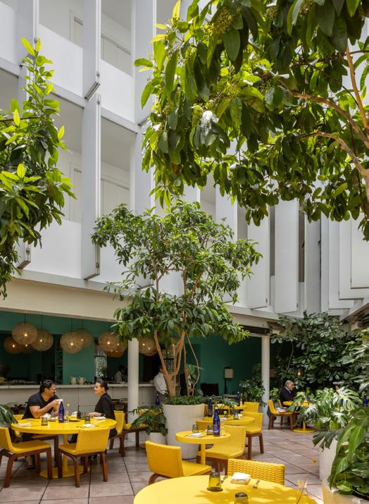
CC Condesa DF was one; we learned so much from India Mahdavi. Another was La Purificadora in Puebla with the famous late-20th-century architect Ricardo Legorreta, who took inspiration from Barragán. He was older at the time, and when we met he looked at me and asked, “What do you expect from me? What special trait do you want the design to have?” I asked if he could deliver something with no color. Of course, Legorreta was known for his use of colors, so it was a bold request. Legorreta replied, “I’ve never been asked that. What a challenge. I love it!” This is when you know it’s a good fit: when the people you work with, no matter how famous, have an open mind.
SA
Do you ever give an architect carte blanche?
CC
Rarely. The closest we have gotten to it is with Kalach at Terrestre. It was his second hotel for us, and by that point his success and experience had made him more commanding, so we gave him free rein to do something unusual, even though we made sure it fit our brand and was right for our guests. The result is extraordinary. The hotel is great for a monk who wants to commune with nature or for a couple who want to have sex for an entire weekend. It’s equally sexy and spiritual, depending on the mood.
SA
What about other architects?
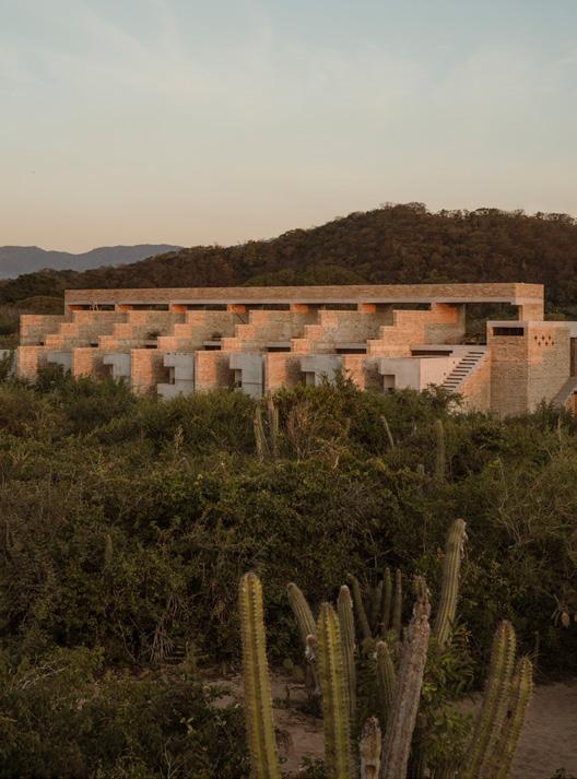
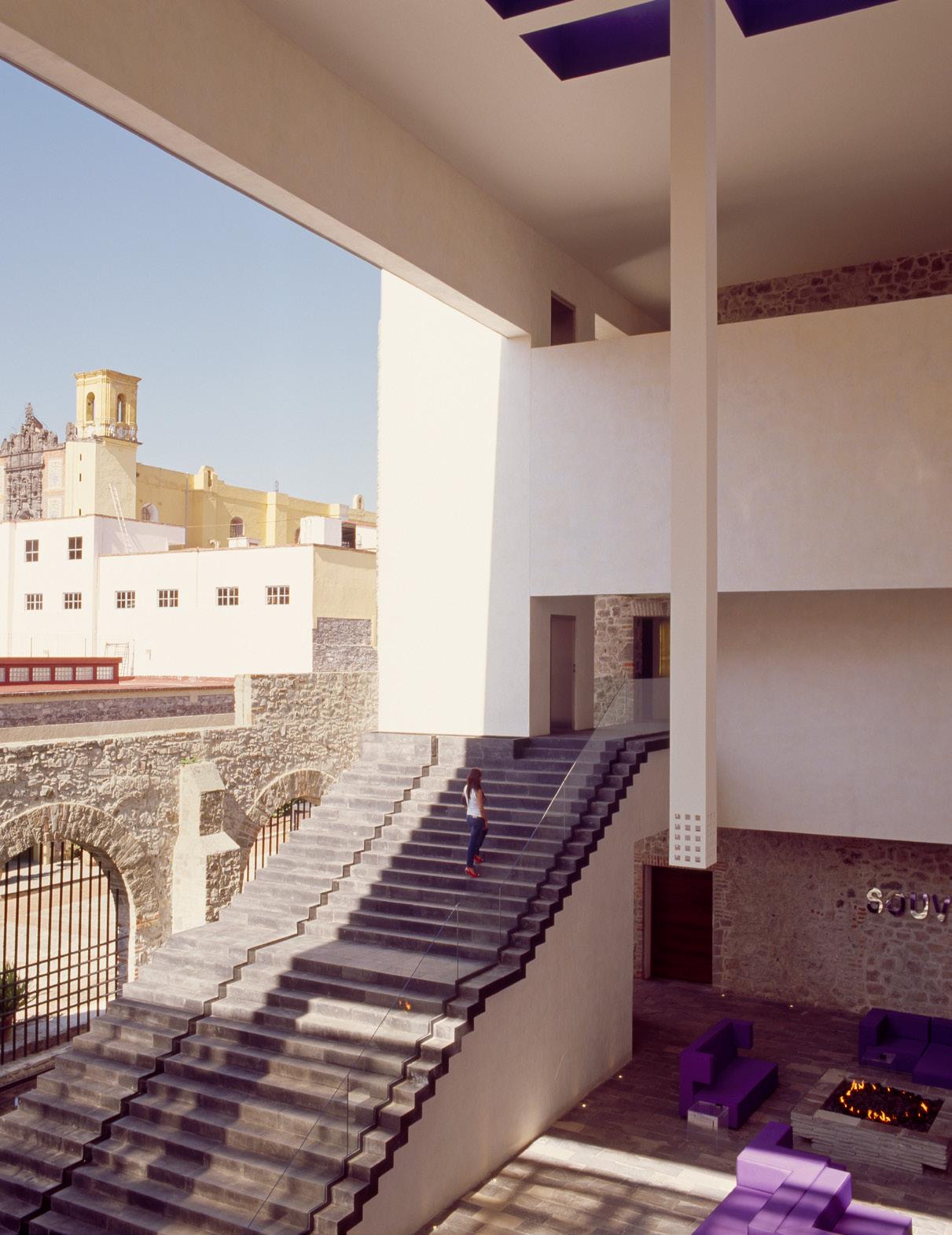
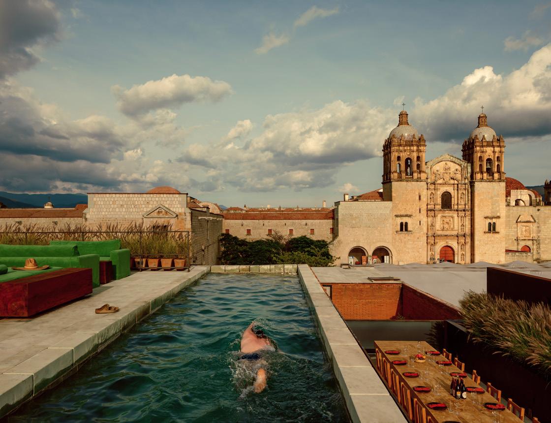
CC
I am a huge fan of Mauricio Rocha; I love working with him. He, along with Gabriela Carrillo, designed a vacation house for me. My brief was simple: I wanted something that felt like a small, sheltered monastery by the beach, vaguely pre-Hispanic. I fell in love with what he delivered. It is a bit like Casa Malaparte but completely suited to its location. I’m happy that we have a hotel designed by Rocha in the works. It was my dream, and it’s coming true. Macías Peredo, from Guadalajara, will also design a Habita property soon. And at some point, I would like to do a hotel with Manuel Cervantes.
SA
How have hospitality and the needs of travelers you cater to changed in 25 years?
CC
Accommodation choices have multiplied, so today’s travelers are savvier. There are options for every sensibility and budget. Thanks to social media, people are now experts on what they want and aren’t as intimidated by a big foreign city as they used to be. They follow their instincts, but they also rely on what other people have said and care about ratings. That has made hotel concierge service redundant. Instead, people make their own itineraries and their own reservations.
This means we need to be more careful and stand out when designing and running a hotel, because people can easily stay somewhere else. Innovation and creativity are important; people get bored quickly these days.
SA
What is nonnegotiable for guests lately?
CC
Internet! It sounds banal, but people go crazy if you don’t have fast wi-fi. Something less obvious that you have to get right—and wasn’t as important before—is sustainability. Guests, and especially younger ones, ask questions and care whether your labor and material-sourcing practices are responsible. People don’t want to stay at a place that adds trash to the ocean, disrespects the local community, or treats its staff poorly. Those factors are now as much part of what it means to be a luxury establishment as the quality of the mattress.
Our guests desire authenticity and original experiences; they want more than sunshine and a nice pool. Some travelers today are a little bit like reporters in that they avoid what’s trendy and instead want to discover something unique.
SA
Some of Grupo Habita’s spas are quite rudimentary. Does Frida Escobedo’s project in Puebla indicate this will change?
CC
Yes. At Hotel Sevilla in Mérida, designed by Zeller & Moye, which we’re about to launch, we will be retooling the spa component. Increasingly, we’re developing private wellness offerings. For example, Otro, our second hotel in Oaxaca, has a cenote that you can have all to yourself for an hour.
I appreciate Escobedo’s intelligence, aesthetic sensibility, and well-roundedness. Her hotel in Puebla, her second for Habita, repurposes a house made from lava stone that dates from 1890. We’ve spent two years just building out the wellness areas. When it opens, I think it will be my favorite hotel.
SA
Will you keep working with Mexican architects on future projects?
CC
Yes, even if we go abroad, we will only work with Mexican architects. Mexico has such an exceptional pool of talent. Why look elsewhere?
Vinyl NYC, a new book, captures the exploratory rooms of New York’s record shops.
JESSE DORRIS
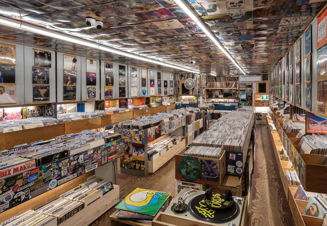
Most record stores—whether their design adheres to a minimalist palette or embraces the chaos of the stacks—embody the platonic ideal of the consumer experience. Record shopping refuses the mindless, algorithmic overconsumption of streaming, but it also rewards the idea of shopping as education, lifestyle, and community-building. Vinyl NYC, a new thirst-inducing survey of the city’s record stores published in September by Prestel, visualizes that promise. Photographed by James T. and Karla L. Murray, with text by Hattie Lindert, the book is itself a record—not just of the city’s love affair with vinyl but also the format’s retail potential.
Every catalogic endeavor is inherently incomplete, and any record collector worth their weight in first pressings will have fun bemoaning the shops missing from the book. Still, the book documents local record stores that honor global histories. For example: On the vibrant walls of Jamaica, Queens’s essential VP Records, for instance, you can witness the global trade of reggae and dancehall music between the Caribbean, U.K., and U.S. Its
cofounder is Miss Pat, who, with her husband, Vincent, founded a record store in Kingston, Jamaica, in 1958—with an upstairs studio that recorded Bob Marley and the Wailers, among others—before moving to Queens and opening VP Records in 1979.
The interior aesthetics of record stores have been sampled into almost any space. Boutique hotels around the world host vinyl emporiums, and you can buy a record, drink, and entry to a DJ set with one transaction at some night clubs. Even retail stores will sell you a record, along with everything else. As interest in vinyl grows, venues hope to press a little spirit of the beloved indie record store into their own grooves.
Usually the corporate vibe doesn’t sync up. After all, as Academy Records founder Mike Davis remarks at the end of Vinyl NYC, the presentation of good music is personal: “There is some human interaction, buried deep in there.” Its warmth is waiting there, in all its complexity, for you to discover, within the stacks of a record store.
Near San Francisco, Good Hot offers an example of how designers can shape communal bathing culture.
KELSEY KEITH
Surely you’ve heard the statistics regarding the dominance of saunas in Finnish culture: There’s more than one for every two people. To wit, I was once informed that the secret to enduring the long, dark Nordic winter is “drinking alone [kalsarikä nnit] and sauna with friends.”
But you, reader, likely live in the United States in 2025 and have a smartphone, so you’ve probably been on the receiving end of digital advertising for infrared basement lighting or been evangelized by a health influencer on the benefits of thermal cycling. If you live near San Francisco, as I do, maybe you received these pitches in person, very genuinely, with full eye contact.
So where shall the two wellness ideas—social safety net and marketed lifestyle product—meet? The answer is still sauna.
You can build a freestanding sauna using basic construction techniques. Start with economical, rectangular dimensions, then assemble a wood frame with a conventional exterior envelope, extrainsulated. Locate ventilation in a few strategic places, and add flair with the details: roof, window, heater. Finish the interior in wood, preferably cedar.
But considering a sauna through structure is like assessing a Peter Zumthor chapel for its code compliance. Ultimately, a sauna is a place for ritual, for meditation, for congregation: It’s a simple building for a transformative purpose. And for an architect, designing that experience requires an intentional shift in scale and focus from typical professional practice.
An example of this growth can be seen in the work of Lou Tamiye and Cooper Rogers, who graduated from the UC Berkeley College of Environmental Design MArch program in 2019. During the pandemic, they designed and opened Good Hot, a collection of five outdoor saunas nestled in a semi-industrial corner of Richmond, California. The site supports a deconstructed bathhouse, an unfolding series of saunas, changing cabins, low platforms, benches, outdoor showers, and chaises—a silvering garden of reclaimed wood.
“After school, we wanted to get our hands dirty,” Tamiye said recently. “We were thinking about architecture relating to people, so for us, putting theory in practice meant focusing on considerations like the experience of washing your hands in a certain way or how it feels to open a changing-stall door.”
Rogers added: “We wanted to have a longer relationship to buildings than architects usually have—to not just be the creators but the caretakers.” In this milieu, caretaking is much more holistic than your standard punch list: “You’re tending to the architecture, to the cleanliness, the light, the temperature.”
The main draw of Good Hot is its proximity to a relatively docile corner of the San Francisco Bay: in sauna parlance, a cold plunge. “How we relate to nature in Northern California, it’s a little rough, there’s a little bite—but that’s what makes it sublime,” said Rogers. Still, this dip is not for the timid. The Bay is choppy, cold, and, in places, contaminated.
“The saunas expand access to the elements, to what would otherwise be an intimidating experience.”
As a space that is equal parts community-oriented, at the mercy of nature, and completely analog, Good Hot feels unique to the Bay Area’s culture. Still, there are larger lessons to be drawn from this architectural experiment. Bathing traditions as social practice are not new, but there is a dawning urgency for accessible spaces to get offline. To retreat. To contemplate. Maybe not to drink alone, but certainly to sauna with friends.
With that in mind, Tamiye and Rogers are currently planning Good Hot’s second location at O2AA, a former oxygen factory in West Oakland now shared by craftspeople and artists. It will have saunas, tubs,
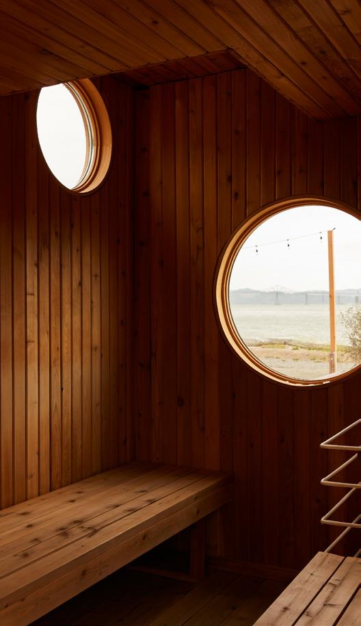
and pools, and, in contrast to Richmond’s windy shores, it’s meant as more of an everyday destination.
A daily sauna ritual is also an architectural experience, or at least an observational exercise in inhabiting the built environment. As someone who has made a career of having feelings about buildings, a sauna is the ne plus ultra. You shiver at a cold draft, appreciate each layer of weatherproofing, absorb all the skylight details—you feel every growth ring in the cedar as you sweat your way to serenity.
A comedian and cultural commentator updates Dieter Rams’s timeless advice for our internet age.
DAN MAHBOUBIAN ROSEN
It must have many followers. It must look good both on the grid and when shared to Stories. Its creation should be sleekly edited to a trendy Olivia Rodrigo song as the designer twerks around it. “How does it look in person?” Good design doesn’t ask such stupid questions.
Size connotes wealth, which as we all know connotes taste. And as we learned from the first principle, human scale is irrelevant when good design is Instagram. It is even better when it is borderline functionless and still retains a ludicrous price tag. This way its owner can most clearly demonstrate their prosperity.
It does not question whether an object should have a light bulb glued to it; it just does it. All things are lamp. A pot can be lamp. A branch you found in the park can be lamp. A chair, with the right light bulb glued to it, can also be lamp. There are no limits of good sense and taste as to what can be lamp.
It must still be produced using quality materials and ethical labor but somehow cost as little as a Monobloc chair or buyers will complain. Its price point must be so low that its designer should be living on food stamps. If the designer wishes to make a living, then they should have thought of that before they got their master’s degree.
It diverts the gaze. Yes, your work may blur boundaries, but have you also just considered being a hot person and dressing cool? Then when you pose on social media or in a magazine, people really won’t care if you’re producing derivative garbage because you’re hot, and that’s good.
You could work hard to invent something unique, bold, and original only to see it be immediately copied by a “star” designer for their new brand collab with Zara Home (and with cheaper materials). You will die alone.
It does not strive to create something timeless but instead responds to the current trend that is sweeping the algorithm. It should not be intentional, useful, or serve a purpose beyond its own status. It must be manufactured to last only as long as the latest craze.
Nothing is more important now than technology, so the more of it you use, the better your design is. Don’t ask yourself: “Should this couch be 3D-printed?” Instead, ask yourself: “Why shouldn’t this whole house be 3D-printed?
It deeply considers how its materials, fabrication methods, and supply chain affect the planet. It is built to last for generations, or at least until the next collection is released the following year, which will be even more sustainable.
It doesn’t waste time attempting to expand our aesthetic universe when it can much more easily remix the past with generative AI. It is designed by and for the internet. We’re all too distracted to sit down and have an original thought anyway, so why not sit back and let Midjourney take the wheel.
TOTO’s NEOREST LS Smart Bidet Toilet offers a high-luxe design with elegant wave-like design lines and decorative metallic trim in silver, nickel, or black, enabling consumers to coordinate their smart toilets with their faucets, remote control, and paper holder, creating design harmony. Among its many technologies, the NEOREST LS features EWATER+® to clean the wand, bowl, and bidet seat’s underside, preventing waste accumulation and stubborn yellow stains and reducing the need for harsh cleaning products, which aids the environment.
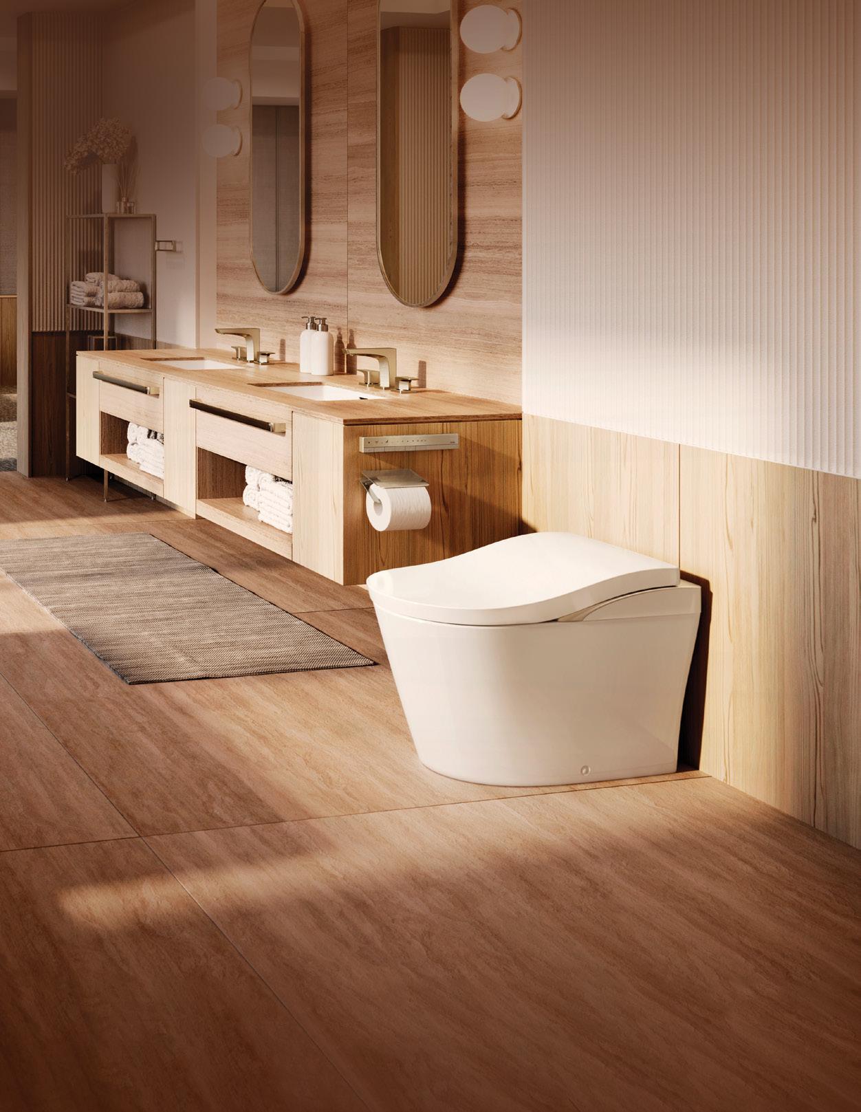
SCAN CODE FOR INFO
