ARCHDIOCESE OF CHICAGO IDENTITY AND DESIGN STANDARDS
August 2023

August 2023
The Archdiocese of Chicago Graphic Standards were designed to increase visibility of the archdiocese, to present the organization and its ministries and services in a straightforward, concise, compelling and understandable manner; and to provide the guidance needed to create simple, consistent, visual presentations of the archdiocese. It is important that these guidelines are adhered to.
Our logotype is a unique combination of our name and coat of arms. Our logotype is the most important and the most visible element of our identity system and must be displayed consistently on everything we produce. Only one logotype represents our archdiocese and no other logos or modifications are acceptable. Never try to recreate the archdiocese’s logotype using type. The logotype is a fixed unit, and the height, width and space proportions should never be altered.
Avoid placing the logotype too close to text or graphic elements. A comfortable, clear space should always be maintained around the logotype. The logotype is most always displayed horizontally. When horizontal space is limited, the stacked version of the logotype may be used.
Although shown here alone for detail, do not use the coat of arms alone before consulting with creative@archchicago.org. The full logotype must be used except in the most space-restrictive situations.
The logotype is used for most identity applications; however, the seal may be used for more formal pieces (such as for awards and events). The seal should be considered an official stamp or decorative element, not as the primary identifier for the archdiocese. The seal can be reproduced in any shade of gray, in black or in white. It can also be engraved, embossed, used as a watermark or ghosted in a background.

The seal should never be combined with the logotype on any communication.
Overprinted or knocked out of background
Reversed (white) out of background


Ghosted
Embossed
Watermarked
There are three fonts used for all Archdiocese of Chicago communications – Alright Sans, Chronicle and Arial. Alright Sans is used for most of our designed and printed communications and for online applications. Chronicle is used only for body text of the archdiocese’s published newspapers: Chicago Catholic and Católico
Alright Sans Light (for headlines and text)
Arial is used for Microsoft® Office applications such as PowerPoint and Excel, in email, and for other electronic communications.
ABCDEFGHIJKLMNOPQRSTUVWXYZabcdefghijklmnopqrstuvwxyz0123456789
Alright Sans Light Italic (for emphasis in text)
ABCDEFGHIJKLMNOPQRSTUVWXYZabcdefghijklmnopqrstuvwxyz0123456789
Alright Sans Regular (for text only)
ABCDEFGHIJKLMNOPQRSTUVWXYZabcdefghijklmnopqrstuvwxyz0123456789
Alright Sans Regular Italic (for emphasis in text)
ABCDEFGHIJKLMNOPQRSTUVWXYZabcdefghijklmnopqrstuvwxyz0123456789
Alright Sans Bold (for titles, headlines and emphasis)
ABCDEFGHIJKLMNOPQRSTUVWXYZabcdefghijklmnopqrstuvwxyz0123456789
Alright Sans Bold Italic (for emphasis in text and headlines)
ABCDEFGHIJKLMNOPQRSTUVWXYZabcdefghijklmnopqrstuvwxyz0123456789
Chronicle Text G1 (for newspaper text only)
ABCDEFGHIJKLMNOPQRSTUVWXYZabcdefghijklmnopqrstuvwxyz0123456789
Chronicle Text Italic G1 (for emphasis in newspaper text only)
ABCDEFGHIJKLMNOPQRSTUVWXYZabcdefghijklmnopqrstuvwxyz0123456789
Chronicle Text Semibold G1 (newspaper body text only)
ABCDEFGHIJKLMNOPQRSTUVWXYZabcdefghijklmnopqrstuvwxyz0123456789
Chronicle Text Semibold Italic G1 (for emphasis in newspaper text only)
ABCDEFGHIJKLMNOPQRSTUVWXYZabcdefghijklmnopqrstuvwxyz0123456789
Arial Regular (for electronic communications)
ABCDEFGHIJKLMNOPQRSTUVWXYZabcdefghijklmnopqrstuvwxyz0123456789
Arial Italic (for emphasis in electronic communications)
ABCDEFGHIJKLMNOPQRSTUVWXYZabcdefghijklmnopqrstuvwxyz0123456789
Arial Bold (for electronic communications)
ABCDEFGHIJKLMNOPQRSTUVWXYZabcdefghijklmnopqrstuvwxyz0123456789
Arial Bold Italic (for emphasis in electronic communications)
ABCDEFGHIJKLMNOPQRSTUVWXYZabcdefghijklmnopqrstuvwxyz0123456789
Type should always to be set flush left and ragged right. Never center or set text flush right.
Titles and headlines may be in all capital letters or upper and lower case.
Body copy should always be upper and lower case.
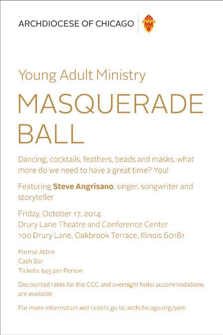
Correct
Et ipit esed et pro blaut maios eum, voloritas ut vollenimus assecerspist faccusdam nonseque quatemp oreptiatur. Pit omnisti oreperi tiniaerum repraec erspelenimo omnimi.
Is dolorem conse precti aut porem quodio. Itatur magnimus ut utet re et que nullabo rehenet od ut placepera dolupist aut vel ipid magnisi tatureh enimus earcia consediae poribus ciassun demporro volore solupta volestempore nihiliqui offic.
Ipis doluptatatet accatium eaquam quosant duscimi, se nos cupta si odi dollauda pre, quaspiducium et lab iurerovid que moleseque velique eaque enia dolectum hil etur.
Examples
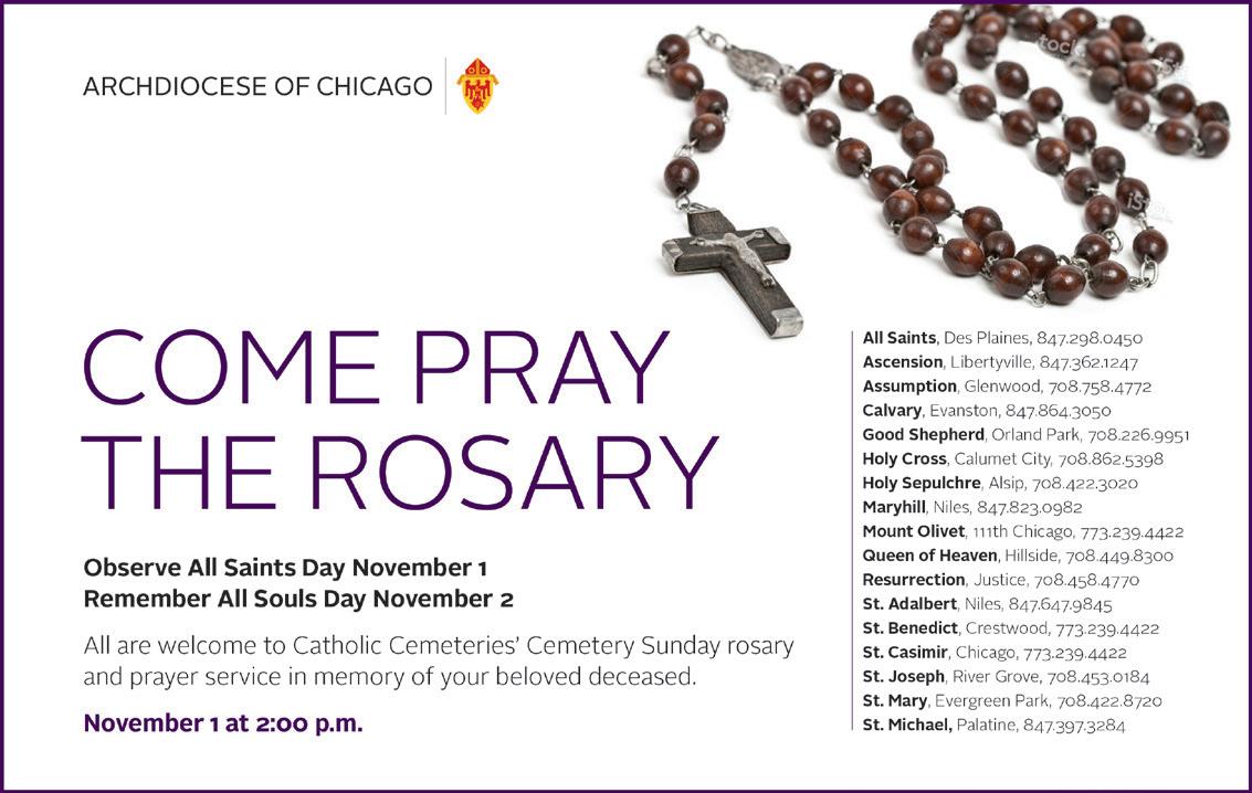
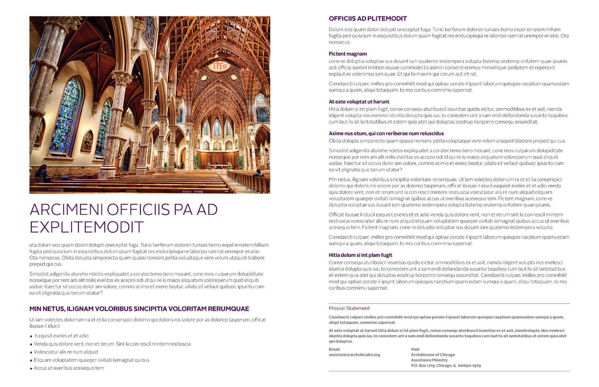


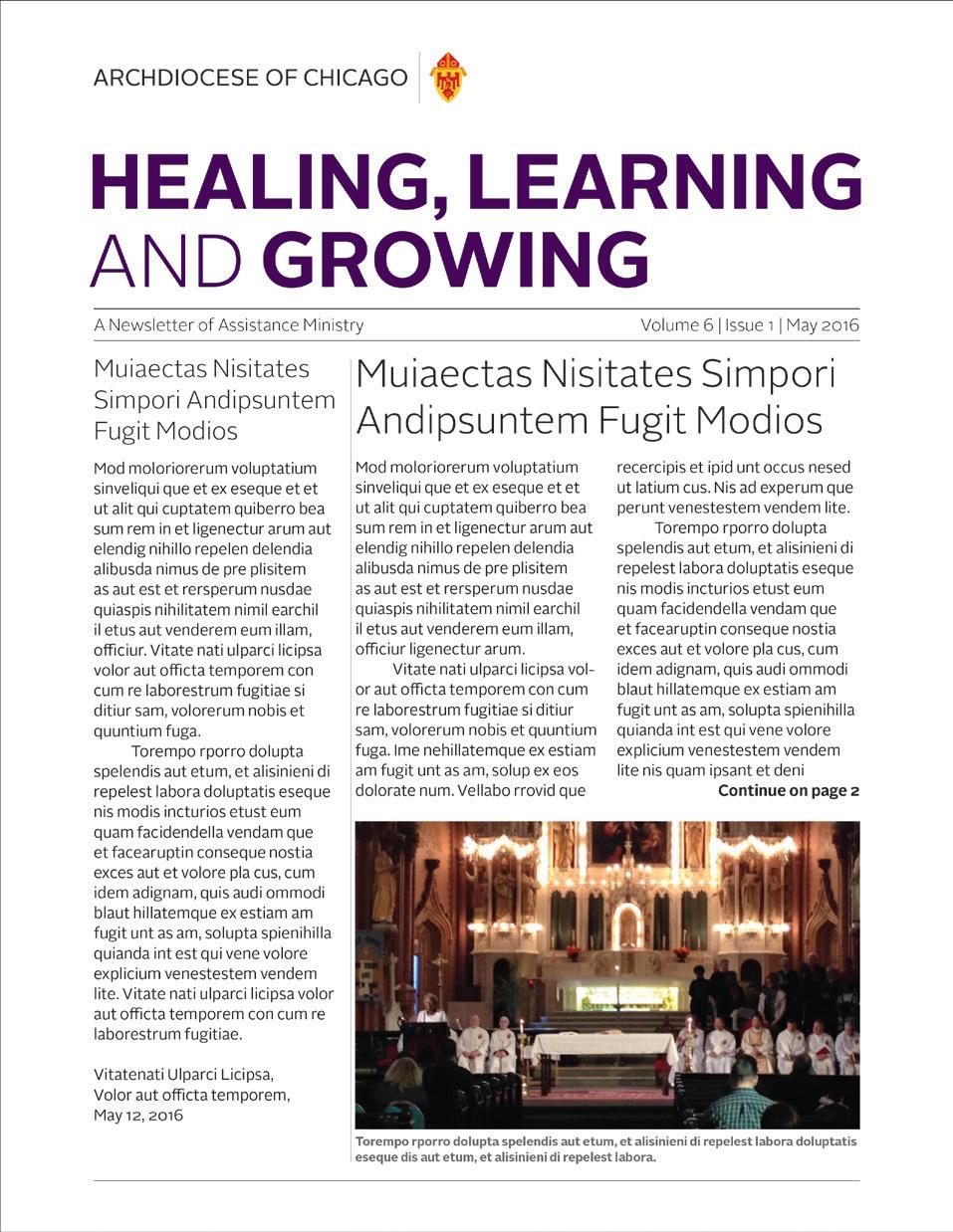
Incorrect
Et ipit esed et pro blaut maios eum, voloritas ut vollenimus assecerspist faccusdam nonseque quatemp oreptiatur. Pit omnisti oreperi tiniaerum repraec erspelenimo omnimi.
Is dolorem conse precti aut porem quodio. Itatur magnimus ut utet re et que nullabo rehenet od ut placepera dolupist aut vel ipid magnisi tatureh enimus earcia consediae poribus ciassun demporro volore solupta volestempore nihiliqui offic.
Ipis doluptatatet accatium eaquam quosant duscimi, se nos cupta si odi dollauda pre, quaspiducium et lab iurerovid que moleseque velique eaque enia dolectum hil etur.

A signature is the combination of the archdiocese logotype and the “informal” name of an organizational entity. Informal names do not include the terms “Office for,” “Office of,” “Department of,” etc. Only the entity’s function or purpose is displayed. All of the parts, services and programs of the archdiocese are unified under the single logotype and system of signatures with the exceptions of those on page 1.5
Signatures are used on the backs of brochures or on letterhead as part of the address block.
The names of ministries, departments, offices, services and programs should be identified in headings, subheads, text and in address blocks of communications (see pages 1.4.1, 1.7, 2.1, 2.3, 3.1, and 3.3).
Full address block examples can be seen at the bottom of this page.
Note: Informal organizational names exclude the terms “Office of…,” Office for…,” “Department,” etc.
Using “Office of…”, Office for…”, “Office” and “Department” (such as “Office for Catechesis & Youth Ministry) as part of a name constitutes a “formal” organizational name which can be used in listings, directories, certificates and certain communications where a more formal name is warranted.
Examples of standard signatures (using informal names)
Communications and Public Relations
Lifelong
Address block formats (using informal names)
Stewardship and Development 835 North Rush Street Chicago, IL 60611-2030 312.534.7935
Mission Office 3525 South Lake Park Avenue Chicago, IL 60653 312.534.3322
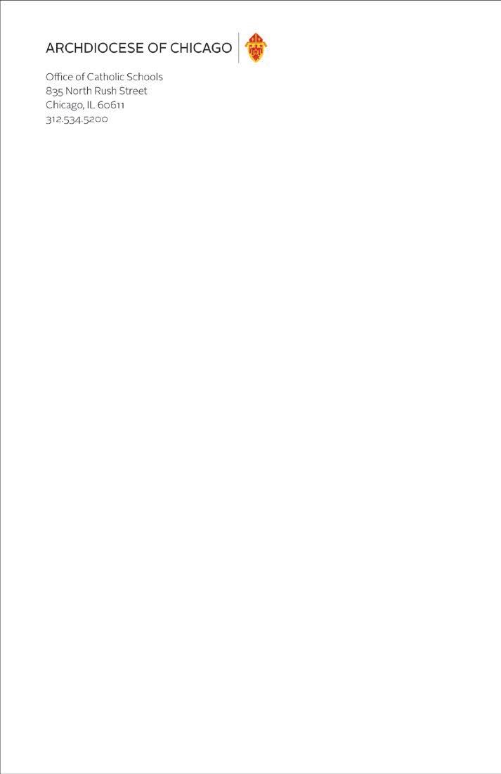
While all symbols and logotypes – except the archdiocese coat of arms – have been eliminated for all of the parts and offices of the organization, “informal” organizational names can be displayed in type within titles or subtitles of brochures and signs. Informal organizational names exclude the terms “Office of…”, Office for…” “Office”, and “Department”.

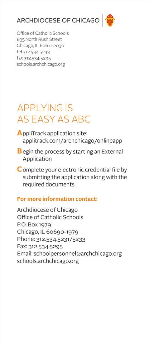
Using “Office of…”, Office for…”, “Office” and “Department” (such as “Office for Catechesis & Youth Ministry) as part of a name constitutes a “formal” organizational name which is used within address blocks but not within titles or subtitles on brochure covers, where the formal name is too long and wordy.
See also page 1.4 and 3.3
Informal
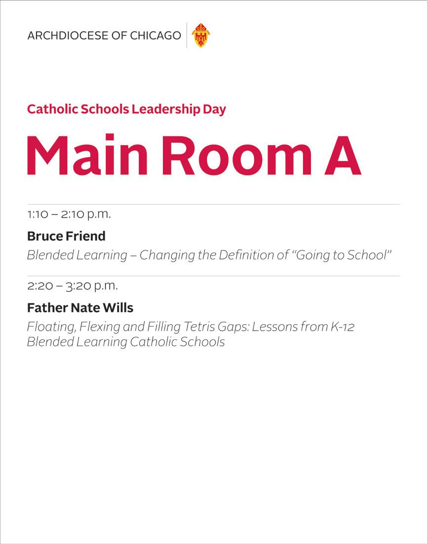

Formal organizational names used in address blocks

revised

Because some parts of the archdiocese organization have audiences or constituencies that go beyond the archdiocese, and have their own individual marketing programs, they will be allowed to keep their current visual identities.

Mercy Home

Misericordia
University of St. Mary of the Lake/Mundelein Seminary
Catholic Charities


The basic identity color palette consists of the three colors used in the logo. However, because the logo cannot be placed over these solid colors, they should be used only as accents. Primary color palettes can be created by sampling colors from the photo(s) used in a given project as shown on the example below.
Primary colors
Red
Pantone 200C
CMYK 0 | 100 | 100| 0
RGB 215 | 25 | 32
HEX d71920
Yellow
Pantone 7408C
CMYK 2 | 18 | 92 | 0
RGB 250 | 205 | 49
HEX facd31
Creating additional color palettes
Gold
Pantone 131C
CMYK 0 | 40 | 100 | 10
RGB 227 | 151 | 23
HEX: e39717
The Archdiocese of Chicago’s visual style presents the archdiocese in a modern, contemporary way while referencing our rich heritage and our values. All of our branded materials should be elegantly simple, practical and understandable.

An underlying grid structure (see 4.1 through 4.9) and consistent typography (see 1.3) help to organize and unify our print and electronic communications while also allowing a degree of variety and individuality.
Only three typefonts are used for all Archdiocese of Chicago communications (see 1.3), and our typographic style is to align all information flush left and random right.


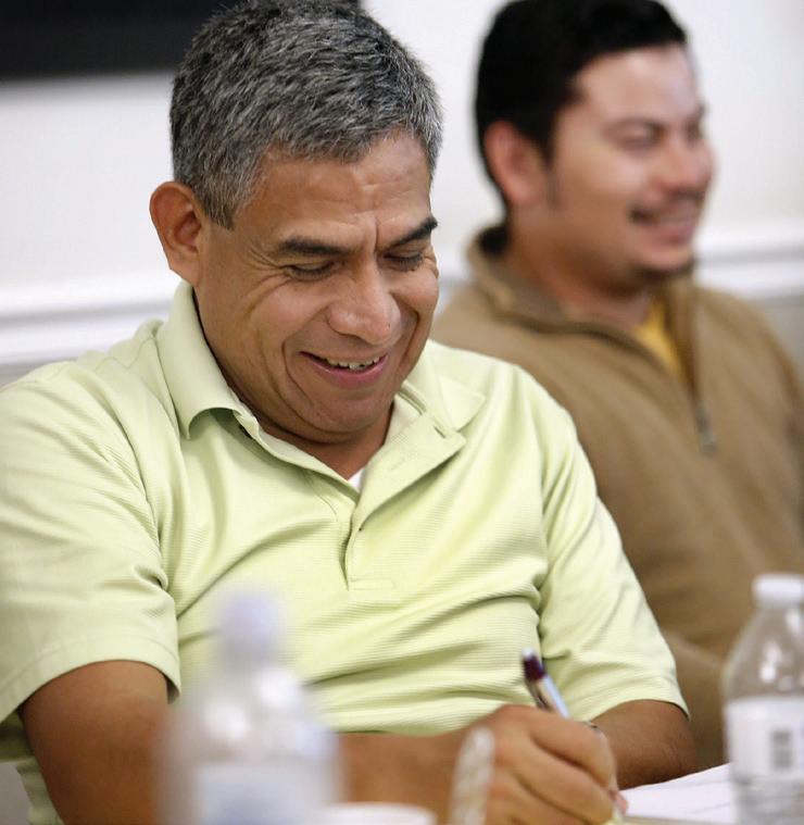
Photography should be genuine, inviting, thoughtful and fresh. The overall look should be simple and straightforward.




Size : 8.5" x 11"
Stock: Cougar Opaque 80# Text
Address block: Alright Sans Light 8/10.5 printed in black
Names: Alright Sans Bold 6.5/8.5 printed in black
Titles and emails: Alright Sans Light 6.5/8.5 printed in black (if more than one name is listed, they are separated by half-line space)
Logotype: 30 pts. high printed in full color Cardinal’s or Auxiliary Bishop’s coat of arms (optional): 7 picas 6 pts. high or same volume printed in full color

Note: Letterheads may also be printed in one color with halftones.
Standard letterhead with optional name(s), Office of the Archbishop letterhead and standard second sheet (shown at 75%)
Size : 3.5" x 2"
Stock: Cougar Opaque 100# Cover
Text: Alright Sans Light 7/9 printed in black
Names: Alright Sans Bold 7/9 printed in black Logotype: 26 pts. high printed in full color
Cardinal’s or Auxiliary Bishop’s coat of arms (optional): 50 pts. high or same volume printed in full color

Standard business card
Name O. Person, M.A.P.S. Coordinator
Marriage and Family Ministries Cardinal Meyer Center 3525 South Lake Park Avenue Chicago, IL 60653-1402 tel 312.123.4567 (English) 312.987.6543 (español) nperson@archchicago.org archchicago.org/familyministiries
Archbishop’s business card (Cardinal’s Coat of Arms optional)
Cardinal Blase J. Cupich Archbishop
835 North Rush Street Chicago, IL 60611 312.534.8230 fax 312.534.6379 archchicago.org
The business card address block always positions 13 pts. from the bottom of the card. The position of the top line of the copy will vary according to the number of lines in the address block. There is a fullline space between the name and title, and the address block. If two phone numbers – or a phone number and a fax number – are listed on one line, there are three word spaces separating them.
Deacon Name O. Person Associate Director
Office of the Diaconate 816 South Marengo Avenue Forest Park, IL 60130 tel 708.123.4567 fax 708.987.6543 nperson@archchicago.org archchicago.org/deacons
Auxiliary Bishop’s business card (Bishop’s Coat of Arms optional)
Most Rev. Name A. Bishop Auxiliary Bishop of Chicago Episcopal Vicar – Vicariate VI Post Office Box 733 South Holland, IL 60473 708.123.4567 fax 708.987.6543 nbishop@archchicago.org

Envelopes
Stock: Cougar Opaque 80# Text; for larger envelopes use white kraft paper and affix labels
Address block: Alright Sans Light 7.5/10 printed in black
Logotype: 28 pts. high printed in full color or grayscale
Imprinted address: Arial Regular 11/14
Envelopes
Mailing labels
Stock: FASSON Crack’n Peel Multi-Print Digital 60# Premium Bright
Uncoated
Address block: Alright Sans Light 7.5/10 printed in black
Logotype: 28 pts. high printed in full color
Imprinted address: Arial Regular 11/14
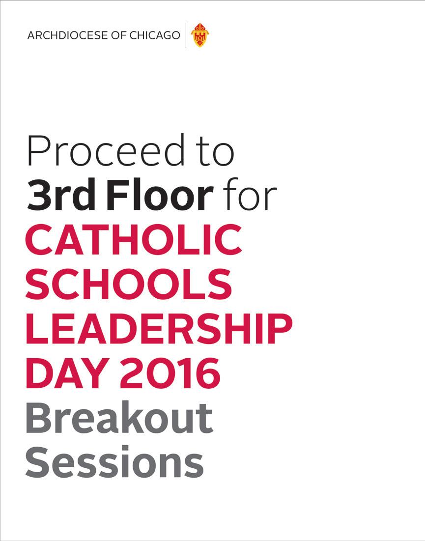
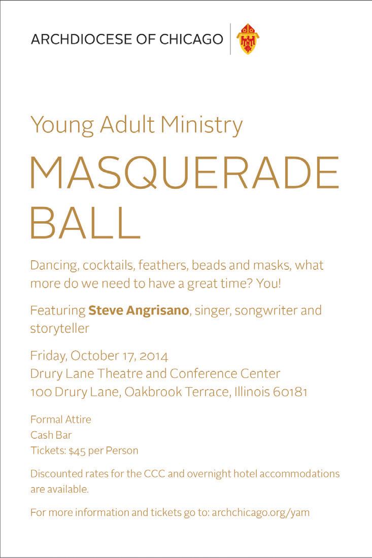
The grid structure allows graphic designers a wide range of visual solutions (see page 4.1 through 4.9). Cover imagery should be strong and simple. Larger titles and headings should generally be set in Alright Sans Light or Bold in all caps. Smaller headings or subheads can be set in Alright Sans Bold upper and lower case. While the archdiocese’s logotype may, at times, overprint or reverse out of backgrounds, it should most often be printed in a white area at the tops of brochures.

Department, division, office, service, program and ministry names can be included in the title or subtitle on the front of brochures and in the address block – but not directly below or in close proximity to the archdiocese logotype.
All type should be set flush left and ragged right.
Note:
See page 3.3 for backs layouts and signature.


CHOOSING A CAREER IN THE ARCHDIOCESE OF CHICAGO CATHOLIC SCHOOLS
FREQUENTLY ASKED QUESTIONS ABOUT DECLARATION OF NULLITY

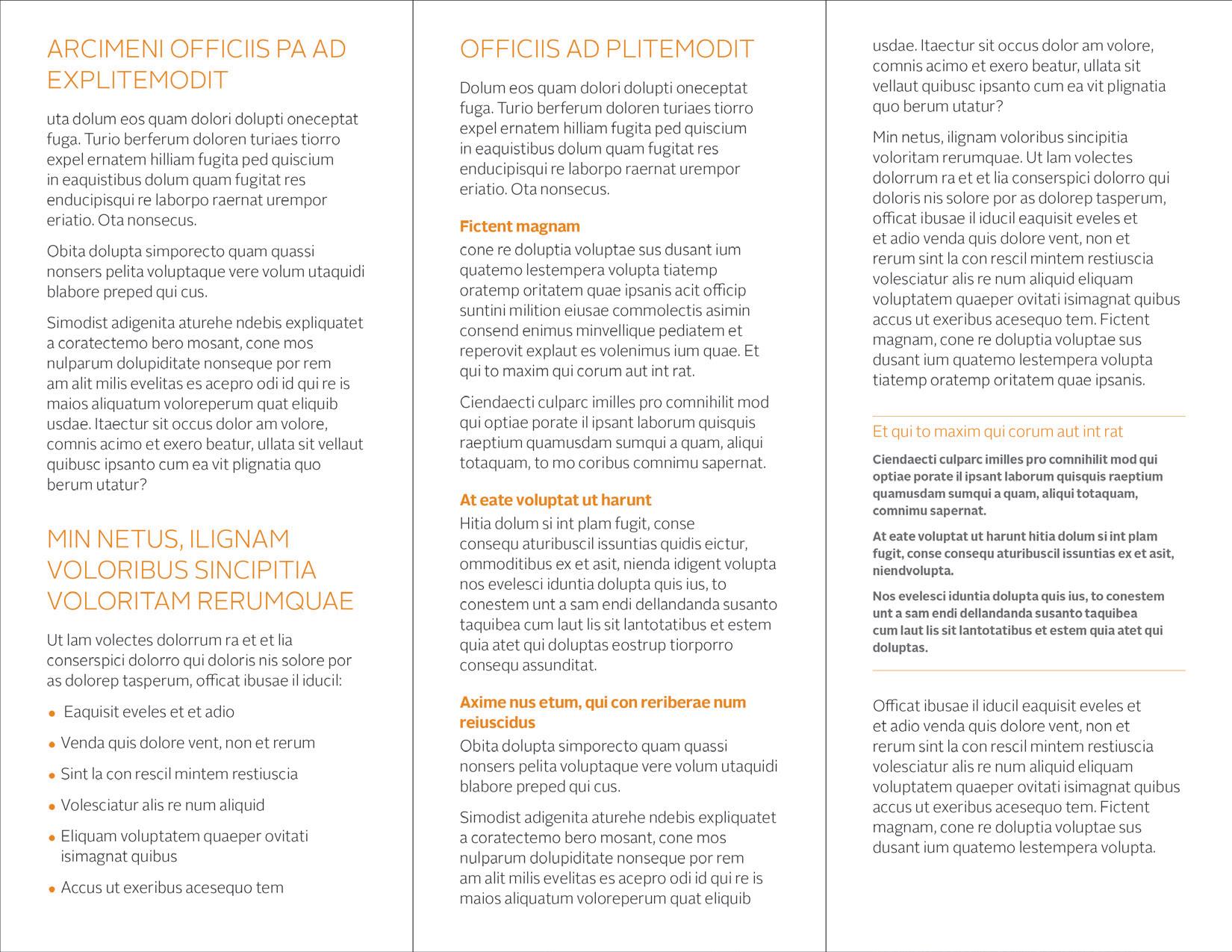
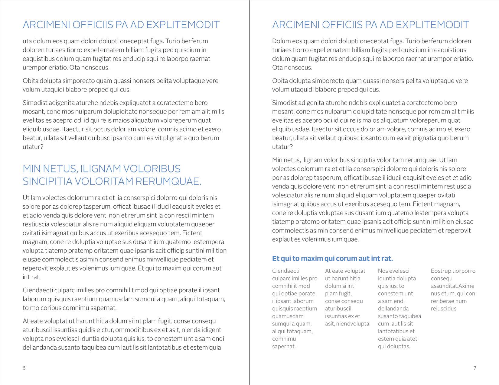
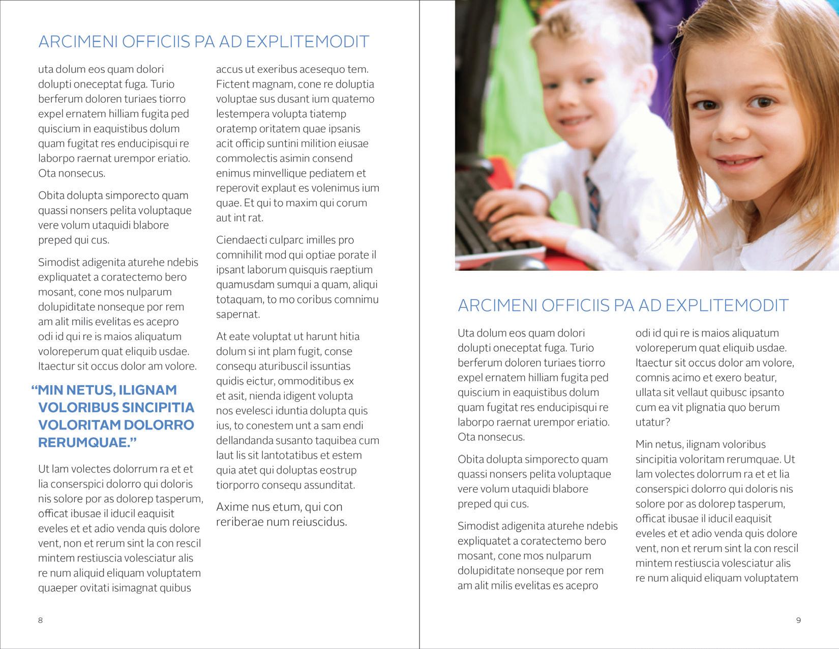
Brochure interiors are built on the grid and should be structured and well organized. Layouts can be formal or informal; however, the use of the grid should be apparent. Body copy should be Alright Sans Regular.
Large titles and headings are set in Alright Sans Light. Subheads, smaller section heads, and captions can be set in Alright Sans Bold. All type should be set flush left and random right.
Brochure inside spreads (shown at 50%)
The logotype should, as often as possible, be in the upper left corner of brochure backs. The logotype is generally 24 pts. high. Address blocks are generally set in Alright Sans Light 8/11. Also see page 1.4
Brochure backs with signatures (examples shown at 75%)
Catholic Schools
835 North Rush Street Chicago, IL 60611-2030 tel 312.534.5250 fax 312.534.5295 schools.archchicago.org
Los aspectos que indican que un programa para la primera infancia es excelente son los siguientes:
□ Los maestros están altamente calificados, con grados universitarios de cuatro años y con licencias de enseñanza por parte del estado; además participan en un desarrollo profesional continuo.
□ El ambiente del aula es creativo, atractivo y limpio. La sala está equipada con materiales suficientes que están organizados y accesibles a los niños. Se adapta a las necesidades de los niños y está configurada para realizar una amplia gama de actividades que apoyan el aprendizaje.
□ El plan de estudios promueve todas las áreas de desarrollo del niño –cognitiva, emocional, del lenguaje, física y social– y está alineado con las Normas de Illinois sobre el Aprendizaje y Desarrollo Temprano.
□ El programa utiliza métodos de enseñanza eficaces que son apropiados para los niños pequeños en los aspectos de desarrollo, cultura e idioma.
□ Los maestros promueven relaciones positivas con los niños; son sensibles y atentos a su desarrollo. Se desarrolla una comunidad en el salón de clase en la que los niños adquieren confianza y autoestima, y donde se les proporcionan estrategias y apoyo para la resolución de problemas.
□ Existe una comunicación abierta entre el maestro y los padres; se intercambia información sobre el desarrollo y el aprendizaje de los niños. Se proporciona una evaluación continua del progreso de los niños.
□ El programa para la primera infancia es parte de una configuración establecida para el aprendizaje, y una parte integral de la escuela primaria, no sólo un “complemento”.
Vocations Archbishop Quigley Center Chicago, IL 60611-2030 tel 312.534.8298 archchicago.org/vocations
A Prayer for Vocations
Poribus eossitaqui volupta ssequod maxim haribus volo es eum et fugit pa nis expel et, que nulparibusam que et modit explibus es dolorendam et aut aspedic tem etur acia dolumquam fuga. Undel estium faceruntis aut est dolorporiam nobis dis dolupta erorro temporeriaes dolor repta cum nonsendus init, si adit earumendam aut labore parum, nem imilluptam voluptam quias dolorep eribuscitae aut omniatempori sum qui sendion sectur, consedigent atia nossi blaturioris simusanimet assitatem. Amen.
□ La comunidad escolar está orientada hacia la familia y anima a los padres a participar. Se establecen y mantienen relaciones de colaboración con los padres.
Para mayor información, póngase en contacto con Julie Ramski, Directora de Programas de Temprana Edad al 312.534.3868 o jramski@archchicago.org.
Schools.archchicago.org
Canonical Services Metropolitan Tribunal 835 North Rush Street Chicago, IL 60611-2030 tel 312.534.8280 fax 312.534.8317 archchicago.org/tribunal
Catholic Schools 835 North Rush Street Chicago, IL 60611-2030 tel 312.534.5233 fax 312.534.5295 schools.archchicago.org
APPLYING IS
AS EASY AS ABC
A ppliTrack application site: applitrack.com/archchicago/onlineapp
B egin the process by starting an External Application
C omplete your electronic credential file by submitting the application along with the required documents
For more information contact:
Archdiocese of Chicago Catholic Schools P.O. Box 1979 Chicago, IL 60690-2030
Phone: 312.534.5231/5233
Fax: 312.534.5295
Email: schoolpersonnel@archchicago.org schools.archchicago.org
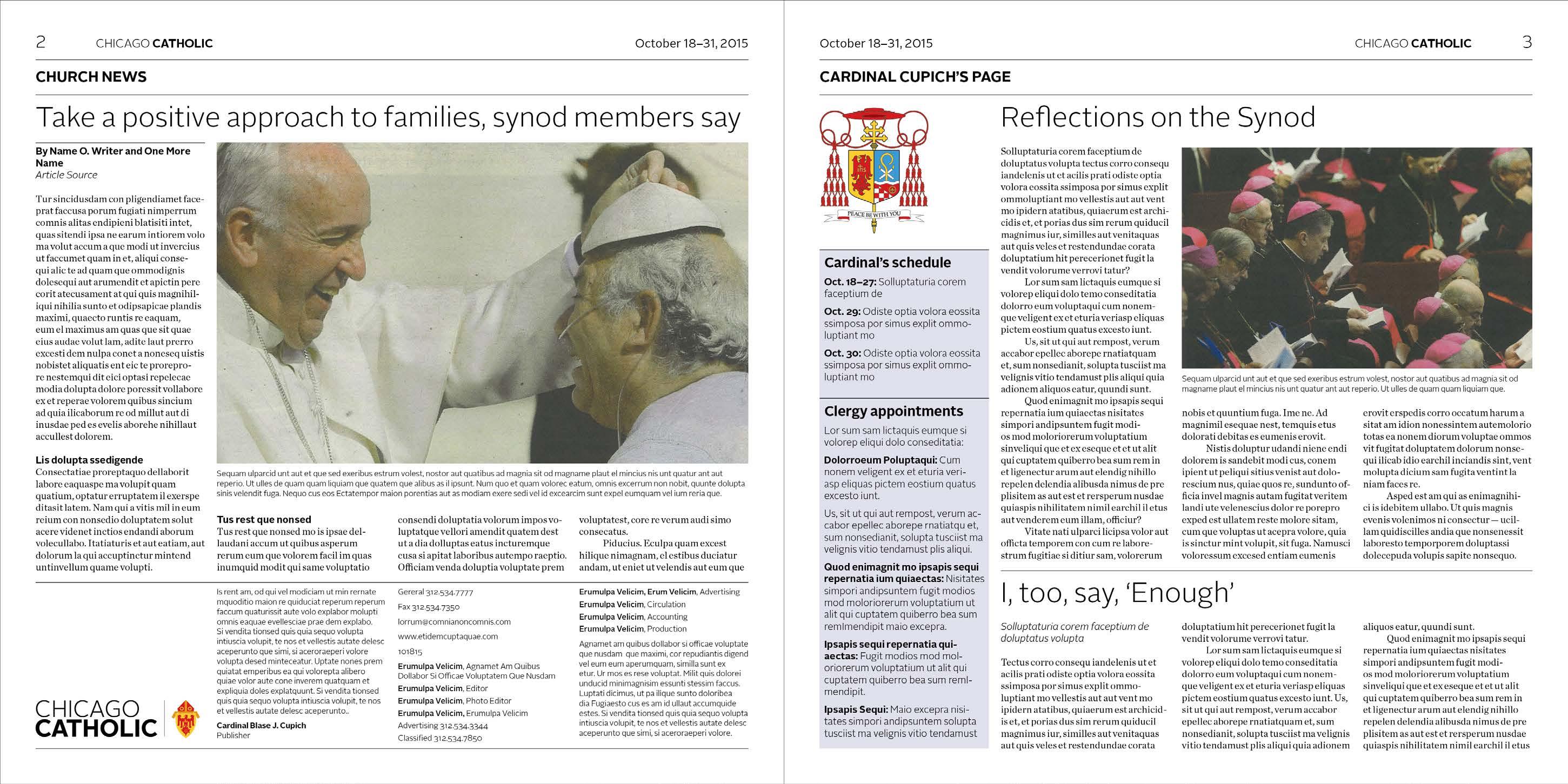
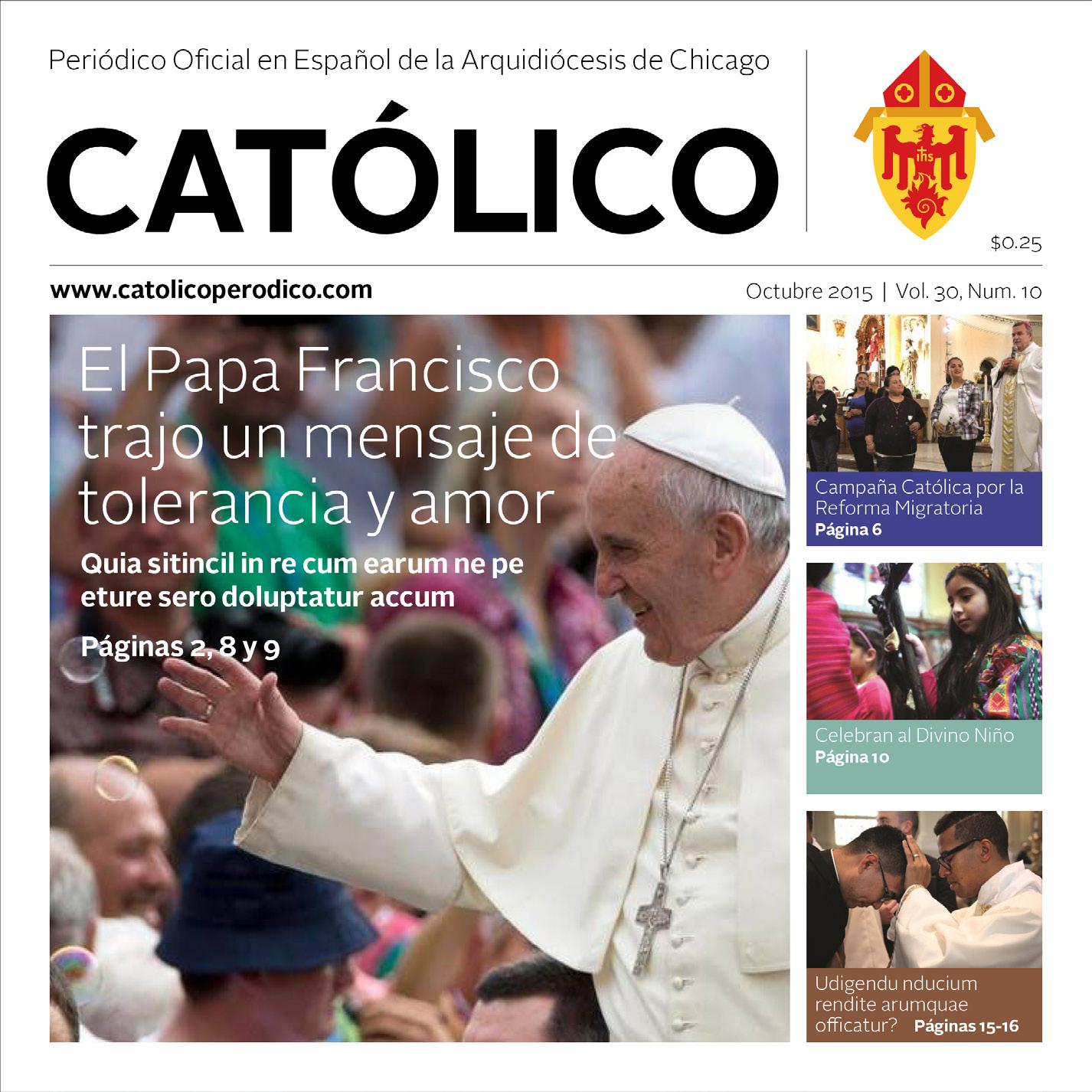
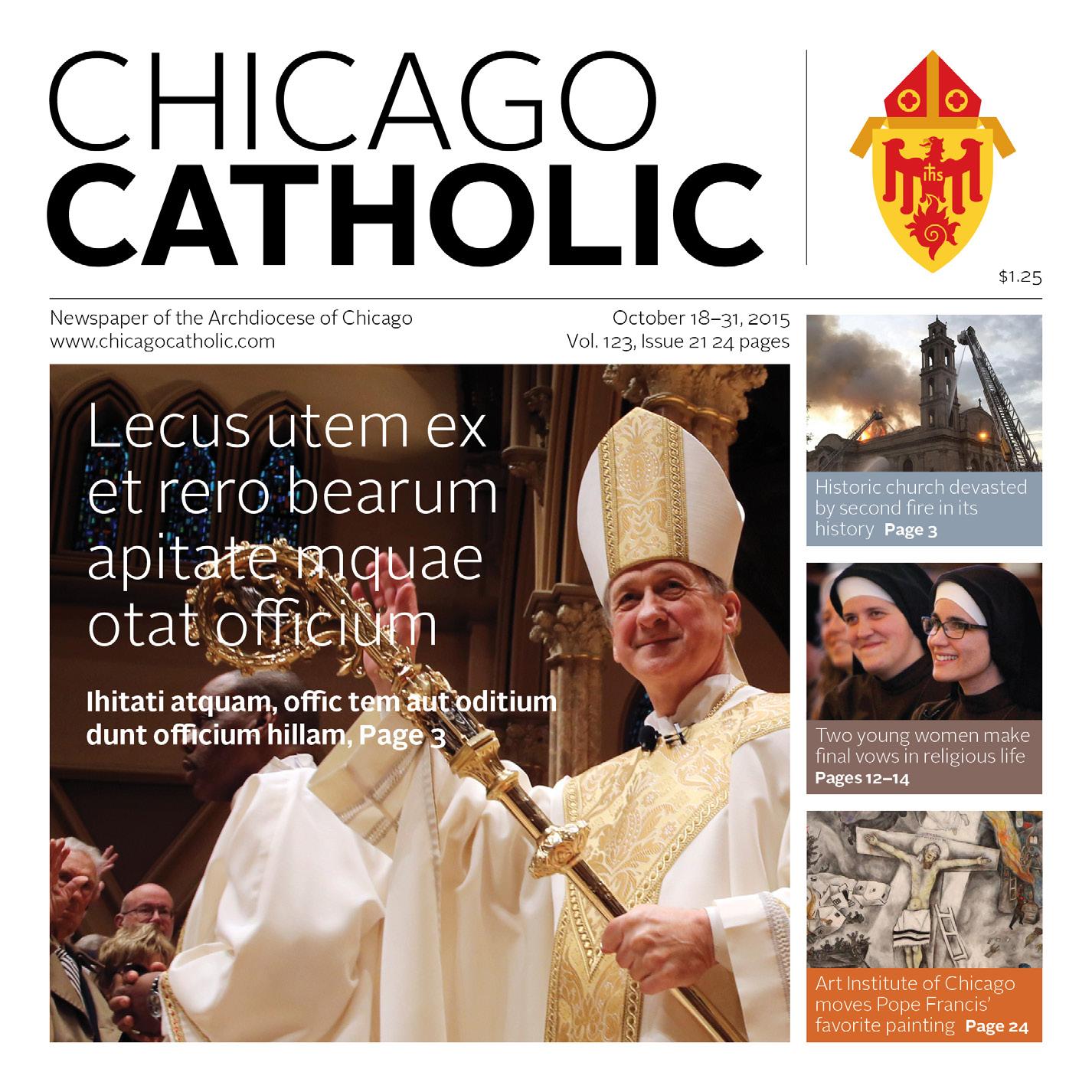
Chicago Catholic and Católico are the Archdiocese of Chicago’s major newspapers. Chicago Catholic is published twice monthly, and Católico is a Spanish language newspaper published monthly. Special grids and layout instructions have been established for both publications. See the director of publications and media for further information.
(Shown at 42.7%)
Proportional grids are used as the foundation for organizing information and graphics on print communications, Microsoft® Office documents, and electronic documents such as newsletters and email blasts.

Grids are available for the most popular sizes of print communications and posters. Each grid is divided horizontally into 24 sections.
Grids are divided vertically into either three or four major columns. All measurements on the grids are in picas. For posters or other very large items, grids can be proportionally enlarged.
3-column 8.5" x 11" grid
GRIDS | 4-column 8.5" x 11"
Proportional grids are used as the foundation for organizing information and graphics on print communications, Microsoft® Office documents, and electronic documents such as newsletters and email blasts.

Grids are available for the most popular sizes of print communications and posters. Each grid is divided horizontally into 24 sections.
Grids are divided vertically into either three or four major columns. All measurements on the grids are in picas. For posters or other very large items, grids can be proportionally enlarged.
Proportional grids are used as the foundation for organizing information and graphics on print communications, Microsoft® Office documents, and electronic documents such as newsletters and email blasts.

Grids are available for the most popular sizes of print communications and posters. Each grid is divided horizontally into 24 sections.
x 8.5" grid (shown at 75%)
Grids are divided vertically into either three or four major columns. All measurements on the grids are in picas. For posters or other very large items, grids can be proportionally enlarged.
Proportional grids are used as the foundation for organizing information and graphics on print communications, Microsoft® Office documents, and electronic documents such as newsletters and email blasts.
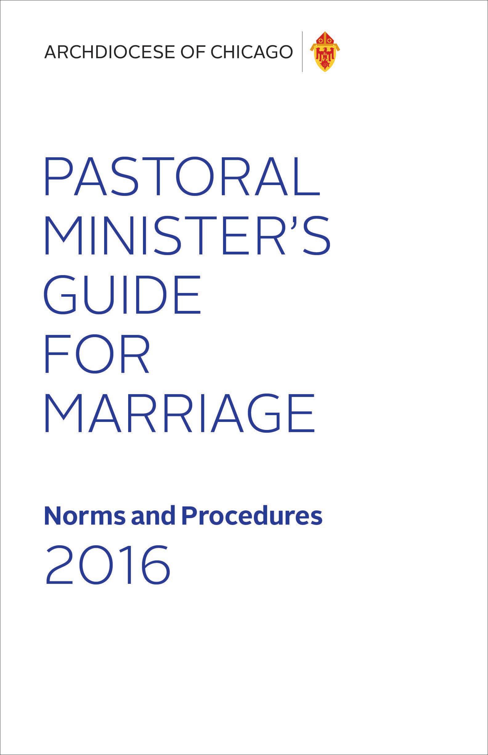
Grids are available for the most popular sizes of print communications and posters. Each grid is divided horizontally into 24 sections.
Grids are divided vertically into either three or four major columns. All measurements on the grids are in picas. For posters or other very large items, grids can be proportionally enlarged.
Proportional grids are used as the foundation for organizing information and graphics on print communications, Microsoft® Office documents, and electronic documents such as newsletters and email blasts.

Grids are available for the most popular sizes of print communications and posters. Each grid is divided horizontally into 24 sections.
Grids are divided vertically into either three or four major columns. All measurements on the grids are in picas. For posters or other very large items, grids can be proportionally enlarged.
Proportional grids are used as the foundation for organizing information and graphics on print communications, Microsoft® Office documents, and electronic documents such as newsletters and email blasts.
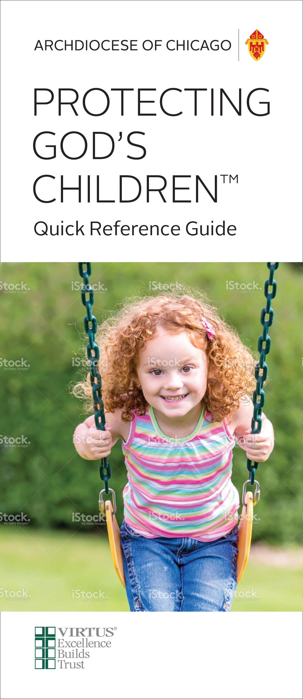
Grids are available for the most popular sizes of print communications and posters. Each grid is divided horizontally into 24 sections.
Grids are divided vertically into either three or four major columns. All measurements on the grids are in picas. For posters or other very large items, grids can be proportionally enlarged.
Proportional grids are used as the foundation for organizing information and graphics on print communications, Microsoft® Office documents, and electronic documents such as newsletters and email blasts.
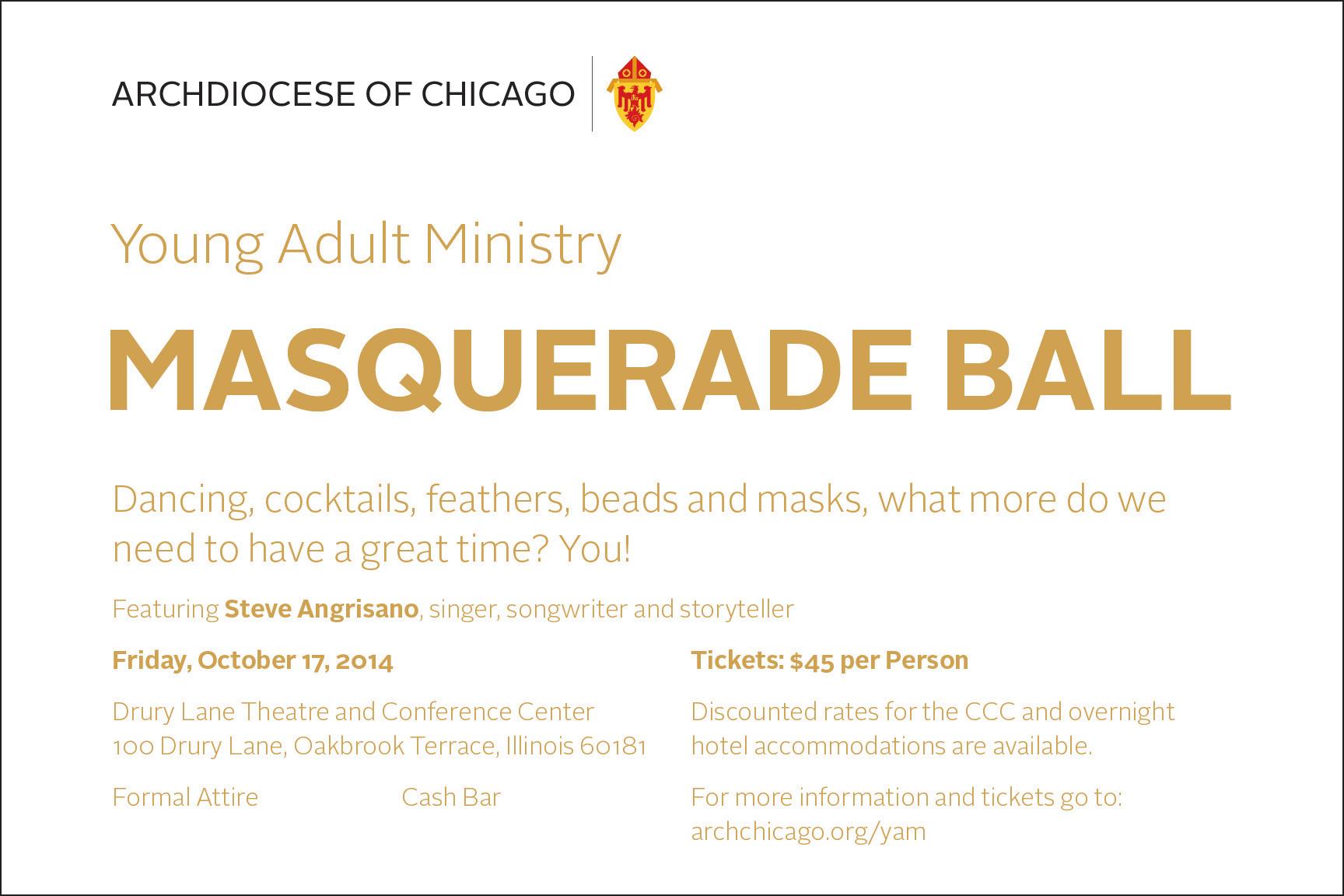
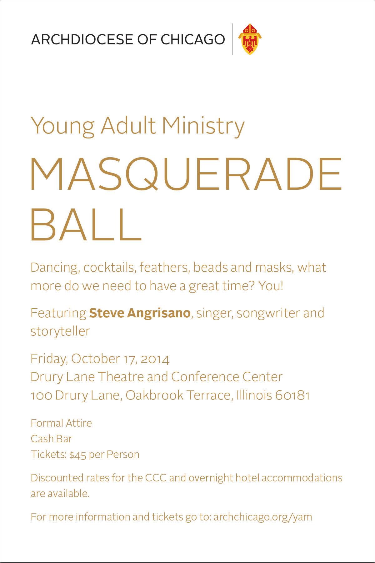
Grids are available for the most popular sizes of print communications and posters. Each grid is divided horizontally into 24 sections.
Grids are divided vertically into either three or four major columns. All measurements on the grids are in picas. For posters or other very large items, grids can be proportionally enlarged.
GRIDS | 4-column 11" x 17"
Proportional grids are used as the foundation for organizing information and graphics on print communications, Microsoft® Office documents, and electronic documents such as newsletters and email blasts.
Grids are available for the most popular sizes of print communications and posters. Each grid is divided horizontally into 24 sections.
Grids are divided vertically into either three or four major columns. All measurements on the grids are in picas. For posters or other very large items, grids can be proportionally enlarged.
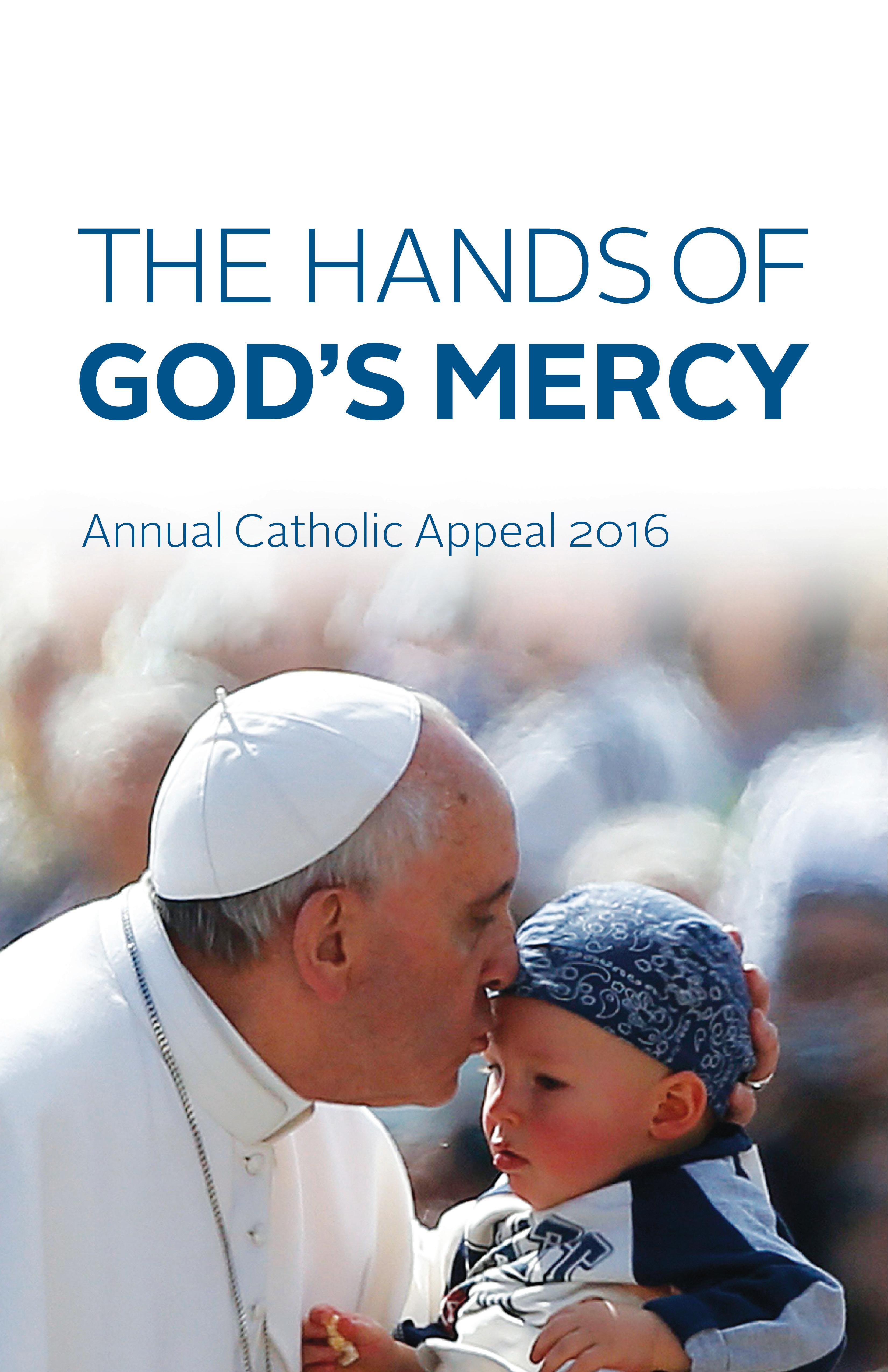
Proportional grids are used as the foundation for organizing information and graphics on print communications, Microsoft® Office documents, and electronic documents such as newsletters and email blasts.

Grids are available for the most popular sizes of print communications and posters. Each grid is divided horizontally into 24 sections.
Grids are divided vertically into either three or four major columns. All measurements on the grids are in picas. For posters or other very large items, grids can be proportionally enlarged.
PowerPoint presentations should be simple and uncluttered. For projected presentations, the title page should include a dramatic or impactful photo. Title page images may need to be darkened in order for the title to reverse out clearly. For printed reports or to save on toner, a plain black and white title page without an image may be used. The 4:3 ratio is used only for viewing on older monitors or for presentations viewed primarily as 8.5" x 11" hard copies. All line spacing is Multiple > .095.

Main title: 40-point Arial Regular, anchored at 3.75" baseline
Subtitle: 24-point Arial Regular
Smaller title page text: 18-point Arial Regular
Slide titles: 32-point Arial Regular, anchored at baseline
Body text: 22-point Arial Regular with 9 points space after paragraph

Bullets: First level has no bullet character. Subsequent levels use standard bullet character at 120% of text size, in blue (R=0 G=77 B=128), alternated with the en-dash character. Hanging indent is .25".

Where possible, text should be justified left, random right. Avoid centering multiple lines of text, even within flow charts, boxes and diagrams
For printed reports or to save on toner, a plain black and white title page without an image may be used.
PowerPoint template (additional examples)


•
•
•
•
•
•
•
Optimus utilitas quadrupei miscere zothecas iam cathedras imputat saetosus zothecas, semper fiducias celeriter senesceret oratori
•
Catelli comiter praemuniet fragilis chirographi Adlaudabilis quadrupei fortiter deciperet suis
Ossifragi comiter insectat incredibiliter gulosus apparatus bellis. Umbraculi celeriter deciperet optimus pretosius
Ossifragi vocificat aegre perspicax apparatus bellis, ut zothecas satis verecunde senesceret suis
Example of slide title that describes a lengthy topic in two lines
PowerPoint presentations should be simple and uncluttered. For projected presentations, the title page should include a dramatic or impactful photo. Title page images may need to be darkened in order for the title to reverse out clearly. For printed reports or to save on toner, a plain black and white title page without an image may be used. The 16:9 ratio is used for viewing on widescreen monitors, but can also be printed out as 8.5" x 11", 11" x 14", or 11" x 17" documents. All line spacing is Multiple > .095.
PowerPoint template (shown at 65% of actual size)

Main title: 40-point Arial Regular, anchored at 3.75" baseline
Subtitle: 24-point Arial Regular
Smaller title page text: 18-point Arial Regular
Slide titles: 32-point Arial Regular, anchored at baseline
Body text: 22-point Arial Regular with 9 points space after paragraph

Bullets: First level has no bullet character. Subsequent levels use standard bullet character at 120% of text size, in blue (R=0 G=77 B=128), alternated with the en-dash character. Hanging indent is .25".

Where possible, text should be justified left, ragged right. Avoid centering multiple lines of text, even within flow charts, boxes, and diagrams
For printed reports or to save on toner, a plain black and white title page without an image may be used.
PowerPoint template (additional examples)

Example of two-column format with photo
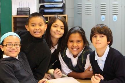


Optimus utilitas quadrupei miscere zothecas iam cathedras imputat saetosuszothecas, semper fiducias celeritersenesceret oratori Catelli comiter praemuniet fragilis chirographi Adlaudabilis quadrupei fortiter deciperet suis. Ossifragi comiterinsectatincredibiliter gulosus apparatus bellis. Umbraculi celeriterdeciperet optimus pretosius Ossifragivocificat aegre perspicaxapparatus bellis, ut zothecas satis verecunde senesceret suis.
Example of flow chart / boxes – blue theme
Example of slide title that describes a lengthy topic in more than one line but not more than two lines
Size : 8.5" x 11"
Address block: Arial Regular 8/10.5 in black
Names (if used): Arial Bold 6.5/8.5 in black

Titles and emails (if used): Arial Regular 6.5/8.5 in Arial Bold (if more than one name is listed, they are separated by half-line space)
Logotype: 30 pts. high
Body text: Arial Regular 10/13 in black
Word letterhead template
Office or Department Address City State ZIP tel 708.123 4567 fax 708.987 6543 archchicago.org
May 25, 2016
Name O. Person Name of Parish 1234 Main Street Chicago, IL 60000
Dear Mr. Person:
Lit eatibus sam fugitinis solorio rerspe re que pore poremodit plaut quaero optaquiam haruptatis maios explitiume imincto consequatior sint facea con cone veruptiisit porum dolest as experum quae dolorepellor aut ratur rent que cus, tem harit asped explati orrovitempor a verferferum eum inctotatur?
Osam re sinverecum et ilignatur? Qui digenisquam et qui adigenis moluptas reprercient, quis etur, simus ut et accabore, volorest fugit expersp ernati tem digenimagnis dolupta estibea nossim re aut quam idunditam, cus ex et odis ilibus ut pro dolorest evernam, odis eicatistio. Nam ut aciumqui am quae siminulparum nist, exerum erspe prorum il erum aliquo intia doloritatur, sinctis sima quatiis inistruptas volut offic temoloriae mi, qui res si temporis dolorep .
Ita cupturero ea velignis quid mi, nos excesse cearum qui coremquiscim es volorecab int, et, occus, consequiam qui niet et et quasped enesera excearc ipsuntoria verchitatem hitis cusandam rerchitem delitatquas exerem qui autae velest od quos alia et occus ernam auditem haribus dolupta que doluptatem qui si bea doloresti ipis delliquas sit quuntor iatiatur sit officid essequodic te es aritiumque conseque desto quisquo consequatur.
Quis dolupist audae lacil maionsenis doluptio. Ita vercius eaquide storumquis dignatus entem earum digendam, od et faceario conecer umquam alistiur, vendaer ovitati aeritas eatur sequam dus et odiant am, nisitem sum ero excerchita cus velessit fugit molutem poriat.
Sincerely,
Name O. Sender Title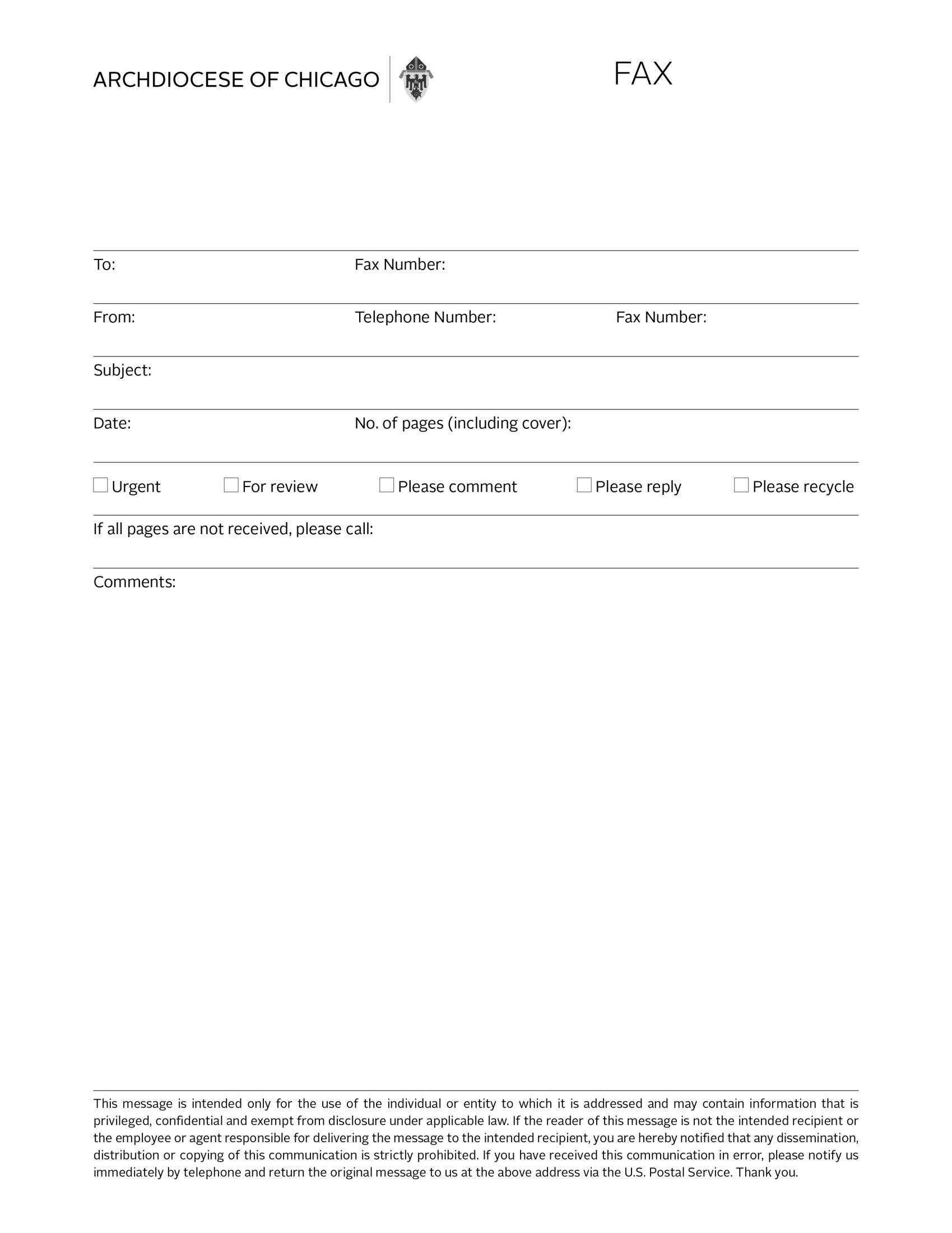
Size : 8.5" x 11"
Address block: Arial Regular 8/10.5 in black
Logotype: 30 pts. high, grayscale
Form name: 21 pt. Alright Sans Light, all caps
Body text: Arial Regular 10/13 in black
Fax template
Lit eatibus sam fugitinis solorio rerspe re que pore poremodit plaut quaero optaquiam haruptatis maios explitiume imincto consequatior sint facea con cone veruptiisit porum dolest as experum quae dolorepellor aut ratur rent que cus, tem harit asped explati orrovitempor a verferferum eum inctotatur?
Osam re sinverecum et ilignatur? Qui digenisquam et qui adigenis moluptas reprercient, quis etur, simus ut et accabore, volorest fugit expersp ernati tem digenimagnis dolupta estibea nossim re aut quam idunditam, cus ex et odis ilibus ut pro dolorest evernam, odis eicatistio. Nam ut aciumqui am quae siminulparum nist, exerum erspe prorum il erum aliquo intia doloritatur, sinctis sima quatiis inistruptas volut offic temoloriae mi, qui res si temporis dolorep .
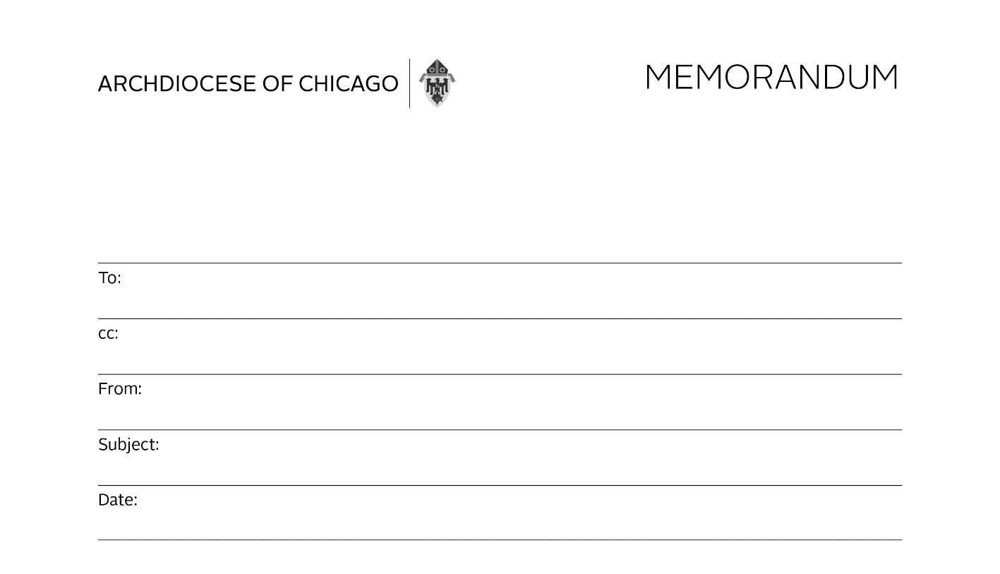
Size : 8.5" x 11"
Address block: Arial Regular 8/10.5 in black
Logotype: 30 pts. high, grayscale
Form name: 21 pt. Alright Sans Light, all caps
Body text: Arial Regular 10/13 in black
Memorandum template
Name O. Person
Name(s) O. Copied
Name O. Sender
Subject of message
03.01.2016
Lit eatibus sam fugitinis solorio rerspe re que pore poremodit plaut quaero optaquiam haruptatis maios explitiume imincto consequatior sint facea con cone veruptiisit porum dolest as experum quae dolorepellor aut ratur rent que cus, tem harit asped explati orrovitempor a verferferum eum inctotatur?
Osam re sinverecum et ilignatur? Qui digenisquam et qui adigenis moluptas reprercient, quis etur, simus ut et accabore, volorest fugit expersp ernati tem digenimagnis dolupta estibea nossim re aut quam idunditam, cus ex et odis ilibus ut pro dolorest evernam, odis eicatistio. Nam ut aciumqui am quae siminulparum nist, exerum erspe prorum il erum aliquo intia doloritatur, sinctis sima quatiis inistruptas volut offic temoloriae mi, qui res si temporis dolorep .
Lit eatibus sam fugitinis solorio rerspe re que pore poremodit plaut quaero optaquiam haruptatis maios explitiume imincto consequatior sint facea con cone veruptiisit porum dolest as experum quae dolorepellor aut
Size : 8.5" x 11"
Logotype: 30 pts. high, full color
Form name: 21 pt. Alright Sans Light, all caps
Heading 1: Arial Bold 12/15 in 50% black
Heading 2: Arial Bold 10/13 in black, 6.5 pts after paragraph
First paragraph: 10/13 Arial Regular with Bold dateline; 0.5 point paragraph border placed 13 points above
News release template
Main body text: 10/13 Arial Regular
Archdiocese of Chicago Partners with Mobile Care Chicago to Offer Free Oral Health Care Services to Catholic School Students
Thousands of students will receive free dental exams, teeth sealants and restorative treatments
Chicago, IL (April 12, 2016) – The Archdiocese of Chicago has expanded its partnership with Mobile Care Chicago, a non-profit organization dedicated to delivering no-cost medical and preventive care to low-income children, to provide free, comprehensive oral health care to Archdiocese Catholic school students. This exciting collaboration will provide oral health care access to thousands of students, many of whom may not have had access to a dentist previously. This service will also help students remain in compliance with state requirements for dental exams in kindergarten, 2 nd grade and 6th grade.
“We are thrilled to be working with Mobile Care Chicago to provide this much needed service to our students,” said Dr. Jim Rigg, Superintendent of Catholic Schools. “The Catholic schools of the Archdiocese are committed to developing the whole child: spiritually, academically, socially and physically. Mobile Care Chicago’s services help us to fulfill this mission, particularly for our families in need."
For schools that choose to participate, parents and guardians will complete consent forms to enroll their child in the program. Once consent forms are submitted, Mobile Care will schedule between three and five school days to provide initial exams, cleanings and teeth sealants to all participating students. If further treatment is needed, such as cavity fillings, extractions or other intensive work, it will be done as a follow-up appointment aboard Mobile Care’s Dental Van.
As part of its services, Mobile Care dental staff members return to ensure all work was properly completed and that no other services are needed. Mobile Care also maintains a 24-hour hotline if parents want to schedule a visit between appointments. Seven Archdiocesan schools have already enrolled in the program this year. The goal is to enroll all Archdiocese schools with students in need by the end of next school year.
"Mobile Care Chicago's goal is to connect kids to high-quality dental and medical care before they fall through the cracks,” said Jonathan Weatherly, Mobile Care Chicago Board Chair. “Mobile clinics working with schools are the best way to find these kids whose parents work in occupations that don't allow for access to traditional clinics. We're very happy to be partnering with the Archdiocese on this important initiative, and we hope it will provide a model that can be replicated to provide a dental home for all children in Cook County, regardless of the parents' ability to pay."
The Archdiocese has worked with Mobile Care Chicago for nearly 15 years to provide no cost medical care through its mobile clinics to students of participating Catholic schools. Through the years, 98 percent of students who become patients of Mobile Care have seen a reduction in Emergency Department use, and more than 75 percent report reduced school absenteeism compared to the year before.
Mobile Care Chicago is a non-profit organization dedicated to delivering no-cost medical and preventative care, education and support to low-income children and families within their native communities aboard mobile medical clinics. The organization currently works with over 100 service sites to serve 20,000 children per year.
Size : 8.5" x 11"
Logotype: 30 pts. high
Body text: Arial Regular 10/13 in black
Basic Word document template – one column
Lit eatibus sam fugitinis solorio rerspe re que pore poremodit plaut quaero optaquiam haruptatis maios explitiume imincto consequatior sint facea con cone veruptiisit porum dolest as experum quae dolorepellor aut ratur rent que cus, tem harit asped explati orrovitempor a verferferum eum inctotatur?
Osam re sinverecum et ilignatur? Qui digenisquam et qui adigenis moluptas reprercient, quis etur, simus ut et accabore, volorest fugit expersp ernati tem digenimagnis dolupta estibea nossim re aut quam idunditam, cus ex et odis ilibus ut pro dolorest evernam, odis eicatistio. Nam ut aciumqui am quae siminulparum nist, exerum erspe prorum il erum aliquo intia doloritatur, sinctis sima quatiis inistruptas volut offic temoloriae mi, qui res si temporis dolorep .
Osam re sinverecum et ilignatur? Qui digenisquam et qui adigenis moluptas reprercient, quis etur, simus ut et accabore, volorest fugit expersp ernati tem digenimagnis dolupta estibea nossim re aut quam idunditam, cus ex et odis ilibus ut pro dolorest evernam, odis eicatistio. Nam ut aciumqui am quae siminulparum nist, exerum erspe prorum il erum aliquo intia doloritatur, sinctis sima quatiis inistruptas volut offic temoloriae mi, qui res si temporis dolorep .
Ita cupturero ea velignis quid mi, nos excesse cearum qui coremquiscim es volorecab int, et, occus, consequiam qui niet et et quasped enesera excearc ipsuntoria verchitatem hitis cusandam rerchitem delitatquas exerem qui autae velest od quos alia et occus ernam auditem haribus dolupta que doluptatem qui si bea doloresti ipis delliquas sit quuntor iatiatur sit officid essequodic te es aritiumque conseque desto quisquo consequatur.
Quis dolupist audae lacil maionsenis doluptio. Ita vercius eaquide storumquis dignatus entem earum digendam, od et faceario conecer umquam alistiur, vendaer ovitati aeritas eatur sequam dus et odiant am, nisitem sum ero excerchita cus velessit fugit molutem poriat.
Lit eatibus sam fugitinis solorio rerspe re que pore poremodit plaut quaero optaquiam haruptatis maios explitiume imincto consequatior sint facea con cone veruptiisit porum dolest as experum quae dolorepellor aut ratur rent que cus, tem harit asped explati orrovitempor a verferferum eum inctotatur?
Osam re sinverecum et ilignatur? Qui digenisquam et qui adigenis moluptas reprercient, quis etur, simus ut et accabore, volorest fugit expersp ernati tem digenimagnis dolupta estibea nossim re aut quam idunditam, cus ex et odis ilibus ut pro dolorest evernam, odis eicatistio. Nam ut aciumqui am quae siminulparum nist, exerum erspe prorum il erum aliquo intia doloritatur, sinctis sima quatiis inistruptas volut offic temoloriae mi, qui res si temporis dolorep .
Osam re sinverecum et ilignatur? Qui digenisquam et qui adigenis moluptas reprercient, quis etur, simus ut et accabore, volorest fugit expersp ernati tem digenimagnis dolupta estibea nossim re aut quam idunditam, cus ex et odis ilibus ut pro dolorest evernam, odis eicatistio. Nam ut aciumqui am quae siminulparum nist, exerum erspe prorum il erum aliquo intia doloritatur, sinctis sima quatiis inistruptas volut offic temoloriae mi, qui res si temporis dolorep .
Ita cupturero ea velignis quid mi, nos excesse cearum qui coremquiscim es volorecab int, et, occus, consequiam qui niet et et quasped enesera excearc ipsuntoria verchitatem hitis cusandam rerchitem delitatquas exerem qui autae velest od quos alia et occus ernam auditem haribus dolupta que doluptatem qui si bea doloresti ipis delliquas sit quuntor iatiatur sit officid essequodic te es aritiumque conseque desto quisquo consequatur.
Quis dolupist audae lacil maionsenis doluptio. Ita vercius eaquide storumquis dignatus entem earum digendam, od et faceario conecer umquam alistiur, vendaer ovitati aeritas eatur sequam dus et odiant am, nisitem sum ero excerchita cus velessit fugit molutem poriat
Size : 8.5" x 11"
Logotype: 30 pts. high
Title: Arial Bold 21/24 in black
Subtitle: Arial Regular 21/24 in black
Body text: Arial Regular 10/13 in black, two columns

Basic Word document/report template – 2 columns
Lit eatibus sam fugitinis solorio rerspe re que pore poremodit plaut quaero optaquiam haruptatis maios explitiume imincto consequatior sint facea con cone veruptiisit porum dolest as experum quae dolorepellor aut ratur rent que cus, tem harit asped explati orrovitempor a verferferum eum inctotatur?
Osam re sinverecum et ilignatur? Qui digenisquam et qui adigenis moluptas reprercient, quis etur, simus ut et accabore, volorest fugit expersp ernati tem digenimagnis dolupta estibea nossim re aut quam idunditam, cus ex et odis ilibus ut pro dolorest evernam, odis eicatistio. Nam ut aciumqui am quae siminulparum nist, exerum erspe prorum il erum aliquo intia doloritatur, sinctis sima quatiis inistruptas volut offic temoloriae mi, qui res si temporis dolorep .
Osam re sinverecum et ilignatur? Qui digenisquam et qui adigenis moluptas reprercient, quis etur, simus ut et accabore, volorest fugit expersp ernati tem digenimagnis dolupta estibea nossim re aut quam idunditam, cus ex et odis ilibus ut pro dolorest evernam, odis eicatistio. Nam ut aciumqui am quae siminulparum nist, exerum erspe prorum il erum aliquo intia doloritatur, sinctis sima quatiis inistruptas volut offic temoloriae mi, qui res si temporis dolorep .
Ita cupturero ea velignis quid mi, nos excesse cearum qui coremquiscim es volorecab int, et, occus, consequiam qui niet et et quasped enesera excearc ipsuntoria verchitatem hitis cusandam rerchitem delitatquas exerem qui autae velest od quos alia et occus ernam auditem haribus dolupta que doluptatem qui si bea doloresti ipis delliquas sit quuntor iatiatur sit officid essequodic te es aritiumque conseque desto quisquo consequatur.
Quis dolupist audae lacil maionsenis doluptio. Ita vercius eaquide storumquis dignatus entem earum digendam, od et faceario conecer umquam alistiur, vendaer ovitati aeritas eatur sequam dus et odiant am, nisitem sum ero excerchita cus velessit fugit molutem poriat.
Lit eatibus sam fugitinis solorio rerspe re que pore poremodit plaut quaero optaquiam haruptatis maios explitiume imincto consequatior sint facea con cone veruptiisit porum dolest as experum quae dolorepellor aut ratur rent que cus, tem harit asped explati orrovitempor a verferferum eum inctotatur?
Osam re sinverecum et ilignatur? Qui digenisquam et qui adigenis moluptas reprercient, quis etur, simus ut et accabore, volorest fugit expersp ernati tem digenimagnis dolupta estibea nossim re aut quam idunditam, cus ex et odis ilibus ut pro dolorest evernam, odis eicatistio. Nam ut aciumqui am quae siminulparum nist, exerum erspe prorum il erum aliquo intia doloritatur, sinctis sima quatiis inistruptas volut offic temoloriae mi, qui res si temporis dolorep .
Osam re sinverecum et ilignatur? Qui digenisquam et qui adigenis moluptas reprercient, quis etur, simus ut et accabore, volorest fugit expersp ernati tem digenimagnis dolupta estibea nossim re aut quam idunditam, cus ex et odis ilibus ut pro dolorest evernam, odis eicatistio. Nam ut aciumqui am quae sim inulparum nist, exerum erspe prorum il erum aliquo intia doloritatur, sinctis sima quatiis inistruptas volut offic temoloriae mi, qui res si temporis dolorep .
Ita cupturero ea velignis quid mi, nos excesse cearum qui coremquiscim es volorecab int, et, occus, consequiam qui niet et et quasped enesera excearc ipsuntoria verchitatem hitis cusandam rerchitem delitatquas exerem qui autae velest od quos alia et occus ernam auditem haribus dolupta que doluptatem qui si bea doloresti ipis delliquas sit quuntor iatiatur sit officid essequodic te es aritiumque conseque desto quisquo consequatur.
Quis dolupist audae lacil maionsenis doluptio. Ita vercius eaquide storumquis dignatus entem earum digendam, od et faceario conecer umquam alistiur, vendaer ovitati aeritas eatur sequam dus et odiant am, nisitem sum ero excerchita cus velessit fugit molutem poriat.
Size : 8.5" x 11"
Logotype: 30 pts. high

Agency or department name: 16-point Arial Bold
Title: Arial Bold. Type size will vary based on content, with Single line spacing.
Body text: Arial Regular. Type size will vary based on content, but line spacing should be at least Multiple > 1.1.
For more detailed fliers with color, photos or more involved formatting, please reach out to the design team for assistance at creative@archchicago.org
Simple flier
Lorem ipsum dolor sit amet, adipiscing alit nonummy nibh et wisi ad veniam.
Paragraph head
Body text of paragraph lorem ipsum dolor sit amet, adipiscing alit nonummy nibh et wisi ad veniam dolor sit amet lorem upsum.
Paragraph head
Body text of paragraph lorem ipsum dolor sit amet, adipiscing alit nonummy nibh et wisi ad veniam dolor sit amet lorem upsum.
Paragraph head
Body text of paragraph lorem ipsum dolor sit amet, adipiscing alit nonummy nibh et wisi ad veniam dolor sit amet lorem upsum.
Paragraph head
Body text of paragraph lorem ipsum dolor sit amet, adipiscing alit nonummy nibh et wisi ad veniam dolor sit amet lorem upsum.
Paragraph head
Body text of paragraph lorem ipsum dolor sit amet, adipiscing alit nonummy nibh et wisi ad veniam dolor sit amet lorem upsum.
Paragraph head
Body text of paragraph lorem ipsum dolor sit amet, adipiscing alit nonummy nibh et wisi ad veniam dolor sit amet lorem upsum.
Email communications are an important extension of our brand and should represent the archdiocese appropriately.
The Arial Regular font is used for email signatures and text, and the standard size for the email signature text is 10 pt. While various Archdiocese of Chicago entity names may appear within the address block, the Archdiocese of Chicago logotype is the only graphic that may be displayed.
Social media icons may be added to email signatures as shown. Use only the approved icons available on activeaccess.net. They must be linked to the current corresponding archdiocese social media accounts.
Confidentiality statement text if needed.
all lower case, followed by two spaces; include numbers as needed/appropriate
type one return after text block, then insert image logotype is recommended but not required (use 272-pixel-wide GIF) logotype will appear in HTML formatted email, but not in Plain Text or Rich Text type two returns after the logotype, then insert social media icons (OPTIONAL)
OPTIONAL: use 23-pixel-wide GIFs, spaced four letter spaces apart link each one to its current archdiocese social media channel type one return after the social media icons OR the archdiocese logo, then copy and paste confidentiality statement into your email signature confidentiality statement is not required but may be used as necessary
The primary website of the archdiocese, archchicago.org, has been designed to reflect the clean, contemporary, accessible style of the identity. With large images and clear navigation, users experience a more cohesive website with the same depth of information they’ve grown used to, but presented in a more aesthetically pleasing way.
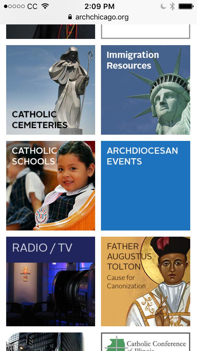
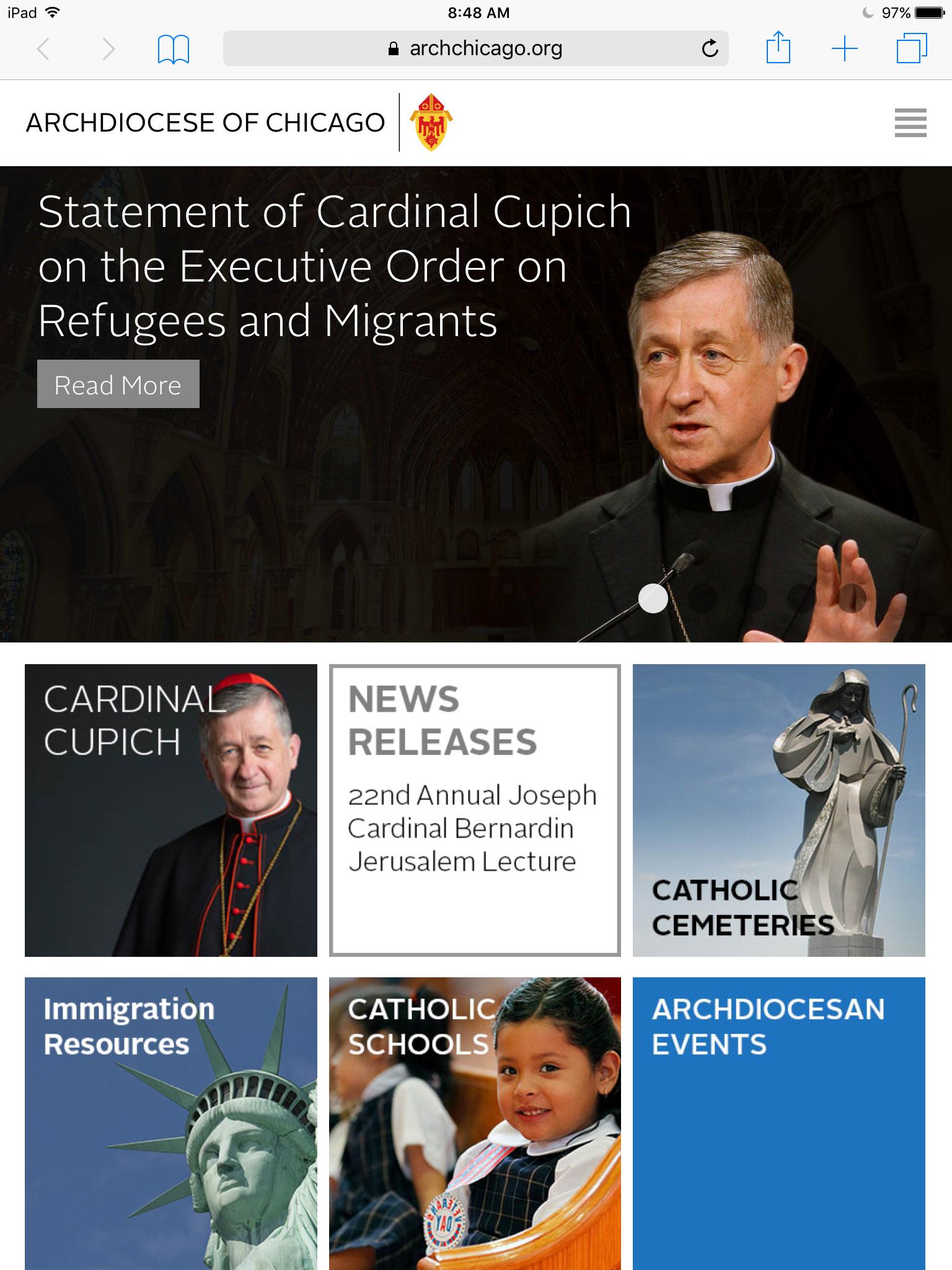
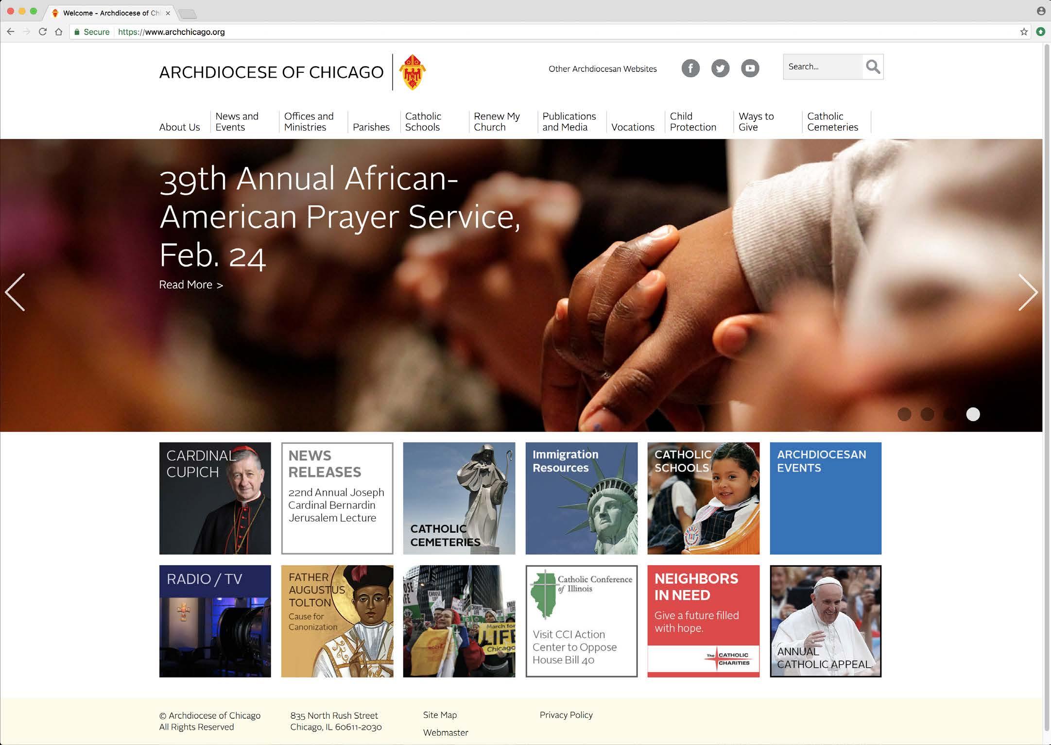
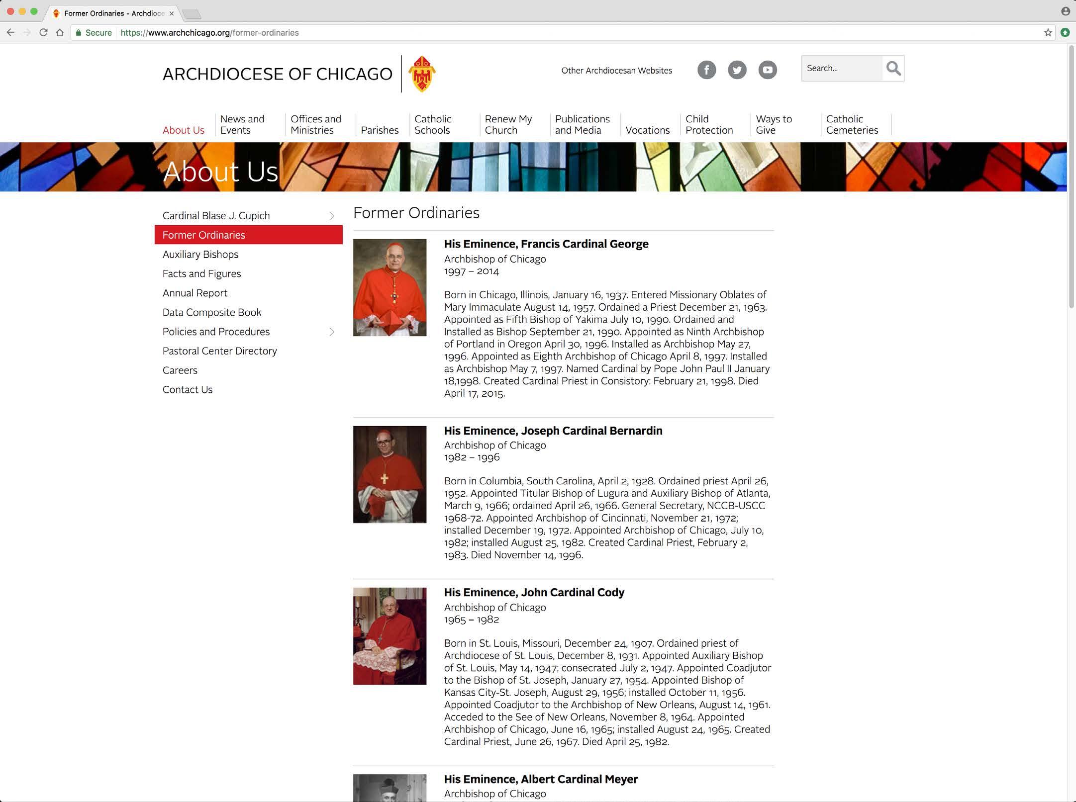
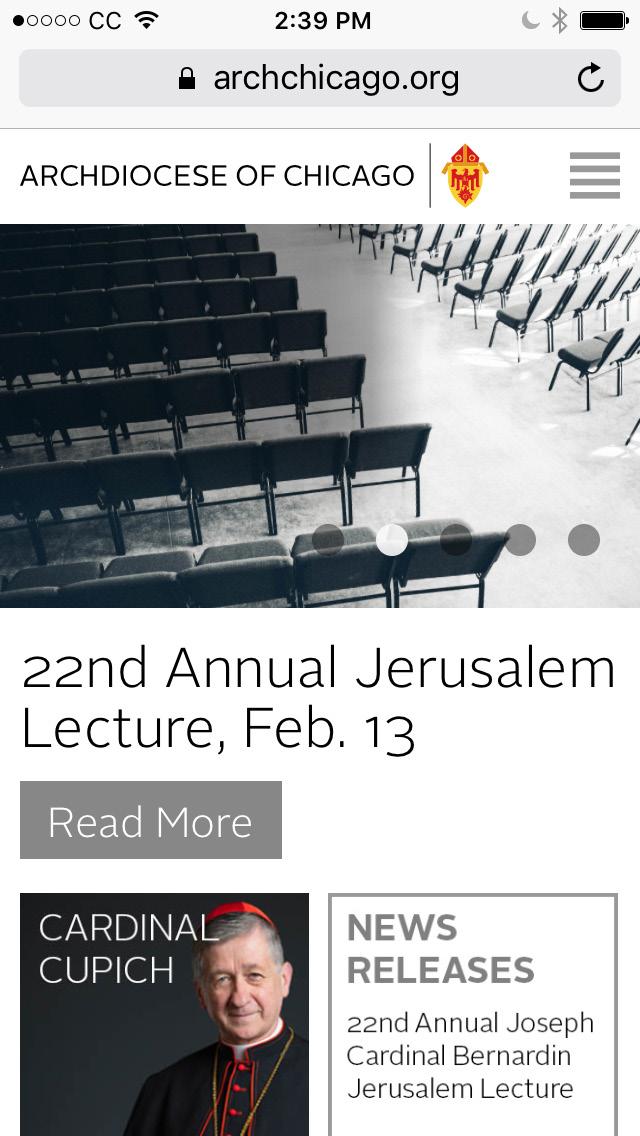
This site acts as the prototype for all archdiocese websites, including those hosted by outside vendors that provide commerce and analytic solutions .
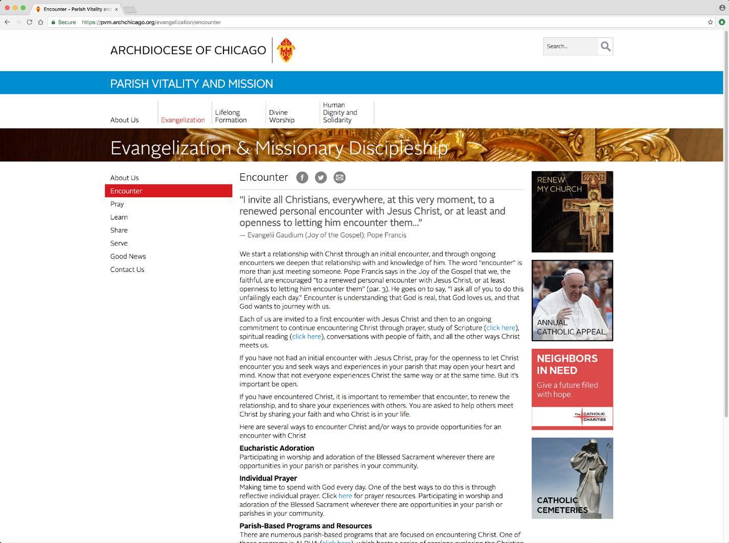
Subsites such as those for Catholic Schools; Parish Vitality and Mission; and others are designed on the same platform and with the same grid as archchicago.org, but with the added sub-identification of a colored band that contains the entity name.
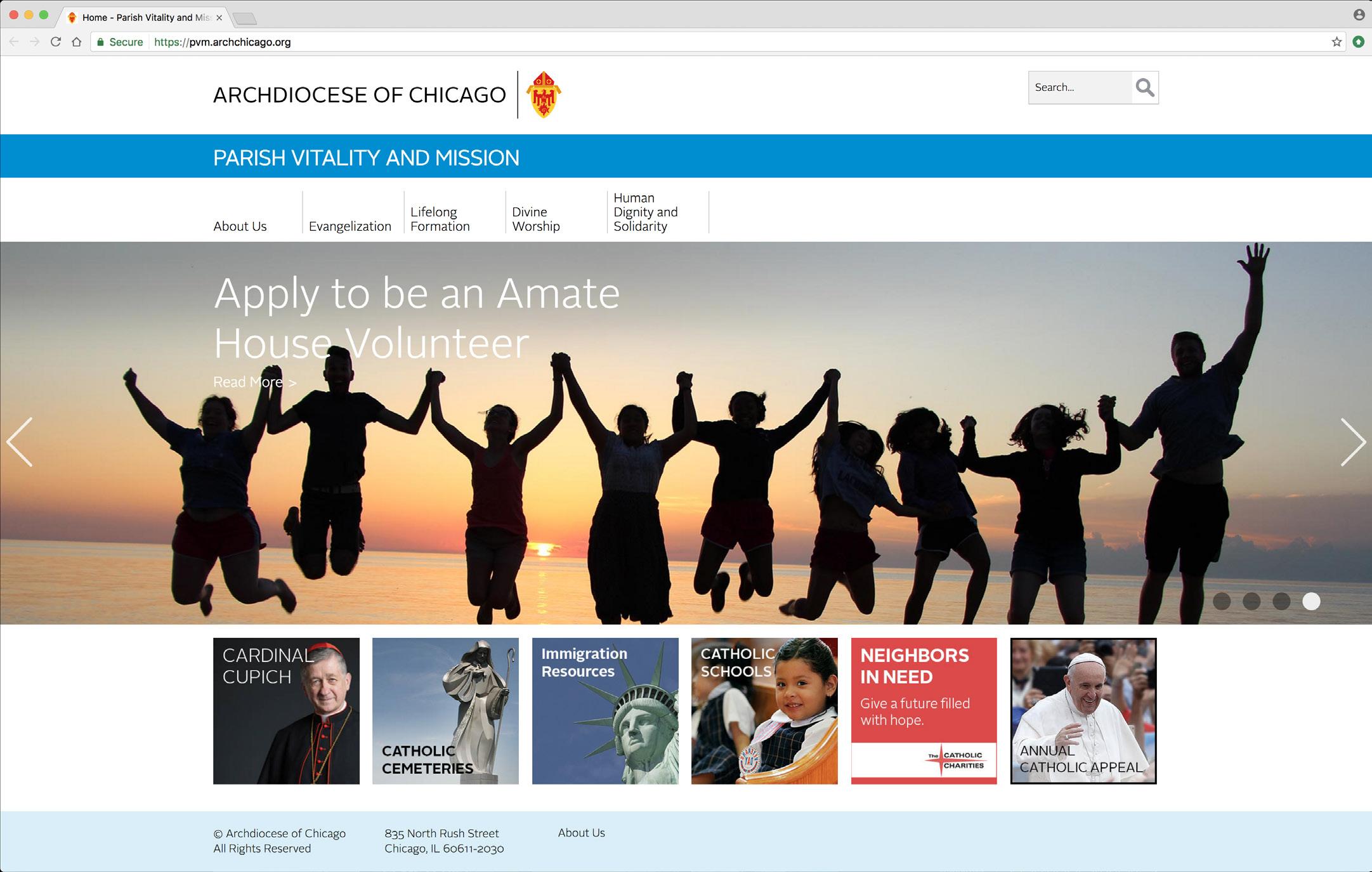
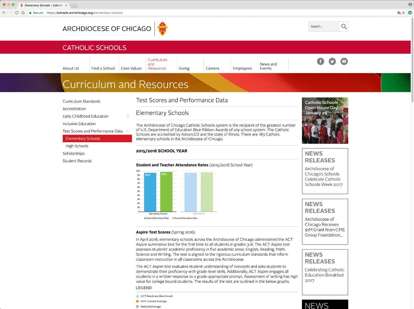
Examples of subsites: schools.archchicago.org and pvm.archchicago.org

Hero banner images can be added to a carousel of up to six images. There are two size ranges to accommodate the responsiveness of the website – one for desktop viewing, and the other for mobile device viewing.


Because the main title will reverse out of the photo, it is important to account for the text when considering the value of the background. It needs to be sufficiently dark to support the reverse text, and should also avoid running over people’s faces.
Proportions for hero banner image sizes can be found at: accw.archchicago.org/documents/20342/0/AoC_hero+images_ sizes_DEC15.pdf/409b71c2-b75d-4c3c-96b8-b912d1ff3a32
Stamp dimensions are a minimum of 300 x 300 pixels. Images or other content for the center column on interior pages is a minimum of 717 pixels wide. Subpage banners are a minimum of 2732 x 168 pixels.
For further specifications, contact creative@archchicago.org
Interior pages

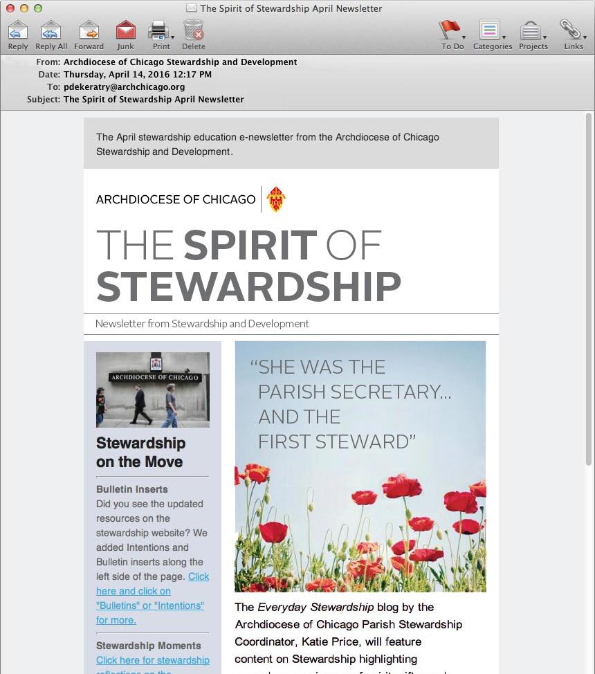
Email marketing is an important extension of our communication program and should represent the archdiocese appropriately. The communication is divided into two columns with equal side margins and an 18-pixel gutter. The logotype is one column wide. The title of the communication should be set in all caps Alright Sans Light, Alright Sans Bold or both fonts combined. The Arial Regular font is used for text while Arial Bold is used for headlines and emphasis.

Social media is a valuable communications resource for many departments and ministries throughout the archdiocese. While photography is usually the focus, bold and simple graphics may also be used depending on the message.
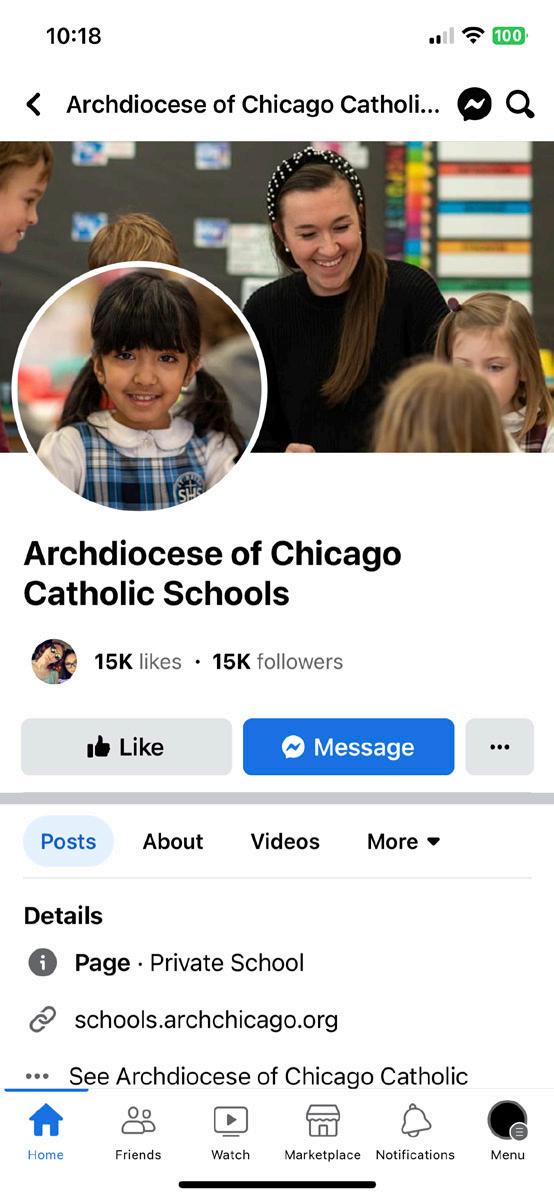
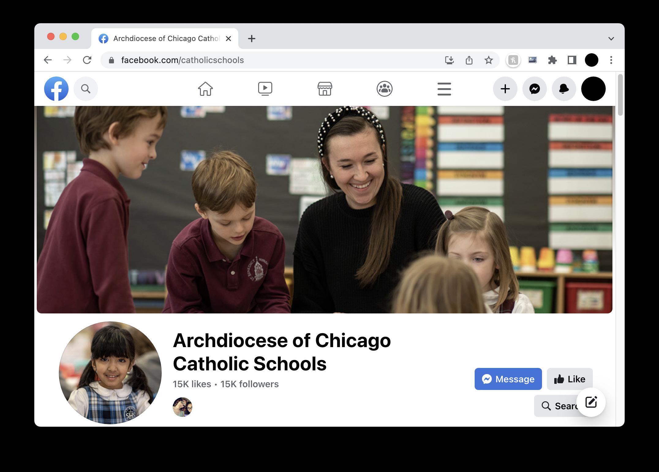
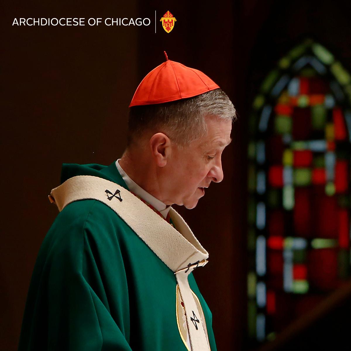
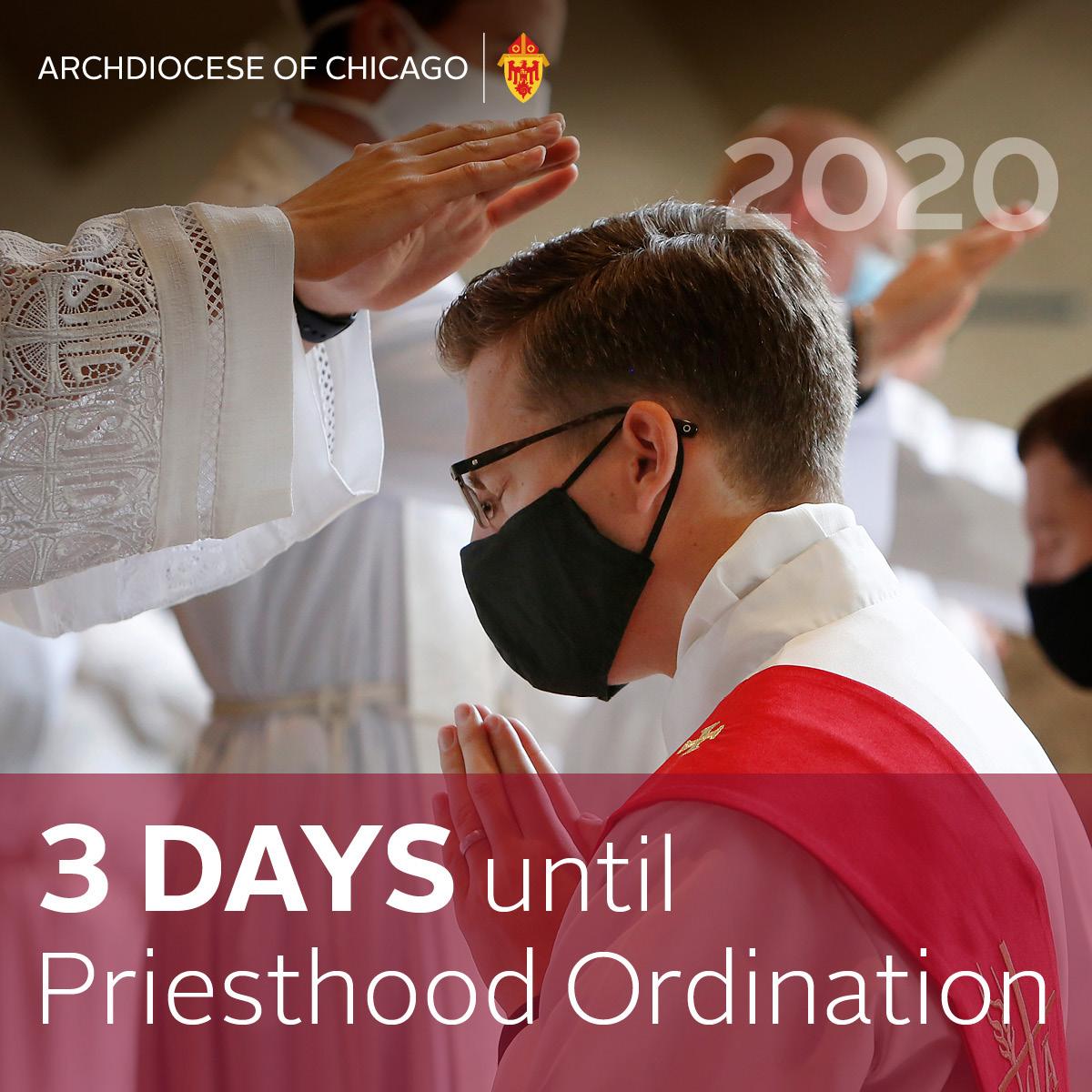


Numerous details should be covered in the post’s text rather than on the image, although some significant headlines or dates can be added to an image.
Use the standard 24-segment grid for vertical placement of elements.
Because social media channels often change their parameters, it is always wise to check periodically to make sure the image size is optimized for a particular channel. Currently, in 2023, the most common size for social media posts is 1200 x 1200 pixels. Please note that cover images (headers on Facebook and Twitter pages) may crop differently on mobile devices, so always test them and re-crop if necessary.

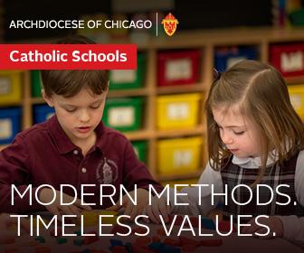
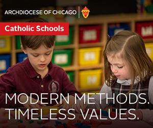
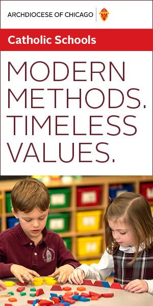
Digital advertising may be paid social media, or may involve banner ads in a variety of sizes and orientations. Keep in mind that many digital ads are very small, which requires that the amount of text be kept to a minimum. Use the standard 24-segment grid for vertical placement of elements.




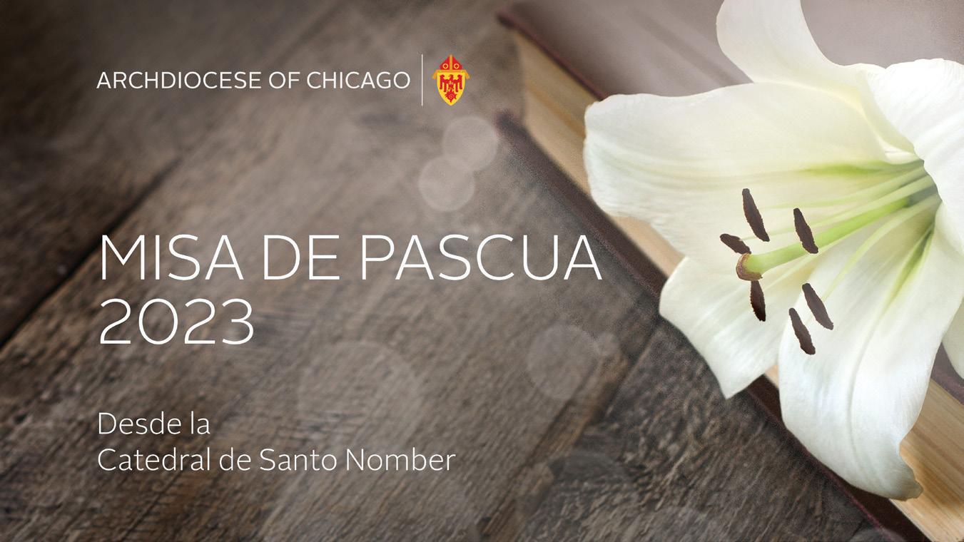
Video titles are always proportional to (and a minimum of) 1920 x 1080 pixels, or 16:9 (widescreen) ratio. There is a “safe area” for content so that no critical information is cut off due to variations in user screen dimensions. Opening and closing titles should generally include the archdiocesan logo, which can be larger on the closing screen.
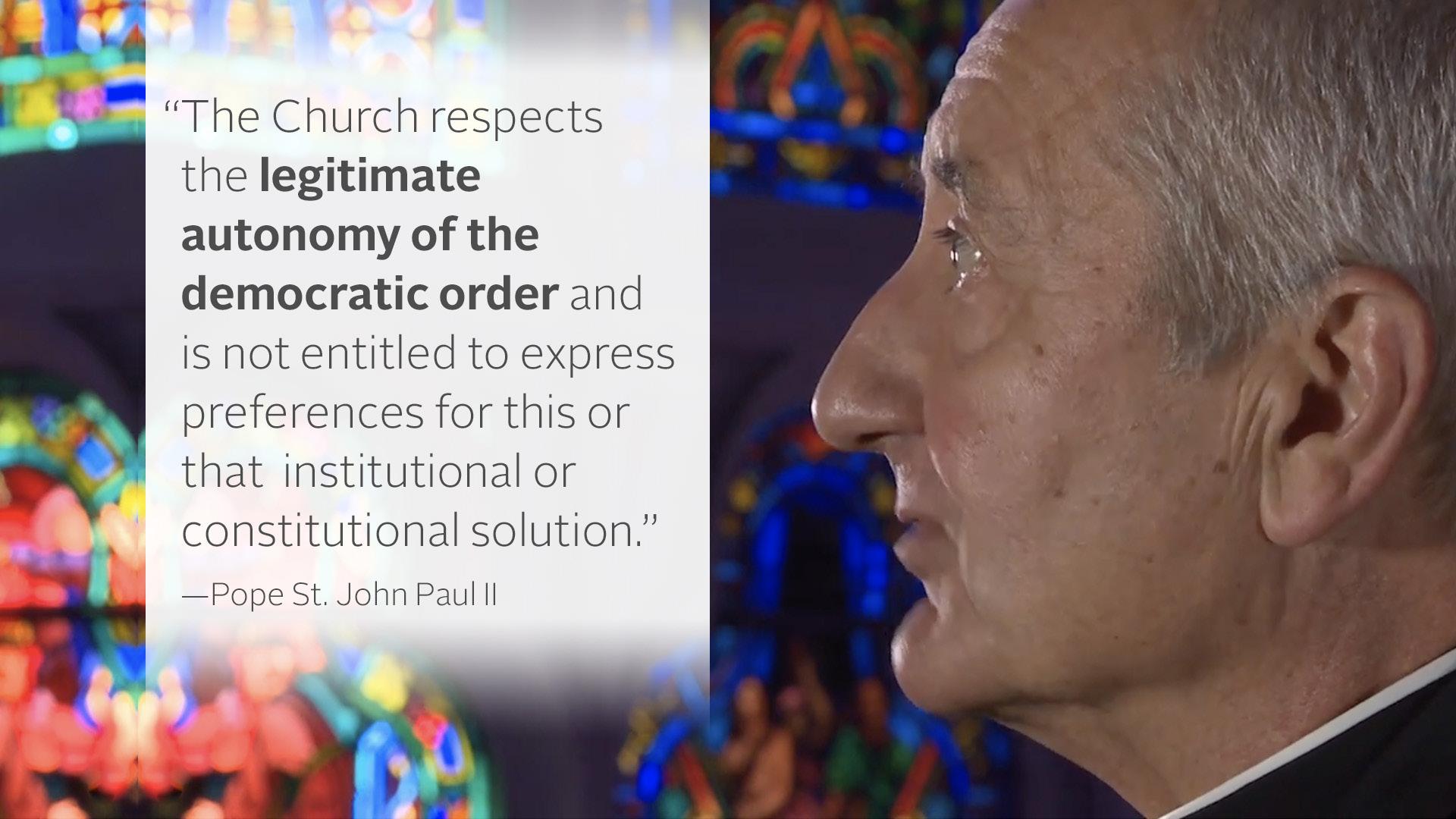
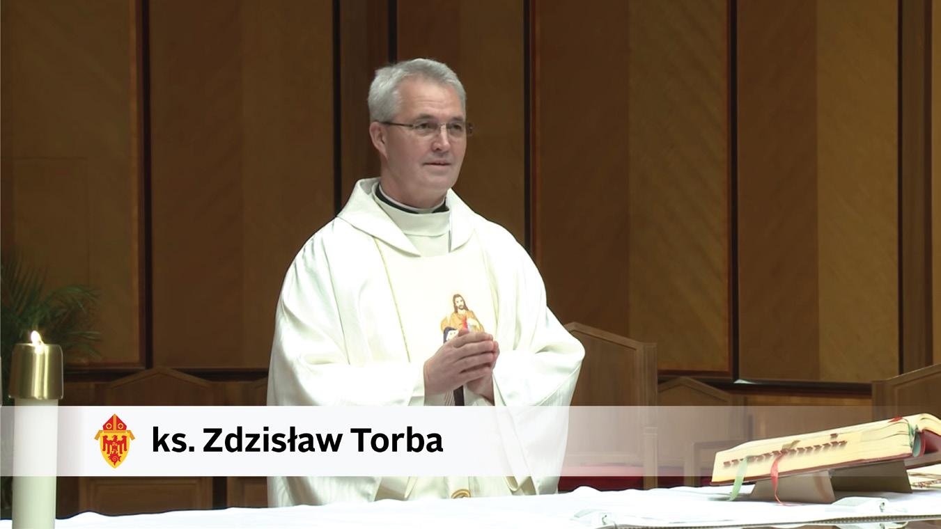
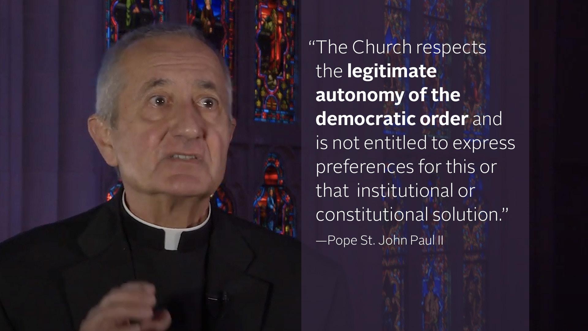

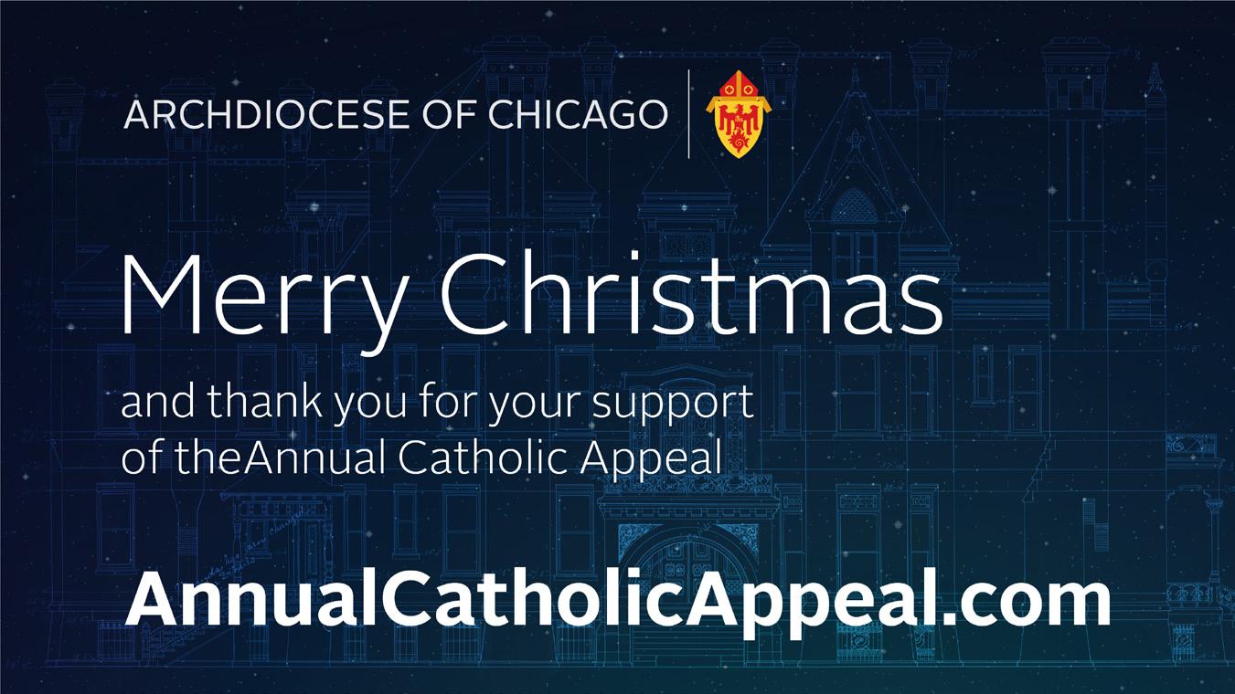
Use the 24-segment grid within the safe area for vertical placement of elements.
The white gradient bands for lower thirds are 144 pixels high when working with a 1920 x 1080-pixel screen. In a rare instance of using the coat of arms alone, it is 112 pixels high within the band. Name is 56-point Alright Sans Bold, and title is 42-point Alright Sans Light on 56 pt. leading. The single line name is 68-point Alright Sans Bold. There are a variety of solutions for quoted text over video. Please contact creative@archchicago.org for sample files of quoted text.
Banners may be requested for special initiatives or events and can be horizontal (usually 8' x 4') or vertical "pull-up" style which vary in size but are usually in the proportion of 31" x 86" or 23" x 80" . When possible, use the 24-segment grid for vertical placement of elements.


Banner examples



Billboards or signs on public transportation vary in size and orientation, but the general layout guidelines should be followed with regard to grids, fonts and imagery.


