logo guidelines
Deliverables
1.1 What is a sport bra?
The sports bra has become an essential item for women who participate in athletic activities, but it wasn’t always a popular or even widely available piece of clothing. In the early 1970s, as women began to participate more in sports, many struggled with uncomfortable and unsupportive undergarments that hindered their performance. A few innovative companies started to create bras specifically designed for athletic activities, but it wasn’t until the introduction of the compression sports bra in the mid1990s that the market really took off. These bras provided more support and reduced movement during exercise, making them ideal for high-impact activities like running and jumping. Since then, numerous brands have emerged, offering a wide range of styles and features to meet the specific needs of different sports and body types. Today, the sports bra market is a multi-billion-dollar industry, and the garment has become a symbol of empowerment for women who want to push their physical limits and break down barriers in the world of sports.

1.2 Who are we?
Flexi is a female sport bra brand that has become a popular choice among women who are looking for high-quality and comfortable athletic wear. The brand was founded in the early 2010s by a group of women who were passionate about fitness and wanted to create a sports bra that could keep up with their active lifestyles. The founders noticed that many sports bras on the market were uncomfortable, unsupportive, or didn’t fit properly, so they set out to design a better solution. We focused on using high-quality materials, incorporating innovative design features, and paying attention to the unique needs of different body types and activity levels. Since its launch, Flexi has become known for its exceptional comfort, support, and durability, and has gained a loyal following of women who trust the brand to help them achieve their fitness goals. With a focus on innovation and quality, Flexi continues to push the boundaries of what’s possible in the world of women’s athletic wear.

1.3 Our philosophy
Our brand philosophy is centered on empowering women to achieve their fitness goals while feeling comfortable and confident in their athletic wear. We believe that every woman deserves access to high-quality sports bras that provide superior support, comfort, and durability, regardless of her body type or fitness level. To achieve this, we focus on using innovative design features and high-quality materials that can withstand the rigors of intense physical activity. We are committed to promoting a healthy and active lifestyle and believe that fitness should be accessible to everyone, which is why we strive to create products that are both functional and fashionable. Our goal is to inspire women to embrace their bodies and take on new challenges, knowing that they can rely on us to provide the support and comfort they need to succeed. We are dedicated to being a trusted partner in their fitness journey, and our brand philosophy is all about empowering women to feel their best and achieve their full potential.

2.1 Vision

- Now: Starting to open a store in the commercial center of Ho Chi Minh City, an official store. Has its own website.
- 5 years: Become a popular brand in the commercial centers of Ho Chi Minh City and the Southeast of Viet Nam. There will be 2 more genuine stores located in Can Tho and 5 stores in Ho Chi Minh City. Reach more than 10,000,000 customers.
- 10 years: Expand the area to the whole Central region and Hanoi and Hai Phong. Open more sports centers, create healthy drinks and exercise aids. Open some stores in overseas shopping centers and gradually approach foreign customers.
- 15 years: Popular throughout the country with a large system of stores and centers. There are more branches in Asia and about to open more in Europe.
2.2 Mission
Our mission is to empower women to achieve their fitness goals by providing them with high-quality sports bras that offer superior support, comfort, and durability. We are committed to creating innovative designs using high-quality materials to ensure that every woman can pursue an active lifestyle with confidence and comfort.

- Contribution: -> Addresses mental health and wellness issues, prioritizing safety and comfort and supporting women to gain confidence.
- Impact: Confident women express their personal style comfortably, feel like themselves. In other words, you can live your life to the fullest.
2.3 Value
Respect – Appreciate differences, uphold fairness and equality. Explore – Encourage novelty, originality and creativity. Empathy – Kind and caring.
Expression: expressing yourself truthfully and confidently. Ambition – Turn dreams, passions into motivation to achieve goals.

3.1 Our Story
Our brand story begins with a group of women who shared a passion for fitness and a frustration with the sports bras on the market. They found that many bras were uncomfortable, unsupportive, or didn’t fit properly, which led them to explore the possibility of creating a better solution. After months of research, development, and testing, they founded our brand with the goal of empowering women to feel confident and comfortable while pursuing their fitness goals.

Throughout our journey, we have remained committed to our core values of empowerment, quality, accessibility, sustainability, and community. We are dedicated to creating innovative and high-quality sports bras that provide superior support, comfort, and durability. We believe in promoting a healthy and active lifestyle and making fitness accessible to women of all shapes and sizes. We are committed to minimizing our impact on the environment and building a supportive community of women who inspire and encourage each other to be their best.
Our brand story is one of passion, dedication, and innovation. We are proud of what we have achieved so far, and we look forward to continuing to empower women and help them achieve their fitness goals.
3.2 Brand Name
Our brand name, Flexi, embodies the essence of our brand and the values we stand for. “Flexi” represents the flexibility and adaptability that we believe every woman should have in her fitness journey. It symbolizes the freedom to move, stretch, and challenge oneself without limitations. The name also reflects our commitment to creating sports bras that are designed to move with the body, providing flexibility and ease of movement during physical activities. Additionally, “Flexi” signifies our brand’s agility and ability to evolve with the ever-changing needs of women in the world of sports and fitness. We chose the name to resonate with our customers, conveying a sense of empowerment and confidence that comes from wearing our products. Overall, our brand name encapsulates the spirit of flexibility, empowerment, and active living that lies at the core of our brand philosophy.
3.3 Tagline
“Flexibility in every movement” highlights the core benefit of wearing Flexi sports bras. It conveys the idea that with Flexi, women can experience freedom of movement and flexibility during any physical activity. The tagline emphasizes that Flexi sports bras are designed to provide the necessary support and comfort without restricting or hindering movement. Whether it’s running, yoga, or any other exercise, Flexi enables women to move naturally and effortlessly, allowing them to fully enjoy and excel in their workouts. It encapsulates the brand’s commitment to providing sports bras that enhance flexibility, empowering women to reach their fitness goals with ease and confidence.
4. Brand Persionality
4.1 Brand Archetypes
70% Hero – 30% Explorer
• People who want to make an impact, do something meaningful in life and want to be remembered.
• The type of person who always explores and discovers new things in life. The brand wants to set a trend in the bra industry. At the same time, the brand is always searching, discovering, improving and innovating to bring unique fashion products with the best quality and satisfaction from customers.

•We love creativity because it creates new and effective designs that satisfy customers’ needs for comfort in movement.
• We do not like restraint because it hinders freedom in dress, activities and self-expression.

Shutterstock/2065597613
4.

Brand Persionality
4.2 Brand Voice
Tone of voice:
• We are strong but not grumpy.
• We are confident but not arrogant.


1.1 Logo Inspiration
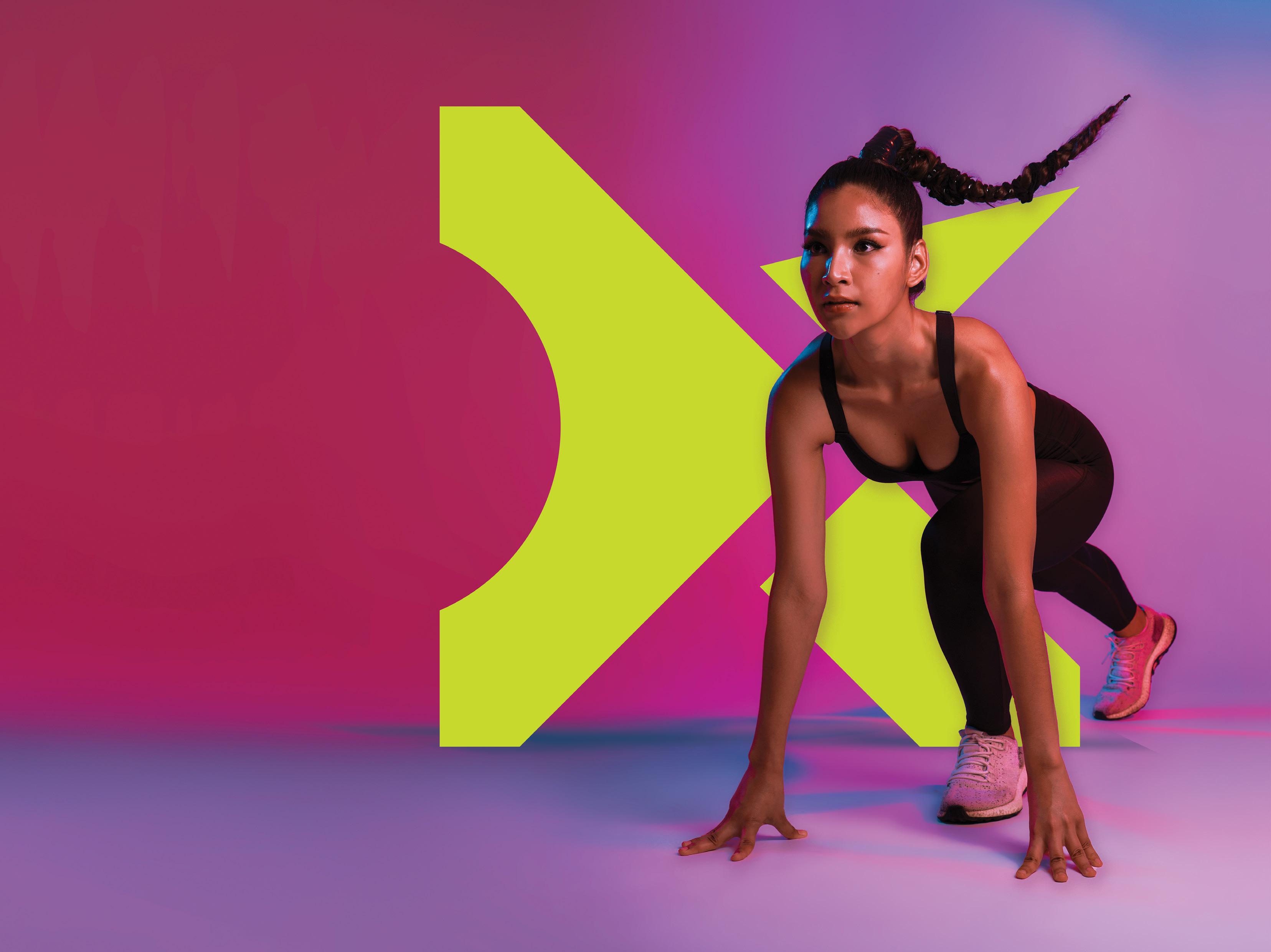
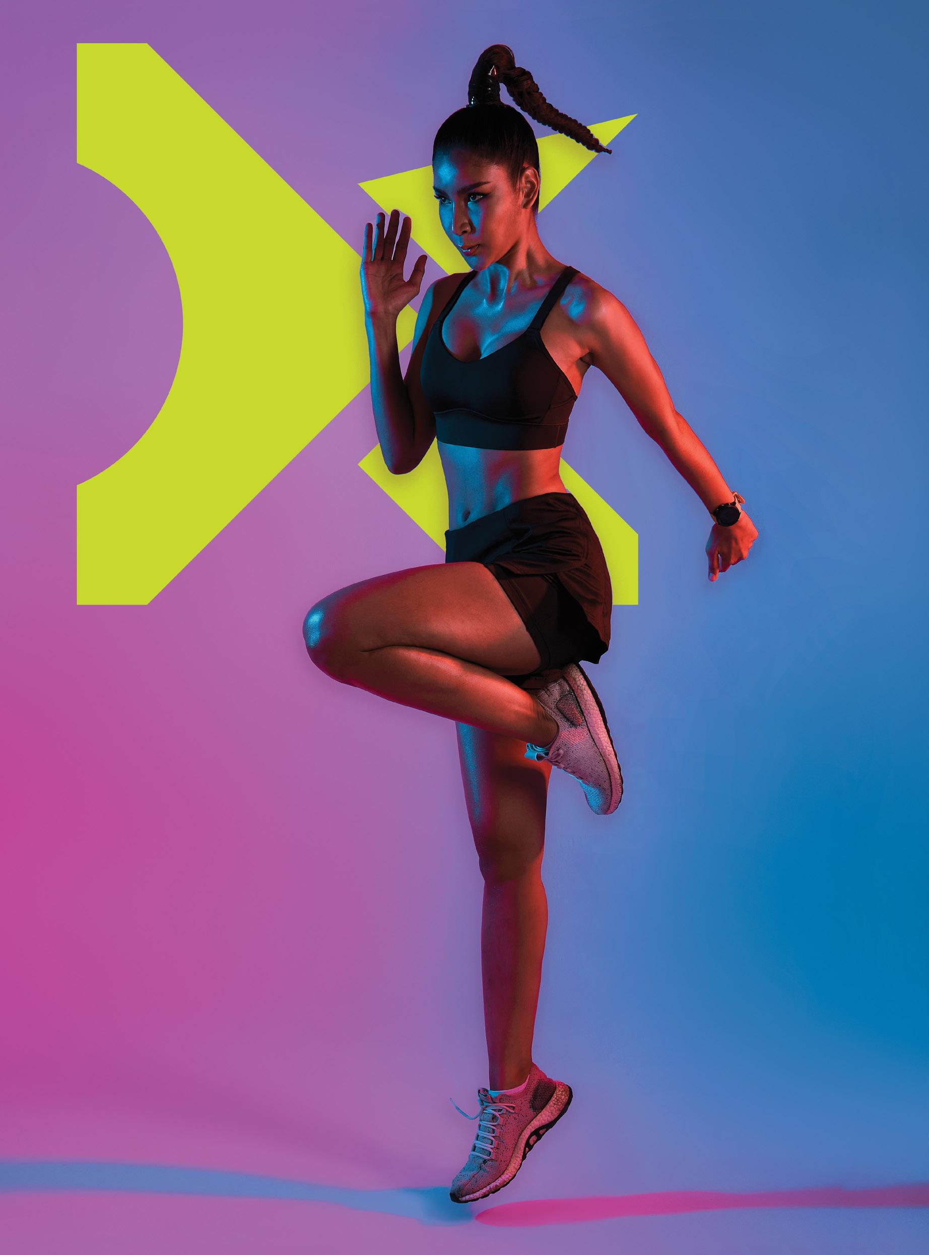
We came up with the idea of customize the letter “X” in the brand name using the running figure and an arrow. The act of running represents the essentials in sports and the arrows represent agility and growth, plus we add a curve to represent a woman’s breasts, which is what our products we want to and protect
1.2 Logo Grid System
1.2.1 Wordmark
This is the main component of the logo, this wordmark represents the letter “x” in the name of the brand Flexi. This wordmark can also be a separate logo on it own to be more aesthetic on some of our products such as printing on the bra, logo for the name card, favicon, ect.
Grid system for standard logo without tagline
1. Logo specifications and example of usage
1.2 Logo Grid System
1.2.2 Standard logo
This is how our official logo looks like. This brand is new to the industry so we want to make a logo that can be easily memorized by the customers. The tagline is also apart of the logo because we want to emphasize that the flexibility of our products is outstanding.
Grid system for standard logo with tagline
1.3 Logo Version
There are four main version of our official logo:
1. Standard logo: This logo is used in administrative documents or will be used for our store sign.
2. Text logo: This is a shortened version of the standard logo, which can be used for decoration or advertising.
3. Monochrome logo: This logo is used in product labels or sometimes as part of a product’s design.
4. Wordmark logo: This is a logo used in product designs or small sized office stationery.
1. Logo specifications and example of usage
1.4 Safety Zone
To look its best, your logo needs space to stand out. We have defined parameters to make sure no other elements encroach on this clear space.
The safety zone refers to a designated area of clear space surrounding the logo. It is the minimum amount of space that should be kept free from any other elements, such as text, graphics, or other visual elements. The purpose of the safety zone is to ensure that the logo remains visually distinct, legible, and unobstructed when placed alongside other elements or in various contexts.
The specific dimensions of the safety zone are determined by the logo designer and may vary depending on the complexity and size of the logo. It is typically defined as a proportionate distance around the logo, measured in units such as pixels or inches.
1. Logo specifications and example of usage
1.5 Minimum Size
To ensure the logo remains legible at all times it should not be reduced below its minimum size.
Standard Logo
Print: 10mm x 30mm
Digital: 40px 150px
Wordmark Logo
Print: 10mm x 10mm
Digital: 50px x 50px
Standard Logo
Print: 10mm x 30mm
Digital: 40px 150px
Wordmark Logo
Print: 10mm x 10mm
Digital: 50px x 50px
1.6 Black and White Logo
A black and white logo, also known as a monochrome or grayscale logo, is a version of a logo that is created using only black and white colors, without any additional colors or shades. This simplified version of the logo is primarily used in situations where color reproduction may be limited or where a more minimalistic or versatile presentation is desired. Black and white logos have several important purposes and applications:
Print and Reproduction: In print materials such as newspapers, magazines, or documents that may not support full-color printing, a black and white logo ensures that the design remains clear and recognizable.
Fax and Photocopy: When sending or copying documents through fax machines or photocopiers, color logos can lose detail and clarity. A black and white logo guarantees legibility and maintains the logo’s visual impact.
Embroidery and Fabric Printing: For applications like embroidery on apparel or fabric printing, where color options may be limited or costly, a black and white logo simplifies the production process and ensures consistent results.
High-contrast Applications: In situations where high contrast is desired, such as on dark backgrounds or in low-light environments, a black and white logo provides clarity and visibility.
Brand Consistency: A black and white version of a logo can be used to maintain brand consistency across various mediums or when color reproduction is inconsistent, ensuring the logo’s recognition and visual identity.