NOURISHMENTAL
DIRECTIVE
Conceptualize, research, and layout a mini magazine.
RESULT
A magazine focused on the interaction amongst mental health and nutrition. Tailored for individuals prioritizing their physical and mental health in their daily lives, the articles focus on new research into gut health, interviews with nutritionists, and support pieces for people struggling with their mental well being.
Every element in the magazine is original. Copy, vector illustrations and photographic imagery – I even prepared the food – all created solely for the work.
TOOLS
Adobe InDesign
Adobe Illustrator
Adobe Photoshop
Illustration Vector
Photography | Food, Product Copy Writing


TYPE DECK
DIRECTIVE
Research 26 typefaces and develop a deck of type cards and packaging.
RESULT
A swooping, grandiose card back contrasts the typical structured typefaces. The cards are printed on textured cardstock, hand-cut, rounded, and a lesson in just how difficult accurate double-sided printing can be. The tight lock-ups compliment the typefaces and incorporate elements from the back design.
A custom box template developed to fit the width of 26 cards and designed featuring design elements from the front and back of the card deck.
TOOLS
Adobe Illustrator
Illustration | Vector
Physical Craft | Double-sided printing, precision cutting


THE CHAIR
DIRECTIVE
Develop a hand-crafted accordion book and corresponding packaging.
RESULT
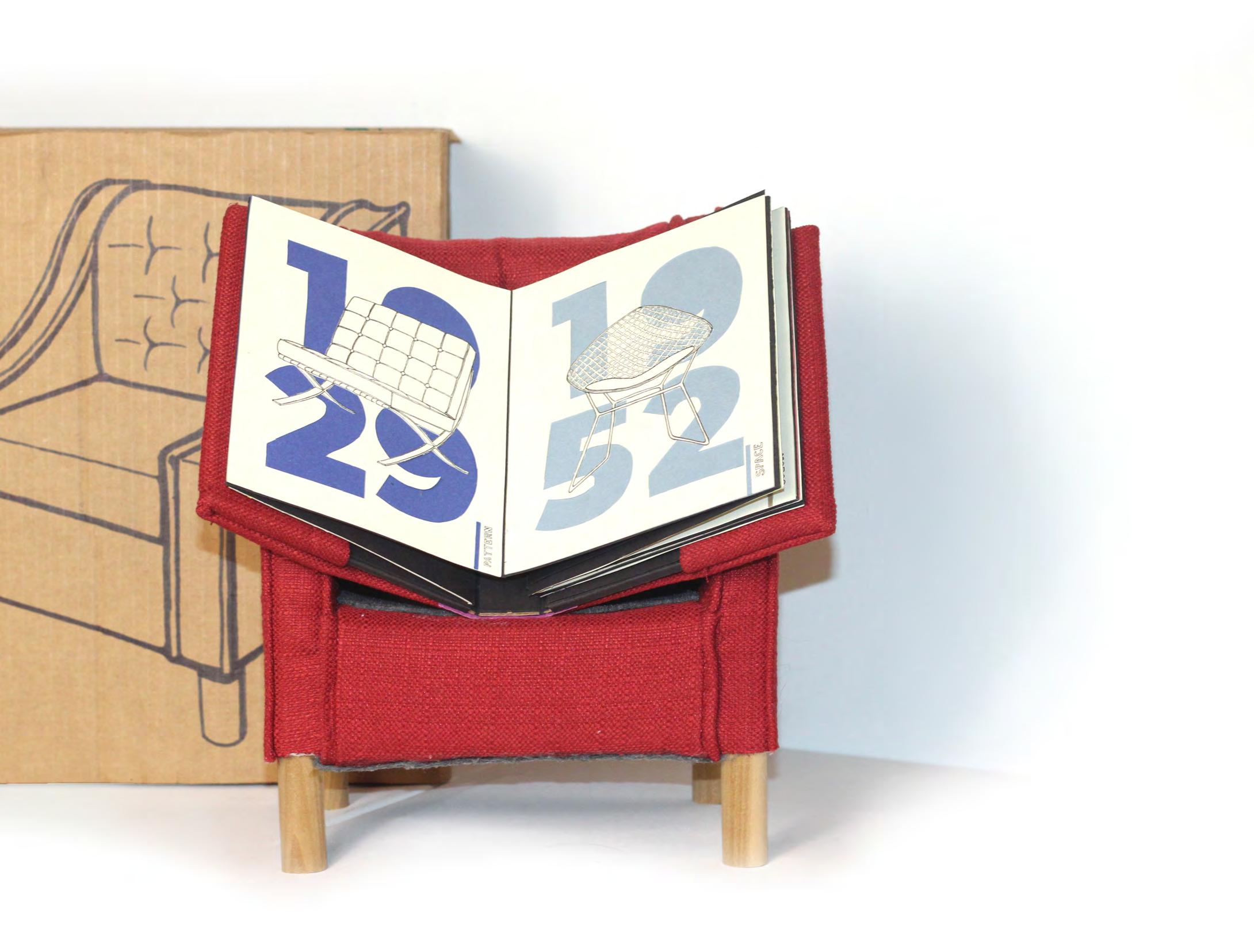
Eight accordion pages featuring hand illustrated historic chairs, each representing a basic design element or principle.
Hand-cut chairs and dates reveal colors related to the chair’s time period. The pages are held by a case bound cover displaying simple chair iconography and a band closure.
Created from entirely recycled or waste materials, the chair is loosely based on the FLINSHULT armchair from IKEA. Custom patterned and completely hand-sewn to fit the wooden frame, the upholstery is made from a fabric sample from a furniture store. Quilt batting and foam line the frame to create a convincing silhouette. A book jacket disguises the book as it slides right into the seat of the chair, disappearing from sight.
TOOLS
Illustration | Pen
Physical Craft | Pattern drafting, sewing, bookbinding, precison cutting


SHARKS
DIRECTIVE
Develop multiple works of wall art for a shark-adoring household.
RESULT
Shark Lisa and Shark with a Pearl Earring are simply just for fun. A long running family joke, my love for sharks was began following Katy Perry’s Super Bowl Halftime show in 2015... Left shark! The original canvases are 16” by 24” and 24” by 36”, respectively. The paintings currently reside with my father in my childhood home in Austin, Texas, one even hanging above the fireplace mantle.
TOOLS
Illustration Acrylic paint on canvas

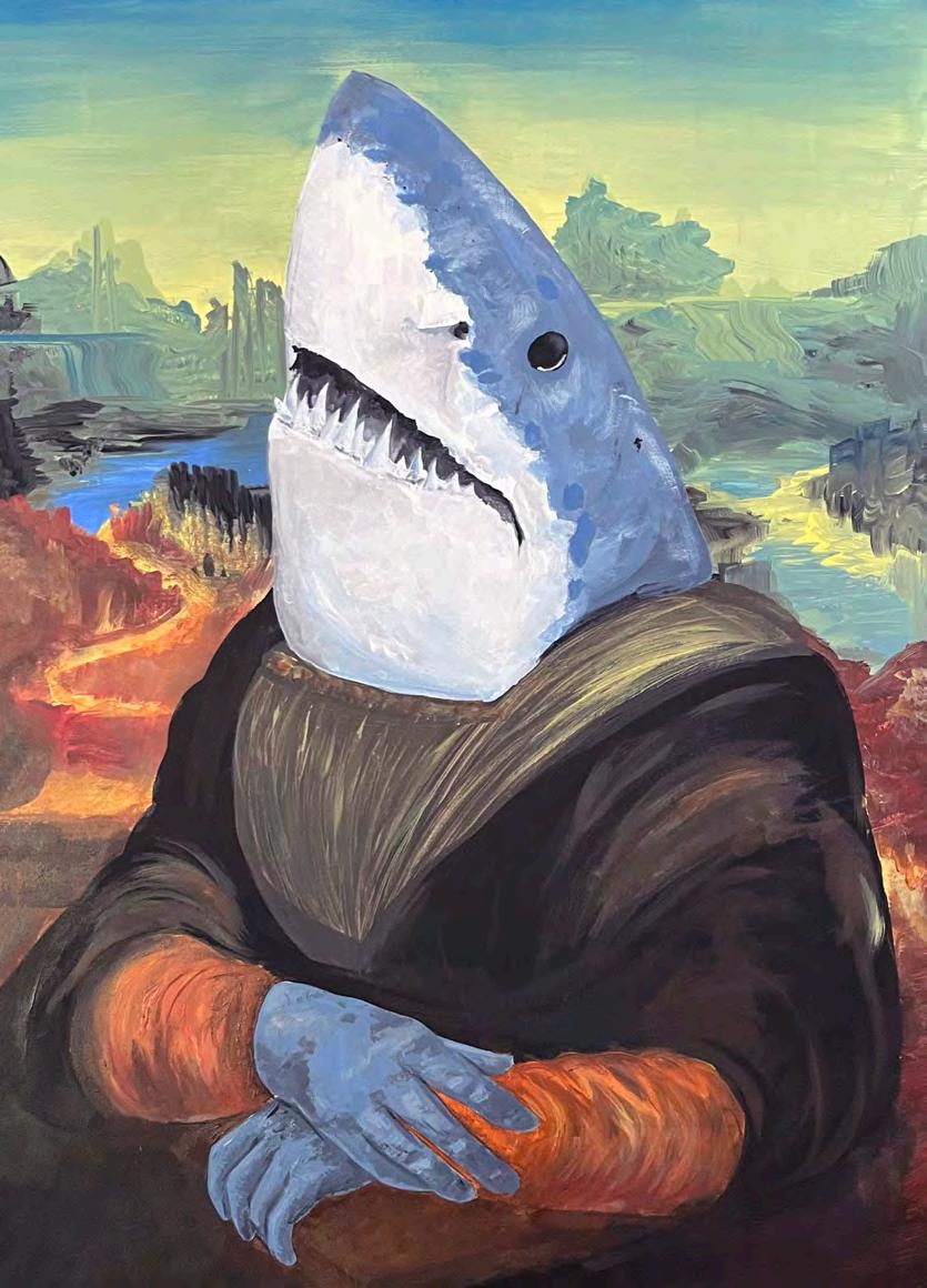 Right: Shark Lisa | 2021
Left: Shark with a Pearl Earring | 2023
JWU X TAC
DIRECTIVE
Identify and rectify the lack of public art on and near the Johnson & Wales University campus.
RESULT
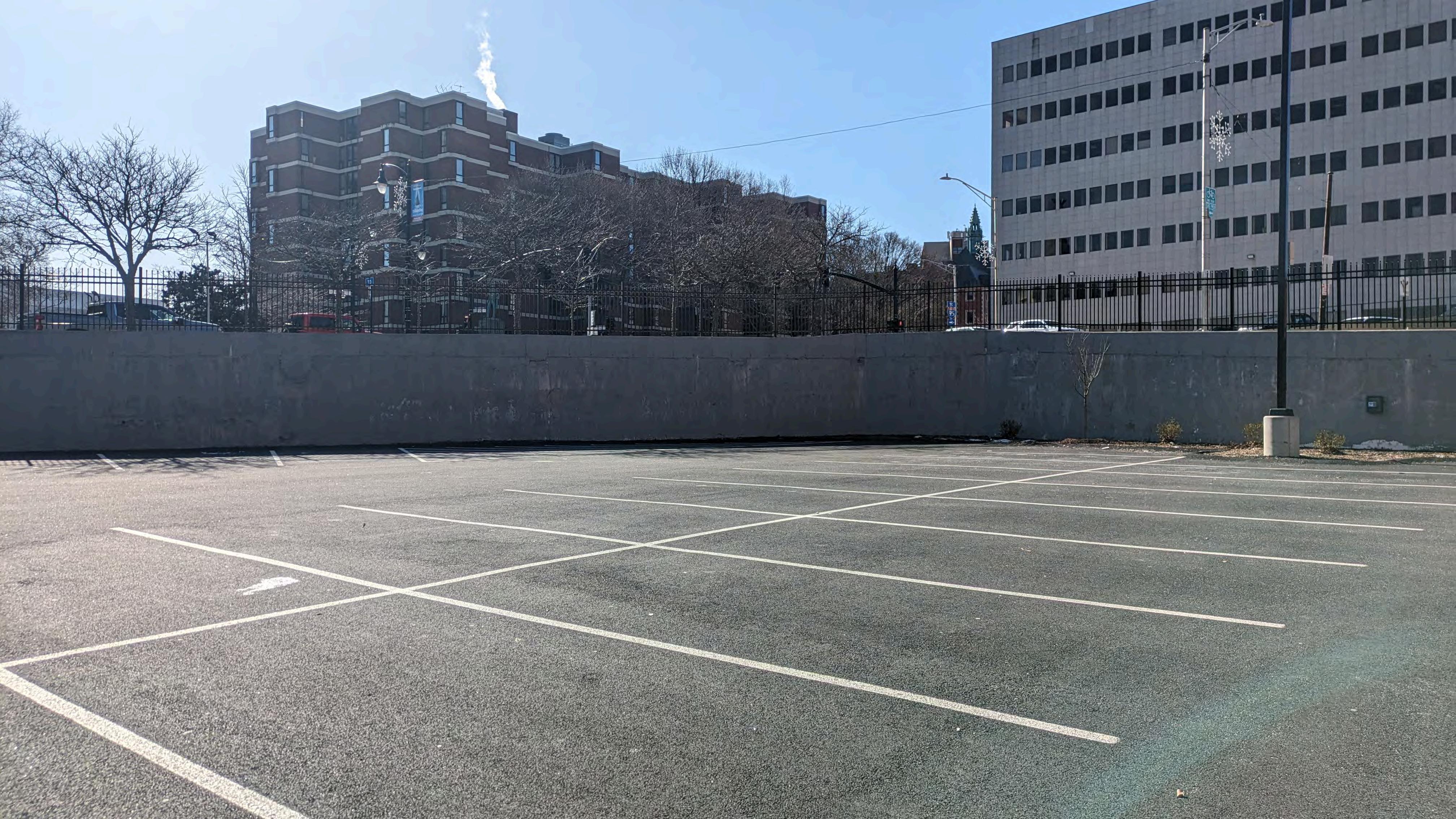
Six design majors came together to collaborate with The Avenue Concept, an organization based in Providence, RI that nurtures and facilitates public art throughout the city. Through in depth exploration and research, the group landed on a design celebrating the Providence Performing Art Center’s musical performers. Located in a newly constructed parking lot down the street, the mural would be visible to many of the residents and tourists visiting PPAC. I completed the portraits, Shea Lambert and Matthew Sheetz developed the patterns, Stephanie Pezzullo and Anthony Colacchio completed the type lock ups, and Megan Doyle contributed the linework and composition of the elements.
TOOLS
Adobe Photoshop
Illustration | Vector, Acrylic paint



JWU X TAC 2
DIRECTIVE
Furthering the initiative for more public art on the Johnson & Wales campus..
RESULT
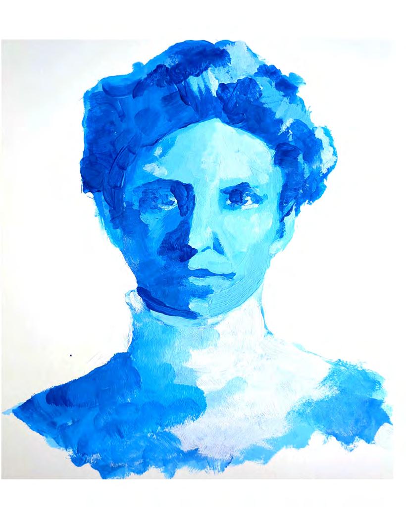
The design majors chose three locations each and developed art concepts that would lend themselves well to the space. My third concept chose to honor our school’s founders, Mary Wales and Gertrude Johnson, on a utility box located along the path to three of our major academic buildings and our campus Starbucks. Megan Doyle, a graphic design senior on our team, and I chose to combine my concept and her location, the Remington building on Friendship Street. I painted Wales and Johnson and she developed the type, illustrations, and layout. Currently in discussion with JWU administration, the concept has been well received and has been proposed to receive funding in the coming years.
TOOLS
Adobe Photoshop
Illustration Acrylic Paint


UIB BRAND
DIRECTIVE
Ideate and execute a logo, branding, merchandise, and mascot for Johnson & Wales University Involvement Board.
RESULT
Hoping to read as a welcoming yet professional on-campus club, the UIB logo has custom type, rounded edges, and a light bulb illustration in the counter of the ‘b’.
Continuing the light bulb theme, Wattson, an anthropomorphic light bulb featuring a snazzy bow tie became the clubs official mascot.
Finally, I drew iconic features of the club, university, and surrounding city to use as a shirt design, business card elements, and a custom table cloth for promotion.
TOOLS
Adobe Illustrator
Adobe InDesign
Illustration | Vector


TWIST
DIRECTIVE
Create a company, logo, branding, and a sample customization website.
RESULT
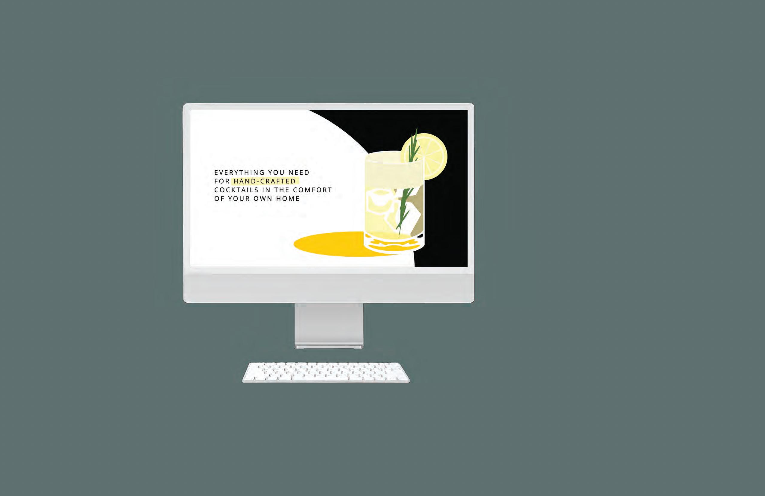
Combining craft cocktails with the growing alcohol-free community, Twist puts a twist on a classic alcohol subscription box. With the option to choose the level of alcohol sent in each box, ranging from full proof, low alcohol, and zero proof, as well as selecting sweetness, calorie, and flavor profiles, Twist becomes the perfect gift for all. Illustrations offer an idea of what the cocktail may look like, understanding that appearance is subject to change with customization.
TOOLS
Adobe Illustrator
Figma
Illustration | Vector
