


I keep a list of things that make me happy in a small little journal tucked away in the drawer of my desk, and near the very top of that list is: the subtle grit of smooth ink on paper.
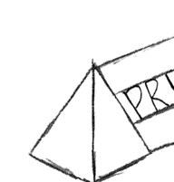
Pen & Paper is my homage to the timeless origin of creativity: the simple, powerful act of sketching. Before I mastered digital tools like Adobe Illustrator or Photoshop, I first connected with my ideas through the tactile experience of pen on paper. From raw sketches to polished designs, each piece starts with the intimate, unfiltered creativity that only pen and paper can inspire.

01 Reality & Fantasy (page 6)

02 Health & Humanity (page 26)
03 Plants & Flowers (page 40)
04 Superheros & Spirit (page 50)
07 History & Modernity (page 94)

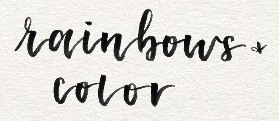
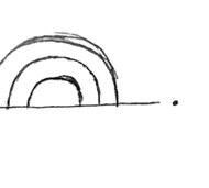
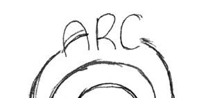
05 Rainbows & Color (page 64)
08 Food & Books (page 106)
06 Koi Fish & Sunsets (page 80)
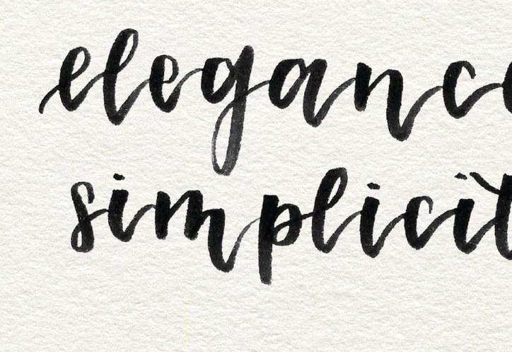
09 Elegance & Simplicity (page 124)


PROJECT ONE
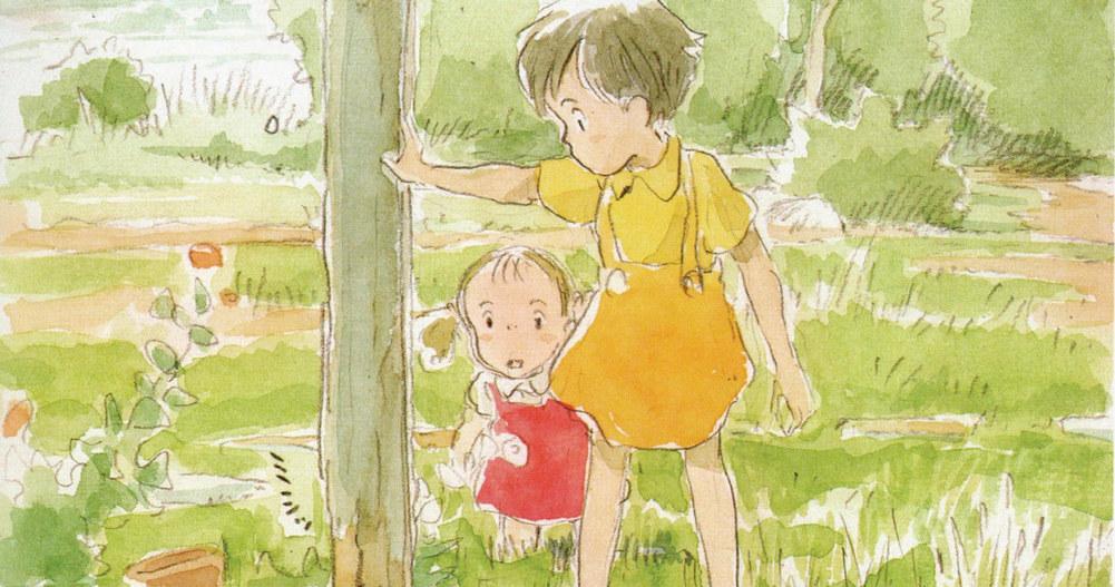
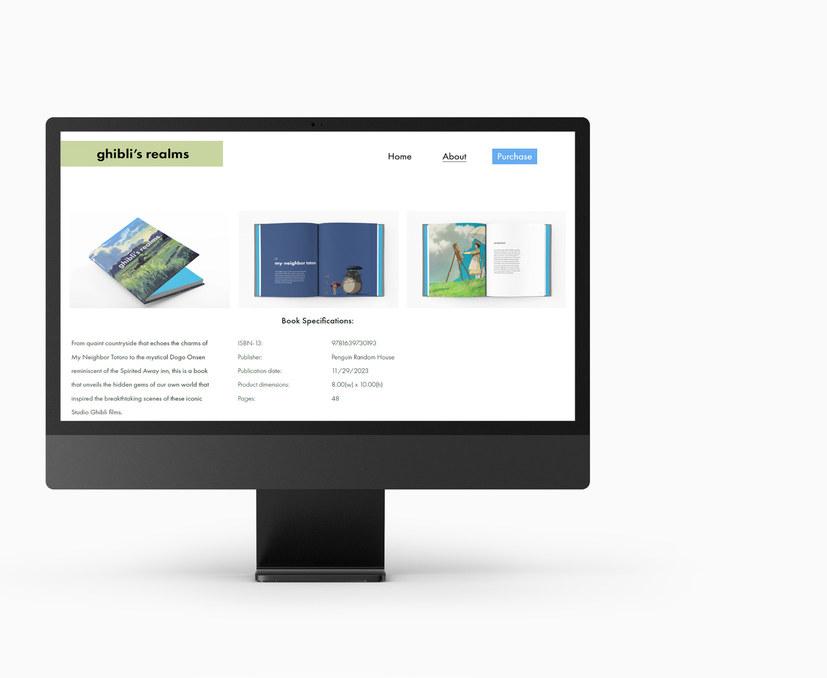
Ghibli’s Realms
COURSE
Typography 3
INSTRUCTOR
Laurie Makela
CATEGORY
Print design, Publication
KEYWORDS
Wonder, nostalgia, escape
My goal for this project was to unveil the real-world landscapes that inspired some of the most iconic Studio Ghibli films through the form of a coffee table book. My intent was to utilize simplistic layouts to reflect the minimalism often seen in Japanese design.


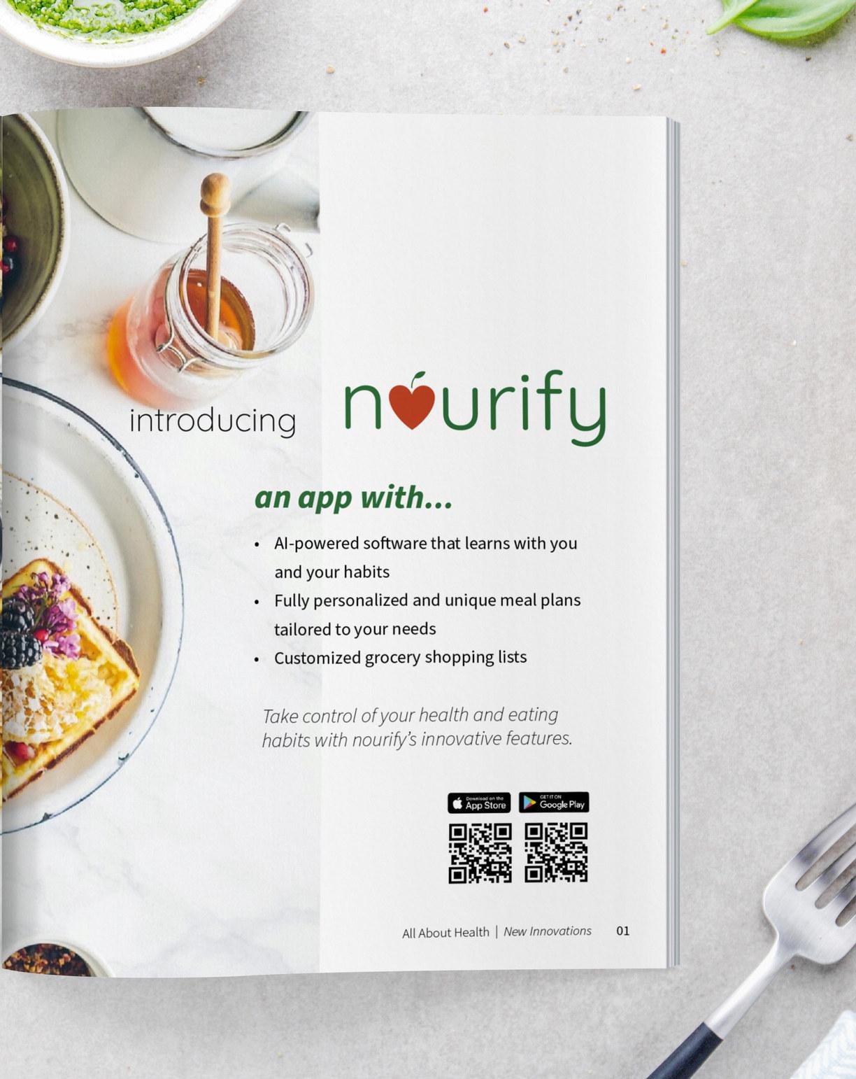
PROJECT TWO Nourify
COURSE
Graphic Design 3
INSTRUCTOR
Lloyd Mitchell
CATEGORY
Print Design, Web Design, UX/UI
KEYWORDS
Contemporary, nourish, enrich
My goal for this project was to channel the power of AI into an app for wellness. My intent was to create an app that utilizes AI to analyze users’ current health standings and demographics to formulate a custom meal plan based on their dietary needs and restrictions.


PROJECT ONE
Adobe Garamond Cards
COURSE
Typography 2
INSTRUCTOR
Tracy Merchant
CATEGORY
Print Design
KEYWORDS
Organic, elegant, graceful
My goal for this project was to design a card set about the Adobe Garamond typeface explaining its rich history and anatomy. My intent was to incorporate botanical illustrations into my designs to create a stylish and graceful card set that would honor the unique characteristics of the Adobe Garamond typeface.


PROJECT FOUR
CAPE Rebrand
COURSE
Strategies for Branding
INSTRUCTOR
Peter Chun
CATEGORY Branding
KEYWORDS
Energize, fun, modern
My goal for this project was to rebrand a non-profit organization called CAPE, which stands for the Community Association for Preschool Education.
My intent was to breathe a bit more life and energy into the brand starting with the logo and working my way up to the website, photography, and iconography.


PROJECT FIVE kaleyediscope
COURSE Graphic Design 1
INSTRUCTOR Erin Kristine Canoy
CATEGORY
Branding, Photography
KEYWORDS Rainbow
My goal for this project was to take a keyword, rainbow, and create a oneof-a-kind eyewear brand that aids those with color vision deficiency. My intent was to harness the millions of hues and shades found in our color spectrum and incorporate them into fashionable yet functional eyewear.


PROJECT SIX
Sunset Festival
COURSE
Visual Communication B
INSTRUCTOR
Kathryn Morgan
CATEGORY
Print Design
KEYWORDS
Dreamy, warm, peace
My goal for this project was to develop a series of evocative posters for a music festival. My intent was to create something that celebrates Asian heritage and infuse it with their philosophy of peace and harmony.


PROJECT SEVEN
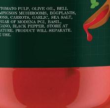
Williams Sonoma
COURSE
Packaging Design
INSTRUCTOR
Thomas McNulty
CATEGORY
Packaging, Branding
KEYWORDS
Gourmet, friendly, modern
My goal for this project was to redesign three types of food packaging from Williams Sonoma. My intent was to modernize their pasta, marinara, and cake mix packaging to make it more approachable to the general public while still maintaining some of the traditional and gourmet aspects of the Williams Sonoma brand.


PROJECT EIGHT
CookBound
COURSE
Strategies for Branding
INSTRUCTOR
Peter Chun
CATEGORY
Branding, Web Design
KEYWORDS
Community, interactive, organic
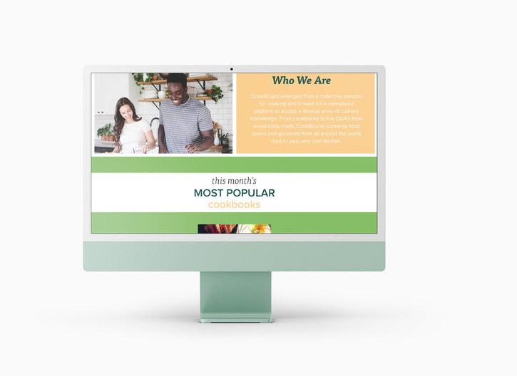
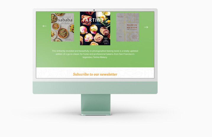
My goal for this project was to create a unique brand that exclusively sold cookbooks worldwide and also provided various forms of community engagement via forums, cooking classes, monthly cooking challenges, etc. My intent was to develop a fun and modern logo that would reflect the brand’s ideals as well as design a website and stationery system to accompany the visual system.


PROJECT NINE
Klarity
COURSE
Graphic Design 2
INSTRUCTOR
Jeremy Stout
CATEGORY
Print design, Publication
KEYWORDS
Rejuvinating, cleanse, fresh
My goal for this project was to create an all-in-one skincare product that replaces the majority of a skincare routine with just two steps. My intent was to incorporate a sense of elegance and sophistication into the brand, while keeping the overall designs clean and simple.


TO MY MOM AND DAD
Who have never once discouraged or dissuadded me from pursuing design as a career and for giving me the freedom to decide how I want to live my life.
TO MY INSTRUCTORS
Mary Scott, Laurie Makela, Thomas McNulty, Peter Chun, Hunter Wimmer, and more who have continuously and quite rigorously pushed me to be the best designer I can be, and for their brutal, but necessary, critique that only challenged myself to keep improving.

CONTACT
Anessa Tam
anessatamdesign@gmail.com anessatamdesign.com
SCHOOL
Academy of Art University
School of Graphic Design
San Francisco, CA
INSTRUCTOR
Mary Scott
Summer 2024 Spring Portfolio

TYPOGRAPHY
The Seasons Nitti
PRINT & BINDING Blurb STOCK
Mohawk Super Fine Eggshell
100# Text
PHOTOGRAPHY
Anessa Tam
ADDITIONAL PHOTOGRAPHY
Adobe Stock
COPYRIGHT ©2022 ANESSA TAM
All rights reserved. No part of this publication may be reproduced in any manner whatsoever without permission and transmitted, distrubuted, in any form or by any means, including photocopying, recording and other electronic or mechanical means.
Student project only, no part of this book is for commercial use