
ANDREA ROMERO
HELLO, I’M ANDREA ROMERO
I´m a visual information designer sion for advertising, branding, and UX/UI design. I thrive on exploring how visual solutions can create meanin gful connections between brands and their audiences. My creative process is driven by curiosity, attention to detail, and a commitment to delivering impactful de signs. I love collaborating with teams, learning from others, and constantly exploring new tools and techni ques to push boundaries and innovate.


idea s experiences
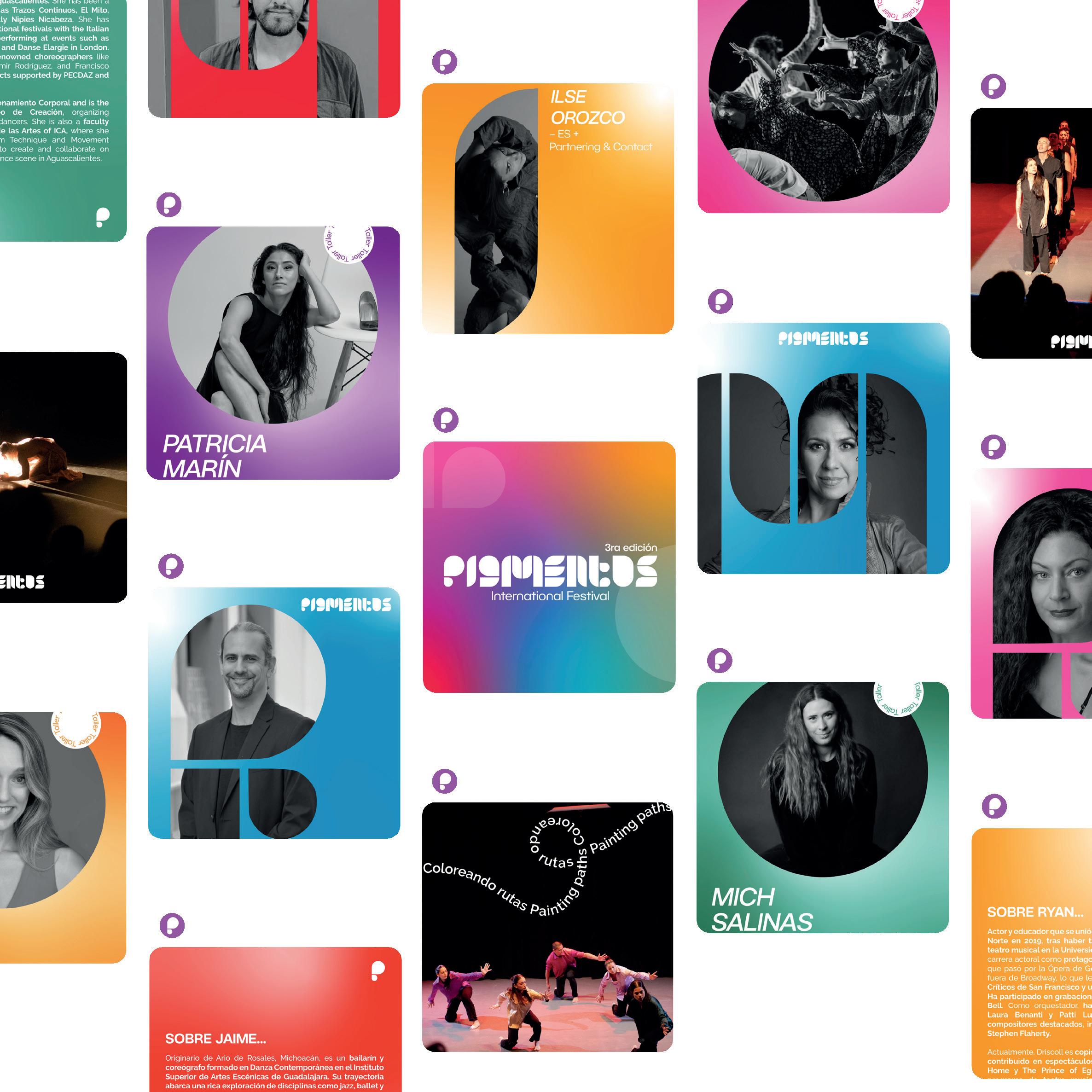
Pigmentos
Pigmentos is an international festival of dance and musical theater held in Puebla, Mexico, that fosters connections between students, institutions, and artists worldwide. The 2024 identity design draws inspiration from pigments—materials that transform light into vibrant colors—translated into a bold and dynamic palette that reflects the festival’s diversity and energy. This visual identity gave the brand a complete refresh, making it significantly more recognizable. As a result, the festival’s Instagram following doubled, further amplifying its reach and impact. Pigmentos continues to evolve as a vibrant cultural landmark.
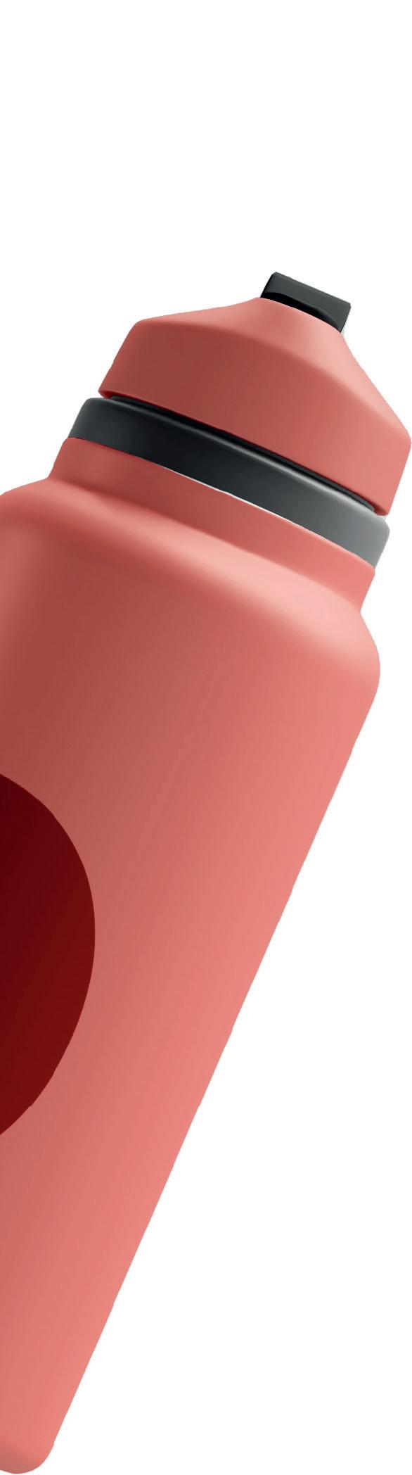
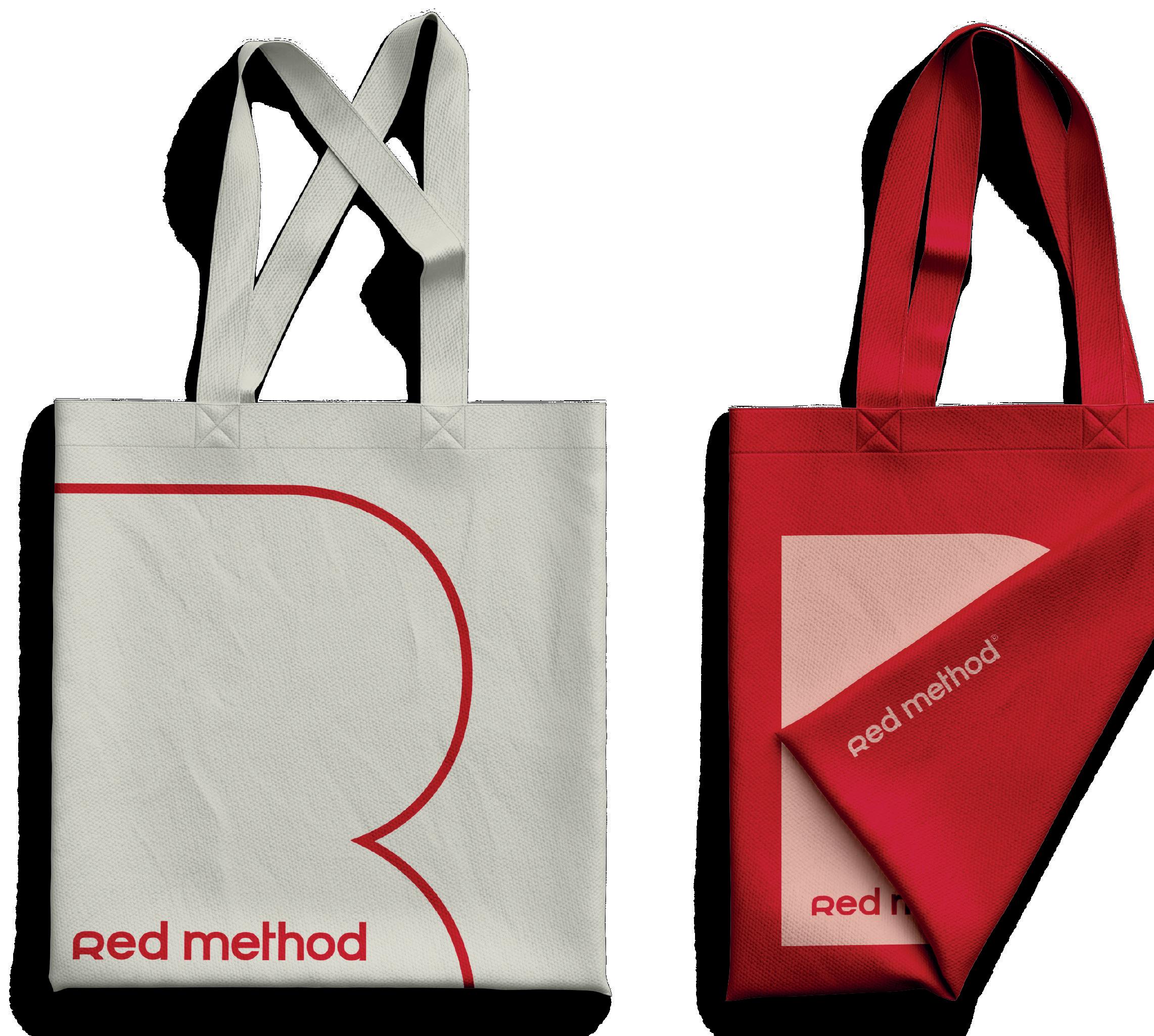
Red Method
Red Method is a Pilates studio in México specializing in infrared-powered workouts, a project I had the opportunity to develop while working at the design agency Lata Láctea.
The branding reflects the studio’s empowering ethos, aimed at women seeking strength and confidence. Inspired by infrared light and the concept of “sweat is the new sexy,” the visual identity features a bold palette evoking energy and determination. Iconic phrases like “Warning: Side Effects May Cause Unstoppable Confidence,” were crafted to ensure the brand’s memorability. Beyond fitness, Red Method is about fostering a supportive community where individuals can achieve their best selves.

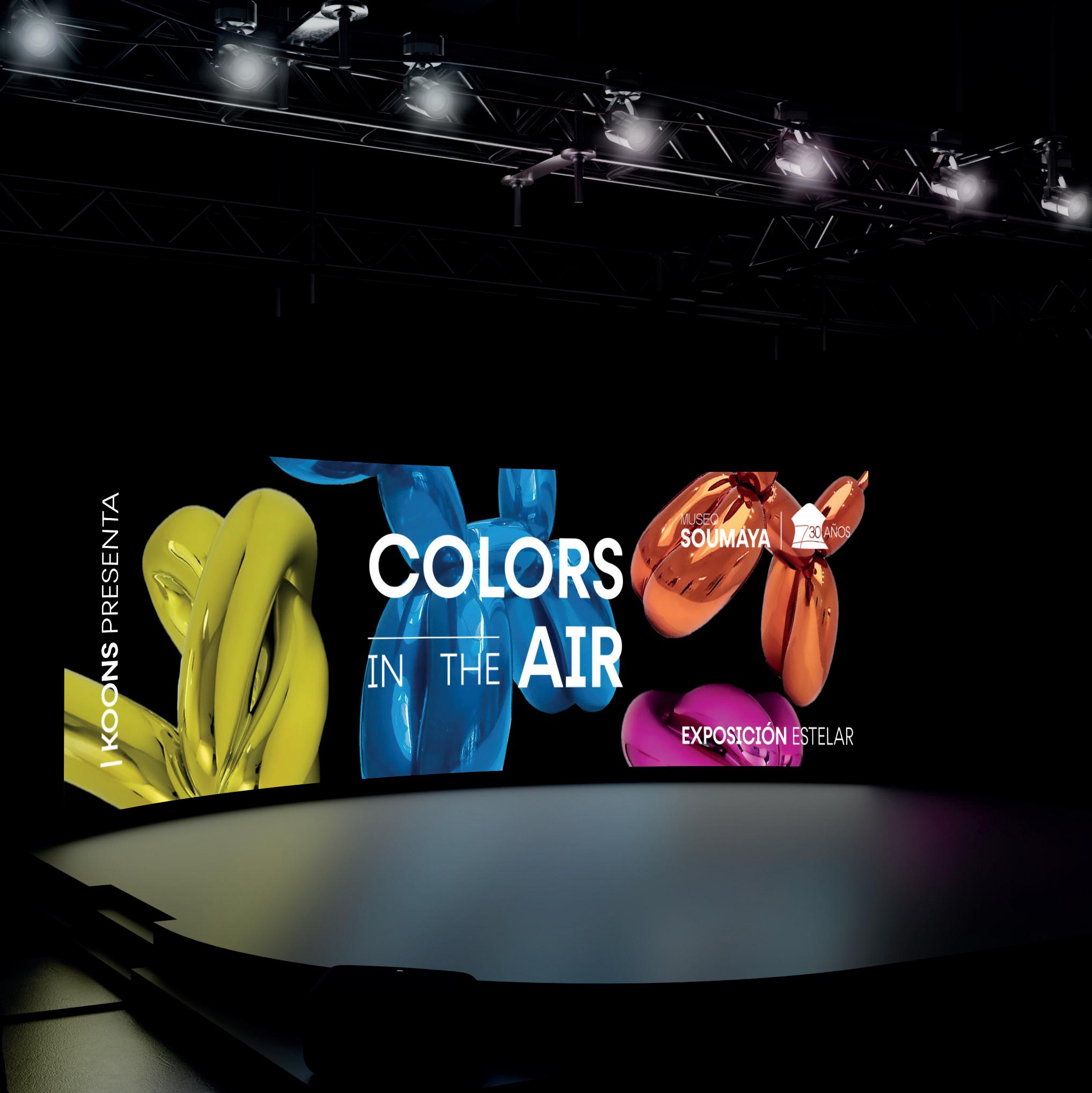
Soumaya
The Museo Soumaya, an architectural and cultural landmark in Mexico City, celebrated its 30th anniversary with a bold new vision. We undertook a comprehensive rebranding of its visual identity, aligning it with global design standards to reflect the museum’s innovative essence. To amplify this milestone, we developed “Colors in the Air,” a strategic campaign inspired by Jeff Koons’ iconic Celebration series. The campaign aimed to elevate the museum’s positioning as a global cultural hub by connecting modern audiences with its vibrant collection. Through a mix of digital, print, and experiential strategies, we crafted a compelling narrative that fused art, modernity, and celebration, creating an unforgettable experience for visitors.


Branding
Category Finalist

Premio a! Diseño

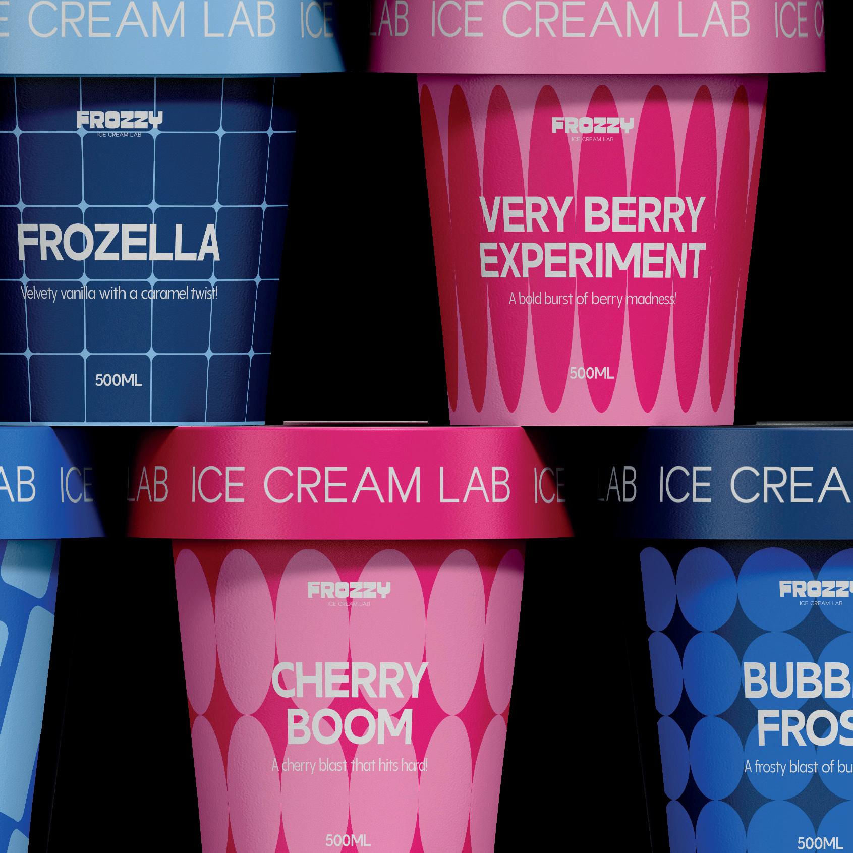
Frozzy
A bold and playful brand that transforms the ice cream experience into a flavor-filled experiment. Inspired by scientific labs, the visual identity blends geometric patterns, vibrant colors, and quirky illustrations, creating a dynamic and memorable aesthetic. The packaging showcases bold, modern shapes with a color palette of blue, pink, and white, giving each flavor a distinctive and eye-catching personality. The mischievous lab-themed mascot adds a fun, human touch, while the scientific references reinforce the experimental concept. Frozzy celebrates imagination, boldness, and the joy of unexpected flavors—one scoop at a time. BRANDING PACKAGING ILLUSTRATION
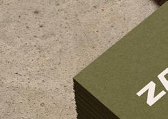
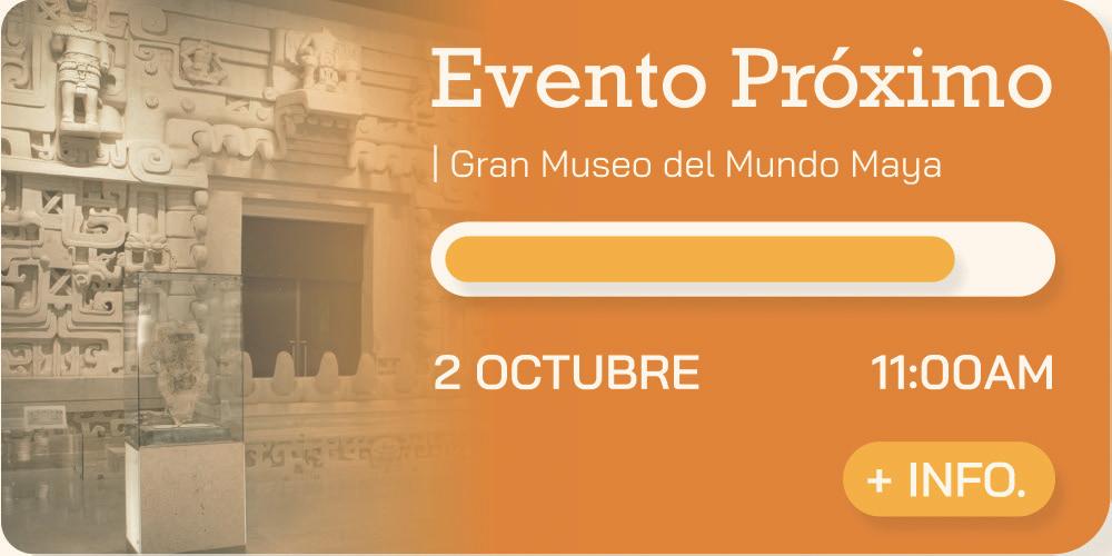
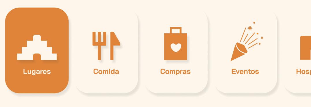
Zalúm
Zalúm is an interactive and inclusive travel app designed to enhance your journey through Mérida, Mexico. Inspired by the Mayan word “zalúm”—which means “to explore”—the app features Modo Suutal, an emotion-based mode that adapts itineraries and suggestions to the user’s emotional state, promoting calm and well-being. With a user-centered design and a visual identity rooted in Mayan culture, Zalúm offers a personalized, accessible, and mindful way to discover the city. Zalúm redefines travel as an emotional journey—where discovery, culture, and inner peace go hand in hand.
BRANDING UX/UI

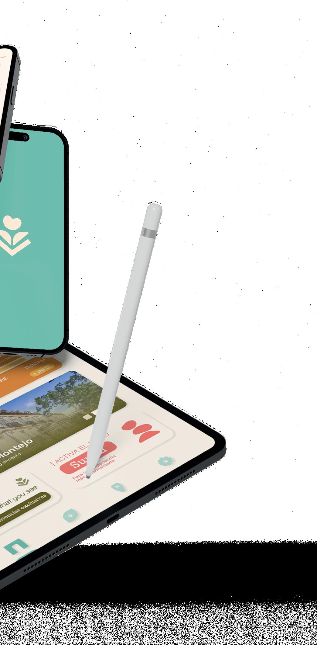
S AN EXPERIENCE BE LIVED


With Zalœm, travel beyond what you see.
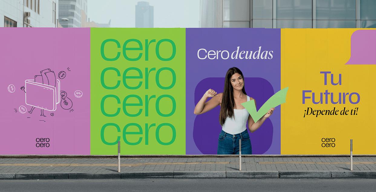
Cero Cero
Cero Cero is a playful and informative brand created to teach financial concepts in an engaging way. Developed as part of an educational campaign, the project blends bold visuals, a vibrant color palette, and accessible language to make topics like saving, budgeting, and investing fun and easy to understand. The identity system was designed to feel energetic, clear, and youth-friendly, helping demystify personal finance for new generations. By using storytelling, relatable examples, and interactive content, Cero Cero simplifies complex financial topics to make each lesson feel like an exciting journey rather than a boring task.
cerocero.mx
cerocero.mx
cerocero.mx
¡Depende de tí!
Aprender sobre finanzas, hace más fácil ahorrar, invertir, y protegerse contra los problemas económicos.
[ conoce ]
¡Paga tus deudas, baby!
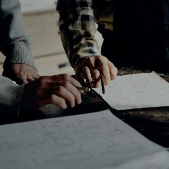
Inhabita
For Inhabita, we crafted a comprehensive branding and UX/ UI design that reflects the essence of their mission: creating homes with identity, quality, and functionality. The visual identity we developed emphasizes warmth and comfort, utilizing a balanced color palette and minimalistic elements to convey trust and modernity. The logo and brand visuals were designed to communicate a sense of home and security, while also showcasing Inhabita’s commitment to innovation. For the digital experience, we focused on creating an intuitive and seamless interface that reflects the brand’s values of simplicity and user-centricity. The result is a cohesive and modern identity that elevates Inhabita’s presence
BRANDING UX/UI
Desarrollo Inmobiliario
Hacemos la diferencia en tu vida

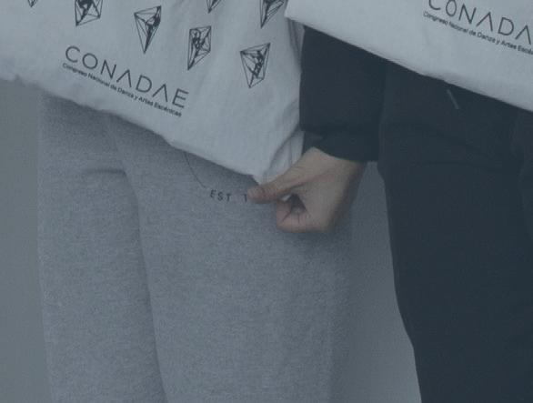
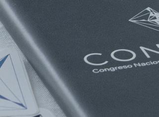
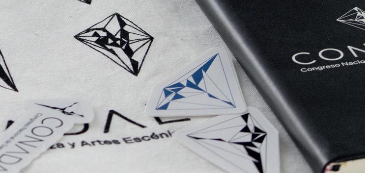
Conadae
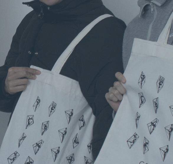
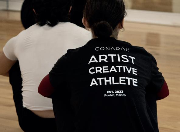
CONADAE is an organization focused on inspiring, connecting, and transcending in the world of dance. Our mission was to develop a brand identity that embodies its core values of growth, creativity, and athleticism. The tagline “Artist. Creative. Athlete.” is reflected through a dynamic and modern visual identity that balances elegance with strength, using fluid forms and bold typography to represent the physicality and artistry of dance. The logo design draws inspiration from movement and expression, while the color palette conveys energy, passion, and professionalism.


Huella
Rypple
Rypple is a gamified app designed to inspire and motivate young people and adults to take action for the environment in their communities. Through eco-friendly challenges, badges, and rankings, users can engage in missions that drive real-world impact. With a local focus, Rypple tailors its challenges to the user’s location, connecting them with actual initiatives in their city. The app encourages concrete actions to reduce waste, protect natural resources, and promote environmental justice, creating a ripple effect that extends beyond the individual. Through its engaging and user-centered design, Rypple fosters a sense of community and collective responsibility for a more sustainable future.
BRANDING UX/UI

Meltaway
Meltaway is a premium chocolate brand that redefines indulgence through a sensory-driven experience. For this project, we developed a sophisticated brand identity and digital platform that capture the essence of softness, elegance, and modern luxury. The visual language combines delicate typography, refined textures, and a muted color palette to evoke the feeling of chocolate melting—inviting users to slow down and savor. We also designed a sleek, intuitive website that allows users to personalize their chocolate experience, from flavor selection to event gifting. Every detail was crafted to immerse the user in the world of Meltaway.

Premio a! Diseño
Branding
Category Finalist
Mangiamo
Mangiamo is a restaurant that embodies the warmth and authenticity of Italian cuisine. Rooted in tradition yet infused with a playful, inviting spirit, the brand balances sophistication with joy. The visual identity embraces a warm color palette inspired by southern Italy, complemented by dynamic graphic elements and hand-drawn illustrations that reflect the richness of its cuisine. Every detail was crafted to create a cohesive and immersive experience that captures the essence of Mangiamo. More than just a restaurant, Mangiamo is an invitation to savor, celebrate, and indulge in the true flavors of Italy. BRANDING

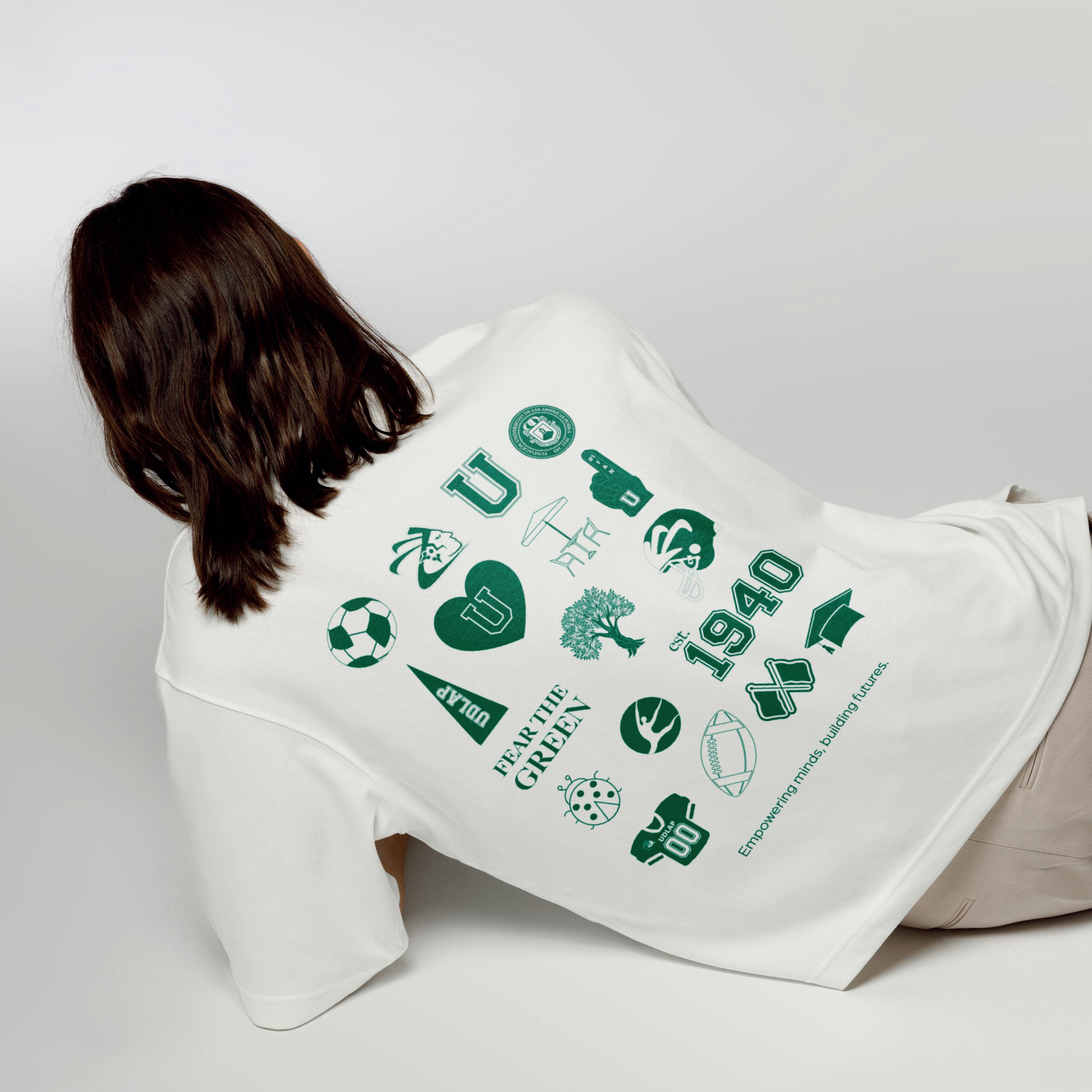
UDLAP Merch
Green Escenes is a visual concept developed as part of the official 2025 merchandise for Universidad de las Américas Puebla (UDLAP). Selected among various proposals, the design captures the essence of campus life through a fresh, minimalist aesthetic that blends school pride with a contemporary visual approach. Comfort and practicality were central to the design choices, resulting in pieces that are not only stylish but truly useful in everyday student life. Green Escenes reimagines what university merch can be: timeless, wearable, and rooted in identity—something that belongs in your daily rotation, not just your closet.
BRANDING MERCH DESIGN ILLUSTRATION
[2024]
[2025]
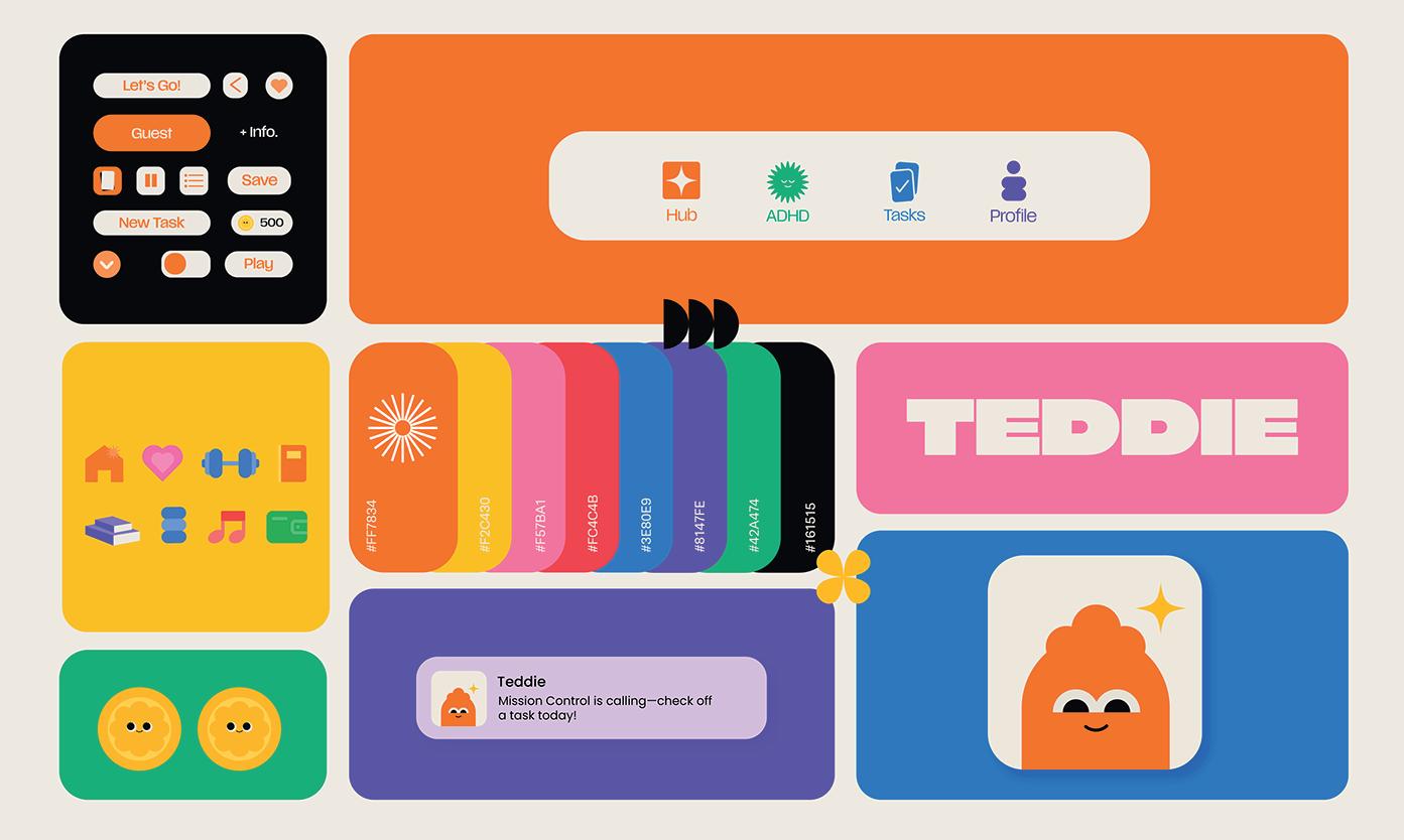
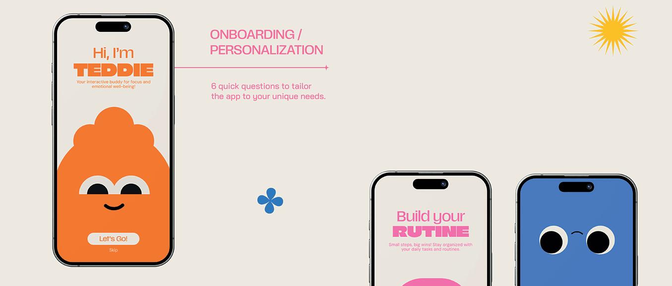
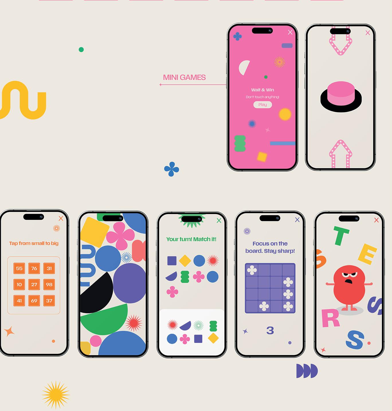
TDAH/ Teddie
This project began with an animated infographic on ADHD, developed as an engaging educational tool to explain the disorder’s characteristics, types, and everyday challenges. By combining thoughtful storytelling with accessible visuals, the animation helped simplify complex information and foster empathy and understanding. Building on the success and visual language of this piece, we expanded the concept into Teddie—a mobile app designed to support individuals with ADHD in their daily lives. While the animation laid the foundation for awareness, Teddie turned that insight into action, offering a structured yet playful digital space for task management and routine building.
MOTION GRAPHICS
Premio MX
Diseña México Motion Graphics Category Winner
Premio a! Diseño Animation Category Finalist
work


If you want to see more of my projects, scan this code to visit my Behance and find my contact info.
