&

Neville Brody
Table Of Contents on Back
ARTWORKSDESIGN 1980’s
1

Table Of Contents on Back


Who is Neville Brody? He is an English graphic designer, typographer, and art director. Brody was born on April 23, 1957, in Southgate, London, United Kingdom and is currently 65 years old. He attended Minchenden Grammar school and studied level A-art then in 1975 Brody did a Fine Art foundation course at Hornsey college of art. In 1976 he started a three-year BA course in graphics at London college of printing. Lots of Brody’s work was influenced by the explosion of punk rock in London where he grew up. While in college he designed posters for student concerts at the school. He is known for his work on the face magazine (1981-1986), Arena magazine (1987-1990), and designing many record covers for artist’s. He had won many awards like D&AD Presidents Award (2011) and a prince Philip designers prize (2010).
Brody was part of the punk rock scene in London that influenced most of his style. His works in The Face magazine influenced a generation of designers by creating things that weren’t traditional. This is what Brody had to say about The Face magazine: “The face was a living laboratory where I could experiment and have it published. Our golden rule was to question everything, if a page element existed just as taste or style, it could be abandoned. Page numbers could be letters or shapes increasing in size. We could start the headline on the page before, we had disasters and near misses every issue. We had two weeks to art direct everything, then lay it put. It was pre-computer, so everything was traced by hand… It certainly wasn’t a nine-to-five job. You had to be obsessed to make it work. -Neville Brody”. Brody’s thinking process was just experimental with influence of punk, but it wasn’t done by anyone traditionally so as he mentioned in the quote you just had to place things somewhere in the work and see if it works if not try something else but experiment with it.
He was focused on art in his early education and attracted to art and design to adulthood, when he started studying design, he felt like the fine art world was becoming elitist and if he continued, he would be limited, so he started learning print mediums which he thought would allow him to commu nicate with people more. Learning print is what made Brody love the communication side of graphic design. Brody’s work has evolved, in the sense that its less London punk andmore creative and strategic, he knows what works and what doesn’t. Most of Brody’s most known works came from the Face magazine and album covers he created for famous artists like Cabaret Voltaire and the man machine. He has created over 30 album covers for various musicians.
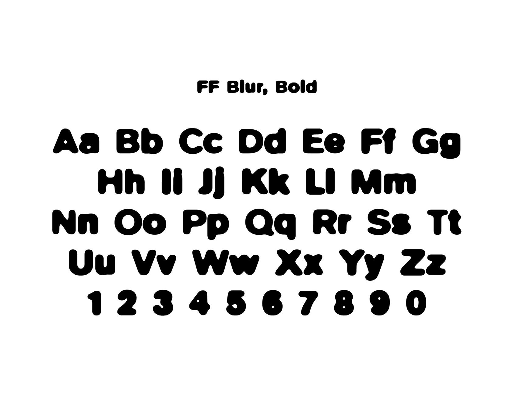
One of the Brody’s most known work is the “FF Blur” typeface that he created and was displayed at the MOMA Arts Museum. The letter forms of the FF Blur type are fuzzy around the edges like an out of focus photograph, seem imperfect, like a copy of a copy grainy and low quality. He has made many more typefaces like Autotrace, Insignia, Industria, and FF Harlem. The font “FF Blur” fits with Neville’s punk influence with the way experimental and new/edgy. The use of computers was new for Neville since he used to make typefaces by hand, but this is what he comes with the use of modern technology and creative ideas. The typeface “FF Blur” was purposely contemporary and bent the rules of typography just like Neville always does with his works. It is meant to look imperfect and used in that way.
 Neville Brody font
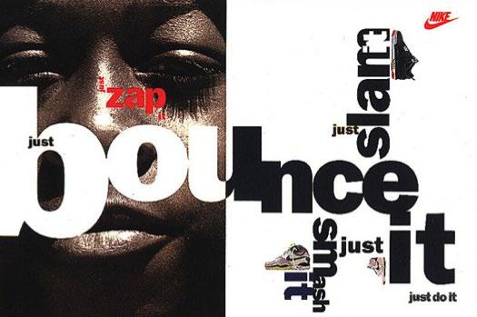
Brody designed a piece for Nike in 1988, called “Brand Strategy for Nike” which produced new ways to see type across the medium and new ways to create and play with hierarchy. The creation of hierarchy with big scaling of some words and the shrinking of others, as well as the words being in different directions was a new way to play with type and make movement connecting the type and design. Brody always wanted to reject the conventions of traditional typography and make a new form of it with image. Seeing this poster, you can see how unconventional it is to have the words vertical and on different sides of each other, but it works well because of the words he’s using (bounce and slam) and how they are placed to where you know what to read first.
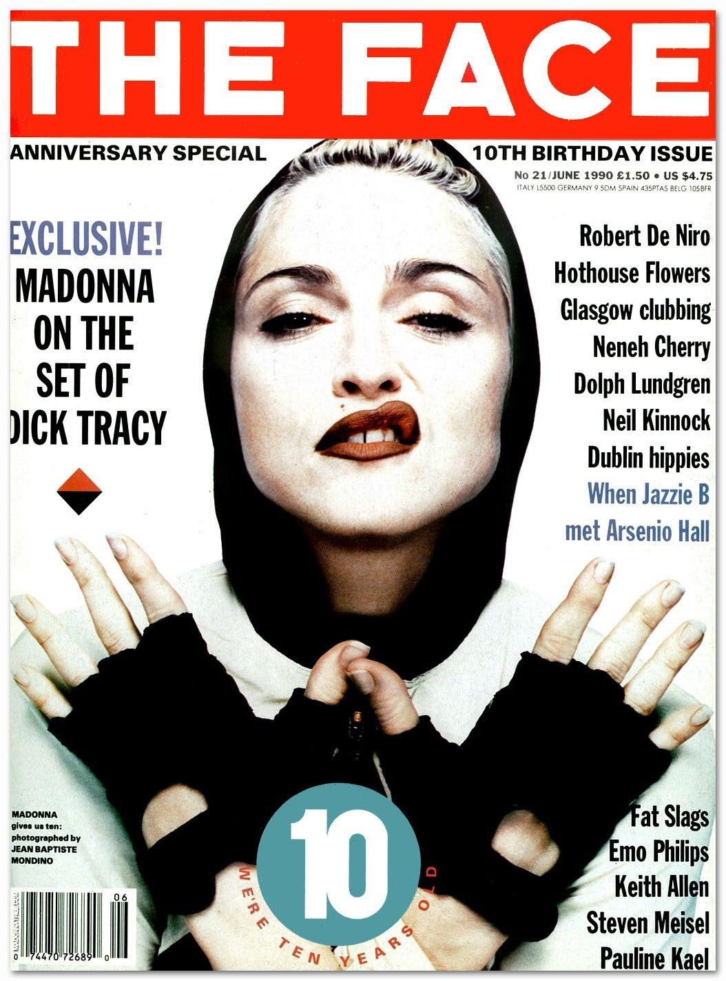
PArt of nike poster byN eville Brody was the art director of the face magazine from (1980-2004). The Face was the starting of Brody’s work which helped him launch his career into what it is now. The monthly magazine covered pop culture like music and fashion. Brody was able to gain recognition because of his experimental work in the magazine. The Face was a place where Brody would experiment
with type, scale, and color. Brody established his punk style aesthetic in the face magazine, he wanted to design something different from the normal magazine design which he created by questioning everything he does. He often uses scale to create hierarchy across the page and scale to fill up the negative space.
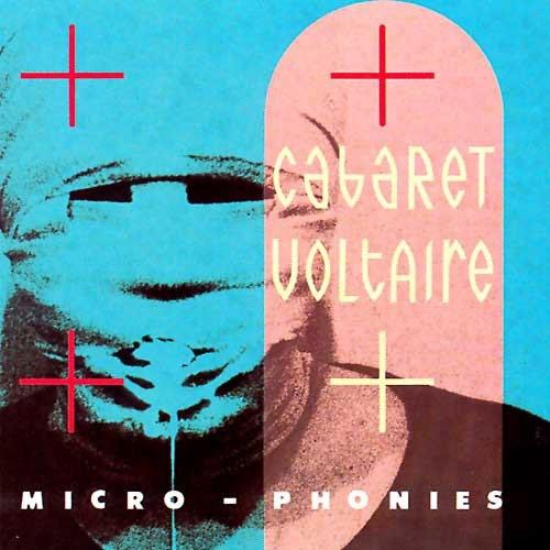
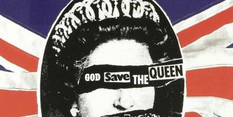
N eville Brody started out making album covers and flyers for musicians at his college. Brody’s experimentation with type and posters caught the eye of many people including music record companies like “Fetish Records” and “Stiff Records” after he left college. Brody worked manly with Grudge and punk bands since that’s where his inspiration came from. The work on the left is from the album “Micro-Phonies” By Cabaret Voltaire and was art directed by Brody in 1984, you can see the use of grungy style in the cover. Another album cover Brody did was for the sex pistols “God save the queen” you can see in this one how he likes to experiment with type and not respecting space for imagery by having the type “god save the queen” across the eyes of the queen of England.
Neville Brody’s -art work he made using his own type.
T his work is by Brody is called “free me from freedom” 2008. This work is somewhat different from Brody’s traditional work as it plays with color and only sticks to one balance of scale for the letters. He fills the space up, but that’s normal in Brody’s work, the weight of the letters stacking on each other are equal and uniform. The stacking of letters is what Brody was meaning when creating his experimental work and just having to go out the norm. The experimental use of colors in this is what makes it Brody, but the black background helps it not be distracting from the lettering itself and creates a nice contrast which is normal for Brody to have calm background and more risky type. The composition of the letters on one side works well too.
rody’s work is experimental and fun. He gives lots of room of creativity but keeps his style intact with the playing of scale, placement, and hierarchy. He uses scale to cover all the negative space. His color choice is usually always natural and gives a punk vibe.
https://www.designboom.com/design/inter - view-with-graphic-designer-neville-brody-10-10-2014/
https://go.distance.ncsu.edu/ gd203/?p=25176#:~:text=In%201975%2C%20Brody%20 began%20studying,Neville%20Brody%20Graphic%20Designer%E2%80%9D).
https://www.smashingmagazine.com/2020/03/ inspired-design-decisions-neville-brody/
https://en.wikipedia.org/wiki/Neville_Brody
https://www.rca.ac.uk/more/staff/profes - sor-neville-brody/#:~:text=Neville%20Brody%20has%20re - ceived%20numerous,Philip%20Designers%20Prize%20(2010).