Creative Composition Award, Council of Agriculture
Silver award, yodex Industry - Academia Cooperation
Bronze Award, Chemical Disaster Education App Design Competition
Gold award, Tax Manga Painting Competition
3D Modeling
Blender
Maya
Substance
Alias
KeyShot
Game Design
Service Design
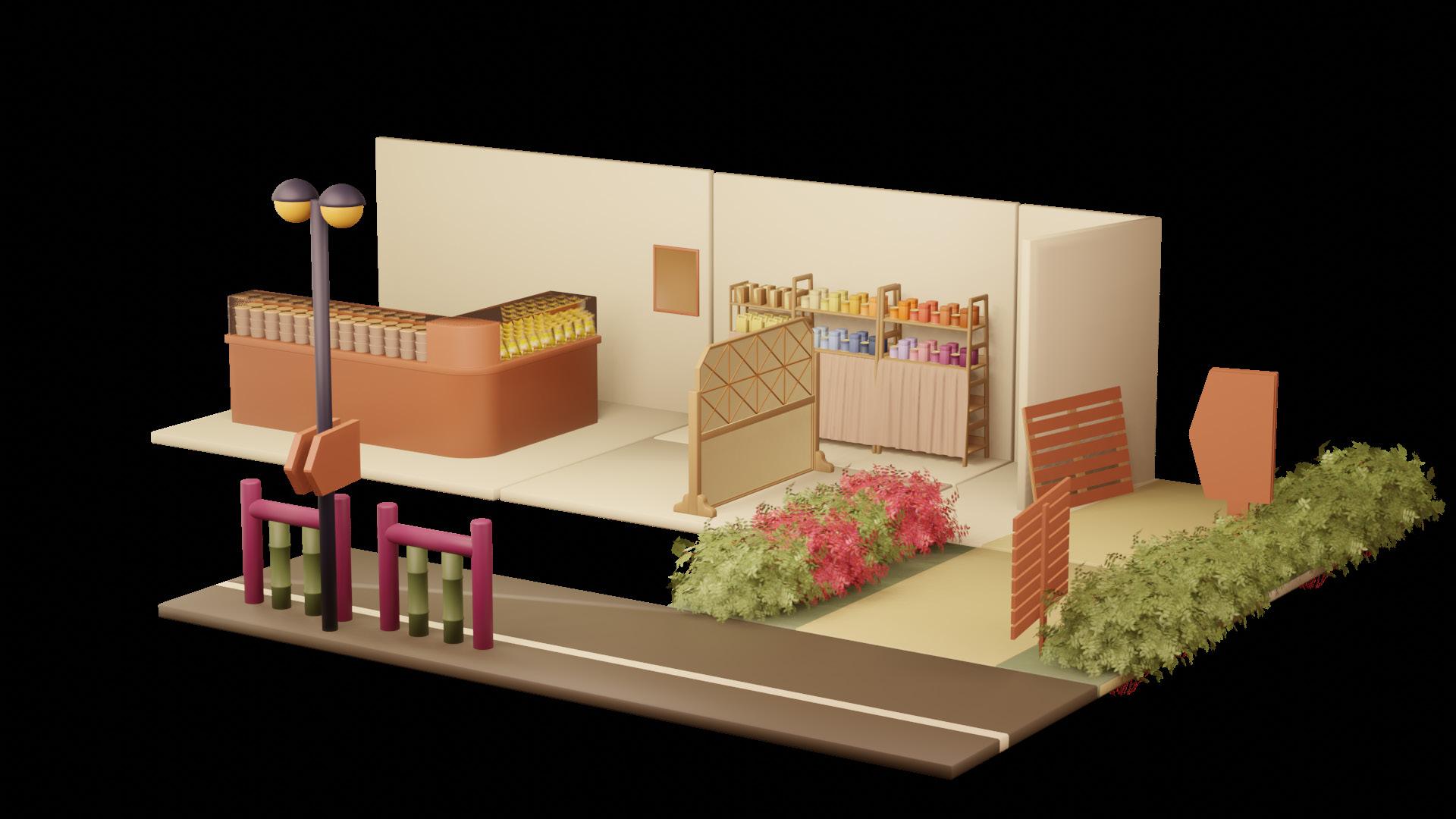
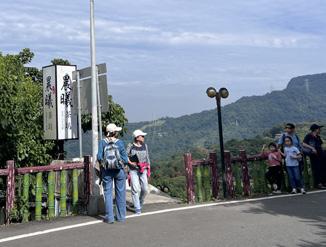
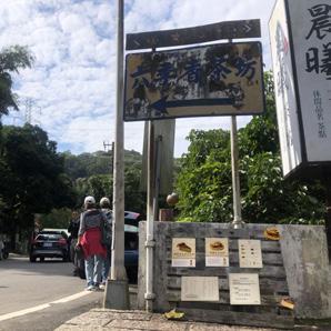
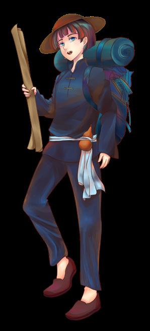
Tea House Design Background
The preliminary research included two surveys: "Modern Views on Maokong and Tea Culture" and "Customer Experience at Morning Sun Tea House."
The surveys aimed to gather insights on tea perceptions and customer experiences. Distributed via Facebook tea groups, friends, and past customers, the five-day survey collected 104 valid responses.
Service Development Goals
The goal is to design services that bridge communication gaps and provide a seamless tea experience with minimal staff. This includes redesigning the menu, product displays, and flow, while co-creating solutions with customers to address staffing shortages.
Service Current Status Analysis
Service Browsing and Survey Analysis
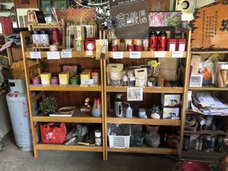
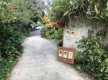
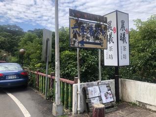
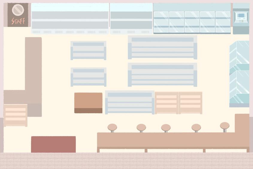
Chen Xi tea house was operated by the fourth-generation descendant of Mu Zha Tie Guan Yin, offers on-site tea tasting, tea events, and tea products. The space features a semi-open indoor and outdoor tea area, with some exclusive activities known only to regular customers through word of mouth.
Services Tea tasting/ Cold tea
Products User thoughts Advantages Disadvantages
16 types of homegrown tea leaves/ Baozhong tea
Bring your own tea Tea desserts/ products
None
You can take any leftover tea leaves home. Offering high-quality tea in low prices. Hard to identify tea if take leftover tea home.
Enjoying the environment, bringing tea, and food. Compared to other stores, the prices are low. The store is a open space with mosquitoes in the summer.
Choosing signature meals and tea of Maokong. Affordable pricing, using local tea.
Listen and follow the tea brewing instructions (images/text).
Teaching brew tea, allowing them to brew and enjoy their tea.
Desserts are homemade by owner, no time to make.
Each brewing step has different versions and incorrect.
Participate in activities and taste tea to learn about tea culture. Free tea service and opportunities to learn about tea culture. Customers learn about the place through word of mouth.
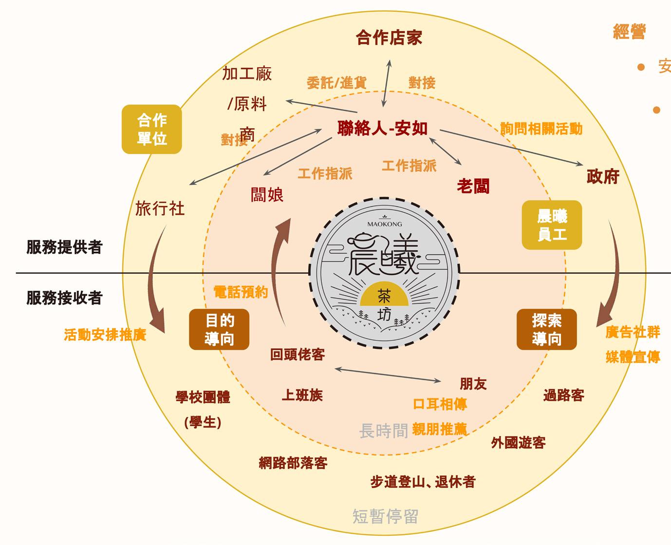
Stakeholder Diagram
The store runs with a small team of three, handling tasks through collaboration and delegation. With many partners and a large customer base, communication and coordination are often challenging. Staff shortages make it difficult to manage the high volume of customers.
Business Strategy
The strategy focused on repeat customers and word-of-mouth, retaining clients but failing to attract new ones.
Primary clientele
Repeat customers
Relies on word-ofmouth for promotion and marketing Attracts customers with low prices and high quality
Service Gap
Service Blueprint
Customer interviews and observations identified service gaps, highlighting issues in communication and customer management, with interviews explaining the causes.
Customer Journey
Line of Interaction
Frontstage
Line of Visibility
Backstage Actions
Support Processes
Many customers lack knowledge of the history and culture: Chengxi Tea House, run by the fourthgeneration descendant of the Tie Guan Yin founder, struggles to attract customers unfamiliar with tea, while tea connoisseurs prefer gifting from century-old, renowned tea shops.
Language barriers with foreign tourists: Maokong's popularity often leads to communication issues.
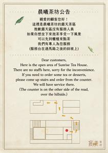
Staff shortages and inconsistent service: Without reservations, homemade desserts and tea-tasting activities are unavailable.
The menu is unclear: Customers aren't aware they can take leftover tea home or that some teas are homegrown. Information gaps and complex service: Inconsistent details and complicated brewing steps make it hard for customers to learn quickly.
Limited visibility: Staff shortages leave no time for managing social media.
Inconsistent communication: Despite having a Facebook page and event collaborations, the owner's focus on operations leads to missed promotional opportunities.
Service Design Solutions
By designing services for both stores and customers, we reduce communication gaps and offer a seamless tea-tasting experience with minimal manpower.
Problem Definition
How can we help Chenxi Tea House maximize resources, improve service, and enhance the group visitor experience with limited manpower?
Customer Segments - Three Types
Survey and interview insights show that return visitors come for the friendly service and scenic views, seeking relaxation.
Business Model
Analysis
New vs. Value
Proposition: Targeting spontaneous Maokong visitors to expand the customer base, building on the loyalty of existing customers.
Key Partnerships
Tea snack suppliers
Dessert raw material manufacturers
Other tea restaurants
Tea pickers
Food processing factories
Muzha farmers
Customers
Key Activities
Produce and sell tea products
Manage tea environment
Host group activities
Establish standard services
Involve customers in service process
Key Resources
Tea leaves/Dessert materials and food processing
Marketing channels
Workforce (relatives, customers)
Visiting without a specific purpose
Walk past the store along the trail, with some visitors being foreign tourists
Take Maokong Gondola and discover the location via Google (1/3 are local visitors)
20-30 years old 20-30 years old
Learn about tea and tea-brewing culture
Enjoying beautiful scenery and private spaces for relaxation and entertainment
Information delivery takes too long
Difficulty in fully understanding the provided information
Poor communication with the store
Services not meeting customer expectations
Value Propositions
Allowing customers to enjoy quality tea at the lowest price
Becoming a "third space" for tea appreciation
Providing a seamless customer experience with minimal staff
Customer Relationships
Facebook fan page
Instagram
Google Maps
Channels
Physical store
Shopee online shop
Professional farmers’ association
Visiting with a clear purpose
Bring new customers through outings with family/ friends (2/3 are local visitors)
35-40-year-old couples/ their parents, and elderly individuals aged 70-80
High-quality tea/having a spacious environment to chat with friends and family
Service information gaps leading to confusion
Negative experiences during return visits
Customer Segments
Returning customers with a clear purpose
Potential customers or walk-in visitors passing by Chenxi
Cost Structure Revenue Streams
Tea leaves from other farmers
Dessert raw materials
Food processing
Fertilizer for the tea plantation
*The added value is highlighted in yellow
Tea pickers' wages
Printing costs (service information pages, menus, promotional flyers, etc.)
Homegrown tea leaves
Tea leaves from other farmers
Tea desserts
Tea-related activities (tea oil, tea sugar)
Experience activities and tea tasting
Walk-in customer sales
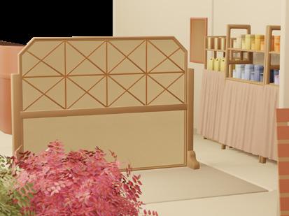
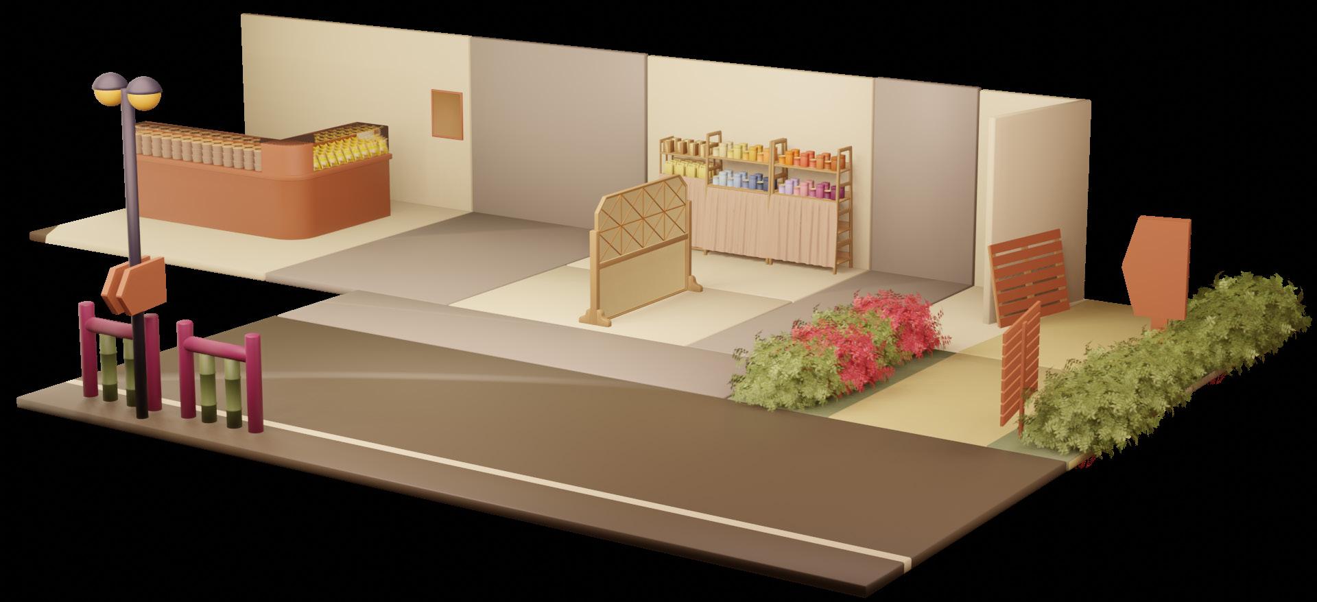
Gap Solution - Creating a Memorable Brand Image
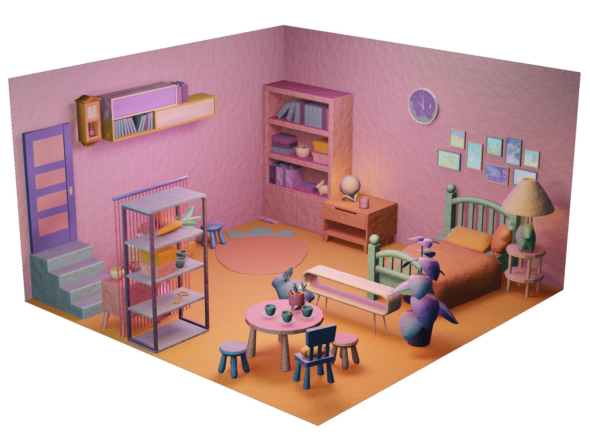
Based on interviews, customers associate Chen Xi Tea House with comfort, relaxation, and warmth. To reflect this, the space will be designed with a 'homely' feel, focusing on atmosphere rather than elaborate decor.
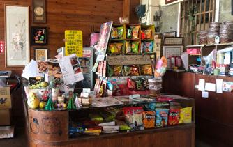
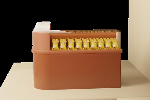
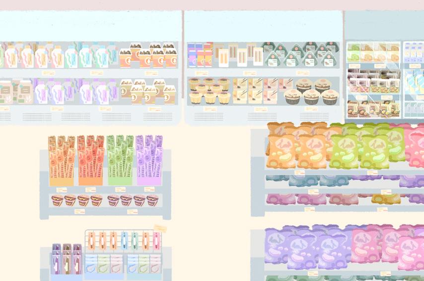
Checkout Counter Display 1
Product info. disorganized.
Difficulty accessing products.
Uncertain whether products behind counter were accessible.
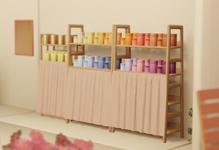
Product Display / Screen Information 2
Excessive variations in product packaging. Weak brand consistency.
Messy on display shelves.
Items blocked products and information.
Improved visual flow to help customers locate products more easily.
Simplified and removed unnecessary items for a cleaner presentation.
Reorganized packaging design, aligning with different tea varieties.
Rearranged entrance items and placed info. display in prominent areas.
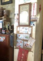
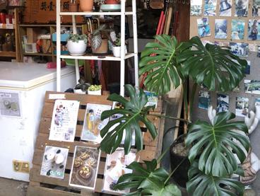
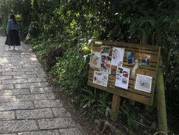
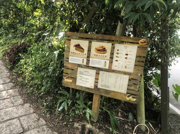
Signs and Wayfinding 3
Updated and organized outdoor promotional boards. Provided tea area route map, placing it at entrances and exits. Notices and Information Display 4
*Mainly responsible for hardware setup, simulation, and some graphic layout and design.
the presentation of outdoor and trail signage for clarity.
Customers
Added a signboard at the outdoor tea area entrance.
Trail view caused customers to miss the store.
Installed a directional sign at the entrance to guide visitors.
Info. about outdoor tea area was unclear.
couldn't identify outdoor tea area.
Boards were placed indoors but obscured. Trailside signage appeared cluttered.
Moved indoor boards to more visible locations. Adjusted
Space planning and key indicators address customer pain points, aligning with their needs through targeted design solutions.
Points
Alignment Benefits of Implementing Service Design for Chen Xi Tea House
Design Background
As technology advances, people have become accustomed to keeping digital records. Data shows that the internet is the most common tool for documenting daily life. With the growth of social media, people use it to stay connected and share their experiences.
Compared to physical photo albums, cloud albums save space and make sharing easier, gradually becoming a popular storage option. With high demand and limited time, users face the challenge of quickly finding and organizing their photos efficiently.
Research Goals
To understand user needs in cloud albums, this study explores the usability of mobile cloud album interfaces using the service design process. It identifies service gaps from a preliminary experiment and develops design concepts to address them. After validation, the study will propose improvements and recommendations.
Global Population Uses Social Media Social Media Users Main Reason For Using Makes up 60% 4.8 billion people
Stay connected with family/friends
User Needs Gap Design Service Improvement Usability
Current Status Analysis
Literature Review
Based on literature on cloud albums and photo management behavior, the following key points have been summarized: Cloud Album
User expects to achieve their goals in a shorter time, focusing on connecting with others
User is able to save time on complex services that are timeconsuming and involve complicated, repetitive steps
Understand the user's needed features and behaviors
Pilot Testing
To study the service gaps in existing sample applications, a design research method was used for sample testing. 30 testers were selected to test three sample applications, and the conclusions are summarized below.
Experiment Introduction
Participant Information Form
Start of Experiment
Task Introduction & Execution
Questionnaire
Semi-Structured Interview & Feedback
Explore User Habits and Motivations for Using Cloud Albums
Photo management behavior
Explain the basic principles and key elements of cloud albums
Experiment Process
User
User Interface
Provide users with a good interface experience
Analyze using interface design principles and usability evaluation methods
Identify service gaps
Service Design
Theoretical Framework Diagram
Use scales to quantify user experience data and interviews to understand qualitative insights
Photo Organization: Most users do not have a habit of organizing photos and only use manual tools when storage is full. Showing both uploaded and non-uploaded files in the cloud can be confusing.
May 1
Albums and Tags: Users find it troublesome to set aside time for categorizing photos. Users prefer simple and fast categorization methods, such as adding photos to "Favorites."
Search Panel: Users think keyword searches rely on system recognition. They mainly find photos by scrolling through the screen or searching by date and relative position. Some also recall photos based on previous messages sent in other apps.
Cloud Album
Customer Journey Maps
Allow
Based on the customer journey map, new or improved features are designed to address service gaps and enhance the user experience.
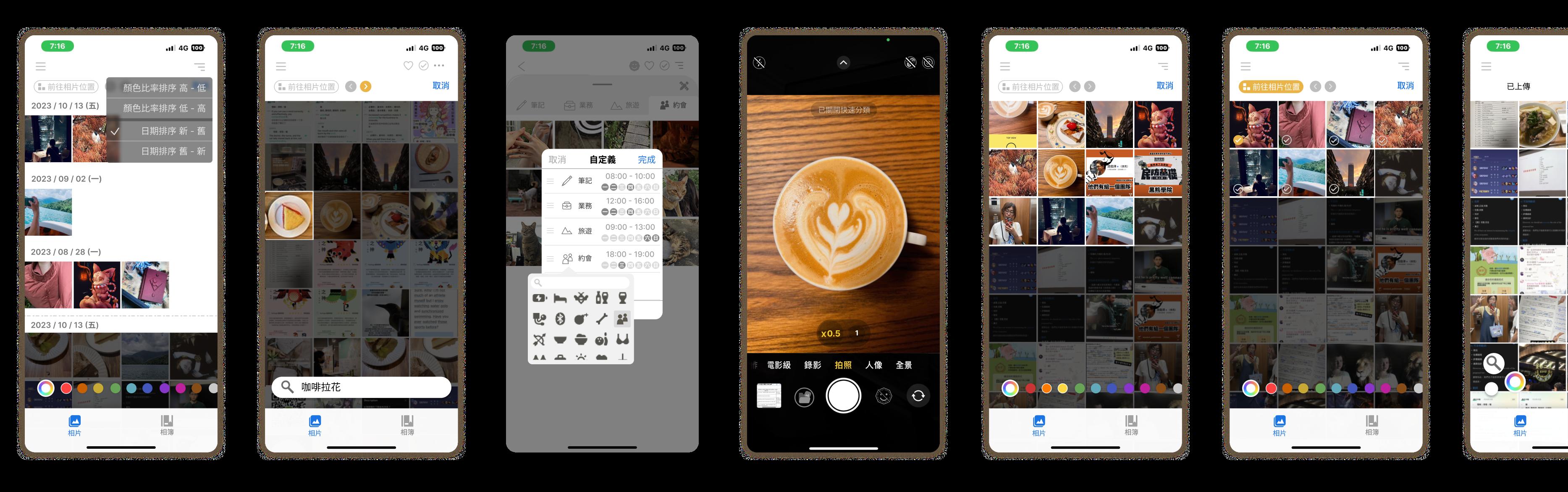
※ Based on the design foundations of the Apple Camera App and Google Album, this study focuses on the design and improvement of features, excluding the overall application design.
Auto Recycle
Allows users to quickly mark unwanted photos for deletion right after taking them. Ex. menu, notes.
Custom Mode
Enables users to define their own categories and choose a folder before taking photos.
Combine feature in album.
Features in camera
Go to Photo (improved)
Integrates the existing function with search features and relocates the button to a more visible spot.
Can be combined with other features).
Color Search
Allows users to filter photos based on color memory, sorting results by color saturation.
Image-Based Search (improved)
Finds photos with similar shapes, themes, or color patterns using an existing photo as a reference.
Validation Experiment
Consistent with the existing data analysis, after the prototype was completed, 51 participants were invited to participate in the experiment and complete an experience evaluation scale.
Conclusion and Recommendations
This study explores gaps functionalities and user experience challenges in the usage process and evaluates whether the improved design enhances the overall service experience. The findings aim to improve user interaction and serve as a reference for future cloud album application development.
Prototype Problem Definition
Persona Customer Journey Maps
Prototype Design
Task-analysis Interview Questionnaire
Interview Feedback
Validation Experiment Framework
Enhancing Organization Motivation: Encourage users to pre-sort photos upon adding them to facilitate easier retrieval later.
Customizable Feature Options: Since user habits vary, features should be adaptable to personal preferences for tailored experience.
Exploring Service Gaps for Different User Groups: The study focuses primarily on younger users, while cloud albums cater to a wide range of age groups with different needs. 25+
Photo Recognition & Image Cognition: Users perceive photos differently based on color and focal objects. Analyze user habits and cognitive patterns to refine information retrieval.
Real-World Testing for New Features: Current usability tests occur in controlled environments, failing to replicate real-life distractions.
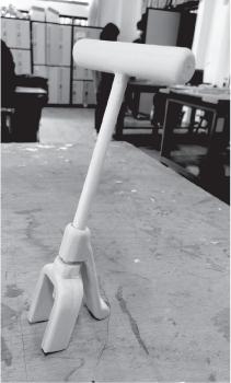
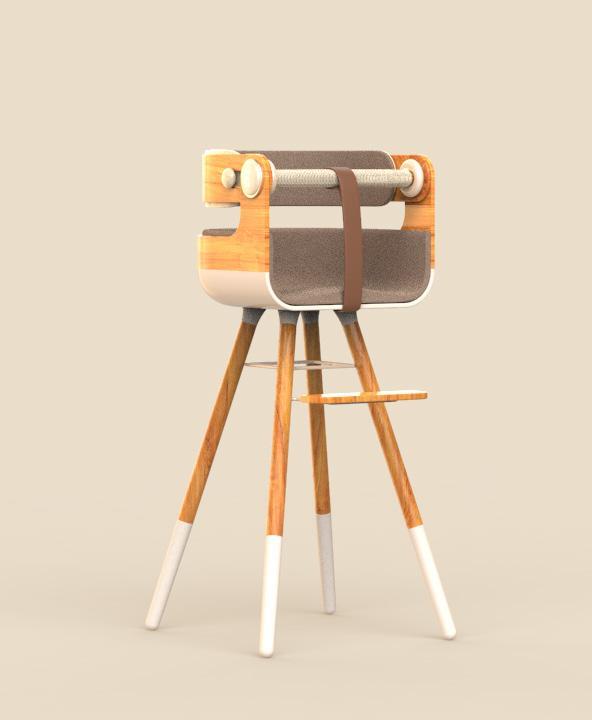
Chair|
Team Members: 2 Designers
Personal Contribution: Research Product Design (Style/Logo) Prototyping
Industrail Design
Design Background
As environmental awareness rises, many products are essential in every household. If these items could accompany us from childhood to adulthood, adapting their forms and functions over time, could they bring further benefits to a sustainable society?
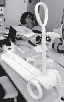
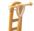
Environmental Sustainable Modular |Go Go Car|
yodex Industry - Academia Cooperation Silver award
Design Guidelines Target Audience
By incorporating circular design, the goal is to use modularity to enhance product functionality, addressing the needs of different age groups and extending the product’s lifecycle to achieve sustainability and continuous reuse.
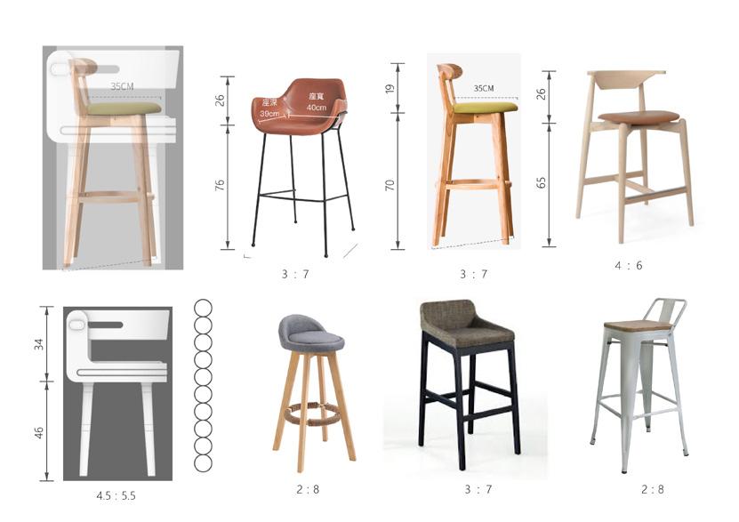
Competitive Product Analysis - Needs Table
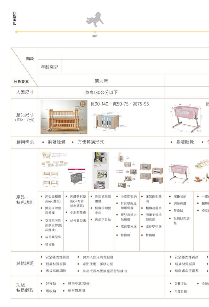
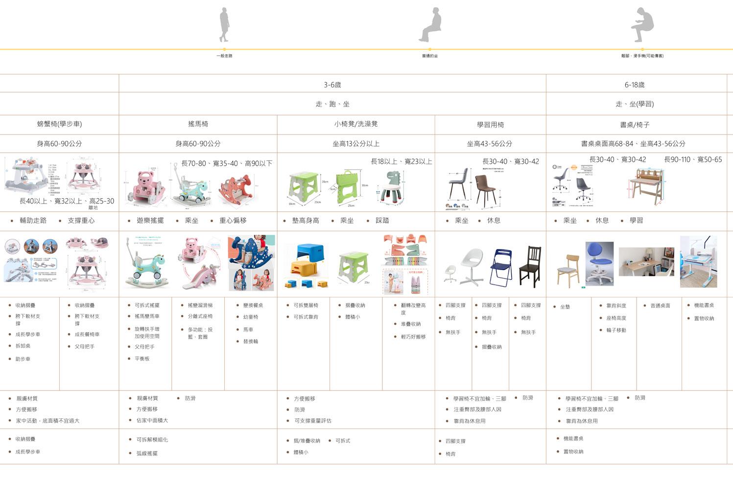
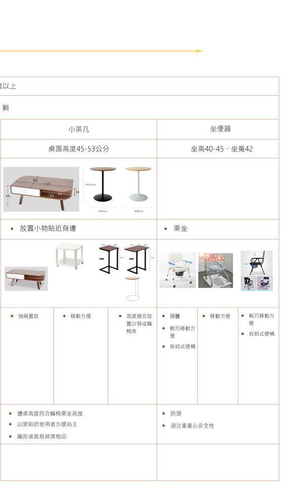
The preliminary research included a competitive product analysis, organizing information into six age groups. The content covers:
Needs of each age group
Ergonomics and product dimensions
Usage requirements
Key product features and functions
Based on the above points, a product comparison and demand analysis were conducted to align with user needs and enable targeted design.
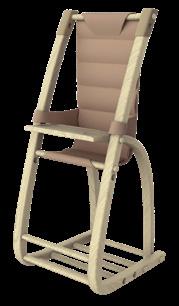
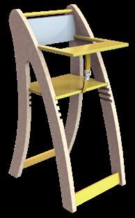
The product is designed for children, focusing on growth and long-term use, with adaptable features to meet the needs of different life stages and users.
Needs Table (Key Highlights)
Design Concept
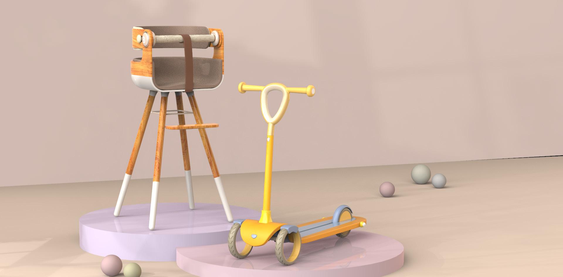
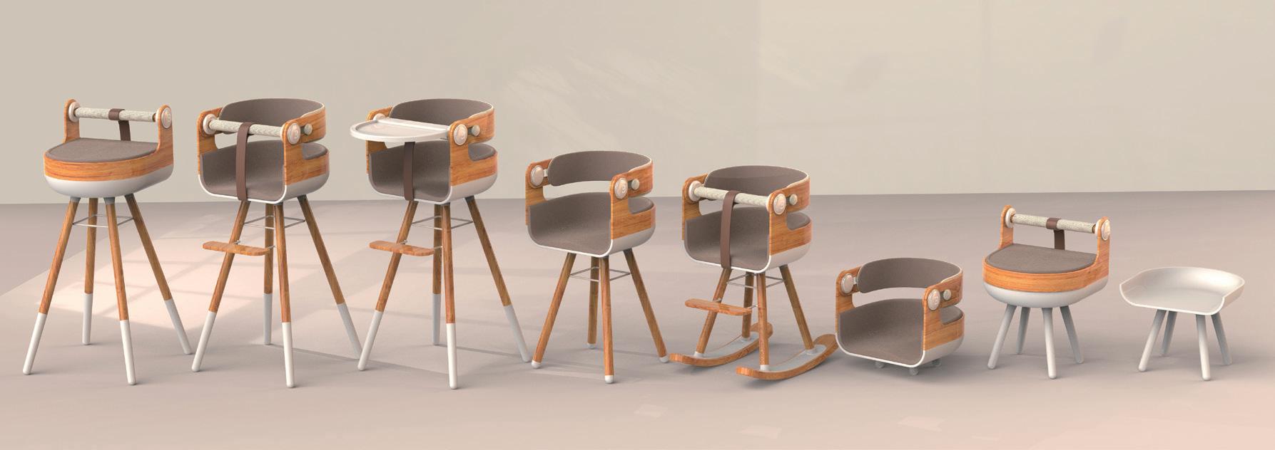
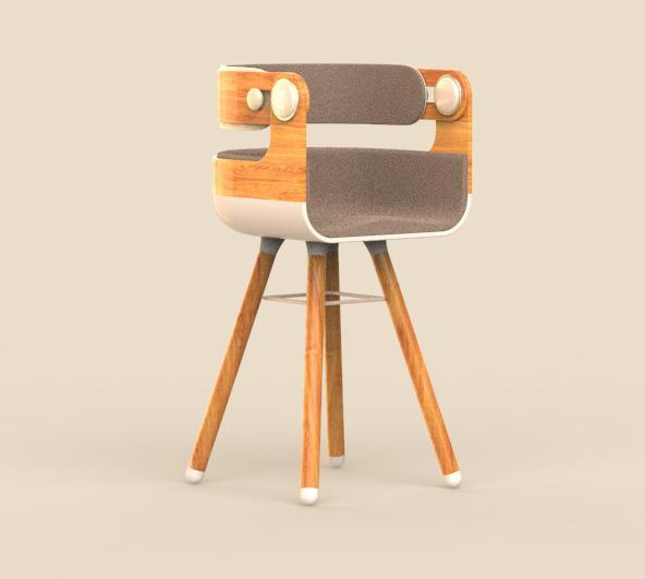
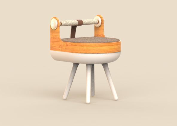
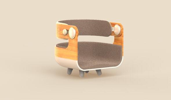
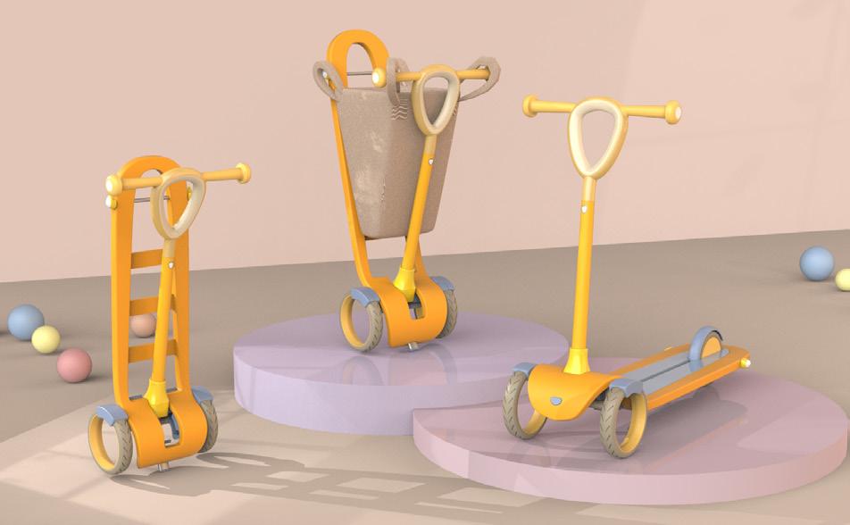
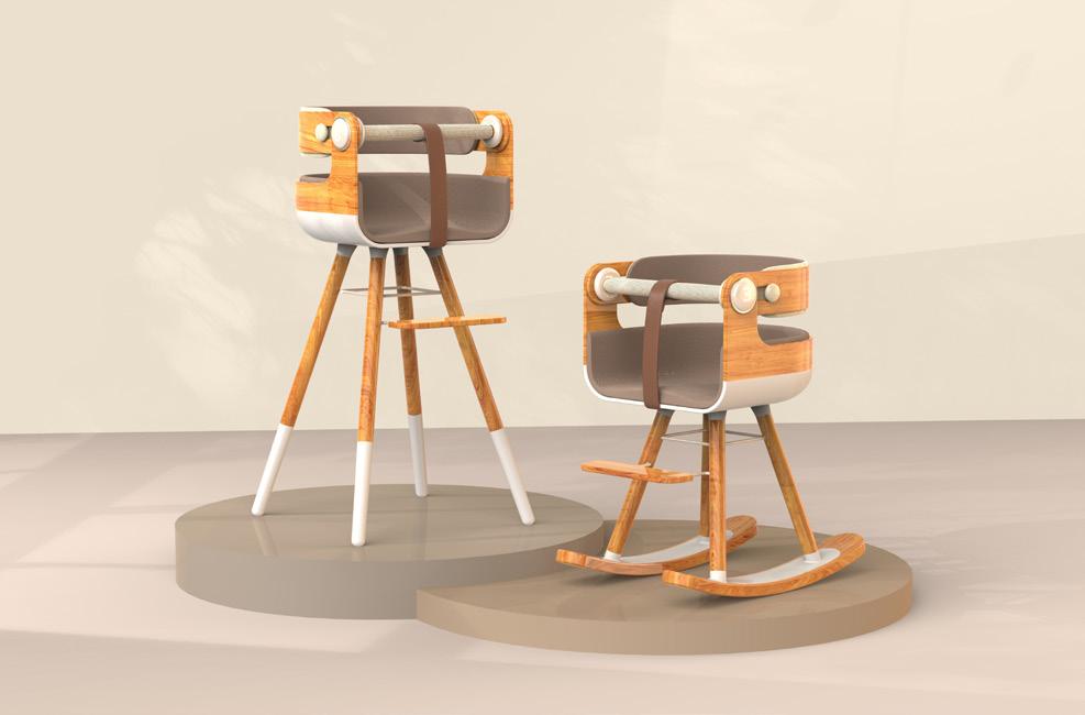
The product is designed for children, focusing on growth and long-term use. Through modular components, it adapts to different life stages, making it a sustainable home item.
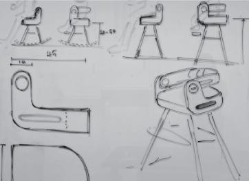
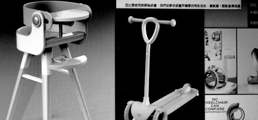
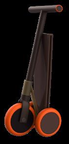
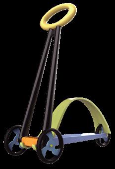
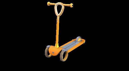
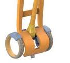
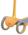
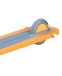
From a high chair for children to a learning chair, rocking chair, stroller, scooter, and shopping cart, the product’s modular design allows users to repurpose it as they grow, ensuring continued use without waste.
Research and Compare
Starting with everyday items, the focus is on integrating products and functions.
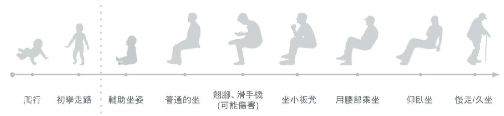
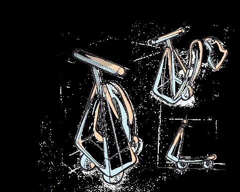
By selecting essentials from food, clothing, shelter, and transportation, the goal is to develop new product concepts. Human Sitting Posture Evolution Chart
Analysis Elements
Human Factors
Crib/Cradle
Functions/ Needs
Lying, sitting, crawling, walking/running
Rounded edges to prevent bumps
Comfort Function
Extraction
Reasons for Function
Extraction
Ample range of motion, skin-friendly materials
Lying, sitting, movable, foldable
Sitting
Resting
Space-saving
Walking, running, learning
Anti-slip mechanism
Skin-friendly materials, leg bending support
Sitting, interacting, playing
Sitting, learning
Restricted backrest reclining angle for chairs
Focus on lumbar and hip support
Sitting, adjustable height Seat firmness/angle
Height growth
Comfort
Resting
Sitting, working, resting
Durability and structural stability
Comfortable and breathable materials
Sitting, reclined sitting
Resting
Upright sitting (learning)
Age Definition and Need Integration
Stability to prevent falls in elderly users
Prolonged sitting, prolonged lying, walking leisurely Added leverage points for easier standing up
Armrest assistance, seat firmness/seating angle
Relaxation
Lying
Prolonged sitting
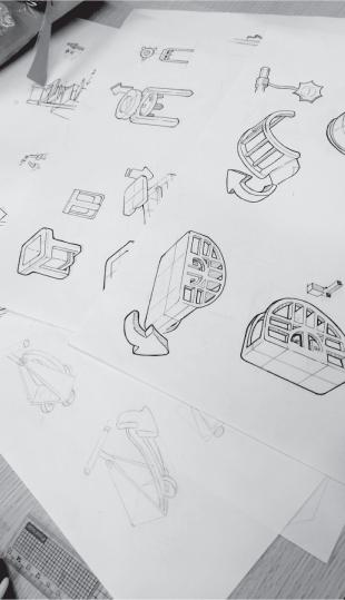
Design Development
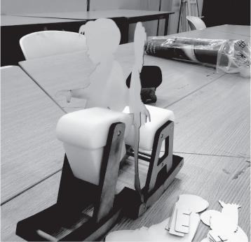
Analyze the sitting posture of users at different age stages, then use existing products to plan the shape, adjust proportions, and measure dimensions to create models and prototypes.
Adjusting the proportions of existing products and integrating the development of both products.
of basic functions Shaping Feasibility integration
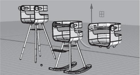
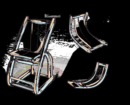
CB Chair
Sketches
Confirmation
Convert Form
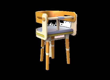
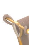
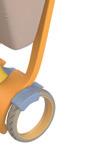
The CB Chair is a modular design with over eight configurations. It adapts as children grow, offering adjustable legs for height, removable backrests, and adjustable seat width, ensuring long-term use.
The Go Go Car offers flexible functionality with detachable parts. Pedals can be folded or added, along with a shopping bag, for customizable use.
Logo Design
The concept merges the ideas of chairs and cars. The name "CB" comes from the emphasized letters in "Combine," paired with the "∞" symbol to represent sustainability and infinite use, conveying adaptability.
The initial focus was on letters To experiment with wireless symbols Final Logo
Exhibition Reflection
This work participated in two exhibitions. The model's scale was slightly larger than expected, and the color scheme was not quite ideal.
Many visitors felt that the scooter's color did not need to lean towards a childlike palette, and the chair did not necessarily need to feature a wood grain design.
It may be because the proportions and dimensions of the shape in the model construction did not accurately reflect the real-life scale. Although the model's features and details were confirmed to be correct, there were many challenges during the model-making process.
VR Game Design
Design Background
By blending three unique gravity mechanics with a beloved fairy tale, this virtual reality adventure offers a surreal yet tangible journey into the fantastical.
Design Concept
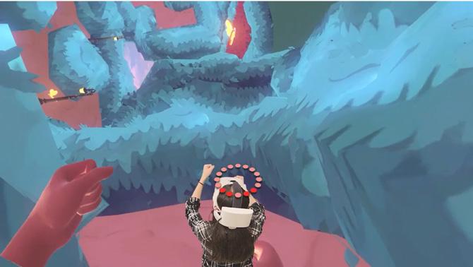
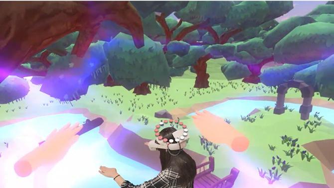
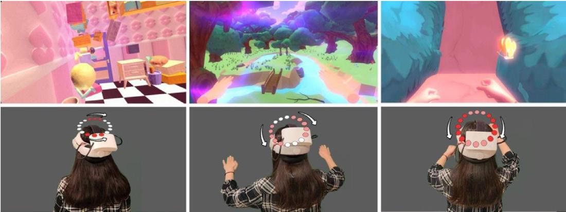
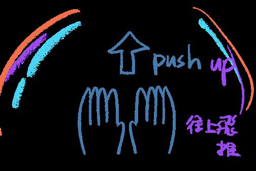
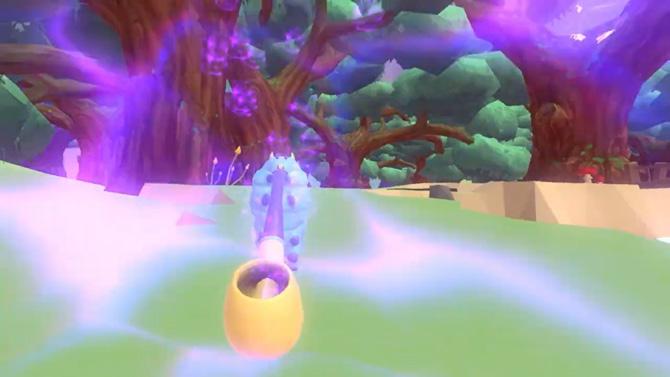
Experience gravity in new ways with gesture controls: changing gravity direction, floating in the air, and walking on walls, all while solving puzzles for an immersive adventure.
Game Features
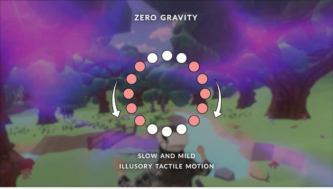
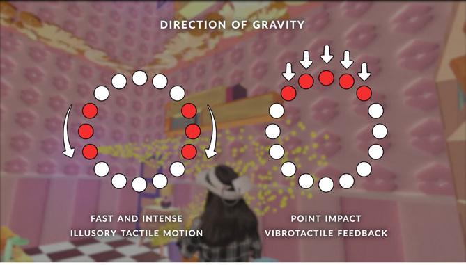
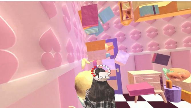
Visual Experience: Players can experience three types of gravity visuals within the world, interact using natural gestures, and explore the story narrative throughout the environment.
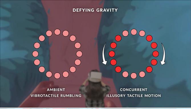
Head Haptic Feedback Mechanism: To address the issue of motion sickness in virtual reality, when players experience in-game movement or angle shifts, the headband's vibration motors activate at corresponding points to reduce dizziness.
Game Play
The game is a single-player exploration and puzzle-solving gravity experience. Players use gesture recognition to control gravity shifts and movements, divided into four functions:
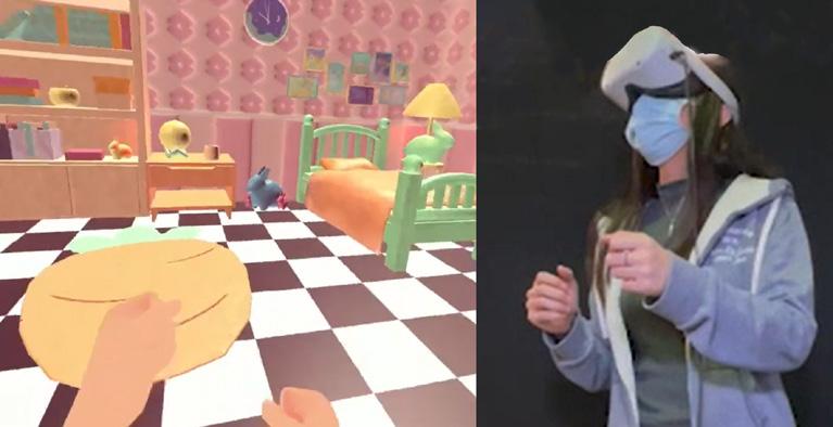
Basic Movement: Swing your hands in front of you to simulate a walking gesture.
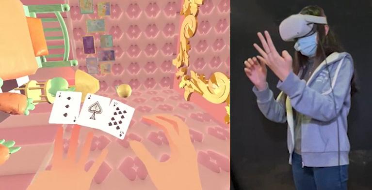
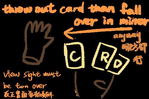
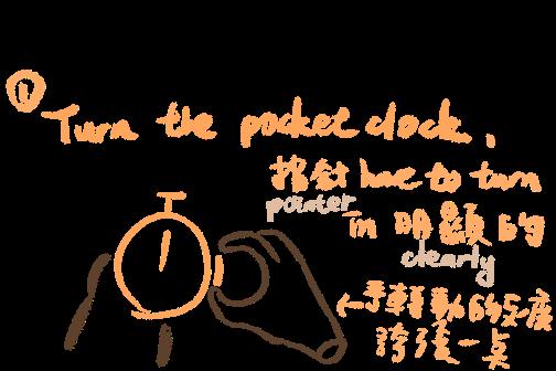
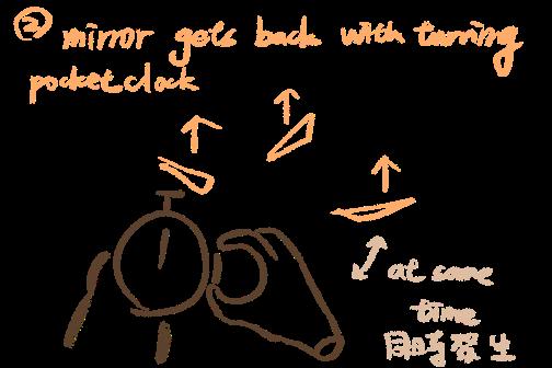
Gravity Shift: Use "playing cards" by making a number 4 gesture with your left hand to display the card, then pick it up with your right hand and release it into the air to activate.
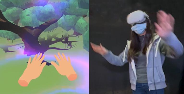
Floating Motion: Use a breaststroke hand gesture to move forward.
Story Overview
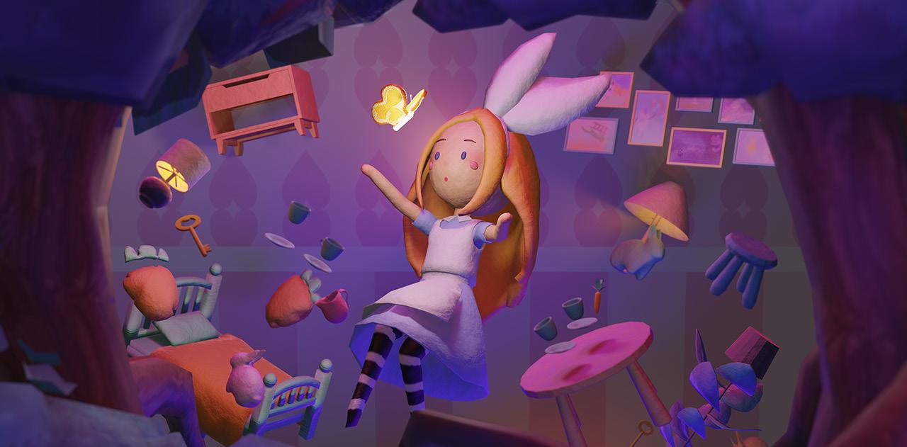
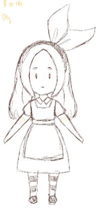
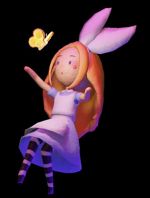
Inspired by the classic story Alice in Wonderland, the game immerses players in environments that reflect the character's emotions, allowing the storyline to unfold freely as players complete exploratory tasks.
Vibration Motor
Position Diagram
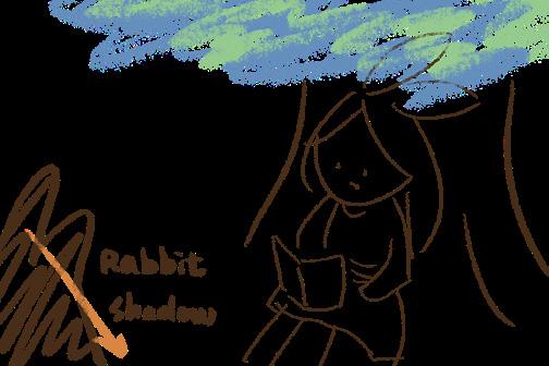
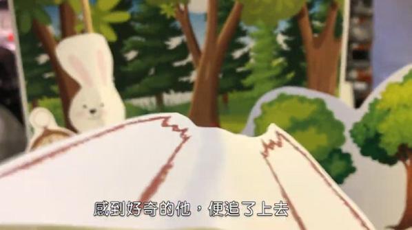
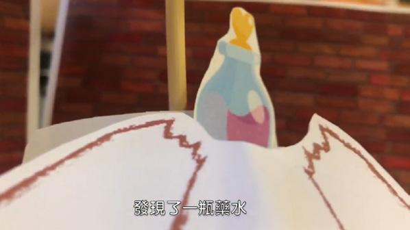
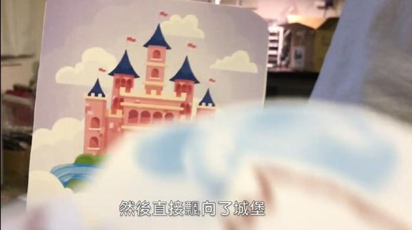
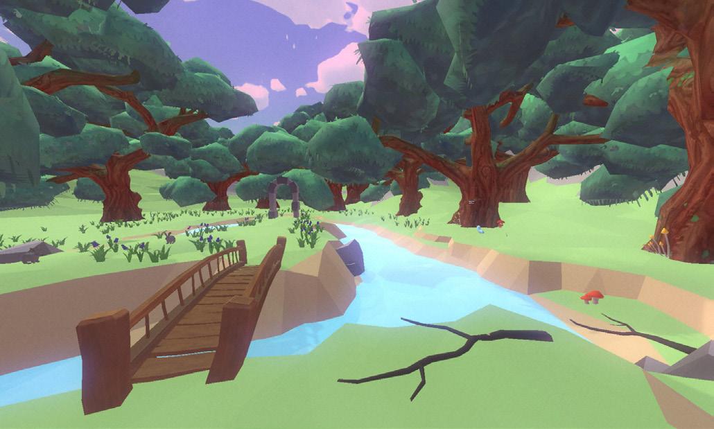
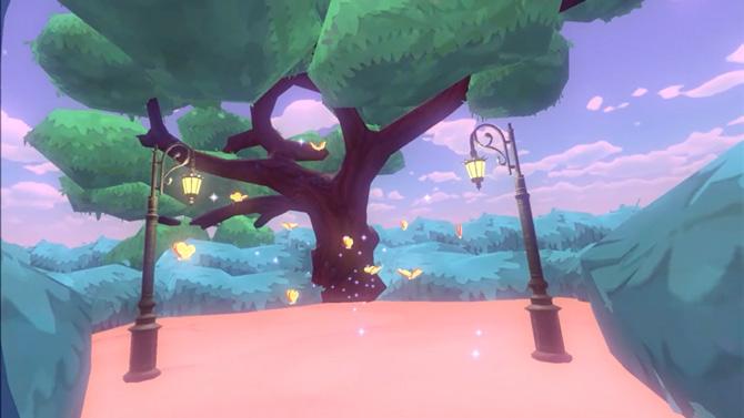
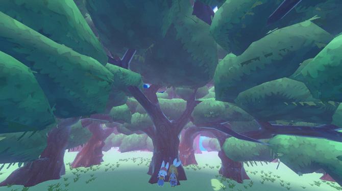
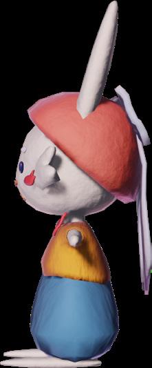
The player begins by waking up in a dreamlike forest and is lured by a jumping rabbit.
Following the rabbit, player falls into a tree hole. To return home, the player must explore the world and find the way back.
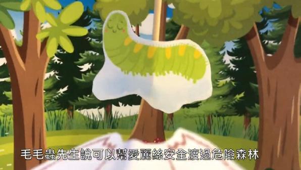
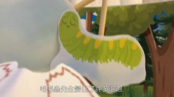
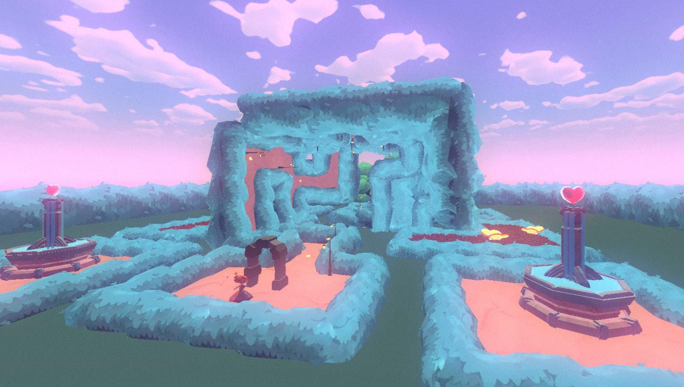
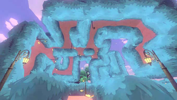
There are three scenes to navigate: the Rabbit Hole, the Caterpillar Forest, and the Maze Garden. Each scene features unique gravity challenges, with a total of three levels.
After exploring all three scenes, the player will awaken back in the original forest.
Customer Journey Maps
Beginning:
Change gravity direction
Enter the tree hole
Forest
Change gravity direction Float
Find the cookies Rabbit Hole
Enter the tree hole
Back to forest
Walk on walls
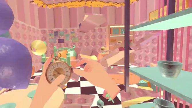
Find the cards Find the pocket watch
Enter the small door
Caterpillar Forest
Walk on walls Enter the gate
Maze Garden
Find the mushroom
Players acclimate to the world, following the rabbit into a mysterious cave.
The main storyline unfolds, drawing players into a subjective, immersive narrative that piques their curiosity.
The goal shifts to escaping the world, creating a sense of urgency and excitement as players prepare to leave.
Players return to the opening scene, reflecting on their experience.
Forest
Rabbit Hole
Caterpillar Forest Maze Garden
(None)
(None)
It's primarily used for visual guidance in scene design. We start with simple 2D storyboards to outline the story sequences. Then, we create basic mock-ups with cardboard to simulate the player's view through VR headset.
Level Design
The game consists of three levels, with the main puzzle-solving taking place in the Rabbit's Room. Each level offers a unique gravitational visual experience for players to explore.
Rabbit Hole: Experience gravity shifts, exploration, and puzzle-solving.
Caterpillar Forest: Follow the caterpillar's animation as it guides you through drifting bubbles.
Maze Garden: Escape the maze with a visual experience of walking along the walls.
Game Art Design
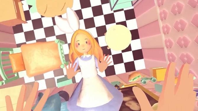
Using clay combine realistic materials create a visual experience that transitions from reality to a dreamlike adventure. In the Rabbit Hole, most objects are crafted from clay.
As the player moves through the Caterpillar Forest and Maze Garden, the clay elements gradually fade, replaced by familiar objects the player has encountered before. This creates a sense of déjà vu for the player, gradually leading them back to the world.
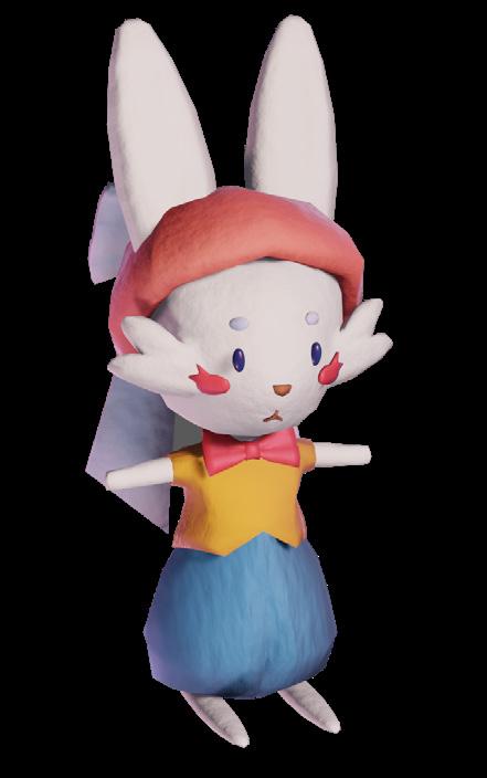
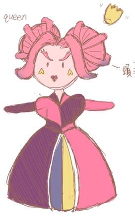
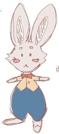
The characters selected for the game include the iconic Alice (the player), the Rabbit (story progression), and the Queen (antagonist), based on their significance in the original story. The design uses complementary colors to create a cohesive overall aesthetic.
Scene and Character Design
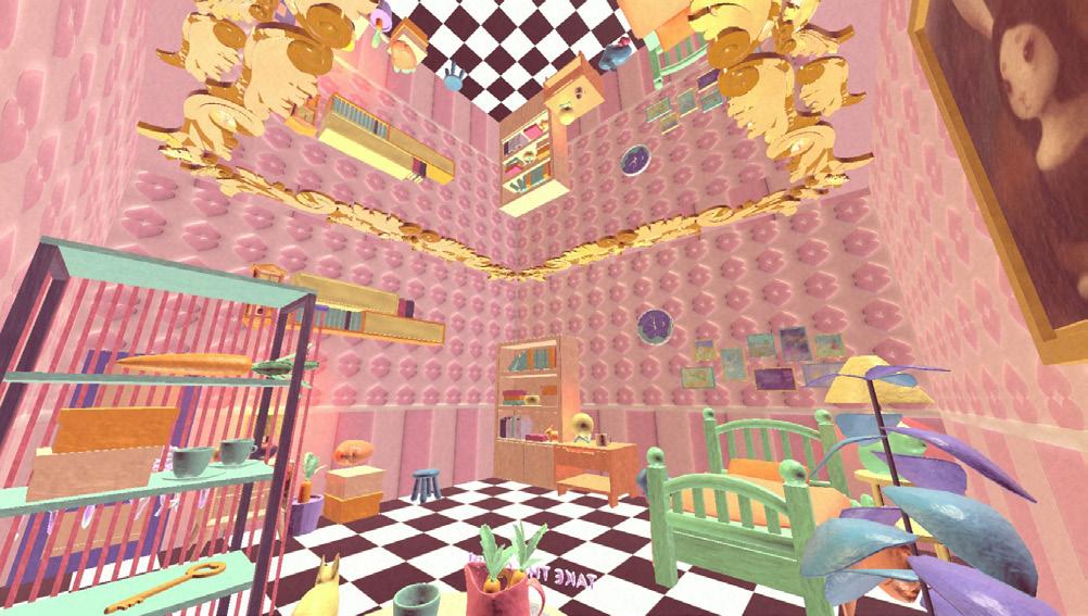
The main scene created is the Rabbit's Room, enhanced with images from the original story to add narrative depth. The scene uses vibrant, eye-catching colors to present a dreamlike, surreal world, reinforcing the fantastical and whimsical atmosphere of the game.
Mirrors are used as key elements in the room's puzzles, not only enriching the visual experience for players but also blurring the boundaries between the real world and the surreal, distorted mirror world.
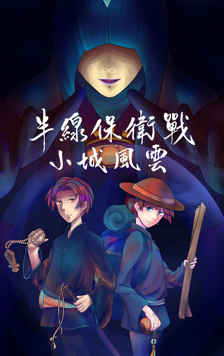
Team Members: Team of 5% Design Action in Changhua Personal Contribution:
Reality Puzzle Game
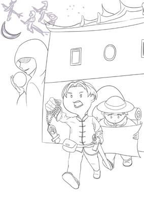
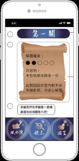
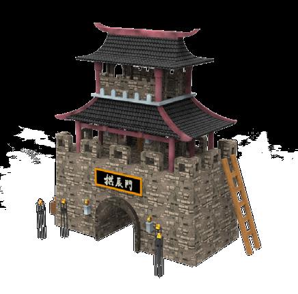
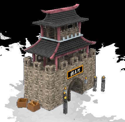
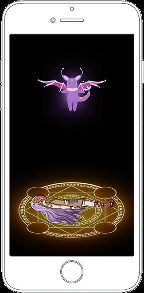
For Changhua County's 300th anniversary, a gamified experience combines its historic temples and city gates with a chatbot guide, enabling participants to explore and appreciate Changhua City’s cultural heritage interactively. Design Background
Logo and Icons Physical Props and Design Content
The logo design combines the character "化" from Changhua with temple imagery. The color scheme centers on the red of temples, complemented by icons corresponding to different game levels.
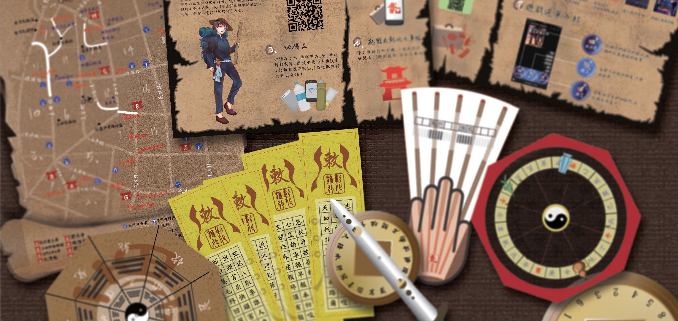
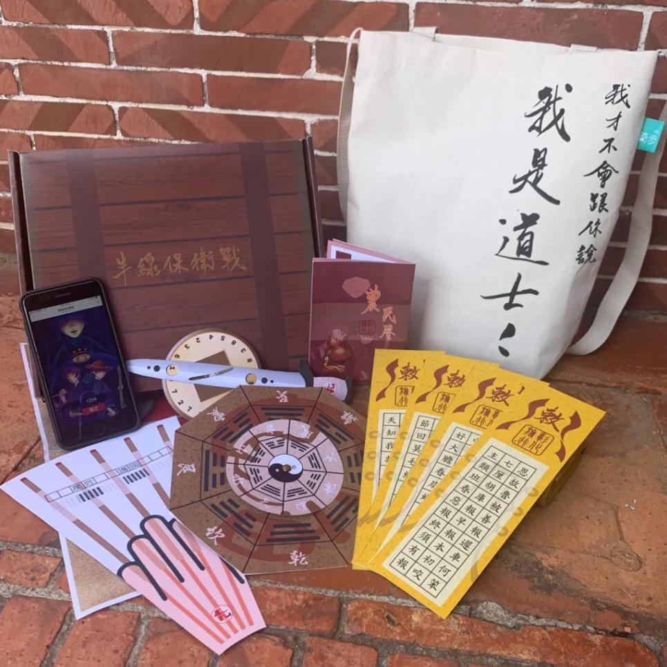
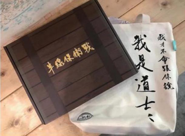
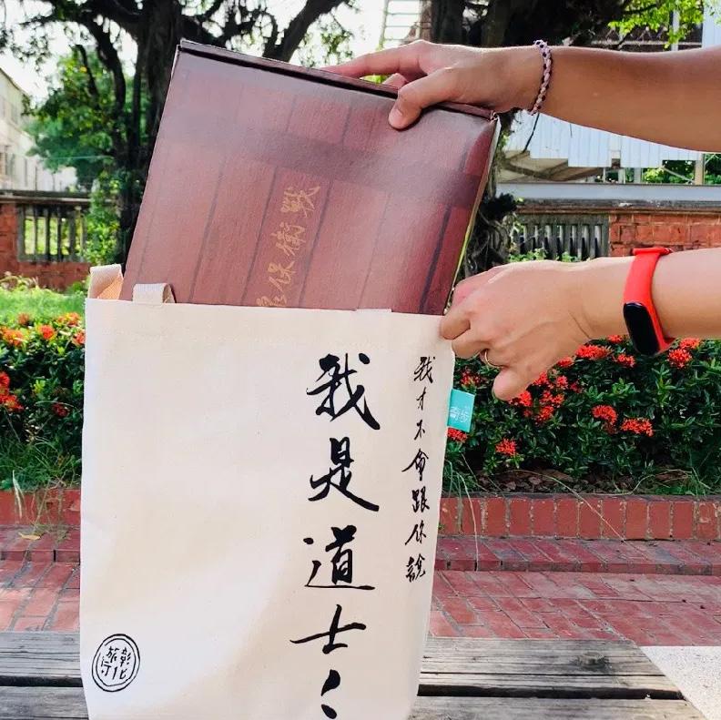
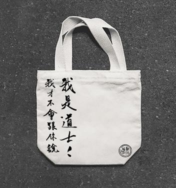
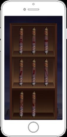
Through previous research, it was found that a common issue during immersive puzzle games is not knowing how to store the props. The design of the physical props allows all items to be stored in a canvas bag. After the game is finished, the props can be taken out, and the canvas bag can be used.
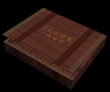
The outer packaging is designed in the form of a wooden box to emphasize the sense of concealment for the Eastern-style props.
M90 Y80
C40 M100 Y100 K10
Drafts
Incense Burner
Red Lantern City Gate
Double Swords
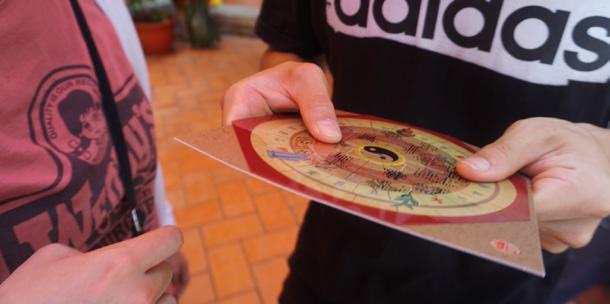
Fortune Tube Ba Zi Plate Talisman
Qinglong
Command
Game Art Design
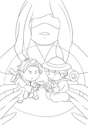
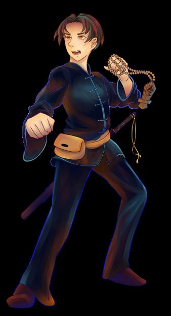
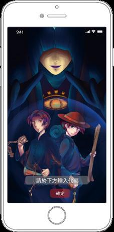
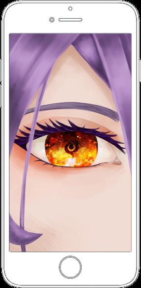
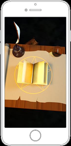
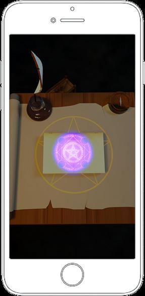
The main storyline centers around an Eastern Taoist battling against the Western magical world. The puzzle-solving physical props showcase Eastern-style artifacts, with the character and object designs using darker tones to reflect the mysterious and ominous atmosphere.
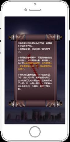
Intro Video
The animation is designed to be approximately thirty seconds long, with a focus on briefly describing the story and quickly immersing the player into the narrative.
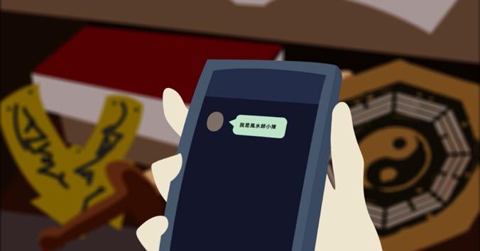
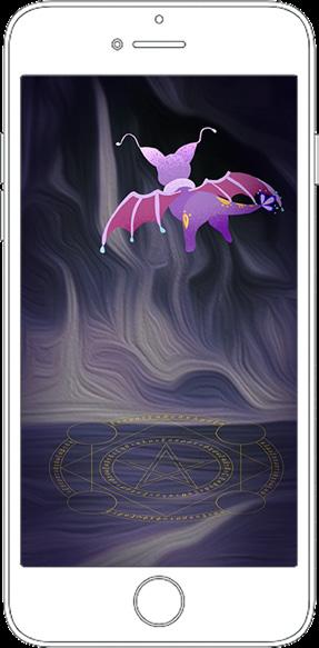
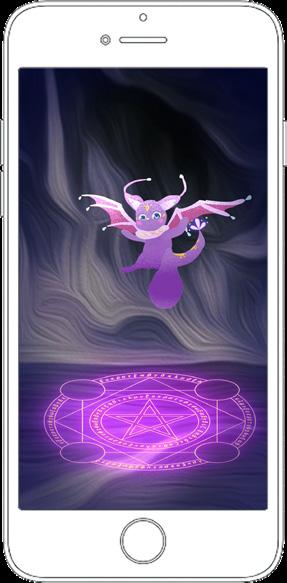
Xiao Chen Guide players into the game
Player
The avatar of the player
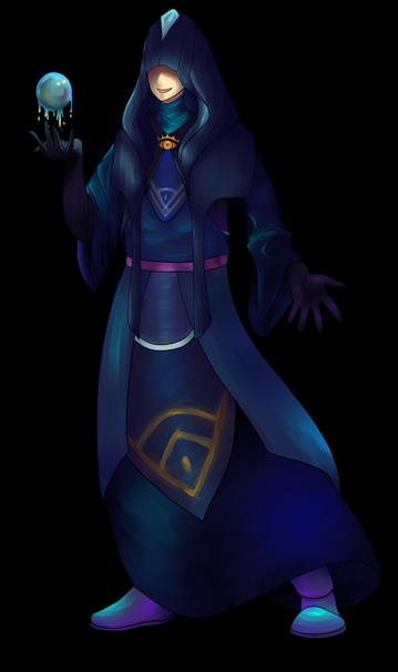
Villainous Sorcerer Antagonist in the story
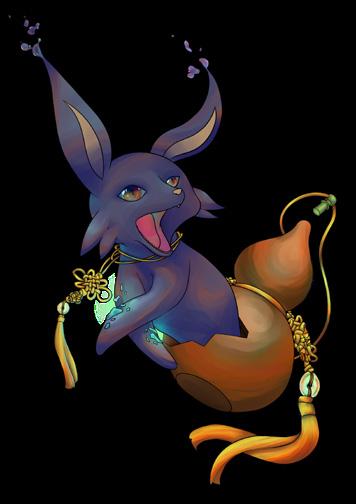
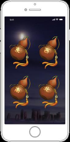
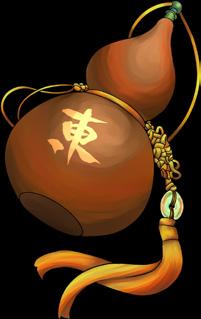
Gourd Spirit Chatbot guide
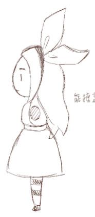
Sketches for the poster
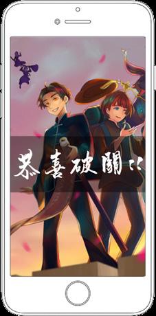
Main poster
Ending poster
User Interface
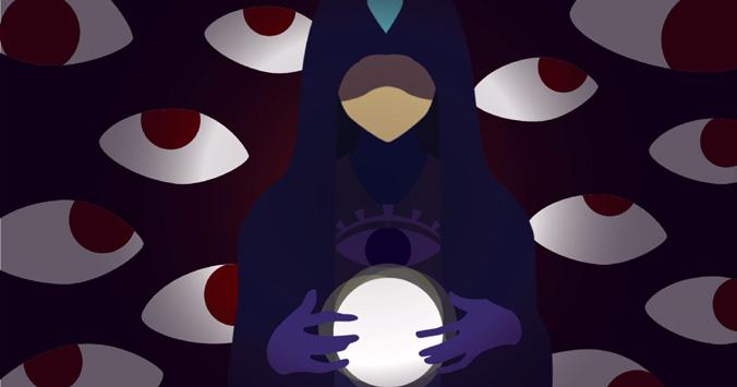
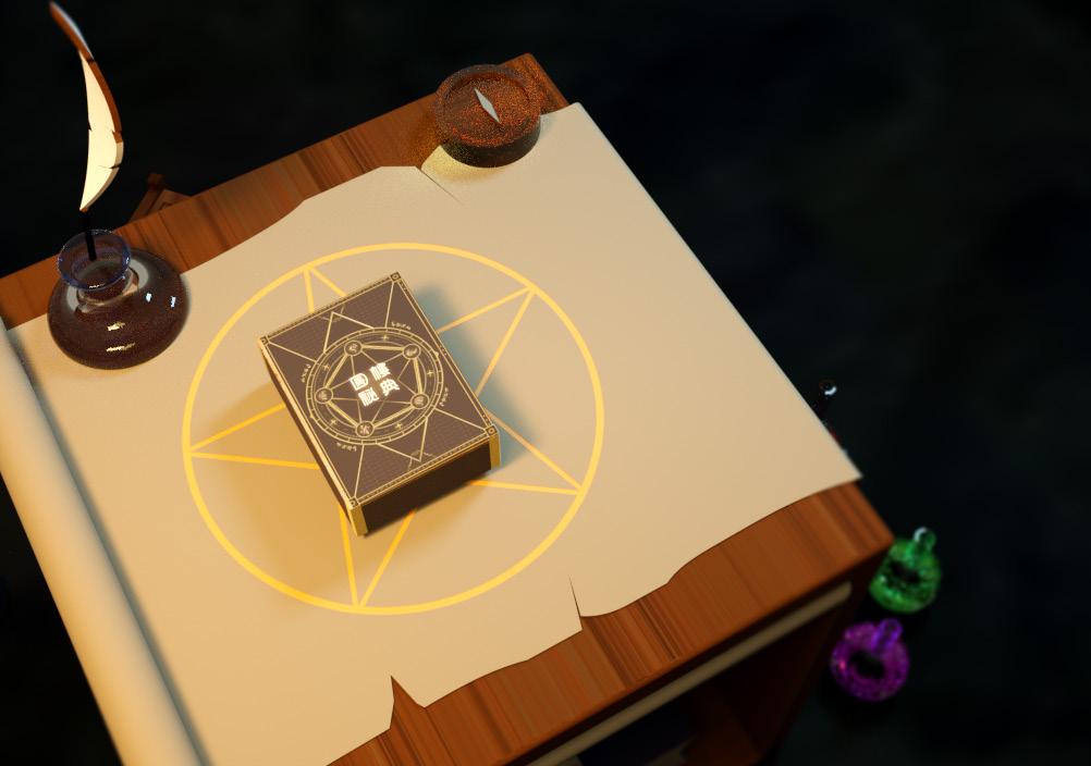
The design uses a crystal ball, symbolic of Western sorcerers, as the background, while integrating Eastern Taoist talismans and elemental motifs as inspiration for the icons. This fusion of styles is reflected in the visual and text-based menu layout.
The silk pouch and the gourd provide hints and record progress as the story unfolds.
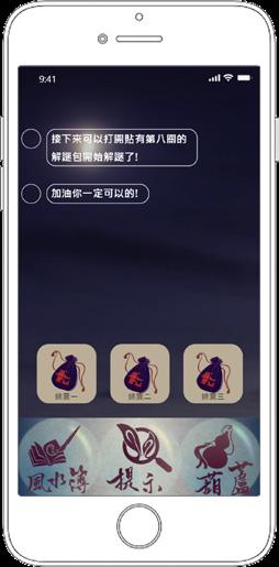
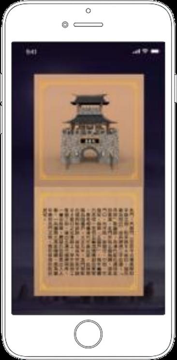
The text menu includes items such as the Feng Shui Book, Hints, and the Gourd, each allowing players to view its specific content. For example, players can view scroll records for each level within the Feng Shui Book (left image, second item from the left).
The initial visual-text menu interface is shown below, with the final menu displayed in the following image.
During the story, there will be explanations of the local city gates in Changhua, allowing players to learn about the history of these gates.
The screenshot showcases the second story released after the project's launch. The animation style remains the original project to preserve the same worldbuilding and key elements. However, new features have been introduced to reflect a different timeline and location within the narrative.
Team
Personal Contribution: Game Design Game Art
User Interface
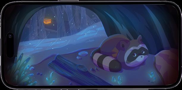
Mobile Game
Design Background
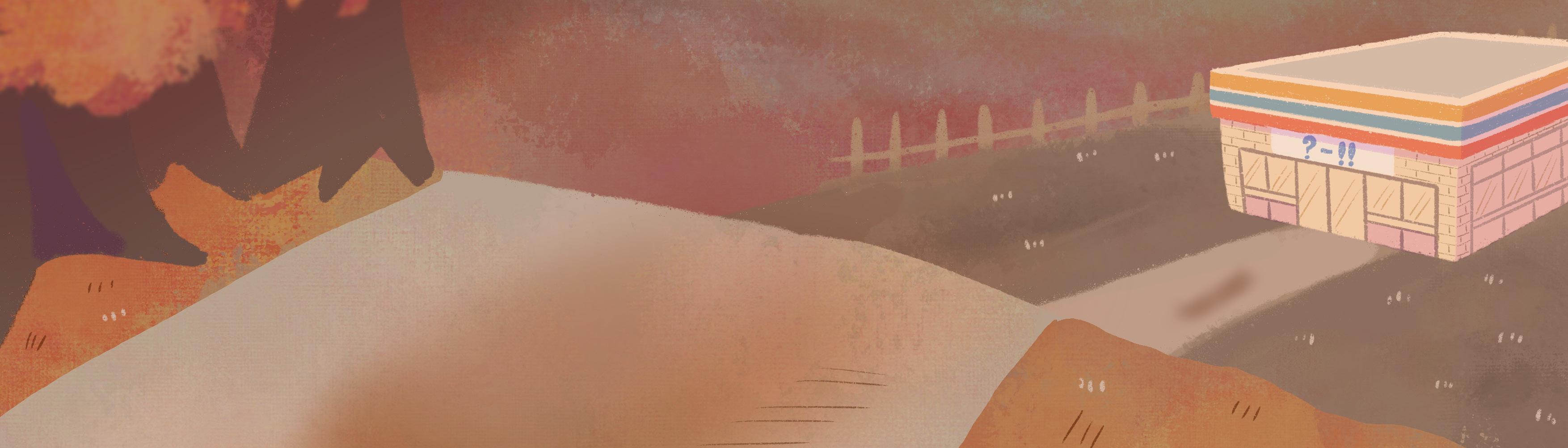
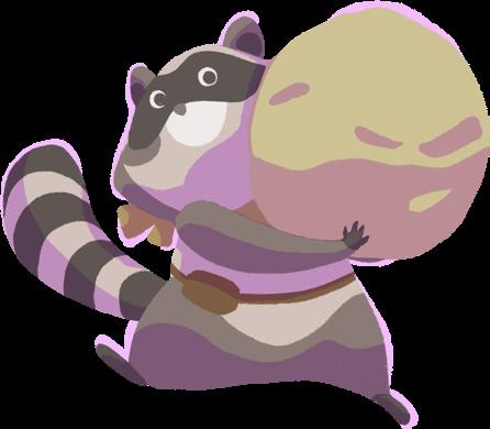
When hunger strikes, convenience stores are the spot for all creatures. For animals, grabbing food from a convenience store is just part of their foraging routine. Could we "socialize" this behavior and have animals participate in human society?
Design Concept
The project use a simple rock-paper-scissors game to convey focused ideas, it teaches children that even simple methods for determining winners can help resolve conflicts. The project encourages empathy and perspective-taking, helping children understand that animals, too, need a space to return to nature.
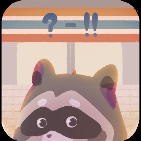
App Icon
Anthro Gaming Education
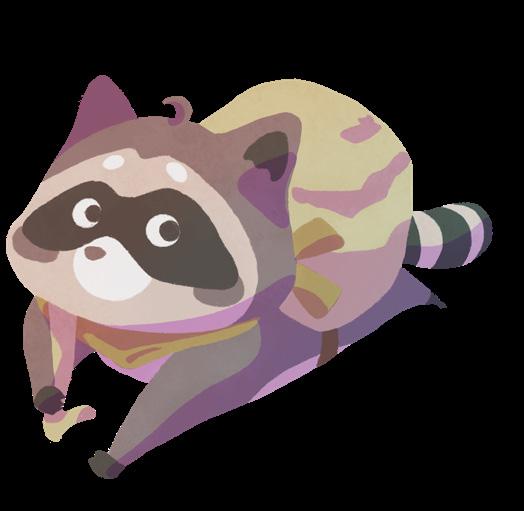
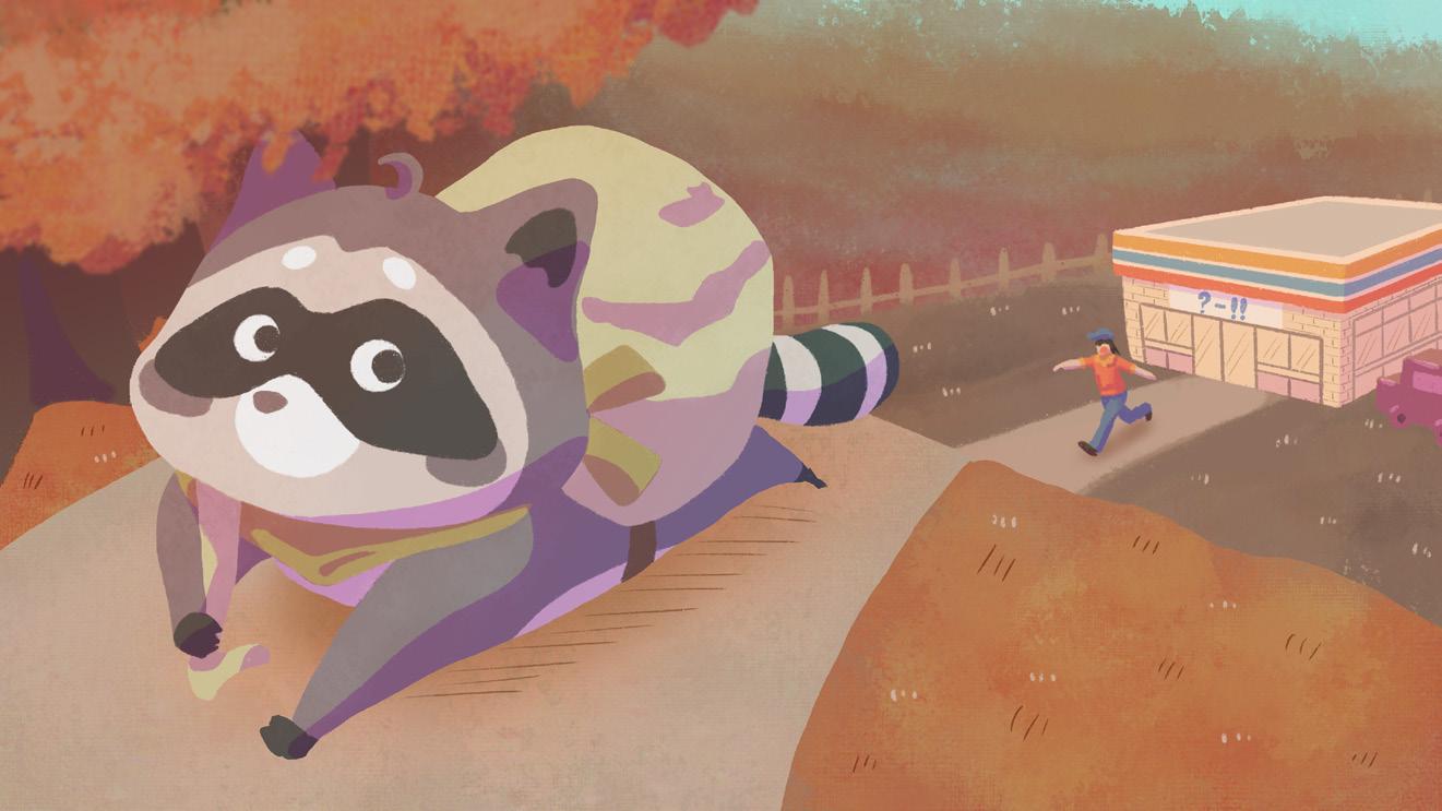
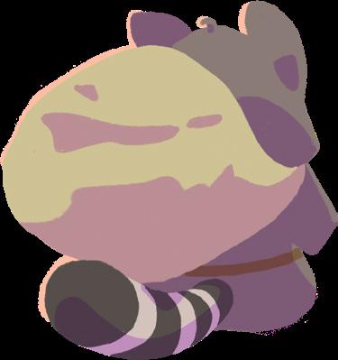
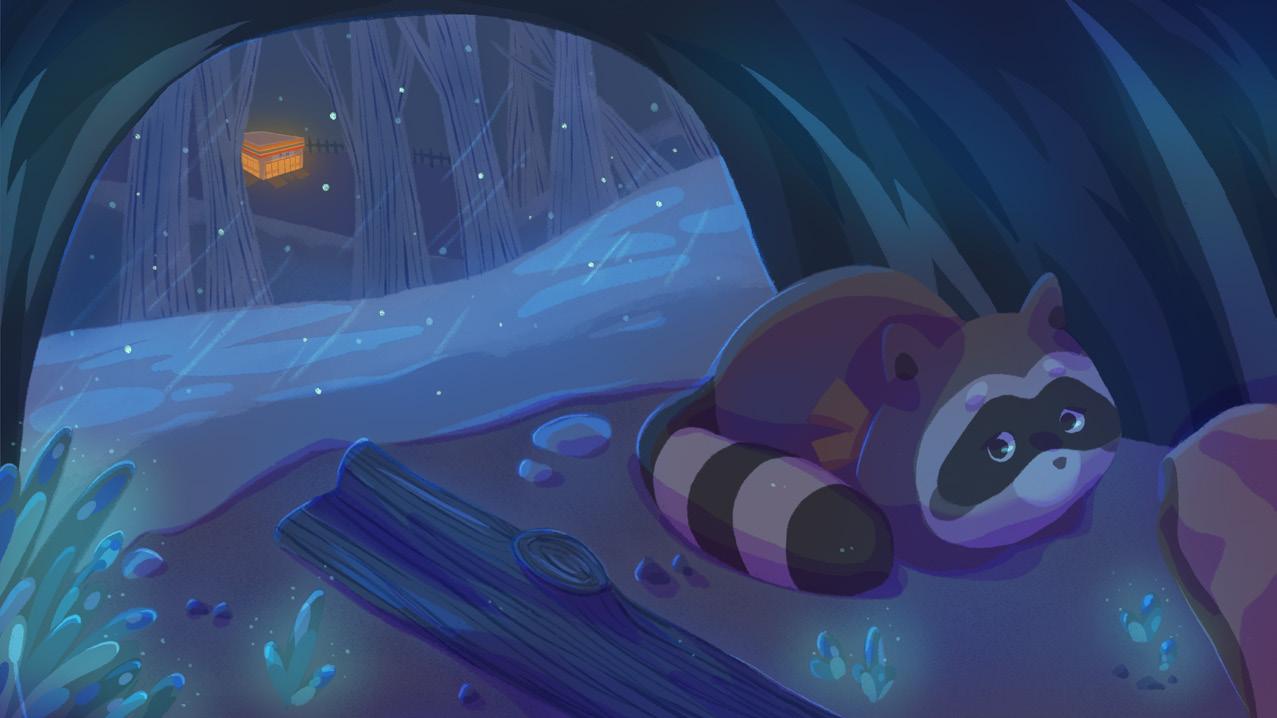
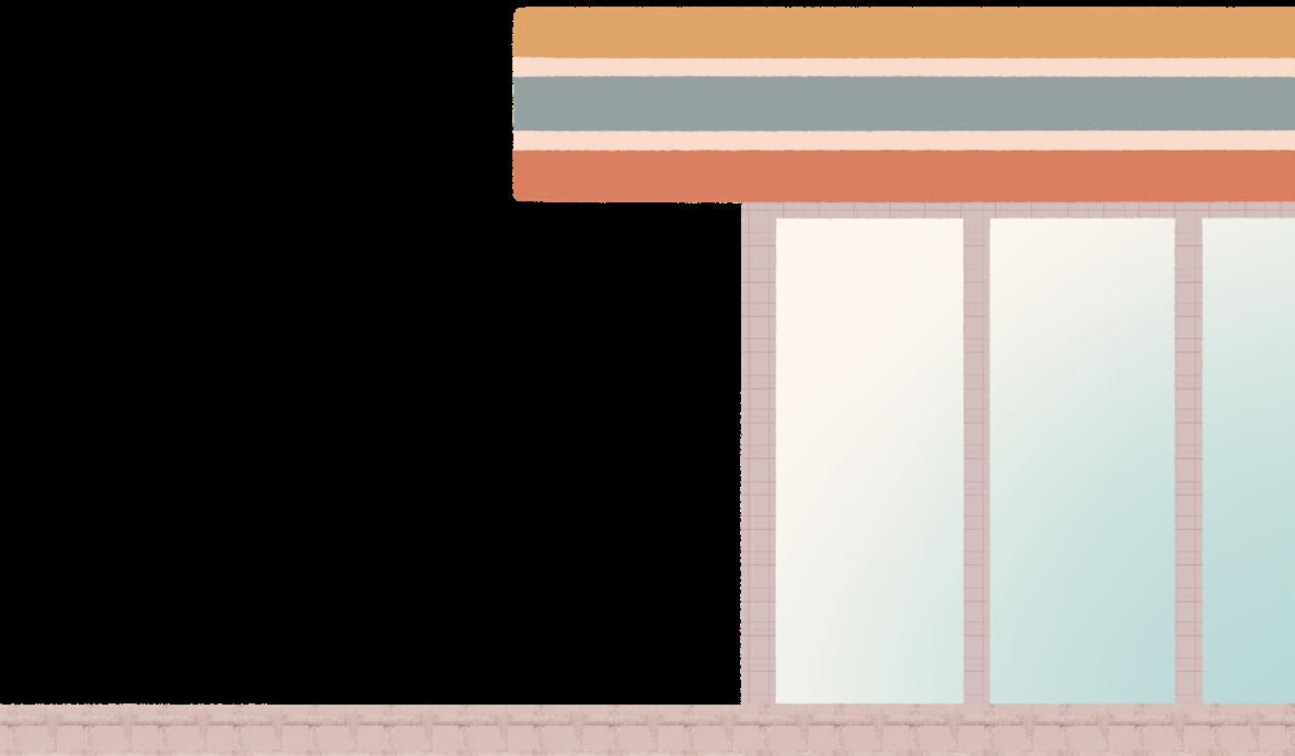
The app icon features the main character looking back at the camera while heading to the convenience store for food. The color palette and lighting create an atmosphere as the raccoon waits for the perfect moment to "raid" the store. This setting also conveys the raccoon's sense of excitement, inviting players to join in the adventure of the convenience store.
Game Type and Gameplay
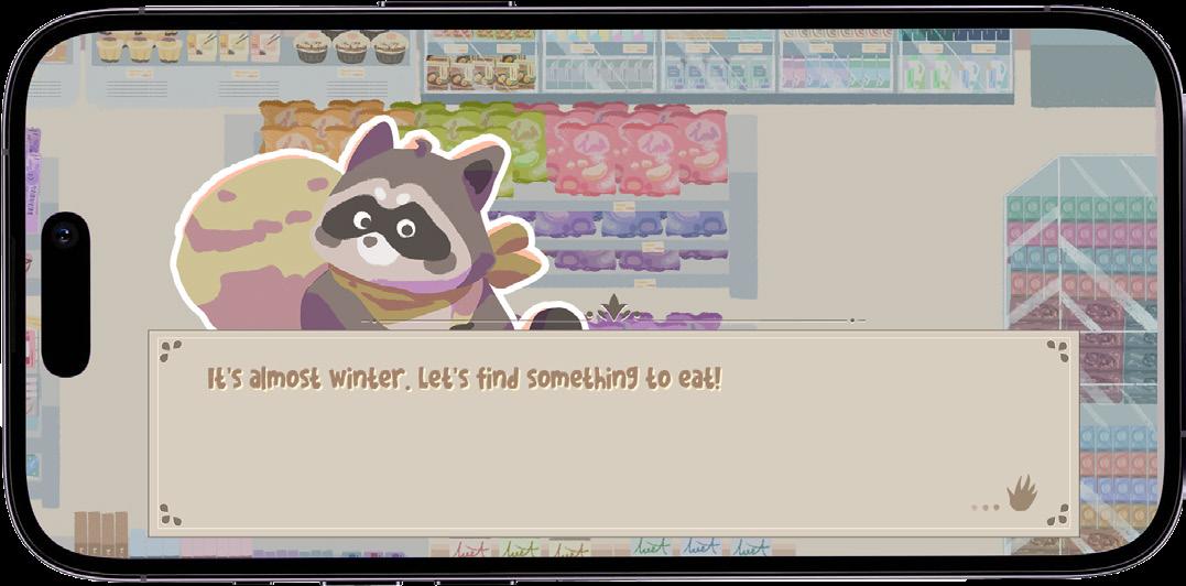
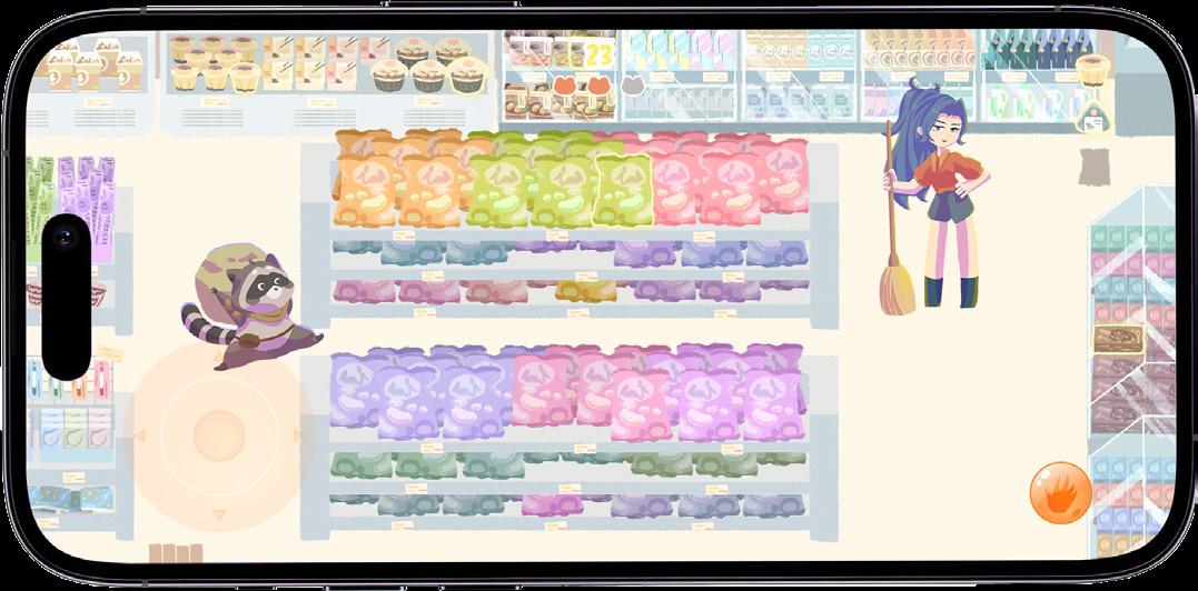
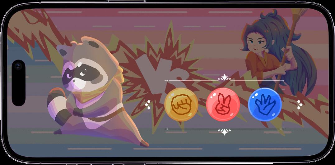
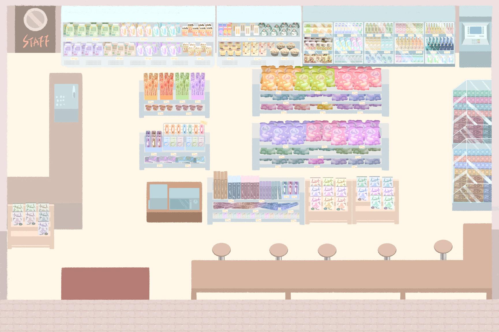
A 2D map-based, third-person perspective exploration adventure game. Players control a raccoon entering a convenience store to collect winter supplies. When faced with challenges, they use a rock-paper-scissors mechanic to win and avoid danger.
Storytelling
Describe the story background in text form.
Basic Controls
Battle mode
Choose to either continue
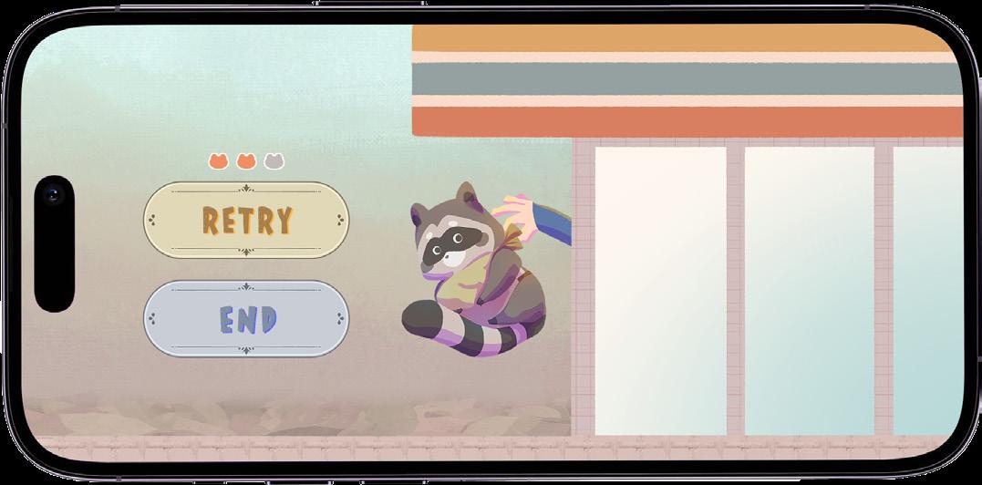
collecting or proceed directly to the ending when losing the battle.
To control the raccoon's movement.
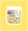
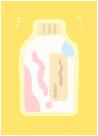
To collect items needed for tasks.
Mission items needed.
If encountered, enter battle mode. The game ends when it run out.
Rock-Paper-Scissors Selection
Win to continue collecting items
Tie to play another round
Lose to ejected from the store
End of Starving
End of Eating
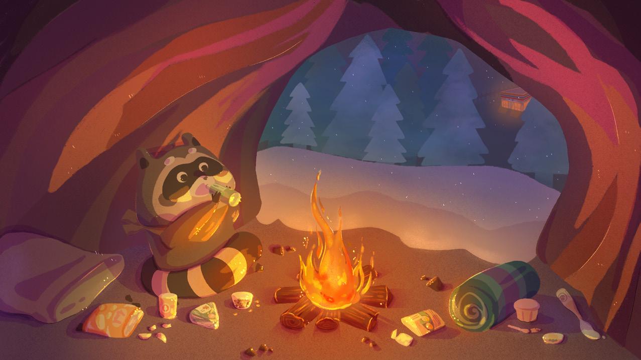
RacoHood
The primary illustration style is a wireframe, block-color design reminiscent of American comic art, paired with vibrant colors to create a lively and energetic atmosphere.
Home Page
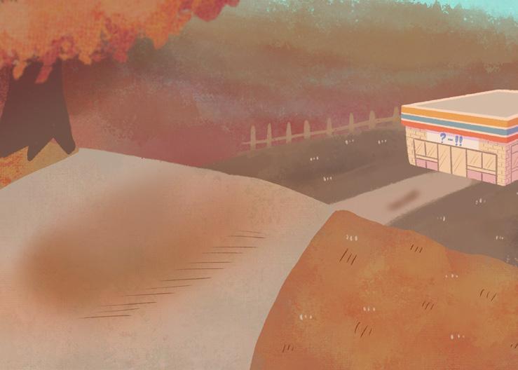
The warm autumn colors set the tone for the adventure, signaling the raccoon's preparation for the colder months ahead.
User Interface
The player controls a raccoon as the main character, chosen for its mask-like markings, which aligns with the game's setting and theme.
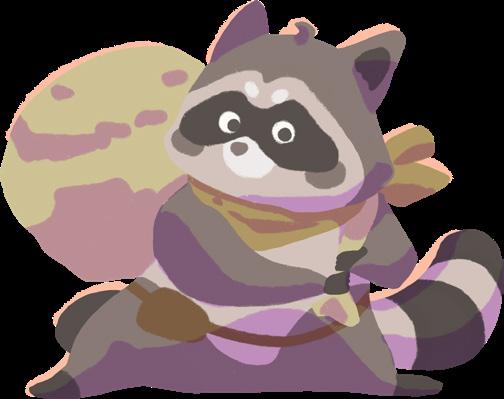
Standby - Front
Standby - Back
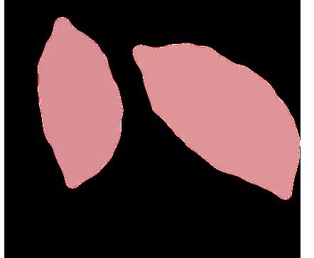
Collectible items will be highlighted with a yellow border
Other objests
Clerk and customers
If the player encounters a store clerk or customer during their walk, the game will enter battle mode. If the player encounters a restocking clerk, they will be unconditionally ejected from the store.
Clerk Clerk
Configuration
Battle state
Battle state
Restocking clerk
Customers
Endings
There are two possible endings. If the player successfully collects all the required items, the ending features a warm, cozy atmosphere to symbolize a peaceful winter. On the other hand, if the player fails to complete the tasks, the ending is depicted with cold tones.
Choose to continue collecting items or proceed directly to the ending If the life or time runs out, directly proceed to the "Cold Winter" ending
Well-Fed Winter
Cold Winter
Design Background
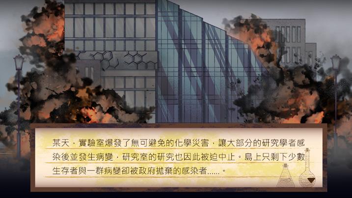
Chemical disasters are often unfamiliar to the public, and many don't actively seek information on how to respond. However, these incidents can greatly impact nearby residents, wildlife, and the environment. Increasing awareness of chemical disaster response in daily life could help both the public and businesses better prepare.
Design Concept
The game serves as an engaging tool to educate players on chemical disaster response. Using a 2D side-scrolling format, it focuses on cleanup operations, teaching players about decontamination agents, protective gear, and its proper use.
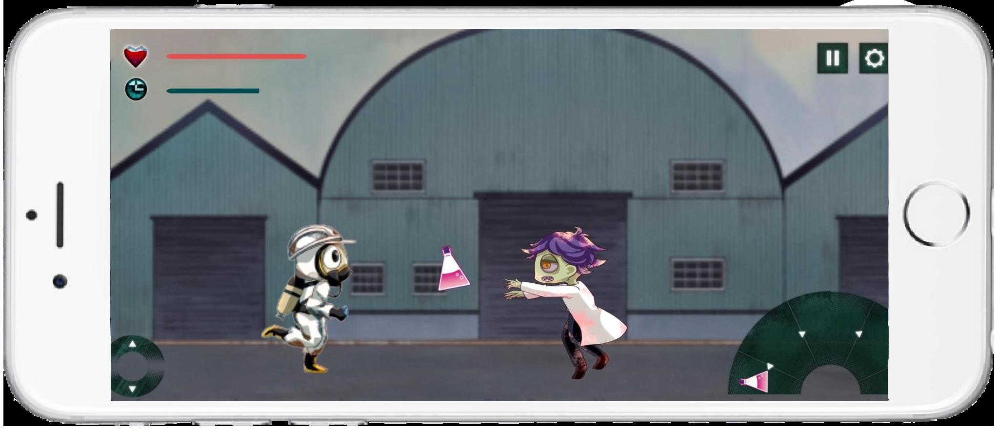
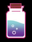
App Icon
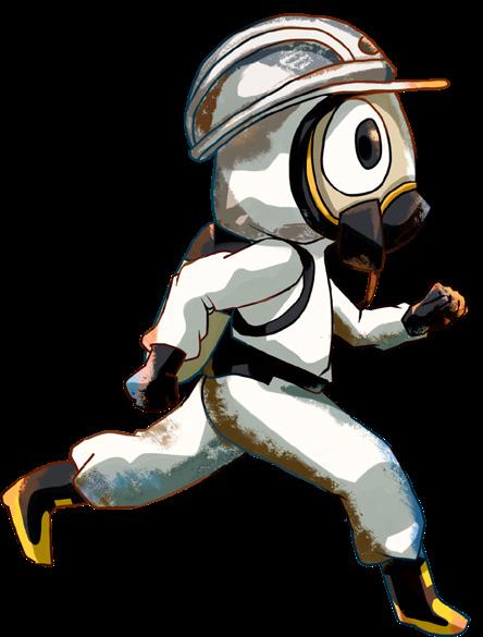
The app icon uses warning colors with saturated tones to convey urgency, while the typography features rounded corners and sharp edges, balancing seriousness with a playful touch.
Chemical Disaster Education App BronzeDesign Award
Mobile Game
Game Type
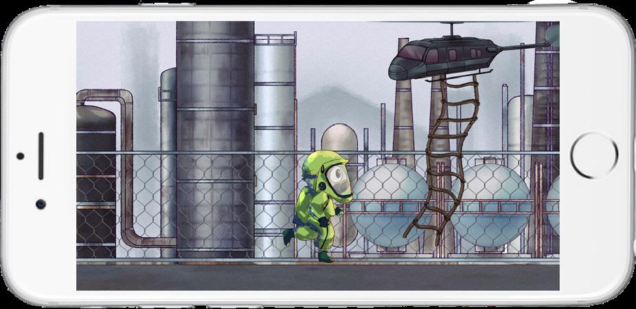
The game, "Chemical Disaster Knowledge Starts with Mini-Games," is a 2D side-scrolling, third-person adventure where players learn about chemical disaster response. Combining shooting mechanics with education, players navigate levels, applying the right decontaminants and wearing protective gear to overcome challenges.
Intro Video
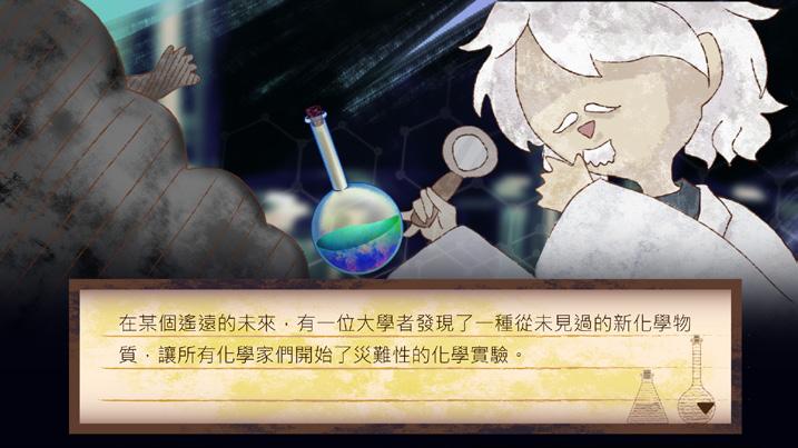
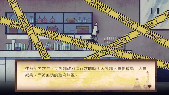
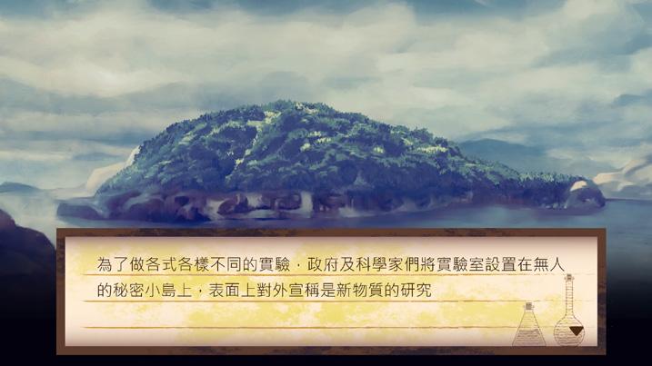
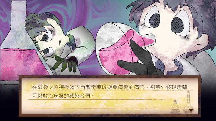
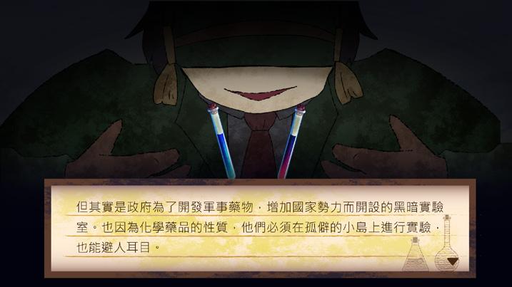
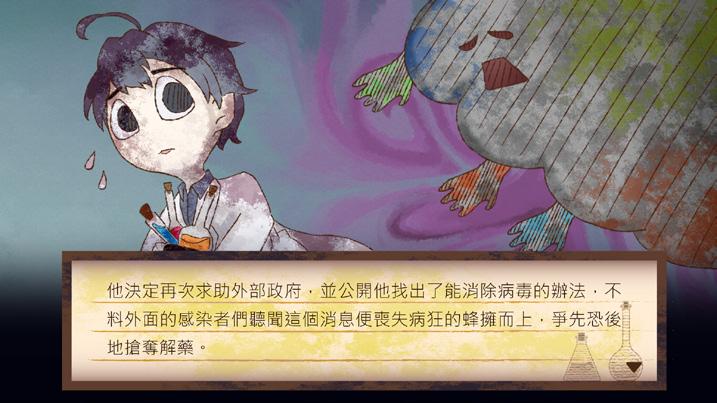
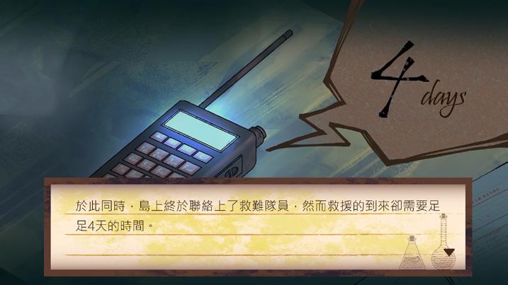
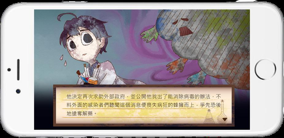
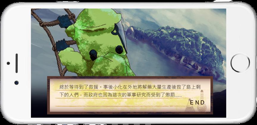
The game quickly immerses players into the story with an opening animation. The narrative follows a scientist who discovers a previously unknown chemical substance. One day, a chemical disaster occurs, infecting the researchers and causing mutations. The protagonist, the last surviving pharmacist, accidentally discovers an antidote that can cure the infection. As the protagonist prepares to save others, infected individuals hear of the cure and frantically rush to obtain it. The player must treat the infected while defending themselves and waiting for rescue.
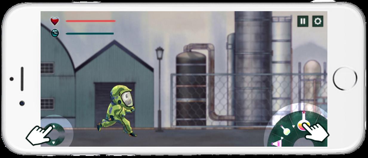
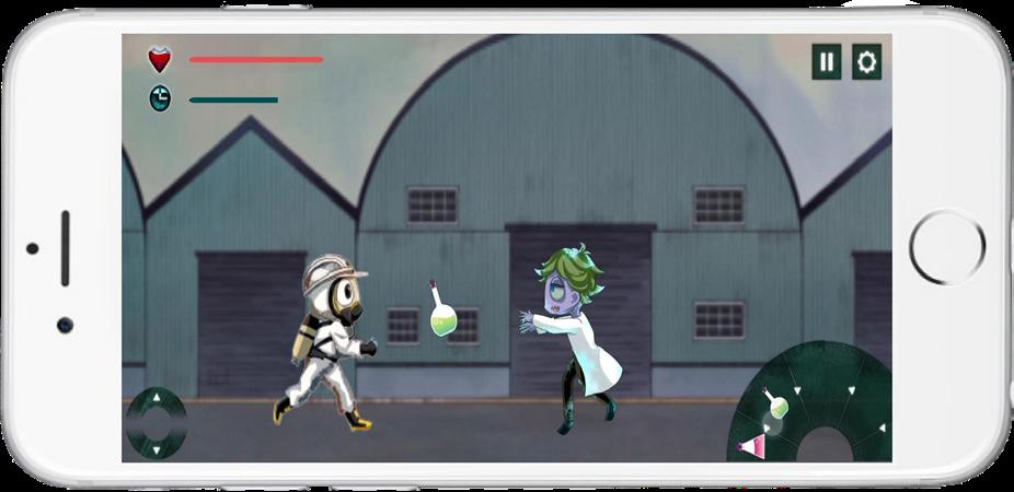
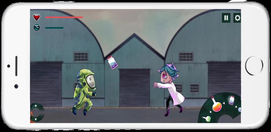
Gameplay
In the game, players click decontamination items to treat infected patients and use arrow keys to dodge them. Contact with an infected character reduces health, and if it reaches zero, the game ends. Each level has a time limit, and upon completion, a transition animation shows the next type of infected. The game ends with a final animation after all levels are completed.
Game Flowchart
The game starts with a story animation and tutorial. There are four levels, each with varying numbers of patients and obstacles. If the player’s health runs out, the game ends and the score is calculated. If the time runs out, the level is completed. Successfully completing all four levels leads to the final level, followed by the ending animation, marking the completion of the game.
The game uses clickable video clips to convey the story, allowing players to quickly understand the content without lengthy subtitles.
Game Art Design
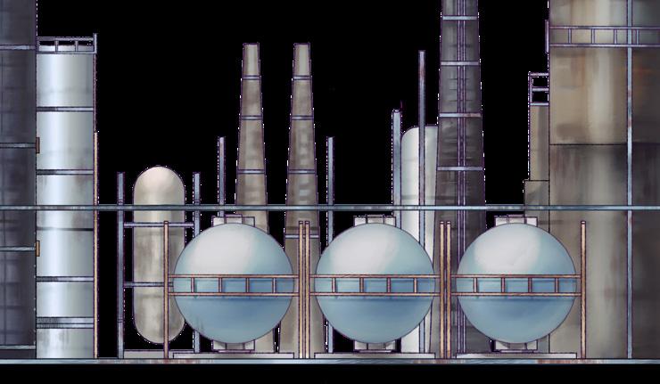
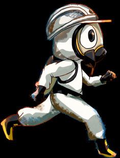
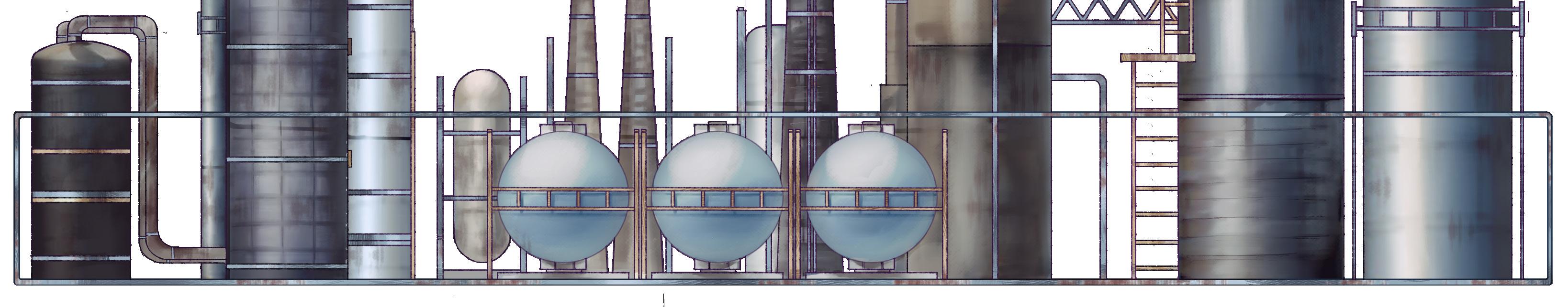
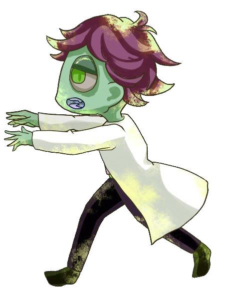
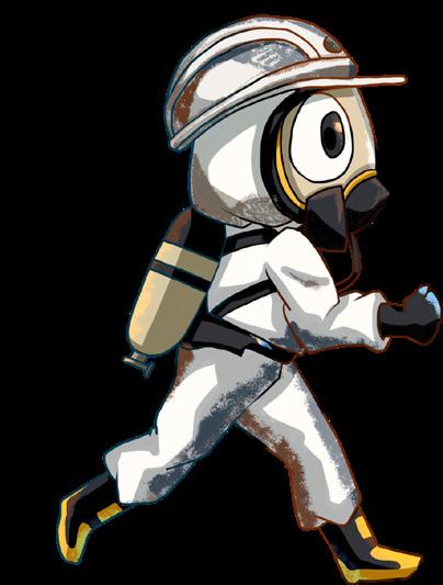
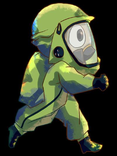
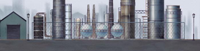
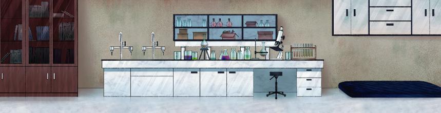
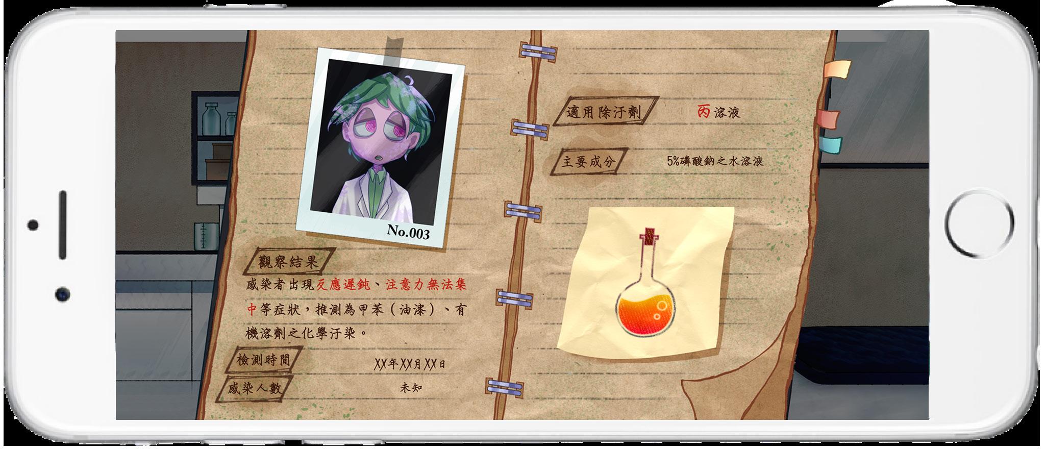
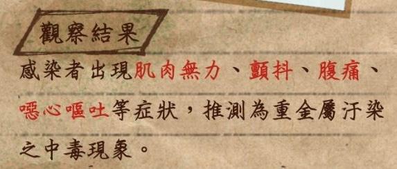
The game features an industrial style with splatter effects as the main visual approach. The protagonist has two types of protective suits: C-level and A-level, with stronger protection as the difficulty increases. Patients come in two forms and five different colors, changing appearance after being treated. The main settings are an outdoor factory and laboratory.
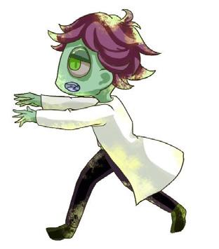
Protagonist in the C-level suit
Protagonist in the A-level suit
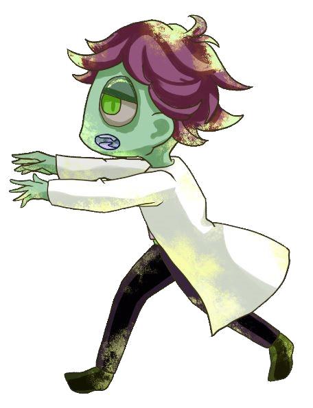
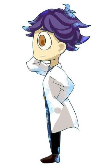
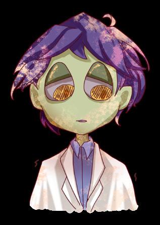
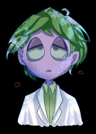
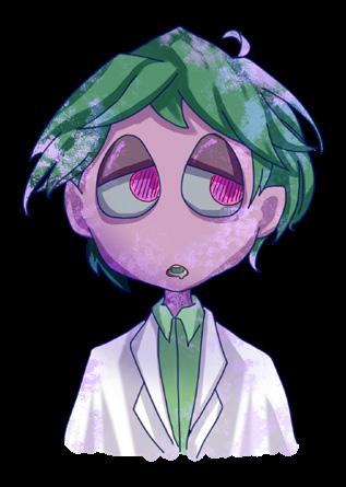
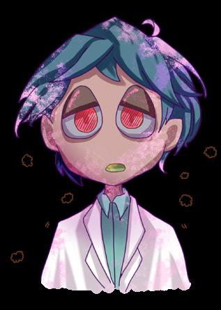
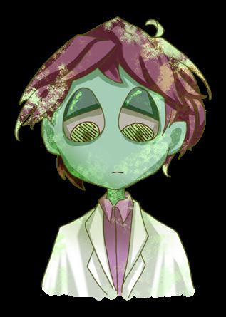
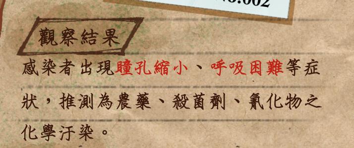
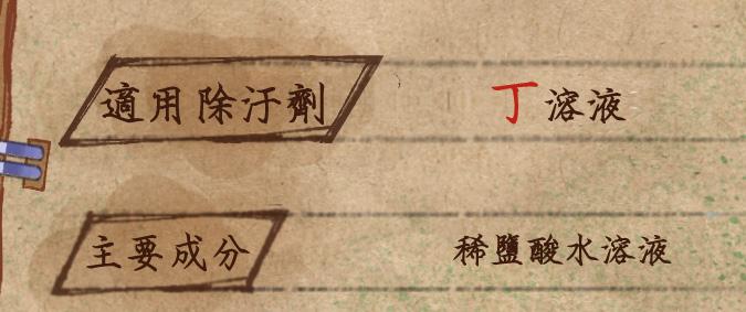
Different infected patients Scenes
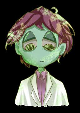
Patient
Patient (Treated)
Level Design
Standard level
The game is divided into four levels, with difficulty varying based on the number and types of patients. The interface is intuitive: the left thumb controls movement, while the right thumb selects the decontaminant. The top-left corner displays the current health and remaining time for the level.
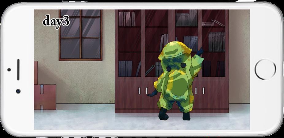
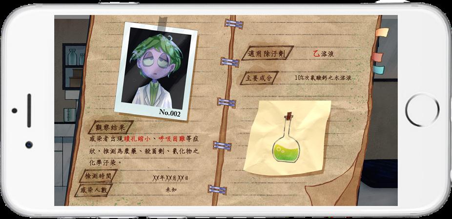
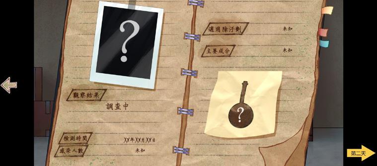
Patient Records
After each level's transition animation, players are given a chance to review patient characteristics and symptoms before starting the next level. The educational aspect is emphasized here, as players observe patient symptoms and decontaminant properties during gameplay, with the two elements corresponding to each other for learning.
The record book will gradually add pages over different days.
Design Reflection upon Completion
After completing the design and conducting real-world testing by releasing the game to testers, several aspects of the gameplay experience were identified that need improvement.
Allowing characters to have different body types and shapes can significantly enhance the game's diversity and richness. While colorcoding is effective for distinguishing characters, incorporating varied body types can make each character feel more unique and reflective of a broader range of individuals.
To ensure players remain engaged, the opening animation should be kept under 40 seconds.
To prevent visual fatigue, it's important to adjust the background scrolling speed in relation to the player's movement. If the background moves too quickly, it can overwhelm the player, causing discomfort or fatigue
Although the educational value remains, the information is often skimmed or skipped by players, as it's presented passively.
To improve, the game could integrate knowledge about chemical disasters, such as effects of chemicals on the body or decontamination practices, through interactive questions, ensuring players learn as they play.