
Architecture Portfolio | 2021-2025
Spring 2023 | Lindsey Stouffer
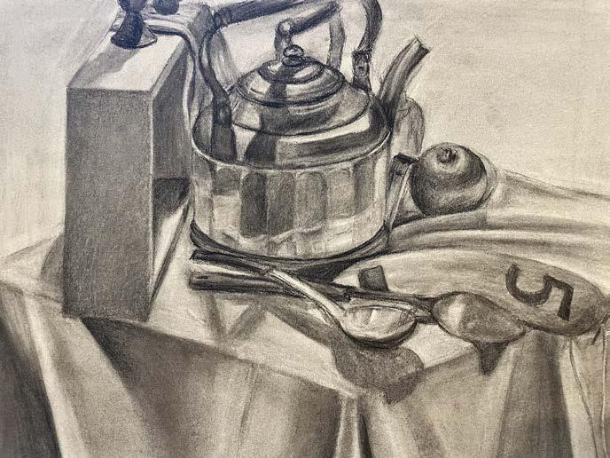
Fall 2022 | Patrick Hatheway
Fall 2023 | Chandler Ahrens
Fall 2021 | Amela Parcic
Spring 2024 | Karel Klein
Fall 2024 | Hatheway, Mhatre, Murphy, Schump | Kaley LeBlanc
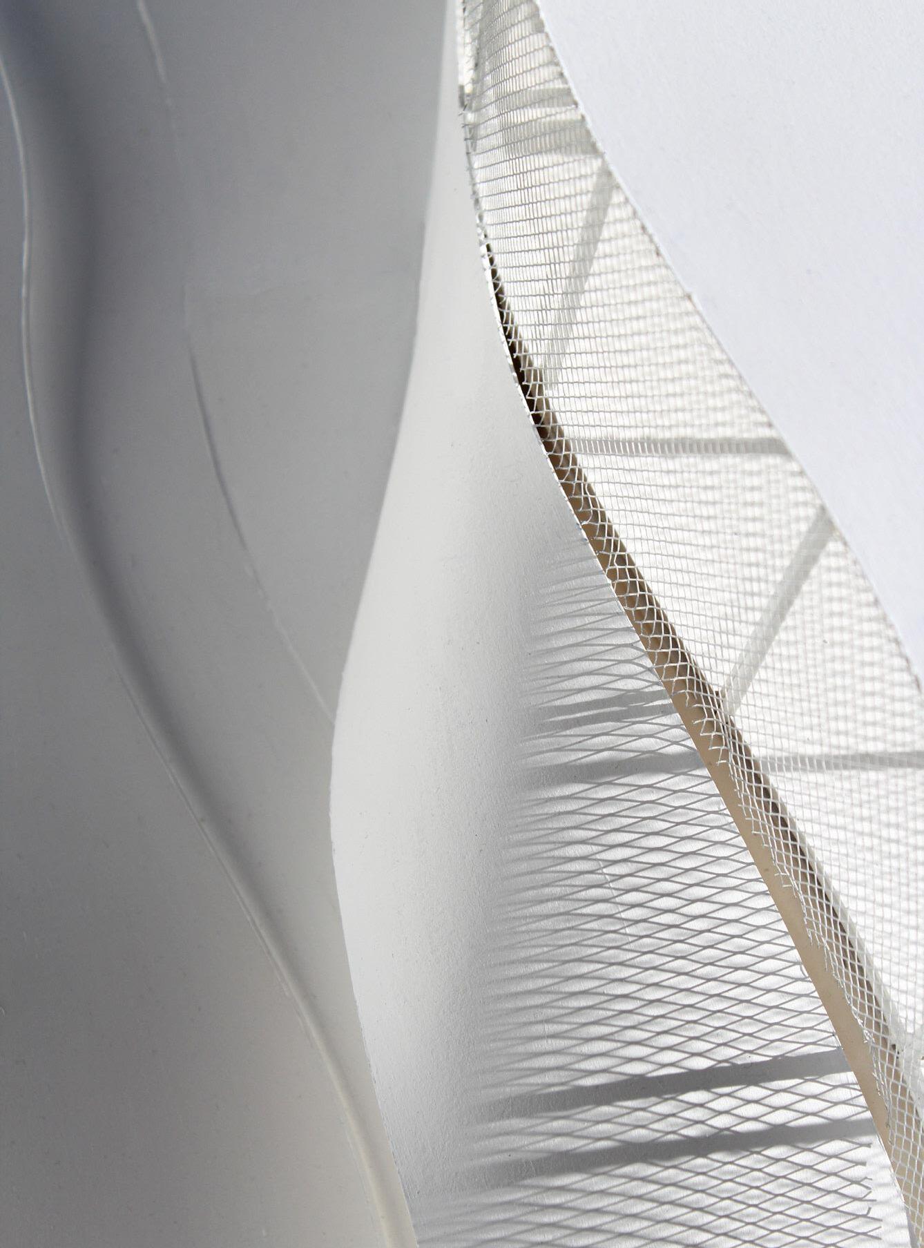
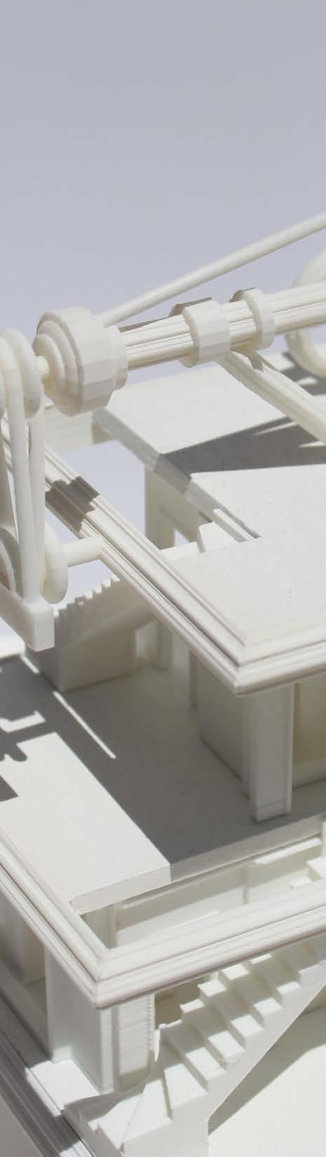
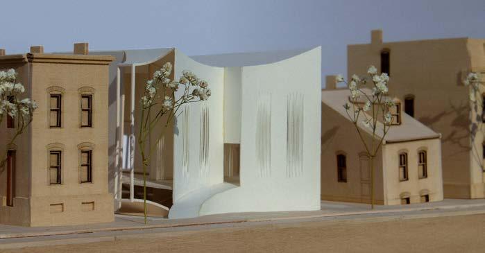
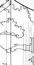
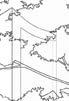
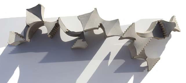
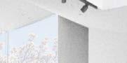
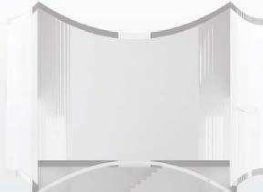
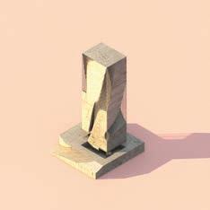
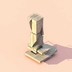
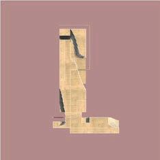
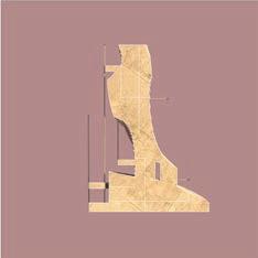
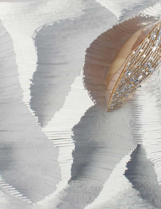
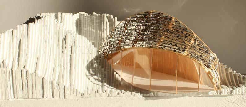
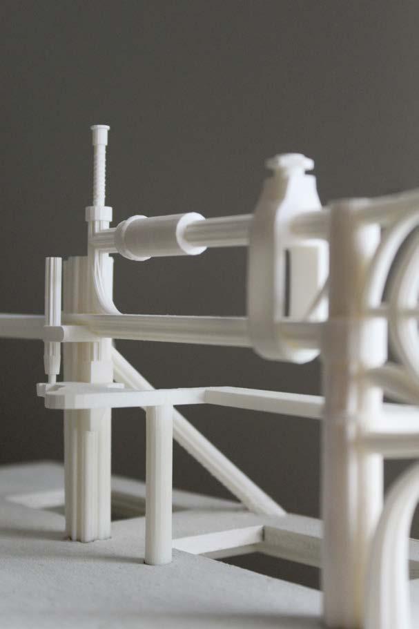
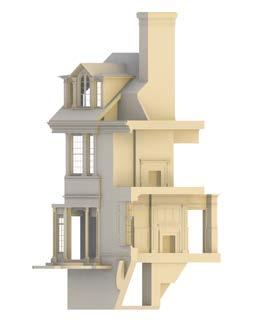
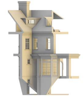
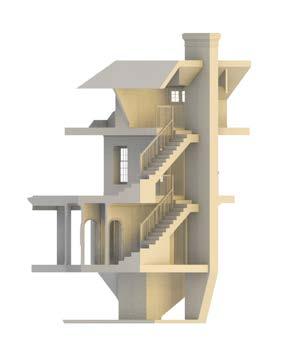
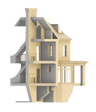
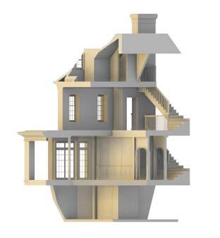
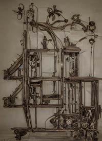
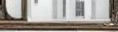
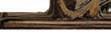
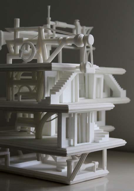
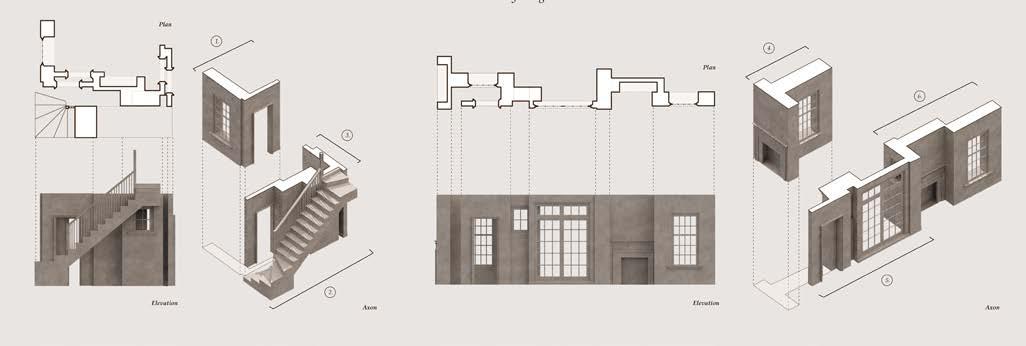
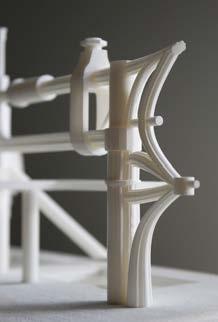
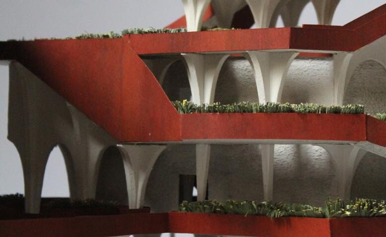
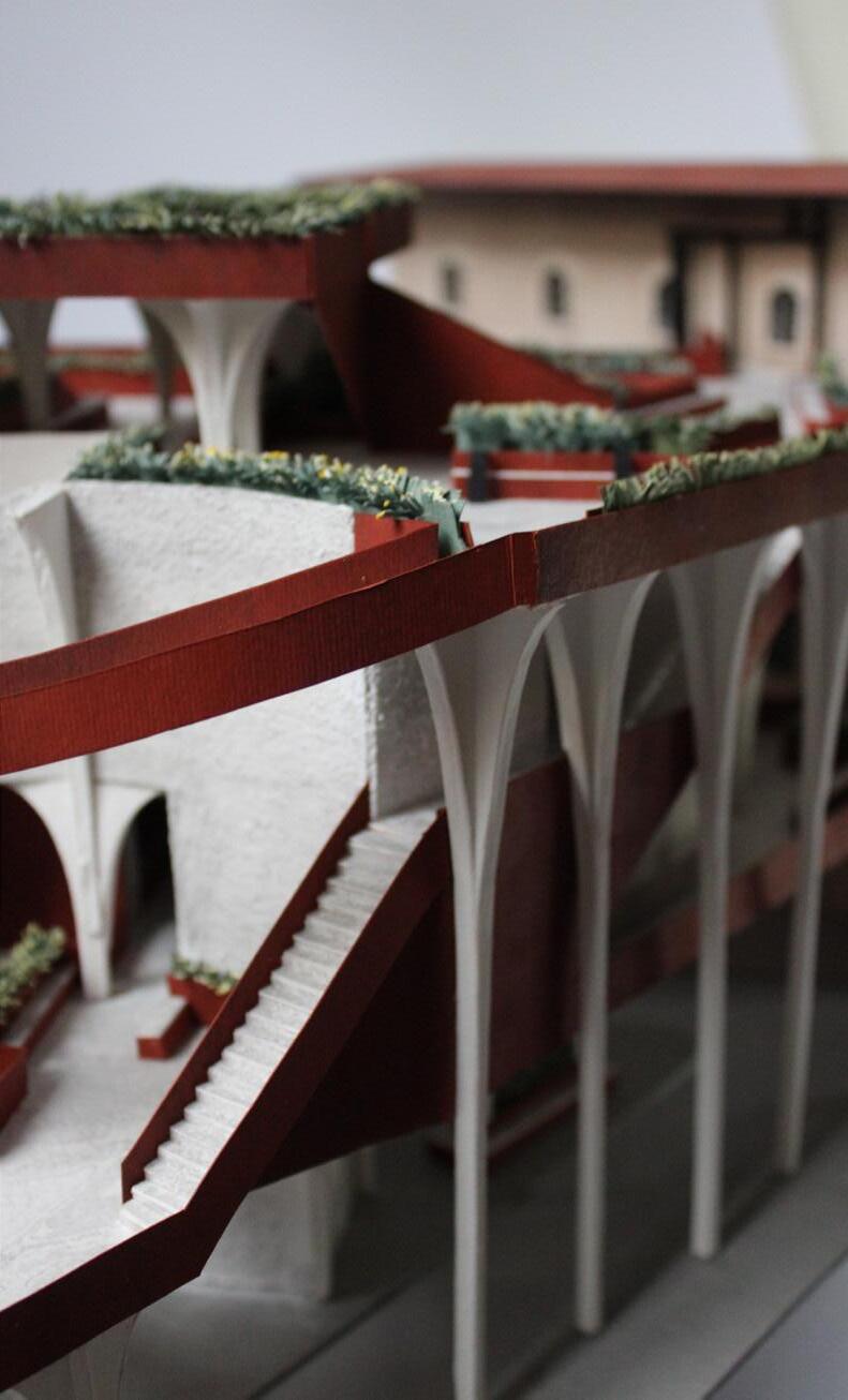
section through physical model
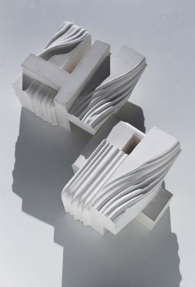
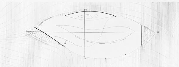
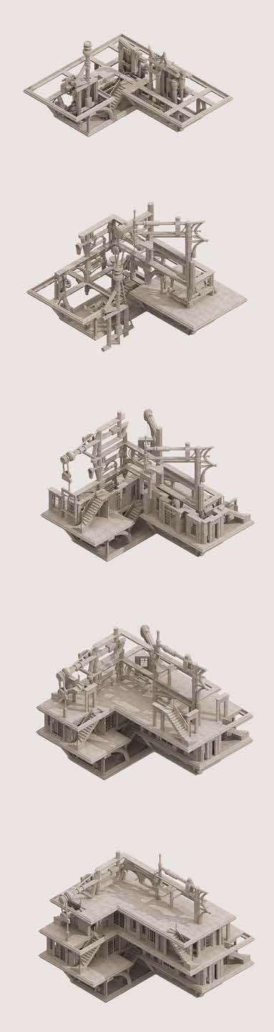
In the same manner as research, the design process began through discovery. Through form exploration, two plaster cast modules were created as seen to the left. The design was interested in how a rectilinear form could be intersected through a controlled curve. These form explorations were used to create an Urban Wildflower Research and Archive. In this sense, the “urban” is represented by line and the organic is represented by curve. The central idea was to use a continuous curve to wrap two programmed rectangles - public education & research - so that they would be separated yet in conversation with each other. In the center of these programs would be the research garden, where wildflowers - inherent to pollinators and thus the greater food systemcould be researched and controlled. Below the public sphere is a seed archive where visitors can examine preserved wildflower seeds. The intent of the research would be to examine how wildflowers and urban landscapes can live as one. Sketchbook
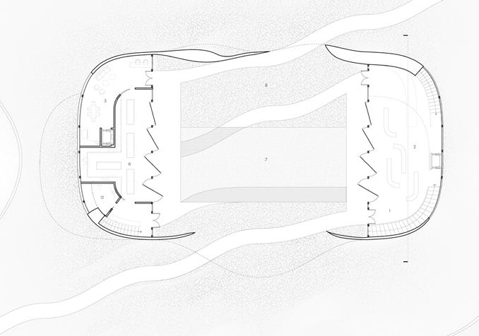
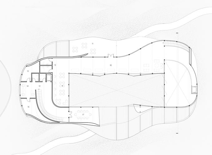
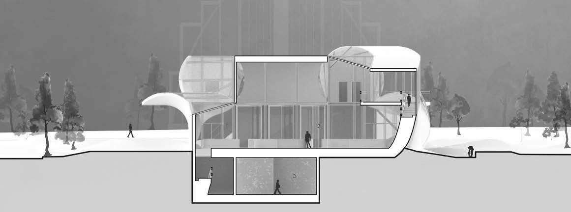
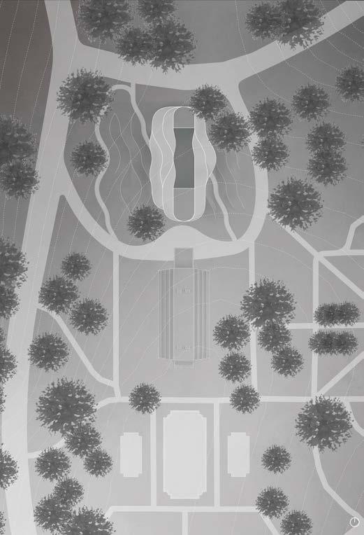
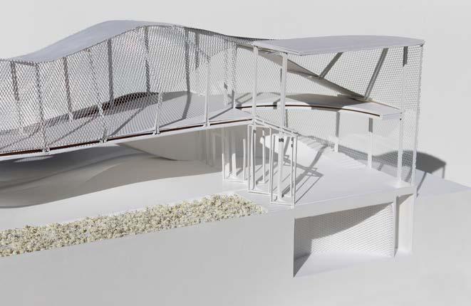
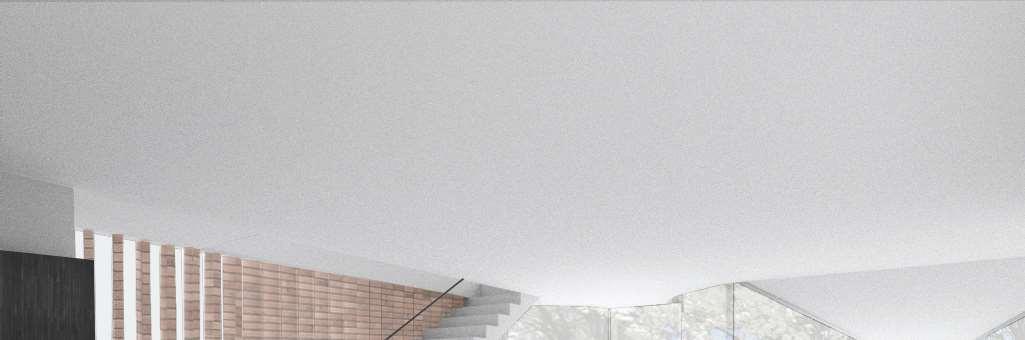
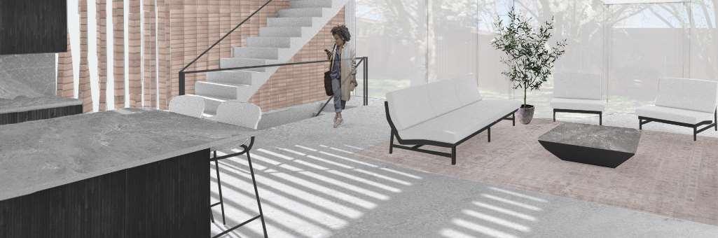
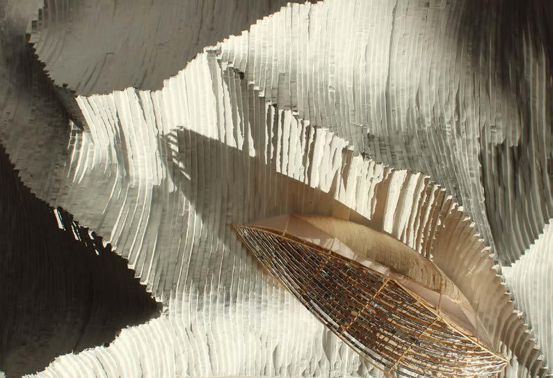
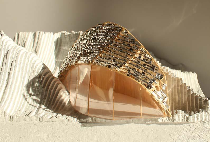
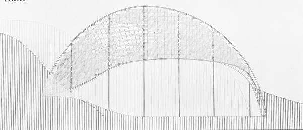
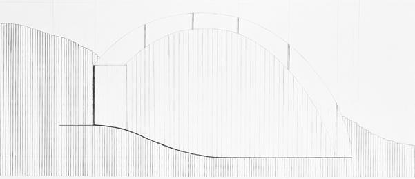
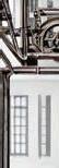
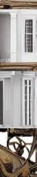
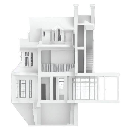
The Urban Wildflower Research & Archive is located in Forest Park, St. Louis adjacent to the Jewel Box - a 1936 greenhouse home to various tropical plants and flowers. The research center sits in juxtaposition to the Jewel Box: while non-native plants are confined to their home inside the greenhouse, the native Missouri wildflowers are meant to grow free on the grounds of this research center. The rectilinear shape of the jewel box is mirrored into the architecture as an open air research garden for Missouri wildlife in which the building is surrounded by. The grounds and building are meant to speak as one unit, with soil rising onto the emerging mass in a Maya-Lin-esque style. The materiality used in the architecture is to provide both sun-shading and a playful way for light to bounce off and enter the building. The rolling hills surrounding the architecture are also meant to be playful, drawing the community in to learn about the research.
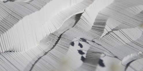
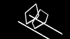
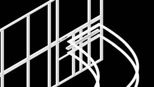
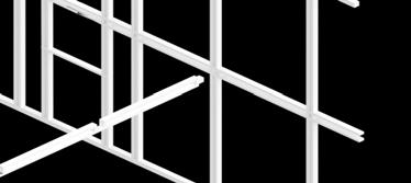
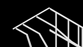
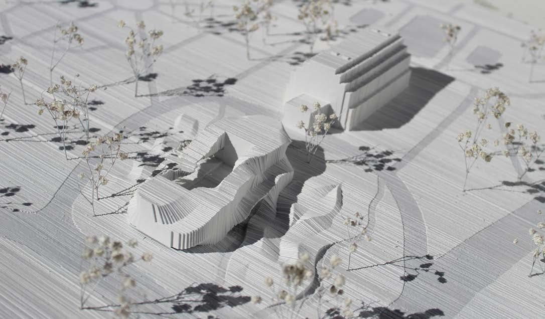
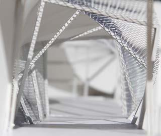
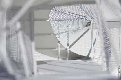
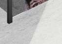
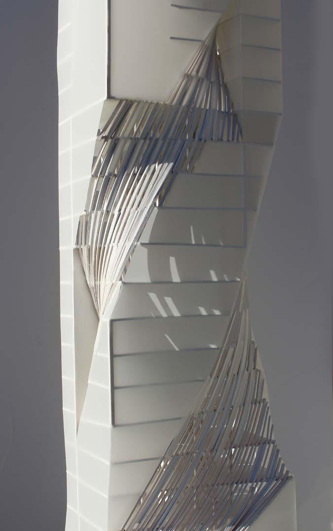
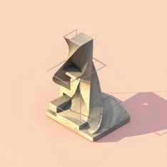
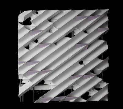
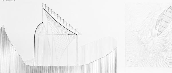
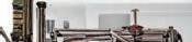
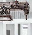
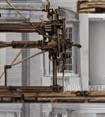
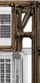
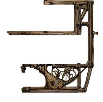
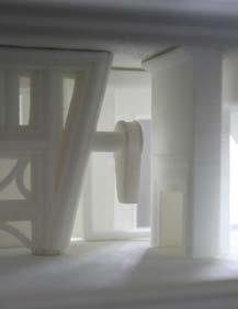
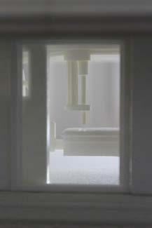
To physically construct the section model, I created a framework system that uses connection joints for quick assmebly and support for the additional building materials. I designed the system so that each beam and column would be doubled and thus smaller to create a more delicate aesthetic.
The framework also allowed the curved structure to follow a controlled curve, wrapping around a hallway on the upper floor, as pictured to the right. Thr bridge supported by the structural system allows the building to adapt to wind-flow and enter the interior garden and funnel into the building when desired.
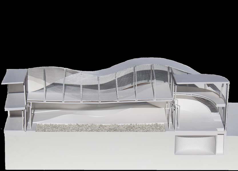
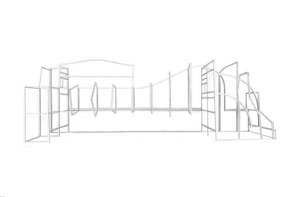
Section Model | 36” X 16” X 18”
Jenny Saville is a contemporary British artist who is credited with reinventing figure painting of the female nude on large confrontational canvases. Her studio, gallery, and residence is designed to be situated on Cherokee Street. A popular business and residential street in the mid-19th century, the strip is now home to small boutiques, restaurants, and artist studios. Mirroring the street’s architecture, light enters the gallery in a facade design that applies the same horizontal dimensions and materiality as the windows of neighboring houses.
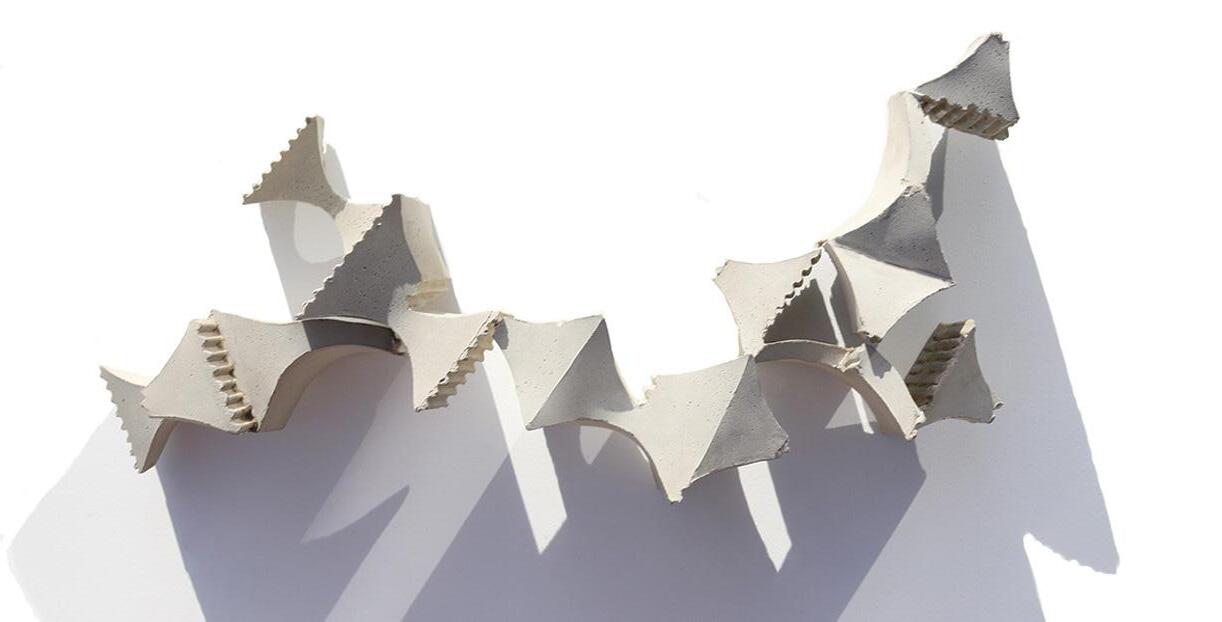
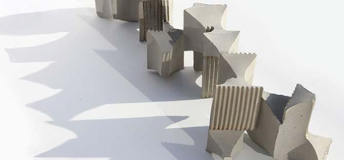
The architectural form came from an exploration in cast-concrete, as seen to the right. The eight concrete blocks are unique and lock together to form a series of wall iterations. These units were placed together and manipulated to contribute to the form of the massing.
Cast concrete in collaboration with Zach Dietrich and Emily Ellison.


Aggregation Models and Tests


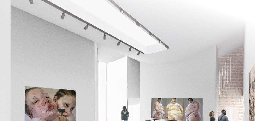


Patrons are guided into Jenny Saville’s gallery by a graceful ramp from street level. Directly below the gallery is her studio, a design intended so that the two programs could be in conversation with one another. Her studio can be seen by visitors through a massive light tunnel, beginning as a sunlight on the roof and then continuing down to bring light through the main floor. The main floor is supported by a series of beams mirroring the roofline in both plan and elevation. The side extrusions are light wells that exist on the East-West axis of the site to light the gallery, studio, and residence within. They vary in height to respond to the needs of the gallery within or the height of the neighboring houses.


On the North-South axis, a facade system of rotating bricks responds to the needs of the artist in terms of privacy or lighting.
Jenny Saville has her own residence in the back of the site, removed but still connected to her gallery and studio. The light wells in the residential program become usable square footage, turning into bay windows for seating or clearance for circulation. The rotating brick provides a unique light experience at every hour of the day for the artist who is often inspired by lighting conditions and how the body interacts with nature.


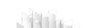
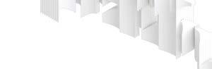
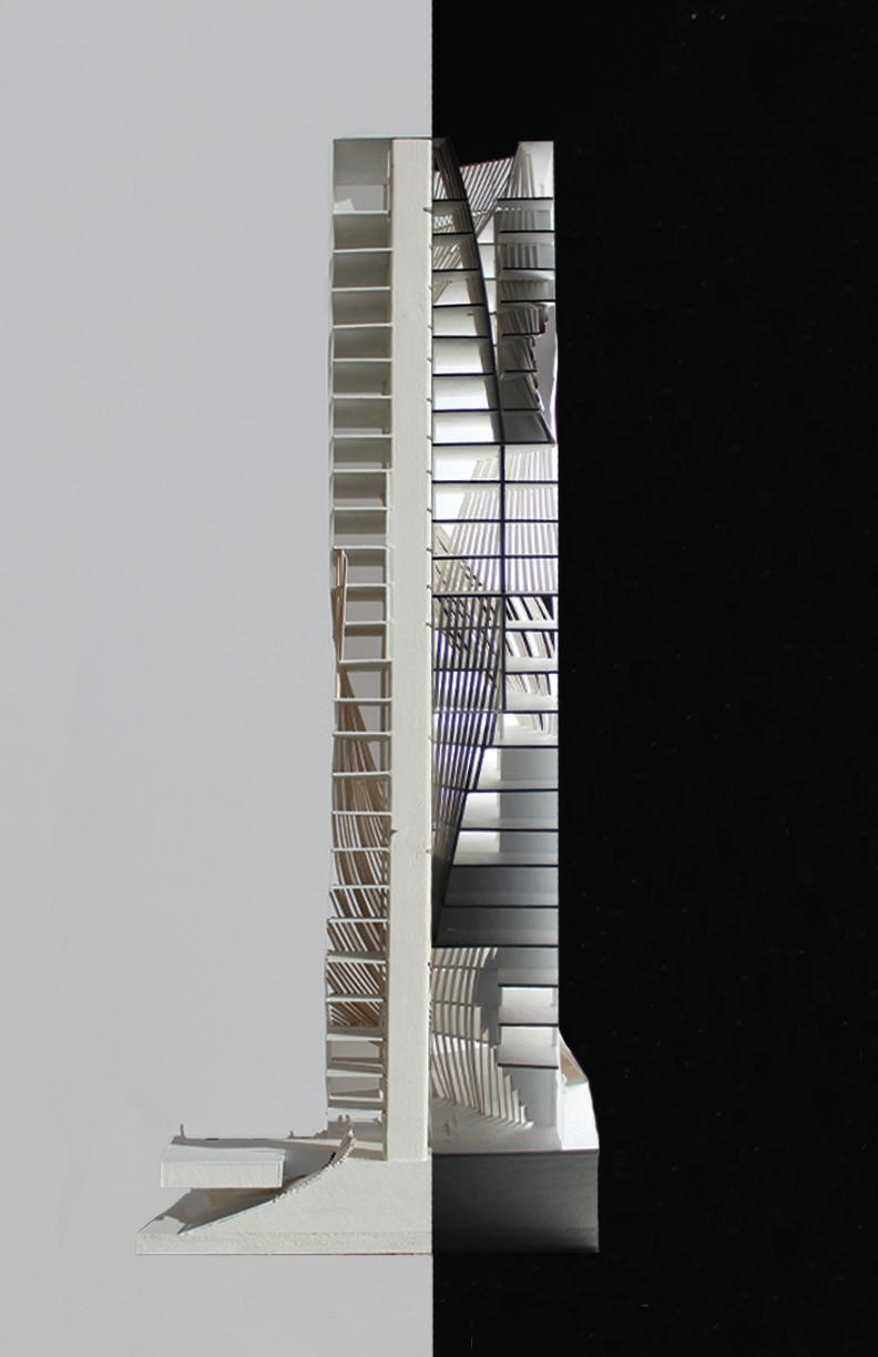
In this tower design, there was an emphasis on using the digital to spark ideas and the physical to explore them. Thus, the designs, in massing and facade, were first imagined through many iterations in the digital world, as seen above, and then curated into the physical, as seen to the right. Using grasshopper parameters, ideas of separations and unions between the solid/void, interior/exterior, and line/solid were explored.
Following this, the extremities and balance of forms, through both the overworking and under-manipulation thereof (seen above), guided the design.This tower is imagined to be an artist live-work residence. Thus, these ideas of opposites, specifically applied to public and private space, were an inherent factor in designing the tower. This led to the idea of a rectilinear form that was carved away by sweeping shapes to inform the programmatic needs of the creators and their creations.
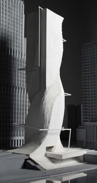
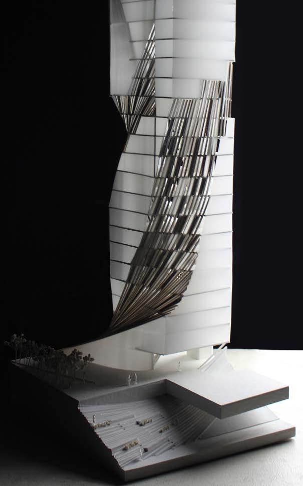
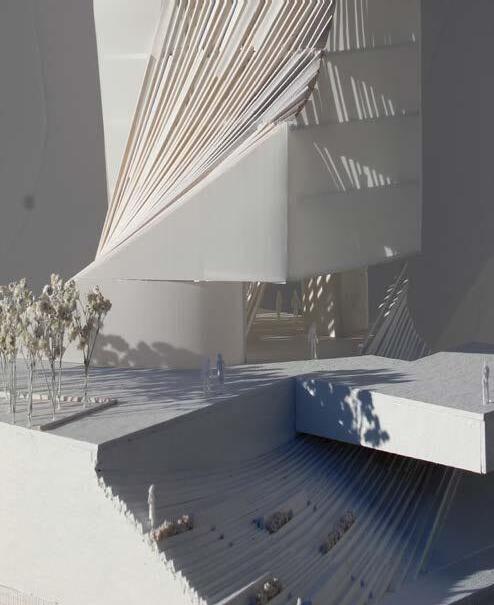
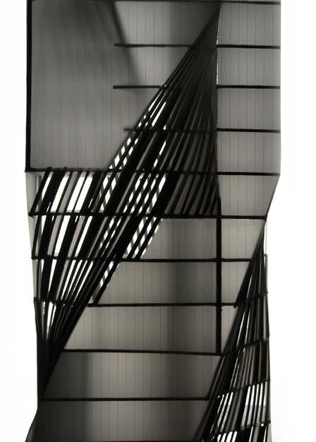
This section model of the designed tower plays with the balance of opposites: light/dark, public/private, curve/line, solid/void, opaque/transparent, negative/ positive. It takes on different characters amongst different lighting conditions: whereas in daylight the building reads more as a solid, night-time allows the facade to come to the forefront and read as a series of twisting paths amongst a translucent form.
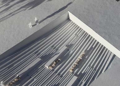
The sweeping shapes are determined by programmatic and contextual needs. For instance, because the tower is located on the Chicago riverfront, there is a large elevation change between the river and street-level. A sweep draws out of a staircase between these two levels, serving as a public amphitheater for the public to enjoy. Another sweep draws from the Northern street level, creating a tall interior space located next to the public sphere to serve as a gallery for artists living in the tower to exhibit their work. Additional sweeps divide the interior of the tower between public spaces to create, share, and collaborate with the private residential spaces.
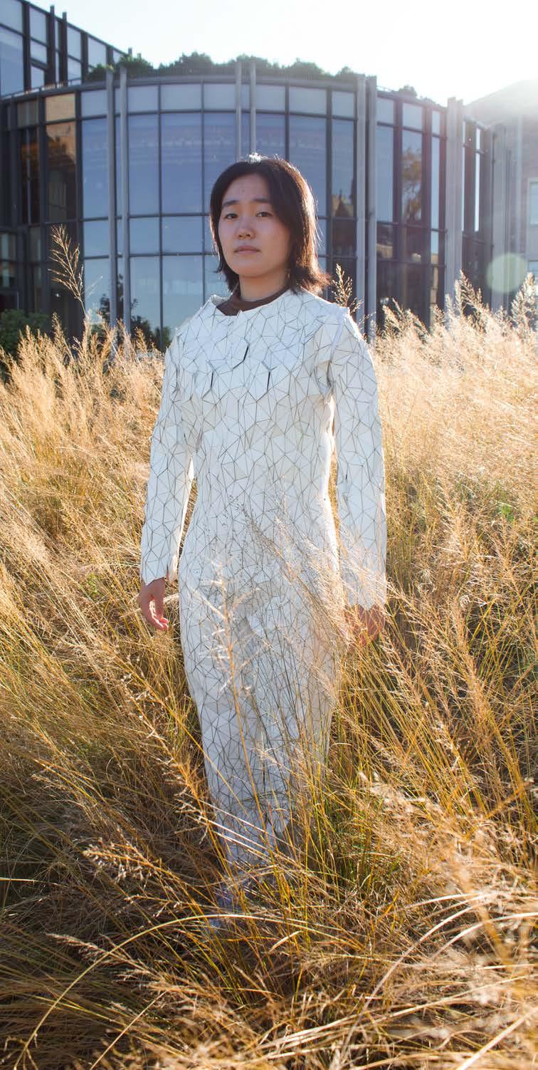
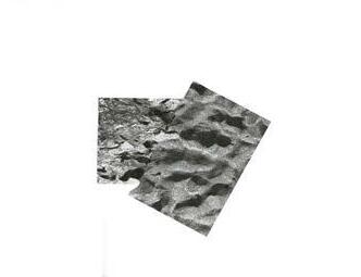
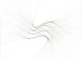
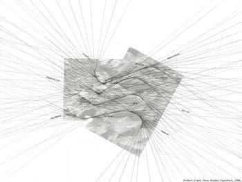
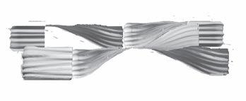
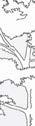
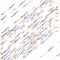
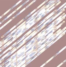
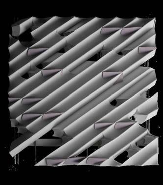
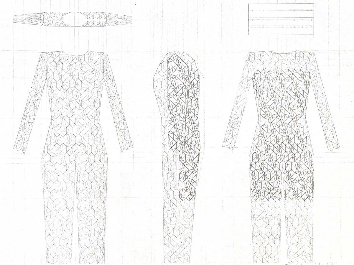
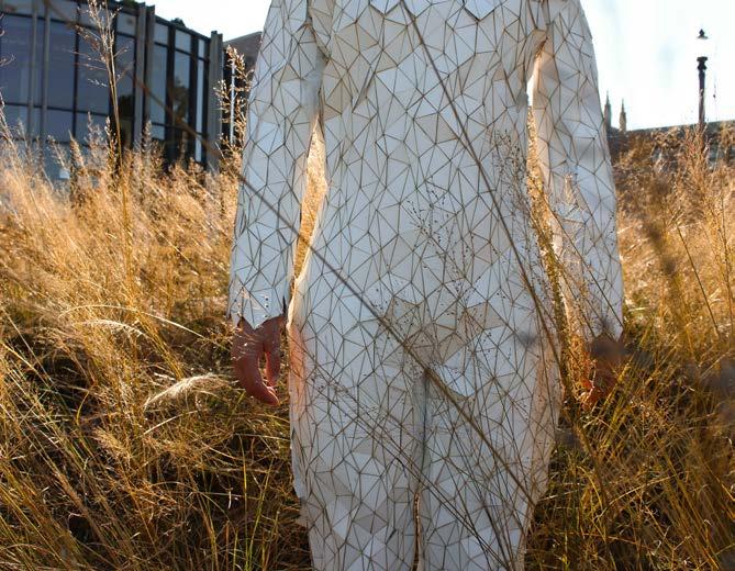
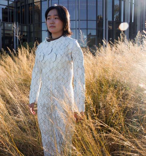
This project began by examining a written passage from Dune by Frank Herbert describing an extreme environment of unbearable heat, wind, and exhaust. After weaving images of two textures that resemble this environment, tangent lines revealed important intersections in the palimpsest (images above) forming a tesselation. Then, in the continuing examination of this futuristic environment, a body-device was designed to combat the elements. The central idea behind the body suit was that it would be able to protect the inhabitant from all forms of a harsh world - from extreme sun exposure to harsh winds to frigid temperatures.
The process to create this device began by sewing the underlying bodysuit out of Tyvek and using a zipper, running along the shoulder, down the arm, and to the waist to fit a tight form of the body. The next step was applying a tessellation design, adapted for both movement and protection.
Bodysuit in collaboration with Elliot Andrew Model: Natsuko Nozaki
After designing the landscape, inspired by the linework of the palimpsest, a bivouac shelter in the extreme environment was designed to live amongst the sand dunes. The design was inspired by an interest in how wind forms sand dunes and create convex and concave curves. Thus these curves were used to shape the bivouac so it would be responsive to the environment. The shingles serve as a wind gauge and to represent what could be used as solar panels for power. In the model and drawings, there is a common increment forming landscape, wall, and shingle, to create a uniform and simple aesthetic.
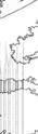
Hand drafted drawings are seen to the right. Section A demonstrates how the solar shingles respond to the windy desert environment.

Chunck 01 preliminary sketches over historic architectural drawings and modeled oblique elevations
Chunck 02 preliminary sketches over historic architectural drawings and modeled oblique elevations
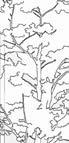
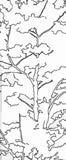
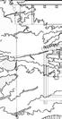
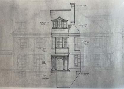
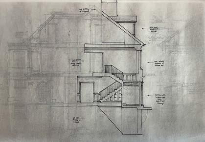
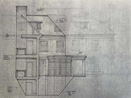
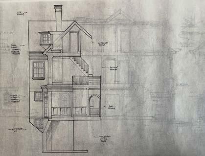
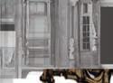
The 1920s in St. Louis was a decade of growth and excitement, innovation and grandeur. It was a period where extravagant mansions were built per demand by white-upper-class families. In 1926, 54 Westmoreland Place was one of these houses, located in the prestigious neighborhood of Westmoreland and Portland Place. Now gated and inaccessible to the public, these mansions exist excluded from the public eye. Thus, their interiors and exteriors can only be seen through blueprints kept at the historic St. Louis Library. By examining the architectural drawings through tracing and modeling, as seen to the left, this house can already by considered uncanny in today’s context through it’s separated servants quarters and hidden kitchen to jogged fireplaces. Taking chuncks to highlight the weirdness, the oblique elevations served as a perfect template to make futher uncanny through AI models.
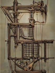
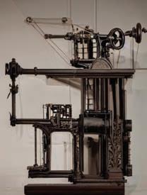
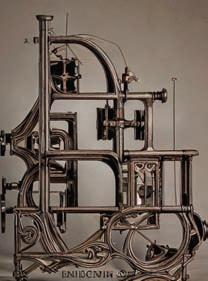
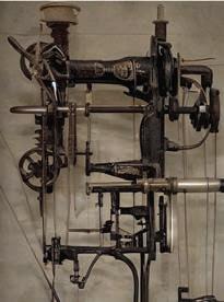
Using Automatic 1111 to create images and Lora to train image and text data sets, these tools became inherent in creating an uncanny language that could be applied to the house to further estrange them. In an essay called Homes for Cyborgs by Anthony Vidler, the author spoke of how weaving organic and inorganic natures creates an uncanny quality. After much exploration through various components, I became enamored with the aesthetic qualities of weaving lilypads viewed from underwater and gothic architecture. However, it was missing another aspect. I went back to the reading and discovered themes of the woman’s womb as home and the woman-machine. This got me thinking of sewing machines, particualrly vintage Singer machines. Many of the machines I pulled images from were created in 1926, the same year 54 Westmoreland Place was built. This image set additionally tied the house back to St. Louis through its industrial and innovative form and historic time period. Weaving these three archetypes together (lilypad, gothic architecture, and vintage sewing machines) and placing them over the oblique house elevations resulted in images of a unique architectural language, seen to the right, of a visually unsettling yet beautifully intricate machine.
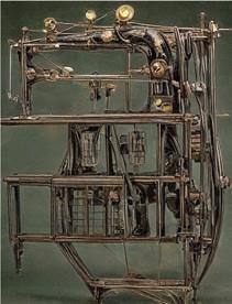
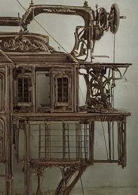
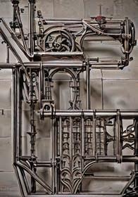
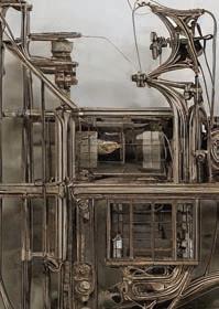


By re-examining the AI-produced images into the lens of a built architecture, a new story comes to front. How could a machine function as a house? How could it create a house? How could it do both? These questions were explored in the creation of the uncanny house. Machines must be built. Artificial Intelligence is created. Thus, there is always humanity in design and thus in a home. Referencing the essay Homes for Cyborgs, Vidler discusses how Cyborgs are of the uncanny: both human and machine. This architecture is created from the same uncanny concept. It begins as machine, created and built by artifical intelligence, yet inhabited by the human.
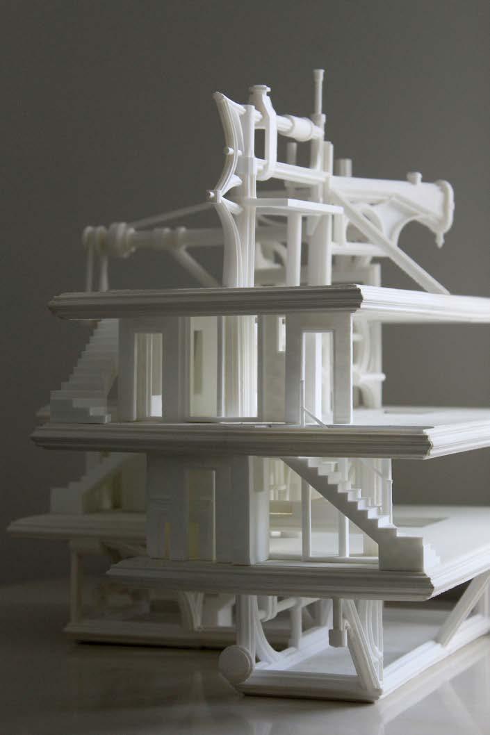
The unbuilt machine comes to site with all of it’s object-parts. These object-parts consist of various domestic-architecture building blocks, such as stairs, doors, windows, and fireplaces. It pulls itself up through its limited intelligence, given by human. It creates a house by also creating itself.
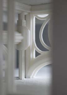
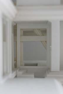
As the machine assembles itself, it pulls object-parts up onto floors, placing them in a random manner until enclosure is achieved. It will continuously place object-parts until there are no openings, thus creating a redundancy to the wall system. The machine does not know door from window, nor fireplace from stair. Hence, the machine causes windows to be stacked in front of doors, fireplaces facing the exterior, or little nooks for future furniture placement.
This excess in material is balanced by the absense of labor, creating an economic neutrality. Redundant systems, such as the one this machine creates, allows for safer egress or higher R-values. It creates a new aesthetic and experience for both the exterior and interior. The machine that the house now consumes becomes opportunity for a kitchen countertop, an integrated bench, or something as simple as a coat rack. The duality of these two systems: the object-parts and the machine, creates a unique aesthetic and home for the human - or cyborg - inhabitant.
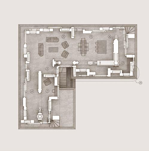
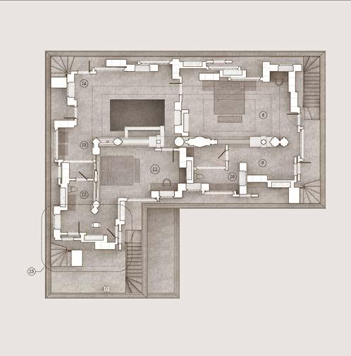
5. Butler’s Pantry
6. Circulation
7. Reading Nook
8. Primary Bedroom
9. Primary Closet
10. Primary Bath
11. Secondary Bedroom
12. Secondary Bath
13. Laundry Room
14. Circulation
15. Redundancy Diagram
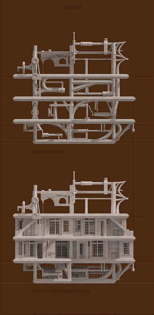
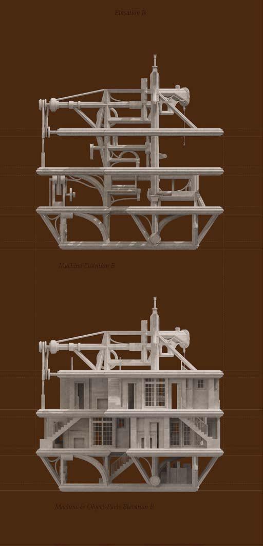
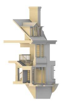
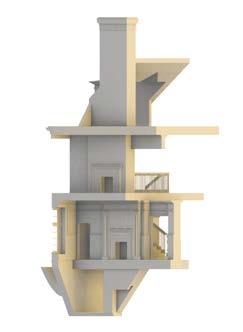
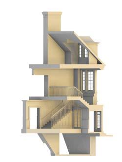
These drawings show two of the four elevations. The upper images show the machine as itself, demonstrating how the house would look without enclosure and only as the system. The would be equivalent to removing the sheatrock and siding off a house, to explose everything from the studs and insullation to plumbing and electrical, the “brain” of the house. The lower images then show how the machine assembles itself, and thus creates its final enclosure. From these elevational drawings, it becomes more aparent how the layered wall system has immense depth as well as relief, through shadows and light coming forward. It also illustrates the confusion the viewer must feel when looking at the house. Am I looking at an interior wall or an exterior? Am I inside of a vast machine or loooking at a house? All of these questions create the feeling of uncanny. We understanding waht we are seeing, and at the same time, know nothing of it. The confusion that makes your brain keep searching for answers is the uncanny, found in the house that builds itself.
Fall 2025 | Hatheway,
| in collaboration with Kaley Leblanc
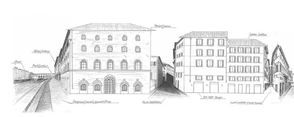
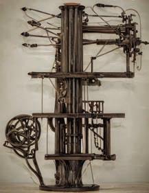
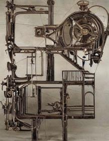
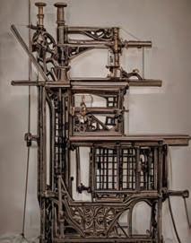
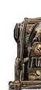
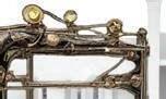
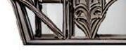
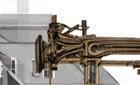
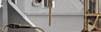
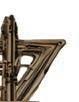
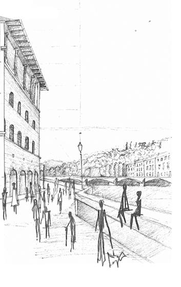
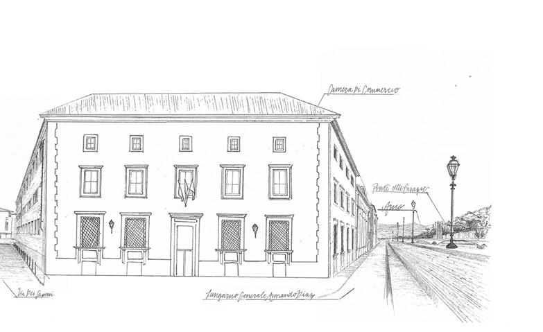
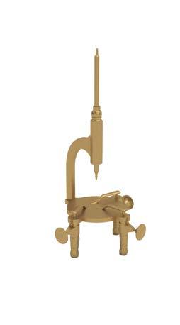
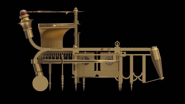
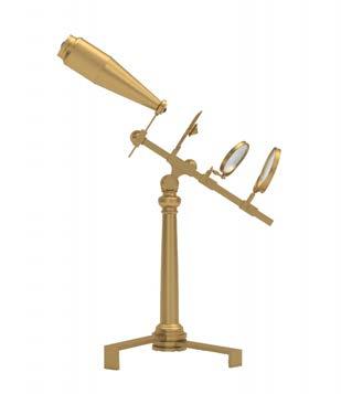
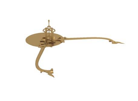
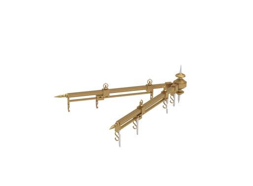
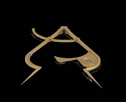
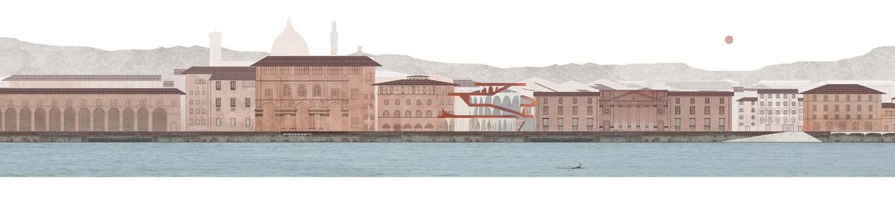
Located in Florence, Italy, the site of the Florence Drawing Institute is adjacent to Museo Galileo, a museum dedicated to the scientist and astronamer Galileo Galilei. It houses thousands of scientific instruments from the 15th through 18th centuries. The design of the proposed Drawing Institute draws from the analysis of selected objects from the museum, seen to the right (Fig. A.-E.).
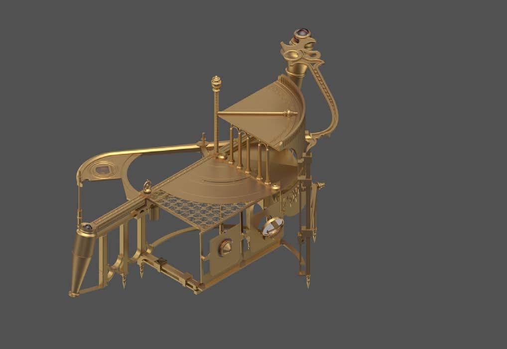
By examining their purposes and aesthetic values, these selected objects were combined into a theoretical new instrument (Fig, F.-G.) called ‘The Cartographer’s Compass.’ It is an instrument for automated artistry and embraces new technology while mainting the aesthetics of the old. Movement, directionality, and delicacy were prioritized in design.
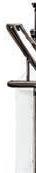
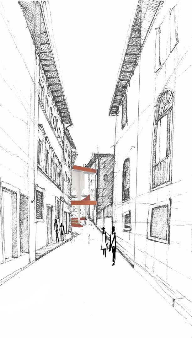
The skeptical facade to the right shows an initial translation of the Cartographer’s Compass into an architectural intervention. It prioritizes the connection, movement, and delicacy of the Cartographer’s Compass.
Extended Elevation
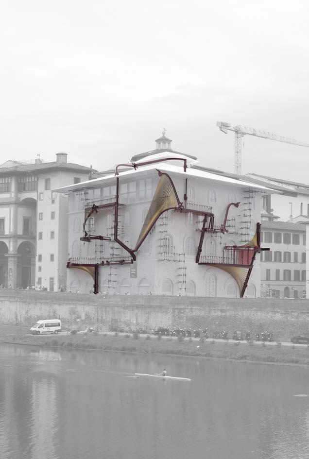
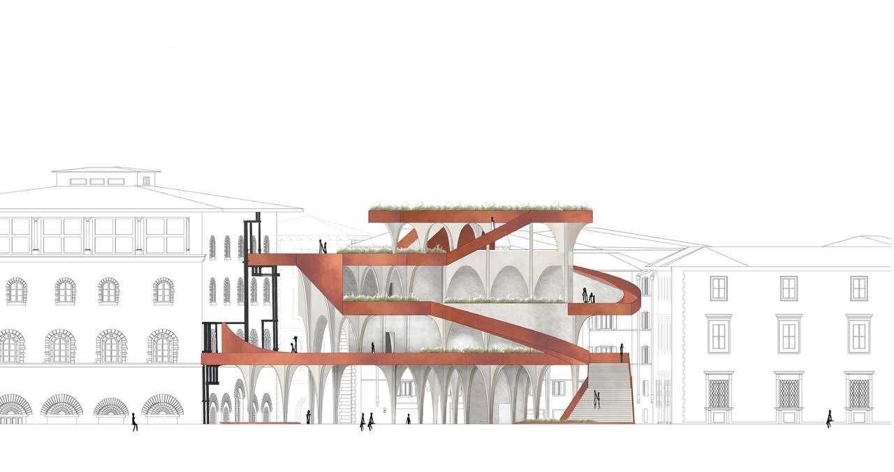
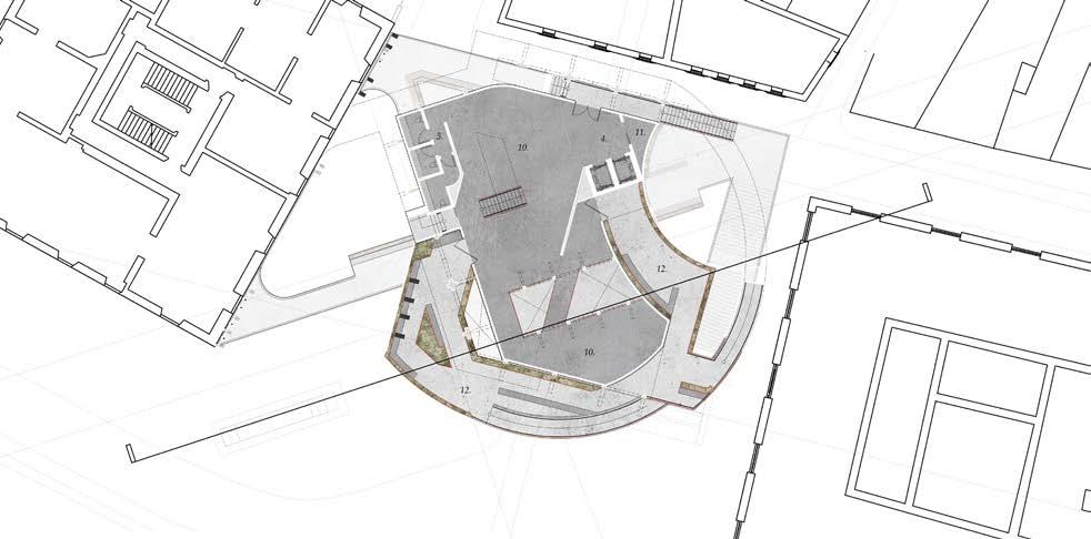
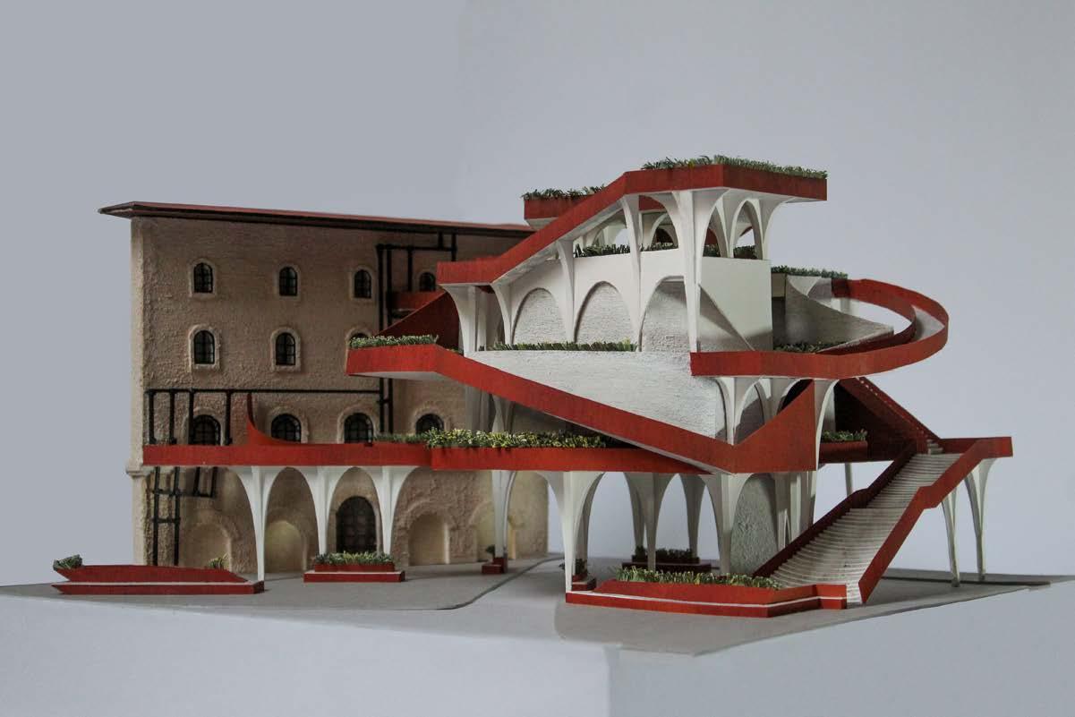
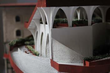
The design of the Florence Drawing Institute is composed of three elements: the stone core, the framing corten, and the plaster columns. Much of Florentine architecture is made from stone, and the continuing use of this material was important to the project’s narrative. The central program of the Florence Drawing Institute is to display the prepatory sketches of Renaissance artists and architectural drawings of important Florentine architecture as across time, drawing has been an underappreciated artform. The interior stone core of the drawing institute is designed to appear fortified like Renaissance buildings, and to thus protect the fragile drawings from light and weathering.
The second element of the proposed design is the corten metal, a modern and playful material, which in constrast to the drawings, is meant to be weathered. The corten dives in and out of the stone core to frame and bound exterior spaces for the secondary program: drawing practice. While the stone is more rational in form and materiality to Florence, the corten takes on a more irrational narrative. The corten creates private outdoor spaces around the building for patrons to relax, sketch, and take in the sights of the city.
The third element of the design are the plaster columns. Their purpose is both structural and to balance the tensions between the rational and irrational elements (the stone and corten). While columns are typical of Florentine architecture, these columns begin to break the rationality of the Renaissance: they are not all uniform in shape, they brace multiple floors, they are situated on irregular axis. The columns seen around Florence are additionally made of stone, while the columns of this design would be plastered in white to articulate the delicacy of the columns themselves through color.

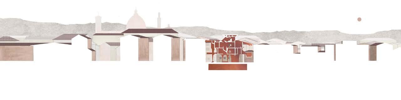
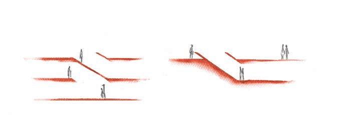
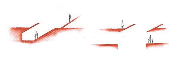
Section Thesholds: Sections through the architecture showing sightlines.
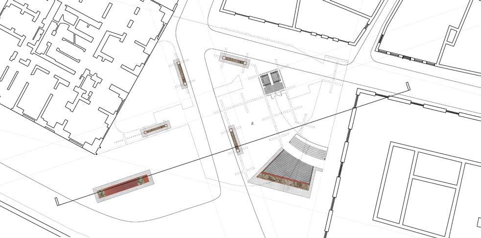
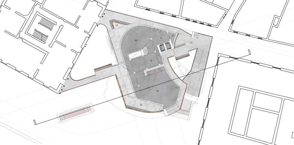
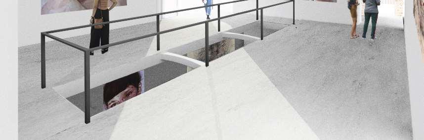
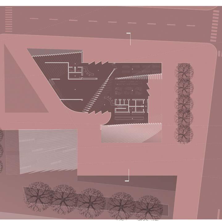
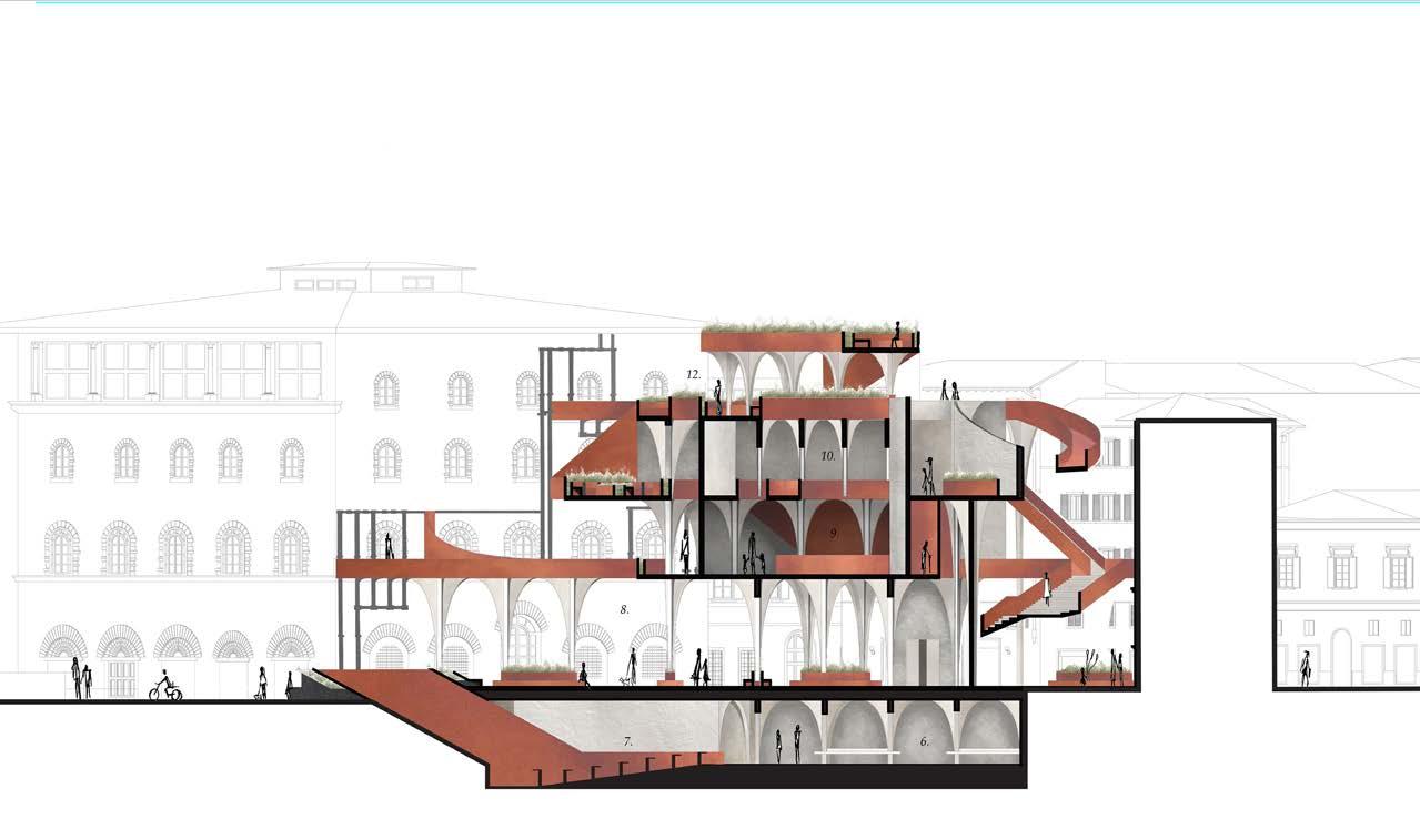
A central design strategy for the site was to keep the piazza activated. Piazzas serve as a central key to the urban fabric of Florence for markets, socializing, and even sunlight amongst the narrow Florentine streets; the building gives the once-parking-lot back to the public. An array of columns raise the building off the ground and allow space for the street to pass underneath, public seating, a light-well, and an elevator shaft and large staircase to draw the public up into the museum. These columns exist on two-axis defined by the neighboring buildings which in turn helps to define the shape of the building above.
Another integral piece to the design of this drawing institute was the public space that would extend beyond the piazza and around the museum. It’s purpose is to invite patrons to explore different views and perspectives of Florence, that could once not be captured. The public space is also important by allowing more plants into Florentine architecture culture, as the city is often sparse with greenery.
The Florence Drawing Institute connects directly into the Museo Galileo in three locations to allow the museum’s programs to be in conversation with each other. A scaffolding system supports these Museo Galileo interventions as it was important to not directly interfere with the historic building.
Observational Drawings