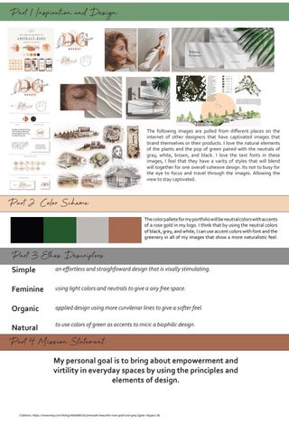
Part 1 Inspiration and Design
The following images are pulled from different places on the internet of other designers that have captivated images that brand themselves or their products. I love the natural elements of the plants and the pop of green paired with the neutrals of gray, white, brown, and black. I love the text fonts in these images, I feel that they have a varity of styles that will blend will together for one overall cohesive design. Its not to busy for the eye to focus and travel through the images. Allowing the view to stay captivated.
Part 2 Color Scheme The color pallete for my portfolio will be neutral colors with accents of a rose gold in my logo. I think that by using the neutral colors of black, grey, and white, I can use accent colors with font and the greenery in all of my images that show a more naturalistic feel.
Part 3 Ethos Descriptors Simple
an effortless and straighfoward design that is visally stimulating.
Feminine
using light colors and neutrals to give a airy free space.
Organic
applied design using more curvilenar lines to give a softer feel.
Natural
to use colors of green as accents to micic a biophilic design.
Part 4 Mission Statement My personal goal is to bring about empowerment and virtility in everyday spaces by using the principles and elements of design.
Citations: https://www.etsy.com/listing/866888535/premade-beautiful-rose-gold-and-grey?gpla=1&gao=1&