PORTFOLIO

Passionate student curious to explore impactful cultural and sociological design with reliable personal and technological skill s. Enthusiastic worker who enjoys collaboration as a constant way to induce creativity and broaden perspectives. Currently seeking to utilize an architect’s education, its related 2D/3D multimedia skills and visual communication methods to further a career in architecture illustratio n, graphic design, and marketing. Truly interested in the design field and how r elated practices cross-pollinate and emerge in design choi ces. Provides a distinct eye for detail and legibility for composition as well as a differentiated background to solving design problems. INFORMATION
DRAW COLLECTIVE
Architectural Intern May 2023 ‒ Aug 2023
KENT STATE UNIVERSITY
COLLEGE OF ARCHITECTURE AND ENVIRONMENTAL DESIGN
Team Publicist
Sept 2023 ‒ Present
FREELANCE PHOTOGRAPHER
Freelance Present
QBurgh Team Photographer
June 2022 ‒ July 2023
KENT STATE UNIVERSITY
College of Architecture and Environmental Design
Bachelor of Science in Architecture 2021 ‒ 2025
HILLEL AT KENT STATE
Social Action Co-Vice President Sept 2022 ‒ May 2023
Service Engagement Intern Sept 2022 ‒ May 2023
KENT STATE UNIVERSITY
Student Success Leader 2022 ‒ 2023
LEED Green Associate May 2023
‒ KSUF CAED Most Inspiring Student Project Merit Award (2024)
‒ CAED Florence Larson Architecture Scholarship (2023)
‒ CAED X-Gallery Recipient (Fall 2024, Spring 2023, Fall 2022)
‒ Hillel Emerging Leader Award (2022)

amandacetorelli@gmail.com


412-759-8560

_afc_photography
SKILLS:
PERSONAL
‒Time Efficient
‒ Detail Oriented
‒ Problem Solver
‒ Strong Work Ethic
‒ Collaborative + Communicative
TECHNOLOGICAL
‒ Adobe
Illustrator, Lightroom, Photoshop
‒ Microsoft
Excel, PowerPoint, Word
‒ Rhinoceros 3D
‒V-RAY, Twinmotion
‒3-D Printing


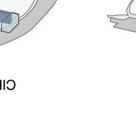
flat roof
“floating”
connectingbridge grounded “piazza/courtyard” recreated
model 4model 5
openspacebelow, lighteningmass paralleltoLoggia glassfacades contemporarystyle midtermbuilding/bridge opening removed
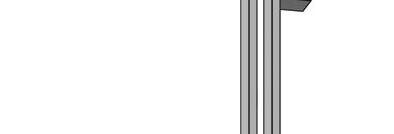
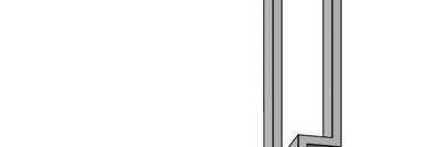
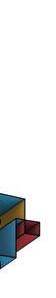
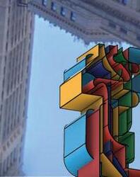
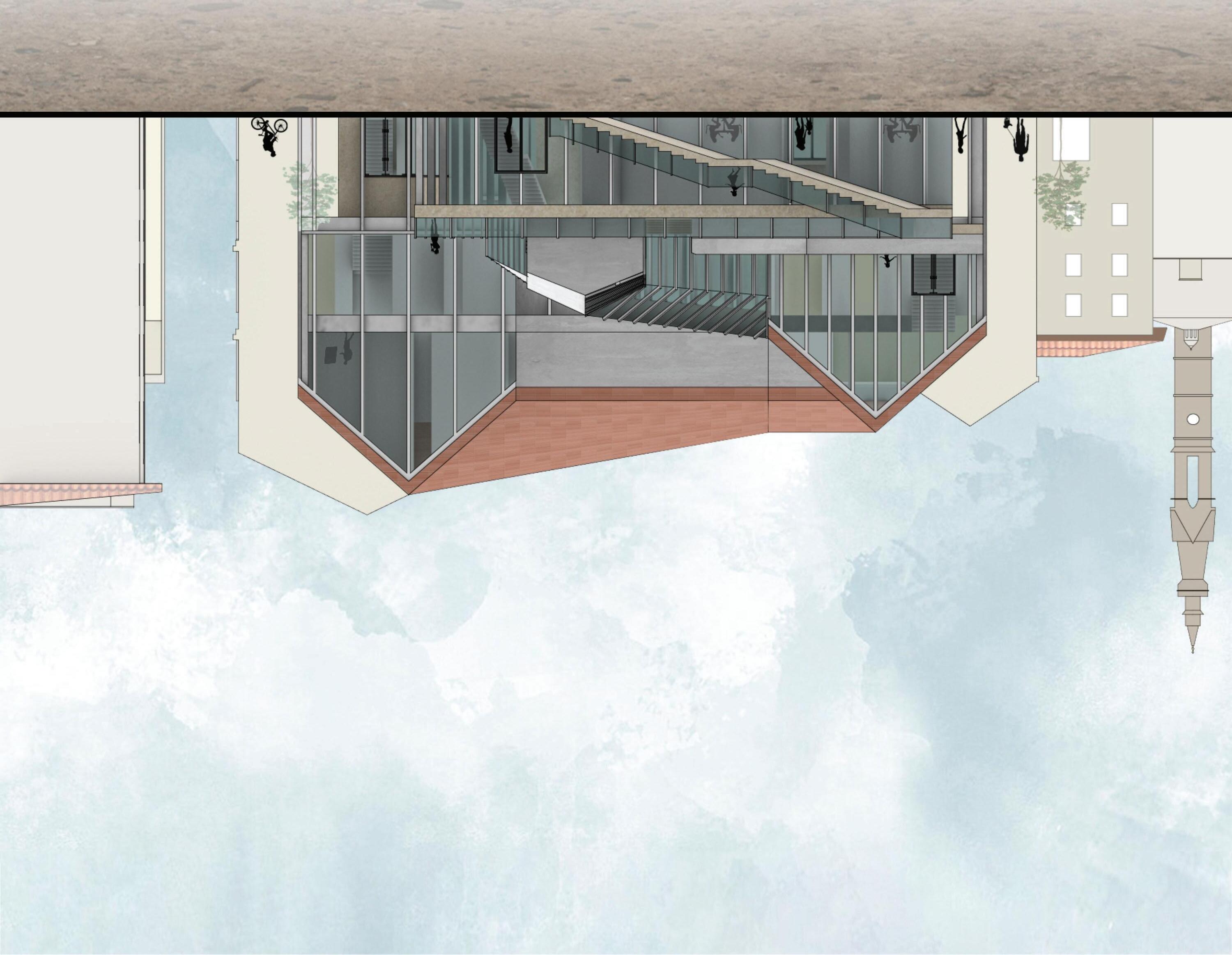
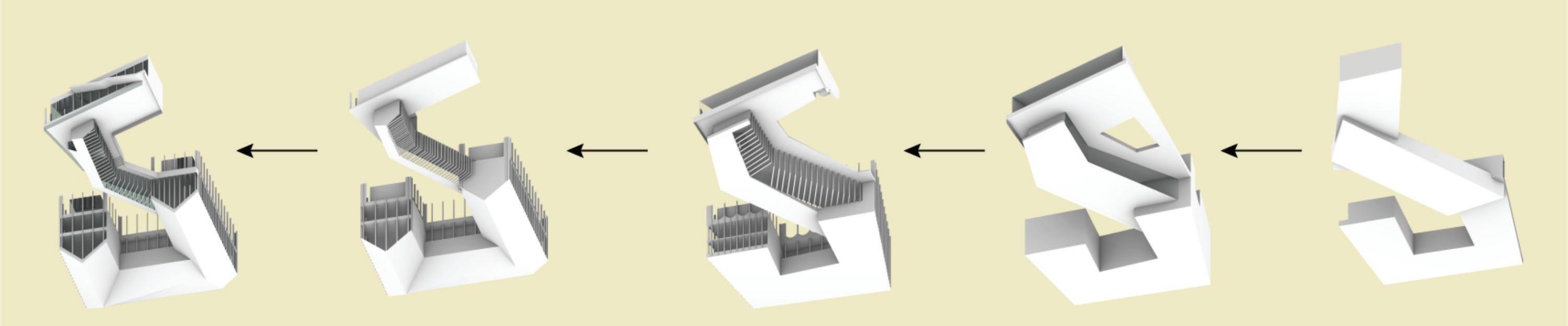
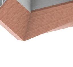
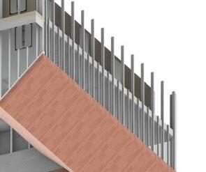
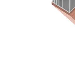
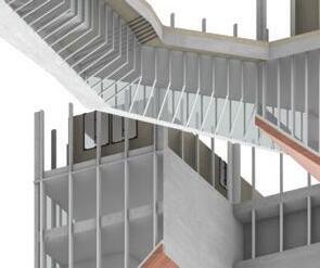
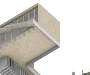
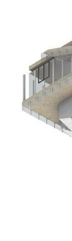
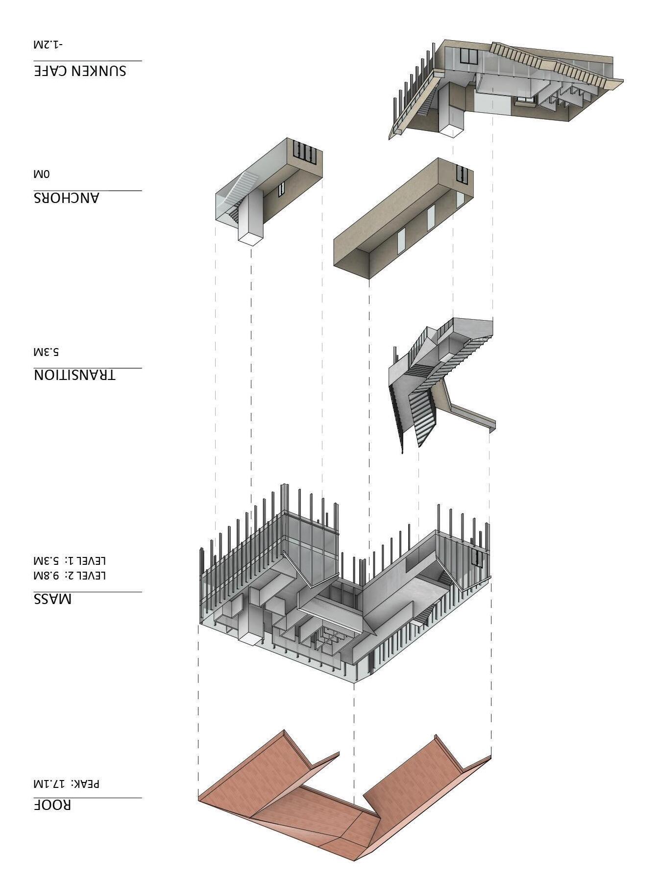
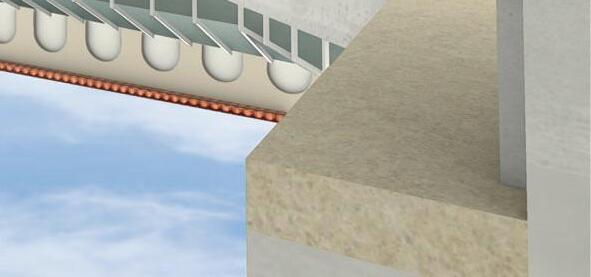
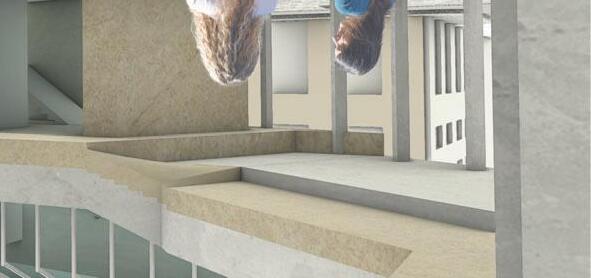
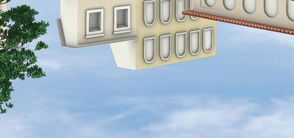
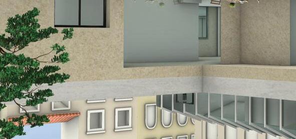
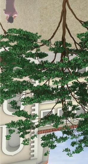
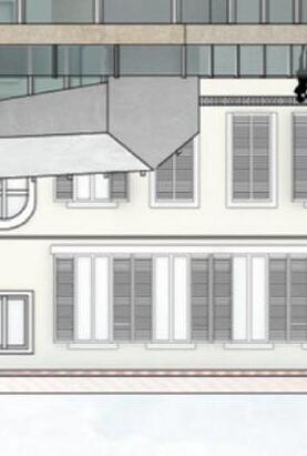
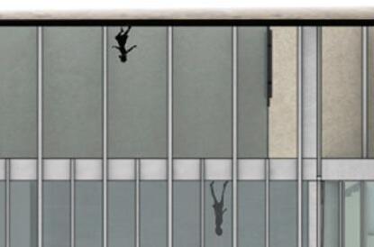
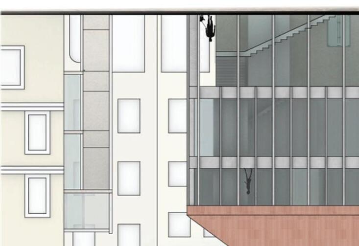
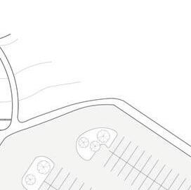
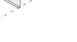
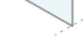
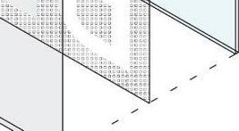
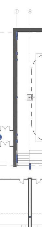
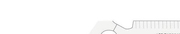
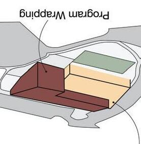
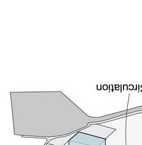
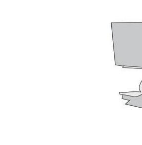
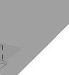
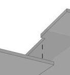
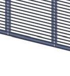
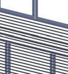
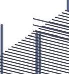
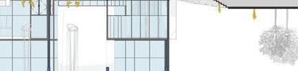
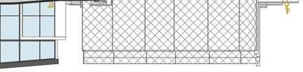
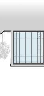
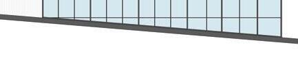
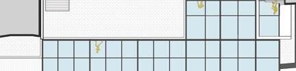
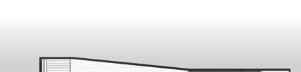
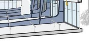
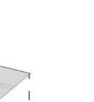
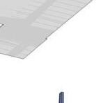
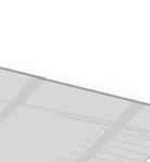
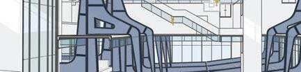
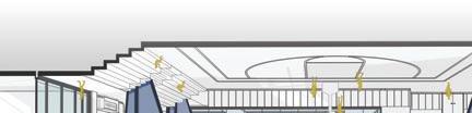
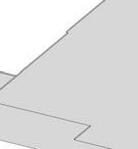
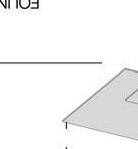
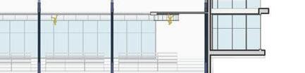
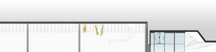
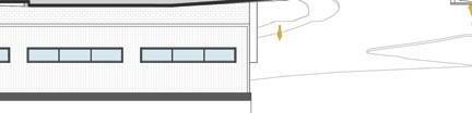
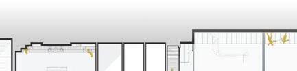
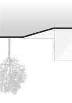
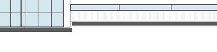
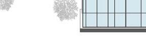
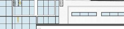
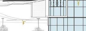
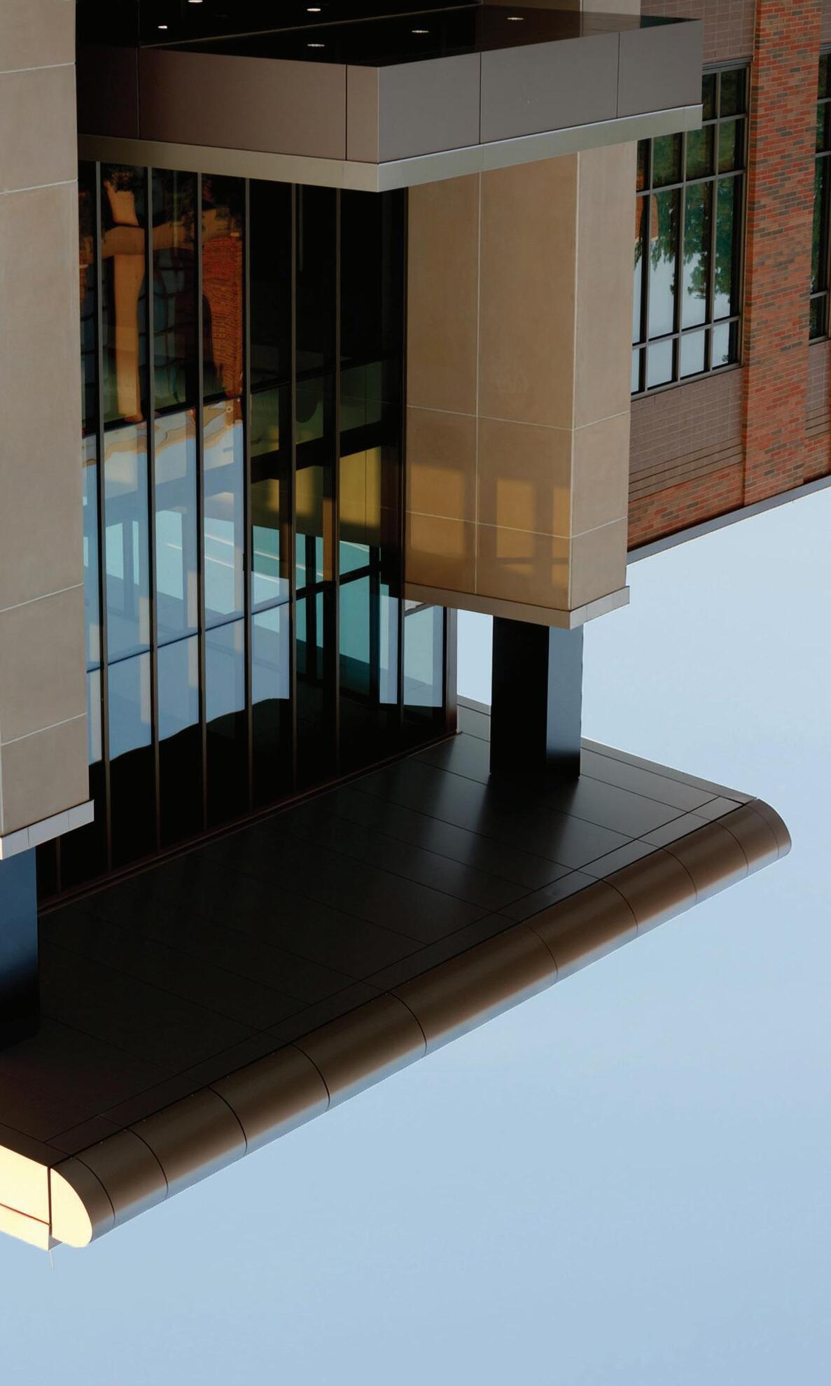
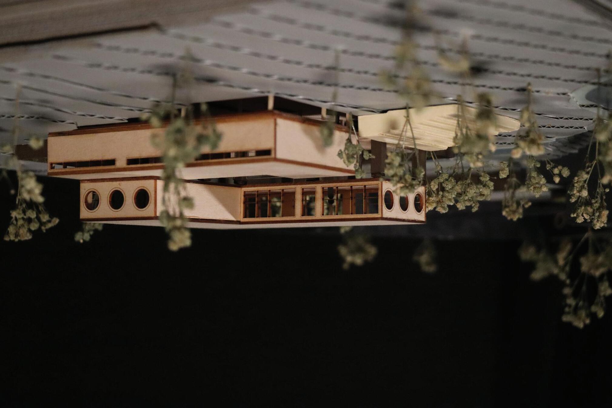
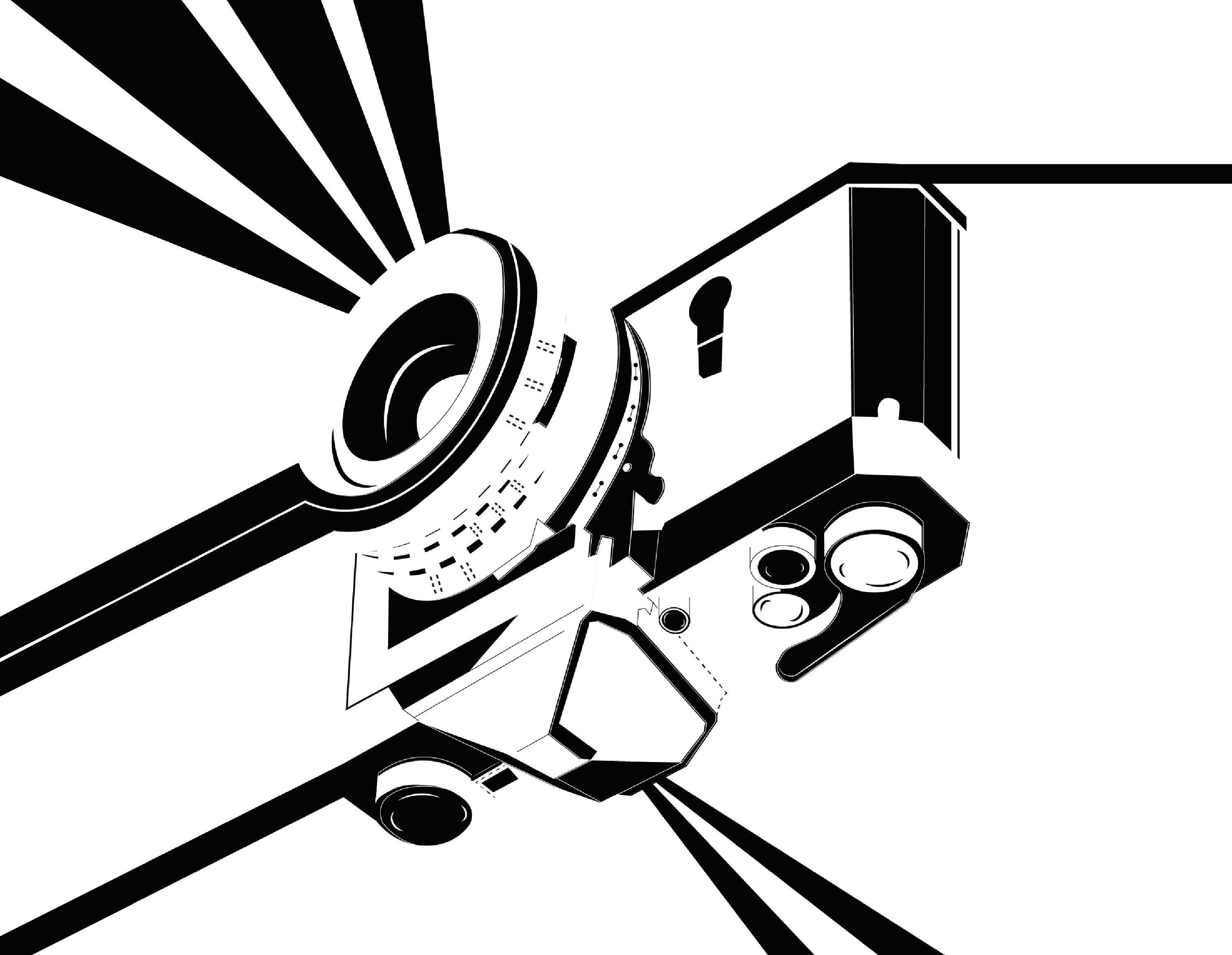
Bridging Connections: Piazza and Urban Community Center proposes an interactive and full-circulation urban experience addressing the previous conditions of the Piazza dei Ciompi while enhancing its natural characteristics. Located in Florence, Italy, the contemporary building and piazza invite natives and non-natives to rest, socialize, and interact with the square.
pitchedroof
program moved to ground
bridge connected to corner stairinfrontofcafe elevationof cafedeepened
progressfinal
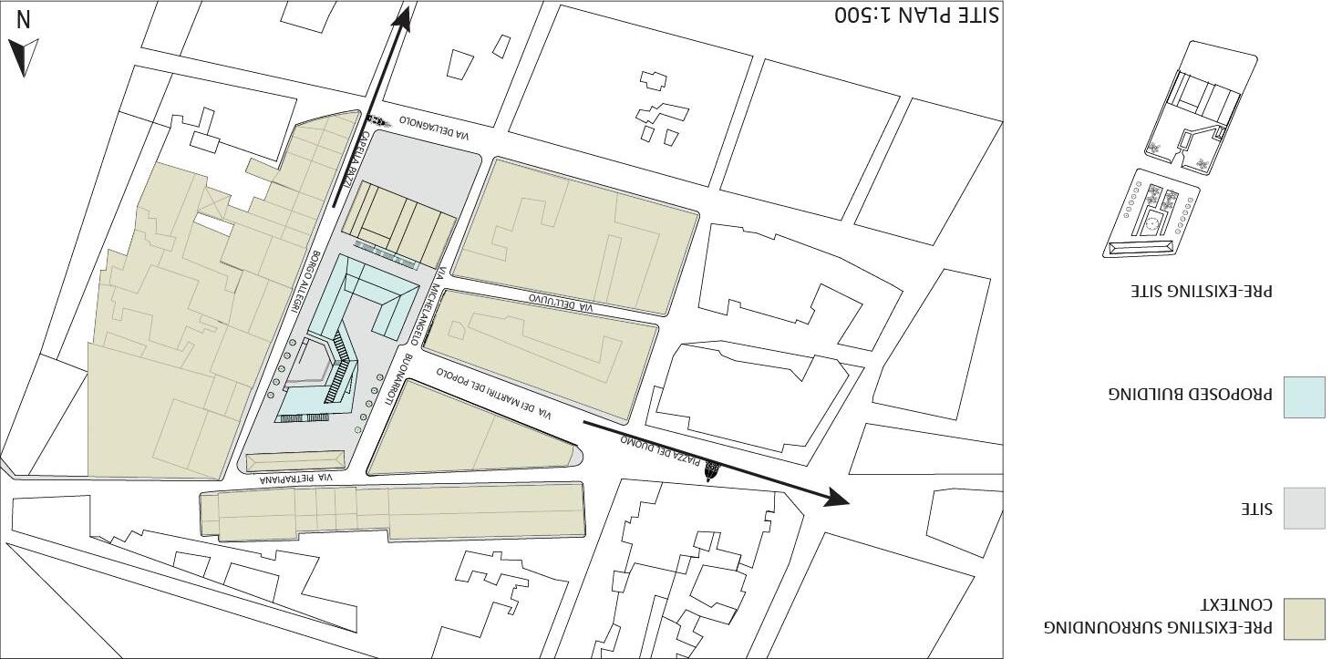
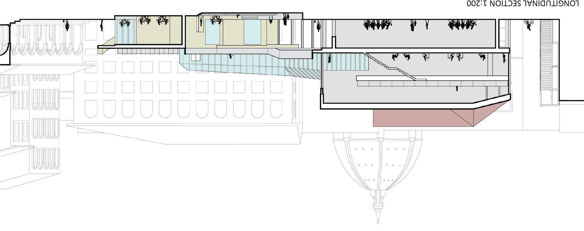
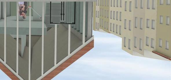
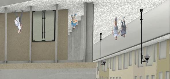
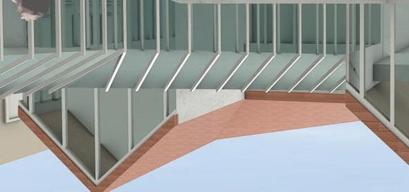
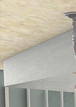
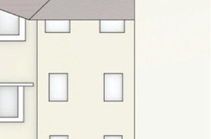
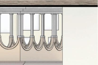
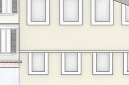
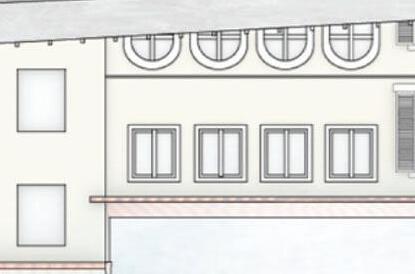
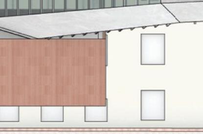
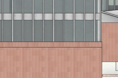
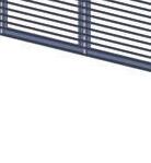
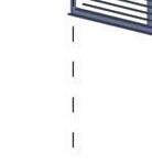
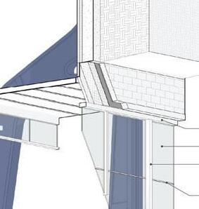
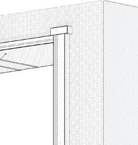
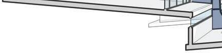
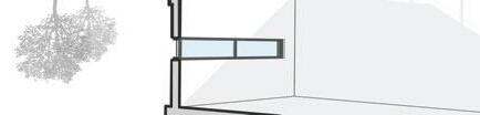
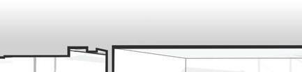
Envisioned is a lively space that celebrates a historic structure, the Loggia del Pesce, and shelters users as a way of communicating its urban stability. The elongated scale of the building and its elevated form engage the site, allowing the piazza and building to communicate as one organism that promotes activity for gathering and play. To respect the surrounding Italian architecture, thoughtful considerations to the materials of the building were made: traditional sandstone on the ground level transitions to cement and steel on the upper levels, a terracotta pitched roof to match the surrounding buildings, and glass facades act as a transparent wall of the encased activity.
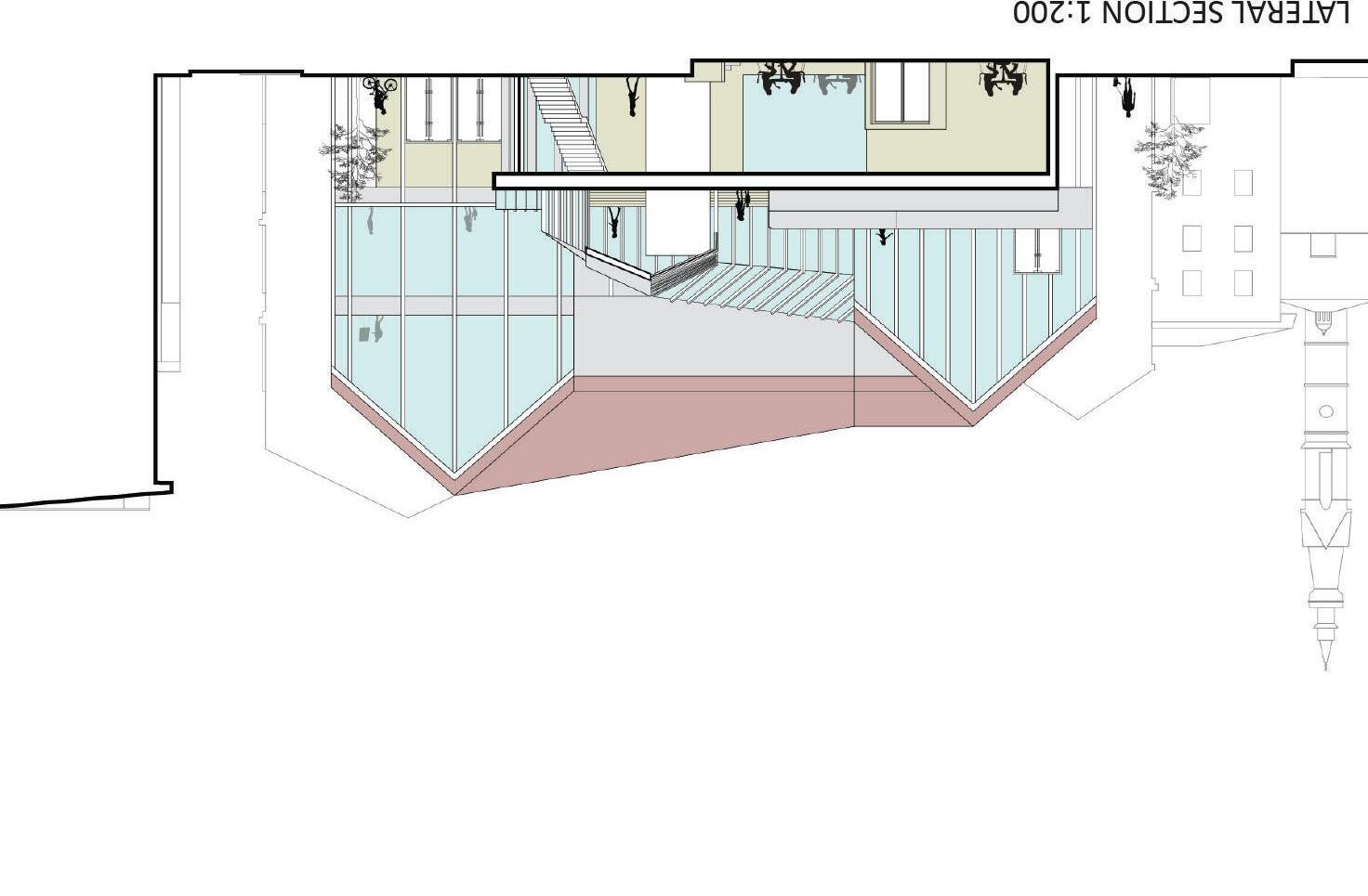
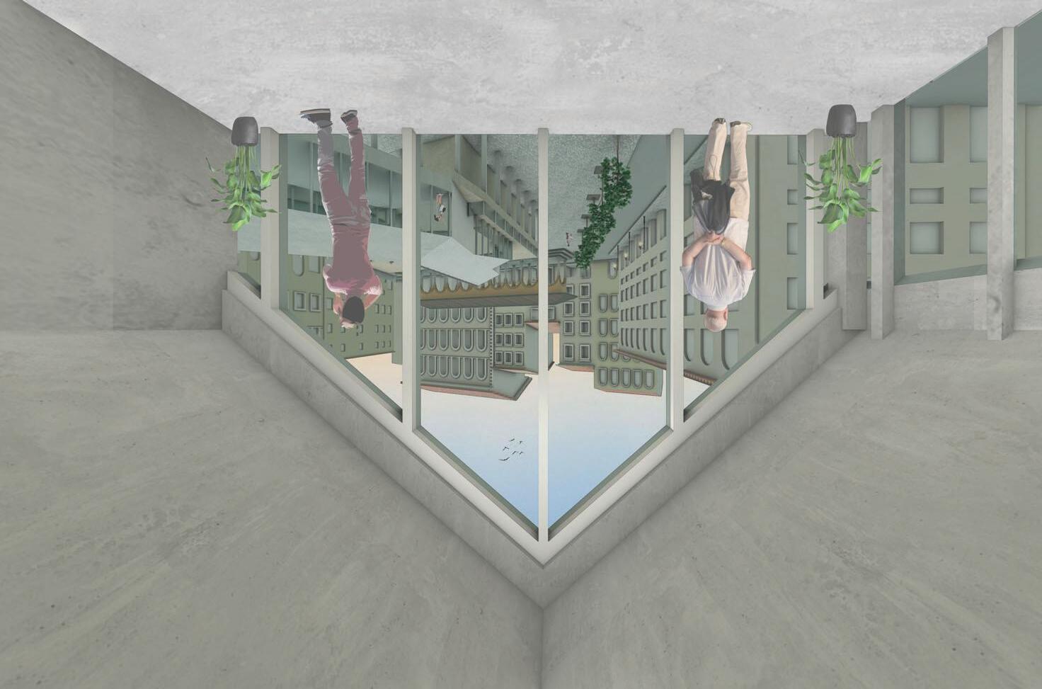
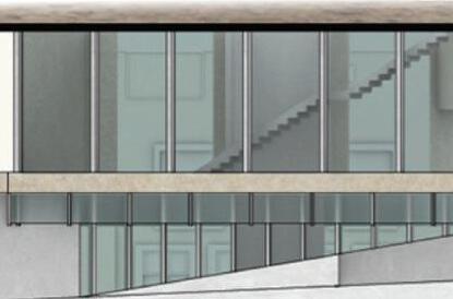
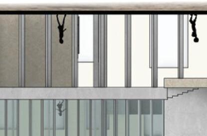
Connecting the proposed building to the pre-existing structures is done by creating an alleyway for the fi re staircase which mirrors the language of the contemporary building staircase in front of the cafe. Generating a terrace to view the Loggia furthers human interaction with the structure by creating another perspective of the tall shelter to admire its strength, history, and beauty.
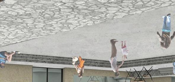
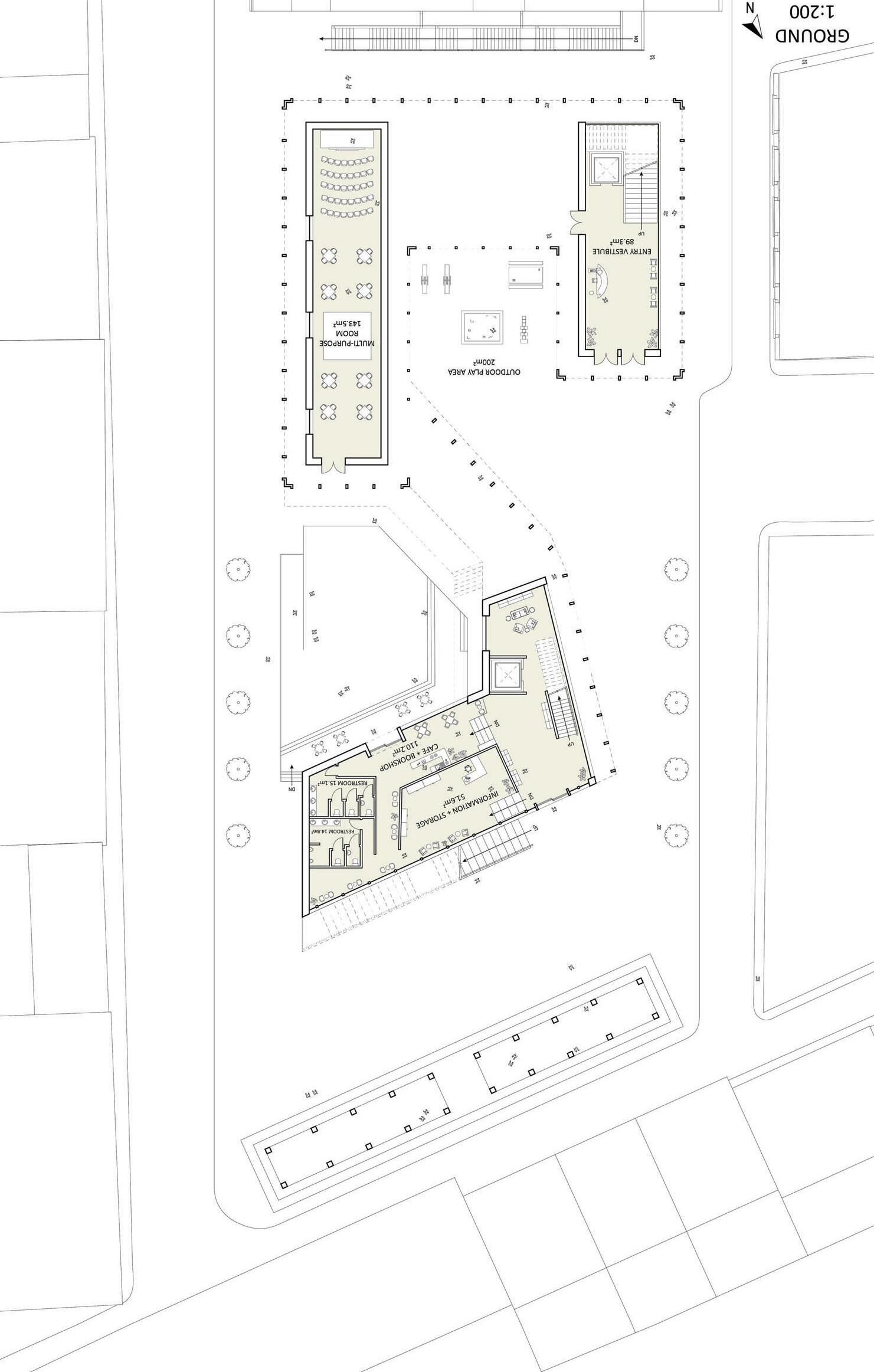

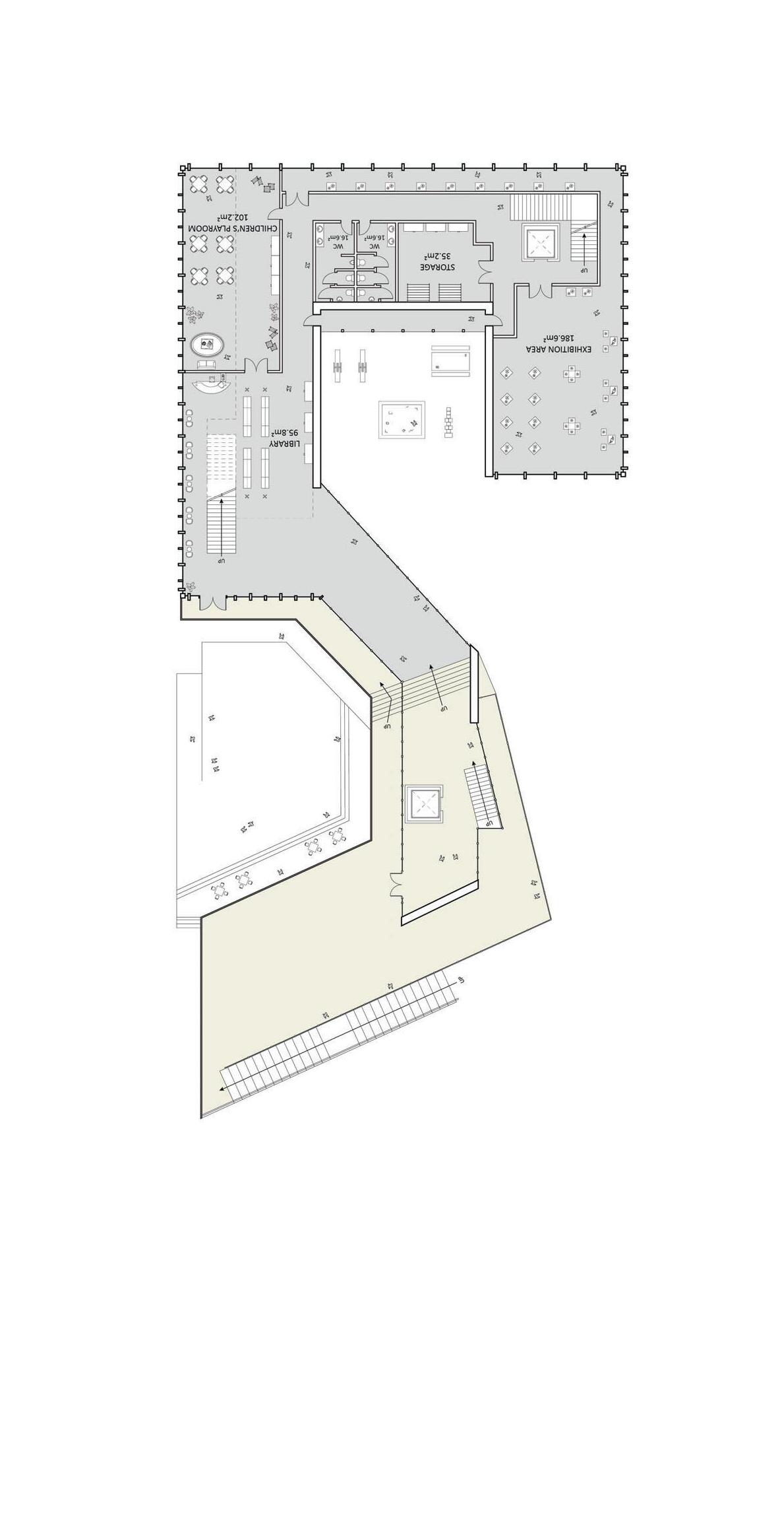
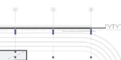
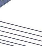
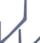
Creating a centralized, fluid space that users gravitate towards rather than walk around was a large driving factor for the design. Above is a conceptual drawing de fi ning the building form by major intersection perspective points.


ADVISOR: ADAM YARACS
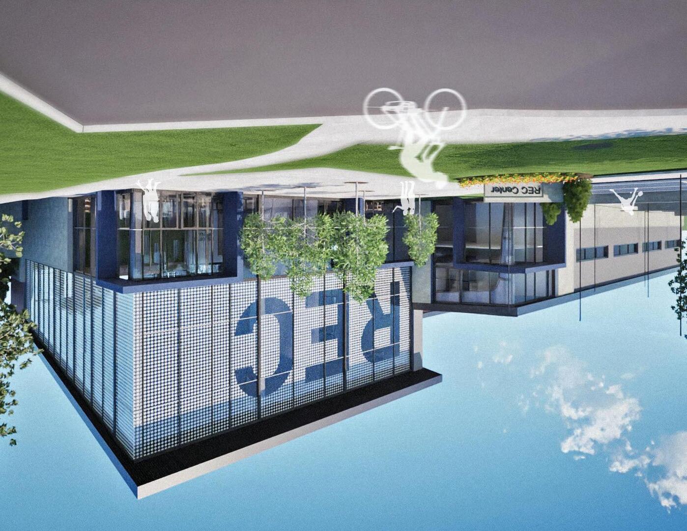
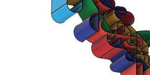
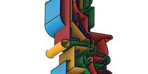
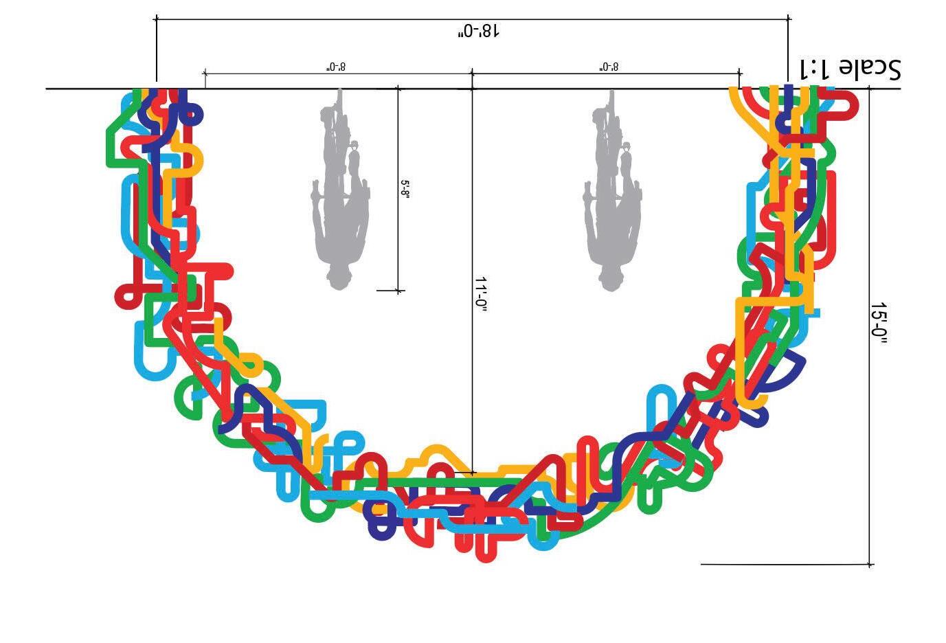
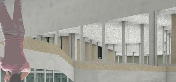
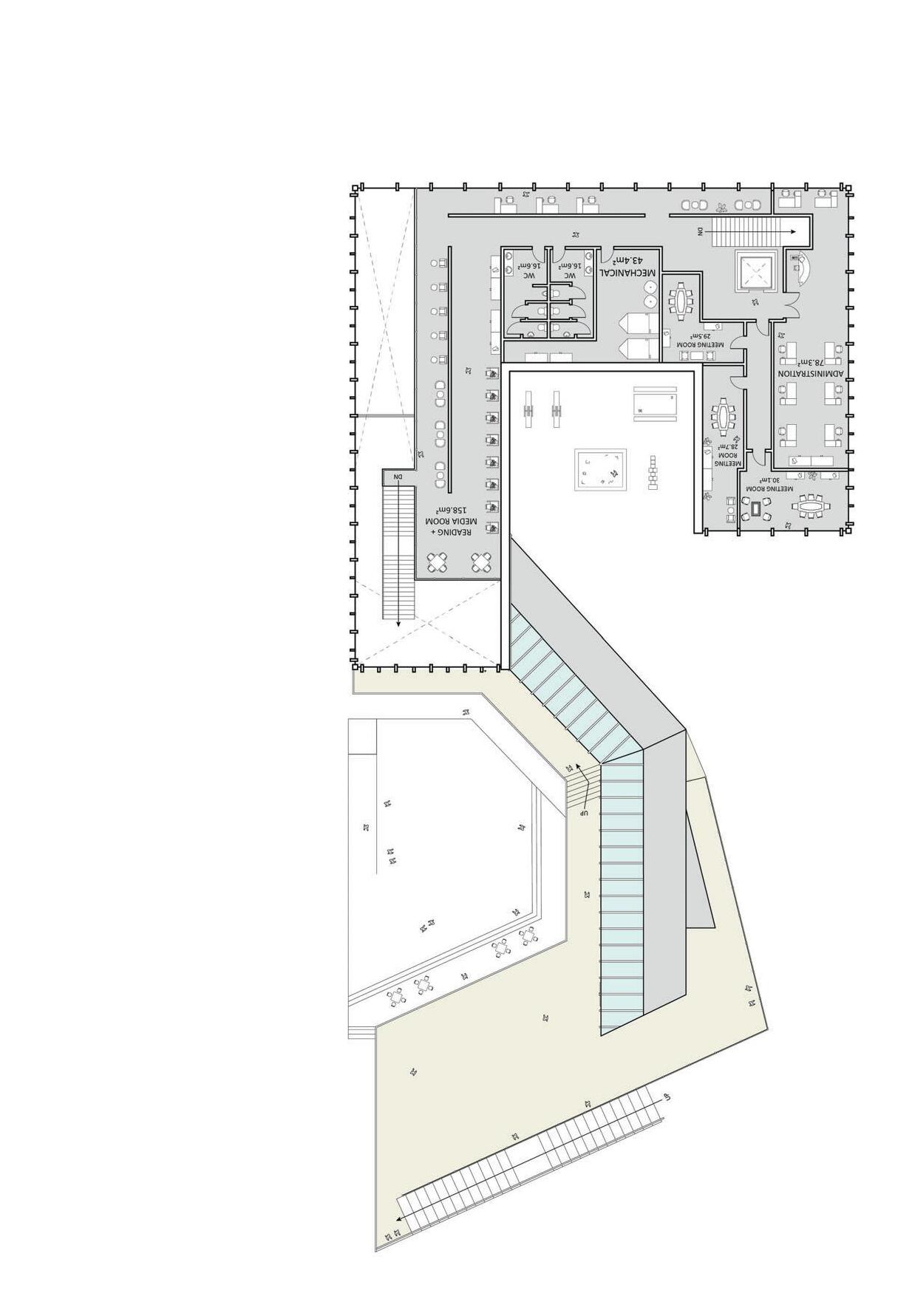
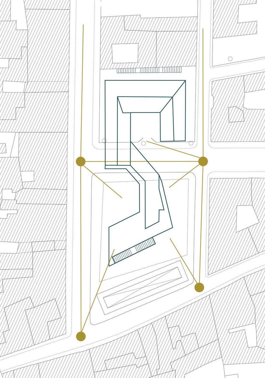
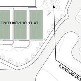
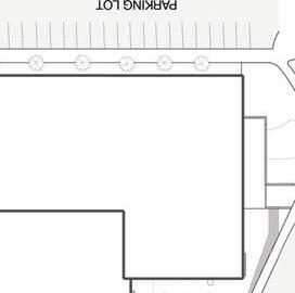
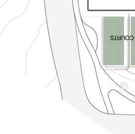
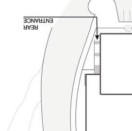
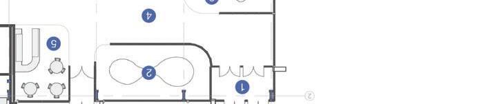
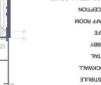
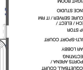
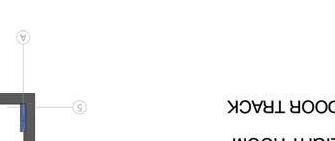
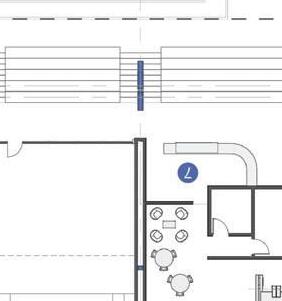
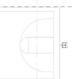
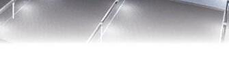
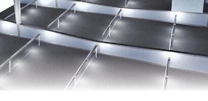
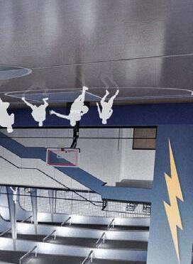
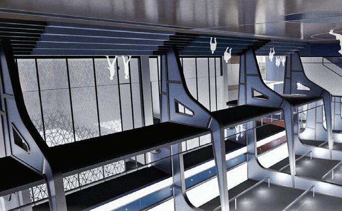
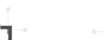
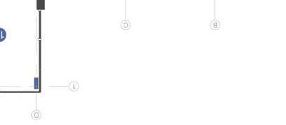
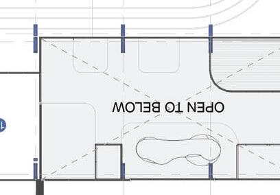
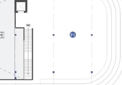
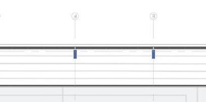
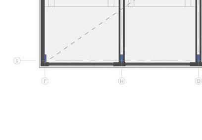
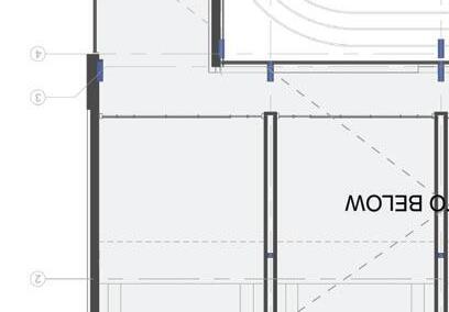
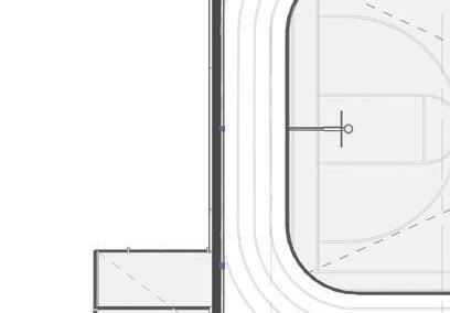
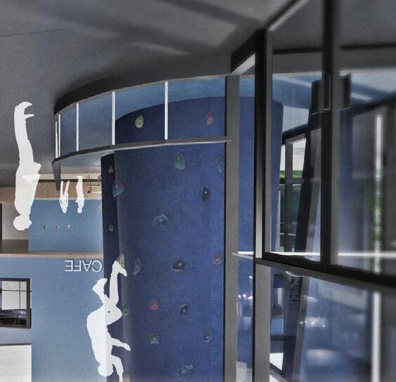
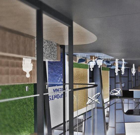
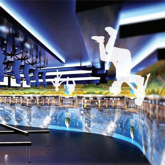
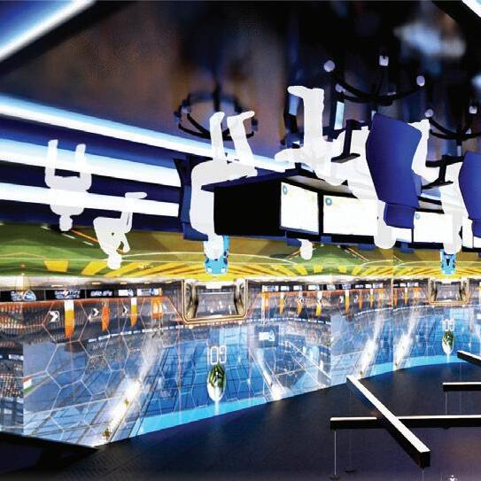
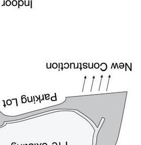
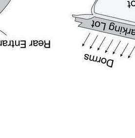
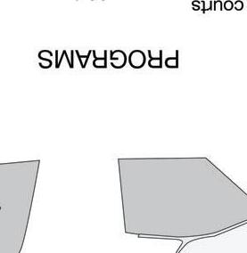
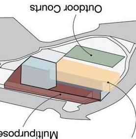
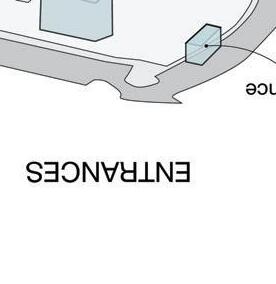
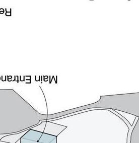
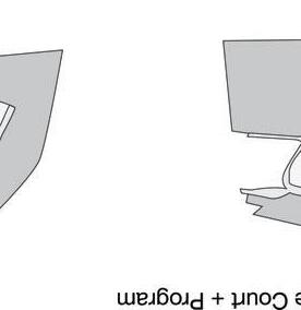
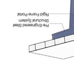
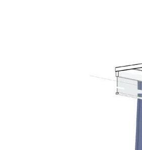
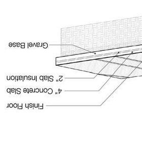
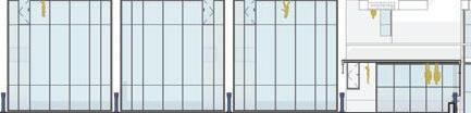
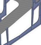
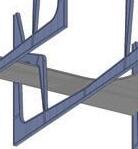
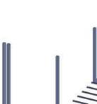
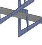
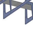
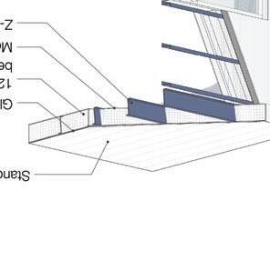
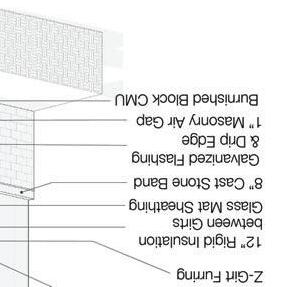
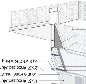
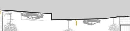
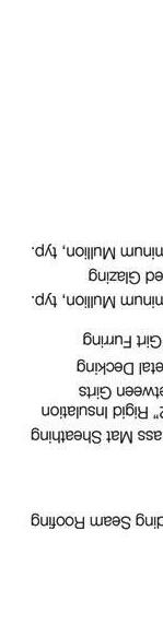
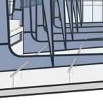
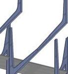
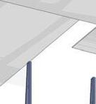
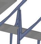
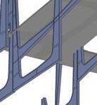
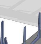
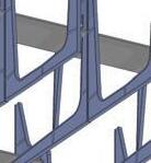
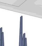
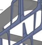
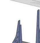
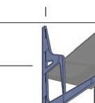
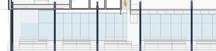
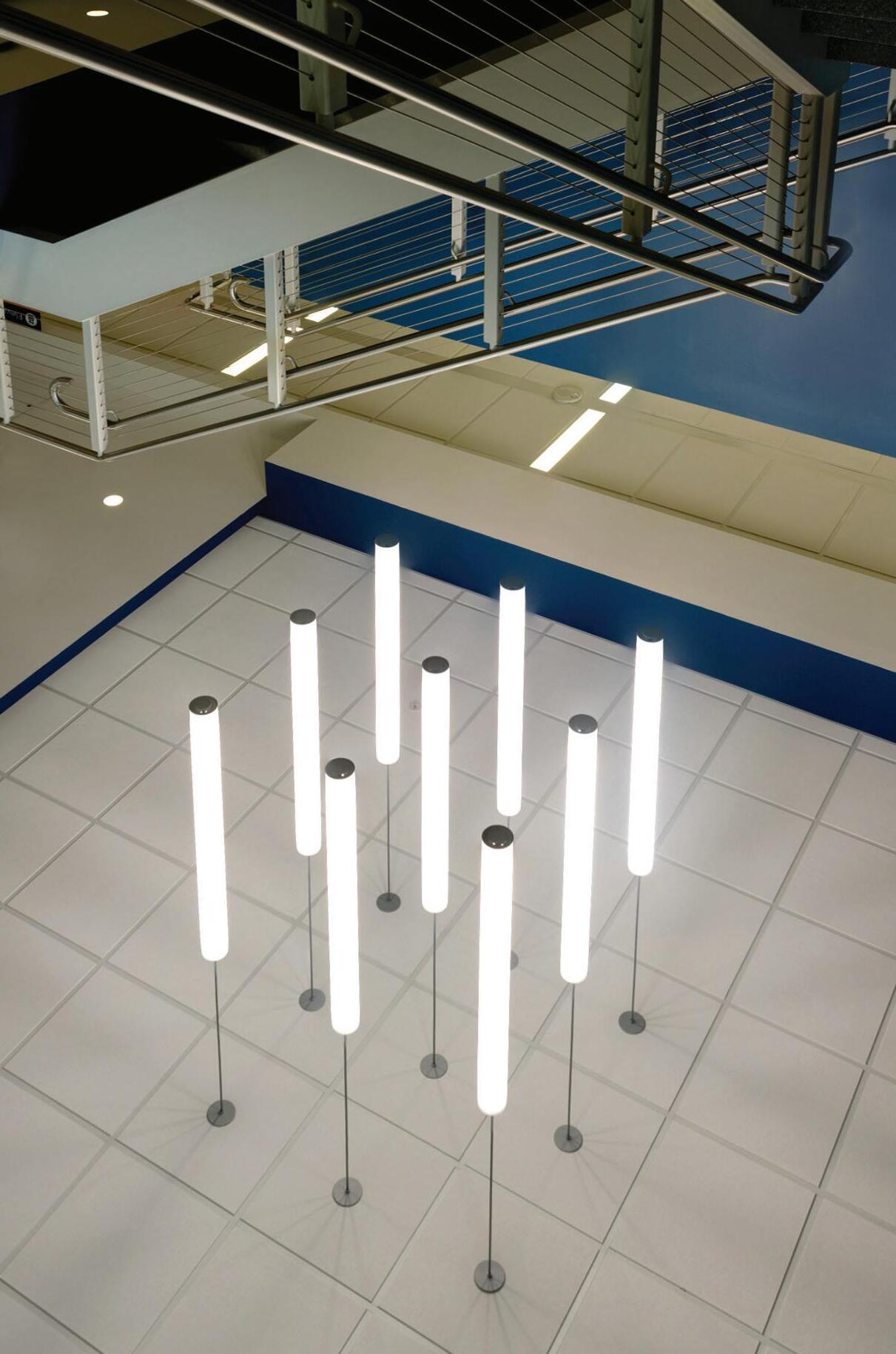
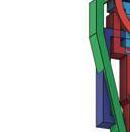
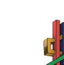
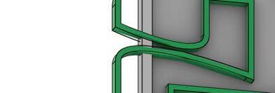
Proposed is a national student design competition submission challenging teams to create a new university sports complex that pushes the standards of metal construction to create the most innovative design solution celebrating metal structures. Serving the student population, the Rec Wellness Center occupies a repurposed dormitory site with a 22’ grade change to host a variety of indoor and outdoor activities. Custom built and colored metal framework supports the building while expressing more energetic forms to metal that unites the structure to the university. With a focus on health and wellness through a sustainable, unique design the team developed a dynamic wellness hub celebrating metal structures.


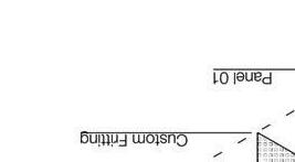

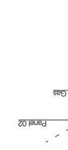
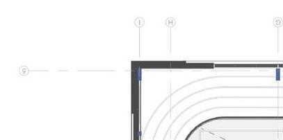
PLAN 1' = 20'-0"


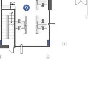

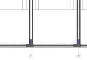
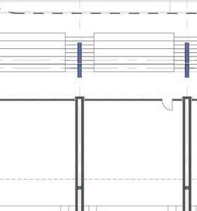
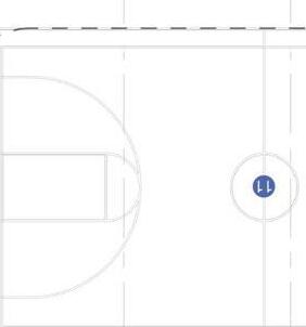
= 20'-0"


Fall 2024
Professor: Jaime Kennedy
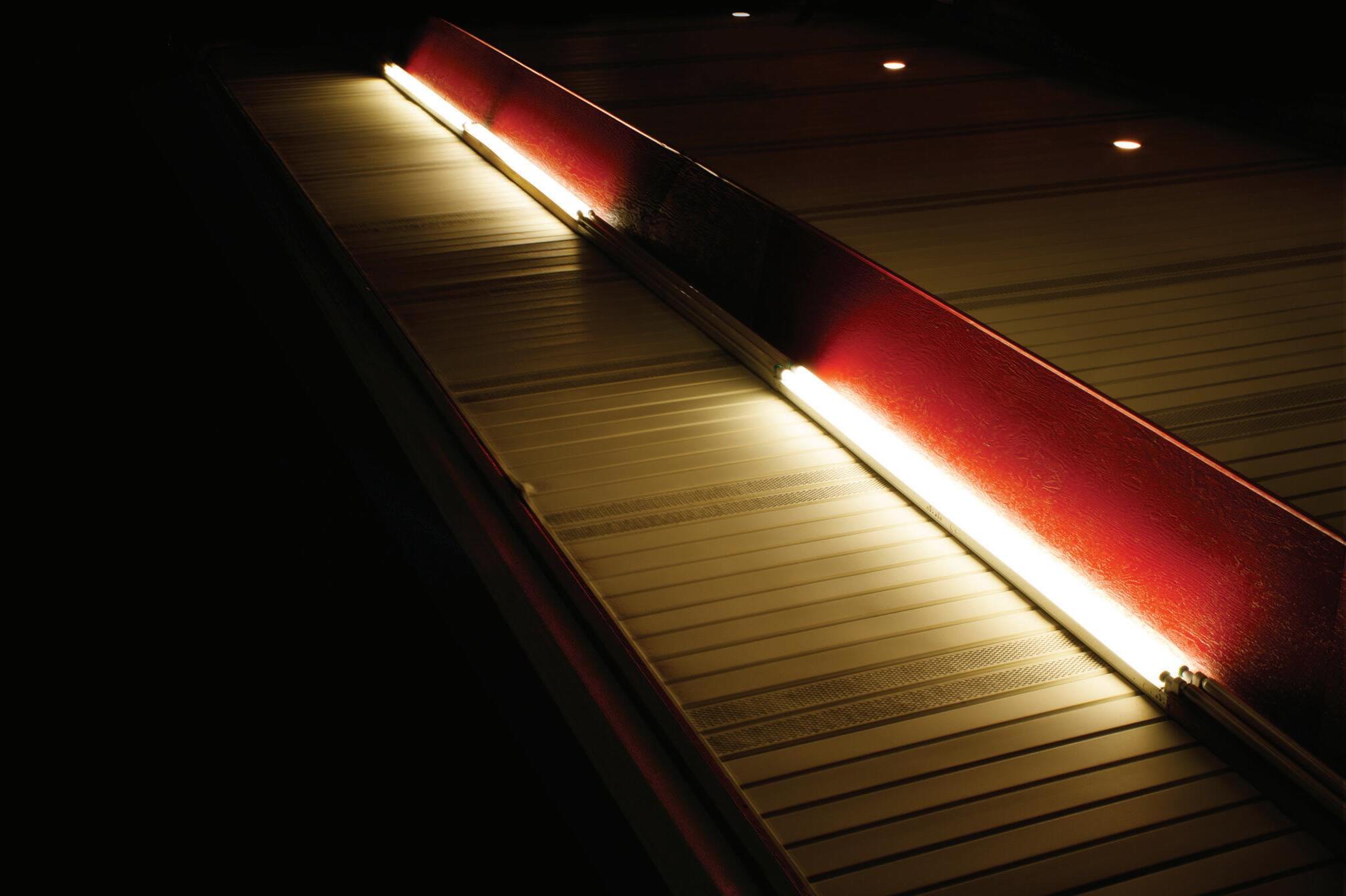
Architectural Photography
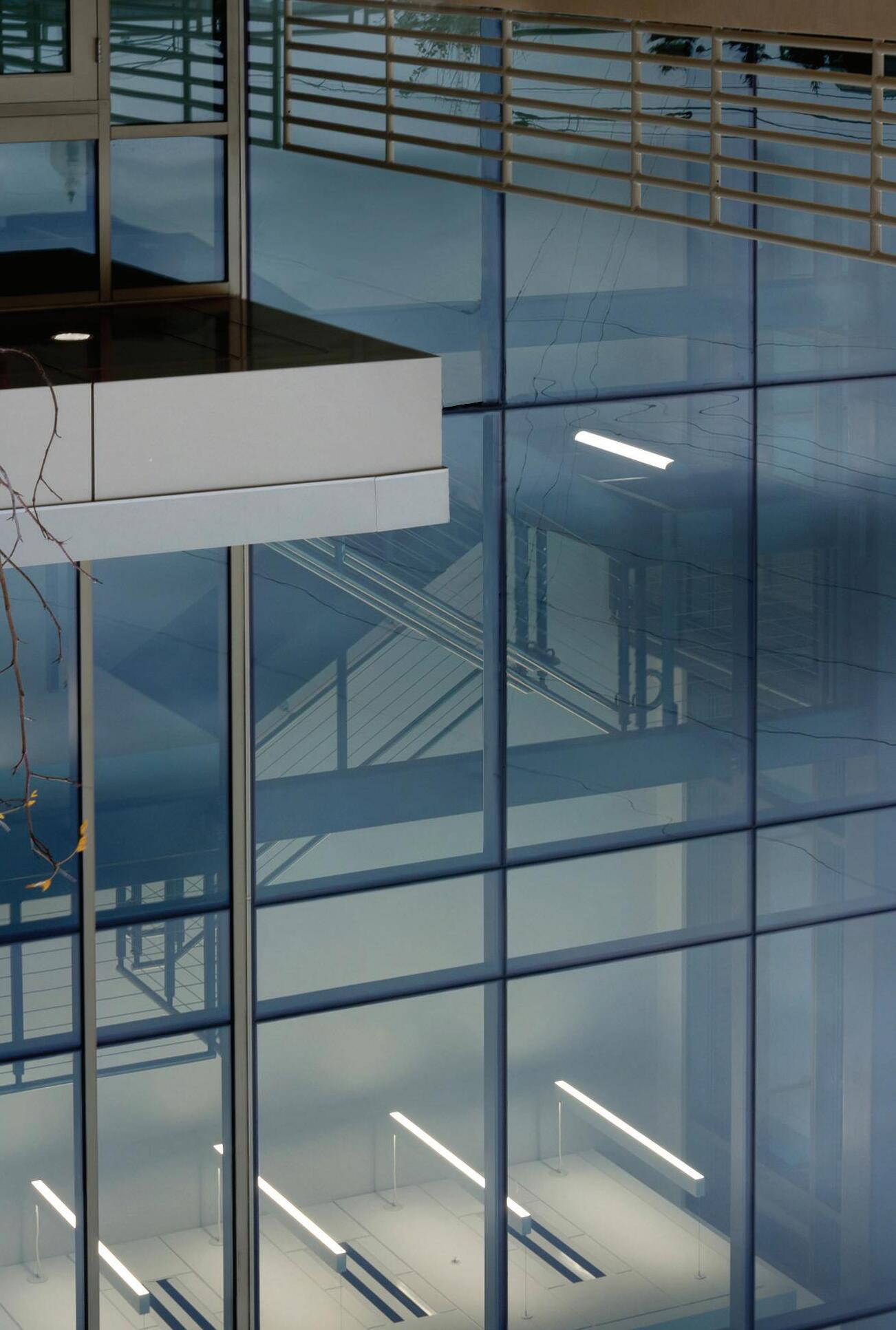
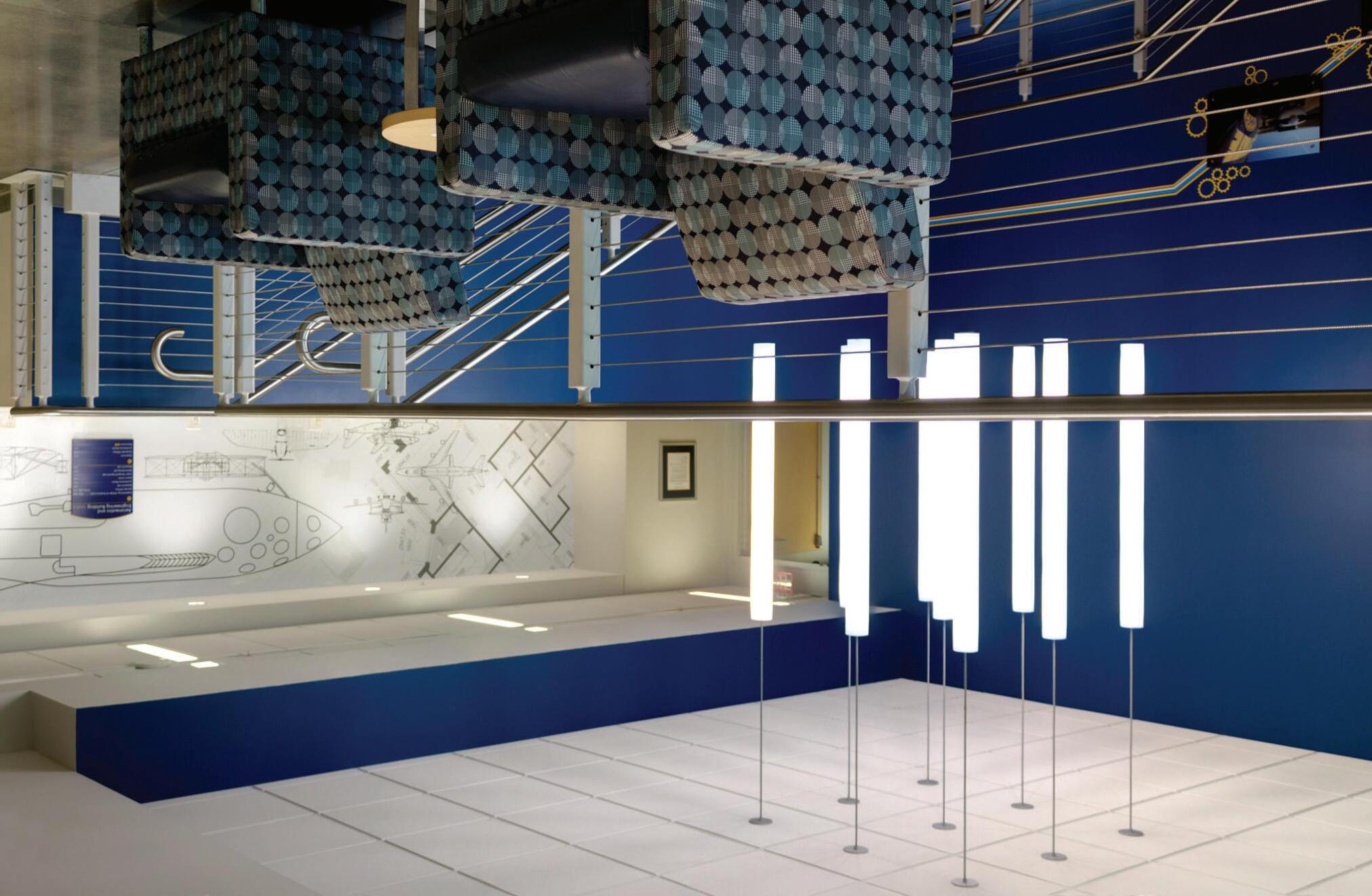
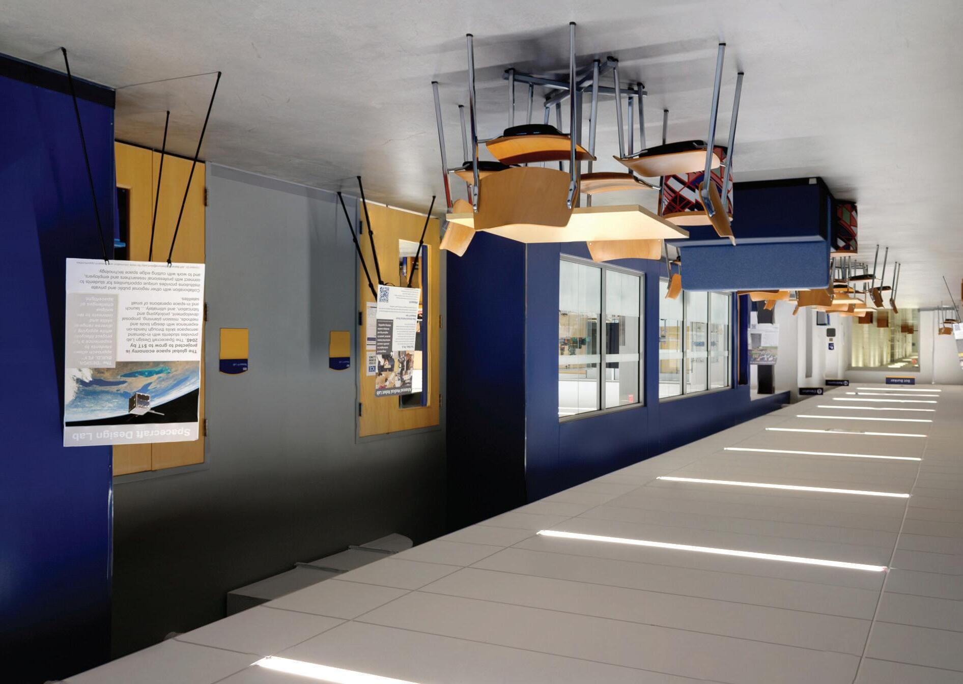
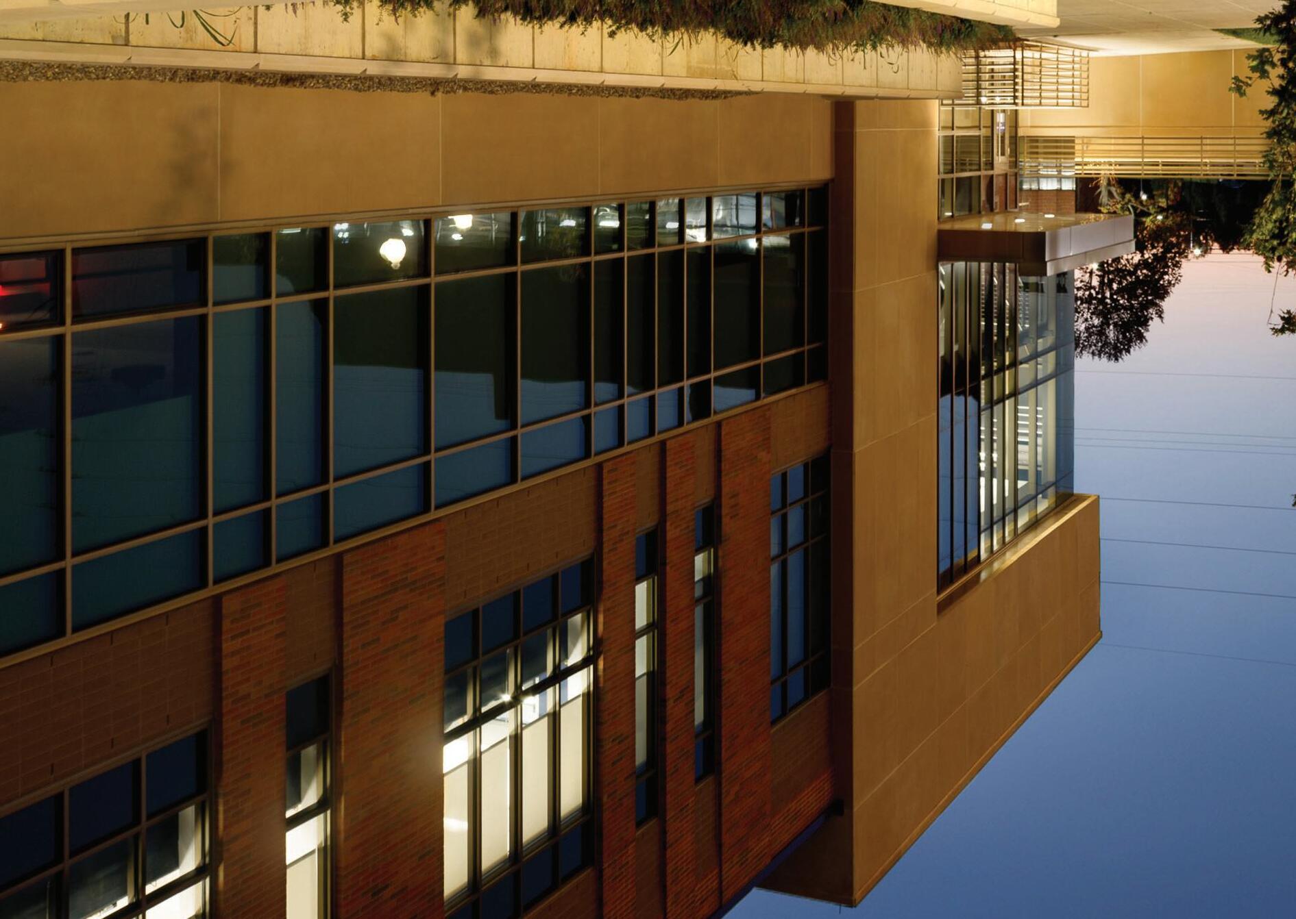
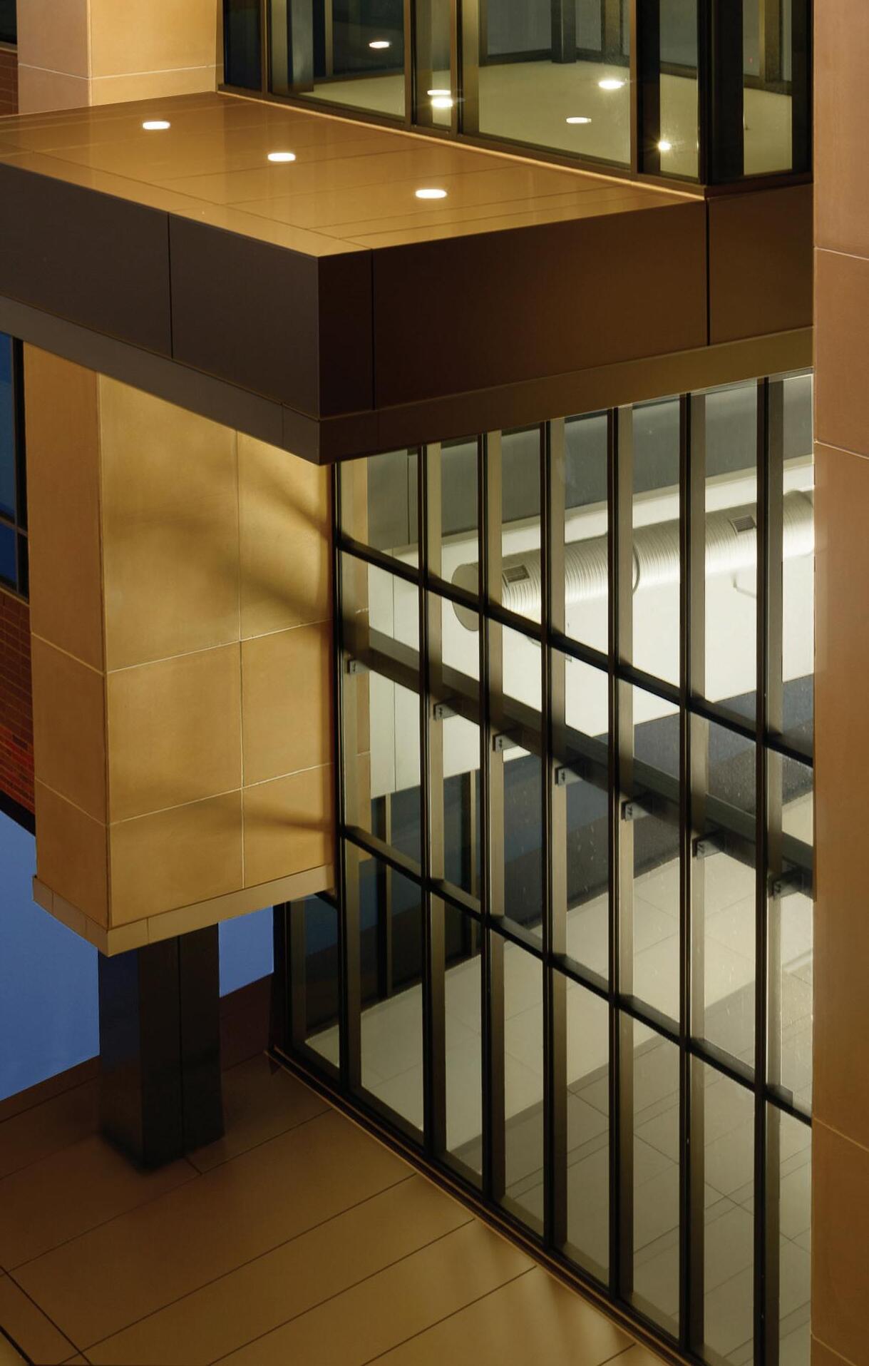
Discovered is a passion for architectural photography through an entry-level experience photographing the Kent State University Aeronautics and Engineering Building. Learning how to bracket, gray card, post-produce, and deliver imagery as a narrative collection were major outcomes for the Editorial Architecture project. Photographic compositional techniques compounded with an architecture student’s background to create a thorough photo collection of architectural spaces.
Project 1 is a study of architecture, thematic colors, and programmatic spaces. Capturing the school-spirited spaces that elicit education and innovation was a major focus. With an emphasis on highlighting architectural aspects through detail and establishing shots, both interior and exterior shots were necessary to envision the student-oriented design.
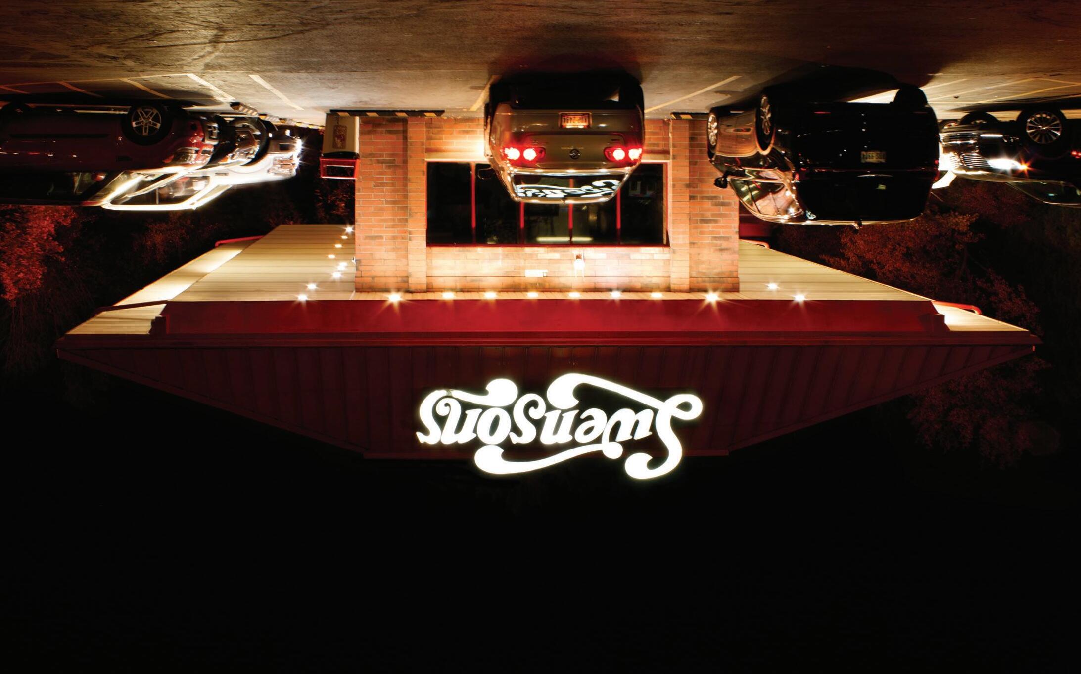
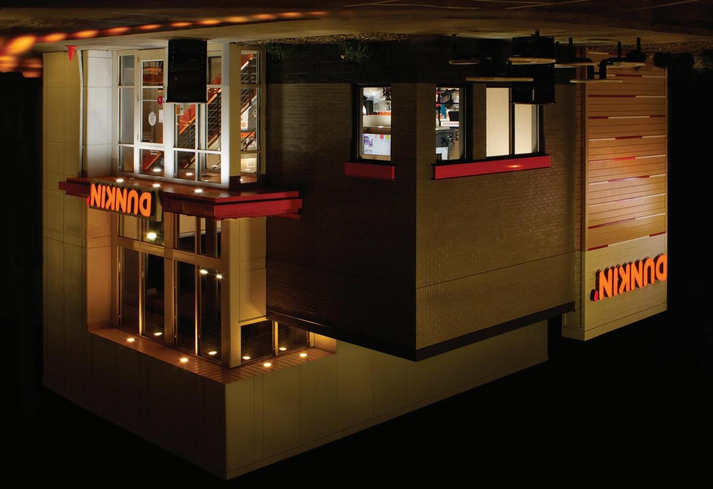
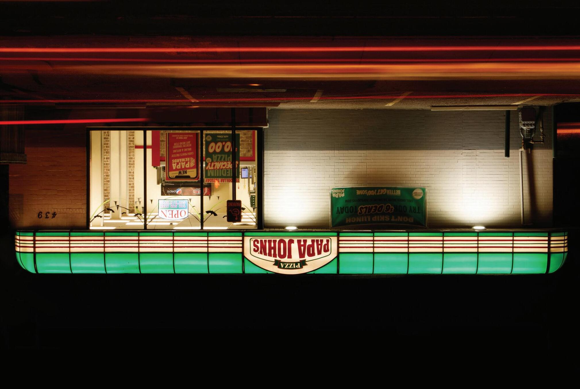
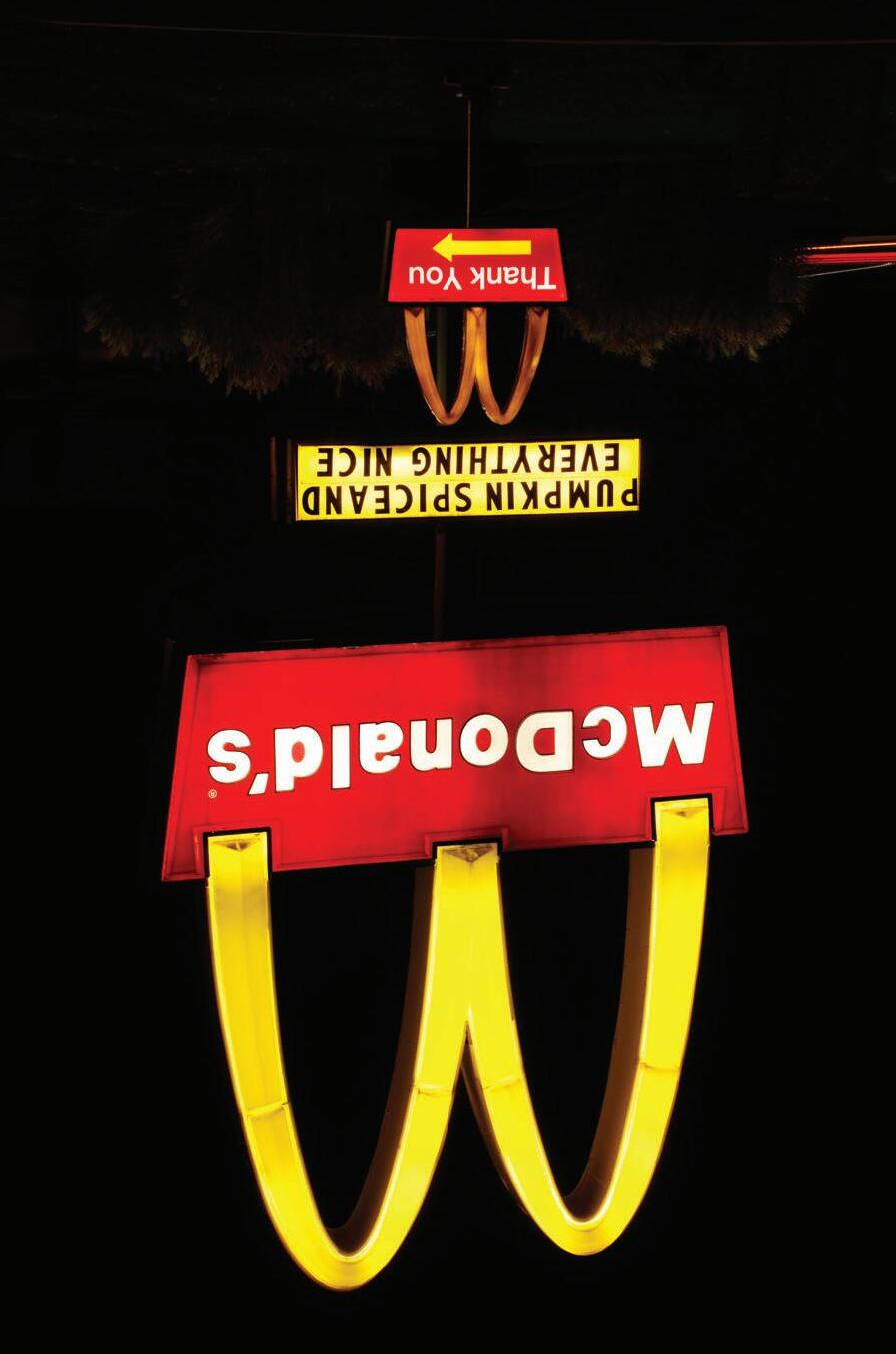
Project 2 challenged a concentration on unconventional architecture as art. Presented is a set of photographs featuring fast food chains to argue the intentional use of color theory as a “Capitalistic Tool for Hunger”.
Visually connecting the theoretical techniques of color theory with real-world marketing strategies, this collection exposes the leverage companies have on consumers through architecture as art. Through photography, an investigation of the purposeful use of color on selected exteriors demonstrates the advantageous strategy of glowing propaganda that feasts on the human psyche.
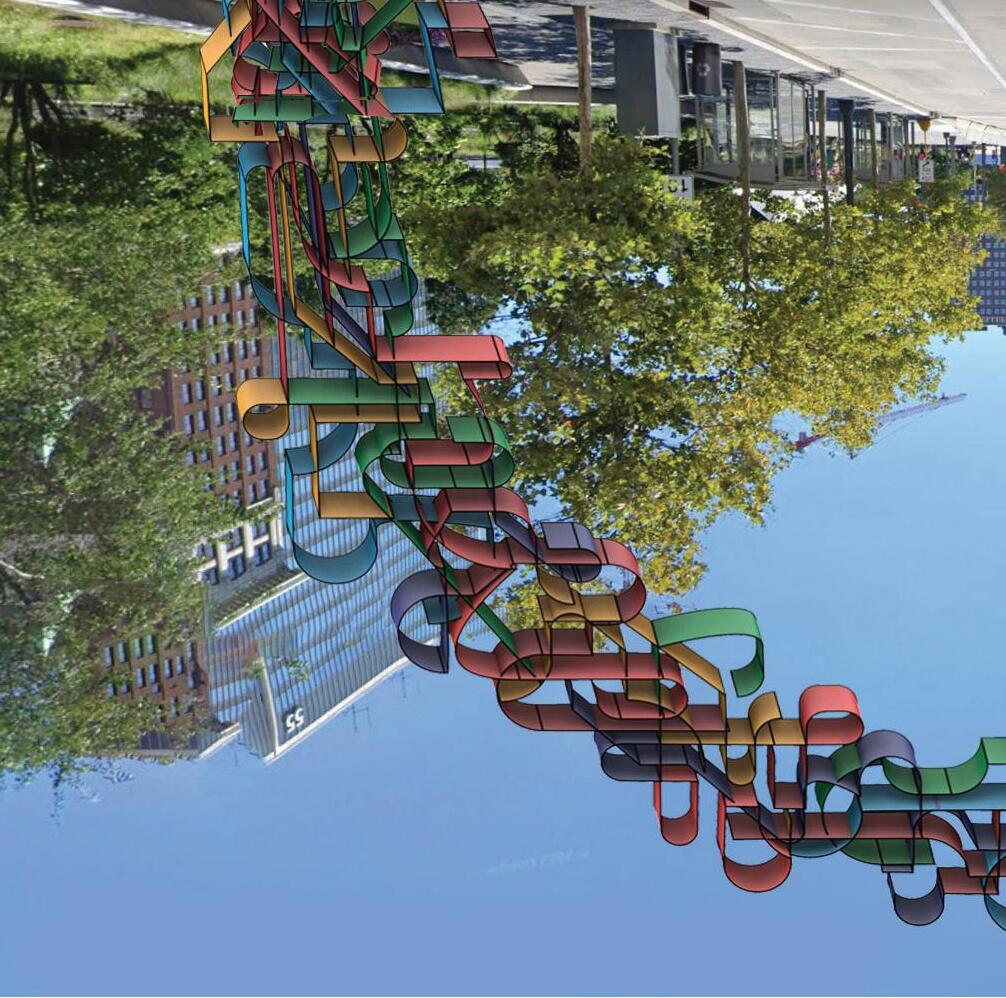
Model/Nature/Event/Portrait
Displayed is a passion for people, storytelling, and nature through various works that span nearly a decade of a once hobby that has turned into freelance work and a creative outlet.
Professional Work Includes:
‒Publications in QBurgh Magazine
‒Model and Event Photography [CAED] ‒Freelance Portrait Photography


Outside of architecture, design dexterity involving type, illustrations, and marketing graphics have all become interests further explored while studying at Kent State University. Developing an understanding of visual representation, hierarchy, and legibility proves beneficial to architecture graphics and a general design career. The cross-pollination of design fields compounds with continuous growth, implementing mixed mediums to generate the projects exhibited.
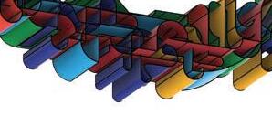
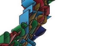
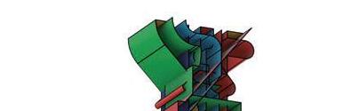
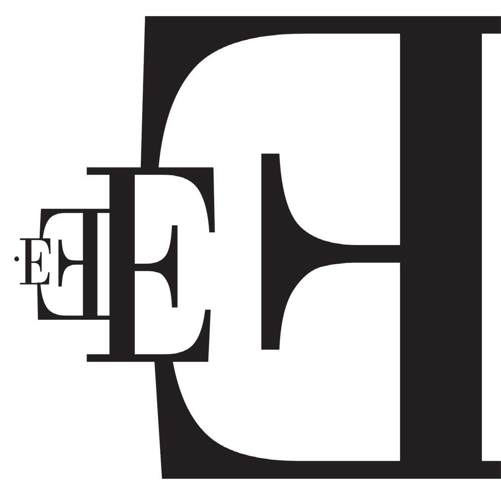
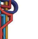
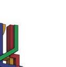
The layout presented is a collection of studio works from Introduction to Visual Communication Design. Crafted with precision and attention to comprehension, three of the works demonstrate proficiency in type-based assignments. The abstract depiction of the letter "E" was a study in expressive illustrations, utilizing the capabilities of graphics to generate a reaction from the viewer that proclaims the audible actions of the still.
Excellence in
Visual Communication Design Three Design Innovators
Massimo Vignelli 1931-2014
Lucille Tenezas born 1953
“You should never lose sight of the fact that you are solving somebody’s problems. At the same time, you should solve your own as well.”
—Tenazas
“The life of a designer is a life of fight. Fight against the ugliness. Just like a doctor fights against disease. For us, the visual disease is what we have around, and what we try to do is cure it somehow with design.”
—Vignelli
Corita Kent 1918-1986
“I think a picture with all words is as much a picture as something with abstract or recognizable shapes.”
—Kent
EXCELLENCE IN VISUAL COMMUNICATION DESIGN THREE DESIGN INNOVATORS
Corita Kent 1918-1986
“I think a picture with all words is as much a picture as something with abstract or recognizable shapes.”
Massimo Vignelli 1931–2014
“The life of a designer is a life of fight. Fight against the ugliness. Just like a doctor fights against disease. For us, the visual disease is what we have around, and what we try to do is cure it somehow with design.”
Lucille Tenazas born 1953
“You should never lose sight of the fact that you are solving somebody’s problems. At the same time, you should solve your own as well.”
An article in a 1966 issue of Look magazine stated, “Long before those young men in New York invented pop art, a small nun in Los Angeles was showing her students at Immaculate Heart College how to discover the novel and beautiful in popular magazines and packages from the supermarket.
Courses Completed to Advance Skills:
‒Environmental Graphic Design
‒Introduction to Visual Communication Design
‒Video, Media, and Architecture
‒Visual Design Thinking
Philippines-born Tenazas is among those whose work came to the fore in the early 1980s, on the cusp of the shift from analog to digital design production and also at the point when the certainties of modernist simplicity and order, which had been integral to the definition of graphic design, were being called into question. This (alleged) undermining of modernism was coming from young designers, many of whom … had been exposed to postmodern theory as it meandered into design from both literary and art sources. Semiotic, structuralist and poststructuralist concepts treated words and images as “signs,” and regarded meaning as an artificial construct created by the reader—or readers— independently of authorial intent.
“YOU SHOULD NEVER LOSE SIGHT OF THE FACT THAT YOU ARE SOLVING SOMEBODY’S PROBLEMS. AT THE SAME TIME, YOU SHOULD SOLVE YOUR OWN AS WELL.”
The impact of these ideas on young designers, who were looking for an alternative to prevailing notions of graphic design as rote formalism or applied “good taste,” has been well documented. Tenazas’ work exemplifies a subtle interpretation of linguistic theory into design, where her translation of ideas through words and pictures, combined with her formidable skills as a form maker, enabled her to create a distinctive body of work.
The impact of these ideas on young designers, who were looking for an alternative to prevailing notions of graphic design as rote formalism or applied “good taste,” has been well documented. Tenazas’ work exemplifies a subtle interpretation of linguistic theory into design, where her translation of ideas through words and pictures, combined with her formidable skills as a form maker, enabled her to create a distinctive body of work.
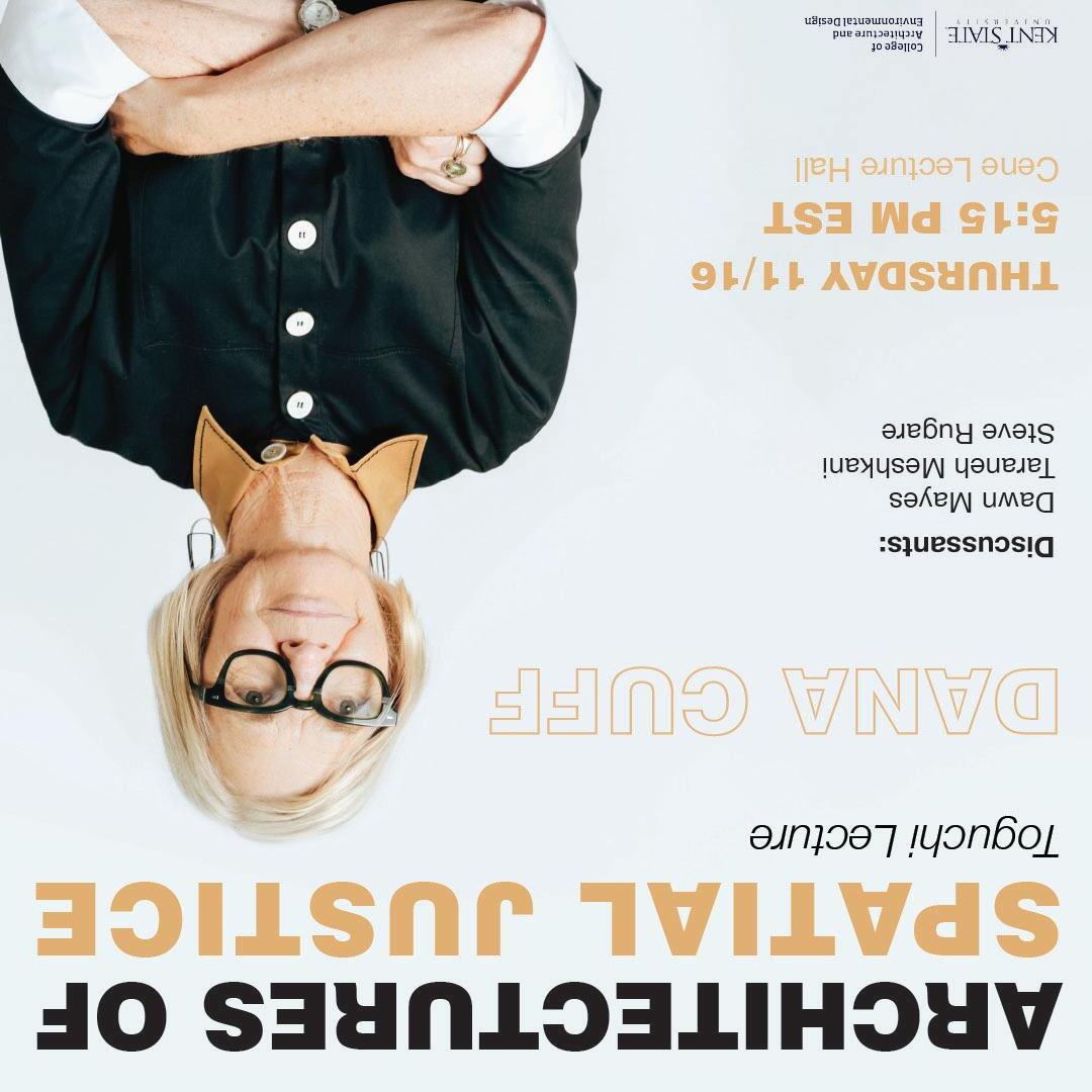
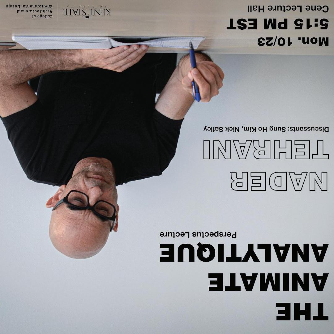
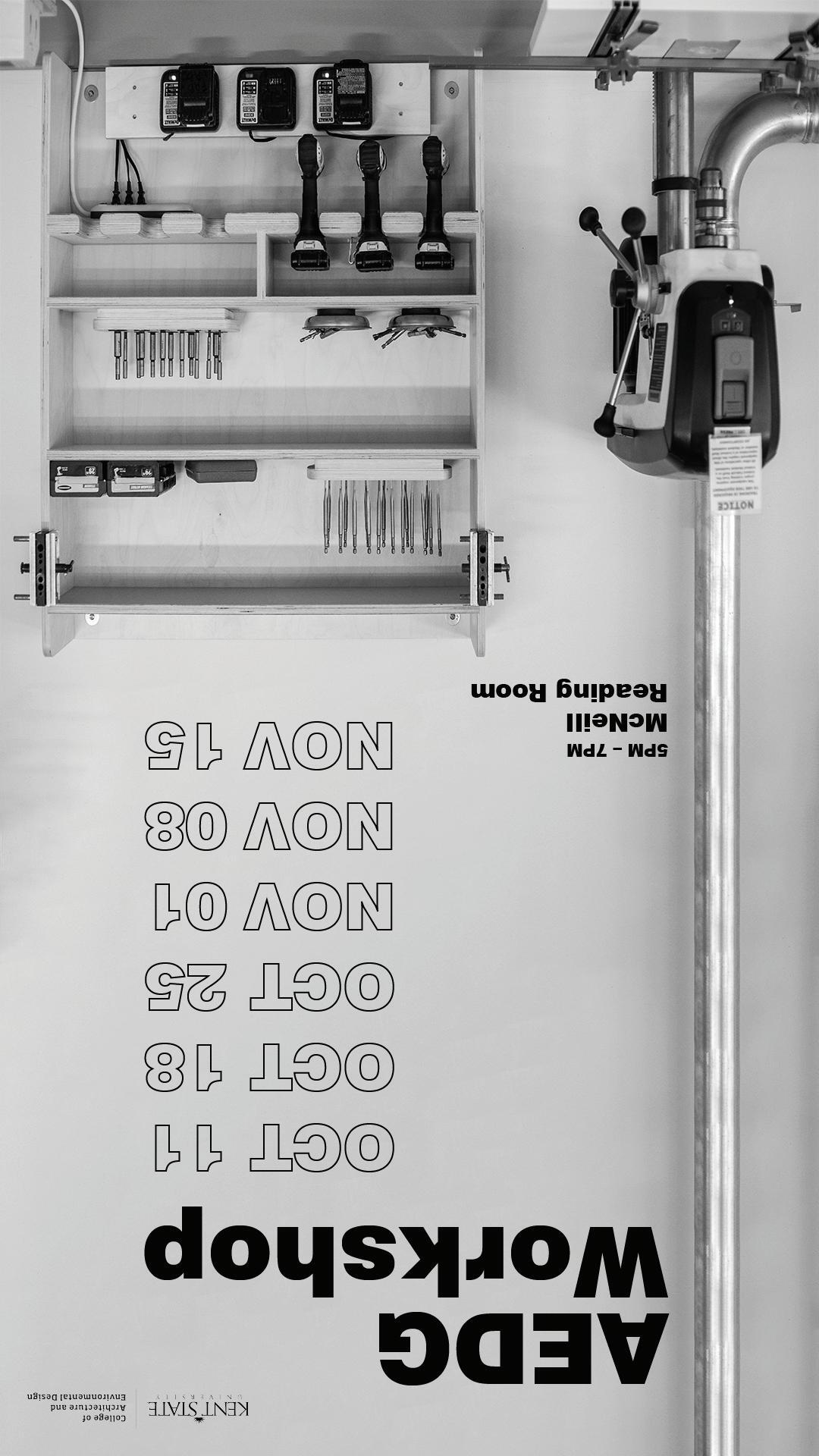
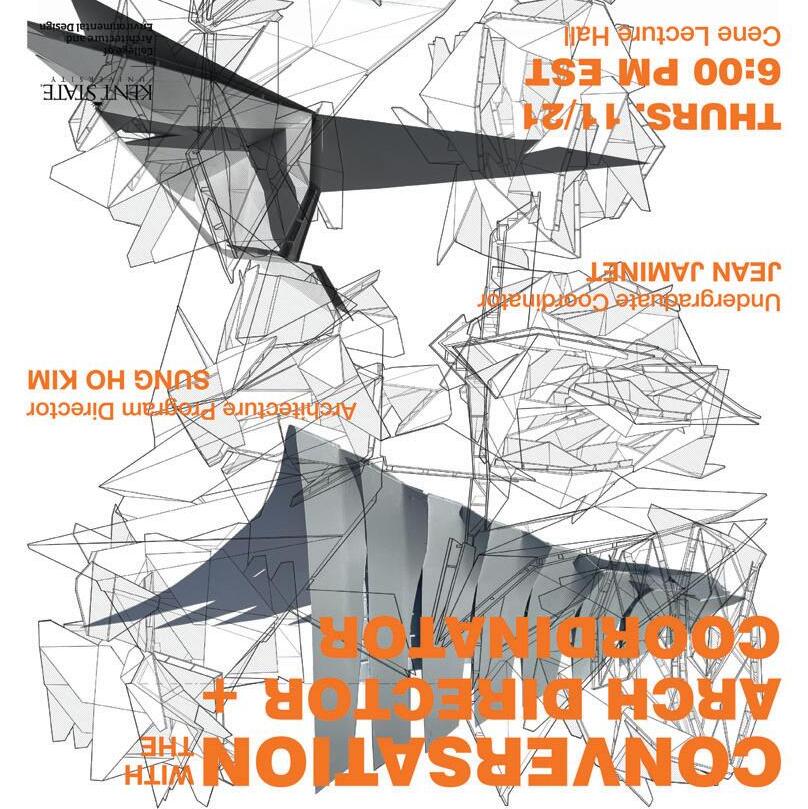
Professionally, as a CAED Team Publicist, content creation and marketing have become an immense career interest. Responsibilities as a publicist included producing, either freely or following protocol, posts and digital displays to advertise to students. Adhering to branding and building upon criticisms from peers and higher-ups is expected and exciting to improve upon.


Professor: David
Fall 2022
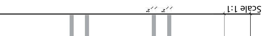
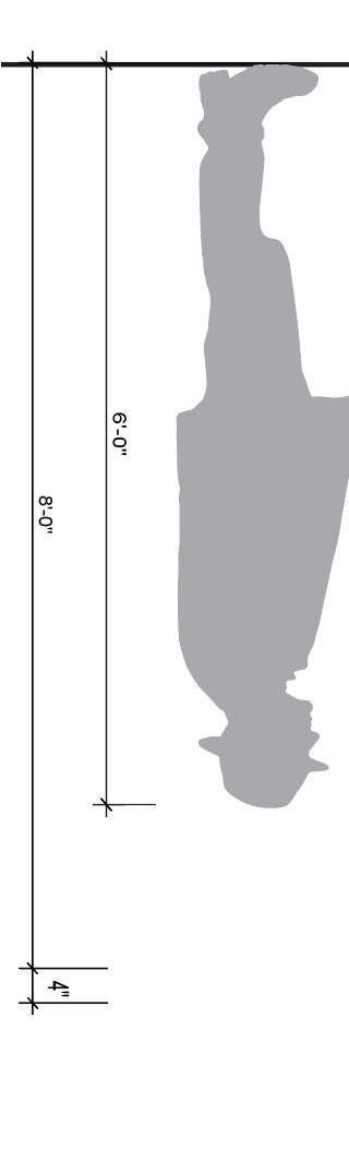
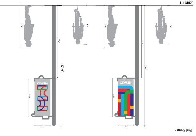
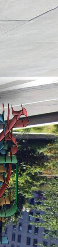
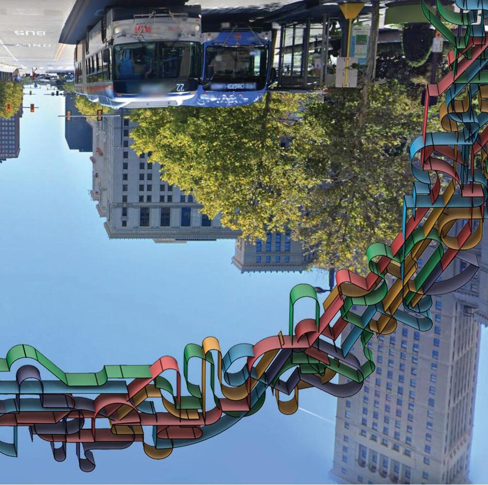
Environmental graphic design
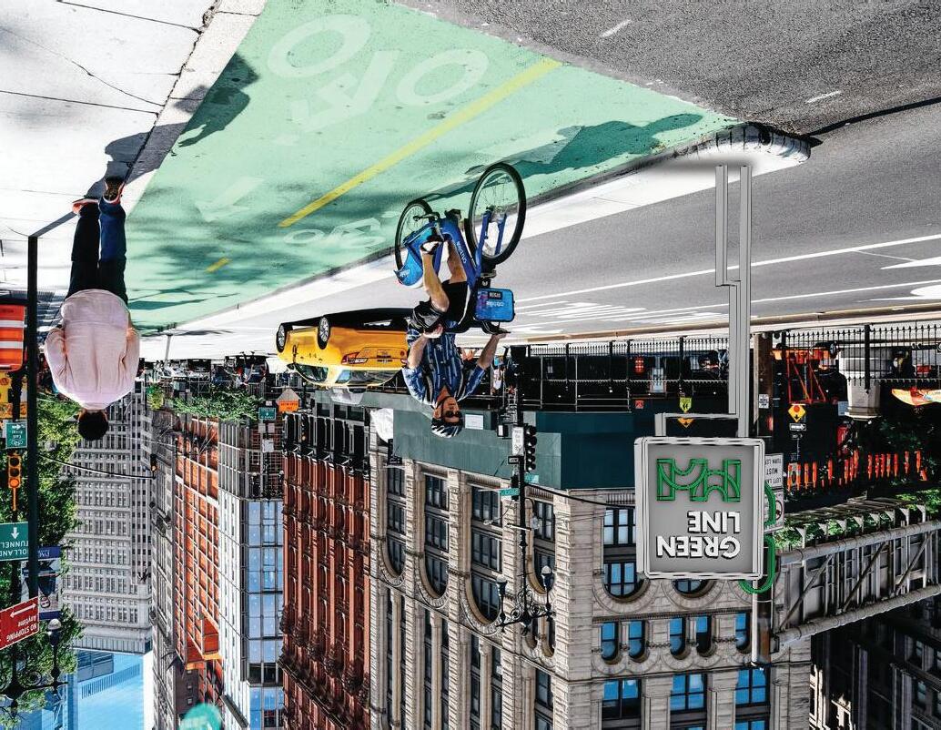
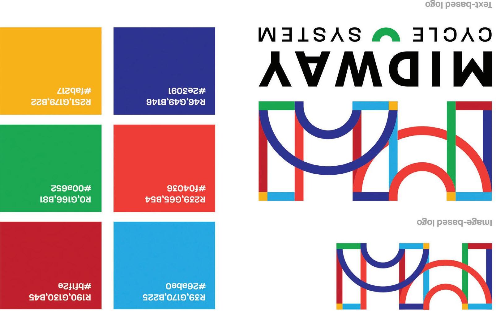
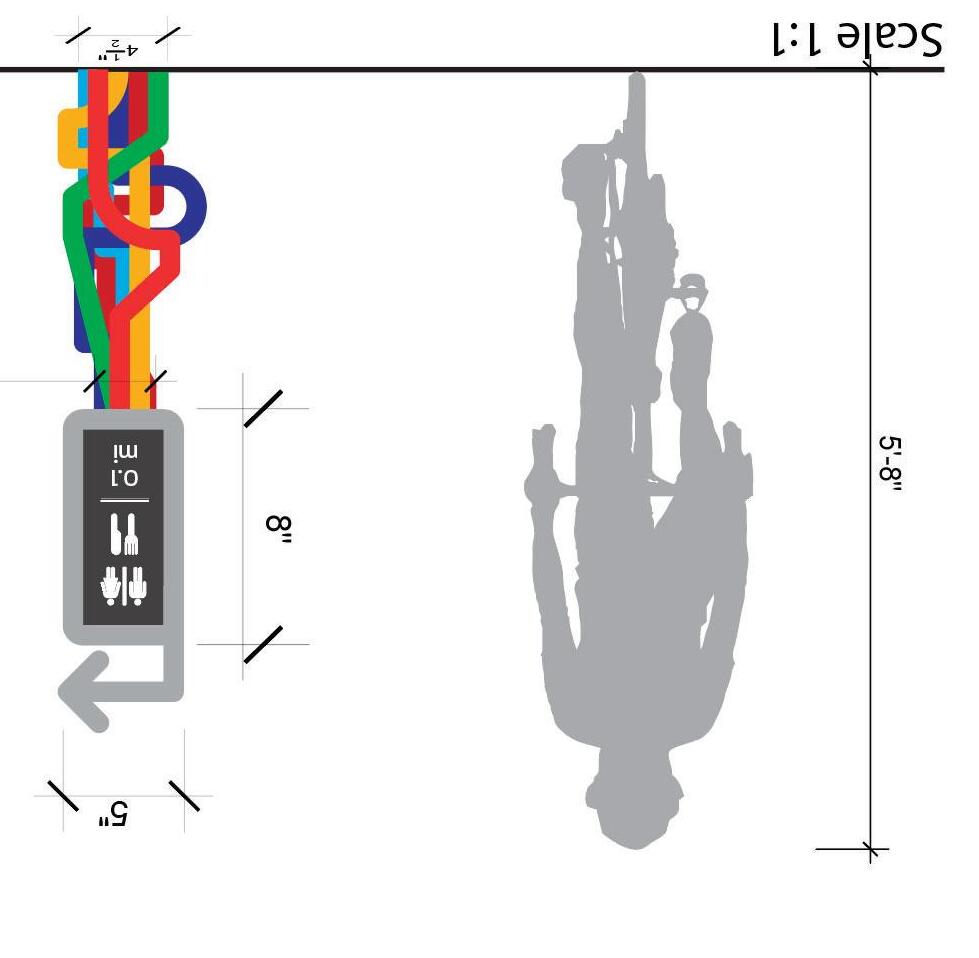


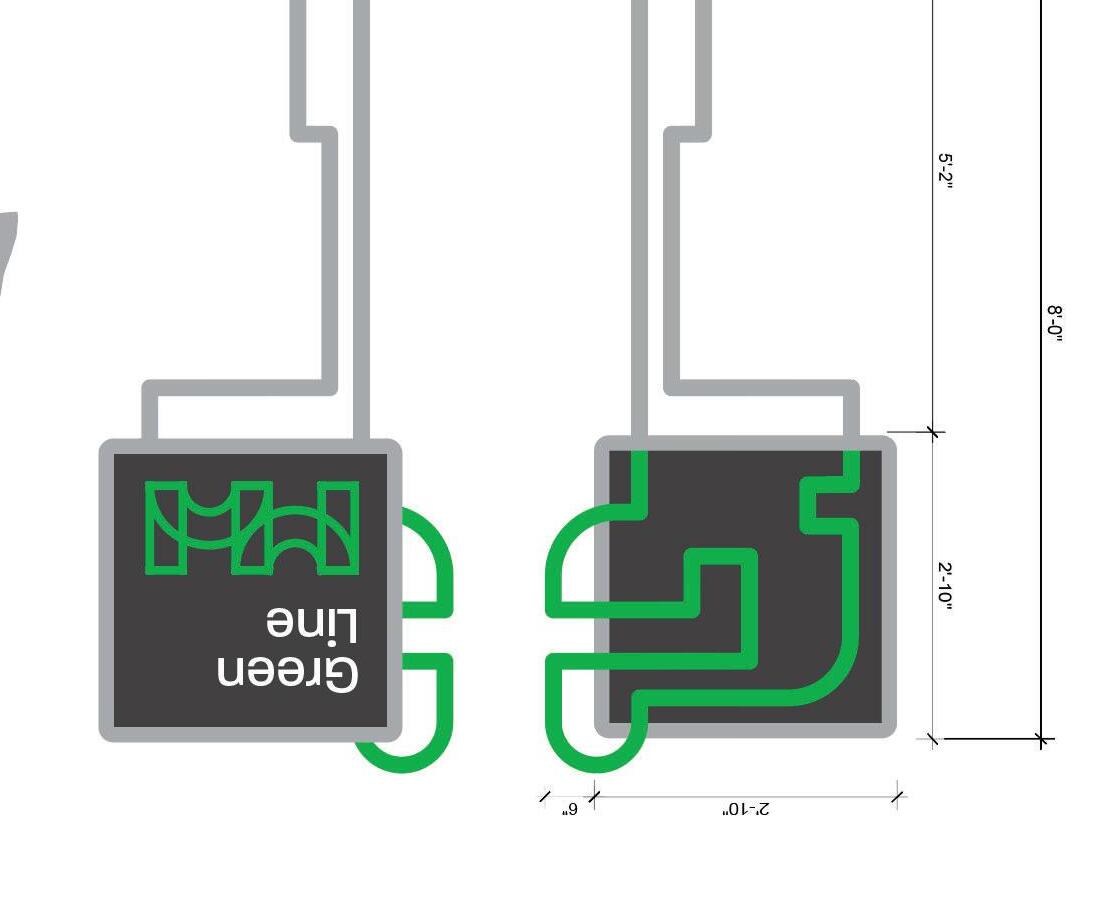
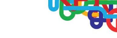
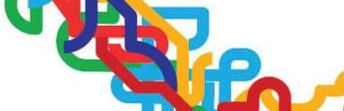
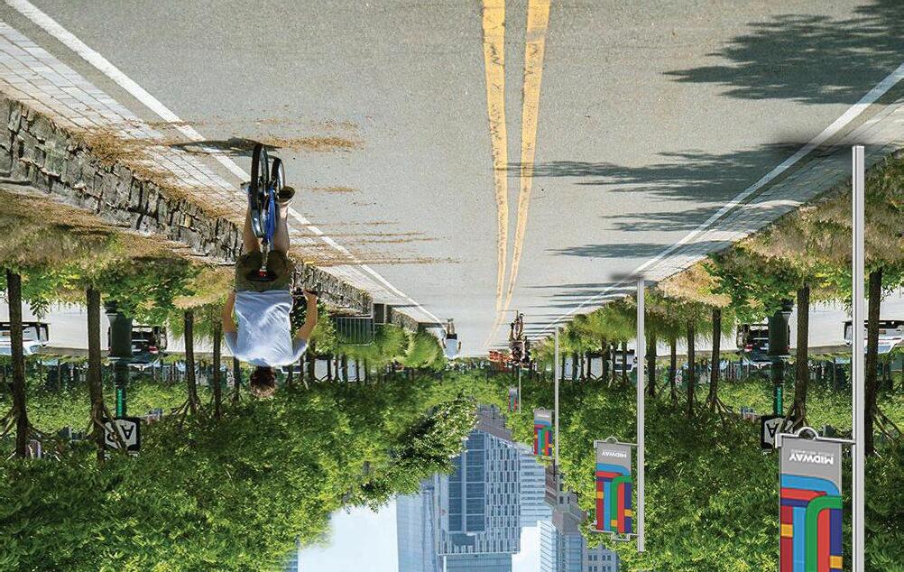
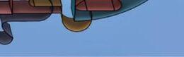
The Midway Cycle System is a proposed cycle system that will improve the safety of riders and replace the current conventional bike lanes in downtown Cleveland, Ohio. Designed in Environmental Graphic Design, a course within the Kent State University College of Visual Communication Design, the proposal provides solutions to potential way fi nding signage, de fi nes a brand and attitude, and strategizes community engagement through graphic design. The Midway will consist of sixty miles of landscape-buffered, twodirectional center-lane bike lanes connecting Cleveland neighborhoods and surrounding key regional assets. Access, connectivity, safety, and equity are some of the many values of the Midway Cycle System.


ned rse e of osal i ng a nd ugh s ist woing key ety, the l li