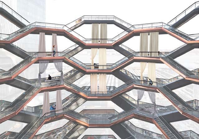
Vessel: A Shelter for the Homeless and Displaced
Nôtres
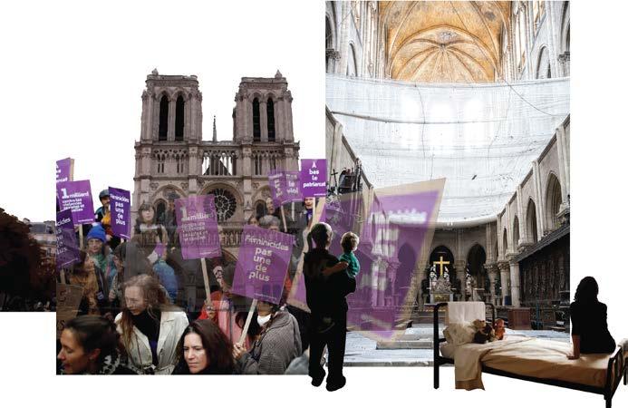
Shelter for Domestic Abuse Victims
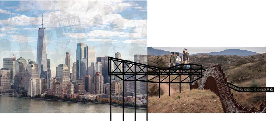
The Bridge of Liberty
Vessel: A Shelter for the Homeless and Displaced


Nôtres
Shelter for Domestic Abuse Victims
The Bridge of LibertyMy last studio of ENVD focused on coming up with a design for the IAAC 8th Advanced Architecture Contest. The contest focused on design for living: “to rethink our habitat, from the body to the city.” I knew I wanted my design to encompass current events, like the Black Lives Matter protests and the global pandemic, because of how they were restructuring our lives already.
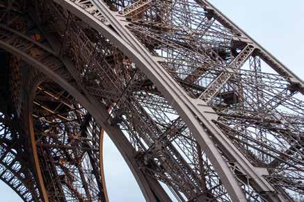
So I found a problem in our built environment to try and solve through the process of this design competition. Something I noticed was that monuments, structures that symbolize the best of our societies, have become useless in our time of need. So I asked the question: how can I deconstruct these monuments in order to help us at our most vulnerable? of the process. I could not separate myself from physical deconstruction. I thought about tearing down the Eiffel Tower
to build affordable housing throughout Paris, or physically deconstructing the Statue of Liberty to create a bridge across the USMexico Border.

After too long it clicked. Deconstruction is a process of tearing down the meaning we associate with an object and not the object itself. Monuments are arguably the most meaningful pieces of architecture in a society, but their meaning is false and the structure is deemed “non-essential” when we need them the most.
My solution to this problem is an attachable and adaptable structure that changes the meaning of monuments in times of need. Whether that be during a pandemic or a housing-crisis. The next three pages of my portfolio exhibit the final boards I turned in for the contest.
 Allison J. Aber | 07.14.20 |ARCH 4100
As we continue our battle with a global pandemic that has inarguably been handled in a haphazard fashion, some monumental structures, deemed “non-essential”, remain vacant on central plots of land. The Eiffel Tower in Paris and The Vessel Heatherwick in Manhattan are two such monumental structures which have been closed to visitors since the outbreak of COVID-19 began. These two structures, like many architectural tourist attractions around the globe are able to handle enormous amounts of foot traffic everyday, and therefore have the potential to become essential in times of a pandemic. With PRO, they can adapt more necessary functions and even accommodate future urbanization.

PRO is a system of pods which can be used as medical clinics or emergency shelters. As consequences of urbanization, space will become more valuable and the homeless population will inevitably increase. PRO utilizes the existing structures of monuments to react. Its versatile form is implemented to reallocate the monuments’ function to assist vulnerable populations in the wake of urbanization and the increasing frequency of pandemics.
Valuable space is taken up by monuments deemed unusable in their most valuable time. This proposal, PRO Pods, optimizes the city fabric making non-essential structures essential to the human habitat.
monuments non-essential structures to support societal needs. Eiffel Tower as housing Statue of Liberty as housing?homeless shelter refugee housing... immigrant housing...
Architecture follows society, Architecture must

“They in no way represent the spirit or the collective feeling of modern times”.
[Josep Lluís Sert]
To
multipurpose & reactive architecture be as efficient as possible utilize space as efficiently as possible!
plan, react, and occupy
most vulnerable are most at risk

design for the future:

External structure holds pod to Vessel landing
Cables reinforce the pod to the Vessel’s structure


Floors can be assigned to hospital-like circulation
Pod entrances are accessed from the Vessel’s staircase landings
Expandable pods can be sized to serve various functions


External structure connects to stack pods together

Pods can be rotated to provide more room as stacked housing
Collapsible sides are interchangeable and can become windows


Cables reinforce the pods to the Eiffel Tower’s structure


Openings for doors are located on every side of each pod to be able to connect circulation through stacked pods if needed


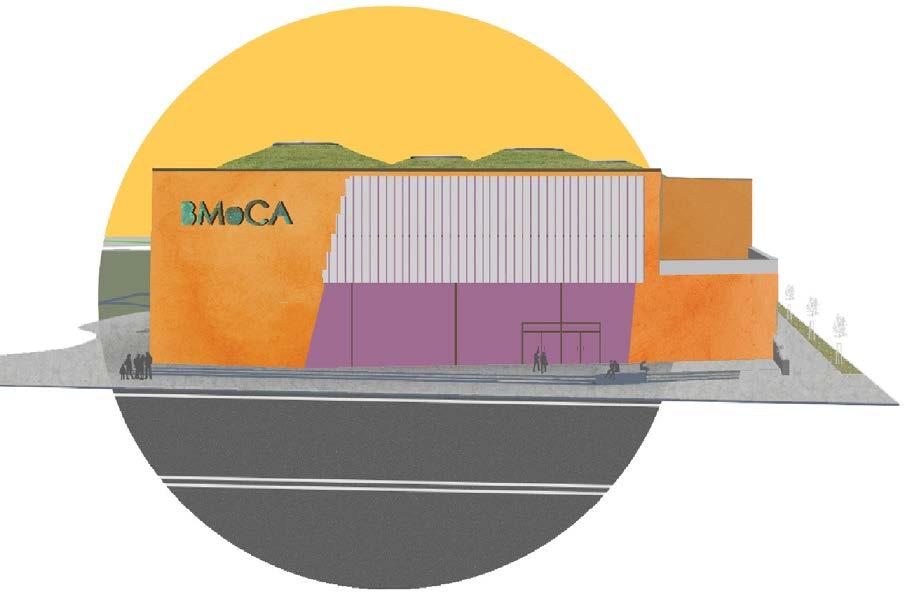
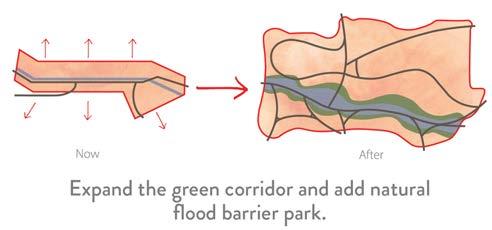
This project involves relocating Boulder’s Museum of Contemporary Art to support Boulder Junction as a mixed-use neighborhood designed around creativity and art, Boulder Junction is a transportation hub and is the perfect place to convene people around a shared experience of art. Art is an important element in building culture in a community. This site will bring creative education and spark innovative genius within an otherwise overlooked corner of Boulder. Integrated into the Sculpture Park is a natural flood barrier system at the North end of the site, along Goose Creek. When water from the creek rises above a certain level, it is collected, filtered and irrigates the sculpture park and sports fields. Applying sustainable practices within this community will generate an interest of natural systems and in turn build a creative and innovative community.
Working to bring people together around art, this site involves relocating BMoCA to

become the foundation of a sculpture park and educational epicenter. Because Boulder Junction is a transportation hub, it is the perfect place to convene a diverse array of people around a shared experience of art. Art is an important element in building culture within a community. This site will bring creative education, sparking the innovative genius within all demographics and generations. A natural flood barrier system is integrated into the sculpture park. When the water from Goose Creek goes above a certain level, it is collected, filtered and returned to the water cycle through irrigation of the plants and sports fields within the park. Applying sustainable practices within a public setting cultivates an understanding of natural and local systems within younger generations influencing future sustainable habits. This site will bring together a population, from not just Boulder, but the entire Front Range connected to the rail system, in turn building a creative and innovative community.

The new building’s greenroof adds to the surrounding environment and promotes green energy.

In addition to the sculpture garden, moving BMoCA on site promotes education and builds a sense of community around art in an otherwise overlooked neighborhood in Boulder.


Our client’s wanted Boson to speak a futuristic, forward-thinking language to it’s consumers. The company at the same time wanted to openly communicate its products and make sure they were easy to understand for its customers. I was tasked with creating diagrams that simplified complex concepts while also incorporating the brand’s unique identity.


I created the graphics on this page for the crypto company’s One-Pager and dCommerce Stack. Please click the hyper-links to see the full designs.


While working at WeandBold, we were hired by Boson Protocol to create a unique brand identity. They came to us with a general idea for a logo and color scheme but the rest was up to us.
Since the initial inspiration for the logo came from particle physics we decided the archetypal goal for Boson was to be a guide or a teacher. From these two foundations we chose a futuristic and innovative approach to Boson’s brand identity.
I was in complete creative control over the Brand Identity Guide. While compliling it, I
created the first iterations of icons and graphics. The creative director and I collaborated on many of the initial designs for the brand.
Using InDesign I created the White Paper, OnePager, and dCommerce Stack. I designed the website in Photoshop and afterwards built it in Webflow. I designed graphics, social media posts, and merchandise using Photoshop and Illustrator.
I created mockups of social media posts and pages, advertisements, and merchandise to be used by the company to aid in the succesful adoption of their new brand identity.
Boson Protocol was a very picky client, but we were able to follow the direction they wanted the brand to move towards. It took a different approach than other brands to design more comprehensive graphics.

I was in charge of designing the identity guide for Boson, shown on the opposite page. Our most conclusive ideas were actually conceived of while compiling the brand identity guide. Like finalizing the color palette, graphic illustrations, and even designing the icons.
Shown to the right is Boson Protocol’s Brand Identity Guide. The initial futuristic design of Boson’s identity came from the design of the logo. The logo design was inspired by the guage boson of particle physics, shown above.
Shown to the left are the horizontal lockups of the logo I designed. These are shown in the identity guide to explain spacing for the logo.


Ukor is a health and fitness app created to help its customers keep track of and learn about their sleep patterns, exercise goals, daily habits, and diet.

This was the first brand I was put in complete creative control over. Ukor had an original logo and brand identity that they wanted remodeled to fit a modernized market. I started by upgrading their old logo. I took inspiration from the new logo to create a huge portfolio of icons to fit each department of the app.
The design of the brand’s identity started by choosing the brand’s archetypes. The sage
archetype was chosen because Ukor’s aim was to teach its customer’s about their health. I chose the hero archetype to represent Ukor’s customers.
With the brand identity, color scheme, and icon portfolio ready I began to design the app. Because Ukor keeps track of many areas regarding health and fitness, it was easy for the app to become crowded and difficult to navigate. I used Adobe XD to create each screen of the app. I chose to use Adobe XD to design the app because of its ability to test each action created in order to navigate through the app in the design process.


The brand Ukor came to us to redesign their established health and sleep based brand. They wanted to update their website and overall approach to become more modern and simple in order to compete with newer brands.
Shown at the top was the process I went through to deconstruct the old logo to create a simpler interpretation while keeping the intended ‘U’ shape.
I made the graphic above to portray how each archetype is reflected in the brand for the brand identity guide.

Shown to the left are some of the icons I designed to be use in their health and sleep tracking app.
Lastly, I designed the brand’s identity guide which is used by the company to remain consistent in their branding, shown on the opposite page.
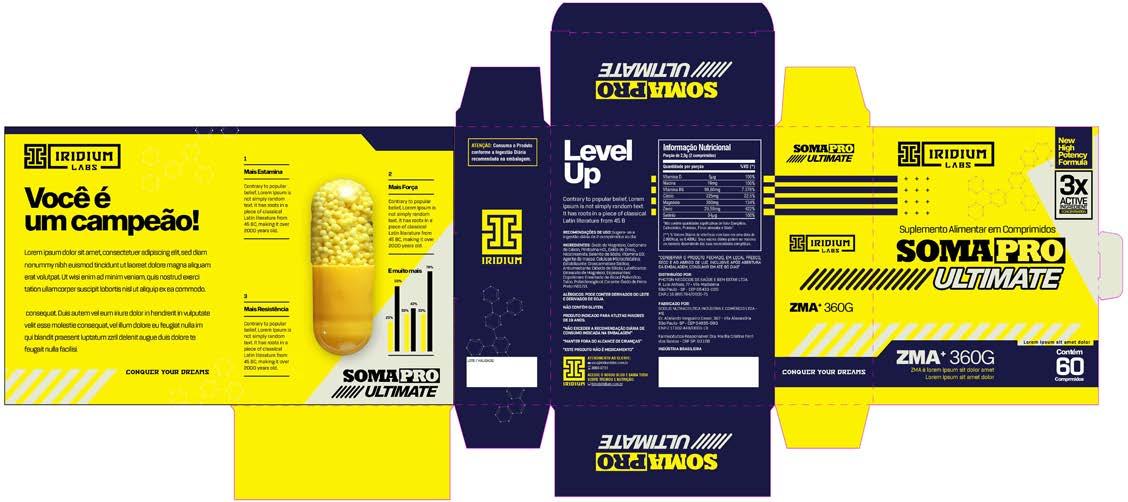
To design the packaging for Iridium Labs we were sent the box details by the manufacturer of the products. With the details uploaded into Photoshop we were able to design the packaging according to the supplement brand’s identity.

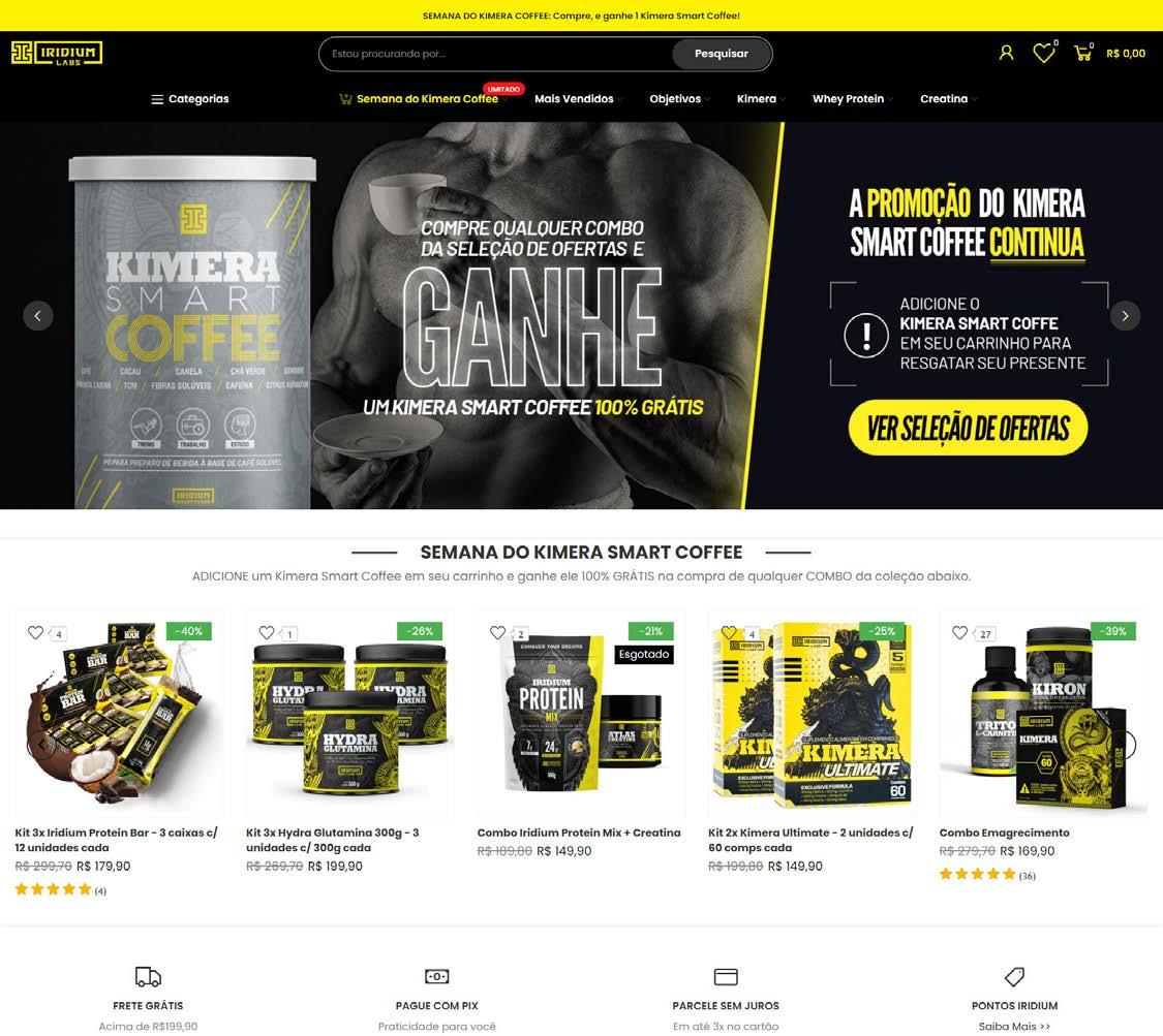
Iridium Lab’s website is the marketplace for all of its products. Because of this, the interface of the website needed to be easy to navigate and incorporated many layers. From the home page to the detailed view of an individual product, the website needed to be able to sell the brand to a wide consumer base.
Because the main image of the brand targeted a more masculine audience, a separate color scheme was created for Iridium Lab’s womens products. Since the yellow in the minimal color scheme preserves the brand’s recognition, only the gray was swaped for a bright pink.
For Iridium Labs, I was tasked with creating packaging, icons, and some graphics. I also designed the website in Photoshop and built it in Webflow.
For the design of the packaging we decided to create detailed graphics to help the brand
stand out among other workout supplements. Because the graphics were so detailed we wanted a black and grey color scheme with a single yellow pop as the brand’s highlight. This minimal color scheme associates the different products and helps to improve the recognition of the brand.
