ALLISON GARBER
INTERIOR DESIGN PORTFOLIO
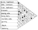
TABLE OF CONTENTS
NEXT
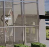
LAW FIRM

LOS
ANGELES,
CALIFORNIA
PROJECT BRIEF
This project was developed for the Steelcase NEXT Student Design Competition and involved designing a 15,000 SF Los Angeles branch office for a fictional global law firm based in New York. The competition required a complete workplace proposal addressing space planning, circulation, and furniture systems across multiple work modes using Steelcase solutions.
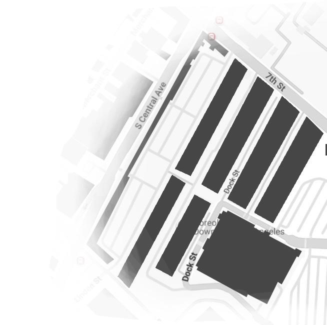
ROWDTLA
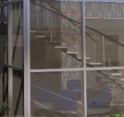
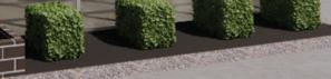
ROW DTLA originated as a collection of historic warehouses that served as a major hub for produce and goods entering Los Angeles via the Southwest Pacific Railroad. Its industrial legacy remains visible through faded signage and time-worn concrete. Located in the Arts District, the site connects industry and contemporary creativity while supporting a mix of office, retail, and cultural spaces. Guided by adaptive reuse and rehabilitation, ROW DTLA reflects Los Angeles’s ability to evolve while preserving its layered identity.
FIRM IDEALS
COLLABORATION
REGENERATION
DESIGN PRINCIPLES

FLEXIBILITY INNOVATION
WELL-BEING
CONNECTION
THROUGH LAYERS OF EXPERIENCE

PAST FORWARD
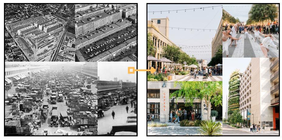
ROW DTLA captures the shift from an industrial past to a creative present. What was once a place for production now thrives with culture and innovation, showing how the site continues to adapt while keeping its original character.

WELL-BEING AS A LIVING FOUNDATION
REGENERATION THROUGH RENEWAL
DESIGN FOR HUMAN RESILIENCE
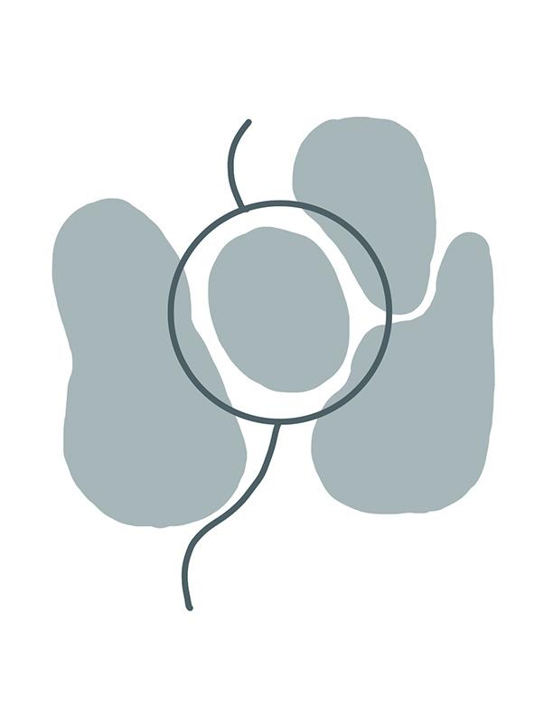
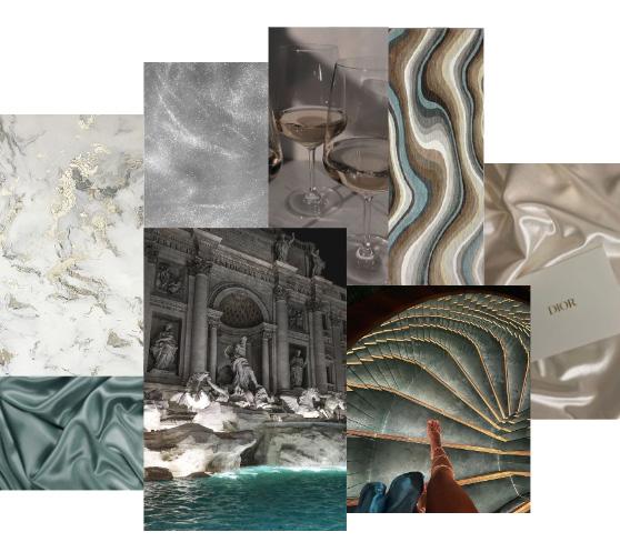
CONCEPT - PENTIMENTO
“A visible trace of earlier painting beneath a layer or layers of paint on a canvas.”

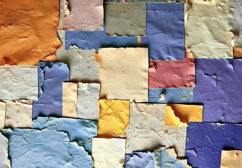

Pentimento is about seeing what came before and understanding that change builds on it rather than replacing it. It represents process, time, and growth by allowing layers of history to remain visible as new ideas take shape. In the design, this concept shows up through layering, contrast, and transparency, pairing exposed structure and raw materials with more refined finishes. Glass, texture, and subtle shifts in color help transition between spaces and keep them visually connected. Together, these layers create an environment that feels honest, evolving, and alive.
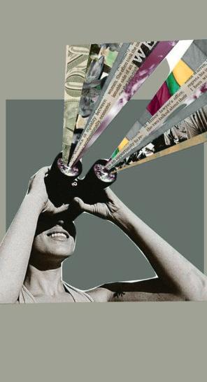
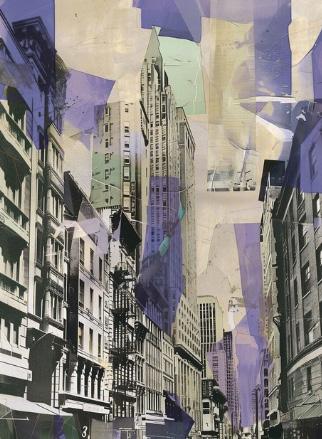
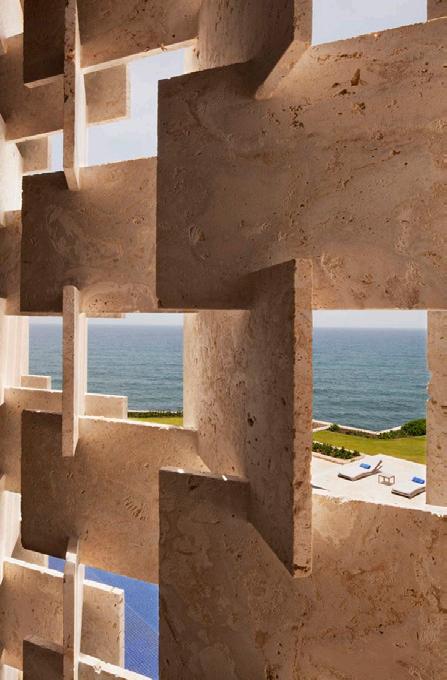
INSPIRATION
These references explore the relationship between old and new by combining industrial textures with refined materials. Linear forms and structured compositions influenced circulation and how spaces are defined, while exposed concrete, metal, and wood contrast with glass and light to create balance. This mix of raw construction and clean design choices guided decisions around layering, proportion, and rhythm throughout the project, resulting in a space that feels precise, cohesive, and renewed.
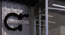
BRANDING
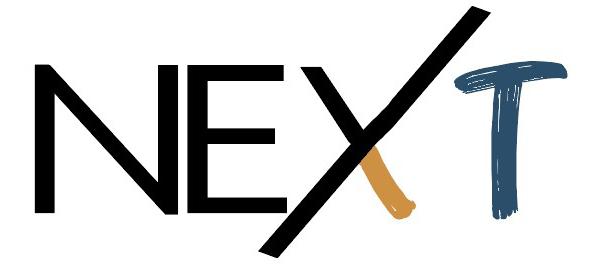
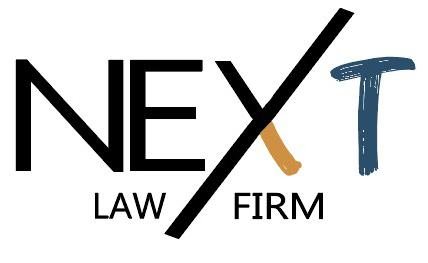
The logo reflects movement, clarity, and transition. The elongated, angled “X” acts as a divider symbolizing transformation. The hand-drawn side references marks made before revision and the firm’s organic roots, while the opposing side represents precision, stability, and professional clarity.
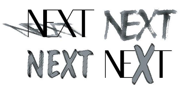
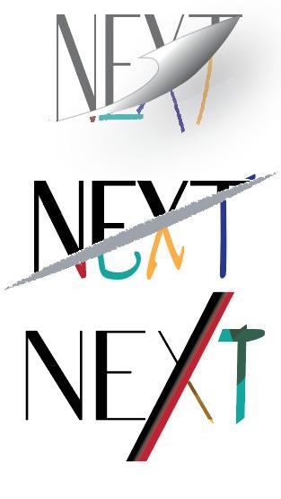
LOGO IDEATION SKETCHES
EFFICIENCY, ENERGY, FORWARD MOMENTUM
TRUST, CLARITY, CONFIDENCE
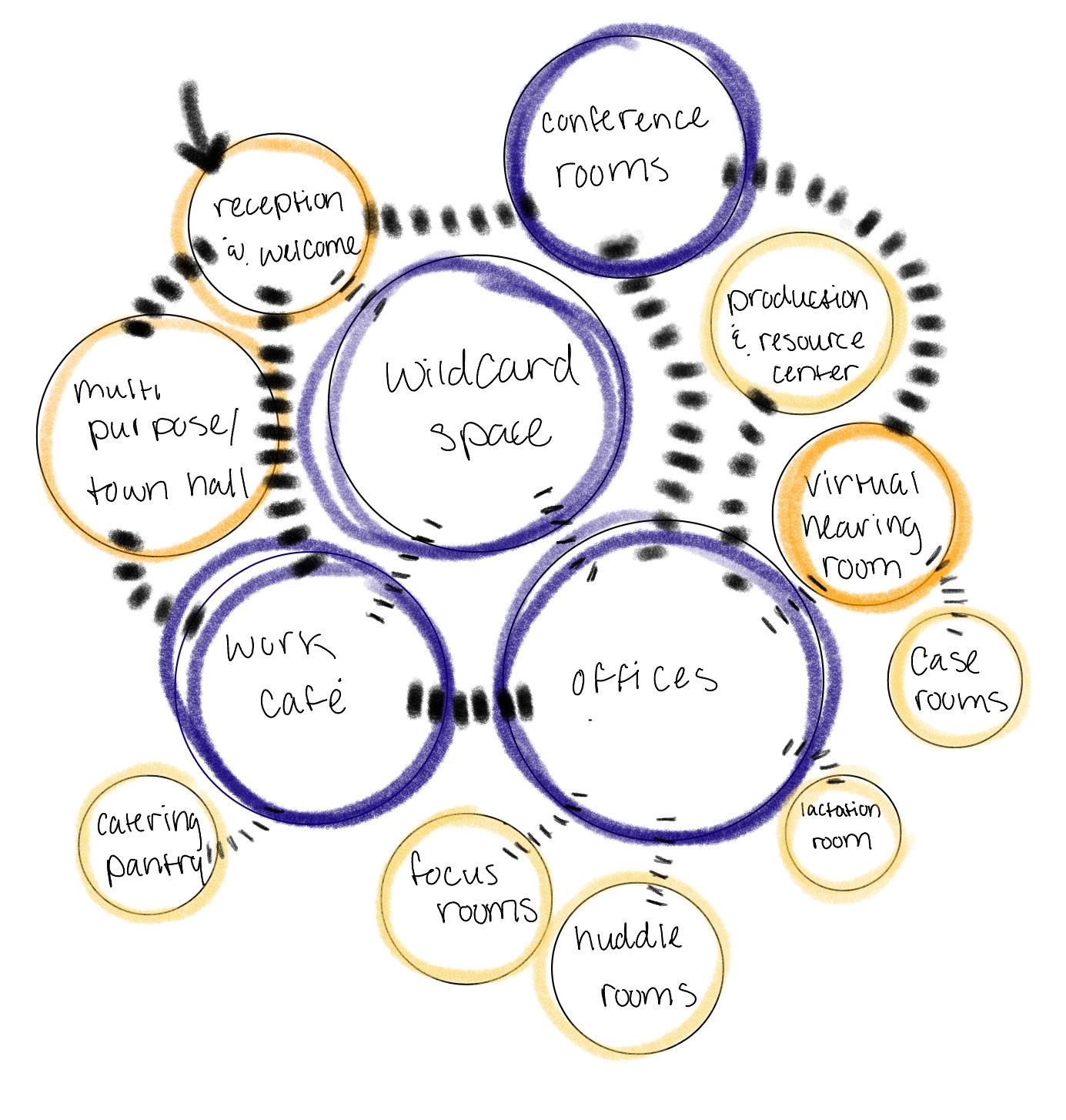
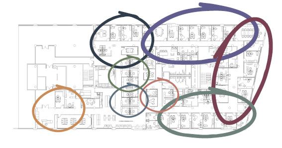
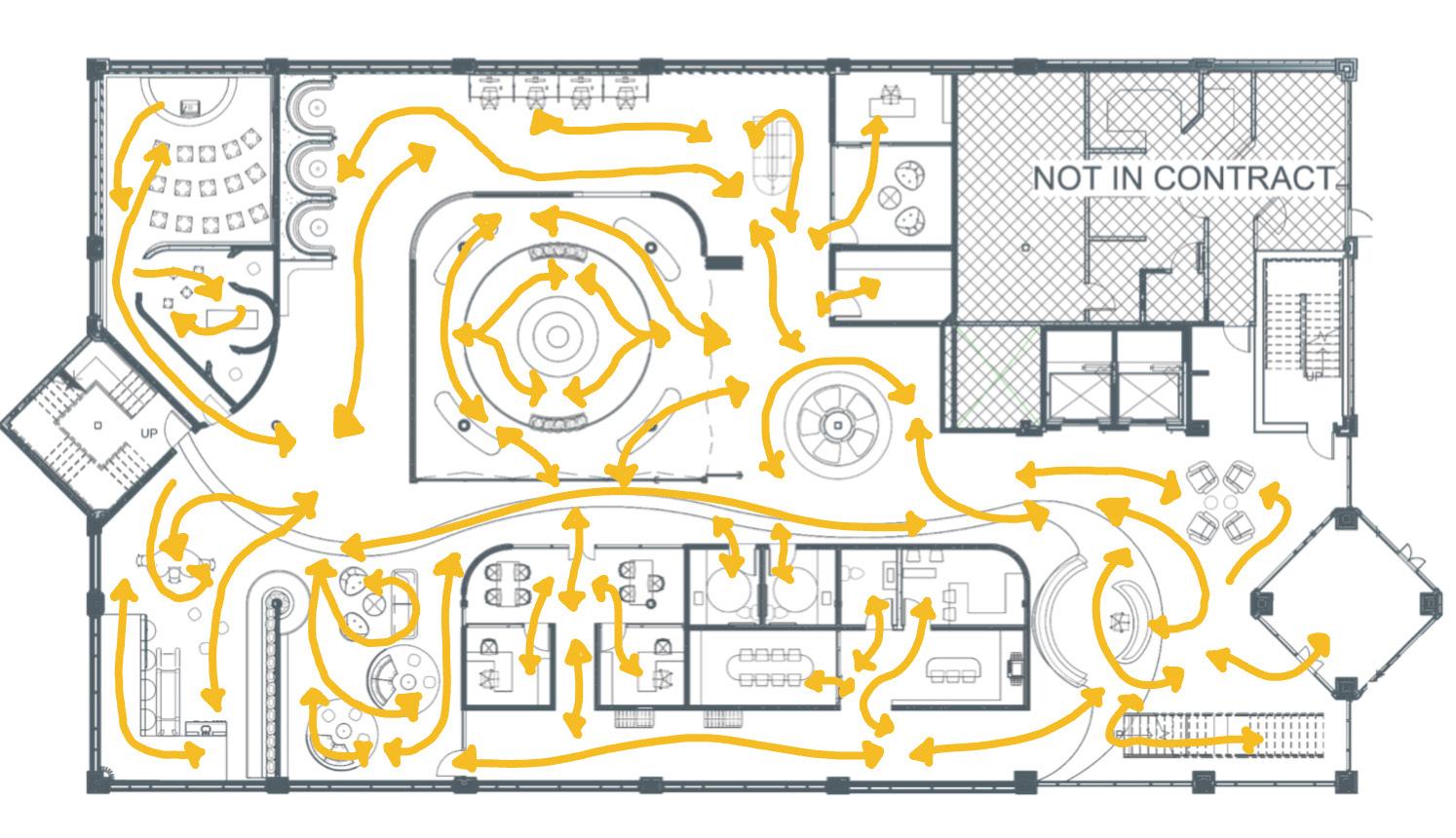
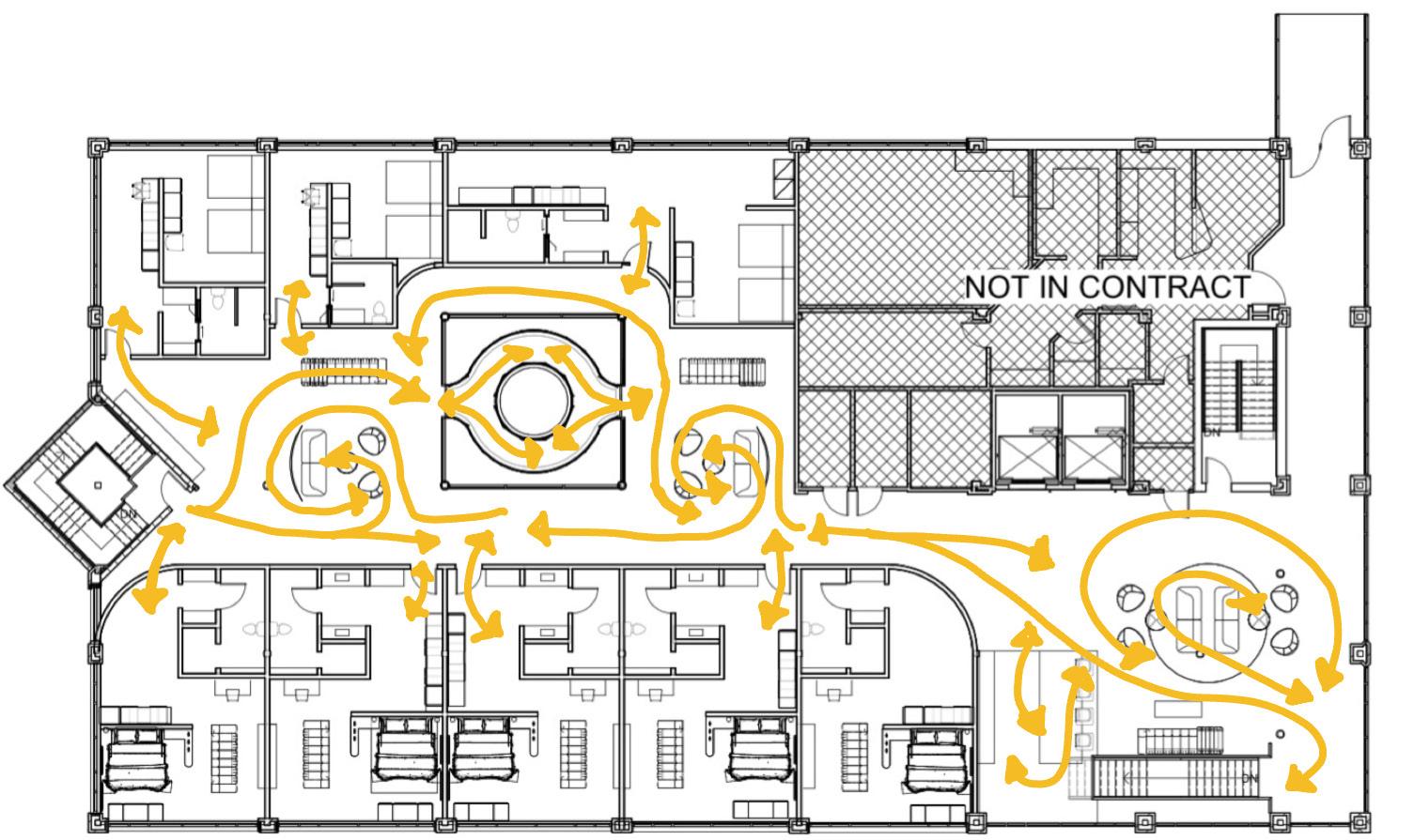
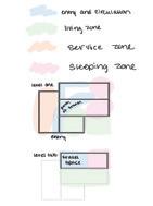
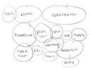
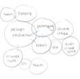
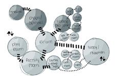
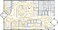
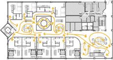
SPACE PLANNING
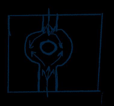
BUBBLE DIAGRAM
SKETCHES
COLOR CONNECTION
LEADERSHIP
TRUST, AUTHORITY, HIGH-CONFIDENTIALITY, SOPHISTICATION, GUIDANCE
LABOR & EMPLOYMENT
STRENGTH, ADVOCACY, ACTIVE, PEOPLECENTERED
INTELLECTUAL PROPERTY
CREATIVE, ORIGINALITY, INSIGHT, INVENTIVE, SERIOUS
REAL ESTATE
STABILITY, GROWTH, DEAL FLOW, CALM, BALANCE, ADAPTABILITY
OPERATIONS
#CC9249
WAYFINDING, PROFESSIONAL, CLARITY, EFFICIENCY, OPTIMISM
EMPATHY, CONNECTION, APPROACHABLE, WARMTH HR
FINANCE & ACCOUNTING
LOGIC, GROUNDING, STABILITY, CONTROL, ANALYSIS
IT & CYBERSECURITY
ALERTNESS INNOVATION, PRECISION
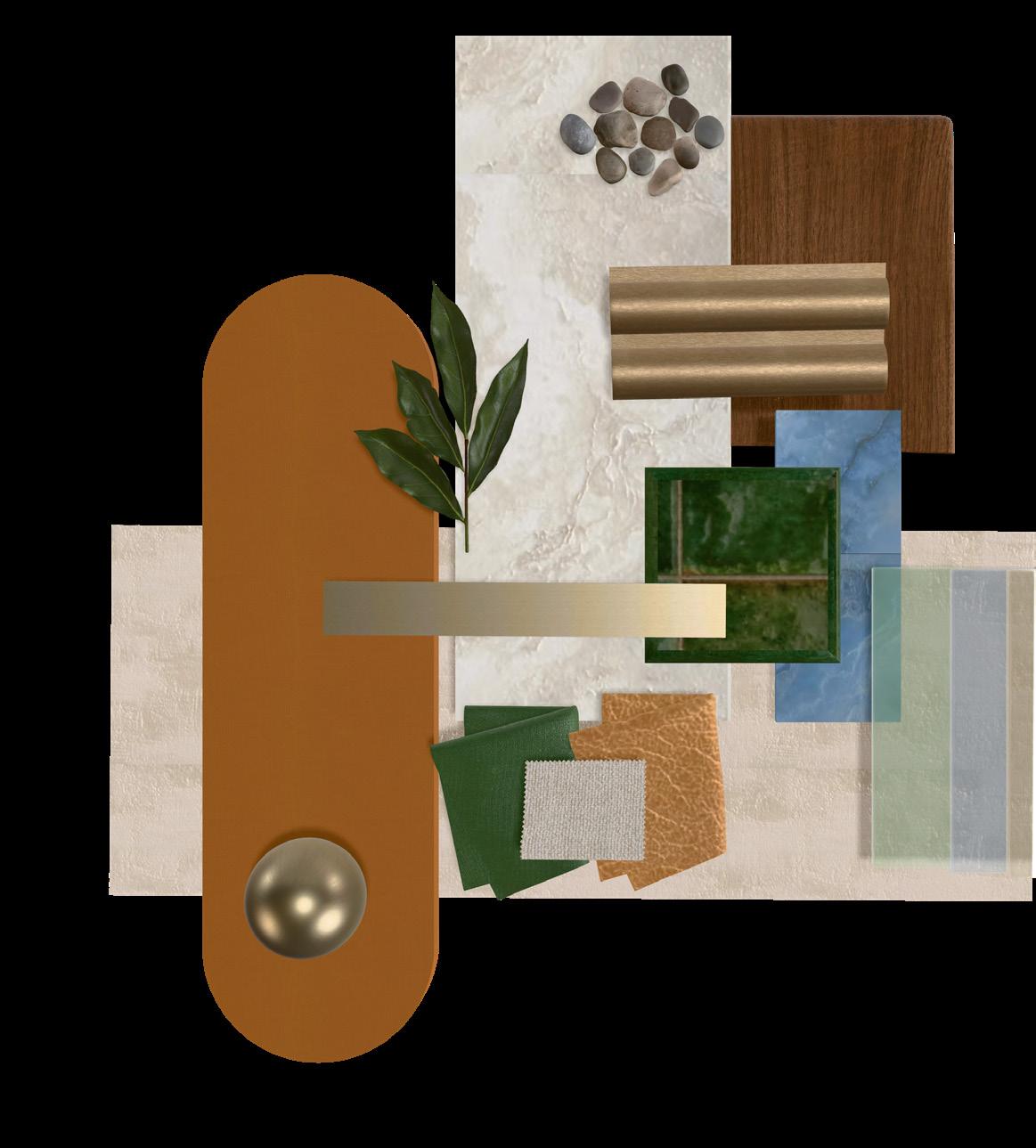
Color is used as a visual system to represent each department’s function and qualities, with tones aligned to role and personality to create subtle distinction, maintain cohesion, guide orientation, and reinforce the firm’s identity.
#2F3D4C #63333E
#514C7E
#6D817B
#BF796E
#7F8266
#5D6F7F
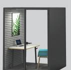
OFFICE LAYOUTS USER CUSTOMIZABILITY
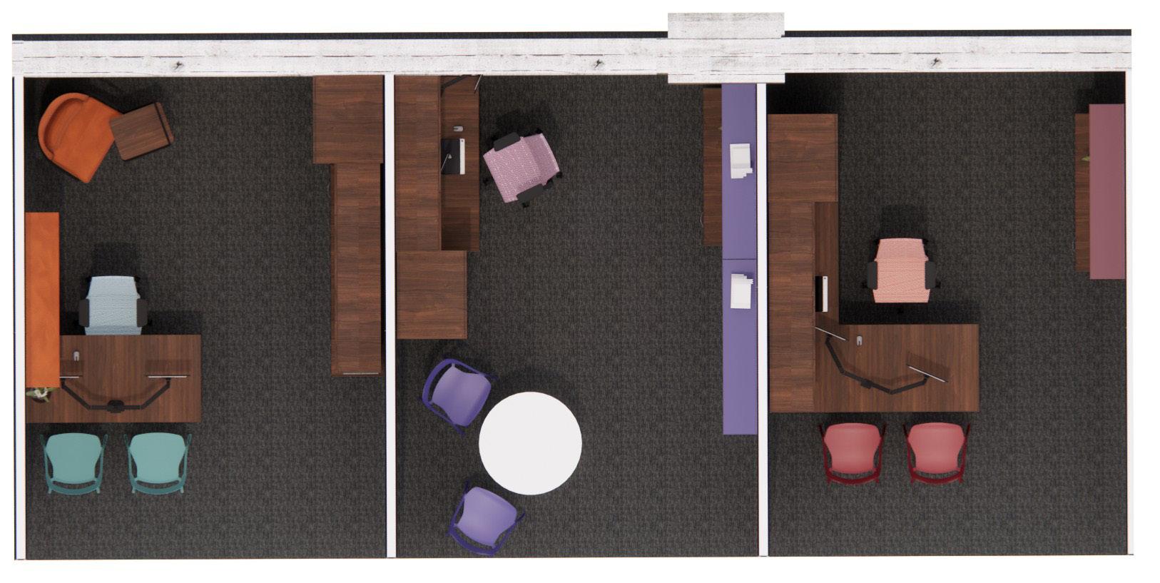
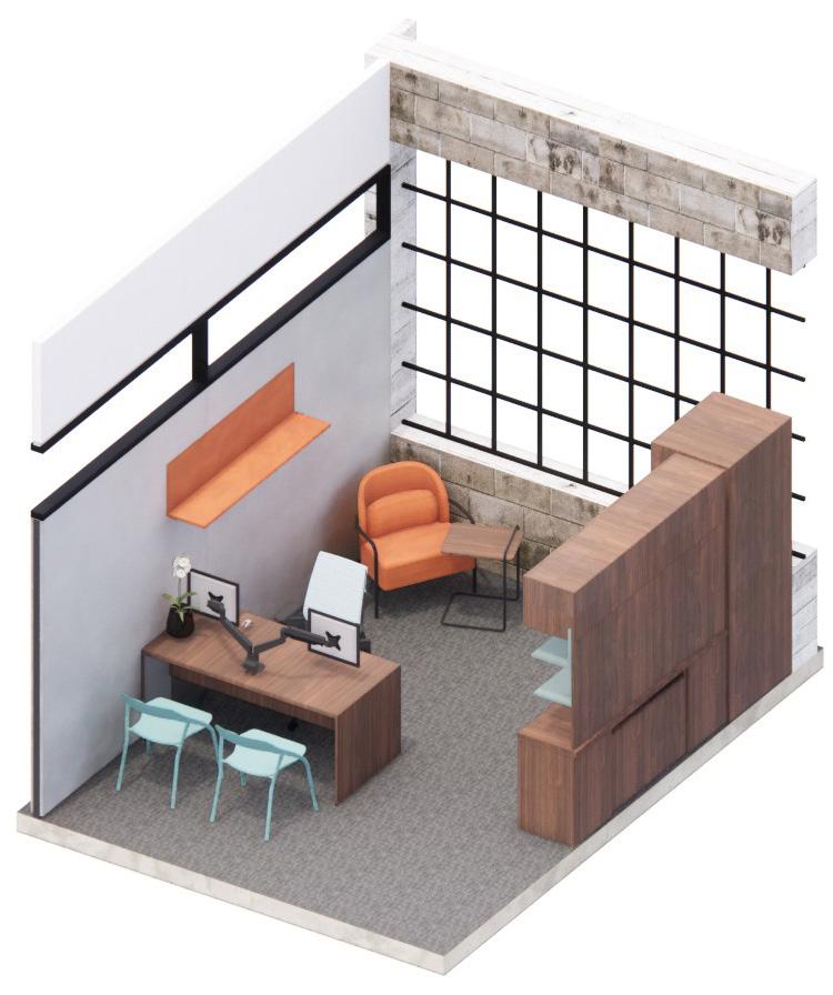
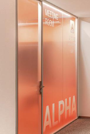
Workspaces are organized by adaptive, collaborative, and structured modes, with each office defined by frosted gradient glass that fades upward to provide privacy while maintaining visual connection.
COLLABORATIVE MODE STRUCTURED MODE ADAPTIVE MODE
Designed for those who thrive on connection and teamwork, this mode uses open layouts and shared tables to encourage communication, brainstorming, and spontaneous interaction.
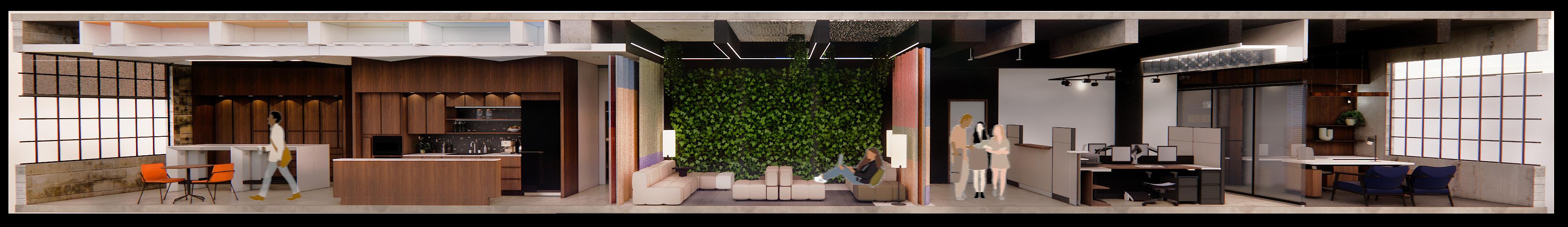
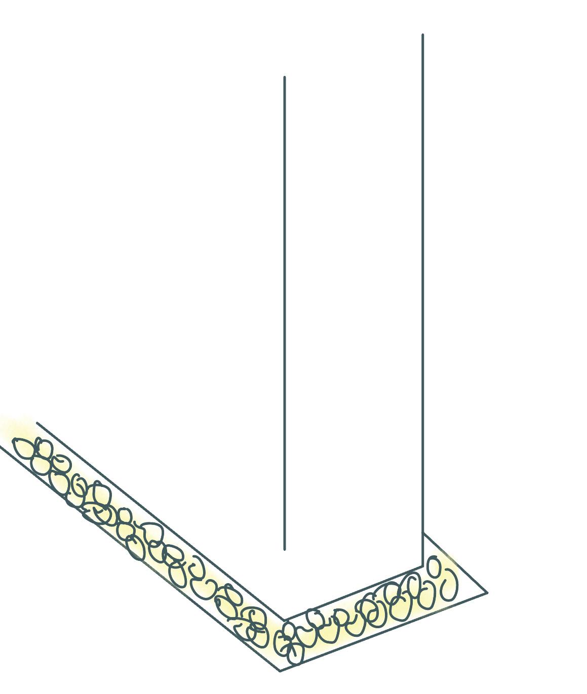
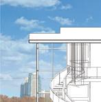
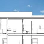
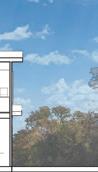
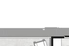
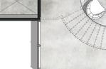
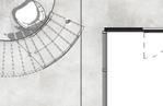
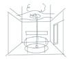
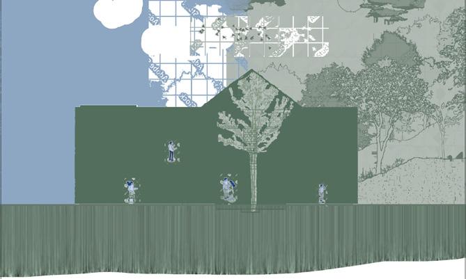
SECTION CUT
Designed for those who prefer a traditional, defined work setting, this layout supports concentration through order, predictability, and professional formality.
Designed for those who value flexibility and independence, these spaces shift easily between tasks, supporting mobility, casual focus, and choice in how and where to work.
This section view highlights the relationship between regeneration, connection, and work, revealing how transitions in material and light define each zone.

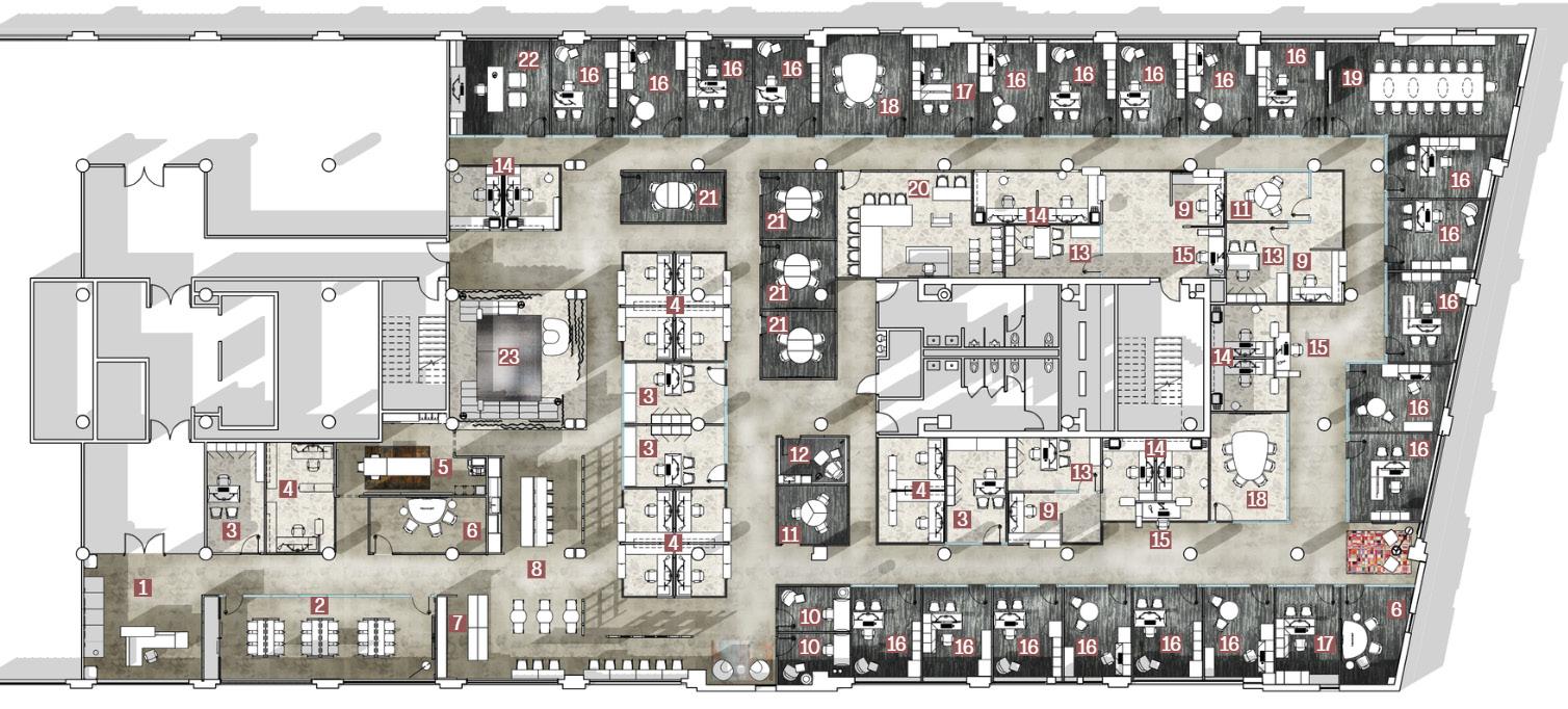
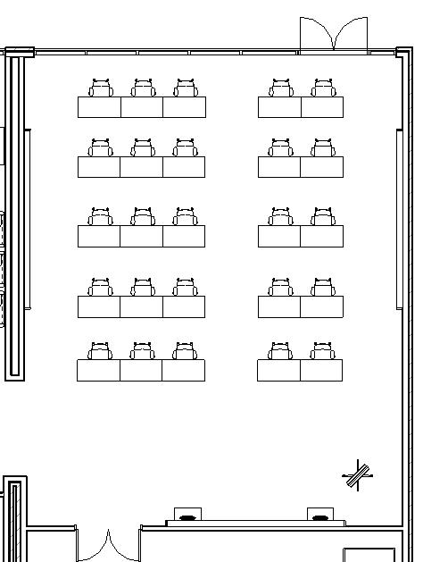
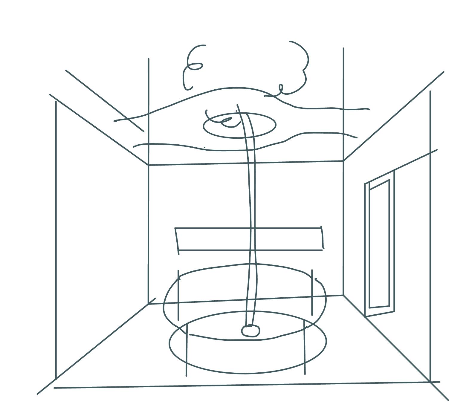
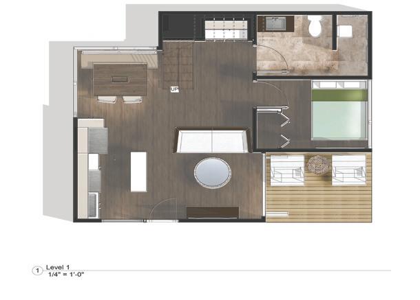
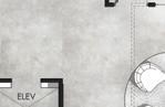
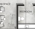
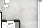
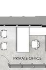
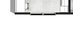
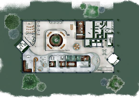
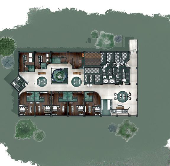
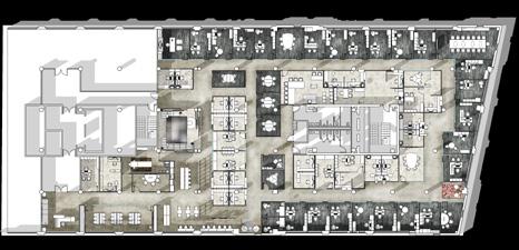
FLOOR PLAN
REFLECTED CEILING PLAN
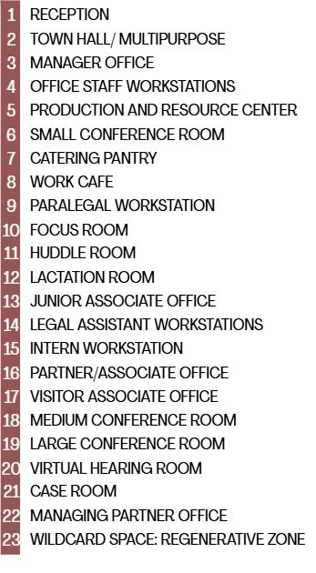
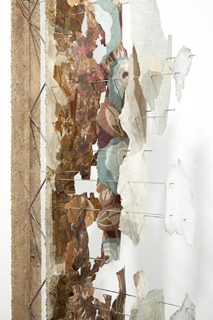
Local art from the mural on the south facade of the building, located on the ceiling surface in between beams, showing process and the idea of building on.
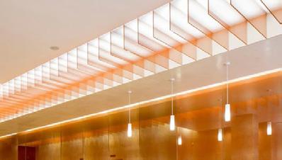
Circadian LED panels placed above Arktura Atmosphera rise, representing the idea of “looking through” like a pentimento art piece.
Structure at 8’9” A.F.F. sitting disconnected from exposed ceiling.
Transparent colored panels hanging below LED light panels - color of panels depends on the department it’s in, blending from one color into the next seamlessly.
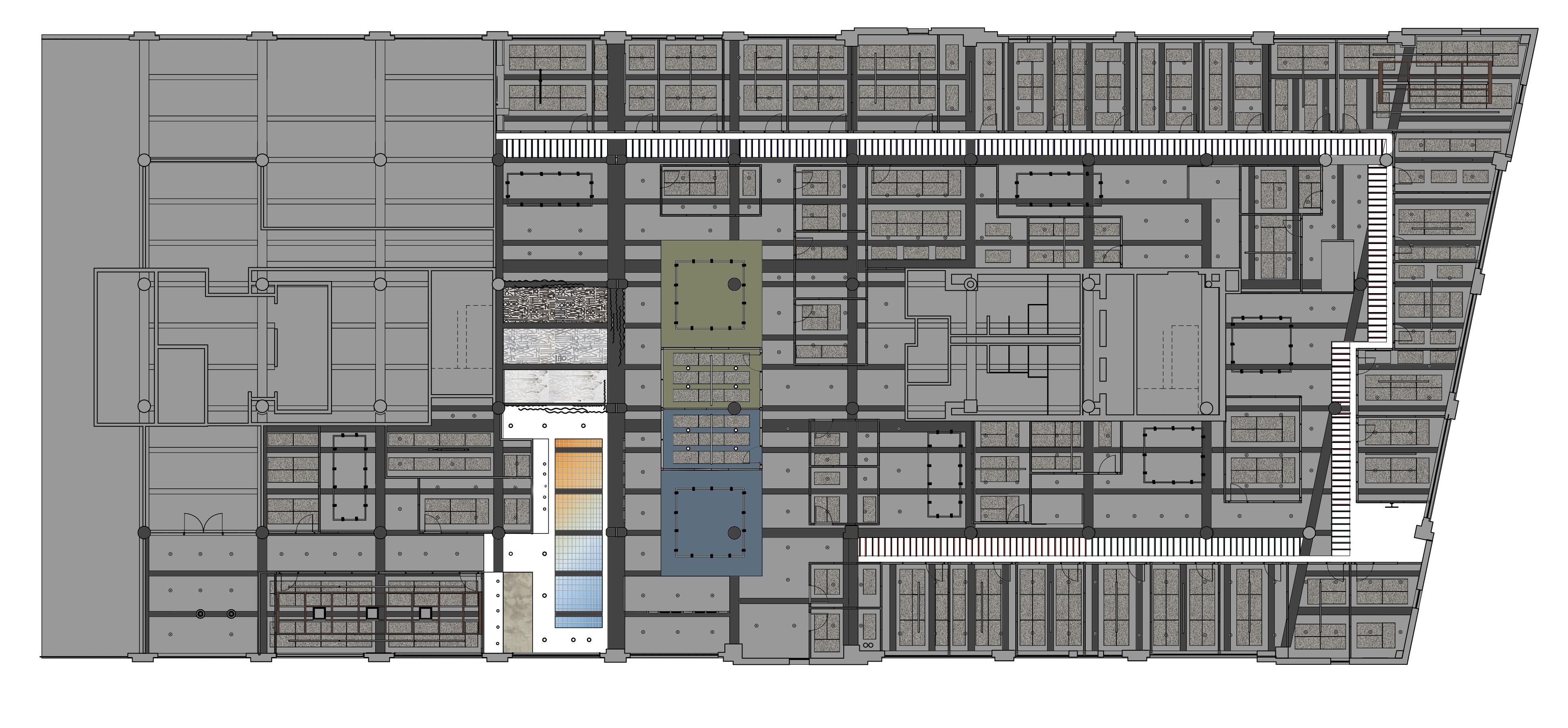

CEILING ALL OPEN TO STRUCTURE UNLESS SPECIFIED OTHERWISE
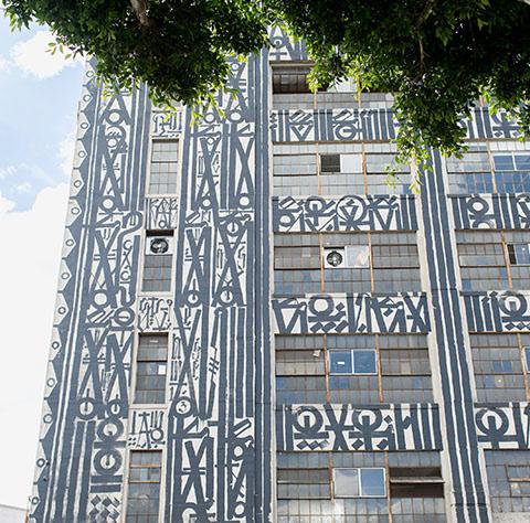
Armstrong acoustic ceiling panels mounted directly to open ceiling in between beams.
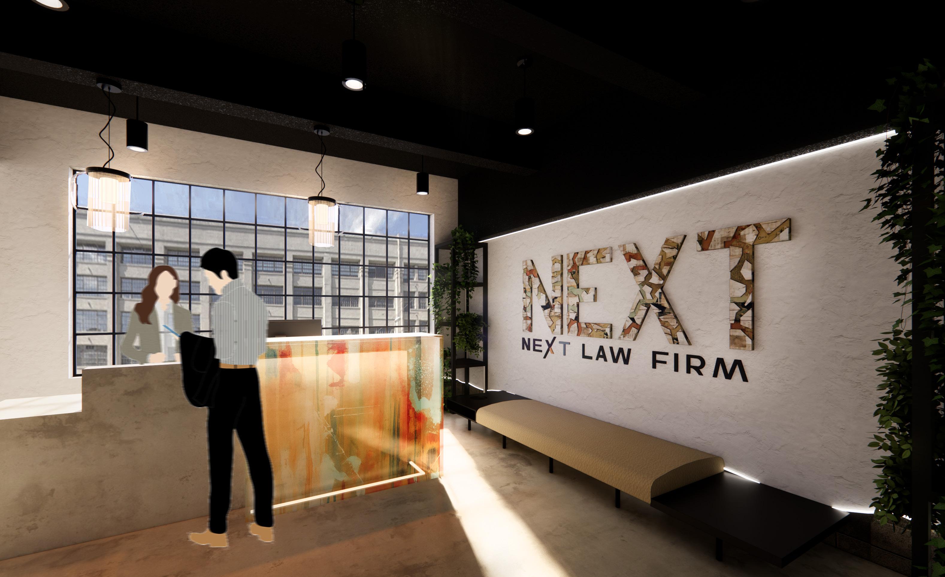
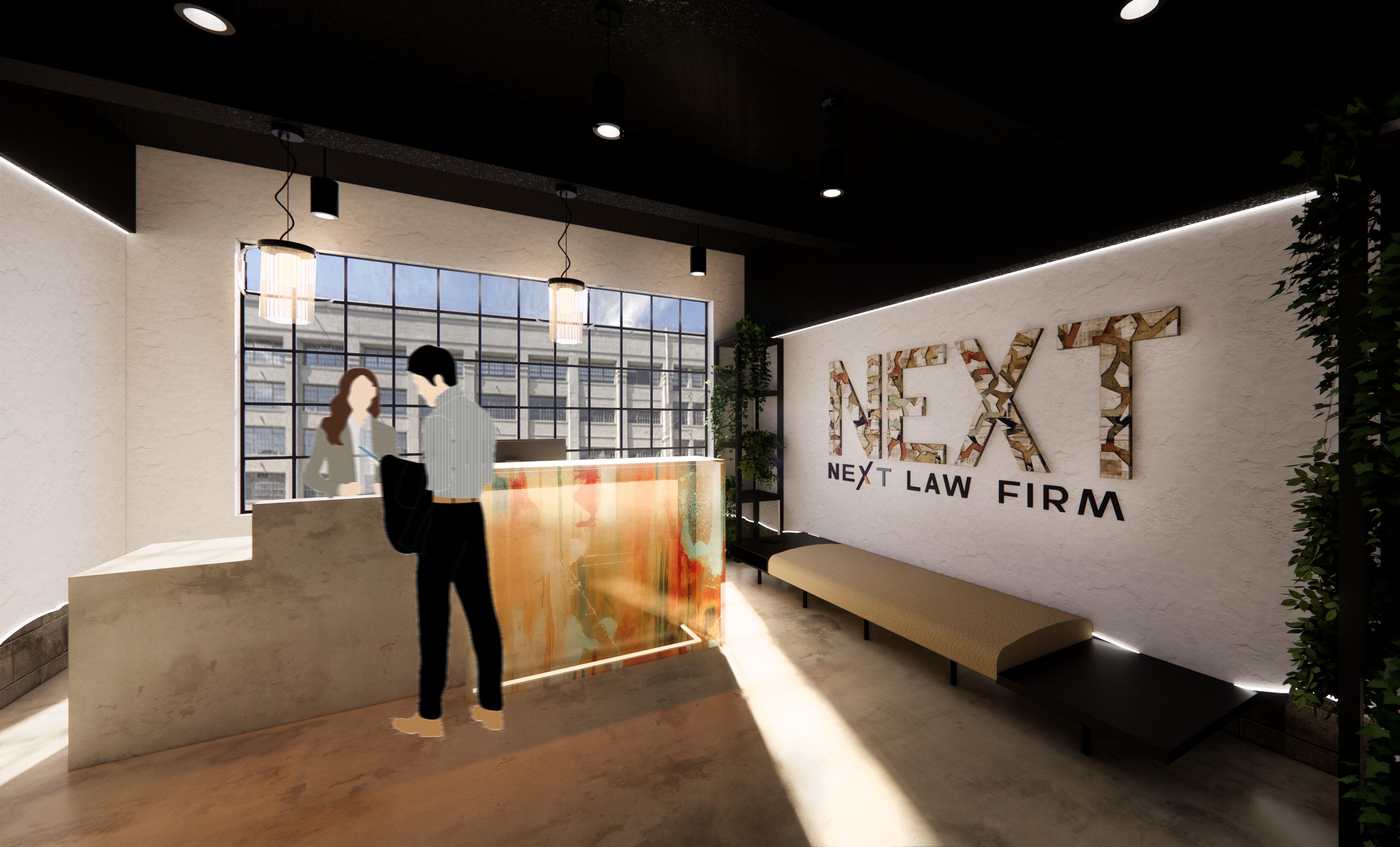
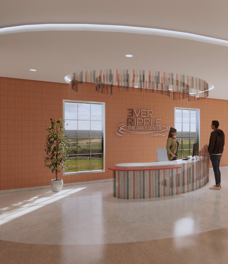
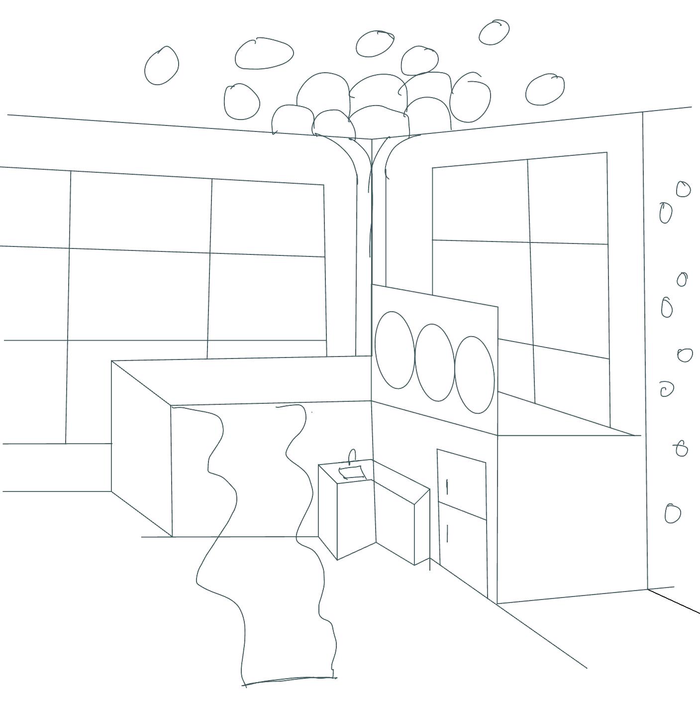
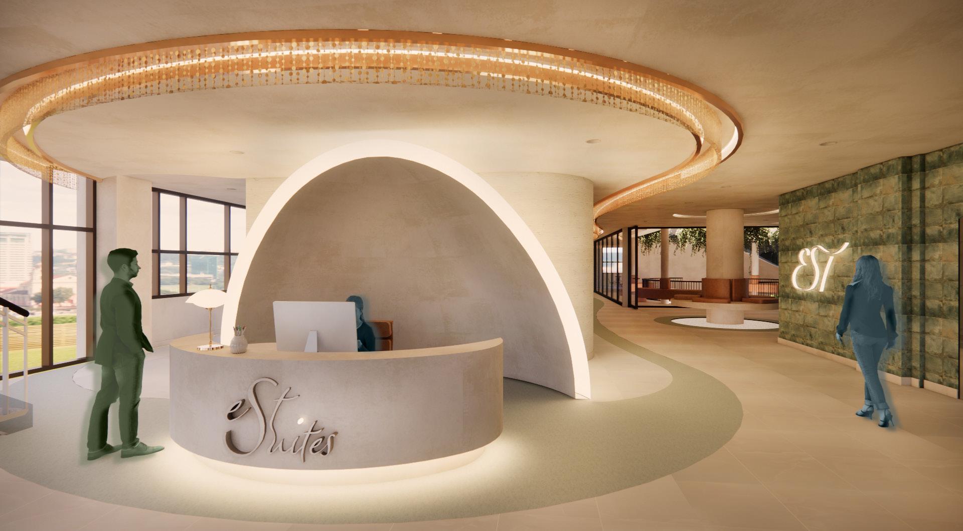
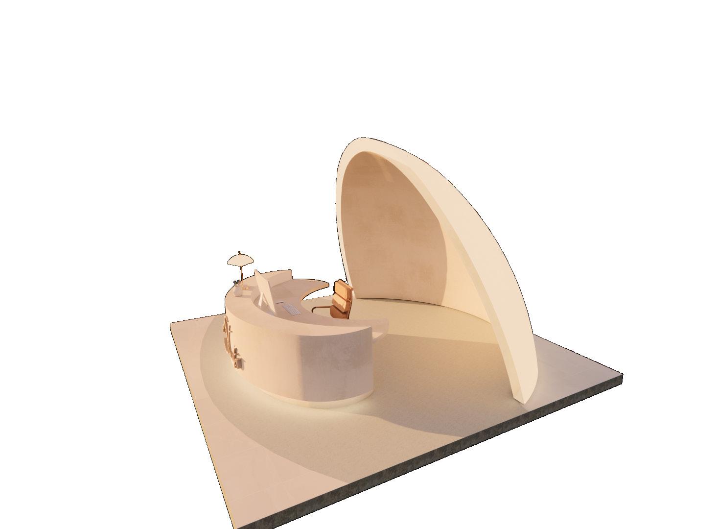
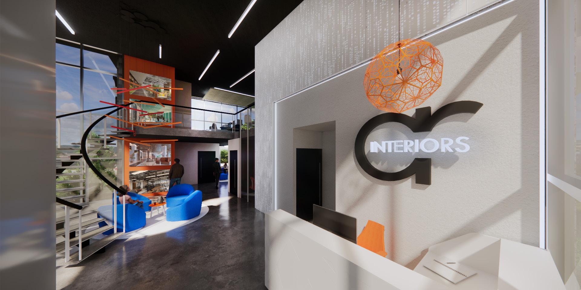
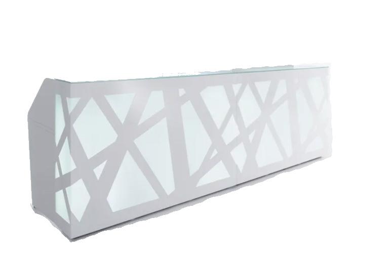
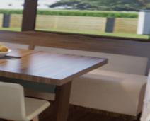
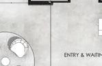
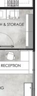
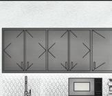
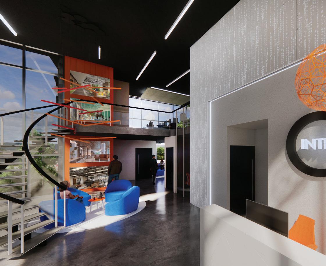
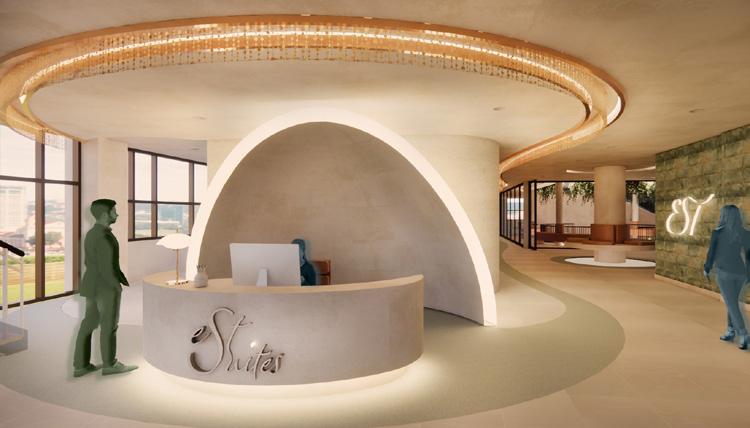
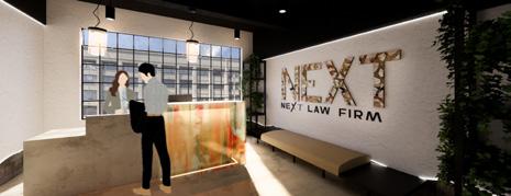
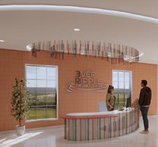
RECEPTION
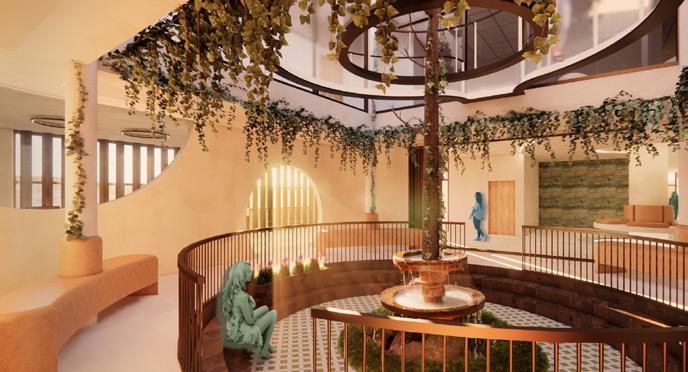
Upon entry, guests are welcomed by a reception that reflects Pentimento with layered materials and warm light create a transparent, welcoming space that sets the tone for collaboration and trust.
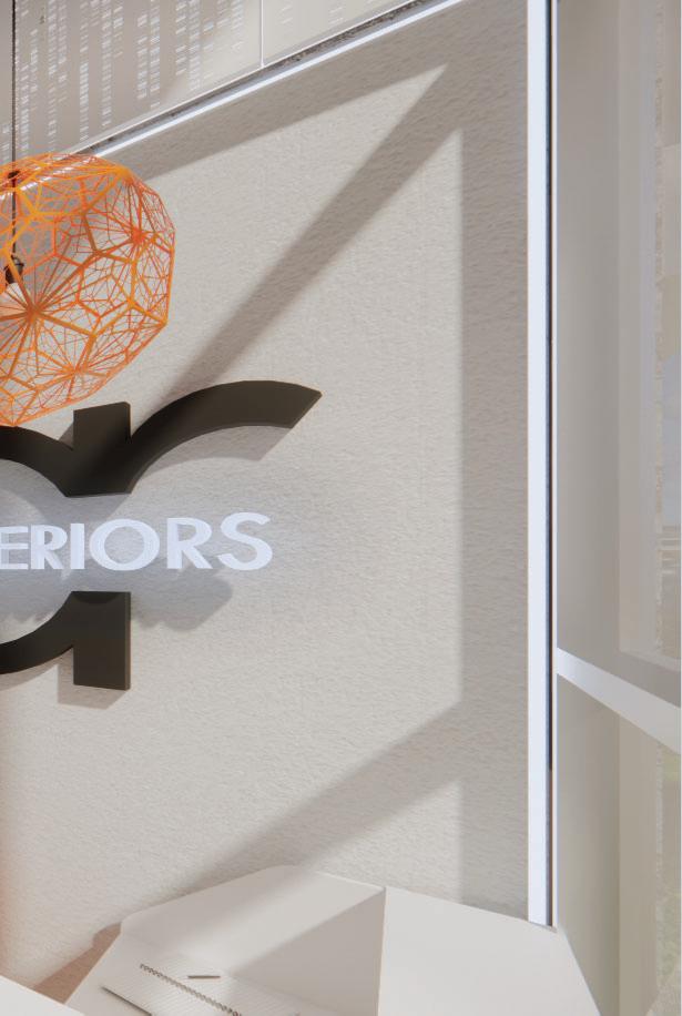
The ‘NEXT’ logo is composed of layered paper, canvas, and photographic fragments, visually expressing
Pentimento’s idea of seeing history and progression.
The multi-purpose room supports collaboration and flexibility, reflecting Pentimento through layered materials and adaptable furnishings that allow the space to evolve with its users.
ALTERNATIVE LAYOUT
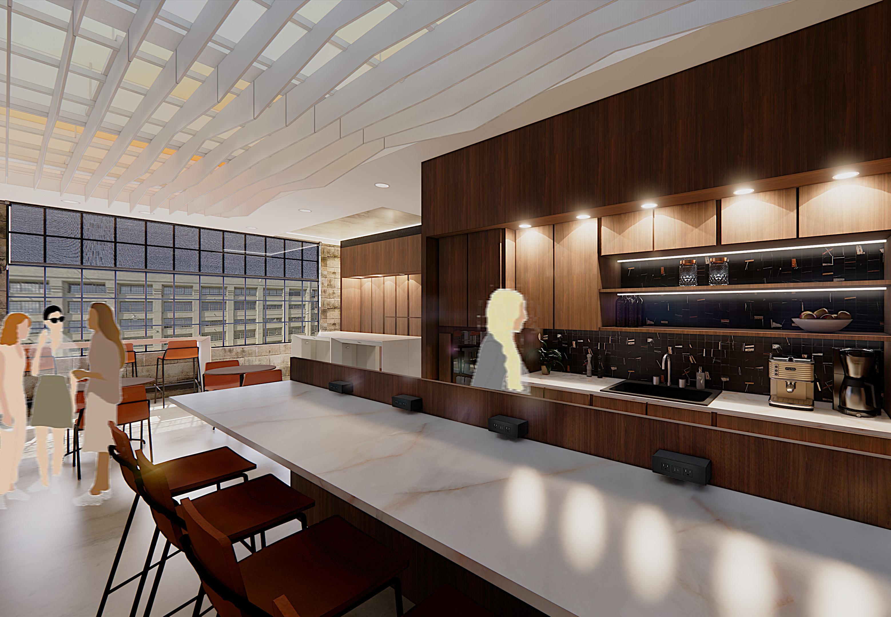
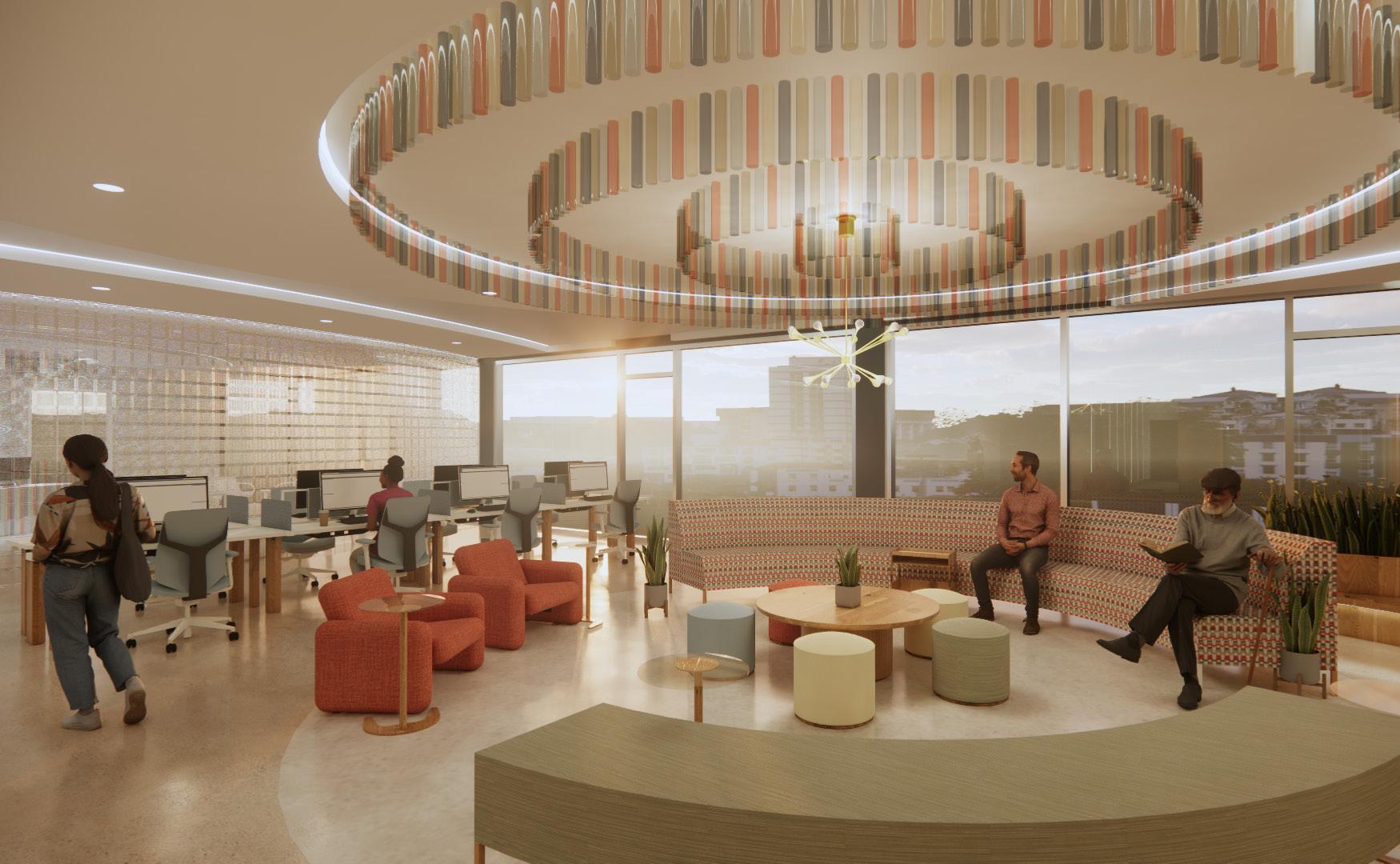
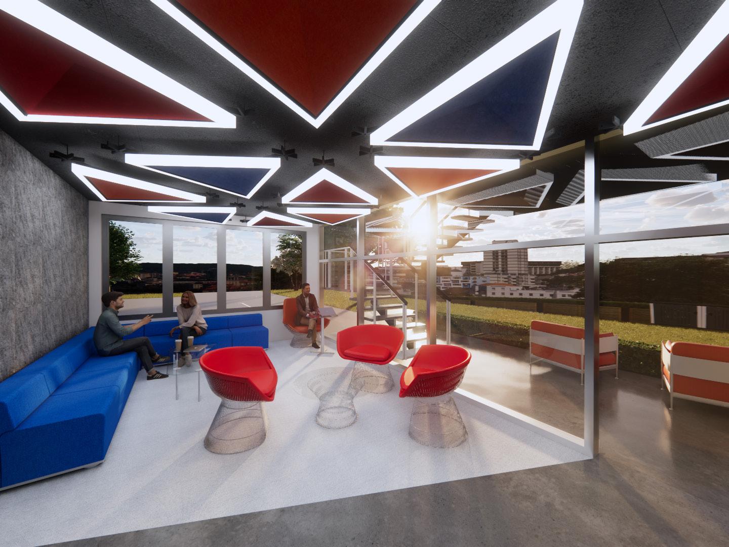
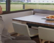
WORK CAFE
The work cafe serves as a social hub for connection and collaboration, blending warmth and functionality as circadian light filters through the ceiling fins to support shared gathering and informal work.
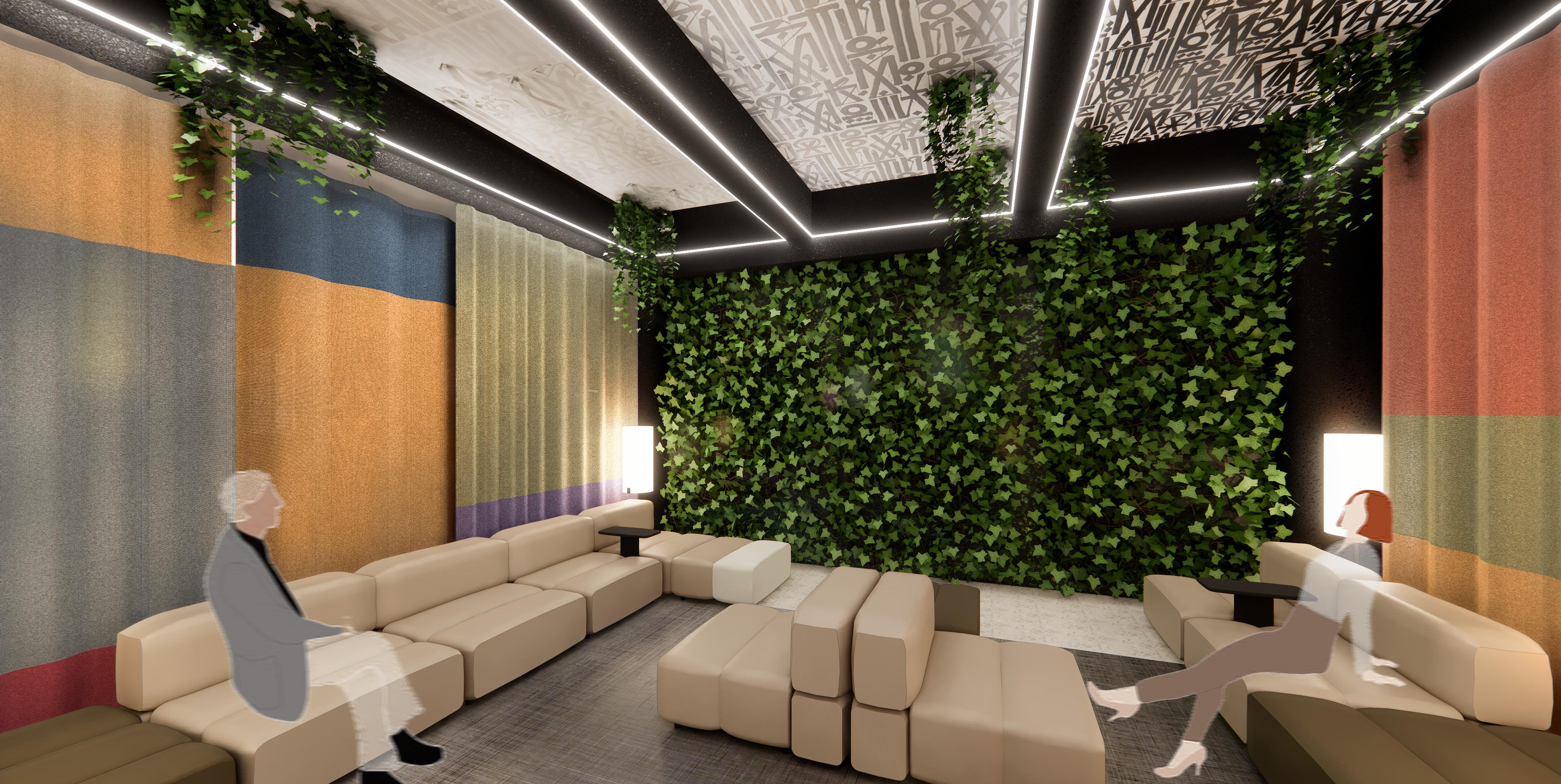
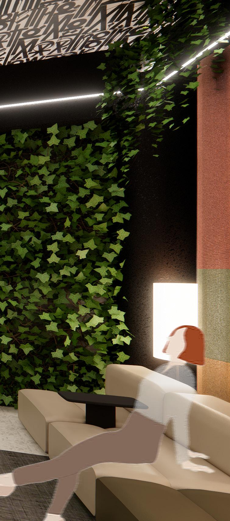
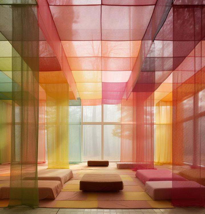
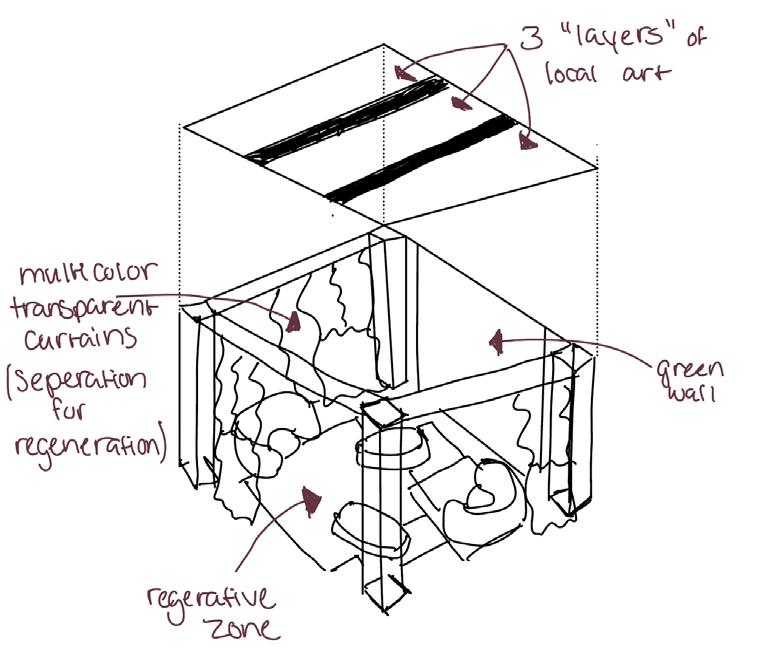
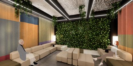
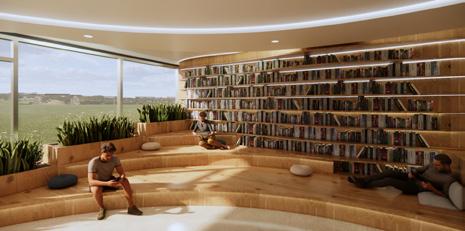
WILDCARD: REGENERATIVE ZONE
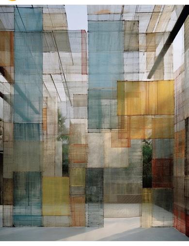
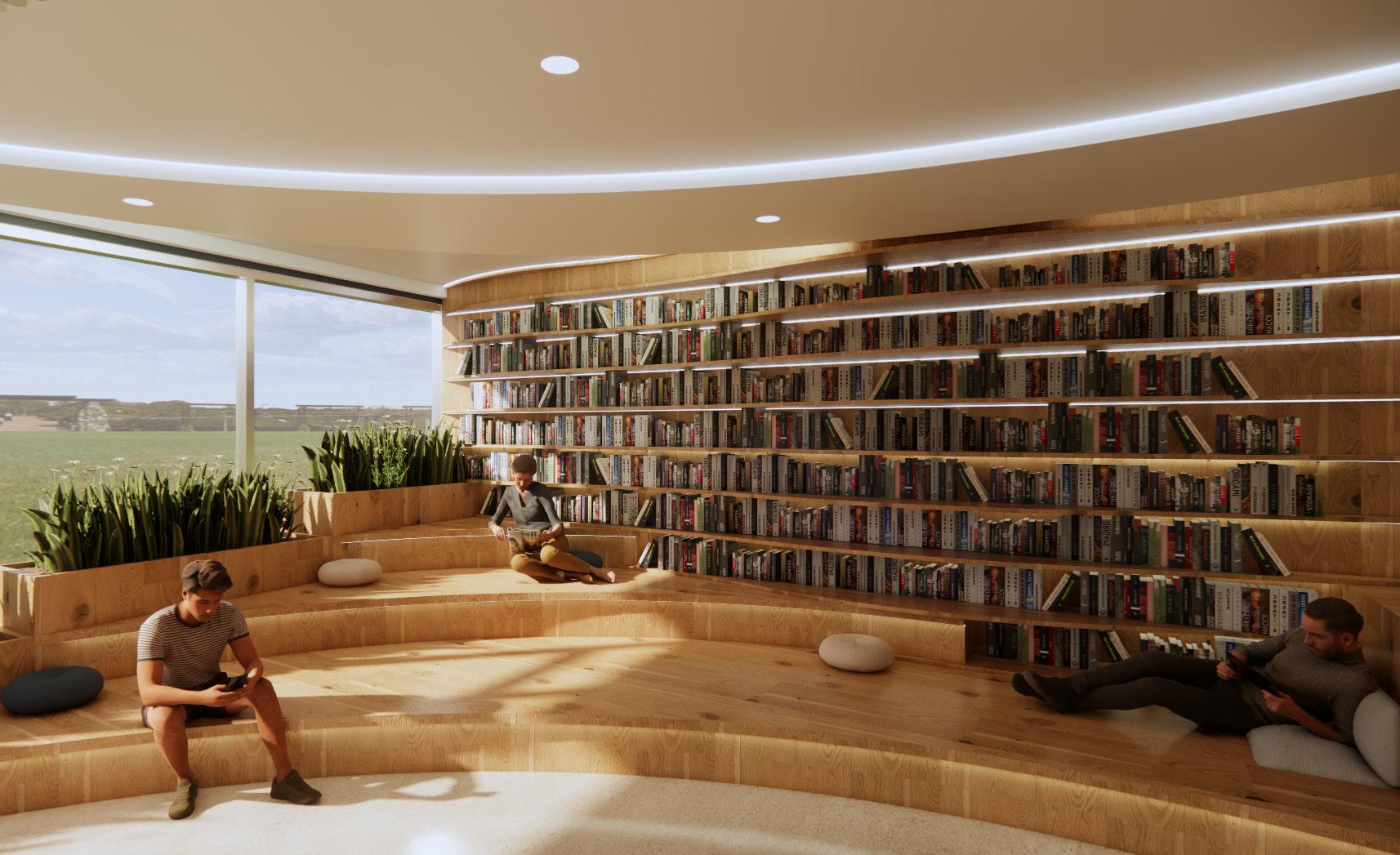
The regenerative zone functions as a restorative retreat for pause and renewal. A living green wall supports biophilic connection, while ceiling art inspired by Retna’s south facade mural reinforces cultural continuity. The artwork’s three stages represent growth, reflection, and reconnection, and layered acoustic mesh curtains provide adjustable enclosure, sound control, and a soft transition from the surrounding workplace.

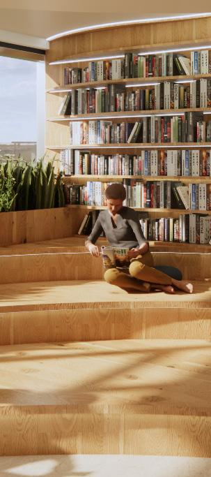
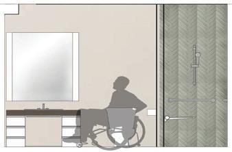
RESOURCE CENTER
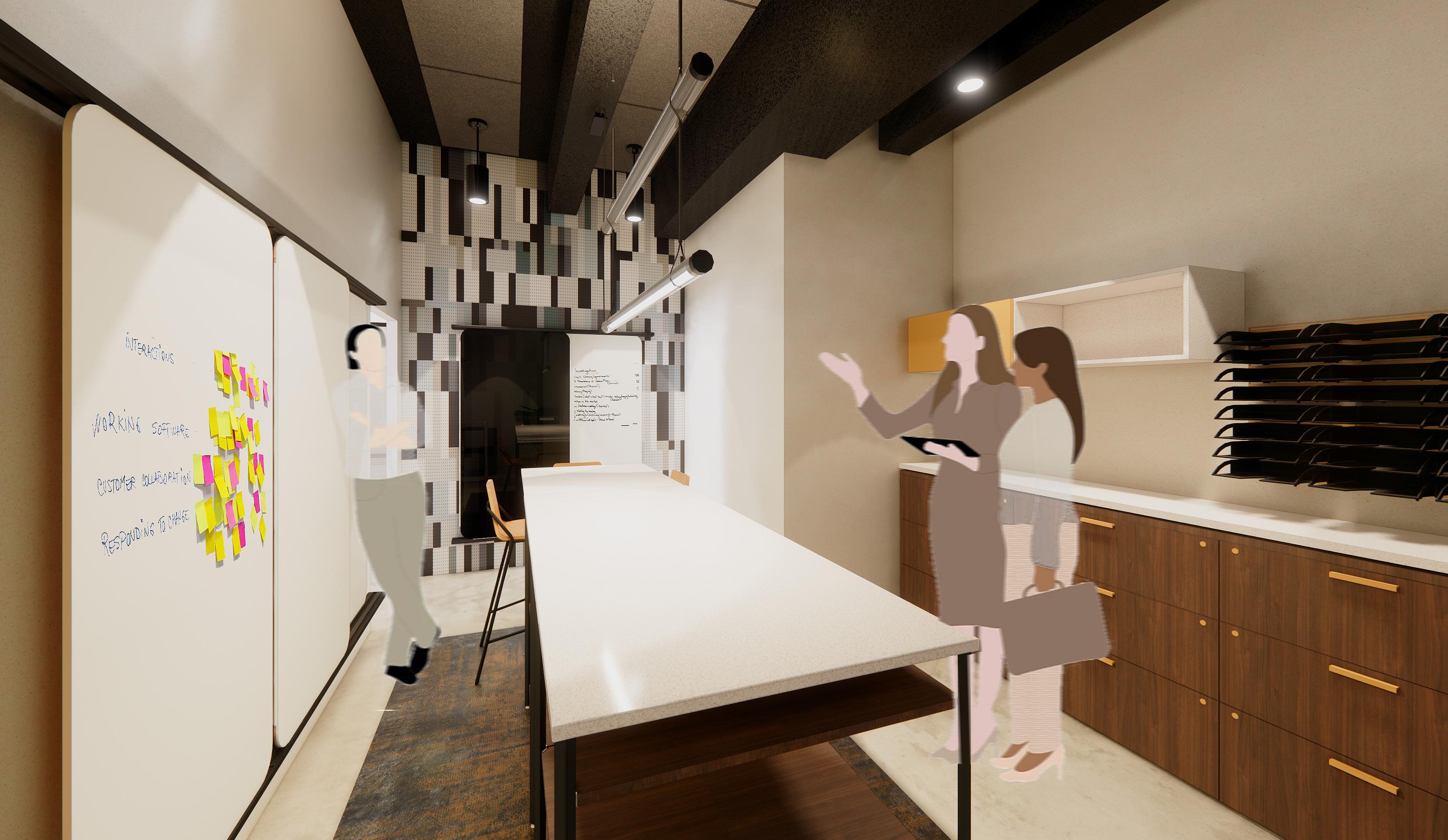
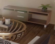
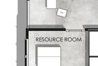
The resource and production center supports collaboration and workflow efficiency, featuring writable surfaces, ample storage, and a central worktable for communication and shared work development.
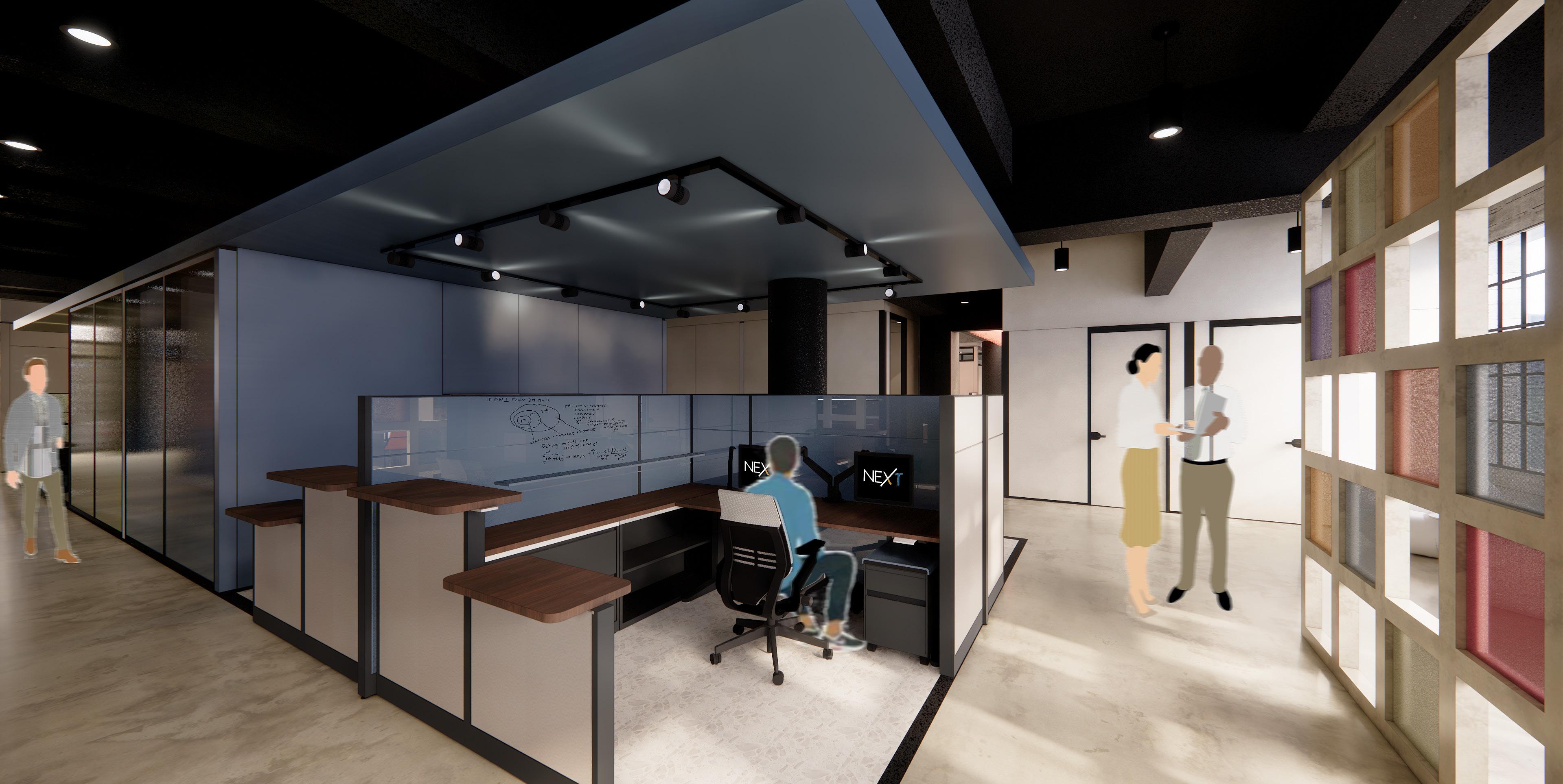
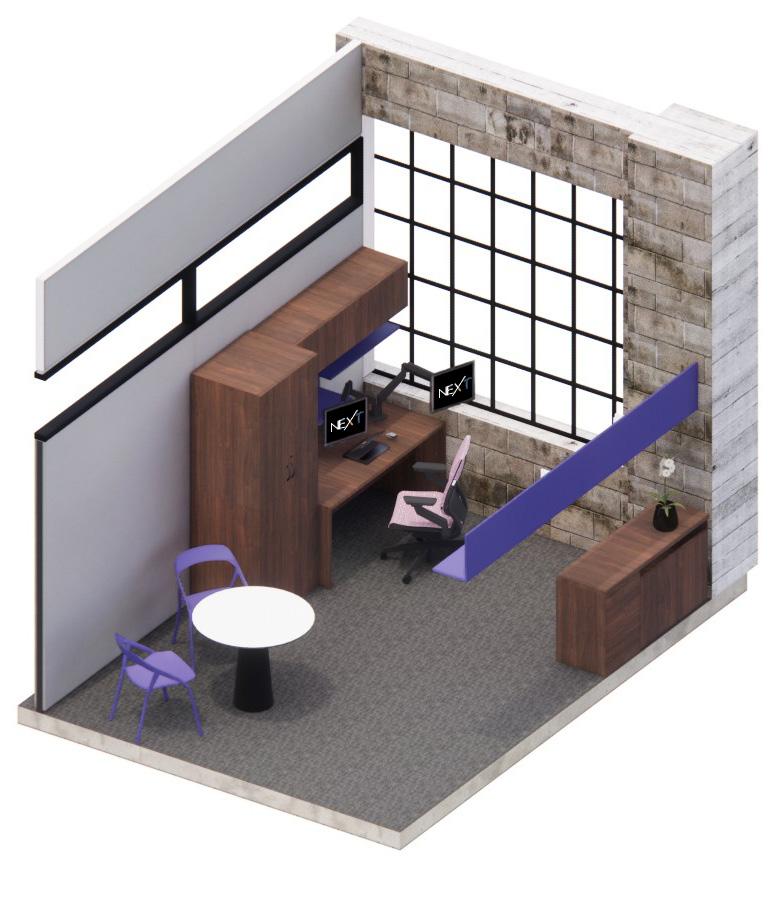
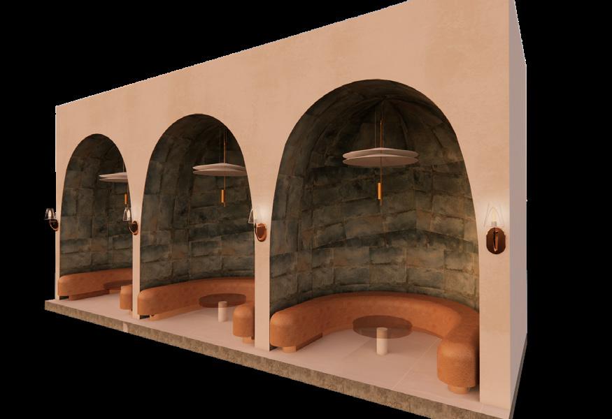
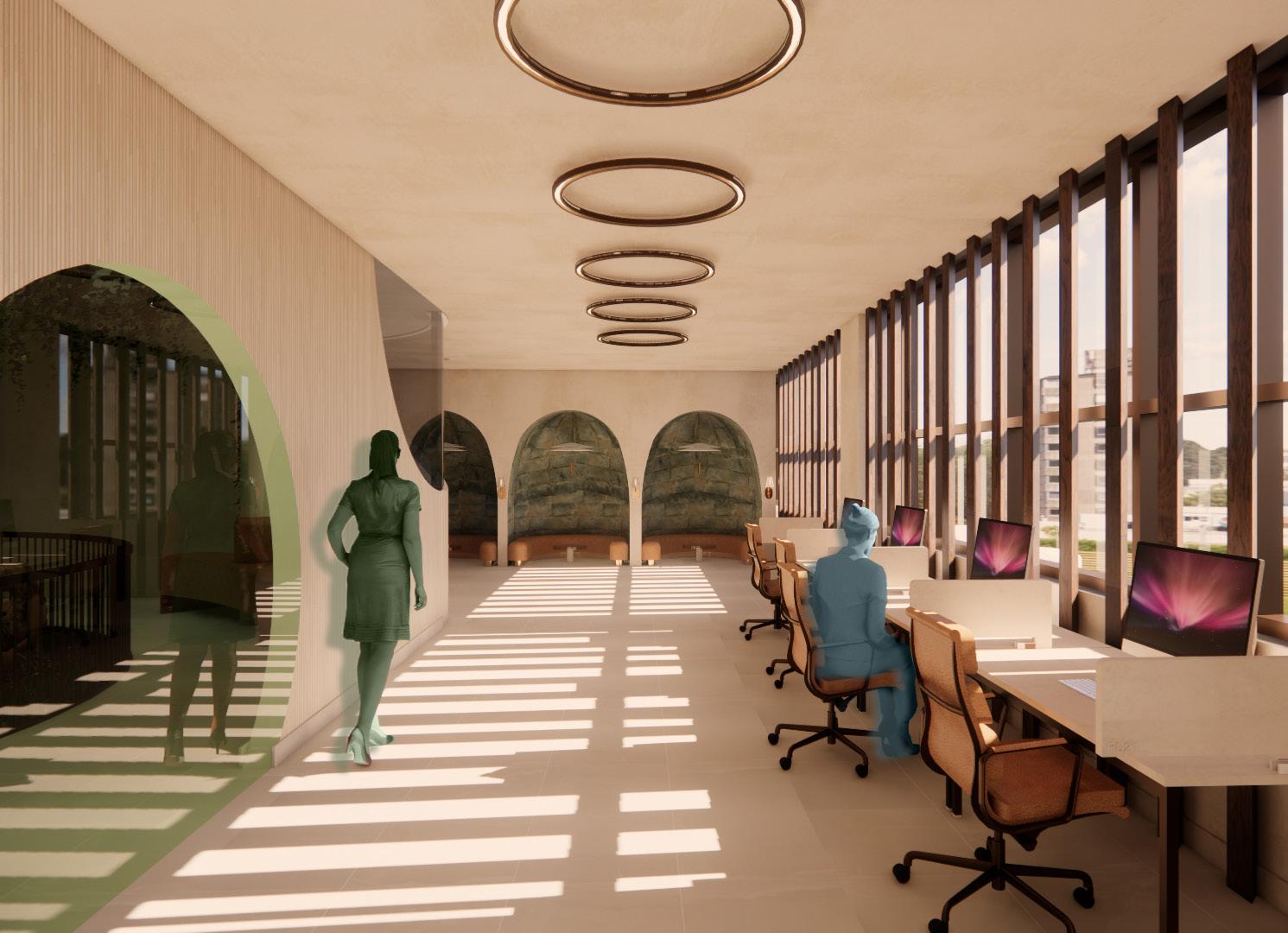
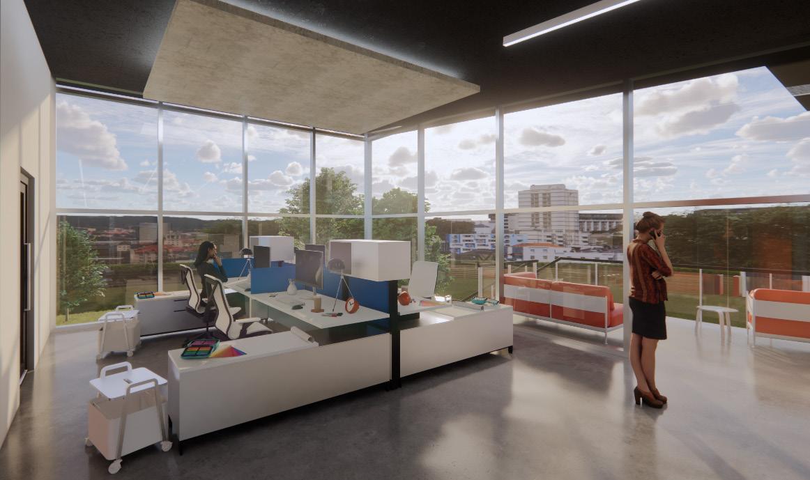
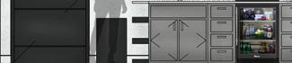
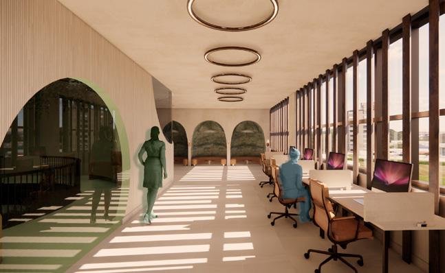
WORKSTATIONS
The IT enveloped workstations are color-coded to their department and designed for focused, tech-driven work within an open layout. A space divider on the right provides subtle separation and noise reduction, reflecting Pentimento through it layered transparency and the idea of “looking through.”
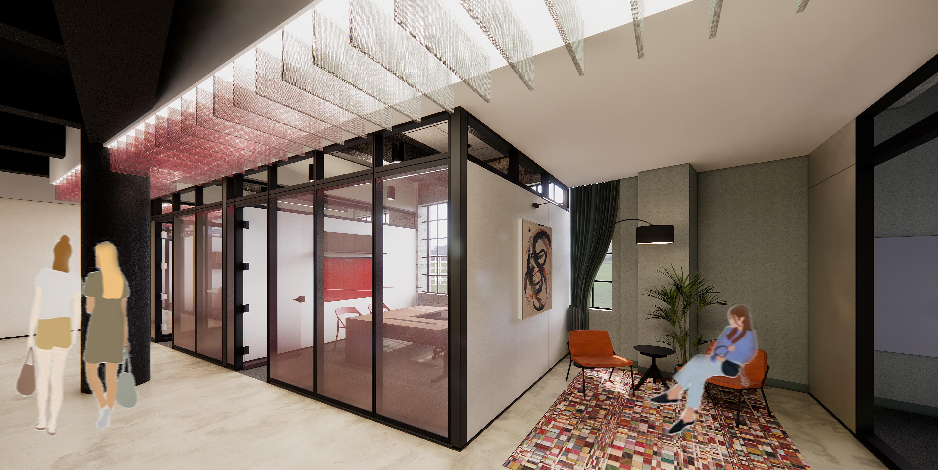

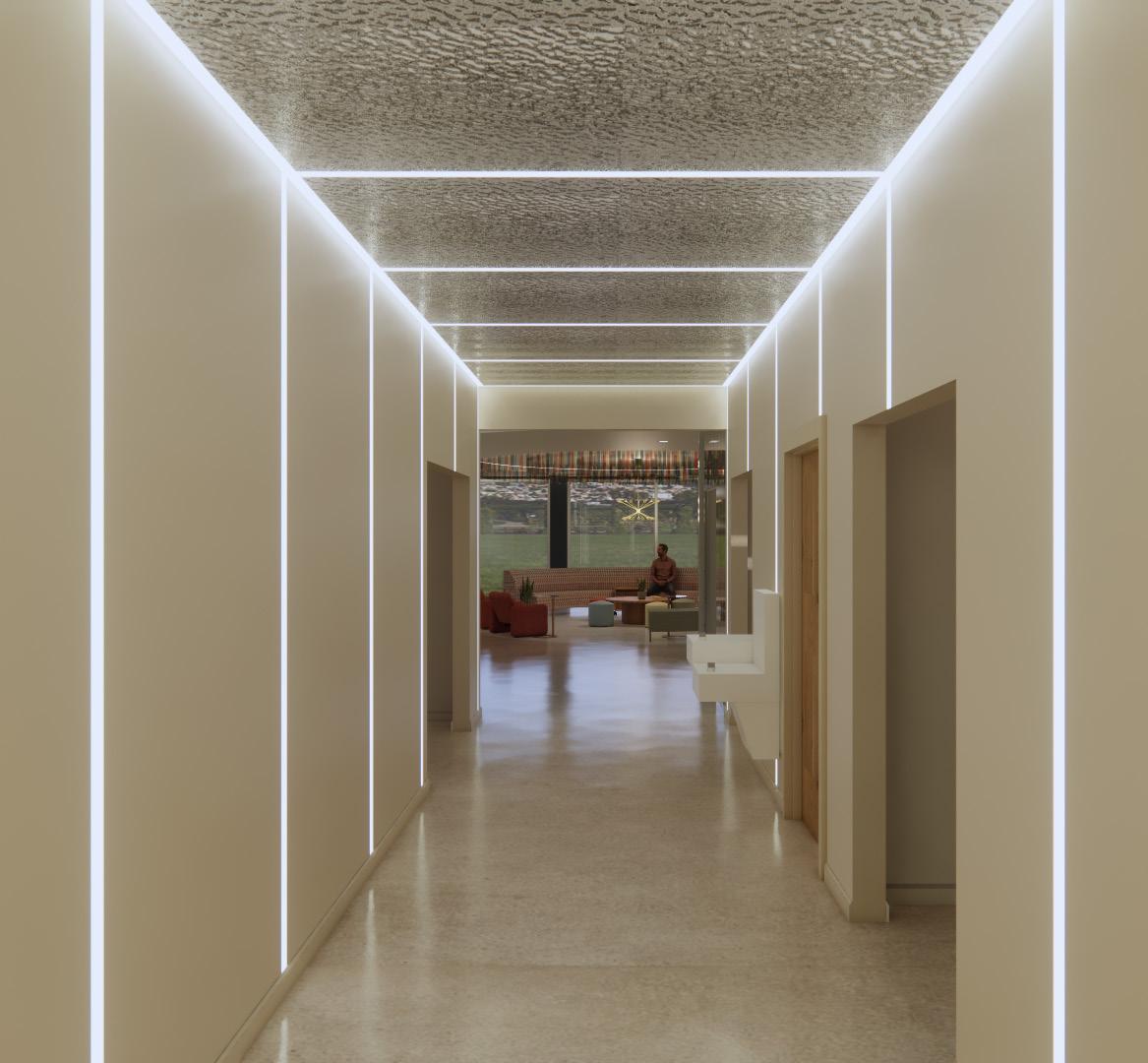
This hallway captures the transition between the Labor & Employment and Real Estate departments, expressed through the layered ceiling panels that shift in tone and transparency. Gradient-frosted office glass provides privacy while maintaining openness, and a small seating nook with local art creates a moment of pause within the flow of movement.
HALLWAY
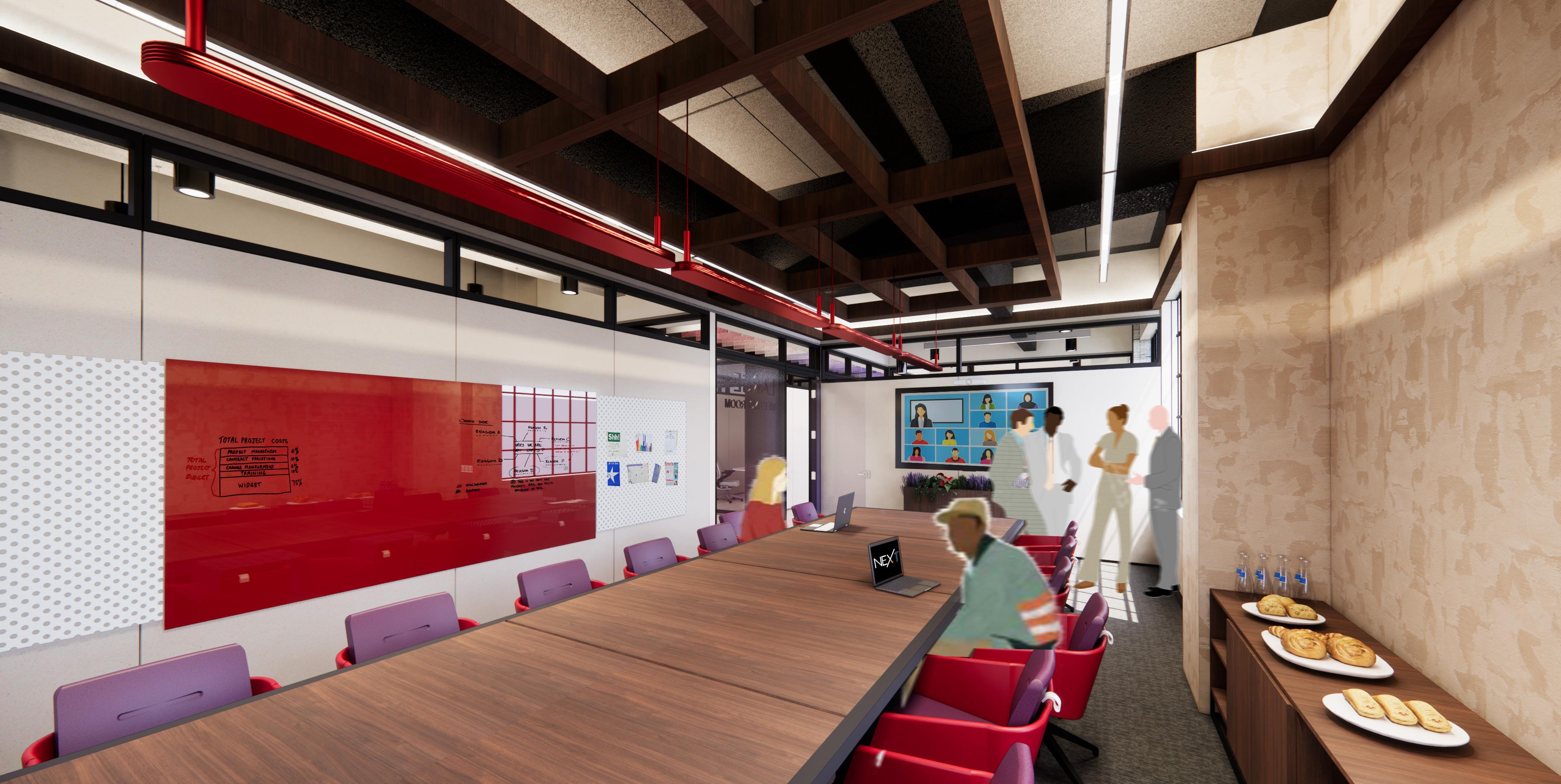
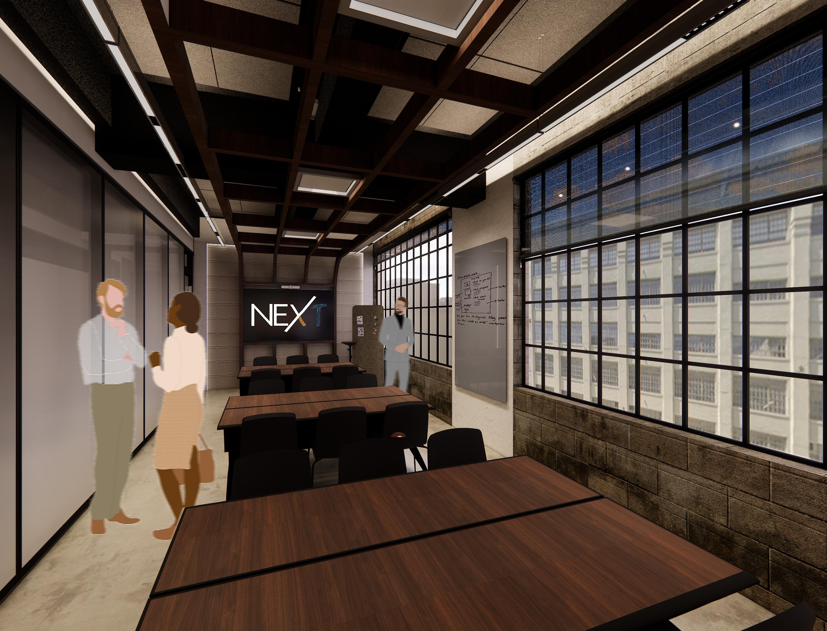
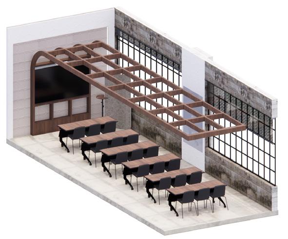
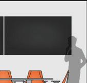
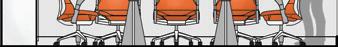
LARGE CONFERENCE ROOM
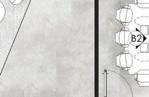
The conference room includes a catering area and supports both in-person and virtual meetings. Positioned between the Labor & Employment and Intellectual Property departments, it blends their red and purple tones to reflect collaboration.
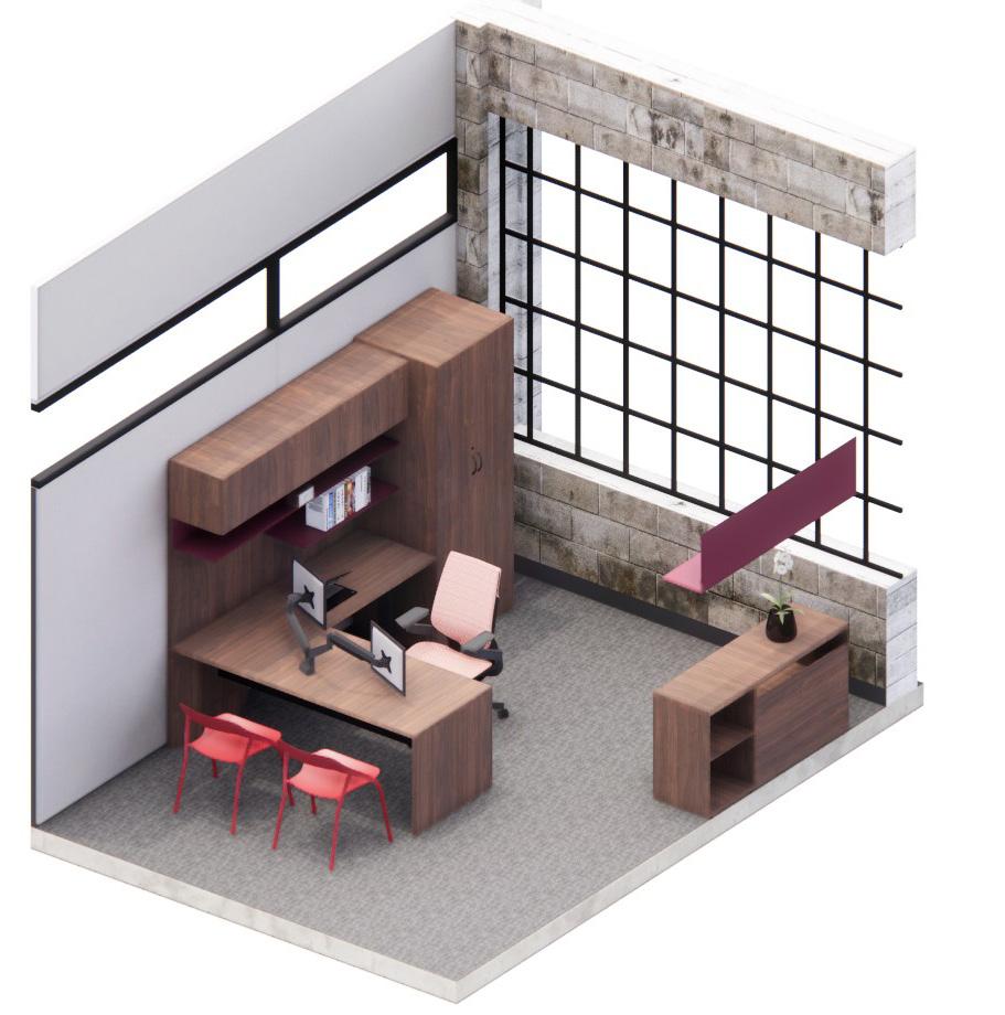
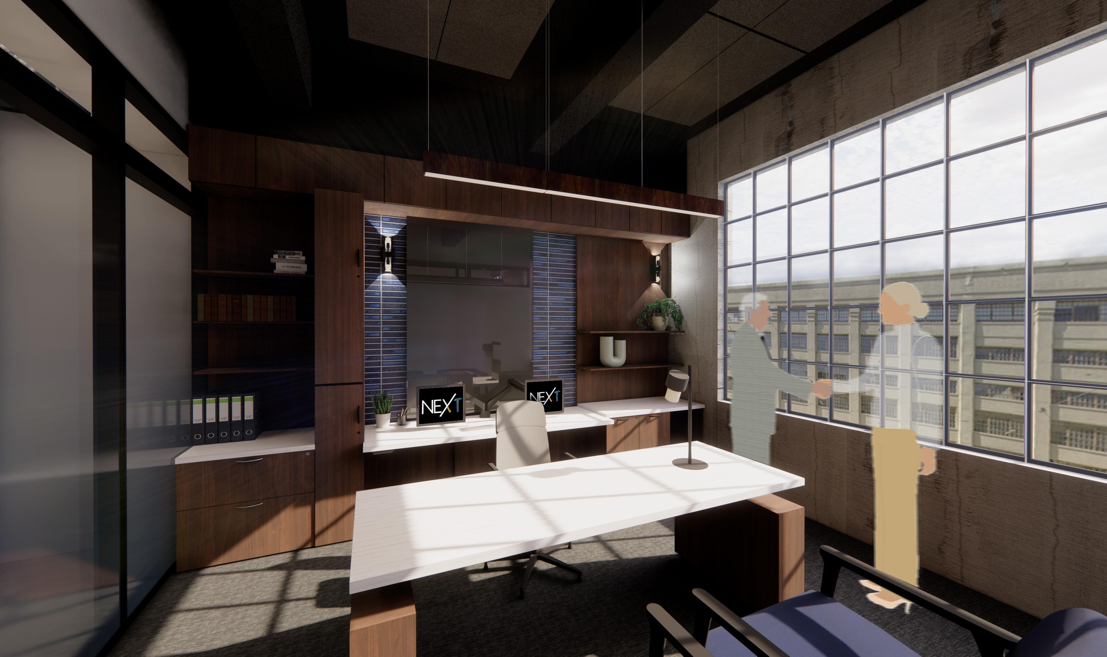
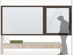
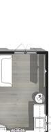
MANAGING PARTNER OFFICE
The managing partner’s office reflects an elevated sense of leadership through refined materials and layered lighting. Gradient frosted glass provides privacy while maintaining a connection to the surrounding workspace, balancing authority with openness.
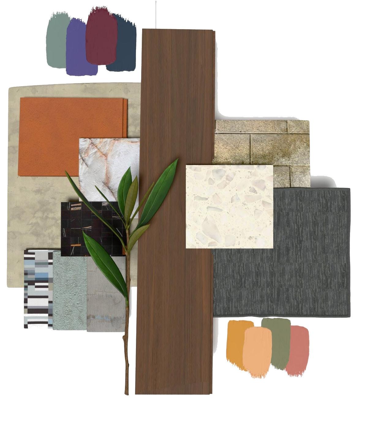
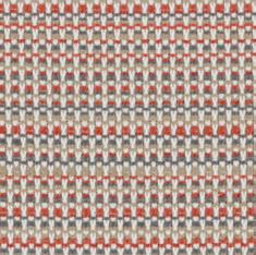
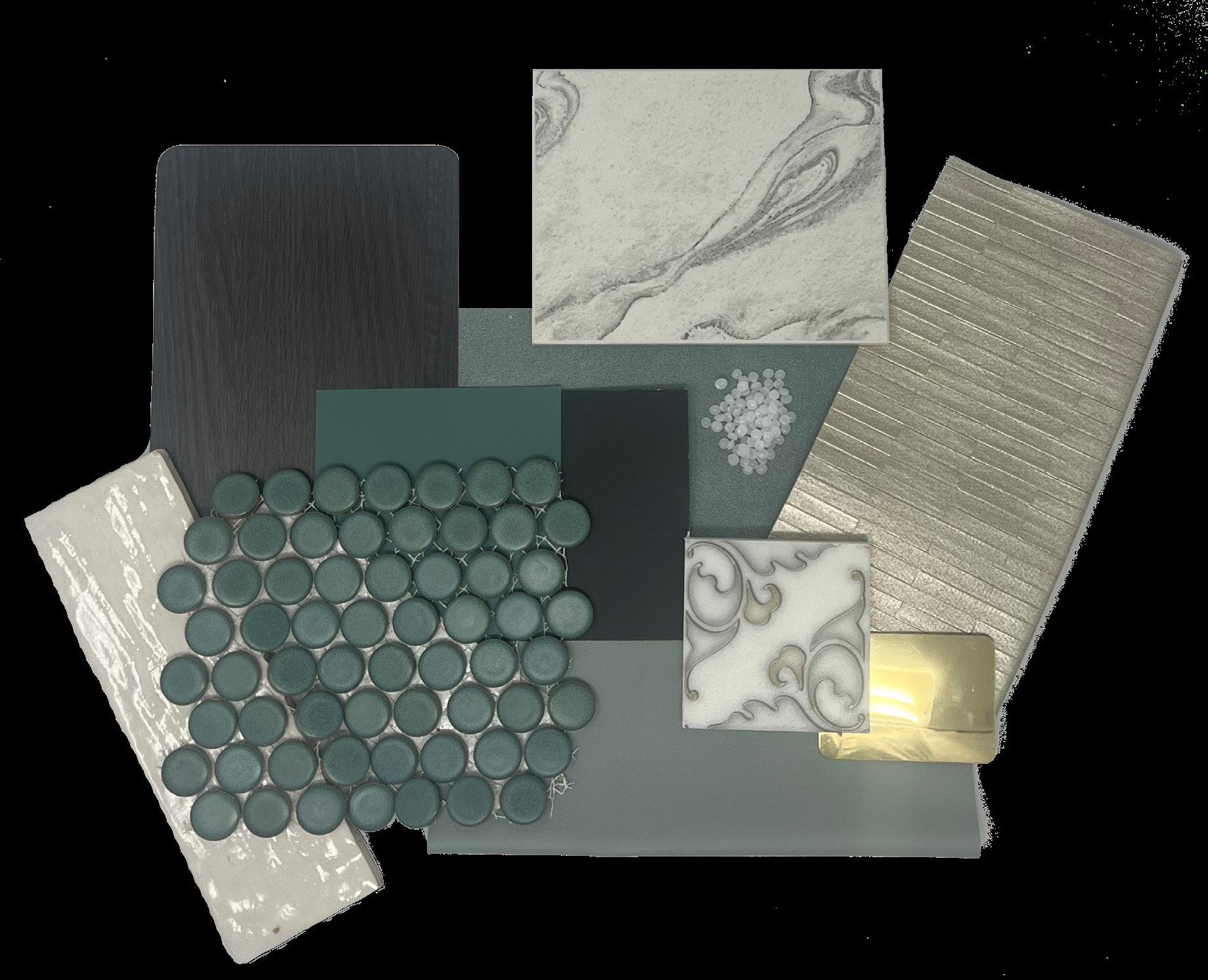
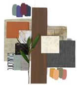
MATERIAL PALETTE
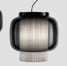
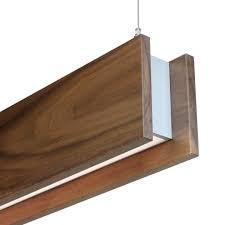
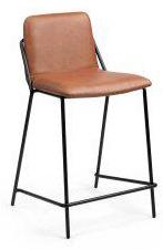
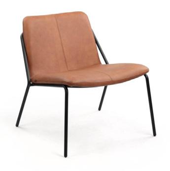
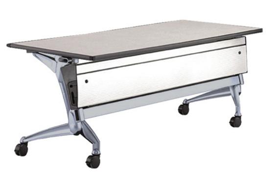
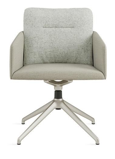
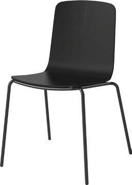
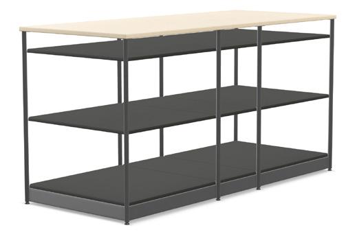
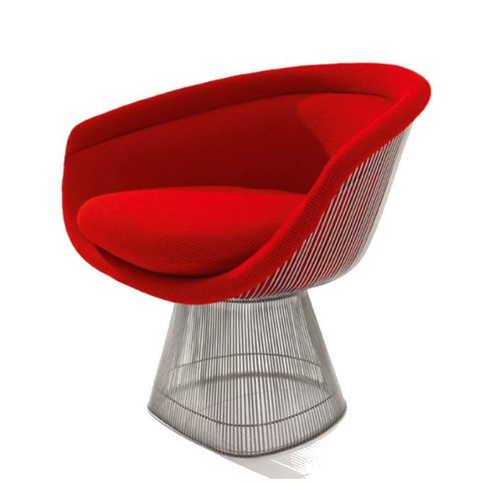
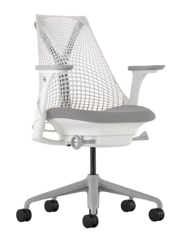
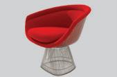
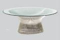
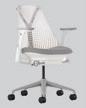
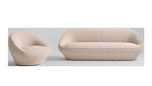
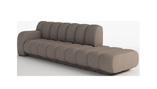
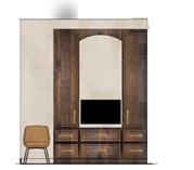
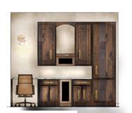
FURNITURE SELECTIONS
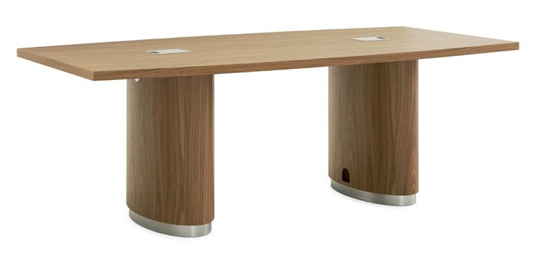
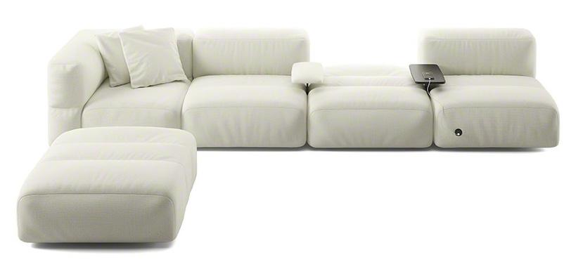
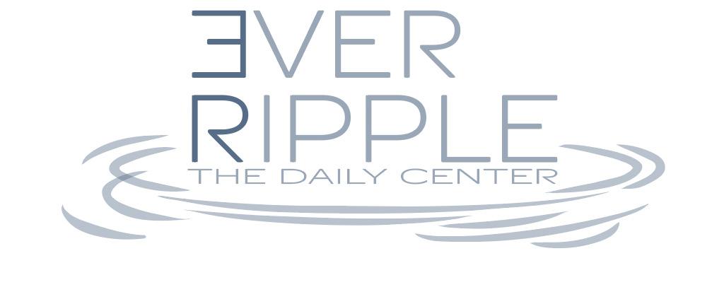
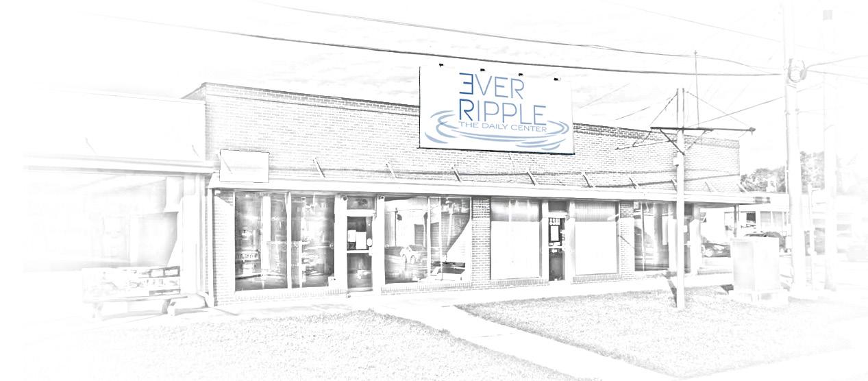
VER RIPPLE
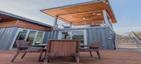
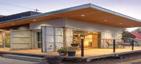
THE DAILY CENTER
WANAMAKER, INDIANAPOLIS, INDIANA
PROJECT BRIEF
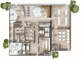
This project was completed for the ASID Indiana Chapter Student Competition and focused on designing a daily center for adults facing housing instability and life transitions. The brief required the adaptive reuse of an existing building to support essential services, including resource access, hygiene facilities, dining, and flexible community spaces. The project emphasized dignified, inclusive design through clear programming, spatial organization, and material strategies that support comfort, accessibility, and community connection.
WANAMAKER, INDIANA
Wanamaker, Indiana, is a small suburban community on the southeastern edge of Indianapolis with roots in early agricultural settlement and a strong small-town identity. While it has evolved into a residential area and become part of Indianapolis, Wanamaker maintains close community ties, local traditions, and a slower, neighborly pace. Built through collective effort by early settlers, this legacy of resilience and shared support continues to shape the community and informed the center’s emphasis on social connection, stability, and personal growth.
RESEARCH FINDINGS & INFLUENCE
Trauma-informed design prioritizes dignity, security, privacy, and wellbeing in spaces supporting individuals experiencing homelessness. Strategies such as natural lighting, noise reduction, flexible layouts, and secure storage, reflected in case studies like True Worth Place and Gensler’s work with San Diego shelters, informed the design approach for the Wanamaker daily center. By incorporating guest feedback, calming elements, adaptable spaces, and essential amenities, the center promotes safety, inclusion, social connection, and personal growth.
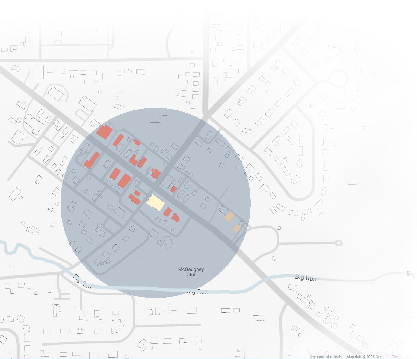
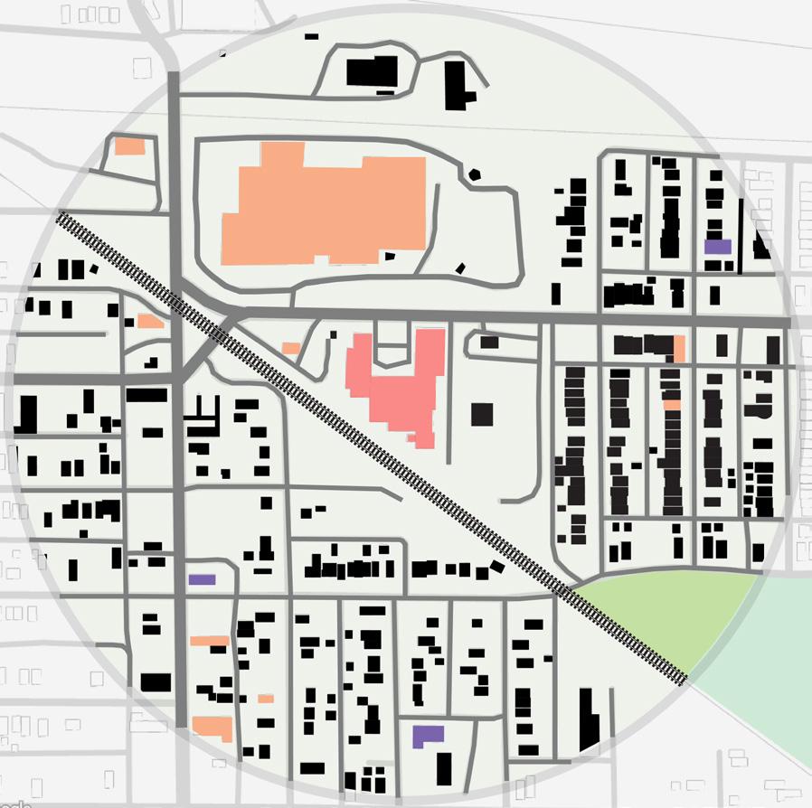
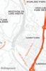
SITE MAP
PROJECT GOALS
5-MILE WALKING RADIUS
BUSINESSES NEARBY
PROJECT LOCATION CHURCHES

WATERWAYS
CREATE A WELCOMING & SUPPORTIVE ENVIRONMENT


PROMOTE
INDIVIDUAL GROWTH
ENSURE A SAFE & SECURE PLACE


BUILD A SENSE OF COMMUNITY
FOSTER AN INCLUSIVE ATMOSPHERE
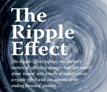
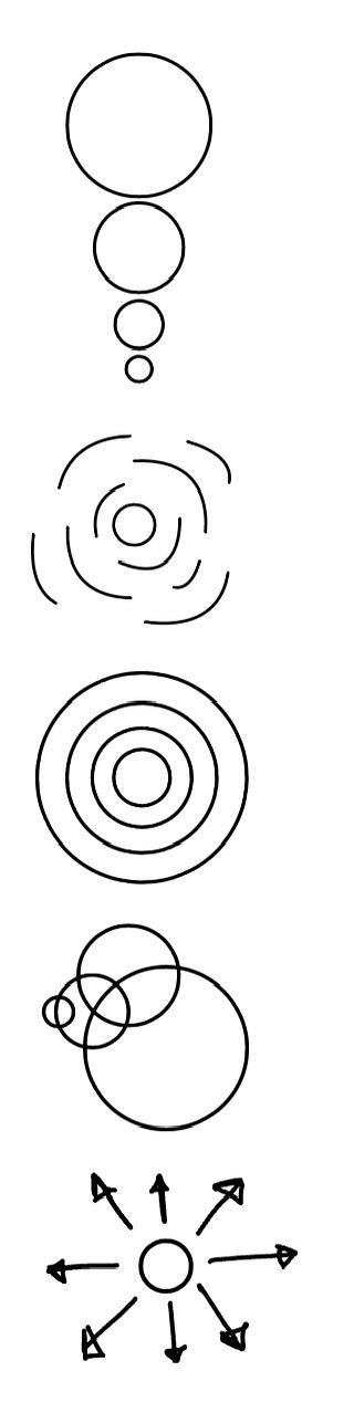
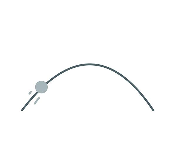
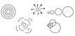
CONCEPT - THE RIPPLE EFFECT
“The Ripple Effect” is based on the idea that small actions can create a widespread impact, much like how early settlers arrived in Wanamaker and gradually developed a thriving town and community. This concept aligns seamlessly with the mission of the daily center, reinforcing the idea that even the smallest beginnings can lead to meaningful, lasting change in a person’s life. Just as a single ripple in water expands outward, this daily center aims to promote growth and transformation - encouraging individuals to take steps that will not only impact their own well-being but also influence those around them.
By embedding this concept into the center’s design, it serves as a symbol of growth and resilience. Each individual who comes in is encouraged to make positive change, whether through personal development, building relationships, or contributing to the community. The “ripple” metaphor also emphasizes the value of collective impact - how acts of kindness, learning, and self improvement can extend beyond an individual and shape the greater community. ELEMENTS
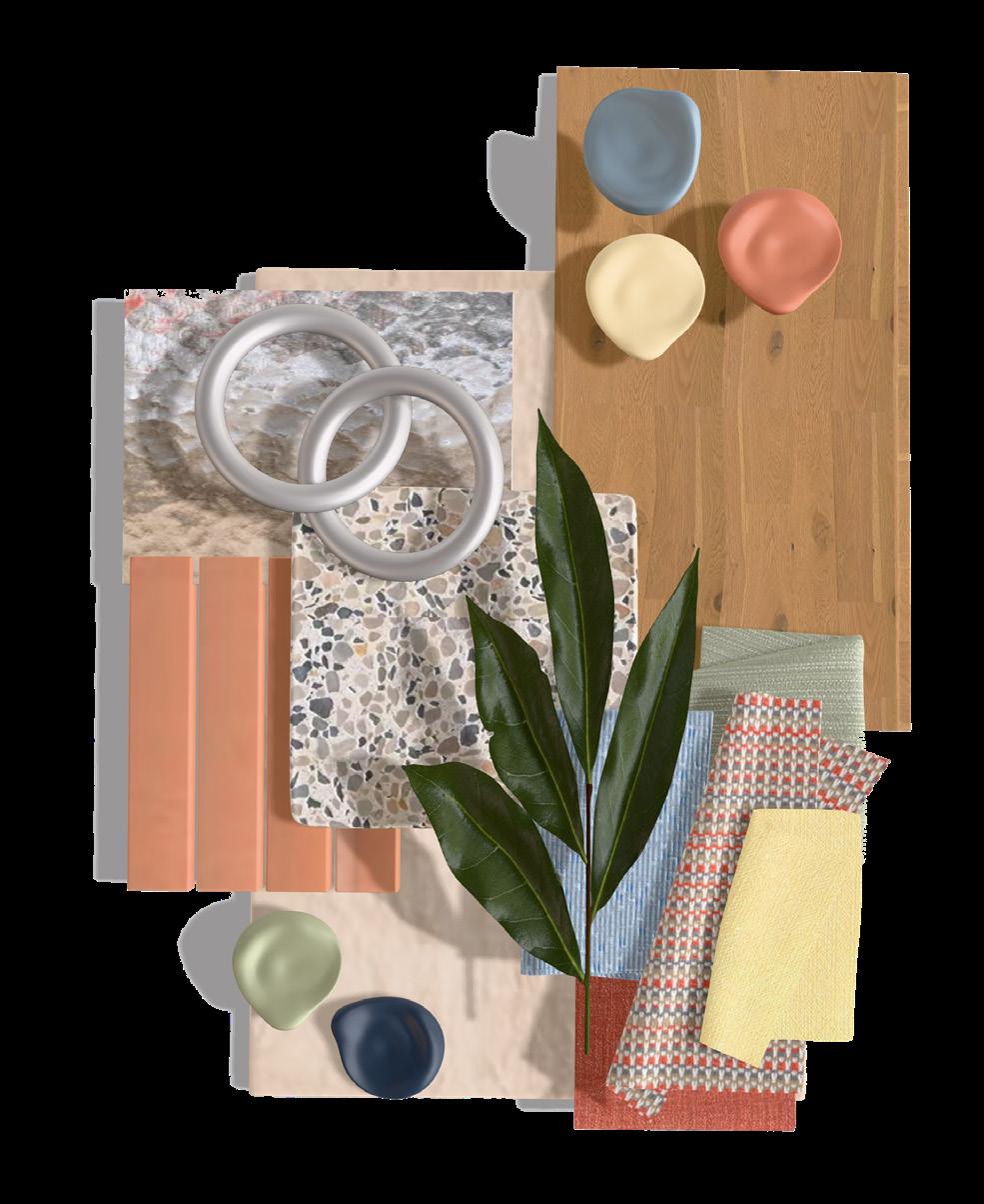
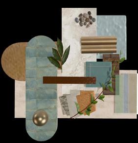
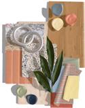
MOOD BOARD


BRANDING
VER RIPPLE: THE DAILY CENTER
Ever Ripple was derived from the initials “E” and “R” in Ripple Effect, forming a new name while maintaining a clear connection to the original concept. “Ripple” was intentionally preserved to reinforce the theme, while “Ever” symbolizes the lasting impact of a ripple effect. This pairing evolved into Ever Ripple, with the “E” flipped to add visual interest and create a distinctive identity. Colors drawn from the mood board were selected to evoke calm and reflect the natural hues of a water ripple.
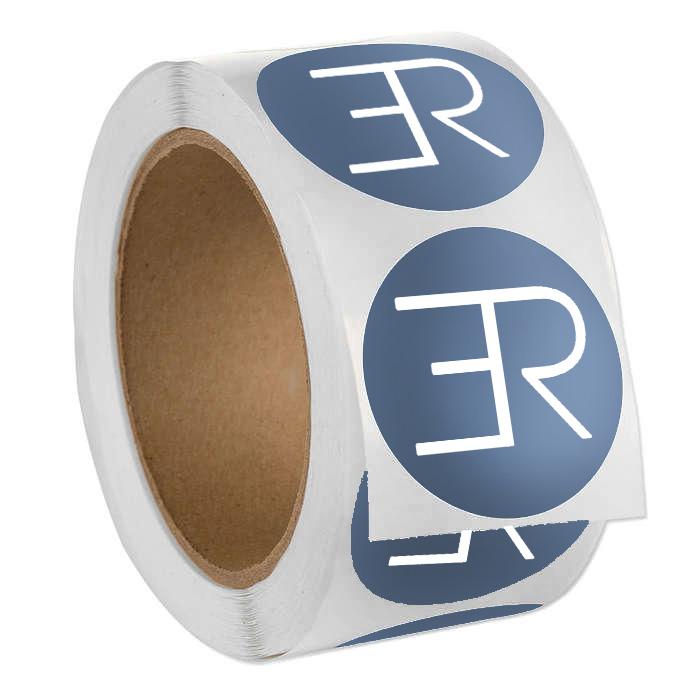
SIMPLIFIED LOGO STICKERS

COLOR PALETTE
E
VER RIPPLE THE DAILY CENTER
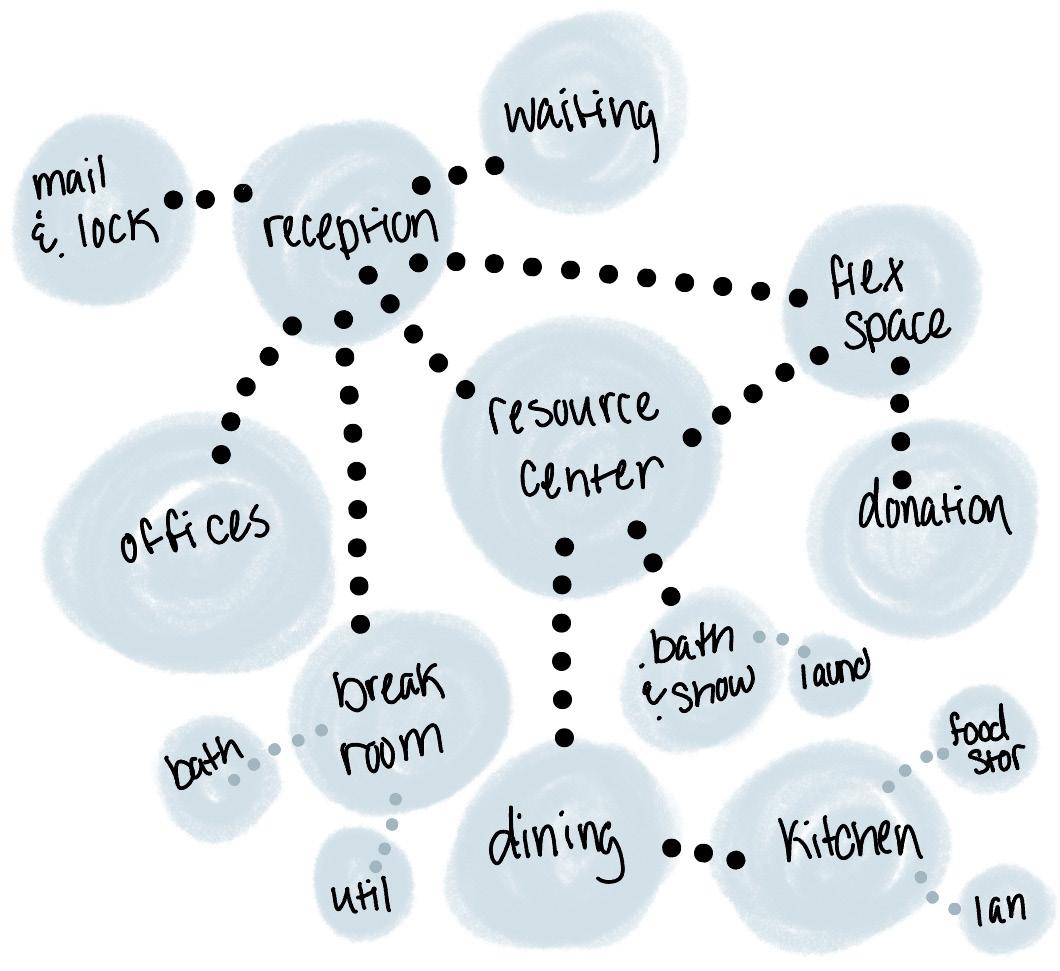
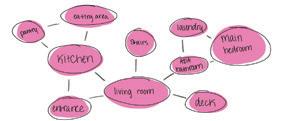
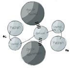
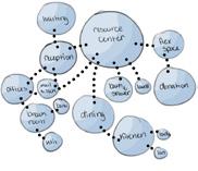
SPACE PLANNING
BUBBLE DIAGRAM
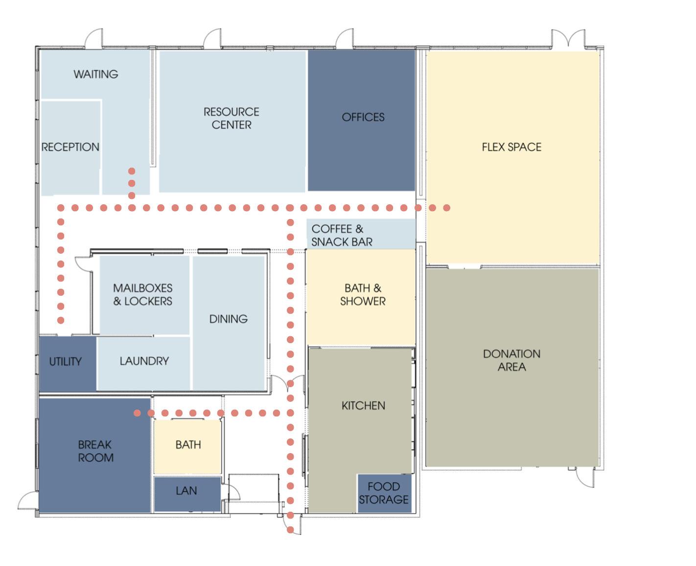
SECOND PLANNING OPTION
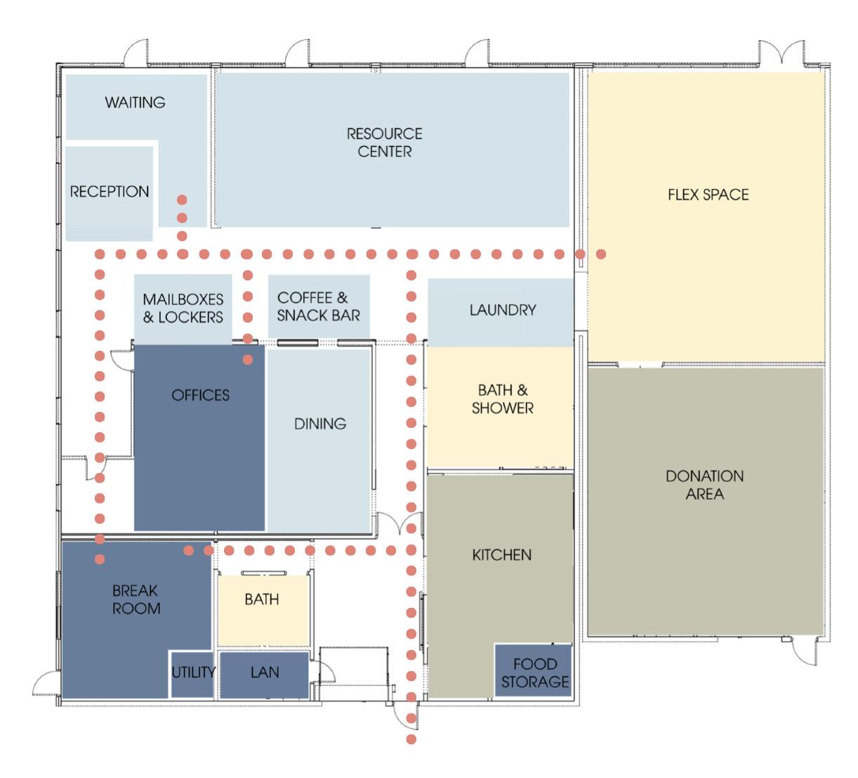

Option 2 was selected for its more organized and functional layout, improving both staff efficiency and guest experience. Offices are more secluded while remaining accessible, and grouping the bath, shower, and laundry areas improves plumbing efficiency and keeps guests near shared spaces. The centrally located coffee and snack bar strengthens adjacencies to the dining area and kitchen. A looped circulation path reduces congestion and supports smoother movement, particularly for staff, while the flex space remains accessible without disrupting core functions. Both options maximize daylight, though relocating offices in Option 1 allows for broader daylight access.


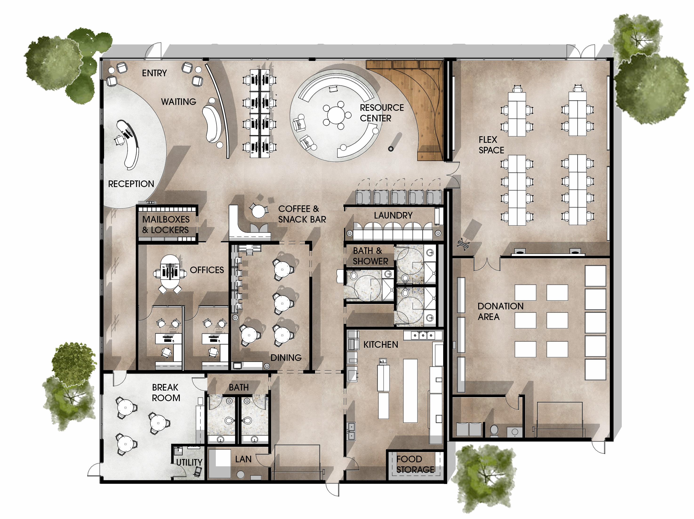
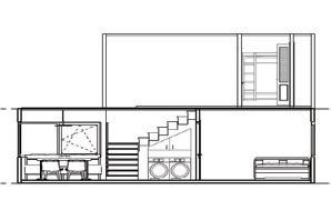
FLOOR PLAN
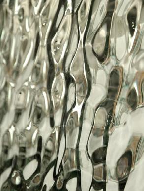
GLASS MOSAIC WALL PARTITION
ALTERNATIVE LAYOUT
REFLECTED CEILING PLAN
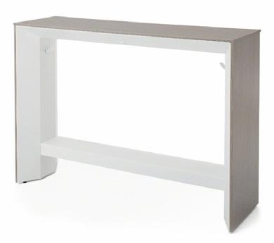
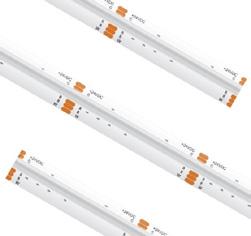
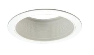
FIXTURE SELECTIONS
9’ 10” CEILINGS UNLESS NOTED OTHERWISE
HALLWAY CEILING & LIGHTING DESIGN


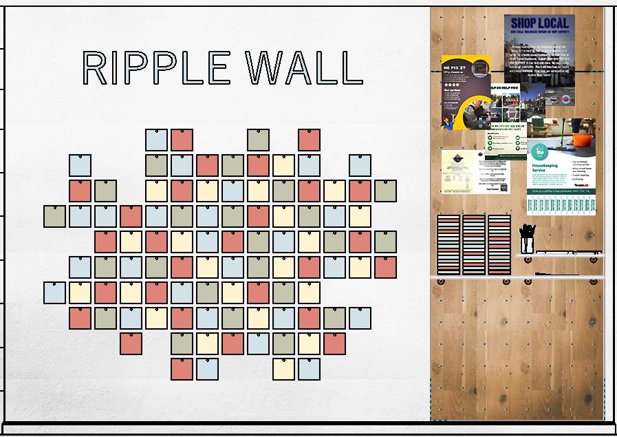
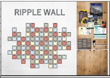
RIPPLE WALL
MATERIAL PALETTE
The Ripple Wall, located adjacent to the reception area, invites guests to participate by adding a translucent acrylic panel to the display. Each contribution includes a written reflection on a personal achievement or meaningful moment, symbolizing how individual actions contribute to a larger whole. As participation grows, the wall evolves into a dynamic installation that reinforces the idea that small efforts can create a widespread, positive impact.
EST. SUITES
IN COLLABORATION WITH ISABELLA BEAGLES
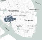
CHARLESTON, SOUTH CAROLINA
PROJECT BRIEF
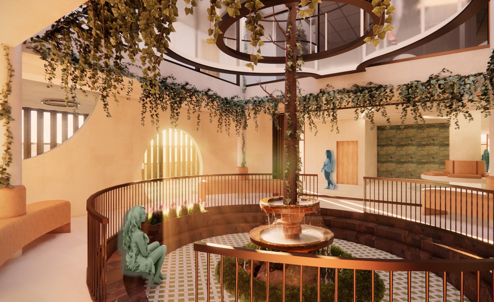
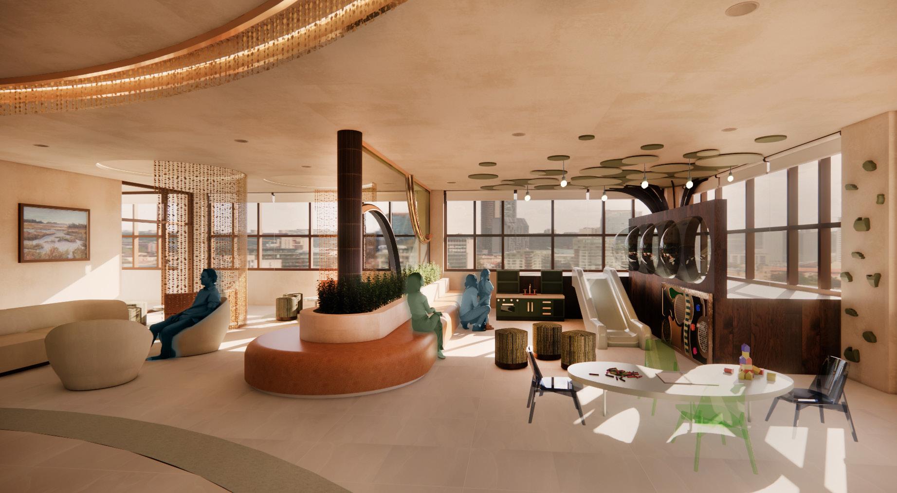
This project involved the design of a hospitality housing facility supporting families traveling for long-term medical care, with the site selected as part of the design process. The program included private guest suites and shared support spaces such as communal kitchens and lounges, family gathering areas, a children’s playroom, counseling and support rooms, a business center, laundry facilities, administrative areas, and a non-denominational chapel and meditation space. The design emphasized accessibility, clear circulation, and functional planning to support extended stays and emotional well-being.
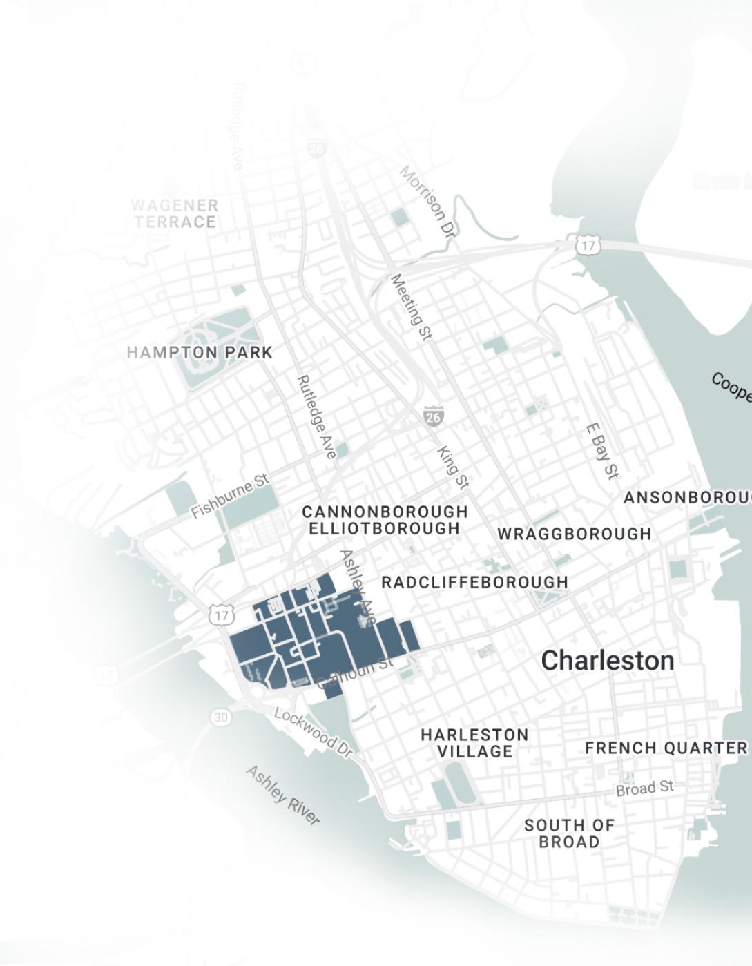
COMMUNITY CONTEXT
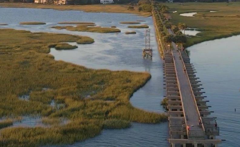
Located in Charleston, South Carolina near the Medical University of South Carolina (MUSC), the project responds to a regional healthcare hub serving both urban and rural populations. Charleston’s limited public transportation and the long travel distances faced by many families underscored the need for nearby hospitality housing that supports comfort, stability, and connection to the surrounding community.
PROJECT GOALS
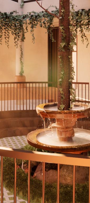
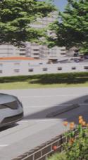
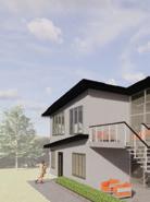
Exterior Perspective

USER NEEDS & PROGRAM RESEARCH
Research identified emotional, financial, and logistical stress as key challenges for families navigating extended medical stays. Design priorities included accessibility, intuitive layouts, secure storage, flexible furniture, and spaces that balance privacy with communal support. The research emphasized trauma-informed and biophilic strategies to reduce stress, support routine, and promote a sense of dignity and control.
CASE STUDY & EVIDENCE BASED INSIGHTS
Case studies including the Ronald McDonald House of Chicago and Gensler’s healthcare hospitality work informed strategies for creating healing, family-centered environments. These precedents highlighted the value of shared communal spaces, trauma-informed layouts, and biophilic design principles. Together with evidence-based research, these insights guided design decisions that balance privacy, community, and emotional restoration.


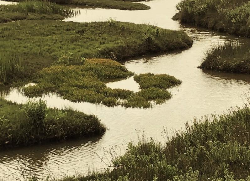
CONCEPT - ESTUARY
Southern hospitality is rooted in a culture of warmth, kindness, and generosity, emphasizing genuine care, comfort, and connection, particularly during times of distress. This spirit aligns with the concept of the estuary, where freshwater and saltwater meet to form a resilient, adaptive environment, reflecting the experience of families transitioning between home and hospital. In Charleston, estuaries shape both the physical landscape and cultural identity, symbolizing care and endurance. The design translates this confluence through intuitive flow between private and communal spaces, access to natural light, and a palette drawn from the coastal environment. For families, the estuary represents an in-between space where healing, adaptability, and connection coexist.


BALANCE
LAYERING
CONNECTION FLUIDITY ORGANIC


BRANDING
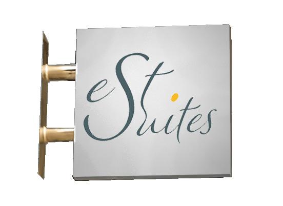
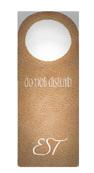
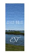
DO NOT DISTURB
DOOR HANGER SIGN


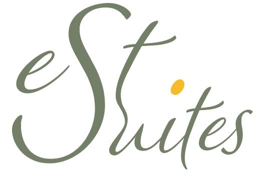

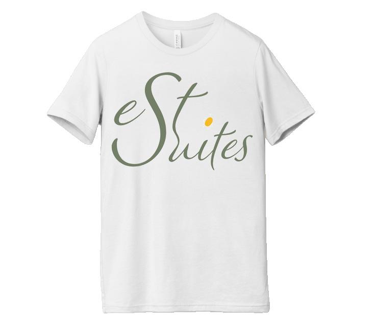
The name EST. Suites references both estuary and established, reflecting ideas of transition and grounding. In the primary logo, the enlarged “S” visually connects “EST.” and “Suites,” symbolizing how an estuary merges distinct elements into a continuous flow. The secondary logo blends the letters E, S, and T into a single form, representing connectivity and unity, much like the natural process of an estuary creating something new.
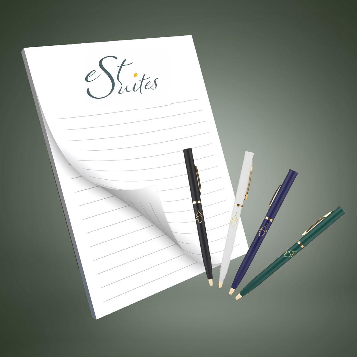
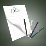
PAPER & PENS
STAFF SHIRTS LOGOS
COLOR
PALETTE
SKETCHES
SPACE PLANNING
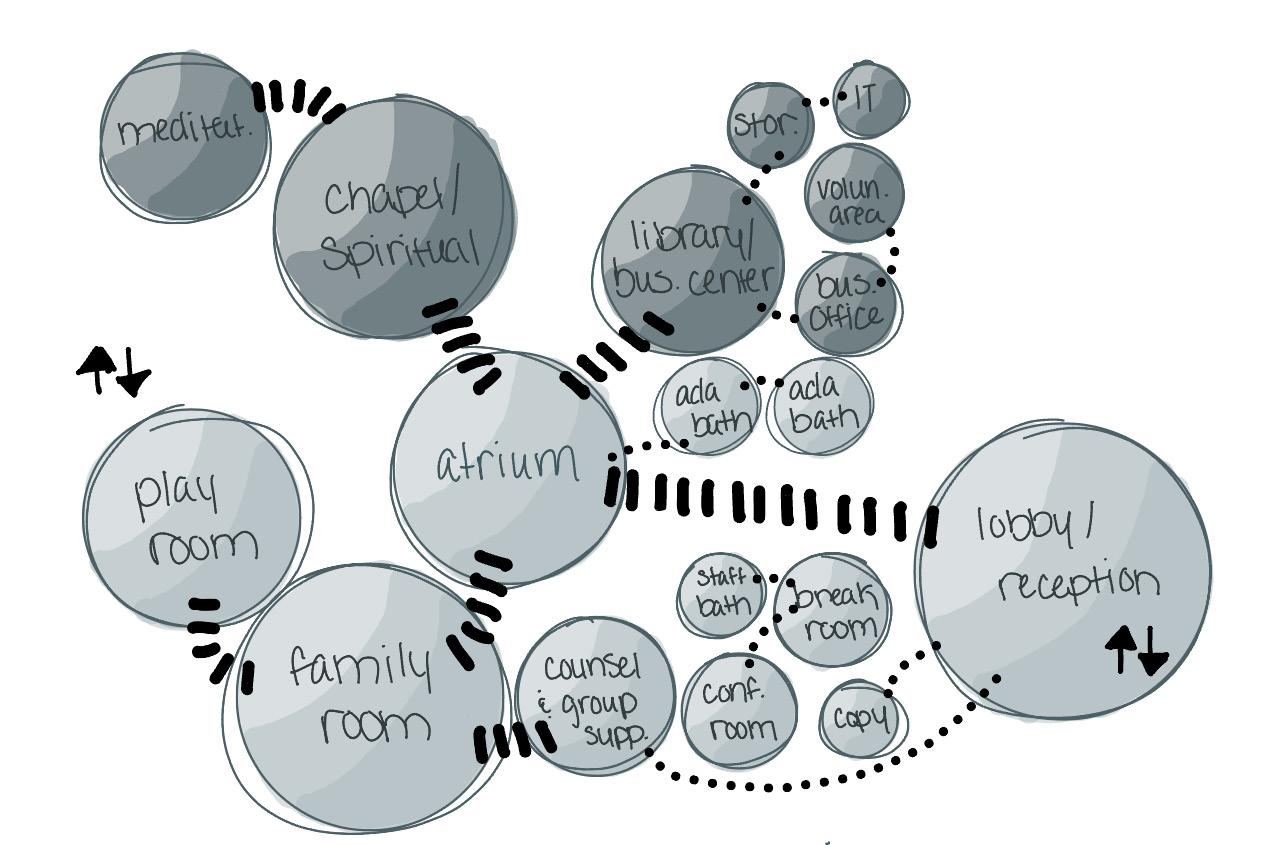
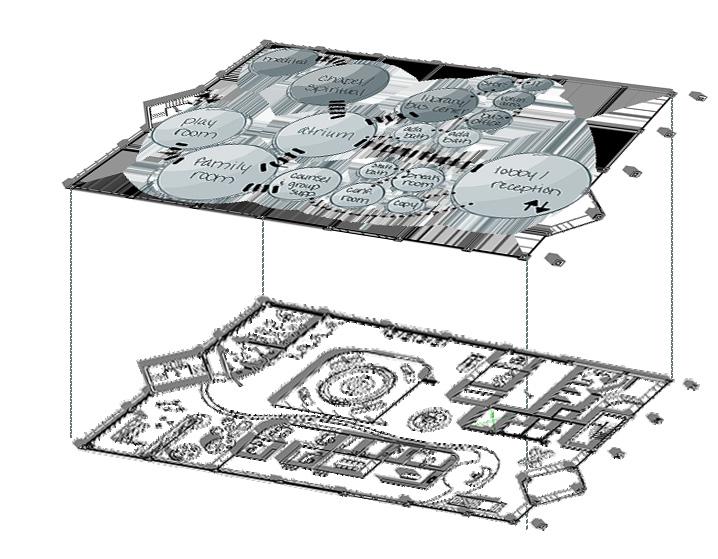

FLOOR PLANS
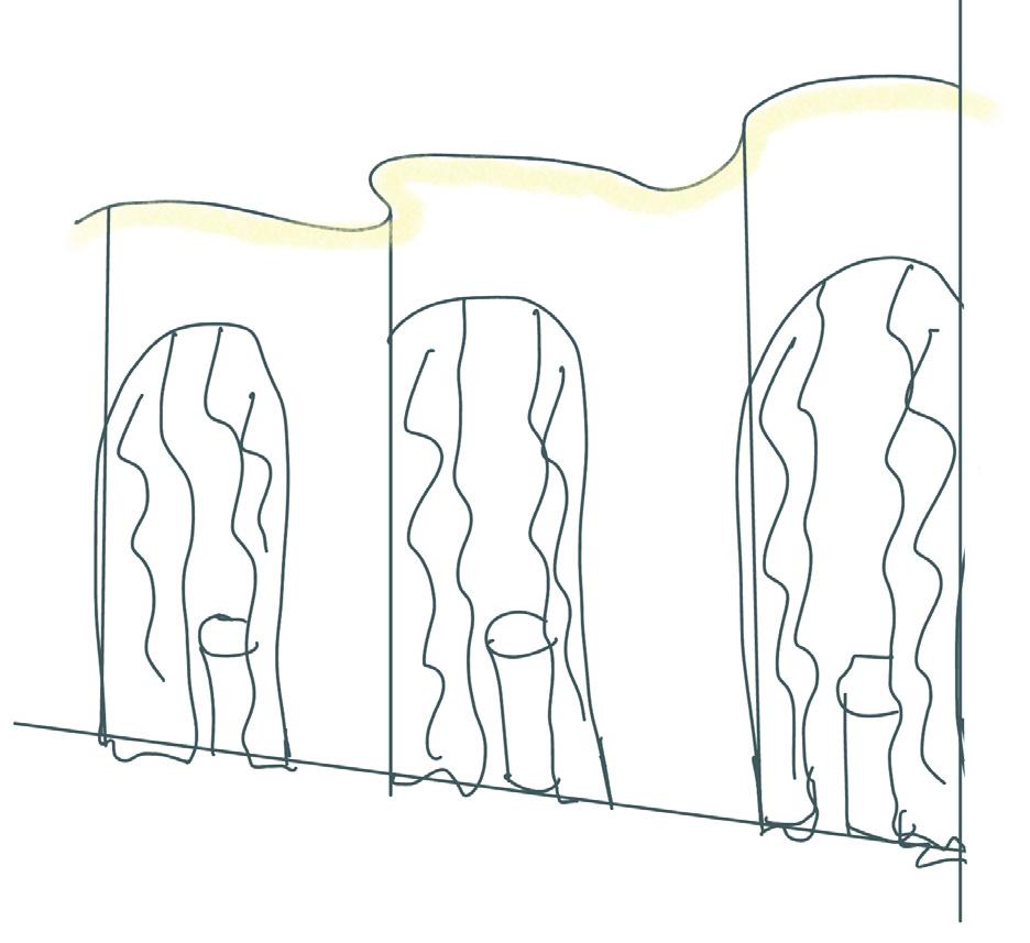
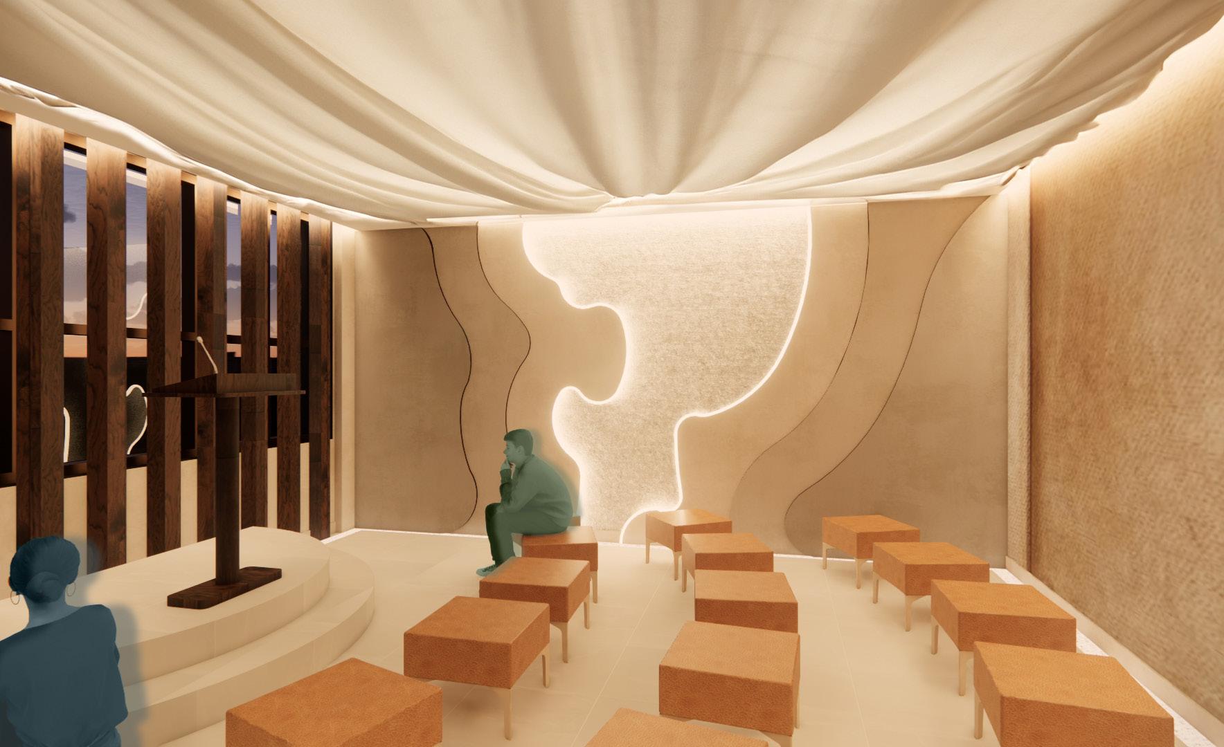
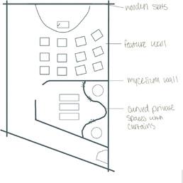
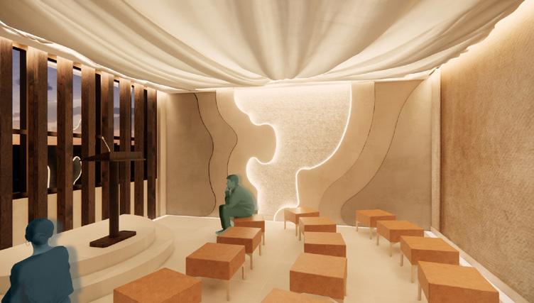
CHAPEL SPACE
MEDITATION ROOM PLAYROOM FAMILY ROOM
BUSINESS AREA/ LIBRARY
COUNSELING GROUP SUPPORT
CONFERENCE ROOM
ROOM
ROOM RECEPTION/ LOBBY

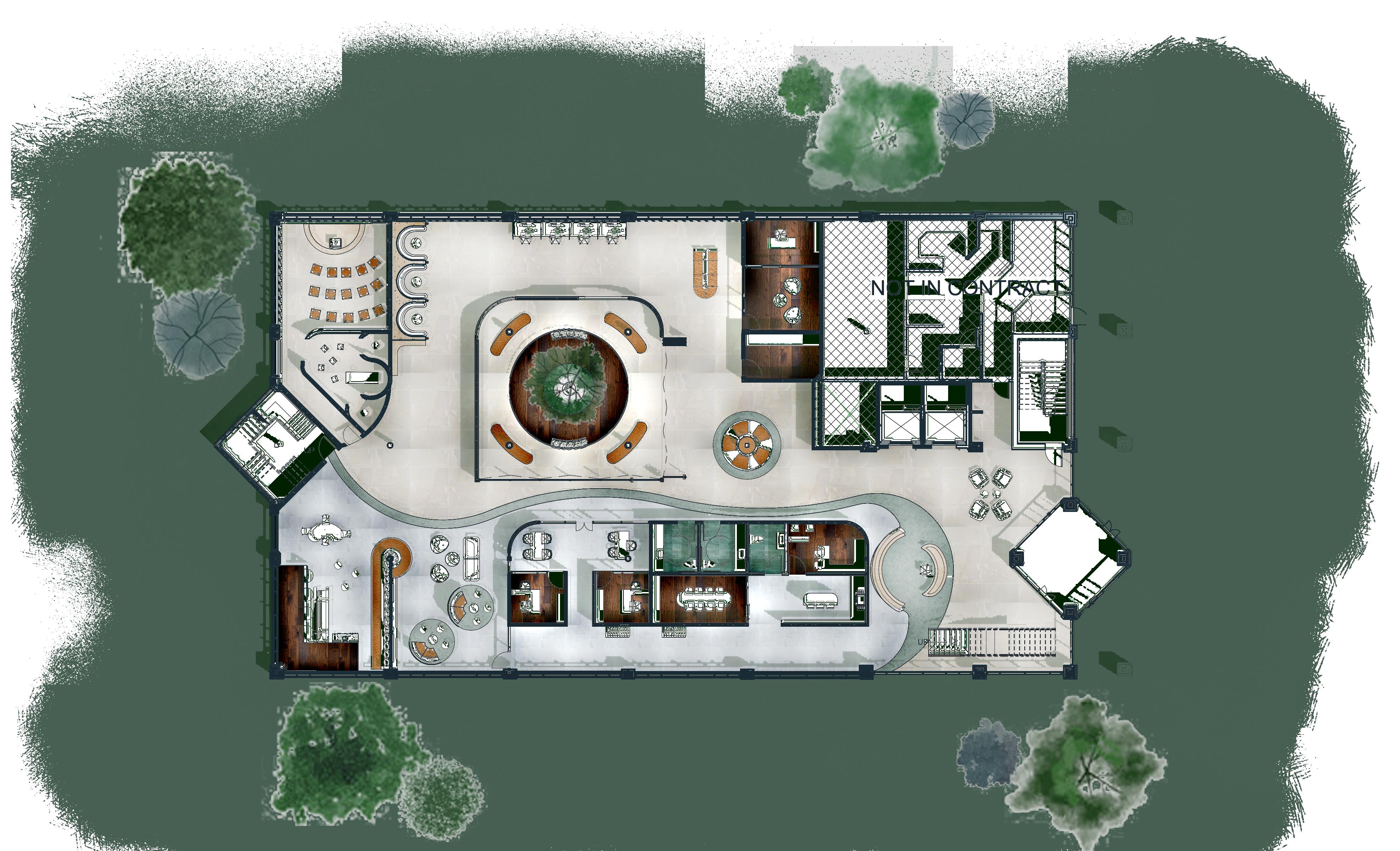
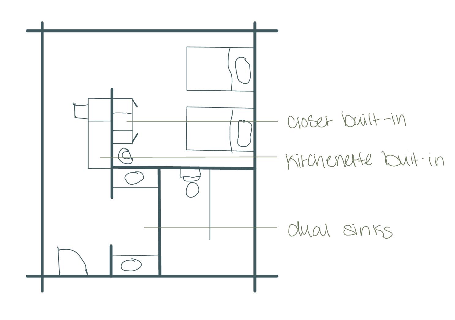
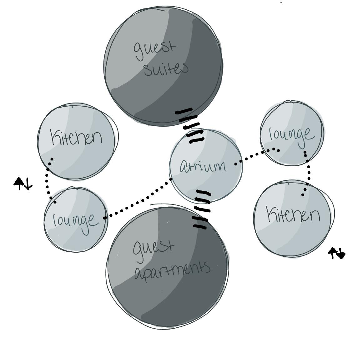
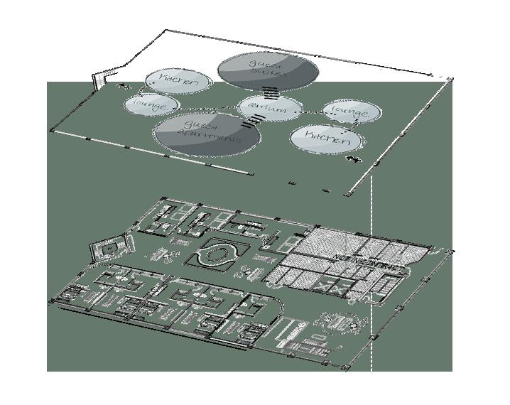
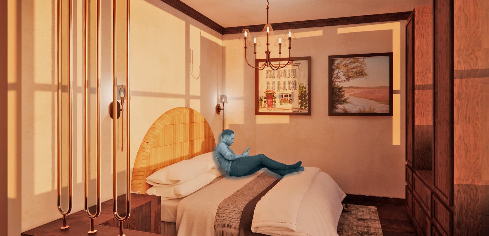
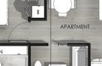
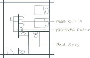
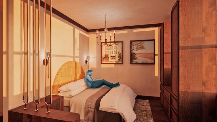
GUEST SUITES
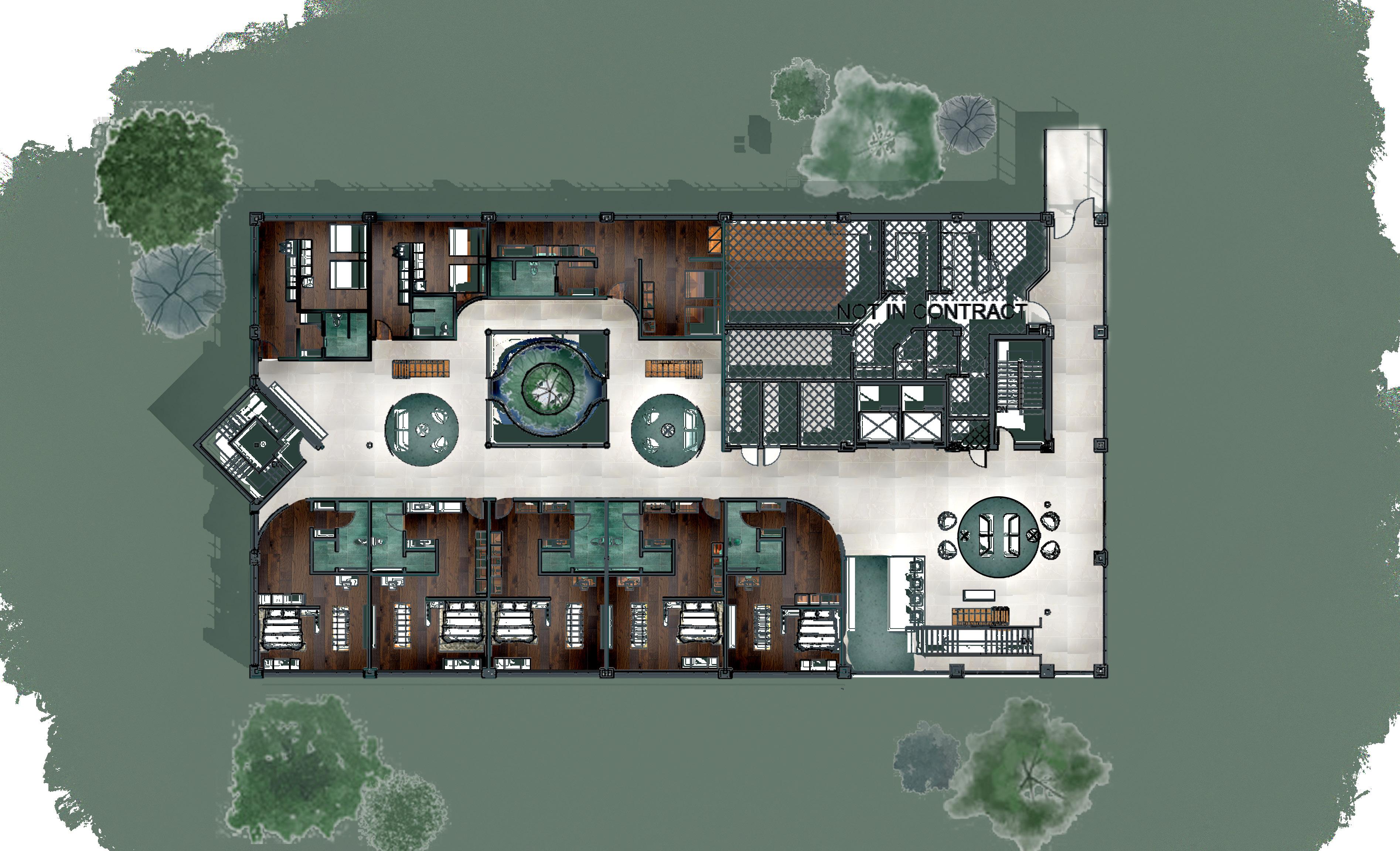
GUEST APARTMENTS
KITCHEN & LOUNGE
KITCHEN & LOUNGE
ATRIUM
SECTION
CHAPEL SPACE
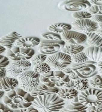
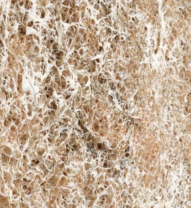
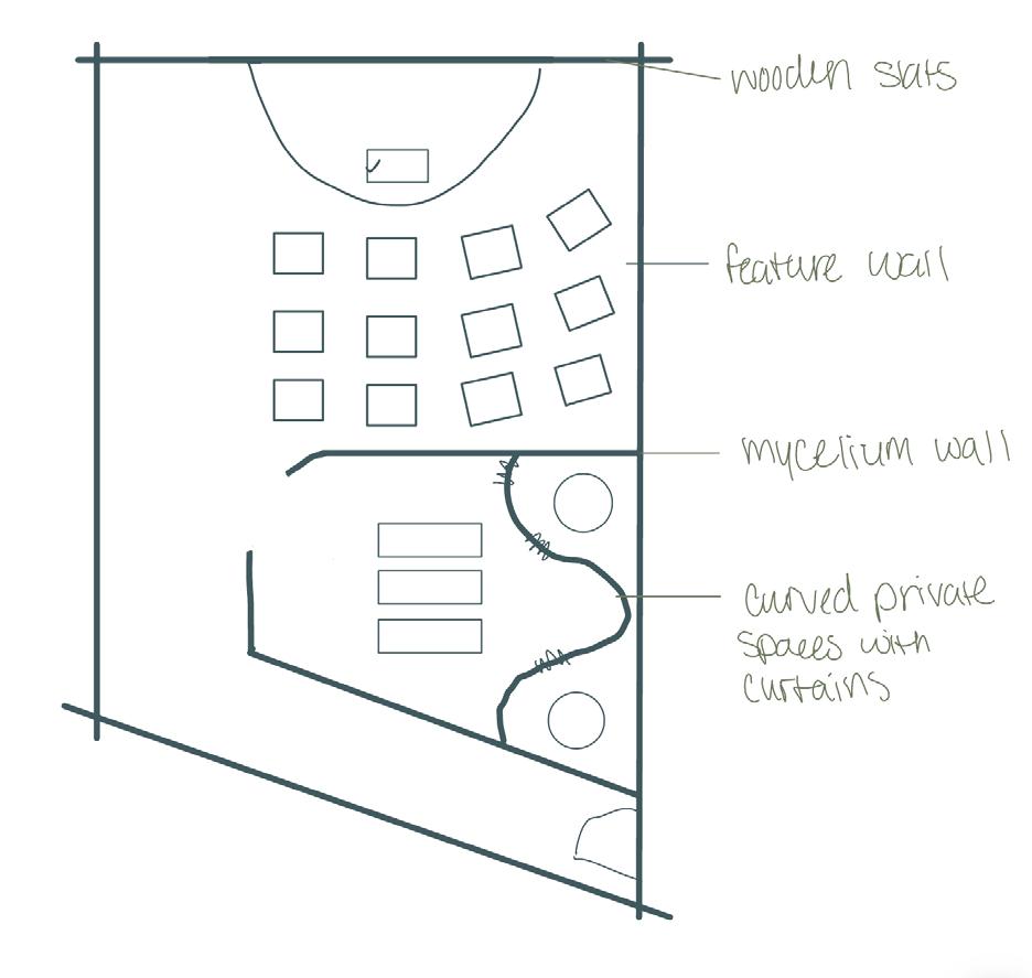
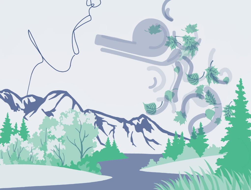
MYCELIUM BASED MATERIALS
Mycelium-based materials are grown from mushroom root systems using agricultural byproducts such as corn husks or sawdust, resulting in a lightweight, biodegradable material with strong acoustic properties and a soft, natural texture. Both functional and sustainable, mycelium supports quiet, grounded environments connected to nature. In the chapel space, a wall constructed entirely of mycelium provides acoustic control and reinforces a sense of calm.
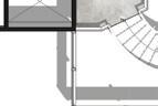
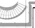
SUN PATH
INSPIRED BOOTH
SEATING
DESIGN FIRM
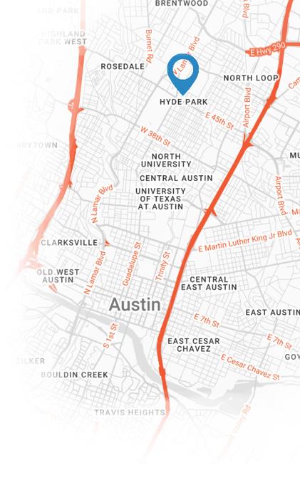
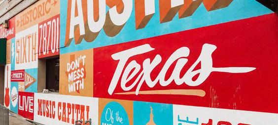
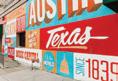
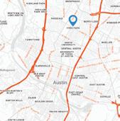
AUSTIN, TEXAS
PROJECT BRIEF
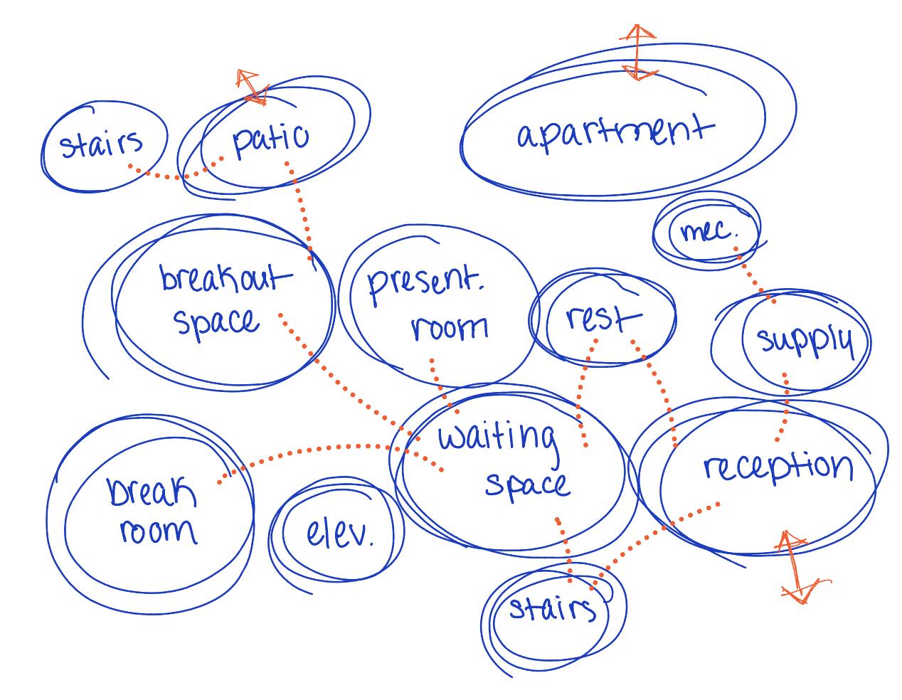
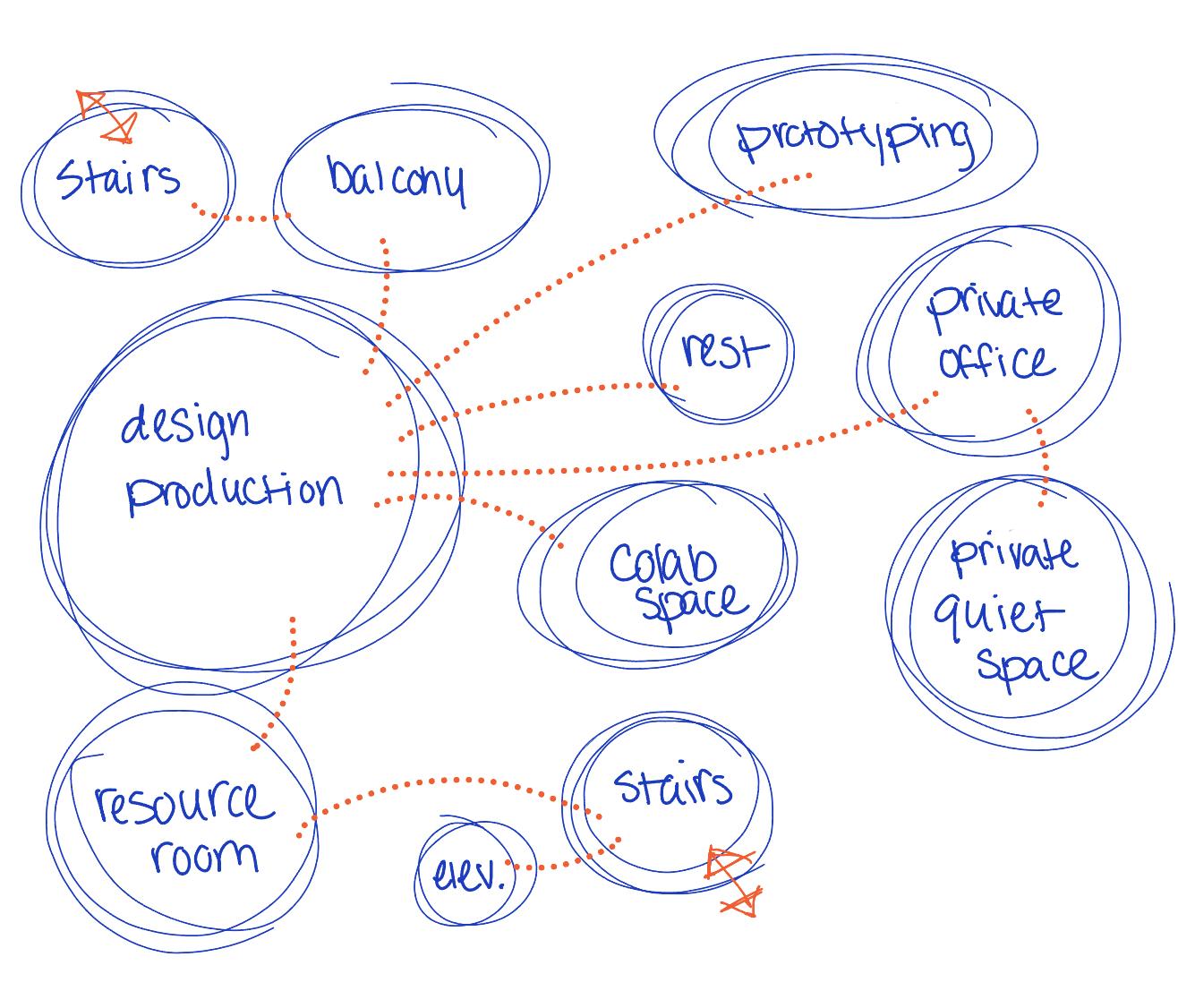
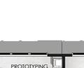
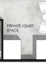
This project involved designing a small-scale interior design studio that began with the interior and extended to the exterior envelope. The building serves as a workspace for a design firm and includes a small apartment for personal use or rental. An existing structure was adapted into a fully functional studio, with programming that includes a reception area, client presentation space, break room, breakout space, design production and collaborative work areas, a resource and prototyping room, a private quiet space, and a private office.
AUSTIN, TEXAS RESEARCH ON OFFICE DESIGN
Modern office design is shifting toward a curated, destination-based approach that responds to the specific needs of each company rather than a onesize-fits-all model. Employees expect workplaces that balance traditional functionality with the comfort and privacy of home. Color shapes mood, with bold tones encouraging creativity and interaction and natural hues supporting calm and biophilic connection. Privacy options such as enclosed pods and quiet rooms support focus, stress reduction, and productivity, while ergonomic seating reduces strain and fatigue. Energizing breakout zones further encourage collaboration, relationship-building, and creative recharge, resulting in adaptable workplaces that support both productivity and well-being.
Austin, Texas, is known for its strong sense of community, vibrant culture, and energetic atmosphere, shaped in part by the city’s emphasis on outdoor activity and social connection. Residents value a close relationship to their hometown, while Austin’s growth as a major tech hub has attracted and produced leading technology companies, including Dell. This blend of culture, connection, and technological innovation creates a city where creativity and progress thrive within a welcoming, down-toearth environment.
PROJECT GOALS

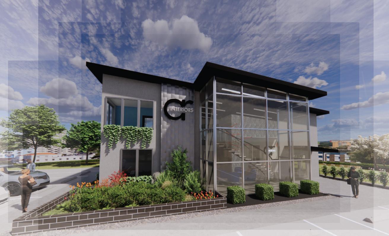
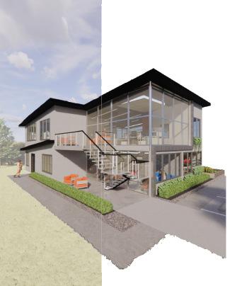
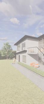
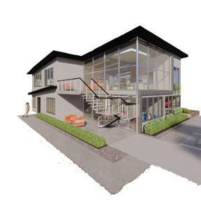
Exterior Perspective
CONCEPT - CONNECTIVITY
The concept for this design firm is rooted in connectivity, emphasizing collaboration within the design team and meaningful connections with clients. In Austin, connectivity reflects both the city’s strong sense of community and its role as a growing tech hub, bridging human interaction and technological progress. This idea is expressed through a digital, forward-looking aesthetic paired with Austin’s character, using bold colors and varied forms. Blue represents technology and connection, while orange reflects Austin’s identity, together reinforcing the relationship between innovation and culture.
INSPIRATION IMAGES


BUBBLE DIAGRAMS
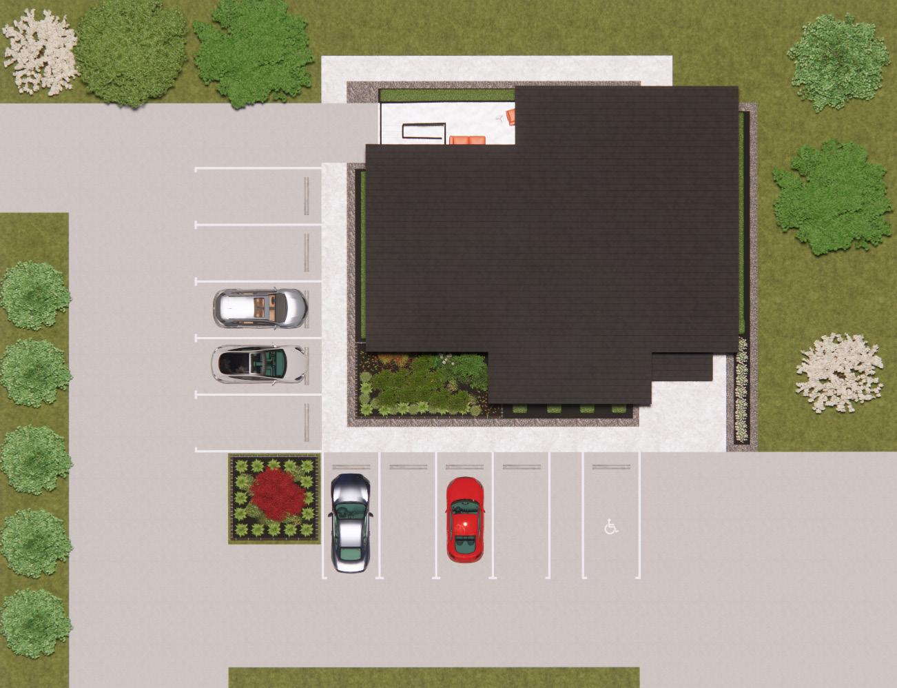
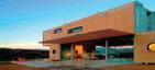
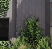
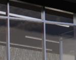
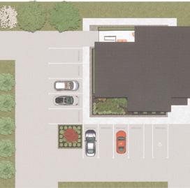
The exterior features a sleek combination of concrete, steel, and glass, creating a minimalist, industrial aesthetic that aligns with the overall design concept. Expansive windows maximize natural daylight and strengthen the connection between interior and exterior spaces. The landscaping enhances the building’s presence, creating a welcoming environment for visitors and staff. The parking lot accommodates ten vehicles, including one ADA-accessible space, with multiple entry and exit points for convenience. Together, these elements balance functionality, modern design, and industrial elegance.
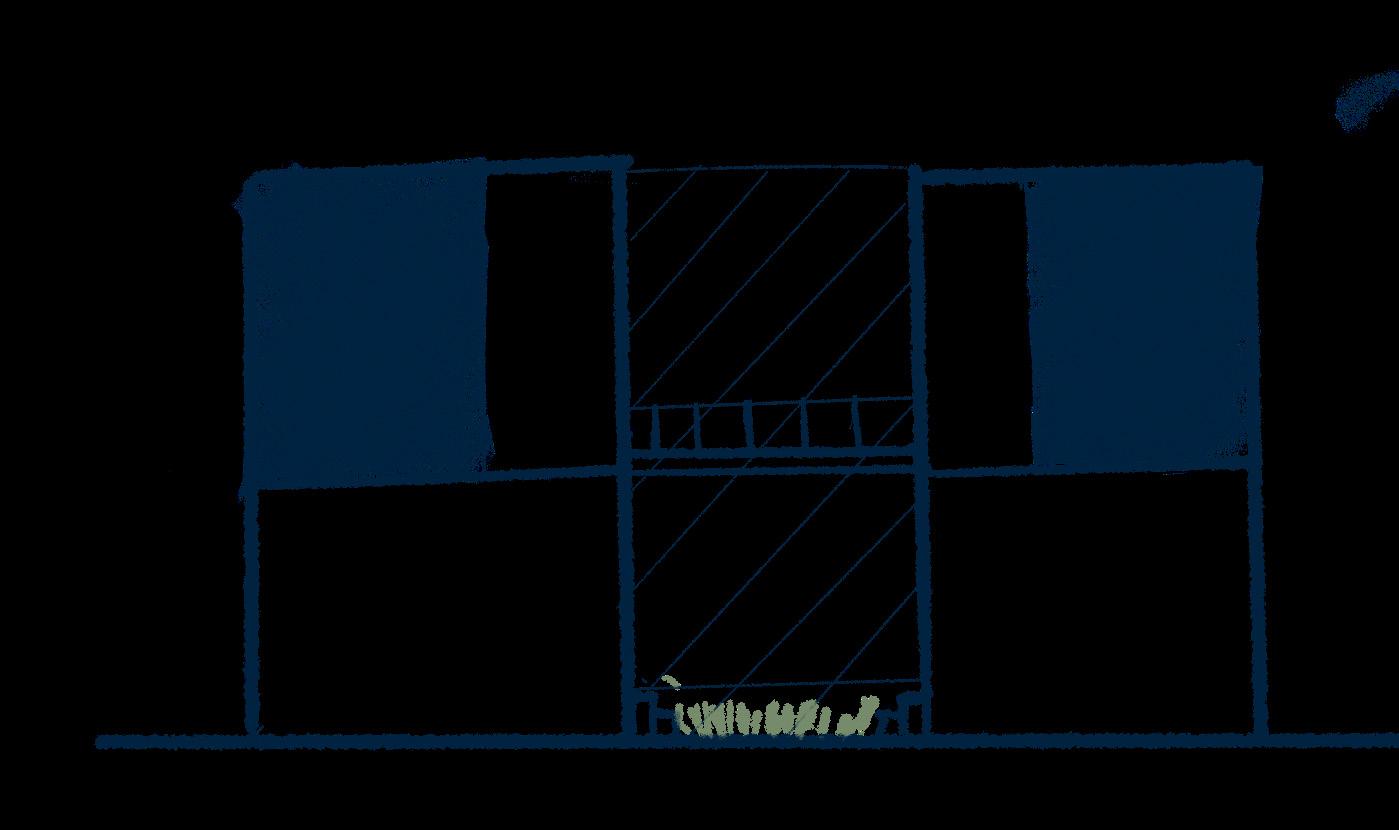
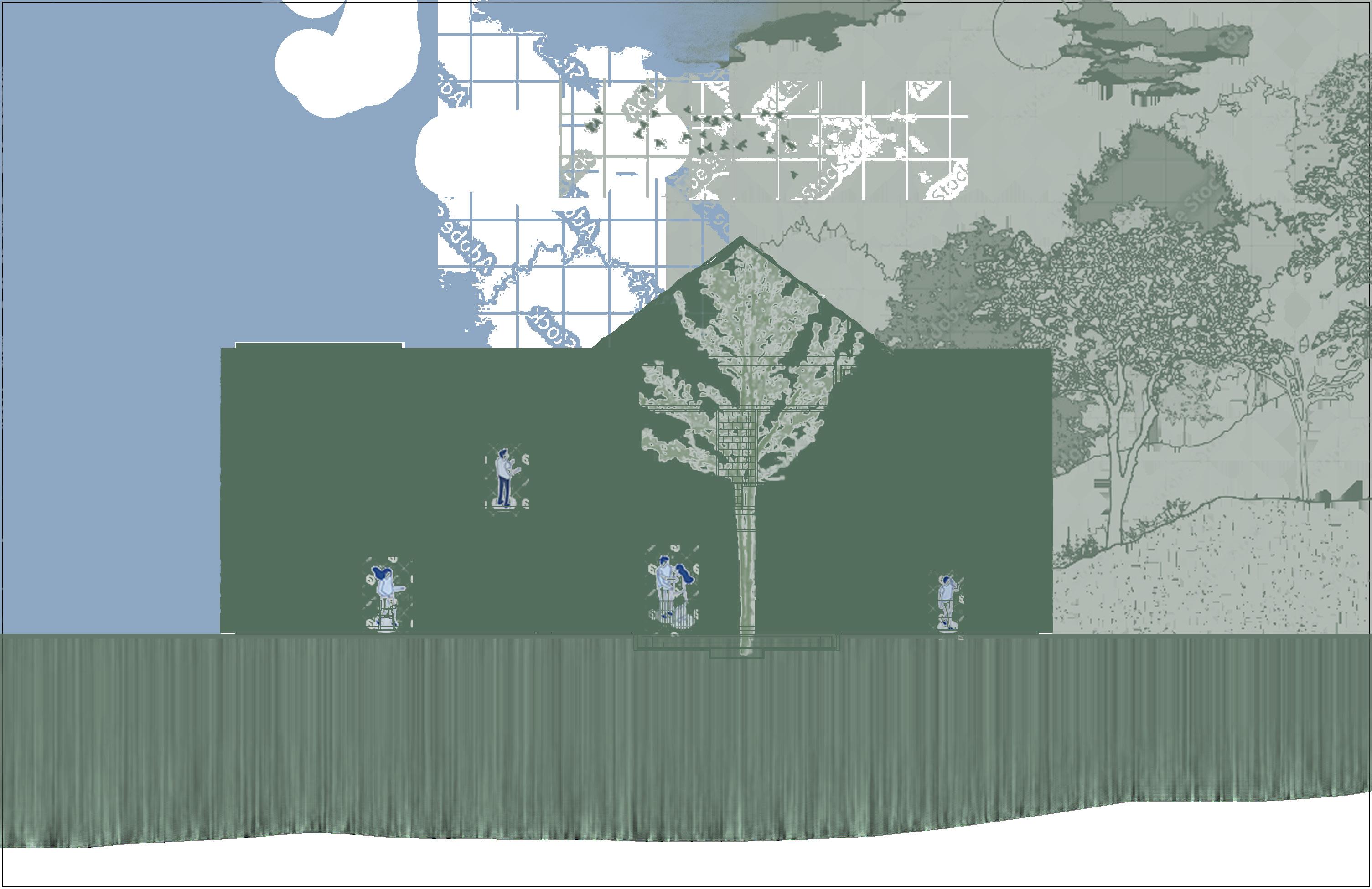
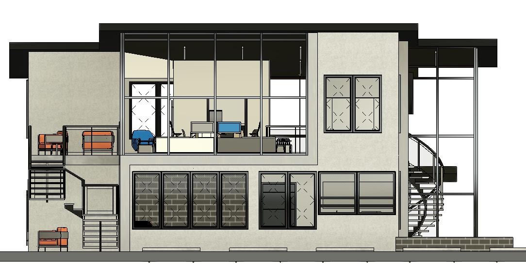
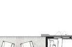
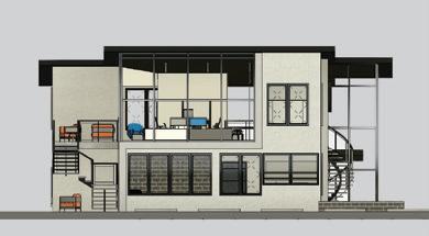
WEST EXTERIOR ELEVATION
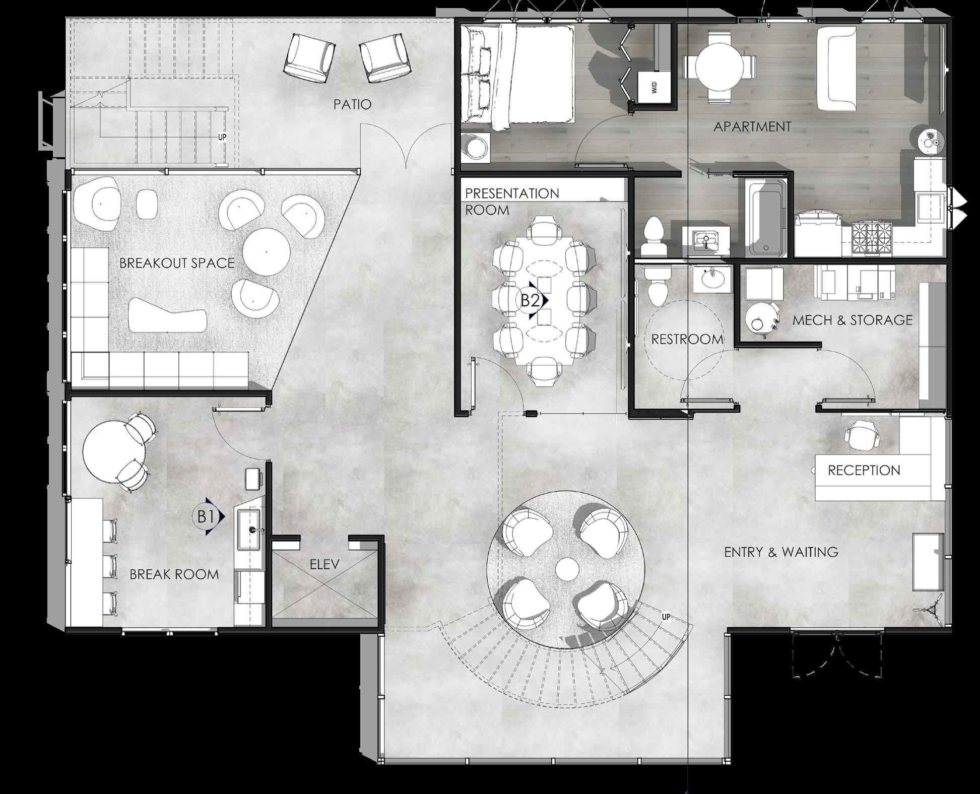
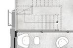
FLOOR PLANS
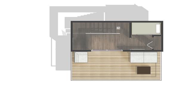
LEVEL 1
LEVEL 2
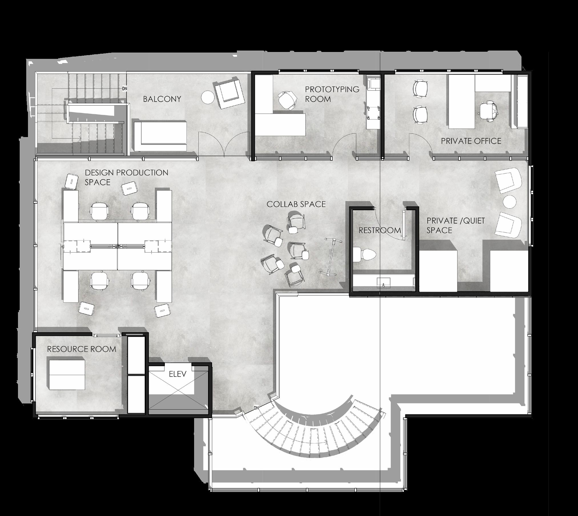
These floor plans prioritize flexibility, functionality, and creativity by offering a range of spaces for both work and lounging within an open layout that maximizes each area. Multiple meeting and collaboration zones reinforce the concept of connectivity, fostering teamwork, engagement, and seamless interaction among designers and clients.
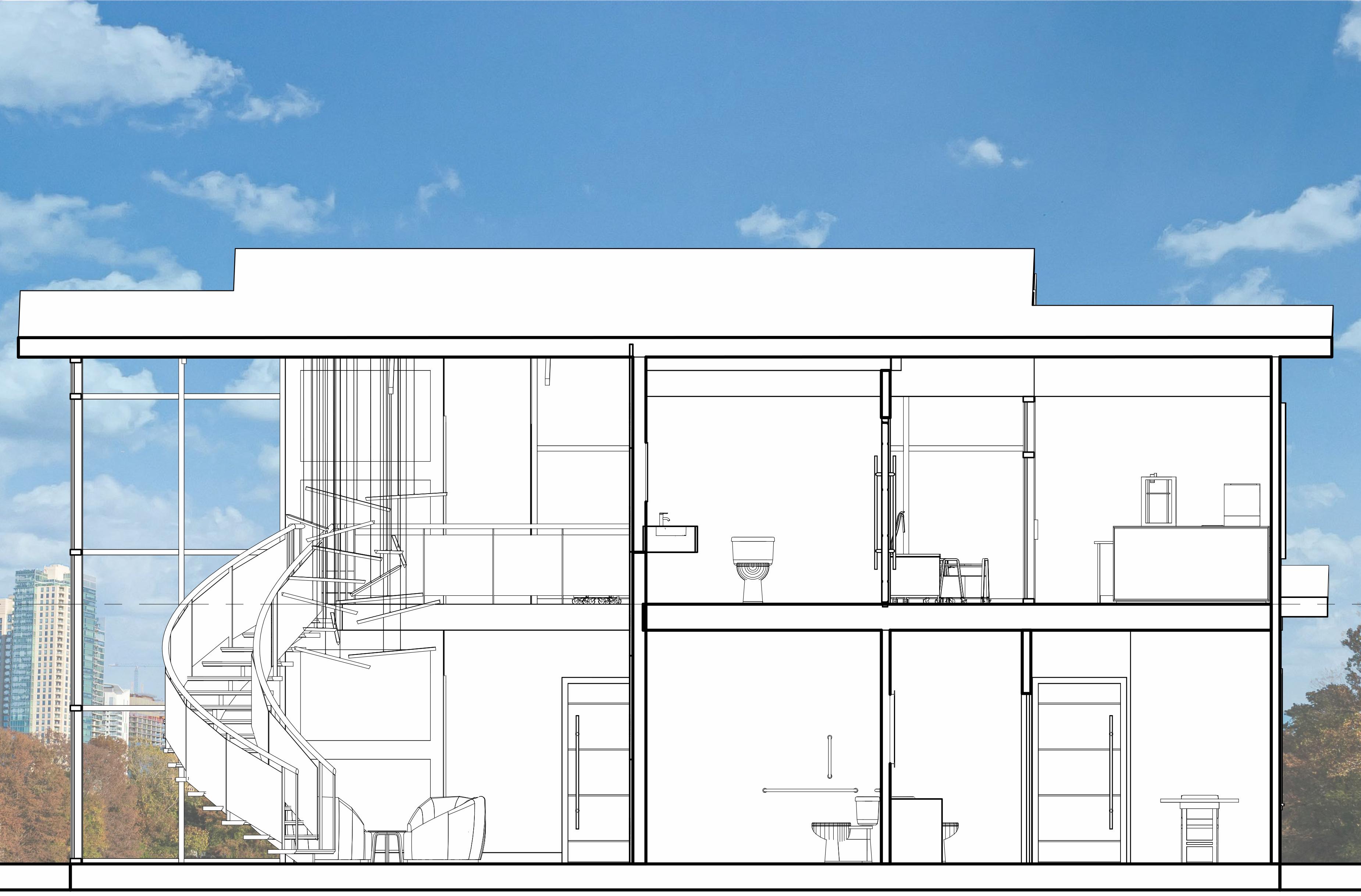
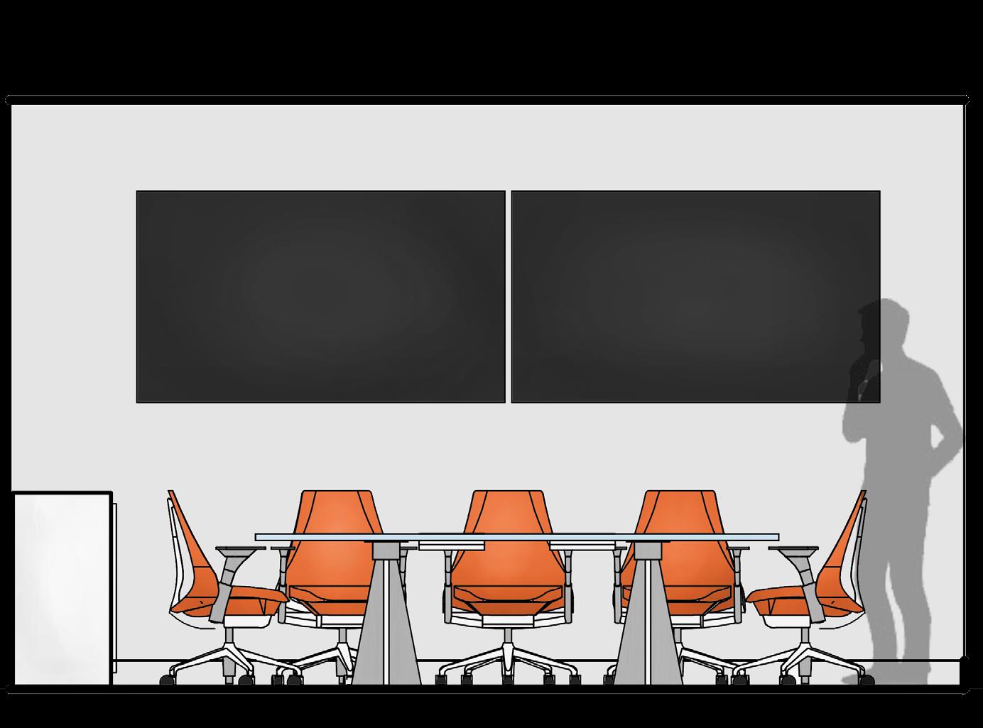
ELEVATIONS
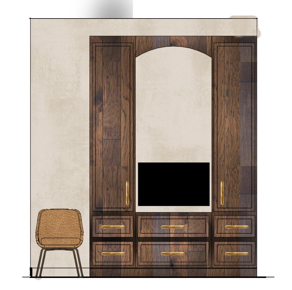
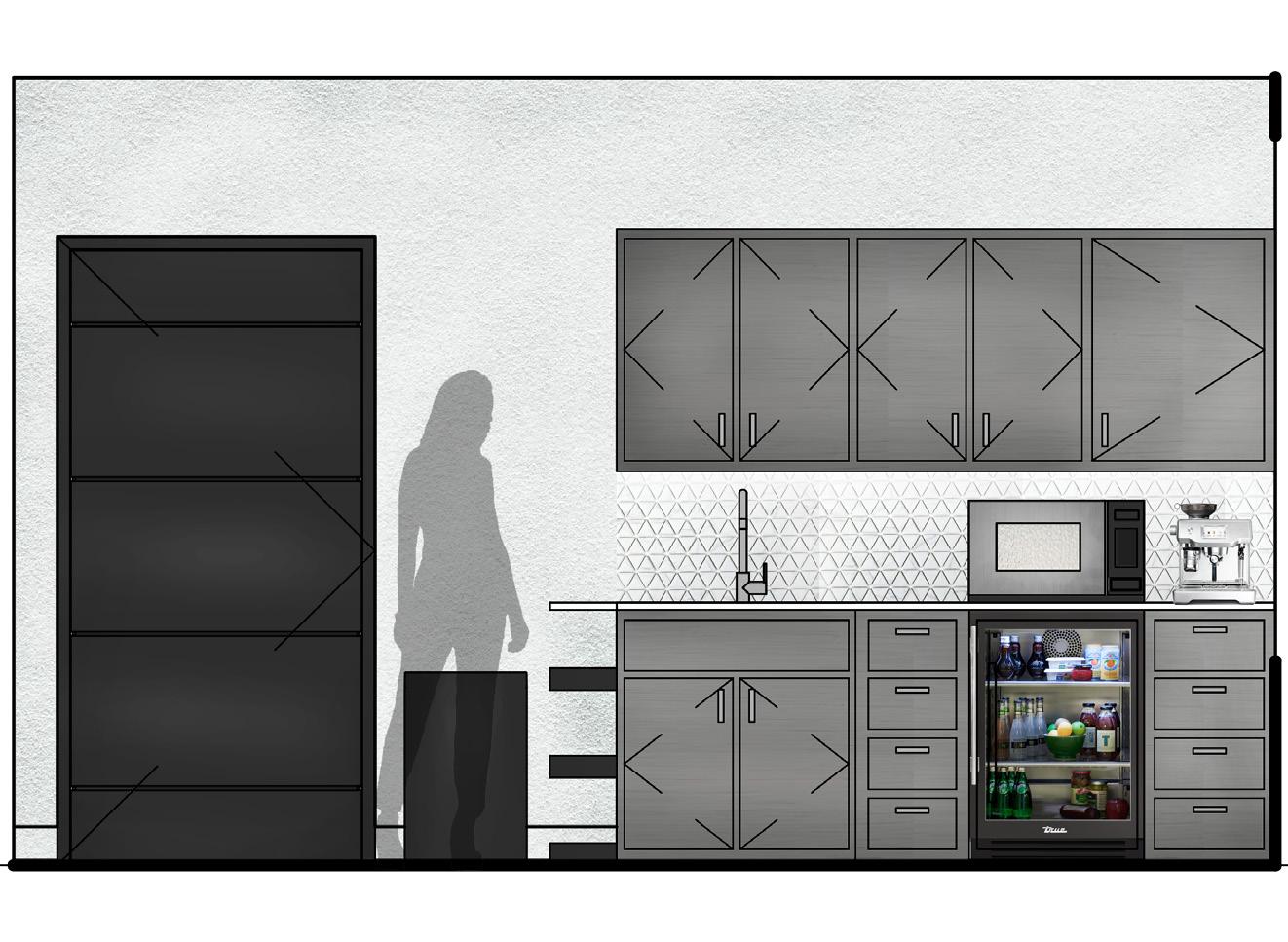
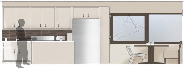
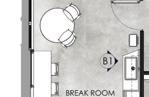
BREAK ROOM
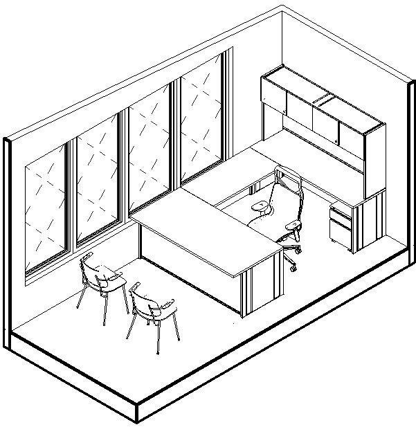
PRIVATE OFFICE ISOMETRIC
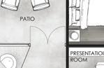
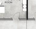
PRESENTATION ROOM
RECEPTION & LOBBY
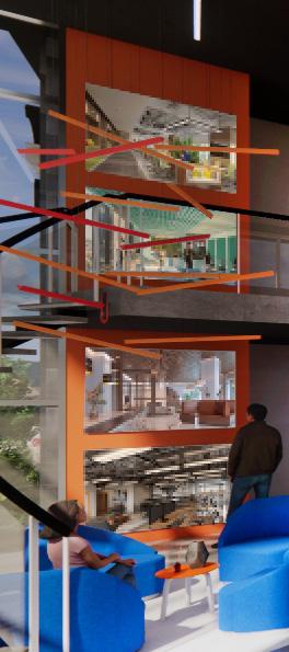
The reception area features a back-lit acoustic accent wall that supports sound control while establishing a strong first impression. A wall of digital screens in the waiting space reinforces the firm’s work and culture through visual storytelling. The adjacent presentation room is defined by a glass wall extending from the second-floor railing with smart glass technology, allowing daylight and visual connection while providing privacy when needed.
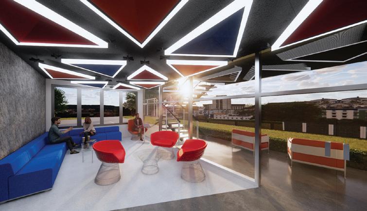
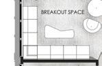
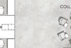
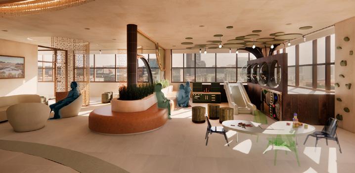
BREAKOUT SPACE
This breakout space is designed to support collaboration, informal meetings, lounging, and brainstorming. Bold colors and a dynamic ceiling with triangular forms create an energizing, playful contrast to the surrounding office environment. Adjacent outdoor seating extends the space, allowing activities to continue outdoors while encouraging relaxation and connection.
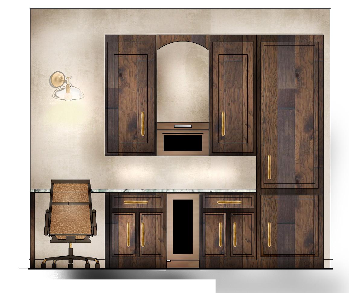
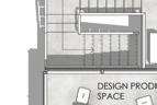
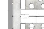
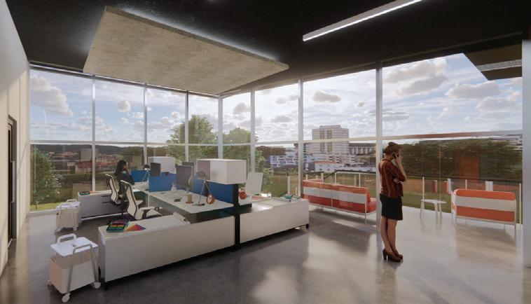
DESIGN PRODUCTION SPACE
This area is dedicated to junior designers and organized to support focused production through integrated workstations and storage. A suspended concrete ceiling feature defines the space and adds visual interest, while bold orange and blue accents energize the environment and reflect the design concept. Balcony access provides flexibility and an alternative work setting.
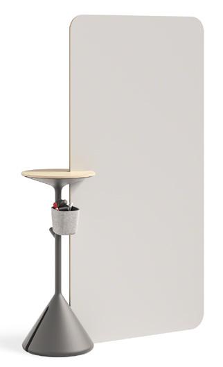
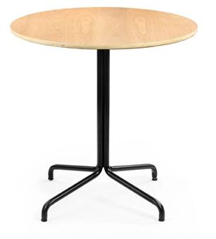
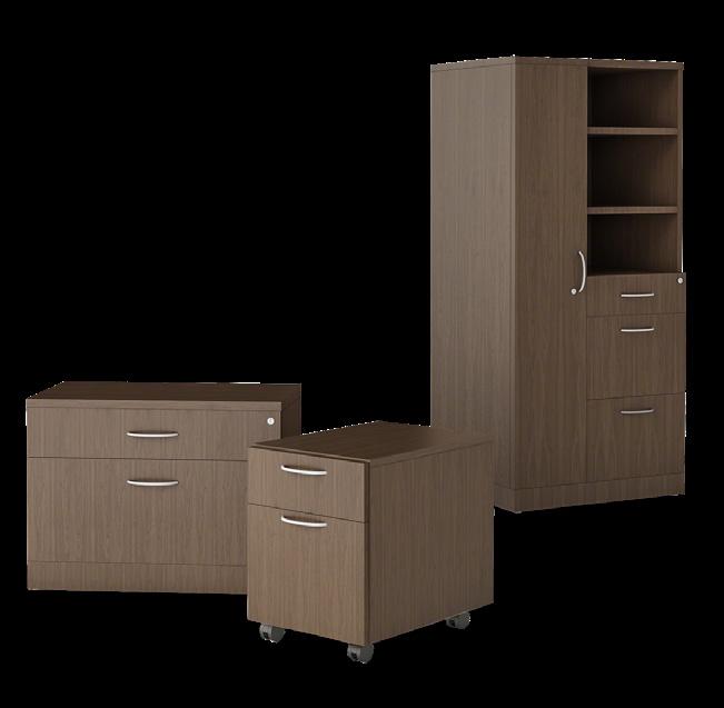
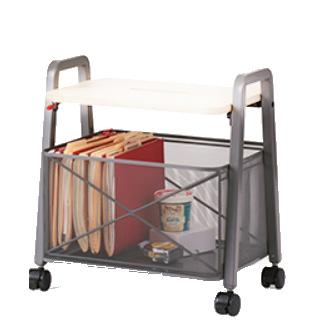
FURNITURE & MATERIALS


COMMUNITY CENTER
GARY, INDIANA
PROJECT BRIEF
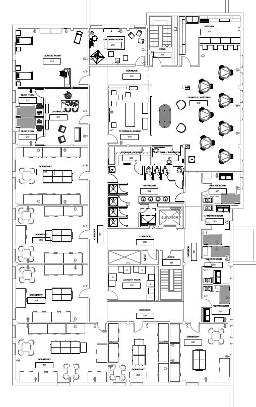
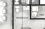
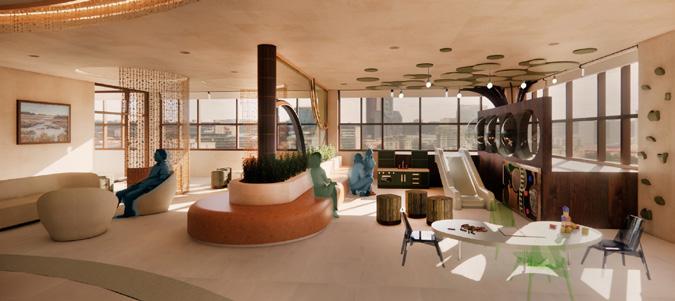
This project involved the redesign of an existing warehouse and second-floor space at Faith Community Center in Gary, Indiana. The design process included a site visit and direct meetings with the client to assess existing conditions, understand programmatic needs, and define priorities. The second floor of the main building was redesigned to provide temporary housing and support spaces for migrants, including a kitchen, lounge areas, laundry room, clinic, counseling suite with separate quiet rooms, a children’s daycare room, and fully renovated bathrooms. The warehouse was transformed into a multi-functional community environment featuring a video production room, classrooms, restrooms, storage, a flexible community space with stage and seating, a dance studio, a gym, and locker rooms.
PROJECT GOALS


GARY, INDIANA
Gary, Indiana, is located along the southern shore of Lake Michigan, approximately 25 miles southeast of downtown Chicago. The city developed around the construction of the world’s largest integrated steel mill, with housing and infrastructure built to support industrial growth. As manufacturing declined due to economic shifts and globalization, Gary experienced significant population loss and long-term disinvestment. Today, many neighborhoods face high vacancy, deteriorating buildings, and limited access to essential services, emphasizing the need for community-focused spaces that support stability, access, and renewal.
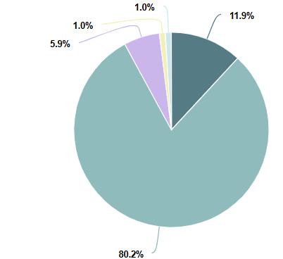
RACE/ETHNICITY
ABOUT FAITH WORKS NETWORK
Faith Works Network is a 40+ member community of pastors, local stakeholders, and individual partners that are dedicated to empowering and enriching the lives of people in Gary. They provide various services including community outreach and networking events. Faith Works Network is focused on faith-led and collaborative economic development. They emphasize 6 pillars; Farm to Table, Business Growth, Holistic Healing, Environmental Justice, Renewable Energy, and Community Safety.
SITE MAP


CONCEPT - LUXURY
The design concept for the community center is luxury, creating an environment that feels as refined and inviting as a high-end hospitality space. The client envisions the community center as a luxurious hotel-like space, providing an elevated yet welcoming atmosphere for all visitors. While the rest of the building embraces a palette of mainly blues and whites, this space will align and also stand out with high-end look.
Flowing lines and organic curves introduce a sense of movement, softening and enhancing the space. A color scheme, containing turquoise, soft neutrals, and metallic accents, balances comfortability with an upscale feeling environment. This space is intended for every individual who enters to feel valued, comfortable, and embraced by an atmosphere of quiet luxury.
MATERIAL PALETTE
WAREHOUSE SPACE PLANNING
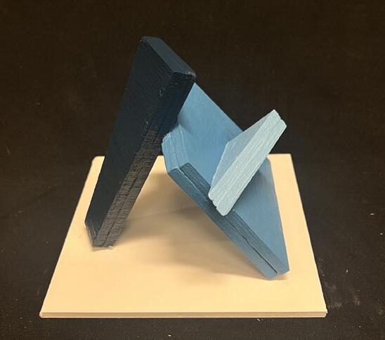
CONCEPT IDEATION MODELS
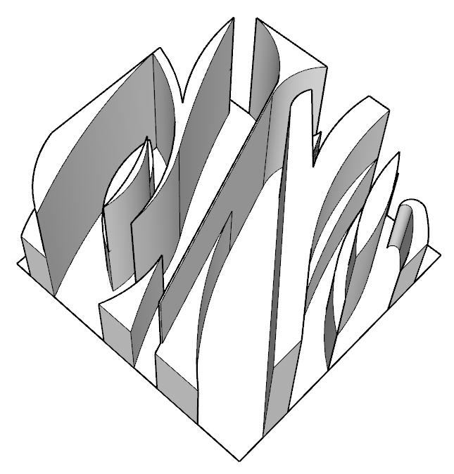
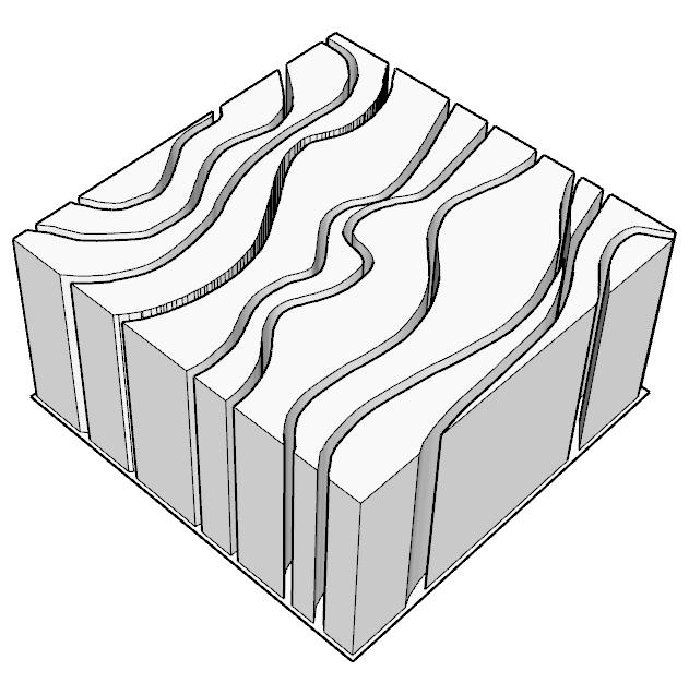
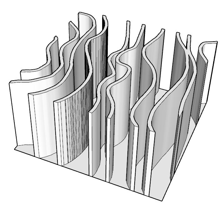
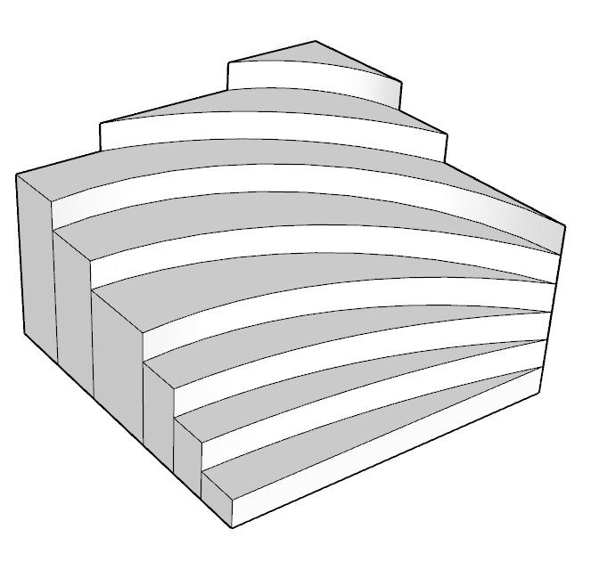
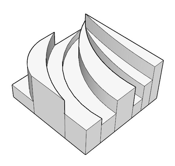
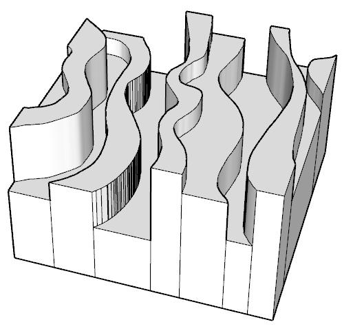
Digital models were developed to explore design patterns informed by the concept, mood board, and physical material board. These studies supported early spatial ideation, guiding layout development, material selection, level changes, and architectural elements.
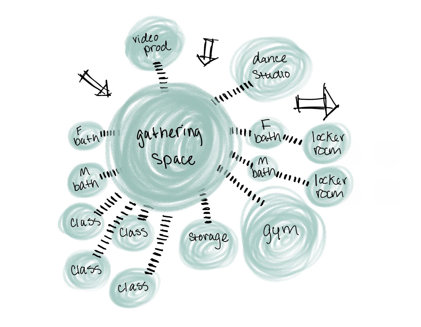
BUBBLE DIAGRAM
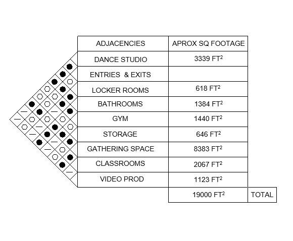
ADJACENCIES
This plan illustrates the relationship between existing walls and newly created spaces within an open layout centered around a primary gathering area. Specialized spaces, including a video production room, storage, classrooms, gym with adjacent locker rooms, dance studio, and multiple entry and exit points, support accessibility and diverse activities. The organization encourages efficient circulation, interaction, and flexible use to meet a wide range of community needs.
WAREHOUSE DESIGN
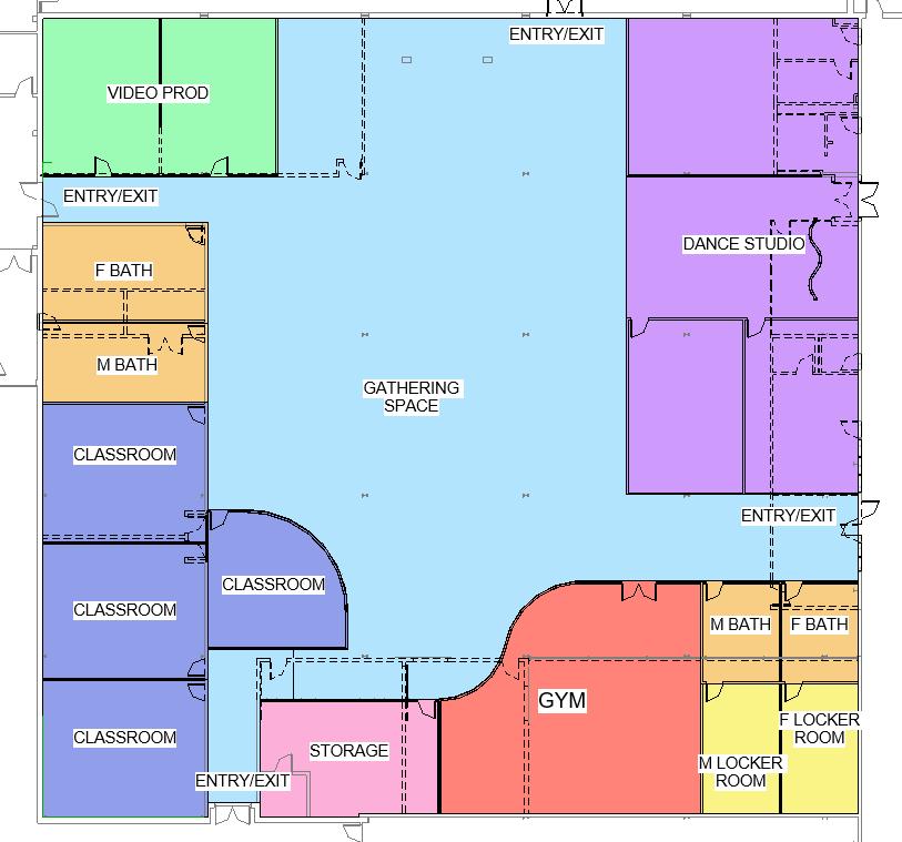
FLOOR PLAN
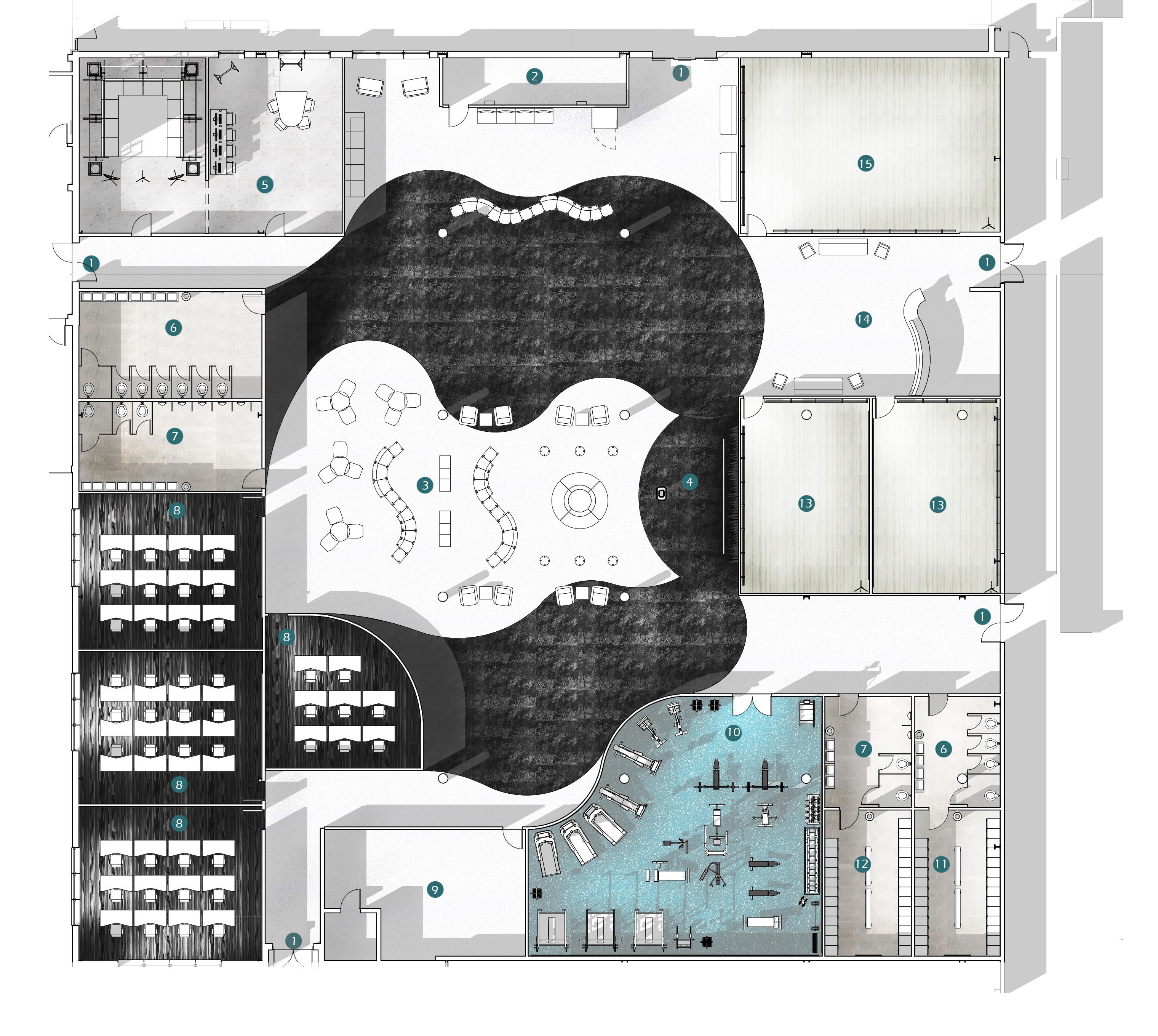
The floor plan illustrates flooring transitions and furniture arrangement using a mix of wood, stone, and rubber. Curved material transitions and wall forms reflect the organic lines of the concept visuals, while varied seating options introduce visual movement throughout the space.
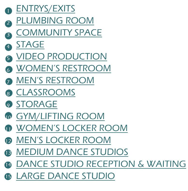
COMMUNITY SPACE LAYOUTS
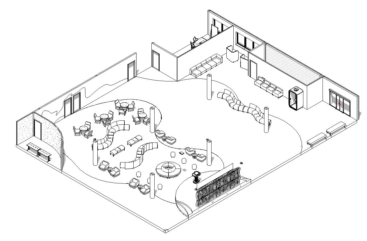
This community space design prominently features curved lines in the ceiling, walls, and furniture layouts, which not only enhance visual fluidity but also align with the elegance of high-end spaces.
EVERYDAY SEATING
CONFERENCE SEATING
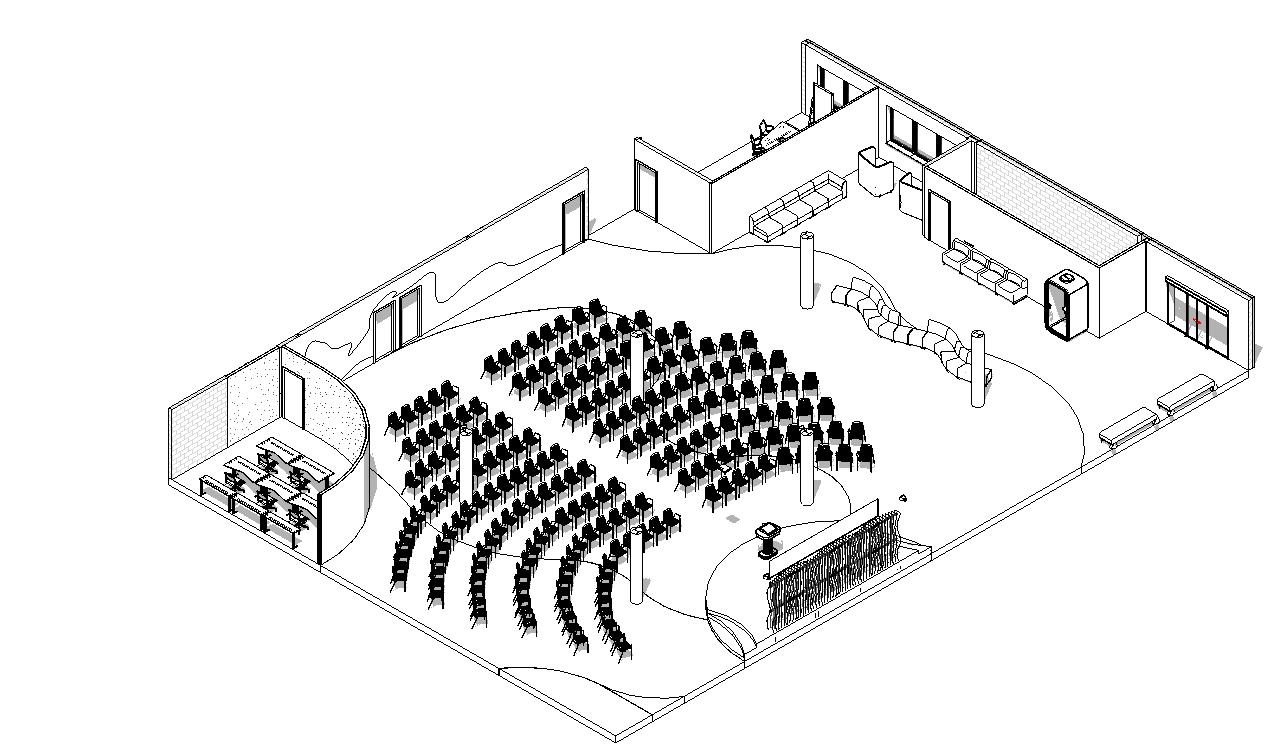
BANQUET SEATING
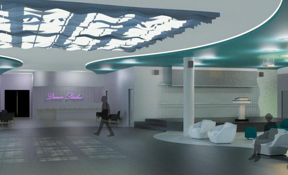
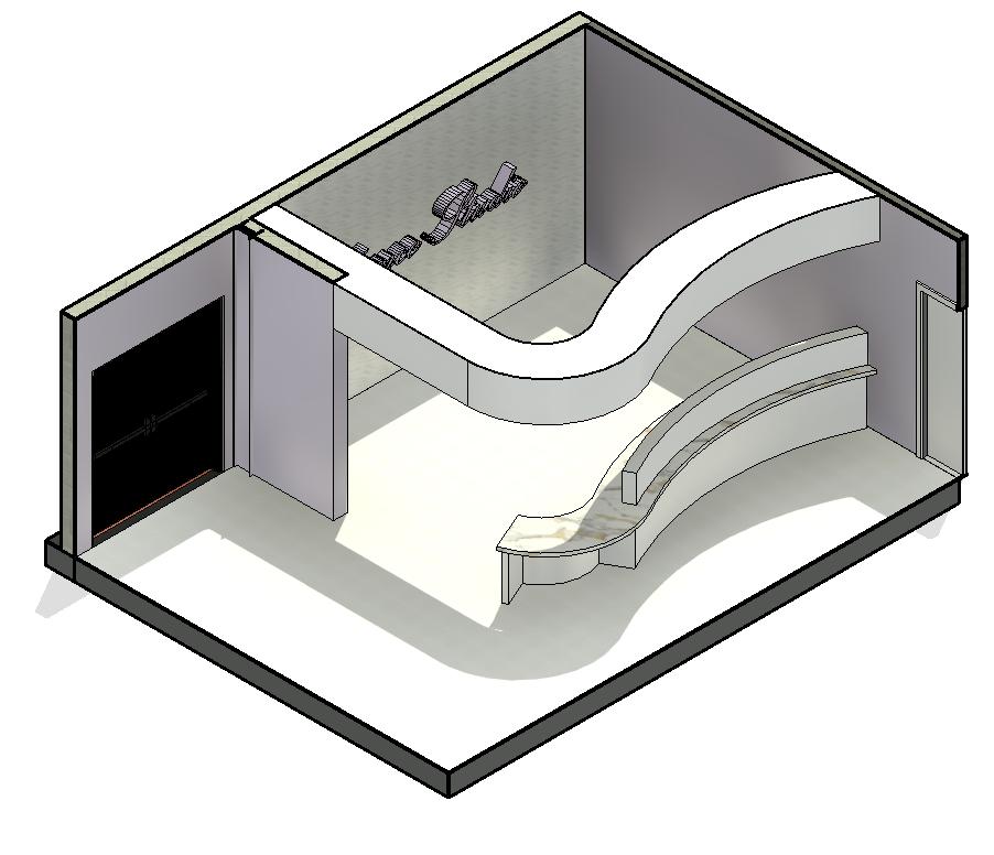
DANCE STUDIO DESIGN
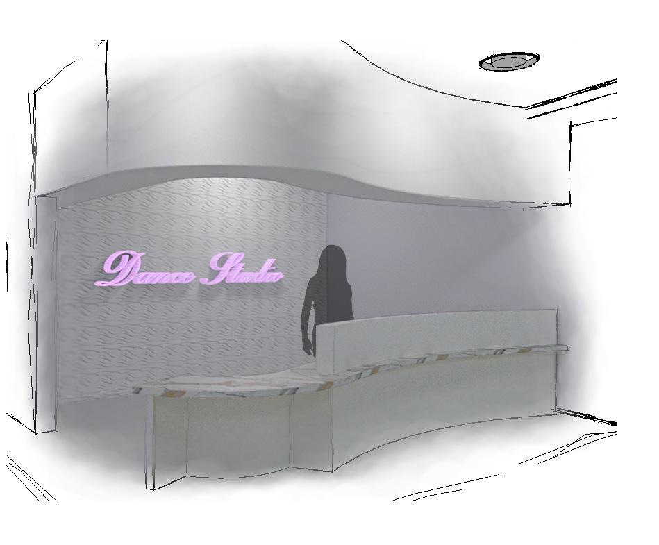
The dance studio is designed with a refined, upscale approach, featuring a reception area defined by a custom curved desk and accent wall. A purple and white palette reflects the client’s preferences and carries throughout the entire studio spaces.
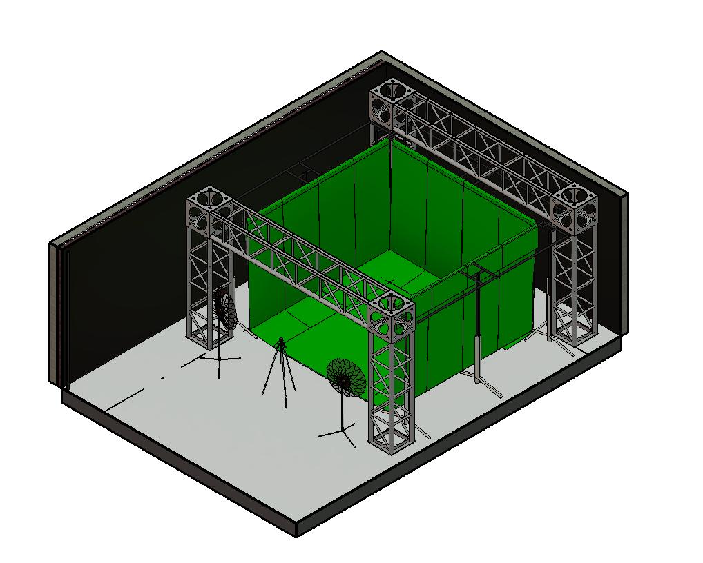
VIDEO PRODUCTION ROOM
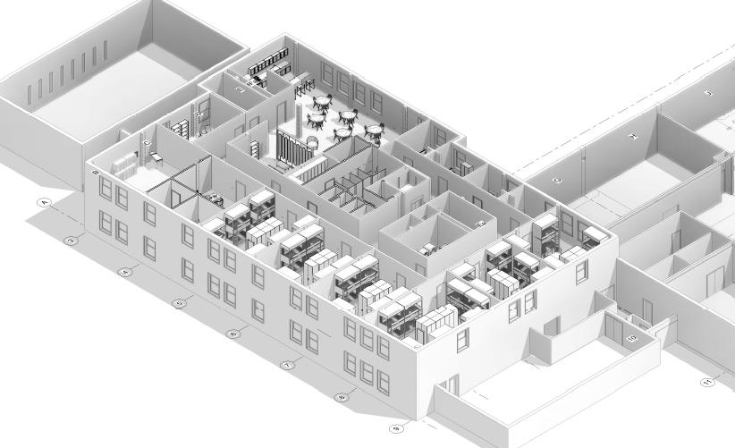
2ND FLOOR DESIGN
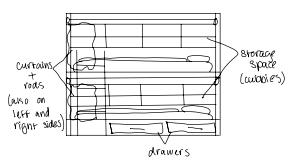
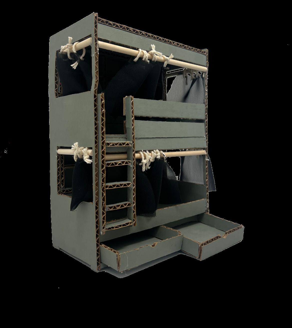
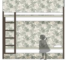
CUSTOM BUNK BED
The custom bunk bed was developed through a process of ideation sketching, digital modeling, and physical prototyping. Key features include personal shelving, an overhead whiteboard for drawings or photos, integrated task lighting, individual drawers, and a privacy curtain to support comfort and personal space.
DIGITAL & PHYSICAL MODEL
POSTER DESIGN


CHARLESTON, SC


CONSTRUCTION DOCUMENTATION
NEXT PROJECT FALL 2025

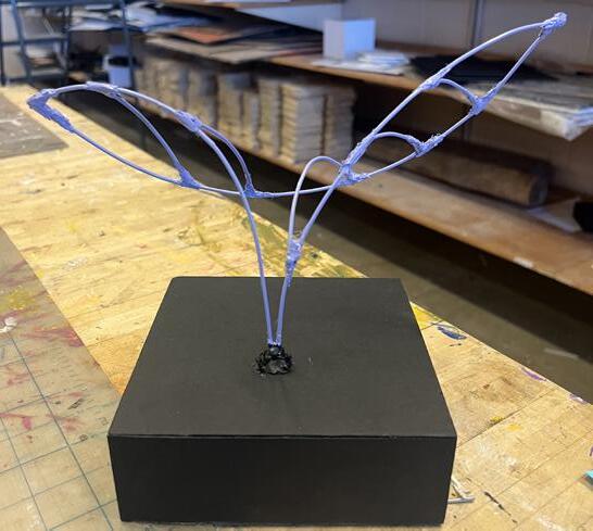
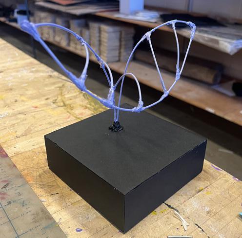
DIGITAL & PHYSICAL
RISOGRAPH PRINT “FRESH AIR”
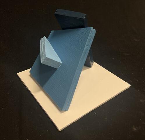
WOODEN SHAPES SCULPTURE
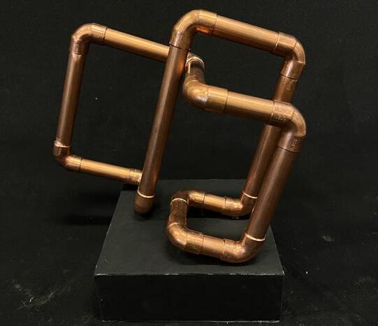
COPPER SCULPTURE
LINE IN SPACE
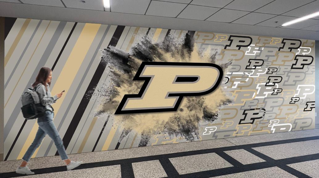
ABSTRACT SUPERGRAPHIC
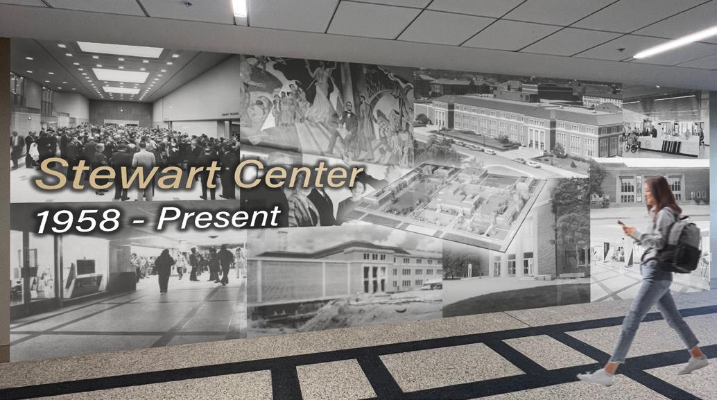
HISTORICAL SUPERGRAPHIC
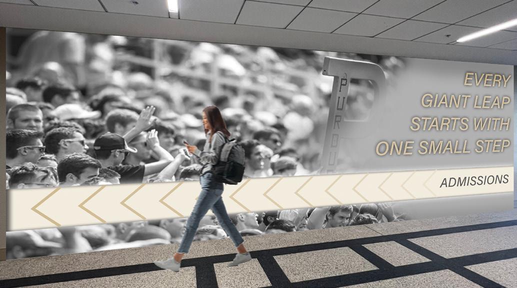
MOTIVATIONAL SUPERGRAPHIC
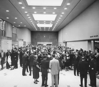


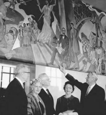
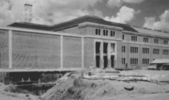
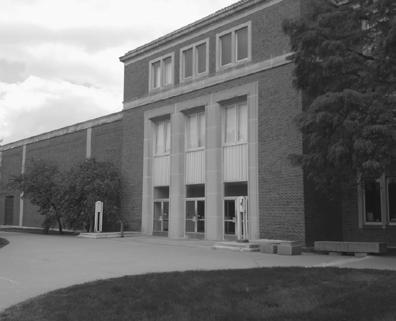
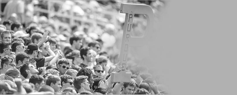
Stewart Center
1958 - Present
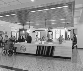
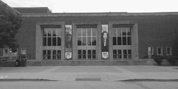
EVERY GIANT LEAP
STARTS WITH ONE SMALL STEP
ADMISSIONS
DRAWINGS

RECREATION CROSS HATCHED INK DRAWING
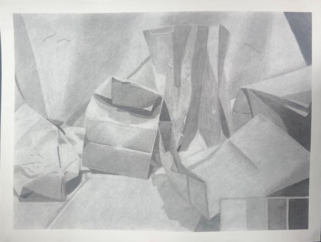
CHARCOAL PAPER BAGS DRAWING

INK DRAWING MATERIAL APPLICATION DRAWING
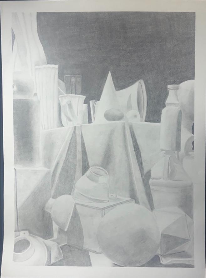
STILL-LIFE CHARCOAL DRAWING


www.linkedin.com/in/allison-garber-197356326
(260) 239 7465
allison.r.garber@gmail.com