ALISON HICKS
PORTFOLIO
University of Oregon Interior Architecture


University of Oregon Interior Architecture
Strong work ethic
Willingness to learn
Creative ability
Proficient in Google Apps, Microsoft Office, Revit, Rhino, and Adobe Creative Suite: Photoshop, Illustrator, InDesign
Dean’s List, University of Oregon - exceeding a 3.75 GPA while taking 15+ credits.
Len and Margaret Casanova Scholarship - active participation in the Newman Center while maintaining a 3.98 GPA.
Crochet
Watercolor
Gardening
1828 Emerald St. Eugene, Oregon, 97403 (530) 927-8553 alisonhicks.me@gmail.com
University of Oregon | Eugene, Oregon
FALL 2018-PRESENT (EXPECTED GRADUATION JUNE 2023)
Interior Architecture Major (5th-year) Food Studies and Architecture Minors
Academia don Quijote | Madrid, Spain
SUMMER 2019
Intensive 20 Program- 20 weekly Spanish classes
Interior Design Intern - LPA

SUMMER 2022
Created three material boards by compiling product samples and creating a digital template to be printed and mounted
Executive Team Chair - IIDA UO Chapter
SPRING 2019-PRESENT
Liaise with faculty and College of Design students to advertise events and professional development opportunities
Active in IIDA Oregon annual student symposium and charette
Event Coordinator - St. Thomas More Newman Center
FALL 2019 - SPRING 2022
Lead group of five to plan and execute engaging student events
Coordinate advertising and social media by creating informational and graphic to promote events
Media Consultant - County of Plumas
SUMMER 2021
Produced and designed series of videos and graphics for the Dixie Fire Debris Removal Program
Branding Consultant - QHS Catering
SUMMER 2020
Worked with Culinary Director of QHS Catering on logo design and branding over a series of professional meetings
Focus: Construction drawing skills, human experience
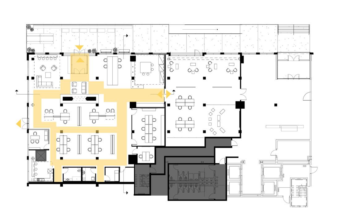
Marché Café is a place for everyone to connect with one another as well as the rich history and art of the museum. The design process focused on effervescence, historic, moody, lively, and smooth flow.
Connecting to the museum, courtyard, and lounge, Marché is in a unique position in both space and time. Being in such a historical and prominent building on the University of Oregon campus. the cafe is both an extension of the museum and a space of contemporary connection. The new Marché Café design will strive for maintaining liveliness while adding moments of privacy and refuge and become a place for students, faculty, and the Eugene community.

Previously, the design for the Marché Café dealt with flow issues, as people walked right into the point of sale which produced a bottleneck effect. By shifting the point of sale down to the main level and out of the way from the entry, users now have a clear line to form while waiting for their order.

The bar seating allows individual patrons to enjoy a hot panini or cup of coffee at any time of the day. This also opens the rest of the tables and seating to group gatherings.
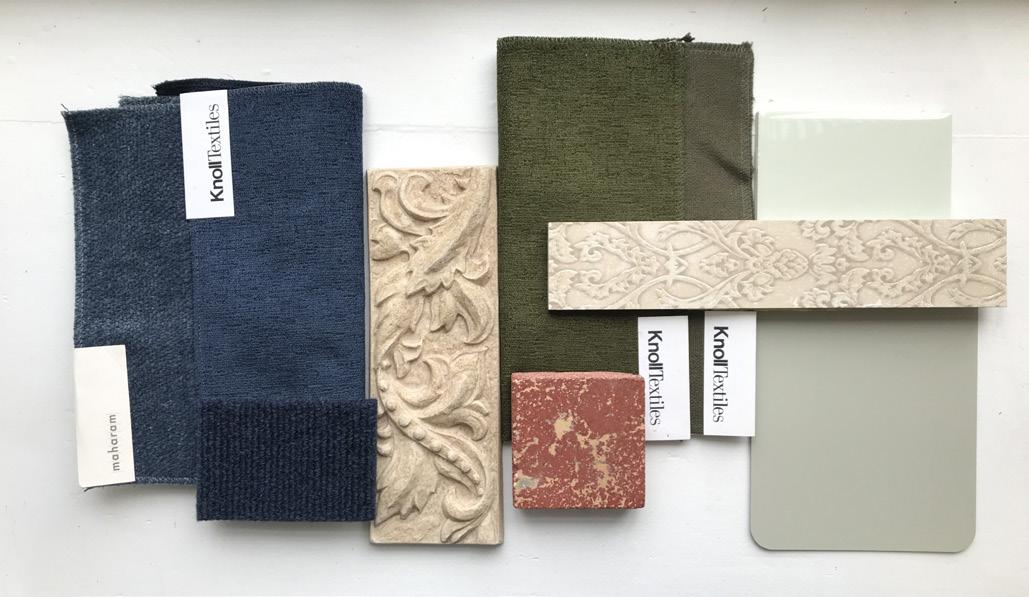
 Ivory Tan
Marche Red
Midnight Blue
Sage Green
Ivory Tan
Marche Red
Midnight Blue
Sage Green


With such a large open space, cafe patrons have difficulty finding a small space to have coffee with a friend or plug away at a project. The west wall alcoves provide a space for people to find refuge within the space, while still having a view of the liveliness of the café.


Designed for sitting criss cross while crocheting, the crochet chair allows comfortable sitting for both left and right-handed users. This chair has a woven back which allows for both comfort for the human back as well as to weave in the concept of textile arts. Made from red alder, the chair has a beautiful oil finish to emphasize the beauty of the natural material.

Through a 5-week process of modeling 1/4, 1/2, and full-scale mockups, many design challenges were worked out in order to prepare for building the final piece using red alder. One major change made in the design process was the elimination of the side arm rest. This change allowed for the chair to work for both right and left-handed users, as well as balancing the weight and connections of the chair.


Additionally, a benefit to the chair design is the ability to recreate and manufacture the parts to a whole. As seen (below right), the chair can be broken down into 5 pieces total: seat pan, back frame, back leg, right leg, left leg.


Using traditional weaving techniques, the back serves as a frame or loom for the woven yarn to sit within. This allows the human back to rest against an elastic surface rather than the hard back of the wood.

The three-legged design allows for optimum balance on any surface to avoid the nuisance of unintentional rocking in the chair. Additonally, the two front legs taper in a mid-century modern style, while the back leg serves as the primary connecting piece.


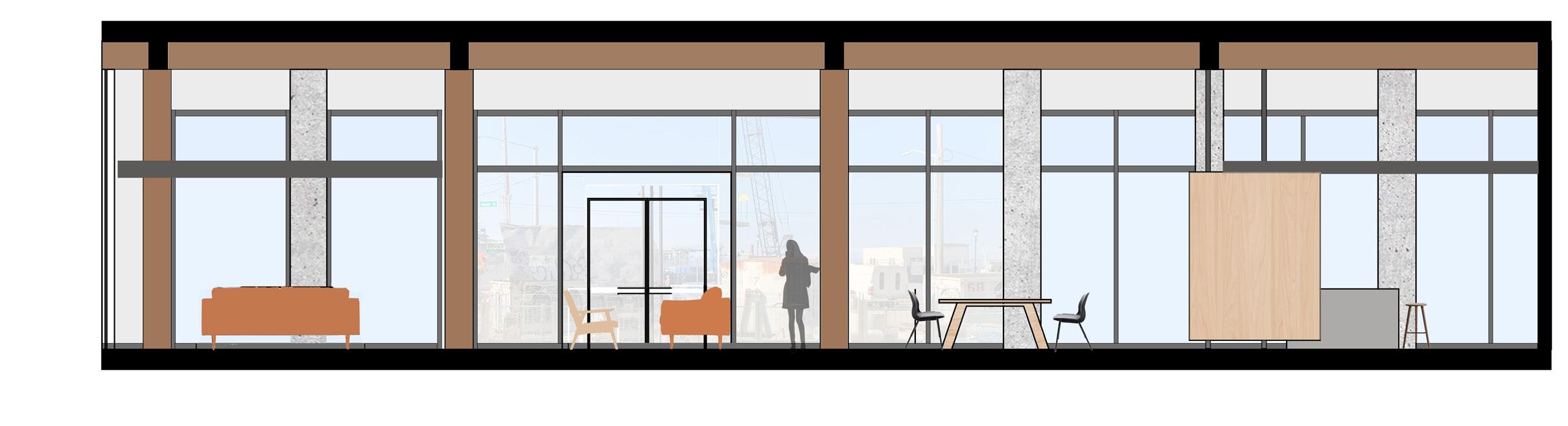
In the wake of the COVID-19 pandemic, Seattle-based architecture and design firm RStudio06 relocated its office to the ground floor of the historic Maritime Building. The new office includes personal work space for the 15 staff members, several communal spaces for gathering - accommodating both in-person and remote - and a flexible community space which also serves the public.
The guiding principles of this project are inside-out, accessibility, authenticity, modern, and thoughtful design.
Creating an experience that bridges landscape to architecture to interior. Allowing parts and people within projects to be seen and accessible to everyone.
Creating beautiful elements that reveal the depth of detail. Organized, clean lines, minimal, space serves as the canvas for the people and their work, white/blank slate.
Selective, intentional, resourceful, good lighting, personal design.
The safety of the staff and visitors was of highest priority, making zoning a major component of this design to ensure public and private areas were separate.
Circulation and COVID-19 strategies both worked together to ensure the safety of employees in maintaining distance.

Day in the Life


Part of the programming and research process included imagining a day in the life of an RStudio06 employee. This process helped shape the spaces for the many needs of its users as well as helped to divide the office into different zones: work, collaboration, and rest (as seen in the zoning diagram above).


As an historic and industrial building, the Maritime Building brings warm tones of the wood columns in contrast with the cool skies and sea. In an effort to make the office feel warm and safe, the palette emphasizes wood, jute, and leather. To ensure maintainence of all materials and the safety of the building’s users, most materials are non-porous.


As a place of gathering, knowledge, refuge, and comfort, a library stands as the cornerstone of a community. This project focuses on the community of Northwest Portland, with a structure that accommodates the climate of the Pacific Northwest and optimizes daylighting strategies in the space. Completed second year of the architecture/interior architecture program, this was my first studio using digital software (primarily Rhino).

The climate of Portland, Oregon is known to be overcast and rainy for the majority of the year. With this in mind, the design for this building focuses on averting rainwater down the center atrium and covering the sidewalk of the building. Additionally, the overcast conditions focus the designs on intentional daylighting strategies to capture the most amount of light while providing some shading techniques on the south facade of the building.


Surrounded by the abundant forests of the Pacific Northwest, Portland is a hub for timber and timber manufacturing - as supported by the region named “Slabtown” where the Northwest Multnomah County Branch Library is located. Cross-laminated timber (CLT) is an up-and-coming building material to the U.S. but has proven to be a strong, efficient, and beautiful material. Also it complements the strong historical ties to timber of the area. CLT has long spans and works as both panels and columns giving more reason to choose it as the material for this library.
The library’s structural system follows a cubed shape with a 16’x16’ grid imbedded within. However, the atrium in the center of the library breaks the grid and creates its own unique structure surrounding the atrium. Using CLT columns, floor and wall panels and glu-lam beams, the vertical and horizontal bearing elements are all timber products.


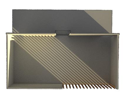
Taking a closer look at the small community room, the exterior louvers provide shading for the south side of the building. The shadow play adapts as the activities in the room change throughout the day, accommodating lectures, workshops, small group meetings, and much more.


In order to relate to the site context, materiality - specifically brick - complemented the surrounding buildings on the site while allowing the library design to shine through in a very different way than the other buildings. Optimizing the natural light allowance in the building pointed to glazing with thin mullions and contrasted the heaviness of the brick portions of the facade.


The live-work unit expresses the simplicity and meaning seen in Mrs. Campbell’s art, bringing a neutral palette with pops of color. Campbell’s graphic style can be contrasted with a strong presence of texture, introducing a balance between soft and hard, smooth and rough to symbolize the harmony that must be met in the live-work space. Just a few strokes make a big impact in calligraphy, inspiring the minimalist approach to the live-work space while also supporting the functional aspect of the space. Inspired by her textiles, bold and simple, or quirky and vintage patterns in upholstery and soft products make an appearance in this design.


