Chapter 2 Graphs, Charts, and Tables Describing Your Data
When applicable, the first few problems in each section will be done following the appropriate step by step procedures outlined in the corresponding sections of the chapter. Following problems will provide key points and the answers to the questions, but all answers can be arrived at using the appropriate steps.
The more difficult problems in this chapter are:
For Section 2.1
2.14, 2.15, 2.16, 2.21, 2.22, 2.23
For Section 2.2
2.39, 2.40, 2.43, 2.45
For Section 2.3
2.54, 2.59, 2.61, 2.62
For End of Chapter
2.74, 2.76, 2.77, 2.78
Section 2.1
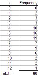
2.1 Step 1: List the possible values.
The possible values for the discrete variable are 0 through 12. Step 2: Count the number of occurrences at each value. The resulting frequency distribution is shown as follows:
Copyright ©2014 Pearson Education, Inc. 2-1

2.2 Given n = 2,000, the minimum number of groups for a grouped data frequency distribution determined using the 2k n guideline is:
2k n or 11 22,0482,000 Thus, use k = 11 groups.
2.3
a. Given n = 1,000, the minimum number of classes for a grouped data frequency distribution determined using the 2k n guideline is:
2k n or 10 21,0241,000 Thus, use k = 10 classes.
b. Assuming that the number of classes that will be used is 10, the class width is determined as follows:
2,9003002,600 260 1010 HighLow
Classes
Then we round to the nearest 100 points giving a class width of 300.
2.4 Recall that the Ogive is produced by plotting the cumulative relative frequency against the upper limit of each class. Thus, the first class upper limit is 100 and has a relative frequency of 0.2 - 0.0 = 0.2. The second class upper limit is 200 and has a relative frequency of 0.4 - 0.2 = 0.2. Of course, the frequencies are obtained by multiplying the relative frequency by the sample size. As an example, the first class has a frequency of (0.2)50 = 10. The others follow similarly to produce the following distribution
2.5
a. There are n = 60 observations in the data set. Using the 2k > n guideline, the number of classes, k, would be 6. The maximum and minimum values in the data set are 17 and 0, respectively. The class width is computed to be: w = (17-0)/6 = 2.833, which is rounded to 3. The frequency distribution is
Copyright ©2014 Pearson Education, Inc. 2-2
b. To construct the relative frequency distribution divide the number of occurrences (frequency) in each class by the total number of occurrences. The relative frequency distribution is shown below.
Total = 60
c. To develop the cumulative frequency distribution, compute a running sum for each class by adding the frequency for that class to the frequencies for all classes above it. The cumulative relative frequencies are computed by dividing the cumulative frequency for each class by the total number of observations. The cumulative frequency and the cumulative relative frequency distributions are shown below.
Total = 60
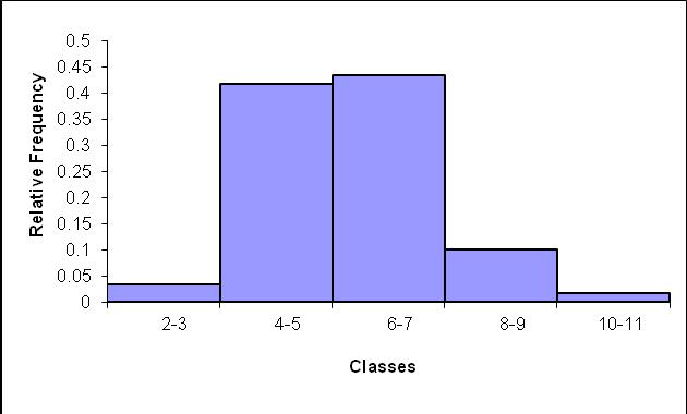
d. To develop the histogram, first construct a frequency distribution (see part a). The classes form the horizontal axis and the frequency forms the vertical axis. Bars corresponding to the frequency of each class are developed. The histogram based on the frequency distribution from part (a) is shown below.
Copyright ©2014 Pearson Education, Inc. 2-3
2.6 Note that the first two classes have a total width of 8.05 – 7.85. Thus, the class width equals (8.05 – 7.85)/ 2 = 0.10. The upper class boundary equals the lower class boundary plus the class width. So, as an example, the first class boundary equals 7.85 + 0.10 = 7.95, and so on. The first class has the same relative frequency and cumulative relative frequency. The frequency is obtained by multiplying the sample size times the relative frequency. So the first class frequency equals 50(0.12) = 6. The other class frequencies follow similarly. If we know the frequency we can determine the sample size, and similarly, if we know the sample size we can determine the frequency.
Each cumulative relative frequency is produced by adding the respective class relative frequency to the preceding cumulative relative frequency. So the second class relative frequency is obtained as 0.48 – 0.12 = 0.36. The other calculations follow similarly yielding
2.7
a. Proportion of days in which no shortages occurred = 1 – proportion of days in which shortages occurred = 1 – 0.24 = 0.76
b. Less than $20 off implies that overage was less than $20 and the shortage was less than $20 = (proportion of overages less $20) – (proportion of shortages at most $20) = 0.56 –0.08 = 0.48
c. Proportion of days with less than $40 over or at most $20 short = Proportion of days with less than $40 over – proportion of days with more than $20 short = 0.96 – 0.08 = 0.86.
2.8
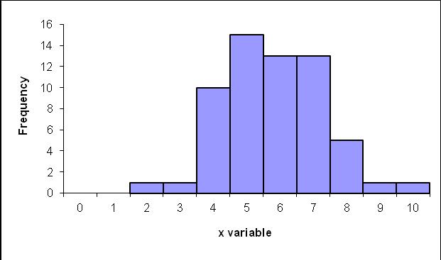
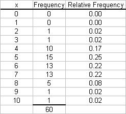
a. The data do not require grouping. The following frequency distribution is given:
Copyright ©2014 Pearson Education, Inc. 2-4
b. The following histogram could be developed.
c. The relative frequency distribution shows the fraction of values falling at each value of x.
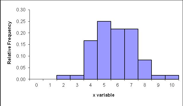
d. The relative frequency histogram is shown below.
e. The two histograms look exactly alike since the same data are being graphed. The bars represent either the frequency or relative frequency.
Copyright ©2014 Pearson Education, Inc.
2.9
a. Step 1 and Step 2. Group the data into classes and determine the class width: The problem asks you to group the data. Using the 2
Class width is:
which we round up to 2.0 Step 3. Define the class boundaries: Since the data are discrete, the classes are:
guideline we get:
Step 4. Count the number of values in each class:
b. The cumulative frequency distribution is:
Copyright ©2014 Pearson Education, Inc. 2-6
The relative frequency histogram is:
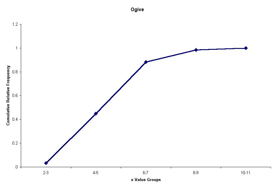
d. The ogive is a graph of the cumulative relative frequency distribution.
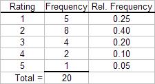
2.10.
a. Because the number of possible values for the variable is relatively small, there is no need to group the data into classes. The resulting frequency distribution is:
This frequency distribution shows the manager that most customer receipts have 4 to 8 line items.
Copyright ©2014 Pearson Education, Inc. 2-7
2.12
b. A histogram is a graph of a frequency distribution for a quantitative variable. The resulting histogram is shown as follows.
c. The proportion that were both on-line and experienced is 0.3667.
d. The proportion of on-line investors is 0.6667
a. The following relative frequency distributions are developed for the two variables:
Copyright ©2014 Pearson Education, Inc. 2-8
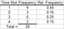
b. The joint frequency distribution is a two dimensional table showing responses to the rating on one dimension and time slot on the other dimension. This joint frequency distribution is shown as follows:
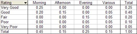
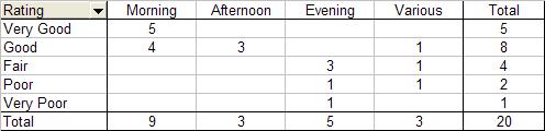
c. The joint relative frequency distribution is determined by dividing each frequency by the sample size, 20. This is shown as follows:
Based on the joint relative frequency distribution, we see that those who advertise in the morning tend to provide higher service ratings. Evening advertisers tend to provide lower ratings. The manager may wish to examine the situation further to see why this occurs.
2.13
a. The weights are sorted from smallest to largest to create the data array.
b. Five classes having equal widths are created by subtracting the smallest observed value (77) from the largest value (101) and dividing the difference by 5 to get the width for each class (4.8 rounded to 5). Five classes of width five are then constructed such that the classes are mutually exclusive and all inclusive. Identify the variable of interest. The weight of each crate is the variable of interest. The number of crates in each class is then counted. The frequency table is shown below.
Copyright ©2014 Pearson Education, Inc. 2-9
c. The histogram can be created from the frequency distribution. The classes are shown on the horizontal axis and the frequency on the vertical axis. The histogram is shown below.
2.14
d. Convert the frequency distribution into relative frequencies and cumulative relative frequencies as shown below.
Total = 49
The percentage of sampled crates with weights greater than 96 pounds is 10.20%.
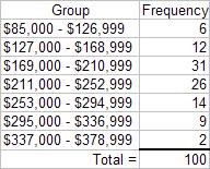
a. There are n = 100 values in the data. Then using the 2k n guideline we would need at least k = 7 classes.
b. Using k = 7 classes, the class width is determined as follows:
Rounding this up to the nearest $1,000, the class width is $42,000.
Copyright ©2014 Pearson Education, Inc. 2-10
c. The frequency distribution with seven classes and a class width of $42,000 will depend on the starting point for the first class. This starting value must be at or below the minimum value of $87,429. Student answers will vary depending on the starting point. We have used $85,000. Care should be made to make sure that the classes are mutually exclusive and allinclusive. The following frequency distribution is developed:
d. The histogram for the frequency distribution in part c. is shown as follows:
Interpretation should involve a discussion of the range of values with a discussion of where the major classes are located.
Copyright ©2014 Pearson Education, Inc. 2-11
b. The data shows 8 of the 25, or 0.32 of the salaries are at least 175,000
c. The data shows 18 of the 25, or 0.72 having salaries that are at most $205,000 and a least $135,000.
2.16
a. We are assuming mortgage rates are limited to two decimal places. Students making other assumptions will get a slightly difference histogram. We are also rounding the calculated class width to .15.
Copyright ©2014 Pearson Education, Inc. 2-12
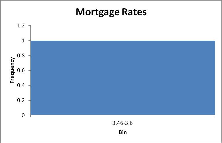
b. Proportion of rates that are at least 3.76% is the sum of the relative frequencies of the last four classes = 0.356 + 0.311 + 0.133 = 0.800

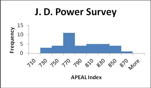
b. The 2008 average is 782 which is less than the 2005 average of 866. This could indicate that the new models are less appealing to automobile customers, or customers could simply have rising expectations.
Copyright ©2014 Pearson Education, Inc. 2-13
b. The tread life of at least 50% of the tires is 60,000 or more. The top 10% is greater than 66,000 and the longest tread tire is 74,000. Additional information will vary.
c.
2.19.
Student will probably say that the 12 classes give better information because it allows you to see more detail about the number of miles the tires can go.
a. There are n = 294 values in the data. Then using the 2k n guideline we would need at least k = 9 classes.
b. Using k = 9 classes, the class width is determined as follows:
321022
99 HighLow w Classes
2.44
Rounding this up to the nearest 1.0, the class width is 3.0.
Copyright ©2014 Pearson Education, Inc. 2-14
c. The frequency distribution with nine classes and a class width of 3.0 will depend on the starting point for the first class. This starting value must be at or below the minimum value of 10. Student answers will vary depending on the starting point. We have used 10 as it is nice round number. Care should be made to make sure that the classes are mutually exclusive and all-inclusive. The following frequency distribution is developed:
Students should recognize that by rounding the class width up from 2.44 to 3.0, and by starting the lowest class at the minimum value of 10, the 9th class is actually not needed. d. Based on the results in part c, the frequency histogram is shown as follows:
The distribution for rounds of golf played is mound shaped and fairly symmetrical. It appears that the center is between 19 and 22 rounds per year, but the rounds played is quite spread out around the center.
Copyright ©2014 Pearson Education, Inc. 2-15
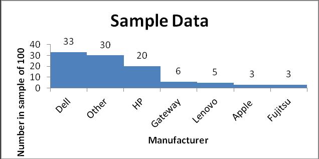
b. Excluding “Other” there are 100 – 30 = 70 percent of the manufacturers. Only Lenovo and Fujitsu have headquarters outside of the United States. There is, therefore, 5 + 3 = 8% for their market share. Therefore, the total market share of US manufacturers excluding “other” = (70 – 8)/70 = 0.89. Therefore, the total market share excluding “other” is 89%
2.21
a. Using the 2k > n guideline, the number of classes would be 6. There are 41 airlines. 25 = 32 and 26 = 64. Therefore, 6 classes are chosen.
b. The maximum value is 602,708 and the minimum value is 160 from the Total column. The difference is 602,708 – 160 = 602548. The class width would be 602548/6 = 100424.67. Rounding up to the nearest 1,000 produces a class width of 101,000.
d. Histogram follows:

The vast majority of airlines had fewer than 101,000 monthly passengers for December 2011.
Copyright ©2014 Pearson Education, Inc. 2-16
2.22
a. The frequency distribution is:
2.23
The frequency distribution shows that over 1,100 people rated the overall service as either neutral or satisfied. While only 83 people expressed dissatisfaction, the manager should be concerned that so many people were in the neutral category. It looks like there is much room for improvement.
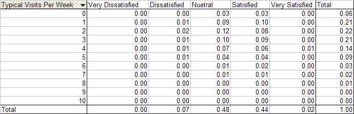
b. The joint relative frequency distribution for “Overall Customer Satisfaction” and “Number of Visits Per Week” is:
The people who expressed dissatisfaction with the service tended to visit 5 or fewer times per week. While 38% of the those surveyed both expressed a neutral rating and visited the club between 1 and 4 times per week.
a. Order the observations (coffee consumption) from smallest to largest. The data array is shown below:
Copyright ©2014 Pearson Education, Inc. 2-17

b. There are n = 144 observations in the data set. Using the 2k > n guideline, the number of classes, k, would be 8. The maximum and minimum values in the data set are 10.1 and 3.5, respectively. The class width is computed to be: w = (10.1-3.5)/8 = 0.825, which is rounded up to 0.9.
The class with the largest number is 6.2 –7.0 kg of coffee.
c. The histogram can be created from the frequency distribution. The classes are shown on the horizontal axis and the frequency on the vertical axis. The histogram is shown below.
The histogram shows the shape of the distribution. This histogram is showing that fewer people consume small and large quantities and that most individuals consume between 5.3 and 8.0 kg of coffee, with the highest percentage of individuals consuming between 6.2 and 7.0.
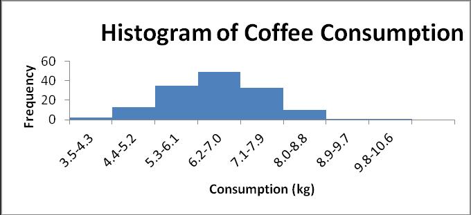
d. Convert the frequency distribution into relative frequencies and cumulative relative frequencies as shown below.
8.33% (100 - 91.67) of the coffee drinkers sampled consumes 8.0 kg or more annually.
Copyright ©2014 Pearson Education, Inc. 2-18
Section 2-2
2.24
a. The pie chart is shown as follows:
b. The horizontal bar chart is shown as follows:
Copyright ©2014 Pearson Education, Inc. 2-19
2.25
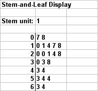
Step 1. Sort the data from low to high. This is done in the problem. The lowest value is 0.7 and the highest 6.4.
Step 2. Split the values into a stem and leaf. Stem = units place leaf = decimal place Step 3. List all possible stems from lowest to highest. Step 4. Itemize the leaves from lowest to highest and place next to the appropriate stems.
2.26
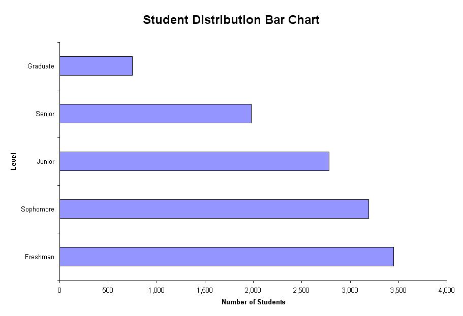
Step 1. Define the categories. The categories are grade level. Step 2. Determine the appropriate measure. The measure is the number of students at each grade level. Step 3. Develop the bar chart.
Copyright ©2014 Pearson Education, Inc. 2-20