

PORTFOLIO GRAPHIC DESIGN
ALIANNA BECERRA
Art has always been a major aspect of my life. My grandfather was an illustrator, my grandmother a painter, my dad a photographer, and now myself a designer. Although I have always loved the creativity of arts like illustration and painting, I’ve also appreciated the more structured aspects of design. I like that it can combine the creative mind with the analytical.
Throughout my life and career I have continued to focus on both creativity and analytics. I spent most of my studies in college in art history, architecture, art and design classes. This allowed me to incorporate a more creative eye into my work in design and a more analytical eye into my art. The influences each of these areas have had on each other through my work have served to be the foundations of myself as a designer.
Professionally I have focused my career on both graphic design and architecture. These experiences and influences throughout my life have informed my designs and my portfolio aims to show that. Through a mix of designs, I intend to tell a story not only of these designs, but of who I am as a designer.
EDUCATIONAL PROFESSIONAL
URBAN CARTOGRAPHICS 04.
10. JOHN SNYDER
14. BATTERY FARM LOGO
ARCHITECTS
SELECTED 2D DESIGN WORKS
URBAN CARTOGRAPHICS
2023-2024
In early March of 2023 I began working as a Graphic Designer with Urban Cartographics, a small group of planning and zoning consultants specializing in the NYC development approval process.
Here I created a lot of maps, presentations, and other related graphics to help clients throughout various stage of the development approval process. I made these visuals mainly through the use of QGIS for map making and CorelDRAW for making presentations. I also used various other tools to aid my design process including SketchUp, Photoshop, Rhino and more.
In this section, you can see a few different samples of the type of work I did throughout my time at Urban Cartographics. Included on this spread is the Urban Design Diagram (left), which was created to help clients visualize early massing models on their site. Also included on the right is the Plan Beautification Project. This was an initiative I developed to help clients to better interpret the architects’ plans for their projects.
Addresses in this section have been changed or redacted for confidentiality purposes.


Urban Design Diagrams - SketchUp, Rhino, Photoshop


Plan Beautification Projects - QGIS, CorelDRAW

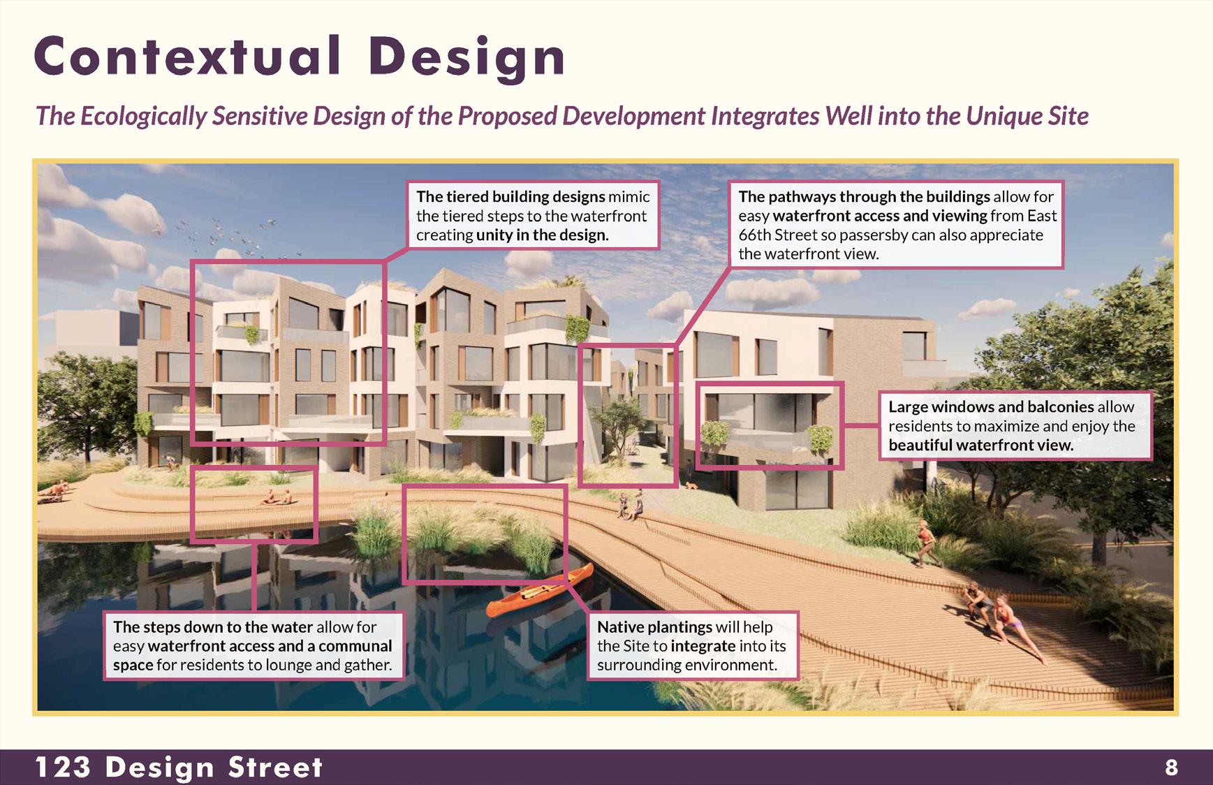


As I became more familiar with the team’s work throughout my time at Urban Cartographics, I became the lead designer on presentation work. These presentations were often used by our clients at meetings during their development approval process. The goal through the presentations was to dissect the plans for the site in question and present them in a way that was clear for any viewer with any level of zoning knowledge to understand. Although I created a lot of these presentations for various projects, no two presentations were ever the same. There were some
slides that were seen in almost every presentation to some capacity, such as the “Access to Many Transit Options” and “Tax Map” slides seen above, but I also created many unique slides that were customized to each project. Examples of those are the “Contextual Design” slide to the left and the “Existing and Proposed Developments” slide above. Despite variety in some of the content of these presentations, they were always cohesive with one another and aligned with the identity of the Urban Cartographics brand.
Full Presentation Slides - CorelDRAW, QGIS, Client Plans, NYC DOF
BATTERY FARM LOGO 2022
In 2022, I was hired to create a logo for Battery Farm of North Salem, New York. The client wanted the logo to be based off of the historic cannon on their property, which can be seen in the reference photograph to the right.
I created a number of iterations for the client based on the reference photo and based on my client’s artistic style preferences. Some of these iterations can be seen to the right as well. The client chose the logo highlighted on the right page of this spread, as it was the most cohesive with his design style for other aspects of his life, such as the logo for his business.
After creating the logo, the client wanted to produce a variety of clothing items to print the logo on. In order to do this, I created mock-ups of the logo on a hat, t-shirt, jacket, and tote bag, as seen on the page to the right.


J. SNYDER ARCHITECTS 2020
During my final semester at Ithaca College I worked at John Snyder Architects (JSA) as an Architectural Intern from February until June. This internship provided me with valuable information about the architecture industry and the skills to better my practice of architecture.
A lot of the work I did during this time was for the redesign of the JSA website, including the work shown in this section. During this time I worked hand in hand with the website designer to create various graphics showing our past and current projects. This experience working on redesigning the JSA website allowed me to practice my graphic design skills in a more professional setting than I had done previously during my time in college.
In addition to the work shown in this section, I also worked on a variety of technical drawings and designs for different projects including residential homes and car dealerships.


Website Imagery - Illustrator, Photoshop


About a month into my time working with John Snyder Architects, the Covid-19 pandemic was quickly escalating throughout the world and where we were located in Ithaca, New York. This began a long period of remote work that forced us to re-imagine what our practice would look like.
During this time, I was doing a lot of work on redesigning our firm’s website and we were in need of a set of new, cohesive headshots for the team. This proved difficult being that we were all in different places and unable to meet with a professional pho-


tographer. Because of this, I decided to make digital headshots for the team based on recent photos that they sent me, as seen above. This allowed us to have an up to date set of headshots that were all following the same format. This also helped me to make the headshots in a style that was connected to the style of the rest of the website imagery.
Employee Headshots - Illustrator
In additional to the technical architectural design work I did with John Snyder Architects and the graphic design that I did for their website, I also was tasked with managing the firm’s Instagram. They did not post on their Instagram very frequently, so I made it my goal to post more often and engage more with our community so people could know more about JSA as a firm.
In doing this, I started a “Throwback Thursday” series, where on Thursdays I would highlight a past project we did. To the top right you can see two images from a highlight I did of The Bank Tower building, a building in Ithaca, New York, that the JSA team did renovations on. Through research of this project I was also able to find historical records of the building before our renovation of it to include in this post.
Between this initiative and other interesting posts I made about JSA, I was able to increase their Instagram’s engagement by an average of 155% and inform the community more about our team and the work we did.


SELECTED 2D DESIGN WORKS
DAVE’S
2019-2020
The following section consists of 3 different projects that I worked on throughout my time at Ithaca College as an art minor with a focus in Graphic Design.
The project seen on this spread was created for the Graphic Design II course at Ithaca Col lege. The task was to create a new logo for a business that we were familiar with. I chose to create a logo for Wander ing Dave’s, a restaurant and food truck in my home town of Brewster, New York. I be gan by designing a logo for the business then implement ing that logo and style onto a


“THE LAND OF THE FREE”
“The Land of the Free” Poster - Illustrator, InDesign


The piece pictured on the left was featured in the exhibit “How Did We Get Here” at the CAP ArtSpace Gallery in Ithaca, N.Y. from November 1st through December 3rd, 2019. The exhibit featured art that focused on ideas of displacement and migration and portrayed various different views of and experiences with these topics.
Featured artists included Ithaca City of Asylum resident artist Pedro X. Molina, Ithaca College professor Paul Wilson, and students of Ithaca College’s Graphic Design II class, including myself. I was honored to be part of this exhibit with such talented artists and grateful for the opportunity to bring light to this topic in this way.
The piece that I had featured in the exhibit drew a parallel between the physical barriers that are often called for in the current conversations about immigration and the concept of freedom in the United States. It questions who the United States is actually free
for. If it is not a place that is free for all, regardless of where you came from, can it really be called “the land of the free”?
“The Land of the Free” was also featured in an article from The Ithacan about the “How Did We Get Here” exhibit. The article, “Local Exhibit on Migration Showcases Student Art” was written by Emily Hung and published on November 7th, 2019.
After being featured in this exhibit, my piece was one of two pieces of student work from this collection to also be chosen as part of Ithaca College’s 2020 Provost Show. The pieces chosen for the Provost Show are displayed in the Ithaca College Provost Office for the entirety of the Spring semester to be viewed by members of the community. I was very grateful to have had my piece chosen for this show to be displayed on campus for my peers and the community to see for the semester.
Photograph of my work in “How Did We Get Here” exhibit
Screenshot of my work in article from The Ithacan
“There

I can’t use one of the handy bikes. Picture that, Mr. Harrisson. My uniform skirt below my knees, my heels. And a simple string of pearls. Well, I don’t own pearls. Lord knows you don’t pay the colored enough to afford pearls. And I work like a dog day and night living on coffee from a pot none of you want to touch!
So, excuse me if I have to go to the restroom a few times a day.”
C

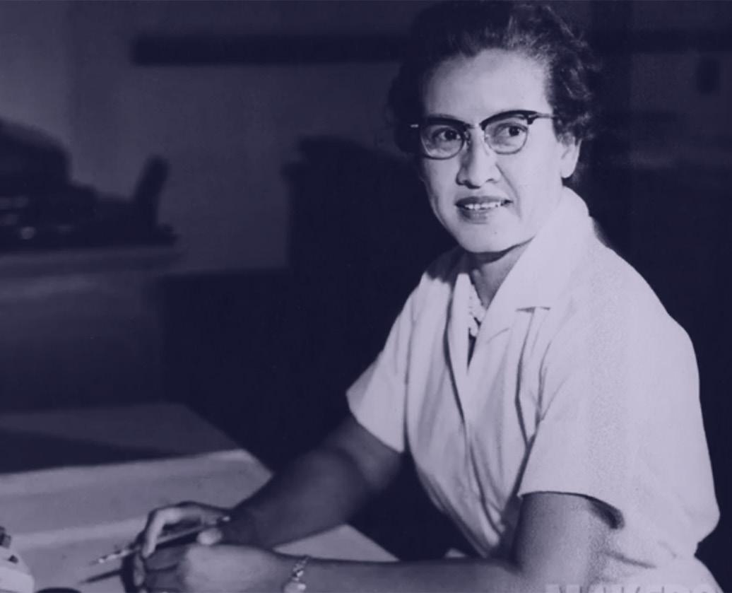
CHRISTINE DARDEN
CHRISTINE DARDEN, despite not being feartured in the film Hidden Figures was a key player in the work of the real life “Hidden Figures.” She joined NASA’s team of “human computers” in 1967 to help them process data. But her goal was to not just process the data, but to create it. She processed data for eight years before being transferred to the engineering section after she approached her supervisor to ask why men of the same educational background as her were being hired as engineers, but she was not. During her 40 years with NASA, Darden led an advisory team, became a deputy program manager, and in 1999 was appointed director of a major aerospace program.

NASA • NASA • NASA • NASA • NASA • NASA
NASA • NASA • NASA • NASA • NASA • NASA
NASA • NASA • NASA • NASA
NASA • NASA
NASA • NASA • NASA • NASA • NASA • NASA •
NASA • NASA • NASA • NASA • NASA • NASA
NASA • NASA • NASA • NASA • NASA
NASA
NASA • NASA • NASA • NASA • NASA • NASA
NASA • NASA • NASA • NASA
NASA • NASA
NASA • NASA • NASA • NASA • NASA • NASA
NASA • NASA • NASA • NASA • NASA • NASA •
NASA • NASA • NASA • NASA • NASA • NASA
NASA • NASA • NASA • NASA • NASA • NASA
BASKERVILLE
DESIGNED IN THE 1750S, BASKERVILLE is known mainly for its proportionality as well as its contrast and crisp edges. It was created by and named after John Baskerville, a master type founder and printer from Birmingham, England. Despite being known as a master of type now, John Baskerville was not always the magnificant type creator that he became. He was originally a servent in a clergyman’s house when his employer noticed his talent for penmanship and sent him to learn how to write. Baskerville was illiterate, but became very interested in calligraphy. His strokes and embellishements that he practiced were later what created his printed typeface that we know today.
Baskerville is a transitional typeface, as it is a stepping stone from old style to modern. It wqas inspired by the idea of perfecting an older typeface: Caslon. Baskerville’s idea of perfection was very subtle and simple. He focused amainly on making higher contrast between thick and thin strokes, sharpening serifs, and shifting the axis of round letters to be more vertical. This maade the round stroes more circular as well and caused for more regularity and consistency in the letter forms.

RESUME
EDUCATION
B.A. in Architectural Studies
Ithaca College, Ithaca, NY
Minor: Art (Graphic Design)
Magna Cum Laude
SKILLS
Adobe Creative Cloud • CorelDRAW • Revit • AutoCAD • SketchUp • Rhinoceros • QGIS
Google Workspace • Microsoft 365 • Hand Drafting • MicroStation • OpenBuildings
EXPERIENCE
Urban Cartographics , New York, NY
Graphic Designer
Battery Farm , North Salem, NY
Graphic Designer
Lee Harris Pomeroy Architects , New York, NY
Junior Architectural Designer
Architectural Intern
John Snyder Architects , Ithaca, NY
Architectural Intern
Ithaca College Art History Department , Ithaca, NY
Teaching Assistant - Architectural Studies
Volunteer Tour Guide
AWARDS
Ithaca College Department of Art History Prize
G. Ferris Cronkite Scholarship
Peggy Ryan Williams Award
March 2023-October 2024 February 2022-September 2022 July 2020-August 2021 February 2020-June 2020 August 2018-December 2019 August 2018-March 2020