Greenville
1.0 Who Are We?
A lifelong solution to your creative needs.
MISSION VISION PROMISE
Our Mission is to help businesses solve their biggest challenges through data-driven creative solutions.
Our Vision is to break the boundaries of Advertising, User Experience and Branding. To become and remain Greenville’s #1 leader in business growth.
We promise to lead with Courage, Integrity, and Purpose. To create better relationships through Education, Execution, and Simplicity.
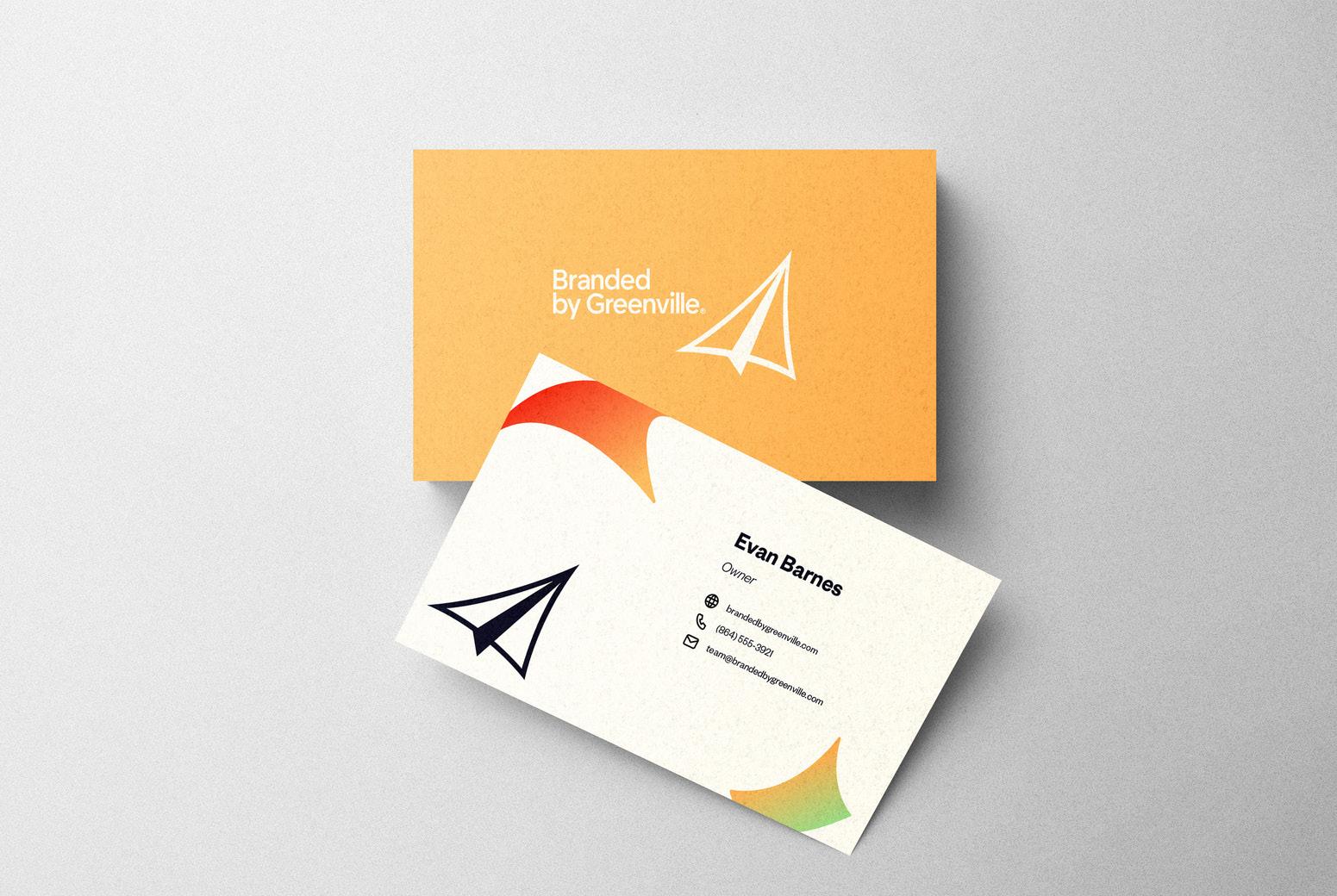
LogoBranded by Greenville’s main logo is made up of a wordmark and icon. The icon primarily depicts a paper airplane, symbolizing the creativity and dedication to upward growth felt by the team of professionals. The image also contains subtle imagery of the Liberty Bridge, an iconic structure located in Downtown Greenville known for its unique design and technological innovation.
Brandmark
Branded by Greenville’s brandmark is a unique combination of two images: a paper airplane and the Liberty Bridge. Viewers from the greater Greenville area may have positive connotations with the more subtle imagery of the bridge, while those outside of Greenville will still see an icon that symbolizes a creative drive and a forwardthinking mindset.
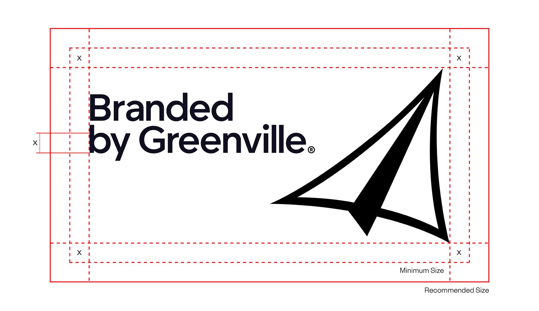
Clearspace: Logo
The minimum and recommended amount of clearsplace designated for the main logo.
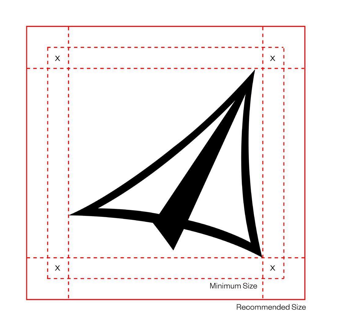
Clearspace: Brandmark
The minimum and recommended amount of clearspace designated for the brandmark.
Color Palette
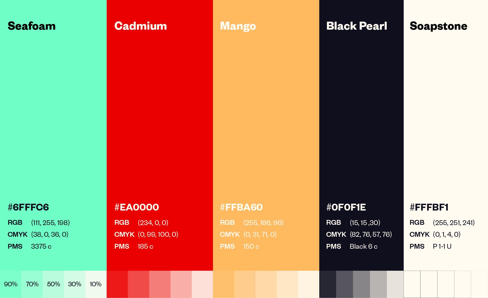
The main brand colors of Branded by Greenville utilizes a primary color scheme, with “Seafoam” being more green than pure blue. “Black Pearl” and “Soapstone” are neutral colors, neither being pure 100% black or white.
Color Usage
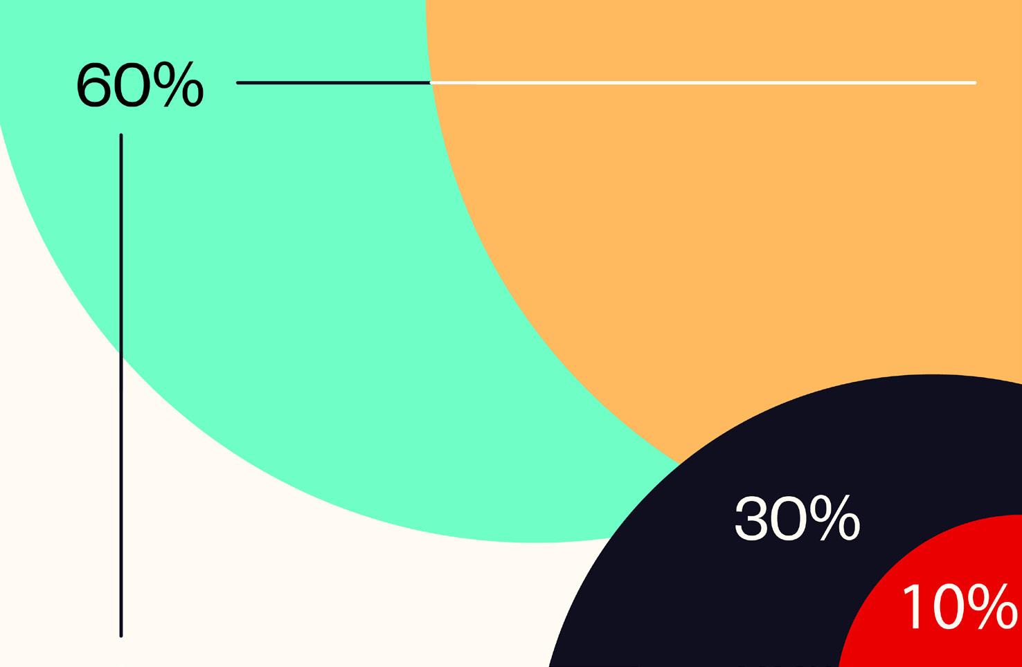
"Seafoam," “Mango,” and “Soapstone” are the primary colors used for Branded by Greenville. “Black Pearl” is a secondary color while “Cadmium” should be used as an accent color.
4.0 Typography
 Branded by Greenville
Designed by Kris Sowersby of the New Zealandbased Klim Type Foundry, Founder’s Grotesk is a grotesque sans-serif inspired by classic grotesques of the early 20th century.
20/30 18/30.6 16/27.2 14/23.8 12/20.4
H1: 65/84.5 H2: 50/65 H3: 30/39 H4: 25/32.5 H5: 20/26
Shape System
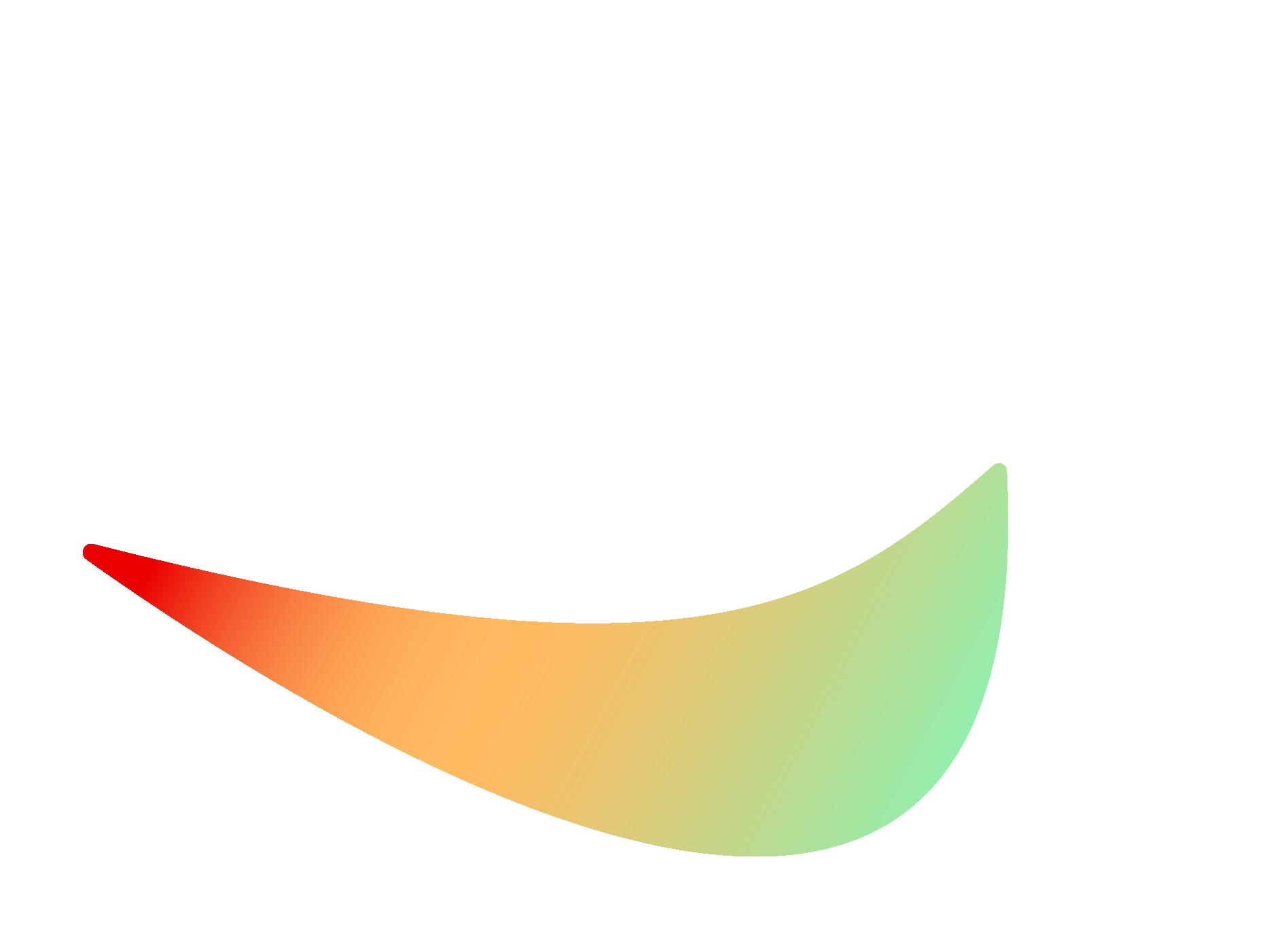
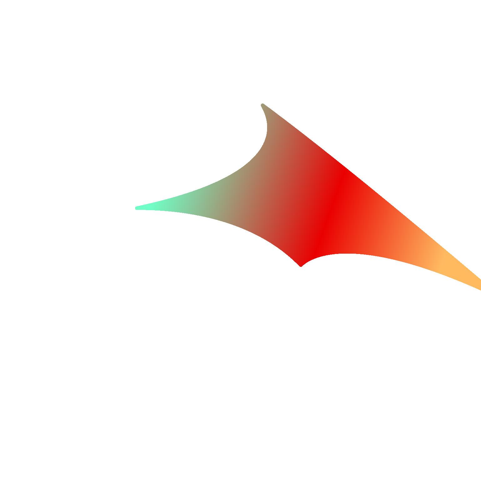
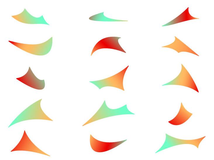
The Branded by Greenville shape system is also inspired by the Liberty Bridge, depicting the negative and positive shapes found within its form. Shapes are to be used as design elements that complement the composition of digital or printed media. All shapes are filled with gradients.
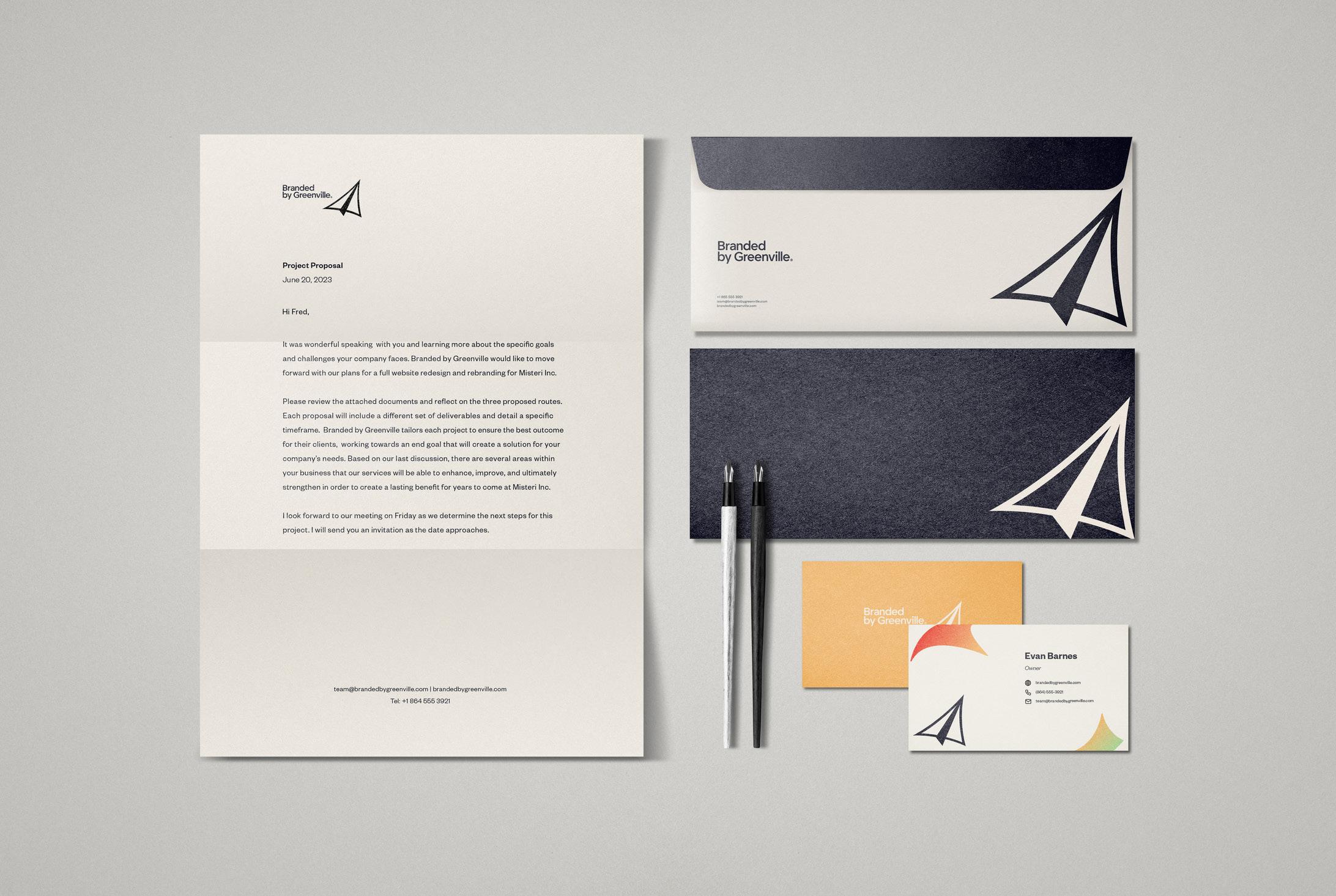
Stationary Kit
Signage
 Branded by Greenville
Brand Guidelines
