PROCESS WORK GR604 ALEX MOONEY
ROUND ONE INITIAL (VERY) ROUGH SKETCHES
ORIGINAL PLANNED PARENTHOOD SKETCHES
This was the original round of ROUGH sketches done to address the new branding of Planned Parenthood, while it kept the original name from 1916. These sketches addressed a combination of the various camps that were considered initially, primarily looking at using the "PP" initials of the brand, and looks that would define concepts such as onward, forward thinking, protection and shields, keeping doors open, preserving the idea of choice and options.
INITIAL PROCESS WORK - WRITING KEY WORDS Initial rough sketches - round one


This is where the start of changing the name began


Planned Parenthood initial ROUGH sketches - round one
ROUND TWO STARTING FROM SCRATCH WITH NEW NAME
In this module, we started from scratch, with renaming the brand from Planned Parenthood to something broader and more inclusive, now calling it "NASRF," The National Alliance of Sexual and Reproductive Freedom. While the acronym does not provide a cute or easily spoken word, the phrase is far more inclusive and representative of what the brand mission provides and for which is stands.
Within these directions we looked at three camps, which were Freedom, Education, and Progress.
Round Two: NASRF initial ROUGH sketches - round one for NASRF


Round Two: NASRF initial ROUGH sketches - round one for NASRF


Round Two: NASRF initial ROUGH sketches - round one for NASRF


ROUND THREE SOME REFINED SKETCHES AND SOME COMPUTER COMPS
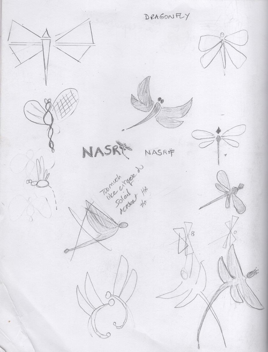
This was actually a combination of round two and round three, since we started fresh with a new name in round two, and had to have a new start. The new acronym, NASRF, and its mission, stands for the inclusion of wellness and agency for all bodies, regardless of any identification, such as age, gender identity, race, sexual preference, or other.
In this round we explored three main concepts: the dragonfly, which symbolizes change, transformation, adaptability, and self-realization; the hummbingbird, which stands for intelligence, beauty, devotion, and love. The hummingbird is also territorial, protecting its space, much like NASRF stands to protect bodies and rights. And lastly, the butterfly, which represents hope, rebirth, strength, and sustaining endurance.
Round Two: NASRF initial ROUGH sketches - round one for NASRF


Round Three: NASRF more sketches - ROUND TWO for NASRF
Narrowing it down: Bird or Butterfly would work best


Round Three: NASRF more sketches - ROUND TWO for NASRF
NASRF NATIONAL ALLIANCE FOR SEXUAL AND REPRODUCTIVE FREEDOM
SOME INITIAL TYPEFACE EXPERIMENTATION
ALLIANCE FOR SEXUAL AND REPRODUCTIVE FREEDOM
FOR SEXUAL AND REPRODUCTIVE FREEDOM
Round Three: NASRF more sketches - ROUND TWO for NASRF NASRF NATIONAL ALLIANCE FOR SEXUAL AND REPRODUCTIVE FREEDOM NASRF NATIONAL ALLIANCE FOR SEXUAL AND REPRODUCTIVE FREEDOM NASRF NATIONAL ALLIANCE FOR SEXUAL AND REPRODUCTIVE FREEDOM NASRF NATIONAL ALLIANCE FOR SEXUAL AND REPRODUCTIVE FREEDOM NASRF NASRF NATIONAL ALLIANCE FOR SEXUAL AND REPRODUCTIVE FREEDOM N A S R F NATIONAL ALLIANCE FOR SEXUAL AND REPRODUCTIVE FREEDOM NASRF NATIONAL ALLIANCE FOR SEXUAL AND REPRODUCTIVE FREEDOM NASRF NATIONAL ALLIANCE FOR SEXUAL AND REPRODUCTIVE FREEDOM NASRF NATIONAL ALLIANCE FOR SEXUAL AND REPRODUCTIVE FREEDOM NASRF NATIONAL ALLIANCE FOR SEXUAL AND REPRODUCTIVE FREEDOM NASRF NATIONAL ALLIANCE FOR SEXUAL AND REPRODUCTIVE FREEDOM
NATIONAL
NASRF NATIONAL
NASRF
ALLIANCE
ROUND FOUR NARROWING IT DOWN
In this module we narrowed the direction into one of two directions:
1. The free bird, representing freedom and choice
2. The butterfly, signifying hope, strength, rebirth, and endurance.
SKETCHES: LETTERS

Some experimentation with collaging the letters. Not the best, but added it to the process to show the thinking.

R4 REFINED SKETCHES: BUTTERFLY
Round Four: NASRF more sketches - ROUND THREE for NASRF
DIGITAL SKETCHES: BUTTERFLY
Last module the feedback was to stick to either butterfly or bird, some kind of winged creature would work best. These pages are ideas for butterflies, and on page 114 are bird concepts. These are the digital sketches.
I don't think the square ones at the bottom work as well as some of the others, but I included them as part of the process. They look too much like gifts or presents.
Round Four: NASRF more sketches - ROUND THREE for NASRF
Round Four: NASRF more sketches - ROUND THREE for NASRF
DIGITAL SKETCHES:
BUTTERFLY
R4 SKETCHES - BIRD

Round Four: NASRF more sketches - ROUND THREE for NASRF
R4 DIGITAL SKETCHES: BIRDS/ HUMMINGBIRDS
Hummingbirds are fiercely territorial, so they would be an accurate representation of preserving the territory of an organization. The other birds are more abstract iterations to mold together the concept of a bird along with either a check mark (which would indicate a positive vote for the company) or a forward arrow, indicating forward progression and flight at the same time.
Words representing birds:
Freedom
FREE
Liberated
Avian
Flight
Winged Release
Uncaged
Sovereign Agency
Empowered
Chirp
Hatch
Round Four: NASRF more sketches - ROUND THREE for NASRF
NASRF NASRF
NASRF NASRF NASRF NASRF NASRF Round Four: NASRF more sketches - ROUND THREE for NASRF
ROUND FIVE BACK TO SKETCHING
NARSF with Star (Estrella in Spanish) vs. Butterfly (Mariposa in Spanish)
NASRF

ROUND
Butterflies
Round Five: NASRF more sketches -
FOUR
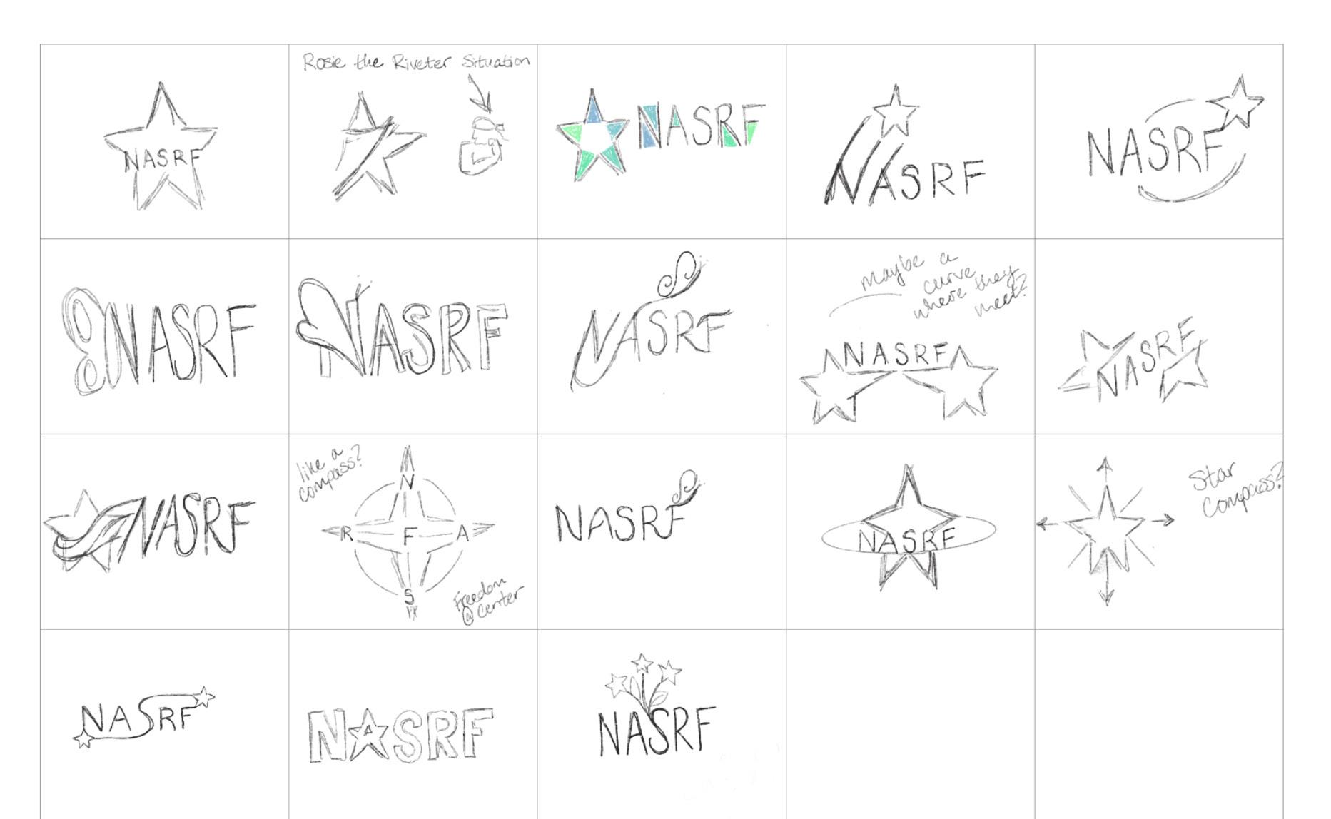

ROUND FOUR Stars
Round Five: NASRF more sketches -
Round Five: NASRF more sketches - ROUND FOUR Butterflies
ROUND SIX GETTING CLOSER
NARSF Butterfly (Mariposa in Spanish)
SOME MORE DIGITAL EXPERIMENTATION
NATIONAL ALLIANCE FOR SEXUAL AND REPRODUCTIVE FREEDOM
NATIONAL ALLIANCE FOR SEXUAL AND REPRODUCTIVE FREEDOM
NATIONAL ALLIANCE FOR SEXUAL AND REPRODUCTIVE FREEDOM
NATIONAL ALLIANCE FOR SEXUAL AND REPRODUCTIVE FREEDOM
NATIONAL ALLIANCE FOR SEXUAL AND REPRODUCTIVE FREEDOM
NATIONAL ALLIANCE FOR SEXUAL AND REPRODUCTIVE FREEDOM
NATIONAL ALLIANCE FOR SEXUAL AND REPRODUCTIVE FREEDOM
simplified butterfly - abstract triangle
REVISITING THE BIRD LOGO
some attempts at abstract birds
NATIONAL ALLIANCE FOR SEXUAL AND REPRODUCTIVE FREEDOM
NATIONAL ALLIANCE FOR SEXUAL AND REPRODUCTIVE FREEDOM
NATIONAL ALLIANCE FOR SEXUAL AND REPRODUCTIVE FREEDOM national alliance for sexual and reproductive freedom
NATIONAL ALLIANCE FOR SEXUAL AND REPRODUCTIVE FREEDOM
NATIONAL ALLIANCE FOR SEXUAL AND REPRODUCTIVE FREEDOM
Getting closer. The top left of this page has the most possibility and will be developed. The swoop has potential, but the butterfly looks too much like a bow, and the look is too frivolous for the brand, which has more gravitas
NATIONAL ALLIANCE FOR SEXUAL AND REPRODUCTIVE FREEDOM NATIONAL ALLIANCE FOR SEXUAL AND REPRODUCTIVE FREEDOM NATIONAL ALLIANCE FOR SEXUAL AND REPRODUCTIVE FREEDOM NATIONAL ALLIANCE FOR SEXUAL AND REPRODUCTIVE FREEDOM NaSrF NATIONAL ALLIANCE FOR SEXUAL AND REPRODUCTIVE FREEDOM
Too many periods. Pun intended.
NATIONAL ALLIANCE FOR SEXUAL AND REPRODUCTIVE FREEDOM
NATIONAL ALLIANCE FOR SEXUAL AND REPRODUCTIVE FREEDOM
NATIONAL ALLIANCE FOR SEXUAL AND REPRODUCTIVE FREEDOM
NATIONAL ALLIANCE FOR SEXUAL AND REPRODUCTIVE FREEDOM
NATIONAL ALLIANCE FOR SEXUAL AND REPRODUCTIVE FREEDOM
NATIONAL ALLIANCE FOR SEXUAL AND REPRODUCTIVE FREEDOM
NATIONAL ALLIANCE FOR SEXUAL AND REPRODUCTIVE FREEDOM
NATIONAL ALLIANCE FOR SEXUAL AND REPRODUCTIVE FREEDOM
More digital comps
Started with this butterfly. Too busy, too many colors, and too cluttered - won't reproduce well at small sizes
Three color but still too small and detailed to reproduce well at small sizes
Finalizing the logo
These were some experiments with the butterfly and typeface extenders, but in the end it was decided that a cleaner, more geometric mark was going to be more successful.
N ATIONAL ALLIANC E FOR SE XUAL AND REPRODUCTIVE F REEDOM
N ATIONAL ALLIANC E FOR SEX UAL AN D REPRODUCTIVE F REEDOM
N ATIONAL ALLIANC E FOR SE XUAL AND REPRODUCTIVE F REEDOM
N ATIONAL ALLIANC E FOR SE XUAL AND REPRODUCTIVE F REEDOM
N ATIONAL ALLIANC E FOR SE XUAL AND REPRODUCTIVE F REEDOM
nAsRf
Three slightly different versions, all simplified:
Looks too much like a spider
Too much like a bow
Dots are too small, won't work at small sizes
Too much like a bow
Best one. Center has three sections to define the body of the butterfly, and the three parts represent the three parts of the brand: Agency, Education, and Progress.
Some semi final layouts for the logo, wordmark, and signature.
AT IO NA L ALL I A N C E
OR SE X UA L A ND RE P R O DU C TIV E F R EE D O M
N AT IO NA L ALL I A N C E F OR SE X UA L A ND RE P R O DU C TIV E F R EE D O M N AT IO NA L ALL I A N C E F OR SE X UA L A ND RE P R O DU C TIV E F R EE D O M N
F
N AT IO NA L ALL I A N C E F OR SE X UA L A ND RE P R O DU C TIV E F R EE D O M
N AT IO NA L ALL I A N C E
F OR SE X UA L A ND
RE P R O DU C TIV E F R EE D O M
N AT IO NA L ALL I A N C E
F OR SE X UA L A ND
RE P R O DU C TIV E F R EE D O M
N AT IO NA L ALL I A N C E
F OR SE X UA L A ND
RE P R O DU C TIV E F R EE D O M
The butterfly represents a diverse population, intersectionality, and transformation. The line represents connecting the dots between needs, services and people. The dot represents the power of agency for the individual, separate, but connected to the whole.
However, the line is somewhat distracting, and the connection doesn't have to be quite so visible. The connection can be inferred, rather than obvious and given.
In experimenting with typefaces, the bolder, narrower typeface works better, and allows more butterfly to show, so that the butterfly doesn't disappear at small sizes.
DIGITAL SEMI FINALS
These work best. The top one is working the best with the clear, easy to see butterfly, and the narrower type which will work better in different usages.
SEMI FINALS
DIGITAL
FINAL LOGO
