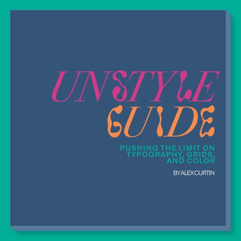

UN STY LE GU I D E
PUSHING THE LIMIT ON TYPOGRAPHY, GRIDS, AND COLOR BYALEXCURTIN
TYPOGRAPHY: MIX


LOGOS SHOULD USE A SINGLE, COHESIVE FONT PAIRING TO ESTABLISH BRAND IDENTITY AND CONSISTENCY. KERNING, LEADING, AND TRACKING SHOULD BE VISUALLY BALANCED.

NOT ENTIRELY TRUE!
While consistency is a safe and professional approach, thoughtful experimentation with typography can enhance brand storytelling, create distinction, and capture attention in a crowded marketplace.
The key is ensuring that any deviation from the rule serves a purpose and enhances, rather than disrupts, brand identity. 1
TYPOGRAPHY: MATCH
EXAMPLE:
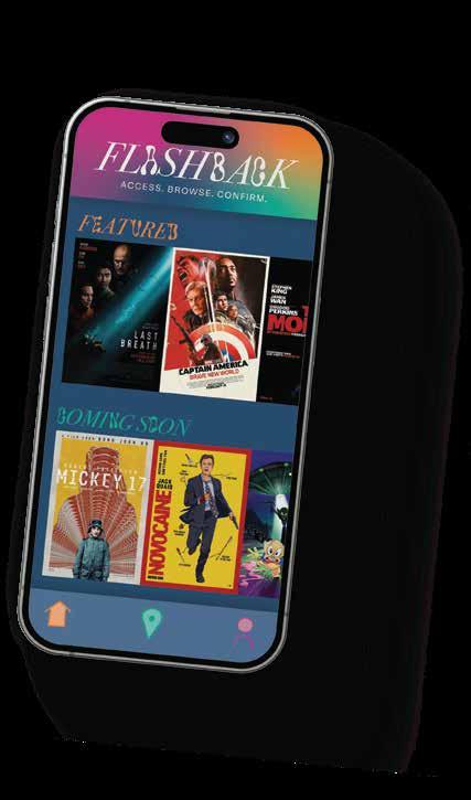
ACCESS. BROWSE. CONFIRM.
The primary logo for Flashback, a movie ticket app, combines an italicized serif with a decorative font. This compliments the experimental, funky aspects of Flashback’s brand. When designing, I wanted to push the boundaries through this type combination.
TYPOGRAPHY: FORMATTING

LEGIBILITY IS KING.
WHEN
SETTING BODY
2 IN SOME CASES...
TEXT,
DESIGNERS SHOULD ENSURE THAT THE SPACING IS CONSISTENT THROUGHOUT.

Designers intentionally vary kerning, leading, or tracking to inject personality or create emphasis in creative or editorial projects. In these cases, a slight departure from even spacing can evoke a unique mood or aesthetic that enhances the overall design...
even if it means sacrificing a bit of traditional legibility.
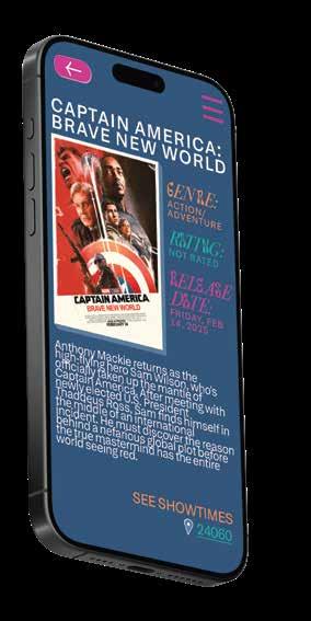
TYPOGRAPHY: FORMATTING
EXAMPLE:
The description for “Captain America: Brave New World” in the Flashback app challenges ideas of typical body text formatting. While it makes the text more difficult to read opposed to different formatting, it aligns with Flashback’s funky brand.
GRIDS PAGE


LAYOUTS SHOULD ADHERE TO A STRUCTURED GRID FOR CLARITY AND ORGANIZATION.

YES AND NO...
While grid structures offer a reliable framework for organizing content, treating them as rules can stop creative expression. Designers may intentionally break the grid to introduce asymmetry, create visual tension, or emphasize particular elements in a layout.
In doing so, they can achieve innovative and memorable designs that may resonate more deeply with an audience.
LAYOUT
EXAMPLE:
The home page for Flashback disregards a grid entirely. While there are alignments, margins, and centered design elements, there was no grid used in the designing of the home page. It is still possible to have a pleasing layout without the use of a formal grid.

COLOR CONTRAST SHOULD BE STRONG TO ENSURE READABILITY AND VISUAL IMPACT.

SORT OF...
In some design contexts, subtler contrasts can create a more nuanced or sophisticated atmosphere, allowing certain elements to recede and letting the overall mood take precedence.
Designers might intentionally use softer contrasts in editorial or artistic projects to evoke emotion, guide the viewer subtly, or challenge conventional visual hierarchies.

EXAMPLE:
In Flashback’s branding, the contrast of the color palette may be somewhat low, making it hard for the users to see. However, the colors flow together in a way that emulates Flashback’s identity.
R = 53, G = 85, B = 120 HEX: #3C5475
R = 96
G = 120
B = 153
HEX: #607899
R = 232
G = 145
B = 89
HEX: #F0B78E
R = 232, G = 145, B = 89 HEX: #E89159
R = 78, G = 173, B = 152
HEX: #4EAD98
R = 142
G = 202
B = 194
HEX: #8ECAC2
R = 197
G = 152
B = 177
HEX: #C598B1
R = 190, G = 71, B = 134
HEX: #BE4786