Portfolio
Graphic Design Alexandra Cathlen / alexandracathlen@gmail.com 2022

A graphic designer based in Jakarta, graduated from Multimedia Nusantara University. This book contains some of my design works, including social media designs, app banners, typography and illustrations. I enjoy my work and am happy to keep learning new things and exploring myself to create better output. It was an honor for me to let you see my design work.
Thank you!

Name
Alexandra Cathlen Sidhartaputri
Place, Date of Birth Bandung, 26th March 1997
Catholic Address
Jl. Hidup Baru Raya No. 22 Kebayoran Baru, Jakarta Selatan
Contact Phone: +62 8770 0294 254 Email: alexandracathen@gmail.com IG: @alexandracathlen_ LinkedIn: Alexandra Cathlen
2012-2015
SMA Sedes Sapientiae Bedono, Majoring in Natural Science
2015-2019
Universitas Multimedia Nusantara, Majoring in Visual Brand Design
2016 2017 2018 2019 2020 2021
Social Designee Visual Division
Social Designee (Revolution) Visual Coordinator
Earth Festival 2017 & 2018 Freelance Graphic Designer
Just Design Indonesia
Intern Graphic Designer (July - October 2018)
Asosiasi Guru Belajar Volunteer Graphic Designer Halodoc Intern Graphic Designer (August - November 2019)
Majoo Indonesia Graphic Designer (February 2020 - February 2022)
Warung Pintar Graphic Designer (April 2021 - July 2021)
Freelance Graphic Designer (July 2021 - September 2021)
AsetKu Graphic Designer (September 2021 - March 2022)
Warung Pintar
Freelance Graphic Designer (January 2022 - October 2022)
OneAset Graphic Designer (Marrch 2022 - present)
2022 2016 2018
Nusakarya Exhibition UMN Selected Artwork
Exam Exhibition UMN Branding

ABOUT
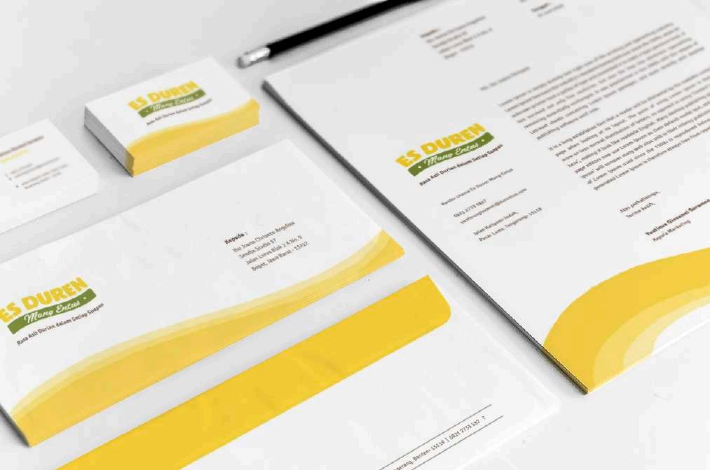
Es Duren Mang Entus, founded in 2013, is a UMKM that sells durian ice cream. Located in Kali Pasir Indah, Pasar Lama, Tangerang. Each branch of Es Duren Mang Entus has a different visual identity, and also the design composition looks packed. Therefore this brand requires a clear visual identity to build a brand that is more consistent and easy to identify.


The typeface has ‘fat’ and ‘rounded’ shapes to represent thick textured of the durian flesh.

The script “Mang Entus” typeface represents the Sundanese culture, that was Mang Entus origin region. Sunda has synonymous with its refined and friendly culture.
+
The curved shape represents the Cisadane river flow as an icon of Tangerang City. Curve direction from bottom to top represents all struggles of Mang Entus business from 7 years ago to the present.


Asosiasi Guru Belajar was founded in May 2019 and is a teacher’s community in Indonesia. This community aims to develop itself by sharing experiences and knowledge about education. Their activities are doing by online.
LOGO CONCEPT
-
We will grow together with a healthy mind and soul.
We have hopes and aspirations to advance the nation through education.
Teachers should have a wealth of knowledge and experience to develop for a better nation.
2019


ABOUT Revolution 2 - Chance for Change is an annual event organized by Social Designee Community to appreciate social activists. The visual design is created in red tones to represent the activist’s enthusiasm to continue their social activities for the people around them. To support, media designs created are print and digital publications, merchandise, print ads, event books, certificates, etc


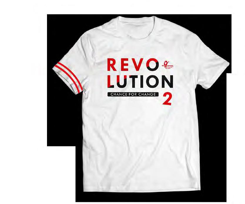

LOCATION Multimedia Nusantara University LOCATION 27-30 December 2017


ABOUT
Earth Festival is a vegan and vegetarian bazaar organized by Gading Youth and in collaboration with IVS (Indonesian Vegetarian Society). The theme of Earth Festival 2018 is “Respect Nature and Respect for All Forms of Life.” The visual design is created by depicting the beautiful and fertile nature of the archipelago.

LOCATION Living World Mall, Alam Sutera
LOCATION 17-20 November 2018


“Pengembaraan Shiloh” is the title of this storybook, is a medium/tool for teaching Christian kids in some regions.
This book tells a little sheep’s story who runs away from the flock. Shiloh wanted to go to the east mountainous, which he thought was more comfortable to live. Unfortunately, in the middle of his going, Shiloh got obstacles. He was afraid and lonely. Finally, soon the shepherd came to find Shiloh alone under the trees. Shiloh cried happily in the shepherd’s embrace. He was regretful for the mistake and thankful that God still protected him. From that moment, Shiloh will be grateful for anything he received in his life.

This storybook size is A4 consists of 20 pages. Font size is rather large to maintain the level of readability. A simple illustration to make readers easier to understand the book’s content.


PT Pangansari Utama Food Resources (PUFR) is a food manufacturing, distribution, and catering conglomerate operating in 33 Indonesian provinces since 1976. One of the marketing activities of PUPR is to produce routine calendars.
PUFR calendar 2018 theme is “Culinary Journey,” which tells a foodie who loves meat. He plans culinary trips to several areas, such as Jakarta, Surabaya, and Papua (based on the subsidiary location). In the cities he visited, he found meat products that he loved. Those are products produced by PUFR. The illustration is created in a surrealist style.


ABOUT
One of task I have done during my internship. Create a blog cover design with a vector style for the Halodoc website. Besides the vector style, there is also an image version that searched in the image stock site according to the desired topic.


ABOUT
One of the daily job desks of marketing is to publish social media content. Some social media pillar designs are created by combining images and illustrations. My responsibility is creating illustrations on images and layout several pillars design based on the template rules from art director.


This UI Illustration is for majoo application. Visual language for these illustrations is to give an expressive impression. It seems from the expression, pose and gestures of the characters in showing the activities.
The color combination gets from majoo feature color palette. Primary colors are purple, yellow, blue, and secondary colors are pink, green, orange. Dominate the primary colors to make consistency in color tone throughout the illustration and looks lighter. An element graphic (like bubble shapes) is applied to make visuals more fun and unrigid.


The majoopreneurs is a monthly digital magazine of majoo that has reached vol 06 until February 2021. My responsibility is to make a magazine cover. The cover concept is created in a surrealist style that highlights the meaning of the topic. The image is also combined with doodle illustrations, which is the characteristic of majoo’s design.


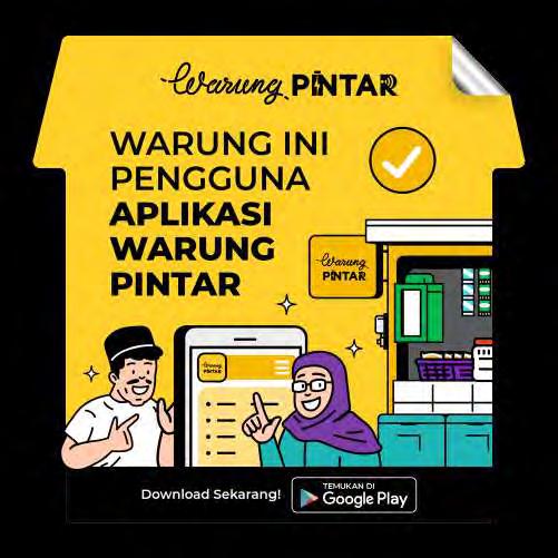
Warung Pintar has a variety of products and features that certainly require a visual identity or logo. To maintain consistency with the Warung Pintar brand, they need the same logo with the script typeface as the word Warung on the Warung Pintar logo. So a complete font is needed to make it easier to make the logo. I am responsible for creating this font from A to Z, uppercase, and lowercase.


Every month Warung Pintar holds retention campaigns, thematics, and special events such as seminars, workshops, and more. So they need a logo and key visuals in every campaign or event. I made several logos and key visuals according to the given theme.


There are regular posts on Warung Pintar’s social media, one of which is the #tipepelangganwarung meme content.
I created an illustration with a comic illustration style based on a mouse reference. @warungpintar_id


Those are some of the designs I made for banner needs in the Warung Pintar application which consist of in-app banners, pop-ups, and push notifications. Usually, this design is for promotion, campaigns, and product info.


To support marketing activities at Warung Pintar, good branding is needed to increase user awareness of Warung Pintar. One way is to build branding sales through the attributes they use. I am responsible for creating design mockups for several attributes, such as uniforms, t-shirts, lanyards, id cards, business cards, and other alternative designs, such as stickers, masks, and cap.


Grow at Warpin is a social media account that is part of the Warung Pintar employer branding. Usually requires a design to be published on Instagram, Medium, and LinkedIn. In this case, I’m in charge of creating a design that mostly uses a vector illustration style.


ABOUT Asetku Benefit’s social media accounts contain information about products, promos, and other updated information from AsetKu. I am responsible for designing social media, especially Instagram because it has a regular posting schedule.


AsetKu Benefit’s social media design dominates the orange color to increase brand awareness of AsetKu. The layout is also tidier to give AsetKu a more trustworthy and professional impression.


AsetKu application contains financial features that include educational articles and videos. These are some banners that I created to serve as cover images for several article categories. I also created a motion video asset with a simple vector style so that viewers can easily understand the information from the video.


ABOUT
These are some of the OneAset app banner designs I’ve created. The key visual of the designs combine photos with 3D icons and other supporting elements so that the design looks quite fun but still looks professional.


OneAset application has an NFT feature as a platform to make it easier for creators to sell and buy their NFT artworks. OneAset provides a collection of NFTs in the form of an image of Ruci, the mascot of OneAset.


I’m in charge of creating Ruci’s NFT with various categories, including Horror, Painting, Sports, Transportation, and Special Foods. Each category has 10 subcategories, each sub-category consisting of 5 NFT images which are distinguished by color, pose, gesture and the attributes used by Ruci.


OneAset application has a financial feature that contains information about finance and investment. This feature includes educational video content in the form of vector-style motion videos. Some of these videos are published on OneAset’s social media, such as Instagram, LinkedIn, and YouTube. Apart from educational videos, there are also paid exclusive videos intended for users who want to add insight in other fields.
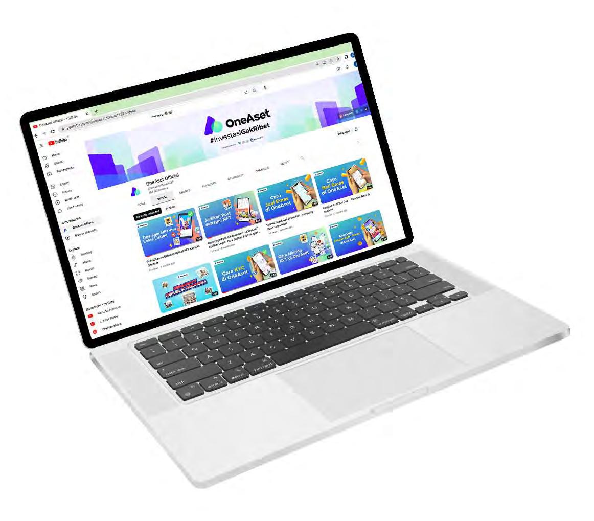
I’m in charge of creating the video assets based on an existing script and then compiling them into a storyboard.


