alessia cerruti designer portfolio


a.
b.
c.
d.
e.
f.
g.
i.
h.
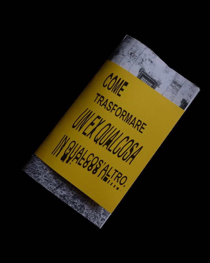
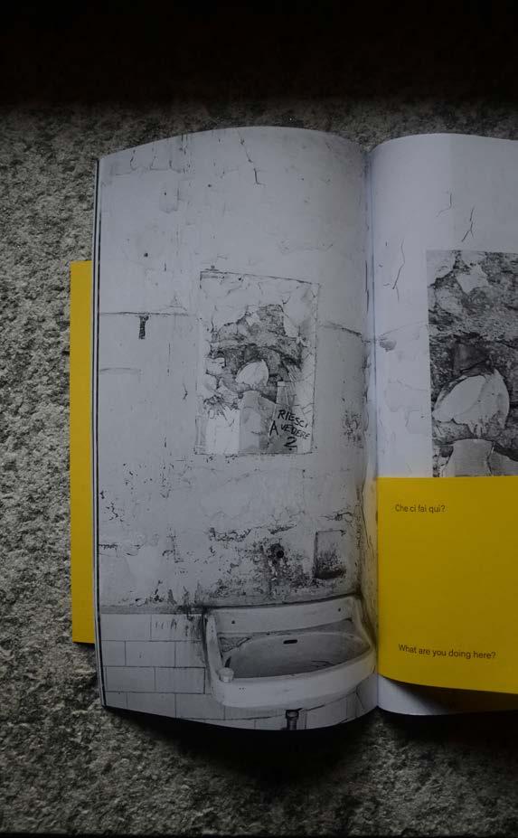
(1) GGG, visual research, 2021, on going (2) Come trasformare un ex qualcosa in qualcos'altro, editorial, fanzine, 2023
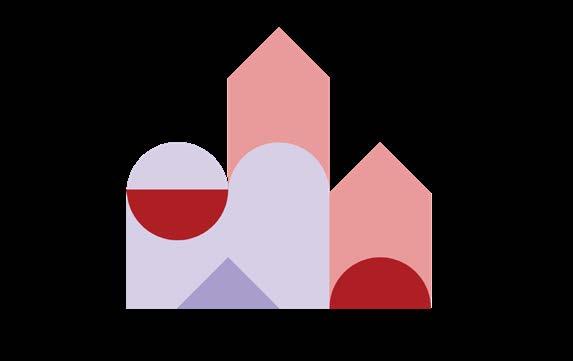
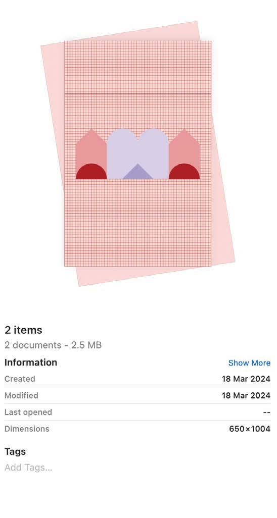
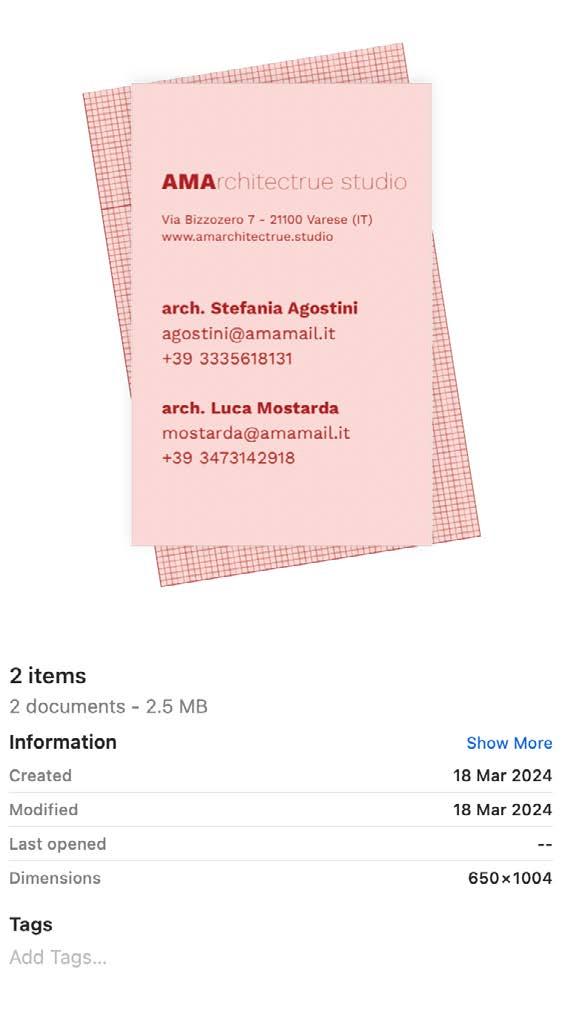
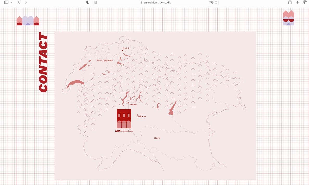
(3) AMA, visual identity, website, 2024
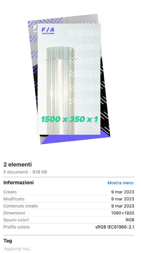
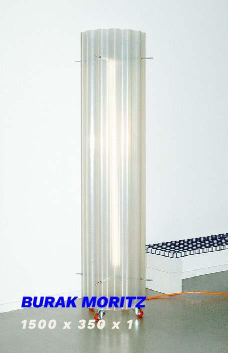
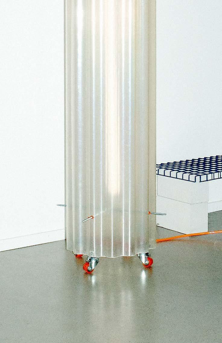
(4) LOST / FOUND, setting and visual identity, 2023
(5) The Caring Mile, research, editorial, 2022
(6) La permanenza dell'effimero, research, 2019
(7) To cut, locally, set design, research, 2024
(8) Per fare un vaso ci vuole un fiore, illustration, 2024
(9) ABSTR-CAT, card, 2023
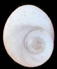
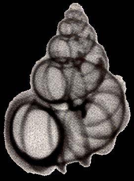
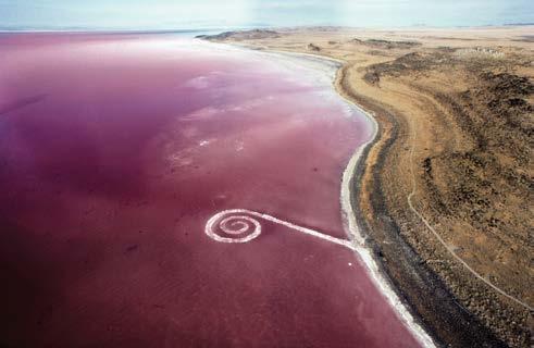
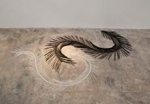
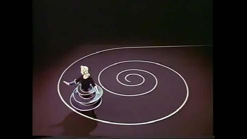
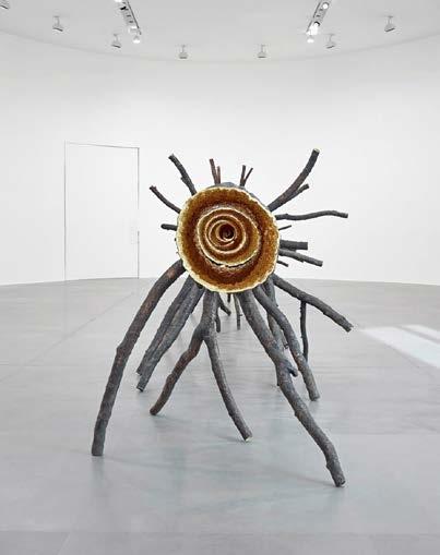
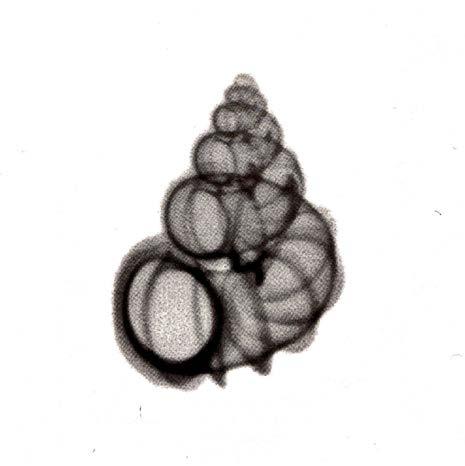
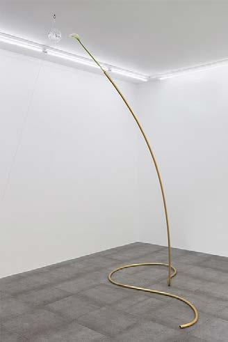
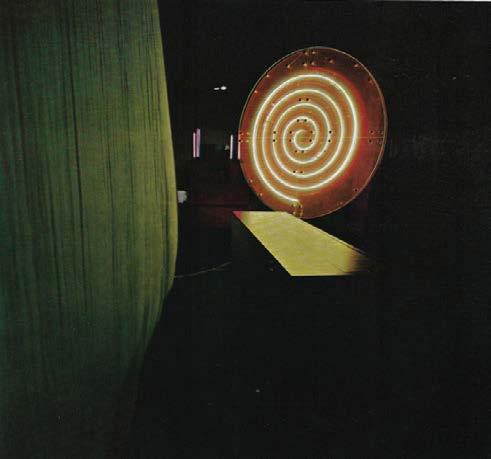
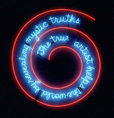
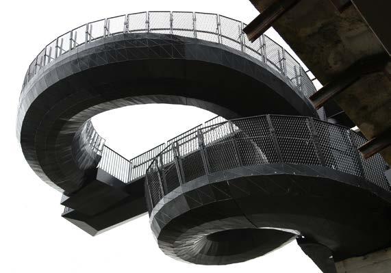
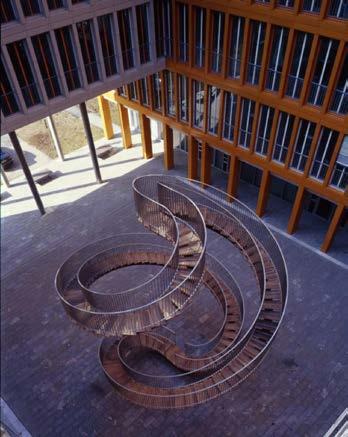
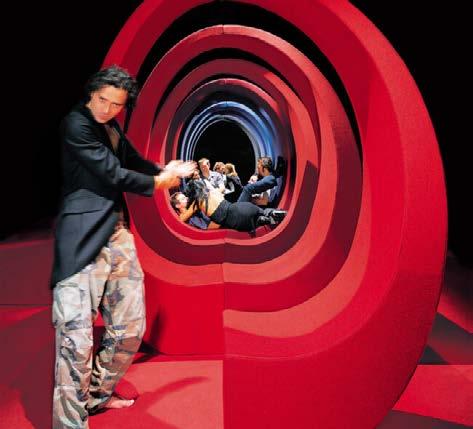
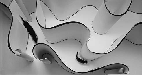
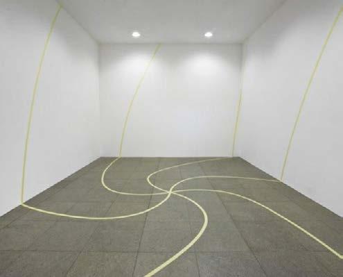
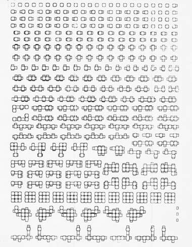
(1) GGG Gorghi Ghirigori Grovigli (2021, on going) is a collection of spirals, a visual research to justify a personal obsession, an expandable archive in constant evolution, a critical essay that relates some of the infinite declinations of the spiral elaborated and interpreted by Italian and international artists and designers through multiple actions, materials, techniques, and languages. A work started under the supervision of Beppe Finessi, now a personal project.

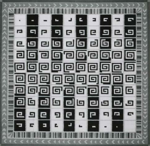
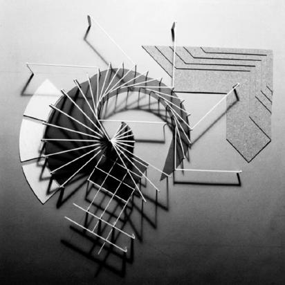
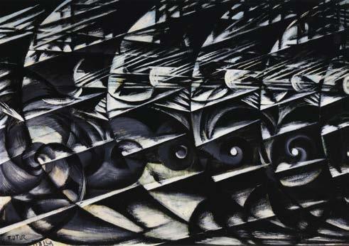
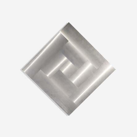
The spiral is infinitely variable: it is the most common form in the natural world, observable in air vortices, in shells and galaxies; it is a universal symbol motif in artistic and religious decorations; it is a geometric curve that grows progressively closer to or further away from its center.
Curves outlined according to precise numerical rules, squiggles resulting from free gestures and sinuous movements, primordial vortices in the making and expressive tangles of contrasting
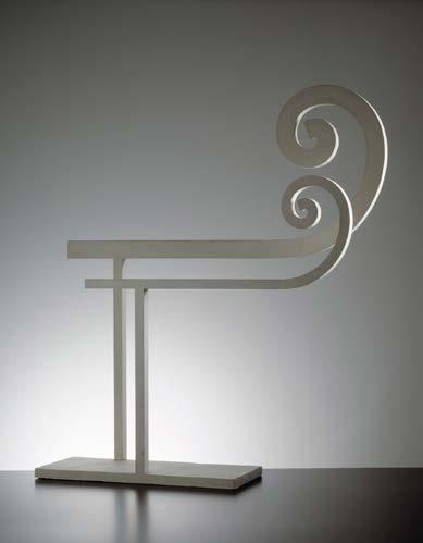
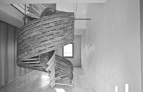
dualities. These are just some of the infinite declinations of the spiral that Italian and international artists and designers have interpreted and elaborated through multiple actions, materials, techniques and languages. What drives their works is the fascination, sometimes obsession, with such a mysterious symbol, recurring since the earliest artistic expressions.
2.
5.
7.
8.


23. Fabio Novembre, AND, 2002
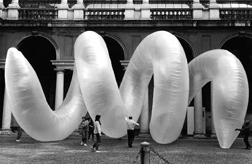
28. Olafur Eliasson, Umschreibung, 2004
25.
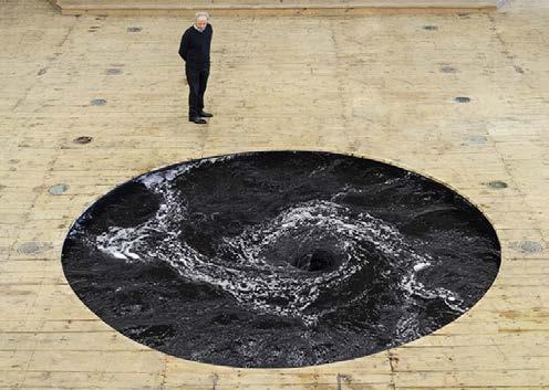
26. Anish Kapoor, Descension, 2015
27. Attilio Stocchi, Vortice, 2006-2013
29. Franco Mazzucchelli, Abbandoni, 1972
30. Antony Gormley, Clearing, 2004 - 2020
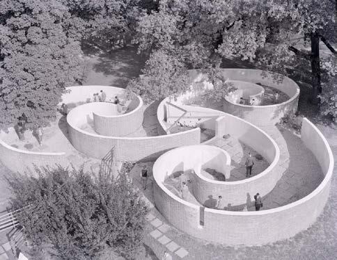
31. BBPR, Labirinto per ragazzi, 1954
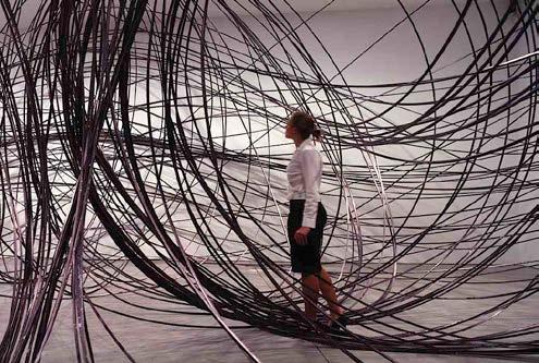
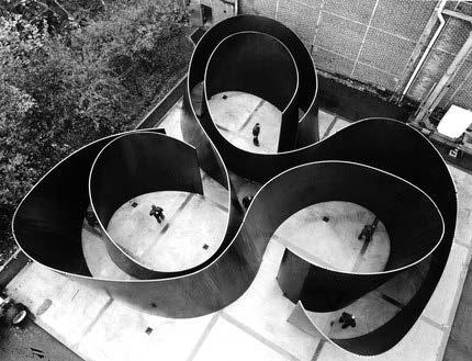
32. Richard Serra, Cycle, 2011
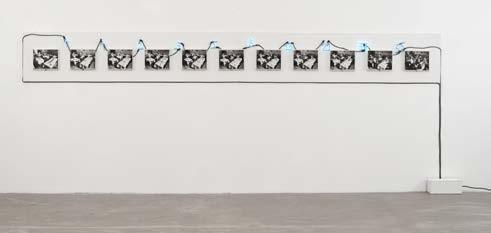
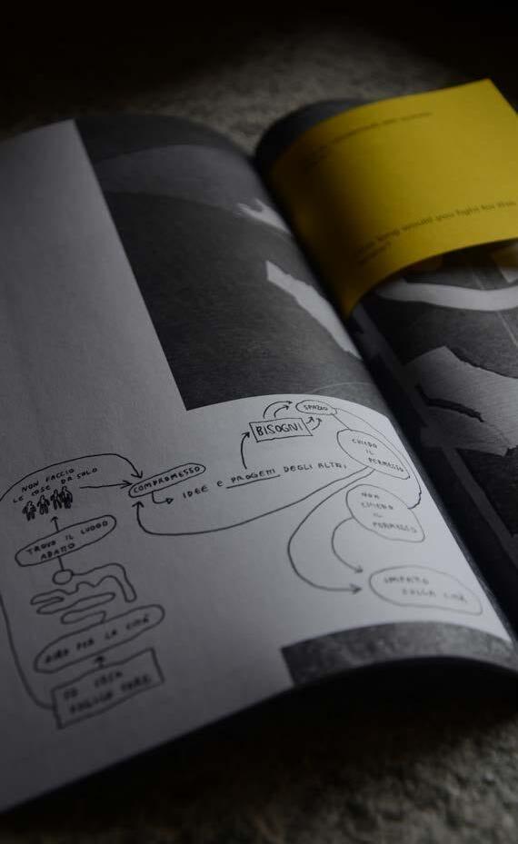
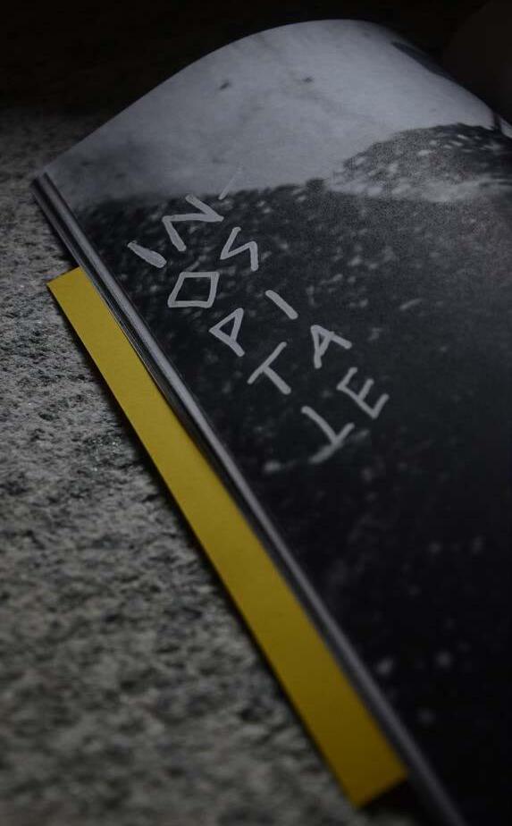
(2) Come trasformare un ex qualcosa in qualcos'altro (2023) collective fanzine developed in occasion of the Winter School Softwaring Engineering, organized by So.No. Societa Nomade and Maite in the space of Exsa ex-carcere Sant'Agata, Bergamo. Produced with Collettivo Franco and Kimia GodarzaniBakhtiari, Maren Lickert, Marielle Scharfenberg
70 pages
100 copies printed on office paper by photocopier
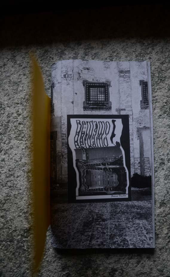
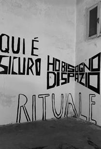
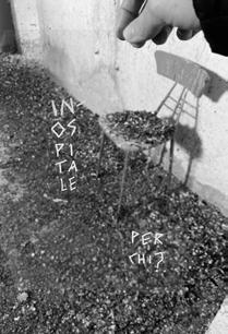
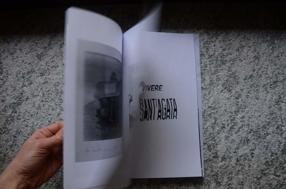
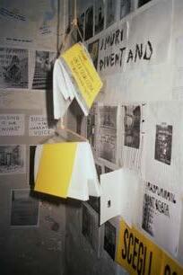
During 7 days shared with many people from different countries, we explored the former prison of Sant'Agata in Bergamo, a space with centuries of history. We lived inside a urban common, building a temporary self managed community. We transformed the hardware collectively by learning and imagining tools and devices able to make it hospitable and activate alternative presents.
This fanzine is the result of a spatial experiment, where, together with Collettivo Franco we created an editorial group, we collected many stories, we explored every nook and cranny on the walls, we wrote down questions, drew many thoughts, did something absurd and somehow pointless.
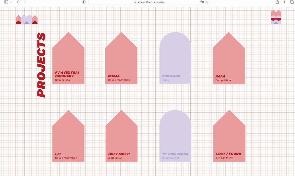
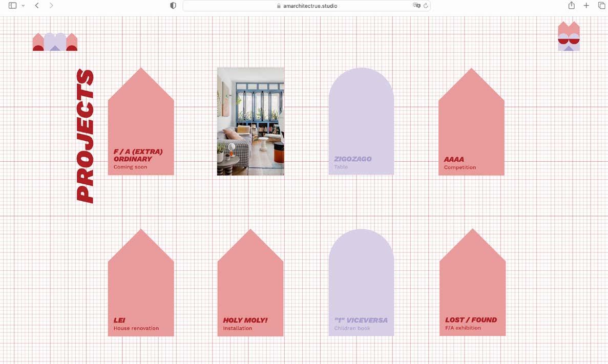
(3) AMA (2023) new visual identity for AMArchitectrue studio.
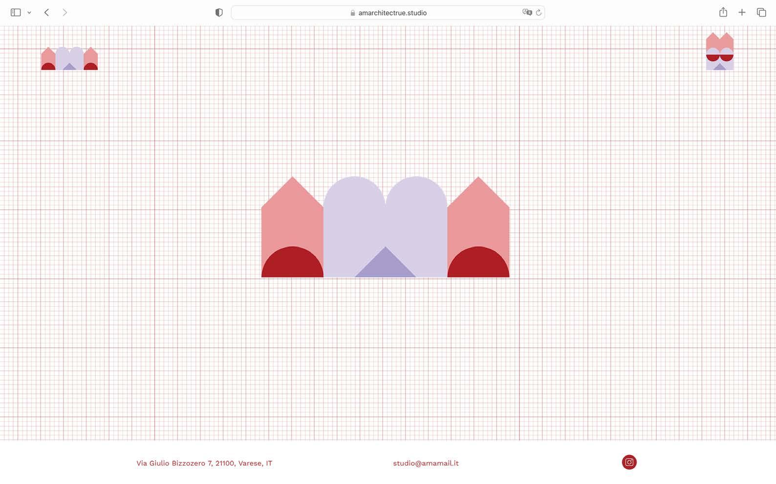
AMA is a young architectural duo, Stefania Agostini and Luca Mostarda. AMA addresses the practice on every nuance’s architecture bring on their tables, spanning in their production from the most various projects and scales, willing to pursue the cultural realm of the nowadays meaning of being an architect.
The new logo and website wants to express AMA creative design approach, playful method and unique language. Curiosity, genuine, irony are keywords in their work.
AMA does love simple geometry, colors and abacus of non structural elements which allow a certain freedom in conceiving new immersive environments: wires, paint, wheels, and mirrors. AMA is obsessed with the puns with which they name curious projects and handicrafts, whether it is a drawing, a model, a book, a layout or an entire house.


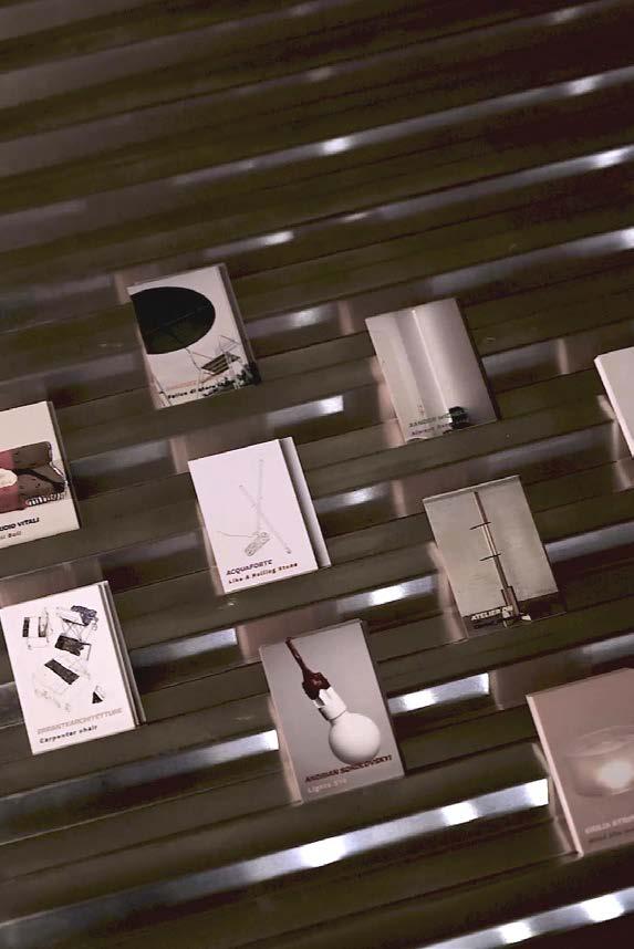
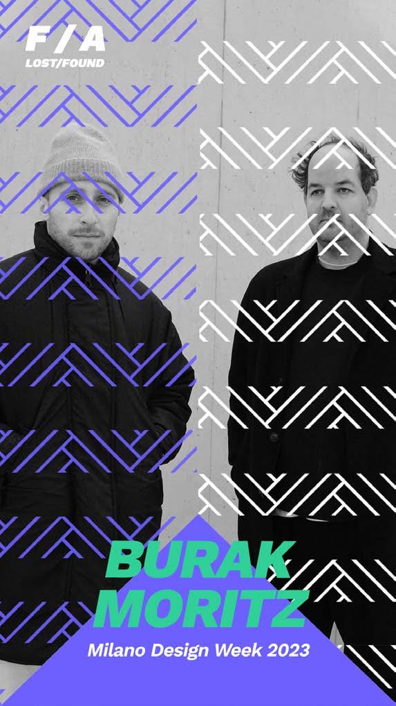
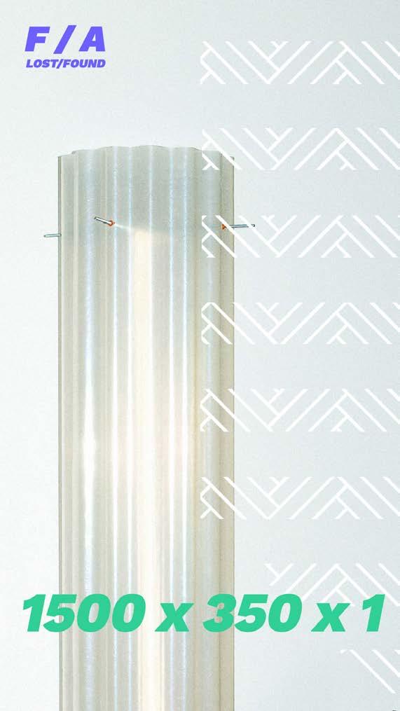
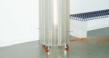
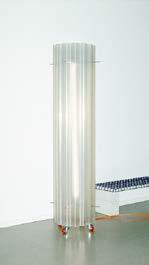
(4) LOST / FOUND (2023) is the fourth edition of F / A FakeAuthentic, an annual event which promotes and disseminates independent emerging design. Hosted at MAS Museo Arte e Scienza in occasion of Milano Design Week 23. Curated in collaboration with Luca and Stefania from AMArchitectrue.
Pictures by Helenio Barbetta
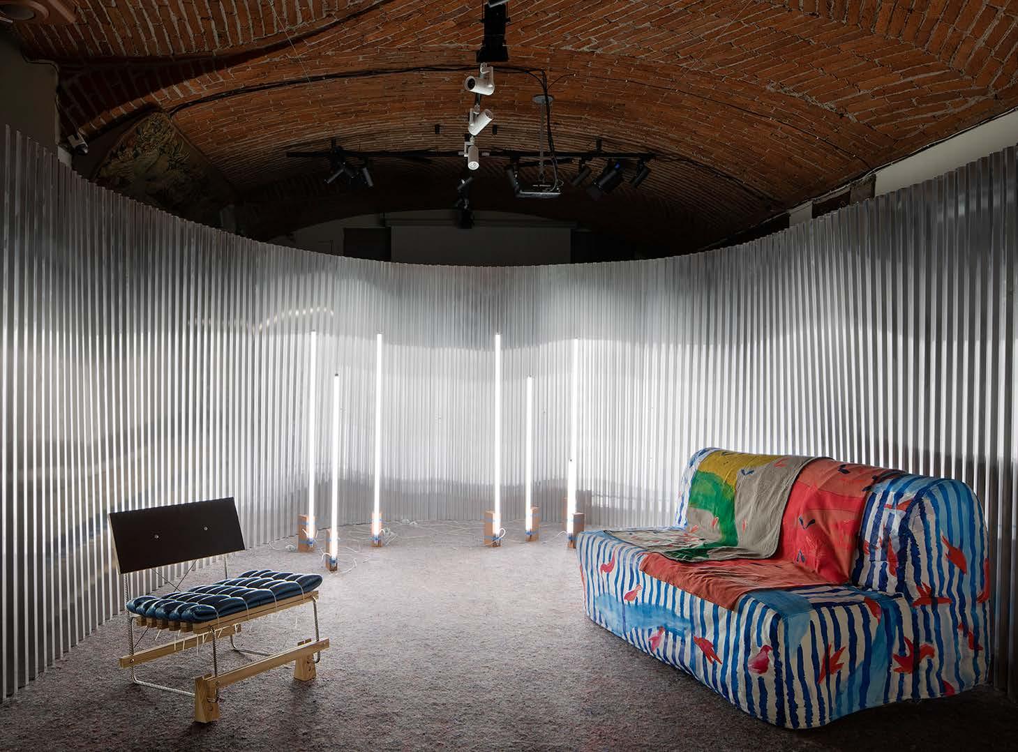
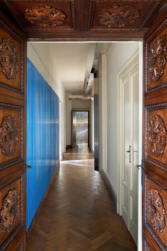
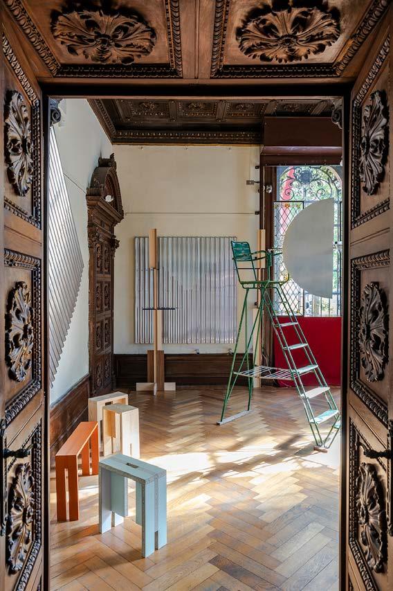
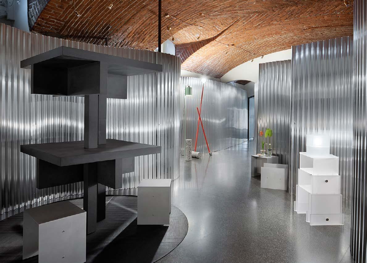
For the setting we focused on the contrast: the diptych between new and old, between solid and ephemeral. We wanted to play that game. A new fantastic sponsorship gave us the instruments to play with: corrugated aluminium sheet to make paintings, to make a boiserie, to wrap space around. Endless opportunities. The inner space of the MAS Museo took new layers. On the above floor the juxtaposition between the
classic interior and the industrial component played a beautiful duo. We used the plates as paintings, covering some areas with colored tape recalling that geometry of the rusticated wall we loved so much. On the lower floor the aluminum sheets became walls and space, creating a new interior, protecting the precious collection of the museum hidden behind the new skin, watchable by little holes we figged out from the metal plates.
14:30,Studio Acquaforte, Atelier Oh, Burak Moritz, Errante architetture, Pia Matthes, Matyas Molnar, Federico Muratori, Andrian Sokolovski, Sanchez Morgillo, Guillaume Slizewicz, Giulia Strippoli, Pascale Theodoly, Vacuum Atelier, Vg13 Architects, Xander Wilhelm, Stefan Wulser

Visual identity developed for the event, including updated logo, social media materials and printed cards. The graphic geometries takes inspirations from the architectural elements of the MAS Museo flooring and F / A logo, while the bright and vivid colours contrast with the context.

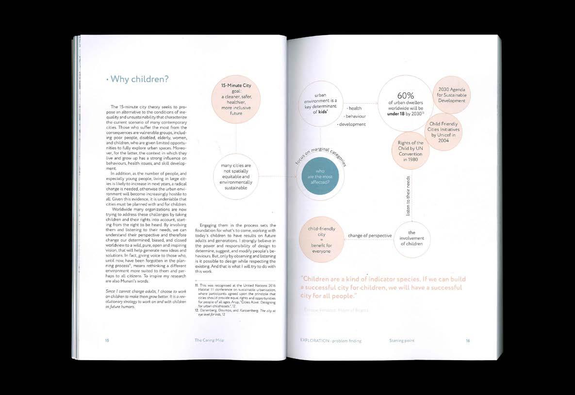
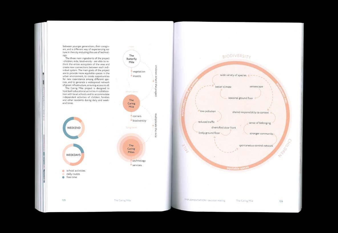
(5) The Caring Mile (2022) applied research on childhood and urban environment.
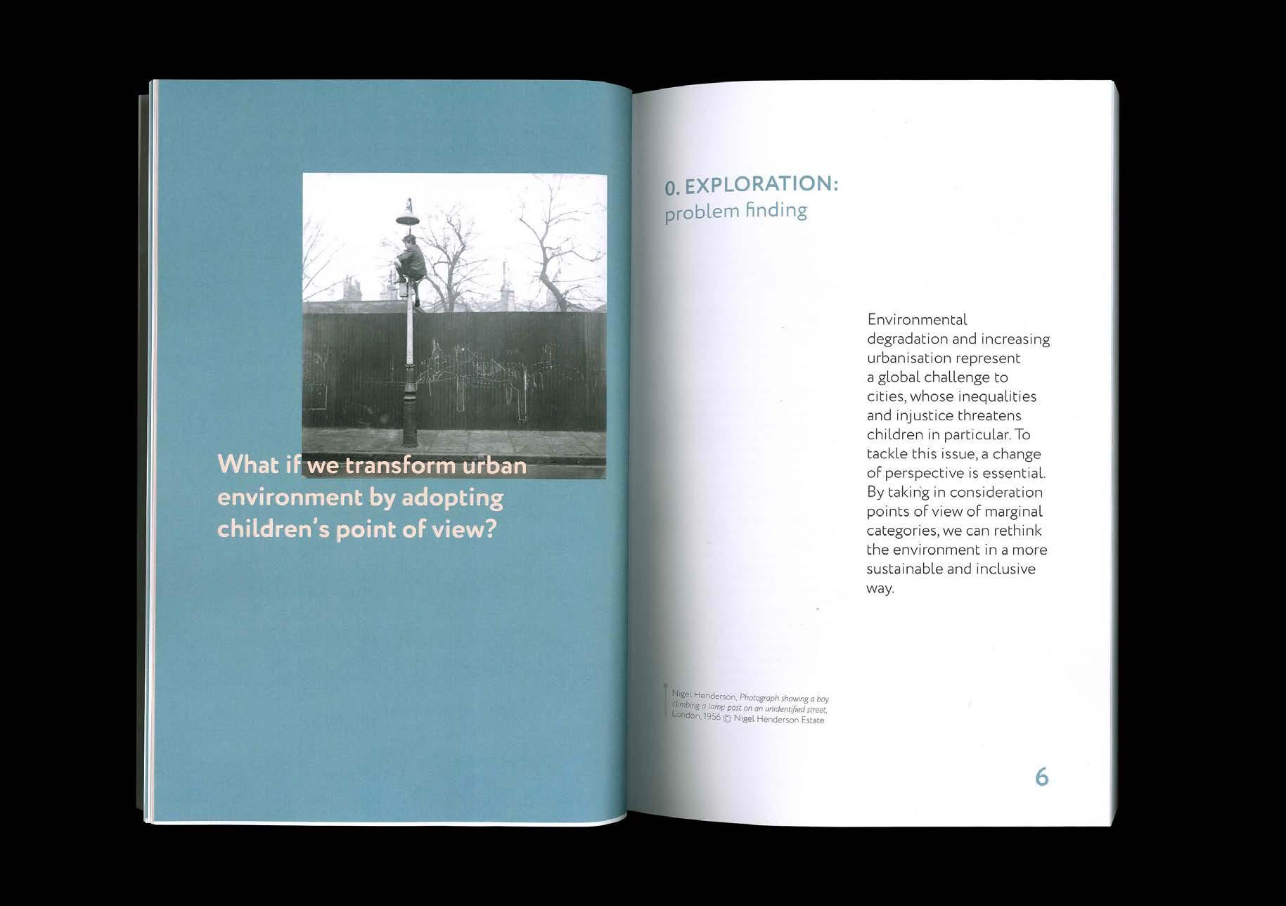
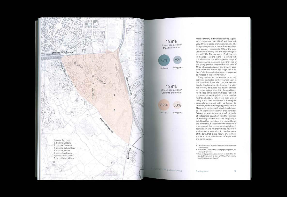
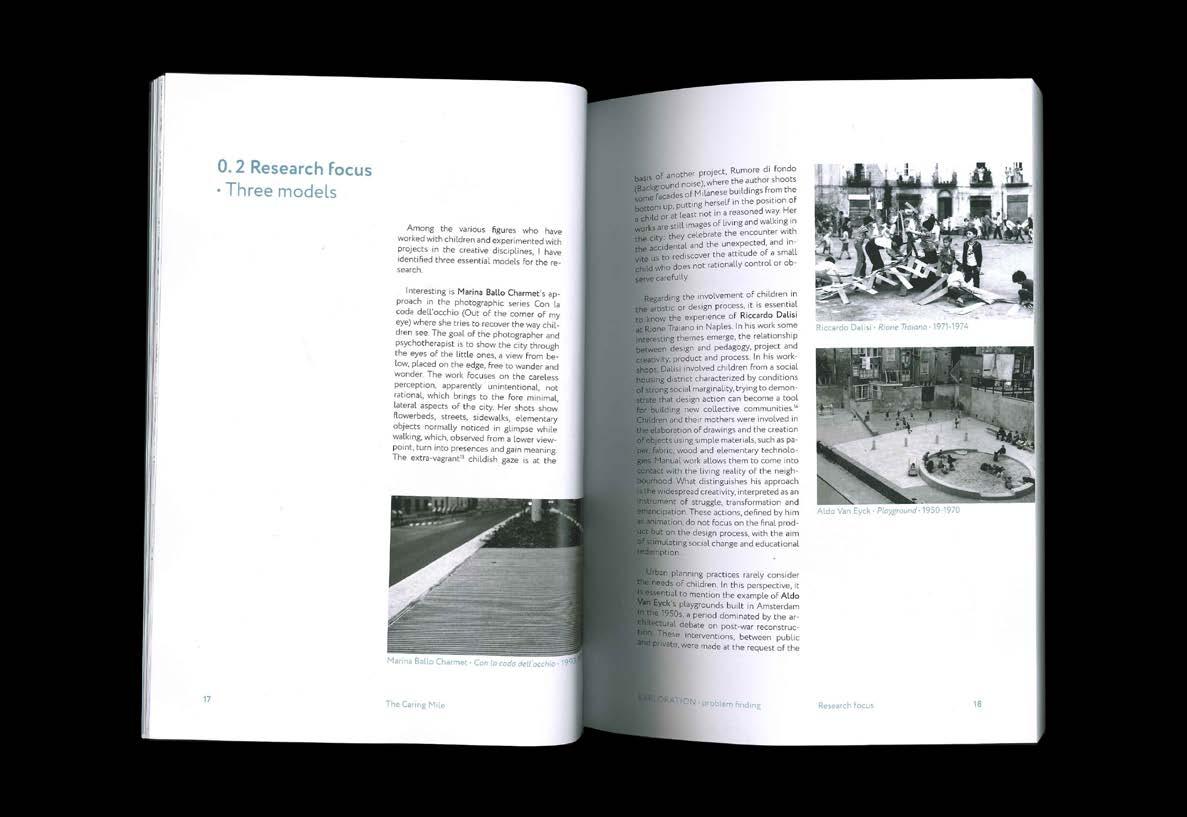
Over the last century, urban environment has been designed following the white-adult man paradigm and a car-centric approach, without considering other marginal conditions. This caused an increase in traffic, pollution and, as a result, a weakening of the social system, leading to hostile and out-ofscale cities that are increasingly disconnected from nature.
This issue affects mainly children, whose freedom to experience the public realm and their right to roam
has been reduced or almost nullified, with several consequences on their health, behaviours and growth.
The research explores this current worldwide condition in order to find a possible solution able to disrupt the current paradigm and give another meaning to the urbanscape. In particualr, it proposes a site-specific experimental intervention for Lodi Corvetto, a densely populated district located in the south-east of Milano.
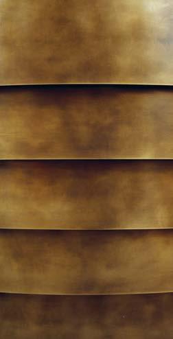
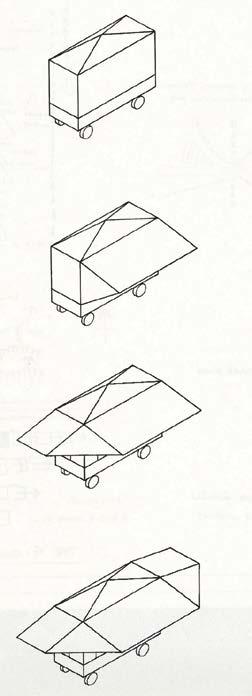
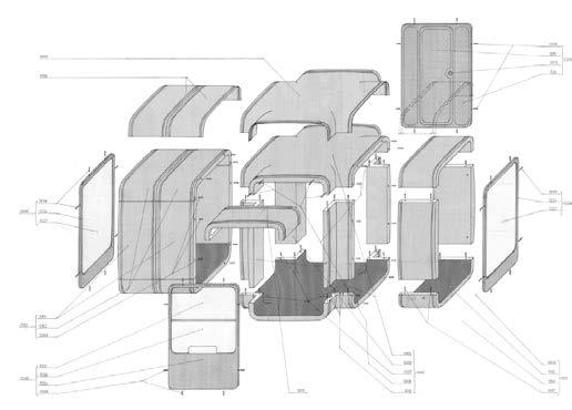
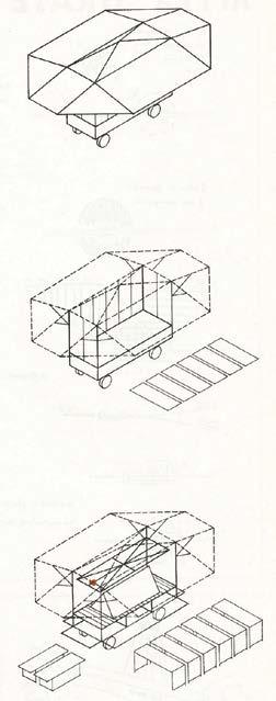
(6) La permanenza dell'effimero (2019) is a research investigating the design of the market display in Europe between 1919 and 2019.
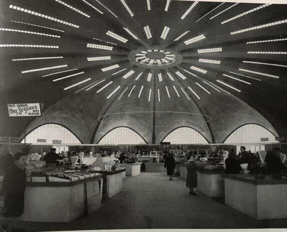
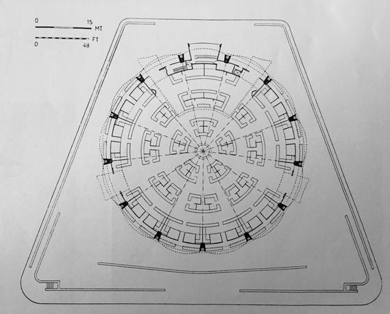
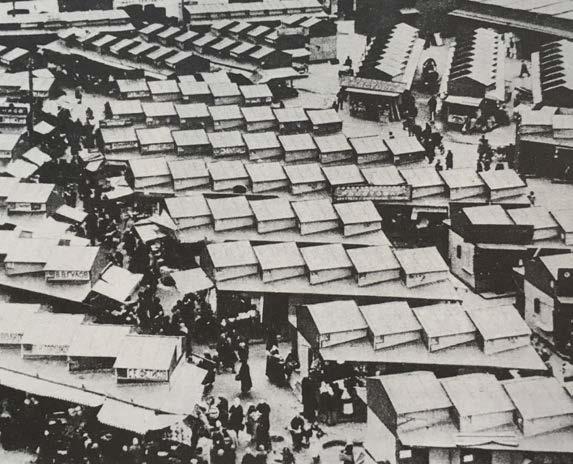
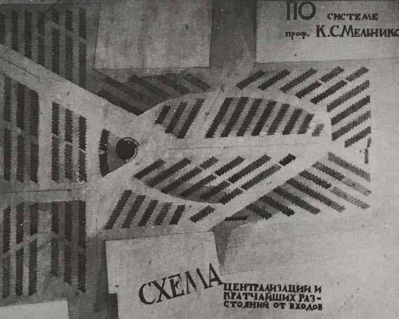
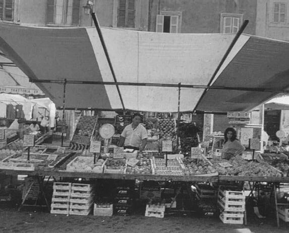
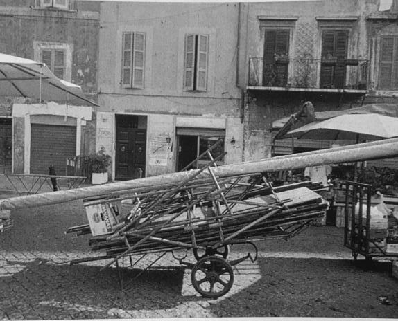
The permanence of ephemerality. Sales exhibition structures in markets: a complex and changing presence. 1900-2019. proposes an analysis of a little investigated sector and often considered of less interest by the world of design. The market has always represented as a dense, chaotic and changing space that contributes to the design and history of cities.
The image of the market is characterized by a set of intangible features such as noises, smells, scents and material elements: the architectural form, the spatial context and sales structures. Precisely the latter, with colors, materials and volume have the greatest impact and determine the final quality.
After a brief introduction on the characteristics of the market and on the three types of space it can occupy - outdoor, sheltered and covered -, the role of these structures was explored.
They were categorized according to the temporary nature of the occupation of the sales space into: boxes, kiosks and permanent displays, temporary dismountable or mobile and fixed structures; of these, 19 cases designed by professionals were shown. The field of research has been restricted to the European panorama where the phenomenon shares similar characteristics and has undergone a common evolution.
Stand assembled and disassembled, Italy Interior and plan of the covered market in Royan, France Sukharveka Moscow open air Market and plan
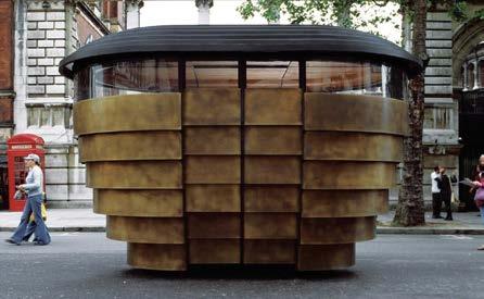
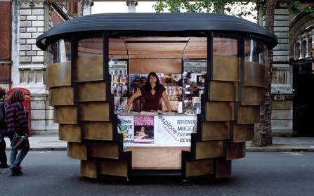
Paper House
Heatherwick studio
Londra, Inghilterra
2002
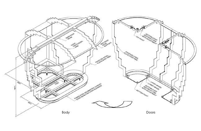
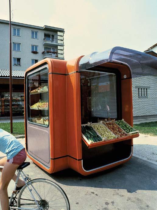
Kiosk K67
Saša J. Mächtig Lubiana, Slovenia
1967,1970
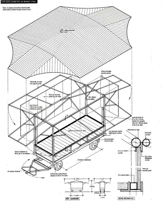
Demountable Cedric Price Londra, Inghilterra
1987
(7) To cut, locally (2024) is a visual narration on the act of cutting. Research, set design and photography developed with Chiara Cerruti.
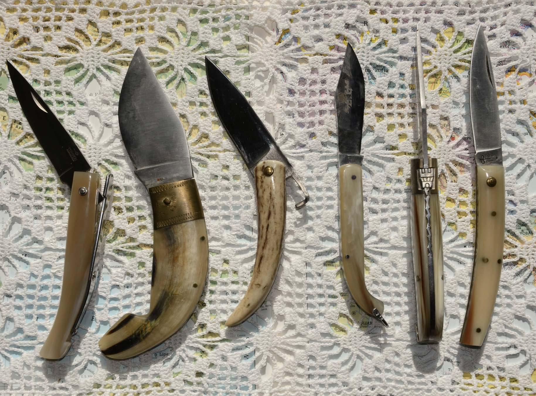
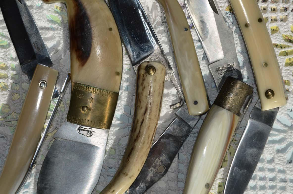

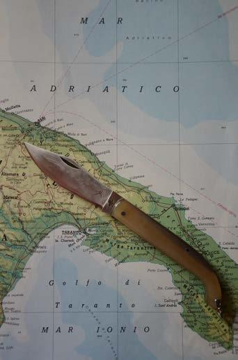
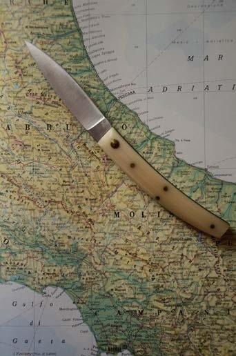
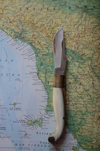
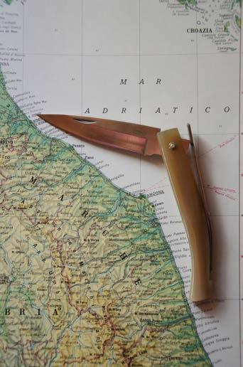
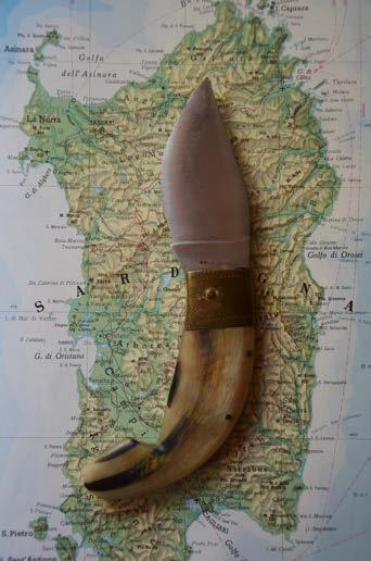
To sharp, to slice, to break, to carve, to dig, to shred, to cut. Which object can perform all these actions? A knife. Imagine you were going on a hike, nowadays you would probably opt for a Swiss Army knife. Well, Serramanico knife would have been a common choice some time ago. A switchblade is a particular type of knife widespread in rural and pastoral civilisations of 18th century Italy. Its popularity was due to its folding blade which allowed to have a safer and more compact tool for travelling, compared to the fixed blade model. Whether it was bread, pecorino cheese or salame, a branch or a rope, the knife responded to the different shades of cutting and it still does.
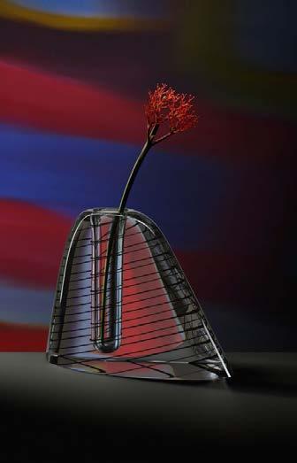
(8) Per fare un vaso ci vuole un fiore (2024) illustration 157x22 cm, 3 colours.