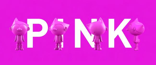
PORTFOLIO
ALAIN SORA SMADJA
GRAPHIC DESIGN / DIGITAL ART
2020 - 2024
™

GRAPHIC DESIGN / DIGITAL ART
alainsora.smadja@gmail.com
Alain Sora Smadja Linkedin: Behance
French/Japanese bicultural individual with unique blend of cultural perspectives and visions of the world incorporated in my design work. My upbringing in two distinct cultures fuels my creative thinking, allowing me to merge diverse aesthetic and conceptual frameworks. Lifelong self-directed learner with a robust intellectual and cultural curiosity, constantly seeking new knowledge and opportunities that enhance my work. Available from September 2024.
Amazon
University
Bachelor of Design
Independent Japan-based Fashion brand
Re-Branding
Re-Branding Startegy
Refreshed Visual Identity
Graphics for Clothing Line
Lycée Internationale de St Germain-en-Laye
Baccalaureate (OIB)
Japanese Section
14.22/20
The Mission
Refresh the identity of an existing High Street brand.
Tools:
• Ad obe Illustrator
• Photoshop
• Blender
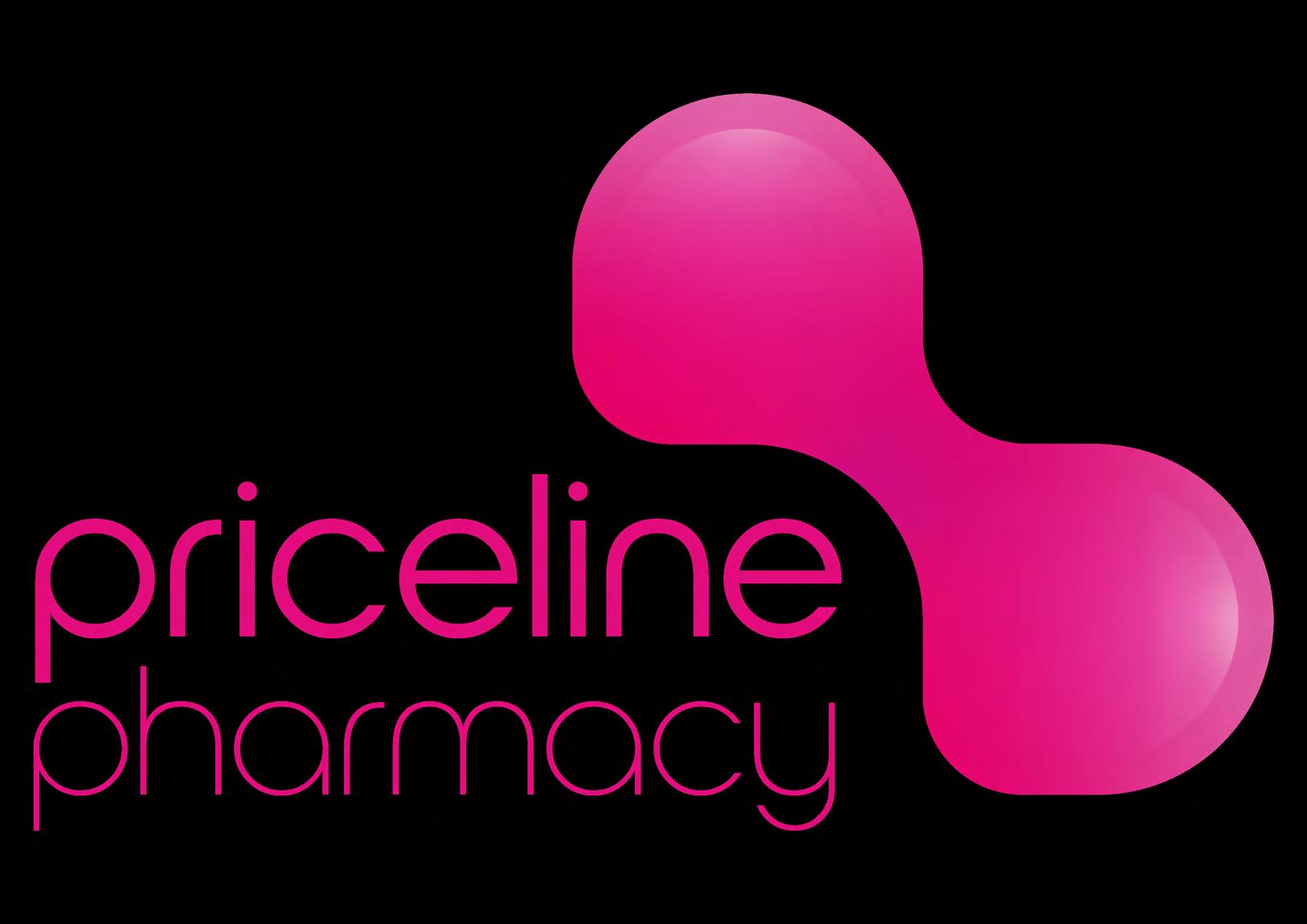
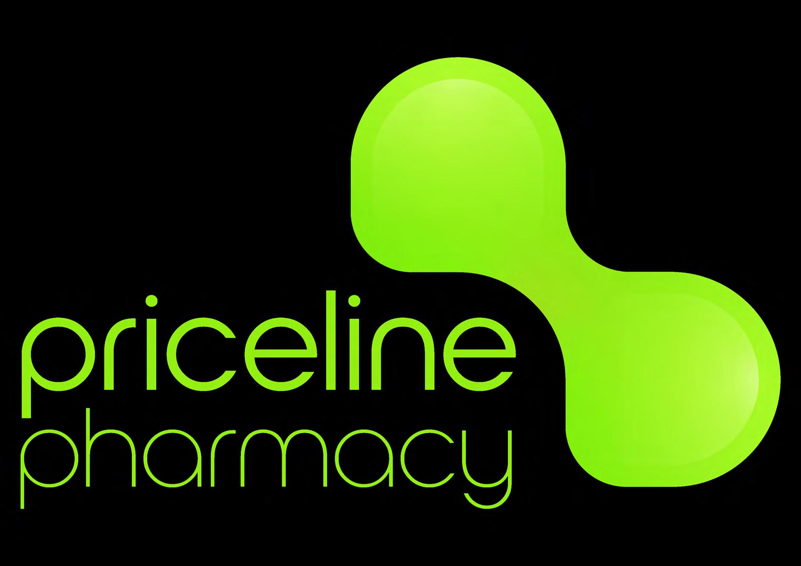
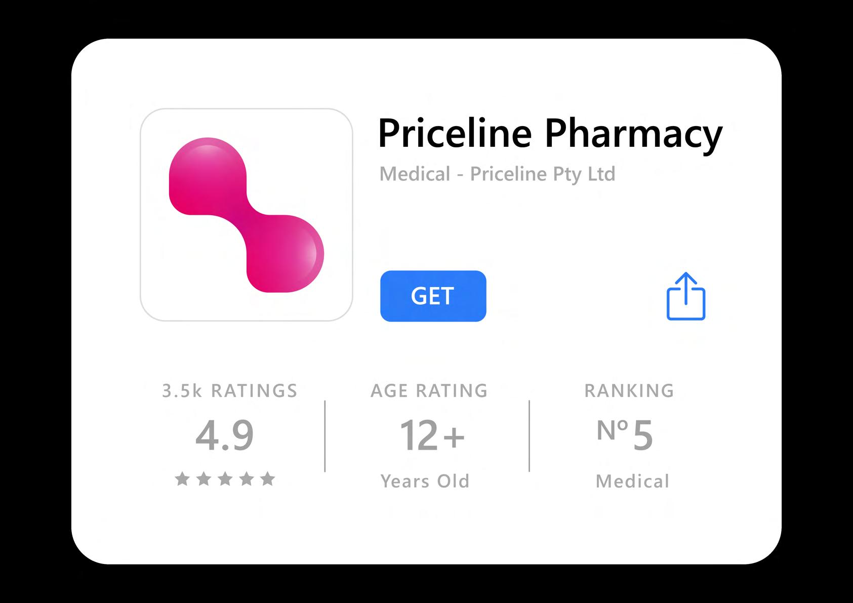
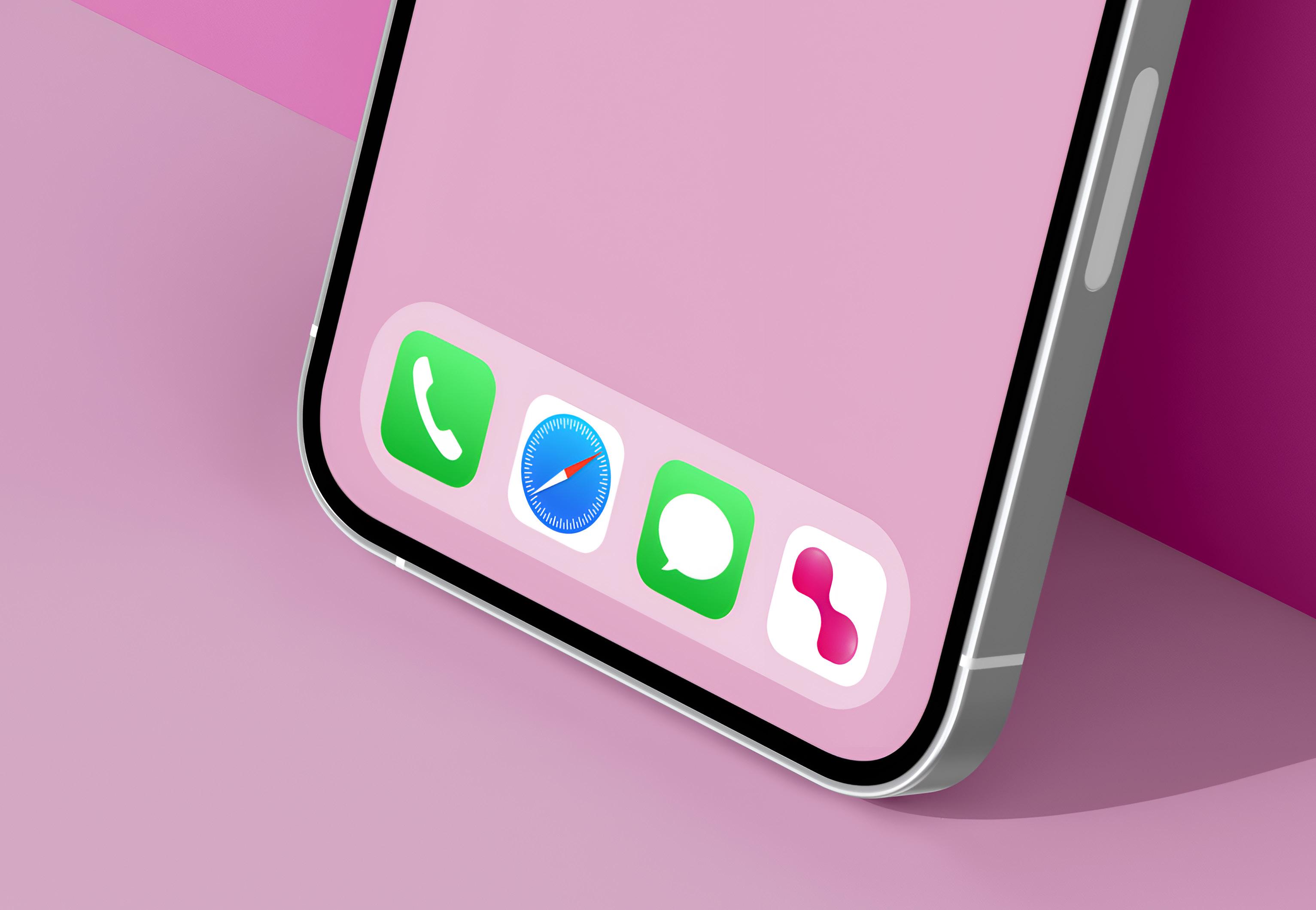
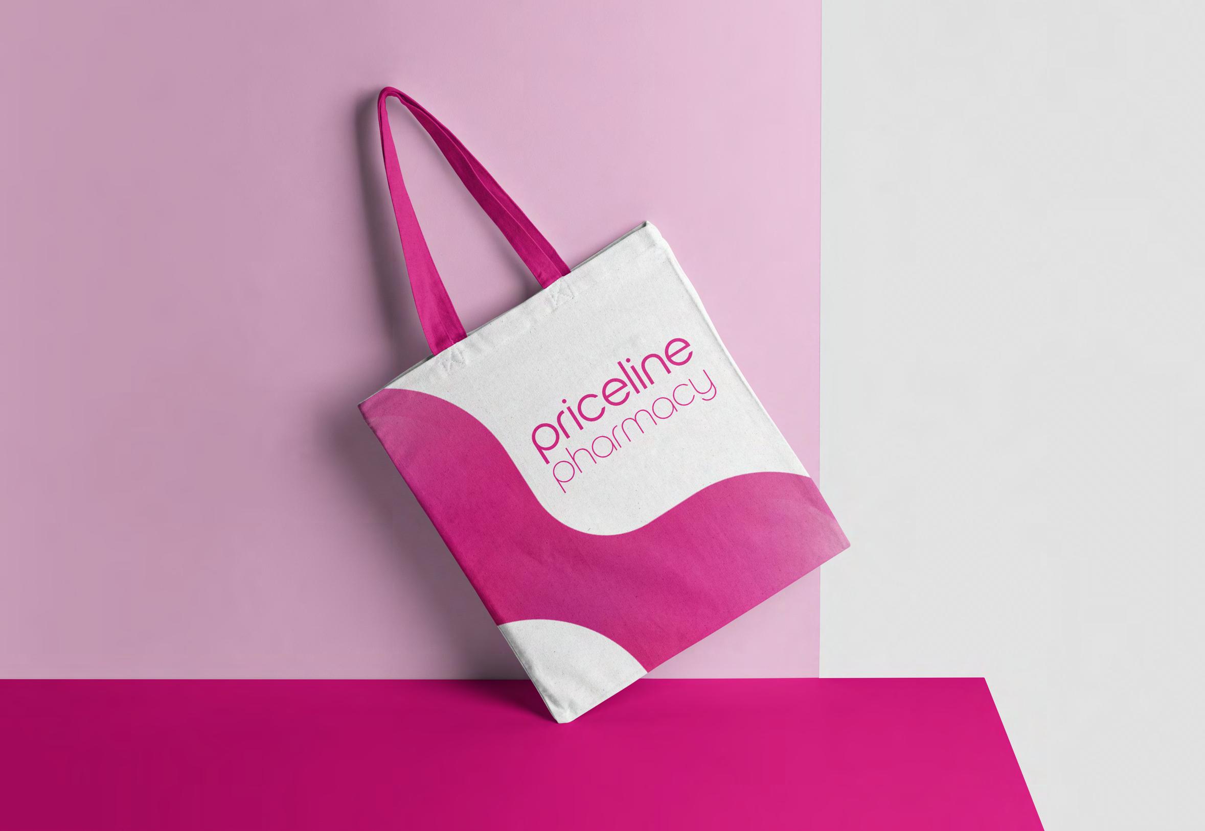
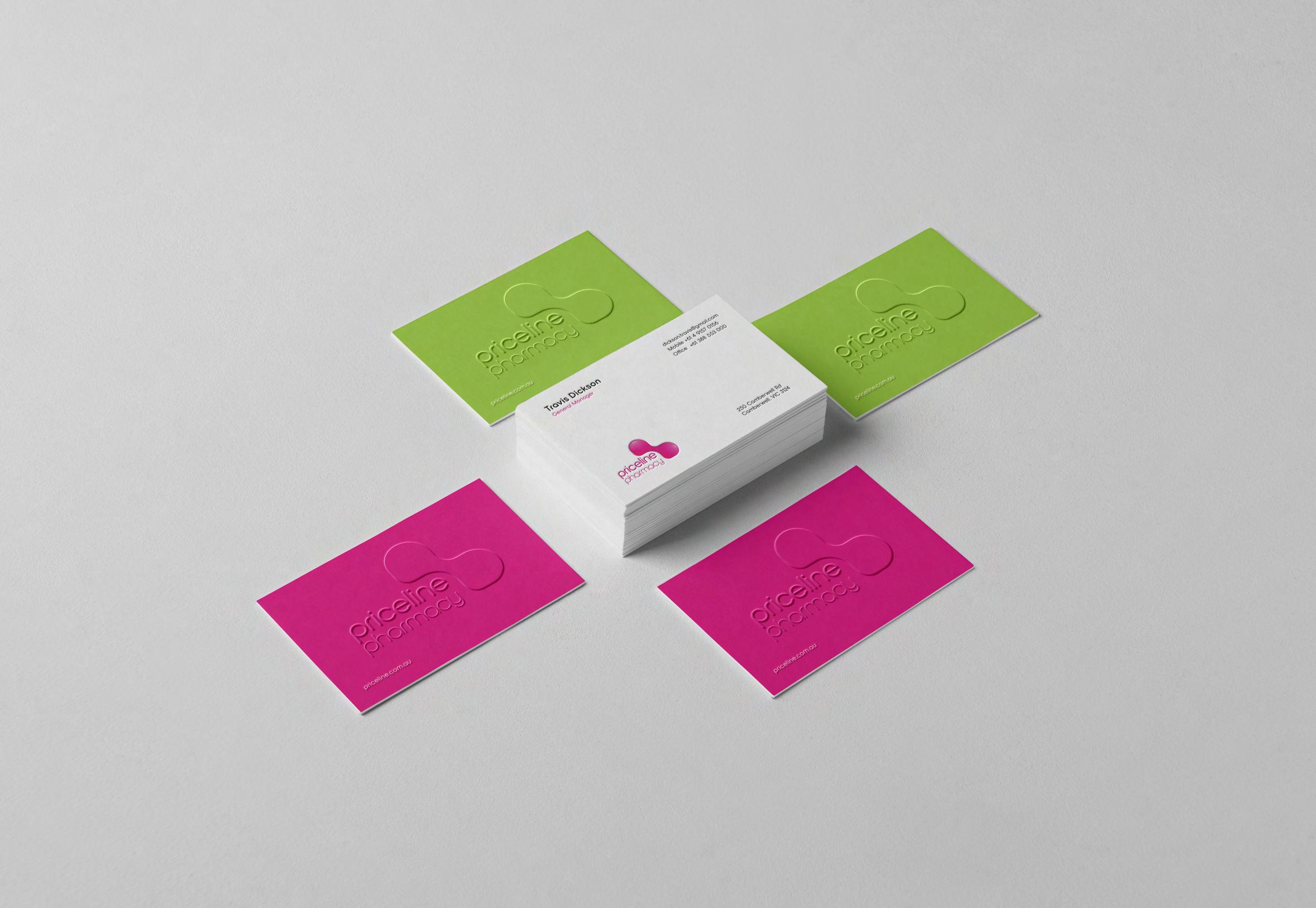
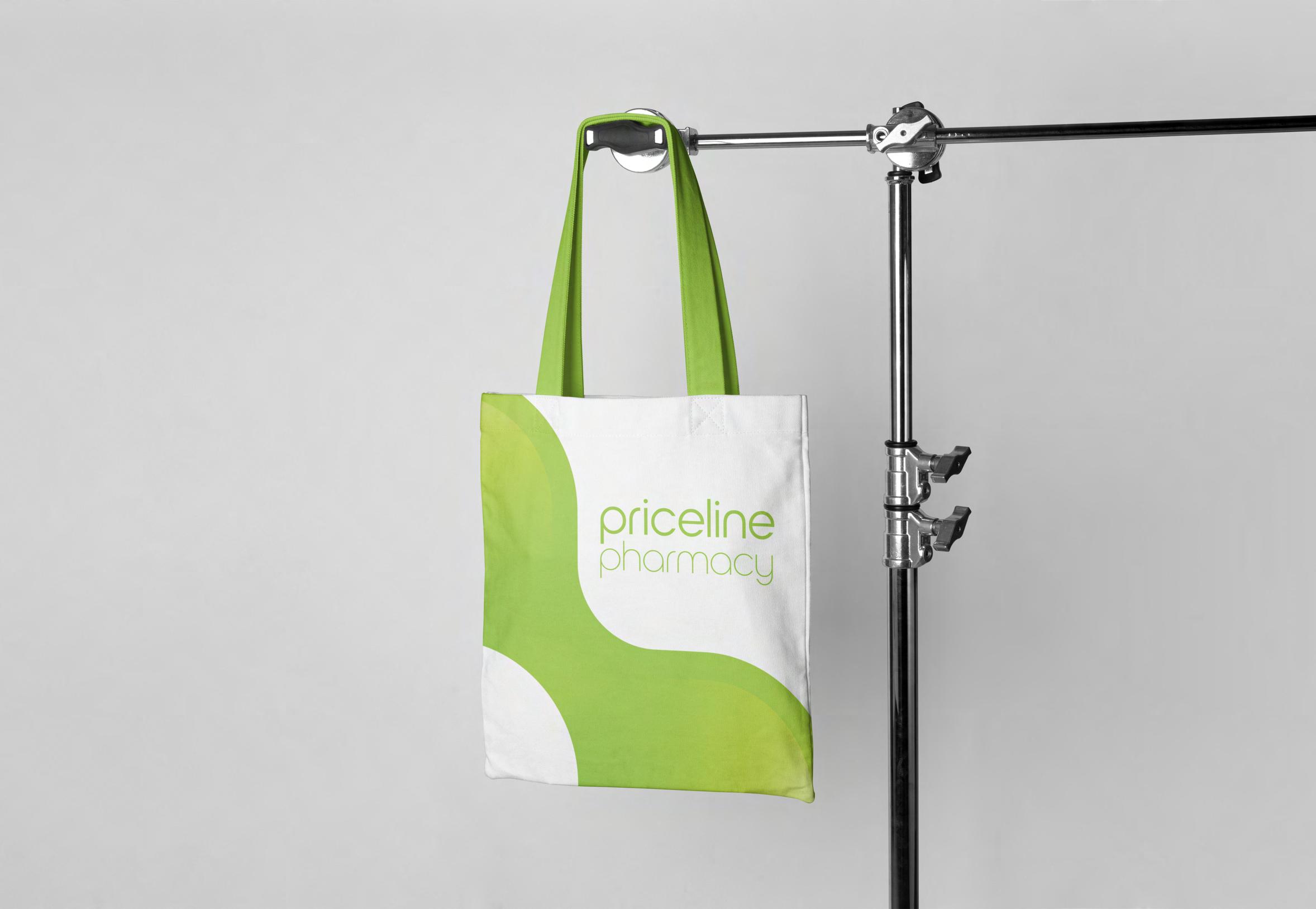
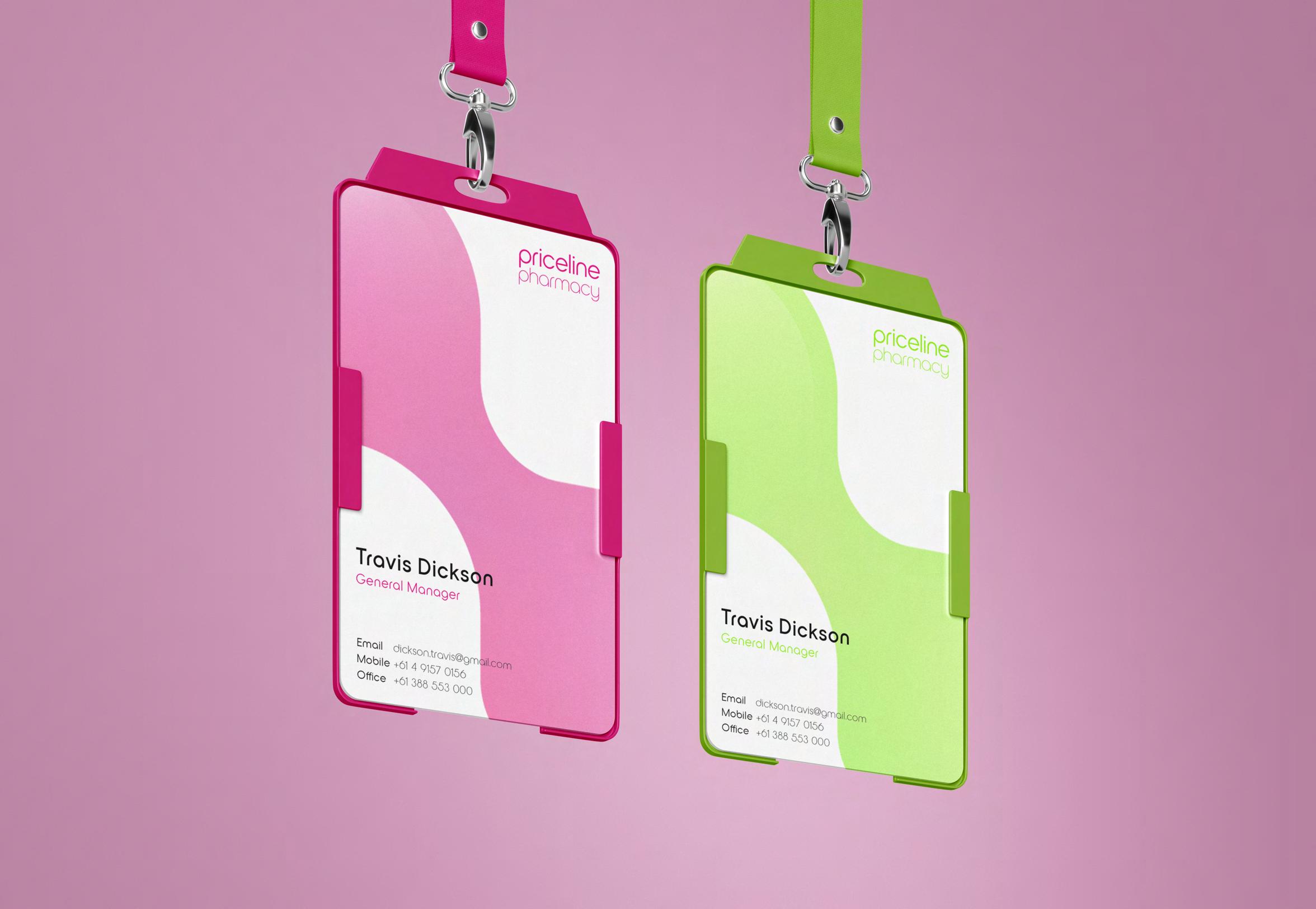
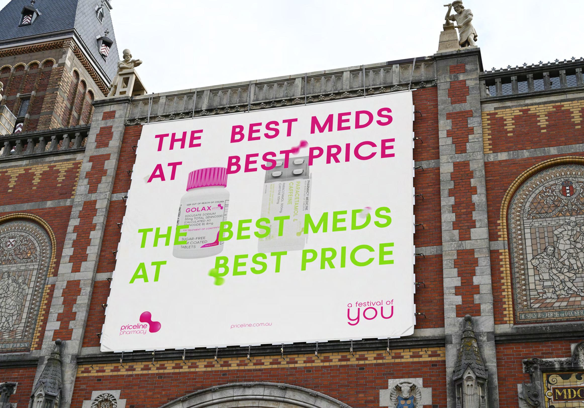
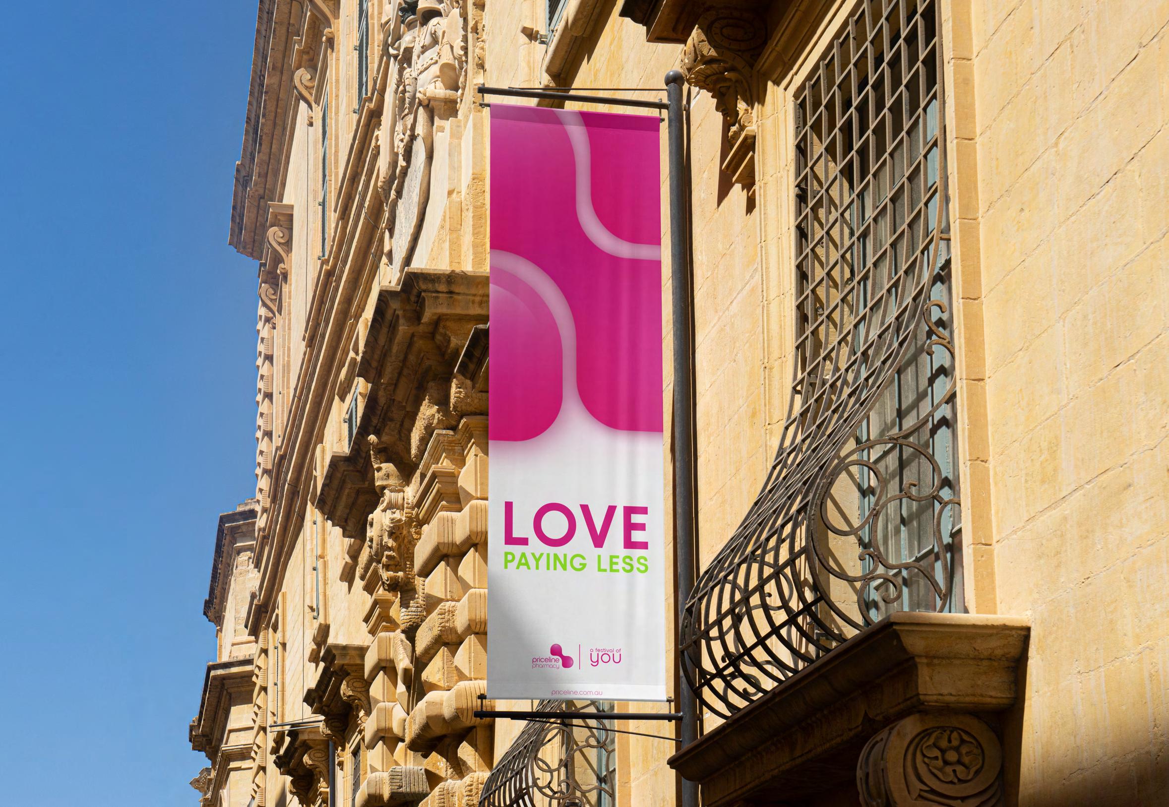
This rebranding project for Priceline Pharmacy originated as a University assignment, where refreshed the brand's visual identity. Upon graduation, further refined and enhanced the project, applying my design expertise to align it with current industry trends.
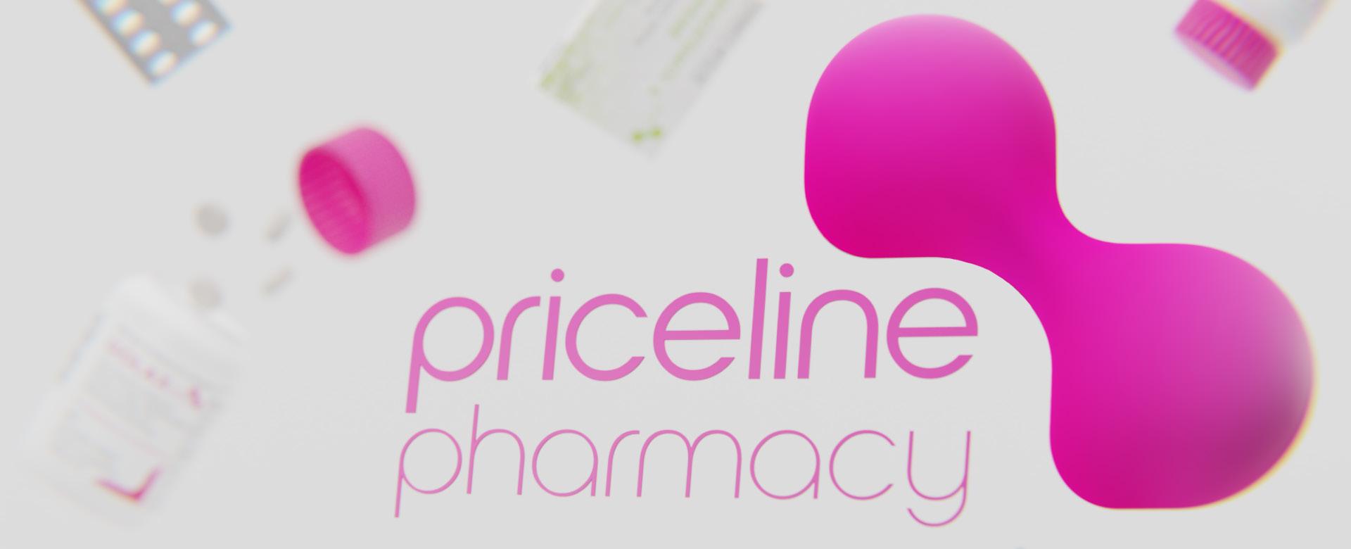
Priceline Pharmacy is a retail pharmacy chain implemented in Australia. The brand sells health and beauty products.
Priceline is mainly aimed at women. On their website, the brand emphasizes their commitment to assisting women in looking good, living well, and feeling great. Their tagline, "We're 100% woman," reinforces their dedication to women.
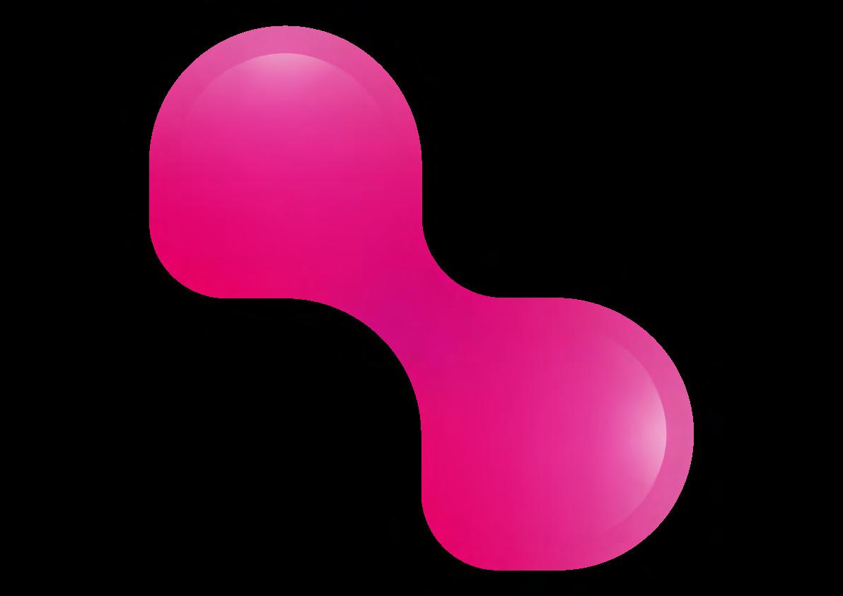
This rebranding project aims to harmoniously blend modernity with the brand's core elements. By drawing inspiration from traditional pharmacy symbols and the brand's logo: the green cross and a heart , the visual identity will evoke a sense of familiarity and trust. The use of vibrant accents or gradients can further enhance the modern appeal and energetic vibe. Throughout the logo creation process, utmost attention will be given to designing a unique and memorable mark that encapsulates the essence of Priceline Pharmacy.
For the creation of the symbol, merged the timeless icon of a heart and pharmacy cross into a minimalistic and abstract shape. A symbol of enduring health and care. The choice of the main color maintains brand continuity, ensuring a fresh yet familiar identity.

The Mission :
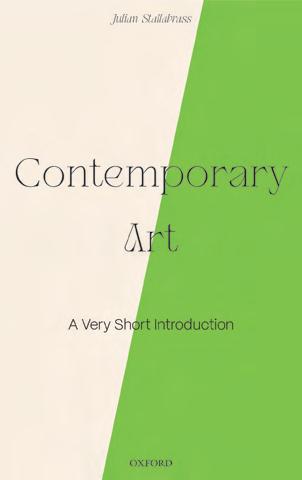
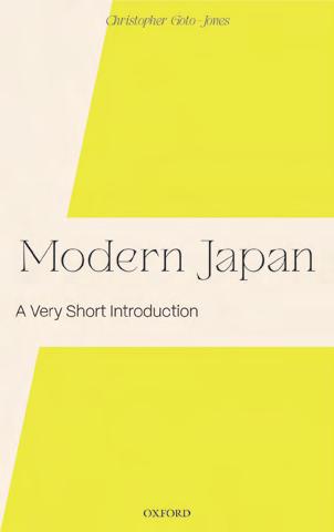
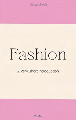
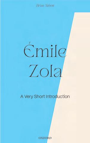
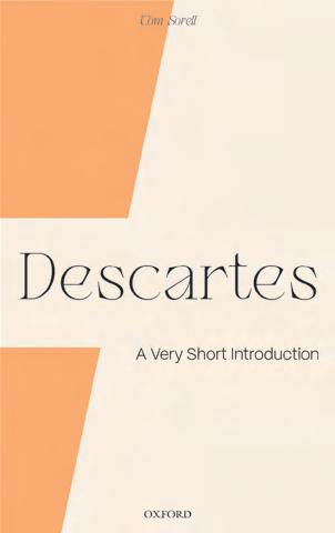
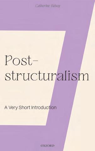
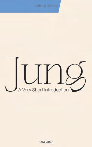
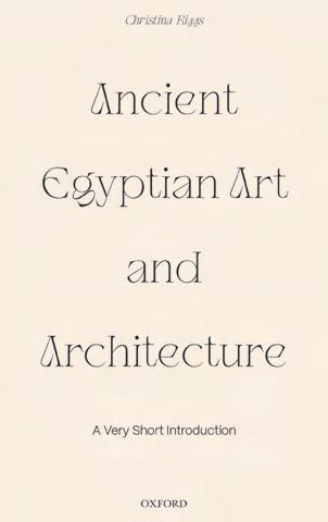
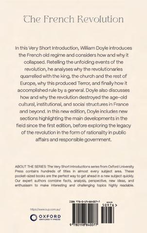
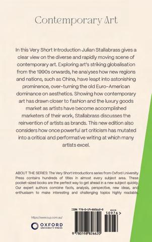
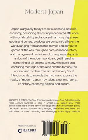
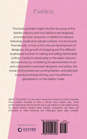
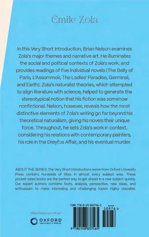
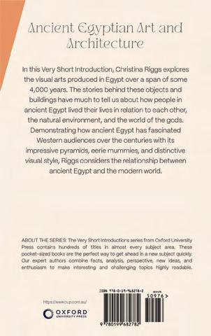
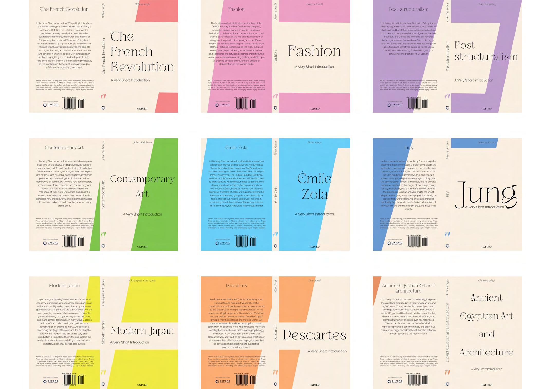
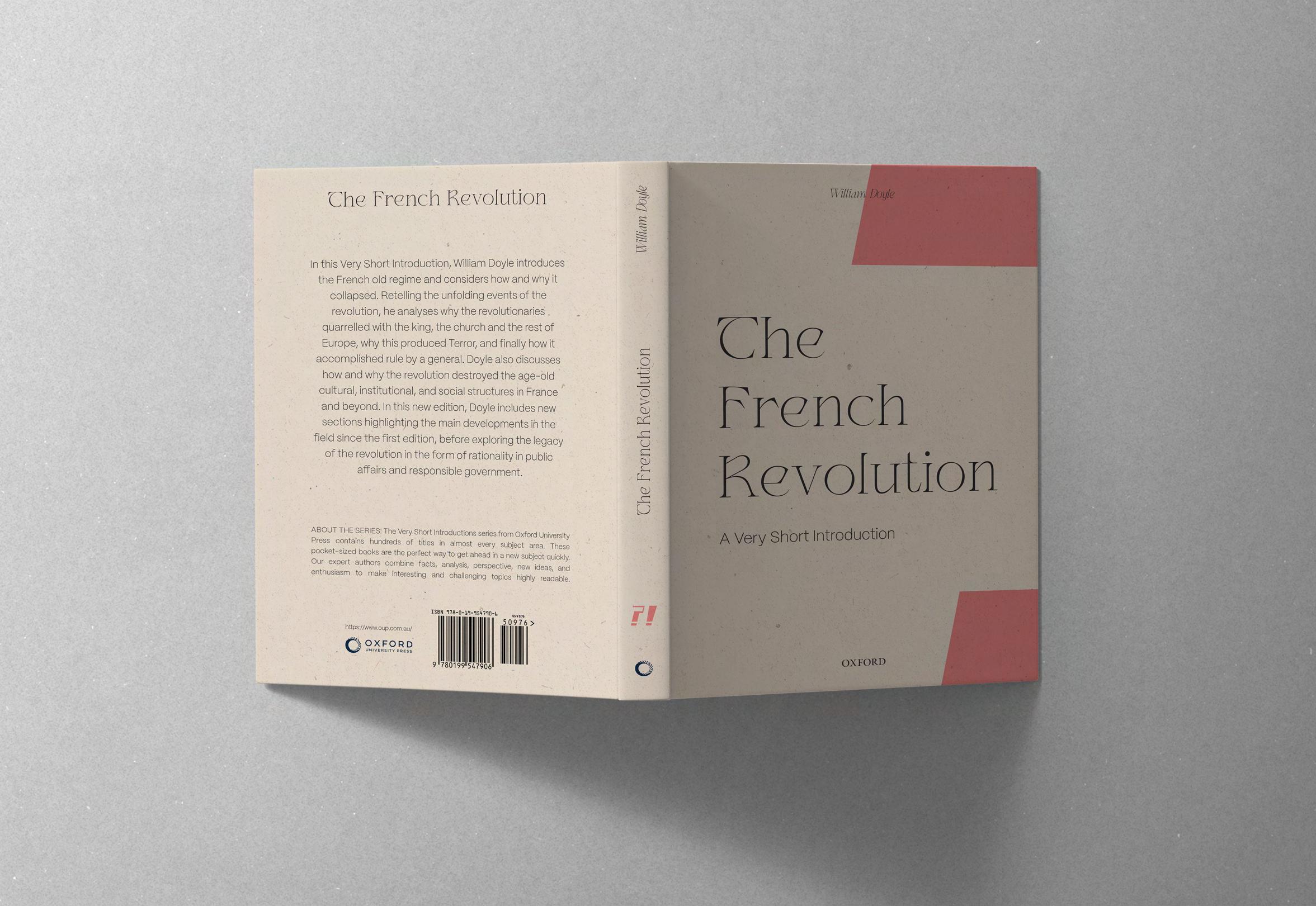
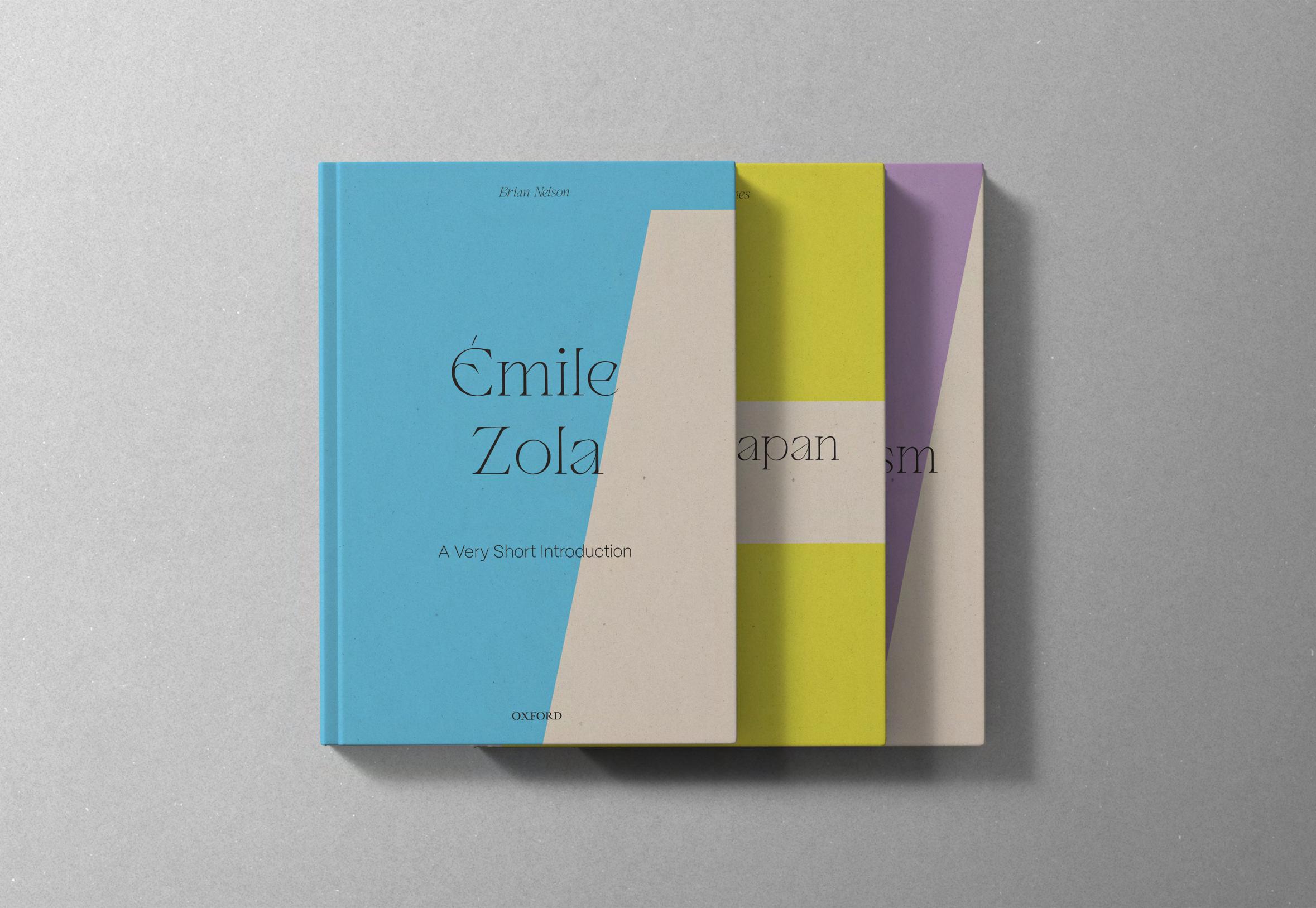
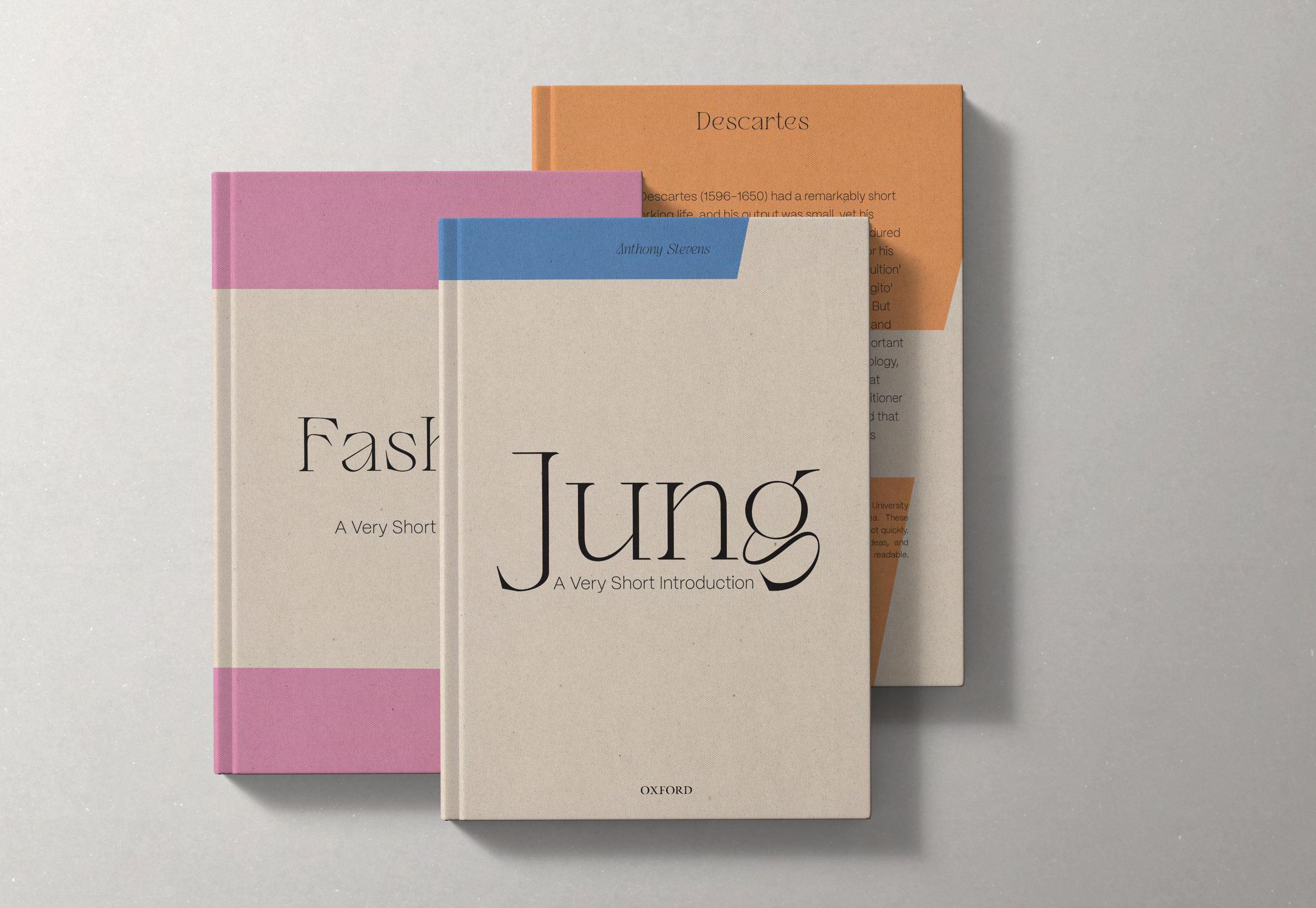
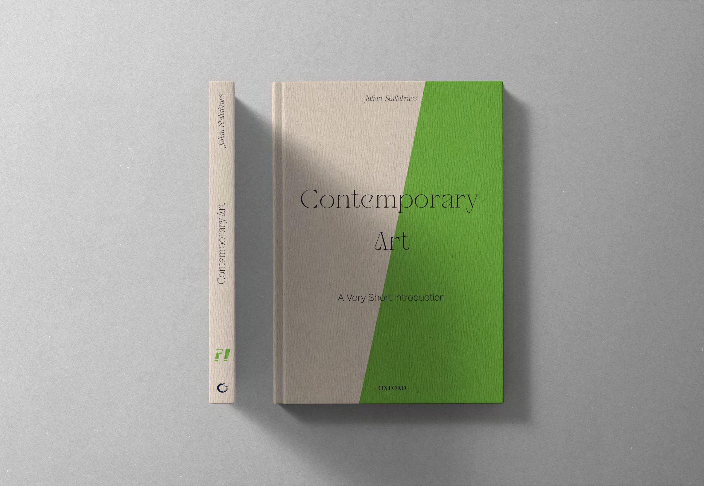
Create a series of 9 collectible covers for the book series "A Very Short Introduction".
Tools:
• Ad obe Illustrator
• Photoshop
This project features a series of collectible covers designed to be assembled, based on the book series 'A Very Short Introduction'.
The covers are intricately crafted, capturing the essence of the book series' core concept.
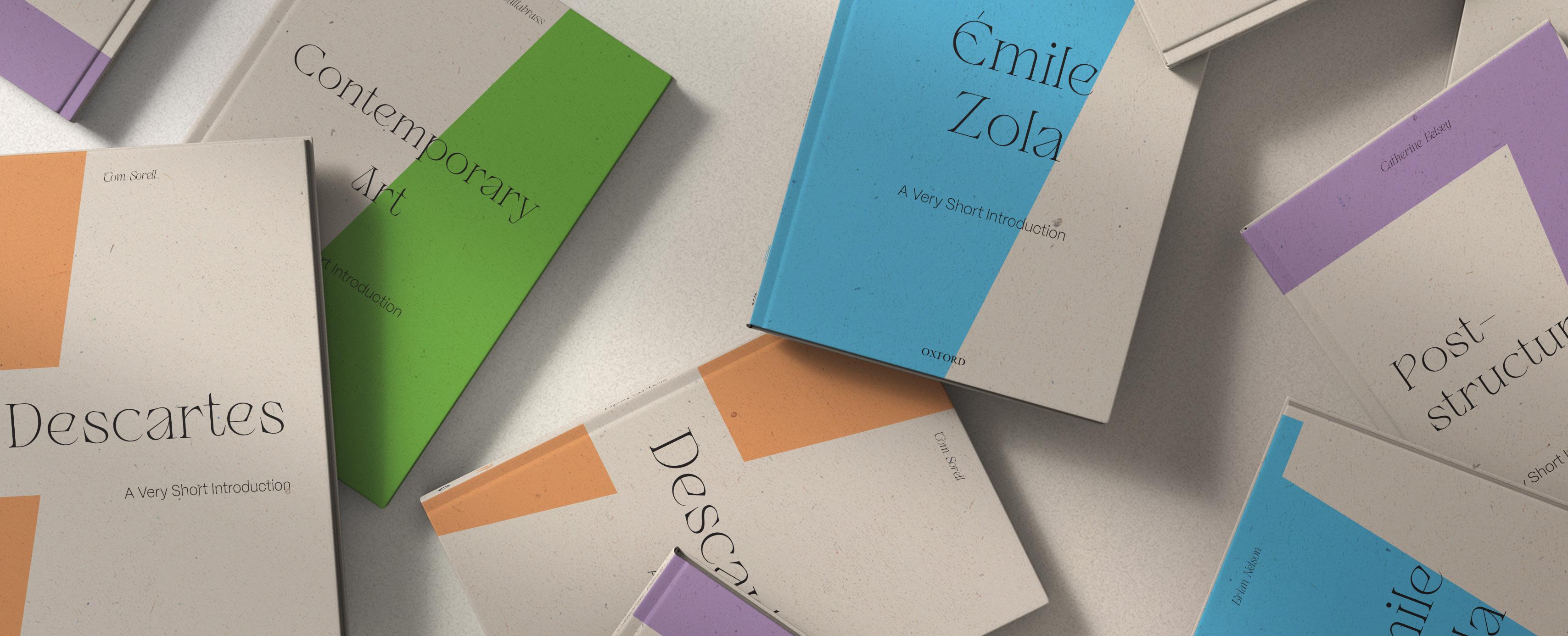
"A Very Short Introduction" is a series of short books from Oxford University Press, giving quick and accessible overviews of various topics. These books offer brief and accessible introductions to areas like science, philosophy, literature, and history. The series aims to make complex subjects easily understandable for a wide audience.
This project centres on the journey to access knowledge and its transformative aftermath— from ignorance to enlightenment Inspired by the idea that the series' books act as literal doors, revealing new horizons and unveiling a new world to the reader. Furthermore, the project will showcase 9 books forming a shape, emphasizing both the collection aspect and the notion that the accumulation of knowledge opens the reader to larger worlds.
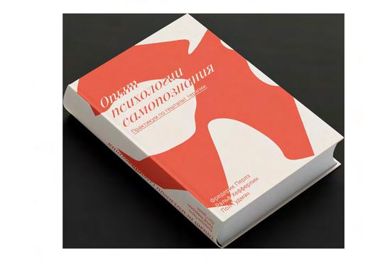

Ignorance is symbolized by a question mark (?), reflecting the curiosity of someone questioning a topic before exploring a book about it. The '?' is crafted like a key, conveying that the book provides the reader with valuable insights. Enlightenment is represented by an exclamation mark (!), illustrating the moment a reader finds answers to their initial questions. The '!' is shaped like a keyhole, signifying that the key offered by the book now empowers the reader to open a door to a new world.
Key
Keyhole Question Exclamation/ Understanding
Skewed Visible across all books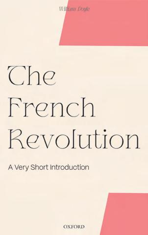
The Mission :
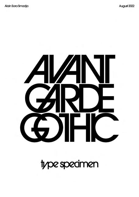
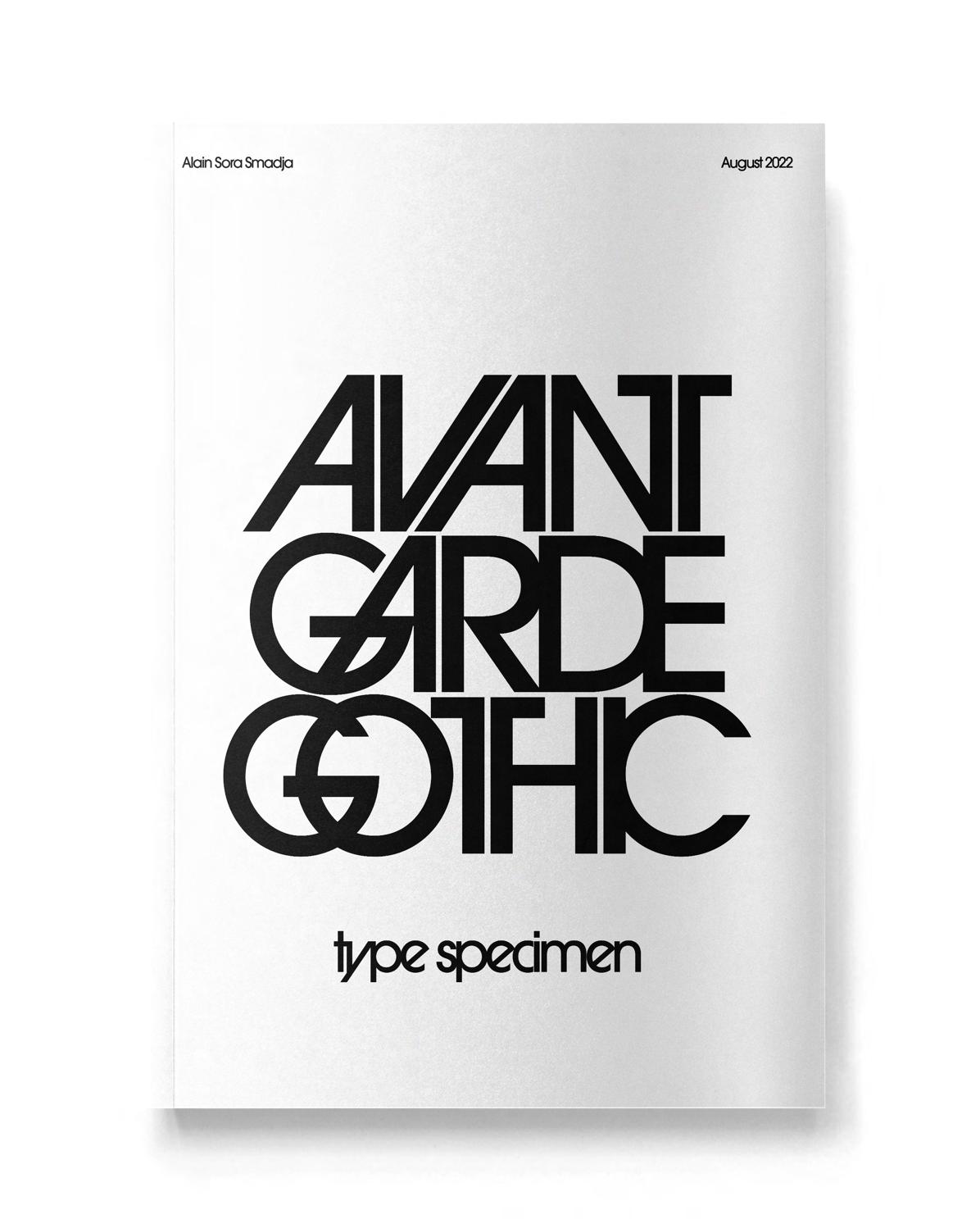
Create a type specimen of a historicaly famous typeface.
Tools:
• Ad obe Illustrator
• Photoshop
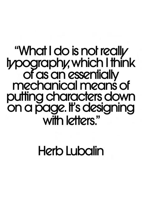
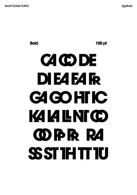
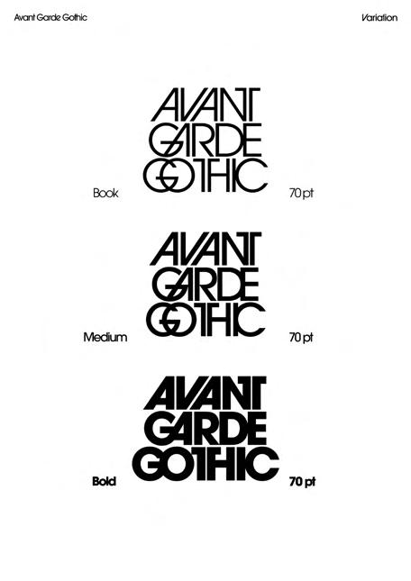
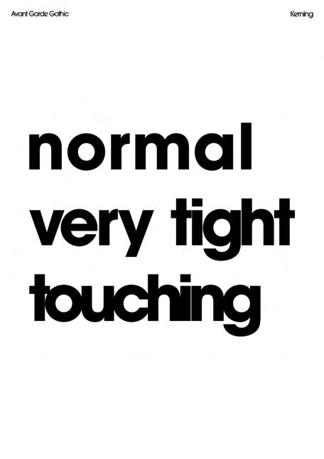
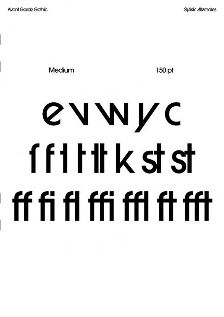
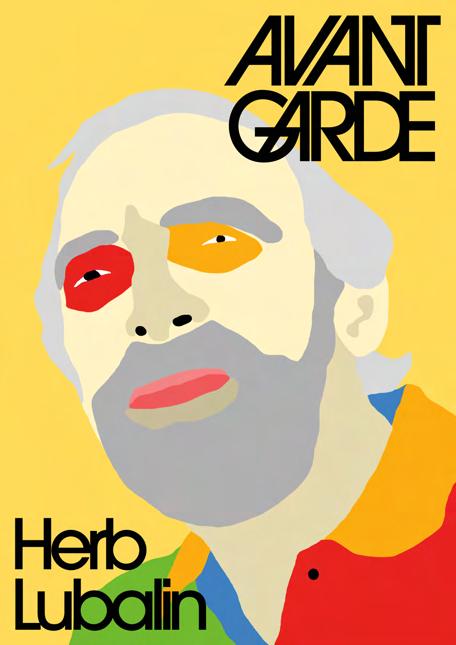
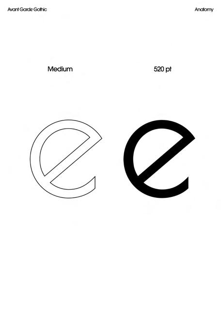
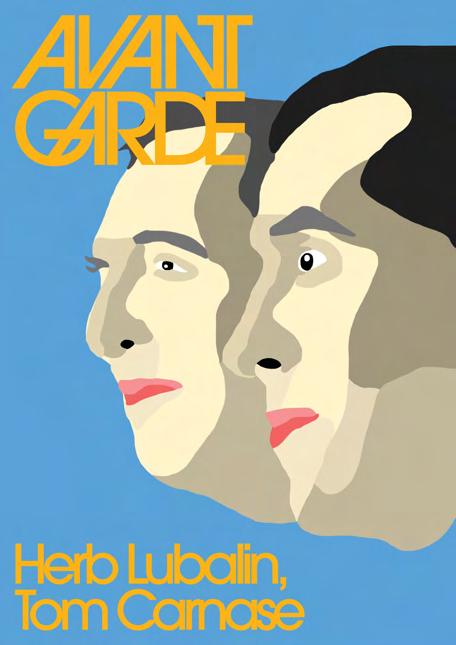
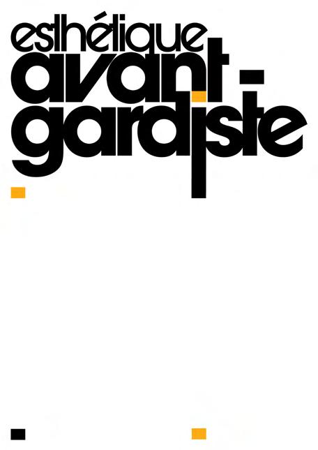
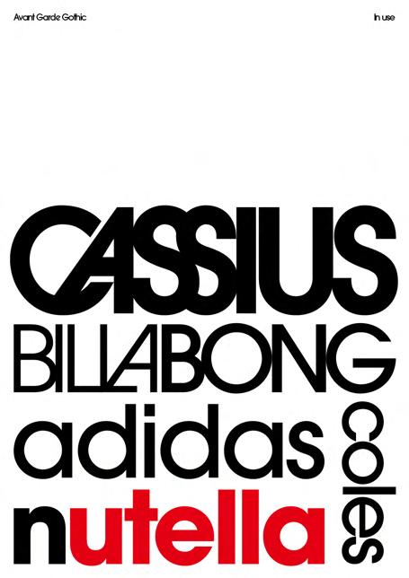
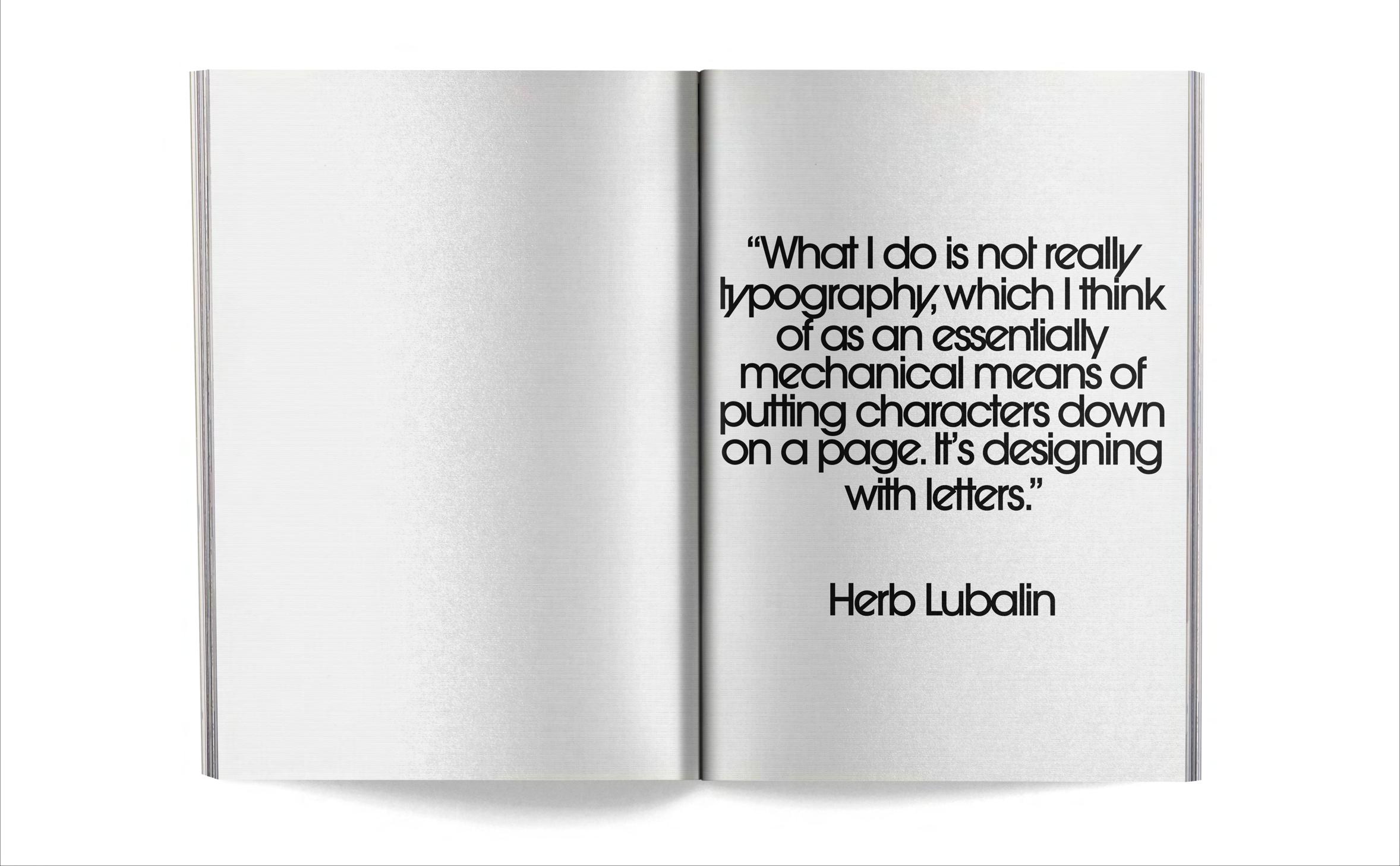
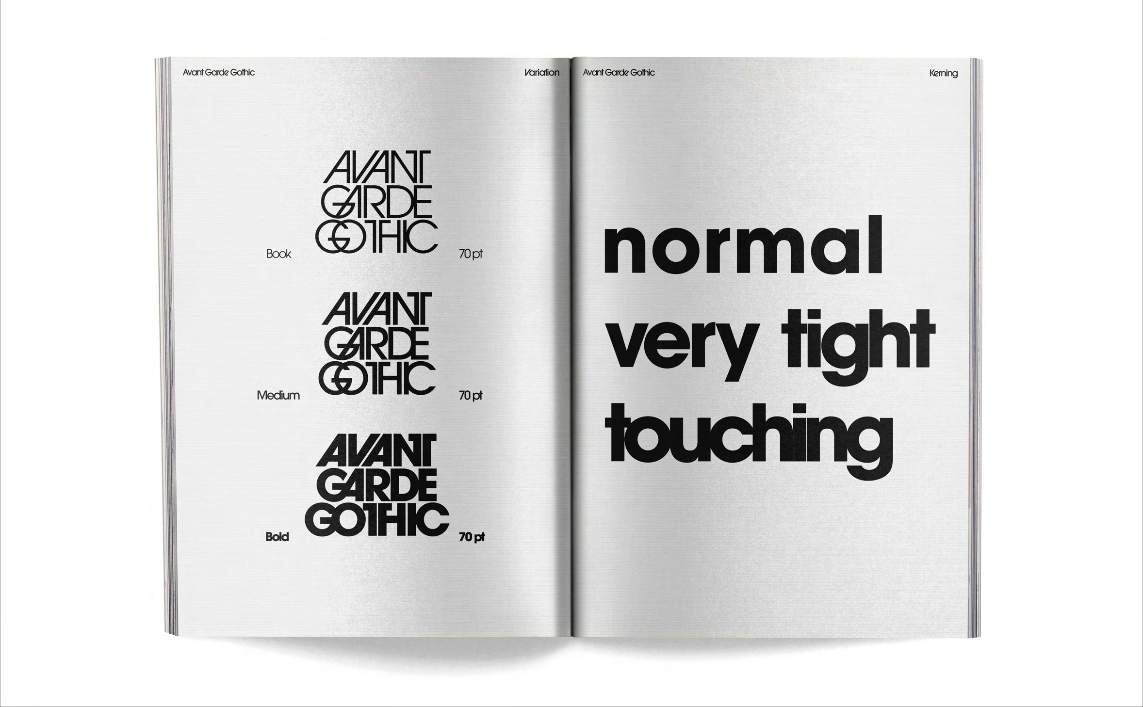
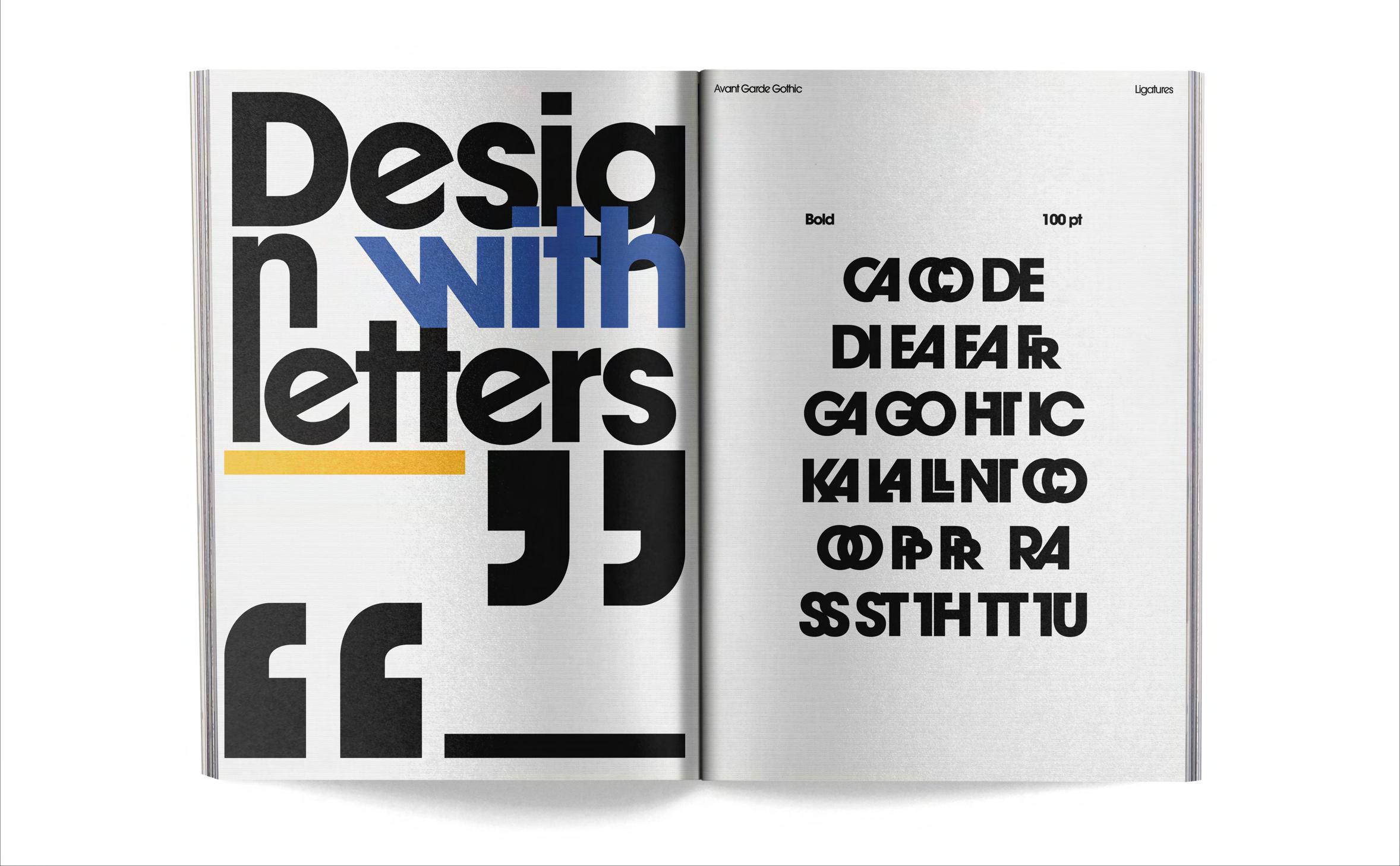
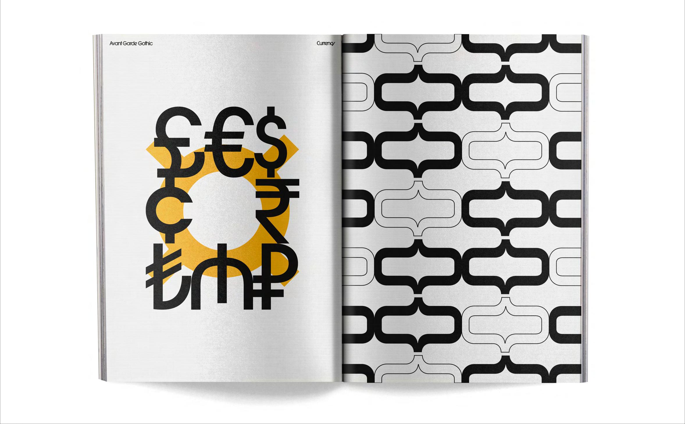
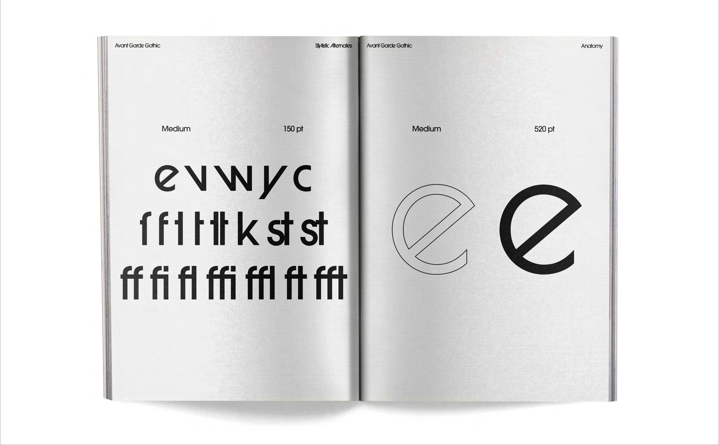
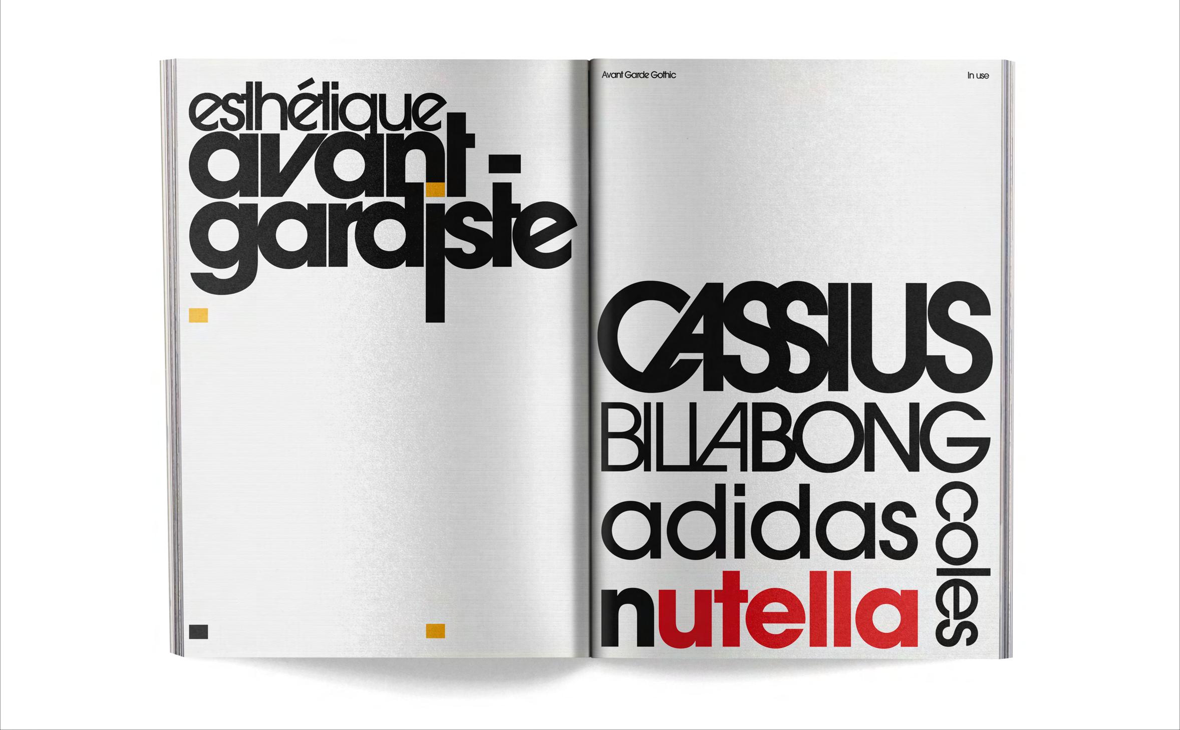
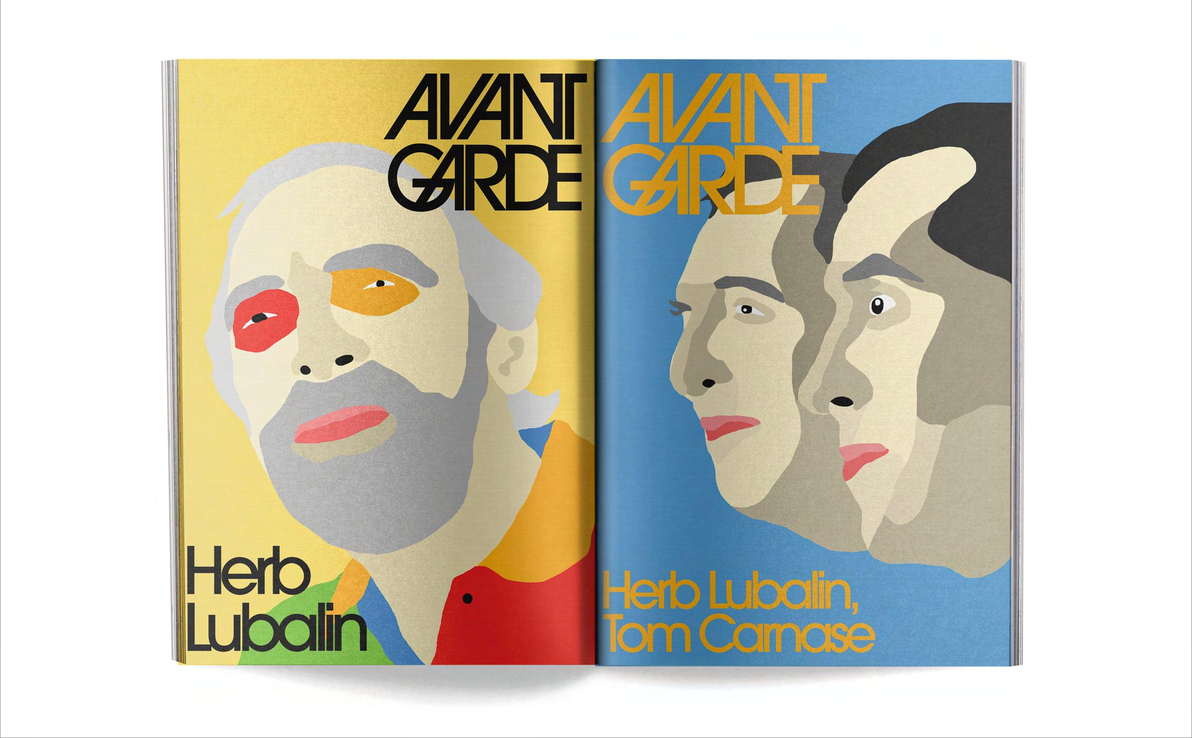
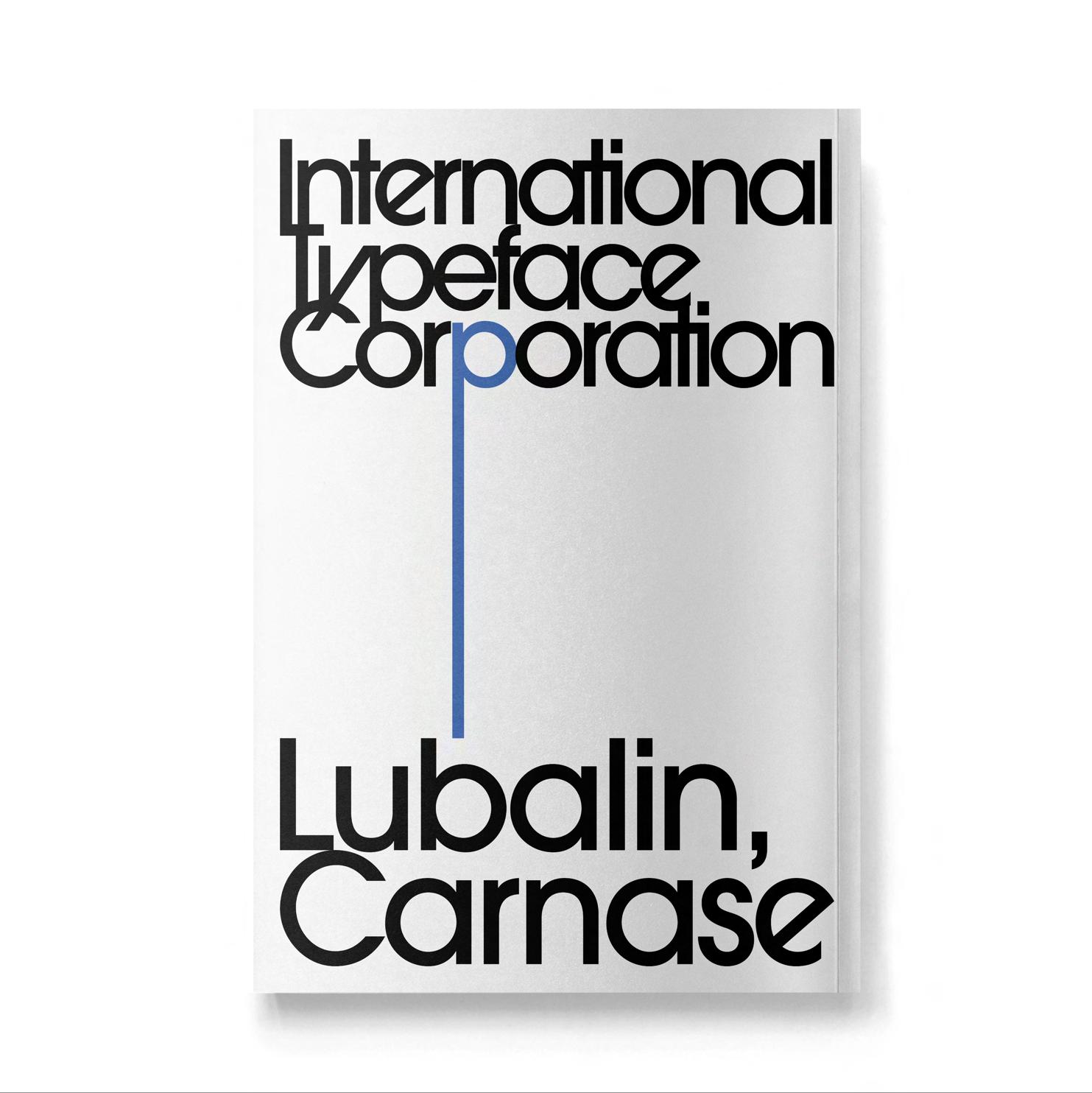
This project is a type specimen of the ITC Avant Garde Gothic typeface. My idea is to present the typeface with an emphasis on the shapes and the relationships between the letters. My project will remain as faithful as possible to Herb Lubalin’s vision while trying to add my personal touch.
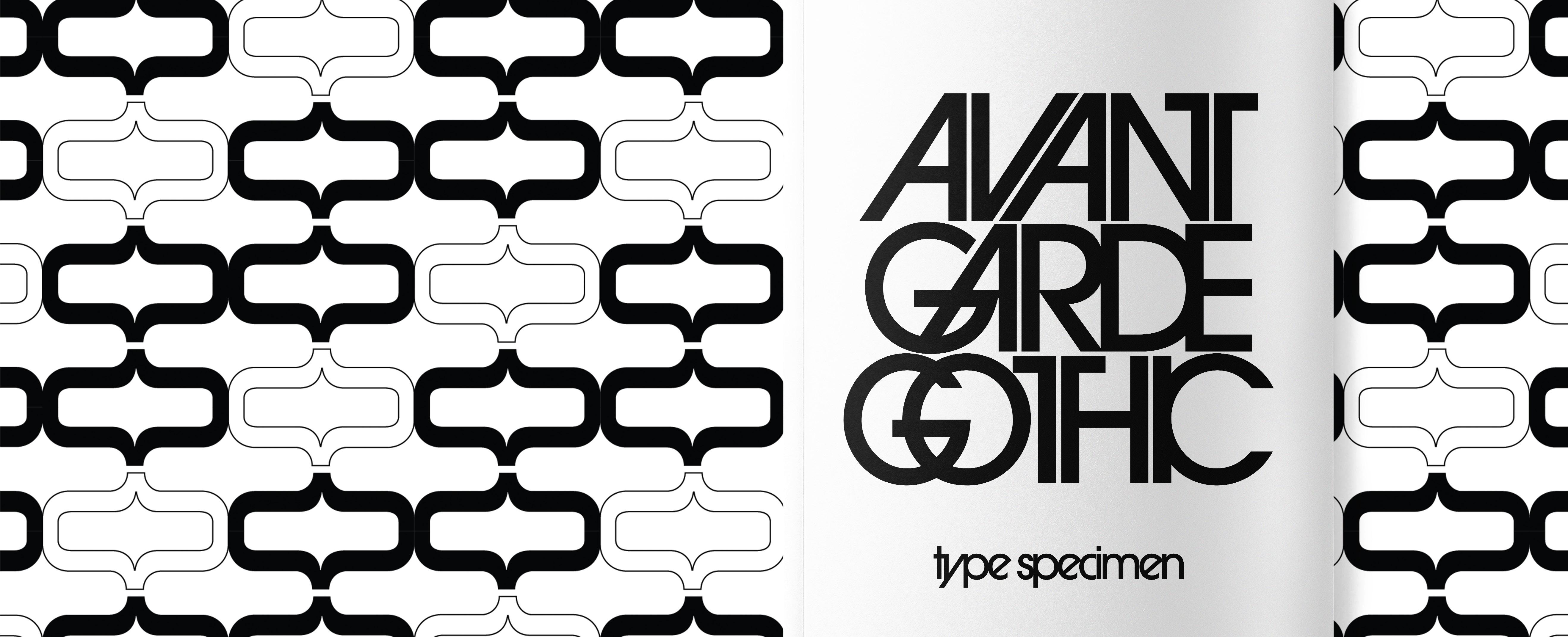
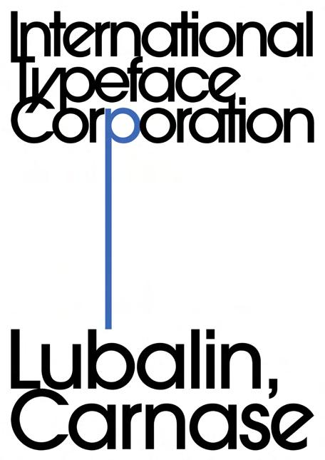
ITC Avant Garde Gothic is a classic typeface designed by Herb Lubalin and Tom Carnase in the 1970s. It features a clean, geometric design with distinctive stylistic alternates and ligatures. Originally created for Avant Garde magazine, it was later commercialized by ITC (International Typeface Corporation).
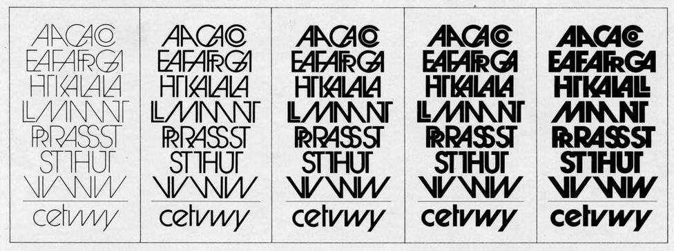
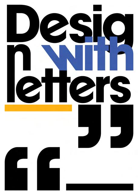
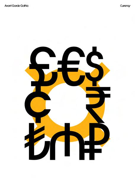
The concept of this type specimen is to highlight ITC Avant-Garde Gothic as a dynamic tool for visual communication beyond conventional text. Rather than presenting letters statically, it emphasizes practical design potential, encouraging viewers to explore its versatility in creative applications.
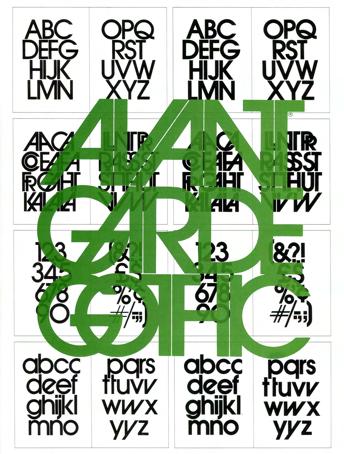
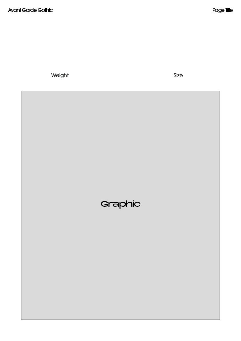
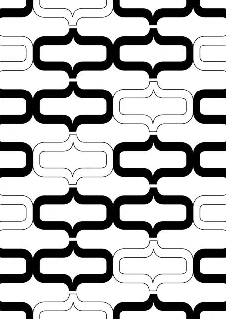
This grid will be used as a starting point, providing a foundation from which I'll branch out creatively.

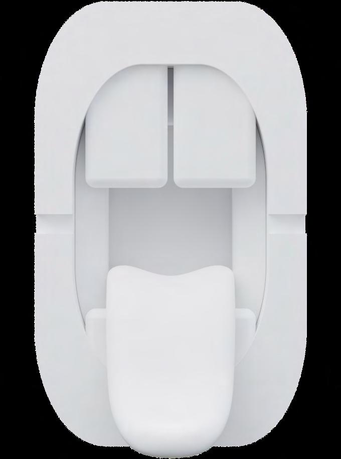
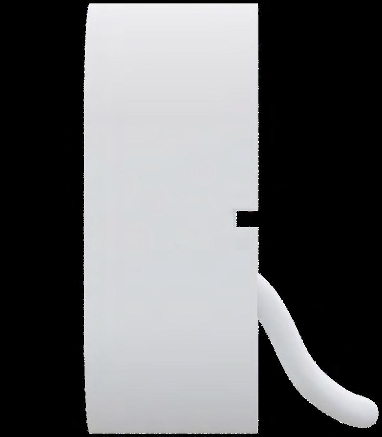
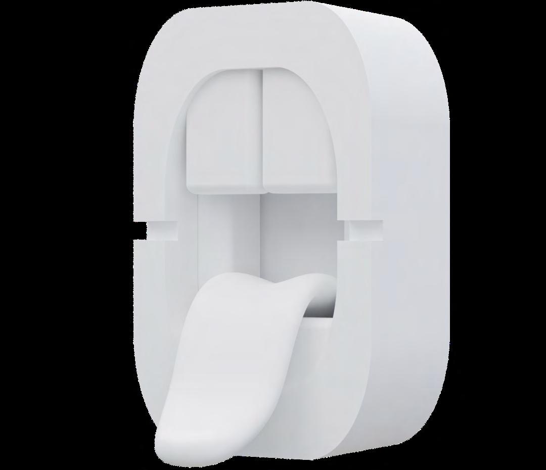
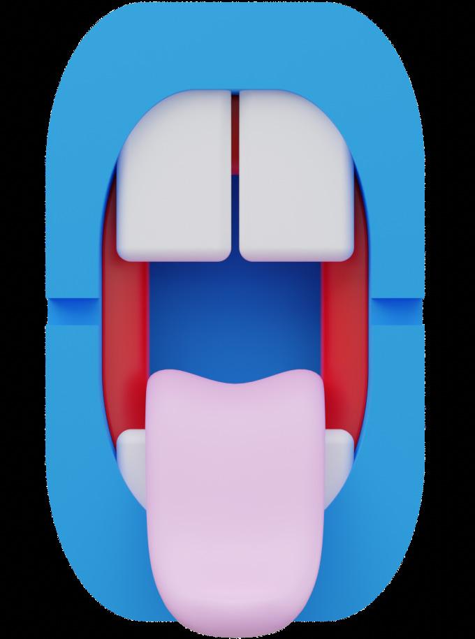
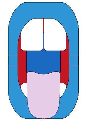
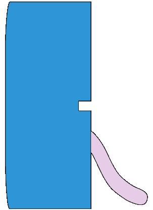
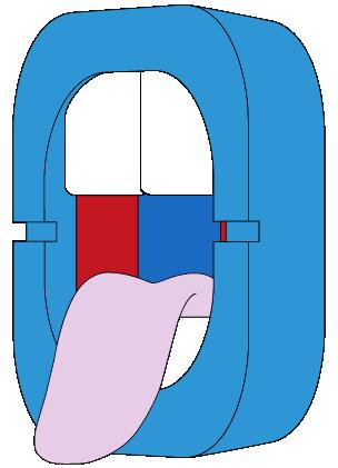
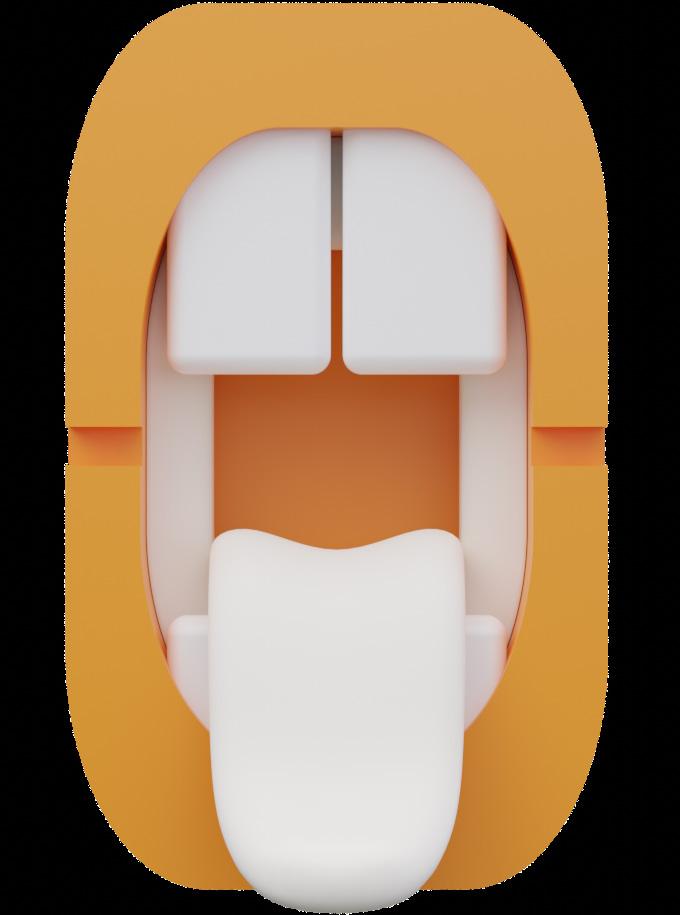
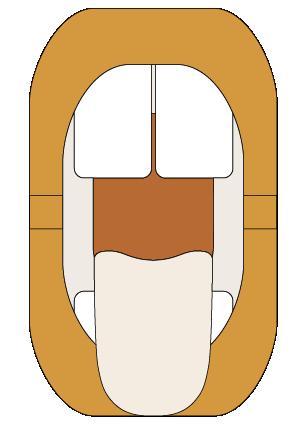
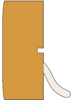
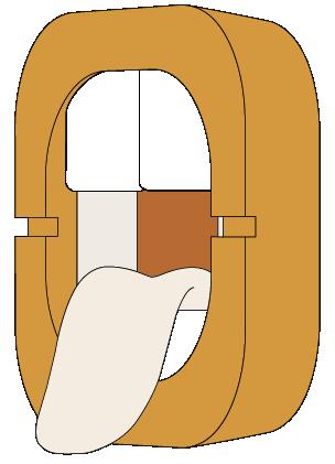
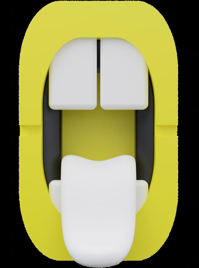
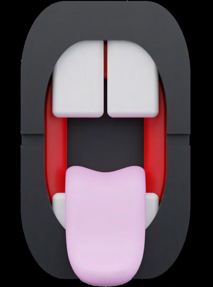
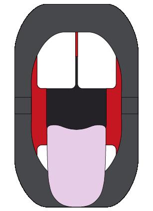
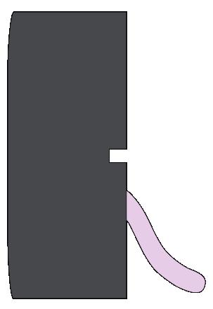
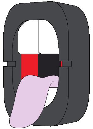
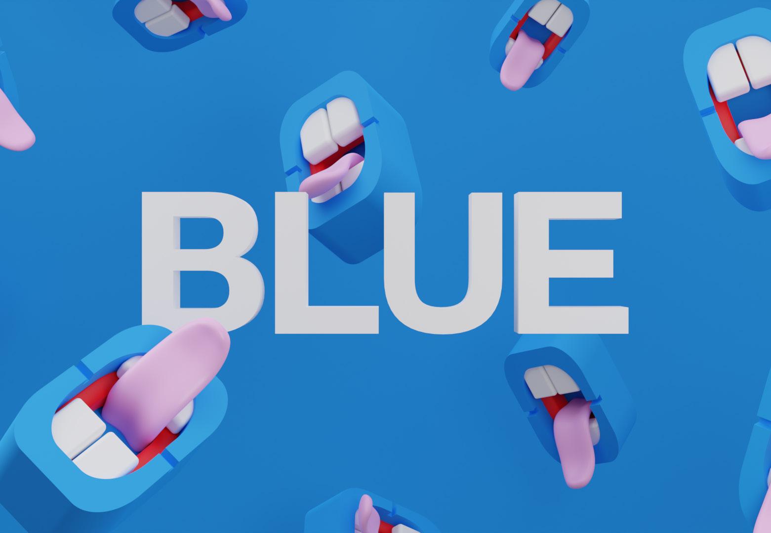
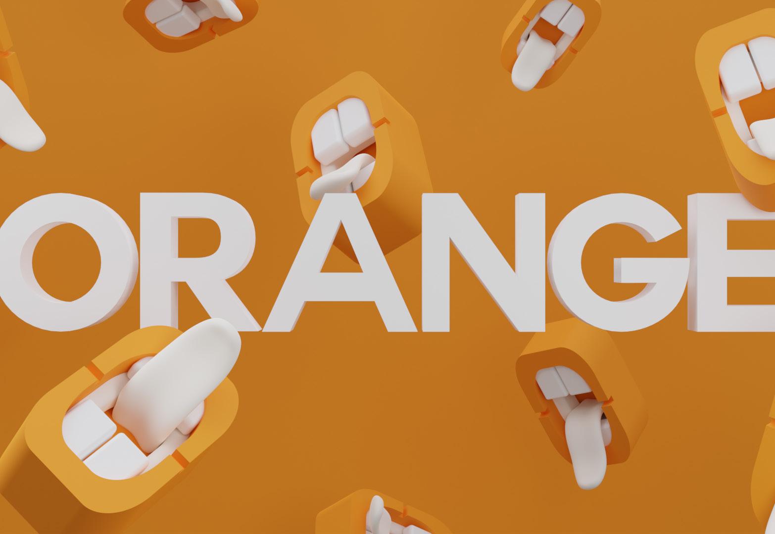
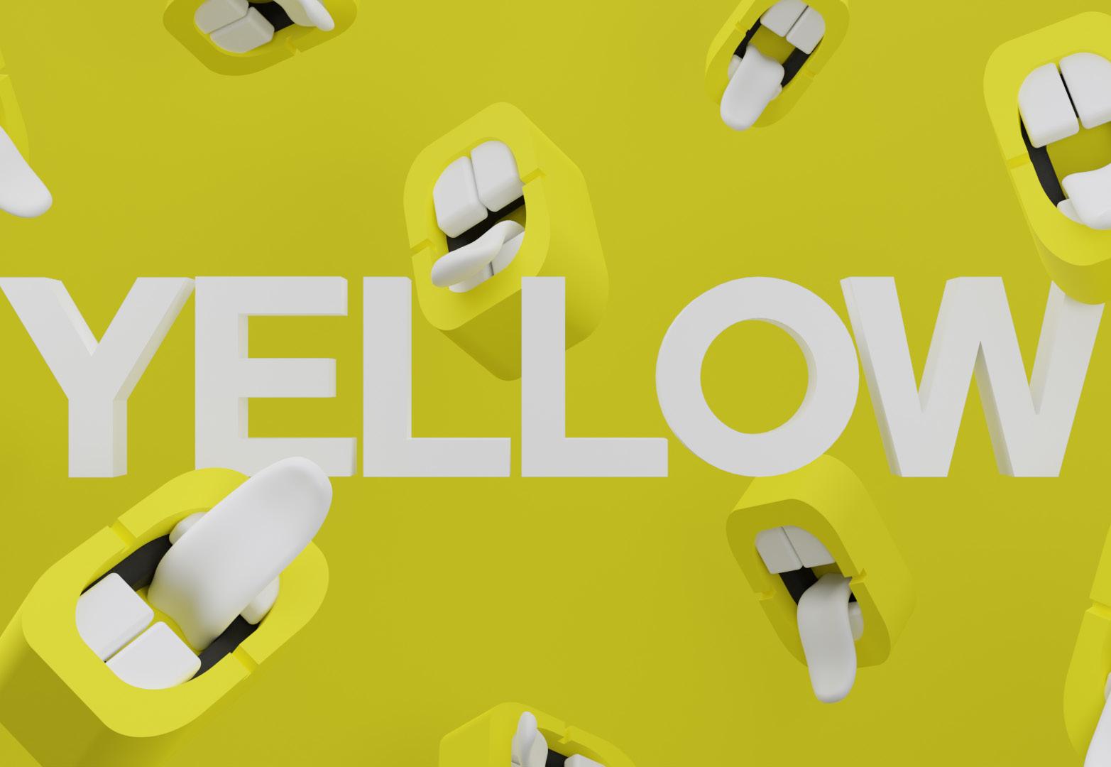
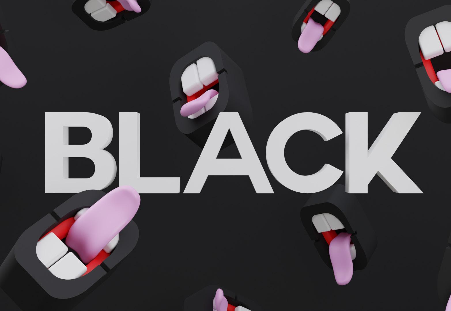
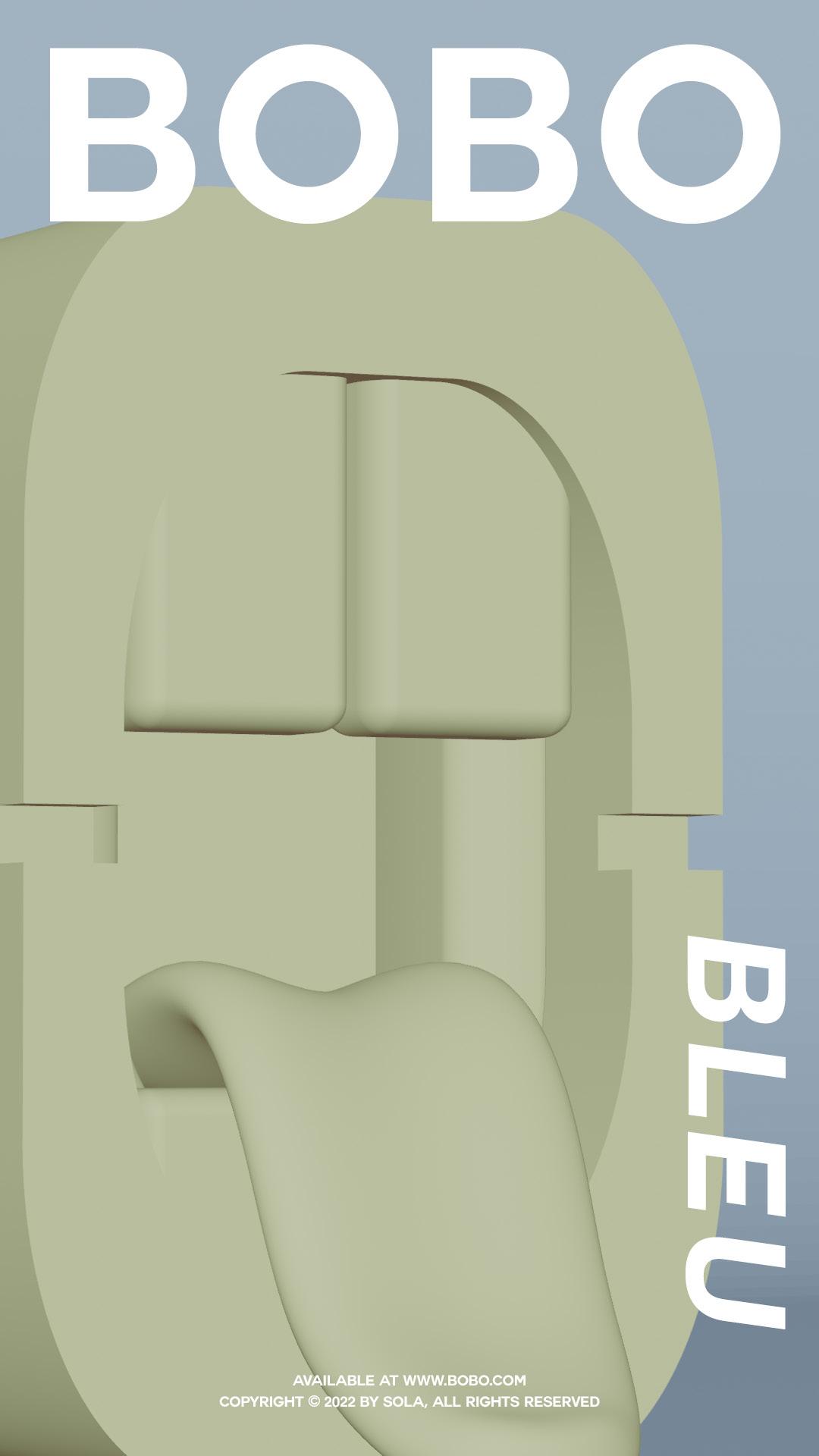
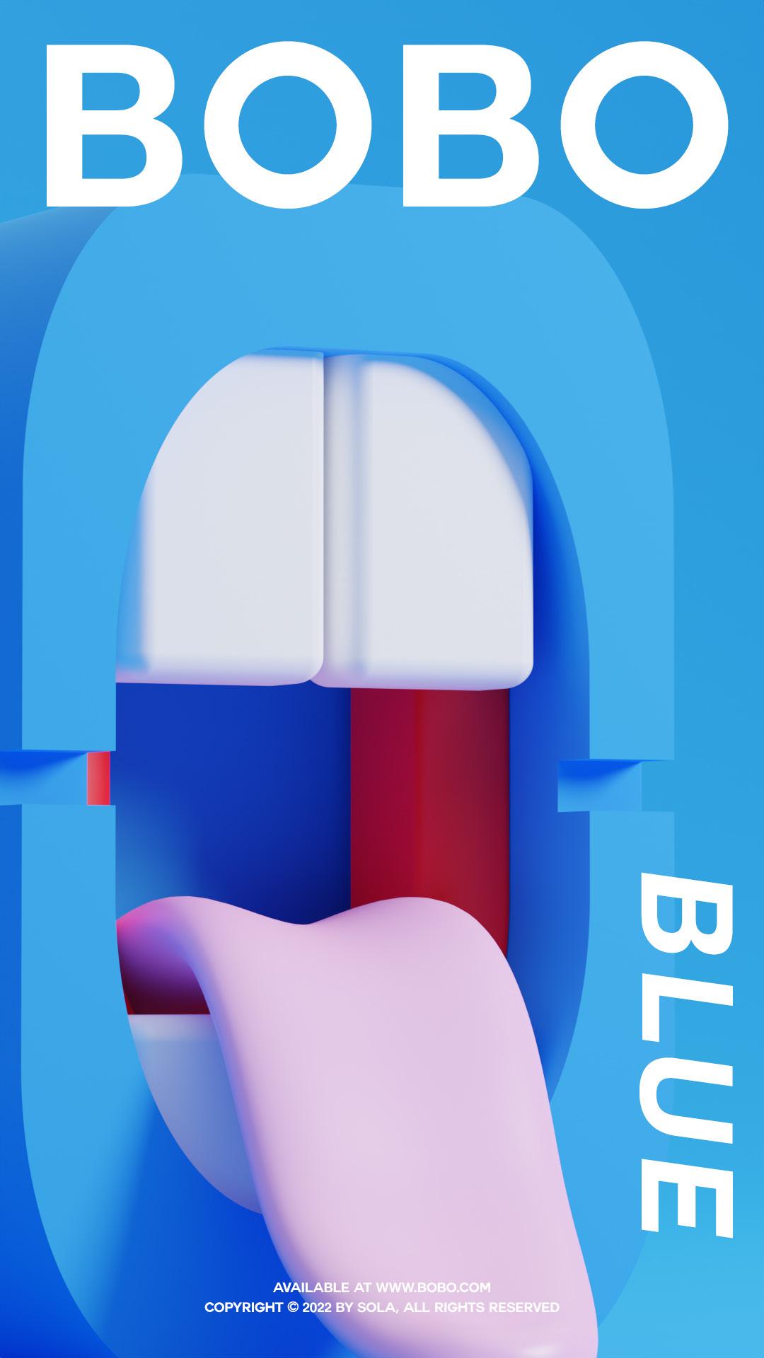
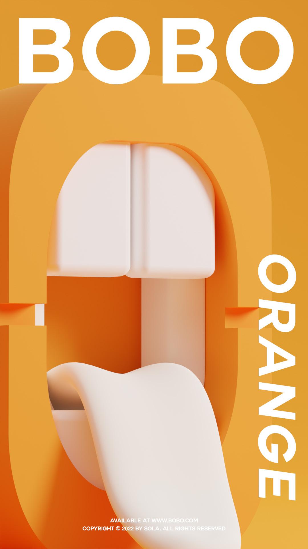
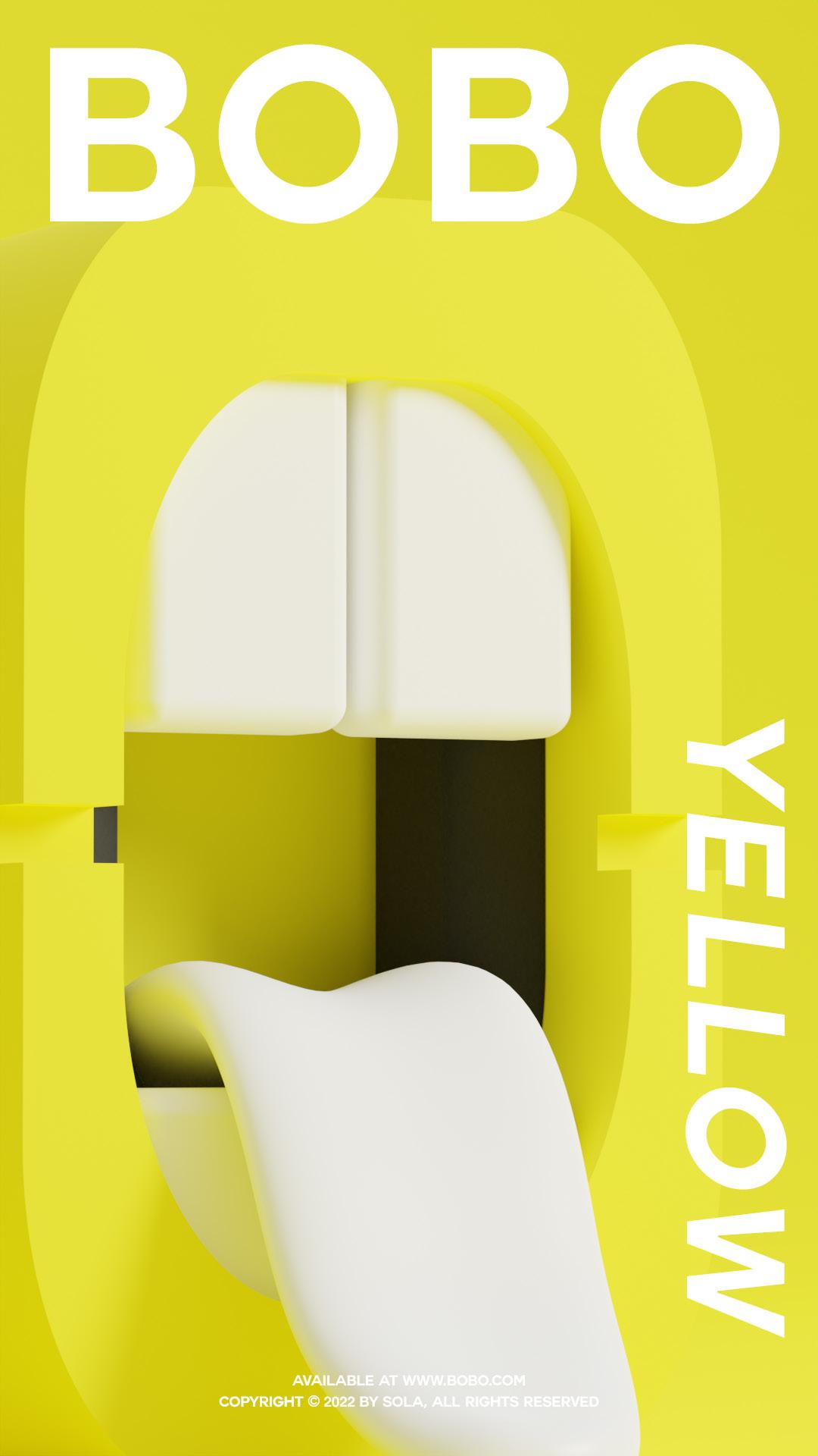
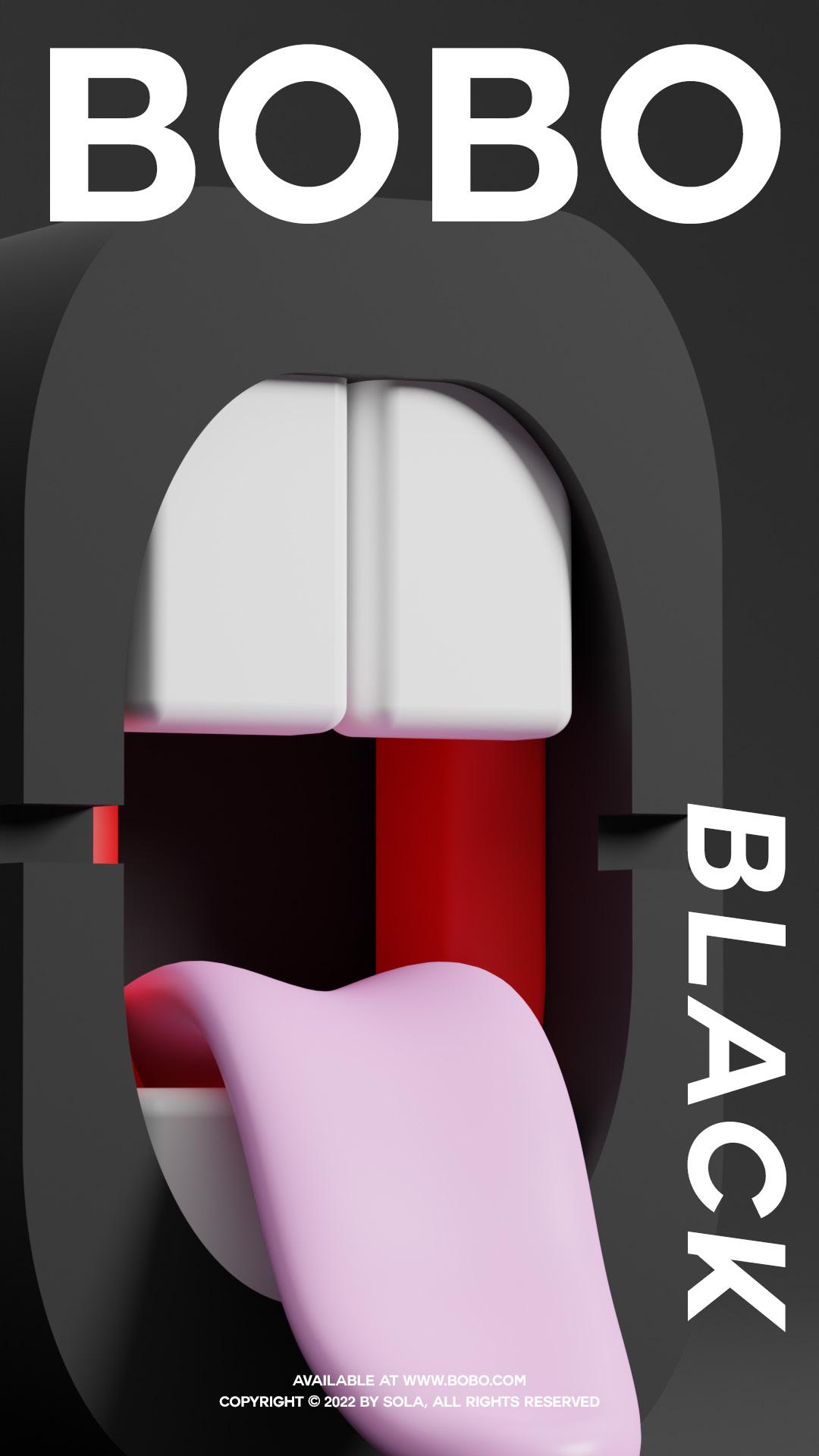
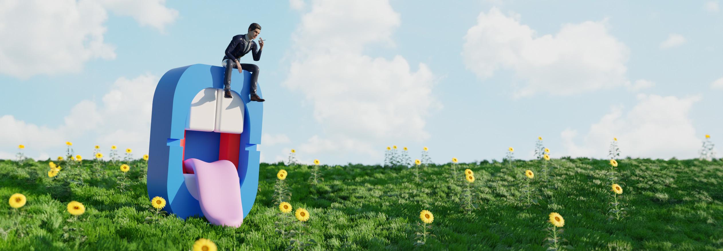
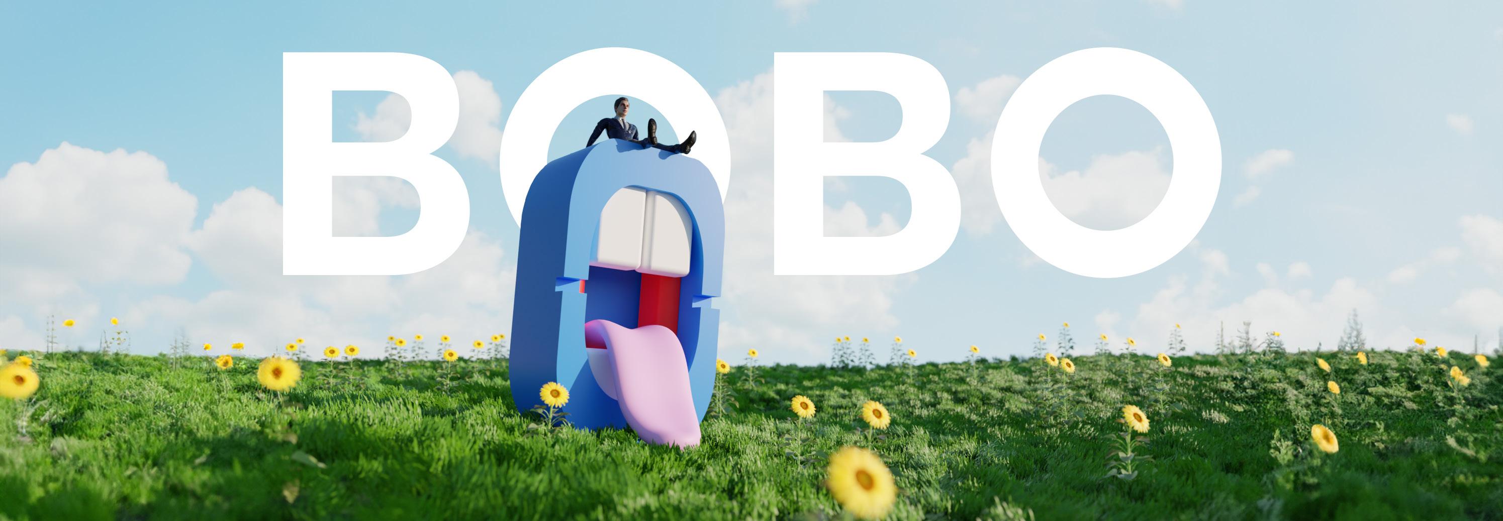
The Mission : Create a 3D printable ashtray. Tools:
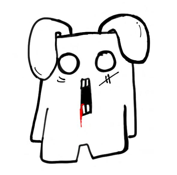
This passion project originated from a basic need for an ashtray in my student apartment. Dissatisfied with generic online options, set out to design something unique and unconventional.
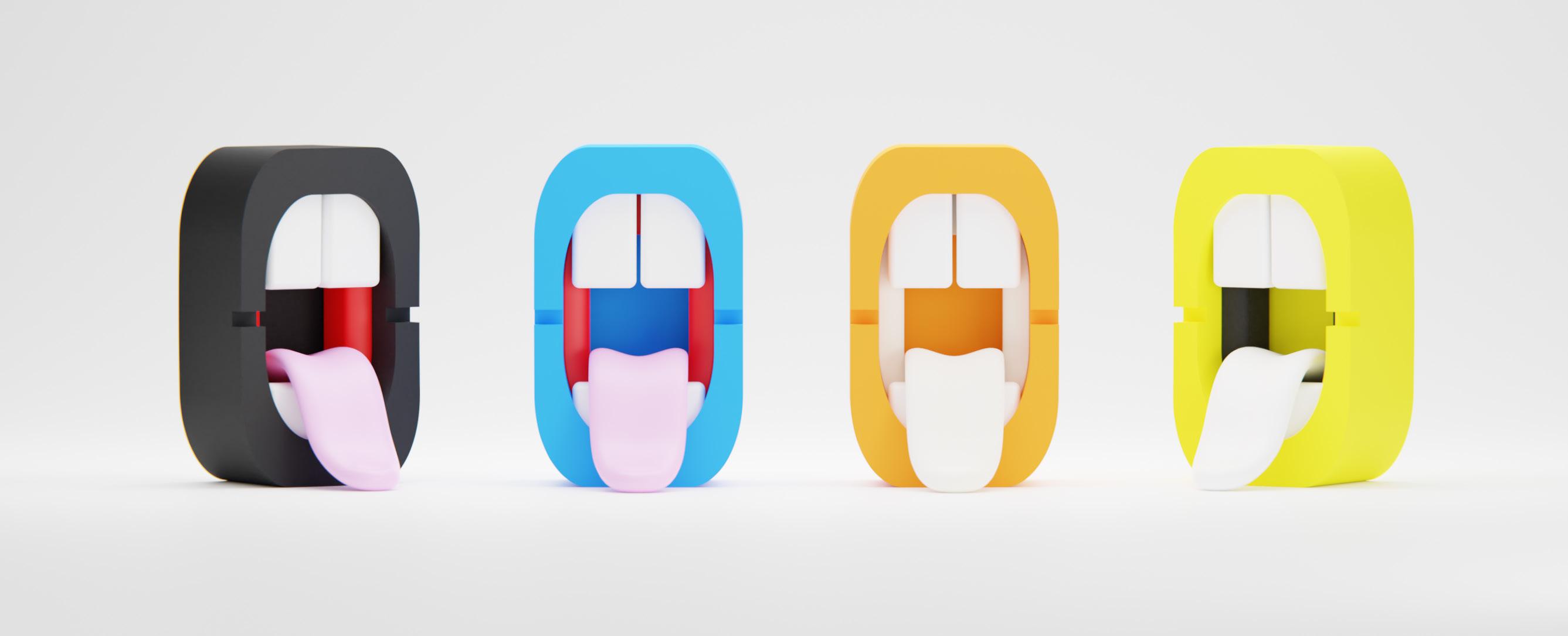
While the ashtray market is saturated with basic designs, my focus shifted to a particular type that piqued my interest: mouth ashtrays
I aimed to design an aesthetically pleasing ashtray, seamlessly blending functionality with inspiration from video games. Beyond its primary purpose, my goal was to elevate it into a decorative piece, challenging perceptions and evoking emotions. Approaching the project with a playful mindset, sought to craft an item that's both visually striking and practical.
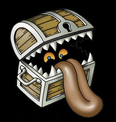
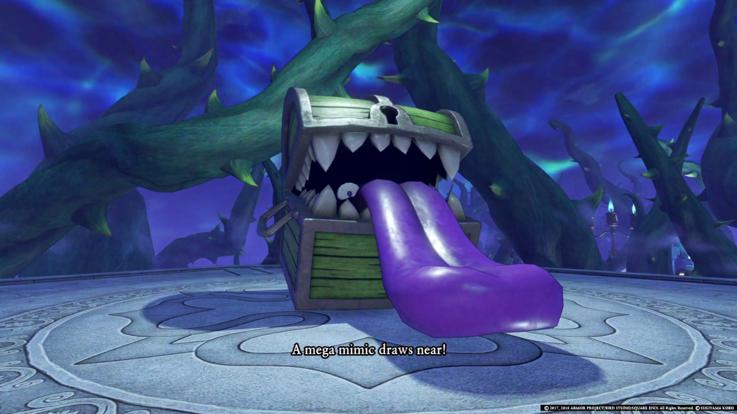
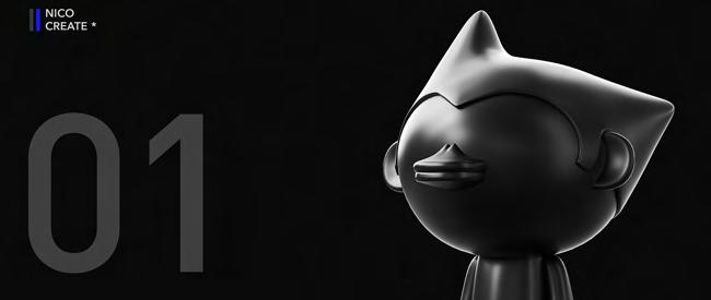
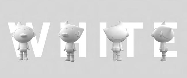
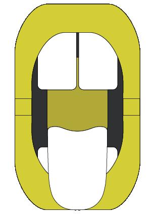
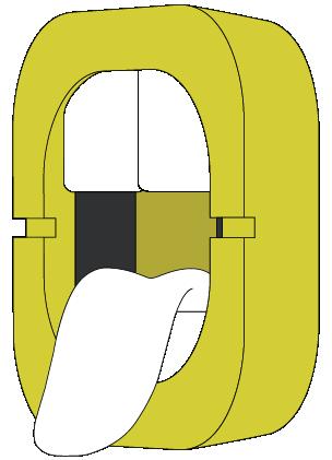
Drawing inspiration from earlier research, recalled a character named BOBO that I had sketched some time ago. Recognizing its potential as a foundation for my design, utilized the distinctive shape of BOBO's mouth as a