Good & Bad Typography
An analysis of typographic examples in pairs
An analysis of typographic examples in pairs
In this book, I have found a variety of good and bad examples of typography during the first ten weeks of my typography course here at The University of West Florida. I examine some major principles of typography over a variety of examples. These have been paired in no specific order, examples found within my dorm room, the building, and on the streets of Pensacola, Florida. I hope you enjoy my examples found throughout the semester.
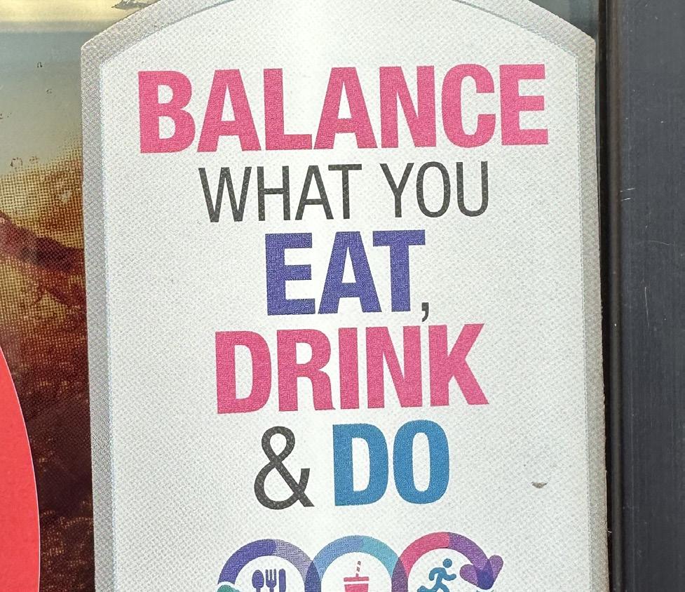
This photo I took is of a small sticker on a Coca-Cola vending machine. I think it has effective typography because it is well-balanced, has clarity, and hooks my visual interest. The first word seen, “BALANCE,” is important to the whole design and is displayed in bold and bright pink that very quickly grabs a reader’s attention. This makes the theme of the message in just one look. The following words, “EAT,” “DRINK,” and “Do,” are also shown in bright colors that easily make the words stand out and are distinguished, supporting the message’s main theme. I think that this sticker has interesting color diversity that helps enhance these specific keywords.
The order of the design is handled well throughout. The phrase “WHAT YOU” is shown as less bold, helping it not compete with the more meaningful words. This draws the reader’s eye smoothly down the design, from the headline to the colorful action words. With the ranges of sizes of words and their colors, the creator made a flow that is communicated quickly, which is super important for anyone who passes by it.
Lastly, the typography goes well with the small icons at the bottom that visually affect the text’s meaning. The layout is neat, clean, and centered which makes the design nice to look at. That is really important for any design, that way the reader is drawn towards it and will actually read
This photo I took was on my way to work. I was behind this Coastal Aluminum Structures company truck and didn’t think its back design was appealing. It seems off-balance and almost random. As if someone threw it together too quickly. The company name “CAS” is a little oversized in my opinion, and the supporting text of what the company is is far too small to see from a distance. The phone number is off-center with the company website. To make this better, in my opinion, they would need to have a clearer order of importance, service, making the business name, and contact information quickly identifiable.
It also has one too many font styles, and it affects the design’s organization. The large CAS letters are bold, while the other text goes between small and compressed styles. This inconsistent style affects the design as a whole, making the message harder to process quickly, which is pretty important, I’d say, for a moving vehicle advertisement.
The background image is also something I think is heavily distracting from the displayed text. The nice sunroom photo makes the smaller text more difficult to make out. I think that to make that typography more effective, it needs a stronger contrast between the text and the background.

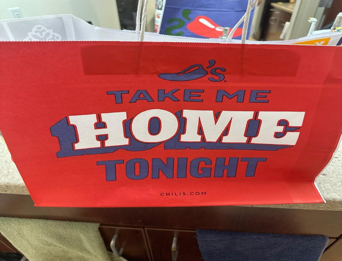
After eating out at Chili’s, they allowed me to take home a bag of their tortilla chips and salsa. The bag it came in has a clever statement that says, “Take me home tonight.” I think this is a strong example of effective typography because it balances clarity, hierarchy, and branding in a visually engaging way. The word, “HOME,” appears to be the most important on the bag, placed right in the center in a large, bold, block lettering print, instantly catching a viewer’s eye. Its size and weight establish it as the focal point of the design, making the message immediately understandable. The surrounding words, “TAKE ME” and “TONIGHT,” are a little smaller, yet bold and clear enough that it still guides the viewer’s reading path in a natural sequence from top to bottom. This hierarchy ensures the playful slogan reads easily, even at a glance.
The color choices also reinforce the effectiveness of the typography. Set up against a vibrant red background that ties to their branding, the white and blue letters stand out with a high contrast, overall helping with its legibility.
Also, the tone of the typography, in this case, supports Chili’s identity. The phrase on the bag, “TAKE ME HOME TONIGHT,” feels inviting and playful which reflects their casual dining personality. Overall, the typography amplifies this message.
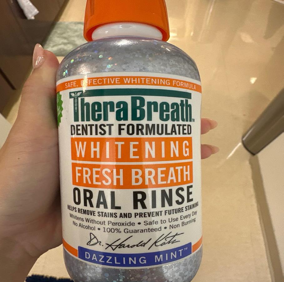
On my bathroom sink counter, I noticed this mouth wash bottle and its label and took one look and decided to use it for this assignment. The TheraBreath oral rinse label is an example of bad typography because it overwhelms the viewer with too much information on the bottle. Typography should guide the eye smoothly to establish a clear hierarchy so readers can instantly identify the product name and the purpose. Instead, this specific design competes with itself. The words “Whitening,” “Fresh Breath,” and “Oral Rinse,” are all in bold, uppercase letters, that leaves the viewer unsure of what the actual product identifier is. I think, in order for a design to not feel chaotic, it needs a clear focal point.
Another important issue is the overuse of typefaces, weights, and all the colors. The label mixes green, orange, black, and blue letters, combined with a serif like font and a few other fonts throughout. This patchwork of styles is inconsistent and overall dilutes the brand’s professionalism and just makes the whole design too cluttered. Also, the bright color blocks almost pull attention in too many directions, away from the main product name.
I think good typography should balance readability, hierarchy, and visual harmony. This label overall fails in all three of these areas. It forces the viewer to work too hard to decipher what the product really is, undermining the clarity and trust that branding should provide.
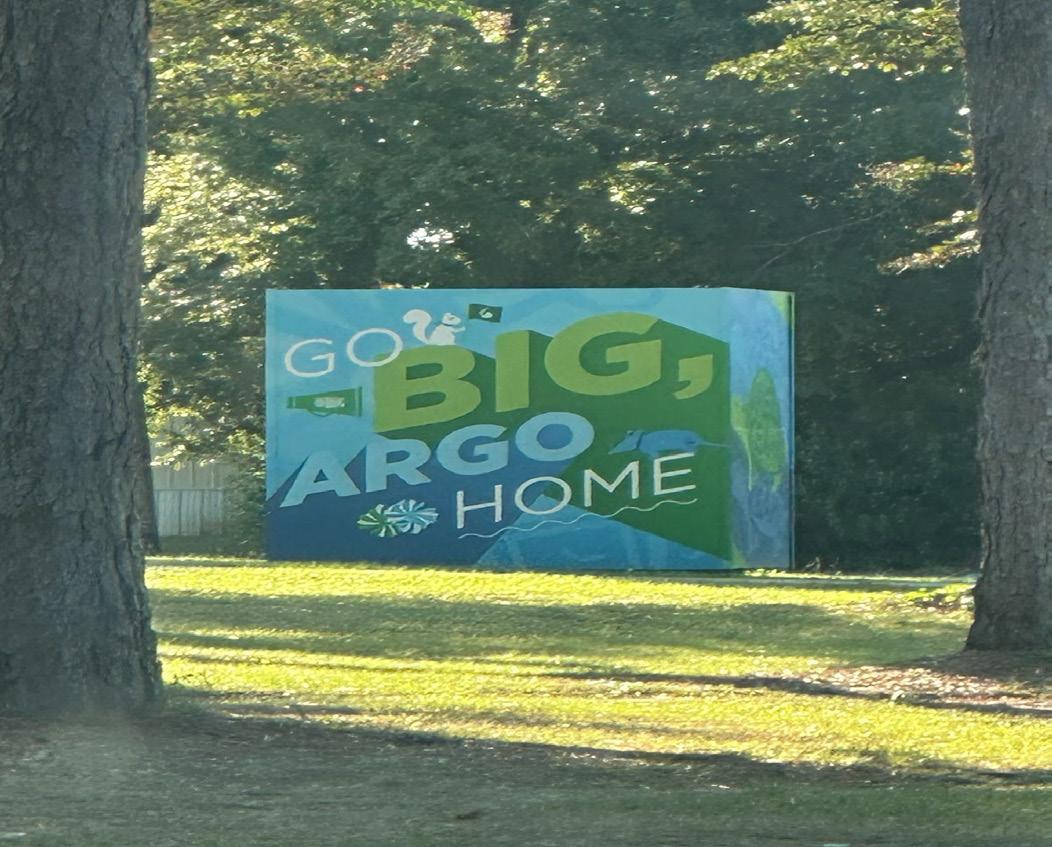
On my way to the UWF gym, I found this fun sign near the football field. I think this demonstrates strong typography because of how it balances the creativity and overall visual appeal; it’s both clear and engaging. The phrase “Go Big, Argo Home” is a play on the common expression “Go big or go home,” giving it both familiarity and a unique identity that ties to the college’s mascot. Whoever designed this used scale very effectively by making the word “BIG” the largest and boldest element on the sign. This ensures that even from a distance, the core idea is communicated instantly.
The use of contrasting weights and sizes of the text relates a natural hierarchy that guides the viewer’s eyes from “GO” to “BIG,” then “ARGO,” and finally “HOME.” Every word feels intentional in their placement, with the diagonally aligned “ARGO” adding movement and energy without sacrificing clarity. The color choices of the green and blue creates harmony with the natural surroundings while tying with school spirit. The mix of -what looks like- sans-serif type with playful design elements, like the squirrel and the flags, makes the composition approachable and lively.
Overall, the typography of the sign is very well done, draws attention, and conveys school pride.
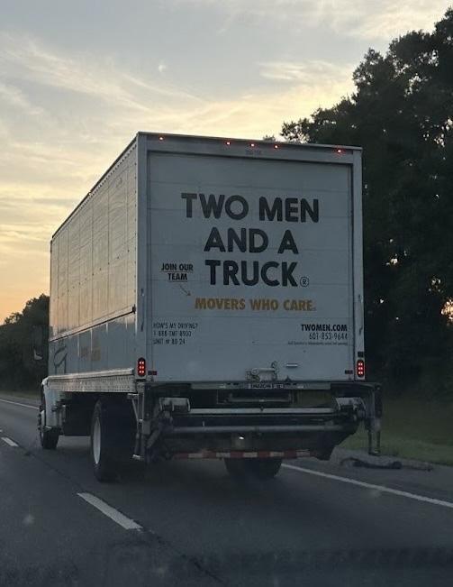
I saw this truck on my way back from having a weekend at my family’s house and knew I should take a picture for this assignment. The main issue here is that the design lacks visual hierarchy, branding clarity, and effective communication. While the large and bold type for “TWO MEN IN A TRUCK” is legible from a distance, the overall layout just feels unbalanced. The company name, tagline, and other text all appear in a similar style, which makes the reader have no clear sense of what is most important. Drivers need to be able to process information quickly, especially on a fast-moving highway.
The placement of the words also creates awkward spacing. The company name is broken into multiple lines in a way that disrupts the natural flow, forcing the reader to pause and put the pieces together. The tagline, “MOVERS WHO CARE” is small and tucked under everything, almost as if it is an afterthought. This makes the impact of the slogan weak, when it should be central to the brand’s identity.
The design also lacks personality. Without distinctive typography, graphics, or a logo, it fails to stand out from the plain moving trucks on the roads. Overall, this is poor typography because it communicates the basics but misses the opportunity to convey identity, hierarchy, and memorability.
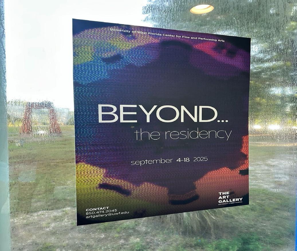
I found this poster in the hallway of the art building on my way to class. I think this poster is an effective example of good typography because it demonstrates clarity, hierarchy, and visual balance. The title “Beyond…” is set in a large, clean sans serif font that captures the viewers attention quickly. The size and placement near the center ensures that it is the focal point of the design, drawing the viewer in before leading the eye naturally to the following text below. The text, “the residency,” uses a lighter, thinner typeface, which contrasts well with the bold title. This contrast not only creates hierarchy but also communicates a sense of refinement appropriate for an art related event.
The smaller text, including all the dates and contact information, is legible and is spaced out well. By keeping these details simple, the designer ensures they remain accessible without overwhelming the viewer. The alignment stays consistent which gives the overall layout a sense of order. The typography also works well with the abstract and colorful background.
The clean and modern typefaces stand out against the vibrant imagery, making sure it is readable while also complementing the artistic theme of the event. Overall, the typography successfully conveys creativity and clarity which are key to an effective design.
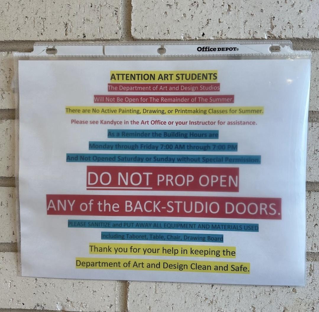
I also found this poster on my way to class. Although it immediately caught my attention, it was because I thought it would be a good example for this very project. It lacks visual hierarchy, consistency, and readability. The overuse of colors, font weights, and with everything highlighted creates visual clutter, making it difficult to actually read it and unsure of where to even focus. For example, the bold red “DO NOT PROP OPEN ANY of the BACK-STUDIO DOORS” is intended to be the most important message, but it competes with other highlighted phrases in yellow, blue, and red. Instead of creating emphasis, the excessive variation rids the massage of clarity and overwhelms the viewer.
Also, the lack of consistent alignment and spacing weakens the design. The text blocks feel crowded, with little breathing room, making the sign harder to read or scan quickly. Effective typography relies on clear hierarchy, which is often established with consistent font sizes, weight, and spacing rather than a rainbow of highlights. The mixture of underlines here, bold, all caps, and colors feels chaotic.
Overall, the combination of all-caps, inconsistent fonts, and everything highlighted just creates too much confusion for it to be good typography.
I saw this billboard on my way to the grocery store and it stood out as good typography to me. It balances hierarchy, readability, and visual impact. The bold sans-serif font used in the phrase “GET CHARGED” immediately commands attention. Its thickness and clean letterforms make it easy to read from a distance, which is critical for outdoor advertising where viewers often have only a few seconds to process the message. The integration of the red lightning bolt in place of the “A” adds a clever design element that reinforces the theme of electricity and charging, while also creating a memorable brand impression.
The hierarchy of information is also well established. The main message is the largest and boldest, ensuring it is first to be seen. The supporting text,”Tesla wall Connector Installation” is smaller but still clear, providing context after the headline draws attention. The phone number stands out in red within a shape, making it easy to locate and recall.
Also,the color usage of black, white, and red, creates a strong contrast that improves its legibility in various lighting. Altogether, the typography is functional, visually appealing, and perfectly suited for its advertising purpose.

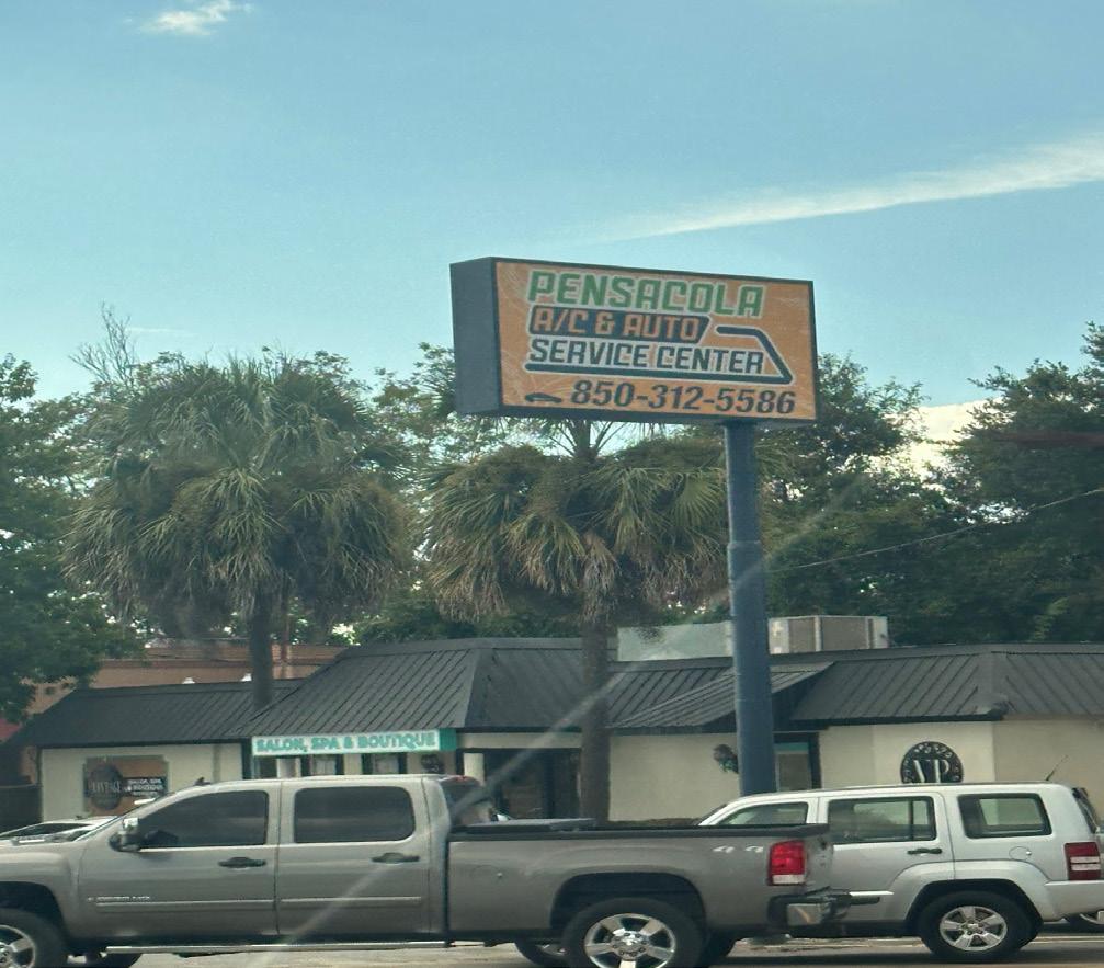
I also found this billboard on my way to the store and it looked cluttered to me. I think it’s an example of poor typography because it doesn’t have readability or clarity, which are two very important qualities for signage, especially one viewed by drivers. The first issue is the inconsistent use of fonts and styles. The word “Pensacola” is in a bold, blocky typeface with a heavy green outline, which competes visually with the orange and white text below it. Instead of creating hierarchy, the different fonts and colors create clutter and for the eye to jump around without any clear focal point.
Color choices also hurt legibility. The orange background clashes with both the green and blue lettering, making the words harder to distinguish. The thin white outlines around some of the letters don’t give the design enough contrast against the bright background, so parts of the text fade, especially from a distance. Also, the multiple color schemes for each section, green, orange, and blue, create visual noise instead of guiding the reader logically through the information. Plus, the critical part about the A/C and auto service center is broken up and makes it harder to read, defeating the purpose of a quick roadside sign.
Overall, poor font choices, clashing colors, and weak hierarchy make this typography weak.
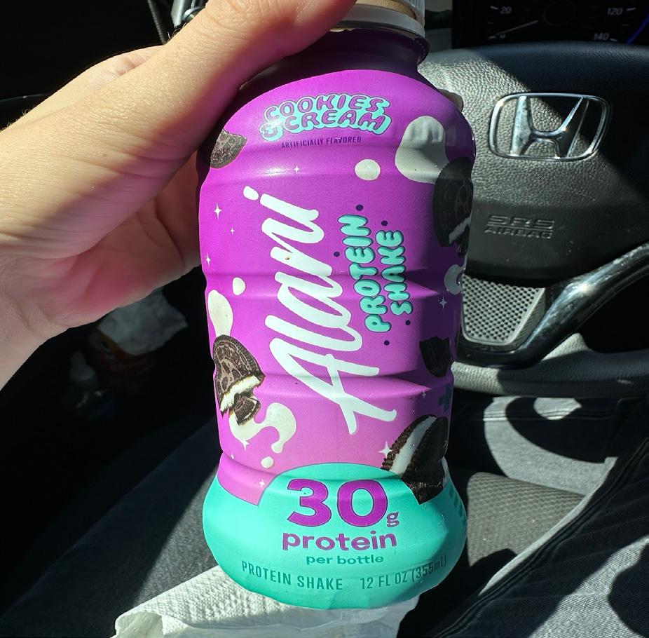
I drink these protein shakes often and the label always stands out to me. This protein shake label is a strong example of good typography because it successfully combines readability, hierarchy, and visual appeal to reinforce brand identity. The playful, handwritten-style logo “Alani” stands out prominently in white against a bold purple background, immediately drawing attention to the brand name. Its smooth, curved lettering complements the energetic and youthful tone of the product. The supporting text, like “30g protein” and “Cookies & Cream,” uses clean sans-serif fonts that balance the decorative logo and maintain legibility even at smaller sizes.
The typographic hierarchy is clear—viewers first see the brand name, then the flavor, and finally the key nutritional detail, creating a natural visual flow. Color contrast enhances this readability: the white and turquoise text against purple ensures clarity and vibrancy. The playful font choice for “Cookies & Cream” with slightly whimsical curves matches the indulgent dessert theme while keeping the overall design cohesive.
Spacing and alignment are handled well, leaving enough breathing room around text elements to avoid clutter. Altogether, the typography feels dynamic, approachable, and modern—perfect for a lifestyle-oriented brand targeting health-conscious consumers while maintaining a sense of fun and personality.
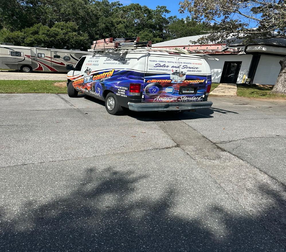
While on my break at work I found this truck in the parking lot and I thought the vehicle wrap is an example of poor typography because it lacks visual hierarchy, clarity, and consistency, making it difficult for viewers to quickly absorb key information. The van features several competing fonts—some italicized, some bold, some outlined—which creates a cluttered and unprofessional appearance. The mix of serif, sans serif, and script styles results in a confusing design that doesn’t establish a cohesive brand identity. In addition, the text placement across the curved surfaces of the van further distorts readability, especially from a distance or while the vehicle is in motion.
The color contrast is another major issue. Bright orange and yellow text against a busy blue gradient background reduces legibility, particularly under sunlight or glare. The overlapping imagery and gradients distract from the text rather than supporting it, leaving important details like contact information and services hard to read. The excessive use of effects—such as shadows, outlines, and gradients—adds visual noise without purpose.
Effective typography on vehicle graphics should be simple, bold, and instantly readable, but this design overwhelms the viewer. Overall, the layout demonstrates poor typographic control, where too many elements compete for attention instead of guiding the eye smoothly to the company’s name and essential information.
This book’s cover is an example of good typography. It demonstrates clear hierarchy, balance, and effective contrast. The title, I Don’t Have Enough Faith to Be an Atheist, is arranged and aligned with a thoughtful structure that I think guides the reader’s eye naturally from top to bottom. The emphasis on the words “FAITH” and “ATHEIST” through size and capitalization immediately communicates the central theme of the book, while the smaller supporting text creates a smooth visual rhythm. The serif font conveys seriousness and credibility, which suits the book’s true theological subject matter.
The contrast between the white text and the dark background ensures really clear legibility, while the spacing between lines (leading) and letters (kerning) maintains an open, readable layout. The torn-paper design element framing the glowing image adds depth and visual intrigue without overpowering the typography. I think it enhances the message metaphorically, suggesting revelation and discovery. The authors’ names at the bottom are smaller but remain easy to read, maintaining proper hierarchy and alignment.
Overall, the cover’s typography is cohesive, legible, and purposeful. It effectively combines visual appeal with clear communication, reinforcing the book’s intellectual and reflective tone through disciplined, well-organized typographic design.

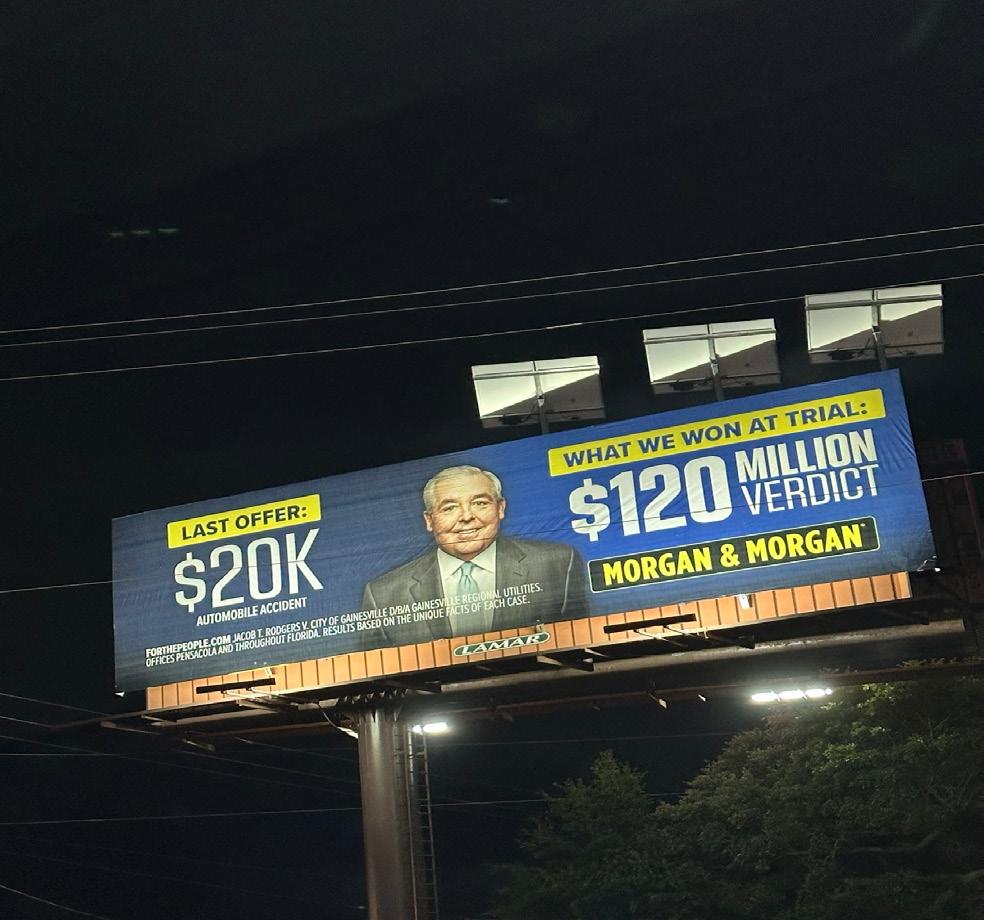
At dinner one night this week I saw this billboard out near the restaurant and I thought it could be a poor example of typography. It lacks visual hierarchy, balance, and clarity and the use of multiple font sizes and weights creates confusion rather than guiding the viewer’s eye smoothly through the information. While the intent is to emphasize the large verdict amount, the surrounding text butts heads for attention instead of supporting the message. The “$20K” and “$120 MILLION” are both in large, bold type, but the contrasting color schemes and inconsistent alignment make the layout feel too cluttered. The text spacing is tight and the overall composition feels cramped, especially given the limited time a driver has to read a billboard.
Additionally, the typefaces used do not go together well. The bold fonts feel heavy and lack style, while the smaller explanatory text is too small to read from a distance. The combination of all-caps, bold yellow highlights, and white text on blue creates visual noise instead of focus. Effective typography should prioritize legibility, contrast, and flow, especially in large-scale advertising. The message here is lost in the visual competition among font styles, colors
, and sizes, making the billboard overwhelming and less effective at quickly communicating its key point.
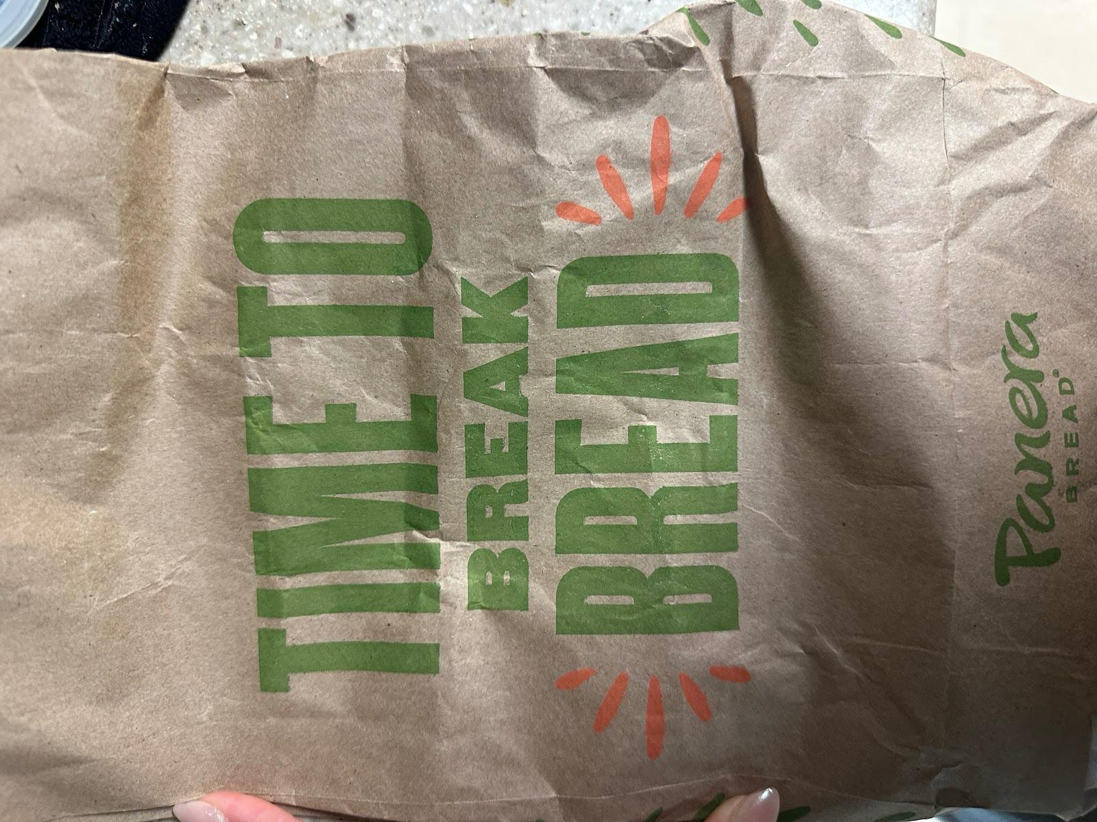
The design on this Panera bread bag is an example of good typography because it demonstrates clear hierarchy, balance, and effective use of space. The bold, sans-serif typeface used for the phrase “TIME TO BREAK BREAD” is strong, modern, and highly legible, making the message instantly readable even from a distance. The vertical alignment adds visual interest and breaks away from a standard horizontal layout, which helps catch the viewer’s attention. The words “BREAK” and “BREAD” are aligned in a way that visually emphasizes the brand’s central theme — connection and sharing over food.
Also, the use of color also enhances the typography. The earthy green and warm orange tones complement the natural brown of the paper bag, reinforcing Panera’s wholesome, organic brand identity. The fun bursts of orange around “BREAD” act like rays of warmth, symbolizing friendliness and hospitality. The placement of the Panera logo in a smaller, unobtrusive size allows the main message to dominate while still maintaining brand presence.
Overall, I think this typography is clean, well-proportioned, and expressive without being cluttered, successfully combining design and message into a cohesive visual identity that reflects Panera’s welcoming and fresh image.
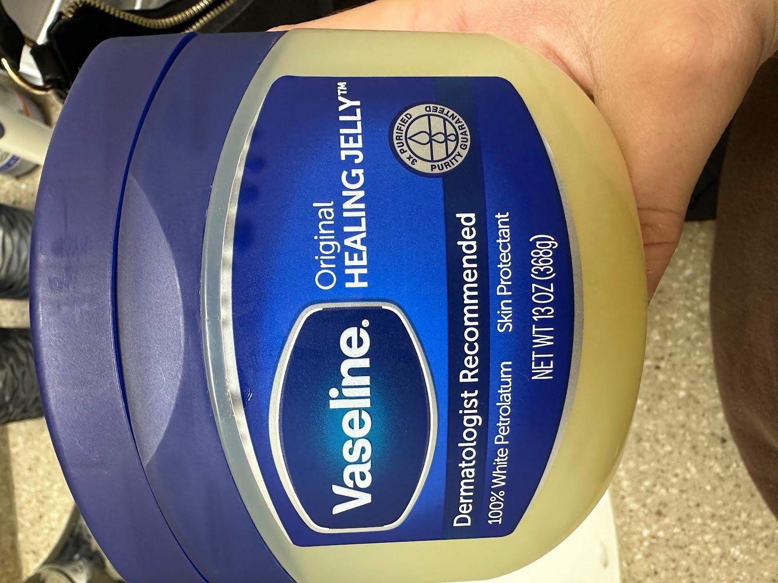
This jar of vaseline’s design I think is considered an example of poor typography. It lacks clear visual hierarchy and balance, making the information appear cluttered and difficult to process at first glance. The type on the Vaseline label uses several different font sizes and weights, but without a strong organizational logic. For example, “Original Healing Jelly” and “Dermatologist Recommended” compete for attention instead of leading the eye in a clear sequence. The placement of the text feels crowded, with minimal breathing space between lines and around the logo, creating a cramped appearance.
Also, the vertical alignment of certain text elements, like “Skin Protectant” and the product weight, disrupts readability and flow. The varying text alignments, with some centered, some left-aligned, and others vertical, contribute to visual inconsistency. While the blue and white color contrast ensures legibility, the overuse of bold sans-serif fonts gives the packaging a heavy, utilitarian feel rather than the clean, soothing aesthetic that would better reflect a skincare product.
The overall layout could be improved by simplifying the hierarchy, allowing the logo and primary product name to dominate while secondary information remains subtle. This lack of typographic unity weakens the design’s visual appeal and professionalism.
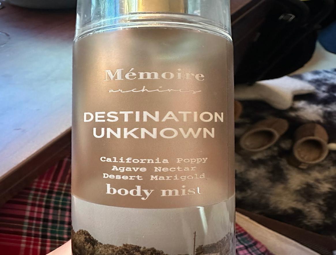
This is a body mist I have had since high school and I still have it lying around in my room. I think this design is an example of good typography because it effectively combines clarity, hierarchy, and aesthetic harmony to reflect the product’s mood and identity. The elegant serif typeface used for “Mémoire” conveys sophistication and a sense of nostalgia, which aligns with the idea of memory and travel. The contrasting sans-serif type for “DESTINATION UNKNOWN” provides a clean, modern counterbalance, creating a visual hierarchy that draws the eye to the product’s title first.
The use of all caps in “DESTINATION UNKNOWN” adds emphasis and structure, while the smaller, lowercase serif text below—“California Poppy, Agave Nectar, Desert Marigold”—introduces a softer, more intimate tone that reflects the natural, gentle quality of the body mist. Spacing and alignment are handled thoughtfully, giving each text element room to breathe and maintaining legibility even on a curved bottle surface.
The consistent alignment and restrained color palette integrate seamlessly with the minimalist packaging design, reinforcing a sense of calm and balance. The typography complements the product’s concept of wanderlust and serenity without overwhelming it, showing that visual simplicity and thoughtful font pairing can create a refined and cohesive brand identity.
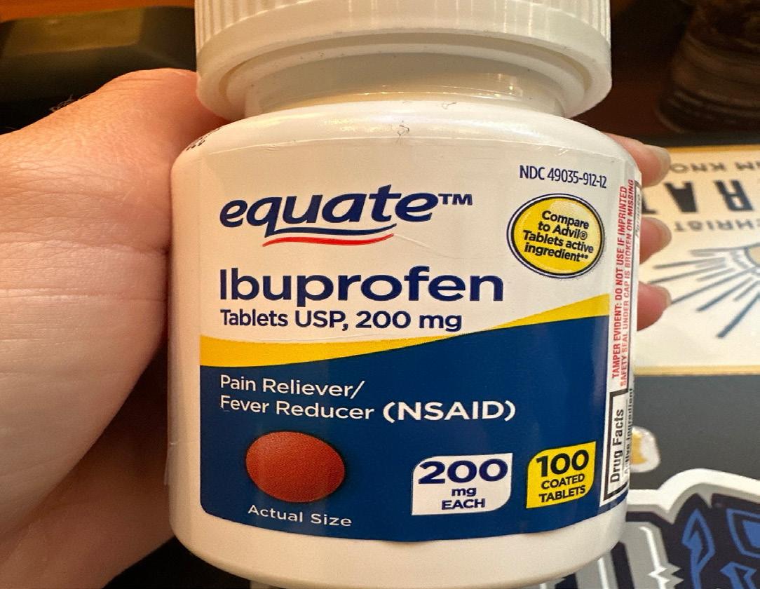
This pill bottle stood out to me as an example of poor typography because I think it lacks visual hierarchy, consistency, and aesthetic harmony, making the information appear cluttered and overwhelming. The label uses several different type sizes, weights, and colors that compete for attention rather than guiding the viewer’s eye naturally. The bold blue “Ibuprofen” and the smaller black subtext below it (“Tablets USP, 200 mg”) create a sharp contrast, but the hierarchy becomes confusing with additional bolded text such as “Pain Reliever/Fever Reducer (NSAID)” and “200 mg EACH” in separate sections. The overuse of bold fonts and all-caps lettering reduces the impact of important information because everything appears equally emphasized.
Also, the combination of italicized, bold, and standard sans-serif typefaces with inconsistent spacing and alignment creates a disjointed visual flow. The circular and rectangular callouts with various font treatments—like “Compare to Advil” and “100 Coated Tablets”—add to the clutter and make the design feel crowded. While the label succeeds in including required information, it fails to present it in an orderly, visually appealing manner.
A more cohesive typographic system with clear hierarchy, consistent alignment, and balanced white space would make the packaging easier to read and more professional in appearance.
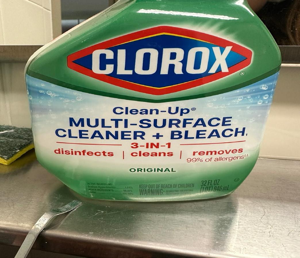
After cleaning my bathroom with this spray I realized this label represents good typography. The clorox cleaning spray demonstrates strong typography because it effectively balances clarity, hierarchy, and brand recognition. The bold, all-caps “CLOROX” logo immediately captures attention through its high contrast and geometric sans serif letterforms. The diamond-shaped logo enclosure provides a strong visual anchor, ensuring that the brand name remains the most dominant element. Below it, the secondary text—“Clean-Up Multi-Surface Cleaner + Bleach”—is organized with an excellent typographic hierarchy. The use of varying font weights and sizes clearly differentiates the product type, function, and benefits, guiding the viewer’s eye smoothly from one piece of information to the next.
The alignment and spacing are well executed, maintaining a clean and structured layout that mirrors the product’s promise of cleanliness. The use of blue and red typography against a white and green background enhances readability while reinforcing the brand’s trustworthy and hygienic image.
Important action words like “disinfects,” “cleans,” and “removes” are in red, drawing attention to the product’s benefits and emphasizing its effectiveness. The consistent sans serif typeface conveys modernity and reliability, while the strategic use of capitalization adds emphasis without overwhelming the design. Overall, the typography is legible, purposeful, and visually cohesive— successfully communicating both the brand identity and product function.
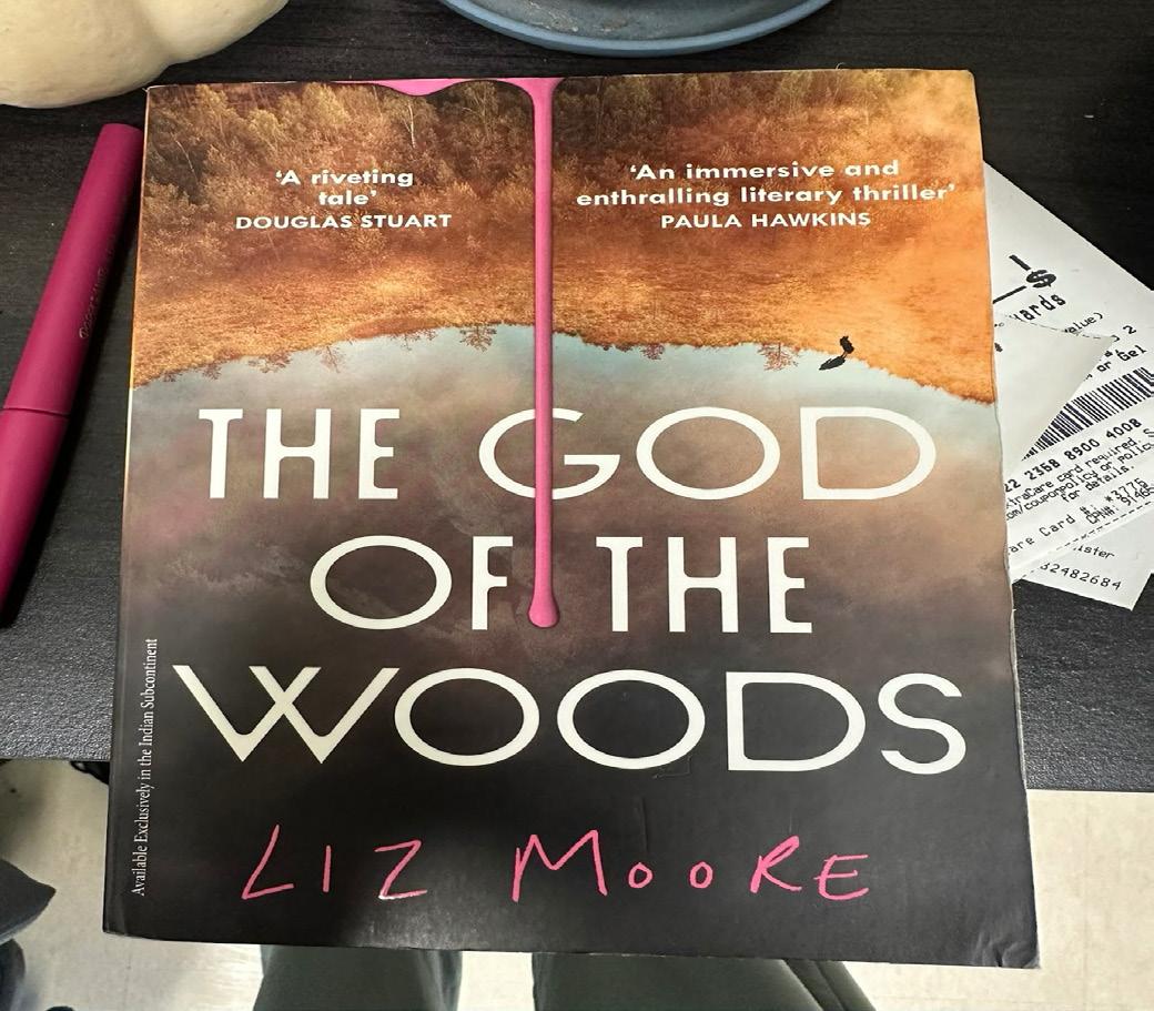
My roommate let me borrow this book and I felt as though the typography was poor. This can be considered poor typography for several reasons including several issues that affect readability, visual balance, and overall coherence. While the image and color palette create a moody atmosphere appropriate for the title, the typography doesn’t fully harmonize with the design. The most noticeable issue is the placement and spacing of the title text. The words are stacked unevenly, and the alignment feels slightly off-center, making the composition look awkward. The dripping pink line running through the “G” in “GOD” visually disrupts the title, drawing attention away from the words and interfering with readability.
Additionally, the contrast between the background and the white type varies across the cover, making some letters blend into the lighter areas of the image. The mix of type styles—clean, geometric sans serif for the title and a handwritten, bright pink script for the author’s name—creates a disjointed visual hierarchy. The two styles clash rather than complement each other, making the design feel inconsistent. The pull quotes at the top add to the clutter, competing with the title for attention.
Overall, the typography lacks cohesion and clarity, weakening the professional and atmospheric impact the cover intends to convey.
In the completion of this book, I discovered some similarities throughout the good and bad typography I found. For good typpography, I tend to favor expressive, modern and clean designs. The bad typography I had found were commonly illegible, rushed, and overall messy. Overall, I worked hard to find examples, both good and bad, that felt they deserved a place in this book. I hope you found this book as enjoyable to read as I found to create.
-Anna Thomas