BRAND GUIDELINES
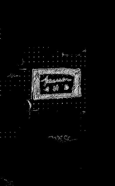
00 Table of contents Pause
Typography and Colour The Brand Logo Introduction 1.1 3.1 Typeface 2.1 Logo Exploration 1.2 Brand Mission 3.2 Colour Palette 1.3 1.4 1.5 1.6 Brand Vision Brand Moto Target Audience Tone of Voice 2.2 Logo 2.3 Clear Space 2.4 Logo Usage 2.5 Logo variants 1.0 3.0 Brand Assets References 4.1 Letterhead 4.2 Leaflet 4.3 Uniform 4.0 5.0 2.0
Table of Contents About The Brand
1.0 About the brand
The Establishment Is Not A Traditional Cafe And Does Not Engage In Selling Food. However, They Do Serve A Distinctive Kind Of Cuisine That Focuses On Local, Regional, And Seasonal Ingredients. A Community Cafe That Embraces The Concept Of ‘Pay What You Want’ And Operates On An Invite-Only Basis.
1.1 Pause Intro
Introduction
Brand
Mission
Building a environment that accommodates extended periods of seating for individuals.
welcoming and cost-free
1.2 Mission statement Pause
Create a community space that becomes a familiar and expands within 6-8 months.
go-to destination
1.3 Brand Vision Pause
Brand
Vision
Brand Moto
Helps in Coming together of similar minds and a Cherished and Fun environment. Make everyone feel Welcomed.
“More Than a Cafe”
1.4 Brand Moto Pause
Tone of Voice
Friendly and Open
A "Friendly and Open" tone of voice fosters Inclusivity and meaningful engagement with the audience in a welcoming and genuine environment.
1.5 Tone of Voice Pause
Target Audience
Age: 23-40
People in their mid-30s (Conscious Millennials.
For people in their 30’s want Exploring, Relaxing, Community involvement and make a impact.
1.6 Target Audience Pause
2.0 The Brand Logo
Logo Exploration

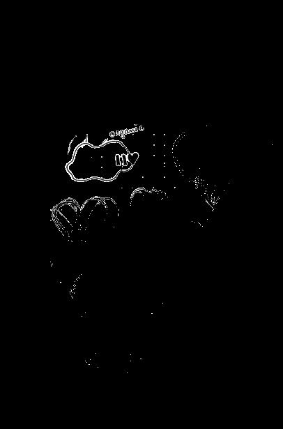
Logo Exploration
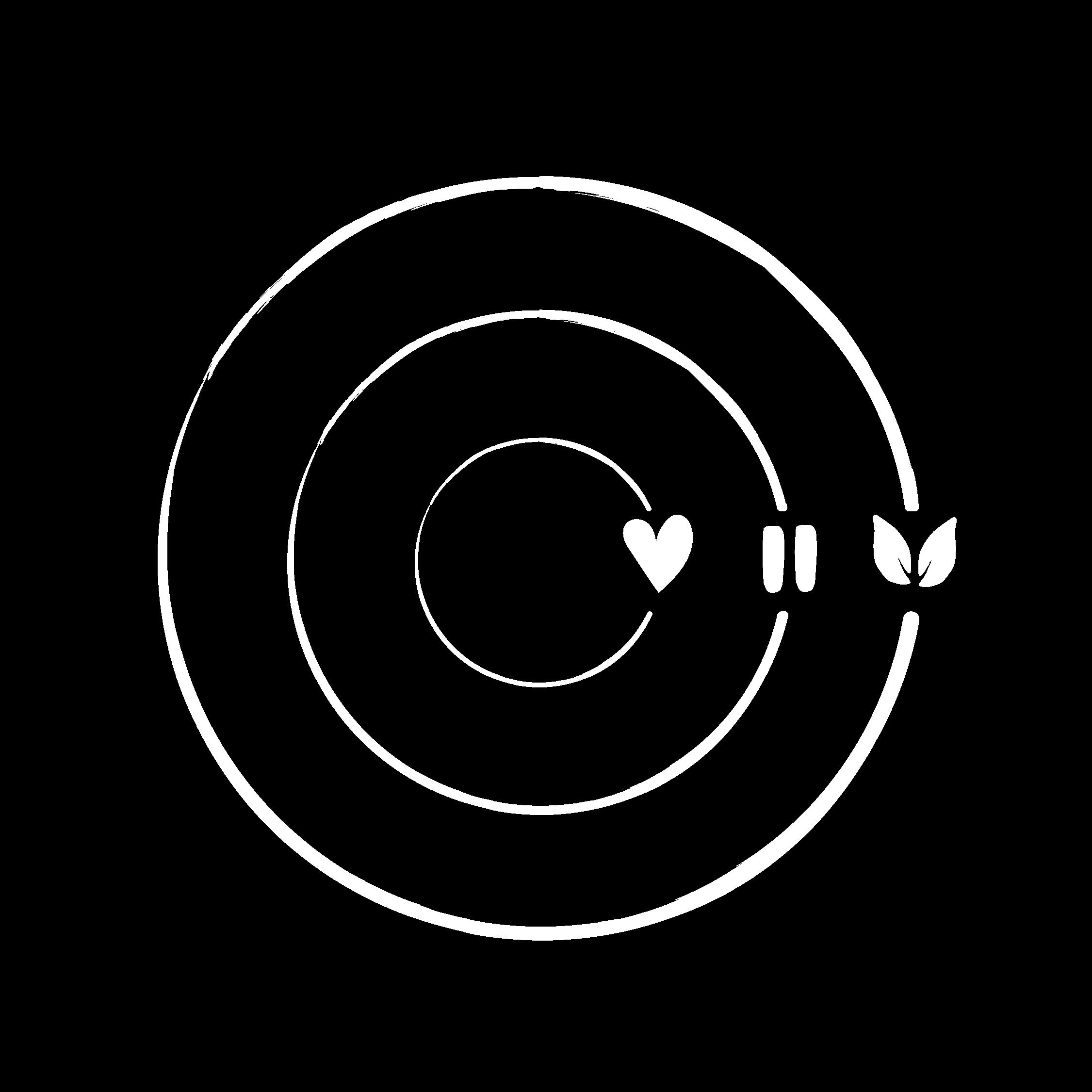
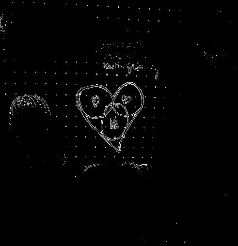
Logo
Logomark
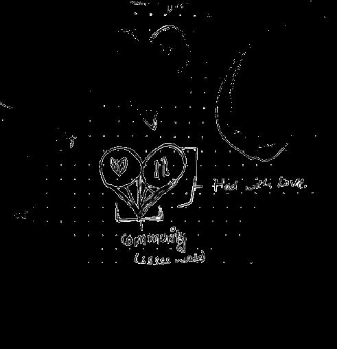
Community
Primary Logo
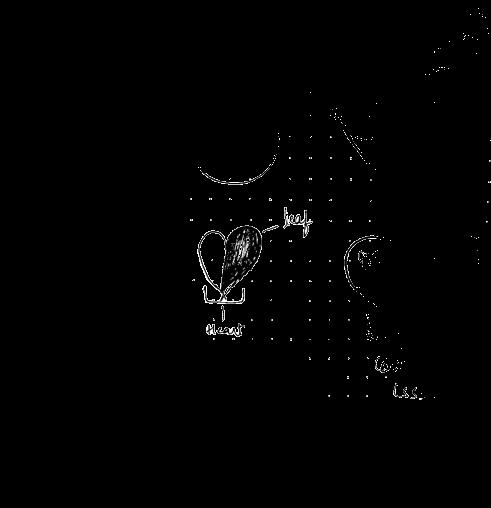
Strokes: to give them a handmade touch
Open Space: Welcome
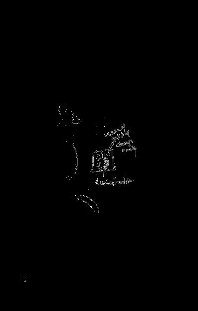
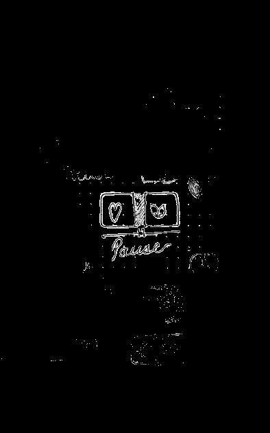
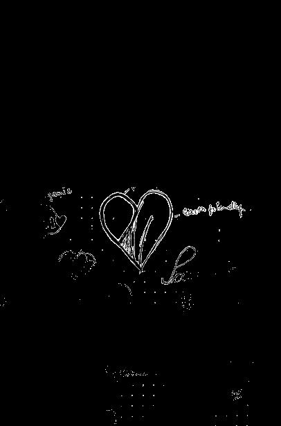
A circle is a safe space - it involves equal participation of all points. And the Symbols used are the representation of their Values.
2.2 Logo Pause
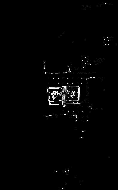
Clear Space
Design components, such as type, graphics, or other elements, should not hinder the legibility of the logo by obstructing clear space. Additionally, text or images that carry a strong impact or impression should be kept away from the logo.
1/2 x 1/2 x 2.3 Clear Space Pause
x x
1/2 x 1/2 x 1/2 x 1/2 x
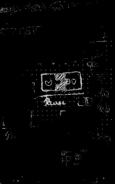
Logo Usage
2.4 Logo Usage Pause
2.5 Logo Variants Pause
3.0 Typography
Only one font is used in logo. Reason for using this font is the contrast between thin and thick strokes.
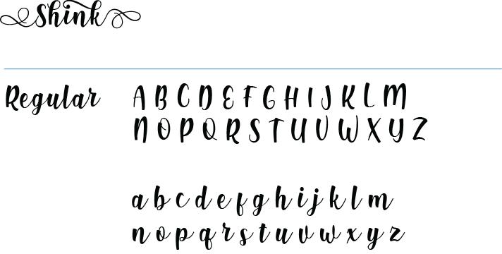
3.1 Typeface Pause
Earth
3.2 Color Palette Pause HEX #A7A437 60% USE HEX #5C402B 60% USE HEX #F15E55 10% USE HEX #6AA8D8 30% USE
4.0 Brand Assests
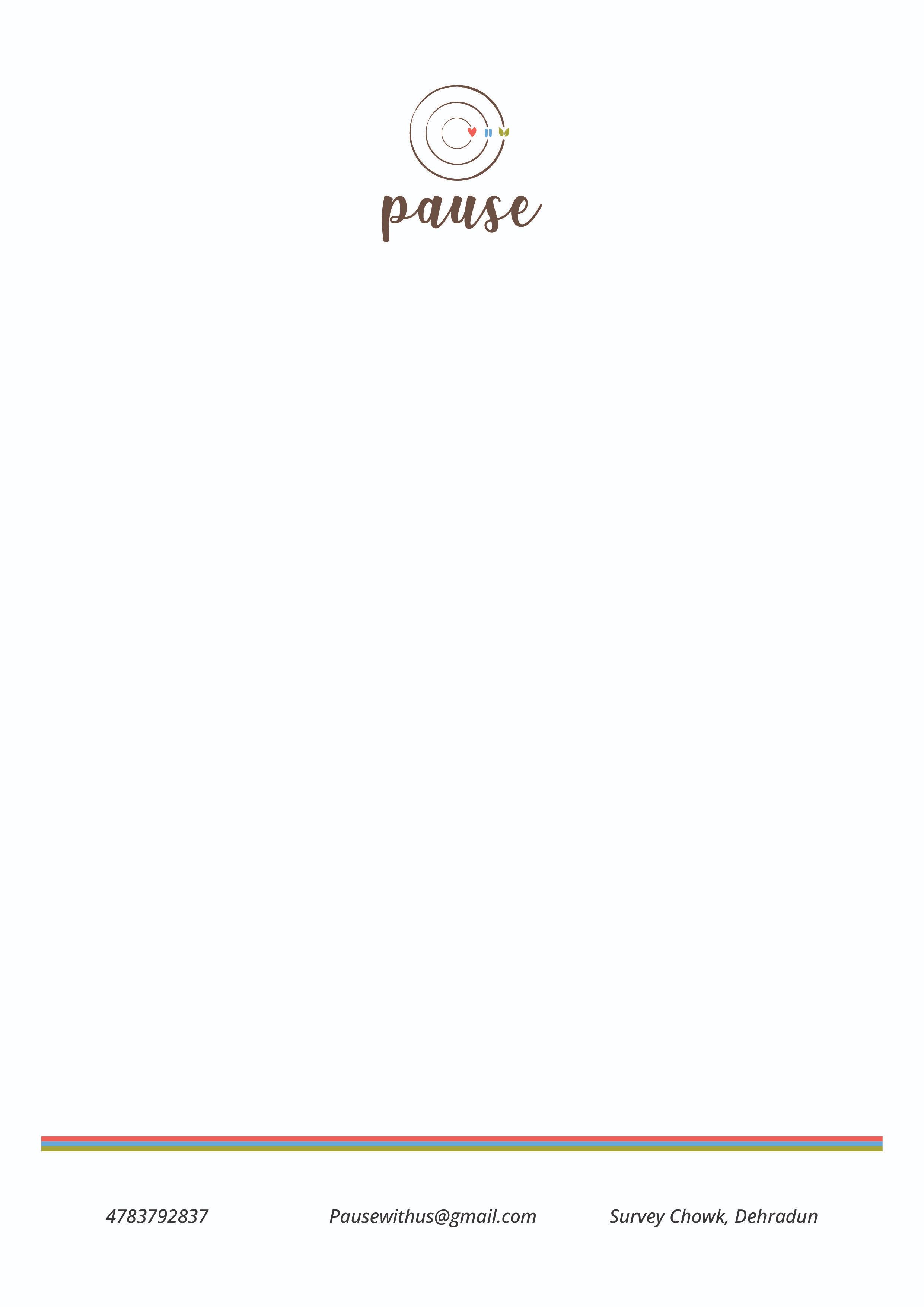
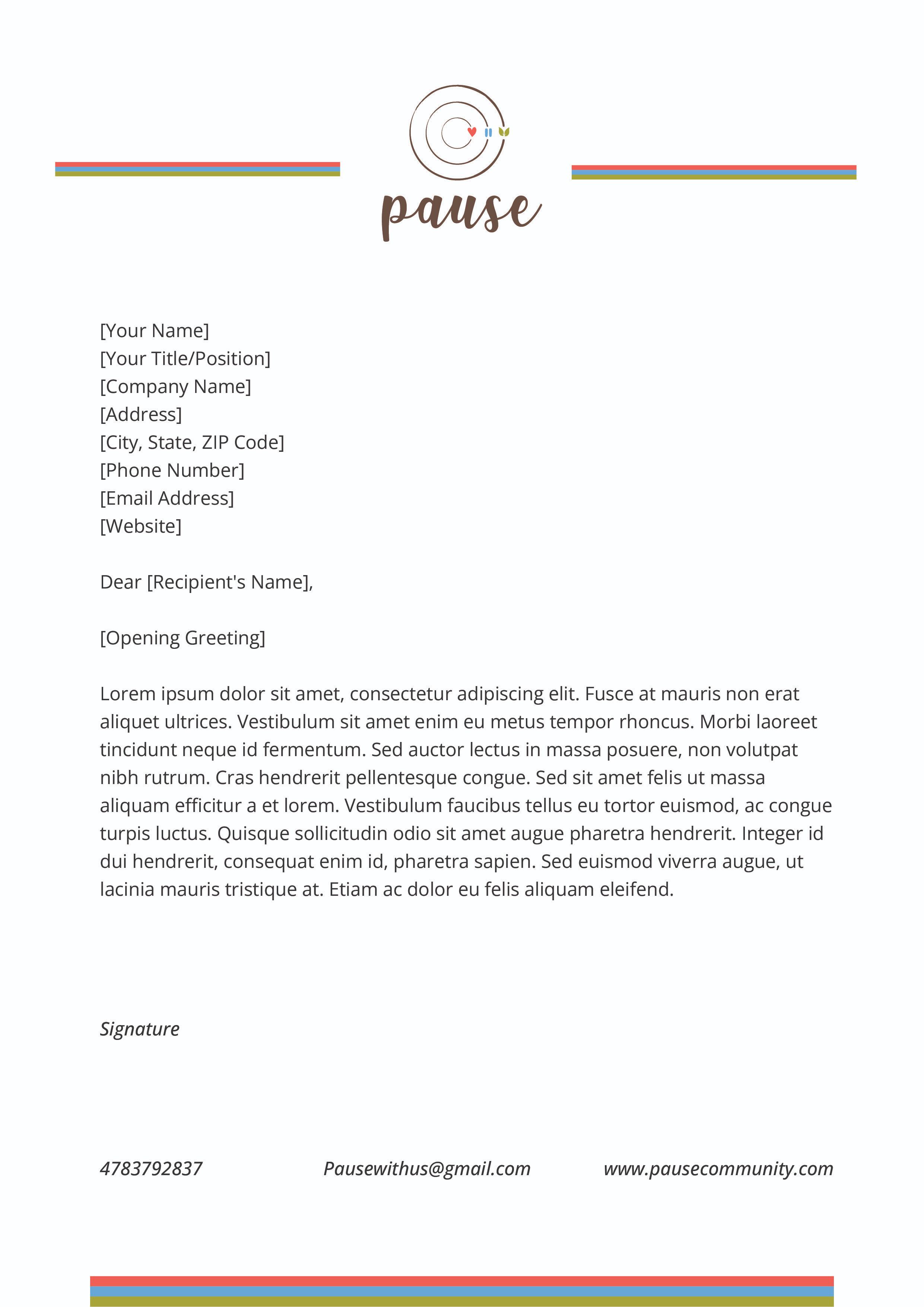
4.1 Letterhead
Pause
ROLENO BLUE OFFBLACK
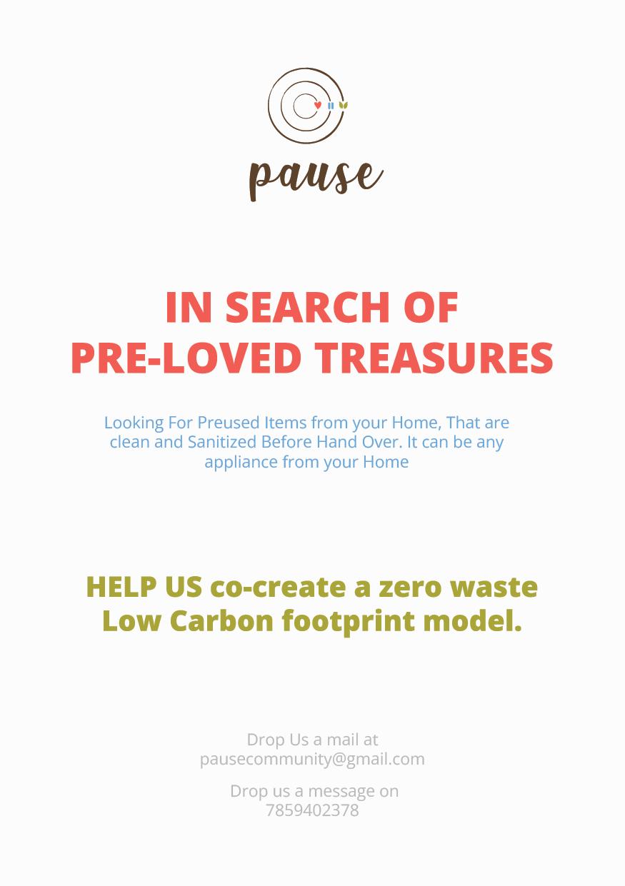
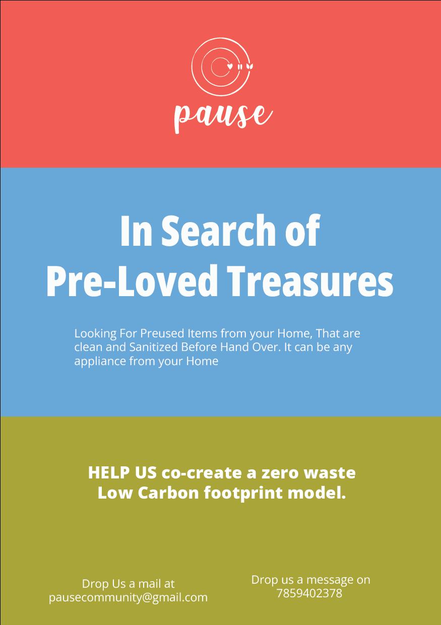
4.2 Leaflet Pause
5.0 References
https://issuu.com/adityaarora070/ docs/brand_book_copy
https://www.behance.net/
https://99designs.com/blog/logobranding/how-to-create-a-brandstyle-guide/
5.1 References Pause
5.1 Pause