
Brand Guidelines


IT’S PLEASANT IN THE PRAIRIE. Always
About PLEASANT PRAIRIE
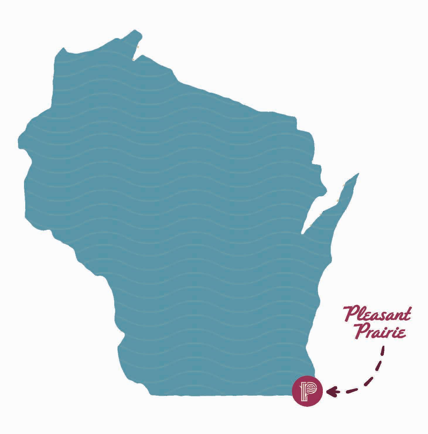
On the shores of Lake Michigan, tucked away off the corridor that connects Chicago and Milwaukee, lies a place that perfectly blends natural areas, recreational spaces, retail shopping, commercial properties, residential neighborhoods, and a wide variety of dining and entertainment options. It’s a place rich with authentic experiences, enjoyed by both visitors and residents alike. And it’s a place where people, even those recently transplanted, easily grow roots that run deep. Experience having it all in a place that is as nice as it sounds, right here in Pleasant Prairie, Wisconsin.
BRAND
PROMISE
Visit Pleasant Prairie is an organization dedicated to developing and promoting the Village of Pleasant Prairie as a great place to visit, stay, live, work, and run a business.
We are a 501(c)6 nonprofit, primarily funded by hotel and short-term lodging taxes.
Our vision is to authentically inspire everyone to love the Village of Pleasant Prairie as much as we do, and our mission is to positively impact our community’s quality of life so that residents and visitors can enjoy our special corner of the world today, tomorrow, and for generations to come.
GRAPHIC IDENTITY
LOGO SIZE & CLEAR SPACE
To ensure readability, never reproduce the Visit Pleasant Prairie logo smaller than 1” wide. Always maintain a clear space around the logo. This prevents text, illustrations, photos or other elements from interfering with the logo’s legibility. More space is generally preferred. For the logo, the height of the letter “P” in the word “Pleasant” should be used as a measure to determine the minimum amount of space required between the logo and the other elements and text.
1.5''
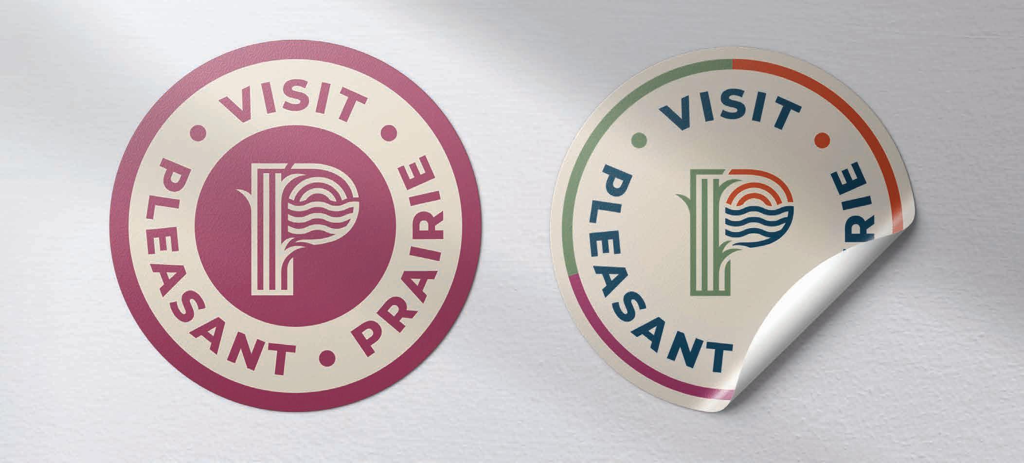
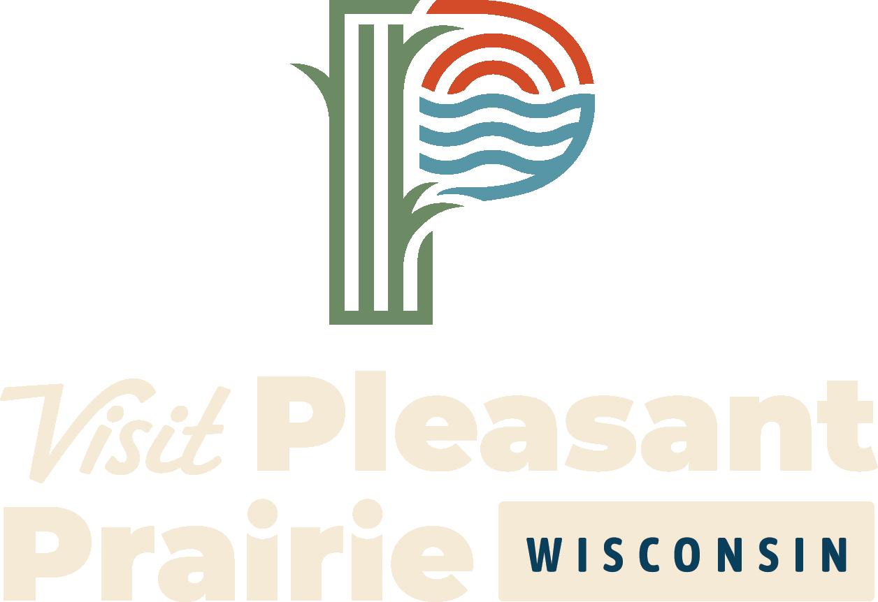
LOGO VARIATIONS
The logo can be shown in a variety of colors and sizes as well as in (1) stacked and (2) horizontal variations. There is also a (3) social icon variation as well as a (4) badge version. When choosing which version of the logo to use, take into account the other images and colors that will be seen around the logo and choose the option that works best.
USING COLOR
Combine colors accordingly for best contrast. Pleasant Blue and Momper’s Merlot should never be used together.
STACKED LOGO (1)
HORIZONTAL LOGO (2) BADGE LOGO
(4) SOCIAL ICON (3)


TYPOGRAPHY
The right typeface, used consistently, creates an effective presence and provides a sense of familiarity for the audience. It will also provide a consistent look and feel throughout all communications.
HEADLINE 2 HEADLINE
BARLOW CONDENSED BOLD
Aa Bb Cc Dd Ee Ff Gg Hh Ii Jj Kk L l Mm
Nn
Bb Cc Aa Bb Cc ABc
CALDER DARK
BARLOW CONDENSED MEDIUM Aa Bb Cc Dd Ee Ff Gg Hh Ii Jj Kk Ll Mm Nn Oo Pp Qq Rr Ss Tt Uu Vv Ww Xx Yy Zz 0 1 2 3 4 5 6 7 8 9
SUBHEAD Accent 2
Accent 1 Body
Ave Bold
Aa Bb Cc Aa Bb Cc Aa Bb Cc
MONTSERRAT REGULAR
USE BARLOW CONDENSED MEDIUM
& BARLOW CONDENSED BOLD FOR
A REALLY POWERFUL HEADLINE.
CALDER DARK PAIRED WITH Redondo Ave Bold CAN ALSO BE USED FOR ACCENT HEADINGS AND CALL OUTS.
MAGNESIUM MVB CONDENSED, IN ALL CAPS, CAN BE USED FOR A STRAIGHTFORWARD SUBHEAD.
Montserrat can be used for BODY COPY and should be set at at 10 pt. with generous leading (line spacing).
Example of body copy: Quam adi siminctur? Qui des earcipsum aut officid quunt occus, sim fugia auda dolorro blantinci sant lant aut autecabo. Lignis expliquidi del imendis nonsequiam velendem aut que magnimagnis nim quam, sum ate es parupta sitaquam laccab ipide mosapic iatur? Eveles moluptatur? Lia vendame dellacc aborepr emperro ipsum eum etur? Qui re pelescitia nim vellaut ium inimus et etur susciis ant eos necerum inus dis is ut et audis conecusae volorem quiditam, ute niendi quae. Nam quos evelita doluptae et prature volest hilibeatiam nonecum, quat fuga.
INCORRECT LOGO USAGE
Following are some examples of how NOT to apply the Visit Pleasant Prairie logo. A good rule to follow is the logo should never be modified or changed and only an approved version should be used.
Do not squeeze, stretch, pinch or distort the logo.
PLEASANT
PRAIRI E
Do not change the font or typesetting in the logo.
Do not change or alter colors in any way.
Do not alter the logo, add or remove any elements.
COLORS
PHOTOGRAPHY
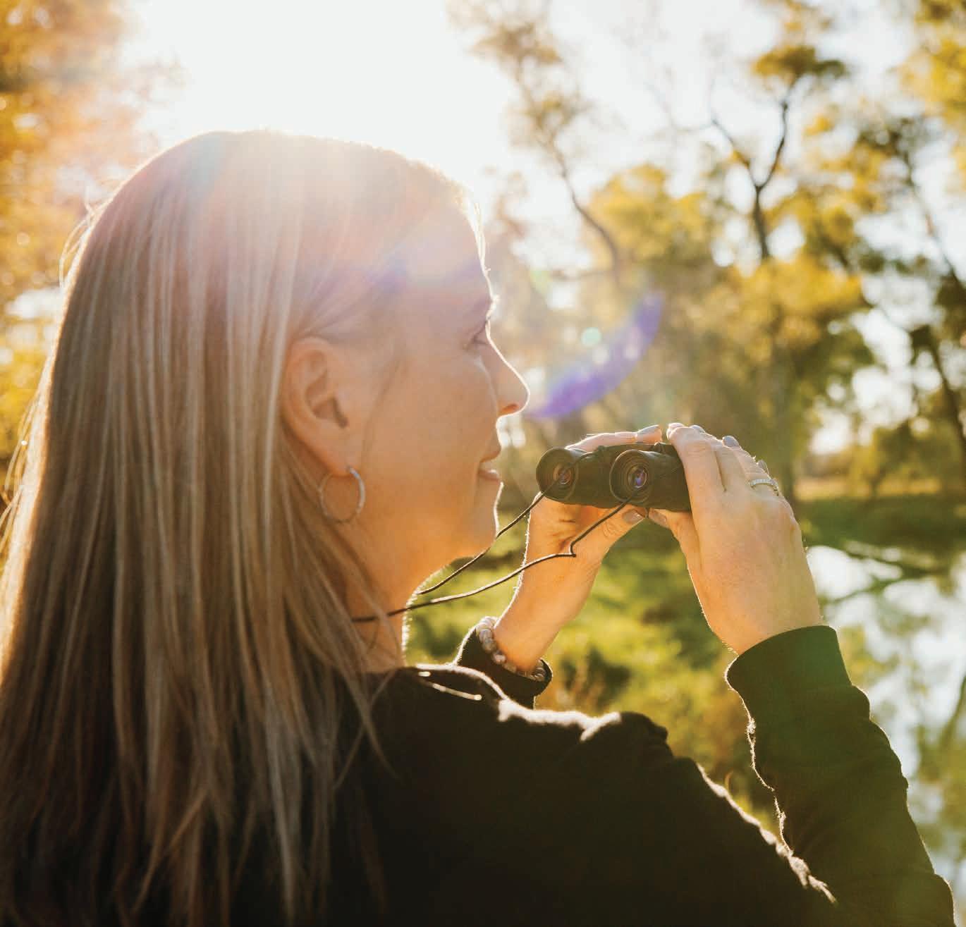
Photography should not look staged or posed; Just captured moments of enjoyment as if the camera wasn’t even there.


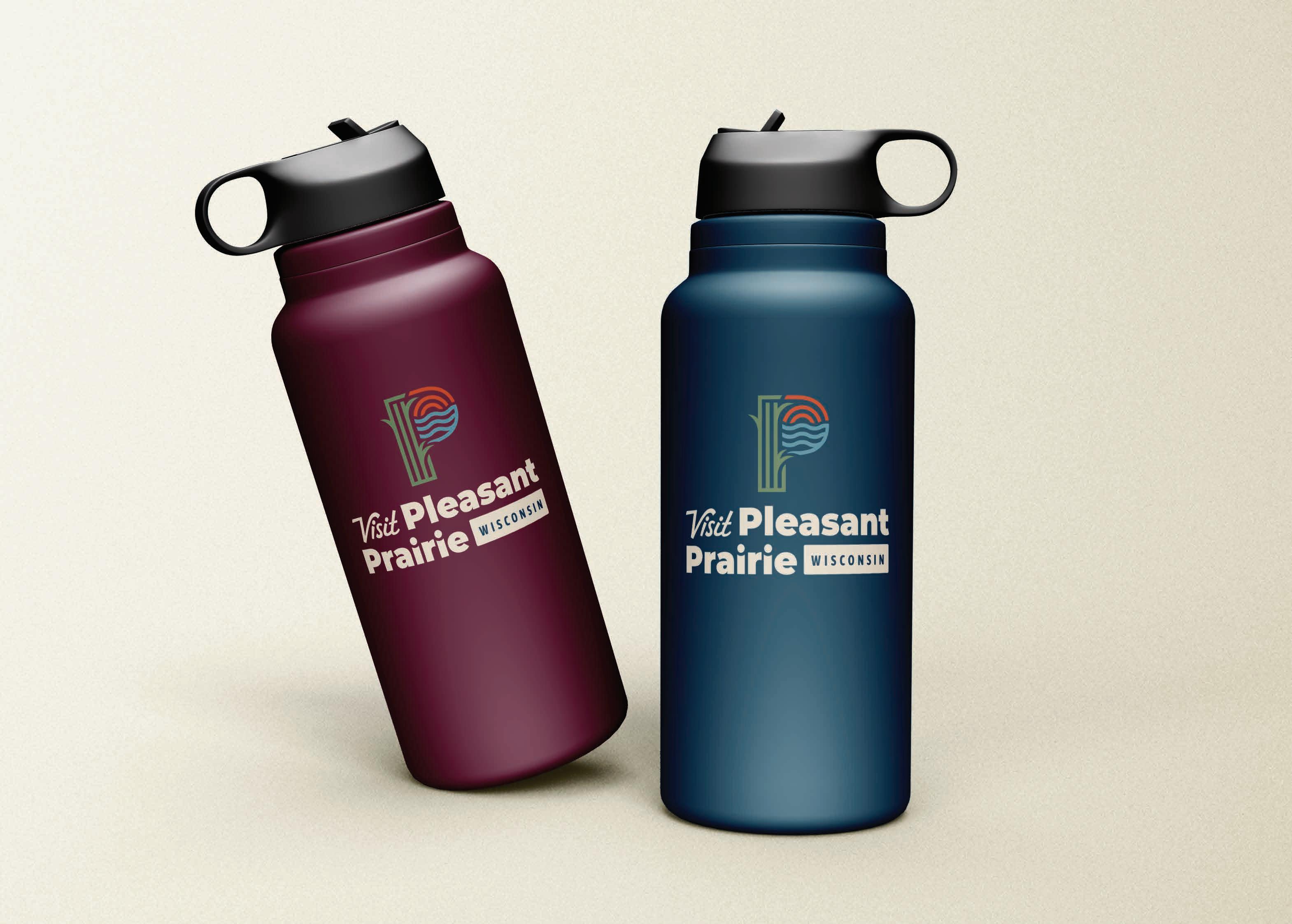
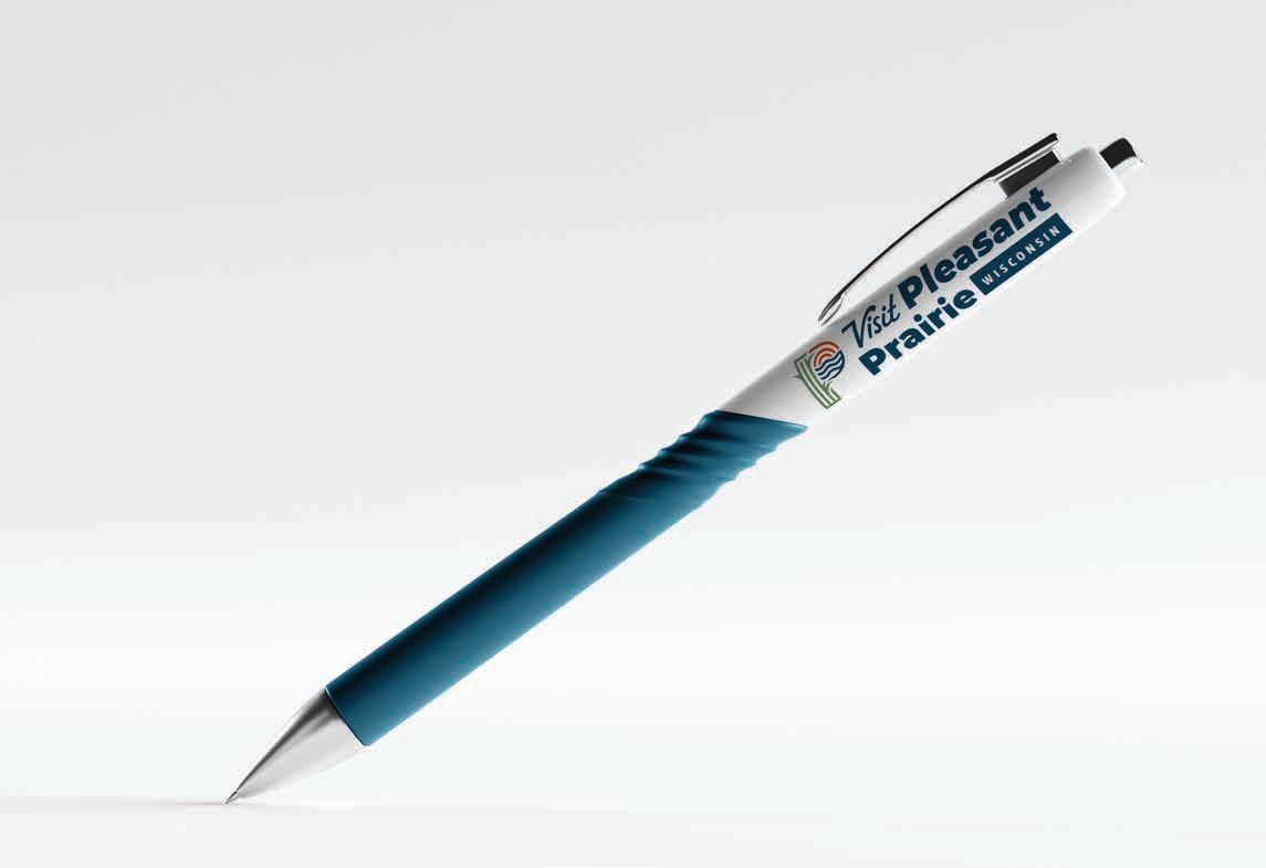
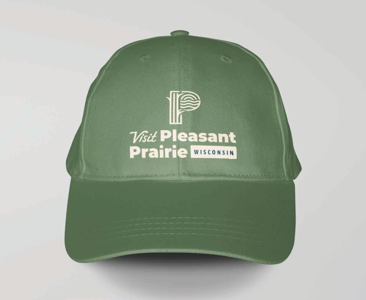
MERCHANDISE
Promotional merchandise and products branded with the Visit Pleasant Prairie logo are distributed to employees and visitors to promote the Visit Pleasant Prairie brand. Such products are often called SWAG and are distributed as handouts at trade shows, during sales calls and presentations, and at events.


APPAREL
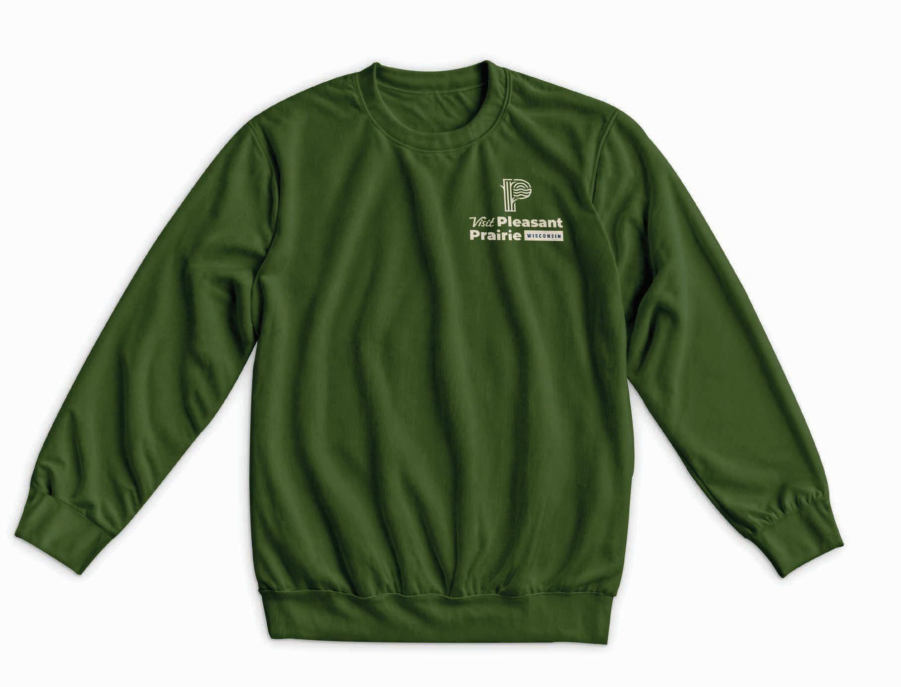
The largest category for promotional products is apparel, such as hoodies, shirts, jackets, and hats. Each item prominently features the Visit Pleasant Prairie logo.


PRINT USE
The stationery kit includes envelope and letterhead. The envelope sample is a #10. The letterhead should be printed on 8.5’’x11’’ paper.


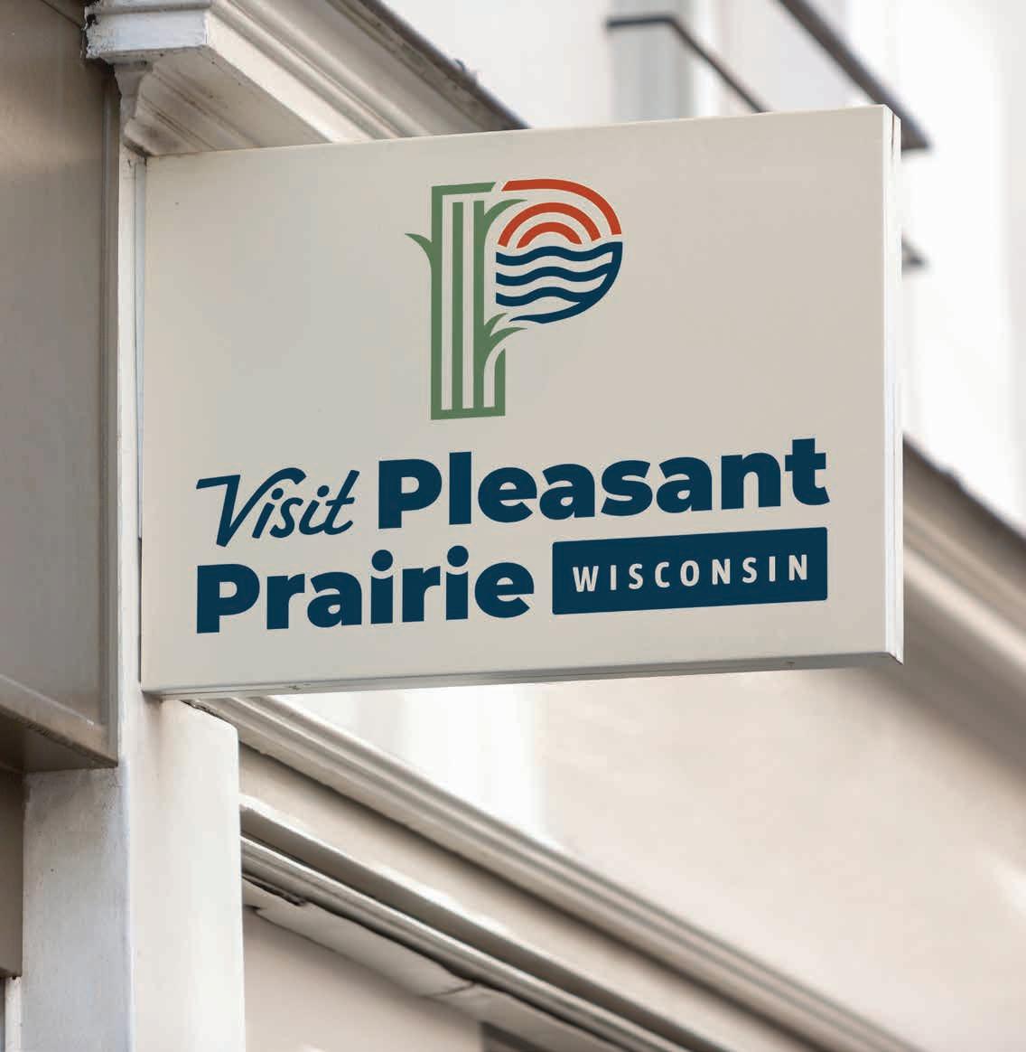
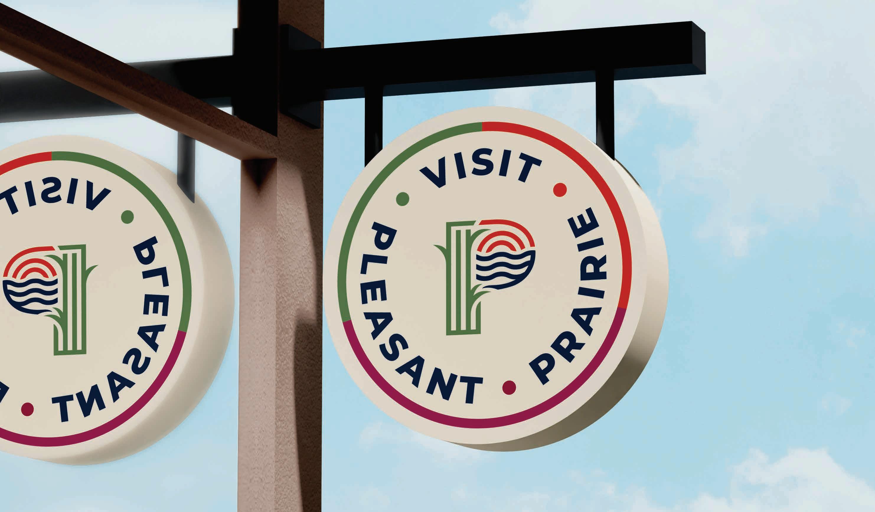
SIGNAGE
The Visit Pleasant Prairie brand identity is supported by company exterior signage that create eye-catching advertisements for Visit Pleasant Prairie.

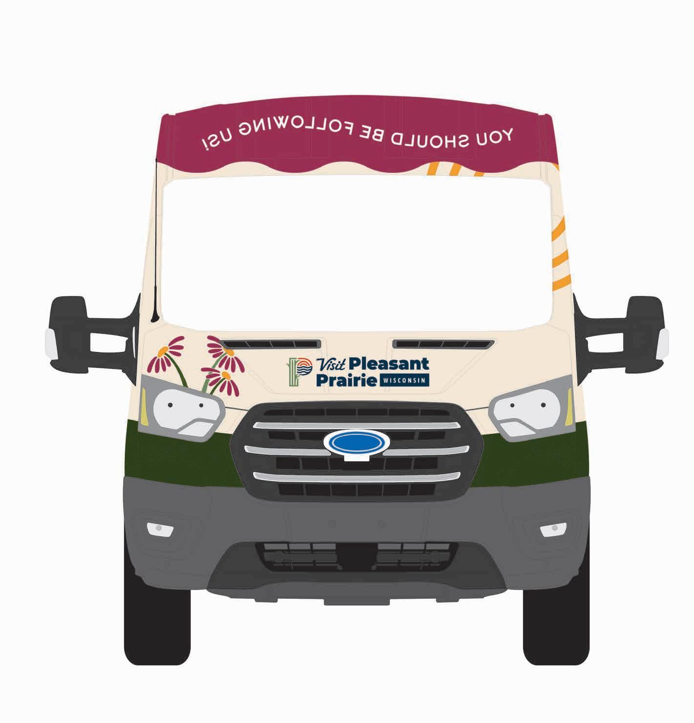
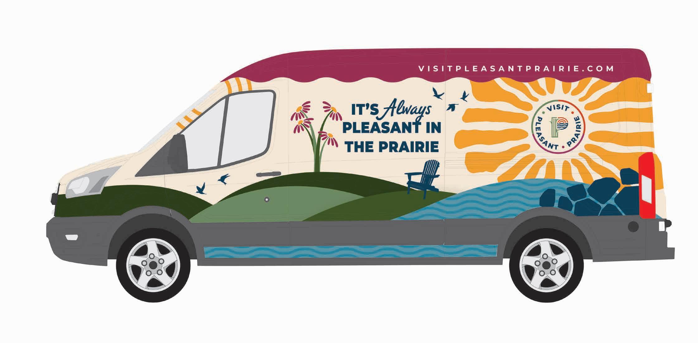
VEHICLES
Company vehicles featuring the Visit Pleasant Prairie logo and designs build brand identity while going to trade shows, conventions, events and traveling in the region.


DIGITAL
Headlines used for social and digital applications should be clearly legible and placed within the color “swoosh” design element. “P” icon variations can be used as icons throughout social channels.
SOCIAL ICONS


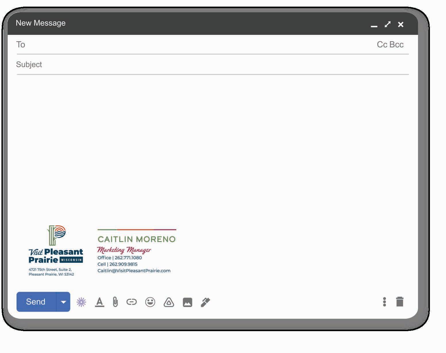
EMAIL SIGNATURE