Introduction 01
About Us
Created in 2024, Building Bonds is a nonprofit organization that was created with the mission to empower Indiana single mothers through childcare support. Too often, mothers must make job decisions based on childcare considerations rather than in the interest of their financial situation or career goals.
Building Bonds provides childcare onsite at our locations across Indiana from certified volunteers while also compiling outside childcare resources in one simple place to make finding childcare for single mothers as quick and easy as possible – we know that time isn’t always easy to come by when it comes to raising children!
Providing easily accessible childcare that is convenient and flexible ties hand in hand with our mission to empower single mothers to excel in their careers without having to worry about their children’s’ wellbeing.
Mission
Our mission is to support Indiana single mothers by providing childcare resources and programs to help their children and themselves thrive.
We strive to alleviate the stresses of finding childcare, enabling mothers to pursue personal and professional growth while nurturing their children’s well-being.
Vision
Our vision is to ensure that across Indiana, single mothers are embraced by a supportive community and equipped with the resources to nurture their children with love and confidence.
Brand Personality
Helpful
Our main goal is to make finding childcare resources accessible and easy! We strive to be as helpful as we can while assisting single mothers in any way possible throughout this campaign.
Accessible
We care about providing support to all single mothers in need.
One of the main problems with government provided childcare is confusing and inaccessible language that is used. Our goal is to make this experience easy for mothers from all backgrounds.
Approachable Friendly
Visual branding is made to feel as friendly and inviting as possible to make viewers feel at ease.
Voice and Tone
Our voice and tone are the verbal counterpart to our brand’s visual look and feel. The way we present Building Bonds to audiences has a huge influence on how they feel about us.
Building Bonds’ voice is trustworthy, inspiring, clear, confident, and passionate.
Write simply, but not too simplistically. Everyone should be able to understand the information presented.
Don’t write in all caps. Building Bonds aims to be friendly and welcoming, not accusatory or stressful.
Get straight to the point and focus your message. Tell viewers what they need to know in a clear and concise way.
Use casual, but not informal language. We are an accessible organization, but we are still professionals!
Use Oxford commas. Always place a comma before the final item in any list of three or more items.
Writing should be optimistic and hopeful. We believe in growth and positive change. The tone should never be negative, uncooperative, or apathetic.
Brand Identity 02
Primary Logo
The primary logo is a key aspect of the brand and shows the core values of. Building Bonds. The logo is never intended to be redesigned under any circumstances.
The horizontal orientation of the Building Bonds logo is the primary orientation that will be used in brand materials. Children’s building blocks represent the community, teamwork, and personal growth that will be built in Building Bonds while the rounded type, corners, and calming colors create an inviting atmosphere for the brand. This logo is integral to Building Bonds.
Primary Logo: Clear Space
The space around a logo is just as important as the logo itself. This space must remain free from other copy to ensure that the logo is not obscured. This space is equal to the cap height of the uppercase B in Filson Soft.
The same free space applies when the logo is used in the secondary form. Nothing can be put here, including text, drawings, photographs, or any other media. Space around the logo enhances its appearance and helps to position it correctly.
Minimum Size
Print = 1”
Digital = 96 px
Secondary Logo
Our primary logo is our most important symbol when representing our brand. However, the secondary logo can be used when a vertical orientation is needed. This is reserved for use when the logo needs to be more compact while still representing Building Bonds’ brand values.
Secondary Logo: Clear Space
Just like the primary logo, the vertical logo also needs ample clear space around it. This space is equal to the cap height of the uppercase B in Filson Soft.
Nothing can be put here, including text, drawings, photographs, or any other media. Space around the logo enhances its appearance and helps to position it correctly.
Icon
Our primary logo is our most important symbol when representing our brand. However, the logo icon can be used when a small size or an icon without the context of the brand name is needed. The logo icon still represents Building Bonds’ brand values.
Icon: Clear Space
Just like the primary logo, the logo icon also needs ample clearspace around it. This space is equal to the height of the middle block of the icon.
Nothing can be put here, including text, drawings, photographs, or any other media. Space around the logo enhances its appearance and helps to position it correctly.
Minimum Size Print = 0.5” Digital = 48 px
Logo Misuse
Building Bonds
Do not change the typeface of the logo
Do not change the colors of the logo
Do not rearrange the elements of the logo
Do not stretch the logo in any direction
Do not create outlines of the logo elements
Do not add any effects to the logo, including drop shadows
Brand Colors 03
Brand Colors
This is the primary color palette for Building Bonds. These colors have been taken from the logo and modified to have a light and dark variant to comply with WCAG guidelines while still conveying compassion, growth, and relaxation. Color pairings to maximize readability will be covered in this guide. Use only the primary color palette when creating assets for the brand identity.
HEX: b24f68
RGB: 178 79 74
CMYK: 27 81 44 6
HEX: e08c9b
RGB: 224 140 155
CMYK: 9 54 24 0
HEX: 2e7470
RGB: 46 116 112
82 37 54 15
HEX: 6bb5b0
RGB: 107 181 176
CMYK: 58 10 33 0
6b7c35
107 124 53
60 34 100 16
HEX: b8cb80
RGB: 184 203 128
CMYK: 31 7 63 0
HEX: f6ebea
RGB: 246 235 234
CMYK: 2 7 4 0
HEX: d6edea
RGB: 214 237 234
CMYK: 15 0 8 0
HEX: eaedd7
RGB: 234 237 215
CMYK: 8 2 17 0
Neutral Colors
This is the neutral color palette for Building Bonds. These colors are intended to be used when color cannot be implemented or in conjunction with the primary color palette for readability concerning body text.
HEX: 404040 RGB: 64 64 64
68 61 60 47 HEX: 878787
135 135 135
49 41 41 5
Color Pairings
To keep information legible, specific color pairings have been approved for Building Bonds. These color pairings are approved for use and can be used with text and imagery.
Note: WCAG 2.0 level AA web accessibility guidelines require a contrast ratio of at least 4.5:1 for normal text and 3:1 for large text. The last three color combinations may be used for large text in print materials, but not web based materials to adhere to WCAG guidelines and preserve legibility.
Acceptable
Contrast ratio: 4.27:1
Acceptable
Contrast ratio: 3.85:1
Acceptable Contrast ratio: 4.45:1
Acceptable
Contrast ratio: 4.98:1
Acceptable
Contrast ratio: 4.6:1
Acceptable
Contrast ratio: 8.88:1
Acceptable
Contrast ratio: 8.68:1
Acceptable
Contrast ratio: 5.45:1
Acceptable
Contrast ratio: 8.47:1
Not for web
Contrast ratio: 2.5:1
Not for web
Contrast ratio: 1.76:1
Not for web
Contrast ratio: 2.36:1
Typography 04
Brand Typefaces
Our primary typeface is Filson Soft, a rounded and friendly sans serif used for headings and subheadings.
Our secondary typeface is Montserrat, a simple and legible sans serif used only for body copy.
Salted is an accent typeface, used for adding a personal and unique touch to our branding materials. Salted should be used sparingly.
Primary Typeface
Filson Soft
Secondary Typeface
Aa Bb Cc Dd Ee Ff Gg Hh Ii Jj Kk Ll Mm Nn Oo Pp Qq Rr Ss Tt Uu Vv Xx Yy Zz Aa Bb Cc Dd Ee Ff Gg Hh Ii Jj Kk Ll Mm
Nn Oo Pp Qq Rr Ss Tt Uu Vv Xx Yy Zz
Montserrat Regular
Accent Typeface
Aa Bb Cc Dd Ee Ff Gg Hh Ii Jj Kk Ll
Rules and Hierarchy
Typefaces should be used according to the rules shown here.
Subheads should always be 70% of the header. Body copy should always be 28% of the header.
Header Subhead
Typeface: Filson Soft
Weight: Black
Leading: 120%
Kerning: Optical Tracking: 0
Typeface: Filson Soft
Weight: Medium
Leading: 125%
Kerning: Optical Tracking: 25
Accent Type Body Copy
Typeface: Salted
Weight: Regular
Leading: 120%
Kerning: Optical
Tracking: -5
Typeface: Montserrat
Weight: Regular
Leading: 130%
Kerning: Optical Tracking: 10
Our mIsSiON
Learn more about us!
Our mission is to support Indiana single mothers by providing childcare resources and programs to help their children and themselves thrive.
We strive to alleviate the stresses of finding childcare, enabling mothers to pursue personal and professional growth while nurturing their children’s’ well-being.
Brand Imagery 05
Photography
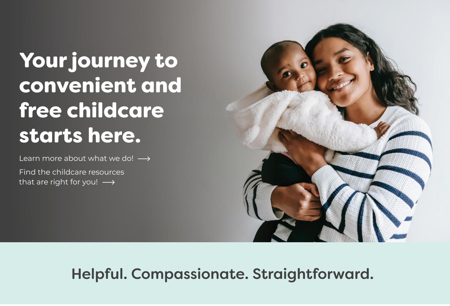
Photography is an essential element of Building Bonds. When choosing photography to include in branding materials, follow these guidelines:
Women and children from diverse racial and socioeconomic backgrounds
Children of various ages, not only toddlers, babies, and newborns
A strong connection between the mother and child
Realistic backgrounds, candid photos




Photo Treatment
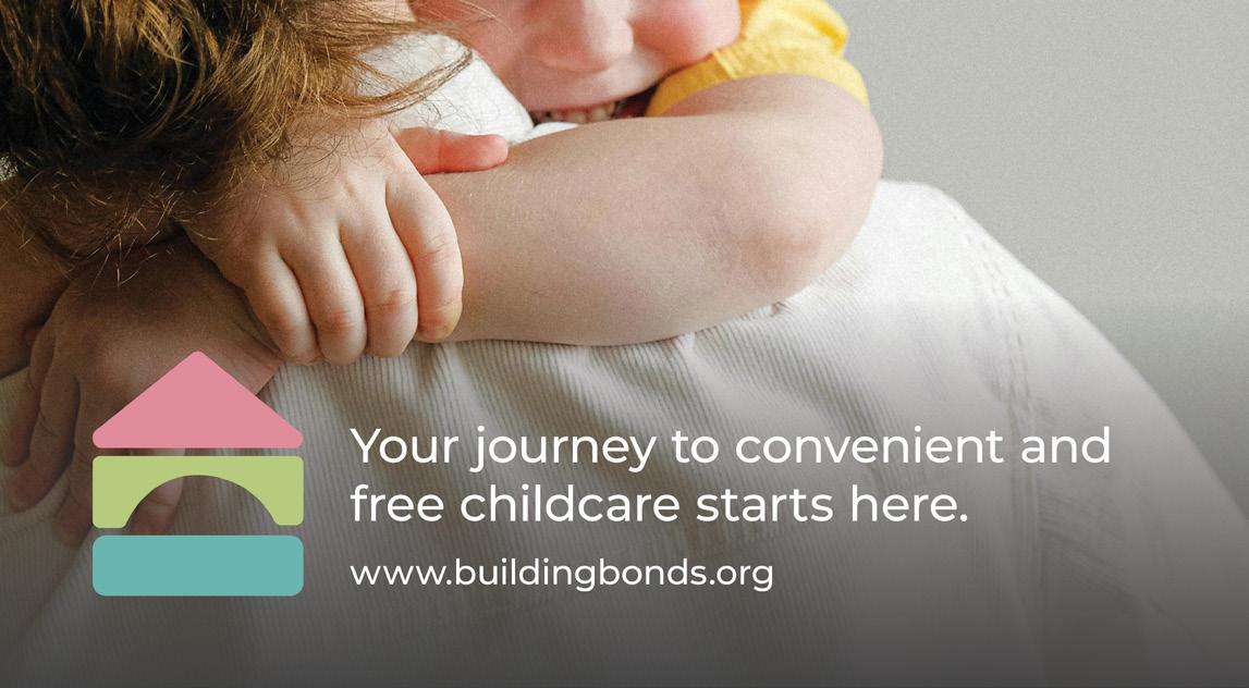
To keep text on photography legible, use a gradient to achieve adequate contrast.


Brand In Use
Identity Application
Keeping Building Bonds’ identity application consistent preserves the professional feel of the brand. From left to right: letterhead, business card, and envelope.

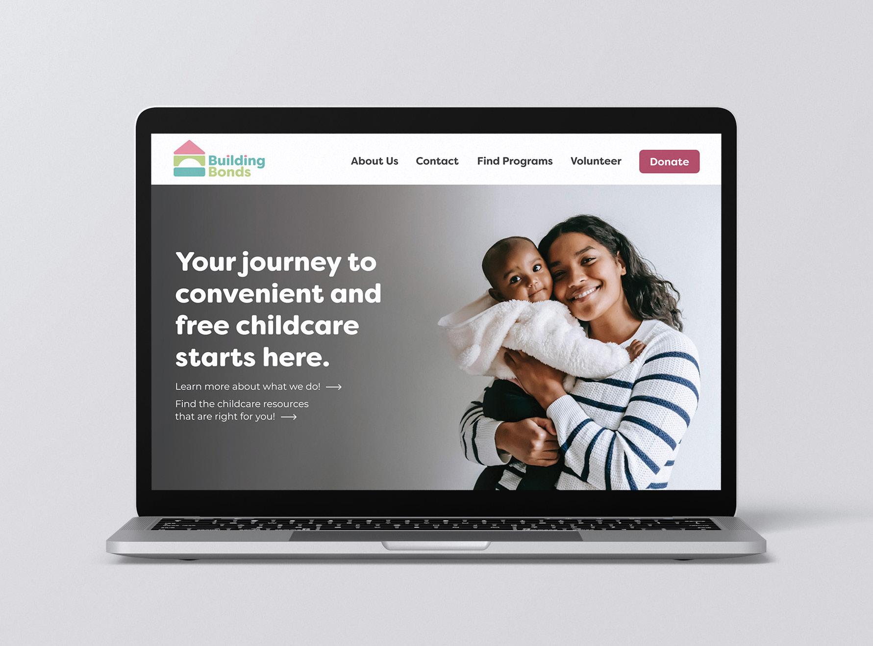
Website
Building Bonds’ website is crucial when it comes to giving the audience more information and maintaining a central hub for all resources. Maintain consistent and WCAG-compliant color combinations and photos with appropriate subjects.
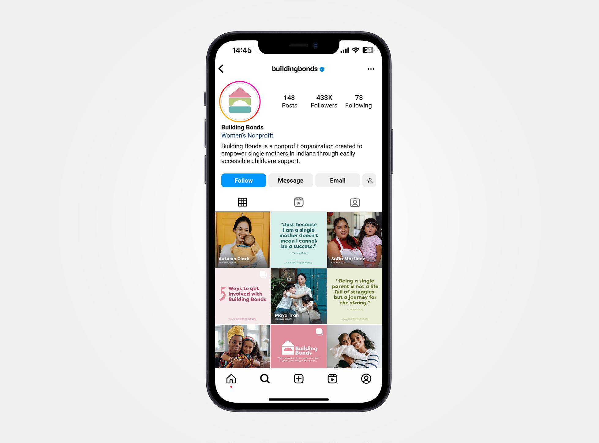
Social Media
Social media posts are an essential part of Building Bonds’ marketing. Make sure to use accessible language in these posts and adhere to Building Bonds’ guidelines. Content will include mom spotlights, ways to get involved with Building Bonds, inspiring quotes, statistics detailing why our work is important, and community events.
Bus Wrap
Public bus vehicle wraps help spread Building Bonds’ message to individuals who use public transportation as well as onlookers that live or work nearby. A QR code should always be present along with contact material that can direct interested viewers to Building Bonds’ resources.

If you have any questions, please contact the designer: Annika Schaller
annikaeschaller@icloud.com (765) 748 4871
