ADRIENNE BERRY

“The creative process starts with a sketch and then it becomes an outline. Little by little, you put the pieces together and create a strong strategy that propels people to take action.”
- Adrienne Berry
TABLE OF CONTENTS
Featuring Avenir Next Type
Graphic Design
Bear Brews Brewery
Positive & Negative
4
5
6 7
GreenHaus Winery
Interior Design Magazine
Plackers and POH
Miscellaneous
About Adrienne
About

FEATURING AVENIR NEXT TYPE
Skills used: Typography, illustration, graphic design, editing, color theory, mock-up design, and organization
For this project, I created a playing card deck based on a central theme and showcased one typeface and its varied font family. I created 52 unique playing cards, 2 jokers, the back of the cards and the design for the box.
COLOR CONCEPT


Distinctive, fun, unique, and engaging
Yellow: #fcaf17
Orange: #f1592b
Pink: #ec2c8d
Blue: #3d479d
White: #ffffff
Black: #010101
Bold design, playful with typography to showcase different styles available with the typeface and a unique way to look at film photography and experience it.
TYPOGRAPHY
A clean, geometric, sans-serif font, Avenir Next was initially designed in 1988 as “Avenir” by Swiss designer Adrian Frutiger in Bern, Switzerland. This typeface is based on Erbar (1922) and Futura (1927) typefaces.

I chose to use the typeface Avenir Next for the film photography theme as film cameras are known for being chunky, sometimes heavy but are often square boxes. I wanted the typeface to give off those similar attributes and characteristics—geometric, square, boxed and bold/heavy.


BEAR BREWS BREWERY
Skills used: Typography, customized logo design, mock-up design, package design, illustration, copywriting, research, editing, color theory, graphic design, and organization
For this project, I created an imaginary beer company called Bear Brews Brewery. During college, I lived in the Shenandoah Mountains and loved my time there. I wanted to do a theme based on my love of those mountains and re-create experiences of my memories there. Each beer flavor goes with a unique Shenandoah Mountain experience—which one do you want to try?
COLOR CONCEPT


Natural, neutral, calming but a pop of fun
White: #ffffff
Yellow: #f3e7c1
Orange: #f9ac86
Pink: #f48aa1
Blue: #3480c2
Brown: #503217
Beer is often drunk outside so why not bring beautiful mountains and outdoor activities to a beer label? And why not drink beer in a beautiful setting?
TYPOGRAPHY
TITLES & HEADLINES: PORTER BOLD DEMO
Designed by Frank Hemmekam in 2015, Porter
Bold Demo is a sans-serif typeface that’s easy to read, modern & contemporary, bold and distinct.

BODY COPY FONT CHOICE: AVENIR
A clean, geometric, easy to read, sans-serif font, Avenir was initially designed in 1988 as “Avenir” by Swiss designer Adrian Frutiger in Bern, Switzerland. This typeface is based on Erbar (1922) and Futura (1927) typefaces. The family includes 8 fonts in 4 weights (regular, medium, demi, and bold) and 1 width (based on normal width), with complementary italics.


BEER BOX DESIGN


PICK YOUR EXPERIENCE (OR YOUR FLAVOR!):


POSITIVE AND NEGATIVE
Skills used: Photography, composition eye, photo editing, graphic design, research
For this project, I researched the buildings, planned the trip, packed by bags and walked around cities snapping shots of architecture that spoke to me. I wanted to highlight interesting angle and unique geometry, and bring to life buildings and the architects who made them. I especially wanted to play with light and dark, push and pull, positive and negative space, and where does the photograph stop on the page?
All images by Adrienne Berry


CAMERAS USED
Leica M6 35mm with black and white film
Zeiss Ikon Ikoflex Medium-Format with black and white film
DREAM DOWNTOWN HOTEL
Location: New York City, New York
Designed by Handel Architects
Completed in 2011
Graphic design and photography by Adrienne Berry
Image taken under a street light looking up at the building

THE BREUER BUILDING
Location: New York City, New York
Designed by Marcel Breuer
Completed in 1963
Graphic design and photography by Adrienne Berry
Image taken under the front overhang of the building looking up at the large window on the side


CITIES PHOTOGRAPHED
New York City, Paris, Chicago, Atlanta, Nashville

GREENHAUS WINERY
Skills used: Graphic design, composition eye, color theory, logo design, art direction
A prototype for an imaginary rebranding of a winery located inside of a botanical garden greenhouse*. I created two logos, one for merch and a simpler one for website and packaging design. I also created a mock bottle, wine glass, merch tote bag, a food and beverage menu and a mock prototype for a website.
*Note: This project is imaginary and has no affiliation with Longwood Gardens


INTERIOR DESIGN MAGAZINE
Skills used: Graphic design, visual layout, composition eye, research, art direction, typography, color theory
For a class project, I enjoyed creating an imaginary interior design magazine to experiment with visual layout and hiearchy. I love interior design and so I knew this would be a fun project to tackle. I enjoyed curating the content and experimenting with different graphic elements and styles!


Initial rough sketches I created for the first company we chose, POH floss.


PLACKERS AND POH
Skills used: Graphic design, mock-up design, typography, AI image generation, composition eye, idea generation
For a class project, my group and I needed to come up with a data-driven campaign for a company of our choosing. We chose to focus on a flossing company as we found that dental care and hygiene is often overlooked. We wanted to bring more awareness to oral care by looking at whole body health.
We first chose POH floss as our company but then decided to do Plackers, as they have more information on their brand and past adds to work off of.
How I contributed to the group project:
• I came up with idea of working wtih a floss company for the data-driven campaign
• I helped research the brand and understand their brand and target audience
• I helped create the visual designs and I created the mock-ups

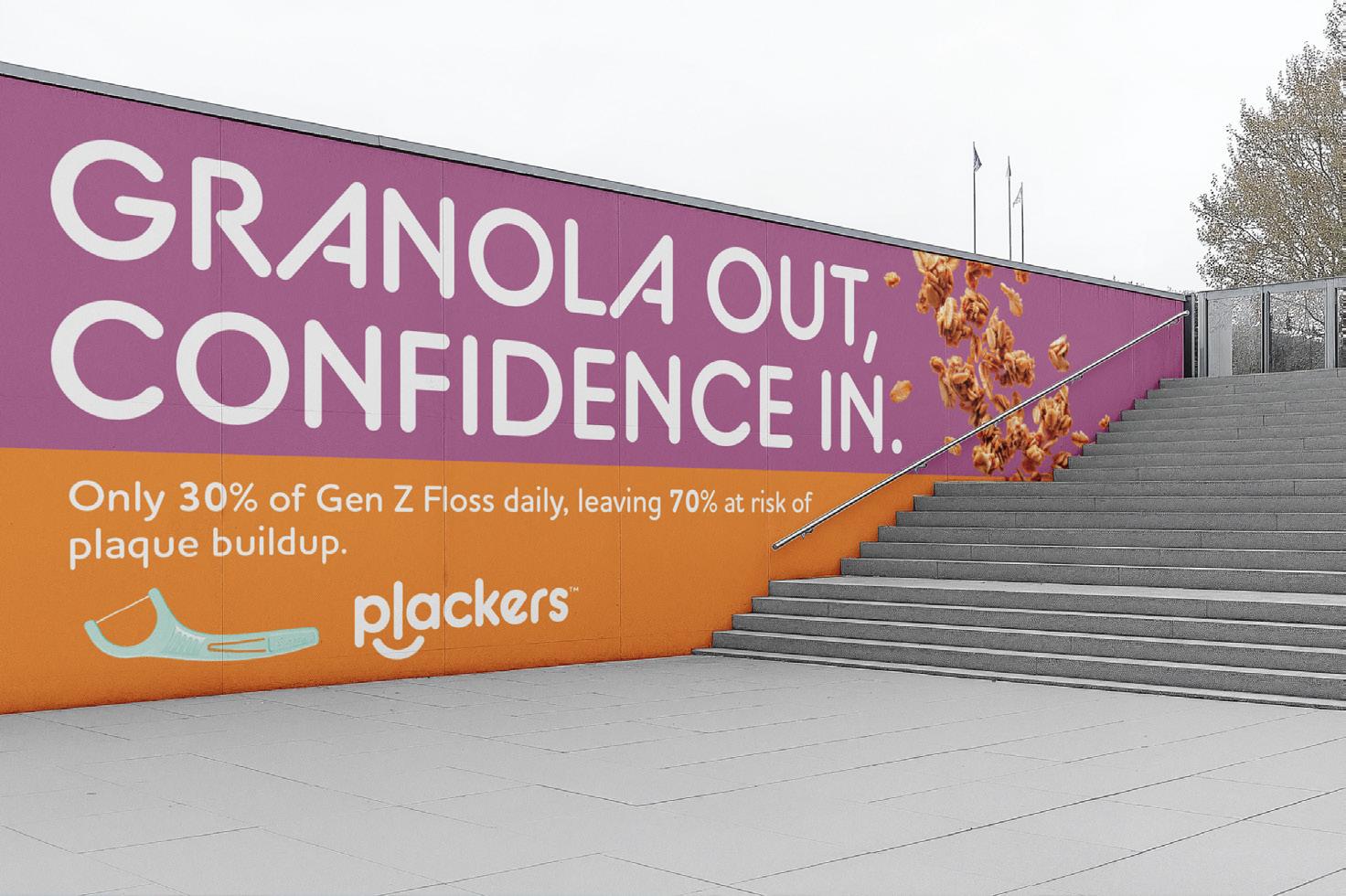
Color palette and typography of Plackers brand; initial sketches for Plackers brand advertising; the target audience is Gen Z college students, want to keep brand playful, fun, and use bold colors


Our campaign tagline is: “Food out, confidence in” to focus on getting the “gunk” out of your teeth
On the left: Initial designs
On the right page: Finalized visual designs and mock-ups, strategic placement of ads on college campuses and pedestrian zones


MICELLANEOUS
Skills used: Graphic design, idea generation, visual eye, organization, typography, research, composition eye
Project 1: Prototype design for an imaginary app called NIBBLE. NIBBLE is an app for cheese, looking up the different cheese available around the world, its history, where one can buy it, and also including recipes that use that type of cheese.


Skills used: Graphic design, AI-generated images, idea generation, typography, research, organization, composition eye
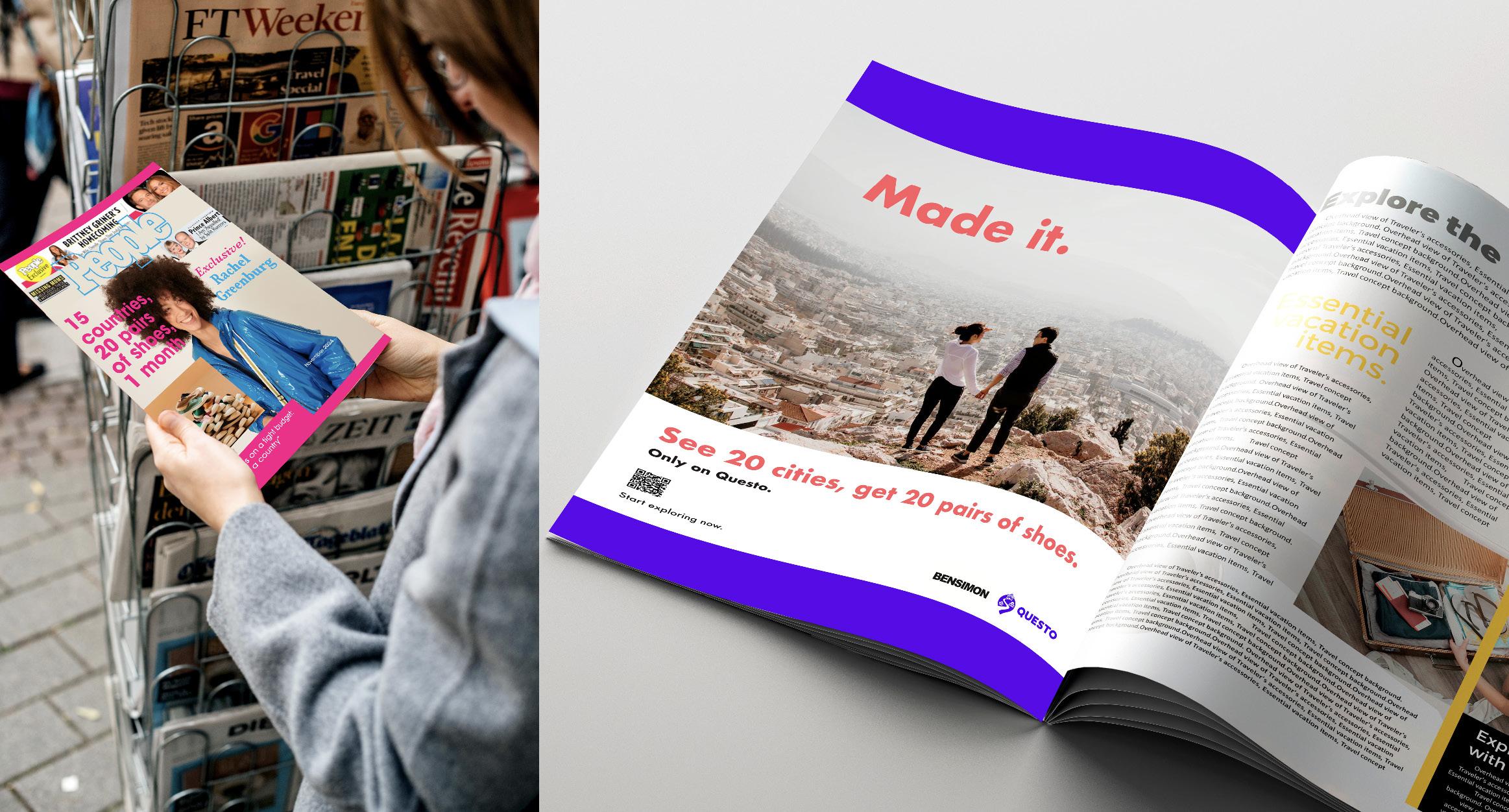
Project 2: Collaboration between outdoor escape game app Questo and shoe company Bensimon. I did research on the companies and their target audiences, created a strategic campaign, visual ads and mock-ups.


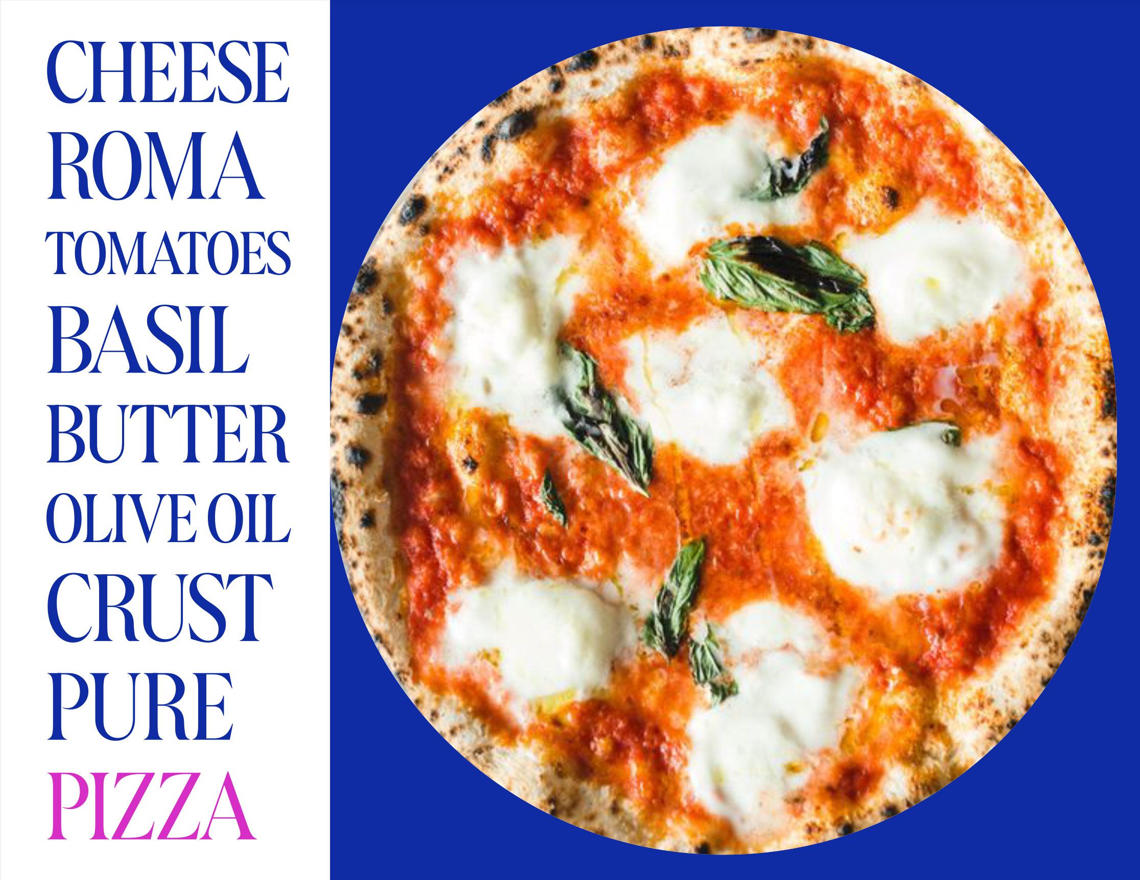
On the left page: Fun fact about me. My favorite food is authentic Italian pizza! Pure deliciousness!
BA in Art History, 2019 BA in Studio Art, 2019 MA in Advertising, 2025
Adrienne studied art history and film photography at The University of Virginia and trained her eye over the years to focus on simplicity and exceptional quality. She has lived in Italy and in France and speaks French. Adrienne is currently pursuing a master’s degree in advertising at The Savannah College of Art and Design.
www.adrienneaberry.com @adrienneaberry_
www.adrienneaberry.com

