Adriel Nathanael Purba
PORTFOLIO

Hi, I’m Adriel, a designer that never stops learning and is always on the lookout for the next exciting development. I have always been fascinated by the nature of stories and how they can affect us. Designing in general has allowed me to explore and visually represent those stories, from the grandest scale to the seemingly mundane things in our daily life. Architecture specifically, has shown me the potential of how far we can take design, literally adding another dimension to my generally 2D way of thinking. I’m excited to expand my knowledge further in design, finding new problems and solutions along the way.
adrielnathanael.purba@gmail.com
WA: (+62)8119291712
IG: adriel.l.l
LINE: adriel_nathanael Jakarta, Indonesia
EDUCATION
Sep 2019 - Jun 2023
Universitas Indonesia
Architecture Major, GPA: 3.46/4.00
Depok, Indonesia
2023 2016 - 2019
Queensland University of Technology
Architecture Major, Student Exchange
Queensland, Australia
SMA Negeri 81 Jakarta
Science Class
Jakarta, Indonesia
EXPERIENCE
Jan 2024 - present
Nusantara Academy Audio Visual Designer
Created a narrative consisting of youtube shorts, social media posts, and video assets to engage the youtube channel and linkedIn audience
Oct - Dec 2023
Nusantara Academy Graphic Design Internship
Designed a series of promotional materials such as banners, brochures, and thumbnails
Create Generation
Speaker for a workshop hosted by the Create Generation organization.
UI ArtX Exhibition
Work selected for the art exhibition hosted by Universitas Indonesia.
SOFTWARE
Adobe Illustrator
Adobe Photoshop
Adobe Indesign
SketchUp
Rhinoceros 3D
Capcut
SKILLS
Advertising Design
Brand Identity
Editorial Design
English (IELTS Band 7.5)
Social Media Content
Typography
3D Modelling/Rendering
Video Editing

Nusantara Academy
An educational company focused on upskilling Indonesia’s talent in the data center industry. Even though the target audience is mostly professionals in the technology field, the brand identity also caters to the younger generation. This focus on the younger generation entails a variety of sleek designs, along with occasional bold and quirky highlights to prevent it from becoming boring.

Creating unique youtube thumbnail for a new podcast series to build interest.

Creating a series of shorts on the youtube channel to build an audience, through its entertaining edits. For more examples, check out: https://www.youtube.com/@nusantaraacademy/shorts

Enriching the online community with different merchandise designs for various events.Creating a lively engagement between different members through things such as custom invitations, name card, etc.


A series of promotional materials created for certain events, from email templates, thumbnails, brochures, and linkedIn posts.


Typhon

A gaming company focused on providing narrative-driven experiences that are unique and exciting. The brand identity was intended to be suitable for youth and adults, as they are the most dominant demographic in the gaming scene.


Creating a logo for the brand starts by getting rid of the generic ideas such as naming conventions or letters, and using a figure that can be associated with keywords such as “wind” and “storm”. This represents the dynamic nature of the games being provided for the players.

The chosen figure is a Greek god of storms called “Typhon”; its monstrous look creates a familiar aesthetic that hardcore gamers recognize while intriguing nongamers through its bold design.
Main logo:

Logo variation:


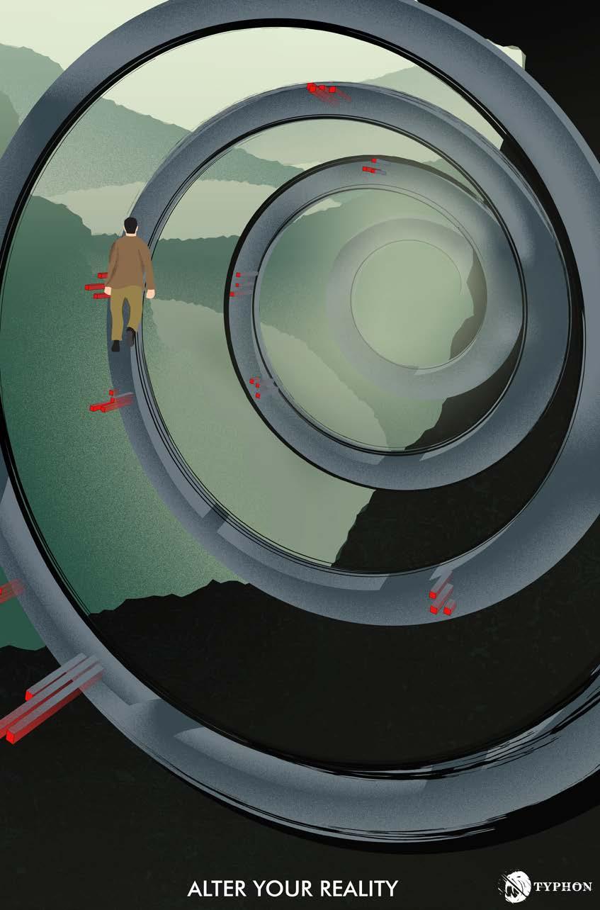
Creating an over-arching story about traveling different worlds that runs throughout the promotional material, in the form of rhetorical images.

This represents the feeling that people will get by playing the console, using familiar gaming elements such as futuristic and natural environments to create visual interest.


Packaging design for the gaming console itself along with its accessories.

The merchandise design is based on the aesthetic of the rhetorical images and gaming experience, in this case, a futuristic and glitch-like effect.

The Verge

Created for the competition hosted by the student journalism organization of Queensland University of Technology (QUT), “The Verge” is a rebranding that focused on communicating its values. This includes the mentality and work ethic of the organization in bringing viewers the latest, most important news out there.


Eliminating cliché words and imagery used in describing news such as newspapers or gadgets.

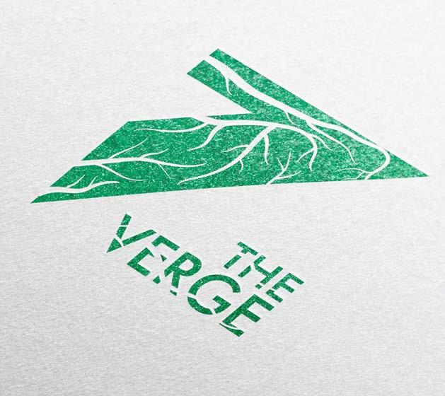
The logo was first inspired by phrases such as “on the edge”, which represents the previously mentioned values. Finally landing on “verge” because of the potential the letter “V” has in creating a sharp and dynamic logo.


THE the verge
erge erge erge
Part of the letter “V” was scaled to create an impression of the edge of a cliff. Roots were added as it represents life, telling the viewers that even though this organization is quickwitted and efficient, they are also inclusive and tell socially useful stories.
Main logo: Logo variation:


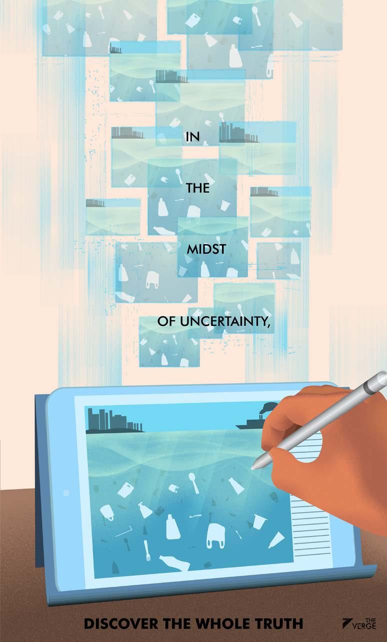

A space that provides the latest news thoroughly amid false information and uncertainty became the narrative in the promotional images.
The campaign images are also used for the organization’s social media, mainly through posts relating to certain messages.

Even with different proportions, it still maintains most of the visual cues such as the illustration and color palettes.


Trajan Typographic Zine
A zine itself can be defined as a self-published booklet of original content for local communities such as schools or other organizations (Burkhard, 2022). In this project, the aim is to build interest in typography in general, specifically the Trajan typeface, using attractive visual styles such as the simple contrasting shapes and colors.


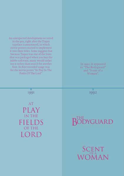


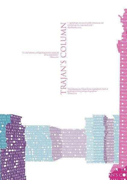


The challenge includes no photos allowed in these pages, I worked around this by using textual elements to form geometric shapes or even the creator’s face. The aspect of scale is also used to highlight the interesting shape of the letters, giving the impression of them being objects in space instead of individual letters or sentences.


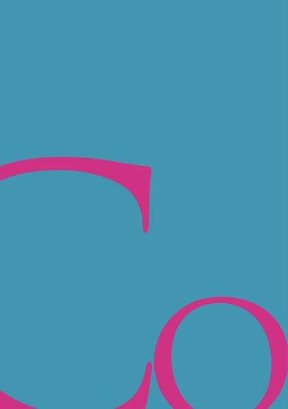
Another design principle used to arrange the content is grids. The simplest ones are to arrange the more textual and information-heavy pages, balanced with the more complex ones to compose the illustration-heavy pages.

Predator Typeface
In this experimental typeface, i want to create an alphabetical system based on a certain theme, in this case, “Symbiosis”. I chose the “Predator” character as the main inspiration because it represents the interesting dynamic of humans and their artificiality with mother nature. Each of the characters’ designs was based on the Predator’s silhouette, using grids to precisely balance the composition, thus giving that artificial aesthetic.


Applying a system of visual weight distribution that categorizes each character based on which part of the them has more surface area, thus creating a balanced overall look.


Contrasting shapes create a dynamic visual language prominently featured in many parts of the Predator’s fictional universe.


Using the fontlab software to transform the characters designed in adobe illustrator into a usable typeface. Which is then implemented in the poster.

Passion Projects
Some of the personal projects i have worked on in pursuing or practicing graphic design. Ranging from hand-drawn art, competitions, and commissions.


Framing the Nature / 2020
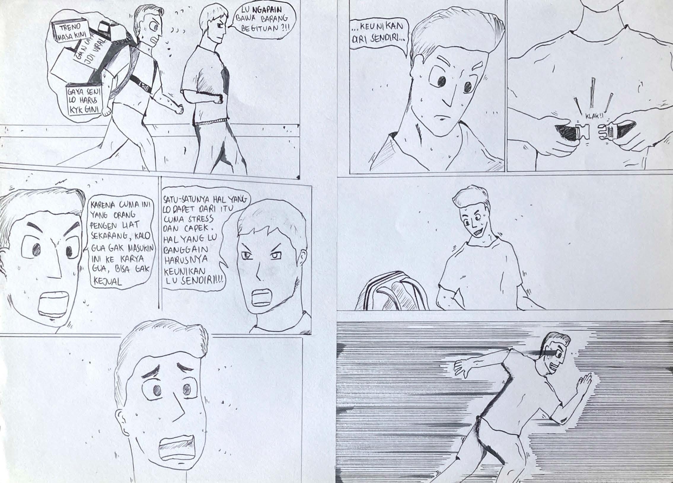
UI ArtX Exhibition / “Unnecessary Burden” / 2020

Church commission / 2021


comics series / “The Battle Loop” / 2019
