inspirationjournal
ADELISTA WIDJAYA BRIEF 1 // CAPSTONE
2022
1 CAPSTONE inspirationjournal
brief
by ADELISTA WIDJAYA
weekone weektwo weekthree weekfour referencelist 946238204 journalBRIEFADELISTAcontentWIDJAYA1//CAPSTONE
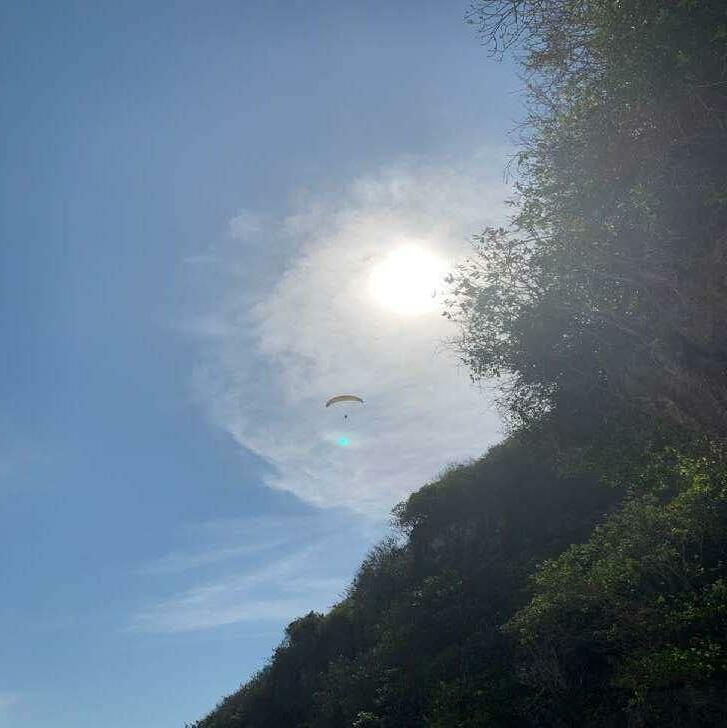
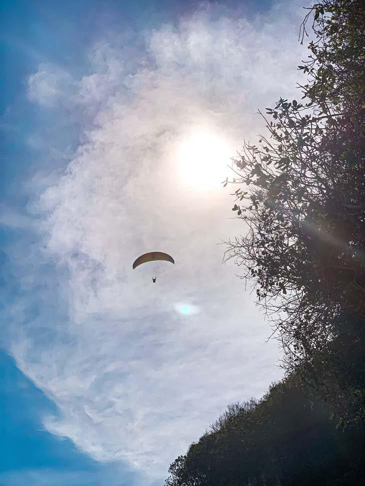
inspirationjournal BRIEF 1 // CAPSTONE weekone
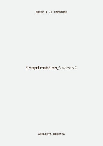
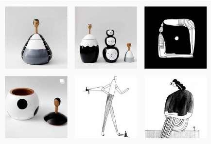
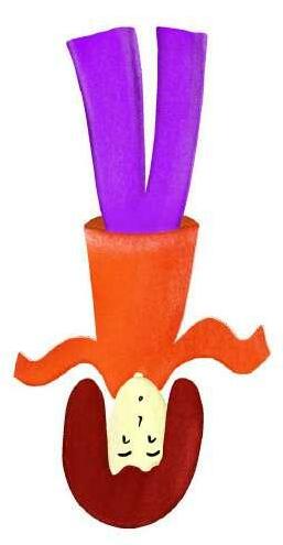
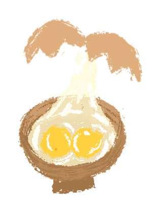
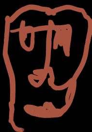
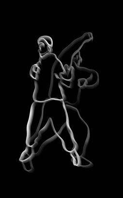
Found in 2015, Obie is a brand made by Tobing Dewi, an Indonesian visual artist and designer. Her art is expressed with monochrome and shading effects. Her inspiration comes from her daily life, focusing on feelings, human, and relationship. The brand develops over time from print and merchandise, to clothing and home & living.
inspirationjournal INSPIRATION 1 BY.OBIE
inspirationjournal
INSPIRATION
One thing that impressed me the most about Obie is its visual consistency, making it very recognizable seeing it in a glance. I follow @by.obie on Instagram and everytime they crossed on my timeline, I immediately recognize them. Besides their consistent branding, their art feels honest and pure, giving such positive energy when we’re looking at their masterpiece.
KEY POINTS OF INTEREST
inspirationjournal
1 BY.OBIE
ITS INFLUENCE
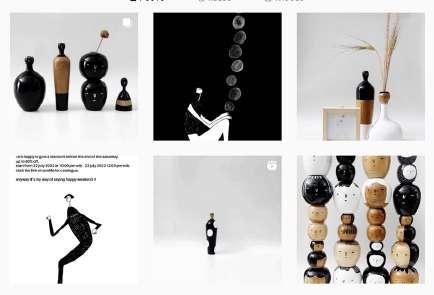
Obie most probably targets illustrator, especially freelancers whose goal is to embrace their own original creations. Shown by their consistent style and how they apply their designs into various exclusive merchandise. They also targets audience who embraces simple aesthetic, who likes line drawing and doodle. Moreover, people who appreciates art through their senses—attracting them to get their merchandise.
This source inspires me to explore their design application through my style. I’m excited to recreate specifically their home & living merchandise by executing it with my own drawing, or something that relates to what I like.
DESIGN PRACTICE EXPERIMENTATION
inspirationjournal INSPIRATION 1 M.I.BOBIE’SSERIES
inspirationjournal EXPERIMENT 1
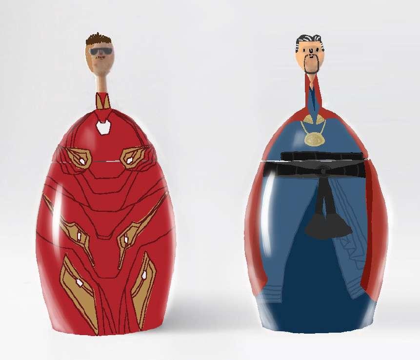
SCULPTURECHARACTER
This experiment comes from the Men In Black sculpture collection. I took the ‘character’ approach concept, and interpreted it by sketching my imaginary favorite characters: Iron Man and Doctor Strange from the Marvel Cinematic Universe. I’m aware that one of my weakness is my efficiency. Delivering meaningful piece in a simple visual is challenging for me. I’m trying to keep it simple and keeping the value visible, but I’m not happy with the result yet.
TISSUEOBIE’S BOX
INSPIRATION 2
inspirationjournal
Picture 2 & 3: Tissue box mock up
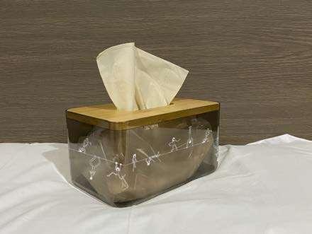
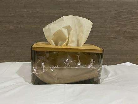
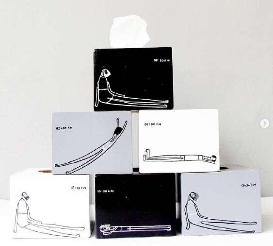
I immitated their approach to their tissue box merchandise. I took pictures of my tissue box from several angles. I doodled some rough line drawing of a person with a lot of poses, hang on a tight rope. I did a rough mock up to see how it might look like if printed and I love the result so much. The style, the simplicity, the
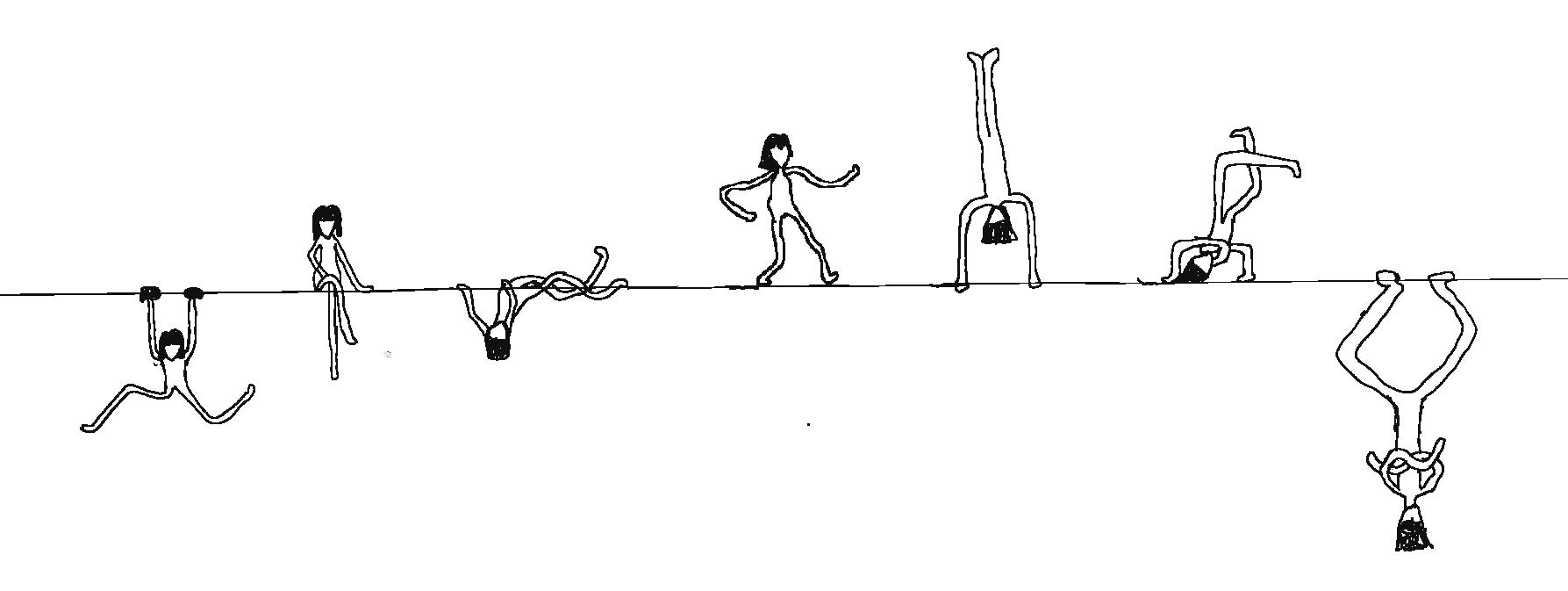
TISSUEILLUSTRATEDexclusivity.BOXEXPERIMENT 2 inspirationjournal
Picture 1: Doodle
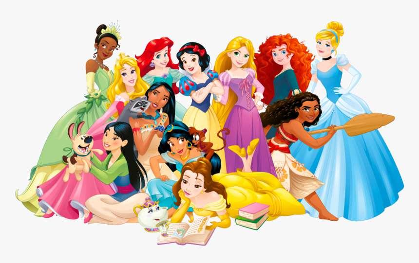
Disney Princess is a toy-lined owned by The Walt Disney Company, created by the chairman Andy Mooney in the end of 20th century. The line up consists of female protagonists who have appeared in Disney movies and/or franchises. The 12 characters are Snow White, Cinderella, Aurora, Belle, Ariel, Jasmine, Pocahontas, Mulan, Tiana, Rapunzel, Merida, and Moana.
inspirationjournal INSPIRATION 2
DESIGN PRACTICE EXPERIMENTATION
This source inspires me to explore the Disney Princess characters in my own illustration. My plan is to sketch and remake the characters in different drawing styles.
Disney’s primary market is children. The idea of femininity, womanhood, and beauty standard are (sometimes overly expressed) through the Disney Princess. The movies suggest the ideal romance or ‘happy ending’ everyone dreams of. As the era goes, Disney movies adapt their storyline into a more progressive value. The stories include diversity and inclusivity without losing the idea of the ‘ideal happiness’, redefine it into realistically honest.
ITS INFLUENCE
I grew my interest on the Disney Princess over time. Usually our interest towards them peak when we were little, and it fades when we grow into adulthood. That isn’t the case for me. I appreciate them more as I grow up and rewatch the old Disney movies. Their originality, the empowerment lessons, the flaws, the art——hit me more, now that I know things better.
PRINCESSDISNEY
KEY POINTS OF INTEREST
inspirationjournal INSPIRATION 2
inspirationjournal
This is a quick sketch of my first illustration approach. As each of the character has a strong branding, they are very recognizable even thorugh a very simple and rough drawing. In this illustration style, I tried to express the ‘kiddie’ aspect of the characters, by doing ‘baby-styled’ princesses.
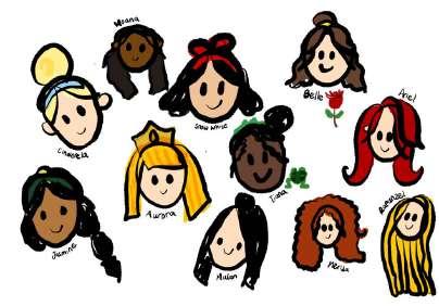
ILLUSTRATIONCHARACTER
1
EXPERIMENT 1
APPROACH
ILLUSTRATIONCHARACTER 2
Tiana

I took myself more time to do this second illustration approach. The style is influenced by Dinda Puspitasari’s style, an acknowledged local artist in Indonesia. Here I experimented with expressing details through colors. The idea is to create textures through the use of dots, lines, and colors. I made 2 Disney Princess characters which are Merida from the movie Brave, and Tiana from the movie Princess and the
EXPERIMENT 2 APPROACH
inspirationFrog.journal
Merida

journal INSPIRATION 3
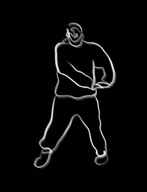
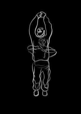
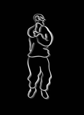
inspirationDANCEHAND-WAVE
Dance is one of a few things that is similar in my life, specifically street dance. One of the most popular dance moves is the hand wave. According to dancebeat.lv, ‘waving’ is an illusory style of dance that consists of a series of movements, creating the impression that there are waves flowing through the body of the dancer.

inspirationjournal INSPIRATION 3
The hand-wave is very much used in choreography and freestlye all over genres and style. Even non-dancers are likely to do the hand wave in casual dancing. Whether it’s live action or animated movie, the hand-wave has mostly appeared in the dance scenes. It’s in the dance movie Step Up Revolution yet it’s done by Squidward in one of the Spongebob Squarpants episode.
INTEREST
DESIGN PRACTICE EXPERIMENTATION
The ‘hand-wave’ that inspired me particularly is from a dance choreography that I learned recently. Even though it’s been years since the last time I danced, this is still such an interesting move to revisit and refine. You could never have a perfect wave. It’s always an exciting challenge to perfect your wave, and lately it’s on the list of my KEYenjoyment.POINTSOF
DANCEHAND-WAVE
ITS INFLUENCE
This source inspires me to explore ‘hand-wave’ by illustrating the visual of it. Realistically, a complete series of hand-wave is impossible to be captured in one frame. I’m going to illustrate a complete hand-wave, approaching it through cartoony styles.
ILLUSTRATIONfurther. INSPIRATION 2

This is my attempt to create a video animation of hand waving. There are several layers that is needed to create the stop motion. The style and the execution in this case isn’t very familiar for me. Regardless, I had a good time and learned something new that I’d like to explore
inspirationjournal
inspirationjournal
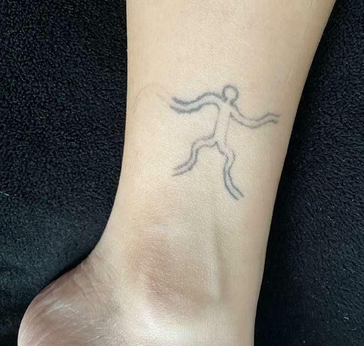
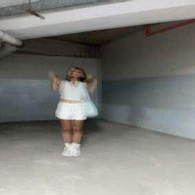
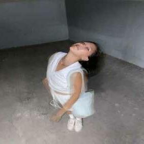
Tattooing is one of the design practices that I’ve been learning for a while. I did an experiment to tattoo a simple line drawing of waving on my left ankle. It’s far from perfect but I plan to continue and refine it later
TATTOOEDILLUSTRATIONSIMPLEon!INSPIRATION 2
inspirationjournal BRIEF 1 // CAPSTONE weektwo
DESIGNILLUSTRATIONPRACTICE
Illustration is a visualization or a depiction made by an artist, such as a drawing, sketch, painting, photograph, or other kind of image of things seen, remembered or imagined, using a graphical representation. (Aspire Art Studios, 2014)
inspirationjournal INSPIRATION 1
Source: Freepik
Source:
inspirationjournal

Source:
Designyourway
Designyourway
DESIGN PRACTICE EXPERIMENTATION
inspirationDESIGNILLUSTRATIONPRACTICE journal INSPIRATION 1
According to Zippia.com, by September 2022, there are over 92,556 illustrators currently employed in the United States. Illsutration is often dismissed under association with children, yet it’s way wider, way essential of the art we know today. Moreover with the digital technologies developing, illustrating has become ‘easier’ to master and to access. This heavily influenced a lot of creative and non-creative fields in the society.
ITS INFLUENCE
The experimentation will be straighforward: my attempts to explore digital illustration styles.
KEY POINTS OF INTEREST
I follow a lot of illustrators on Instagram. My Pinterest save is flooded with illustrations. I’ve always loved illustrations because I wasn’t born with the talent. I’m not bad at it, just decent——not extraordinary. Seeing talented people able to draw and explore shapes mezmerize me in a lot of way. Inspires me to take illustration projects just for the fun (and stress) of it.
APPROACHlips. 1 inspirationjournal EXPERIMENT 1 ILLUSTRATIONDIGITAL
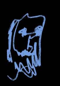
My first attempt is a face illustration. In this case, I’m illustrating The Hulk and Captain America from the Marvel Cinematic Universe. The idea for this experiment is to create a ‘feminine’ figure of Superhero, which is expressed through their facial expressions and features including their eyes, eyebrows, eyelashes, and
Attempt 1

ILLUSTRATIONDIGITAL
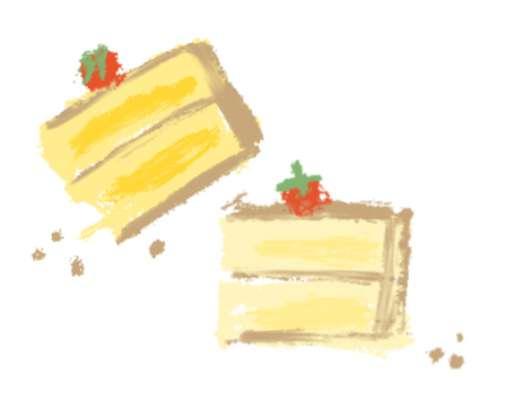
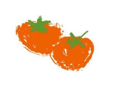
The second attempt for my digital illustration experiment is making a baking series of illustration. I tried to execute it with a consistent style and it turns out better than I expected!
inspirationjournal EXPERIMENT 2
Attempt 2
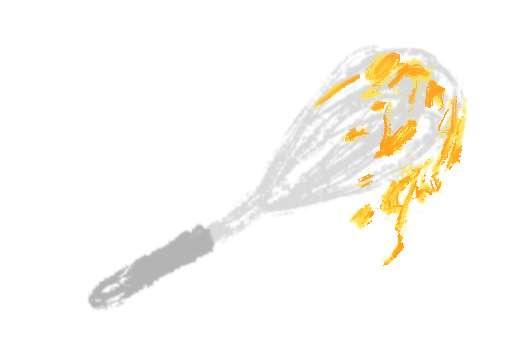
APPROACH 2
INSPIRATION 2
inspirationjournal
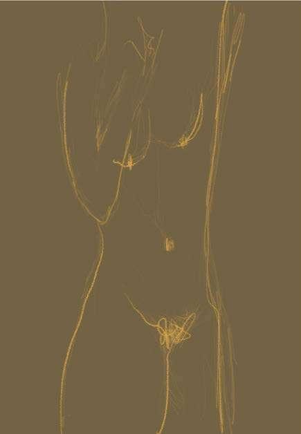
PORTRAITSELF
PORTRAITSELF
One of the greatest activity to check in my well-being is looking into the mirror——my self reflection. It’s been an effective way for me to keep in touch with myself and the reality. The ‘self portrait’ topic from my other Studio course has triggered a part of me to be vulnerable and it‘s taken more time for me reflecting upon how I’ve seen myself.
KEY POINTS OF INTEREST
inspirationEXPERIMENTATION journal
INSPIRATION 2
From this source of inspiration, I plan to watch myself in the mirror and let the pencil flow, expressing whatever I see and/or feel at the moment.
The context of ‘self-portrait’ as my inspiration is psychological. To me personally, a ‘self-portrait’ activity is essential. Getting to know myself, asking myself questions, seeing who I am—are keys to resolve daily conflicts and existing traumas.
DESIGN PRACTICE
ITS INFLUENCE
APPROACH

inspirationILLUSTRATIONDIGITAL1 journal EXPERIMENT 1
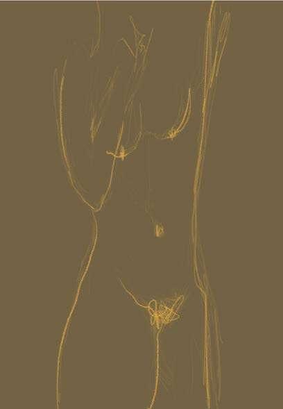
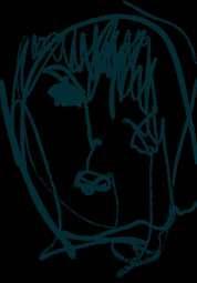
My first attempt requires me to go nude and see myself ‘naked’. The intimate body parts displaying is an attempt to embrace my parts that the beauty standard calls ‘wrong’. For instance, letting my body hair grows and not shaving it to look ‘pretty’. The non-existing curve that is claimed ‘unapplealing’. I think this experiment has helped me to embrace my body as the literal/physical self-portrait that I’ll always carry anywhere I go.
inspirationjournal
APPROACH inspirationILLUSTRATIONDIGITAL2 journal EXPERIMENT 2


inspirationjournal
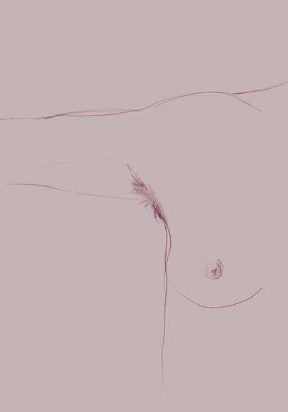
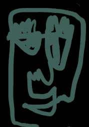
My second approach is by doing a one-line drawing of my face along with the body parts on it. Eyes, nose, lips. In this experiment I closed my eyes and started drawing whatever my memory caught regarding my face. The results are not typically ‘beautiful’, but I think it’s raw, unique, and honest.
journal INSPIRATION 3
Source: Video on @reinhardgouw Instagram
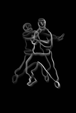
This dance choreography is a piece by Reinhard Budiman, an Indonesia-based dancer who is now living in Melbourne. He has regular classes in several Melbourne dance studios, as well as teaching in universities including RMIT. In this piece, Reinhard choreographed to the song Nights Like This by Kehlani and I’ve been watching it ever since the video was uploaded.
inspirationBUDIMANBYCHOREOGRAPHYDANCEREINHARD
KEY POINTS OF INTEREST
ITS INFLUENCE
It’s a privilege that I had the opportunity to learn this choreography from the master himself, last July. The more I dance to the piece and listen to the song, the song imprints and grows in me. It has become a therapy for me, whereas I would dance this piece casually until today to make me feel great about myself.
BUDIMANBYCHOREOGRAPHYDANCEREINHARD
inspirationjournal INSPIRATION 3
I think what do I love so much about this piece is the texture of the movement that enables the lyrics/message to be delivered beautifully through the movement. I’ve grown to love Reinhard’s dance pieces and this is his best masterpiece in my personal opinion.
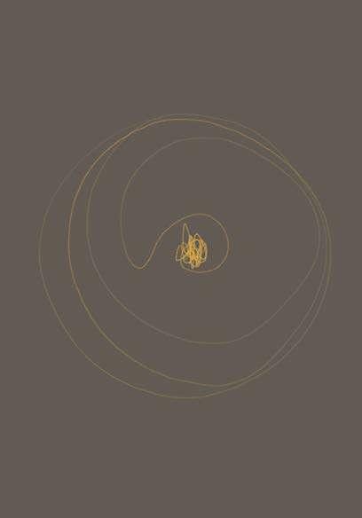
This dance routine inspires me to explore its interpretation on design practice. I’d like to interpret the flowiness of the dance through a form of illustrations. Perhaps a smooth stop motion could
DESIGNwork.PRACTICE
EXPERIMENTATION
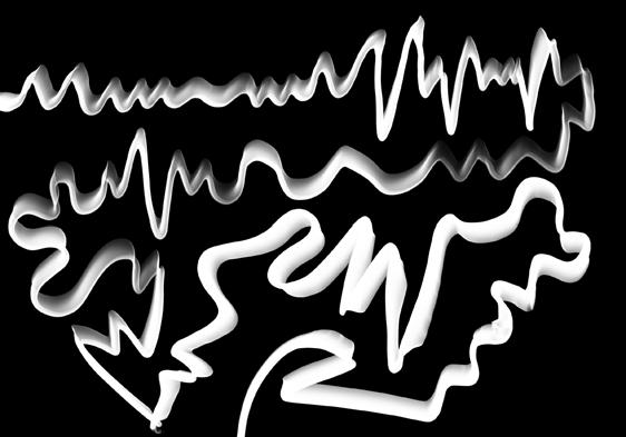
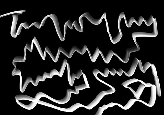
INTERPRETATIONVISUALRHYTHM


Attempt 1 Attempt 2 inspirationjournal
EXPERIMENT 1
In my initial experiment, I let my hand ‘dance’ to the song. I played the music and my put the tip of my pencil followed through the particular rhythm that are executed in the dance choreography. It turns out to be an artefact of a random sound wave visual that records my personal feelings and textures interpretation towards the piece. 4
inspirationjournal Attempt 3 Attempt
inspirationjournal ILLUSTRATIONDIGITALEXPERIMENT 2
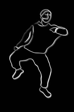

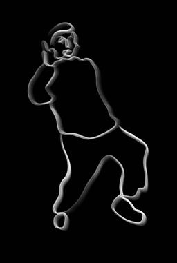

I sketched some of the key movements from the dance video and created a stop motion out of it. I tried to capture the flowiness as it is one of the value that is meant to be expressed through the dance execution.inspiration
journal

inspirationjournal BRIEF 1 // CAPSTONE weekthree
Source: Muchwow.graphics
Source: Group-Font
Source: Armin Hofmann
inspirationjournal INSPIRATION 1
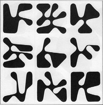
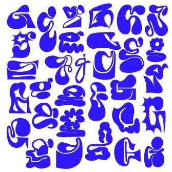
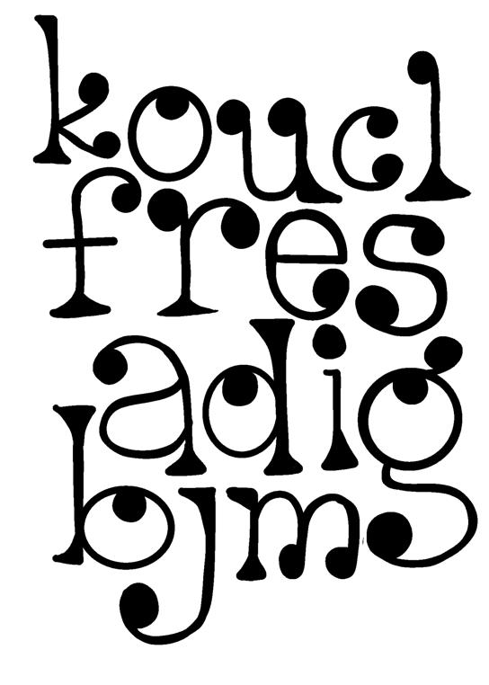
Quoted in the website ThoughtCo., decorative fonts, also referred as display type, are described as fonts with extreme features such as swashes or exaggerated serifs, and designed to be used at larger than body copy sizes. (Bear, 2019)
TYPOGRAPHYDECORATIVE


Source: Lola WaddySource: Shannon Levin

ITS INFLUENCE
TYPOGRAPHYDECORATIVE
It’s highly interesting for me as I am familiar and mostly attracted to digital design practices, that includes typography. Decorative typography is basically fonts that are unique, eccentric, odd. They are fun and expressive. They aren’t limited by rules to be classified in a genre. They doesn’t have to be neat and conventional, or they can. It’s screams breakthrough and freedom in typography.
DESIGNcreativity.PRACTICEinspirationEXPERIMENTATION
I plan to experiment on making my own decorative typeface. I will explore several themes or identity to be expressed through specific letters according to my journal
INSPIRATION 1
KEY POINTS OF INTEREST
Through each particular font’s uniqueness, it surely has a purpose to stand out and grab the viewers’ attention. They carry specific themes in the designers’ mind. When they are put in the market, the users will be attracted to those which visually fit the users’ aimed specific personality.
inspirationjournal EXPERIMENT 1 MY TYPEFACEOWN
My first attempt is an exploration of a serif type look. The serifs are prominent, yet the inconsistent thickness creates a sense of playfulness, along with the circle-shaped serif on the tip of the letters.
journal EXPERIMENT 2 MY
This experimental typeface is inspired by the logs or the woods’ texture. The spirals are the main decorative element, and is used to fill in the aperture of theinspirationletters. TYPEFACEOWN

inspirationjournal EXPERIMENT 3
This typeface is specifically inspired by the typeface design by Muchwow.graphics. I tried to interpreted my own way, which turns to be less rigid and proposing a quite playful set of letters.

MY TYPEFACEOWN
Source: Muchwow.graphics
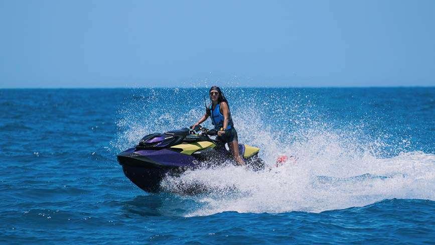
EXPERIENCEJET-SKIINSPIRATION 2

inspirationjournal
MY
KEY POINTS OF INTEREST
INSPIRATION 2
DESIGN PRACTICE EXPERIENCEJET-SKI
One thing that is in touch with me frequently is my personal water-craft (PWC), which we commonly know as a jet ski. There is nothing that is not interesting from jet ski activity. You get the sports, the fun, the adrenaline, the sun, the sea, the community as a package in a single ride.
Jet ski is categorized as an extreme sports. However, its user friendly combined with the safety protocols makes it a quite accessible sports activity or recreational in Jakarta, Indonesia, which is where I live. It has become a lifestyle that provides a community to the riders. As for me, I met a lot of people and have gained a lot of opportunities to develop myself through the ecosystem of jet ski in Indonesia.
My own jet ski experience has inspired my design practice lots of time. In this opportunity, I’d like to explore illustration styles of jet ski object itself.
ITS INFLUENCE
inspirationEXPERIMENTATION journal MY
APPROACH inspirationILLUSTRATIONDIGITAL1 journal EXPERIMENT 1
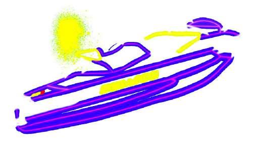
The first approach I’m using to illustrate the jet ski is making a neon flex jet ski display. I doodled the jet ski and colorize the lines using the color purple, yellow, and white and add a glowing effect to make it shiny. Lastly, I made the background dark grey to make the glow visible.
inspirationjournal
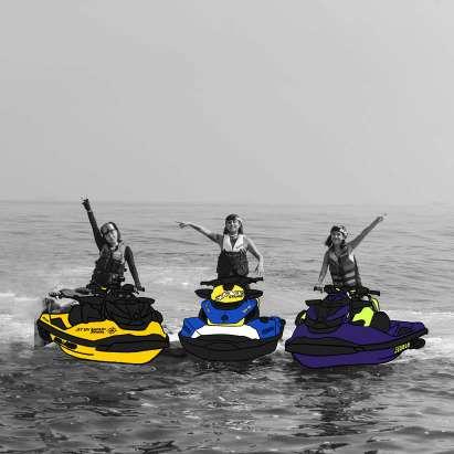
APPROACH inspirationILLUSTRATIONDIGITAL2 journal EXPERIMENT 2
white.inspirationjournal
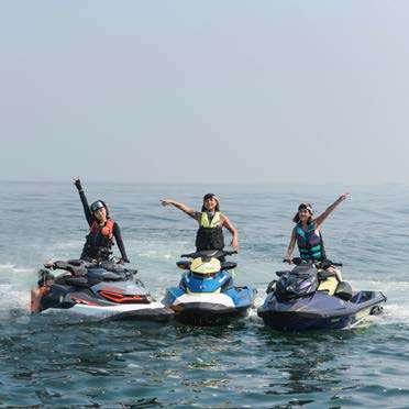
One of the most memorable jet ski ride was the 2021 Women’s Day Ride. I emphasize the jet ski cartoony illustration by editing the original picture into black and
inspirationCOLOREDTHROUGHEXPLORINGPENCIL journal EXPERIENT 3

inspirationprominent. journal
In this experiment, I came back to the actual paper and try to illustrate with colored pencils. I tried to explore themes in my interpretation. I chose Christmas as the closest upcoming holiday. I don’t really like how it turns out, but it’s fun getting back to non-digital crafting. What I like about this is how the texture is
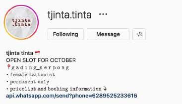
TINTATJINTA
inspirationjournal
INSPIRATION 3


ITS LookingINFLUENCEattheir
KEY POINTS OF INTEREST
DESIGN PRACTICE
branding, their portfolio is terrific. However, in my personal opinion, their logo hasn’t done equal to their value. I want to try recreating their logo. Additionaly, I will try to design some of my own tattoos that could be my own art style.
inspirationEXPERIMENTATION journal TJINTA TINTAINSPIRATION 3
What impressed me the most from this local tattoo artist is their art and style that are able to adapt various kinds of design. Their piece stands out and executed in the accurate details. I’ve seen a lot of tattoo artists in Indonesia who doesn’t seem to have ‘the hand’, hence the tattoo result isn’t 100% match the initial design.
Their effort to show their own original style as their branding is impressive as not all artists are brave enough to ‘claim’ and hold on to their own style. This effort is essential in Indonesia tattoo or other creative industry as plagiarism is still common here. Their confidence, excellence, and marketing strategy has brought them to grow in quite rapid and consistent——filtering loyal customers who get back to them as their appreciation towards their art.
EXPERIMENT 1 Attempt
inspirationjournal
Attempt
REMAKELOGO 1 2
inspirationjournal
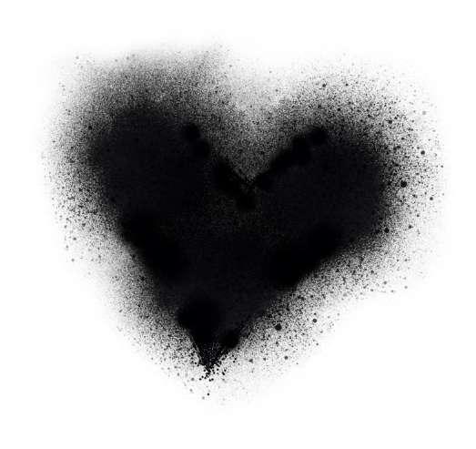
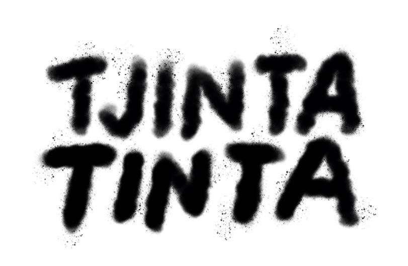
The word ‘tjinta’ means love, the work ‘tinta’ means ink. Together, the phrase means ‘the love of ink’. I tried to use airbrush effect to express the ink texture. In my first attempt, I wrote ‘TJINTA TINTA’ with an airbrush brush. I do not like the result at all. In the following attempt, I drew a heart shape as a symbole of ‘love’, using airbrush brush as the ‘ink’. I don’t love it but it’s a concept.
EXPERIMENT 2
In my first style attempt, I tried TJINTA.TINTA’s style, which is micro-realist. I made a two sides of a rubic cube illustration. I took a picture of my hand and made a mock up of how it would look like if the design is tattooed on the skin.

inspirationjournal
DESIGNTATTOO
On-skin Mock Up
inspirationjournal

inspirationjournal
EXPERIMENT 2
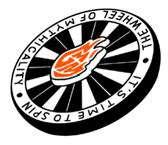
On my second experiment, I made a doodle art of ‘A Wheel of Mythicality’ enamel pin from Good Mythical Morning merchandise, as it’s my favorite show. I tried an on-skin mock up on my right calf.
DESIGNTATTOO
inspirationjournal
Up
On-skin Mock

EXPERIMENT 2
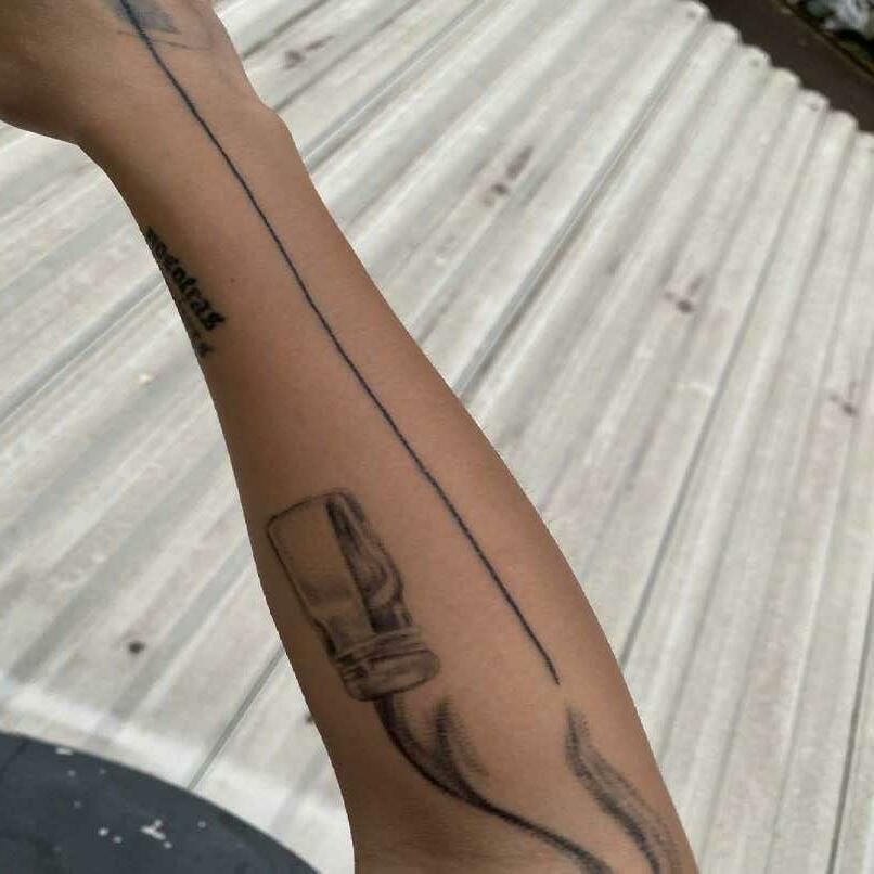
The third style attempt is simple line drawing. I repurpose the illustration I made in my previous experiment on Week One’s ‘OBIE’. The line is already existing on my hand, which immediately giving me an idea to apply the design to complement the line to see how it looks. I love it.
inspirationjournal
DESIGNTATTOO
On-skin Mock Up
inspirationjournal
inspirationjournal BRIEF 1 // CAPSTONE weekfour
This source inspires me to explore photography techniques and photo editing as an essential part of DESIGNphotography.PRACTICE
KEY POINTS OF INTEREST
Photography has changed the world since camera was first invented. Its ability to capture what is seen subjectively creates millions of point of view of an object. It has been a tool to basically change the world. It stops time. It saves memory. It levels up communication. It produces masterpieces. It allows honesty, yet able to manipulate reality.
My initial interest in photography comes from my interest in taking scenery pictures while I travel. Since I was a kid, I like to take shots of the view whenever I go exploring the nature or the city. However, when it comes to product photography, somehow hasn’t become my forte. The idea of collecting memories is the only thing that keeps my interest in photography.
ITS INFLUENCE
inspirationEXPERIMENTATION journal INSPIRATION 1 PHOTOGRAPHY
inspirationjournal EXPERIMENT 1 FLAT PHOTOGRAPHYLAY


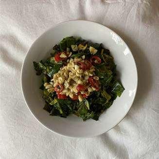

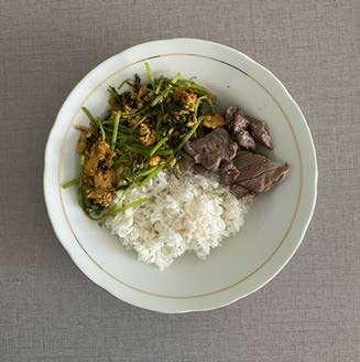
In this case, I experimented taking pictures of my meals by putting the plateware on a ‘cleaner’ background to create a series of geometric-influenced flay lay photography.
Quoting from The School of Photography website, flat lay is a photograph taken from directly above looking down on usually products or food. It’s an extremely popular genre of photography on social media.
inspirationjournal
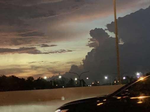
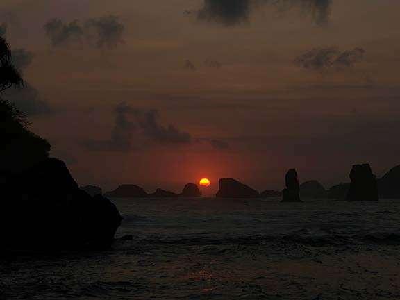
inspirationjournal EXPERIMENT 2 ON SUNSET


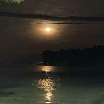
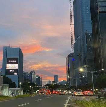


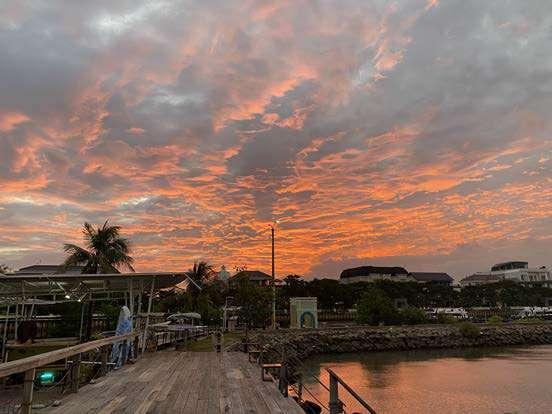
Another experiment on photography is to take pictures of the sunset sky. It took 7 days to record all these. The pictures took place in various locations and directions, the idea is to face to the west side and capture sky whenever it’s sunset. The challenge of this experiment is to adjust the brightness and get the photo color as accurate as possible with the inspirationreality.

journal
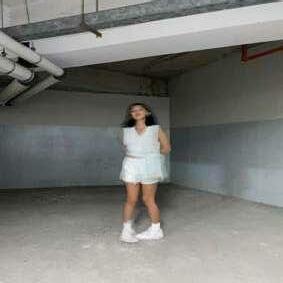
inspirationjournal SHUTTERSPEEDSLOWEXPERIMENT 3


journal
Since iPhone has the feature already, I experimented with it by taking pictures of my sister in the apartment’s basement. The idea is to keep some part of the body move, like hands, to make the ‘motion blur’ effect. It was a fun experience and I love the inspirationoutcome.
Slow shutterspeed photography is a technique that lets the camera open for a long time to take all moving subjects and captures moving points of light.
PHOTOS


EXPERIMENT 4 inspirationjournal
EDITINGPHOTO
OLD TRAVEL
As I mentioned before, one of the activity that I always do on my travel is taking photos of the scenery. Through this experiment, I edited 4 selected photos of my previous travels.
Two pictures on top are pictures from Canada back in 2018. The other two on the bottom are pictures taken in Bali in 2019. I explored basic exposure adjustments, color grading, cropping, to photoshop skills regarding removing unwanted objects to touch up the photo. I really enjoyed the process and the outcomes.
inspirationjournal
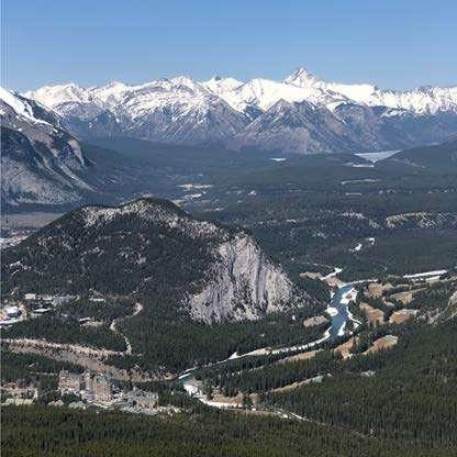
inspirationjournal Original Photo Alberta 27 April 2018 3.52 PM

Edited Photo
inspirationjournal

Banff 28 April 2018 4.21 PM Original Photo inspirationjournal

inspiration
Edited Photo journal

Bali 13 October 2019 1.57 PM Original Photo inspirationjournal
Edited Photo inspirationjournal
Bali 12 October 2019 12.19 PM Original Photo inspirationjournal
Edited Photo inspirationjournal

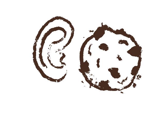
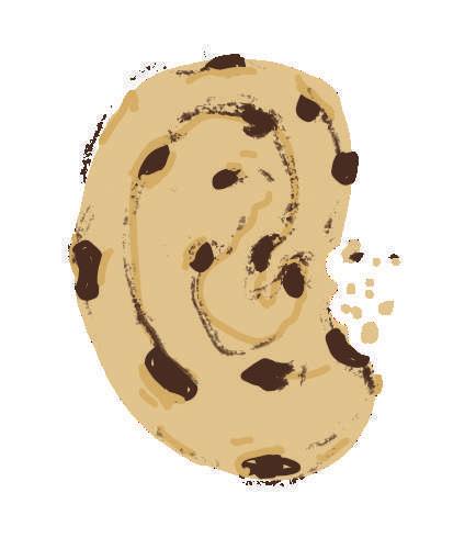
EAR PODCASTBISCUITSINSPIRATION 2 inspirationjournal Ear Biscuits with Rhett & Link is a podcast by Mythical Entertainment, hosted by Rhett & Link. It’s a weekly podcast where the two best friends——Rhett McLaughline and Link Neal——talks about pop-culture commentary, personal stories, and anecdotes.
KEY POINTS OF INTEREST
inspirationEXPERIMENTATION journal INSPIRATION 2
Quoting the Ear Biscuits description on their Youtube channel, they guarantee the viewers to be left with a ‘greast up funny bone and a stimulated psyche’. Joined in 2014, they have a total of 71+ million views with 452k subscribers on Youtube alone. Their relatibility, vulnerability, and personality growth breaks off the white men stereotype——attracting people to listen, reflect and be vulnerable with them.
DESIGN PRACTICE
EAR PODCASTBISCUITS
Ear Biscuits is the only podcast I listen to. What makes it interesting for me is because it was something that me and my best friend aspired to be. Rhett & Link’s Youtube show ‘Good Mything Morning’ (GMM) started my love towards the podcast. Whereas GMM is the business model, Ear Biscuits is the platform to getting to know them. Their specific agnostic values and crunchy jokes resonates with me.
In this opportunity, I’d like to experiment on interpreting the title ‘Ear Biscuits’. The words are catchy and unique. I’d like to illustrate them into some playful illustrations.
ITS INFLUENCE
inspirationjournal
BRAND INTERPRETATIONVISUALNAME

In my first attempt, I did a script handwritting of the phrase ‘Ear Biscuits’ using ‘Blackburn’ brush——Procreate’s built-in brush. It has a texture that interprets biscuit crumbs, and I add more ‘crumbs’ around it to emphasize the idea.

Attempt 1
EXPERIMENT 1
Attemptjournal2
think the biscuit illustration is a little ambiguous. Nonetheless, I like the idea of interpreting it literally. It speaks artsy and straighforward at the same time——following through the duo’sinspirationpersonality.
journal
In my third attempt, I used a brush with less texture and added some color to add the illustration value. However, I just realized the more I look at it, the more it says ‘Ear Cookie’ instead of ‘Ear inspirationBiscuits’!
Attempt 3

inspirationAttemptjournal4
I don’t know what I feel about this illustration. I think it’s funny and disturbing at the same time. The idea is pretty clear——an ear-shaped biscuit (read: cookie!). But it’s the experiment that counts, right?
CREATIVESTUDIOSHAKAINSPIRATION 3 inspirationjournal Source: @shakastd Instagram page

As vintage came back to the aesthetic trend, the illustration style of Shaka Studio Creative is definitely on high demand. Their style is influenced by the 70s design, which was the epitome of ‘retro’ style design. The era’s aesthetic might be remembered as unpleasing, but the high production of glamorous and iconic designs are made during that time——and they are rich in essence.
KEY POINTS OF INTEREST
DESIGN PRACTICE
inspirationEXPERIMENTATION journal INSPIRATION 3
Shaka Studio Creative stumbled across my Instagram explore page several months ago. I immediately followed them and casually go to their page just to enjoy their artwork. I love the vintage style that is interpreted in the drawing, the paper, and the texture. One more plus point is apparently they are Indonesian——a local artist!
ITS INFLUENCE
I plan to create my own illustration of vintage-styled art, and apply it into some tangible application mock ups.
CREATIVESTUDIOSHAKA
Attempt 1
THEEXPLORINGSTYLE
inspirationjournal
The most challenging part of creating vintage style illustration is is filling the negative space with ornaments, as the style has the characteristics of their richness of ornaments. Here I pushed my limit to be as creative and explorative.
EXPERIMENT 1
inspirationjournal Attempt 2
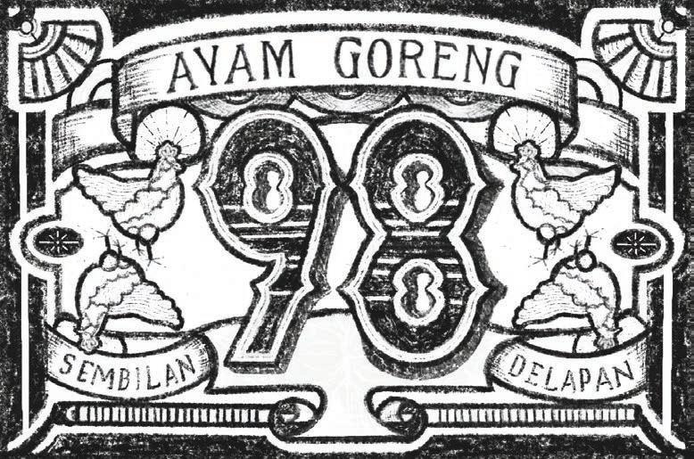
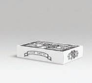
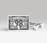
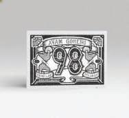
Design 1 — Packaging Mock Up
My first attempt is by sketching a fried chicken brand. ‘Ayam Goreng 98’ is the name of the brand. The word ‘ayam goreng’ itself means fried chicken in Bahasa Indonesia. Right after, I explored the design application by making a box mock up as the brand’s packaging.
inspirationjournal EXPERIMENT 2
APPLICATIONDESIGNEXPLORING
inspirationjournal
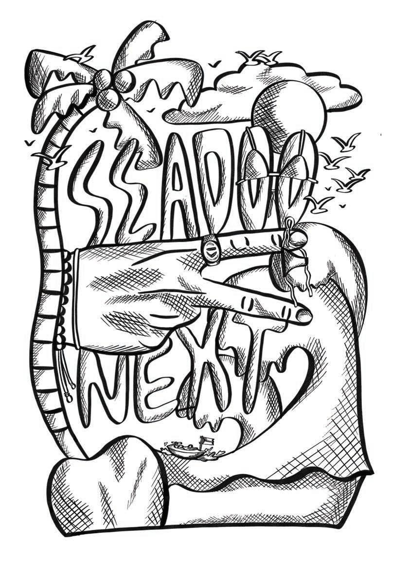
Design 2 — Graphic T-Shirt Mock Up
My other attempt of creating a vintage-styled illustration that is based on my jet ski community——Sea-doo Next. I put some color and paste it on a t-shirt mock up.
APPLICATIONDESIGNEXPLORING
inspirationjournal EXPERIMENT 2
inspirationjournal


inspirationjournal
LISTREFERENCE
How to Use Decorative Type Properly in Desktop Publishing, ThoughtCo. https://www.thoughtco.com/kinds-of-decoraBiscuits,tive-typeography-1078016E.‘EarBiscuits
Levin,play-fonts--cms-33518https://design.tutsplus.com/articles/a-brief-history-of-dis-S.
What is Flay Lay Photography?, The School of Thegram.com/by.obie/Obie.0on%20social%20media.tography#:~:text=What%20is%20Flat%20Lay%20Photography,of%20photography%2https://www.theschoolofphotography.com/tutorials/flat-lay-pho-Photography.‘By.obieAccountPage’.[Instagram],Obie.https://www.insta-Artling.
Obie, The Artling. https://theartling.com/en/artists/obie/ Tinta, T. ‘Tjinta.tinta Account Page’. [Instagram], Tjinta Tinta. Waddy,https://www.instagram.com/tjinta.tinta/L.‘InspiredByMagda.marchOnIg’,
Andren. ‘Armin Hofmann’, Tumblr. Aspireblr.com/post/188190613722/armin-hofmannhttps://andren.tum-(22November2014)
Diet Cig, Shannon Levin. http://shannonlevin.com/diet-cig Maodudi, A. ‘Shakastd Account Page’. [Instagram], Al Maodudi. https://w-
Waving, Dance Beat. https://dancebeat.lv/en/dance_styles/Fussell,tus/1260331097675780098LowellcollectivelyDenton,e's%20arms.t=It%20is%20believed%20that%20waving,making%20waves%E2%80%9D%20with%20onwaving-2/#:~:tex-A.L(13May2020)‘’A’and‘5’forGROUP,anewtypefacemadeby36artistsfromallovertheworld…’[Tweet],AaronDenton,https://twitter.com/aarondenton/sta-G(17June2020)
Future Archive, Muchwow.graphics. Newton,ics/post/638875727988736000/httpsifttt3hnrcmu-httpsifttt38hl5zqhttps://muchwow.graph-M.
Pinterest. https://id.pinterest.com/pin/675258537896179126/
What is Illustration?, Aspire Art Bear,raphical%20representation.t=An%20illustration%20is%20a%20visualization,imagined%2C%20using%20a%20ghttps://www.aspireartstudios.com/what-is-illustration/#:~:tex-Studios.J.H(17November2019)
A Brief History of Display Fonts, Envato Tuts.
Muchwow.ww.instagram.com/shakastd/
A Guide to Vintage Design Styles, Envato Tuts. Keung,tage-design-styles--cms-26986https://design.tutsplus.com/articles/the-potted-guide-to-vin-L(9November2020)
About Page’. [YouTube], Ear Biscuits. Dancehttps://www.youtube.com/c/earbiscuits/aboutBeat.
inspirationjournal ADELISTAWIDJAYA BRIEF1//CAPSTONE