Hello, my name is Adan H. Ramirez, and I am currently a Freshman with a Graphic Design Major. What brought me into art and design was when I was a little kid growing up, I just had a passion to create new things in my head and draw them out, or even create them using paper and glue. So when I was in Middle School through High School, I knew I had something special because I would get first-place to third-place awards for my art and design projects that made people fall in love with my art. In my Senior year of High School, I was a well-known artist in my school because people noticed my work and were intrigued that I was going to have a Major in Art. The only reason I did art was that it was peaceful to me and just enjoyable to make art that others find interesting to their eye. Plus, I didn’t like math or science, so art class took me out of them classes because art was a big credit for me during High School. People also ask me if I have a background in Art and Design. I would then tell them no, because my mom never did art in her life, and my brothers were into English, math, and science-based careers that made me different from them. But what made me pursue a degree in Graphic Design and take this class was to get better skills and knowledge on how to improve on digital design skills. I first wanted to Major in Apparel Design because I liked working with clothes and creating new ideas of clothing apparel that people would wear. But Graphic Design was the closest thing to that major that I wanted to pursue, and do, but now I get the experience of what Graphic Design is all about. I now have a better understanding of Graphic Design and Adobe and how to use all the font choices, design concepts, and compositions. So I have a better understanding of being a Graphic Designer to the best of my ability, and just having the value of making great art and design projects for others to see.
Crash
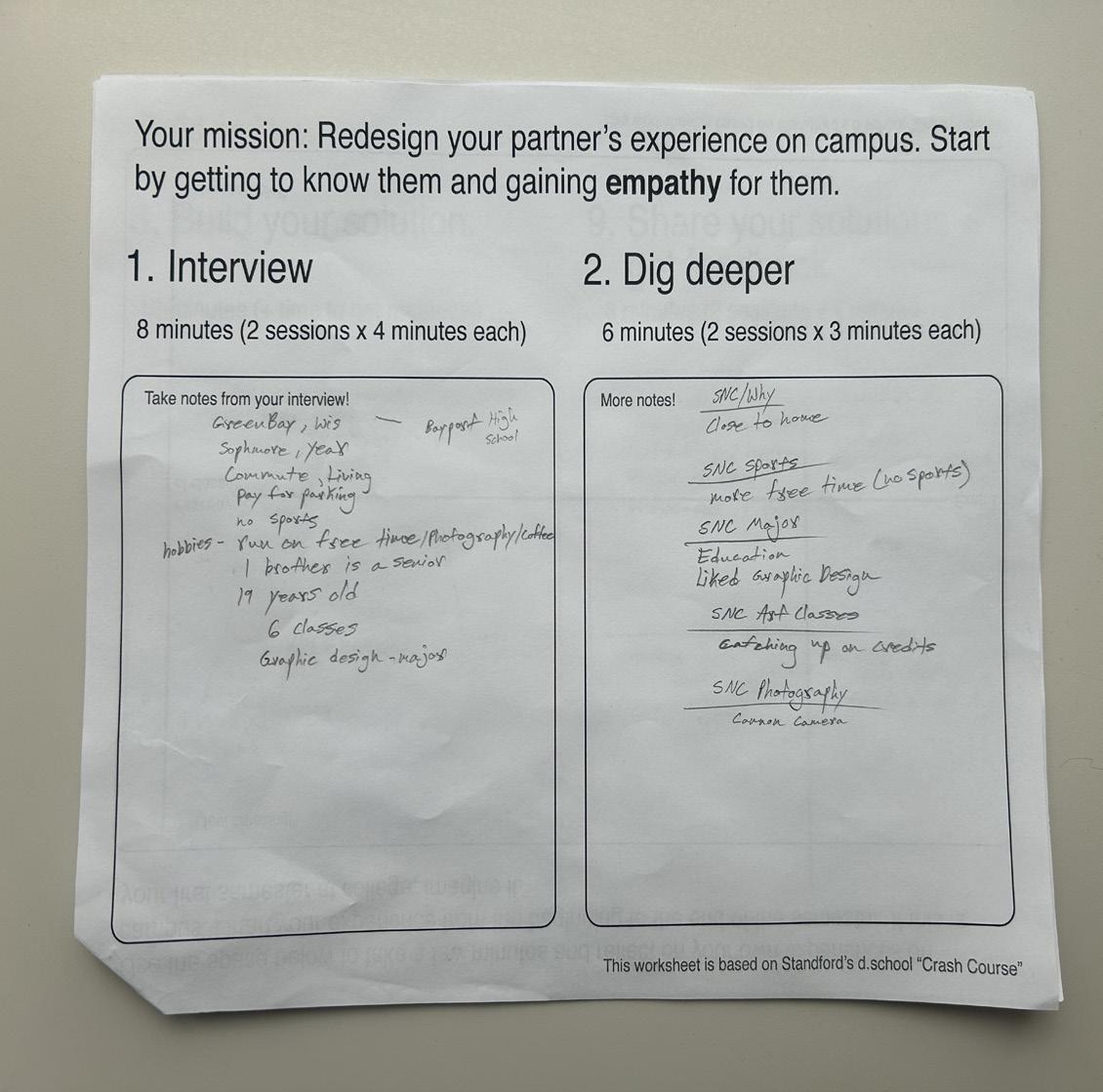
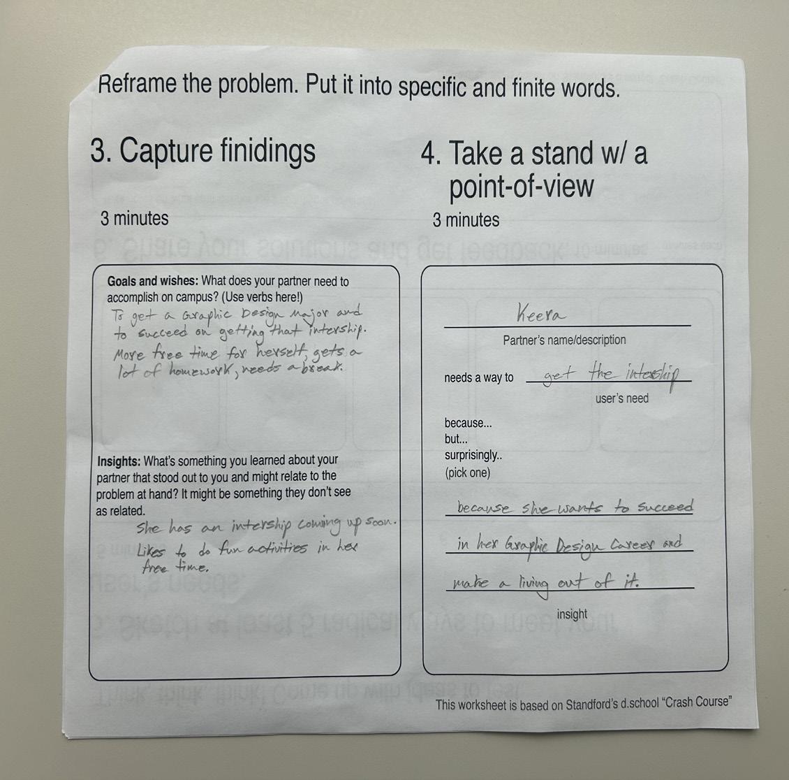
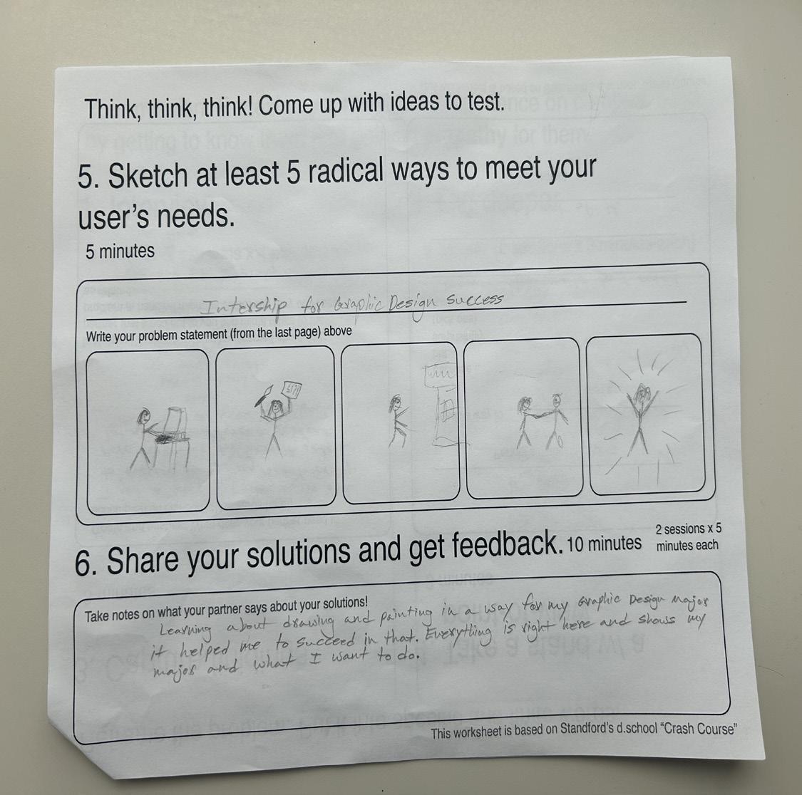
At the beginning of Introduction to Design, we were asked to reflect on our past semester and how it was going. Then, after that, Professor Ries challenged us to interview the person right in front of us at our table and then ask them questions on how their first semester experience has been and what new experiences they went through, so the questions were easy at first, and they then progressed into more difficult questions. We had a total of 2 rounds of asking questions, and then we needed to solve the problem of the person’s question that we got from them. Then we created sketches and designs on how we’d solve the problem, receive feedback from our partner, and then make a real-life prototype of their accomplishment on what they want to pursue in their future. Then, to wrap up this assignment, the main goal of interviewing someone new that we didn’t know at all was just to get to know the person on another level, thinking creatively/being open-minded, and to work on our communication skills with our partner. This also helped us on how to work one-on-one and how to work on a time frame that was short to get all the information and answer our partner’s questions, and answer them as well in a matter of time.
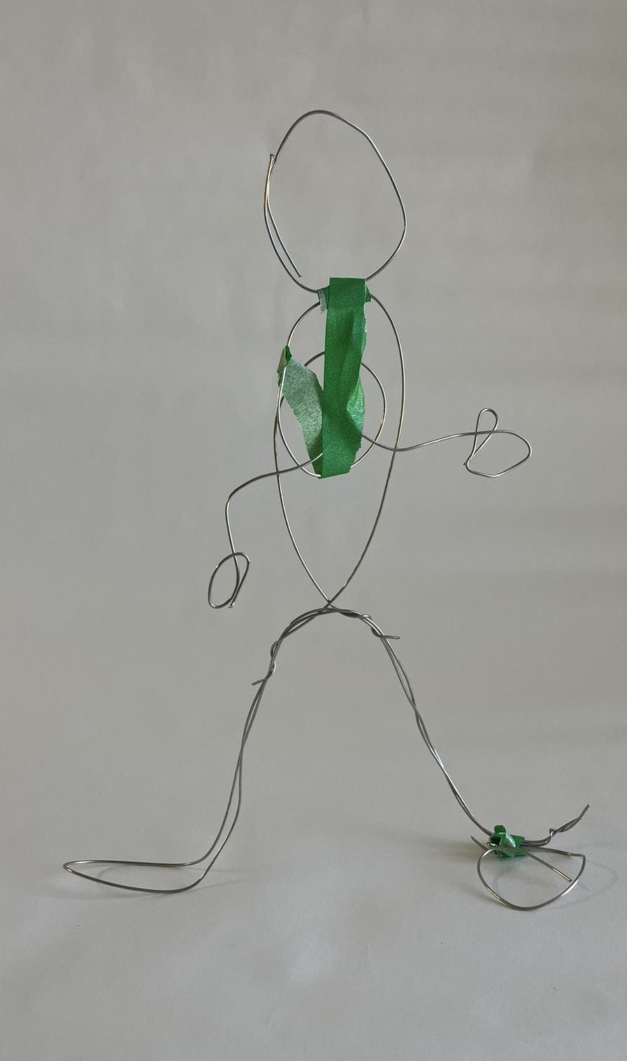
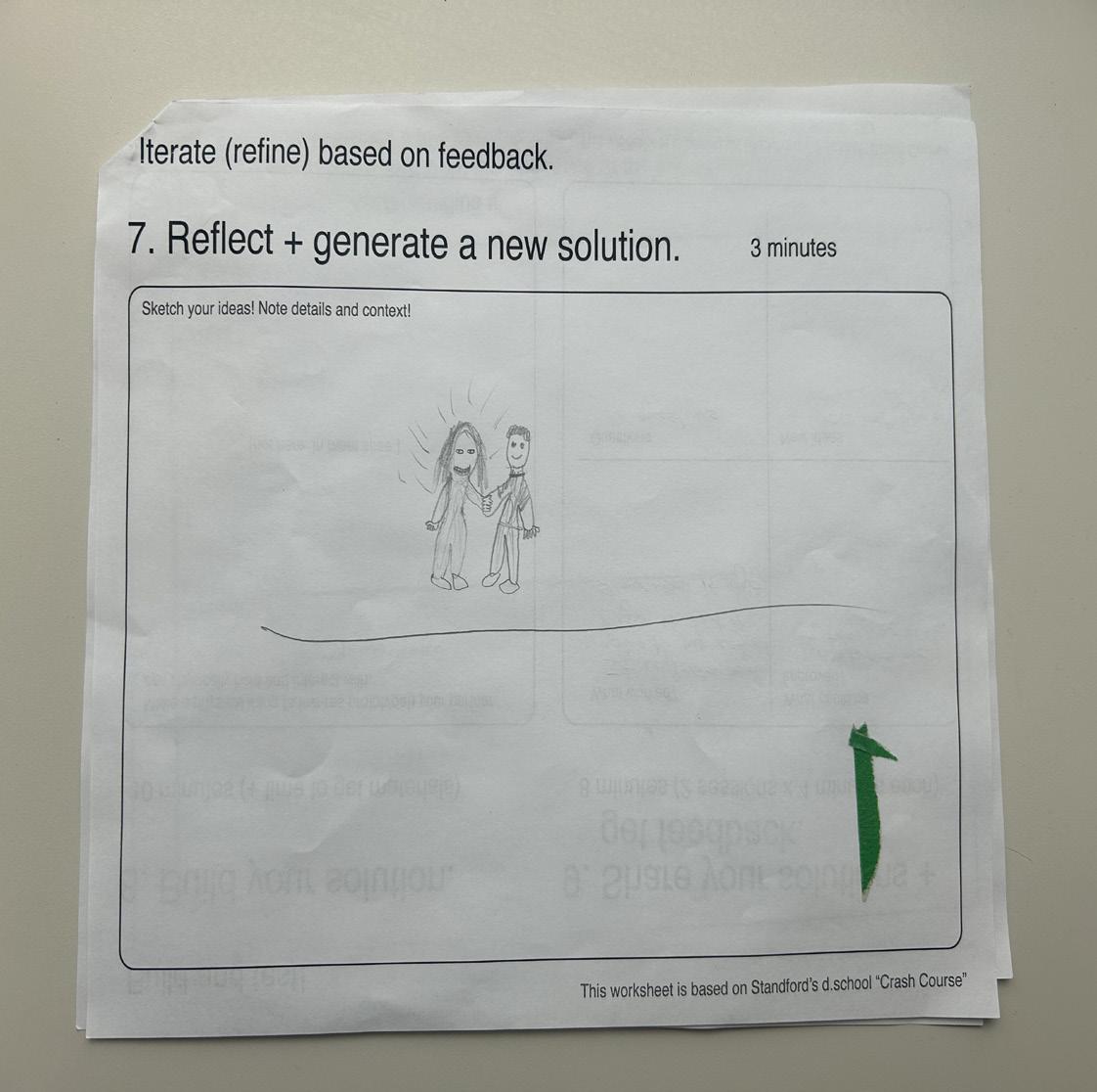
Keera is a Sophomore at SNC and is a Graphic Design Major with an Education minor. I made Keera a wire figure of her with a hand shaking gesture of her succeeding in getting the internship. You can tell that Keera is hard working and passionate about her Major because she’s having an internship in the summer, which she wants to make a living out of.
I enjoyed working with Keera and getting to know her. It opened my eyes in a way that knowing another student’s life and their passion and work ethic, she has to be successful in life. Although I wasn’t finished with the wire figure of her shaking another wire figure, which was going to be someone who gave her the good news and said that she got an internship in Graphic Design. But overall, I think I accomplished what I was trying to show of Keera and her success in the future. Keera was a wonderful partner to get to know.
Course
Letter
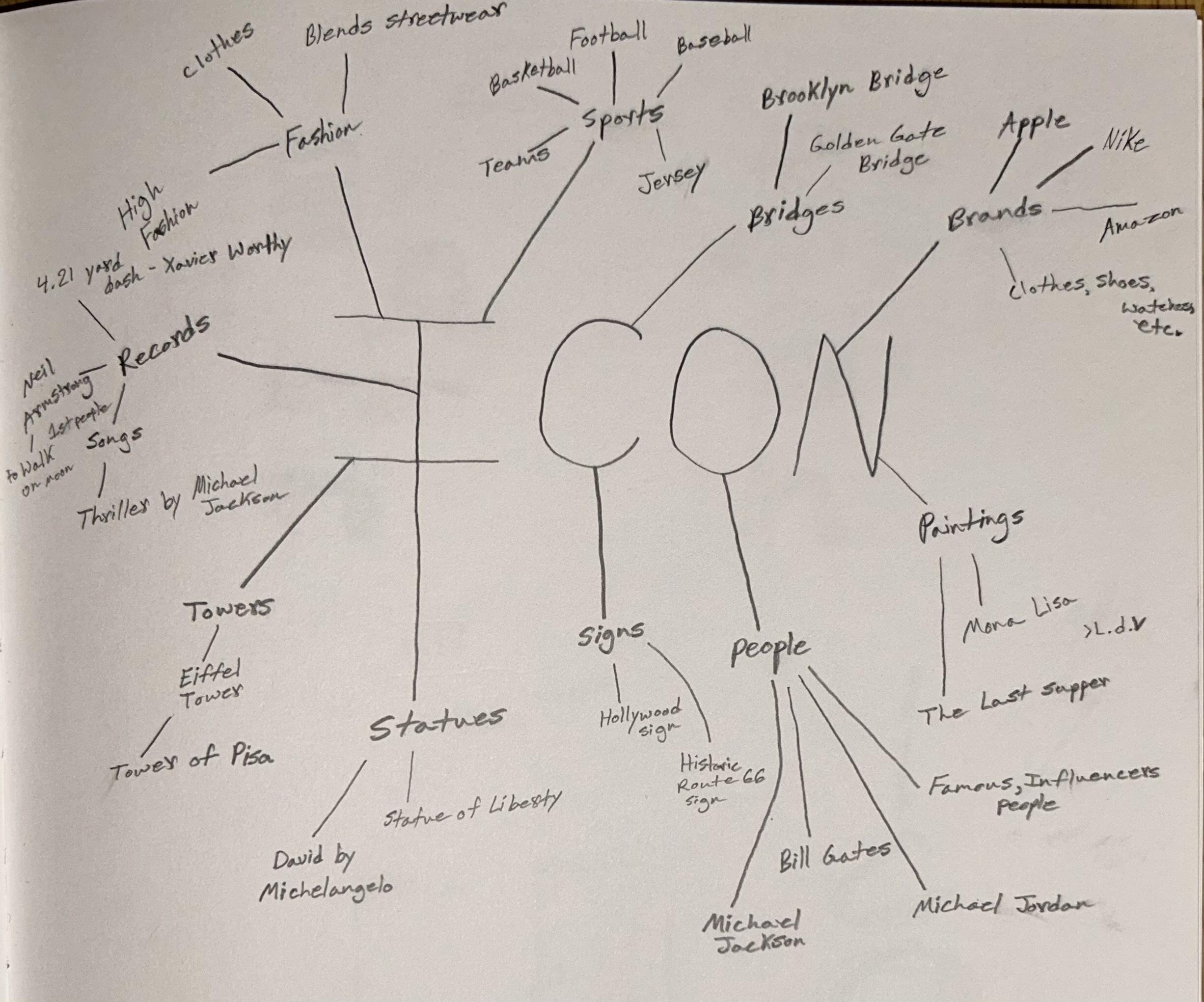
The meaning of the word is more than just a word, not just a simple word like Icon, Wave, or Scar, there’s more to the meaning of them words. I find it interesting how we could expand on the words we used and what ideas we could come up with by using the words that we picked. Just critiquing our words every week was helpful on how to improve the meaning of it, on how we placed it or arranged it in our artwork pieces. If I could keep on working with my letter forms, I’d do the same thing as always, and that’s to use my notes that I got from my peers to make it better and more understandable. Overall, this project caught my eye and made me think and explore the word meaning of the word I chose, so it was a great project at the end.
Forms
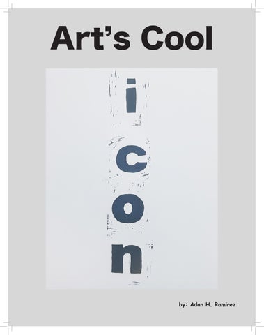
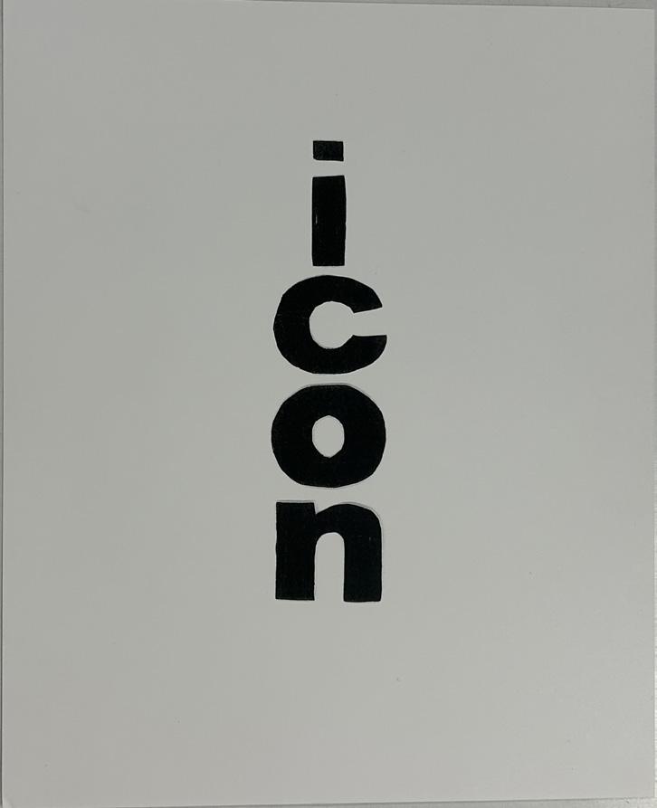
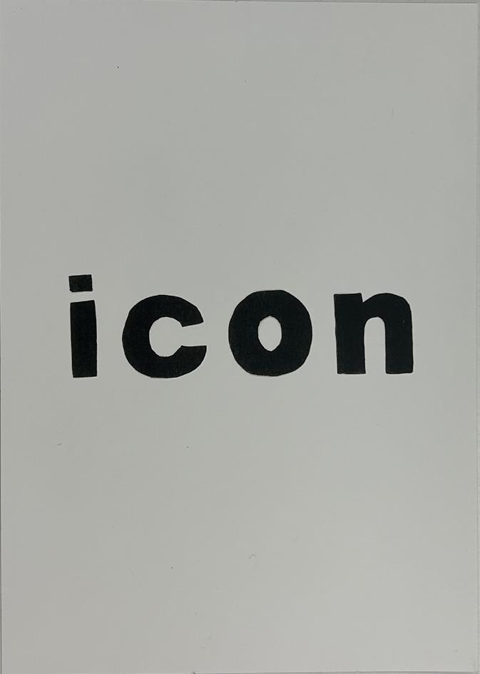
My first design was a letter ink print of my word Icon. Using ink for the first time and applying it was difficult because you needed the right amount of ink to fully print out the letters.
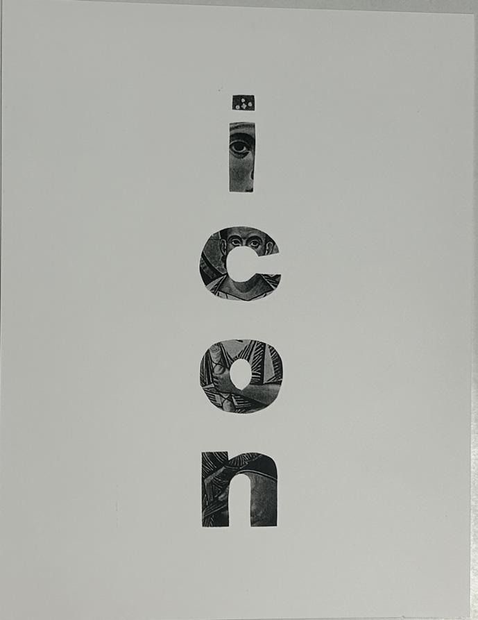
My third design was a vertical print of the word Icon. I used the letters from my first design and improved them, and colored them in to give me more of that bold, dark color.
My second design was a straight print of the word Icon. I made the letters as straight as I could, but the letter C is a tad bit under the rest of the other letters.
For my final design, I cut up pieces of the letter forms of a religious print of someone holding a baby while they’re in their robes and looking at the cross of Jesus Christ.
Who Designs?
Luba Lukova is one of the most original image-makers to this day. What makes her famous is her use of economy of line, color, and text to convey her sense of human conditions and underlying fairness or justice. Her work is powerful and gives meaning to the images she creates. Luba says, “Less is More.” What she means by that is that it’s more about the message, more effect, and more expression of the artwork. Luba’s work is based on boldness with few fine details, but it conveys the message. Luba has many famous, well-known artwork pieces, but the three that should be talked about are Peace, Income Gap, and Censorship. The meaning of Peace, her artwork poster, means that we as human beings have a war-like behavior that we go through conditions and that we are imperfect, and we therefore
have to understand are madness and what the cause for it is in our bad and good side. The second artwork of Luba is Income Gap, which represents the inequality in the world. Also, the visualization of how it represents the different groups of people of wealth and income in society. So you get the symbolic imagery of the poor and the rich, raising awareness of economic inequality. The third artwork of Luba is Censorship, The artwork was meant to address Social Justice and the growing inequality of the world around us. Also, the statement from the Censorship poster shows the importance of freedom. In conclusion, Luba Lukova has a fantastic and open imagination of how she does her artwork in representing it, making it, and how the artwork speaks for itself in ways that are unique and make the audience get the right idea from the posters.
Illustrations
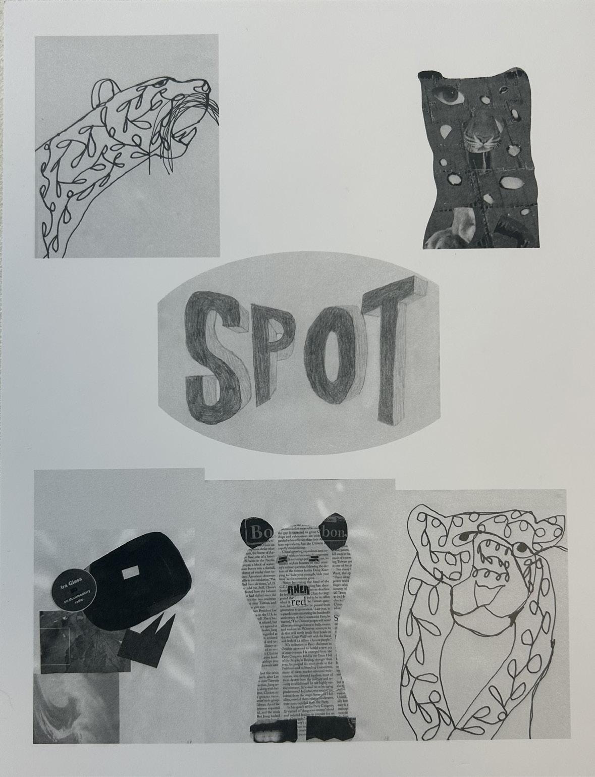
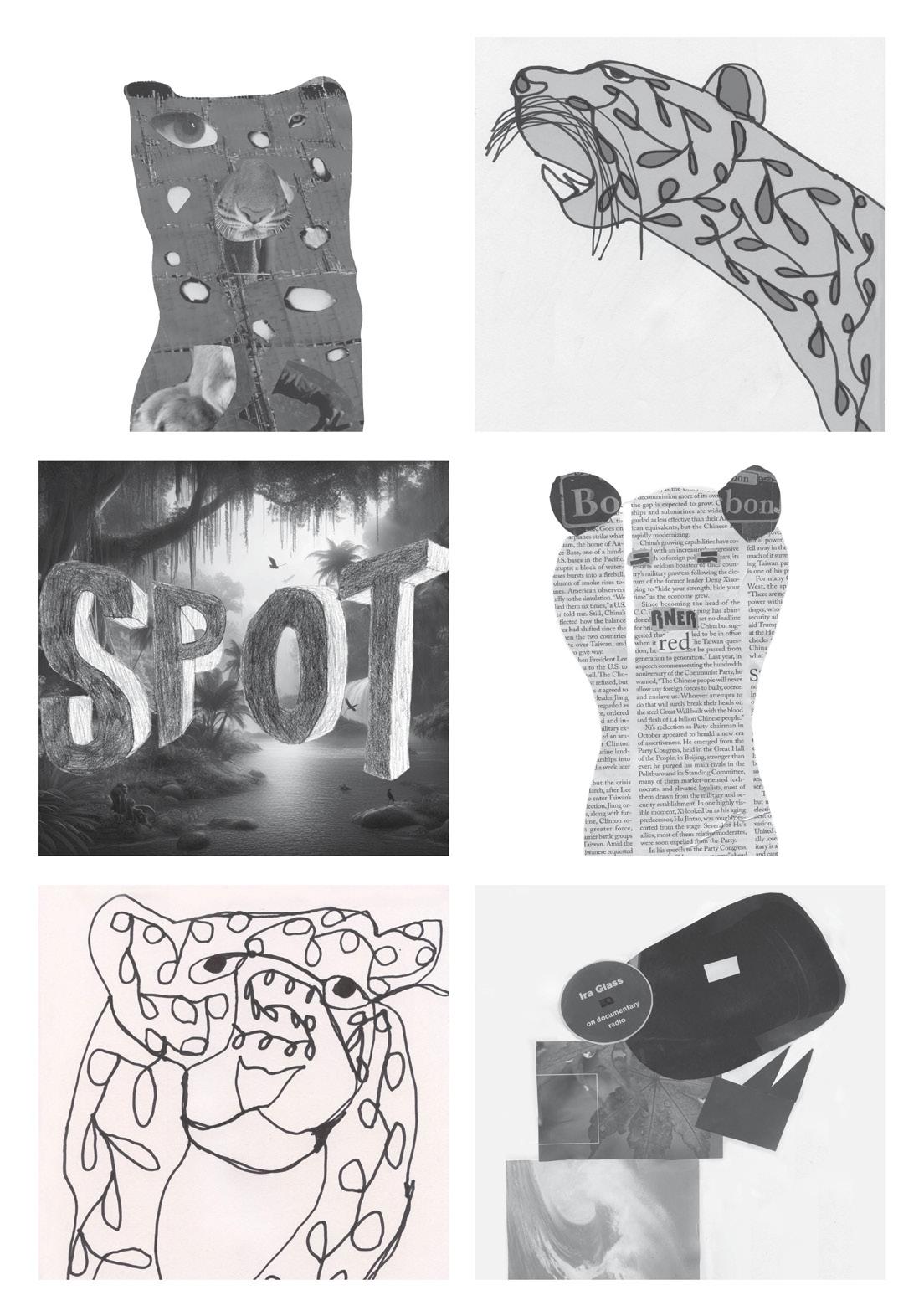
Now going into my second and final Iterative Illustration, I knew how to use other tools to help set up the squares perfectly and how to put the word spot into a background to give it the meaning of the animal I was trying to represent. Even getting rid of the rincles on my images to make them look clean helped me out because it used to look all messy, like on the first attempt I made. But overall, I liked how my images were created and how they stood out to my peers, especially the Spot image.
My first Iterative Illustration was a rough start because I didn’t know the tools to make my words and images fit right into the square boxes. It looked like I just inserted images in a blank doc without using any tools, which made my first project not so good.
Favorite
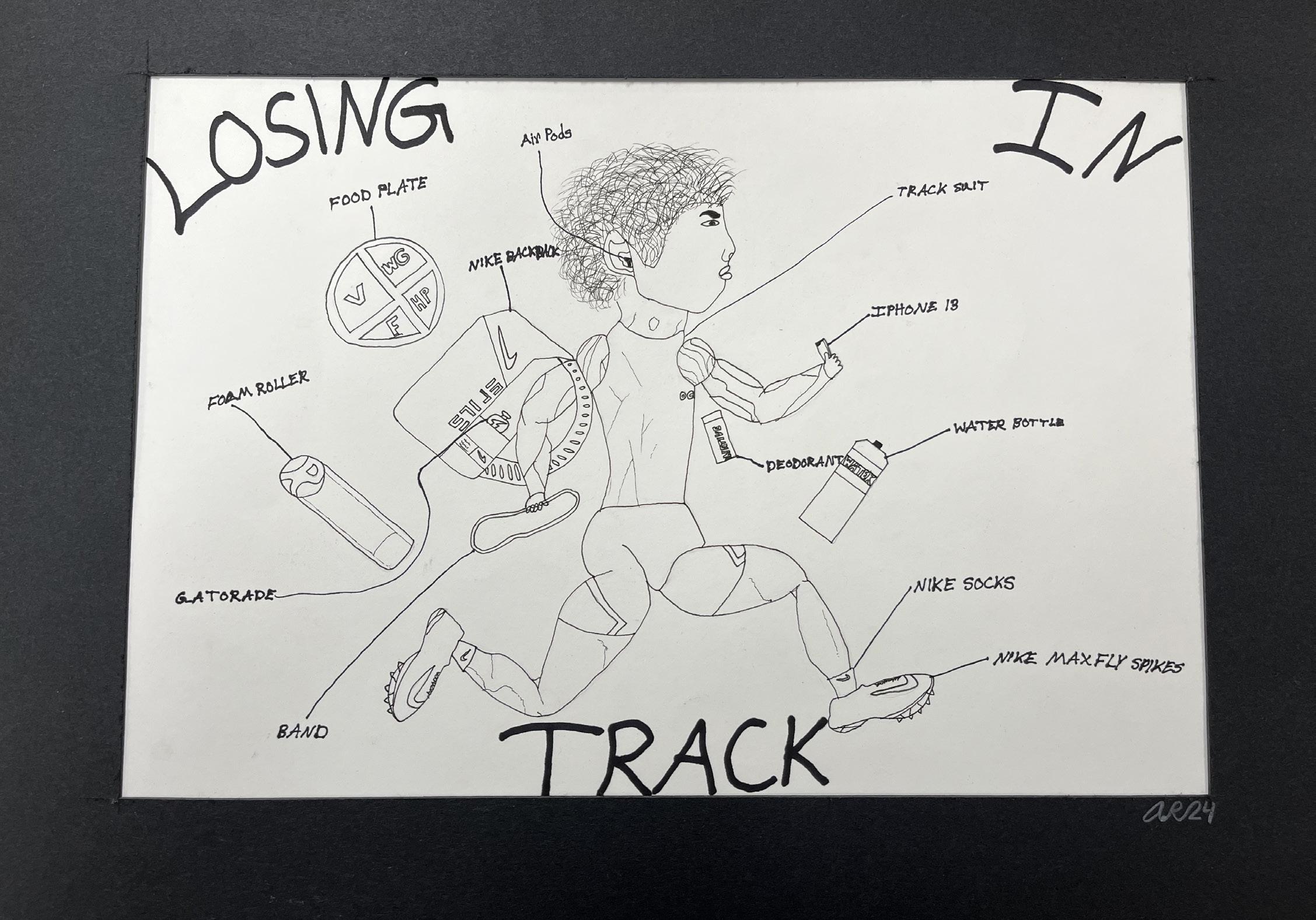
One of my best art projects in my Senior Year of High School was this drawing of me running on the track and what affects me, and what I need to prevent losing on the track. I did this project becasue I was well known in track for the 400 meter dash, and I hold the 3rd fastest time at my High School for it that made me think of why not draw it and show poeple what I need for myself to perform so well on the track field and off the track field. The materials I used to create this project were 3 types of Sharpees (Bold, Thin, Regular), a white sheet of paper, and a matted black sheet of paper.
Pieces
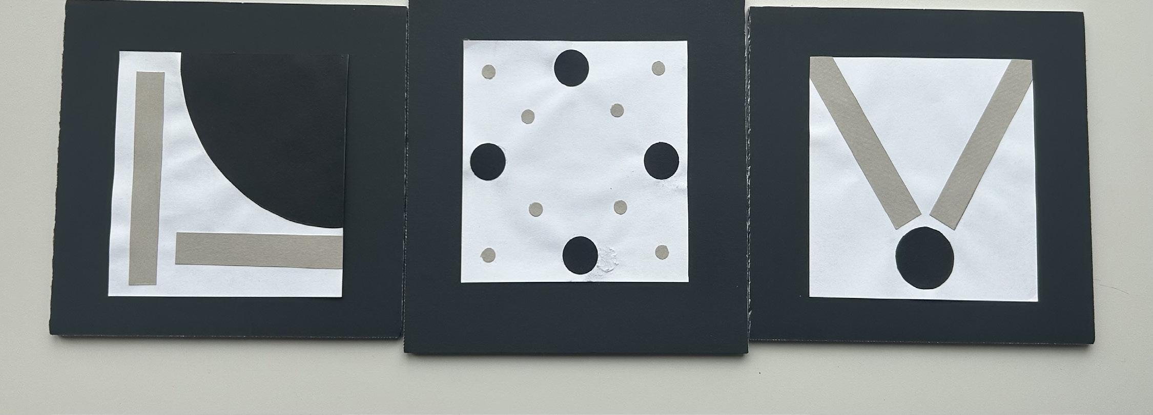
One of the most stressful, exhausting, and hardest, in my opinion of projects that I had to do during my art career. It was a long process of doing all them 30 mini boxes of the three words we chose to pick and just making new ideas on top of new ideas and how to represent the word and its meaning using only shapes. The process of that took a while, but then when we had critique day, it helped me rethink new ideas based on the 30 mini boxes I had already done. We did that a couple of times, and then I found my best three images that represented my best three words. I picked Joy, Comfort, and Freedom because they were going to be challenging to do, but I knew that I was capable of doing it and making some great art pieces for people to get the word out about my pieces, only using shapes. I enjoyed this project a lot because I didn’t do anything close to this during High School in my art classes, so something new that interested me, and now I know that there is meaning to shapes and that they can represent words. The materials I used to create this project were matte paper, circle cutter tools, scissors, glue, and a variety of colored paper for the shapes and background.
This book was made as part of the Introduction to Design at St. Norbert College in the spring of 2025. The fonts used were Hiragino Kaku Gothic StdN Bold 72pt and Comic Sans MS Bold 14pt. It was digitally printed and saddle-stapled at the St. Norbert College Print Center.