
Akira Tuazon
ILLUSTRATION + GRAPHIC DESIGN PORTFOLIO
Product Design + Branding
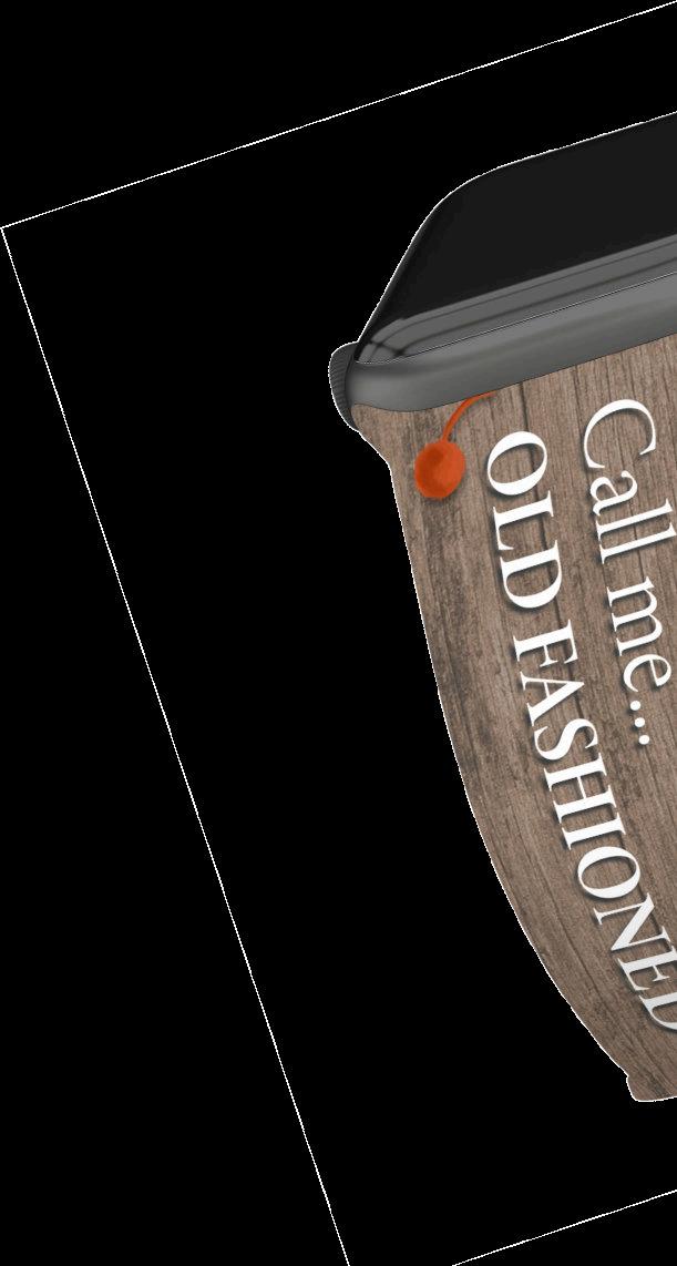
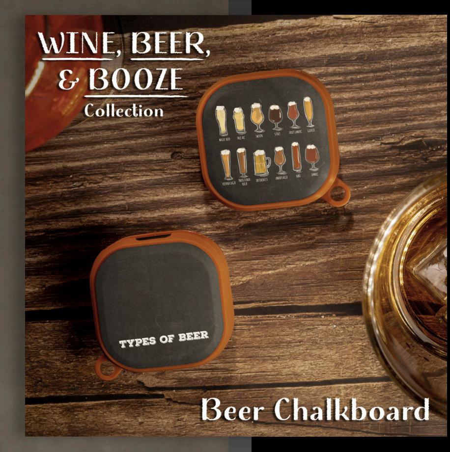
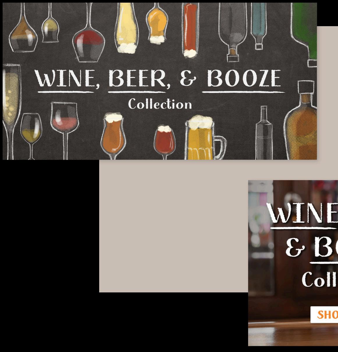
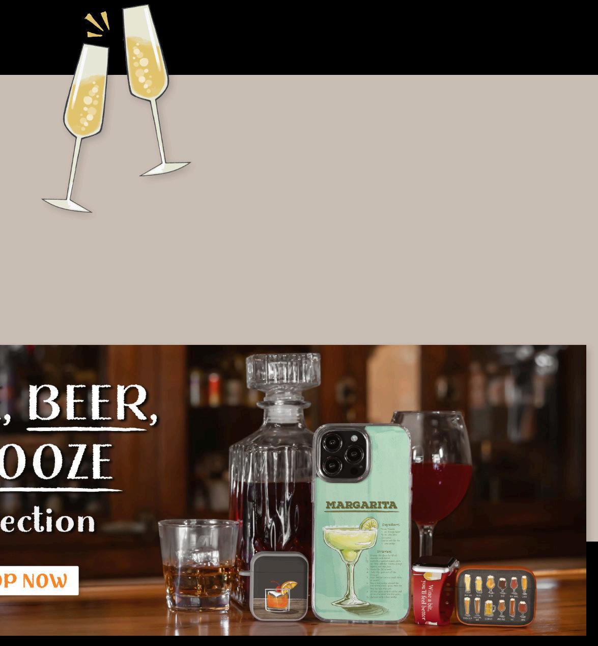
Wine, Beer, & Booze
UNLICENSED COLLECTION
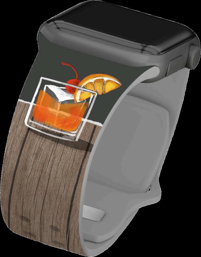
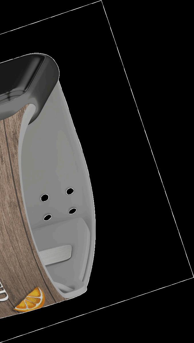
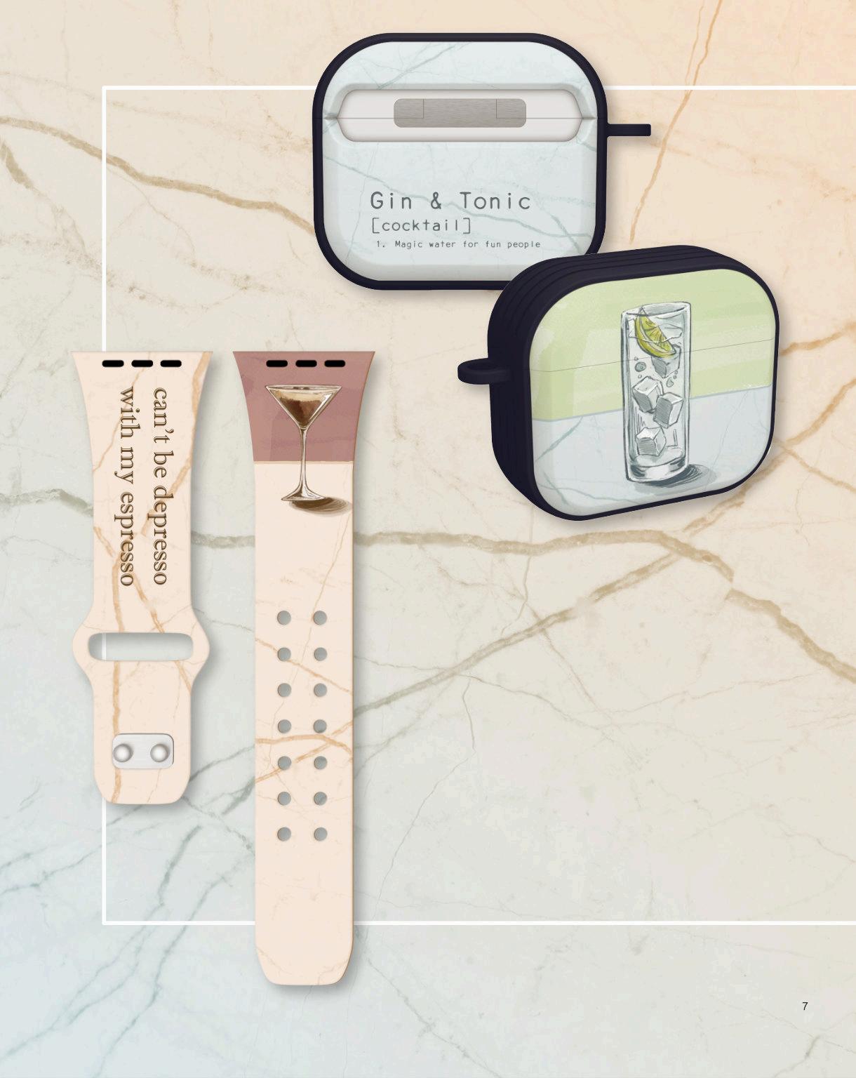
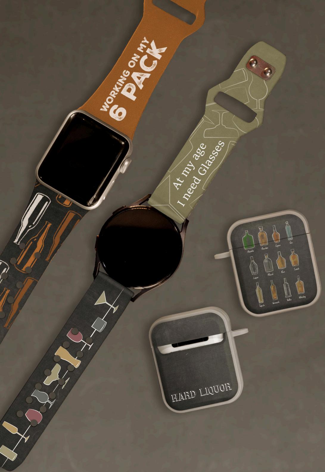
Unlicensed collections consist of watchbands, earbud cases, and phone cases designed by one graphic artist. For each product, there are several 3D renders and two infographics that are used for marketing on the website. After my initial renders were approved, I created EPS files for in-house manufacturing. This required test prints and CMYK color correction to match the original product renders. Lastly, I created homepage banners for both desktop and mobile formats. Along with an email layout to promote the new collection.


OVERALL AESTHETIC

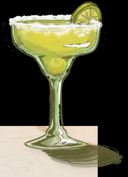
For this theme, the company focused on funny puns and relatable slogans related to drinking. I researched and chose certain phrases that suited multiple age groups. Depending on the text, I illustrated a simple matching graphic or image for each accessory. The style leans more towards sketched drawings with simple shading and color. Many of my designs mimic traditional media such as watercolor or chalkboard illustrations. The fonts vary throughout the collection due to the art aesthetic or the nature of the phrase. Each font was chosen carefully reinforce these themes.


PRODUCT INFOGRAPHICS
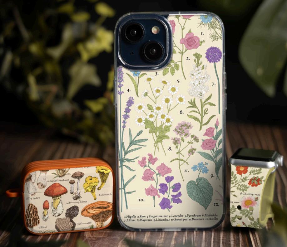
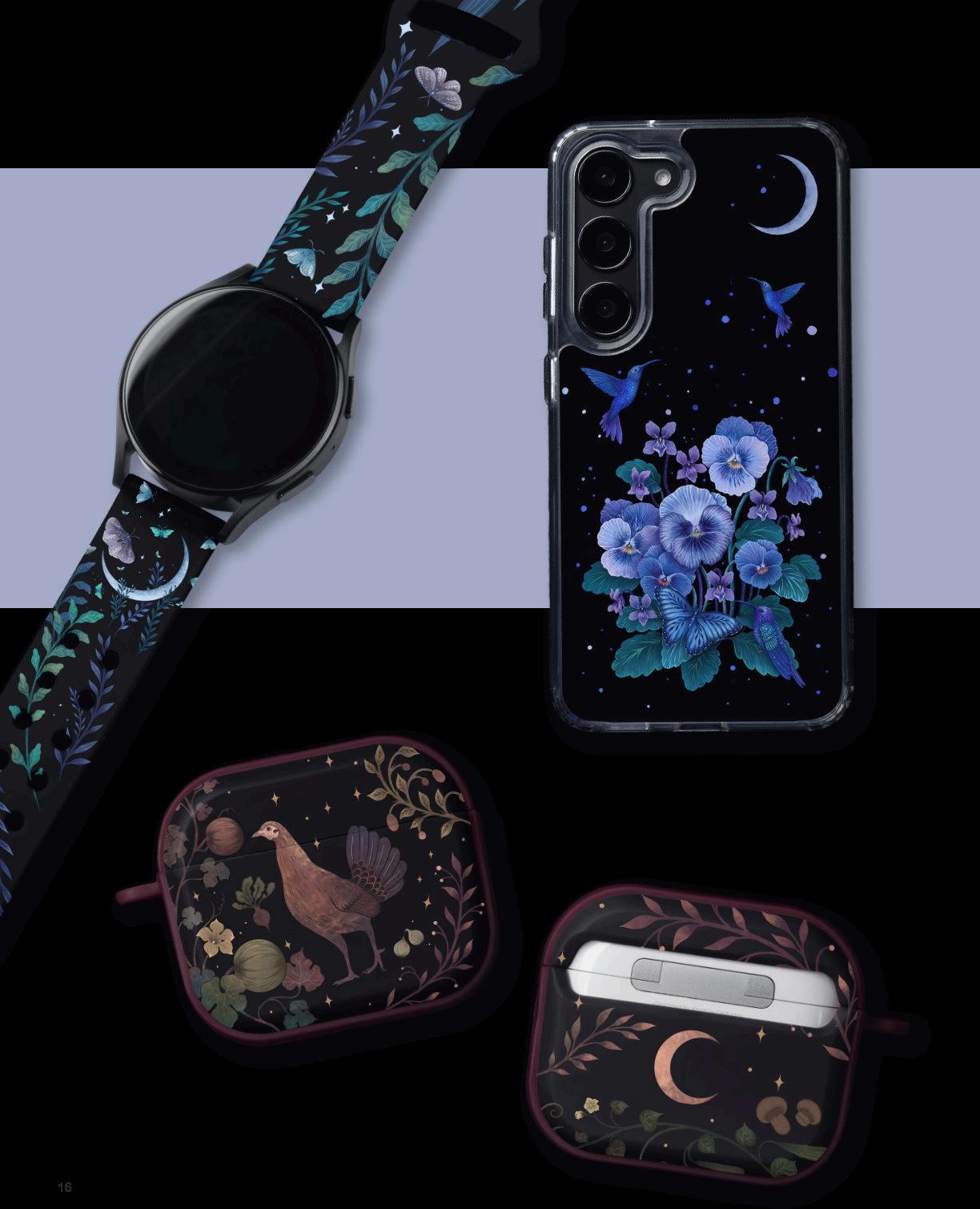
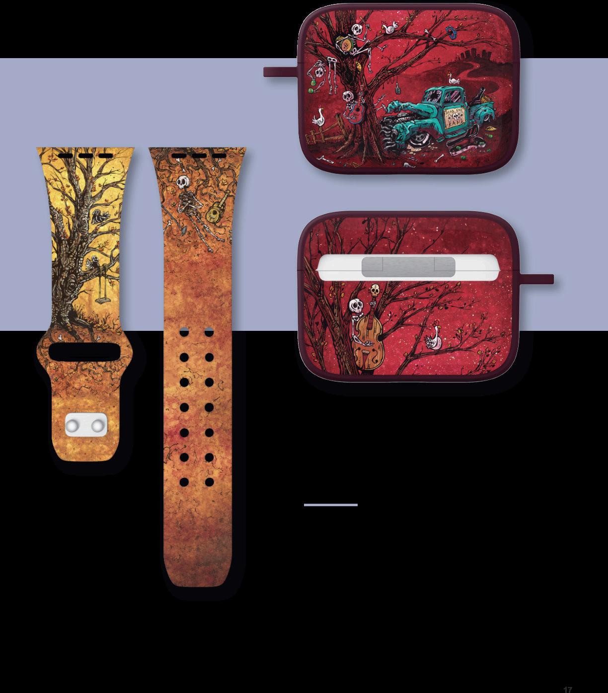
For the website, each watchband, earbud case, and phone case has an infographic labeled with the collection’s title and design name. These images are made to look like actual product the consumer will receive. The accessories are photographed blank and each design is photoshopped onto to them. Using smart objects of the original RGB file made the process more efficient when switching designs on each product. Especially, when it came to earbud cases and the various colors. I collaged different adjustment layers and blending modes to mimic shadows so the product looked as realistic as possible.

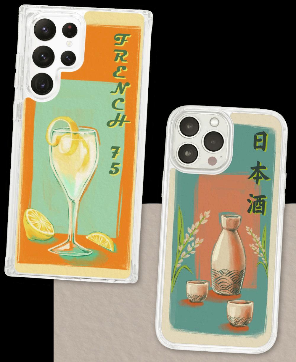
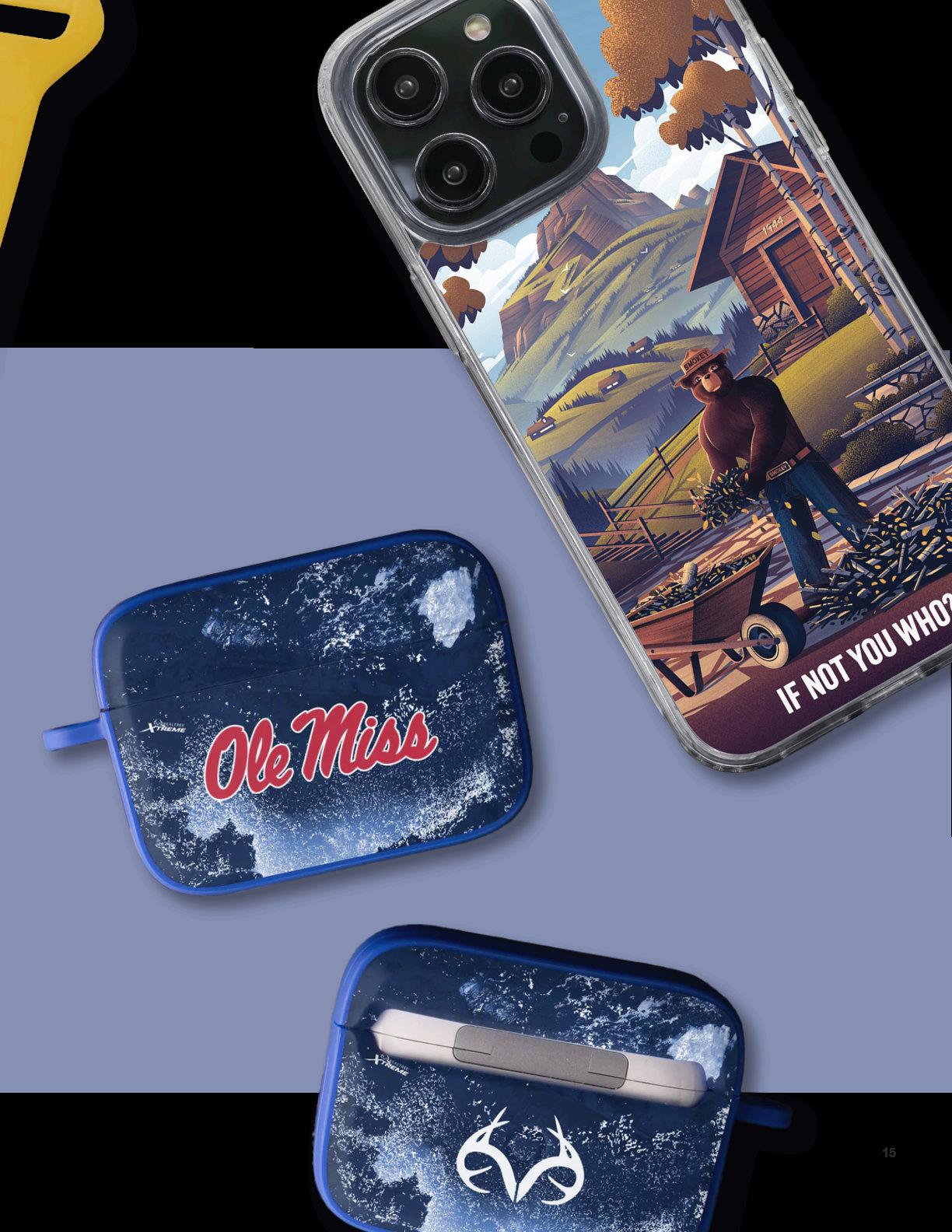
PHONE CASE DESIGNS
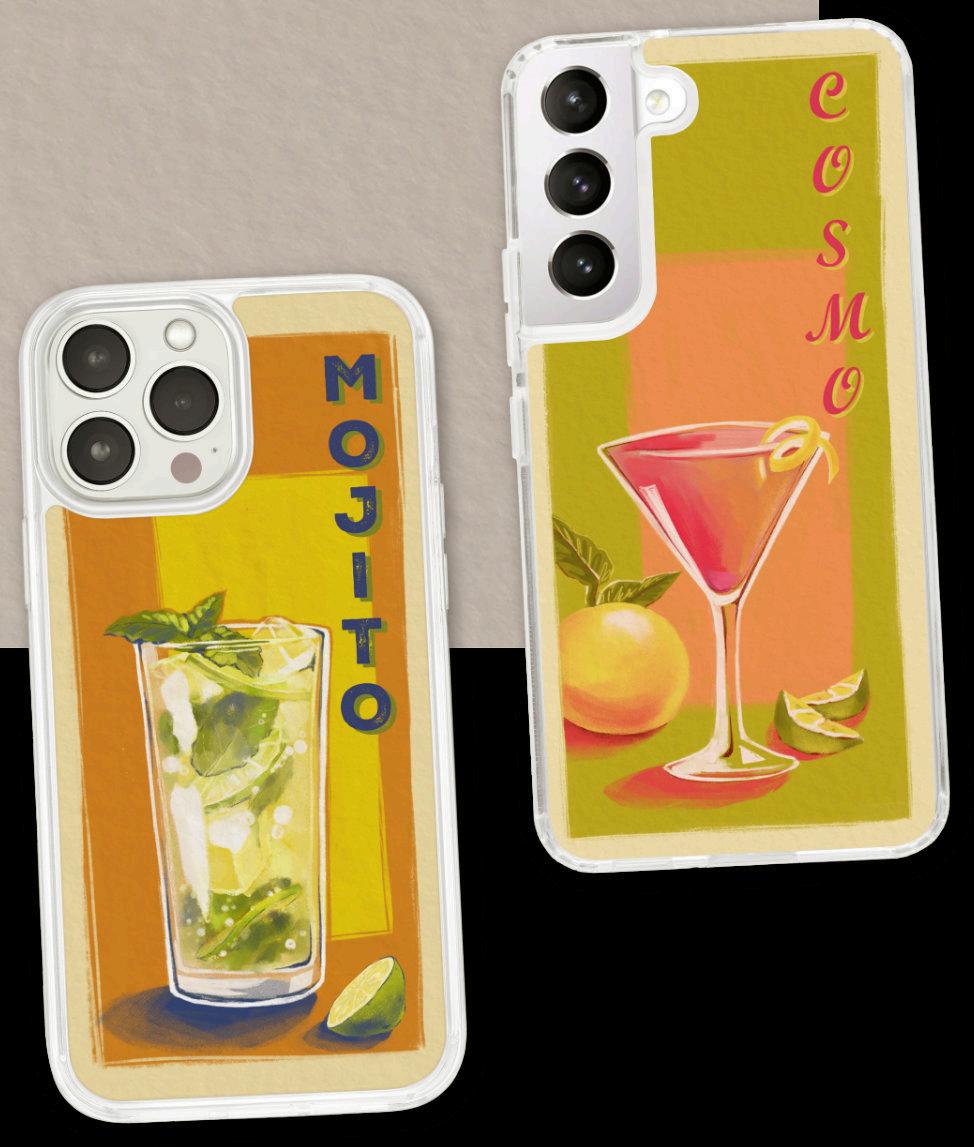
Phone cases were the most versatile when it came to designs and often have extra illustrations that only suited the larger scale format. This allowed for the designs to be more detailed than the restraints of the smaller dimension of the other tech accessories.
These four designs were inspired by vintage posters. Even though they are more painterly, they still fit within the collection’s style.


SCAN TO VIEW FULL COLLECTION
WEBSITE BANNERS
One of the last steps for the collection is the design of the collection header and the accompanying homepage promotional banner.. In my collection there was a common theme of the chalkboard and each type of liquor was drawn in that style. I used assets from the chalkboard designs to make a clean and representative collection header, along with a title in a matching textured font.
The homepage banner was used to showcase the actual products to entice the consumer into clicking. I photoshopped the designs onto blank products, changed the colors of the cases using adjustment layers and added the products reflection into the bar’s surface. This promotional piece was one of the more complicated banners , due to that reflection of the accessories and artwork.
Licensed Products
WORKING WITH BRANDS
At Affinity Bands, I worked with graphics from several licensed brands, sports teams and artists. Every design was submitted for approval and often was sent back with revisions. Most brands required samples of the physical product to be sent out, which made test prints and color correction of utmost importance.
Sports teams in particular were strict on the use of their graphics, colors and often updated their logos. Thus, every product for that team would have to be resubmitted with the new brand logo. Licensed artists were more relaxed with the use of their designs as they had single images that would be collaged together to fit different product dimensions.

EPISODIC DRAWING
ARTIST COLLABORATIONS
I was assigned two collections using illustrations from licensed artists. Depending on the image, each had to be cut apart in photoshop to fit the different product dimensions. Due to the watchbands long design, it required the most creative thinking to come up with an appropriate composition.
For episodic drawing, her initial illustrations were already similar to collages, which translated well to each product. For David Lozeau’s work, not every design worked on each format. Especially for watchbands, they had to be cropped to strategically portray the original art.
DAVID LOZEAU
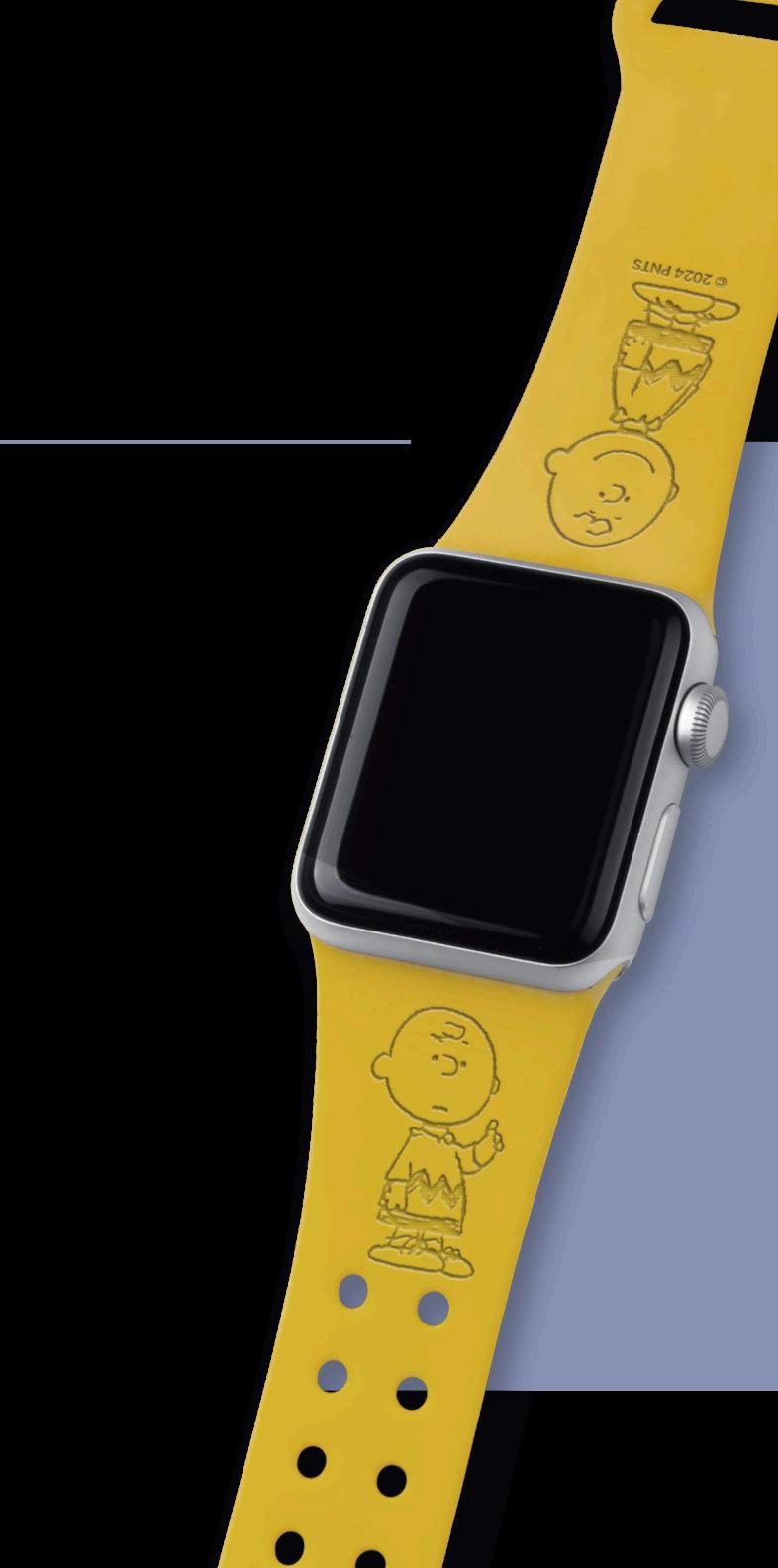
BEAGLE SCOUTS
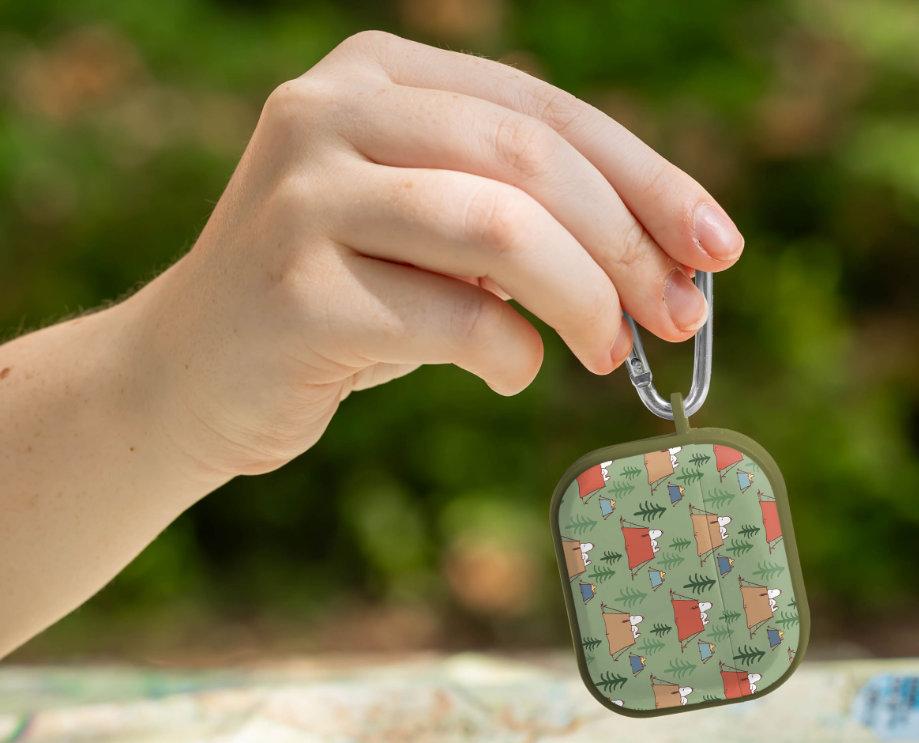
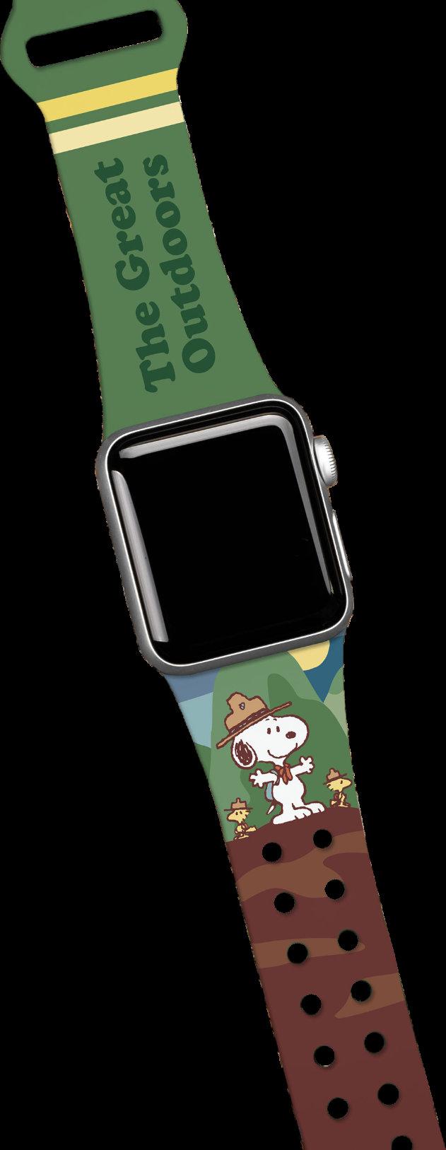
I assisted the team and produced many of the website images for many Peanuts collections. With the Beagle Scouts series, I was in charge of creating the infographics, and lifestyle photos to market the product.
Each image had to fit the theme of the collection while only using assets that the brand supplied for the images. For instance, the product infographic required the 50th anniversary logo as it is unique to these particular licensed graphics.

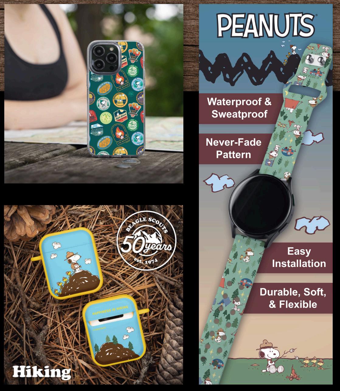
LIFE STYLE MODEL IMAGE
Sweatshirt Designs
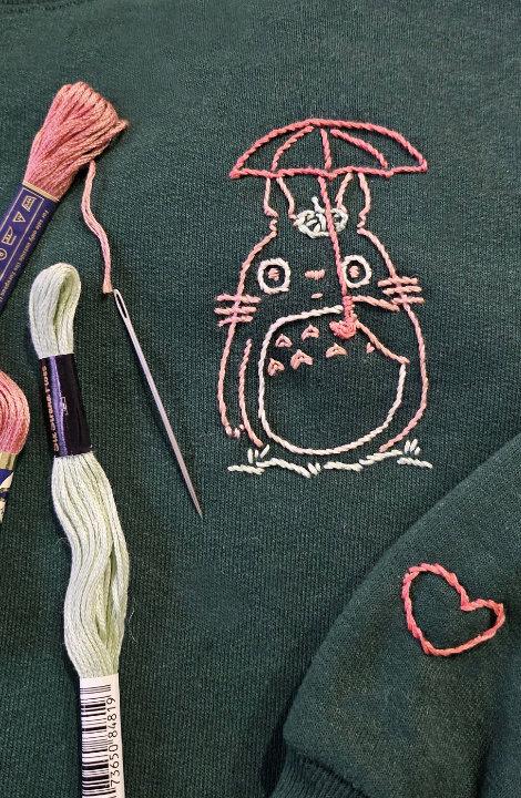
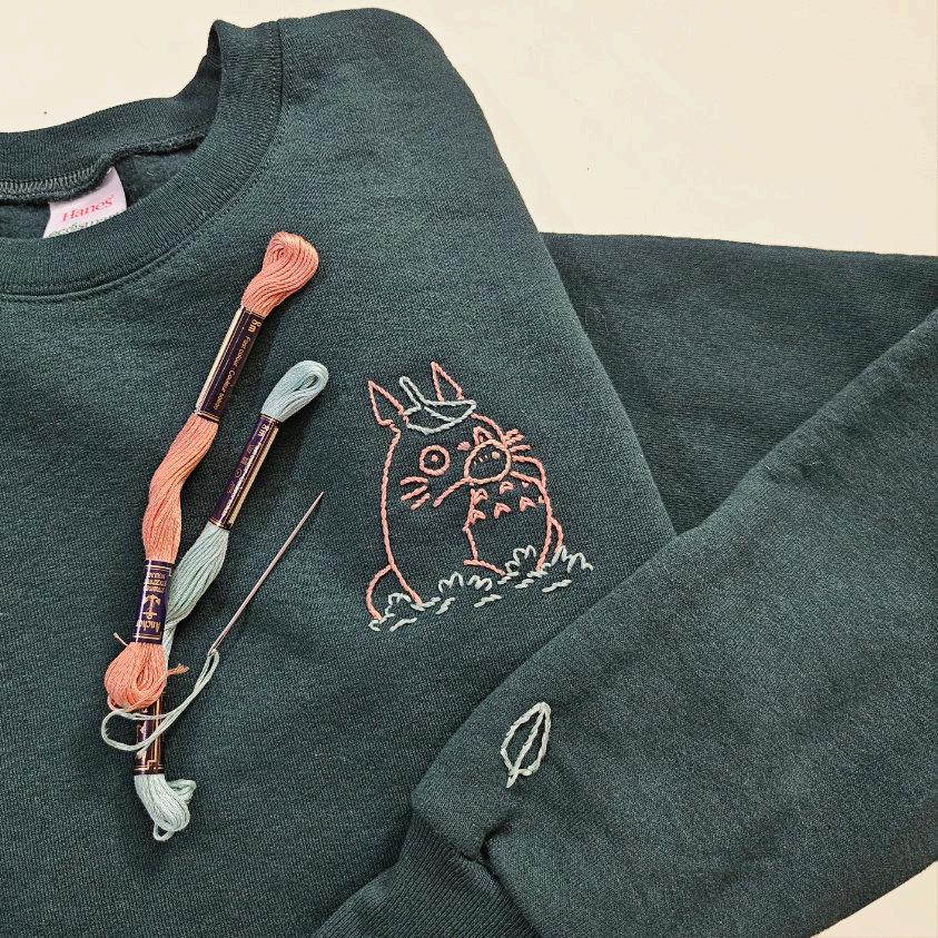
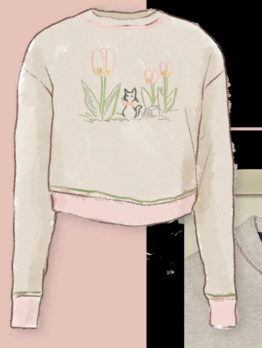
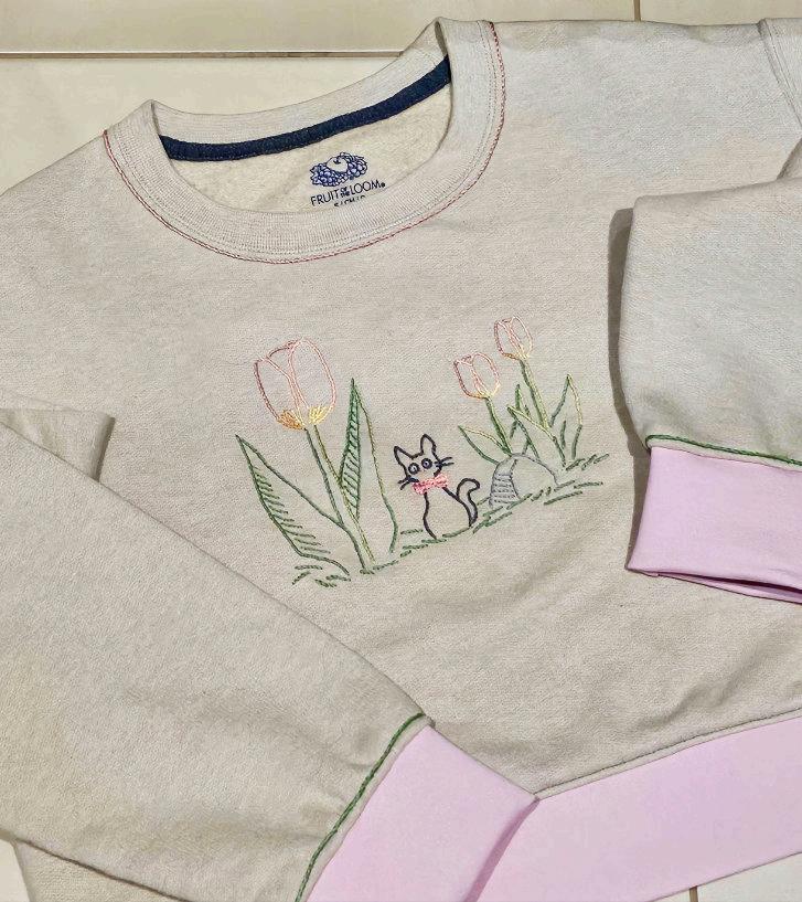
HAND EMBROIDERY
Recently, I decided to marry my love of sewing and drawing together by picking up hand embroidery. At a previous job as a garment printer, I learned the ideal sizing and certain placement for graphics on shirts and other clothing. From there, I started with doing simple left chest designs and found stitches that suited the line quality similar in my own artwork. There was a learning curve sewing on a stretchy garment as opposed to linen or quilt cotton, but quickly became use to the nature of the fabric.
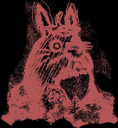
These two designs are left chest graphics of one of my favorite Studio Ghibli characters. I started by drawing a very simple sketch of Totoro, then used chalk to apply it to the dark fabric. I sewed with one color at a time and chose to not include lighting in these two as they were some of my first attempts with the medium.


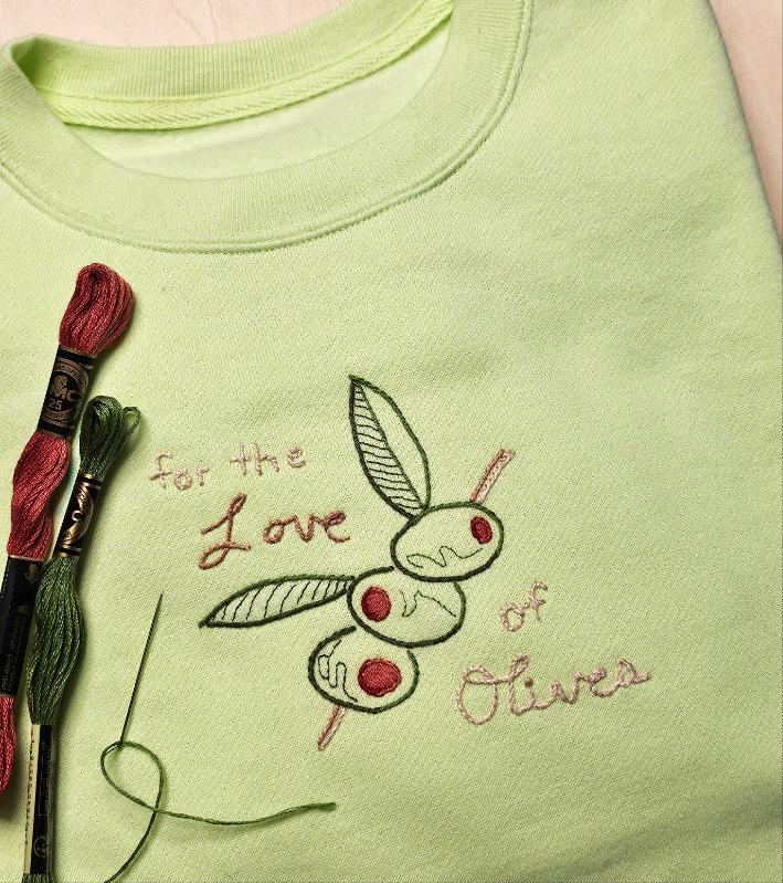
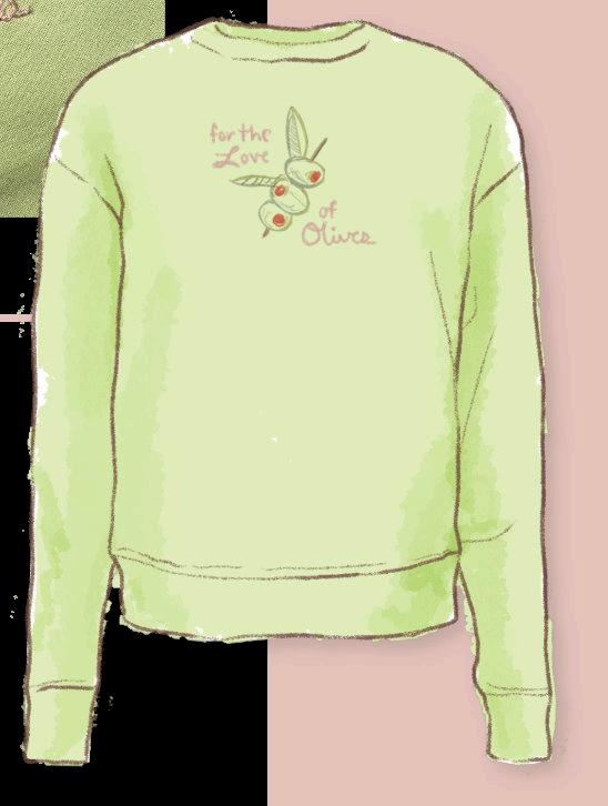
FULL FRONT DESIGNS
After doing more designs, for full front graphics I made quick mock ups for color and scale. Similar to doing color studies to prepare for a illustration. I played around with lighting through thread colors. On both of these designs, I used a warm and cool color thread to simulate where the sun is positioned. It adds an element of variety for the eye to look at without having to fill in the whole shape as it would in traditional machine embroidery.
Illustration

World With Paper
CHILDREN’S ILLUSTRATION
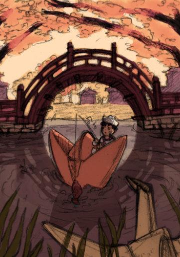
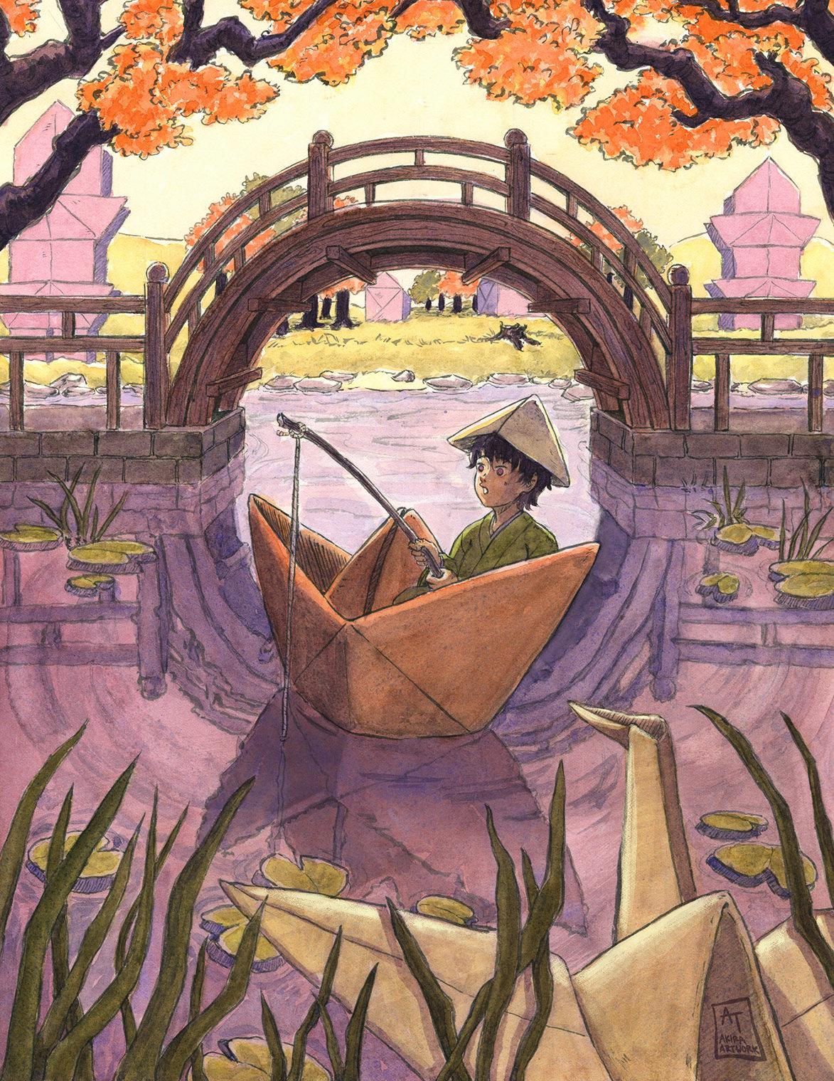
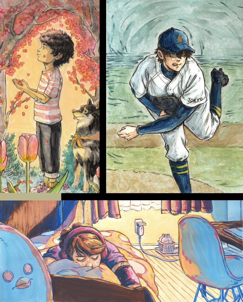
This piece is based on the art of origami and Ukiyo-e prints. In every child’s life, there is a phase where they are invested in the art of paper folding. I combined this tradition with surrealism to create a memorable world that has the balance between paper and real objects.
The color scheme in this illustration was particularly important to me, because I wanted to channel the Japanese traditions in many aspects. I explored two seasons that are widely celebrated in Japan. The first being Hanami, which is when the cherry blossoms bloom, and Momiji which is the leaves changing in the fall. I choose this fall palette because it suit the warm cozy, and childlike feeling within the piece.
Top of the Deku Tree
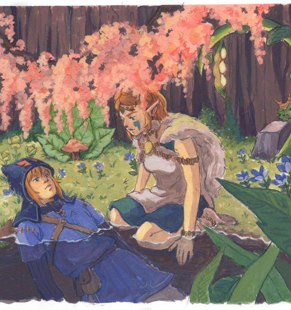
FAN ART CROSSOVER
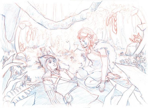
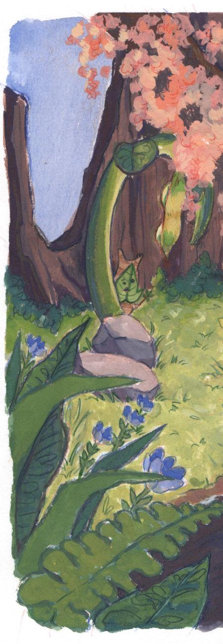
After finishing my play through of Legend of Zelda: Tears of the Kingdom, I saw many similarities between this game and the movie Princess Mononoke. I created outfits that mixed character designs from both together. The background is the top of the Deku Tree, a hidden location, which looks similar to a scene in the film. My line drawing was done in color pencil with warm and cool tones, so that it impacted the color temperature of the paint. For this piece, I used Nicker poster paint, rather than my usual watercolor style, to portray a similar shading style to the original content.
About Me

Artist Bio
I’m Akira Tuazon, an illustrator and graphic designer based in southeast Michigan. I have a passion for promotional artwork, product design and branding. By applying the illustrative process to a variety of traditional and digital mediums, I create unique pieces inspired by products, companies and people to engage and attract consumers.
My work consists of illustrations for Detroit Indie Band, The Fruits, and RAE comic’s Joystick Angels, as well as personal illustrative commissions. I have had my work displayed at Vivat Veritas Pop Up Shop and Fashion Show as well as the annual CCS Student Exhibition. I graduated from College for Creative Studies with a Bachelor of Fine Arts; majoring in Illustration.
In my spare time, I enjoy drawing fan art for my favorite shows or games, reading manga, trying all kinds of food, and spending hundreds of hours on JRPGs.

Thank you!