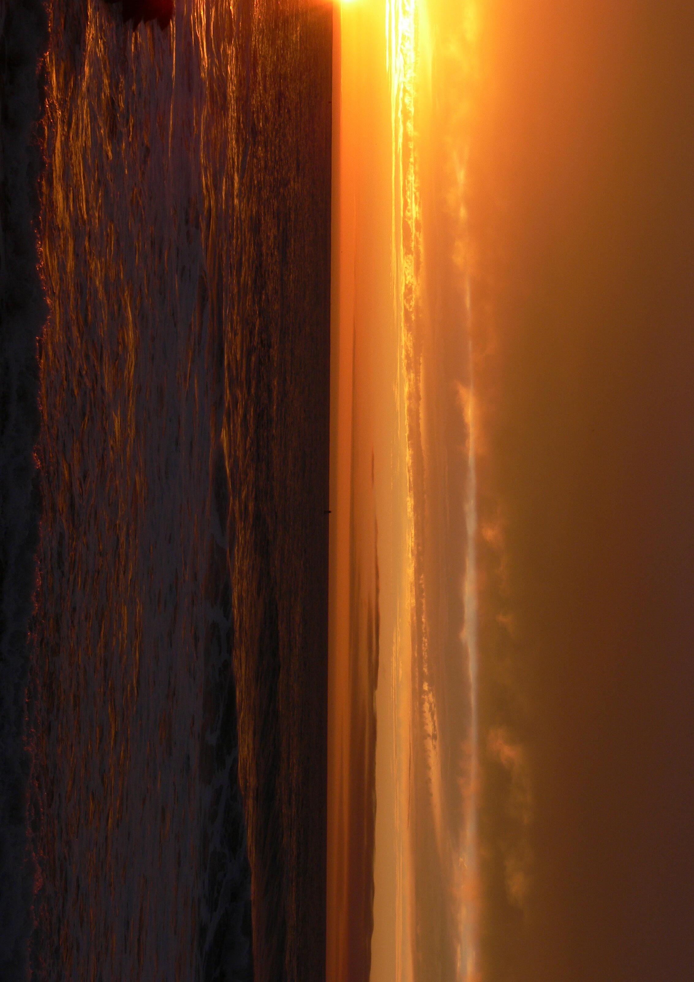
Sunset Sunrise Sunset
Alexandre da Cunha
: Some Technical Questions
Eleanor Pinfield in Conversation with Kevin Walker
Everyday and the Eternal: Commissioning Alexandre da Cunha
In 1848 , a little-known painter, Robert Westall, caught the view Carlyle enjoyed on the return leg of his rides, as he descended Battersea Rise, with Chelsea Hospital the distant architectural eye-catcher. In the foreground is featureless Battersea Fields, stretching on and on, treeless but intersected by busy raised tracks, before shading into an indeterminant meeting of water and land, which in the winter months became a muddy morass There are no houses but plenty of people in view, tiny figures working the land or scurrying along The only identifiable structures near the Thames are the stubby base of the eighteenth-century windmill, by then sail-less since it was steampowered and, further east, the prominent new Water Pumping Station. Framed by a collection of tall, exposed gantries, even to us it exemplifies a confident, engineered future Inside were a couple of Cornish beam engines, eventually becoming five, ever larger, struggling to deal with an urban water supply Beyond lies a reservoir and the crucial filter beds These would be the site for the future Battersea Power Station.

If Charles Dickens wrote off Battersea Fields as ‘a waste expanse for what attempted to pass for country’, the reality was probably closer to the agriculture of the Fens. From the early seventeenth century, the poor soil had been liberally fertilised with stable litter from central London. Innovative market gardeners extracted two crops of asparagus by digging old roots into ‘hot beds’, warmed by the fiery combination of glass and manure By 1721 , good times for energetic nursery gardeners, ‘Battersea affords the largest natural Asparagus, and the earliest Cabbages.’3
The rapid urbanisation of areas such as Battersea within a couple of decades was entirely determined by the railways. ‘Brutally cut about by the so-called second railway mania of the 1860 s’,4 nowhere was more vulnerable than Battersea. Those open fields promised easy pickings
once the drainage and sewerage had been fixed and the Thames adequately embanked Meanwhile, the railway companies, racing for the new central termini that served the south of London, knotted their multiple lines together to produce what became known as the Battersea Tangle Passengers poured in and out of Clapham Junction, which was (and is) not in Clapham at all but in Battersea.
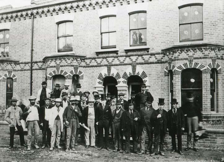
The railways brought industry, especially the most noxious trades, to the riverside, but they also brought people into town The population of Battersea doubled in the 1870 s alone, from 54 ,000 to 109 ,000 . In 1850 it was under 11 ,000 . The trend continued exponentially upwards. That population growth led to development at immense speed, giving rise to badly built housing in the wrong places, but also exemplary models of construction and layout Different housing types emerged: flatted terraces, apartments and villas overlooking the new park, and, notably, Shaftesbury Park Estate, some 1 ,200 houses provided by the tellingly named Artizans, Labourers and General Dwellings Company This was for a new London, in which the tenants were more likely to be clerks in the City than manual labourers. It was ‘an artisan city’ combining ‘something like the benefits of country life’.5 Donald Olsen quotes Jonathan Carr Jr., who took the Shaftesbury Estate as a model for his own forthcoming, and resolutely middle-class venture, Bedford Park in Chiswick, since it exemplified ‘houses well planned, conveniently arranged, and constructed with regard to both stability
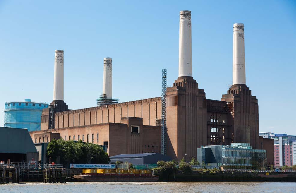
The current dominance of Battersea Power Station is particularly astonishing given that the building saw barely fifty years in operation 12 The rebuilt chimneys (one is to be a glazed lift shaft leading to a viewing platform) loom over the trees as you walk towards it. Ducking under Chelsea Bridge you enter the 42 -acre (15 4 hectare) site that wraps the Grade II* listed building, begun in 1929 and first operational in 1933 , with its shell designed (apparently reluctantly) by Sir Giles Gilbert Scott, whose attention remained on his Anglican Cathedral in Liverpool. Others were responsible for the engineering and proud flourishes in the interior, such as fine ceramic tiles and the great bronze doors depicting ‘Energy’. By the time of the post-war extension, ‘B’ station, the building was double the size of its Bankside sibling, triumphantly transformed into Tate Modern by Herzog & de Meuron to greet the millennium.
Compared to the Lottery-funded art gallery, roofless decommissioned Battersea Power Station was subjected to countless chimeric schemes, some bringing physical damage in their wake, some cresting economic upturns with vision only to be dashed in the surf of a downturn. As I write, it is readying itself to assume a multi-layered identity in which all
13.
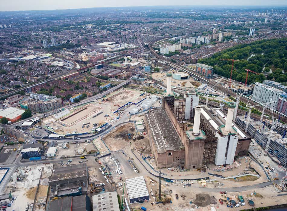
viable options have been combined while we are reassured that the essentials of the building, its massive material presence above all, have been safeguarded
The power station was decommissioned in 1983 , but concerned parties were already on the case The first plan, to turn the shell into London’ s Alton Towers, led to the loss of the roof and the west elevation, but gained planning permission for leisure use, only to founder with the applicant, John Broome’ s, bankruptcy. Undeterred, SAVE (Save Britain’s Heritage) pressed on, supported by the Thirties Society, now the Twentieth Century Society Architect Terry Farrell proposed slicing off the east and west sides and turning the shell into a managed ruin, while John Outram proposed a vast hotel with gigantic Egyptian columns For a moment in 2012 , an adroit phased scheme by architectural practice Allies and Morrison for SAVE suggested a path towards a multi-use stadium (Morrison had worked on a future for the building with SAVE thirty years earlier) but then the current owner of the site bit the dust. 13
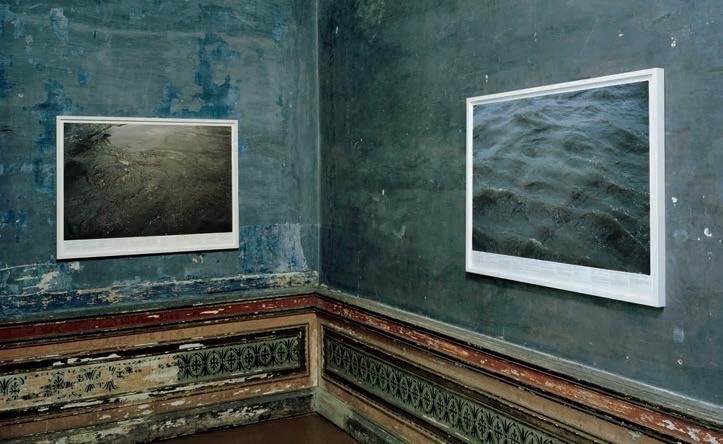
transformations through human occupation, including, more specifically, the processes of urbanisation and (de)industrialisation indexed by the landscape of Battersea, where the work is located. 8 The sculpture also exists in dialogue with a corpus of artworks that archive the myriad ways in which humans have adapted to, and adapted, the riverine flows and territorial forms of the Thames Estuary. From John Constable and J M W Turner’s paintings of the dynamic social and physical lives of the river, via Claude Monet’s enchantment with the sooty skies that reflected its industrialisation, and through to Roni Horn’s photographic series Still Water (The River Thames, for example) (1999 ) in which the river is a rich repository of histories, da Cunha’ s work also references London’s intimate relationship to the Thames, albeit in non-figurative, oblique manner from its site embedded in an transport hub that itself hunkers in the shadow of a former urban power plant. Indeed, it is interesting to think of da Cunha’s work in broader terms as part of the fluvial city as an ‘organic machine’ made up of the tidal river and its urbanised banks. ‘Organic machine’ is the term used by the environmental historian Richard White to describe the Columbia River as a flow where natural history and modern technology are intertwined, where the river’s natural course and pulse become an intensely mediated milieu, stopped and started, dammed and liberated. 9
As a carefully engineered composition of rhythms and movements, Sunset, Sunrise, Sunset articulates a tempo that signals directly how humans contrive technologies and infrastructures that regulate time and space by moving matter and bodies around natural and urban
London’s nineteenth-century sewage engineering works were synchronized with the Thames’ tidal rhythms O Jones, ‘“The breath of the moon”: The rhythmic and affective time-spaces of UK tides’, in Tim Edensor (ed ), Geographies of rhythm: Nature, Place, Mobilities, and Bodies, (London: Routledge, 2010 ), 189 –203 Cited in Jackson et al, ‘River Rhythmicity’, 6
Richard White, The Organic Machine: The Remaking of the Columbia River (New York: Hill and Wang, 1995 )
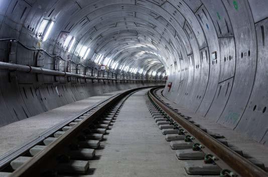
environments. Indeed, this is the very raison d’etre of infrastructures such as transport systems or telecommunications networks, which serve to ‘mediate exchange over distance, bringing different people, objects, and spaces into interaction and forming the base on which to operate modern economic and social systems’.10 Curiously, despite their outsize scale and ceaseless influence on our lives, infrastructures tend to live largely unnoticed lives Huge underground tubes criss-cross cities carrying waste and water, towering pylons buzz with energy, and trains screech along under streets, taking people from home to work and back again, but as infrastructure studies scholars regularly note, infrastructure is only noticed when it goes wrong. Breakdown interrupts precisely the programmatic rhythms and movements that are designed to make quotidian events, quite literally, go like clockwork. Da Cunha’s practice is attuned to the overlooked lives of infrastructure, however, as is evident in the many works he has made on infrastructural scales and with infrastructural materials, which find new lives as public sculptures. This is the case with both Sunset, Sunrise, Sunset, with its repurposed billboards placed in an underground Tube station, and the monumental Figurehead works, in which the artist upends huge concrete underground sewage and water pipes to turn them into contemporary monoliths Just as da Cunha moves infrastructural objects from obscurity to public view, he also turns construction tools into sculptural artefacts, interrupting the afterlives of oblivion and obsolescence to which utilitarian objects are relegated once they have served their purpose. By stripping cement mixers and concrete mixer drums of their contexts and placing them on plinths as sculptures, as occurs in MIX (2012 ) and Urn V (2013 ), the artist returns them to the turbulent tides of time There they assume a presence at once futuristic and worn, resembling pseudo-archaeological artefacts from a future that hasn’t happened yet.
Uncanny Moments
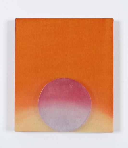
Sunrise, Sunset, Sunrise invites viewers to interact with it within a range of attention spans, from fleeting glimpse to contemplative meditation. While its fluid dynamics escape facile readings that might see it as an invitation to return to nature, it holds space for the contemplation of sublime colour, a phenomenon that is both a time-honoured mode of aesthetic inquiry and the very thing that makes sunsets perhaps the most clichéd of all landscape tropes. 13 This ineffability in the work, its refusal to imitate, represent or enunciate a recognisable object, and its reluctance to settle on either lofty or ironic postures, is entirely intentional, and hints to ways in which da Cunha’s practice holds gravitas and levity in balance The artist’s previous riffs on heliotropic clichés exemplify these playful and generous invitations to the viewer to contemplate scenes that are the epitome of cliché In Morning VIII (2016 ), a scarf and a trivet compose a dusky pink sunrise scene, while in Laissez Faire (Wet Look I) (2016 ), a beach towel emblazoned with a dramatic sunset – a hackneyed symbol of the exotic beach holiday –is refashioned as a wall-mounted work.
Playful engagement with the objects, spaces, temporalities and imaginaries of everyday life is an operation that runs through da Cunha’s work as a consistent thread The artist’s practice pivots on the act of taking an everyday object and pushing it to do something that it


advertising boards turn, set by the road at roundabouts, flyovers and traffic lights Soda adverts would merge into sunshine shots of faraway holiday destinations, tropical fruit drinks fading to reveal fantastical movie posters or supermarket best buys As one image disappears, the next, half erased, starts to form
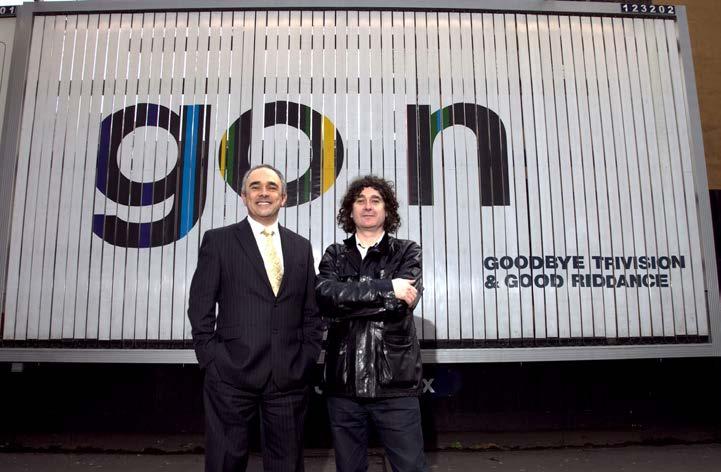
In the early 2000 s, the digital screen was vanishing from the advertising world The rotating panel was not mourned; its demise was even a moment of celebration Trevor Beattie, a leading British advertising executive, held a press conference to mark the final ‘turning off’ of ad agency JCDecaux’s trivision panels in 2011 Standing next to a trivision panel reading, ‘Goodbye Trivision and Good Riddance’, Beattie commented: ‘Neither me nor my clients want to see our ad shredded into a hundred little strips and revolved around at a rate of knots, only to be replaced by a big silver car four seconds later or some awful airline ad.’1
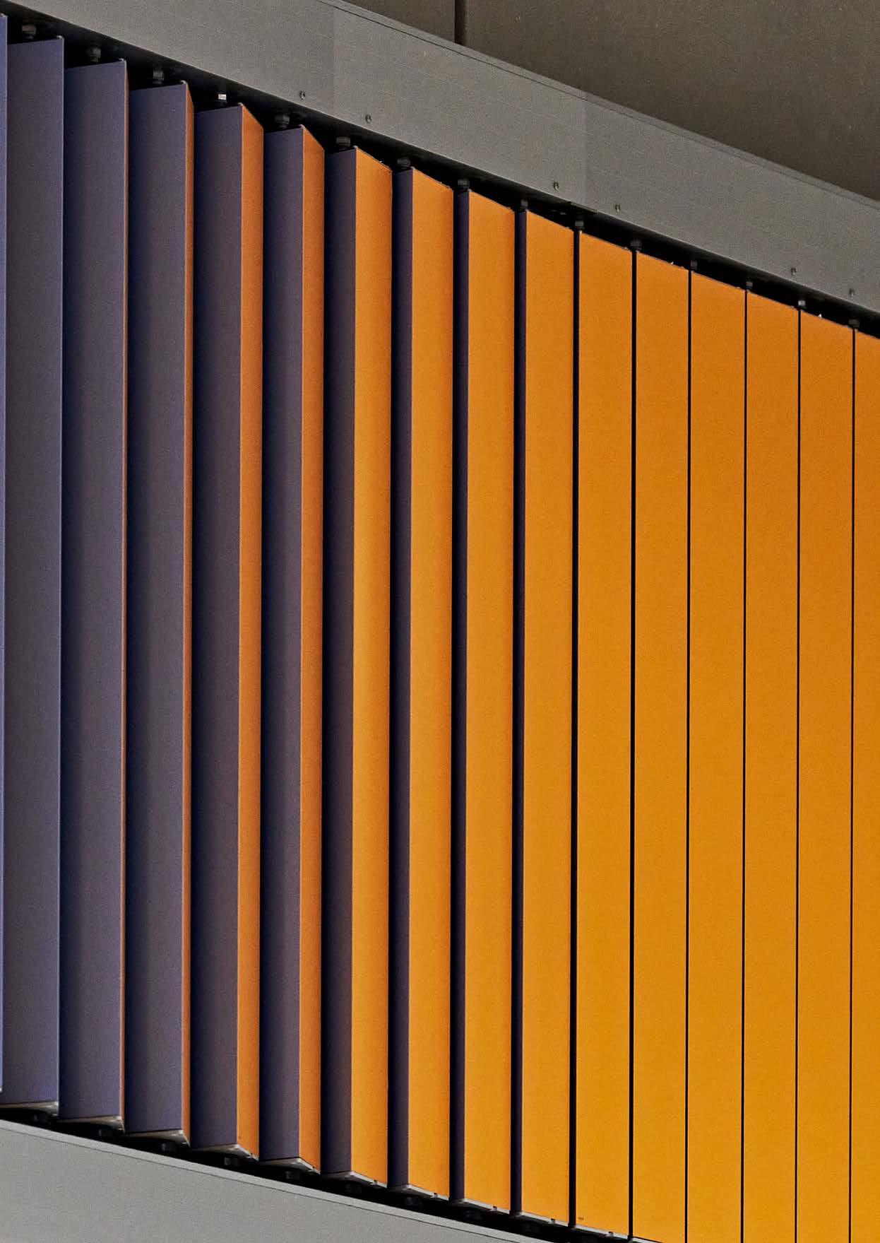
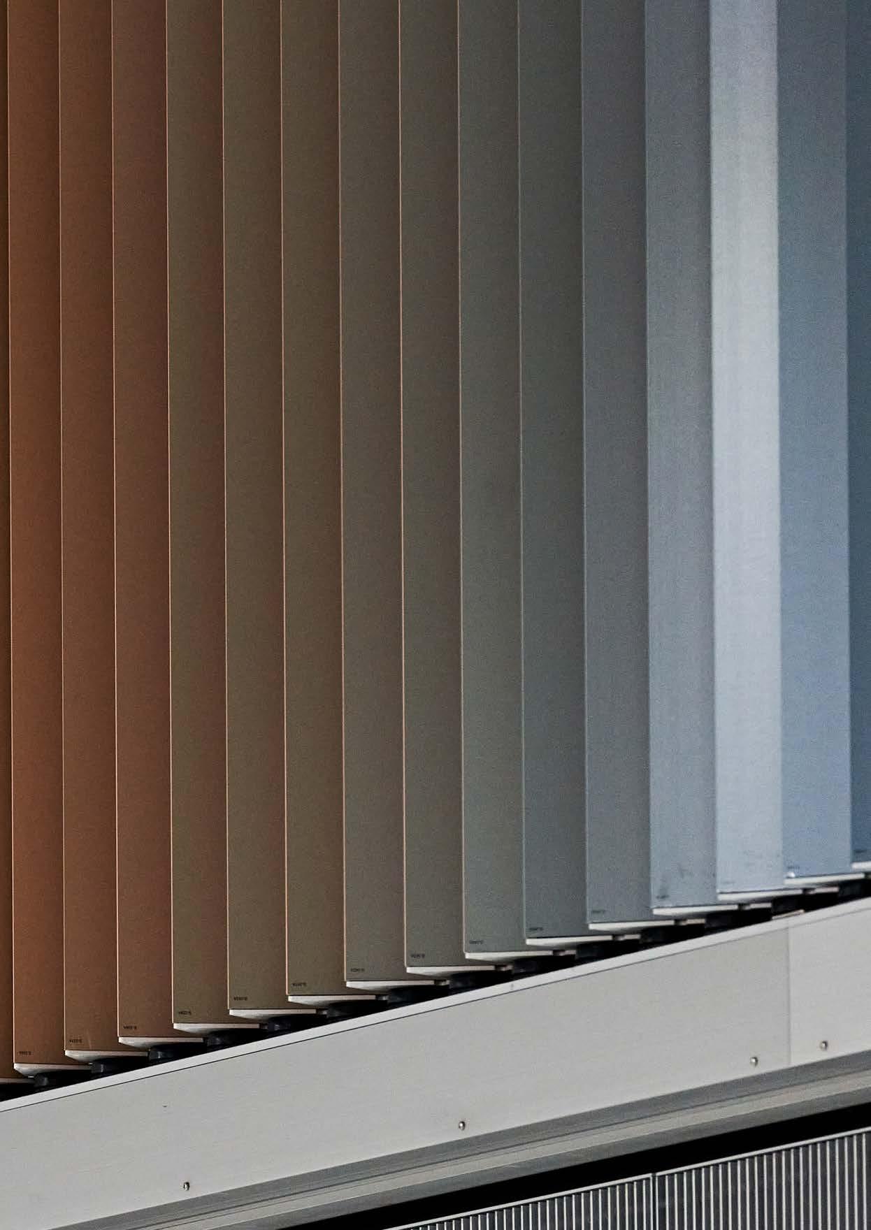
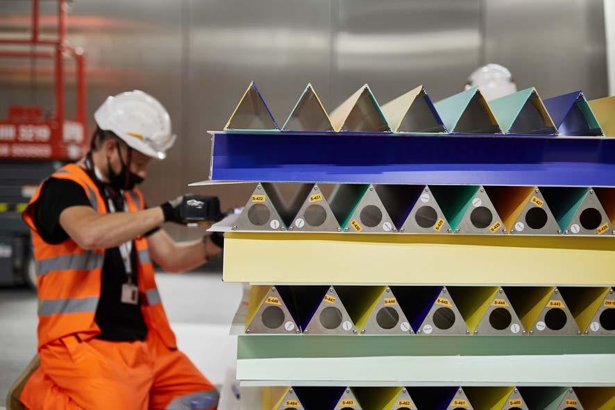
The concept of shredding an image into a hundred little strips is at the core of Sunset, Sunrise, Sunset As we developed the work, da Cunha explained how the panels form what might be considered a generic image of a landscape split into single colour units, so simple a child might create it This landscape is a window to a sky, a view of nothing, a void space. The mechanical board turns but gives us no information, no urge to buy, no explanation of why it exists Instead, the rotating panel offers us just a notion – a profound notion – of a daily
mechanical cycle. As we encounter the slight whirr and flutter of the prisms, one landscape shifts into another, the rotating colours never quite appearing the same.
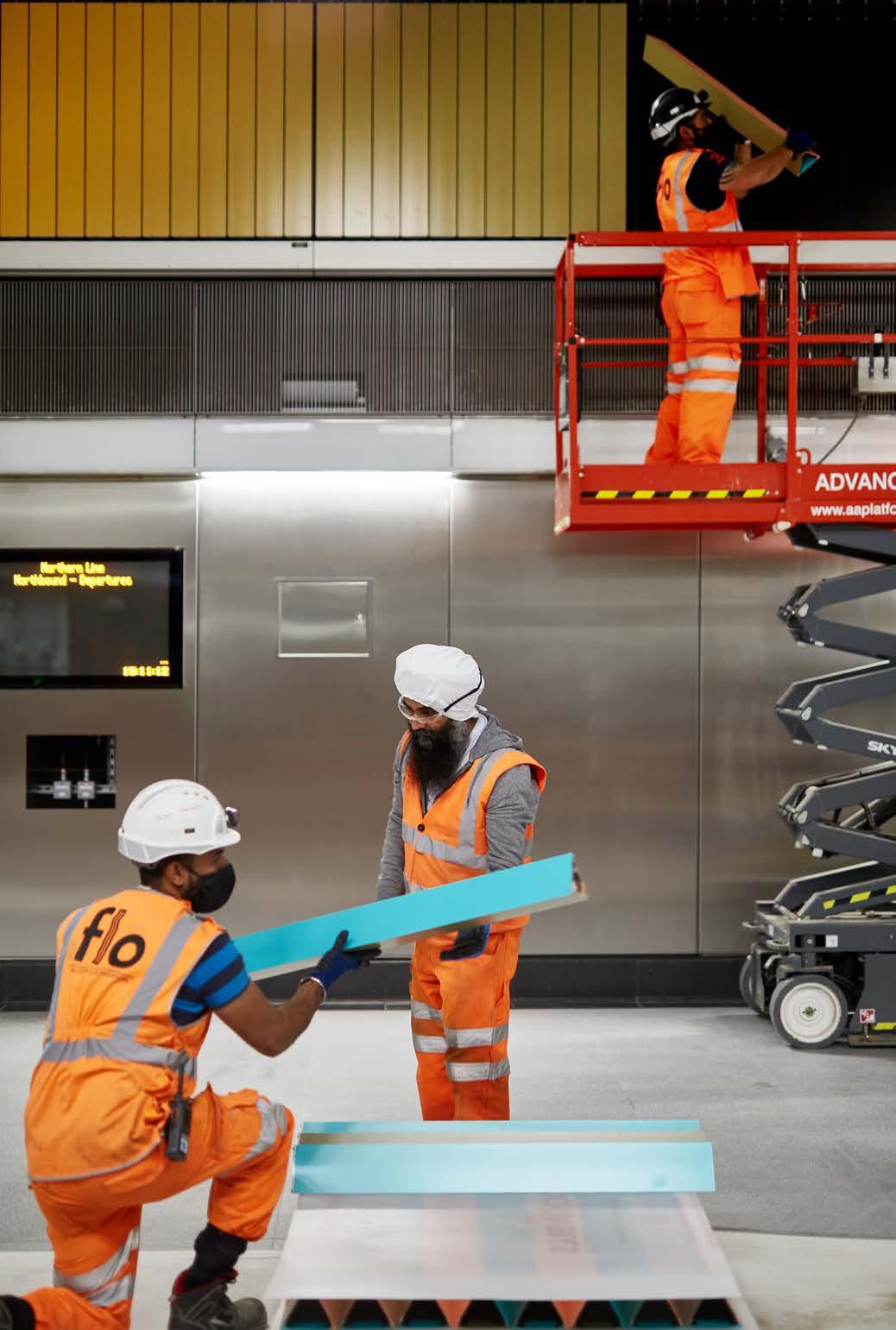
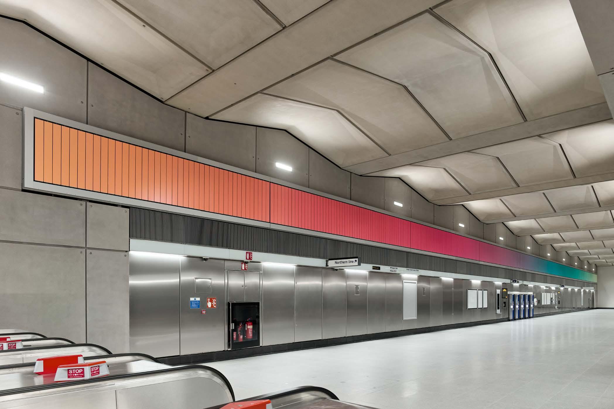
While the colours of Sunset, Sunrise, Sunset appear continually to shift, the work can be understood as presenting six individual images – two panels on each side of the ticket hall, each with three sides The scale of the work is profound: the panel on the south wall of the ticket hall is 62 metres long and has 472 individual prisms, while the panel on the north wall is over 95 metres with 721 prisms Da Cunha worked with designer Melissa Castro Duarte to develop a series of colour gradients for the six images, each colour bar in each sequence changing ever so slightly in tone The collection of colours form together an expanse of shifting hues across over 3 ,500 different prism faces. Sitting high above our eye level, the vast panels are akin to windows that open onto an expansive and ever-changing horizon on the scale of a landscape
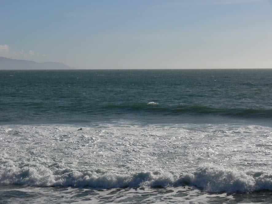
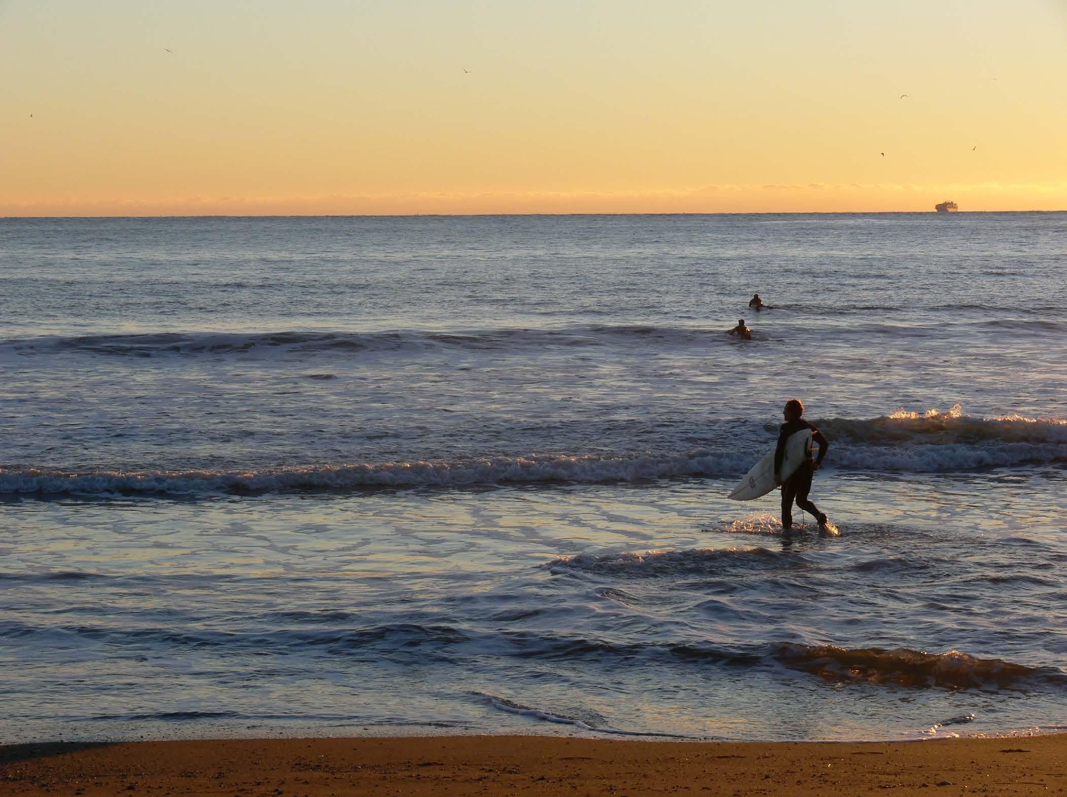
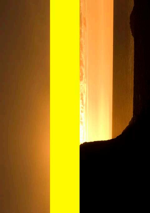
The colours of the work are recognisable from the hues of the sky: reds, pinks, yellows and oranges – the clichéd tones of sunsets and sunrises – set alongside greens, purples, browns and black, dark hues of near nightfall, grey-green textures of misty dawn Da Cunha derived these colour selections from his personal collection of photographs of sunset and sunrise skies, photographs of which feature throughout this book and appear in da Cunha’s past works, including West Series Flags, commissioned as part of Art on the Underground’ s 2016 series London Is Open and handed out to thousands of Londoners in poster form
This publication is released in September 2022 to mark one year since the completion of Sunset, Sunrise, Sunset, Alexandre da Cunha, Battersea Power Station Underground station, commissioned by Art on the Underground.
Editor Eleanor Pinfield
Design Fraser Muggeridge studio
Copyediting Melissa Larner
Project management
Lydia Fuchs, Kerber Verlag, Production Jens Bartneck, Kerber Verlag
Printer and Publisher
Kerber Verlag
Windelsbleicher Str 166 –170 33659 Bielefeld
Germany
+49 521 950 08 10
+49 521 950 08 88 (F) info@kerberverlag com kerberverlag com
Kerber publications are distributed worldwide
ACC Art Books
Sandy Lane
Old Martlesham
Woodbridge, IP 12 4 SD
UK
+44 1394 38 99 50 +44 1394 38 99 99 (F) accartbooks com
Artbook | D A P
75 Broad Street, Suite 630 New York, NY 10004
USA
+1 212 627 19 99 +1 212 627 94 84 (F) artbook com
AVA Verlagsauslieferung
Scheidegger
Obere Bahnhofstr 10 A 8910 Affoltern am Albis
Switzerland
+41 44 762 42 41 +41 44 762 42 49 (F) avainfo@ava ch
Zeitfracht GmbH
Distribution kerber-verlag@knv-zeitfracht de
The Deutsche Nationalbibliothek lists this publication in the Deutsche Nationalbibliografie: dnb de
© 2022 Kerber Verlag, Bielefeld / Berlin, Alexandre da Cunha and authors
All rights reserved No part of this publication may be reproduced, translated, or stored in a retrieval system or transmitted in any form or by any means, electronic, mechanical, photocopying, recording, or otherwise, without the prior permission of the publisher in writing
ISBN 978-3-7356-0771-3
www kerberverlag com
Printed in Germany
