

I am sitting in my writing studio in Los Angeles. In front of me is George Byrne’s Green Sun with Yellow What am I seeing? Is it an abstract composition? The apparent flatness of the dark blue, like blue and white spaces would suggest so? However, beneath the coral colored rectangle, which is beveled, there is a shadow, a depiction of spatiality so clear that I believe I can see under the coral, perhaps slide my hand beneath it. On the beveled border of the coral rectangle is a green sun, a symbol for the sun, a child’s sun. At once the picture is a photograph and a painting, abstract and representative. At the bottom of the composition is yellow cylinder, shaded on one side and impossibly casting no shadow. Abstraction? The cylinder is immediately recognizable as a parking lot pole barrier, common in most cities, but certainly ubiquitous in Los Angeles and so this work becomes a landscape. The magic of it is that as soon as I see the picture it is exactly that, a portrait of Los Angeles. I know what I see, but I cannot articulate the mechanisms at work here. The shapes are not unique to to Los Angeles. Neither are the colors, though they are distinctly southern Californian. It is an abstract landscape that is its subject.
I am reminded of the later paintings of Piet Mondrian. Not simply because of the suggestion of a grid to represent place, but because the work is actively breaking down the constraints of realism. Green Sun with Yellow is a photograph of a place and, though the image might or might not have been manipulated in some way, it is not a composite of several images or several places. It is, in this way, a landscape, but it has reversed its gaze and so our perspective, from out to in, from far to close and yet it still works as a portrait of a place. Is this the power of abstraction or the immediacy of naturalism?
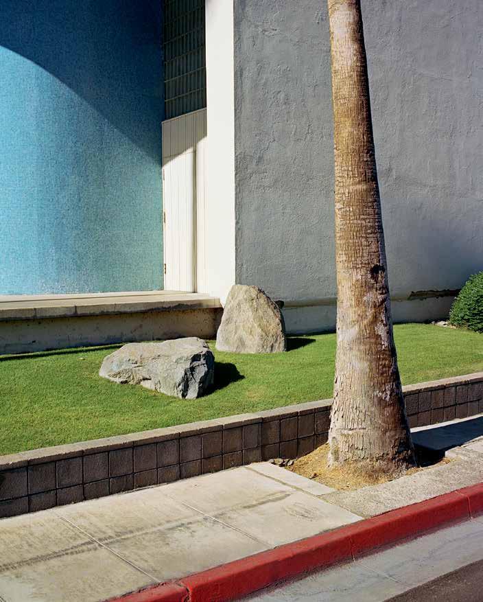
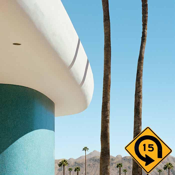
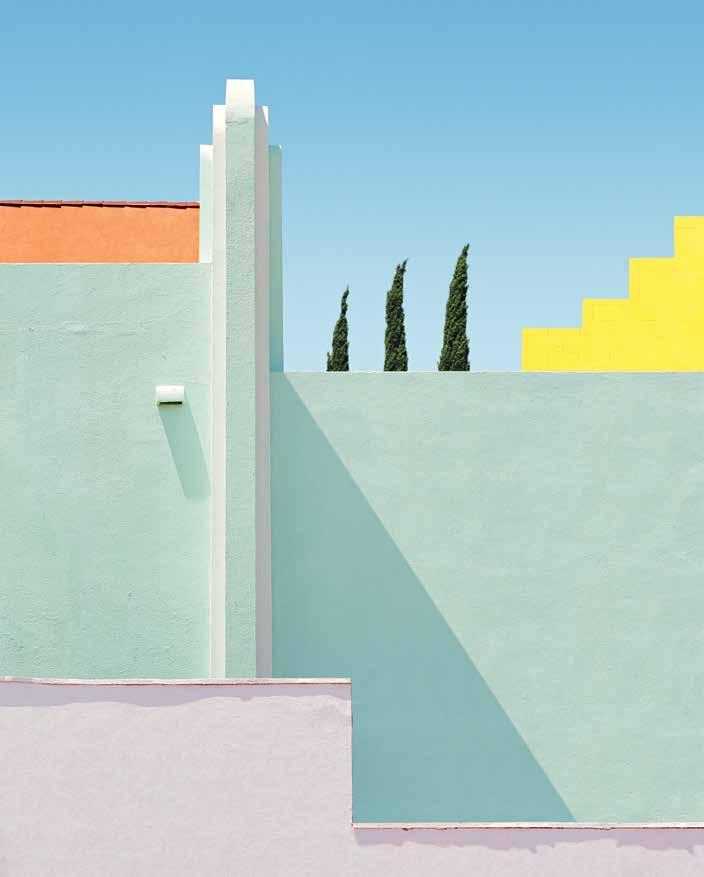
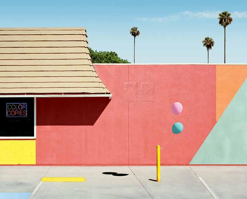
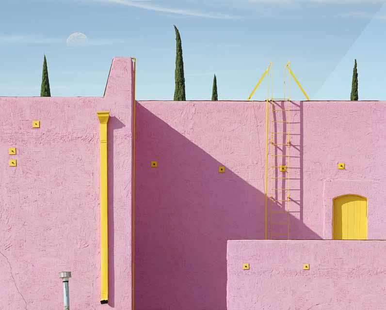
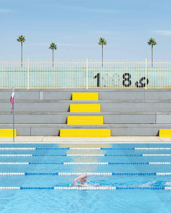
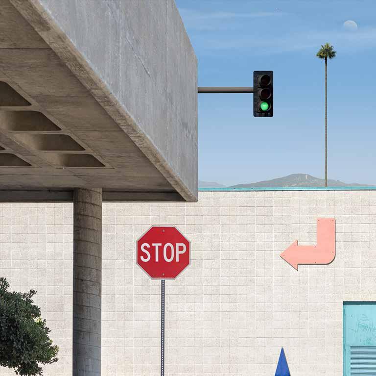
Instead of following an impulse to eradicate the particular form, the aim of the cubists and Mondrian, Byrne embraces existing forms. In these works, lines and the colors are sharply defined. Things are what they are, awnings are awnings, but sheltering what? Doors are appear without knobs or handles. Traffic barriers have no traffic to deflect. Often, the natural world looms just outside the shapes, as backdrop, as if separate from the composition, while, unquestionably, deliberate and necessary. These are photographs that challenge our ideas of photography. They are paintings of the material world that make us question the necessity of paint.
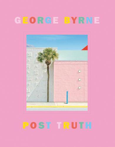
These photographs offer something new every time I come to them. They have a narrative push that appeals to my writer’s sensibility, but I cannot repeat the images with descriptive language. The colors make this works easy to live with, a pleasure to view, but they offer so many surprises. The painting that appears on the cover of this book draws me in with the shadowless palm tree, but the red triangle on the right border strikes me a genius. It is not that it should not be there, but the feeling that, of course, it should be there. Is the red a part of geometry of the photograph or is it an element of nature like the top of the mountain on the left border? Is the palm tree a thing from nature or is it inserted into our world like the blue post?
These are beautiful, challenging works that offer more with familiarity. They are friends or pets. We not only live with them, but they live with us.
Los Angeles, March 2023

“The house he lived in was a nondescript affair called the San Bernardino Arms. It was an oblong three stories high, the back and sides of which were of plain, unpainted stucco, broken by even rows of unadorned windows. The façade was the color of diluted mustard and its windows, all double, were framed by pink Moorish columns which supported turnip-shaped lintels…”
Nathanael West, The Day of the Locust, 1939
there’s someone stalking the streets, strip malls, and second-story car parks of the greater Los Angeles area. At times, it would appear that this mysterious figure is going by foot unaware, evidently, that this is no way to travel in these parts. (Victoria Tennant: “Why don’t we walk?” Steve Martin: “A walk! In L.A.?” Sputtering into helpless laughter, in 1991’s L.A. Story.) In some instances, they appear to take the form of a distracted passenger in a moving car, a convertible perhaps: staring up at a contrail bursting over a palm, or stopped at a red light, watching a shadow cross the street. Whoever it is, they are certainly not a native of the place, since they seem to linger in certain quarters and pore over minutiae that Angelenos themselves would regard as only too essential, too echt Los Angeles. The city this stranger inhabits is a secondhand city, one already well known though the internet and movies and art. Even at its most
unglamorous it appears, for them, charged with energy and allusion, giving way any moment to fantasy.
The individual in question is the subject of photographer George Byrne’s extraordinary work. It is not quite the artist himself, though the two might share some of the same biography transplanted to the great Californian metropole a decade ago, Byrne was born and raised near Sydney, Australia, about as far out of town as one can get. A large part of his earlier oeuvre consists of images of New South Wales, where he received his conservatory degree from the Sydney College of the Arts in 2001 and first came into contact with the work of David Hockney, Ed Ruscha, and a whole cavalcade of West Coast artists who more or less invented L.A. in the artistic imagination. Growing up in the Byrne household meant there was always creativity in the air, and a bit of Hollywood as well: two of his sisters
Editor: Stephanie Emerson
Texts: George Byrne, Percival Everett, Ian Volner
Graphic design: Michael Worthington, Counterspace, Los Angeles
Typeface: Franklin Gothic, Scala Pro
Production:
Printing and binding:
Paper:
© 2023 Hachette and authors
© 2023 for the reproduced works by George Byrne: the artist
Published by Hachette
This is an extended third edition of Post Truth, originally published in 2020 by © George Byrne georgebyrne.com
ISBN 978-3-7757-5253-4
Printed in
Cover illustration: 71st St., Miami, 2019
Frontispiece: Ace Hotel, S. Broadway, 2015